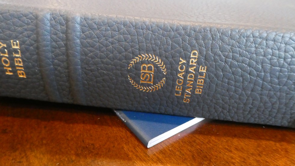
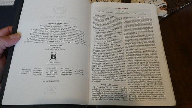
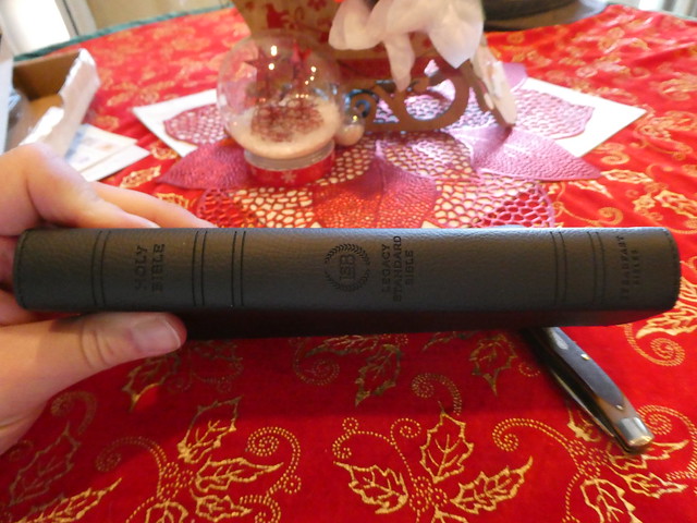
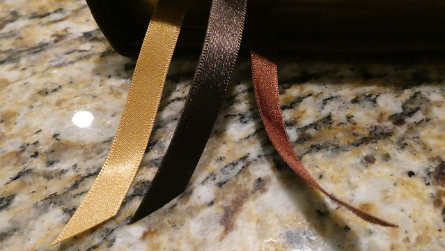
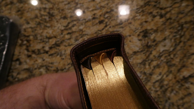
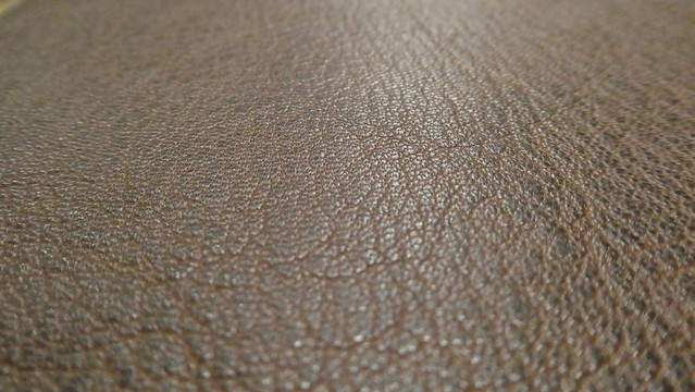
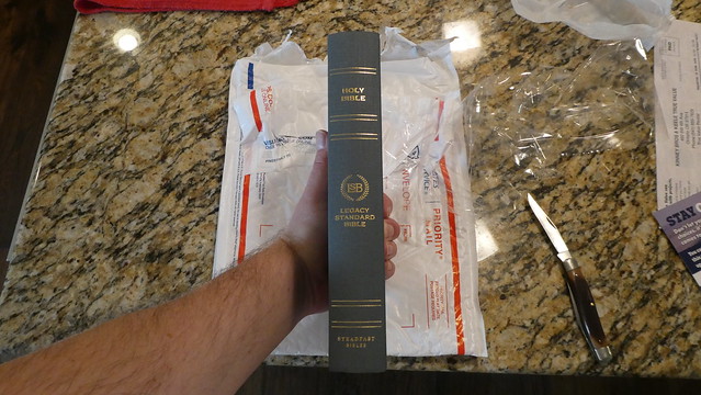
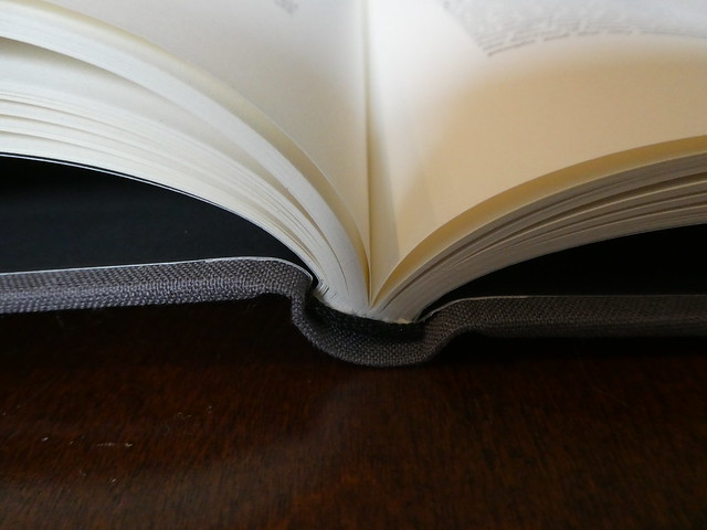
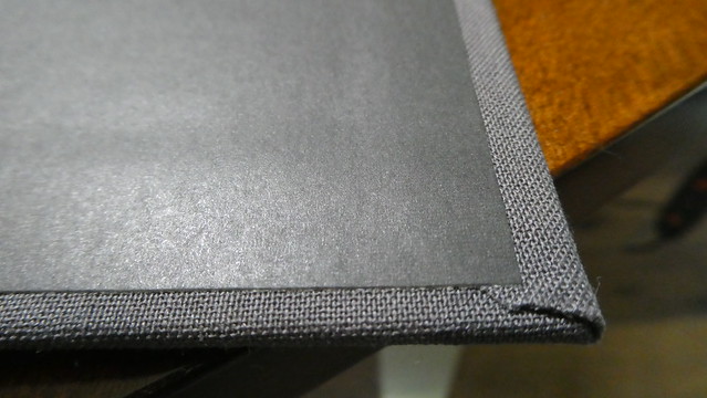
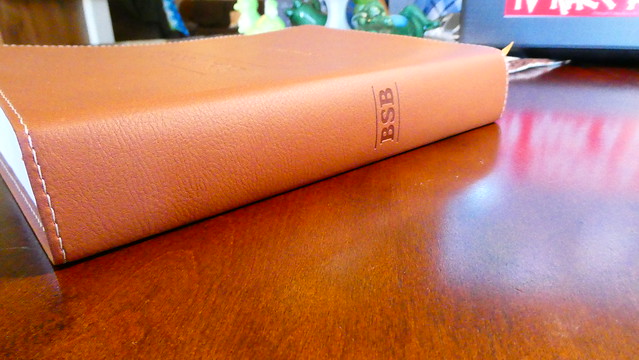
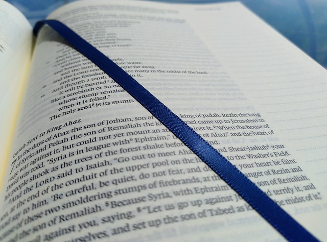
I preordered this edition when the option became available, and have been patiently waiting for it to arrive. I am also waiting for other editions to be published. I know that many people don’t use the cross references often, but I do like to have them in my daily reader. I am hoping for the MacArthur Study Bible in LSB to be announced one of these days. I know it is a matter of time. This Bible isn’t as large as the Large Print, Wide Margin edition, but it feels like it weighs about the same. It is not a light Bible. I have to say, I’m really enjoying the blue cowhide leather cover. The grain of the leather is more pronounced. It hasn’t got the ironed leather look. The perimeter of this edition’s cover is sewn. That should keep it from coming unglued at the corners, since we are talking about a case bound edition here. The corners, as well as the spine are rounded. The spine is smyth-sewn for durability, and flexibility. There are 5 raised spine hubs. “Holy Bible” is hot stamped in gold colored foil on the spine along with the logo for the LSB, and the publisher’s name at the bottom. I did notice some odd markings on the page edges. It looked like someone at the factory tried to repair some spots where the page edge gilt may have been damaged, or misapplied. There were also some minor dings in the page edges. In the Facebook group, another person mentioned the same problem with his Bible. (I hope, once they get the production procedures practiced, the quality control will get better. I sort of expect quality control problems with a new translation being published in South Korea. The Berean Standard Bible is printed, and bound in the USA, and doesn’t seem to have these problems It also costs much less. I wonder why 316 went with a Korean printer instead? Perhaps the American one couldn’t do the volume they needed?) There are 2 ribbon markers, that are nice quality, and the ends have been seared. The head and tail bands are blue to match the cover, and one of the ribbons. 40 g.s.m. paper is terrific! I love the paper. There are 14,000 translation footnotes. This is helpful for the language geeks like me. We want to know. The concordance is a nice addition. It has over 16,000 entries. The font is nice and legible at 11 pts. for the scriptures, and smaller for the references. This is a black text edition, with red titles, headers, chapter, and page numbers. The text is line matched with the text on the reverse side of the page for eye comfort. This is a single column, verse format Bible with the cross references in the inside column between the gutter, and the text column. There are some maps at the very back. I am very pleased that they included a storage box for this edition. It is the best way to keep a Bible protected when not in use. All in all, this is a really nice edition. This translation is, in my opinion, the best modern English translation to date. I am hopefully looking forward to more editions. 316 also included a lapel pin, and a daily planner with this Bible purchase. I have pictures of the planner on my Flickr page along with more pictures of this edition. Click the link to check them out.
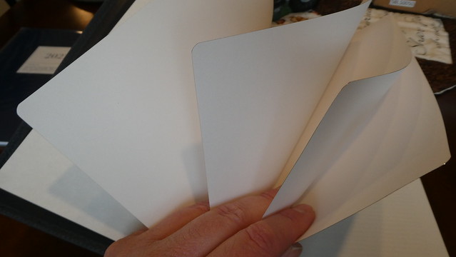
Here are some pictures that highlight the features I mentioned. If you click the album link above, you can see the high resolution pictures instead of these lower resolution ones.
Instead of writing about a feature, and then having a photograph inline, I’m changing it up a bit. I’ll have the write-up of my impression of this edition, and all of the photographs will be after. So if you simply want to look at the pictures you can skip all the text… You weren’t really going to do that were you? I mean… Seriously? You want to just look at pictures… Okay, I tend to do that too, but if you do want to know what I think about this edition, continue reading.
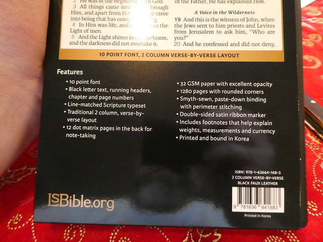
The LSB is, in my opinion, the best modern English translation of the Bible to date. I’m purchasing all new resources to go along with this translation. The two column, verse format LSB, is the first edition of the LSB that is actually quite portable. The double column, verse format, is one of my favorite Bible layouts of all-time. This one lacks some of the fancier features, but for dragging around with me wherever I go, it is perfect. I’m also pretty jazzed that it isn’t made in China.
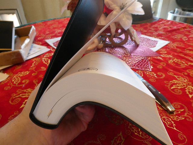
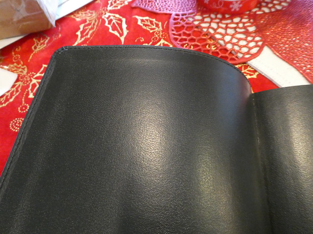
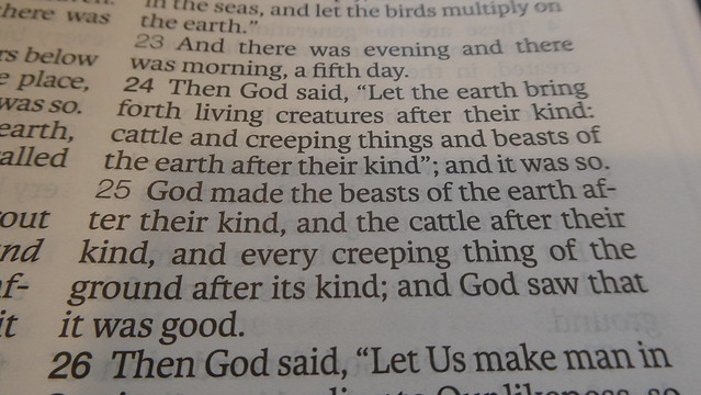
It is printed, and bound in South Korea. Not only do you get the great double column verse format layout, you also get 32 g.s.m. paper, 10 pt font, line-matching, double sided ribbon marker, perimeter stitching, head and tail bands, section headings, rounded page corners, and a rounded smyth-sewn spine. I know, you all wanted to see an edge-lined, goat skin leather edition, but we don’t always get what we want, nor should we. We get what we need… Now, for your reward for reading my opinion, some pictures of this Bible I drew using a camera…
I want to warn you all about the Passion, “translation” of the Bible. I review Bibles on my site. Publishers send me their works for review. I get them for free in exchange for a review. The author of the Passion is just one man. His name is Brian Simmons. He is not an ancient language expert. He is a false prophet. He is a worker of lying signs and wonders. He is a liar, and a charlatan. He sent me some of his work translating Koine Greek to English. He wanted a ringing endorsement. This was evident by the child-like temper tantrum he threw when I told him how horrible his work was. He did not even come close to actually translating the text. It was as if he read an English translation, and then put a bunch of uncalled for, flowery, word salad, in between the words that were actually present in the Hebrew, and Greek texts. Later this charlatan was on Sid Roth’s show, “It’s Supernatural” While on the program he claimed that Jesus appeared to him in his room. He claims that Jesus supernaturally empowered him to know the lost, and true, meanings of the ancient languages. He also claims that Jesus commissioned him solely to give the world Jesus’ true words in this new, “translation.” If you don’t believe me watch the linked video of the show. Start at the 15 minute, 20 second mark. That is where it gets to the point. The video before hand is full of lies about false miracles. https://sidroth.org/television/tv-archives/brian-simmons/ In case that video gets taken down, as many of them have been taken down, here is a link to another video where he tells his lies. https://www.dailymotion.com/video/x2jzaph The interesting part of this video starts at 13 minutes and 38 seconds. This man is a dangerous heretic. Nobody should ever, under any circumstance, use the Passion, “translation.”
Let’s just look at one section of scripture in his fraudulent translation work. Here is the first verse of chapter one in the gospel of John. “1 Ἐν ἀρχῇ ἦν ὁ λόγος, καὶ ὁ λόγος ἦν πρὸς τὸν θεόν, καὶ θεὸς ἦν ὁ λόγος. John 1:1”
I’ll transliterate it for you. En arche en ho logos, kai ho logos en pros ton theon, kai theos en ho logos.
Now let’s look at how those words directly translate into modern English. I’ll put them in the right order given the context provided by the definite article. “In the beginning was the Word, and the Word was with God, and the Word was God.”
Here is how the phony renders it. “In the beginning the Living Expression was already there. And the Living Expression was with God, yet fully God.”
Here is the Greek of verse 2. “οὗτος ἦν ἐν ἀρχῇ πρὸς τὸν θεόν. John 1:2”
Here is the transliteration. “Houtos en en arche pros ton theon.”
It translates to, “He was in the beginning with God. John 1:2”
In verse 2 he gives this false translation. “They were together—face-to-face, in the very beginning.”
These are not difficult passages to translate. So why does Brian get them so wrong? It is because he is a fraud. He is a huckster. He is a false teacher.
Don’t follow this charlatan! Stay away from the Passion, “translation.”
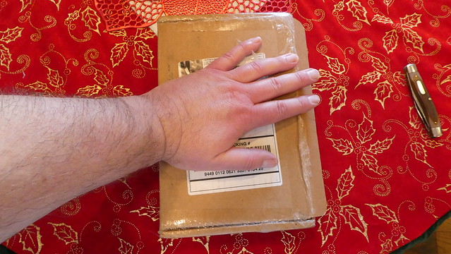
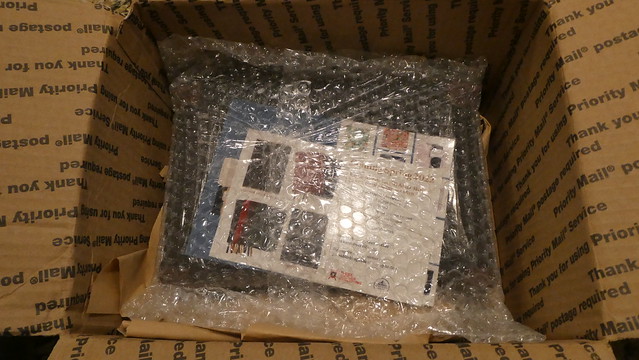
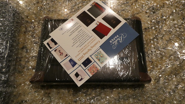
As many of you know, we have been waiting for orders of this edition to ship. Some of us had per-ordered it in August of 2020. The one I ordered finally arrived. I knew what to expect from Jongbloed (Youngblood) as I have reviewed several premium editions over the years passed. All of them were printed and bound by Royal Jongbloed in the Netherlands. This edition did not depart from that standard set by Jongbloed in the past.
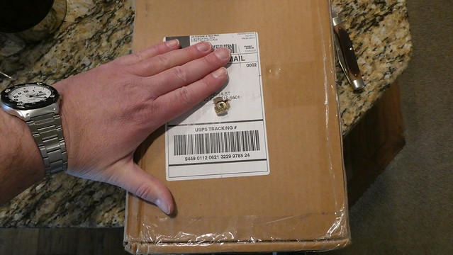
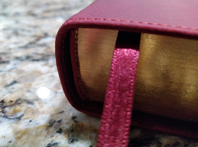
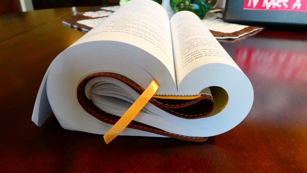
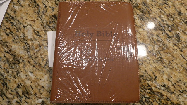
This edition was shipped in a cardboard shipping box via the U.S.P.S. The hardcover comes in a bubble envelope. The cowhide paste-down came in a smaller box. The goatskin edition arrived undamaged, and in perfect condition. The Bible was packed along with the Bible Armor carrying case. The package was cushioned with brown paper. The Bible Armor was in a plastic bag. The Bible was bubble wrapped. It was also wrapped with two paper bands, as is usual with premium goatskin edge-lined Bibles. These bands keep the supple leather from becoming deformed, and in the case of a semi, or full, yapp they keep them bent in to the text block. In times past, full yapp covers kept the text block protected. Keep in mind, these Bibles should never be stored vertically on a shelf! Never! When can you store them vertically on a shelf? NEVER! Glad we got that straight.
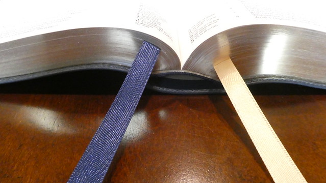
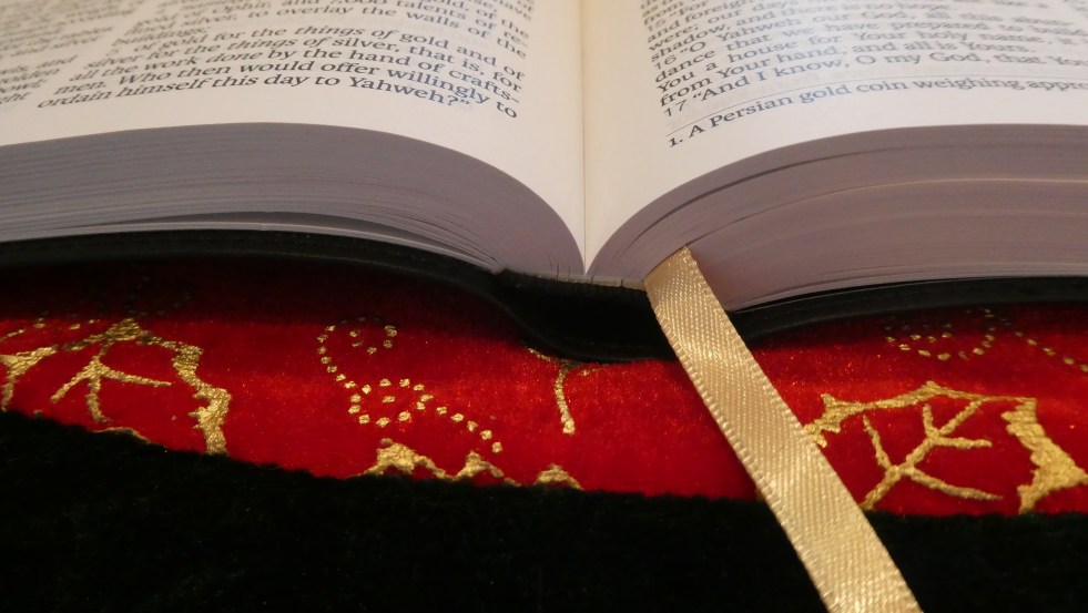
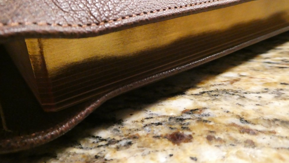
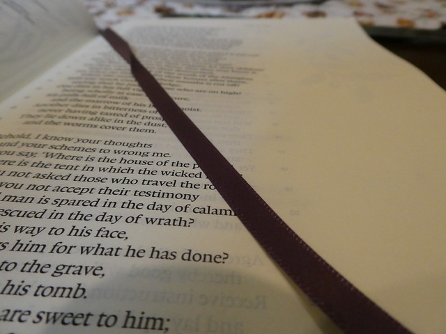
The text block is the same one used in the hardcover, and cowhide Bibles. There are two cowhide options. You can purchase the edge-lined, or the case bound edition. The hardcover’s text block does not have rounded corners. It comes with two ribbon markers. The Cowhide Bibles, and the goatskin have rounded corners. They all have rounded spines. The hardcover, and the cowhide paste-down/case bound Bibles have the narrower 1/4” ribbon markers. The two edge-lined editions come with three of the wider 3/8” ribbon markers.
The covers are dramatically different in tactile experience as well as smell. The edge-lined goatskin of course is the most supple. The paste-down cowhide is comparable to a Cambridge calfsplit leather. The surface is not as glossy and smooth. The leather editions all smell like… leather. What did you expect?
Each edition comes with head and tail bands that match the covers. The edge-lined ones have five spine hubs. The paste down and hardcover have gold colored foil heat stamped lines where the hubs would have been. All of them have, “Holy Bible, LSB Legacy Standard Bible, Steadfast Bibles,” heat stamped in gold colored foil on their spines. All of them have smyth-sewn spines. They all employ a 9.5 point font, that is line matched. That means that on the page facing you the text is printed directly over the unturned pages text so that the lines of text line up over one another. This helps reduce eye strain while reading, and helps if you are prone to headaches while reading for prolonged periods of time. Since these editions are printed on a cream colored french milled 32 g.s.m. Bible paper as well as having line matching, and modern printing, they are all a pleasure to read regardless of which edition you decide to purchase. From the value of the hardcover to the suppleness of the premium goatskin cover, you’ll enjoy the same text block. This text block is something you have to see. Finding this quality in a $40 Bible is very uncommon.
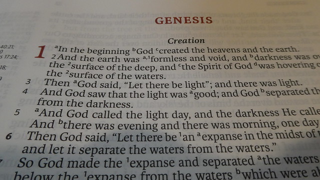
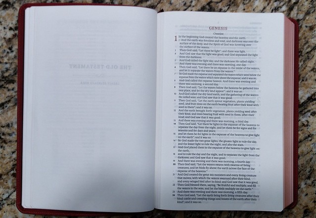
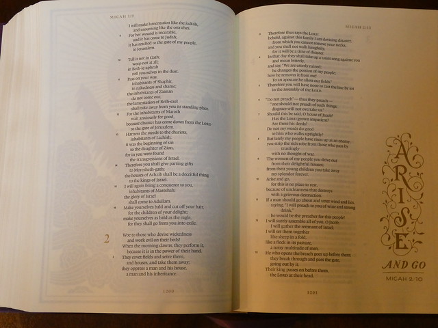
The text is in a single column, verse layout. Paragraphs are denoted by the verse number or a letter being bold. There are section headings in bold print. Page numbers are at the top center in read. Chapter numbers are in drop cap style and printed in red. This is a black letter edition. It is a text edition so there are no cross references or study notes. Italics denote English words that do not appear in the original languages, but are implied by them. An asterisk lets you know that the Greek verb was present tense, but rendered with an English past tense in order to conform with modern usage. Personal pronouns referring to God are capitalized where appropriate. Small caps are used when a passage from the OT is being quoted by someone in the NT, or when they are paraphrasing a citation from the OT. Brackets let you know you are looking at text that does not appear in the oldest collections of text, and probably were not in the original autoscripts.
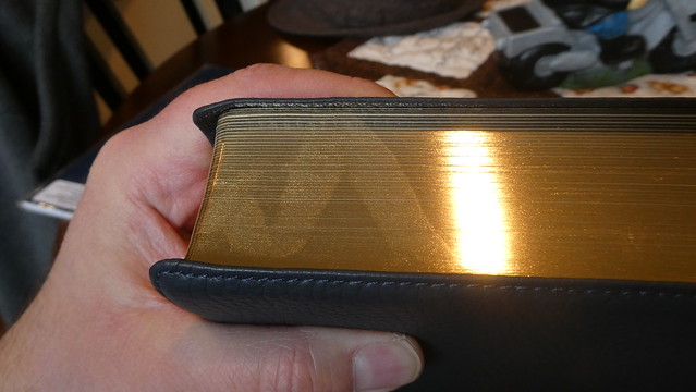
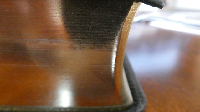
All but the hardcover had art gilt page edges. For those who do not know what this is, it is a red pigment under the gold colored finish on the page edges. Like many book features today, they are decorative. This was not always the sole purpose of these features in the past. Spine hubs were where the signatures were sewn into cords in the spine. Head and tail bands were where the signatures were tied in. Art gilt page edges kept the moisture of a humid room from penetrating deep into the text block. You get the idea. Much of the decorative features were once functional.
If you have ever purchased a Shuyler Bible from evangelicalbibles.com, a premium E.S.V. or a premium Cambridge edition, you are probably already familiar with the quality of Bibles printed and bound by Jongbloed. If you have not seen, or held one of these editions, you should consider the investment. Expensive Bibles may seem like an extravagant expenditure to you, and they may be, depending on your budget. If you can afford one, it is a good investment. These Bibles will last a very long time if properly cared for. You could foreseeably hand this Bible down to your children, or grandchildren. Think about what it would mean for a believer a couple generations away, to be reading the very same Bible you held in your hands all of those years. They could read your notes, look at your underlines, and understand a connection to you, even though you went on to be with Christ years before they were born. I would love to have something like that from my grandparents.
My subjective opinion is that this Bible is of such similar quality to other Bibles produced by Jongbloed, and the price being comparable, there is no reason not to purchase one. Couple those facts with the fact that I believe the LSB will demonstrate that it is the new champ when it comes to communicating accurately the intended meanings of God the author, and you have a winner. I could go on about the paper, and the printing, and the high quality materials and manufacturing processes, but the real star here is the accuracy of the LSB translation itself. The men at Master’s have done a fine job, and I plan on scrapping all of my other daily use Bibles to replace them with LSB editions as they become available. I am looking forward to a thinline for carrying around, a MacArthur study Bible, and a full cross reference large print. In conclusion, visit 316publishers here, and go buy one that fits your budget, and get to reading!
Don’t forget to look at my flickr albums for these editions for more detailed images.
Here is just one interesting translation choice the translators of the Legacy Standard Bible (L.S.B.) made that I think is an improvement. I have found many so far.
1995 New American Standard Bible (N.A.S.B.)
2020 New American Standard Bible (N.A.S.B.)
English Standard Version (E.S.V.)
Legacy Standard Bible (L.S.B.)
Exodus 4:21
21 The LORD said to Moses, “When you go back to Egypt see that you perform before Pharaoh all the wonders which I have put in your power; but I will harden his heart so that he will not let the people go.
And the Lord said to Moses, “When you go back to Egypt, see that you perform before Pharaoh all the wonders which I have put in your power; but I will harden his heart so that he will not let the people go.
And the LORD said to Moses, “When you go back to Egypt, see that you do before Pharaoh all the miracles that I have put in your power. But I will harden his heart, so that he will not let the people go.
And Yahweh said to Moses, “When you go to return to Egypt, see to it that all the miraculous wonders which I have put in your hand, that you do them before Pharaoh; but as for Me, I will harden his heart with strength so that he will not let the people go.
The italic formatted text in the LSB is used to denote English words that do not appear in the original language texts, but are implied by them.
The first thing you’ll notice is that the LSB uses Yahweh for the tetragrammaton instead of the conventional, “LORD.” This is a more accurate translation. I understand why it wasn’t changed sooner, but I am glad to see that it has finally happened. This was a bold and encouraging move.
The next thing you’ll see is that the other translations read, “…When you go back to Egypt…” The LSB uses, “…When you return to Egypt…” This may seem like a distinction without difference, but I appreciate the effort to be as accurate as possible. I think we would all infer that the implication of, “to go back” is that Moses is going back to Egypt, and that it was there that he had come from. Even so, “return” removes all doubt that this is what was meant.
The hand and a man’s work, or what he is doing, are related in Hebrew. An open hand can even mean power like יָד yâd earlier on in the verse. So seeing the connection here we can understand why the other translations went with, “…put in your power…” Since the LSB uses, “… put in your hand…” we can see the correlation directly from the text without the necessity of getting the concordance, and Hebrew lexicon out. Again, there is nothing wrong with the other translations.
This is the section that really gets me. I am starting to love the LSB. Instead of, “…but I will harden his heart …” The LSB uses, “… but as for Me, I will harden his heart with strength…” I may be wrong. I’m not a Hebrew expert, but from what I can gather there is an implication of strength or fortification in Hebrew word חָזַק ḥâzaq that is lost in the other English translations. The LSB puts that intended meaning back into the text. To back up just a bit, I also like how the first part of the sentenced is phrased as well. In English we always capitalize, “I.” When you capitalize personal pronouns in a translation to denote deity, and the letter, “I” is always capitalized it can perhaps cause a bit of confusion. By phrasing it the way they did, they kept the meaning, and helped the reader understand that it was God doing the hardening.
I am really enjoying this translation, and hope that you will order yourself an LSB. Here is the link to 316publishing.com where you can order one. They are the sole retailer of this translation.
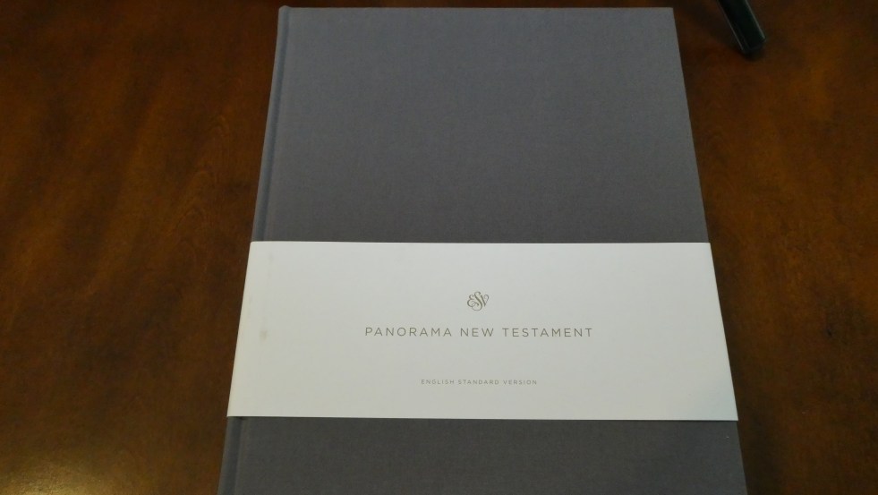
A review of the E.S.V. Panorama New Testament from Crossway.
The folks at Crossway were kind enough to send me this edition for review. I have to admit, I don’t know what to think of it, or what niche it fills in the Bible lineup. It is too tall to fit standing vertically on most bookcases. It is too thin to lay horizontally unless it is on the bottom of the stack or it will warp. It is to wide across to not stick out of most bookcases when laying flat at the bottom of a stack.
I understand that on each page there are pages worth of Bible so that the reader gets to follow the theme of a section uninterrupted longer. I don’t have a problem keeping ideas in context while turning pages. I don’t find it inconvenient, or difficult. I don’t imagine many readers do. It might be a problem for some people. Who knows? I don’t anticipate that it is a large enough problem to necessitate a volume like the Panorama. In other words, it seems to be a solution for a problem that I wasn’t aware of. That being said, I’m not the sole arbiter of problem declaration. I imagine someone saw a problem that needed fixing in their estimation and designed the Panorama.
I know it sounds like I’m knocking this edition, but I’m not. What it was designed for, it does. The paper is very thick, and doesn’t show any ghosting. The text is Crossway’s single column E.S.V. text, but it is laid out in double columns. Each page has what would amount to pages of text in a regular single column Bible.
Here is what Crossway has to say about this edition,
“The treasures found in God’s Word do not come to his people out of context. Even our most beloved verses of the Bible come in the midst of chapters, of carefully reasoned arguments, of intentional flows and patterns of thought—and of entire books. Therefore, the goal of the ESV Panorama New Testament is to allow readers to see as much of a biblical book at one time as possible. In this Bible, any one of 17 of the books of the New Testament can be viewed in its entirety, without the need to turn the page; the other 10 books comprise as few pages as possible. The advantages of a panoramic, two-page spread are many. For instance, users may desire to trace the use of key words or phrases across several chapters of biblical text, or throughout a Gospel or Epistle. The format of the ESV Panorama New Testament allows readers to follow the uses of such words or phrases while turning as few pages as necessary. Furthermore, this edition provides generous spacing between each line of biblical text, with plenty of room to mark or circle words being studied. This panoramic view of the New Testament also encourages readers to consider the large-scale outlines and thought patterns of the writers of Scripture. Preachers or teachers planning sermon series or Bible study lessons, for example, will be able to utilize this edition in a way that allows them to appreciate the major sections and transitions of the book under examination. Line spacing and margins allow for outlining or other ways of marking the biblical author’s flow of thought. These are just a few ways in which the ESV Panorama New Testament will facilitate users’ undistracted interaction with God’s Holy Word. In a style reminiscent of the large scrolls of antiquity, this Bible encourages readers to encounter the New Testament as it was first delivered—as complete Gospels, Epistles, history, and apocalypse. It is our prayer that this edition will foster users’ appreciation of the unity, depth, and beauty of our God’s precious and inerrant Word.”
After looking this edition over, and spending some time with it, I can say that it could help in tracing a thought through in context. If you find yourself having that problem, you could give this edition a try. Let me know what you think afterwards. I think the oddity of this edition might even be sufficient reason alone to purchase it for your collection.
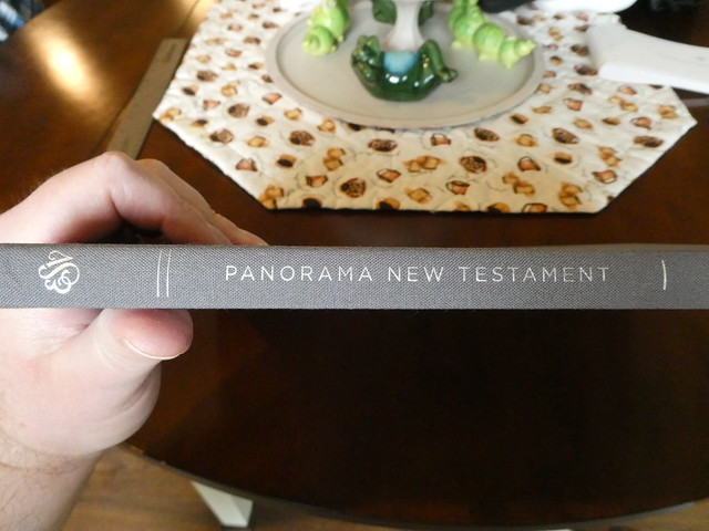
This edition is well made. The gray cloth over board hardback cover is very handsome, and durable. The spine is sewn. The paper, as I said earlier is heavy and offers a nice contrast to the text. The layout is pleasant enough, and the text is free of distractions. There is room on most pages for some note taking. There are 3 very large blank pages at the back of the edition where copious notes could be written. There are no helps at the back of this edition. This is a black letter edition, and does not have a ribbon marker. The only exterior writing on this edition is in silver stamping on the spine. The spine is rounded however, the corners are not. The page edges are not gilt. This is a case bound edition. Overall, I find it well made, and legible.
Here are the stats from Crossway’s product page,
Features
10″ X 12.5″
8.2-point Lexicon type
Double-column format
Thick, cream-colored book paper
Smyth-sewn binding
Extra-large page size
Product Details
Format:
Cloth Over Board
Type Size:
8.50
Page Layout:
Double Column
Page Count:
192
Size:
10.0 in x 12.5 in
Weight:
36.26 ounces
ISBN-10:
1-4335-7193-5
ISBN-13:
978-1-4335-7193-0
ISBN-UPC:
9781433571930
Case Quantity:
10
Published:
February 26, 2021
All things considered, you can make an informed decision about purchasing this edition. If after reading this review you think this would be useful, or interesting to you, you don’t have to worry about the quality of the edition. It is in keeping with Crossway’s standards. If you are interested in picking up a copy you can purchase it through Crossway’s site, or Amazon. Make sure to check out the rest of the pictures I took of this edition on my Flickr page.
I was unaware of this translation being available in a printed physical edition until I saw one on social media. One of my online friends had recently been touting it as possibly being, “The one.” He has been looking for an accurate translation that reads well. Many of us are longtime fans of Lockman’s 1995 New American Standard Bible. (N.A.S.B.) It has been a reliable formal equivalent translation since its release. We haven’t been looking for a new translation, but some were not satisfied so the 2020 NASB became a reality.
The 2020 NASB has been well received by many, but others like me, were not happy with many of the translation choices made in this most recent work. Some of us have been looking for a replacement that reads, “better.” This subjective preference is responsible for the majority of NASB readers opting to adopt the 2020 NASB.
Others like myself are waiting for something with a stricter translation philosophy. Enter the Legacy Standard Bible (L.S.B.) Master’s Seminary has been working on tightening up the translation work of the 1995 NASB. They have released a New Testament with Psalms and Proverbs. The entire Bible will be released later this year, God permitting. I’m still in this camp. (For the time being.)
My friend and his like-minded counterparts insist on an accurate translation, that handles the Hebrew and Greek gendered words properly without the addition of modern sociopolitical ideologies being utilized in the interpretive process. Along with these core principles they also want a translation that is more accessible than the 1995 NASB was in their opinion. This is where the BSB comes in.
I really didn’t want to like the BSB, and was looking at sections of scripture, and their translation choices very critically. I wanted to find a reason to not like it. I attribute this bias to the fact that a bunch of the people I know on social media were fawning over it ad nauseam. It was like being forced to watch your friend and his new girlfriend baby talk each other. So, being the reasonable adult that I am, I requested a Bible for review. I hadn’t really considered my bias against the BSB until I began using it for my daily reading. I am usually critical of, “new” translations. Especially given the horrible track record of some new translations. I proceeded to use the BSB the way I normally do when I get a new Bible for review. I try to live with it for a while and use it side by side with my 1995 NASB, and some language tools on my computer. (I like Olive Tree’s Bible Study program. I’ve invested a good amount of cash on these tools, but not as much as my Logos friends.) When I read a section that seems different to me, I compare it the NASB, then I look up the Greek in Novum Testamentum Graece (NA28) in the Bible Study app.
I need to state a disclaimer here. I am not a Koine Greek expert. I have had more Koine Greek than some Preachers, but not as much as I would need to be a translator. With that out of the way, keep in mind that all translation involves interpretation. You can have a valid translation of a section of scripture that is quite different than another person’s. This is why you need to have an education in the original languages instead of simply using concordances, and computer programs. It is like having a semester of philosophy and presuming you can fix all the worlds problems. Without the education, you aren’t aware of the period in history, the idioms, ways in which a specific word was primarily used, other extrabiblical contemporary texts to cross reference usage, regional differences, translation conventions, some textual criticism, and so on.
Since God is the author, and we want to understand what He intended to communicate, we need to seek to interpret what we are translating in such a way that His intended ideas are communicated. Just because a translation is linguistically valid does not necessarily make it a good or bad translation.
I started coming around after the first week of using the BSB. I don’t think it will be, “the one” for me, but it is one that I will use. I am still waiting for the LSB. I’d be very very interested in the Berean Literal Bible. I asked about it in one of my e-mail correspondences with John at Bereanstudybible;
Q: “Are there plans to make a physical edition of the BLB?”
A: “We are hoping to offer the full draft OT and NT of the BLB online around the end of the year or early in 2022. Following that time there will be a period for additional translation input, public comment, and consistency checking. For the full BSB this period was about 2 years before finalizing and beginning the printing process, so a comparable time period is expected before a BLB printing.”
I am excited for this translation. After using the BSB, it seems to me to be more formal than the first era NIV’s, which utilized a dynamic translation philosophy, and less formal than the ESV. I’d add it seems more formal than the CSB in my opinion. I do like the translation, in as much as I’ve been exposed to it. I can tentatively recommend the BSB as a translation.
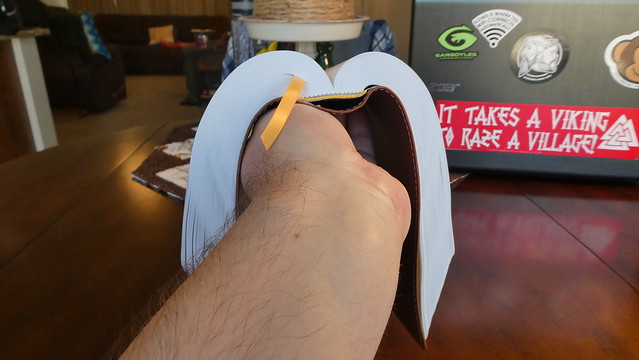
Beyond the translation we have to talk about the actual physical Bible itself. It was shipped in a card-paper envelope with minimal protection. Inside it was in plastic. I hoped it wasn’t damaged. When I opened it up, it was apparent that the text block was exceptionally manufactured. I was impressed at how flexible it was, as well as the paper’s thickness. My first impression was that the spine was smyth sewn. I thought to myself, “Surely it isn’t sewn since it only costs around forty bucks?” I made sure to ask about it.
Q: “What process was employed to manufacture the spine?”
A: “The Printer was Sheridan in Grand Rapids MI and the Case Binding for the Softcover was done at Bintech in Nashville, TN. The Bibles are Smyth Sewn Flex bound (Caseside).”
As many of you know by now, there has been further verification of this by the re-binders who have since posted pictures of the spine to social media. The paper is 45 g.s.m. which is 30.5# with 88% opacity. The inside liner that connected the text block to the cover was a nice change. It was flexible, tough, and didn’t wrinkle as bad as traditional materials.
The cover material is called, “Alpha Aston” manufactured by Ecologicalfibers Inc. The cover material is already starting to show damage from use. I would not trust this cover material to last a long time. Synthetics can be cost effective, but they are rarely as durable as a good quality leather.
This Bible was printed by Sheridan in Grand Rapids Michigan U.S.A. I am happy about that. I really don’t like it when slave labor is used to print a Bible.
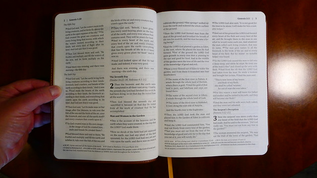
The print is a double column, paragraph format, black text edition, in 10 point font. It is clearly printed for the most part with only a few noticed smears of the text. There are some translation notes at the foot of the page.
Here are some more questions and answers from my correspondence with them;
Are you structured as a ministry, not for profit, non-profit, or something else?
Bible Hub is privately owned. I would say it is structured as a ministry (but supported by advertising so does not take donations.) The translation work was commissioned using ad revenue from the Bible Hub site.
How important is it to the translators to directly translate, when possible, gendered nouns, and pronouns, and allow the reader, with the surrounding scriptural contexts, to come to the correct conclusions?
The translators seek to be true to the original Scripture text regarding gender. Pronoun clarification was permitted where helpful to the reader. Clarifications, parsing, and variants are indicated in the word by word translation tables which are freely available at: https://berean.bible/downloads.htm
Are there plans to make a physical edition of the BLB?
We are hoping to offer the full draft OT and NT of the BLB online around the end of the year or early in 2022. Following that time there will be a period for additional translation input, public comment, and consistency checking. For the full BSB this period was about 2 years before finalizing and beginning the printing process, so a comparable time period is expected before a BLB printing.
Q: “Are there any plans to produce different text blocks? i.e. single column, verse format, personal size, thinline, so on and so forth?”
A: “Depending on sales, a personal size is most likely next. The other options are also strong considerations for the future, but not likely in the very near future.”
Q: “What has your experience been working with an American printer for this edition?”
A: “We have worked with Sheridan (formerly Dickinson) in Grand Rapids for both the NT and full printing and are very happy with their work. Since we are printing in smaller volumes in this early stage, printing in the US is a cost effective solution. Since we are located in the US we prefer to work locally as long as it is reasonably cost effective.”
Overall, I found the translation to be sound. The Bible size was just right allowing for a very comfortable and legible font size. The binding was my favorite feature. The flexible text block should also prove to be durable. The only negative I really have is about the flexible synthetic soft cover. I don’t think it will last long. The text block really deserves a better cover option. I think many people agree as I have seen numerous rebinds on social media. I am looking forward to their future work. Make sure to check out the rest of the photographs on my Flickr page, and watch the youtube video.
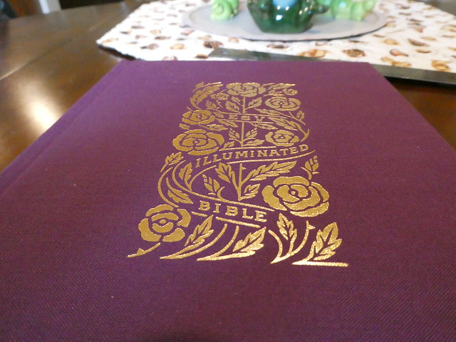
Crossway was kind enough to send me a copy of the Illuminated Bible, Art Journaling edition. This particular one is a burgundy colored, cloth over board, hard back, case bound Bible. It comes in an ornate slipcase that you should maintain for shelf storage to keep your Bible looking good, and to make it last.
We’ve all seen pictures or videos of books from the dark ages that have ornate drawings, and stylized artistic renderings of plant vines, leaves, fruits, and other various things on the covers, spines, page edges, and on the pages themselves. When a book has these features, it is said to be, “illuminated.” Imagine a monk in an abbey some place in Europe, bent over a page of vellum, (animal skin) using a quill, a dip pen, different colored inks, along with gold leaf, to decorate the page of a hand copied Bible. Books were not mass-produced back then. They were very expensive, and time consuming to make. The most valuable book of all time is the Bible. That is not up for debate.
In today’s era of mass-produced clones, it is nice to see something different, but the nagging truth comes back to ruin the illusion for me. This is a mass-produced Bible. It is a very nice mass-produced Bible, but it is mass-produced. The novelty of having all of the art inside, and on the cover is nice, and many people will enjoy this embellishment.
The immense upside of having a mass-produced illuminated Bible is that everyone can afford to have one, and enjoy the word along with the supporting art. Even in today’s day and age, if you were to commission a one off Bible to be made to your desired specifications, retained an artist to do the work, and then had the thing printed and bound, you would be spending a small fortune. I can’t even estimate how much it would cost. This Bible can be had for less than sixty bucks.
Here is a link to the product page if you just want to look at the specifications. Here is a link to Crossway’s page about how it was made, and here is one about illumination.
For those of you who are still here, and didn’t skip out, I have some other information for you that isn’t on those pages. I’ve already told you about the slipcase. Now we’ll get into the details of the Bible. The artwork is done in what looks to be a gold colored foil stamping of some kind. It is very pleasing to look at.
The spine has four raised decorative hubs. Between them we have, Illuminated Bible, Art Journaling Edition, English Standard Version, and the Crossway logo at the foot. The flowers, leaves, and vines harken back to traditional illumination features. The cover is also decorated in a similar fashion. The burgundy colored cloth is pretty typical of cloth covered hardback books. This Bible has cream colored head and tail bands, as well as a burgundy colored ribbon marker. The page edges are gold gilt. The spine doesn’t look rounded. The corners are not either.
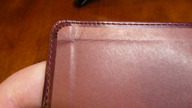
There was an issue with some pages that the corners had folded into the text block during trimming. When that happens, they don’t get trimmed. When you unfold them, they stick out further than all the pages. I believe that would be covered under warranty, but I usually take care of it myself with a razor blade. You have to be very careful. If it is more than a couple of pages, you’re better off sending it back because those pages were not gilt if they were tucked in. Since this was only a couple pages, it wasn’t a big deal. It does happen from time to time though.
I know I shouldn’t like the end papers as much as I do, but I can’t help it. I assume the same artist, “Dana Tanamachi” did the art for them as well. This is a case bound, hard back, with paste down end pages attaching the text block to the cover. Two blank end pages precede the ornate presentation page. The sewn spine’s threads contrast with the darker presentation page, making them easier to see. The darker colors on the presentation page do remind me of some of the illumined books I’ve seen over the years. After that is a burgundy colored title page with gold stamped art. Then there is the publisher’s page, Table of Contents, About the ESV, and an Introduction for this illuminated edition.
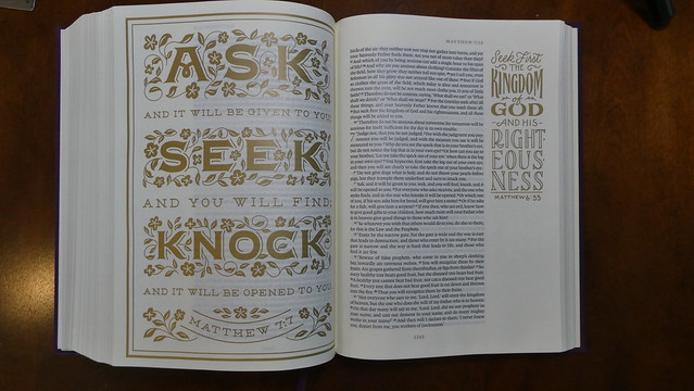
Each book starts with a full page of gold colored thematic art. There is a drop cap at the beginning of each book and full page artistic scripture quotes interspersed. The page numbers, chapter numbers, and address references at the head of the page are all in gold colored ink. The text is laid out in a single column, paragraph format. The font is a uniformly printed 9 point Lexicon type. This is a black letter edition. The page margins are approximately 2 inches wide. They are not ruled. There is art interspersed throughout in the margins as well.
One of the more impressive features in my opinion is the 42 g.s.m. cream colored paper. It is easy on the eyes, and contrasts nicely with the text. Since it is so heavy it helps to reduce ghosting dramatically. In conjunction with the wide margins the paper is good for taking notes. With all of the bold lines in the art the paper can’t stop it from showing through from the other side. This is only distracting when it is the full page art at the beginning of the chapter as it is visible through the text on the opposite page when it is turned over it. At the end of the Bible there is an Index of Title Pages. It includes explanations of how the art expresses some of the themes found in the book. Finally, at the end there is a page with the names of the people who comprised the team that published this edition. There were also 4 blank end pages to write on if need be.
I like this edition on an aesthetic level. If that were the only reason to buy it, I think I would probably hold off. If you are like me, that just isn’t enough to warrant the purchase, but when you consider the 42 g.s.m. paper, and the 2 inch margins, as well as the price, it start to make a lot more sense. Perhaps more art influenced thinkers would buy this solely because of the art? I’m sure you folks are out there, and probably already own this one. For some of the more curmudgeonly among us, add a little flair to your life while getting a solid translation along with great print quality, terrific paper, and a good value. You can see more pictures on my Flickr album for this Bible.
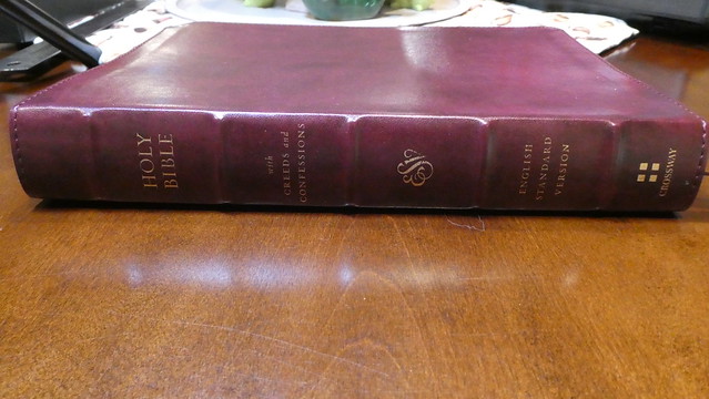
Crossway was kind enough to send me a copy of the, “E.S.V. Bible with Creeds and Confessions.” This particular Bible has a burgundy, Trutone cover. It comes in a handsome slipcase. I thought the design of the slipcase cross and surround, were excellent. Many people discard the case their Bible comes in. I would caution you not to. It is a very important piece of protective equipment. It stops shelf wear and works to protect your Bible during travel. Don’t waste money on a fancy, improperly sized Bible cases. They never protect as well as the original case, and they often do damage by allowing your Bible to slop around inside. They also tend to encourage people to put things inside them, with their Bibles.
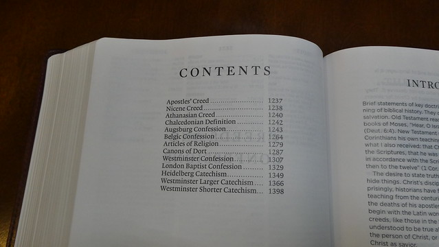
The case is not the most interesting thing about this edition. Forgive me for going on a tangent about the case 😊 The feature that makes this Bible special is that it includes most of the historic Christian creeds, and confessions in the back. Here are the included creeds and confessions;
“The Apostles’ Creed (ca. 200–400), the Nicene Creed (325), the Athanasian Creed (381), the Chalcedonian Definition (451), the Augsburg Confession (1530), the Belgic Confession (1561), the Articles of Religion (1563), the Canons of Dort (1618–19), the Westminster Confession (1646), the London Baptist Confession (1689), the Heidelberg Catechism (1563), the Westminster Larger Catechism (1647), and the Westminster Shorter Catechism (1647).”
As you can see, this is a pretty good list for an overview of historic Christian beliefs. If you read all of them, you can see for yourself what doctrines we have always held to be true, and necessary. They can be traced through the history of the Church. We don’t exist separately from our Christian forefathers. If you are interested, and you would like to have all that information at your fingertips in one volume, this is the Bible for you.
You get the excellent English Standard Version. As well as the thirteen creeds and confessions with introductions to them written by Church historian Chad Van Dixhoorn. Also, an easy on the eyes 10.5 point Lexicon typeface font printed on 36 g.s.m. paper. The paper is also coated. This paper has an opacity of 85% Which is quite good for a Bible costing less than fifty dollars. Did I mention that the text is line matched? That means that the lines of text on a page are printed directly behind the lines of text on the other side of the page. This helps the legibility of the text. With a paper that is not completely opaque, you can see the text through the paper. When the printer uses line matching, this mitigates the muddying of the text. This reduces eye strain from reading and makes it more pleasurable.
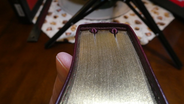
This edition has a burgundy colored, Trutone cover. The cover is perimeter stitched to keep it from coming apart. If you are not familiar with Crossway’s Trutone covers, they are a synthetic leather like material. It has been my experience that they are flexible, and durable. They look good for a long time, and do their job protecting the text block. There are five raised decorative spine hubs. “Holy Bible, with Creeds and Confessions, ESV, English Standard Version, and Crossway” is hot stamped in gold colored foil on the spine between the spine hubs. The inner liner is pasted down, brown paper. The inner liner is pasted to the end papers and connects the text block to the cover. The spine is rounded, as well as the corners. There are two burgundy ribbon markers. The page edges are gold gilt. This Bible’s spine is smyth-sewn. For those of you not familiar with what that means, it is when the pages are printed out in stacks, folded over into signatures (think pamphlets) and sewn to binding cord or ribbons in the spine, and also sewn to each other, until a text block is complete. This makes for a durable and flexible text block. This particular edition lays flat right out of the box. No break in time with this one folks!
There are three end papers in the front. Then there is the presentation page, marriages page, births/adoptions page, and deaths page. These are not for extensive family records but suffice for immediate family.
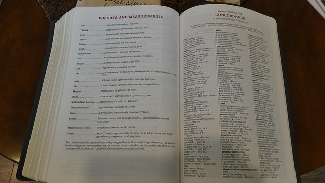
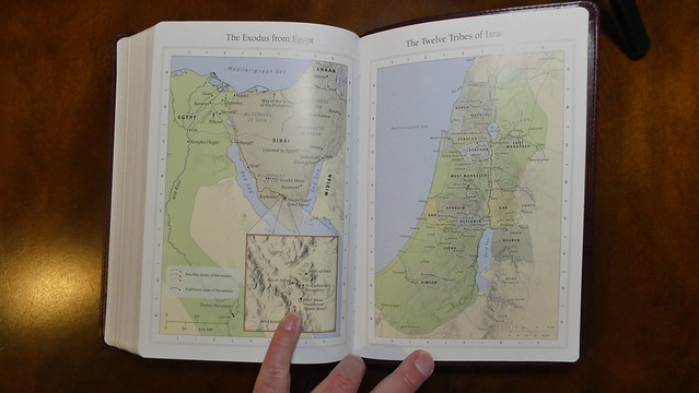
Next is the publisher’s page with copyright information. This edition was printed and bound in China. The table of contents is next, along with the preface and explanation of features. At the end we have a weights and measures page, a concordance, the creeds and confessions with an introduction, and eight pages of maps.
This is a double column, paragraph format, black letter, edition with cross references, and foot notes. I find this volume to be superior in function. The flexibility of the cover, spine, and text block, aid in the holding, and reading of this Bible. The large 10.5 pt. font, the layout, the features, everything about this begs to be used. Considering the finite constraints of Bible design, I’m amazed at how much is packed into this Bible. Even with the large font, and the confessions and creeds this thing still manages to have some cross references, footnotes, a concordance, and maps. This is a great value, and I don’t hesitate to recommend it. You can purchase it directly from Crossway, or you can pick one up from Christianbook.com, Westminster Bookstore, or Amazon. If you’d like to see more pictures go to my Flickr album here.
I hadn’t realized how long I had went in between reviews until recently. I hope to do more reviews, as I will be retiring from my full time job as a Corrections Officer in a few months. Someone I know wanted me to review this Bible, so here’s to you friend. I hope you enjoy the review, and thanks again to Crossway for providing this Bible for the review.
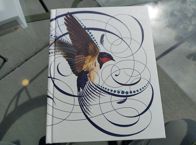
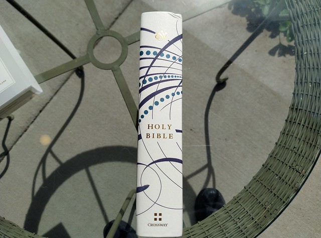
The Artist Series from Crossway highlights the talents of select artists to embellish Bibles. This one has had some line art from Jake Weidmann placed on the outer cover. This is a hardcover Bible. Here is an excerpt from Crossway’s information on the product page about their Artist Series. “The ESV Single Column Journaling Bible, Artist Series is a collection of journaling Bibles meant to celebrate the treasure of God’s Word through the artistic talents of his people. These Bibles feature commissioned cover artwork designed by Christian artists such as Peter Voth, Ruth Chou Simons, and Joshua Noom. Each artist offers a visual entry point focused on a particular biblical theme or passage, setting a tone of reflection as readers engage with the Bible.”
If you are interested in looking at the product page, here is a link. I haven’t written a review on the E.S.V. English Standard Version for a while, so let me reiterate, it is a splendid translation. It is one of my favorite formal equivalence translations. Beside the 1995 NASB, and now the Legacy Standard Bible, it is my next favorite translation. It remains accurate, without watering down the Word, or destroying the majesty of scripture.
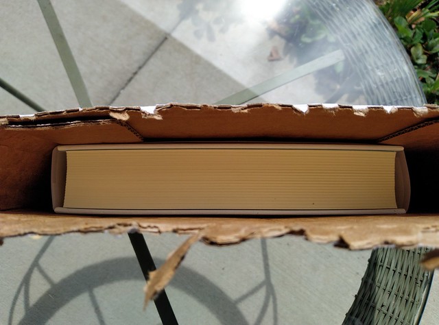
This Bible arrived with a slightly dinged corner. I think that is due to the way it was packaged for shipping. It was not in a box with padding, inside another box. It was sent in a sleeve type box. I know this is popular these days, but keep in mind, if your Bible shows up damaged, you can send it back for an exchange. If this happens often enough, the publishers will need to go back to using more expensive packaging. This cost will be passed on to the consumer, but in my opinion, it would be worth it to make sure the customer is happy.
Instead of having a clam-shell, or two piece box, this Bible is wrapped with a plastic, or cellulose band, that has some information about the Bible’s features, and a bit about the artist Jake Weidmann on it.
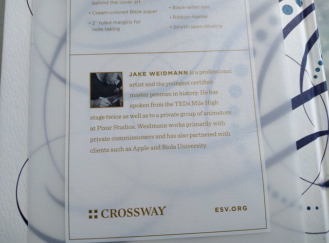
When you open this Bible up, you’ll see a card with a picture of the artist on one side, and an explanation of the cover art on the other. As a fan of the German Bauhaus design philosophy, I was more concerned with the layout, typeface, paper, and other features than the cover art. That being said, the line art on the cover is not gaudy, or in any way excessive, or irreverent. Weidmann’s line art combines nicely with the sparrow. One doesn’t overpower the other.
I asked a friend who was interested in this Bible due to their knowledge of Weidmann and his work to provide a short note about him. Here is what she had to say,
“Jake Weidmann is a master penman, one of only 14 in the world. He earned his Master Penman in 2011, well before the resurgence in interest in decorative calligraphy and the writing arts. He uses calligraphy in his artwork to “give both the words and the pictures more life and a stronger message”. He was fascinated with art, coloring and drawing by age 3. He was obsessed with making his handwriting beautiful and would take all the time in his classes to practice his handwriting. Even in college he didn’t think he would become an artist; he was getting his degree in psychology and when he applied for an art minor in college, he was told that his work wasn’t right for the department. Before he completed college he received requests for commissions of his work, and has been working as an artist ever since.
He uses single line calligraphy to make graphic images primarily of Christian theological themes, such as hymns, bible verses and portraiture. He notes that his work is a kind of iconography, writing a story in the form of a pictograph. He speaks to the heart of the viewer by layering different images, symbols and texts. They are meant to draw you in, to make you think and consider the image on a deeper level.Several videos have been produced of him creating an image, which can take hundreds of hours to complete. His work can be found on jakeweidmann.com and he has his own YouTube channel.” S. Eddy-Kissell
This particular Bible is a single column, journaling Bible. It is a black letter edition. The spine is sewn. That feature makes for a long-lasting, lay flat, Bible. There is a shiny blue ribbon marker. The ribbon’s blue stands out against the cream colored paper. The paper is a smooth, thin, and cream colored. The smoothness of the paper reminds me of the paper used in premium Bibles, although this one is printed, and bound in China, and sells for a value price. The font is 7.5 pt. lexicon typeface that appears to be line matched. These two features, along with the uniform, and consistent print throughout, make this edition easy on the eyes. If you have older eyes, you might want to think about something in a 10 pt. font, or getting some reading glasses if you want to read anything 8 pt. or under. The corners are square, while the spine looks rounded. There are blue and white decorative head and tail bands. The margins are two inches wide, and ruled. This should be splendid for note taking, or journaling.
I don’t think the paper is thick enough to write on with a wet fountain pen. Using a fine, or extra fine tip might be alright, but if it is scratchy at all, it might damage the paper. I’d probably stick to pencils, or Pigma Micron pens for note taking, or journaling in this one. Your opinion may be different. If you are looking for a wonderfully laid out, single column, journaling Bible, at a value price, look no further. This Bible would work well in that role.