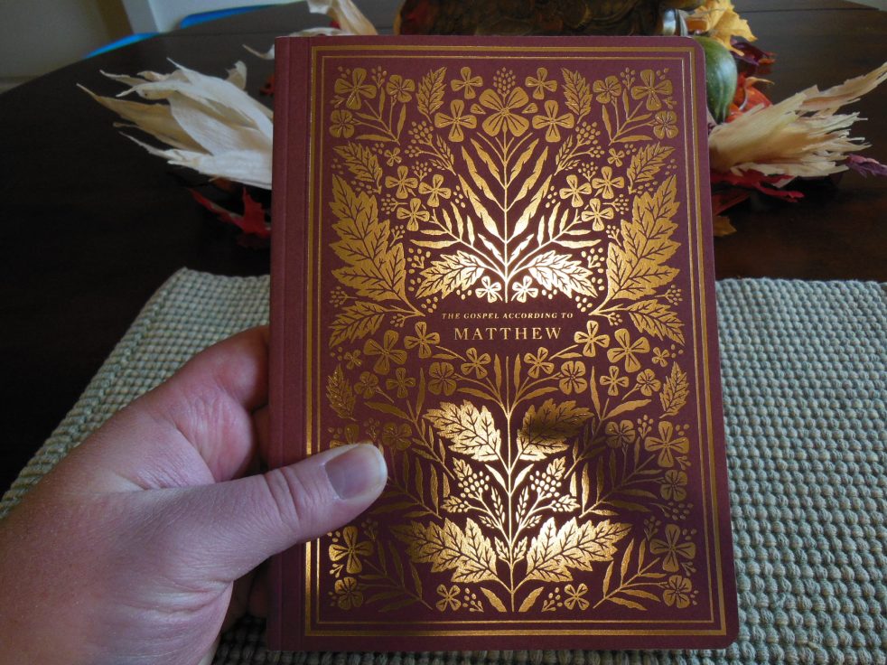
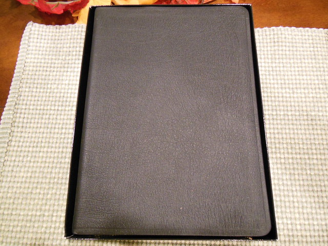
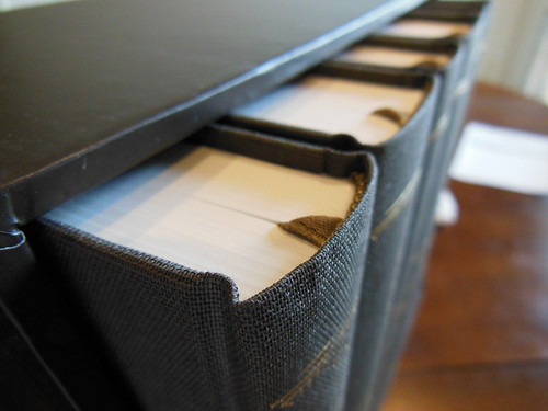
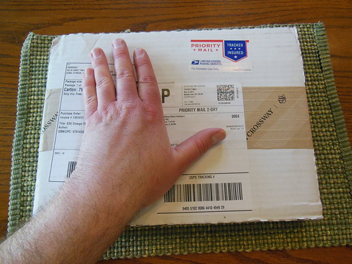
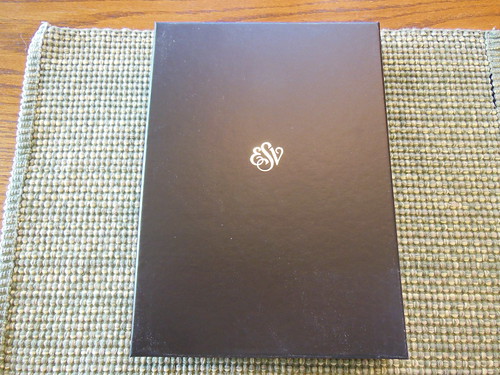
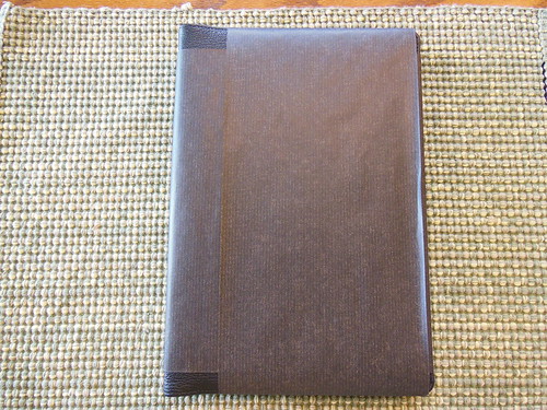
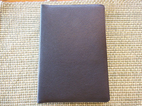
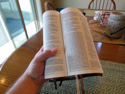
The Illuminated Scripture Journal is a multi-volume set of New Testament books which have been artistically illuminated by Dana Tanamachi who was commissioned by Crossway for her artistry.
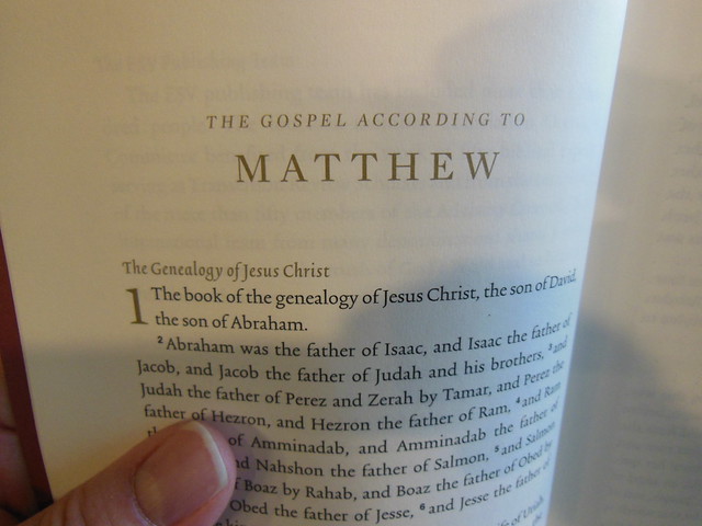
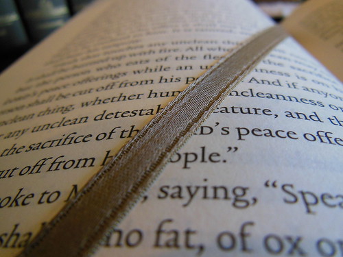
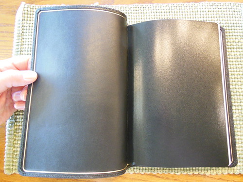
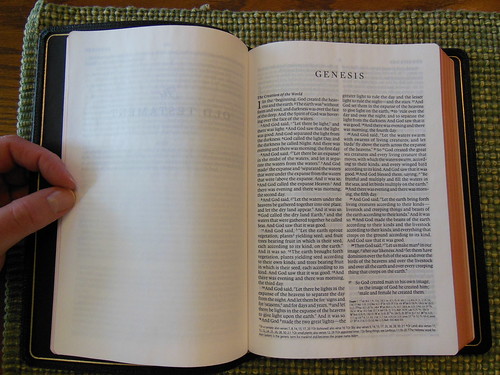
Each page that occurs on the left contains scripture in a single column with drop cap chapter numbers in gold, in a paragraph format, with the verse numbers superscript in black text. Also in gold are section headings above the text.
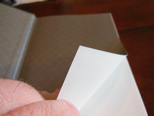
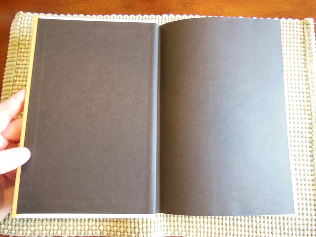
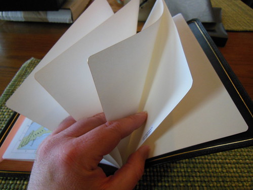
The pages that occur on the right, and opposite of the scriptures, contain blank pages ruled with faintly printed dots to help you keep your lines straight without being too obvious.
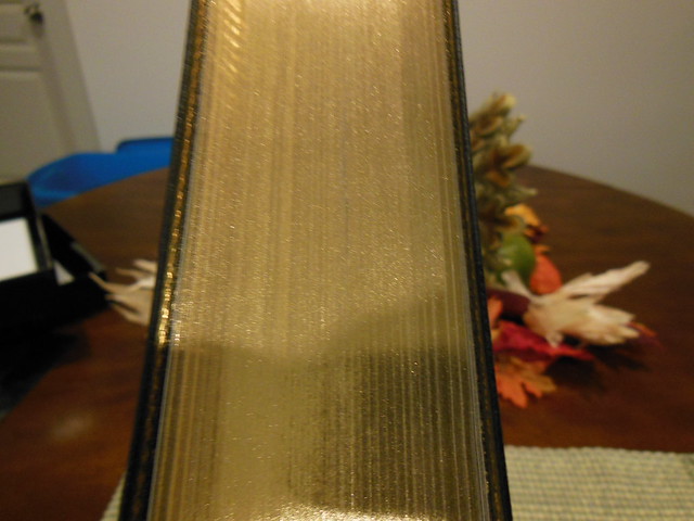
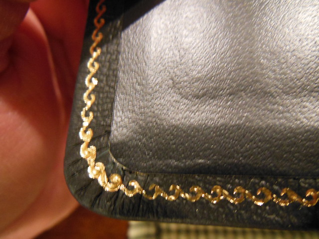
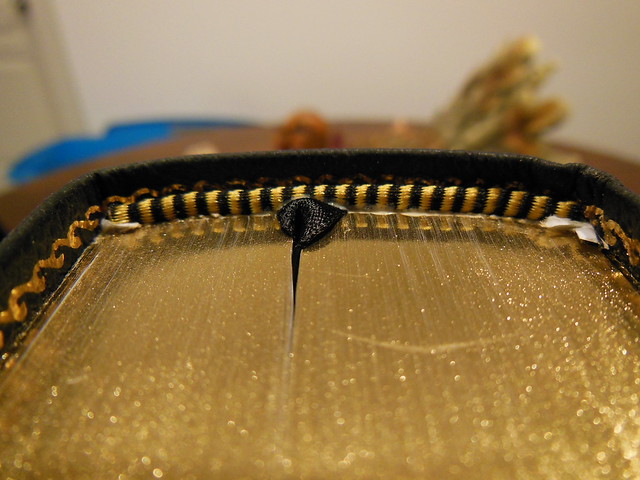
There are also scripture verses, and designs that are artistically rendered in gold on these pages. Some full page features are dispersed throughout.
My first impression of the boxed set was mixed. On the one hand, when I think of illuminated scriptures what comes to mind is an ancient hand copied tome with leather clad wood board covers and a metal hasp, along with ornately decorated pages, multiple colors, and drawings.
This set is much more conservative in its use of illumination. To me they look like a talented person went along with a gold colored marker and marked up the covers, and pages.
Mind you, it isn’t unpleasant, and most peoples minds wouldn’t go where mine did. I still found the work to be pleasant to look at, but we are talking about a set that is covered in card paper, and glued together.
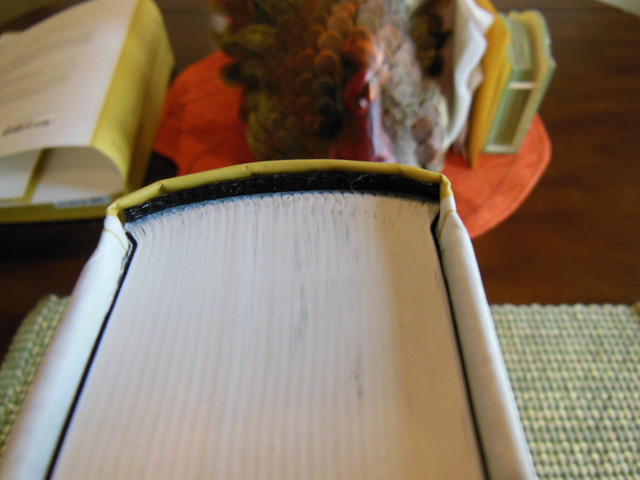
I appreciate the binding being far better than, “perfect bound” books. It isn’t as good as a sewn binding with a leather cover. These personal preferences aside, this set is meant to be affordable, and it is also meant to be used. The idea is for you to engage the word, and for it to be engaging. These volumes are meant to be read, and then written in. They aren’t intended to be some priceless, unapproachable work from antiquity, and most likely, if you use them as they are intended to be used, they will never make it antiquity. You’ll carry them along with you, the corners will get bent, the pages will get marked up, and you’ll learn a lot about the Author, and His intent. If you’d like to look at more pictures visit my Flickr album.
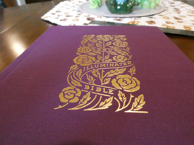
Crossway was kind enough to send me a copy of the Illuminated Bible, Art Journaling edition. This particular one is a burgundy colored, cloth over board, hard back, case bound Bible. It comes in an ornate slipcase that you should maintain for shelf storage to keep your Bible looking good, and to make it last.
We’ve all seen pictures or videos of books from the dark ages that have ornate drawings, and stylized artistic renderings of plant vines, leaves, fruits, and other various things on the covers, spines, page edges, and on the pages themselves. When a book has these features, it is said to be, “illuminated.” Imagine a monk in an abbey some place in Europe, bent over a page of vellum, (animal skin) using a quill, a dip pen, different colored inks, along with gold leaf, to decorate the page of a hand copied Bible. Books were not mass-produced back then. They were very expensive, and time consuming to make. The most valuable book of all time is the Bible. That is not up for debate.
In today’s era of mass-produced clones, it is nice to see something different, but the nagging truth comes back to ruin the illusion for me. This is a mass-produced Bible. It is a very nice mass-produced Bible, but it is mass-produced. The novelty of having all of the art inside, and on the cover is nice, and many people will enjoy this embellishment.
The immense upside of having a mass-produced illuminated Bible is that everyone can afford to have one, and enjoy the word along with the supporting art. Even in today’s day and age, if you were to commission a one off Bible to be made to your desired specifications, retained an artist to do the work, and then had the thing printed and bound, you would be spending a small fortune. I can’t even estimate how much it would cost. This Bible can be had for less than sixty bucks.
Here is a link to the product page if you just want to look at the specifications. Here is a link to Crossway’s page about how it was made, and here is one about illumination.
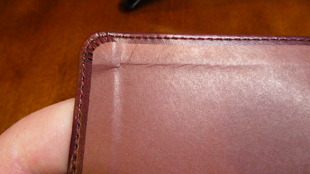
For those of you who are still here, and didn’t skip out, I have some other information for you that isn’t on those pages. I’ve already told you about the slipcase. Now we’ll get into the details of the Bible. The artwork is done in what looks to be a gold colored foil stamping of some kind. It is very pleasing to look at.
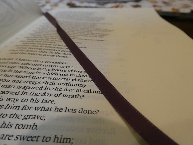
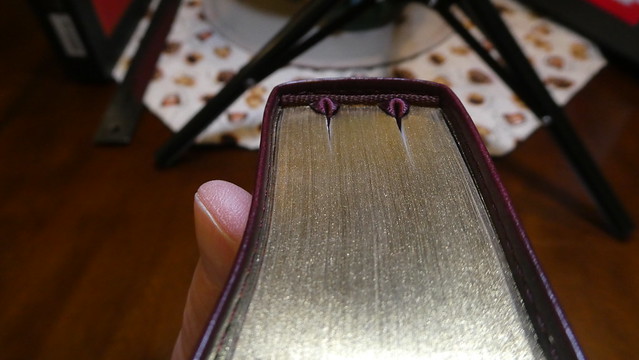
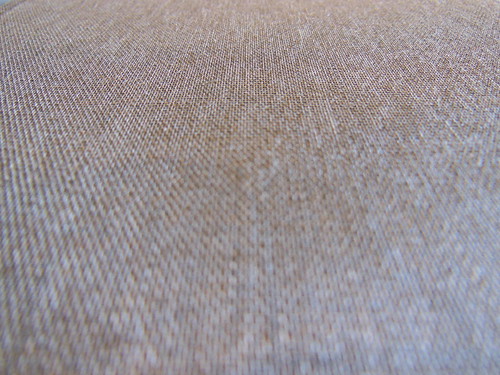
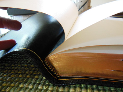
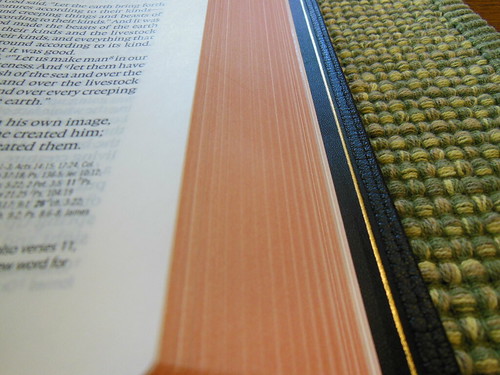
The spine has four raised decorative hubs. Between them we have, Illuminated Bible, Art Journaling Edition, English Standard Version, and the Crossway logo at the foot. The flowers, leaves, and vines harken back to traditional illumination features. The cover is also decorated in a similar fashion. The burgundy colored cloth is pretty typical of cloth covered hardback books. This Bible has cream colored head and tail bands, as well as a burgundy colored ribbon marker. The page edges are gold gilt. The spine doesn’t look rounded. The corners are not either.
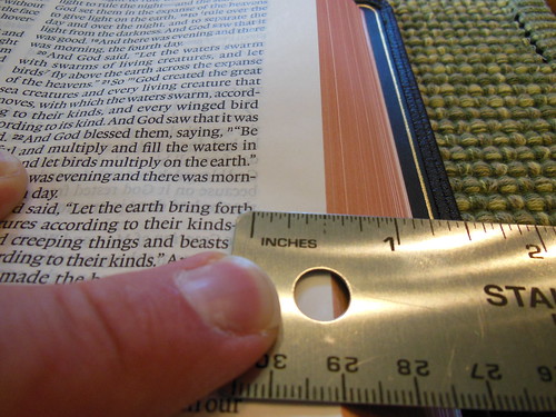
There was an issue with some pages that the corners had folded into the text block during trimming. When that happens, they don’t get trimmed. When you unfold them, they stick out further than all the pages. I believe that would be covered under warranty, but I usually take care of it myself with a razor blade. You have to be very careful. If it is more than a couple of pages, you’re better off sending it back because those pages were not gilt if they were tucked in. Since this was only a couple pages, it wasn’t a big deal. It does happen from time to time though.
I know I shouldn’t like the end papers as much as I do, but I can’t help it. I assume the same artist, “Dana Tanamachi” did the art for them as well. This is a case bound, hard back, with paste down end pages attaching the text block to the cover. Two blank end pages precede the ornate presentation page. The sewn spine’s threads contrast with the darker presentation page, making them easier to see. The darker colors on the presentation page do remind me of some of the illumined books I’ve seen over the years. After that is a burgundy colored title page with gold stamped art. Then there is the publisher’s page, Table of Contents, About the ESV, and an Introduction for this illuminated edition.
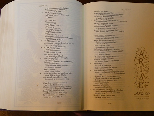
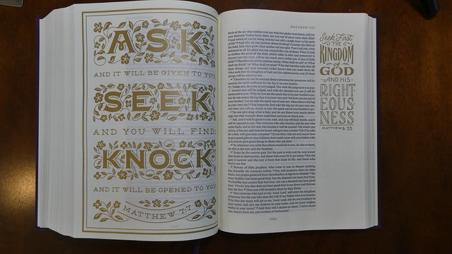
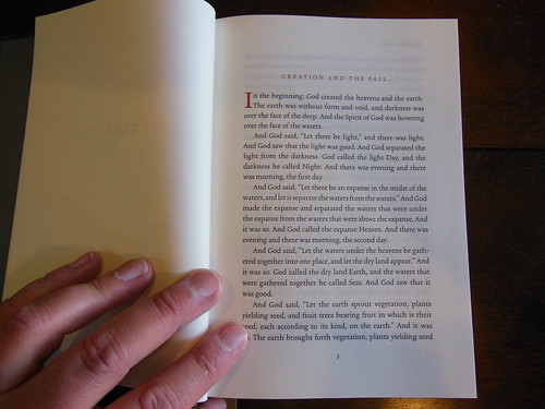
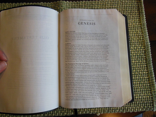
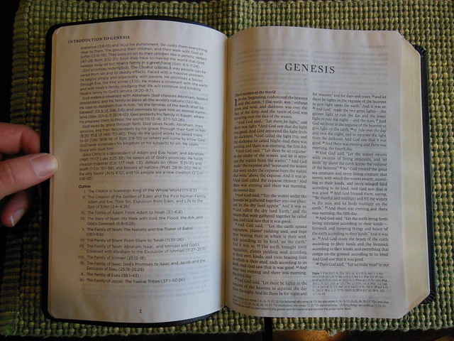
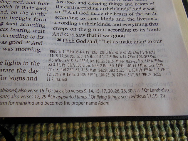
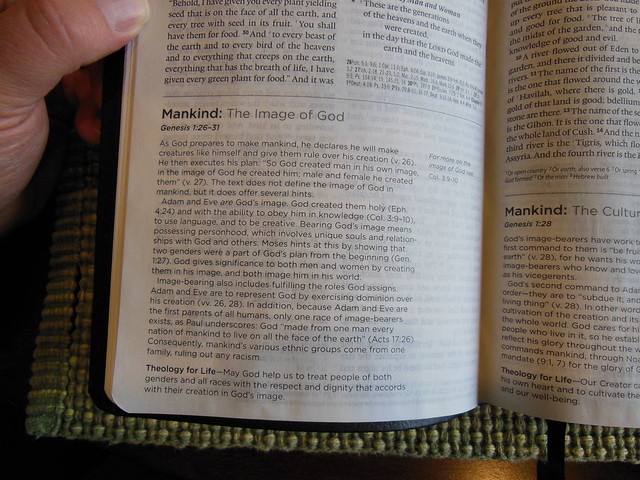
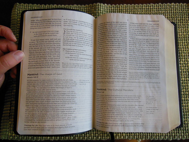
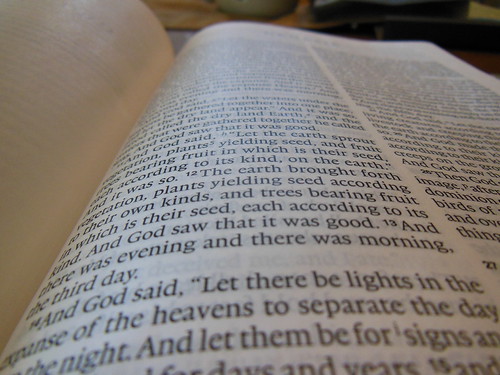
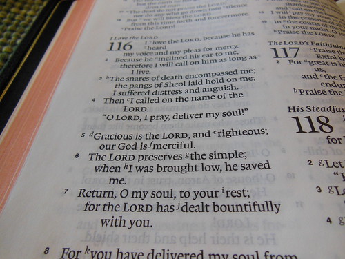
Each book starts with a full page of gold colored thematic art. There is a drop cap at the beginning of each book and full page artistic scripture quotes interspersed. The page numbers, chapter numbers, and address references at the head of the page are all in gold colored ink. The text is laid out in a single column, paragraph format. The font is a uniformly printed 9 point Lexicon type. This is a black letter edition. The page margins are approximately 2 inches wide. They are not ruled. There is art interspersed throughout in the margins as well.
One of the more impressive features in my opinion is the 42 g.s.m. cream colored paper. It is easy on the eyes, and contrasts nicely with the text. Since it is so heavy it helps to reduce ghosting dramatically. In conjunction with the wide margins the paper is good for taking notes. With all of the bold lines in the art the paper can’t stop it from showing through from the other side. This is only distracting when it is the full page art at the beginning of the chapter as it is visible through the text on the opposite page when it is turned over it. At the end of the Bible there is an Index of Title Pages. It includes explanations of how the art expresses some of the themes found in the book. Finally, at the end there is a page with the names of the people who comprised the team that published this edition. There were also 4 blank end pages to write on if need be.
I like this edition on an aesthetic level. If that were the only reason to buy it, I think I would probably hold off. If you are like me, that just isn’t enough to warrant the purchase, but when you consider the 42 g.s.m. paper, and the 2 inch margins, as well as the price, it start to make a lot more sense. Perhaps more art influenced thinkers would buy this solely because of the art? I’m sure you folks are out there, and probably already own this one. For some of the more curmudgeonly among us, add a little flair to your life while getting a solid translation along with great print quality, terrific paper, and a good value. You can see more pictures on my Flickr album for this Bible.
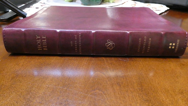
Crossway was kind enough to send me a copy of the, “E.S.V. Bible with Creeds and Confessions.” This particular Bible has a burgundy, Trutone cover. It comes in a handsome slipcase. I thought the design of the slipcase cross and surround, were excellent. Many people discard the case their Bible comes in. I would caution you not to. It is a very important piece of protective equipment. It stops shelf wear and works to protect your Bible during travel. Don’t waste money on a fancy, improperly sized Bible cases. They never protect as well as the original case, and they often do damage by allowing your Bible to slop around inside. They also tend to encourage people to put things inside them, with their Bibles.
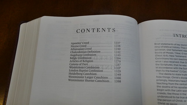
The case is not the most interesting thing about this edition. Forgive me for going on a tangent about the case 😊 The feature that makes this Bible special is that it includes most of the historic Christian creeds, and confessions in the back. Here are the included creeds and confessions;
“The Apostles’ Creed (ca. 200–400), the Nicene Creed (325), the Athanasian Creed (381), the Chalcedonian Definition (451), the Augsburg Confession (1530), the Belgic Confession (1561), the Articles of Religion (1563), the Canons of Dort (1618–19), the Westminster Confession (1646), the London Baptist Confession (1689), the Heidelberg Catechism (1563), the Westminster Larger Catechism (1647), and the Westminster Shorter Catechism (1647).”
As you can see, this is a pretty good list for an overview of historic Christian beliefs. If you read all of them, you can see for yourself what doctrines we have always held to be true, and necessary. They can be traced through the history of the Church. We don’t exist separately from our Christian forefathers. If you are interested, and you would like to have all that information at your fingertips in one volume, this is the Bible for you.
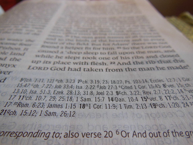
You get the excellent English Standard Version. As well as the thirteen creeds and confessions with introductions to them written by Church historian Chad Van Dixhoorn. Also, an easy on the eyes 10.5 point Lexicon typeface font printed on 36 g.s.m. paper. The paper is also coated. This paper has an opacity of 85% Which is quite good for a Bible costing less than fifty dollars. Did I mention that the text is line matched? That means that the lines of text on a page are printed directly behind the lines of text on the other side of the page. This helps the legibility of the text. With a paper that is not completely opaque, you can see the text through the paper. When the printer uses line matching, this mitigates the muddying of the text. This reduces eye strain from reading and makes it more pleasurable.
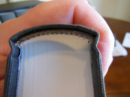
This edition has a burgundy colored, Trutone cover. The cover is perimeter stitched to keep it from coming apart. If you are not familiar with Crossway’s Trutone covers, they are a synthetic leather like material. It has been my experience that they are flexible, and durable. They look good for a long time, and do their job protecting the text block. There are five raised decorative spine hubs. “Holy Bible, with Creeds and Confessions, ESV, English Standard Version, and Crossway” is hot stamped in gold colored foil on the spine between the spine hubs. The inner liner is pasted down, brown paper. The inner liner is pasted to the end papers and connects the text block to the cover. The spine is rounded, as well as the corners. There are two burgundy ribbon markers. The page edges are gold gilt. This Bible’s spine is smyth-sewn. For those of you not familiar with what that means, it is when the pages are printed out in stacks, folded over into signatures (think pamphlets) and sewn to binding cord or ribbons in the spine, and also sewn to each other, until a text block is complete. This makes for a durable and flexible text block. This particular edition lays flat right out of the box. No break in time with this one folks!
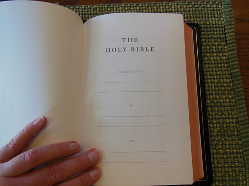
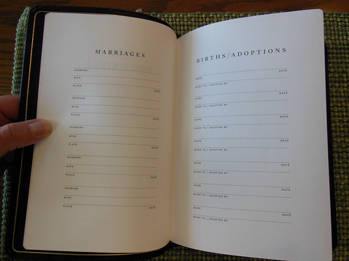
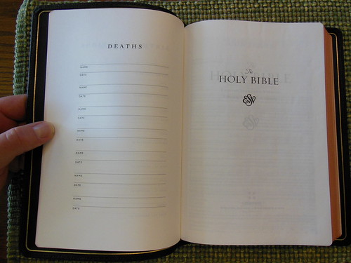
There are three end papers in the front. Then there is the presentation page, marriages page, births/adoptions page, and deaths page. These are not for extensive family records but suffice for immediate family.
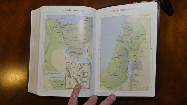
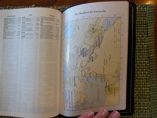
Next is the publisher’s page with copyright information. This edition was printed and bound in China. The table of contents is next, along with the preface and explanation of features. At the end we have a weights and measures page, a concordance, the creeds and confessions with an introduction, and eight pages of maps.
This is a double column, paragraph format, black letter, edition with cross references, and foot notes. I find this volume to be superior in function. The flexibility of the cover, spine, and text block, aid in the holding, and reading of this Bible. The large 10.5 pt. font, the layout, the features, everything about this begs to be used. Considering the finite constraints of Bible design, I’m amazed at how much is packed into this Bible. Even with the large font, and the confessions and creeds this thing still manages to have some cross references, footnotes, a concordance, and maps. This is a great value, and I don’t hesitate to recommend it. You can purchase it directly from Crossway, or you can pick one up from Christianbook.com, Westminster Bookstore, or Amazon. If you’d like to see more pictures go to my Flickr album here.
I hadn’t realized how long I had went in between reviews until recently. I hope to do more reviews, as I will be retiring from my full time job as a Corrections Officer in a few months. Someone I know wanted me to review this Bible, so here’s to you friend. I hope you enjoy the review, and thanks again to Crossway for providing this Bible for the review.
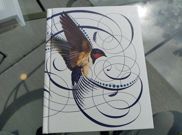
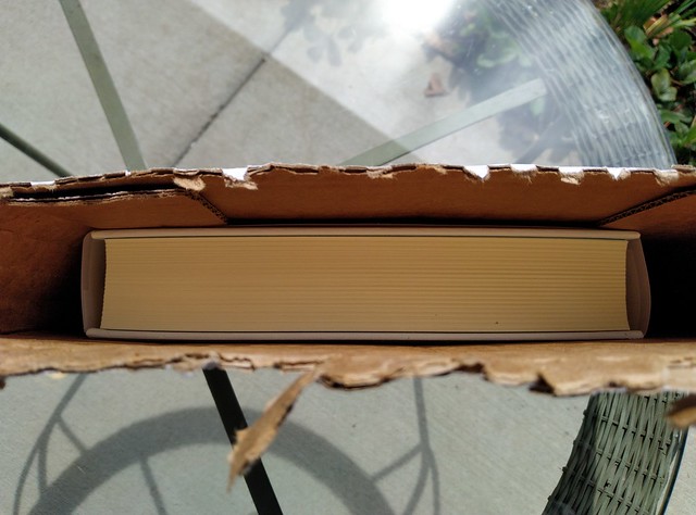
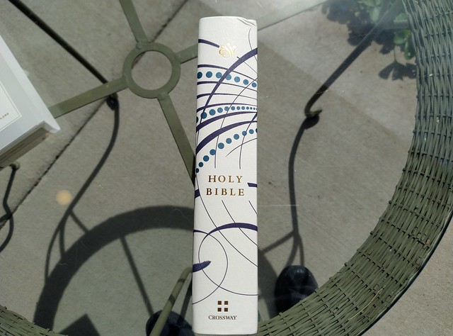
The Artist Series from Crossway highlights the talents of select artists to embellish Bibles. This one has had some line art from Jake Weidmann placed on the outer cover. This is a hardcover Bible. Here is an excerpt from Crossway’s information on the product page about their Artist Series. “The ESV Single Column Journaling Bible, Artist Series is a collection of journaling Bibles meant to celebrate the treasure of God’s Word through the artistic talents of his people. These Bibles feature commissioned cover artwork designed by Christian artists such as Peter Voth, Ruth Chou Simons, and Joshua Noom. Each artist offers a visual entry point focused on a particular biblical theme or passage, setting a tone of reflection as readers engage with the Bible.”
If you are interested in looking at the product page, here is a link. I haven’t written a review on the E.S.V. English Standard Version for a while, so let me reiterate, it is a splendid translation. It is one of my favorite formal equivalence translations. Beside the 1995 NASB, and now the Legacy Standard Bible, it is my next favorite translation. It remains accurate, without watering down the Word, or destroying the majesty of scripture.
This Bible arrived with a slightly dinged corner. I think that is due to the way it was packaged for shipping. It was not in a box with padding, inside another box. It was sent in a sleeve type box. I know this is popular these days, but keep in mind, if your Bible shows up damaged, you can send it back for an exchange. If this happens often enough, the publishers will need to go back to using more expensive packaging. This cost will be passed on to the consumer, but in my opinion, it would be worth it to make sure the customer is happy.
Instead of having a clam-shell, or two piece box, this Bible is wrapped with a plastic, or cellulose band, that has some information about the Bible’s features, and a bit about the artist Jake Weidmann on it.
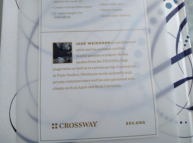
When you open this Bible up, you’ll see a card with a picture of the artist on one side, and an explanation of the cover art on the other. As a fan of the German Bauhaus design philosophy, I was more concerned with the layout, typeface, paper, and other features than the cover art. That being said, the line art on the cover is not gaudy, or in any way excessive, or irreverent. Weidmann’s line art combines nicely with the sparrow. One doesn’t overpower the other.
I asked a friend who was interested in this Bible due to their knowledge of Weidmann and his work to provide a short note about him. Here is what she had to say,
“Jake Weidmann is a master penman, one of only 14 in the world. He earned his Master Penman in 2011, well before the resurgence in interest in decorative calligraphy and the writing arts. He uses calligraphy in his artwork to “give both the words and the pictures more life and a stronger message”. He was fascinated with art, coloring and drawing by age 3. He was obsessed with making his handwriting beautiful and would take all the time in his classes to practice his handwriting. Even in college he didn’t think he would become an artist; he was getting his degree in psychology and when he applied for an art minor in college, he was told that his work wasn’t right for the department. Before he completed college he received requests for commissions of his work, and has been working as an artist ever since.
He uses single line calligraphy to make graphic images primarily of Christian theological themes, such as hymns, bible verses and portraiture. He notes that his work is a kind of iconography, writing a story in the form of a pictograph. He speaks to the heart of the viewer by layering different images, symbols and texts. They are meant to draw you in, to make you think and consider the image on a deeper level.Several videos have been produced of him creating an image, which can take hundreds of hours to complete. His work can be found on jakeweidmann.com and he has his own YouTube channel.” S. Eddy-Kissell
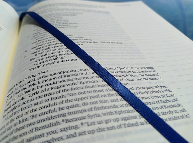
This particular Bible is a single column, journaling Bible. It is a black letter edition. The spine is sewn. That feature makes for a long-lasting, lay flat, Bible. There is a shiny blue ribbon marker. The ribbon’s blue stands out against the cream colored paper. The paper is a smooth, thin, and cream colored. The smoothness of the paper reminds me of the paper used in premium Bibles, although this one is printed, and bound in China, and sells for a value price. The font is 7.5 pt. lexicon typeface that appears to be line matched. These two features, along with the uniform, and consistent print throughout, make this edition easy on the eyes. If you have older eyes, you might want to think about something in a 10 pt. font, or getting some reading glasses if you want to read anything 8 pt. or under. The corners are square, while the spine looks rounded. There are blue and white decorative head and tail bands. The margins are two inches wide, and ruled. This should be splendid for note taking, or journaling.
I don’t think the paper is thick enough to write on with a wet fountain pen. Using a fine, or extra fine tip might be alright, but if it is scratchy at all, it might damage the paper. I’d probably stick to pencils, or Pigma Micron pens for note taking, or journaling in this one. Your opinion may be different. If you are looking for a wonderfully laid out, single column, journaling Bible, at a value price, look no further. This Bible would work well in that role.
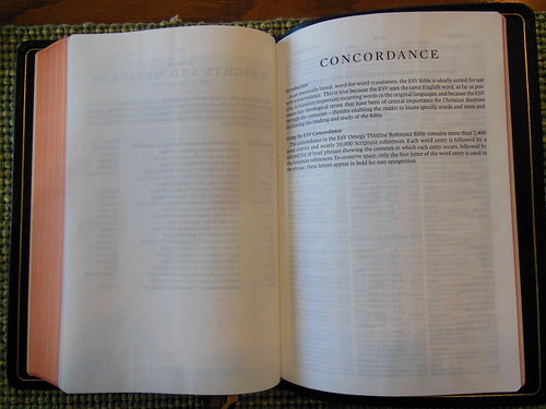
Crossway, for a long time now has been manufacturing terrific quality premium, and value Bibles, as well as helpful Christian books. Oft overlooked are the study resources they publish. Today we are going to look at the, ” ESV Exhaustive Concordance.” If you’ve been a Christian for a while you probably already know what a valuable aid a good concordance can prove to be.
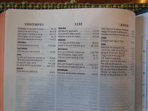
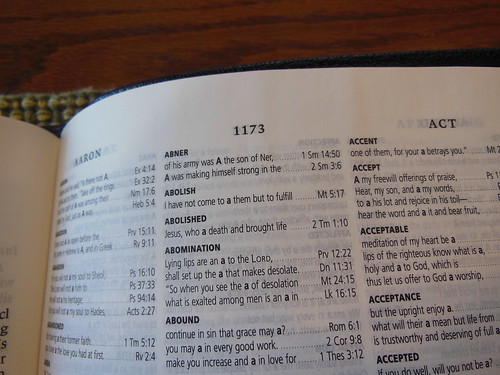
If you don’t know what one is, let me tell you. A concordance has every word in the Bible, no matter how small it is, listed in alphabetical order, along with every occurrence of that word, and where in the Bible it occurred. This one goes a bit further and includes Hebrew, Aramaic, and Greek glossaries, with entries for those words in the original languages. There is also a list of the words followed by their scripture references only, so you can find every occurrence quickly.
If you aren’t quite sure what to do with a concordance here are a few suggestions; Do a word study. Check to see if the English word being used is translated from one or more different Greek words. Verify the veracity of someone’s claim. Trust me, once you start using a full concordance instead of the very abridged on at the back of some Bibles, you never want to be without one.
This concordance is well made for many years of use. It is a hardback edition. The spine is sewn, and rounded for easy use, and durability. There are black head and tail bands. The paper is 36 g.s.m. and opaque. I think it was about as thin as they could go without sacrificing legibility, considering the 6.5 Lexicon font. It strikes the perfect balance for a book of this size. The paper is white, and the type is clearly, and uniformly printed. Concordances, as you can imagine are not small books. This one is a hair thinner than my Strong’s. In the front of this concordance in the introduction you’ll find helpful diagrams of how to use this tome properly, as well as a Preface by Drayton Brenner who compiled it.
You should always have a hard copy of your most important books. Electronic copies, and apps, are nice, and convenient, but they can be changed in one update overnight. Some apps make it difficult to browse to the information you want. Sometimes, it is just easier to look it up in a book. To that end, I encourage you to go out and pick up this concordance for your ESV Bible. You can purchase it on Amazon, Christianbook, or Crossway’s page. To see more pictures of this concordance please see my flickr album.
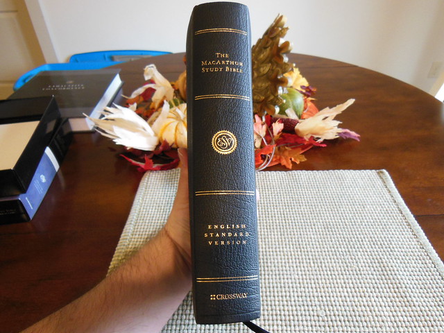
I know this Bible has been out for quite some time, but Crossway was kind enough to send one out for review. This is one of their Bibles I have not reviewed yet, and perhaps you haven’t looked into it yet either. I have two other John MacArthur Study Bibles. One is from Thomas Nelson, and it is a N.A.S.B. The other is the 25th Anniversary Edition in N.K.J.V. The things that struck me between the three different editions are the qualities of the papers, the printing, the spine/binding, and the cover options. In all of the qualities, except one, the Crossway comes out on top, and not just by a little.
The genuine leather cover is more like a genuine calfskin leather, and not at all like the pigskin leather that came on the Thomas Nelson made N.A.S.B. The quality of the 25th Anniversary N.K.J.V. leather cover was slightly better than the Crossway edition’s. The 25th Anniversary edition’s cover was a bit thicker, perimeter stitched,and had an inner liner which moire silk. You would not expect a simple genuine leather edition to come anywhere near the quality of a premium Bible, but it does. The spine of the 25th anniversary edition has raised hubs, the other two do not. This is not a big deal. It is only decorative.
The paper on the Crossway far exceeds the quality of the other two. The other two are less white, and have almost a newsprint color to them. They are also made of toothier paper. The Crossway is smooth, and white, but not too bright. It is just bright enough to offer the proper contrast between the uniformly, and sharply printed font.
The spine of the N.A.S.B. from Thomas Nelson is not sewn, but glued. It is a case/perfect bound Bible. The Crossway, and the 25th Anniversary N.K.J.V. are both sewn. The Crossway is about the same thickness as the Thomas Nelson. Both are much thinner than the 25th Anniversary N.K.J.V. I’m not sure why it is so thick. I’m guessing it is due to the type of paper. They all have relatively the same amount of content. They could all use better ribbons. The Crossway has nicer maps, of course 🙂 If you are interested in it,hurry up and get it while it is on sale for Christmas!
The Crossway, English Standard Version, in genuine black leather comes in a two piece retail box. The box isn’t as sturdy as some other boxes, but I would still hold onto it to store your Bible in when not in use. The Bible itself is full of helpful features that will be of great value to you while you endeavor to learn more about the God who saves.
Here is a list of the Bible’s features from Christianbook.com’s product page;
Features
Complete ESV Bible text
Nearly 25,000 explanatory notes from Dr. John MacArthur
Bible text in 8.7 point type, 7.6 point study notes
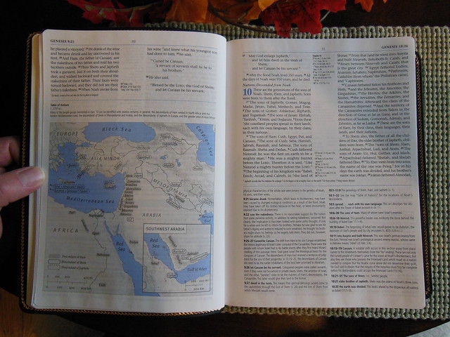
More than 140 two-color maps, charts, timelines, and illustrations
Complete introductions to each Bible book
Concise articles on How We Got the Bible, How to Study the Bible, and Introduction to the Bible
80,000 cross-references
An extensive concordance
Bible reading plans
Index to Key Bible Doctrines
Outline of Systematic Theology
Presentation Page & Family Record Section
Center-Column References
Timeline of Old Testament Kings and Prophets
Timeline of New Testament Chronology
Harmony of the Gospels
Durable smyth-sewn binding
Presentation page
Family record pages
Ribbon marker
Gold page edges
8-point text size
9.75″ x 7.00″ x 1.75″
Product Information
Format: Genuine Leather Number of Pages: 2144 Vendor: Crossway Publication Date: 2010 Dimensions: 9.50 X 7.00 X 1.75 (inches) ISBN: 143352144X ISBN-13: 9781433521447 References: Center Column|Cross References
Text Layout: Double Column Text Color: Black Letter Text Size: 8 Point Note Size: 7 Point Thumb Index: No Ribbon Marker: Yes Spine: Sewn Page Gilding: Gold
You might have noticed there is a discrepancy between the two lists, one says the font is 8.7 pt. for the main text, and 7.6 pt. for the notes, the other list says it is 8, and 7 pt. When I contacted Crossway they confirmed that the font is 8.5 pt. for the main text, and 7.5 pt. for the notes. They also provided me with the font type, which is ITC Stone Serif.
For people who are curious, this Bible is printed, and bound in China. I know, I know, Chinese made stuff is junk… Well Crossway has ensured that the quality is top notch. I’m not sure how they do it, but I would like to find out. Hopefully one day, I’ll get the chance.
The cover has a nice grain to it, and a perimeter groove on the outside. The inside liner looks like your typical vinyl. There is a nice gold perimeter ornamentation hot-stamped on the inside of the cover as well. The page edges are gold guilt, and there are head and tail bands too.
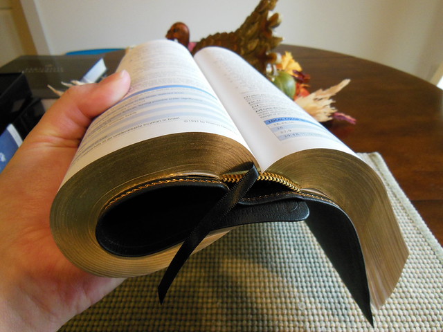
My biggest gripe about cheap Bibles is that they use glued spines, and all the pages fall out. They are also notoriously difficult to keep open, or get to lay flat. You won’t have that problem with a good sewn spine. The Crossway MacArthur Study Bible has a nice sewn spine as you can tell from the following pictures. It also has one ribbon marker.
I really like the simple style of the spine.
One of the things I like about this Bible is the use of the color blue for the chapter numbers and features.
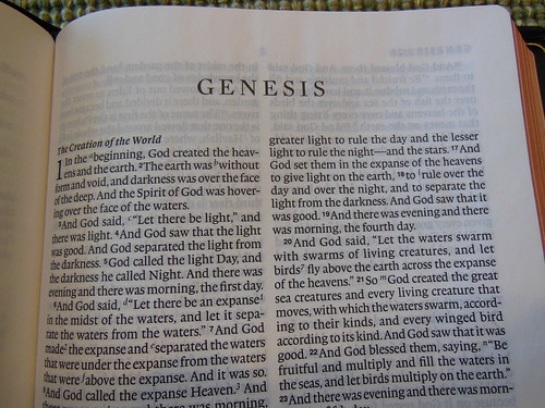
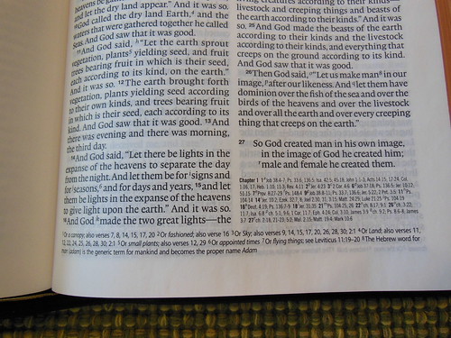
This is a black letter edition, with double column, paragraph layout. The cross references are in the center column, and the notes are on the bottom. With the quality of paper, and printing this Bible is not hard on the eyes.
After looking over this Bible, and comparing it to other editions, I can give it a thumbs up. It is a great value, especially when it is on sale. You can get your copy from Christianbook, or Amazon. Make sure to check out all of the pictures of this Bible on the Flickr page.
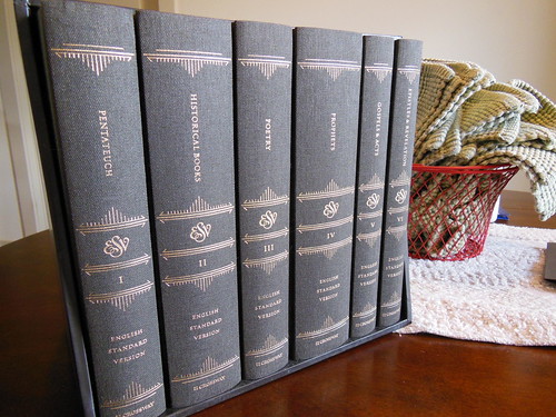
I received this set from Crossway some time ago, and wanted to use it for a while before writing a review. This review will differ from my others in the lack of a listing of the physical attributes like, paper weight, cover material, binding, font size, and layout, as all of that information and more can be found here. The Reader’s Bible is unlike any other Bible I’ve reviewed. This one is a six volume set, intended for undistracted reading. That is not to say that other Bibles aren’t for reading. It is to say, that the focus of the layout, and construction was to be conducive to reading. This is necessarily at the exclusion of other purposes. For instance, study, easy reference, citation, and so on, as there are no chapter or verse numbers, no footnotes or cross references. There is a chapter index in the back of each volume. For older folks like myself, it is so different from Bibles we’ve used for such a long time, that it takes some getting used to. It isn’t a bad experience, just different. I am a slow reader, and tend to study as I go. Other people can speed through the Bible, and retain information. When I simply read the Bible, I have to remain very conscious of what I am reading, and be diligent to properly regard it. When I start to read sometimes I start to drift. I find myself going back over the same section a few times, to make certain I have understood what I’ve read. With the Reader’s set, you can read without getting side-tracked by interesting cross references, or footnotes.
The first thing you notice is the volumes are constructed as a quality hardback, cloth covered book. Each volume has a marker ribbon, sewn spine, heavy paper, and easy to read font. Then while reading you start to experience what Crossway intended. You have a smooth progression through large sections of scripture. As you read, you don’t make your decision on where to stop by chapter numbers, or section headings. Instead, you stop where it seems natural, usually at the end of an idea. As you read, you’ll also notice that your eyes don’t tire as easily due to the very thick paper, and font. (For all the stats follow the link in the first paragraph of the review.) With the longer sessions, you tend to cover more ground. I would not let my reading, exclude separate study of the Bible. Having the Reader’s Set does force you to make time for reading, and study. I think I need that in my daily routine. Separating the two activities does seem beneficial. I think this set should hold up well, as long as they are cared for properly. I would be careful around moisture, as the pages are not coated, and would absorb water, finger oil, and dirt readily. Which brings me to my next suggestion, don’t eat, drink coffee, or have dirty hands when reading this set. You will stain the cover, mess up the pages, and make it look messy. My final thought, is that they are nice to have when you want to sit and read God’s word. My eyes aren’t what they used to be, and even though the font isn’t large, it is easier to read. I like the feel of them. It is an awful lot like reading a hardback novel in certain ways. You can view Crossway’s product page here. You can also read more about this specific sets production here. Be sure to check out the rest of the pictures on my flikr page.
I am giving away a hardcover edition of this Bible.
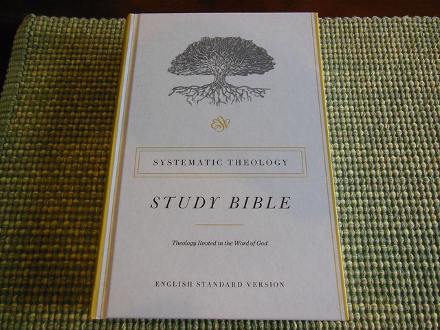
The Systematic Theology Study Bible from Crossway, is a different kind of Study Bible. It isn’t really accurate to call it a reference Bible, or a Study Bible. It is technically a study Bible in the sense that it has study aids in it, but it looks more like a reference Bible with a systematic theology book blended in with it.
For my conservative paedobaptist friends, you’ll notice the notes seem to be in favor of credobaptism. For my friends who don’t believe in God’s sovereign election, you’ll notice the notes don’t agree with you.
Some people would like it if a broad range of theologians worked on this Bible, but they didn’t 🙂 It was mostly Reformed Baptists, and conservative Presbyterians, from what I gathered reading the list of men involved with writing the theology articles.
Contributors:
Gregg Allison
Bruce Ashford
Gerald Bray
Bryan Chapell
Graham Cole
David Dockery
John Frame
Michael Horton
Kelly Kapic
Michael Kruger
Robert Letham
Donald Macleod
Chris Morgan
Stephen Nichols
J. I. Packer
Michael Reeves
Fred Sanders
Sam Storms
Scott Swain
Stephen Wellum
David Wells
The systematic theology seems to lean towards a general Reformed position, which is good, because… well, I think it is the right position lol. 🙂 I think any person who affirms the reformed position on soteriology will be appreciative of this Bible and the articles in it. It is broad in appeal to people who are reformed. It might not get all of your more nuanced secondary, or tertiary doctrines just the way you want them, but we will all be in accord over the treatment of the primary ones. I can definitely see the Reformed Baptist position reflected in the work.
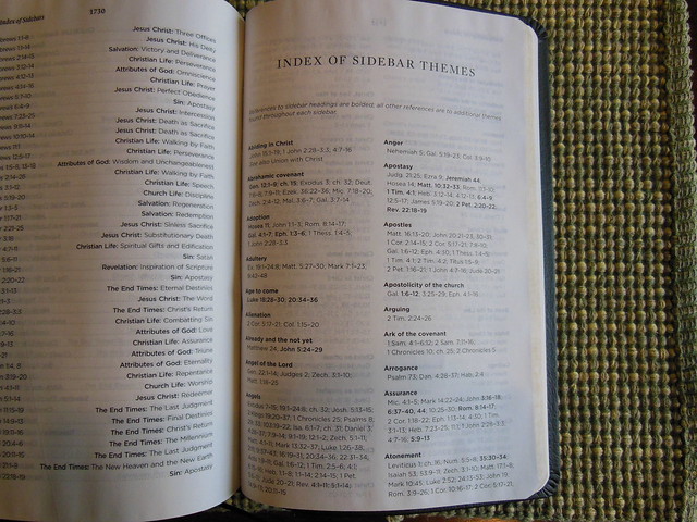
There is basically a mini systematic theology book in the back of the Bible along with some other very useful features. Here is a list of features you’ll find;
“Double-column, paragraph format
Footnotes
Book intros
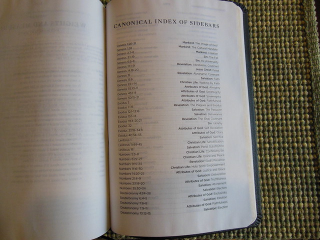
Topical index of sidebars
Cross-references
400+ doctrinal summaries explaining core doctrines and connecting them to specific Bible passages
25+ longer articles on key theological topics
Lifetime guarantee on leather and TruTone editions
Smyth-sewn binding
Packaging: J-Card (Hardcover); Box (Genuine Leather and TruTone)”
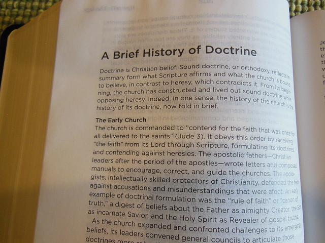
When we look at most study Bibles they either are one man’s theology, like the Ryrie, Scofield, and MacArthur, or they are a compilation of a wide range of theologies like the massive ESV, NIV, Thomas Nelson NKJV study Bibles. The last three are humongous study Bibles with a little bit of everything. The Systematic Theology Study Bible is a neat hybrid. It isn’t one man’s theology, or a broad, neither here nor there conglomeration of positions. (Excluding the ESV which does a great job.) It is from the reformed position. The theology is systematic, which means that it is harmonized. Verses are not put against verses. They are all contextually harmonious.
You’ll find book introductions and outlines before each book. You’ll also notice that the Bible looks a lot like a Cross Reference Bible. It seems to me that Crossway integrated their systematic theology features into the Bible very well. The articles are relevant to the scriptures they appear with, and are indexed in the back along with several theological articles.
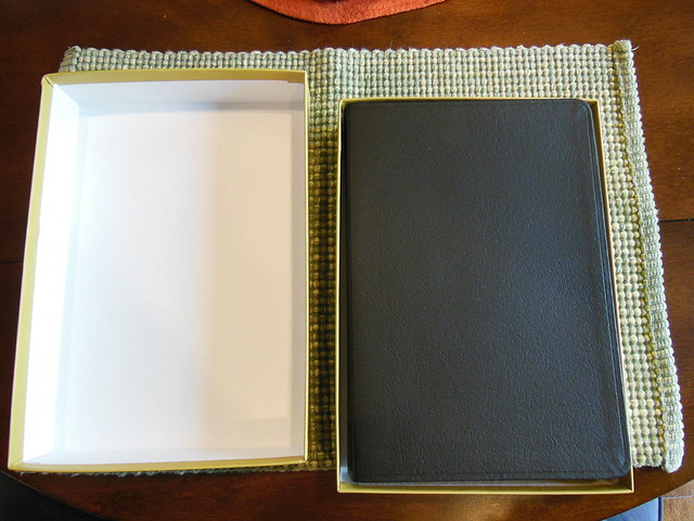
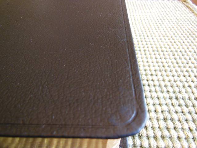
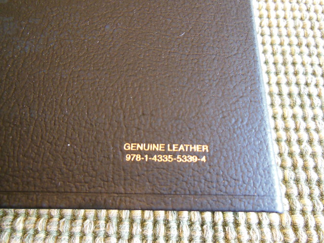
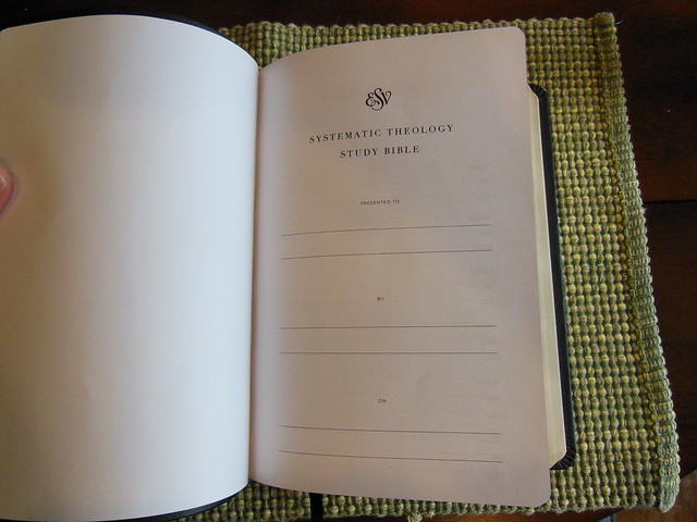
This Crossway Bible was packaged well and delivered in a cardboard box. The Bible was in a two piece retail box. You should always keep the retail boxes for storing your Bibles in if you are swapping it out with another one to read for a while. The cover is black genuine leather with a perimeter groove.
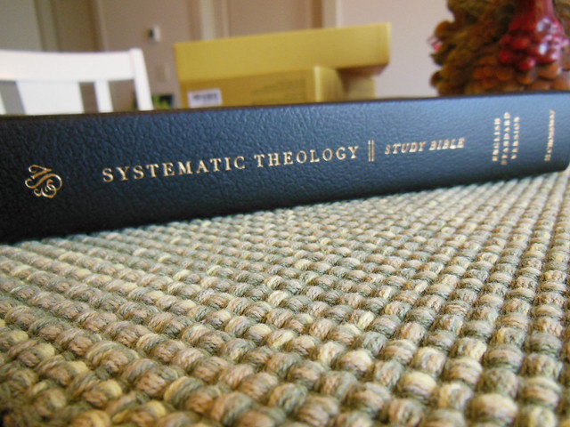
The spine is decorated with the ESV logo at the top, then, “Systematic Theology Study Bible.” English Standard Version at the bottom, with Crossway’s logo hot stamped in gold colored foil.
The page edges are also gold gilt. There are yellow and black, head and tail bands, and one black ribbon marker.
The cover is joined to the text block via case binding. The spine is sewn for superior flexibility, and durability.
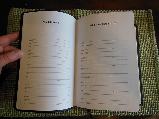
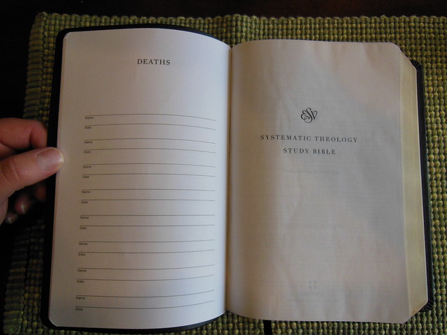
In the front of the Bible there is a presentation page, and some family records pages.
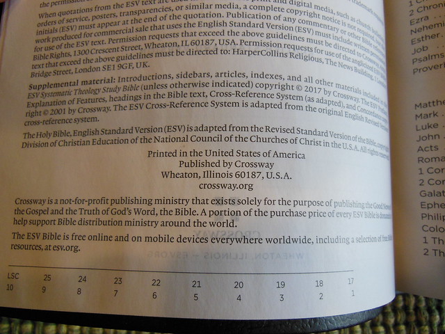
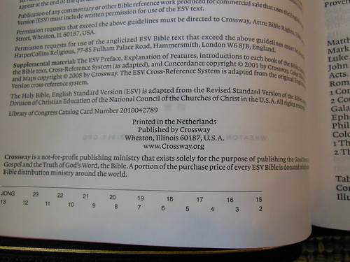
If you look at the copyright page, you’ll be pleased to see this edition was printed and bound in the United States.
The book introductions are well done. I found them to be informative, and concise, but not to a fault.
Cross references and footnotes, along with the systematic theology articles are found at the bottom of the page to save space. The text is laid out in a double column, paragraph format.
The main font is an easy to read 9 pt. Lexicon, and the features are an 8 pt. Gotham, printed crisply on 30 g.s.m. Apple Thin Opaque paper. The paper is smooth, and offers a decent contrast, and due to its color reduces eyestrain.
If you don’t already own one of these, you should get one. It is a times saver if you are intending to read a systematic theology book. You can kill two birds with one stone. It is available from Crossway, Amazon, or Christianbook for a very fair price.
Since you stuck around for the entire review, if you comment on this review, and ask to be in the running for the hardback copy of this Bible I will select a winner out of those who commented. Be sure to check back so I can get your mailing address. I will only mail this to an address in the U.S.
I know that not too many people are aware of the premium Bible market. For those that are, they appreciate the natural hide, edge lined covers, sewn bindings, premium papers, and aesthetics. The price can be the main prohibitive factor for someone seeking to buy their first premium Bible. The Bibles in the premium category usually start out at $150 to $250 price range. The suggested retail price of this Bible is $250. This Bible can be purchased from Christianbook.com for the dramatically discounted price of $169.99 and from evangelicalbible.com for even less at $149.99 Just let that sink in. You can get one of the best quality, best translations, from Crossway printed and bound by Jongbloed, the premiere Bible bindery for the price of a concert ticket.
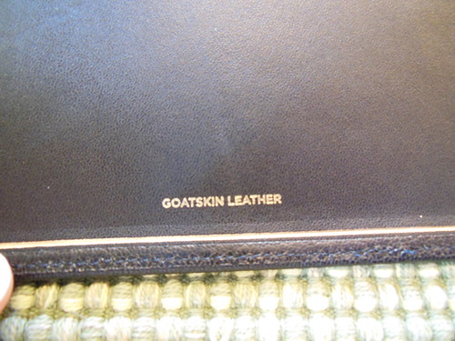
In the world of premium Bibles there isn’t much room for error or variance. If you want to publish a premium Bible, you go to Jongbloed of the Netherlands. When Crossway wanted to publish the Omega, they didn’t skimp. They also went to Jongbloed. There are numerous reasons why publishers utilize them for their premium editions. Paper choices, cover choices, binding methods, printing equipment and methods, overall professionalism and standards, you get the idea. Cambridge, Schuyler, Allan, all have made use of Jongbloed for their top notch Bibles. The E.S.V. Omega Reference Bible in black, edge lined goatskin leather, is one of the best Bibles available today. It belongs in the premium Bible category.
I could go on and on about the great qualities of this edition, but instead I think it would be better if I just show you. Without further delay, some high resolution pictures with comments.
The Omega was shipped from Crossway in a white box. It arrived undamaged.
Inside the shipping package, was the Bible in it’s black, two piece, presentation box. Retain it for storage. The Omega is too flexible as an edge lined Bible for you to stand it on a bookshelf without a box.
Inside the presentation box, the Omega is wrapped in two bands of paper to protect the page edges and keep it from shifting around during shipping.
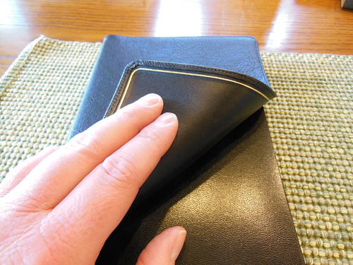
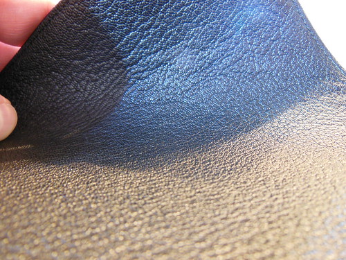
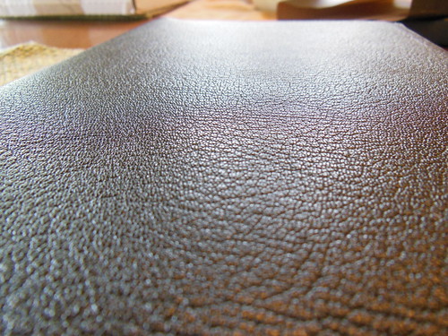
The black goatskin cover is perimeter stitched to the inner liner. It has a pleasing natural grain, and is very supple.
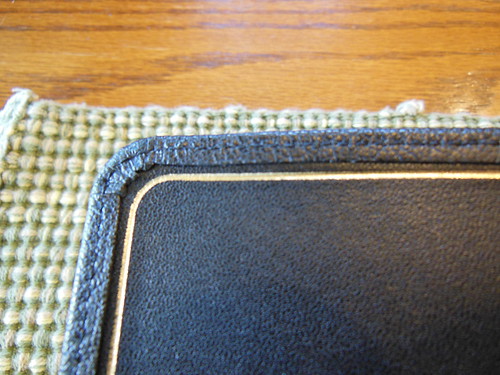
The inner cover/liner is also leather. It has a gold perimeter line and the corners are finished well. The hinge will take a bit to break in, but once you do it will last a long time.
The spine is smyth sewn and very flexible. You can see the signatures bend around it rather than the pages bending around a glued spine. This is a, “must have” feature for a Bible. They should all have sewn spines. I wouldn’t even purchase a value line Bible without a sewn spine unless I had to. The sewn spine is a major factor in how long the Bible will last and how well it will open and lay flat.
As you can see from the pictures, the cover is supple and has a lovely textured grain to it. It is a pleasure to hold. The light weight and dimensions of the Omega equate to hours of easy reading, as well as long evenings of deep study.
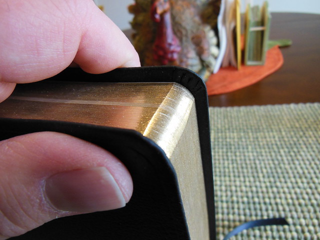
You can see the lovely grain of the leather in this close up picture.
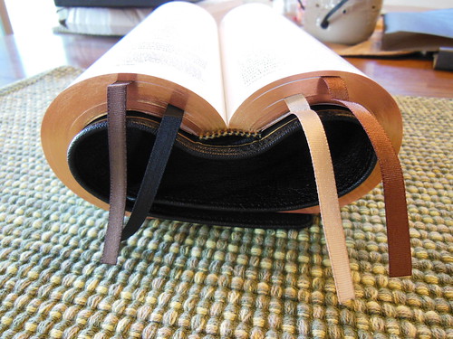
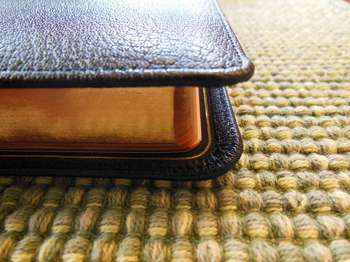
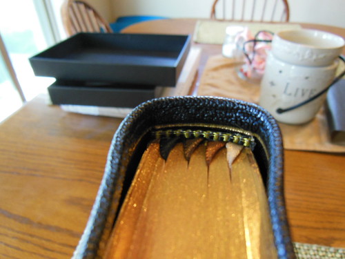
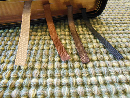
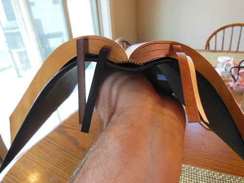
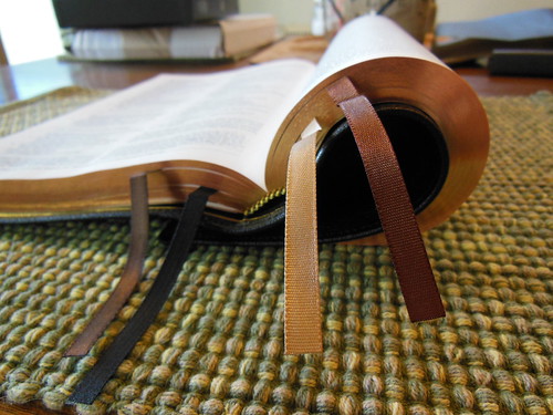
The corners of the cover are very well executed as are the corners of the text block. They have been rounded, as well as the spine. The page edges are beautifully art gilt. Also, take note of the use of four ribbon markers. That is almost unheard of. I know it is the first time I have heard of it, and I like it. The color of the ribbons is complimentary to the cover, and each other. I am actually using all four of them. I use one for my Old Testament reading, one for the proverbs and devotional reading, one for my New Testament reading, and one to mark where I am at in my study with a couple of my brothers in Christ.
The gold and brown head and tail bands match the ribbons and inner liner.
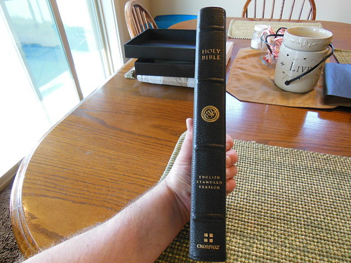
The spine is decorated with four raised hubs. It has, “Holy Bible” at the head, the ESV logo, “English Standard Version” above the foot, where the Crossway logo sits, all hot stamped into the goatskin leather.
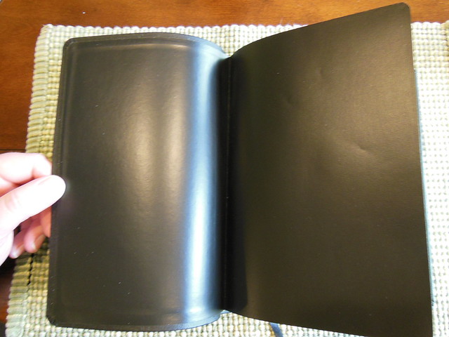
The text block is joined to the cover like all edge lined Bibles, by gluing the leather tab from the inner liner to the block and then covering it with a vinyl coated card paper. This one is glued further up the paper to make it more durable.
At the front you’ll find a presentation page and some family records pages.
The Omega Heirloom Bible employs a 28gsm PDL paper that has a opacity rating of 79. The Omega uses a 10-pt. Lexicon font for the main text.
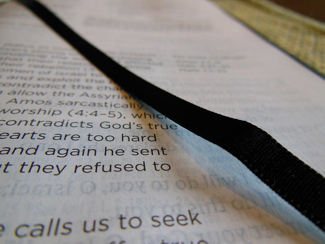
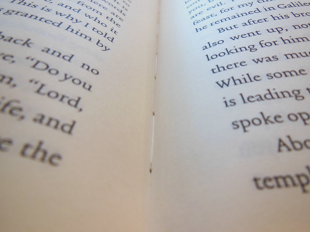
With one page singled out and help up with light showing through from behind you can see how well the line matching was used. It is exceedingly effective in reducing eye strain, and making this Bible a pleasure to read. This coupled with the high quality print job that Jongbloed did makes this a most legible Bible.
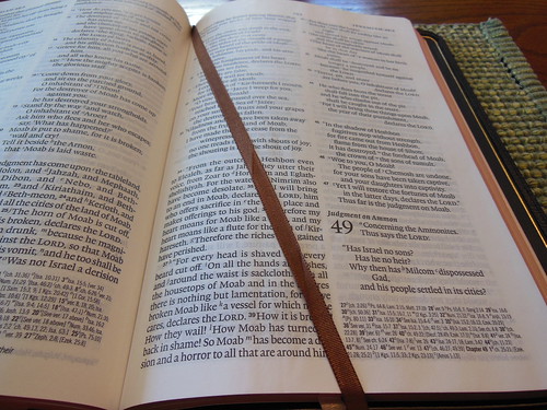
It is a double column, paragraph format layout with drop cap style numbers for the chapters. The book titles appear at the top of the first page of each book. Page numbers are placed at the top and justified to the center of the head. The text is some of the boldest I’ve seen and is very sharp. It contrasts well against the paper and also is a tremendous feature making the Omega a great Bible.
To make space for the text, the cross references and notes are printed at the bottom of the page. This layout is becoming more and more popular because of its effect on text real estate on the page.
For you note takers who dare to write in such a lovely Bible 🙂 there is about a half inch margin available. I don’t see much note taking going on here, but if you must…
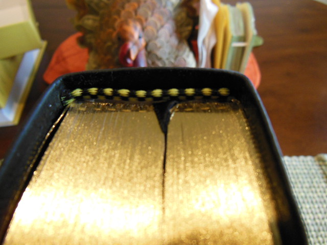
As you’ve come to expect on premium Bibles, the page edges are art gilt with red under gold.
There is a useful 41 page, 3 column concordance in the back of the Omega. Make sure to take advantage of it. It can be a helpful tool.
You’ll find the obligatory maps from Crossway in the back. Their’s are some of the best.
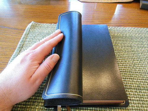
With the sewn spine, and edge lined binding this Bible is nice and flexible. Notice how well it drapes over my hand.
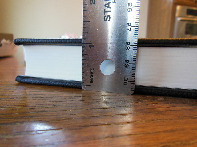
Here it is compared to my R. L. Allan NASB Reader’s Edition. The Omega is a bit shorter, thinner, and more narrow. It is much easier for me to handle than the Allan.
Below you’ll see on the left a page from the Omega, and on the right the Allan. The Allan doesn’t use line matching. Even though it is a great paper, there still is a bit of ghosting. This makes the Omega the winner.
Here we have the Thinline Heirloom, Omega, and Study Bible from Crossway.
I think you’ll be very happy should you decide to purchase an Omega Reference Bible from Crossway. I don’t think there are very many Bibles out there that are any better. It is one of the best. This Bible would make an excellent gift to a person graduating from seminary, a Preacher in your Church, or anyone who enjoys well built Bibles. Make sure to check out the rest of the pictures on my flickr page.
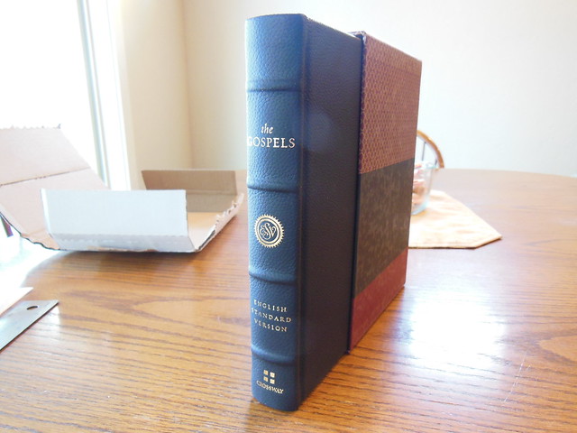
Alright folks, with the recent release of the ESV 6 volume Reader’s set, I thought you might like to read a review about this Reader’s edition of the Gospels. It would be a less expensive way for you to see if you want to shell out the bucks for the entire 6 volume set. Maybe you don’t want the entire set, just the gospels? Whatever the case may be, I offer this review up for your information and pleasure.
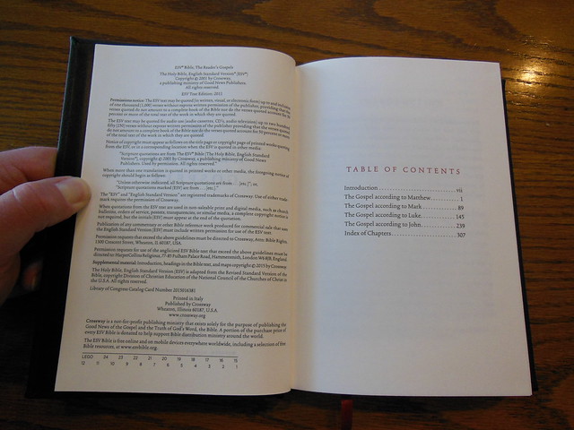
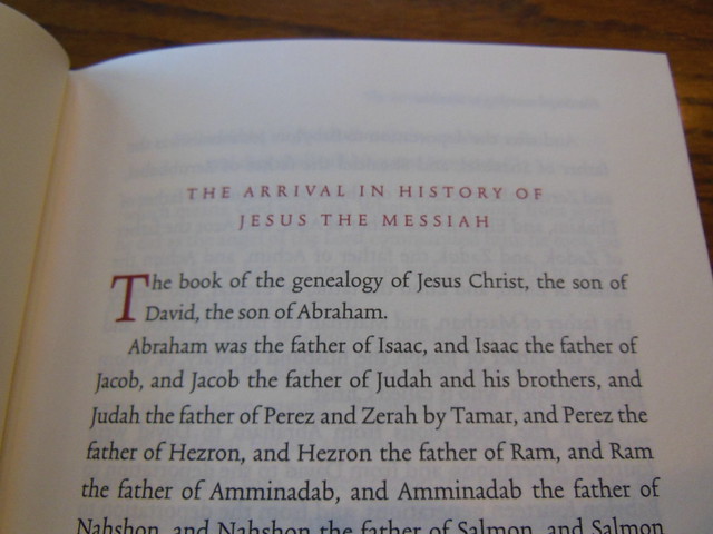
The Reader’s edition is an interesting concept. There are no chapter or verse numbers. There are no cross references or footnotes. The paragraph format is done according to where new paragraphs would start in English. The books are typically arranged other than that. The only way to tell where you are in a book, is by using the index in the back in conjunction with the page numbers. All of this is to accomplish the mission of a reader’s edition, to remove obstacles or impediments for the reader.
I find that as I read, I lose track of my progress. I tend to read more in this volume. Some of it is due to the lack of chapter and verse numbers, as well as the lack of cross references and footnotes. While some of the other design and layout features contribute to it as well. For instance, Crossway utilized a high quality, cream colored, uncoated, heavyweight paper more commonly seen in hardback novels. It is 80 g.s.m. and you can hardly see through it at all. The font is 12 pt. in size. It is sharp and clear. It is laid out in a single column. This edition is truly meant to be read through like a book. There is nothing in between you and the text. I could go on and list all of the cool features of this edition, and I will, but I want to make sure you understand what the point is. Reading and experiencing the gospels in a more fluid and retainable way was the goal, and Crossway achieved it. Bonus is that there is no eyestrain, or headache after a long reading session.
So now that you know how accessible this makes the gospel, let’s look at some pictures and hear about some features of the construction.
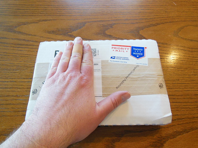
The Bible was shipped from Crossway, and well packaged. It arrived undamaged.
This volume comes in a nice heavy slipcase. It is intended to be kept, and used for storing this volume in when not being used.
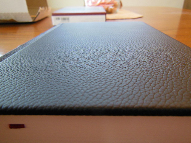
Once it is out of the box, the first thing you’ll notice is how soft the topgrain leather is. If you don’t like leather over board, or if you want a Reader’s edition with a smaller price tag while retaining the same text block, you could get it with cloth over board.
Legatoria Editoriale Giovanni Olivotto or L.E.G.O. for short did a wonderful job printing and binding this book. They are gaining some serious notoriety amongst quality book and Bible collectors here in the states. Jongbloed in the Netherlands might have some competition in text block production if they don’t watch out 🙂
Here is a good close up of the cover.
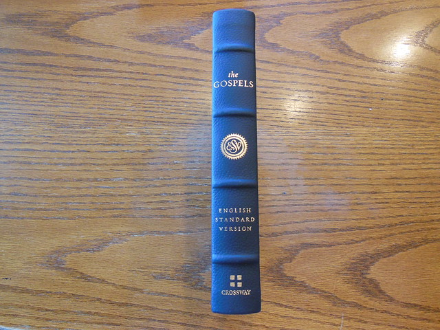
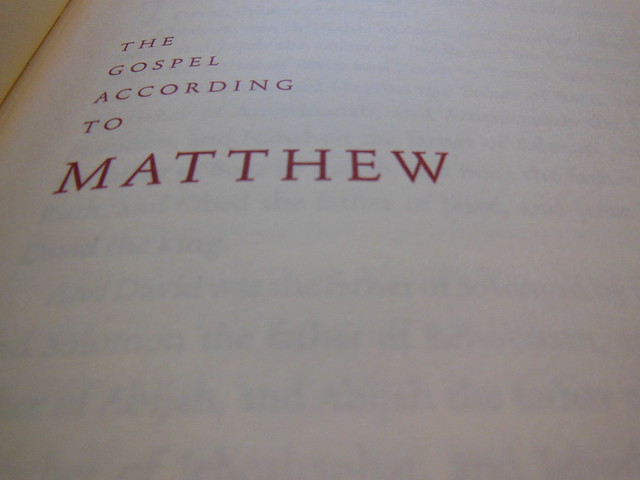
You’ll notice the page edges are not gilt. There are decorative head and tail bands in gold and black. The spine has, “The Gospels” at the head, the ESV logo below that, “English Standard Version” after that, and the Crossway logo at the foot in gold. There are also four ornamental spine hubs.
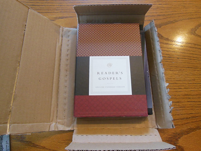
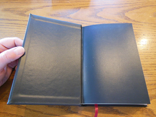
Here is a picture of the inside of this casebound hardcover.
The book names, headings, and drop caps are printed in an appealing red text.
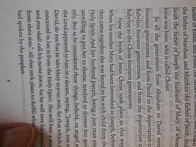
I took a picture of one page, separate from the others, and with light behind it so you could see how thick and opaque it is. I’d never heard of Munken Premium Cream woodfree paper before, but after seeing it I’m sold.
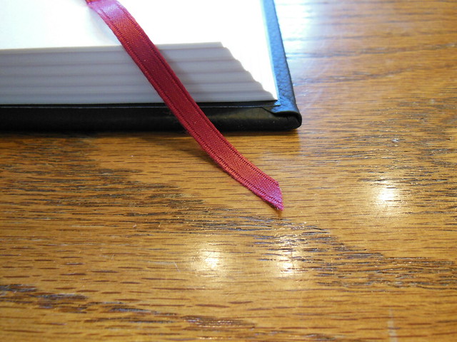
Here is another picture of the wonderful paper, 12 pt. font, and the crimson colored ribbon marker.
From this picture you can also see the fat signatures with the ribbon laying on top of the page.
Of course, like you’d expect on a high quality book, the spine is sewn. This ensures a durable, and useable binding.
Of course my favorite picture is the one where I am reading it.
After reading from this edition, I am eager to purchase the 6 volume set. I will probably get the cloth over board due to the price. I am looking at getting the new Schuyler Personal NASB Quentel when it comes out this year, so I have to save my money 🙂 That way I can get both. I would highly recommend getting this for anyone wanting to try a reader’s edition out. It is one thing to know the concept, but another to live with it for a while. Make sure to look at the rest of the pictures I took of this edition on my flikr page. You can also read about more of the details on Crossway’s product page. You can purchase your copy at Christianbook or Amazon.