The, “Just Love Story Bible” is a mess of Critical Race Theory, social justice, and feminist lies that will present a false god to your children, and keep them in idolatry. One of the authors of this lie, a person who calls herself, the Reverend Jacqui Lewis, said this about her work, “…the book’s goal is to teach children Christian lessons they ‘don’t have to unlearn because they understand from the beginning what this faith is really about…” Her goal wasn’t to accurately translate the word of God, and maintain the ideas He has communicated in His word.
If you think this is bad, just wait. There’s more. Another red flag for anyone who takes the word of God seriously is that Lewis claims to be a Reverend, or in other words she is assuming for herself the role of preaching elder. Which any serious student of God’s word knows is a role reserved only for matured in the faith men. Her co-author is a woman named, the Reverend Shannon Daley-Harris. Look! It is yet another feminist with a hyphenated last name, and she’s assumed the role of Reverend. Of course they are in a theologically liberal church. “…Lewis has long preached at Middle Collegiate Church, a multiethnic congregation in Manhattan’s East Village affiliated with the United Church of Christ…” While her co-author, Harris is an associate dean of Auburn Theological Seminary in Morningside Heights.
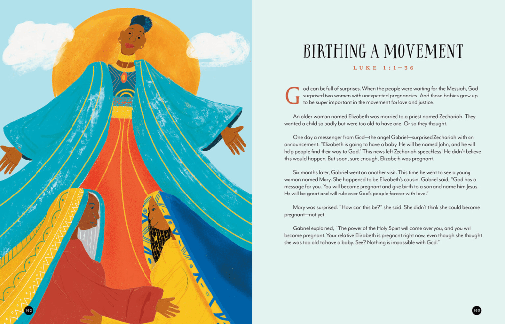
They couldn’t resist the urge to turn Moses, and Jesus from Jews into black men with afros. This isn’t the biggest offense, but it lets you know just one more thing about the liars producing this work. The illustrator is just as much an activist. It also figures that both the authors are from the Presbyterian USA denomination.
When asked, “Why did you create the Just Love Story Bible,” Lewis had this to say,
“I was approached by Beaming Books a while ago about doing an interfaith project. And as time went on, it seemed right to do a Christian book given all the meshugaas (a Yiddish term for madness) in the world about what Christianity is or isn’t. Shannon has all of these gifts from writing liturgy for the Children’s Defense Fund, and she’s got a really strong sense of the Hebrew Bible. Our agenda is teach young people a theology of love and justice that we don’t have to unlearn because they understand from the beginning what this faith is really about.”
Notice it was not her intention to accurately translate, or render the word of God. It was indoctrinate children into social justice, critical race theory, and feminism. I know. You are thinking, “That’s not what I read.” You have to look at the end product, and read in between the lines with liars like this.
Here is what Harris had to say about her work,
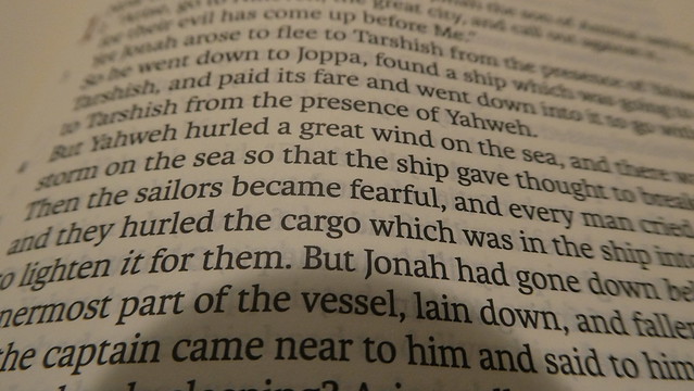
“It’s OK to actually tell kids from the get-go: Some of these stories are about true people and things that really happen, and some of them are made-up stories, but they’re in there because they can still teach us true things about God. You can tell the story of Jonah and the whale and still let kids at all these different developmental levels get into it imaginatively to extract the true lessons about us as God’s people, without feeling like they have to — pardon the pun — buy the swallowed-by-whale thing, hook, line and sinker.”
She, like almost all liberal theologians don’t actually believe the Bible. They pick, and choose. Before you say, “Whoa brother. There are parables that are told that didn’t really happen.” That is is not what she is talking about. You can see from her own words, she doesn’t believe the account of what happened to Jonah.
Don’t believe me about the CRT intent? Here is what Lewis said,
“It is the most gorgeous rainbow of faces. When we talk about what children can do and how they can be activists, or how they can be revolutionary lovers, that looks like a rainbow of people. But the biblical characters mostly look Black and brown and caramel, which is what we would really experience in the region. In the world where children have been exposed to white characters in Bibles for as long as Christianity has been Christian, now white children, I imagine, looking in this Bible and seeing brown people and thinking to themselves, “Oh, brown people belong to God, too.””
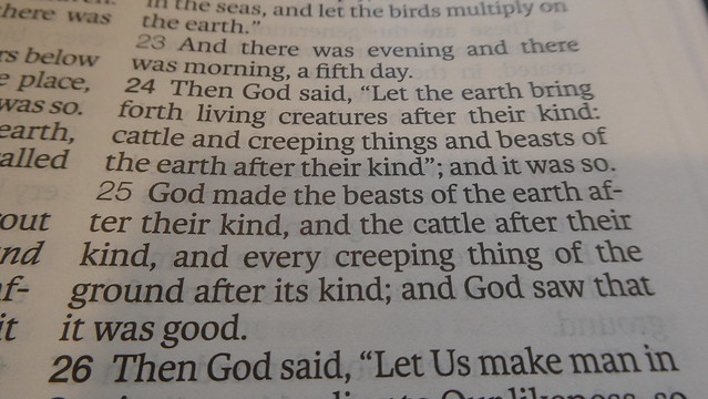
She doesn’t care what God has said. She only cares about how she can twist it to make CRT, social justice, activists of your children. This is disgusting, and perverse. The don’t even keep the text of the word of God. They create all new false stories/lies, and present them as the word of God. Look at the image at the top of this article. That is just one example.
Harris is just as bad. They don’t really care about what God has said. They simply make their own stories up.
“Frankly, the discipline of 300 to 500 words to tell a story in a sort of theologically responsible way. And knowing this book will be for some kids who go to church every Sunday with their families, and some who have never been before and are interested in what it’s all about. Some of them, there is enough dialogue and detail in the text to stay quite close to what we find in Scripture. And then others are almost more like modern midrash — that wonderful Jewish tradition of imagining a text, imagining what wasn’t said, what might have come before or come after. We say this explicitly in one of the introductions: How might the story have been told differently by somebody else who was there?”
Lewis goes on to promote a “hermeneutic of doubt.” This is what satan practiced. He is a liar, and a murderer from the beginning. He tempted Eve by asking her, “Indeed, has God said, ‘You shall not eat from any tree of the garden’?” Genesis 3:1 and “And the serpent said to the woman, “You surely will not die! 5 For God knows that in the day you eat from it your eyes will be opened, and you will be like God, knowing good and evil.” Genesis 3:4-5
Here is what Lewis said, “The New Testament is like this: There was a birth, a death and a resurrection. And (we) want to stay, in a way, orthodox enough that parents who really care about those stories will pick up the Bible and read it, and then we can stretch them, which was my hope and challenge. And when we got to resurrection, I went all the way philosophical, “some people like Plato think… ” and “some people like Aristotle think… ,” to just introduce our faith also includes doubt and the possibility of having a hermeneutic of suspicion. Did that happen? For me, it matters more that children know that love never dies, so that’s where I landed.”
If you don’t believe me about their theological positions as being theologically liberal, here it is in Harris’ own words when asked how she thinks theologically conservative Christians will receive her work,
“There will be a group of sort of literalist or fundamentalist folks for whom this isn’t a welcome resource. But it’s been really interesting to see the reception from not just folks who are raised progressive, but those who are raised in a tradition that no longer fit them, who did grow out of a theology and are looking for one that they can grow into and grow with alongside their children.”
Notice, she calls brands theologically conservative people as fundamentalists. This isn’t by accident.
Here is an excerpt from a news article where she intentionally calls sojourners, strangers/foreigners, immigrants. It is obvious what she is doing, but in case it isn’t to you. Read the excerpt.
Interviewer: “In your summary of Leviticus 19, you include the divine lesson “You shall love immigrants as yourself, for you were immigrants in the land of Egypt. I am your God.” Why did you choose that wording rather than that of other translations that have used “stranger” or “foreigner”?
Daley-Harris: Whatever the language is, the heart, essence and message is, “we’re all newly arrived at this place.” What does it mean to not try to slam the door behind you, but to really use that lived experience to create some empathy for those who are experiencing it anew? Other than our Indigenous friends who are still living in the United States, we’re all immigrants, ancestrally and historically, to this place.”
Of course it is blatantly, satanically, feminist. They tell slippery, soft, pleasant sounding lies, that tickle the ears of self-centered, fleshly, carnal, people.
“Absolutely: that Jesus was a feminist, and maybe there wasn’t language for that then, but he was a culturally Jewish man, a rabbi, who came to understand that he could relate to women differently than the culture around him. He engaged them. He drew them in. And I think those lessons are super important in this modern context. When Shannon and I say, we don’t want children to learn something they have to unlearn, we don’t want them to learn patriarchy from this story Bible.”
Her big concern? She doesn’t want them learning patriarchy from the word of God. Well, where should they learn the truth of it from? Muslims? Mormons? Jews? None of those cults actually treat women as equally being human, and deserving dignity as image bearers of God the way Biblical Christianity does.
Long story short, keep your kids, and grandkids, away from this satanic tripe. It is nothing but political ideologies wrapped up in a antichrist shawl, and served with cookies, and hot chocolate. Because the best liars are the ones who follow satan’s example.
Here is a link to the original article if you care to read it. https://religionnews.com/2025/10/16/new-childrens-bible-aims-to-capture-diverse-nonpatriarchal-theology-of-love-and-justice/