

As many of you know, we have been waiting for orders of this edition to ship. Some of us had per-ordered it in August of 2020. The one I ordered finally arrived. I knew what to expect from Jongbloed (Youngblood) as I have reviewed several premium editions over the years passed. All of them were printed and bound by Royal Jongbloed in the Netherlands. This edition did not depart from that standard set by Jongbloed in the past.
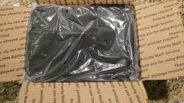
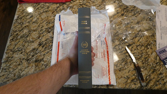
This edition was shipped in a cardboard shipping box via the U.S.P.S. The hardcover comes in a bubble envelope. The cowhide paste-down came in a smaller box. The goatskin edition arrived undamaged, and in perfect condition. The Bible was packed along with the Bible Armor carrying case. The package was cushioned with brown paper. The Bible Armor was in a plastic bag. The Bible was bubble wrapped. It was also wrapped with two paper bands, as is usual with premium goatskin edge-lined Bibles. These bands keep the supple leather from becoming deformed, and in the case of a semi, or full, yapp they keep them bent in to the text block. In times past, full yapp covers kept the text block protected. Keep in mind, these Bibles should never be stored vertically on a shelf! Never! When can you store them vertically on a shelf? NEVER! Glad we got that straight.


The text block is the same one used in the hardcover, and cowhide Bibles. There are two cowhide options. You can purchase the edge-lined, or the case bound edition. The hardcover’s text block does not have rounded corners. It comes with two ribbon markers. The Cowhide Bibles, and the goatskin have rounded corners. They all have rounded spines. The hardcover, and the cowhide paste-down/case bound Bibles have the narrower 1/4” ribbon markers. The two edge-lined editions come with three of the wider 3/8” ribbon markers.


The covers are dramatically different in tactile experience as well as smell. The edge-lined goatskin of course is the most supple. The paste-down cowhide is comparable to a Cambridge calfsplit leather. The surface is not as glossy and smooth. The leather editions all smell like… leather. What did you expect?


Each edition comes with head and tail bands that match the covers. The edge-lined ones have five spine hubs. The paste down and hardcover have gold colored foil heat stamped lines where the hubs would have been. All of them have, “Holy Bible, LSB Legacy Standard Bible, Steadfast Bibles,” heat stamped in gold colored foil on their spines. All of them have smyth-sewn spines. They all employ a 9.5 point font, that is line matched. That means that on the page facing you the text is printed directly over the unturned pages text so that the lines of text line up over one another. This helps reduce eye strain while reading, and helps if you are prone to headaches while reading for prolonged periods of time. Since these editions are printed on a cream colored french milled 32 g.s.m. Bible paper as well as having line matching, and modern printing, they are all a pleasure to read regardless of which edition you decide to purchase. From the value of the hardcover to the suppleness of the premium goatskin cover, you’ll enjoy the same text block. This text block is something you have to see. Finding this quality in a $40 Bible is very uncommon.

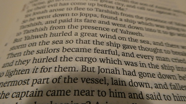
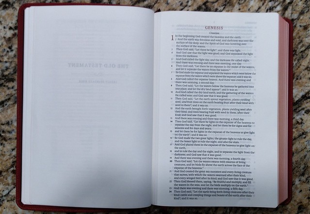
The text is in a single column, verse layout. Paragraphs are denoted by the verse number or a letter being bold. There are section headings in bold print. Page numbers are at the top center in read. Chapter numbers are in drop cap style and printed in red. This is a black letter edition. It is a text edition so there are no cross references or study notes. Italics denote English words that do not appear in the original languages, but are implied by them. An asterisk lets you know that the Greek verb was present tense, but rendered with an English past tense in order to conform with modern usage. Personal pronouns referring to God are capitalized where appropriate. Small caps are used when a passage from the OT is being quoted by someone in the NT, or when they are paraphrasing a citation from the OT. Brackets let you know you are looking at text that does not appear in the oldest collections of text, and probably were not in the original autoscripts.

All but the hardcover had art gilt page edges. For those who do not know what this is, it is a red pigment under the gold colored finish on the page edges. Like many book features today, they are decorative. This was not always the sole purpose of these features in the past. Spine hubs were where the signatures were sewn into cords in the spine. Head and tail bands were where the signatures were tied in. Art gilt page edges kept the moisture of a humid room from penetrating deep into the text block. You get the idea. Much of the decorative features were once functional.
If you have ever purchased a Shuyler Bible from evangelicalbibles.com, a premium E.S.V. or a premium Cambridge edition, you are probably already familiar with the quality of Bibles printed and bound by Jongbloed. If you have not seen, or held one of these editions, you should consider the investment. Expensive Bibles may seem like an extravagant expenditure to you, and they may be, depending on your budget. If you can afford one, it is a good investment. These Bibles will last a very long time if properly cared for. You could foreseeably hand this Bible down to your children, or grandchildren. Think about what it would mean for a believer a couple generations away, to be reading the very same Bible you held in your hands all of those years. They could read your notes, look at your underlines, and understand a connection to you, even though you went on to be with Christ years before they were born. I would love to have something like that from my grandparents.
My subjective opinion is that this Bible is of such similar quality to other Bibles produced by Jongbloed, and the price being comparable, there is no reason not to purchase one. Couple those facts with the fact that I believe the LSB will demonstrate that it is the new champ when it comes to communicating accurately the intended meanings of God the author, and you have a winner. I could go on about the paper, and the printing, and the high quality materials and manufacturing processes, but the real star here is the accuracy of the LSB translation itself. The men at Master’s have done a fine job, and I plan on scrapping all of my other daily use Bibles to replace them with LSB editions as they become available. I am looking forward to a thinline for carrying around, a MacArthur study Bible, and a full cross reference large print. In conclusion, visit 316publishers here, and go buy one that fits your budget, and get to reading!
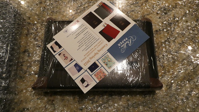
Don’t forget to look at my flickr albums for these editions for more detailed images.

The review was complete with regards to the physical quality of the bible itself but gave me no reason to try the translation itself. WHY does it communicate so well? What sets it apart from the NASB 1977 or 1995, for instance!
LikeLike
I had addressed those issues in other reviews, and articles previously. In short, the translation is based on the ’95 NASB. It is an attempt to make an accurate version, even more accurate. Some translation conventions were replaced, and in my opinion, more accurate interpretation has been done. All translation work, also includes interpretation. This can be be biased. For instance, the NRSV stated in the translation philosophy that the translators would work to make the translation gender inclusive. They often did this contrary to what the Hebrew, or Greek actually said. In the LSB’s case, the translators interpretation was focused on remaining true to what was intended, as much as they could possibly do. You can read their translation philosophy here, https://lsbible.org/foreword/ Here is a short excerpt, “Principles of Translation
Key Principles: The Legacy Standard Bible has worked to uphold the style and translational choices of the NASB as much as possible. Even more, it has endeavored to follow through on the NASB’s stated intent to be true to the original Hebrew, Aramaic, and Greek. While the interpreter, teacher, and pastor have the goal of understanding what the text means, the translator is to provide them with what the text says. Consistently, the goal of this translation is to be a window into the original text. Within that goal, this revision has focused upon accuracy and consistency. It has checked that words and grammar have been carried over properly. It also established rules for the consistent translation of terms within their various nuances. This allows the reader to more easily reconstruct what the original texts said. It also helps the reader more easily trace the flow of argument within a text, identify when the same word is used in another passage, and make connections between texts.
There are limits to the application of this philosophy. In this edition,
a word might not be translated consistently in order to maintain a highly familiar rendering of a text or to preserve a word play in the text that advances the inspired author’s message. Moreover, because Scripture is a literary masterpiece, some linguistic features could not be transferred to this translation, not even by a note. Nevertheless, ensuring that the original languages are precisely rendered paves the way for careful readers to discover these insights for themselves.
In this way, the LSB upholds the philosophy that a translation does not replace pastors or teachers but rather depends upon faithful believers and the church to study and live out what has been written (Acts 8:30-31). Translation is a tool for the church and must be done in that context so that each word of Scripture may be taught and lived.”
One of the most notable changes is in the use of, “Yah” and “Yahweh” instead of the small uppercase word, “LORD.” The convention of, “LORD” instead of using what is there in the Hebrew text necessitates adding a definite article to the English sentence that isn’t there in Hebrew. As a result of removing this convention, reading the Psalms is notably more personal.
That being said, not every choice they made makes sense, unless you remember that they are trying to also stay close to the NASB. All in all, I think it is the best modern English translation to date.
LikeLike