I was in the market for a compact edition, and as it turns out, Three Sixteen Publishing has released a compact edition. I found one I liked in an edge lined, navy blue, goatskin leather.
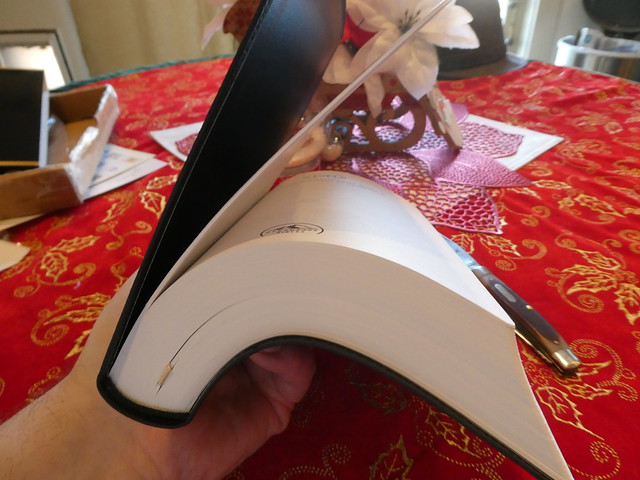
As you can see from the photo, it is pretty compact. I was surprised that the font was still larger than that of the Cambridge Pitt Minion Bibles, and much easier to read. The Pitt’s font is 6pt. The Compact edition LSB is 8.5pt. This makes a significant difference.
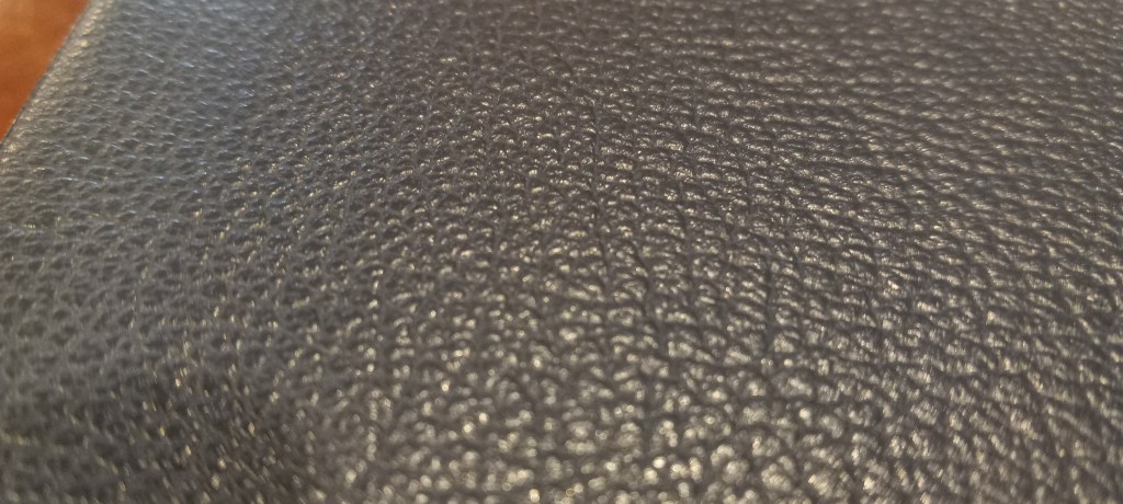
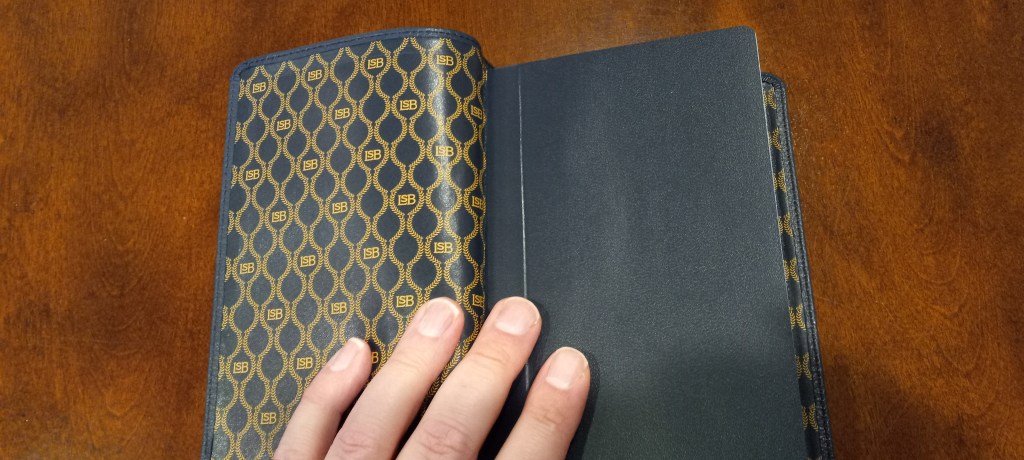
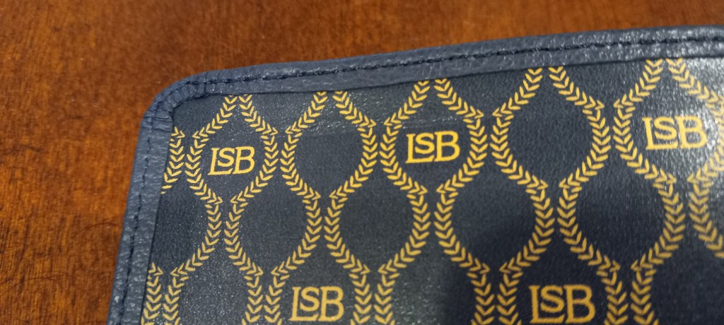
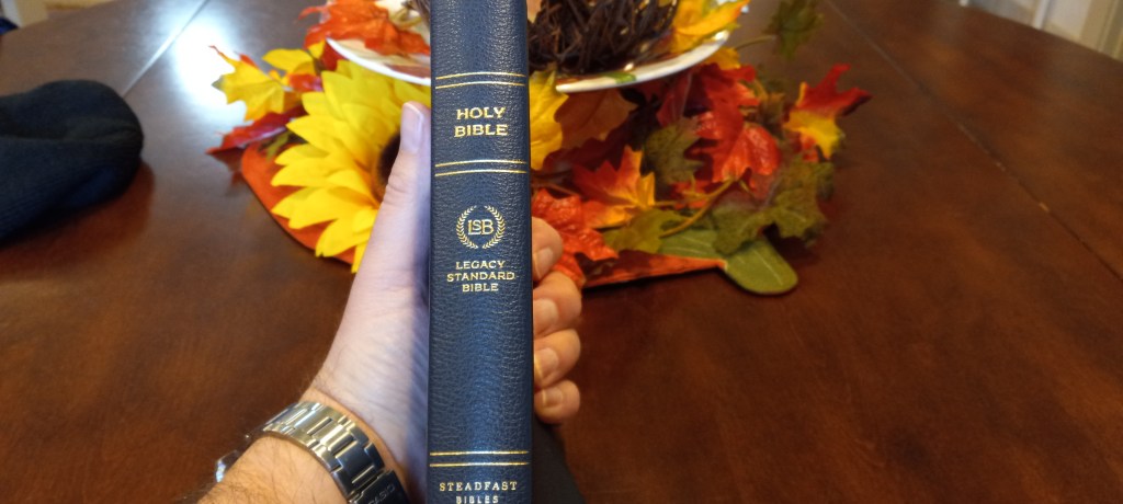
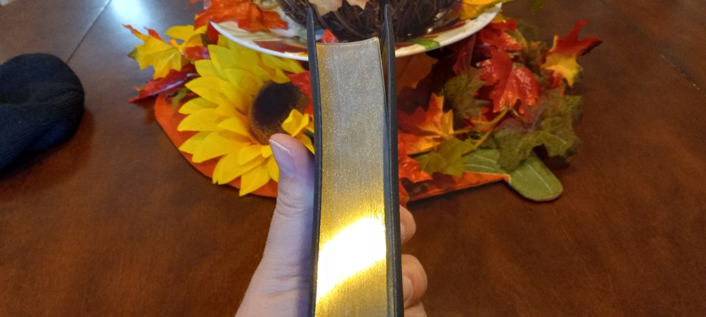
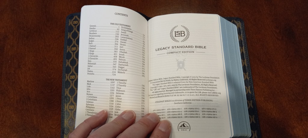
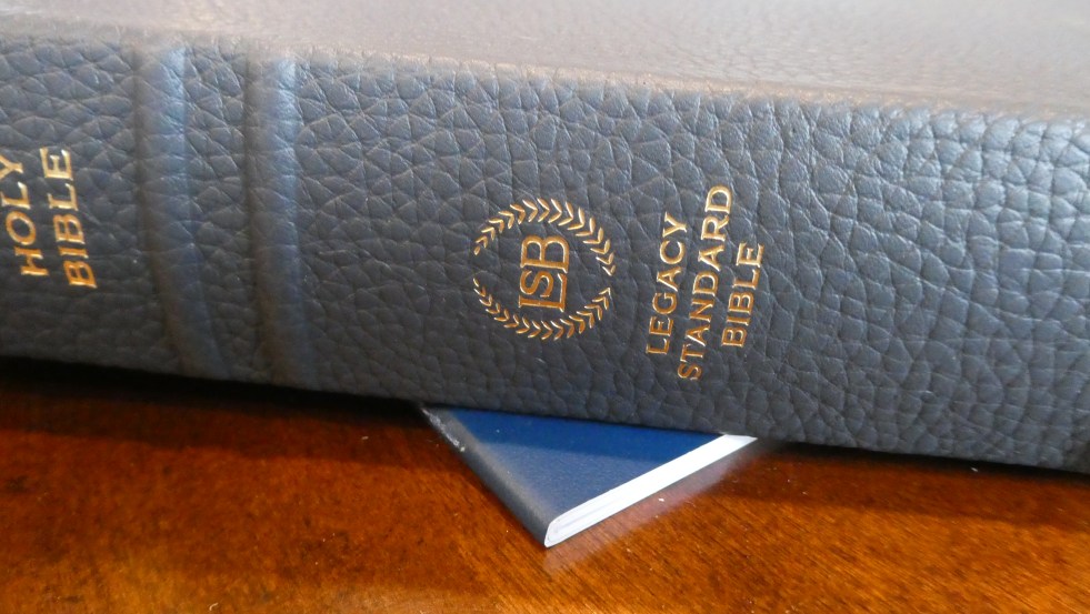
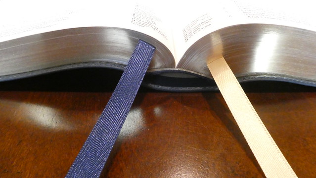
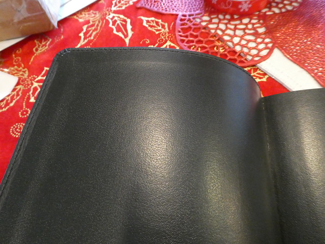
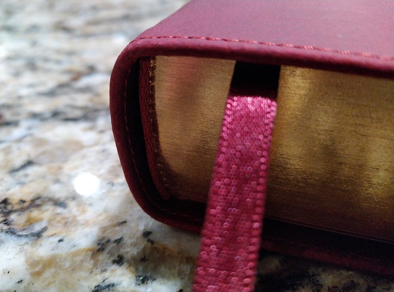
The font is laid out in a two column, paragraph format. It is printed on 28 g.s.m. paper. The cover is pretty soft, and flexible goatskin leather. The edge lined binding, as well as the smyth-sewn spine, also aid in that regard. The inner cover is cowhide, and has the gold colored LSB logo printed on it. The head, and tail bands match the color of the navy blue cover. There are two ribbon markers. One is blue, the other is gold.
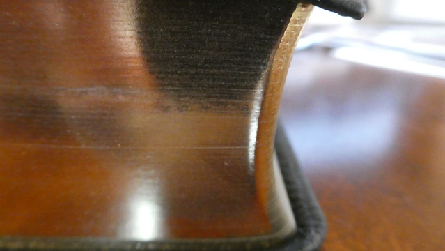
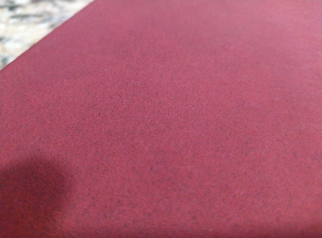
The page edges look more silver than this photo shows.
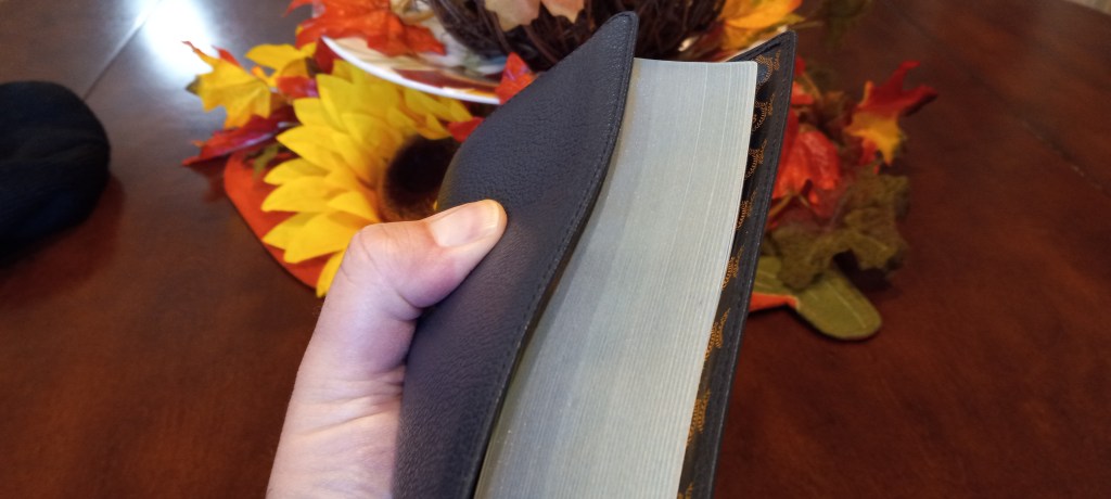
The page edges are blue under silver, and the corners are rounded.
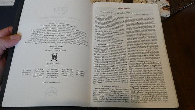
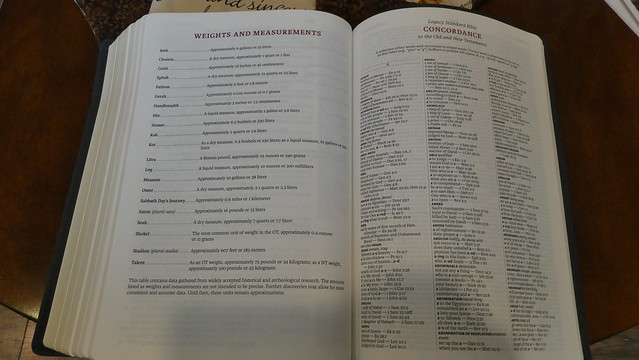
I preordered this edition when the option became available, and have been patiently waiting for it to arrive. I am also waiting for other editions to be published. I know that many people don’t use the cross references often, but I do like to have them in my daily reader. I am hoping for the MacArthur Study Bible in LSB to be announced one of these days. I know it is a matter of time. This Bible isn’t as large as the Large Print, Wide Margin edition, but it feels like it weighs about the same. It is not a light Bible. I have to say, I’m really enjoying the blue cowhide leather cover. The grain of the leather is more pronounced. It hasn’t got the ironed leather look. The perimeter of this edition’s cover is sewn. That should keep it from coming unglued at the corners, since we are talking about a case bound edition here. The corners, as well as the spine are rounded. The spine is smyth-sewn for durability, and flexibility. There are 5 raised spine hubs. “Holy Bible” is hot stamped in gold colored foil on the spine along with the logo for the LSB, and the publisher’s name at the bottom. I did notice some odd markings on the page edges. It looked like someone at the factory tried to repair some spots where the page edge gilt may have been damaged, or misapplied. There were also some minor dings in the page edges. In the Facebook group, another person mentioned the same problem with his Bible. (I hope, once they get the production procedures practiced, the quality control will get better. I sort of expect quality control problems with a new translation being published in South Korea. The Berean Standard Bible is printed, and bound in the USA, and doesn’t seem to have these problems It also costs much less. I wonder why 316 went with a Korean printer instead? Perhaps the American one couldn’t do the volume they needed?) There are 2 ribbon markers, that are nice quality, and the ends have been seared. The head and tail bands are blue to match the cover, and one of the ribbons. 40 g.s.m. paper is terrific! I love the paper. There are 14,000 translation footnotes. This is helpful for the language geeks like me. We want to know. The concordance is a nice addition. It has over 16,000 entries. The font is nice and legible at 11 pts. for the scriptures, and smaller for the references. This is a black text edition, with red titles, headers, chapter, and page numbers. The text is line matched with the text on the reverse side of the page for eye comfort. This is a single column, verse format Bible with the cross references in the inside column between the gutter, and the text column. There are some maps at the very back. I am very pleased that they included a storage box for this edition. It is the best way to keep a Bible protected when not in use. All in all, this is a really nice edition. This translation is, in my opinion, the best modern English translation to date. I am hopefully looking forward to more editions. 316 also included a lapel pin, and a daily planner with this Bible purchase. I have pictures of the planner on my Flickr page along with more pictures of this edition. Click the link to check them out.
Here are some pictures that highlight the features I mentioned. If you click the album link above, you can see the high resolution pictures instead of these lower resolution ones.
Instead of writing about a feature, and then having a photograph inline, I’m changing it up a bit. I’ll have the write-up of my impression of this edition, and all of the photographs will be after. So if you simply want to look at the pictures you can skip all the text… You weren’t really going to do that were you? I mean… Seriously? You want to just look at pictures… Okay, I tend to do that too, but if you do want to know what I think about this edition, continue reading.
The LSB is, in my opinion, the best modern English translation of the Bible to date. I’m purchasing all new resources to go along with this translation. The two column, verse format LSB, is the first edition of the LSB that is actually quite portable. The double column, verse format, is one of my favorite Bible layouts of all-time. This one lacks some of the fancier features, but for dragging around with me wherever I go, it is perfect. I’m also pretty jazzed that it isn’t made in China.
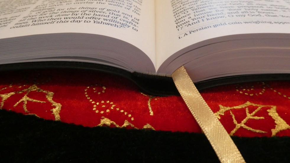
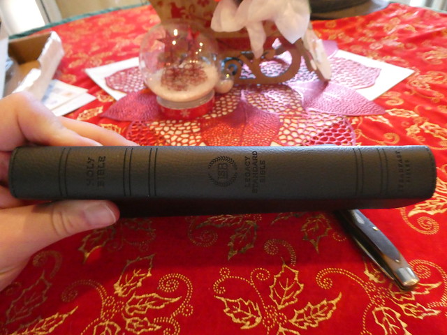
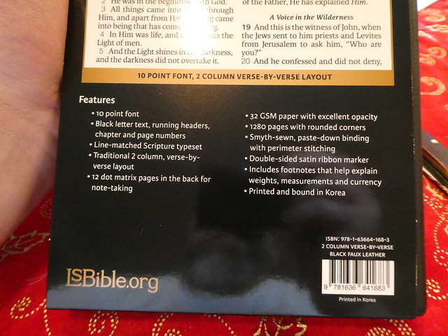
It is printed, and bound in South Korea. Not only do you get the great double column verse format layout, you also get 32 g.s.m. paper, 10 pt font, line-matching, double sided ribbon marker, perimeter stitching, head and tail bands, section headings, rounded page corners, and a rounded smyth-sewn spine. I know, you all wanted to see an edge-lined, goat skin leather edition, but we don’t always get what we want, nor should we. We get what we need… Now, for your reward for reading my opinion, some pictures of this Bible I drew using a camera…
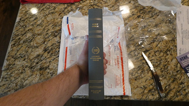
As many of you know, we have been waiting for orders of this edition to ship. Some of us had per-ordered it in August of 2020. The one I ordered finally arrived. I knew what to expect from Jongbloed (Youngblood) as I have reviewed several premium editions over the years passed. All of them were printed and bound by Royal Jongbloed in the Netherlands. This edition did not depart from that standard set by Jongbloed in the past.
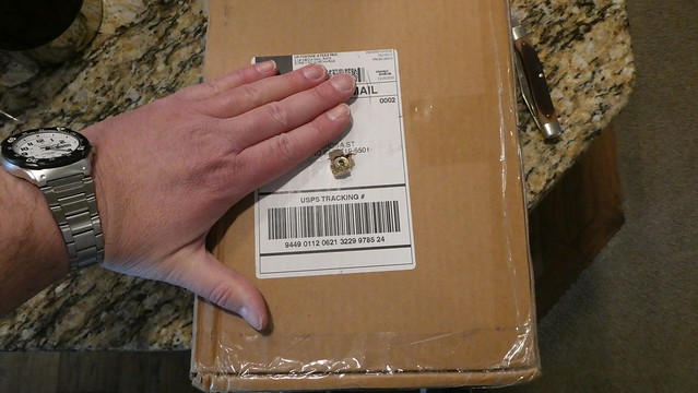
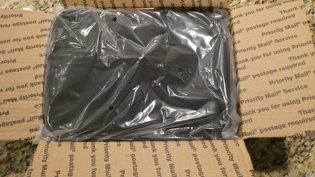
This edition was shipped in a cardboard shipping box via the U.S.P.S. The hardcover comes in a bubble envelope. The cowhide paste-down came in a smaller box. The goatskin edition arrived undamaged, and in perfect condition. The Bible was packed along with the Bible Armor carrying case. The package was cushioned with brown paper. The Bible Armor was in a plastic bag. The Bible was bubble wrapped. It was also wrapped with two paper bands, as is usual with premium goatskin edge-lined Bibles. These bands keep the supple leather from becoming deformed, and in the case of a semi, or full, yapp they keep them bent in to the text block. In times past, full yapp covers kept the text block protected. Keep in mind, these Bibles should never be stored vertically on a shelf! Never! When can you store them vertically on a shelf? NEVER! Glad we got that straight.
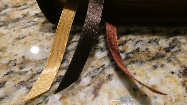
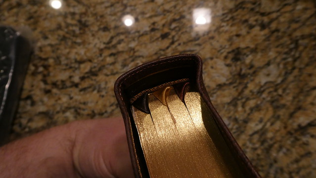
The text block is the same one used in the hardcover, and cowhide Bibles. There are two cowhide options. You can purchase the edge-lined, or the case bound edition. The hardcover’s text block does not have rounded corners. It comes with two ribbon markers. The Cowhide Bibles, and the goatskin have rounded corners. They all have rounded spines. The hardcover, and the cowhide paste-down/case bound Bibles have the narrower 1/4” ribbon markers. The two edge-lined editions come with three of the wider 3/8” ribbon markers.
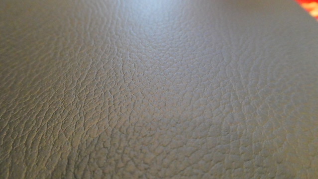
The covers are dramatically different in tactile experience as well as smell. The edge-lined goatskin of course is the most supple. The paste-down cowhide is comparable to a Cambridge calfsplit leather. The surface is not as glossy and smooth. The leather editions all smell like… leather. What did you expect?
Each edition comes with head and tail bands that match the covers. The edge-lined ones have five spine hubs. The paste down and hardcover have gold colored foil heat stamped lines where the hubs would have been. All of them have, “Holy Bible, LSB Legacy Standard Bible, Steadfast Bibles,” heat stamped in gold colored foil on their spines. All of them have smyth-sewn spines. They all employ a 9.5 point font, that is line matched. That means that on the page facing you the text is printed directly over the unturned pages text so that the lines of text line up over one another. This helps reduce eye strain while reading, and helps if you are prone to headaches while reading for prolonged periods of time. Since these editions are printed on a cream colored french milled 32 g.s.m. Bible paper as well as having line matching, and modern printing, they are all a pleasure to read regardless of which edition you decide to purchase. From the value of the hardcover to the suppleness of the premium goatskin cover, you’ll enjoy the same text block. This text block is something you have to see. Finding this quality in a $40 Bible is very uncommon.
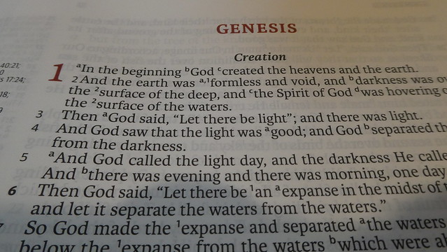
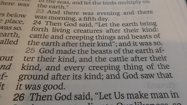
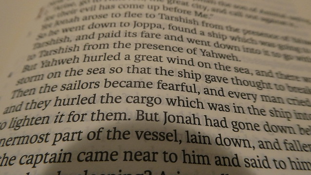
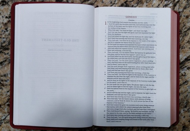
The text is in a single column, verse layout. Paragraphs are denoted by the verse number or a letter being bold. There are section headings in bold print. Page numbers are at the top center in read. Chapter numbers are in drop cap style and printed in red. This is a black letter edition. It is a text edition so there are no cross references or study notes. Italics denote English words that do not appear in the original languages, but are implied by them. An asterisk lets you know that the Greek verb was present tense, but rendered with an English past tense in order to conform with modern usage. Personal pronouns referring to God are capitalized where appropriate. Small caps are used when a passage from the OT is being quoted by someone in the NT, or when they are paraphrasing a citation from the OT. Brackets let you know you are looking at text that does not appear in the oldest collections of text, and probably were not in the original autoscripts.
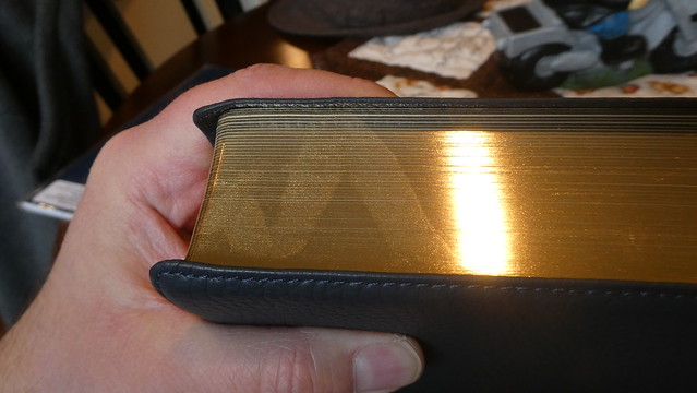
All but the hardcover had art gilt page edges. For those who do not know what this is, it is a red pigment under the gold colored finish on the page edges. Like many book features today, they are decorative. This was not always the sole purpose of these features in the past. Spine hubs were where the signatures were sewn into cords in the spine. Head and tail bands were where the signatures were tied in. Art gilt page edges kept the moisture of a humid room from penetrating deep into the text block. You get the idea. Much of the decorative features were once functional.
If you have ever purchased a Shuyler Bible from evangelicalbibles.com, a premium E.S.V. or a premium Cambridge edition, you are probably already familiar with the quality of Bibles printed and bound by Jongbloed. If you have not seen, or held one of these editions, you should consider the investment. Expensive Bibles may seem like an extravagant expenditure to you, and they may be, depending on your budget. If you can afford one, it is a good investment. These Bibles will last a very long time if properly cared for. You could foreseeably hand this Bible down to your children, or grandchildren. Think about what it would mean for a believer a couple generations away, to be reading the very same Bible you held in your hands all of those years. They could read your notes, look at your underlines, and understand a connection to you, even though you went on to be with Christ years before they were born. I would love to have something like that from my grandparents.
My subjective opinion is that this Bible is of such similar quality to other Bibles produced by Jongbloed, and the price being comparable, there is no reason not to purchase one. Couple those facts with the fact that I believe the LSB will demonstrate that it is the new champ when it comes to communicating accurately the intended meanings of God the author, and you have a winner. I could go on about the paper, and the printing, and the high quality materials and manufacturing processes, but the real star here is the accuracy of the LSB translation itself. The men at Master’s have done a fine job, and I plan on scrapping all of my other daily use Bibles to replace them with LSB editions as they become available. I am looking forward to a thinline for carrying around, a MacArthur study Bible, and a full cross reference large print. In conclusion, visit 316publishers here, and go buy one that fits your budget, and get to reading!
Don’t forget to look at my flickr albums for these editions for more detailed images.
Here is just one interesting translation choice the translators of the Legacy Standard Bible (L.S.B.) made that I think is an improvement. I have found many so far.
1995 New American Standard Bible (N.A.S.B.)
2020 New American Standard Bible (N.A.S.B.)
English Standard Version (E.S.V.)
Legacy Standard Bible (L.S.B.)
Exodus 4:21
21 The LORD said to Moses, “When you go back to Egypt see that you perform before Pharaoh all the wonders which I have put in your power; but I will harden his heart so that he will not let the people go.
And the Lord said to Moses, “When you go back to Egypt, see that you perform before Pharaoh all the wonders which I have put in your power; but I will harden his heart so that he will not let the people go.
And the LORD said to Moses, “When you go back to Egypt, see that you do before Pharaoh all the miracles that I have put in your power. But I will harden his heart, so that he will not let the people go.
And Yahweh said to Moses, “When you go to return to Egypt, see to it that all the miraculous wonders which I have put in your hand, that you do them before Pharaoh; but as for Me, I will harden his heart with strength so that he will not let the people go.
The italic formatted text in the LSB is used to denote English words that do not appear in the original language texts, but are implied by them.
The first thing you’ll notice is that the LSB uses Yahweh for the tetragrammaton instead of the conventional, “LORD.” This is a more accurate translation. I understand why it wasn’t changed sooner, but I am glad to see that it has finally happened. This was a bold and encouraging move.
The next thing you’ll see is that the other translations read, “…When you go back to Egypt…” The LSB uses, “…When you return to Egypt…” This may seem like a distinction without difference, but I appreciate the effort to be as accurate as possible. I think we would all infer that the implication of, “to go back” is that Moses is going back to Egypt, and that it was there that he had come from. Even so, “return” removes all doubt that this is what was meant.
The hand and a man’s work, or what he is doing, are related in Hebrew. An open hand can even mean power like יָד yâd earlier on in the verse. So seeing the connection here we can understand why the other translations went with, “…put in your power…” Since the LSB uses, “… put in your hand…” we can see the correlation directly from the text without the necessity of getting the concordance, and Hebrew lexicon out. Again, there is nothing wrong with the other translations.
This is the section that really gets me. I am starting to love the LSB. Instead of, “…but I will harden his heart …” The LSB uses, “… but as for Me, I will harden his heart with strength…” I may be wrong. I’m not a Hebrew expert, but from what I can gather there is an implication of strength or fortification in Hebrew word חָזַק ḥâzaq that is lost in the other English translations. The LSB puts that intended meaning back into the text. To back up just a bit, I also like how the first part of the sentenced is phrased as well. In English we always capitalize, “I.” When you capitalize personal pronouns in a translation to denote deity, and the letter, “I” is always capitalized it can perhaps cause a bit of confusion. By phrasing it the way they did, they kept the meaning, and helped the reader understand that it was God doing the hardening.
I am really enjoying this translation, and hope that you will order yourself an LSB. Here is the link to 316publishing.com where you can order one. They are the sole retailer of this translation.
I preordered this Bible when I found out it was going to be published. Three Sixteen Publishing/Steadfast Bibles sells it on their site. Master’s Seminary in California, connected with John MacArthur, got permission from the Lockman Foundation to tighten up the translation a bit. I think this was an admirable goal, as I believe the 2020 NASB to be heavily influenced by Zondervan. Zondervan is a major licenser of the NASB from Lockman. I think the 2020 is not as good as the 1995. After looking the LSB over, I can say, I still have some questions about certain translation choices. The LSB does use Yah, and Yahweh, in place of the small uppercase LORD that has been adopted as a convention. Of course in the New Testament where kurious was used, it remained Lord, obviously. I’m sure that will make some cult members mad. I’m not a Hebrew Roots guy, nor am I an Assemblies of Yahweh cult member. I do like the more accurate translation. Doulos has been translated as slave, just like they said it was. My problems with certain choices in translation are few, and not very significant. I just find the translation choices in certain parts to be curious. I would have liked to ask why they did certain things. I was wondering why they didn’t translate Christos as anointed. There was also a spot (I can’t remember where it was now) that inserted the word Jesus into the text, even though in Greek, Insous wasn’t there, but to make the sentence make sense, considering English sentence structure, and context, Jesus was added. It was obvious from the information that was there that the verse was something that Jesus was saying. I guess I was hoping for less italicized words, and an even more strict translation. That being said, it is still a very good translation. So far, I would put it up there with the 1977, and 1995 NASB translations.
The Bible I purchased was printed and bound by Jongbloed in the Netherlands. It is every bit as good as a Schuyler, or Crossway premium that Jonglboed produces.
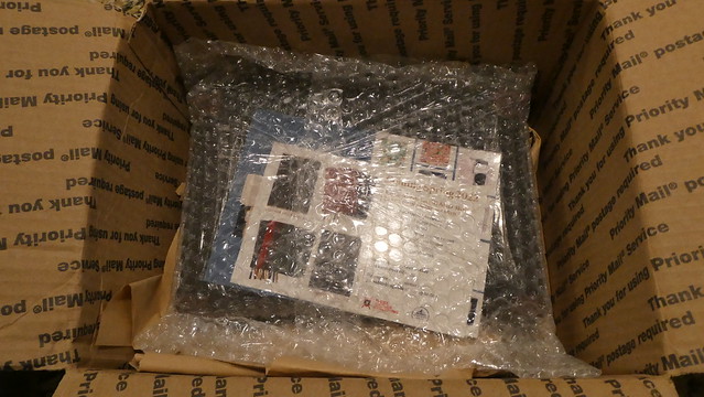
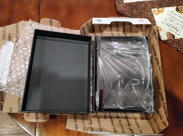
It arrived undamaged, and in a shipping box. Inside that box was a 2 piece box that is pretty well constructed. It should keep your Bible safe for many years.
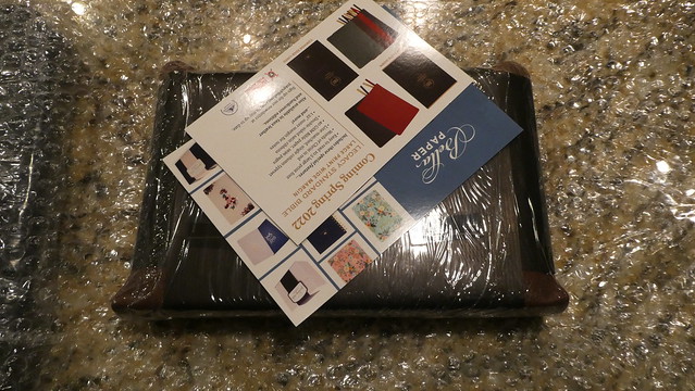
As you can see, it was also shrink wrapped in plastic, and double banded with black paper. I unwrapped it before I thought to take pictures. I wasn’t planning on doing a review. Since I was excited to get it, and unwrapped it, I had to kind of put it back in the plastic, and paper bands to take some pictures.
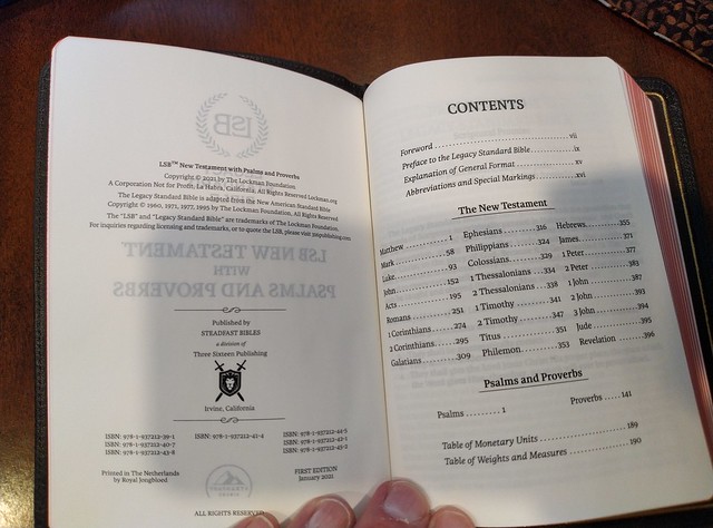
Here are some of the vital statistics from the publisher’s page;
Black letter editions only
Two-column verse-by-verse format
8.5 pt. font size
Line-matched Scripture text
French-milled, 32 gsm paper (same as our Preacher’s Bible Handy Size)
Sewn binding
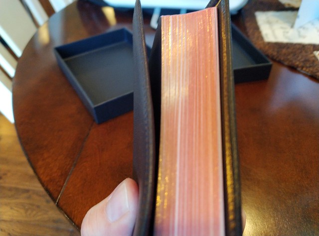
Gold gilding on page edges
Durable foil-stamped cover with perimeter stitching
2 sided satin ribbon marker, matching the exterior binding color
4.5 x 6.2 inches
640 pages
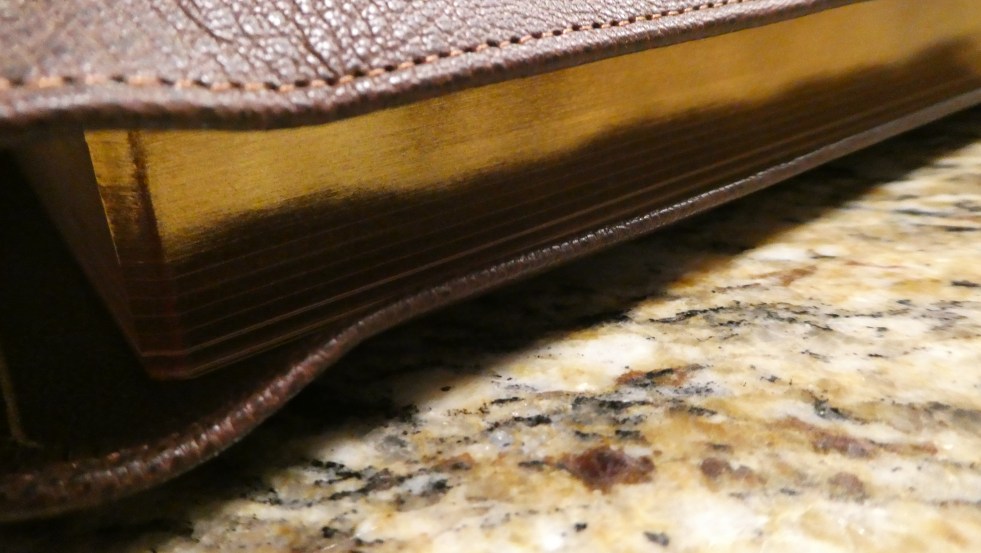
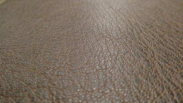
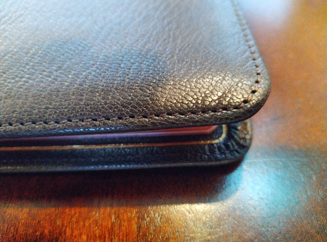
Like I said earlier, if you have had a Schuyler, or a premium Crossway, you can expect the same high quality. The cover is goatskin leather. I chose the deep brown. It is very supple. There isn’t much there as far as texture goes. It is not deeply pebbled. It is pretty smooth, and soft. The edge lined binding makes this Bible a joy to hold in the hand, and yes you can hold this Bible in one hand, and comfortably read it. The line matching, and 8.5pt. font add greatly to this.
The cover is perimeter stitched, and there is a gold perimeter line around the interior cover.
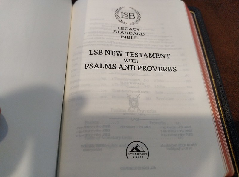
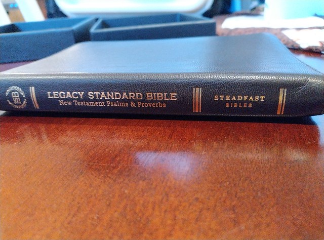
The spine is hot stamped with, “Legacy Standard Bible New Testament Psalms & Proverbs” It has the logo on the head, and, “Steadfast Bibles” on the tail. The page edges are art gilt. Not simply gilded. The less expensive editions are probably the ones that are simply gilded.
It is a black letter edition, with a double column layout, in verse format. There are no cross references, footnotes, or any other helps/features in this edition. (No maps or concordance) The idea for a N.T. edition like this is portability, and readability. An elder on the go will be well served by this design.
You can check out the rest of my pictures of this edition on my flikr album here.
If you’d like to purchase your own copy, you can do so here, 316 Publishing.