Crossway · Uncategorized

A Review of the E.S.V. Reader’s Gospels in Black Top Grain Leather Over Board Hardback Edition.

DSCN5970

Alright folks, with the recent release of the ESV 6 volume Reader’s set, I thought you might like to read a review about this Reader’s edition of the Gospels.  It would be a less expensive way for you to see if you want to shell out the bucks for the entire 6 volume set.  Maybe you don’t want the entire set, just the gospels?  Whatever the case may be, I offer this review up for your information and pleasure.

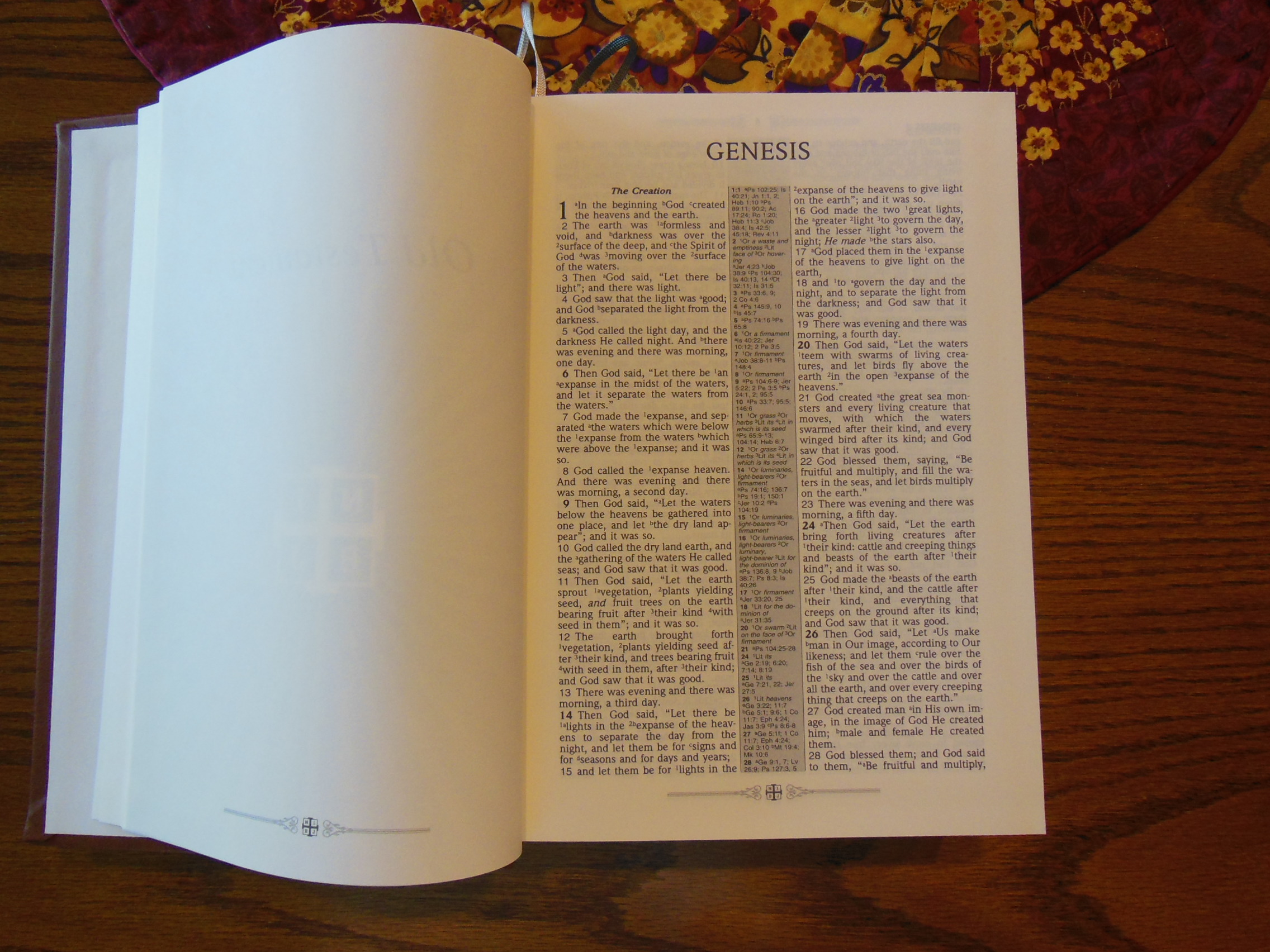
The Reader’s edition is an interesting concept.  There are no chapter or verse numbers.  There are no cross references or footnotes.  The paragraph format is done according to where new paragraphs would start in English.  The books are typically arranged other than that.  The only way to tell where you are in a book, is by using the index in the back in conjunction with the page numbers.  All of this is to accomplish the mission of a reader’s edition, to remove obstacles or impediments for the reader.

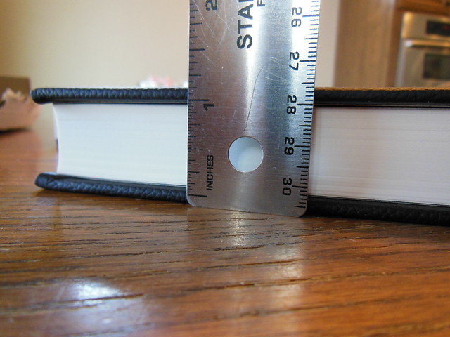
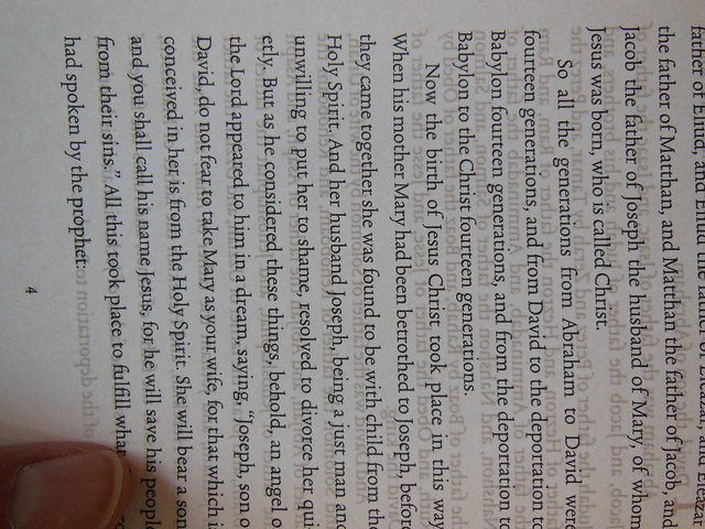
I find that as I read, I lose track of my progress.  I tend to read more in this volume.  Some of it is due to the lack of chapter and verse numbers, as well as the lack of cross references and footnotes.  While some of the other design and layout features contribute to it as well.  For instance, Crossway utilized a high quality, cream colored, uncoated, heavyweight paper more commonly seen in hardback novels.  It is 80 g.s.m. and you can hardly see through it at all.  The font is 12 pt. in size.  It is sharp and clear.  It is laid out in a single column.  This edition is truly meant to be read through like a book.  There is nothing in between you and the text.  I could go on and list all of the cool features of this edition, and I will, but I want to make sure you understand what the point is.  Reading and experiencing the gospels in a more fluid and retainable way was the goal, and Crossway achieved it.  Bonus is that there is no eyestrain, or headache after a long reading session.

So now that you know how accessible this makes the gospel, let’s look at some pictures and hear about some features of the construction.

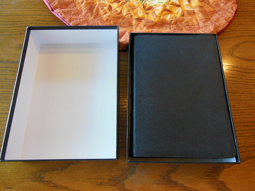
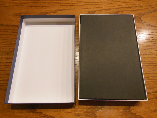
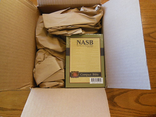
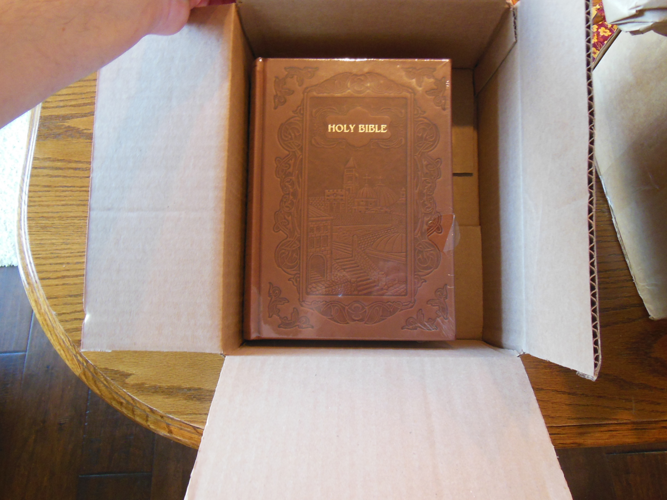
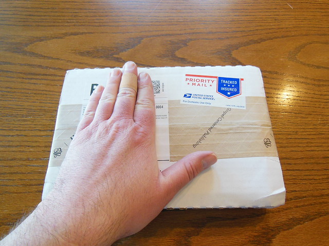
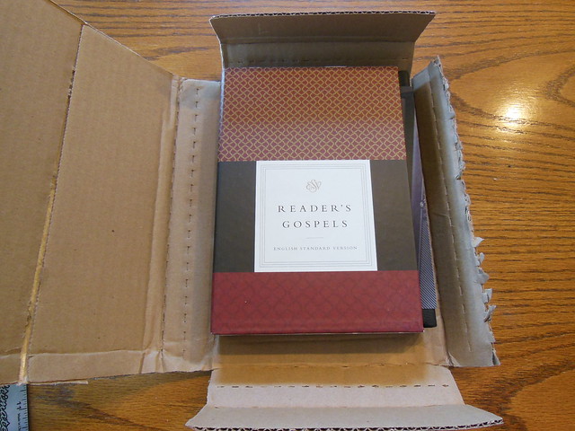
The Bible was shipped from Crossway, and well packaged.  It arrived undamaged.

DSCN5964

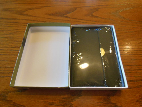
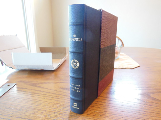
This volume comes in a nice heavy slipcase.  It is intended to be kept, and used for storing this volume in when not being used.

DSCN5965

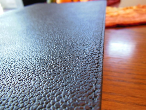
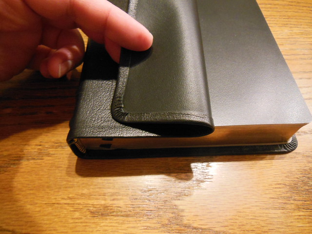
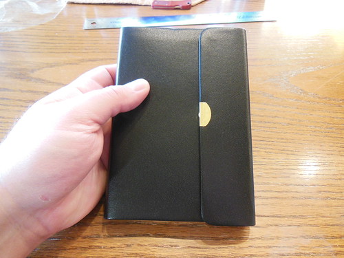
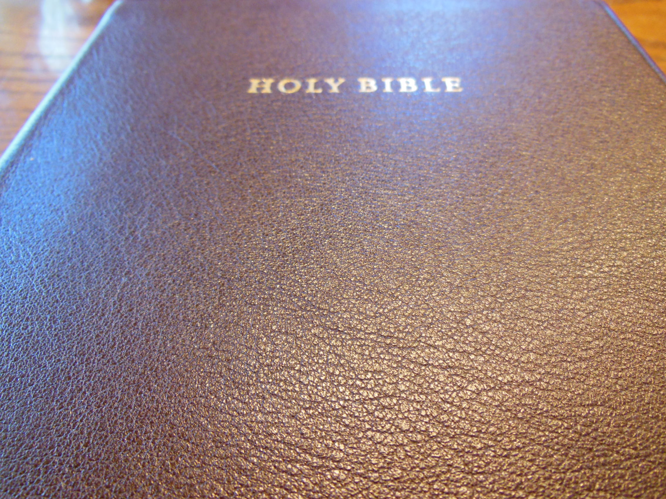
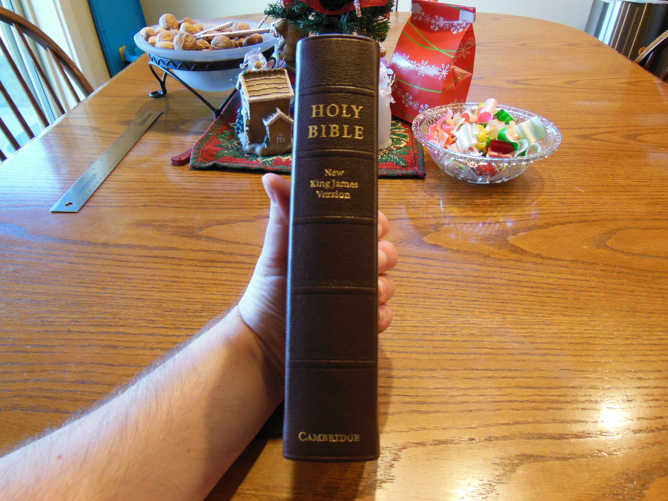
Once it is out of the box, the first thing you’ll notice is how soft the topgrain leather is.  If you don’t like leather over board, or if you want a Reader’s edition with a smaller price tag while retaining the same text block, you could get it with cloth over board.

Legatoria Editoriale Giovanni Olivotto or L.E.G.O. for short did a wonderful job printing and binding this book.  They are gaining some serious notoriety amongst quality book and Bible collectors here in the states.  Jongbloed in the Netherlands might have some competition in text block production if they don’t watch out 🙂

DSCN5984

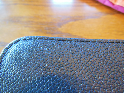
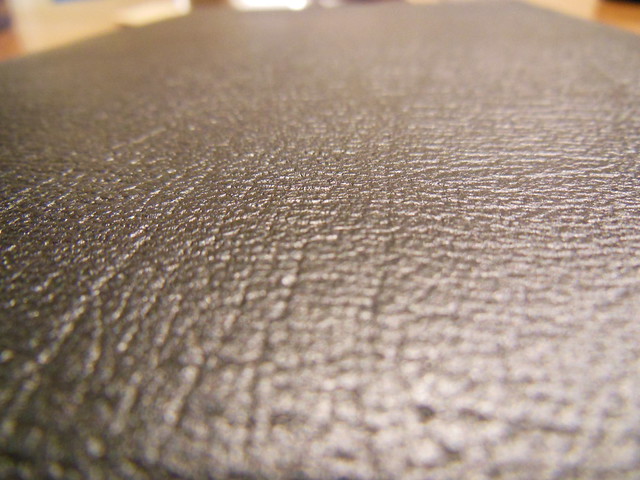
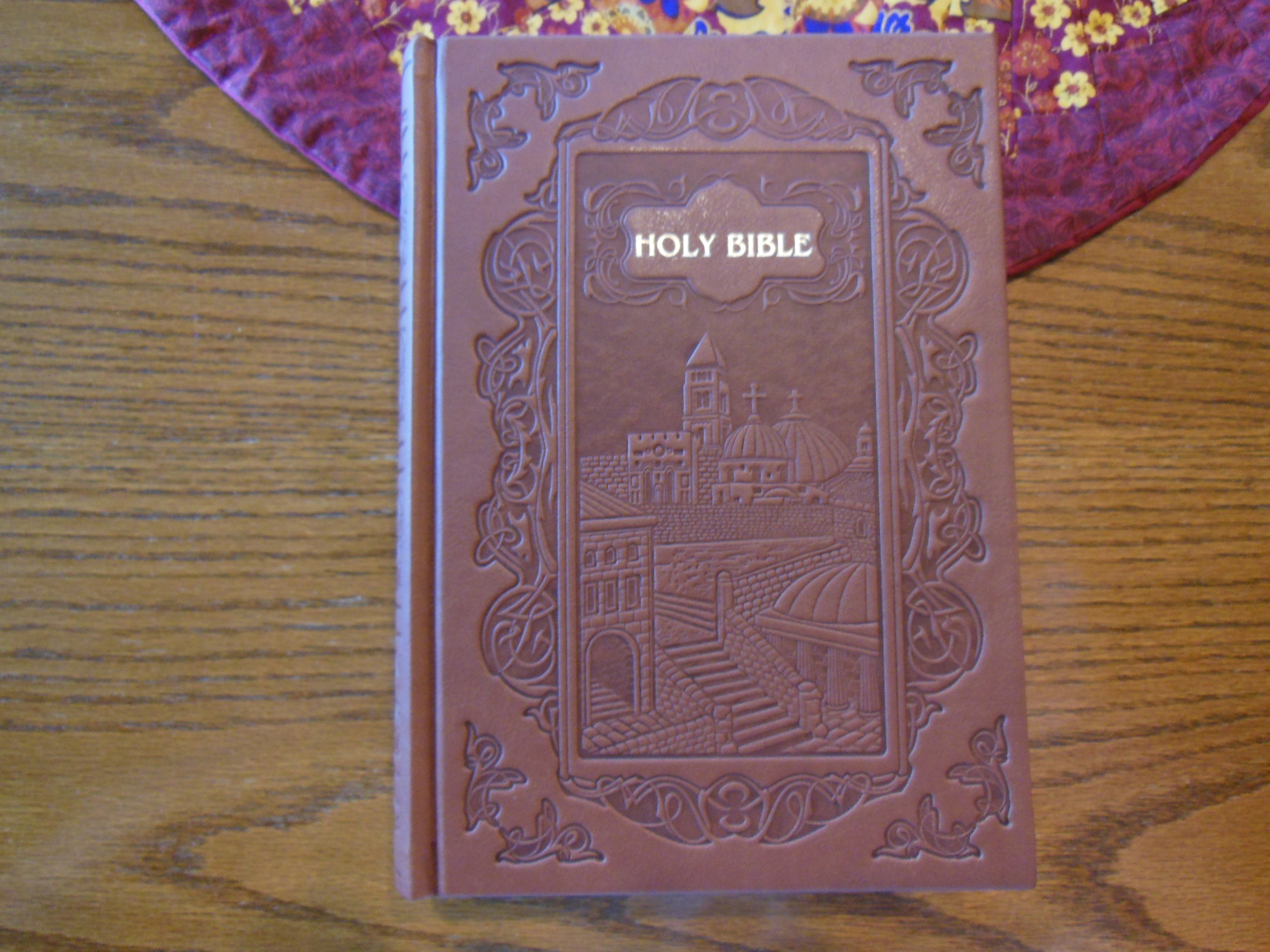
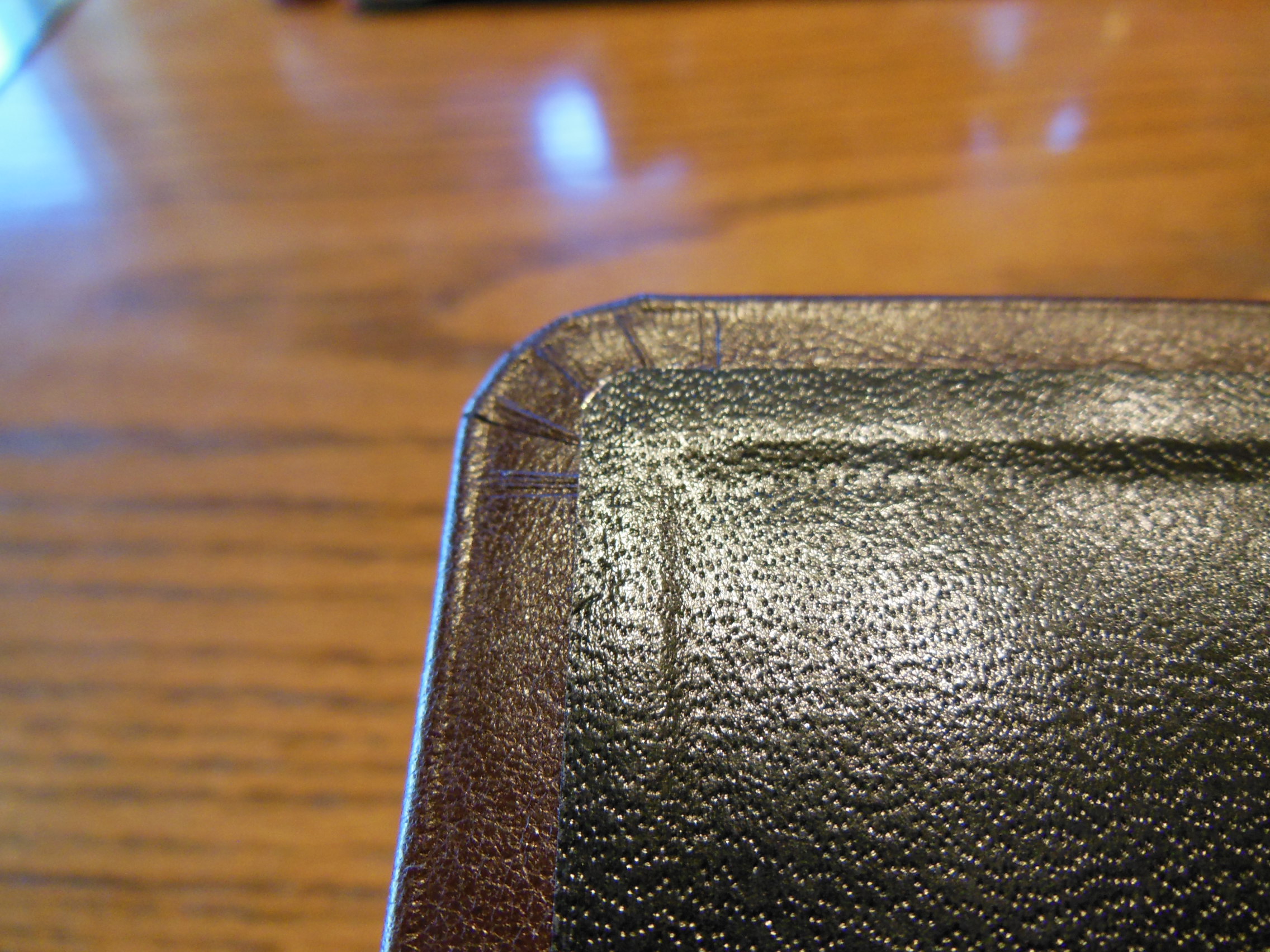
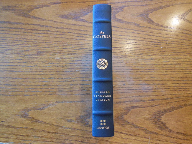
Here is a good close up of the cover.

DSCN5973

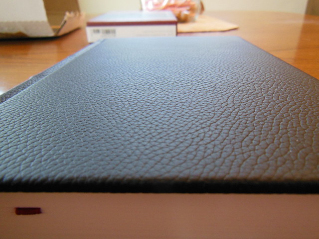
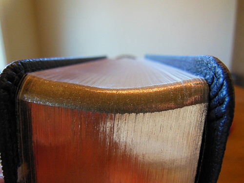
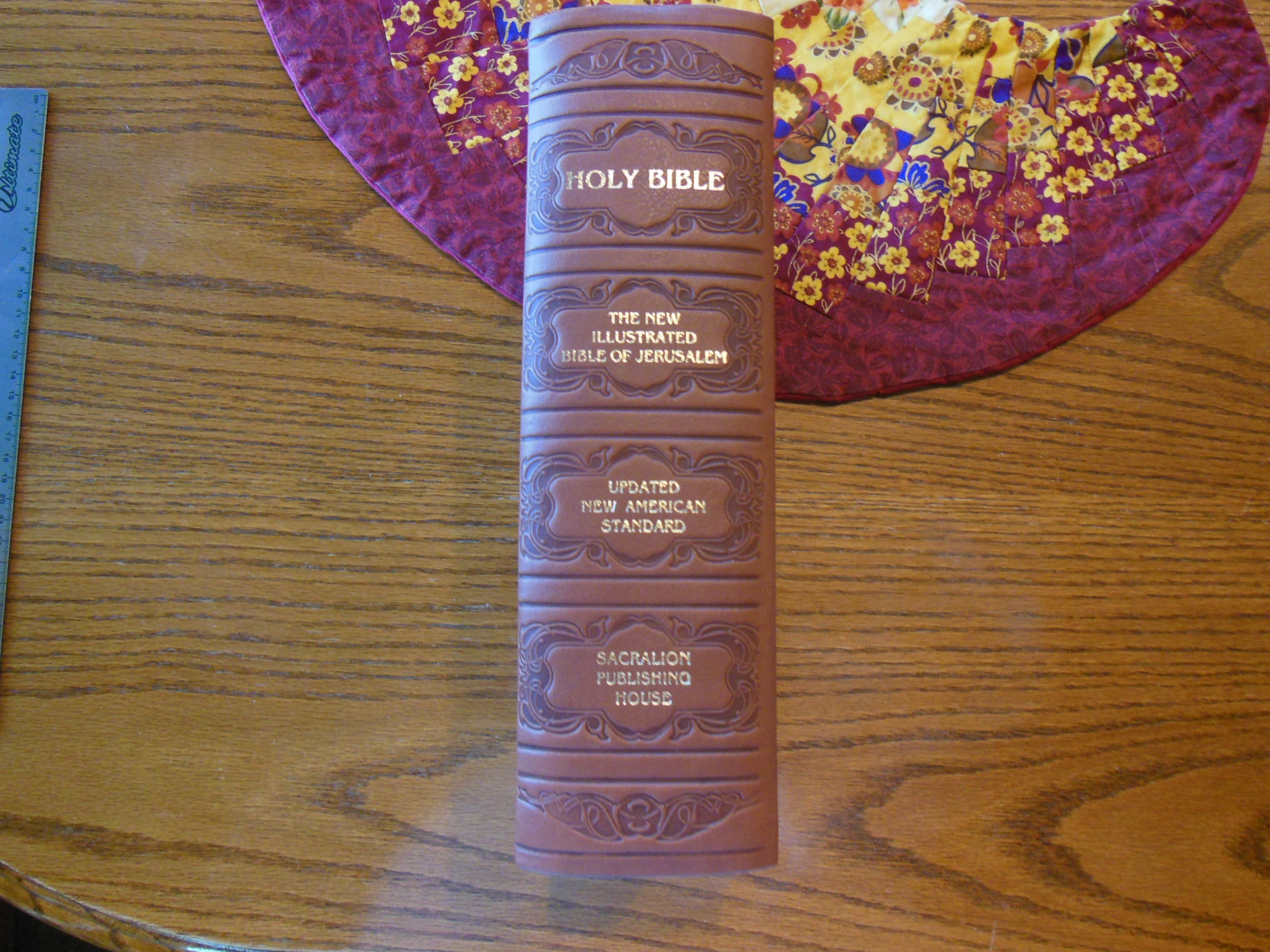
You’ll notice the page edges are not gilt.  There are decorative head and tail bands in gold and black.  The spine has, “The Gospels” at the head, the ESV logo below that, “English Standard Version” after that, and the Crossway logo at the foot in gold.  There are also four ornamental spine hubs.

DSCN5976

DSCN5979

DSCN5977

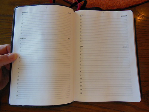
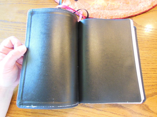
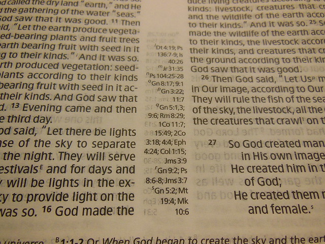
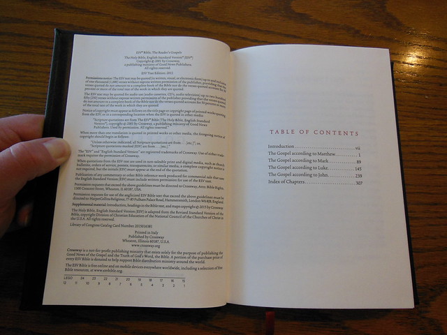
Here is a picture of the inside of this casebound hardcover.

DSCN5981

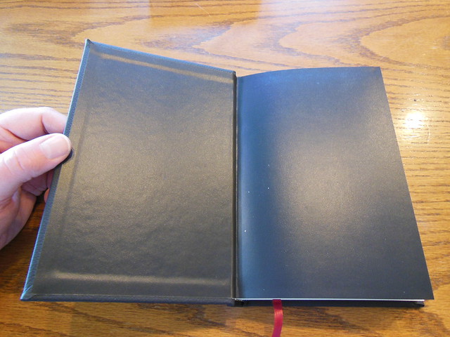
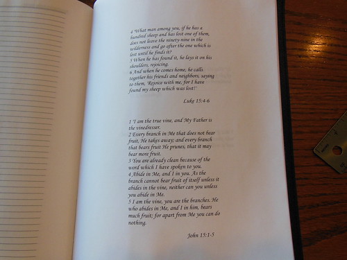
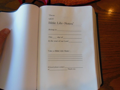
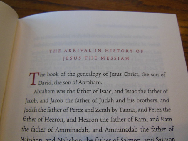
The book names, headings, and drop caps are printed in an appealing red text.

DSCN5988

DSCN5990

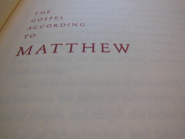
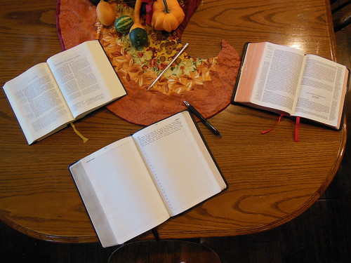
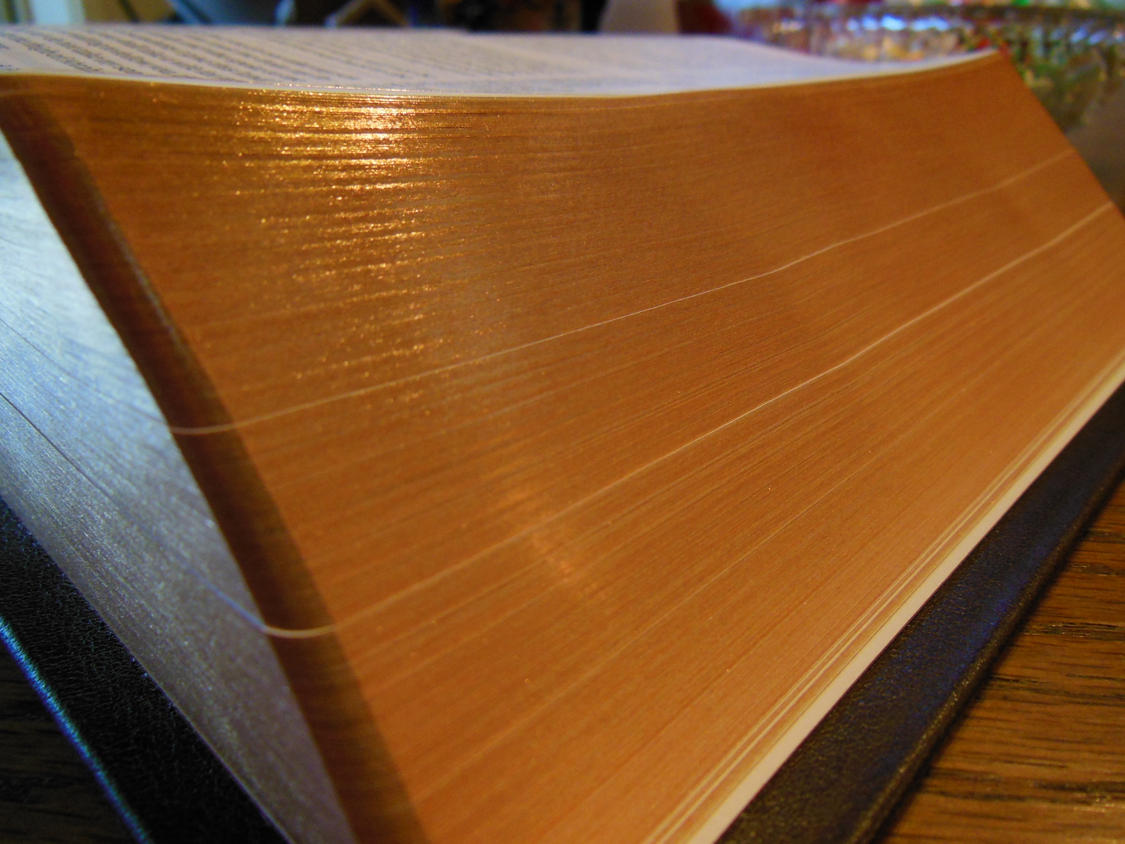
I took a picture of one page, separate from the others, and with light behind it so you could see how thick and opaque it is.  I’d never heard of Munken Premium Cream woodfree paper before, but after seeing it I’m sold.

DSCN5994

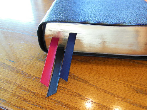
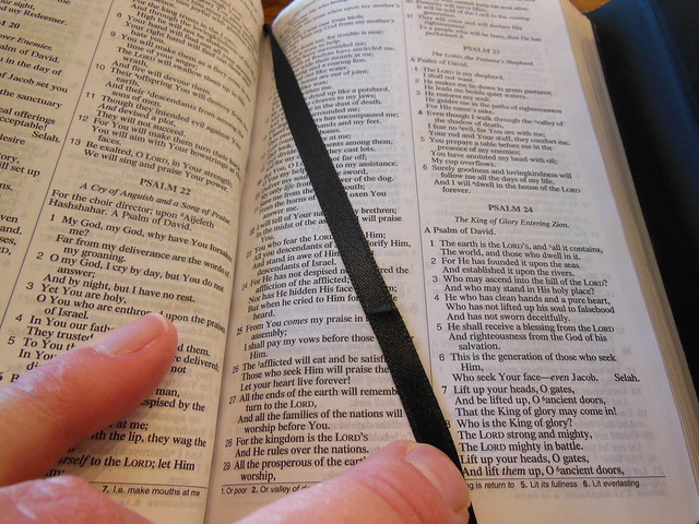
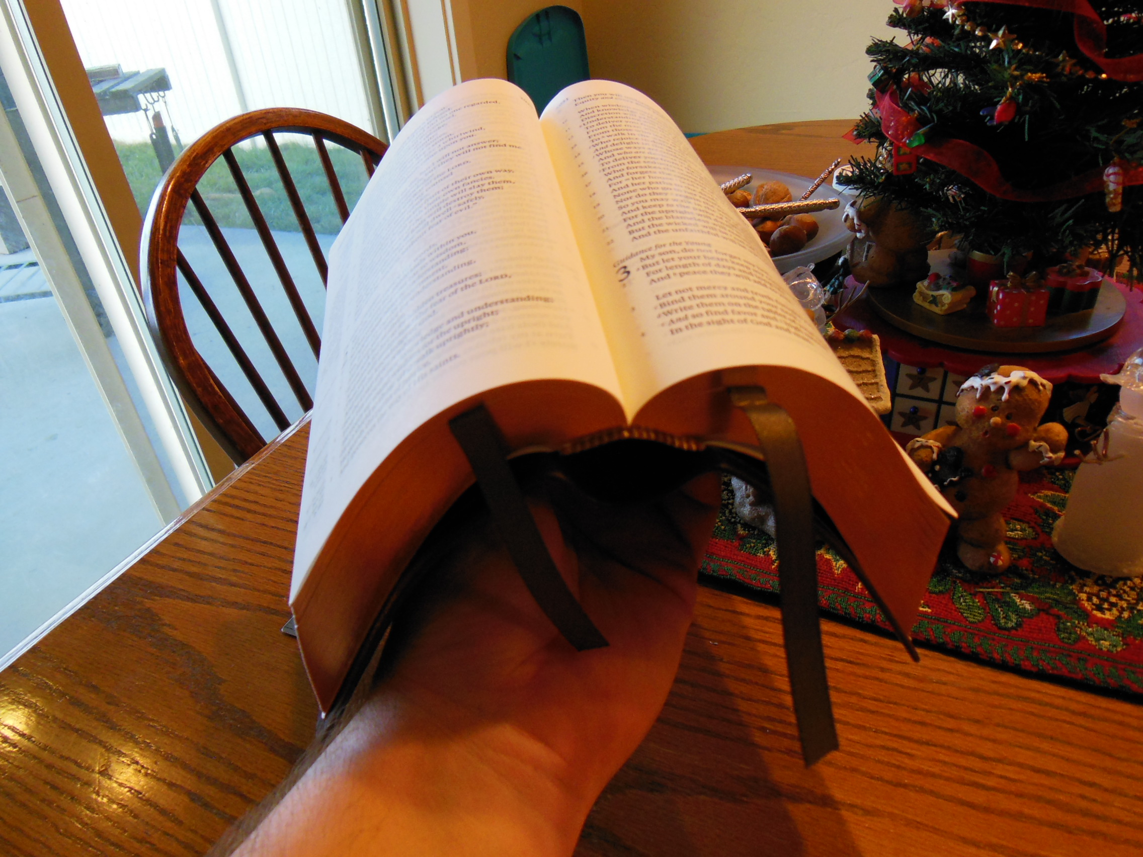
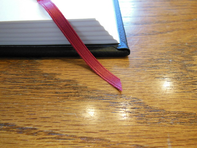
Here is another picture of the wonderful paper, 12 pt. font, and the crimson colored ribbon marker.

DSCN5996

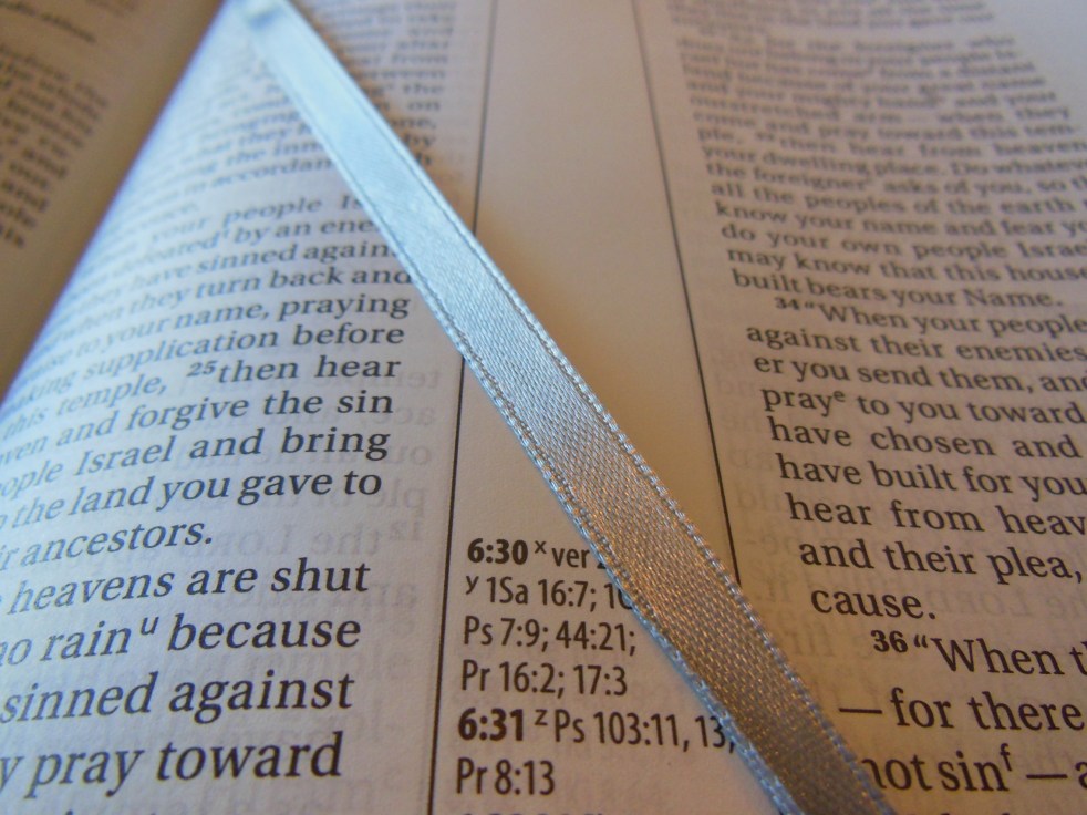
From this picture you can also see the fat signatures with the ribbon laying on top of the page.

DSCN5998

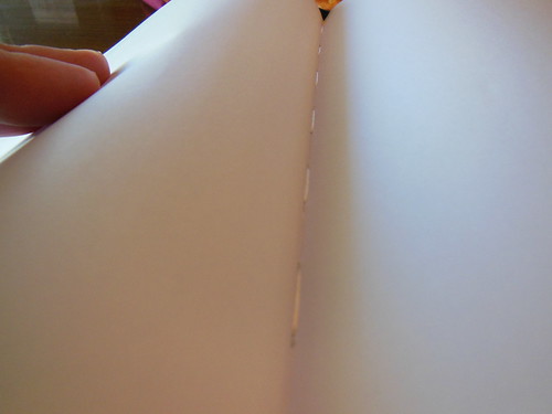
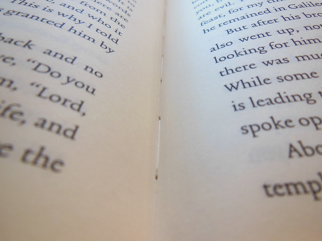
Of course, like you’d expect on a high quality book, the spine is sewn.  This ensures a durable, and useable binding.

DSCN5999

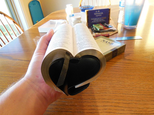
Of course my favorite picture is the one where I am reading it.

DSCN6003

After reading from this edition, I am eager to purchase the 6 volume set.  I will probably get the cloth over board due to the price.  I am looking at getting the new Schuyler Personal NASB Quentel when it comes out this year, so I have to save my money 🙂  That way I can get both.  I would highly recommend getting this for anyone wanting to try a reader’s edition out.  It is one thing to know the concept, but another to live with it for a while.  Make sure to look at the rest of the pictures I took of this edition on my flikr page.  You can also read about more of the details on Crossway’s product page.  You can purchase your copy at Christianbook or Amazon.


ISBN-13: 9781433549823

Book Reviews · economics · God · gospel · Ontology · Theology · Trinity · Uncategorized

A Review of, “God The Trinity” by Malcom B. Yarnell the III.

yarnelltrinity

Today on SnydersSoapbox we will be reviewing a book dealing with the Trinity.  I know that as Christians we desire to understand the Trinity better.  It is a topic that is often speculated on, and many times people just give up.  Don’t feel too bad.  The book and the works of the men cited by the author are all very scholarly.  Some very intelligent men have been contemplating the Trinity for a very long time, and haven’t really come up with any better explanations or understandings than many of us.  They just sound a lot more intelligent when they talk about it 🙂
In the field of Christian books, I am always looking for books that will add value to my library, books that will not be a waste of my time to read.  This was a pretty good book overall.  It was definitely NOT for laymen.  It was a scholastic work.  The author assumes that the reader has read, or is familiar with the works of the other men he has cited in this book.  If you are not familiar with those works you can still read this book and get something out of it.  It is well bibliographed, and indexed.  The author throws in some Greek, not to worry, he explains what it says.  He also uses several big words that you might need to grab a dictionary and look up.  Do not be afraid of heady books.  These things help you learn and grow.  Don’t run from the challenge of education.
As far as the content of the book goes, I appreciated his explanation of the economic Trinity.  This helped me understand how we are in Christ, He is in the Father, and He is in us, as well as the Holy Spirit indwelling us.  It is one thing to know the words, it is another to get a better grasp on the mechanics of how that works.  If you are like me, you are not satisfied until you can see all the steps, or processes of the behind the scenes workings of something.  He also delved into the ontology of the Trinity.  I might not of understood everything he wrote when dealing with this topic, or maybe I did, and just disagreed with him on one of his conclusions.  Even so, If you are patient, and willing to do some work, I think you could learn from this book.
Yarnell also explains some non-Trinitarian heresies, defends the orthodox trinity, deals with some of the concepts of being eternally begotten, and what that looks like.  He explains how Christ accepted worship from people, and he demonstrates how the Bible equates Christ with God the Father.  If you take the time, this will help you with your apologetics when talking with non-Trinitarian heretics.

You can pick up your copy from Christianbook.com, Amazon.com, or Lifeway.com.

ISBN-13: 978-1433680748

heaven · Uncategorized

“The Heaven Promise” by Scot McKnight does not rise above.

heavenpromise

There are plenty of books out on Heaven currently.  This is one among them.  Scot Mcknight is a talented writer.  His book is interesting to read.  I can agree with much of what he said, if I give him the benefit of the doubt in some areas.

The difficulty I have with Christian books is that I look for books that will add value to the Christian’s library.  In the world of Christian books, I read works of scholarly endeavor, and works for the laymen.  In those two groups I apply the same standard, “Does this book rise above the current crop and add value to my library?”  Both categories are flooded, and in my opinion encumbered by copious amounts of average to damaging works.  Every once in awhile I run into a book that does add value to my library.  I heartily recommend those books.  In the laymen’s category, I loved, “Crazy Love” by Francis Chan.  I also loved, “The Holiness of God” by R. C. Sproul.  In the scholastic category, I relished, “Evangelical Influences” by J. I. Packer.  Books like those don’t come around often.

To answer the question formulating in your mind, “Nope, this isn’t one of them.”  Like I said above,  “Scot Mcknight is a talented writer.”  Unfortunately, this book just sets in the middle of the field.  This book was  not aimed at scholars.  It was aimed at the average Christian.  It kept things pretty simple.  It is obvious that Scott leans a little to the left theologically.  He seems like, “emergent lite.”  He obviously thinks Calvinists are wrong.  (Read page 174)  He quotes John Henry Newman and Richard Foster.  One is a Roman Catholic, and the other is an emergent Church mystic.  He makes speculations based on only four options expressed by Jerry Walls, about how God ensures that everyone, even the dead get to hear the gospel.  He does this without ever really presenting the gospel.  The four presupposed options are severely lacking.  This is done on pages 160, 161.

In Chapter 23 he claims purgatory is a doctrine that has divided the Church.  To that I can only shake my head in astonishment.  Unless, in his horrible ecumenism he thinks the Roman Catholic Church is part of the catholic faith, he is including them as Christian.  It also seems that he is teaching that we do things for an eternal reward primarily.  He fails to teach that we should be doing things primarily for the glory of God.  We know that there are rewards for us in Heaven, but that should not be our primary motivation for doing things that are pleasing to God.  He also seems to place an undue amount of importance on the environment.  I don’t know if he understands that God is going to destroy the world with fire.  He tends to speculate where scripture is silent.

So if you are looking for a book on Heaven, that will add value to your library, purchase, “Heaven” by Randy Alcorn instead.  “The Heaven Promise” by Scot McKnight is just mediocre.  It has some problems.  It gets some stuff right, but ultimately it is just o.k.

ISBN-13: 9781601426284

Book Reviews · Journal Review

A Review of the JOT Bible Life-Notes Journal in Black Genuine Leather.

DSCN4999
Do you study your Bible?  I don’t mean devotional reading.  I mean, do you sit down with your Bible, a journal, Greek/Hebrew resources and some commentaries, to unpack God’s word?  If you are a serious student of God’s word, you’ll love this journal.  Pastors study to prepare for sermons, Teachers study to instruct, Evangelists study to make the gospel known, Apologists study to make reasonable arguments, Christians study to be discipled.  As Christians we all should be studying God’s word.  Out of the available tools we have at our disposal, recording our thoughts on paper is one of the most effective ways of revisiting them.  Considering the above callings, it is very beneficial.  

DSCN5006

As a student, I’m often frustrated with the journals available on the market today.  They don’t open flat.  You always are fighting the cover of the journal.  They are small.  You can’t fit all of your thoughts from the entire Bible in one journal.  You end up with several unmatched journals floating around your house.  It ruins the continuity.  I also find that I lose them.  If you are going to a few different places in your Bible during a lesson, you have to remember which journals you wrote in.  You have to gather them and bring them with you.  The covers are usually flimsy card paper or moleskin.  

I realize some of you might be wondering what the fuss is about.  “Isn’t that why the invented wide margin Bibles?”  Well, yes and no.  Anyone who has used a wide margin Bible has run into the problem of not having ruled lines.  This might not seem like a big problem to those of you who have been blessed with the “spiritual gift” of beautiful handwriting. (just kidding. I know that is not one of the gifts.)  No ruled lines, is a real problem for me.  My notes meander all over the margin, not to mention that there is never enough room for some of the most elementary notables to be notated 🙂  While, wide margins have their place, they don’t fit the bill for some of us.  Space is the next issue with wide margin Bibles.  There is never enough blank space for notes.  You can never seem to get all of what you are thinking down on the paper next to the verses you are meditating on.

I often wonder what will happen to all of my journals?  They are all disorganized, and haphazard.  Will my kids toss them out after I’m gone?  Will they know what is in them?  I want to have my all of my ruminations in one volume, organized, durable, functional, and easily referenced.  On more than a few occasions, I’ve wondered if that was too much to ask.  After talking to several other Christian friends over the years, I found that I wasn’t alone.  We just consigned ourselves to the notion that our notes would forever be a collage of our faith journeys.

DSCN5167

I’m glad to say that someone has finally remedied this malady.  The JOT Bible Life-Notes is the perfect receptacle for your meditations, ruminations, and contemplations.  It matches your Bible in looks and size.  It is a fitting companion to bring to the pulpit with your trusty Bible.  It looks like a Bible, but it isn’t.  

DSCN5021


It matches the Bible book, chapter, and verse.  For every verse of the Bible there are two ruled lines with the verse number next to them, printed on fine, acid free, highly opaque, 42 g.s.m. Bible paper!  I mean what!?  You’ve got to be kidding me!  That is far superior to most paper used in Bible printing, and they have an entire journal made from it, sweeeeeeet!  I don’t know if you can tell from the pictures, but I am a pencil masher.  I tend to push pencils and pens through the page when I write.  If I am writing on thin paper, fogehtaboutit…  I hope you can tell from the pictures that this paper holds up to pencil quite well.  I would recommend pencil, as you can go back and edit notes later on.  We are always learning more, every time we read the Bible so sometimes you have to go back and add things to your notes or fix misunderstood verses.  Pencil erases nicely from this paper without leaving the paper wounded.

DSCN5165

DSCN5166

I did write notes in John 1 in black ink. This section of scripture will always assure me of Christ’s power, and the truth of God’s Word. This is what it looks like when you use ink. Just be sure it is something you aren’t going to change. I will only use pencil for the rest of my notes.

DSCN5170

DSCN5169

The printing of the lines and features of this journal is done in a consistent fashion.  I haven’t noticed any breaks in the lines.  The page edges are gold gilt.

DSCN5032

DSCN5023

DSCN5010

The JOT comes in a heavy duty two piece box that should be retained for storage.  It is seriously built better than most Bible boxes.

DSCN5002

The cover is supposed to be genuine leather.  I can’t place it though.  It seems too nice to be pigskin leather, but it is tougher than other cowhide leather covers.  Regardless, it is flexible and durable.  It is a work of form and function.

DSCN5008

The binding is a smythe-sewn spine in a case bound cover.  The spine of the JOT Bible Life-Notes is ornamented with five raised spine hubs.  The perimeter is stitched.  There is a presentation page in the front that includes a spot for you to write your contact information incase you lose your journal so that the person who finds it can get it back to you.

DSCN5016

DSCN5014

DSCN5007

DSCN5036

DSCN5017

There are three ribbon markers in, black, red, and blue. This thing is pretty much built like a quality Bible, but beefed up for note taking.  Again, to be clear, THIS IS NOT A BIBLE, IT IS A JOURNAL!!!  Don’t buy this thinking it is a Bible.  I know it looks like one, but it isn’t.  

DSCN5037

So just to recap the high points here; durable, useful, all your notes in one place, attractive, helpful, heirloom possibilities, preaching aid, study tool, memoirs from time with God’s word.

To be honest there is only one drawback that comes to mind.  It is a hefty tome, but if you know anything about book design, you’d know there are finite attributes that are interrelated.  When you change one thing it affects the others.  Using thick paper, and giving us room to write, necessitates a larger volume.  It can’t be helped.  I’d much rather have ample room along with function and form than have all form.  This thing is meant for work and does not need to be forgiven for that.  So if you are in the market for a high quality depository for all of your meditations instead of just a smattering of them, this is the journal for you.  Give it a try and recommend it to your friends, I know I am.  Make sure to check out all of the close up pictures I took of this journal on my flickr page here.  You can purchase yours on Amazon.  You can also check out their site here.
ISBN: 9780692396193

Bible Reviews

The Holman HCSB, Deluxe Ultrathin Reference Bible in Black Genuine Top Grain Cowhide, is an Excellent Idea, but Poorly Executed.

DSCN3493

I would love to give this Bible a glowing review. It is a good idea. My favorite size Bibles have been ultrathins. They are generally pretty portable and handy. An ultrathin with, sewn binding, some references, top grain cowhide leather cover, edge lined binding, opaque paper, and legible typeset is a wonderful Bible to have. If done correctly, they could sell them as fast as they could make them. Like I said earlier though, the design needs to be properly executed.  There have been some problems with both review copies I was sent. The first copy arrived with the gold stamping on the spine missing in spots,

DSCN3546

the tail band was sliced, one of the end pages was dog eared, the cover was not glued down to the inside liner well enough, this allowed the pages to get between the liner and cover, and the pages were all stuck together. The gold stamping would have been enough to send this Bible back as it is fairly expensive. The second Bible sent to me to replace the first one has leather debris sandwiched between the cover and the liner, leaving two lumps on the front cover.

DSCN3551

These will cause the cover to wear out and eventually put holes in it. That would have been enough to warrant sending that Bible back as well. Generally, I am very pleased with Holman Bibles. Many of their Bibles are produced in South Korea. This one was produced in China. Almost all of the incidents I’ve had with defects in workmanship or materials, have been with Bibles made in China. It doesn’t seem to matter who the American publisher is, whether it is Lockman, B&H, or Hendrickson when they make Bibles in China the quality control is problematic.

Where Holman stands above some of the other publishers is in their customer service. They have quickly and courteously supplied me with another copy, when I brought the defect to their attention. Some publishers were unwilling to replace defective copies. Lockman has replaced defective copies as well, but this review is of B&H.

If this Bible would have been produced without defects, with a higher quality liner, and end papers, it would have been worth the retail price. I would suggest that B&H stop making this Bible in China, and move the production to someplace with higher quality standards. This would have been a great Bible considering the ambition of the design. It was shipped in a cardboard box with paper packing.

DSCN3491

The retail box inside is a two piece box, that should be retained for storage.

DSCN3497

The Bible inside the box was wrapped in black construction paper to protect it during shipping. The cover is supposed to be top grain cowhide leather. It does feel very soft,

DSCN3500

but it has been pared pretty thin.

DSCN3499

I don’t know if Holman supplied the leather or allowed the Chinese binder to provide the leather. The liner looks like a synthetic material. It doesn’t glue well to the hide cover. The end papers are very thin as well. This might have been done to increase the flexibility of this Bible given that it is edge lined bound and not case bound. I appreciate what they were attempting to do, but the end papers just came off as cheap. I love when a Bible has a genuine, high quality hide as a cover. The smell and feel of a genuine hide, not to mention the durability, ensure many years of use. Combine that with a flexible sewn binding, and you have an easy opening Bible that lies flat on your table, or can be wrapped around itself, to be held in one hand for easy reading.

The line matching helps to keep the text legible in conjunction with the uniform printing and ink consistency.

DSCN3526

This is a double column paragraph format, red letter edition Bible.

DSCN3530

There is an oddity that puzzles me. They printed the book names and chapters on the bottom of the page, instead of at the top where it typically is located. It makes you pause for a moment when trying to turn to a specific scripture.  Chances are good that I could have been sent a Bible with zero defects and my review would have been extolling the virtues of this great little Bible.  Chances are, you might order it and receive a good copy.  I just happened to get tow in a row with defects.  The good news, is that Holman will make it right if you get a bad one.  If you really want an HCSB in ultrathin that is edge lined and covered with top grain leather, this is about one of your only choices.

Make sure to check out all of the pictures I took of this Bible and its replacement on my flickr page.

9781586404314

Bible Reviews

Need a Complete Bible in a Handy Size to Slide into a Pocket? The NASB Compact Bible in Black Bonded Leather with a Snap-Flap Fills the Niche at a Great Value.

DSCN3454
As a fan of the NASB translation, I find myself needing a copy of it for several applications.  The problem is that my choices are limited once I demand a sewn binding.  If I want a compact NASB with a sewn binding, I can either spend around a hundred dollars for a Cambridge, or I can spend around twenty for a Chinese made Lockman Foundation.  I know how nice a Cambridge can be, but I there are some benefits to spending less, especially when you are getting a compact Bible.  If you tend to carry the compact with you everywhere, it can get worn out from travel.  You might also forget it on a table somewhere after a talk.  Not to mention the accidental spills and drops.  If you spend around a hundred dollars on a Bible, and then have all of that happen, it would probably give you some heartburn.

Then there are the numerous glued Bibles from companies like Yawn-durp-ven, you know who I mean.  I can’t begin to tell you how much I hate glued bindings.  Constantly losing the front pages and pages from the back, the spine breaking in the middle, I mean, come on already!  I’ll pay the extra few bucks for a sewn binding.  Wait, what’s that?  Lockman Foundation makes a value priced, compact Bible, with a sewn binding?  Do tell.  Yes, it is true.  Now don’t get me wrong, these are not premium Bibles, but if you need to have access to the printed word and you don’t want to use an app on your phone, this little Bible could do the trick.  I know, I know, “It has rubber on the flap…  It smells funny…  The pages pucker where the treads secure the signatures…  It is covered with bonded leather…”  I understand the complaints, but there has to be a compromise.  Like I just got done explaining, do you want to lose a hundred dollar Bible at a coffee shop?  I didn’t think so.  Do you want to open your Bible up to help someone out, and have pages fall out on the ground?  I didn’t think so.  So you see there is a niche that this little Bible fills quite well.

As for some of the gripes, the rubber flap holds up much better than just having a bit of bonded leather there.  The smell is not as strong after it airs out for a couple days.  The puckers are there, you have a sewn binding, deal with it.  Better to not have pages falling out.  The bonded leather keeps the cost down.  Hides are expensive.  This is a value Bible.  You can even afford to lose them or give them away.  I think I saw this one online for like fifteen bucks.  Come on, that is extremely affordable.  So, don’t be a Bible snobs like Bob, get what works for your application.

Time for the rundown, this Bible was shipped in a cardboard box, packed with paper padding.

DSCN3453

It was in a two piece retail package.  Inside the retail package it was wrapped in plastic.

DSCN3458

Some of the features of this Bible are a sewn binding,

DSCN3490

verse format with section headings,
DSCN3481

bonded leather cover, protective snap-flap,

DSCN3463

gilded page edges, presentation page, black ribbon marker, 6.8 pt. font, and compact size. (4.5″ x 6.5″ x 0.75)

Due to the sewn binding this Bible can be opened up without hurting the spine.  The spine is stamped with, “New American Standard Bible” in gold.  The snap-flap protects the page edges, so you can just slip it in a pocket.  The verse format helps you find verses quickly.  The 6.5 pt. font makes it legible.  The end pages are a bit flimsy, but I think that is to keep this small edition from being too rigid.  Overall, this Bible performs the purpose it is intended for.  I would recommend it based on the low price and sewn binding.

be sure to check out the rest of the pictures on my flickr page

If you’d like to purchase a copy of this Bible here are a couple of links,

amazon.com

Christianbook.com


Apologetics · Bible Reviews · Theology

Not a Study Bible, Rather an NIV Reference Bible.

DSCN3113

On the front of the dust jacket of this Bible, the testimonial from Tim Keller is featured, “There are many Study Bibles, but none better.”  This is very misleading.  I have no idea why this quote is featured.  I would hope that there is some good reason why Zondervan did this.  Unfortunately, I can think of one and none has been provided.  This is most definitely not a Study Bible.  It is simply a Reference Bible with Book introductions, Concordance, and Maps.  In no twist of the imagination could this be considered a Study Bible.  If you are looking for a Study Bible, this is NOT one.

My guess, in my opinion, is that Zondervan knows the NIV has taken a serious hit, and as a result has a black eye.  It no longer has the credibility it once enjoyed.  It is not as popular as it once was.  Back in 2011 Zondervan released this gender inclusive mess of a dynamic equivalent in an attempt to sneak it by everyone.  They had the TNIV, and simply dropped the, “T” and changed a few more things to further comply with the translation agenda.  The Southern Baptist Convention caught on to what was happening and officially disavowed the translation.  Here is their resolution,

“WHEREAS, Many Southern Baptist pastors and laypeople have trusted and used the 1984 New International Version (NIV) translation to the great benefit of the Kingdom; and

WHEREAS, Biblica and Zondervan Publishing House are publishing an updated version of the New International Version (NIV) which incorporates gender neutral methods of translation; and

WHEREAS, Southern Baptists repeatedly have affirmed our commitment to the full inspiration and authority of Scripture (2 Timothy 3:15-16) and, in 1997, urged every Bible publisher and translation group to resist “gender-neutral” translation of Scripture; and

WHEREAS, This translation alters the meaning of hundreds of verses, most significantly by erasing gender-specific details which appear in the original language; and

WHEREAS, Although it is possible for Bible scholars to disagree about translation methods or which English words best translate the original languages, the 2011 NIV has gone beyond acceptable translation standards; and

WHEREAS, Seventy-five percent of the inaccurate gender language found in the TNIV is retained in the 2011 NIV; and

WHEREAS, The Southern Baptist Convention has passed a similar resolution concerning the TNIV in 2002; now, therefore, be it

RESOLVED, That the messengers of the Southern Baptist Convention meeting in Phoenix, Arizona, June 14-15, 2011 express profound disappointment with Biblica and Zondervan Publishing House for this inaccurate translation of God’s inspired Scripture; and be it further

RESOLVED, That we encourage pastors to make their congregations aware of the translation errors found in the 2011 NIV; and be it further

RESOLVED, That we respectfully request that LifeWay not make this inaccurate translation available for sale in their bookstores; and be it finally

RESOLVED, That we cannot commend the 2011 NIV to Southern Baptists or the larger Christian community.”

Shortly after the Lutheran Missouri Synod did the same.  Here is the most important part of their statement as I see it,

“We find the NIV’s Committee on Bible Translation decision to substitute plural nouns and pronouns for masculine singular nouns and pronouns to be a serious theological weakness and a misguided attempt to make the truth of God’s Word more easily understood. The use of inclusive language in NIV 2011 creates the potential for minimizing the particularity of biblical revelation and, more seriously, at times undermines the saving revelation of Christ as the promised Savior of humankind. Pastors and congregations of the LCMS should be aware of this serious weakness. In our judgment this makes it inappropriate for NIV 2011 to be used as a lectionary Bible or as a Bible to be generally recommended to the laity of our church. This is not a judgment on the entirety of NIV 2011 as a translation—a task that would require a much more extensive study of NIV 2011—but an opinion as to a specific editorial decision which has serious theological implications”  You can read the entire statement here.

Here is a link to an excellent paper in the Westminster Theological Journal.   The article was written by Dr. Vern Poythress of Westminster Theological Seminary.  Dr. Poythress was also part of the Translation Oversight Committee for the English Standard Version.  By prominently featuring Timothy Keller’s testimonial on the front of this Bible edition Zondervan is trying to do some damage control.  As most of you know Tim Keller also was faculty at Westminster Theological Seminary.  He and Poythress share much in the field of theology.  By getting his stamp of approval on this Bible I believe they were hoping to bring some of us back.  Admittedly, the only reason I requested this Bible for review, over the other ones offered is that his name was on the front.  I was curious if something had changed for the better.  I was disappointed.  Not only was this the same NIV, with all of the gender inclusive language, but it was NOT a Study Bible.

As far as the physical attributes of this Bible go, it is a pretty average to above average publication.  It is blue hard back.  It has a dust jacket.  It is printed in China.  It has two mediocre silver ribbon book markers.  It is a sewn, case bound book binding.  It is printed on good quality paper that is pretty opaque.  The type is clear and uniform.  It is 9 point font.  There is limited ghosting.  It is a double column, paragraph format, with references, concordance, and 14 color maps.  It is nothing special, nothing distinctive, just a good quality hardback.  If only they would revert back to the 1984 NIV and leave these other agendas behind.


ISBN-13: 9780310437956

Bible Reviews

A Tome of Tomes, The Lockman NASB New Illustrated Bible of Jerusalem.

tome of tomes, get it?  Well, I thought it was funny.

nasb picture bible 006

The Bible has been called the, “Book of books.”  This Bible gives you the impression that it is a, “Tome of Tomes.”  It is large and substantial.  The size of this thing is not in vain.  The paper is terrific, the print is great, and the binding is sewn.  Not to mention all of the 436 interesting photographs. (Yes, they are from real photographs, not pictures snapped by a teenager with their phone, while on vacation.) The photographs are from the 1800’s and early 1900’s.  They give you the feel that you are looking at an Israel before modern tourism.  Of course there was tourism in Israel back then.  These are just lacking modern accoutrements. The pictures help you to connect the places that you are reading about, to their actual locations.  The photographs enrich the readers experience.  I don’t know of any other Bible out there like this one.  It isn’t really a family Bible.  It isn’t one that I would take to Church, or carry around, due to the size, but it definitely scratches an itch for those of us who want to see the sites.  It fills a niche that leaves it with little competition.  There are archeological Bibles with pictures, but there is a distinct difference in their purpose, design, and layout.

It is also appealing because of the cover.  I realize it is not genuine, tooled leather.  It is a synthetic cover, but it does a good job of masquerading as an ancient tome that you discovered in an old library, far from home.  That makes it kind of fun to have and put on display.  I put it on the coffee table for a while and now it is on the mantle.  Here is what the description on Lockman Foundation’s page says about it,

From Sacralion Publishing House, Includes 436 pictures of Holy Places taken between the middle 19th – early 20th centuries. These images are spread throughout the whole biblical text and correspond exactly to the specific verses in the Holy Bible.

Features include, Concordance, Maps, Full Column Cross References and notes, Verse Format, Black Letter, Two Column Text, Photograph Index,  Two Marker Ribbons, Old Testament Genealogy Tables, and Illustrations.

Lockman Foundation credits Sacralion Publishing House with the NASB New Illustrated Bible of Jerusalem.  If you are interested in them you can check out their pages here and here.

For those of you who aren’t familiar with the NASB translation of the Bible, I can assure you it is one of, if not the most accurate translations out there.  Lockman Foundation is dedicated to being loyal to God in their translation work.  You won’t find any gender inclusive agenda with them.  Some people say it is a bit more difficult to read, but I have never experienced that.  I have found it an accurate translation that conveys the majesty of God’s word in a modern English translation.

So without further eloquence I will now show you the pictures.

The Bible arrived packaged in two boxes.  One was inside the other cushioned with paper.  I imagine this was due to the size and weight of this Bible.  It arrived undamaged and in good condition.

nasb picture bible 001 nasb picture bible 002

It was shrink wrapped and labeled.

nasb picture bible 004

nasb picture bible 005


The spine is hot stamped with, “Holy Bible” at the top, “The New Illustrated Bible of Jerusalem” next, and then, “Updated New American Standard” and finally at the bottom, “Sacralion Publishing House.”  The front cover is stamped with, “Holy Bible.”  As well as being gilded it is ornately decorated like the cover.

nasb picture bible 008

As I mentioned earlier the synthetic cover is stamped to look like tooled leather.  It does add to the aesthetic value of the Bible as well as the tactile experience.  Of course this leads one to wonder what this Bible would look like with a tooled leather cover.

The first few pages are an, “Introduction to the New Illustrated Bible of Jerusalem.”

nasb picture bible 015

Then we have, “A note to readers.”

nasb picture bible 016

The, “List of Photographic Illustrations” in the front of the Bible is very helpful in being able to match a photograph to scripture and its real location, as well as the page number it is on.

nasb picture bible 019 nasb picture bible 020

The Bible is wonderfully formatted.  It is a joy to read.  The double column, verse format has a  center column reference.  The center column is black text on a grey background.  The font is printed sharply and well inked against the cream colored paper.  The paper is very opaque.  There is virtually no ghosting making this one of the least distracting Bibles to read.

nasb picture bible 026 nasb picture bible 028 nasb picture bible 027

There are two ribbon markers that are quite different from what I am accustomed to.  They aren’t flat.  They are round.  The ends are frayed, and it looks like they are supposed to be this way.  I have a Greek New Testament that has the same style ribbon marker.  It was bound in Germany.  Since both came new out of the packaging like this and I have seen others like this, I assumed this is the style.  One is a white and the other is blue.

nasb picture bible 034

The photographs are black and white.  They are placed with relevant scriptures to help the reader connect to what they are reading.  Here is an example of some of the photographs you’ll see in this Bible.

nasb picture bible 033

The binding on this large Bible is sewn.  That is in my opinion a must for a large book of any kind.  It enables a book of this size to fully open.  At the end of the Bible is a Concordance, The Old Testament Genealogical Tables, and 11 maps.  I think that this is a compelling enough edition that every home library should have one of these.

If you want to order one of these you can find them here Lockman.org and here Amazon.com and here Christianbook.com

ISBN: 0984234306
ISBN-13: 9780984234301

Bible Reviews

Another Excellent Bible from Cambridge, the Clarion NKJV Bible in Brown Genuine Calfskin.

cambridge nkjv clarion and kjv cameo 046

I begin by referring you to my previous review of the Cameo from Cambridge.  The two Bibles were delivered in the same packaging from Cambridge.   Both have the sewn bindings and both are covered with the same brown calfskin.  You can read about those aspects in that review.

The Clarion from Cambridge is an example of modern Bible design done right.  Here is a quote from the Cambridge website about the Clarion in NKJV;

A Cambridge Clarion edition represents an unusual and attractive combination of features – a very readable text in a paragraph style, with a single-column layout – all within a personal size reference Bible format. Here, the NKJV text is presented in a single column with the cross-references in the outer margin, giving the page a very well laid out appearance. The font size is a little under 9 point with generous line spacing. It is typeset in Lexicon No.1, a modern digital font which has many of the characteristics usually associated with traditional Bible typefaces – in particular, a degree of readability more usually associated with much larger type. The Bible has 15 new colour maps and a concordance. There are two ribbons to keep the place in different parts of the Bible. This is a Bible of the very highest quality, printed on India paper with art-gilt edges, Smyth-sewn for flexibility and endurance, and bound in brown calfskin leather

Chances are if you are considering the purchase of the Clarion NKJV Bible in brown calfskin, you have a list of desired attributes in mind; manageable size, legibility, quality sewn binding, beautiful and durable cover, and so on.  The Clarion fits the niche almost perfectly in my opinion.  It brings together many desirable features without sacrificing too much in the other areas of design.  The Clarion is larger than the Cameo.  It is definitely thicker.  The thickness of the Clarion does make it a bit more to hold than the Cameo, but the font is so much more legible.  The tradeoff is well worth it.  Because of the thicker format the Clarion can use a larger font.  It is a modern font, printed with modern technology making it very clear and sharp.  The Cameo’s font was cleaned up, but still doesn’t compare to the font of the Clarion.

Another wonderful attribute is that you can get the Clarion in different translations.  Currently it is available in the New American Standard Bible (NASB), the English Standard Version (ESV), the King James Version (KJV), and the New King James Version (NKJV), which I am reviewing.

So besides the size, font, and available modern translations, the Clarion also breaks in very well.  I have been using an NASB Clarion in goatskin for my daily reading and it has become my standard for comparison.  The NKJV in calfskin adds some rigidity to the cover.  Instead of being edge lined and perimeter stitched with a very flexible material it uses a more common process of vinyl inner liners glued down to the outer cover.  The added structure can be a pro to some and a con to others.  In my opinion, if this Bible were thinner the stiffer cover would be a pro, but it is just a bit too thick.  I can’t roll the cover all the way around like I can with the goatskin covered Clarion.  It makes it a little less comfortable for me.  The cameo gets the size right for this type of cover, but at the sacrifice of font size, line spacing.  These all have an effect on the ease of reading.  If you are going to buy the Clarion, I’d suggest the goatskin.  Of course this is just my opinion.  Everyone has different sized hands and preferences.  I suggest looking one over in the Christian book store, or getting your friend to let you borrow theirs for a few minutes.  It is not a small investment for most people.  Because of the quality of craftsmanship and materials used it will be with you for a long time.  So it is important that you do your research before buying a lifetime companion like the Cambridge Clarion.

This Bible is covered with a genuine calfskin in brown.

cambridge nkjv clarion and kjv cameo 050

It is very supple and soft.  On the front of this Bible is hot stamped, “Holy Bible” in gold.  The spine of the cover has, “Holy Bible” at the top, “New King James Version” immediately under that.  At the bottom of the spine is, “Cambridge” in gold as well.  There are modest hubs worked into the spine as well.

cambridge nkjv clarion and kjv cameo 052

The inner vinyl liners are black and glued neatly to the calfskin.

cambridge nkjv clarion and kjv cameo 053

The calfskin has been folded over and finished uniformly.  The corners are all perfectly finished.  There are two ribbon markers that are color matched to the cover.  The ribbon markers are about a quarter inch wide.

cambridge nkjv clarion and kjv cameo 067

The page edges are art gilded.  This gives them a distinctive look that you won’t find on less expensive Bibles.

cambridge nkjv clarion and kjv cameo 065

The paper is high quality opaque paper.  It is slightly off white and contrasts with the black font nicely.  The text is printed in a single column, paragraph format with line matching.  Line matching is when the lines of text are printed in such a way so as to make the text on one side of the page directly opposite of the text on the other side of the page.  This aids in legibility.  The font is large enough to be easily read yet small enough to keep the size of the Clarion down.  It is clearly, and uniformly printed.

cambridge nkjv clarion and kjv cameo 062

It has a useful concordance and the maps are printed on a heavier paper with a  matte finish.

cambridge nkjv clarion and kjv cameo 069 cambridge nkjv clarion and kjv cameo 073

The sewn binding is of the quality I’ve come to expect from Cambridge.  The Clarion opens well and lays flat when opened.

To sum up, the Clarion is an excellent Bible that fills a big niche in the Bible market.  Many Christians are on the lookout for a Bible that travels well, is easy on the eyes while reading, and is well made.  The Clarion fits the bill and is available in some great translations.  Check out Cambridge Press’ Page.  You can pick up a copy of this Bible on evangelicalbible.com for about $140.00 and you can also get it from Amazon for about $120.00 and Christianbook for about $155.00

ISBN-13: 9781107664425

isbn: 9781107664425

ISBN: 110766442X

NKJV Clarion Reference Bible NK485:X Brown Calfskin Leather

Church · Church Reviews

We visited Lighthouse Baptist Church in Payette, ID on 04/06/14

lbc


We visited Lighthouse Baptist Church in Payette, ID on 04/06/14

  1. How approachable/welcoming, is the Pastor before and/or after the service? The Pastor was friendly and spoke to me after the service.  I did get the feeling he had somewhere to be though.
  2. How friendly is the congregation? The congregation was very friendly. They made sure to talk with me for a moment.
  3. How many congregants were there? There were approximately 10 to 20, the congregation was mostly relatives of the Pastor, and the Sunday School teacher.
  4. How do they take the offering? Offering plates.
  5. Where are they located? They are at 1212 1st Ave. South, Payette, Idaho 83661. Their phone number is 208-642-3940.
  6. How is the service broke down between, prayers, worship, and sermon? Approximately 10% Prayer, 15% hymns, 5% Fellowship, 70% Sermon.
  7. What is the condition of their facilities? The facilities were in fair condition for their age. They are in a building that used to be a Roman Catholic Church.  It has been de-Romanized.
  8. What is the preaching style of their Pastor? The sermon was topical. The Pastor jumped around quite a bit, sighting many different passages.  It seemed that the message got lost in the process.  I personally prefer expository preaching.
  9. Do they use a specific translation of the Bible, or prohibit any translations, if so why? They use the KJV.  Here is a quote from their site, “We’re fundamental, we hold to the King James Bible as the inspired, preserved Word of God for the English speaking people.”  Here is another, “The King James Version of the Bible shall be the official and only translation used by the church (2 Timothy 3:16-17; 2 Peter 1:20-21).”
  10. Do they have a web page? They do, and here is the link; http://www.lbcpayette.com/6052.html If so, is there a clear, orthodox, confession or statement of faith? Here is the link; http://www.lbcpayette.com/11701.html  From what I can tell they are orthodox.  Their soteriology is sound.  They believe in, total depravity, election and predestination, perseverance of the saints, cessationism, and dispensationalism.