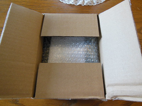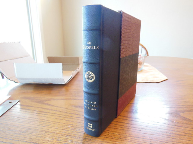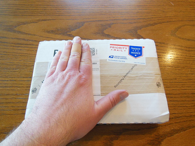

A review of the E.S.V. Panorama New Testament from Crossway.
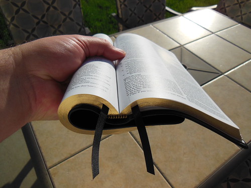
The folks at Crossway were kind enough to send me this edition for review. I have to admit, I don’t know what to think of it, or what niche it fills in the Bible lineup. It is too tall to fit standing vertically on most bookcases. It is too thin to lay horizontally unless it is on the bottom of the stack or it will warp. It is to wide across to not stick out of most bookcases when laying flat at the bottom of a stack.


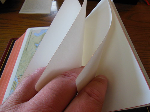
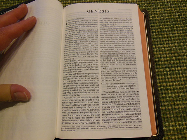
I understand that on each page there are pages worth of Bible so that the reader gets to follow the theme of a section uninterrupted longer. I don’t have a problem keeping ideas in context while turning pages. I don’t find it inconvenient, or difficult. I don’t imagine many readers do. It might be a problem for some people. Who knows? I don’t anticipate that it is a large enough problem to necessitate a volume like the Panorama. In other words, it seems to be a solution for a problem that I wasn’t aware of. That being said, I’m not the sole arbiter of problem declaration. I imagine someone saw a problem that needed fixing in their estimation and designed the Panorama.
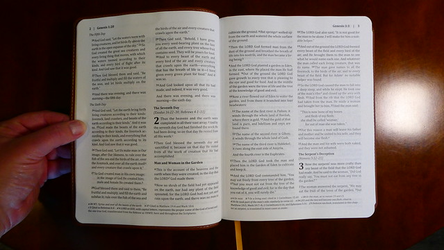
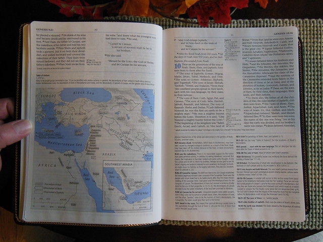
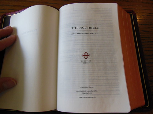
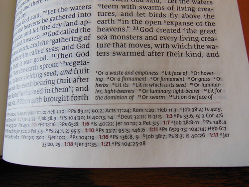
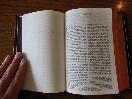
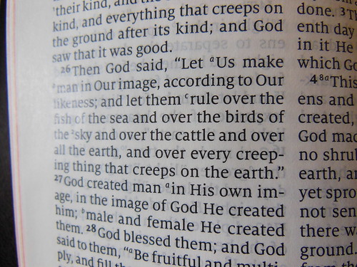
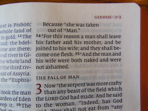
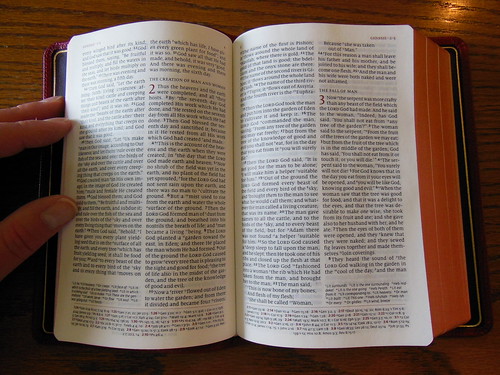
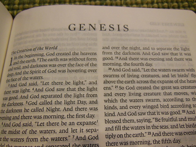
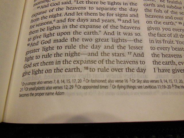
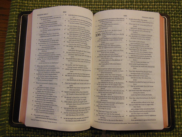
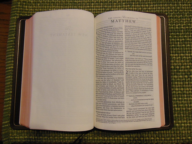
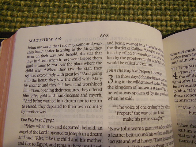
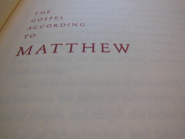
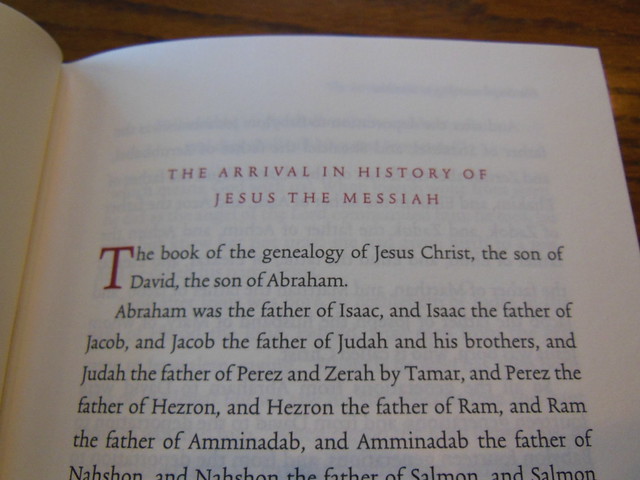
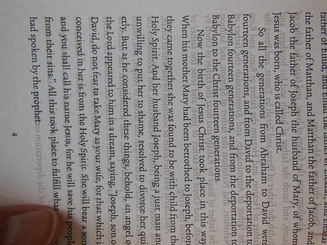
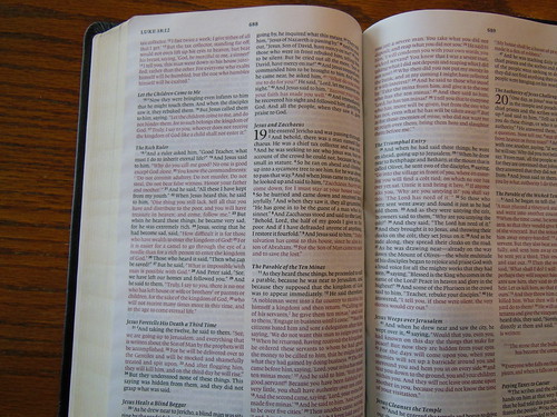
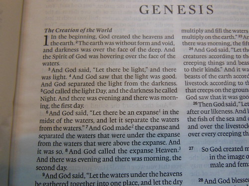
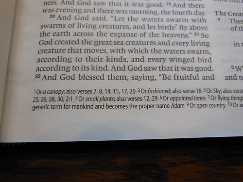
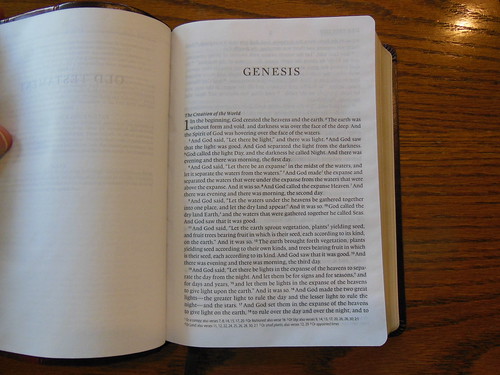
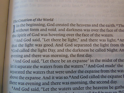
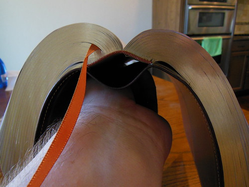
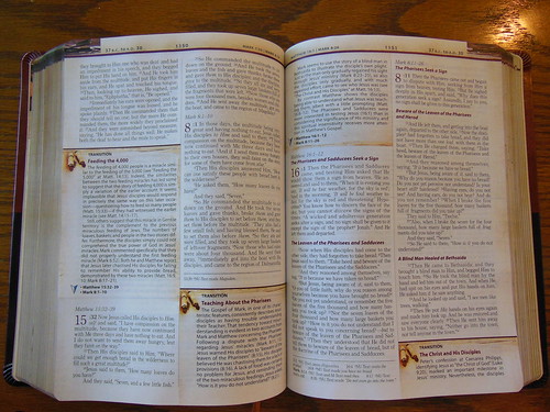
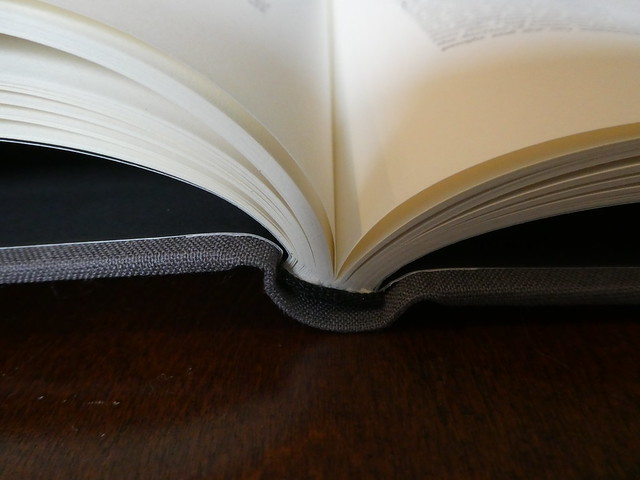
I know it sounds like I’m knocking this edition, but I’m not. What it was designed for, it does. The paper is very thick, and doesn’t show any ghosting. The text is Crossway’s single column E.S.V. text, but it is laid out in double columns. Each page has what would amount to pages of text in a regular single column Bible.


Here is what Crossway has to say about this edition,
“The treasures found in God’s Word do not come to his people out of context. Even our most beloved verses of the Bible come in the midst of chapters, of carefully reasoned arguments, of intentional flows and patterns of thought—and of entire books. Therefore, the goal of the ESV Panorama New Testament is to allow readers to see as much of a biblical book at one time as possible. In this Bible, any one of 17 of the books of the New Testament can be viewed in its entirety, without the need to turn the page; the other 10 books comprise as few pages as possible. The advantages of a panoramic, two-page spread are many. For instance, users may desire to trace the use of key words or phrases across several chapters of biblical text, or throughout a Gospel or Epistle. The format of the ESV Panorama New Testament allows readers to follow the uses of such words or phrases while turning as few pages as necessary. Furthermore, this edition provides generous spacing between each line of biblical text, with plenty of room to mark or circle words being studied. This panoramic view of the New Testament also encourages readers to consider the large-scale outlines and thought patterns of the writers of Scripture. Preachers or teachers planning sermon series or Bible study lessons, for example, will be able to utilize this edition in a way that allows them to appreciate the major sections and transitions of the book under examination. Line spacing and margins allow for outlining or other ways of marking the biblical author’s flow of thought. These are just a few ways in which the ESV Panorama New Testament will facilitate users’ undistracted interaction with God’s Holy Word. In a style reminiscent of the large scrolls of antiquity, this Bible encourages readers to encounter the New Testament as it was first delivered—as complete Gospels, Epistles, history, and apocalypse. It is our prayer that this edition will foster users’ appreciation of the unity, depth, and beauty of our God’s precious and inerrant Word.”
After looking this edition over, and spending some time with it, I can say that it could help in tracing a thought through in context. If you find yourself having that problem, you could give this edition a try. Let me know what you think afterwards. I think the oddity of this edition might even be sufficient reason alone to purchase it for your collection.
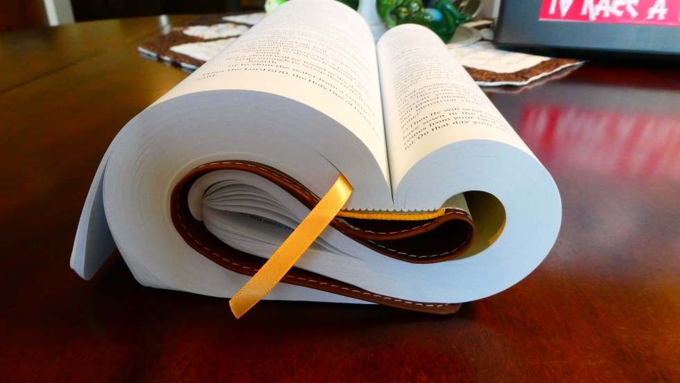
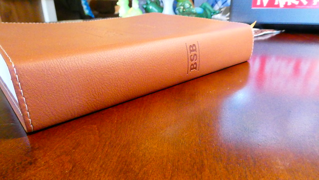
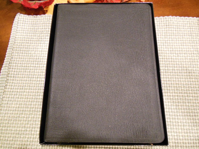
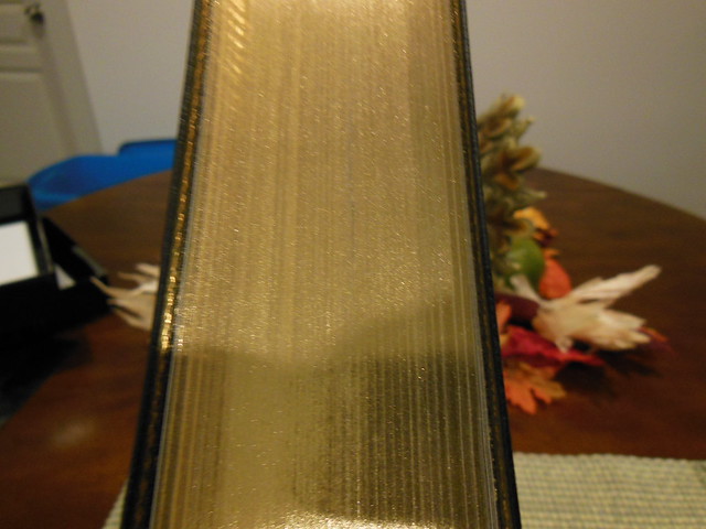
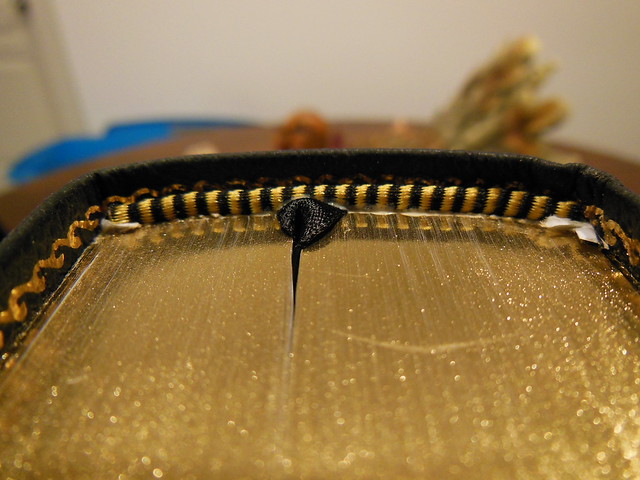
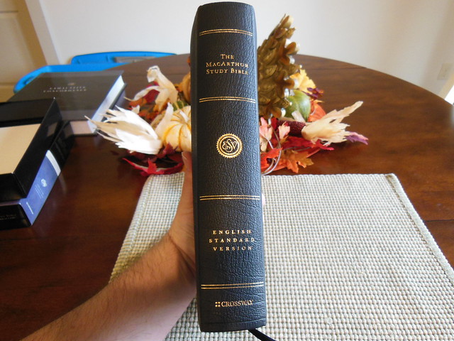
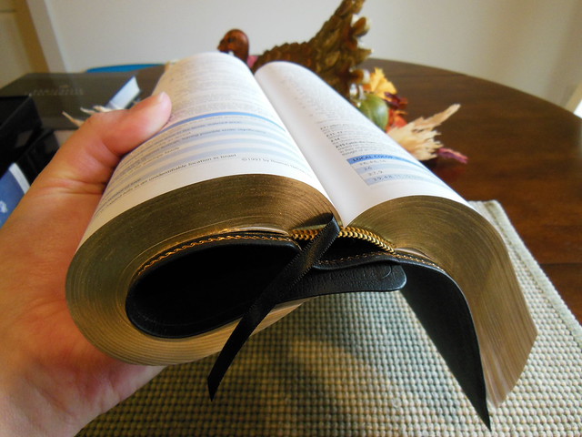
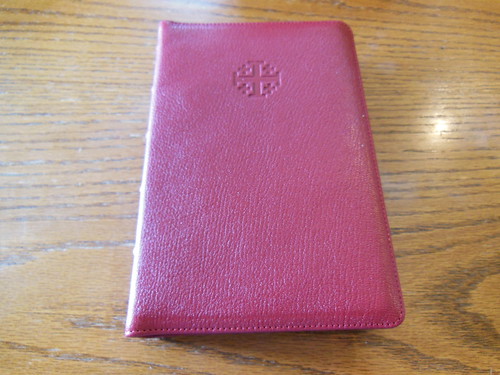
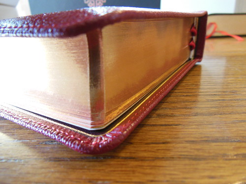
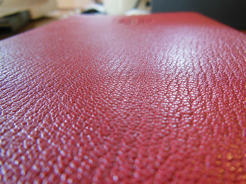
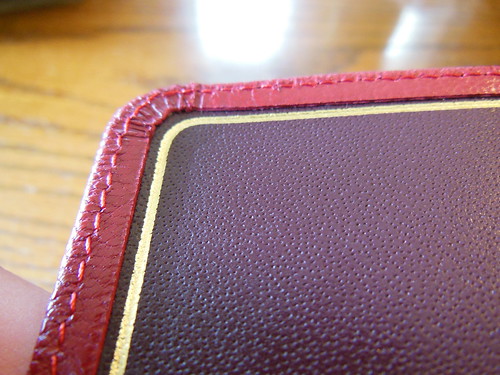
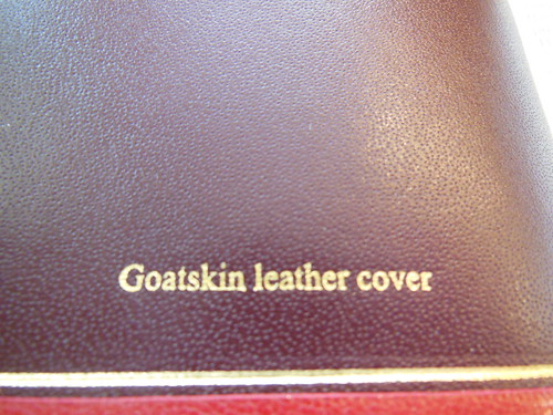
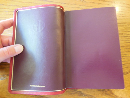
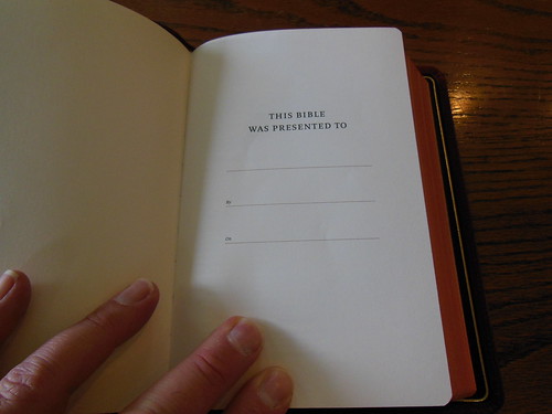
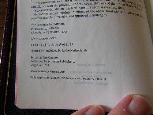
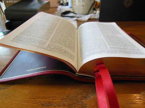
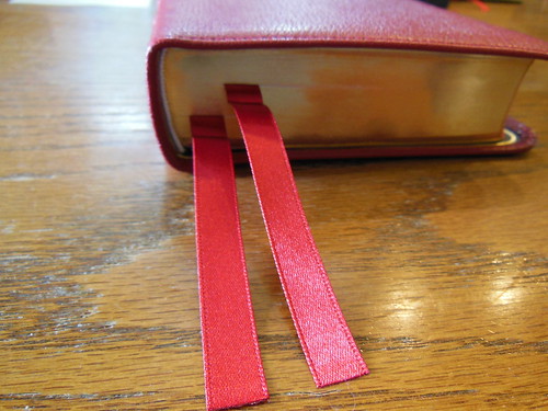
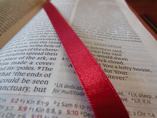
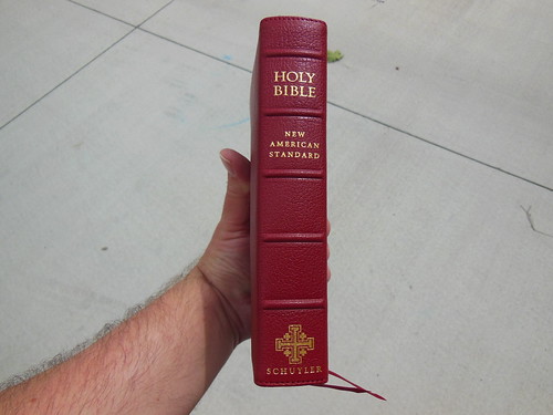
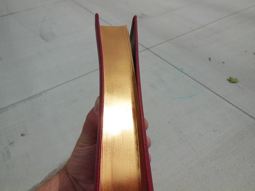
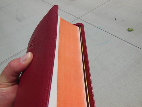
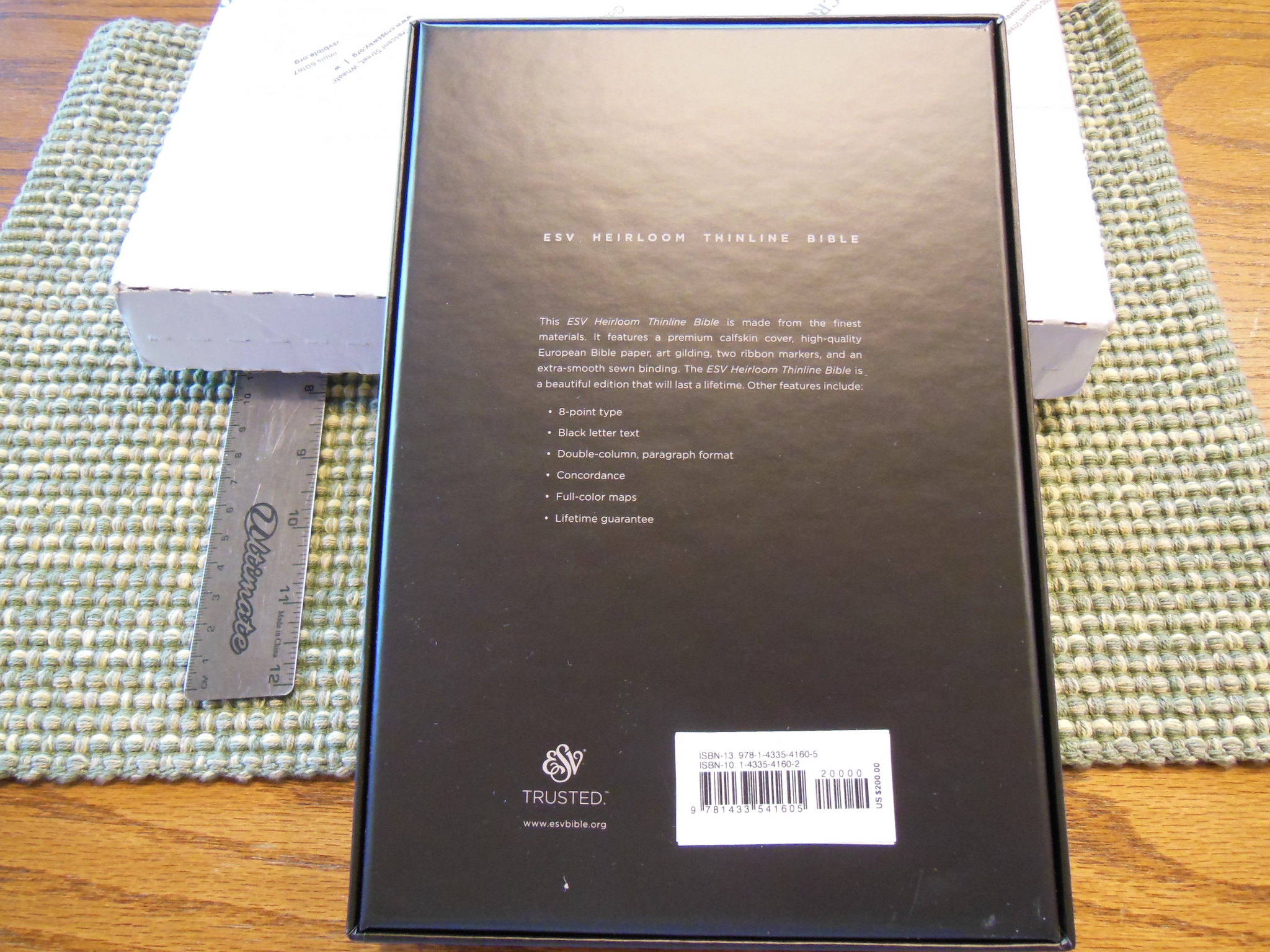
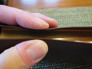
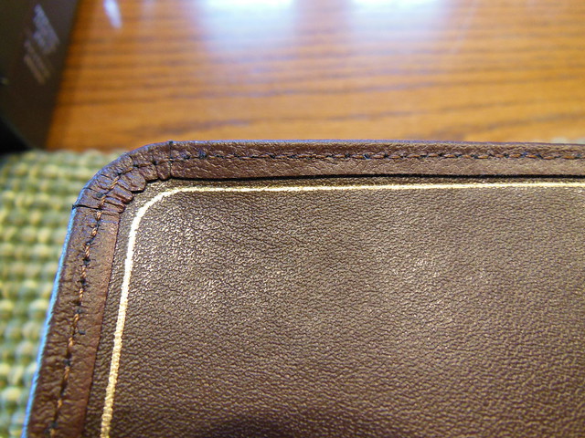
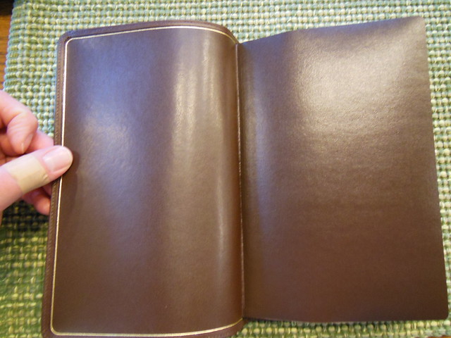
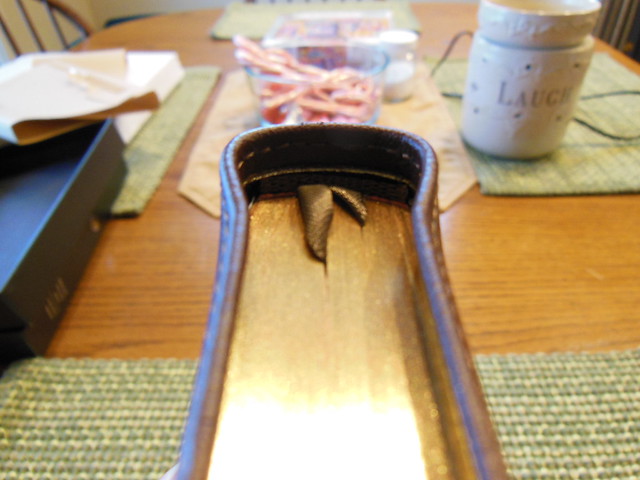
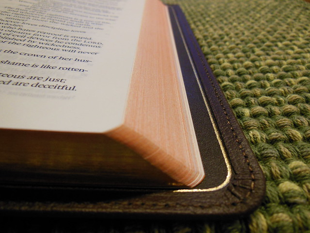
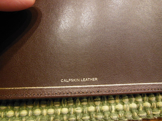
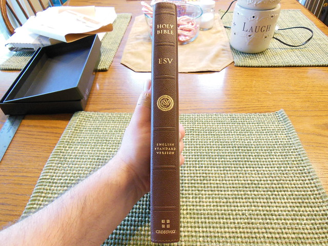
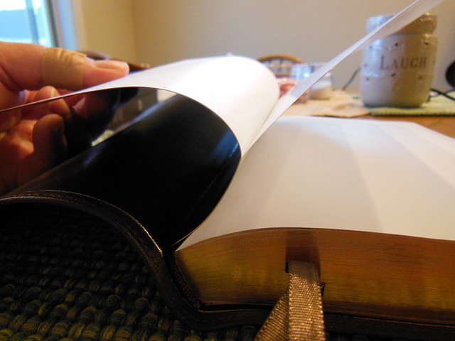
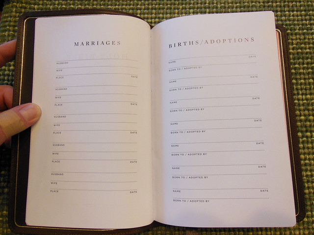
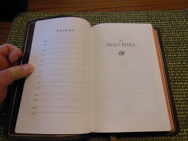
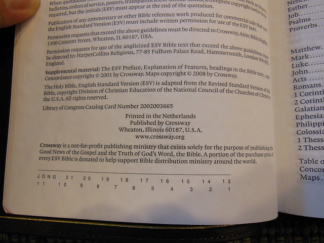
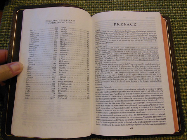
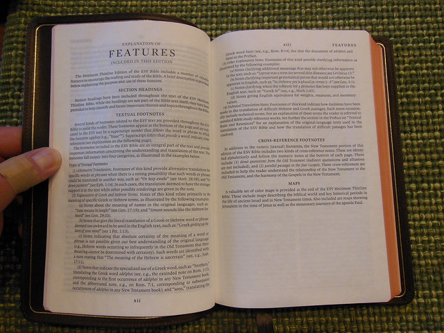
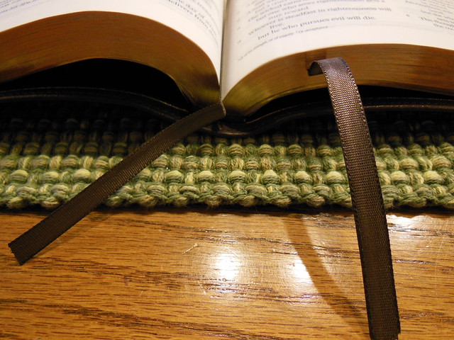
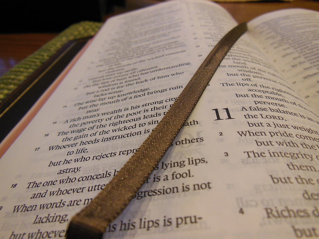
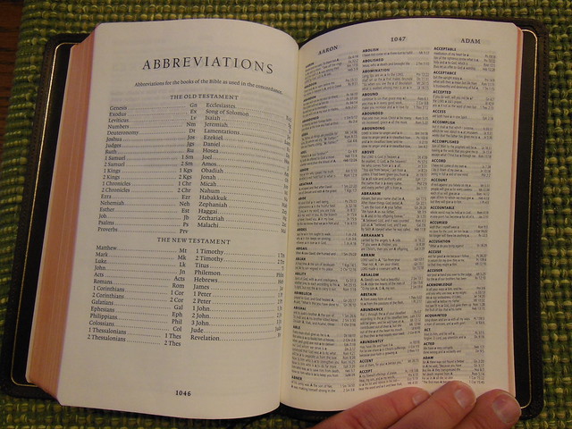
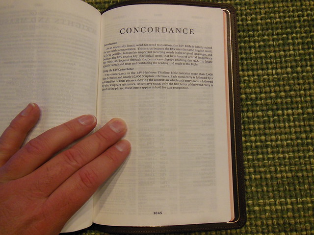
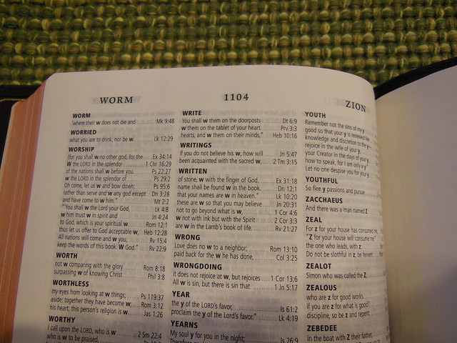
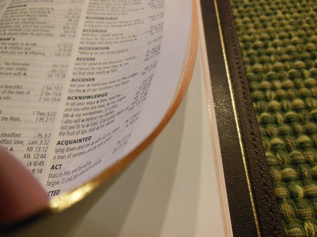
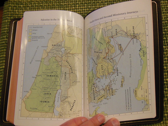
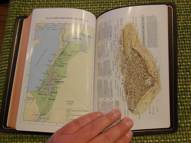
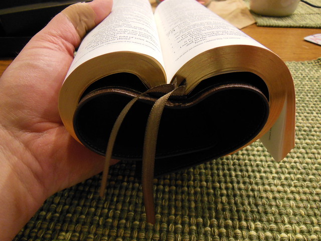
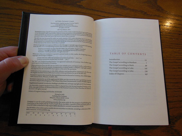
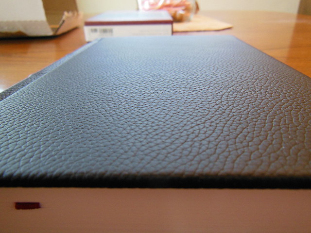
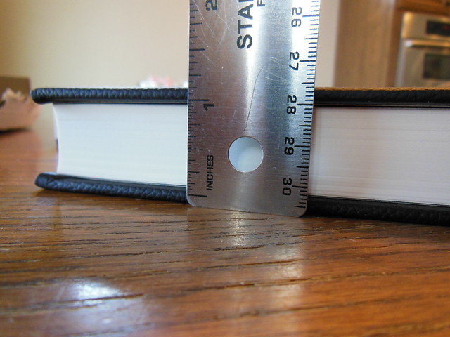
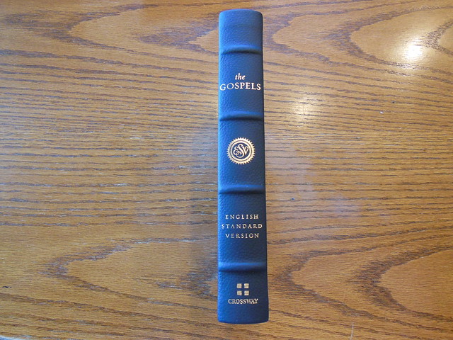
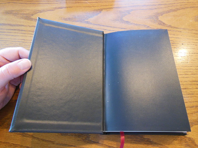
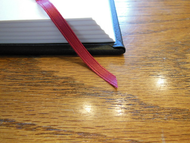
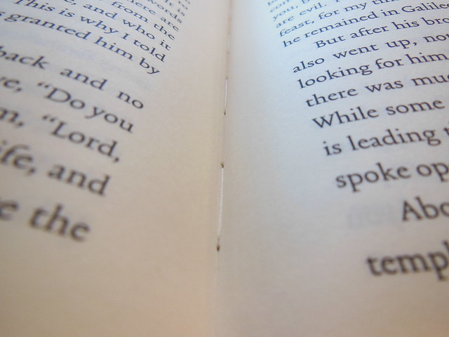
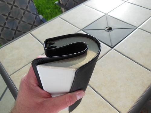
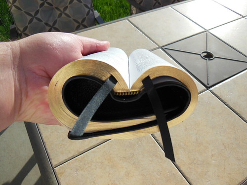
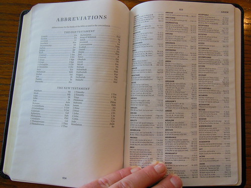
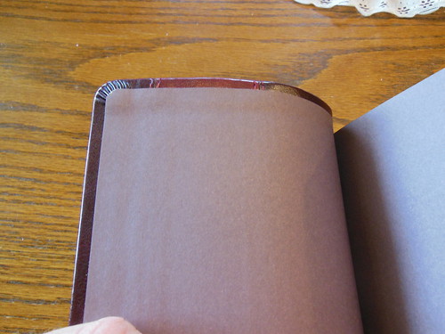
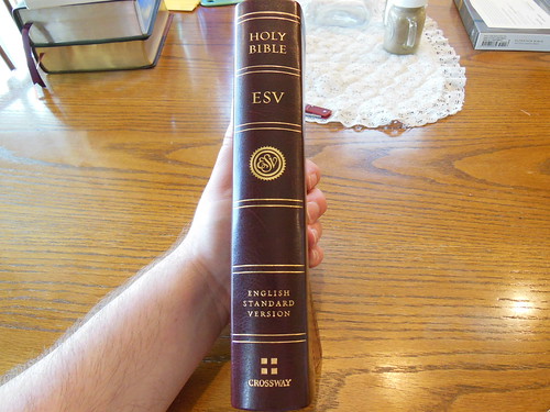
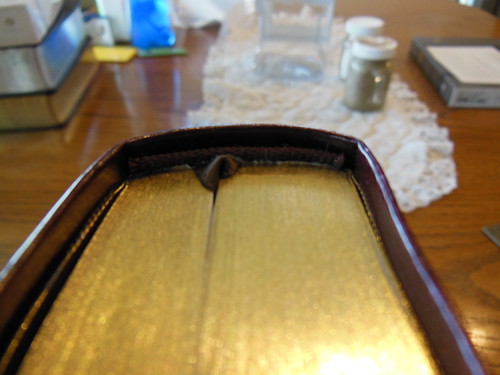
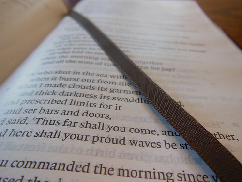
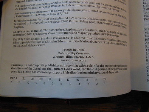
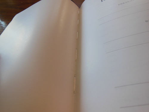
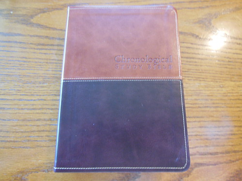
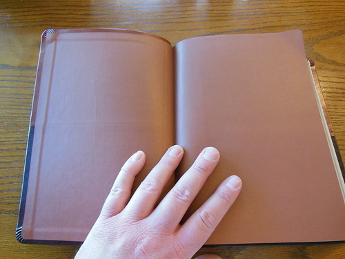
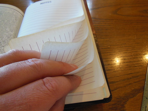
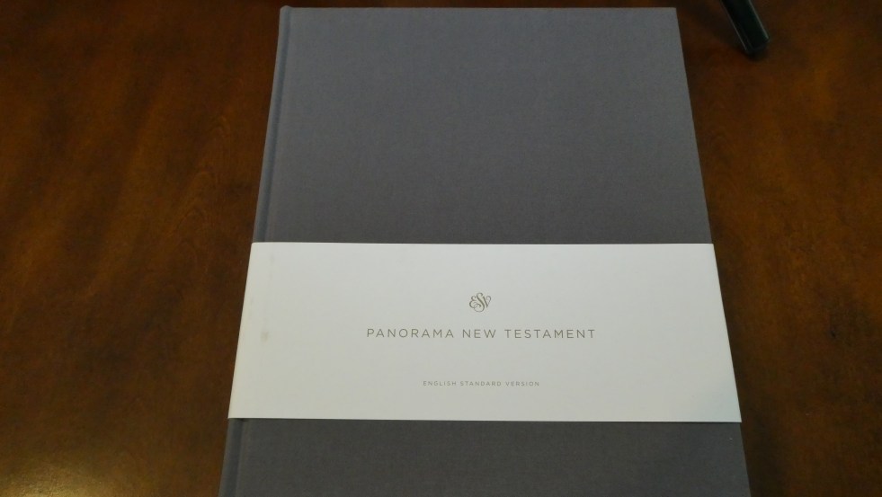
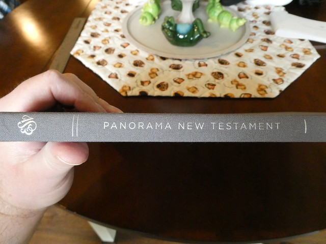
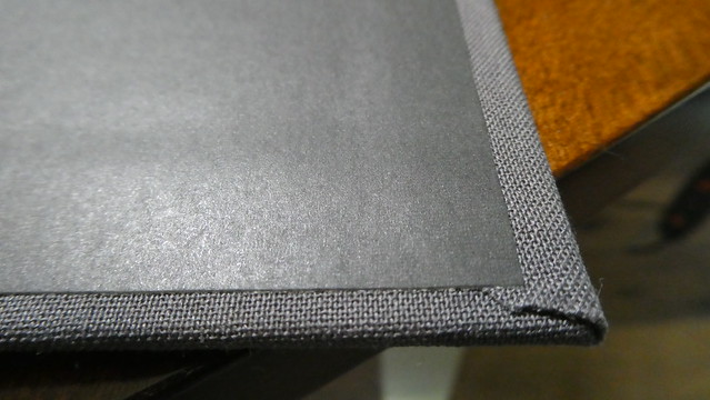
This edition is well made. The gray cloth over board hardback cover is very handsome, and durable. The spine is sewn. The paper, as I said earlier is heavy and offers a nice contrast to the text. The layout is pleasant enough, and the text is free of distractions. There is room on most pages for some note taking. There are 3 very large blank pages at the back of the edition where copious notes could be written. There are no helps at the back of this edition. This is a black letter edition, and does not have a ribbon marker. The only exterior writing on this edition is in silver stamping on the spine. The spine is rounded however, the corners are not. The page edges are not gilt. This is a case bound edition. Overall, I find it well made, and legible.


Here are the stats from Crossway’s product page,
Features
- 10″ X 12.5″
- 8.2-point Lexicon type
- Double-column format
- Thick, cream-colored book paper
- Smyth-sewn binding
- Extra-large page size
Product Details
| Format: | Cloth Over Board |
| Type Size: | 8.50 |
| Page Layout: | Double Column |
| Page Count: | 192 |
| Size: | 10.0 in x 12.5 in |
| Weight: | 36.26 ounces |
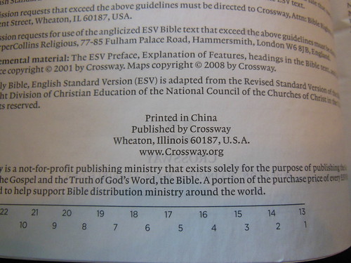
| ISBN-10: | 1-4335-7193-5 |
| ISBN-13: | 978-1-4335-7193-0 |
| ISBN-UPC: | 9781433571930 |
| Case Quantity: | 10 |
| Published: | February 26, 2021 |
All things considered, you can make an informed decision about purchasing this edition. If after reading this review you think this would be useful, or interesting to you, you don’t have to worry about the quality of the edition. It is in keeping with Crossway’s standards. If you are interested in picking up a copy you can purchase it through Crossway’s site, or Amazon. Make sure to check out the rest of the pictures I took of this edition on my Flickr page.