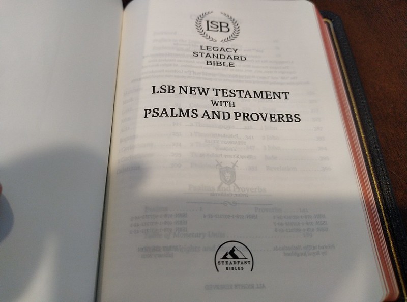
I preordered this Bible when I found out it was going to be published. Three Sixteen Publishing/Steadfast Bibles sells it on their site. Master’s Seminary in California, connected with John MacArthur, got permission from the Lockman Foundation to tighten up the translation a bit. I think this was an admirable goal, as I believe the 2020 NASB to be heavily influenced by Zondervan. Zondervan is a major licenser of the NASB from Lockman. I think the 2020 is not as good as the 1995. After looking the LSB over, I can say, I still have some questions about certain translation choices. The LSB does use Yah, and Yahweh, in place of the small uppercase LORD that has been adopted as a convention. Of course in the New Testament where kurious was used, it remained Lord, obviously. I’m sure that will make some cult members mad. I’m not a Hebrew Roots guy, nor am I an Assemblies of Yahweh cult member. I do like the more accurate translation. Doulos has been translated as slave, just like they said it was. My problems with certain choices in translation are few, and not very significant. I just find the translation choices in certain parts to be curious. I would have liked to ask why they did certain things. I was wondering why they didn’t translate Christos as anointed. There was also a spot (I can’t remember where it was now) that inserted the word Jesus into the text, even though in Greek, Insous wasn’t there, but to make the sentence make sense, considering English sentence structure, and context, Jesus was added. It was obvious from the information that was there that the verse was something that Jesus was saying. I guess I was hoping for less italicized words, and an even more strict translation. That being said, it is still a very good translation. So far, I would put it up there with the 1977, and 1995 NASB translations.
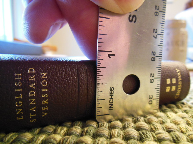
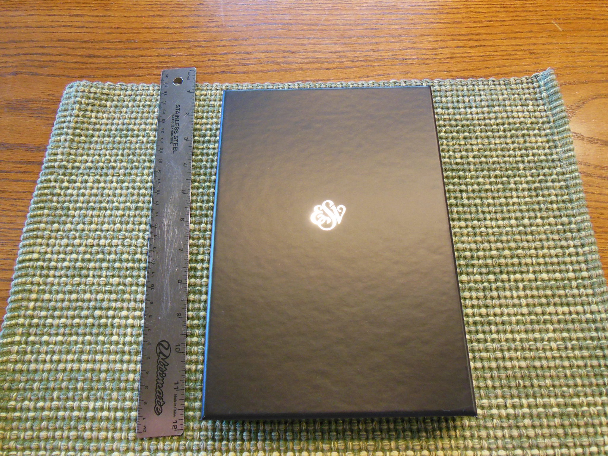
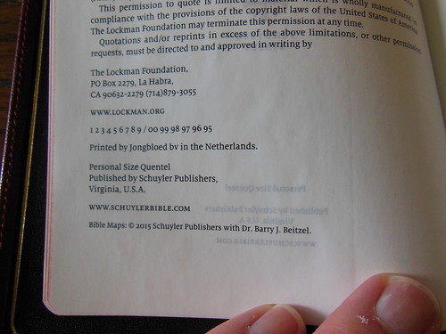
The Bible I purchased was printed and bound by Jongbloed in the Netherlands. It is every bit as good as a Schuyler, or Crossway premium that Jonglboed produces.
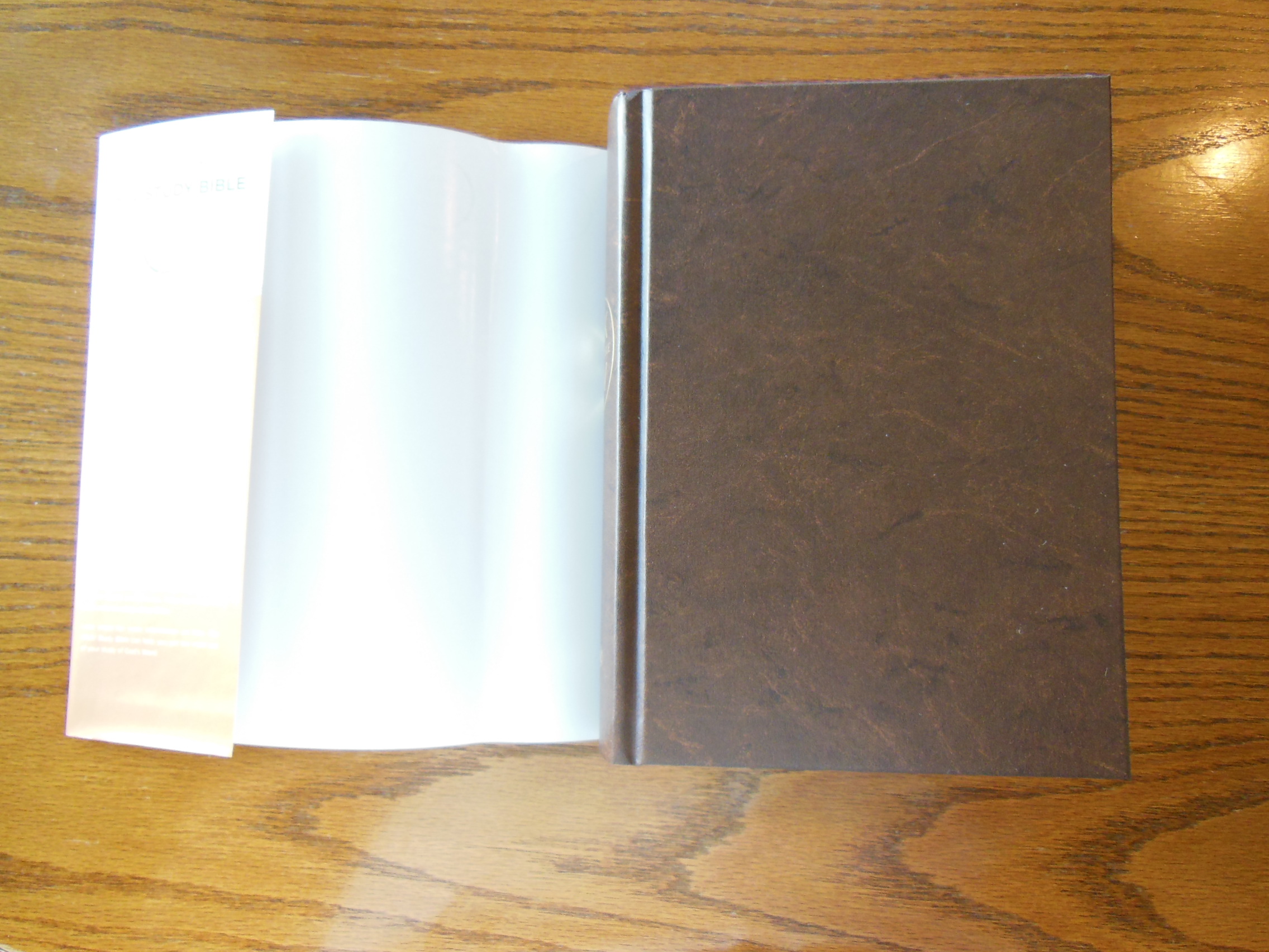
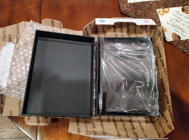
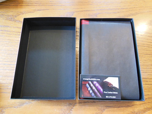
It arrived undamaged, and in a shipping box. Inside that box was a 2 piece box that is pretty well constructed. It should keep your Bible safe for many years.
As you can see, it was also shrink wrapped in plastic, and double banded with black paper. I unwrapped it before I thought to take pictures. I wasn’t planning on doing a review. Since I was excited to get it, and unwrapped it, I had to kind of put it back in the plastic, and paper bands to take some pictures.
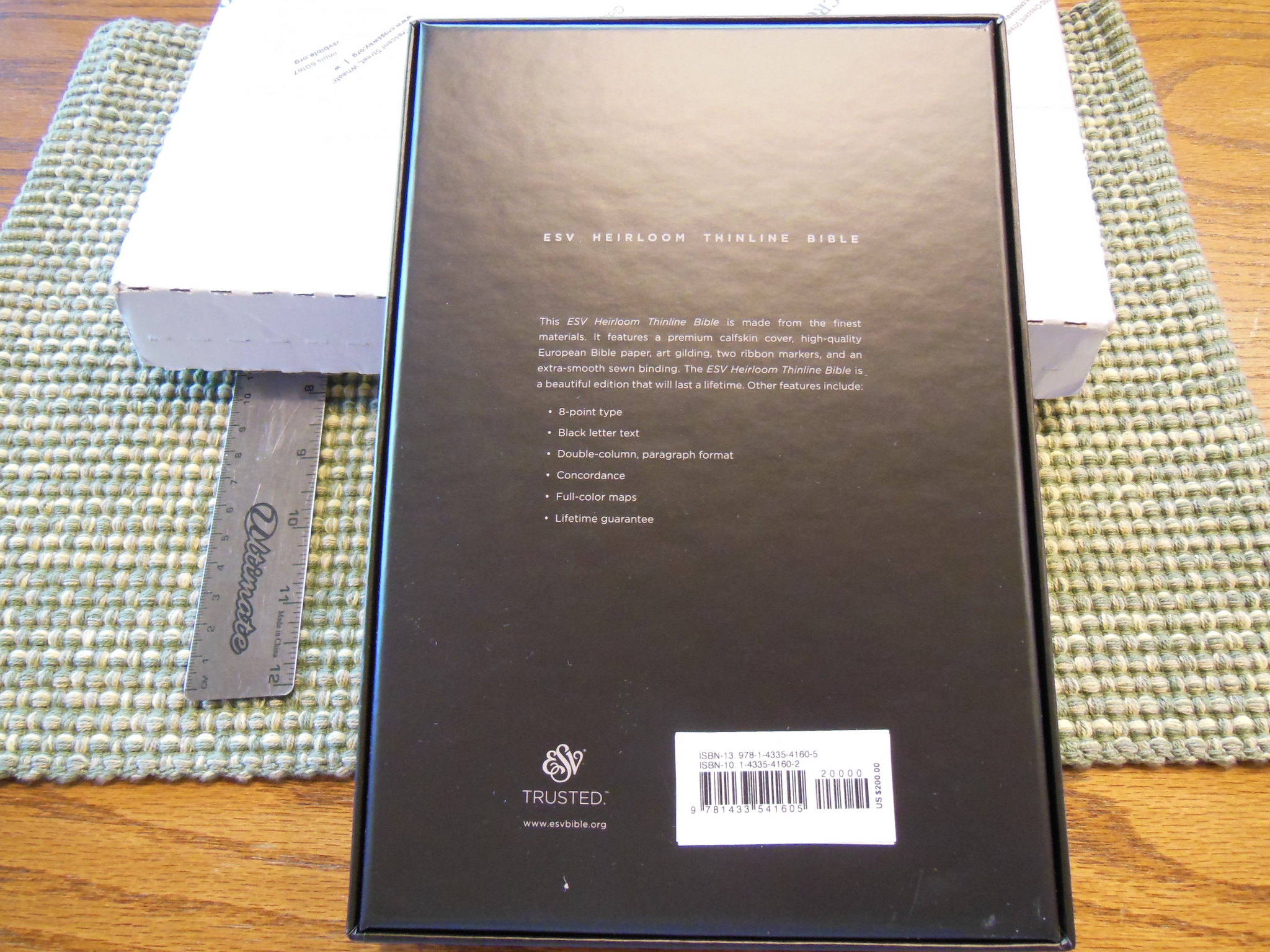
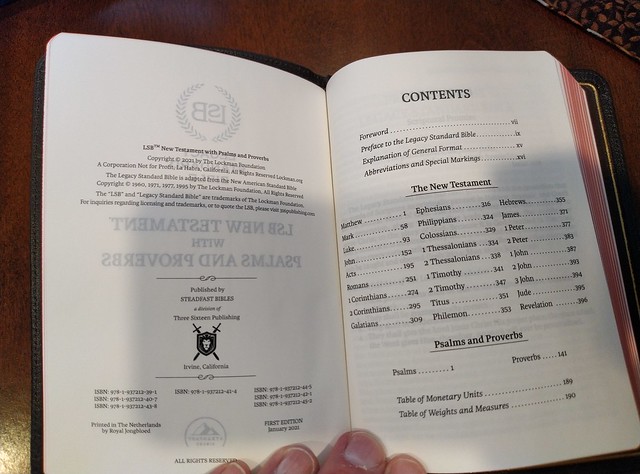
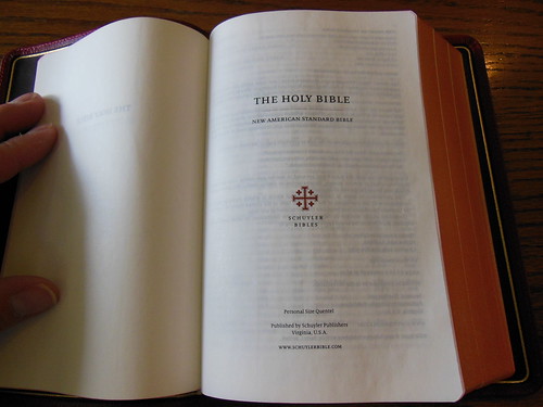
Here are some of the vital statistics from the publisher’s page;
Black letter editions only
Two-column verse-by-verse format
8.5 pt. font size
Line-matched Scripture text
French-milled, 32 gsm paper (same as our Preacher’s Bible Handy Size)
Sewn binding
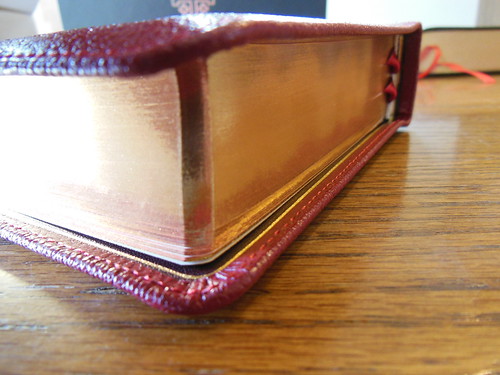
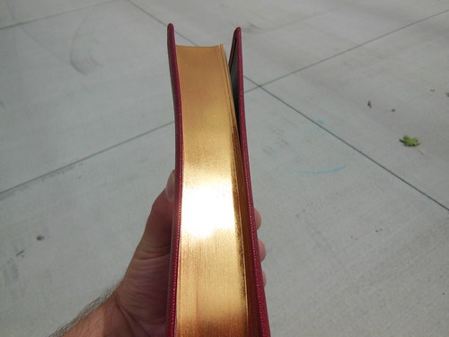
Gold gilding on page edges
Durable foil-stamped cover with perimeter stitching
2 sided satin ribbon marker, matching the exterior binding color
4.5 x 6.2 inches
640 pages
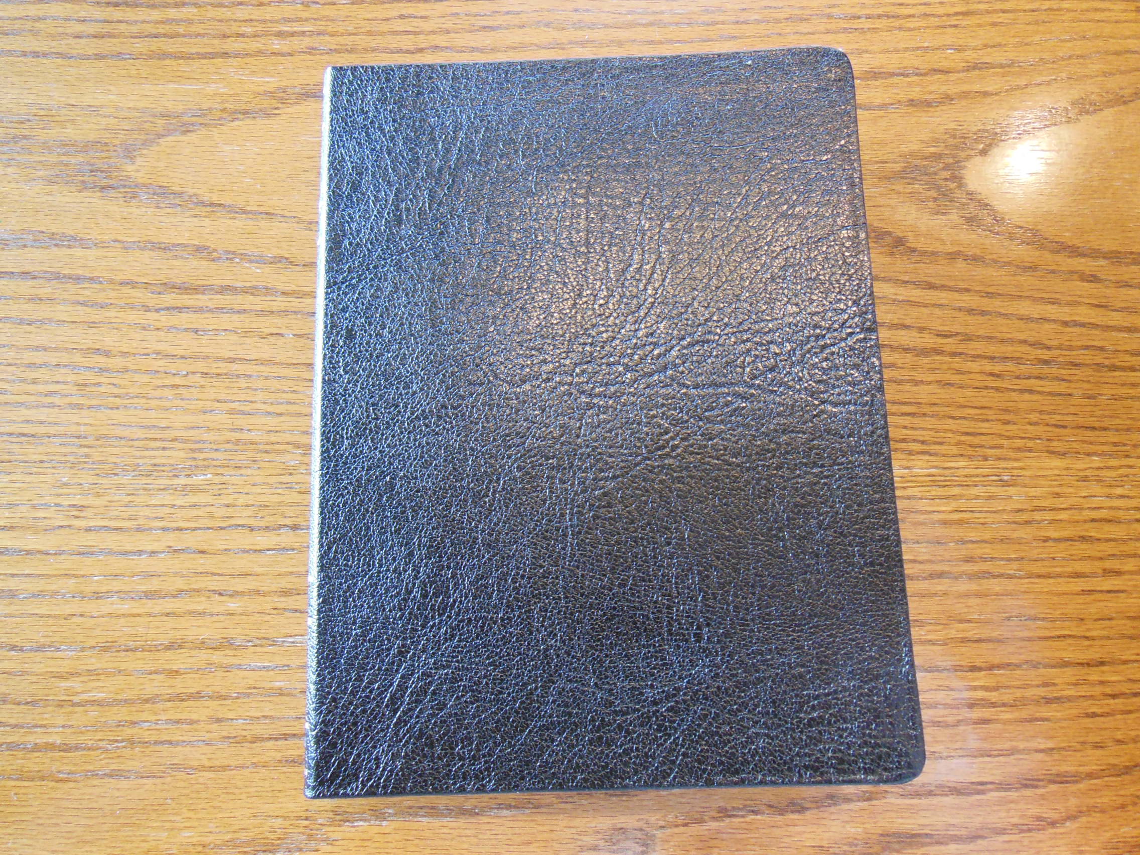
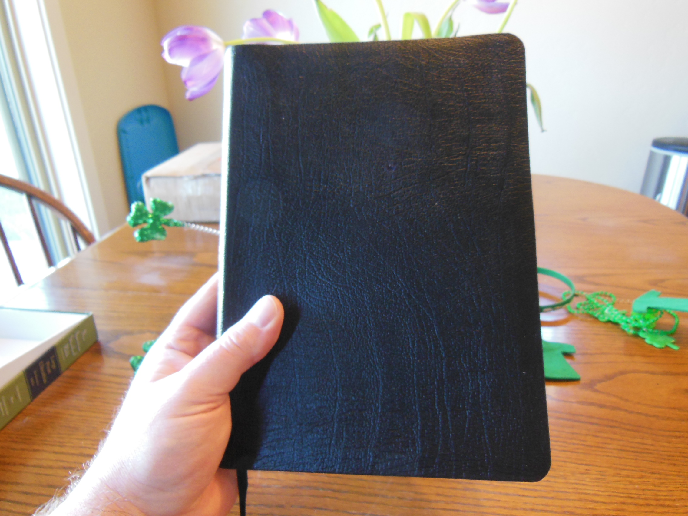
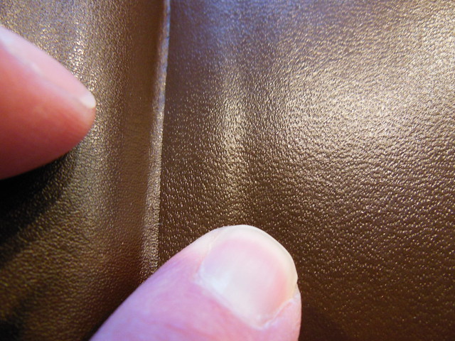
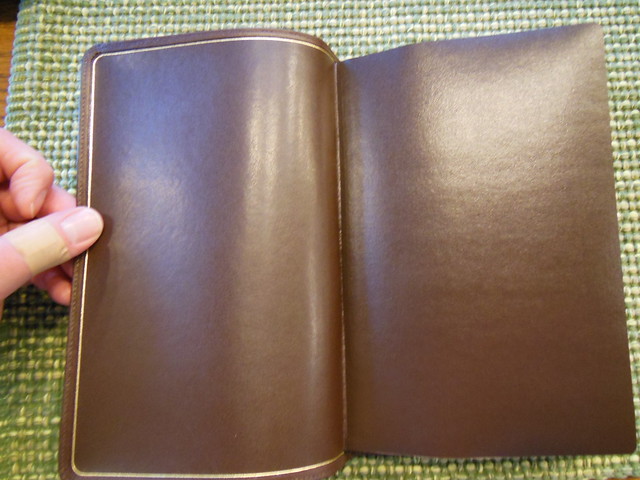
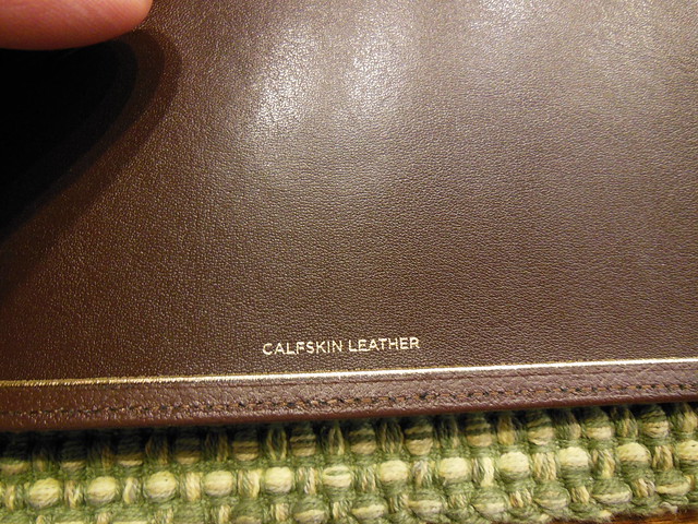
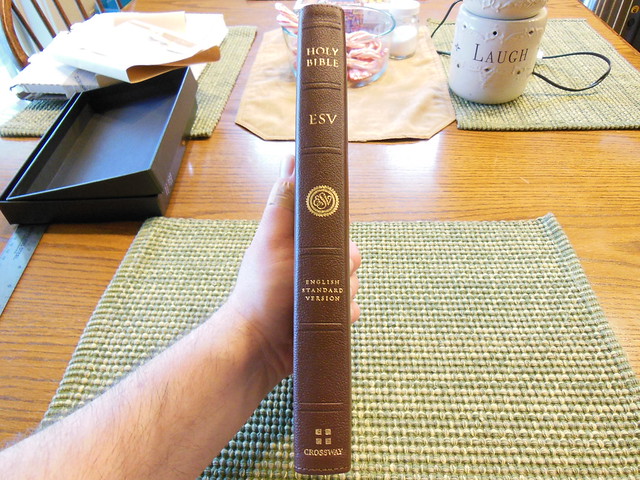
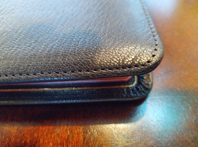
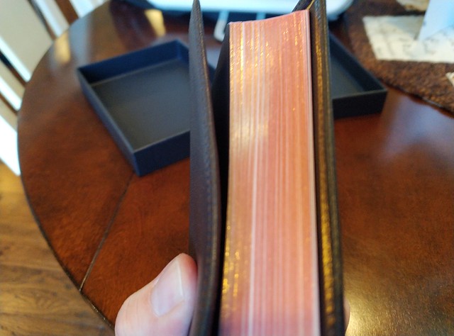
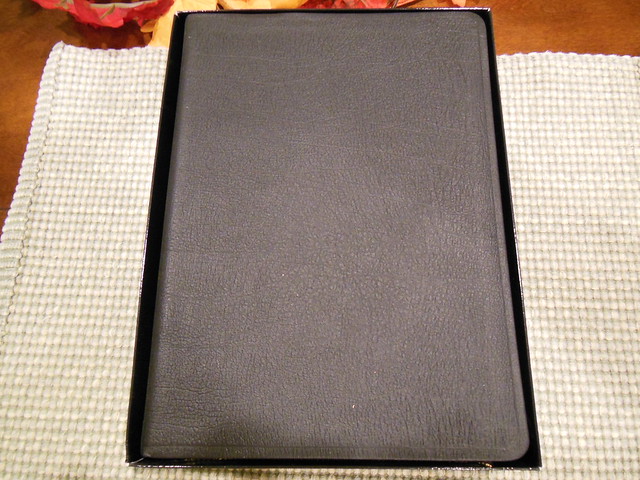
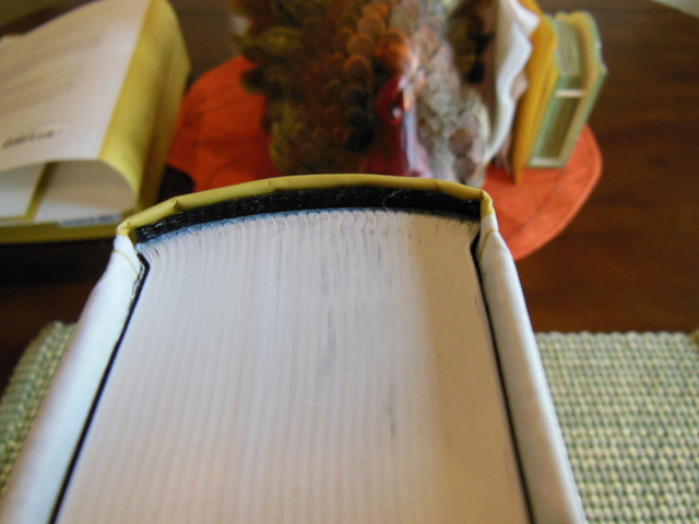
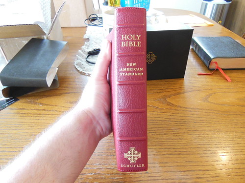
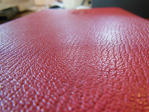
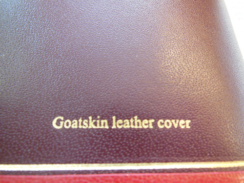
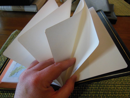
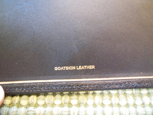
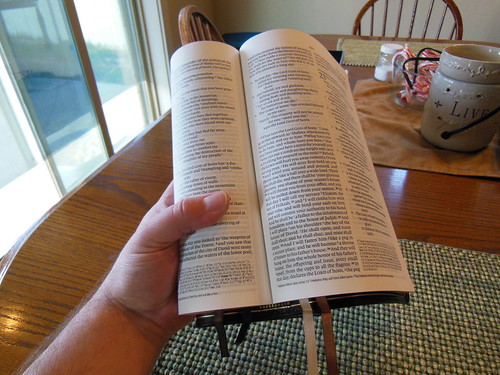
Like I said earlier, if you have had a Schuyler, or a premium Crossway, you can expect the same high quality. The cover is goatskin leather. I chose the deep brown. It is very supple. There isn’t much there as far as texture goes. It is not deeply pebbled. It is pretty smooth, and soft. The edge lined binding makes this Bible a joy to hold in the hand, and yes you can hold this Bible in one hand, and comfortably read it. The line matching, and 8.5pt. font add greatly to this.
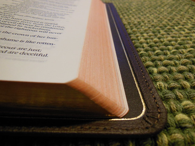
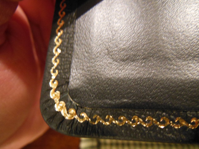
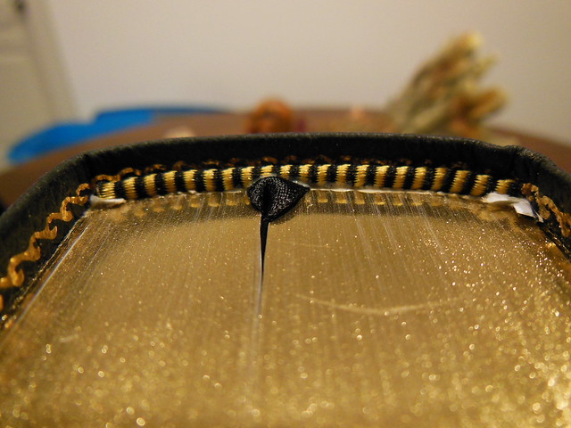
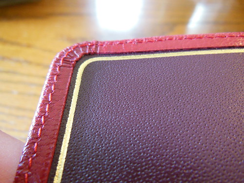
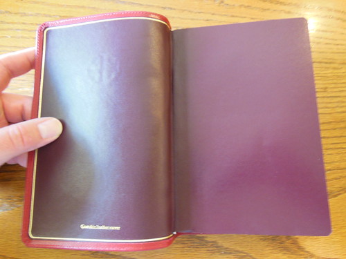
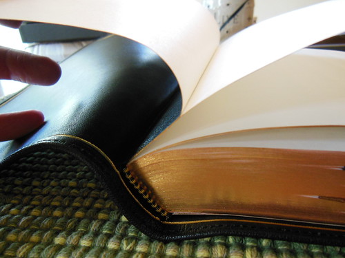
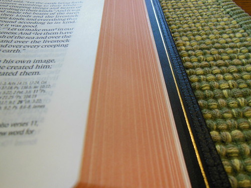
The cover is perimeter stitched, and there is a gold perimeter line around the interior cover.
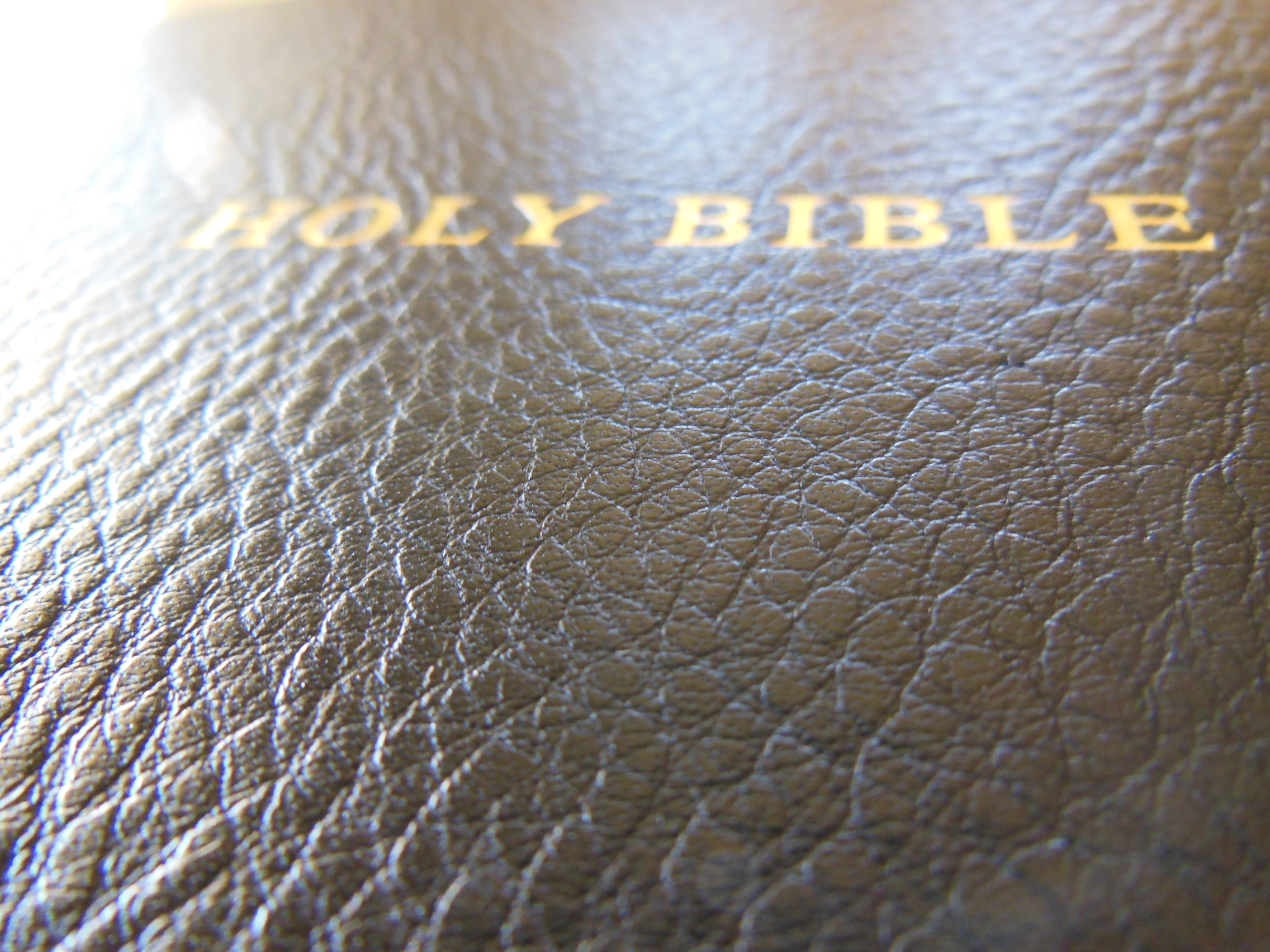
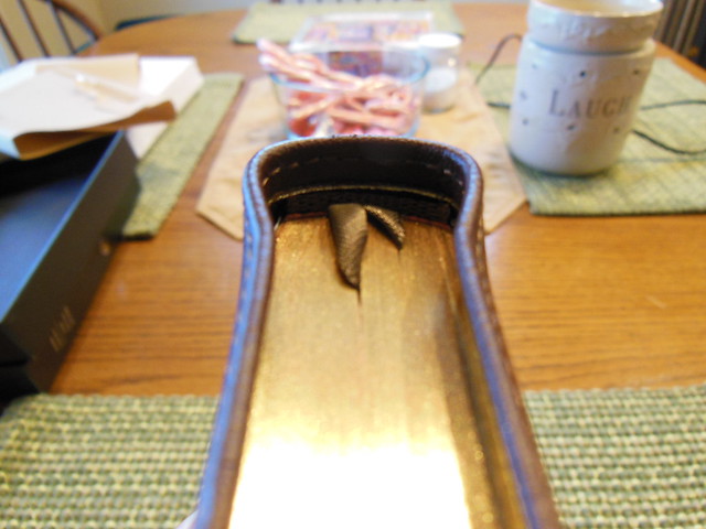
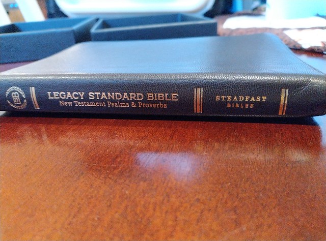
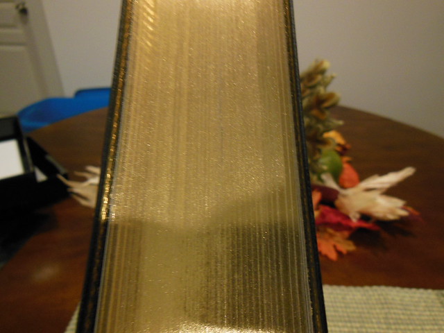
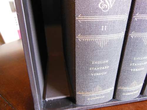
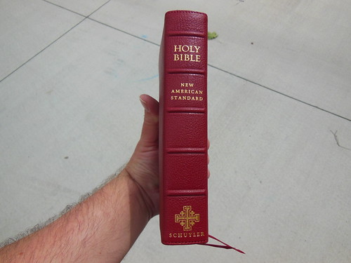
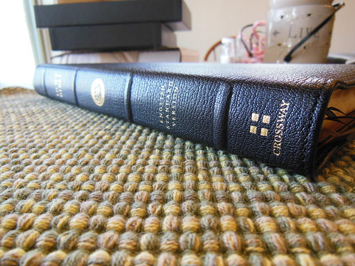
The spine is hot stamped with, “Legacy Standard Bible New Testament Psalms & Proverbs” It has the logo on the head, and, “Steadfast Bibles” on the tail. The page edges are art gilt. Not simply gilded. The less expensive editions are probably the ones that are simply gilded.
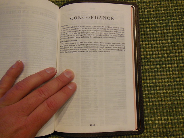
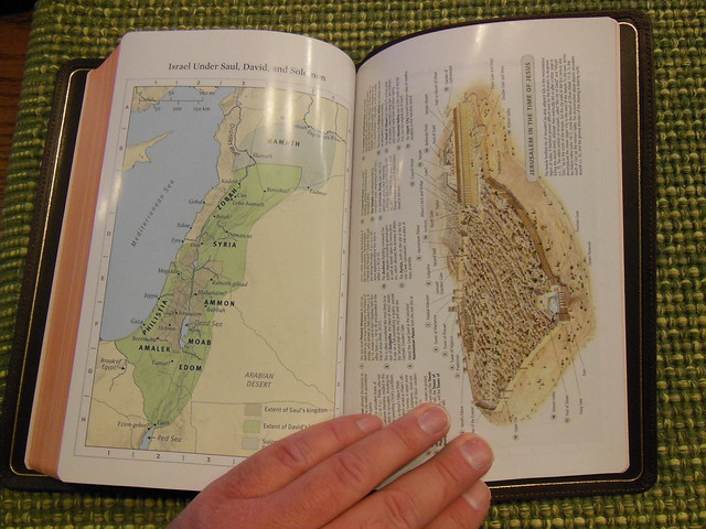
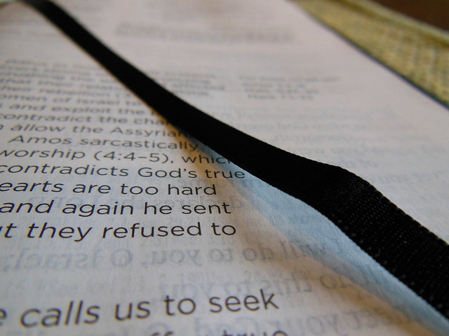
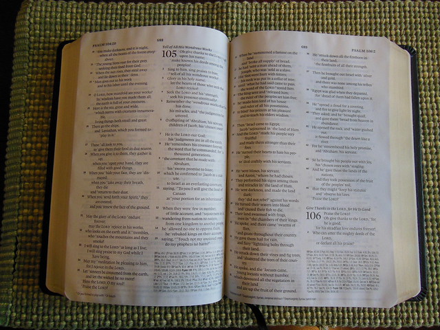
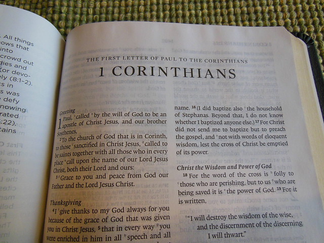
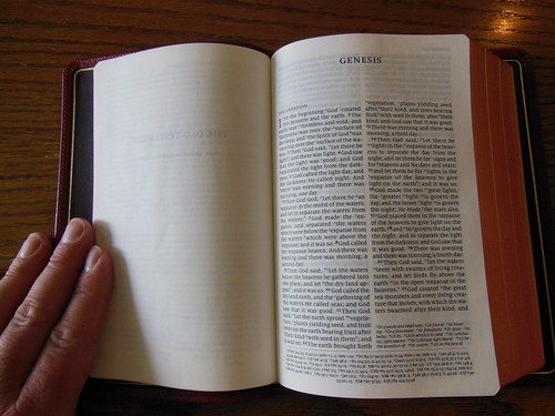
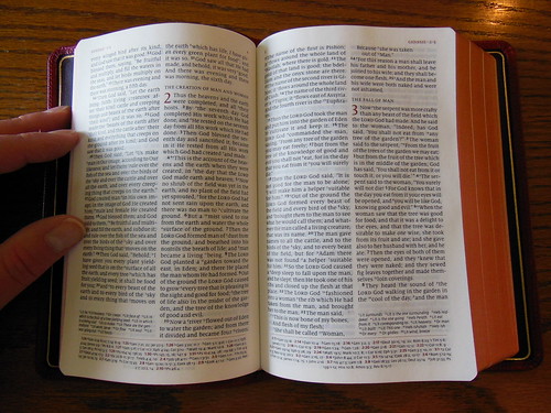
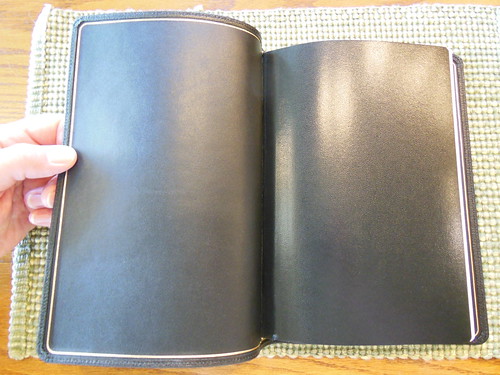
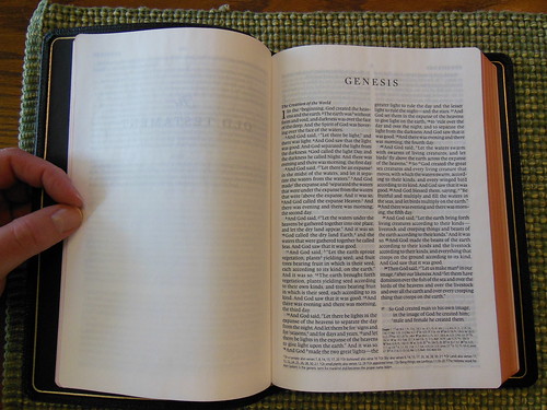
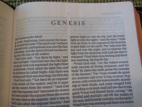
It is a black letter edition, with a double column layout, in verse format. There are no cross references, footnotes, or any other helps/features in this edition. (No maps or concordance) The idea for a N.T. edition like this is portability, and readability. An elder on the go will be well served by this design.
You can check out the rest of my pictures of this edition on my flikr album here.
If you’d like to purchase your own copy, you can do so here, 316 Publishing.
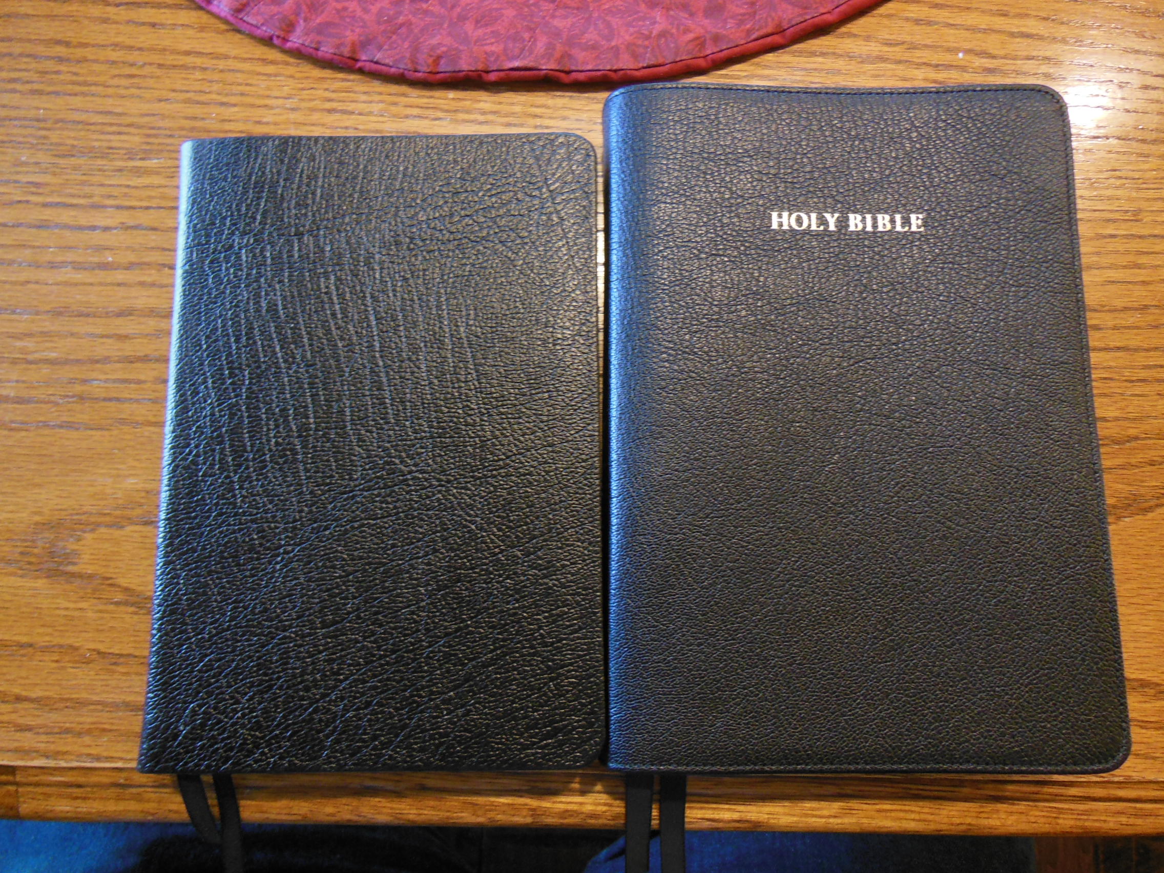
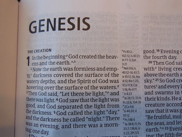
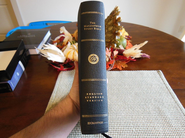
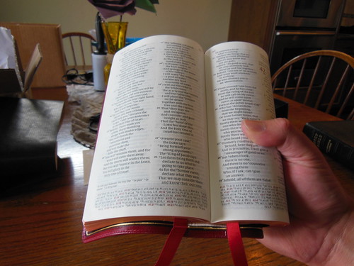
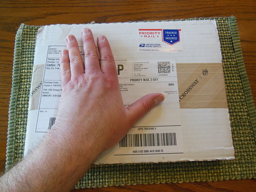
I know this Bible has been out for quite some time, but Crossway was kind enough to send one out for review. This is one of their Bibles I have not reviewed yet, and perhaps you haven’t looked into it yet either. I have two other John MacArthur Study Bibles. One is from Thomas Nelson, and it is a N.A.S.B. The other is the 25th Anniversary Edition in N.K.J.V. The things that struck me between the three different editions are the qualities of the papers, the printing, the spine/binding, and the cover options. In all of the qualities, except one, the Crossway comes out on top, and not just by a little.
The genuine leather cover is more like a genuine calfskin leather, and not at all like the pigskin leather that came on the Thomas Nelson made N.A.S.B. The quality of the 25th Anniversary N.K.J.V. leather cover was slightly better than the Crossway edition’s. The 25th Anniversary edition’s cover was a bit thicker, perimeter stitched,and had an inner liner which moire silk. You would not expect a simple genuine leather edition to come anywhere near the quality of a premium Bible, but it does. The spine of the 25th anniversary edition has raised hubs, the other two do not. This is not a big deal. It is only decorative.
The paper on the Crossway far exceeds the quality of the other two. The other two are less white, and have almost a newsprint color to them. They are also made of toothier paper. The Crossway is smooth, and white, but not too bright. It is just bright enough to offer the proper contrast between the uniformly, and sharply printed font.
The spine of the N.A.S.B. from Thomas Nelson is not sewn, but glued. It is a case/perfect bound Bible. The Crossway, and the 25th Anniversary N.K.J.V. are both sewn. The Crossway is about the same thickness as the Thomas Nelson. Both are much thinner than the 25th Anniversary N.K.J.V. I’m not sure why it is so thick. I’m guessing it is due to the type of paper. They all have relatively the same amount of content. They could all use better ribbons. The Crossway has nicer maps, of course 🙂 If you are interested in it,hurry up and get it while it is on sale for Christmas!
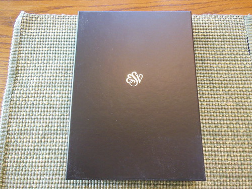
The Crossway, English Standard Version, in genuine black leather comes in a two piece retail box. The box isn’t as sturdy as some other boxes, but I would still hold onto it to store your Bible in when not in use. The Bible itself is full of helpful features that will be of great value to you while you endeavor to learn more about the God who saves.
Here is a list of the Bible’s features from Christianbook.com’s product page;
Features
Complete ESV Bible text
Nearly 25,000 explanatory notes from Dr. John MacArthur
Bible text in 8.7 point type, 7.6 point study notes
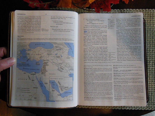
More than 140 two-color maps, charts, timelines, and illustrations
Complete introductions to each Bible book
Concise articles on How We Got the Bible, How to Study the Bible, and Introduction to the Bible
80,000 cross-references
An extensive concordance
Bible reading plans
Index to Key Bible Doctrines
Outline of Systematic Theology
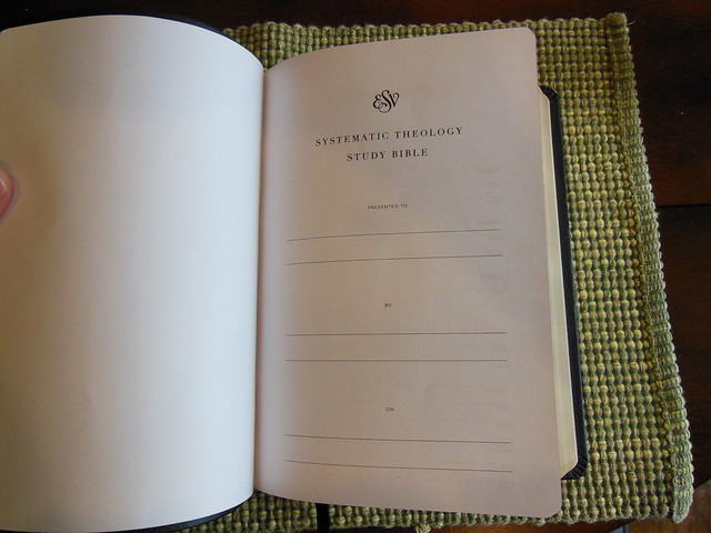
Presentation Page & Family Record Section
Center-Column References
Timeline of Old Testament Kings and Prophets
Timeline of New Testament Chronology
Harmony of the Gospels
Durable smyth-sewn binding
Presentation page
Family record pages
Ribbon marker
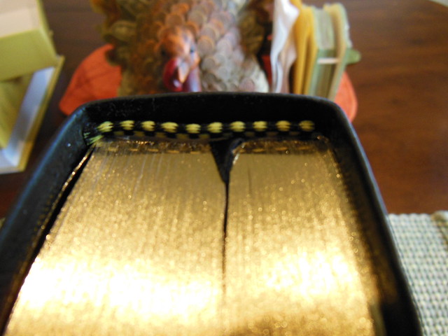
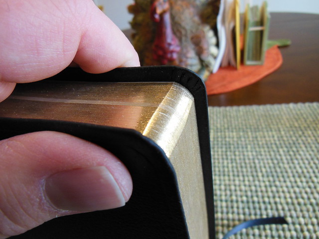
Gold page edges
8-point text size
9.75″ x 7.00″ x 1.75″
Product Information
Format: Genuine Leather Number of Pages: 2144 Vendor: Crossway Publication Date: 2010 Dimensions: 9.50 X 7.00 X 1.75 (inches) ISBN: 143352144X ISBN-13: 9781433521447 References: Center Column|Cross References
Text Layout: Double Column Text Color: Black Letter Text Size: 8 Point Note Size: 7 Point Thumb Index: No Ribbon Marker: Yes Spine: Sewn Page Gilding: Gold
You might have noticed there is a discrepancy between the two lists, one says the font is 8.7 pt. for the main text, and 7.6 pt. for the notes, the other list says it is 8, and 7 pt. When I contacted Crossway they confirmed that the font is 8.5 pt. for the main text, and 7.5 pt. for the notes. They also provided me with the font type, which is ITC Stone Serif.
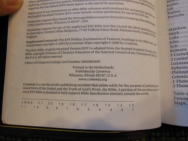
For people who are curious, this Bible is printed, and bound in China. I know, I know, Chinese made stuff is junk… Well Crossway has ensured that the quality is top notch. I’m not sure how they do it, but I would like to find out. Hopefully one day, I’ll get the chance.
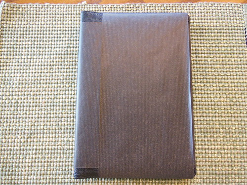
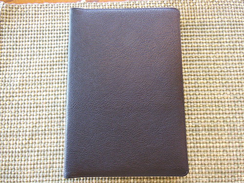
The cover has a nice grain to it, and a perimeter groove on the outside. The inside liner looks like your typical vinyl. There is a nice gold perimeter ornamentation hot-stamped on the inside of the cover as well. The page edges are gold guilt, and there are head and tail bands too.
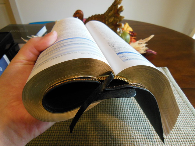
My biggest gripe about cheap Bibles is that they use glued spines, and all the pages fall out. They are also notoriously difficult to keep open, or get to lay flat. You won’t have that problem with a good sewn spine. The Crossway MacArthur Study Bible has a nice sewn spine as you can tell from the following pictures. It also has one ribbon marker.
I really like the simple style of the spine.
One of the things I like about this Bible is the use of the color blue for the chapter numbers and features.
This is a black letter edition, with double column, paragraph layout. The cross references are in the center column, and the notes are on the bottom. With the quality of paper, and printing this Bible is not hard on the eyes.
After looking over this Bible, and comparing it to other editions, I can give it a thumbs up. It is a great value, especially when it is on sale. You can get your copy from Christianbook, or Amazon. Make sure to check out all of the pictures of this Bible on the Flickr page.
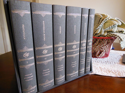
I received this set from Crossway some time ago, and wanted to use it for a while before writing a review. This review will differ from my others in the lack of a listing of the physical attributes like, paper weight, cover material, binding, font size, and layout, as all of that information and more can be found here. The Reader’s Bible is unlike any other Bible I’ve reviewed. This one is a six volume set, intended for undistracted reading. That is not to say that other Bibles aren’t for reading. It is to say, that the focus of the layout, and construction was to be conducive to reading. This is necessarily at the exclusion of other purposes. For instance, study, easy reference, citation, and so on, as there are no chapter or verse numbers, no footnotes or cross references. There is a chapter index in the back of each volume. For older folks like myself, it is so different from Bibles we’ve used for such a long time, that it takes some getting used to. It isn’t a bad experience, just different. I am a slow reader, and tend to study as I go. Other people can speed through the Bible, and retain information. When I simply read the Bible, I have to remain very conscious of what I am reading, and be diligent to properly regard it. When I start to read sometimes I start to drift. I find myself going back over the same section a few times, to make certain I have understood what I’ve read. With the Reader’s set, you can read without getting side-tracked by interesting cross references, or footnotes.
The first thing you notice is the volumes are constructed as a quality hardback, cloth covered book. Each volume has a marker ribbon, sewn spine, heavy paper, and easy to read font. Then while reading you start to experience what Crossway intended. You have a smooth progression through large sections of scripture. As you read, you don’t make your decision on where to stop by chapter numbers, or section headings. Instead, you stop where it seems natural, usually at the end of an idea. As you read, you’ll also notice that your eyes don’t tire as easily due to the very thick paper, and font. (For all the stats follow the link in the first paragraph of the review.) With the longer sessions, you tend to cover more ground. I would not let my reading, exclude separate study of the Bible. Having the Reader’s Set does force you to make time for reading, and study. I think I need that in my daily routine. Separating the two activities does seem beneficial. I think this set should hold up well, as long as they are cared for properly. I would be careful around moisture, as the pages are not coated, and would absorb water, finger oil, and dirt readily. Which brings me to my next suggestion, don’t eat, drink coffee, or have dirty hands when reading this set. You will stain the cover, mess up the pages, and make it look messy. My final thought, is that they are nice to have when you want to sit and read God’s word. My eyes aren’t what they used to be, and even though the font isn’t large, it is easier to read. I like the feel of them. It is an awful lot like reading a hardback novel in certain ways. You can view Crossway’s product page here. You can also read more about this specific sets production here. Be sure to check out the rest of the pictures on my flikr page.
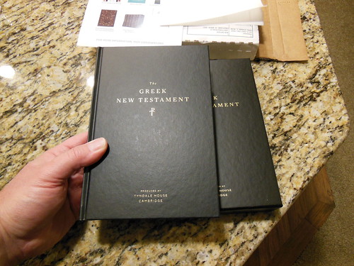
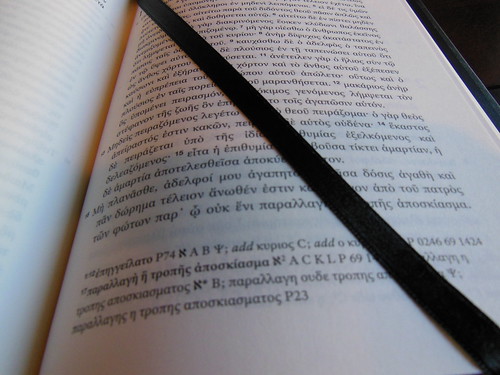
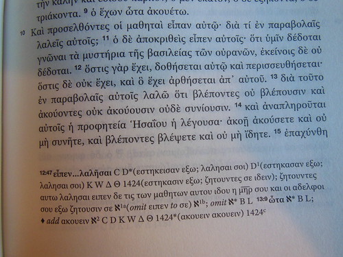
Admittedly the market for Greek New Testaments is smaller than that of English Bibles. However, there is indeed a market. For those of you who have a desire to own a Greek New Testament, I imagine it is because you are either studying Greek, or already read Greek. The most prevalent Greek New Testament out there is the Nestle Aland 28. Crossway decided to produce this edition because of some scribal discrepancies that have come to light. Here is a link to their page with a video that explains more of the reasons why they produced this edition. Here is a link to their FAQ site. I found it helpful. You will too. My review will be more about how well this edition is made.
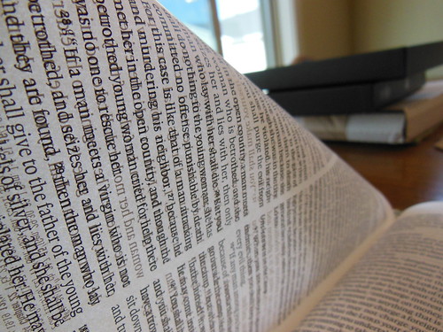
Judging the copy I was sent, I would say that Crossway used some pretty good materials in this edition. The paper was impressive. It isn’t a higher cotton content hardback novel type paper, and it isn’t a thin Bible paper. It has a smooth texture to it and a bit of weight without being as thick and heavy as 80# paper. Crossway says, it is a 70gsm Salzer. I like it. It doesn’t have much ghosting, but is thin enough to make a lighter volume. It is also evident that they employed line match printing. This also makes it easy on the eyes. I know that I started in the wrong order by talking about the paper first. It just impressed me 🙂 the print is nothing to be laughed at either. It is a 10 pt font. That is just about perfect for reading. This edition also comes with a higher quality black ribbon page marker. Most Bibles skimp on the ribbon markers, not this one.
The New Testament comes with a cardboard slipcase. It is pretty sturdy and handsome. Make sure to keep it for storing your New Testament on the shelf. Better to have the slipcase take the ware and tare of being shelved than the edges of your hardcover.
This edition has a sewn spine for many years of use and flexibility. The spine didn’t take hardly any break-in time. This edition is case bound obviously. It couldn’t be edge line bound because it is a hardcover. There is a genuine leather edition, but I believe it is also case bound. You could always have it sent out for a rebind if you desire an edge lined edition. This wouldn’t be possible if it didn’t have a quality sewn binding.
This is a single column, paragraph layout with book titles, chapter and verse numbers, and page numbers. It is easy on the eyes, very legible. Reading it is more of a strain on my brain as a neophyte, than it is on my eyes. If you are in the market for a Greek NT to read daily, this would be an excellent choice. I am no Greek expert, but I do know about quality in materials and manufacture. This edition is put together well, and should last you a long time.
I am giving away a hardcover edition of this Bible.
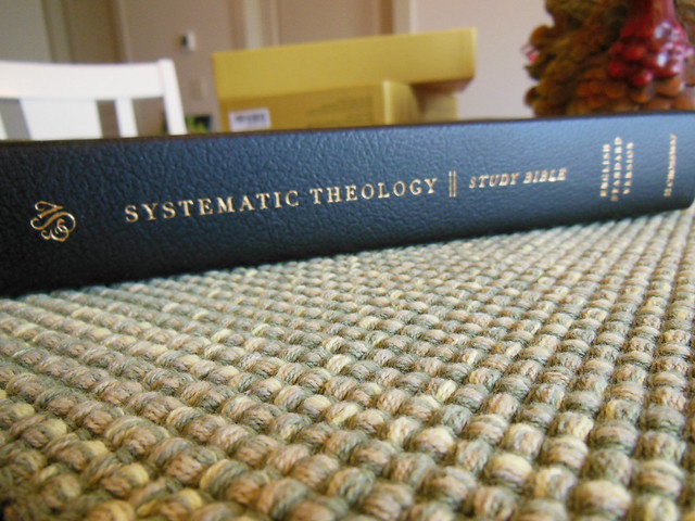
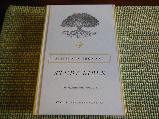
The Systematic Theology Study Bible from Crossway, is a different kind of Study Bible. It isn’t really accurate to call it a reference Bible, or a Study Bible. It is technically a study Bible in the sense that it has study aids in it, but it looks more like a reference Bible with a systematic theology book blended in with it.
For my conservative paedobaptist friends, you’ll notice the notes seem to be in favor of credobaptism. For my friends who don’t believe in God’s sovereign election, you’ll notice the notes don’t agree with you.
Some people would like it if a broad range of theologians worked on this Bible, but they didn’t 🙂 It was mostly Reformed Baptists, and conservative Presbyterians, from what I gathered reading the list of men involved with writing the theology articles.
Contributors:
Gregg Allison
Bruce Ashford
Gerald Bray
Bryan Chapell
Graham Cole
David Dockery
John Frame
Michael Horton
Kelly Kapic
Michael Kruger
Robert Letham
Donald Macleod
Chris Morgan
Stephen Nichols
J. I. Packer
Michael Reeves
Fred Sanders
Sam Storms
Scott Swain
Stephen Wellum
David Wells
The systematic theology seems to lean towards a general Reformed position, which is good, because… well, I think it is the right position lol. 🙂 I think any person who affirms the reformed position on soteriology will be appreciative of this Bible and the articles in it. It is broad in appeal to people who are reformed. It might not get all of your more nuanced secondary, or tertiary doctrines just the way you want them, but we will all be in accord over the treatment of the primary ones. I can definitely see the Reformed Baptist position reflected in the work.
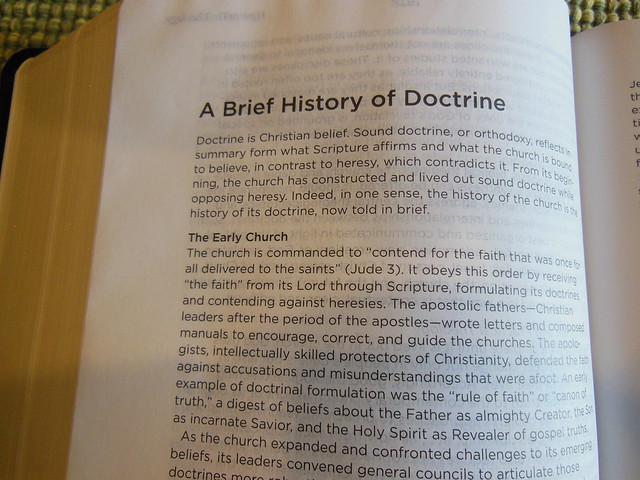
There is basically a mini systematic theology book in the back of the Bible along with some other very useful features. Here is a list of features you’ll find;
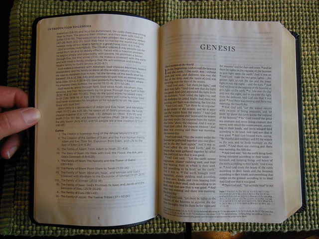
“Double-column, paragraph format
Footnotes
Book intros
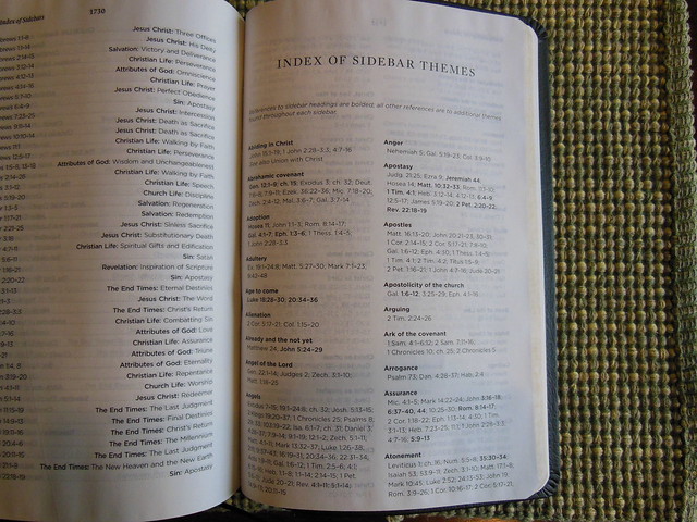
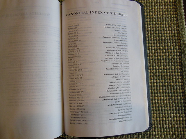
Topical index of sidebars
Cross-references
400+ doctrinal summaries explaining core doctrines and connecting them to specific Bible passages
25+ longer articles on key theological topics
Lifetime guarantee on leather and TruTone editions
Smyth-sewn binding
Packaging: J-Card (Hardcover); Box (Genuine Leather and TruTone)”
When we look at most study Bibles they either are one man’s theology, like the Ryrie, Scofield, and MacArthur, or they are a compilation of a wide range of theologies like the massive ESV, NIV, Thomas Nelson NKJV study Bibles. The last three are humongous study Bibles with a little bit of everything. The Systematic Theology Study Bible is a neat hybrid. It isn’t one man’s theology, or a broad, neither here nor there conglomeration of positions. (Excluding the ESV which does a great job.) It is from the reformed position. The theology is systematic, which means that it is harmonized. Verses are not put against verses. They are all contextually harmonious.
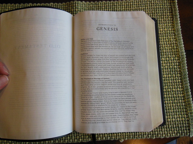
You’ll find book introductions and outlines before each book. You’ll also notice that the Bible looks a lot like a Cross Reference Bible. It seems to me that Crossway integrated their systematic theology features into the Bible very well. The articles are relevant to the scriptures they appear with, and are indexed in the back along with several theological articles.
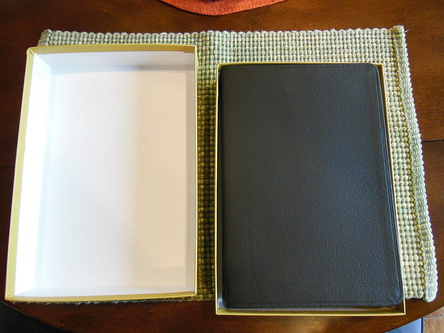
This Crossway Bible was packaged well and delivered in a cardboard box. The Bible was in a two piece retail box. You should always keep the retail boxes for storing your Bibles in if you are swapping it out with another one to read for a while. The cover is black genuine leather with a perimeter groove.
The spine is decorated with the ESV logo at the top, then, “Systematic Theology Study Bible.” English Standard Version at the bottom, with Crossway’s logo hot stamped in gold colored foil.
The page edges are also gold gilt. There are yellow and black, head and tail bands, and one black ribbon marker.
The cover is joined to the text block via case binding. The spine is sewn for superior flexibility, and durability.
In the front of the Bible there is a presentation page, and some family records pages.
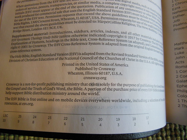
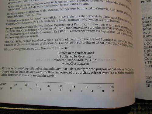
If you look at the copyright page, you’ll be pleased to see this edition was printed and bound in the United States.
The book introductions are well done. I found them to be informative, and concise, but not to a fault.
Cross references and footnotes, along with the systematic theology articles are found at the bottom of the page to save space. The text is laid out in a double column, paragraph format.
The main font is an easy to read 9 pt. Lexicon, and the features are an 8 pt. Gotham, printed crisply on 30 g.s.m. Apple Thin Opaque paper. The paper is smooth, and offers a decent contrast, and due to its color reduces eyestrain.
If you don’t already own one of these, you should get one. It is a times saver if you are intending to read a systematic theology book. You can kill two birds with one stone. It is available from Crossway, Amazon, or Christianbook for a very fair price.
Since you stuck around for the entire review, if you comment on this review, and ask to be in the running for the hardback copy of this Bible I will select a winner out of those who commented. Be sure to check back so I can get your mailing address. I will only mail this to an address in the U.S.
I know you’ve heard me extol the virtues of a few different Bibles in the past. I know there are a lot of truly great editions out there. I’m not trying to take anything away from them when I say this. This is the perfect Bible. (for me.) Keep in mind that the features/attributes of any edition are appreciated subjectively by the individual. We all like different things.
I have been looking for a Bible like this for a very long time. Like you, I’ve purchased several Bibles looking for the one that satisfy most of my desired features. It never fails, I use them for a while and get irritated with one of the design, “flaws.” They aren’t really flaws folks, just features I didn’t like, or missing ones I do like. Bible design is difficult. You have to work with different finite attributes. I think it is impossible to make one edition that everyone will think is perfect for them.
This of course, is a modern problem. In the past you didn’t have much choice. You were blessed to have one. Go back far enough and it was illegal for you to own one. Thanks to God and the men of the Protestant Reformation we have God’s word available for almost anyone who wants a copy. Count your blessings folks if you have one Bible and appreciate the providence of God that you were born in a time and place such as things are where you can get picky about what features you would prefer. I know I do.
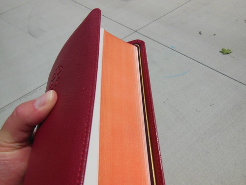
The Personal Size Quentel is just the right size to hold for long reading sessions. The font is 8.5 pt. It is a bit small for people with eye problems who don’t want to wear reading glasses or their prescription lenses, but for people like me, or folks who do wear corrective lenses, the font is clear, sharp, uniform, and overall well done. It is very legible without being too small. If they had made the font any larger they would have had to increase either the page size or number of pages. If they wanted to keep the Bible the same thickness they would have had to decrease the paper thickness. This would have made the paper less opaque. Everything is tied together.
If you are like me, the full size Quentel is just too large to drag around everywhere. Compact Bibles are too small, and their font is too small. Usually 6 pt for them. The Ultrathins and Thinlines are nice, but their length and widths are too much for holding in one hand unless you fold the cover completely over. When I saw the dimensions for this edition listed on evangelicalBible.com I was excited and hopeful. I had been waiting for a Bible with all the stats that they were posting, and it was coming out in NASB to boot! I was like, “Take my money!” All that was left now was for them to get them and ship them out.
Here are the vital stats from evangelicalBible.com the ones responsible for Schuyler. Natural Grain Firebrick Red Goatskin with Dark Red Calfskin Liner
Same Pagination as the Quentel Series – (all page numbers and format will be identical)
Approximate font size: 8.5
4.7″ x 7.1″ x 1″ (120 mm x 180 mm x 25 mm)
Line Matching
28 GSM Indopaque paper
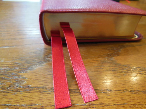
2 Ribbon Markers (Dark Red)
Art-Gilt edging (red under gold)
9mm yapp
Smyth Sewn
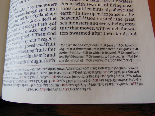
Black letter text (chapter numbers, headers and page number in red)
More than 95,000 entry cross references
Presentation page
Lined note paper
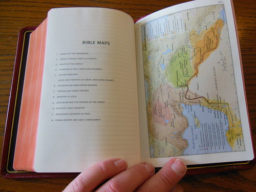
Extensive Schuyler Bible Maps
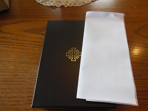
The Personal Size NASB Quentel arrived undamaged from evangelicalbible.com There was a small dent in the cardboard box, but the Bible inside was packaged in a bubble wrap. The retail two piece presentation box was not dented.
The Bible was wrapped in two pieces of paper to help the Bible keep its shape, and protect it during shipping. There was a business card from evangelicalbible.com in the box as well as a warranty card. I’ve never had any problems with a Bible from evangelicalbible.com, but I know people who have had some experience with them. I’ve heard they are always kind, and ready to replace a Bible you are not happy with.
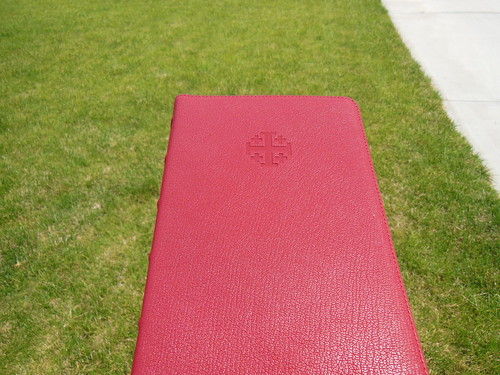
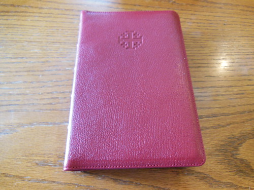
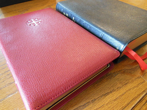
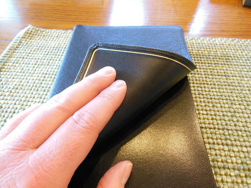
As you can see, I ordered the firebrick red. I like it a lot. It is a bit darker than my R. L. Allan NASB Reader’s edition, but I think they make a lovely couple. I find the crosses stamped into the front cover to be a pleasing feature. I don’t know how well gold stamped lettering would hold up in a cover so flexible, so the stamped crosses make sense. The perimeter stitching is executed flawlessly. There are no missed stitches, or mistakes.
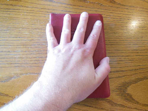
Wow, look at the size of that Bible! My hand almost covers it. Just the right size for me. You might also think that, if you are like me in your tastes.
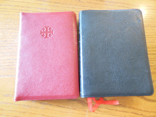
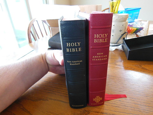
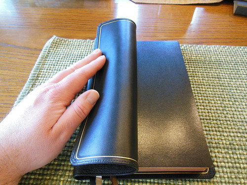
Here is an NASB Cambridge Clarion in black edge lined goatskin next to the Personal Size Quentel. The Clarion is a bit wider across. This makes it a little harder for me to hold onto with one hand, while reading.
The Clarion is also quite a bit more thick when compared to the Quentel.
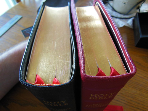
The head and tail bands are white. They are understated and clean.
The spine has five raised spine hubs. They are all straight and parallel to each other. The gold stamping on the spine is not too busy. It gives you the information without putting too many decorations on it. As usual, Jongbloed has done a great job with this edition.
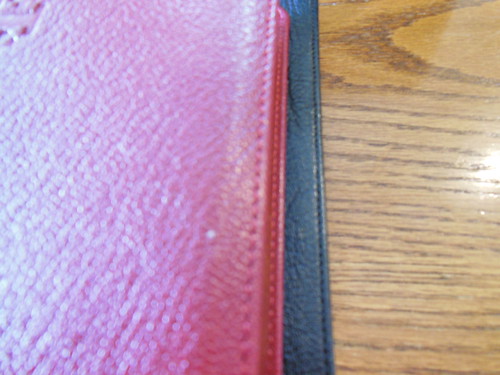
The grain of the goatskin along with the red cover is visually striking and attractive. I think it is something special.
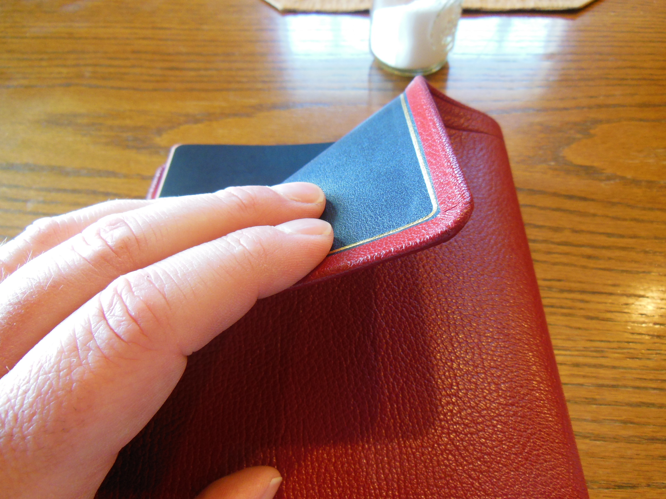
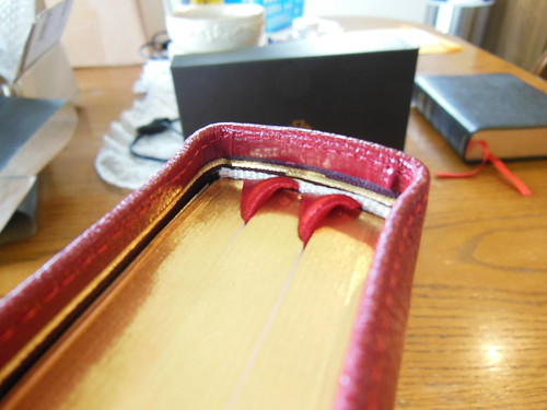
Here is another picture of the inside cover and corner. You can see up close the stitching, gilt line, and even pores of the cowhide liner. The darker maroon color of the inner liner accentuates the firebrick red of the outside.
Where the text block is attached to the cover the hearty card page stock in the front and back of the Bible are glued up further than needed to strengthen the connection. This will help your Bible last a long time. It is not a defect. 🙂
The stamp on the front cover is barely visible through the inner liner. This picture gives you a better look at it.
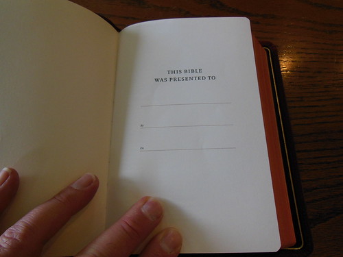
I think Schuyler did the right thing by keeping the presentation page clean and simple. I would leave the family record pages to Bibles with more room.
The copyright information page shows that this bible was made in the Netherlands by Jongbloed.
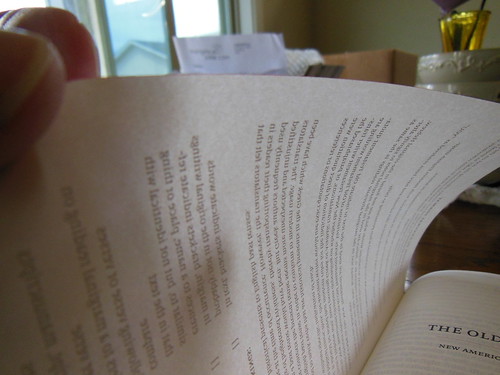
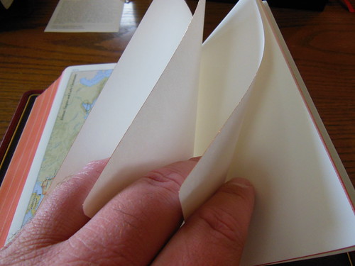
Here is a shot of one page singled out with direct light from behind it. If they had gone thicker it would have ruined the hand feel if you ask me. I am glad they didn’t. If they had gone thinner it would have been to transparent and the ghosting would have been a problem. As it is, I have not had a problem 🙂
I mean, come on! Look at that page. For a Bible this small and paper this thin, for the font to be so good is a rare thing.
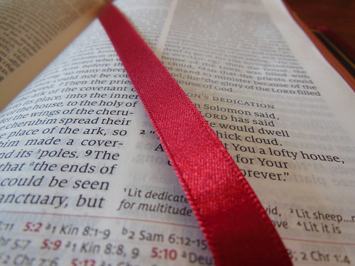
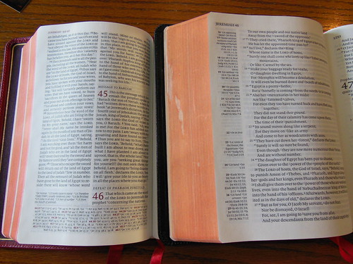
Looks like line matching to me folks. Gorgeous pages and setting. I love the use of the page by this layout. It is the same as the full size Quentel. The pagination is the same as well. It would make a terrific companion to a full size Quentel in the same color.
Just like its big brother, it has some red highlights on the page numbers, book and chapter information, chapter numbers, and cross references at the bottom.
Brand new right out of the box it stays open. Not perfectly, but it does. I’m sure once it is broken in it will be better to.
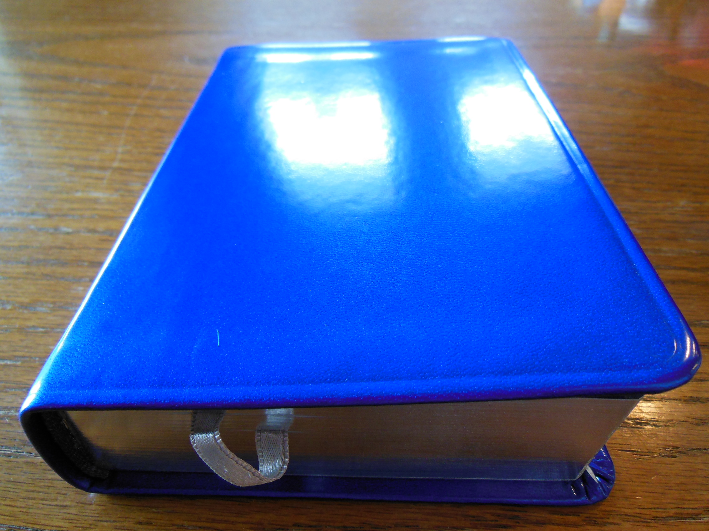
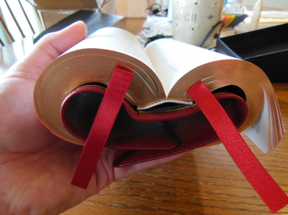
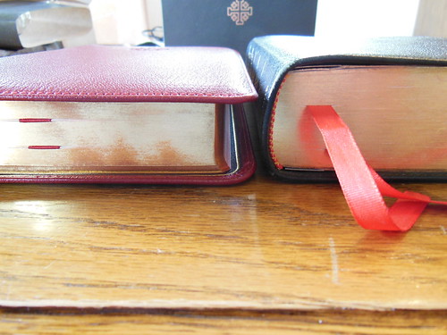
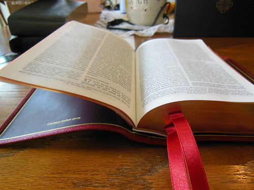
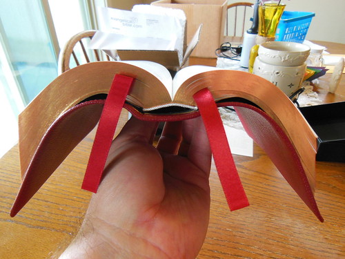
The two red ribbons are wider than what you might be accustomed to. They are also higher quality. The ends are cut and seared so as to not fray. I like them much better than the ribbons on the Clarion.
I love the way the red ribbon looks across the white page. It looks the way it should.
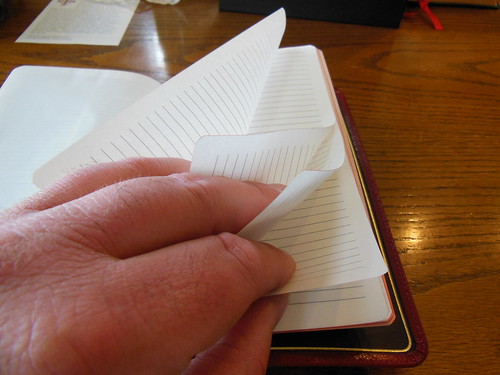
There are some pages of ruled paper in the back for limited note taking. You don’t see this that often in Bibles. It is a great feature for people who are concerned that there isn’t enough room in the margins.
Schuyler has a set of high quality maps as well. They are printed on paper that feels to be about double the thickness of the bible paper without being card paper. The maps use multiple colors and are printed nicely.
There are some card papers in the back as well. You could take some notes on it if you wanted to.
Mysterious floating Bible, oooh ahh…
As you can see the Clarion is a bit shorter than the PSQ. That necessitates it being thicker. The Clarion is a bit too thick to fold one side over and hold in one hand. The PSQ does it easily.
I spilled water on my Clarion shortly after I got it a few years ago. So the page edges are not a flaw from the publisher it was my fault.
Prerequisite Bible bending…
Here it is in its natural environment.
I would highly recommend purchasing this edition if you are looking for an New American Standard Bible in a size that is between compact and full size. There aren’t very many out there in that niche. Bottom line, get one. (If you can responsibly afford it.)
As usual make sure to check out my Flickr.com page for all the pictures!
I know that not too many people are aware of the premium Bible market. For those that are, they appreciate the natural hide, edge lined covers, sewn bindings, premium papers, and aesthetics. The price can be the main prohibitive factor for someone seeking to buy their first premium Bible. The Bibles in the premium category usually start out at $150 to $250 price range. The suggested retail price of this Bible is $250. This Bible can be purchased from Christianbook.com for the dramatically discounted price of $169.99 and from evangelicalbible.com for even less at $149.99 Just let that sink in. You can get one of the best quality, best translations, from Crossway printed and bound by Jongbloed, the premiere Bible bindery for the price of a concert ticket.
In the world of premium Bibles there isn’t much room for error or variance. If you want to publish a premium Bible, you go to Jongbloed of the Netherlands. When Crossway wanted to publish the Omega, they didn’t skimp. They also went to Jongbloed. There are numerous reasons why publishers utilize them for their premium editions. Paper choices, cover choices, binding methods, printing equipment and methods, overall professionalism and standards, you get the idea. Cambridge, Schuyler, Allan, all have made use of Jongbloed for their top notch Bibles. The E.S.V. Omega Reference Bible in black, edge lined goatskin leather, is one of the best Bibles available today. It belongs in the premium Bible category.
I could go on and on about the great qualities of this edition, but instead I think it would be better if I just show you. Without further delay, some high resolution pictures with comments.
The Omega was shipped from Crossway in a white box. It arrived undamaged.
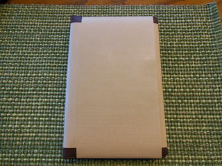
Inside the shipping package, was the Bible in it’s black, two piece, presentation box. Retain it for storage. The Omega is too flexible as an edge lined Bible for you to stand it on a bookshelf without a box.
Inside the presentation box, the Omega is wrapped in two bands of paper to protect the page edges and keep it from shifting around during shipping.
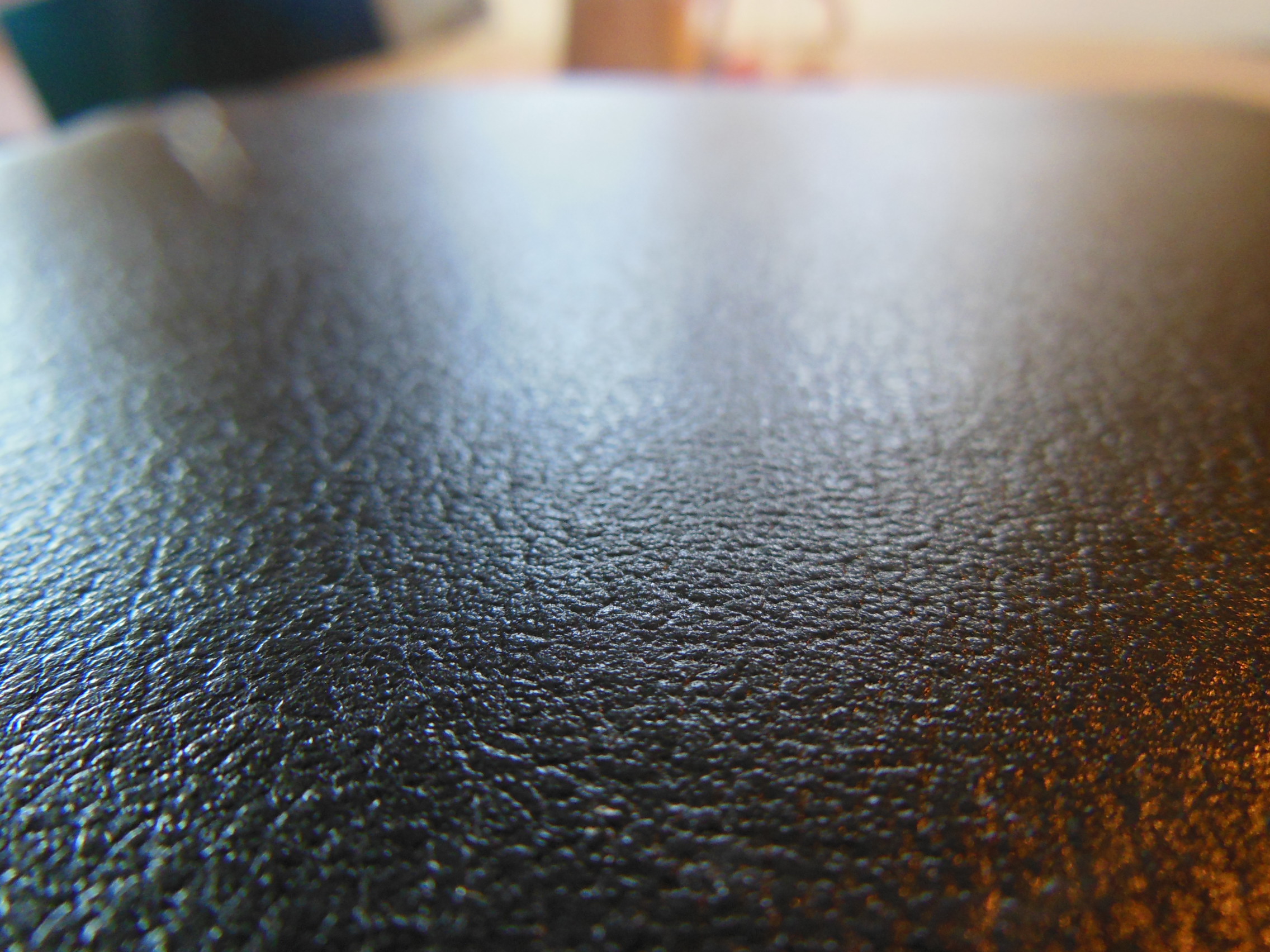
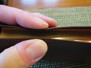
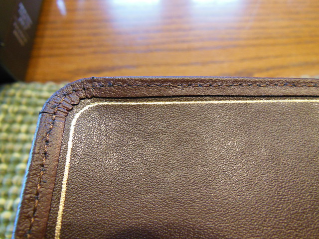
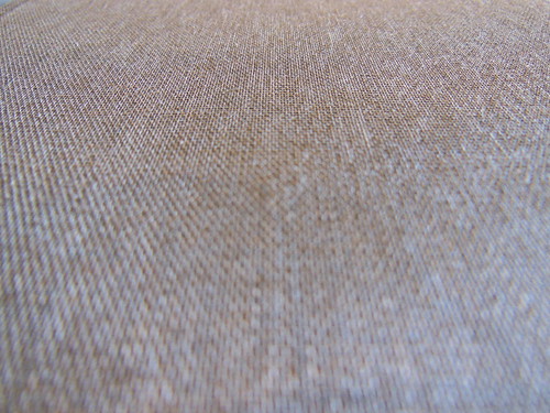
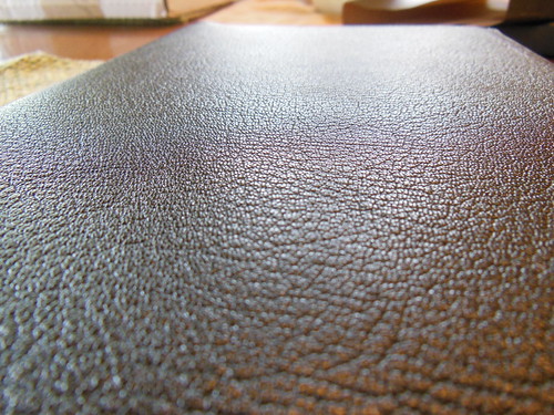
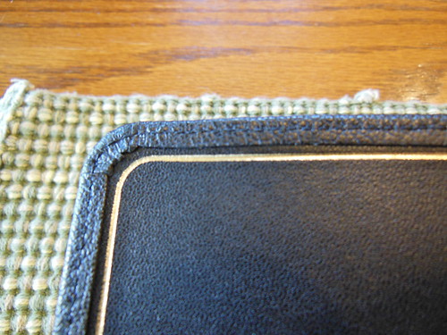
The black goatskin cover is perimeter stitched to the inner liner. It has a pleasing natural grain, and is very supple.
The inner cover/liner is also leather. It has a gold perimeter line and the corners are finished well. The hinge will take a bit to break in, but once you do it will last a long time.
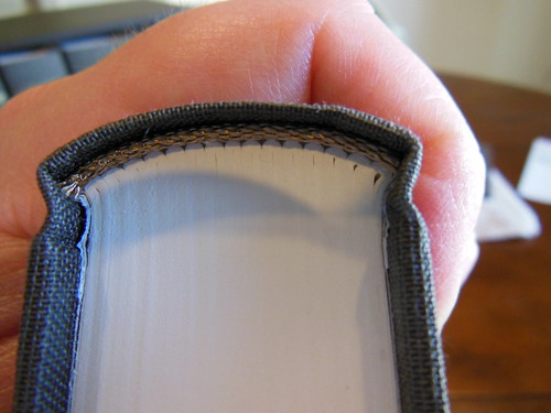
The spine is smyth sewn and very flexible. You can see the signatures bend around it rather than the pages bending around a glued spine. This is a, “must have” feature for a Bible. They should all have sewn spines. I wouldn’t even purchase a value line Bible without a sewn spine unless I had to. The sewn spine is a major factor in how long the Bible will last and how well it will open and lay flat.
As you can see from the pictures, the cover is supple and has a lovely textured grain to it. It is a pleasure to hold. The light weight and dimensions of the Omega equate to hours of easy reading, as well as long evenings of deep study.
You can see the lovely grain of the leather in this close up picture.
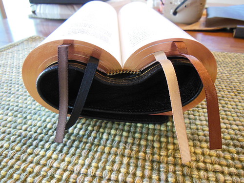
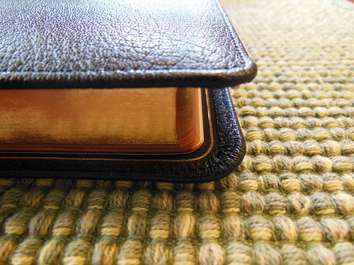
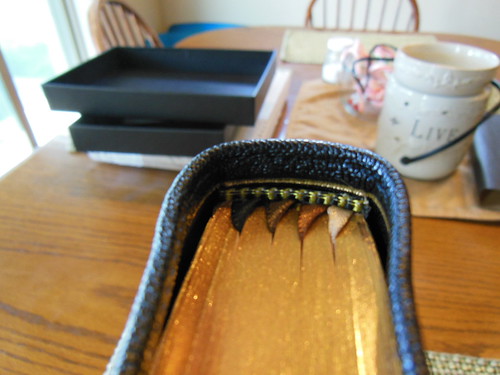
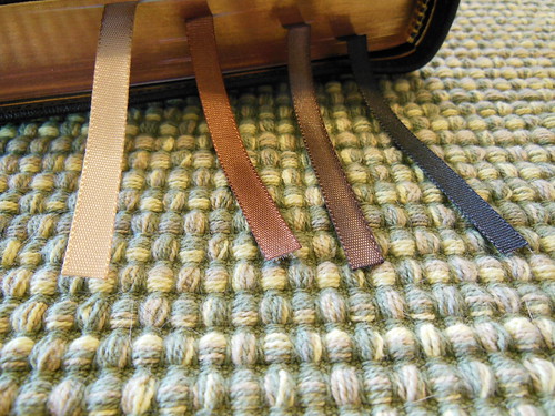
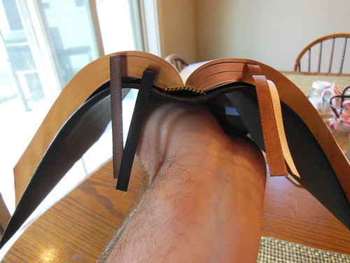
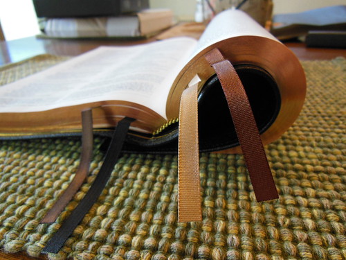
The corners of the cover are very well executed as are the corners of the text block. They have been rounded, as well as the spine. The page edges are beautifully art gilt. Also, take note of the use of four ribbon markers. That is almost unheard of. I know it is the first time I have heard of it, and I like it. The color of the ribbons is complimentary to the cover, and each other. I am actually using all four of them. I use one for my Old Testament reading, one for the proverbs and devotional reading, one for my New Testament reading, and one to mark where I am at in my study with a couple of my brothers in Christ.
The gold and brown head and tail bands match the ribbons and inner liner.
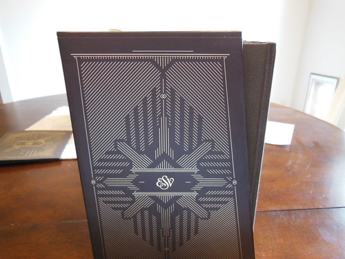
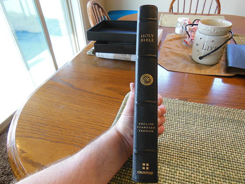
The spine is decorated with four raised hubs. It has, “Holy Bible” at the head, the ESV logo, “English Standard Version” above the foot, where the Crossway logo sits, all hot stamped into the goatskin leather.
The text block is joined to the cover like all edge lined Bibles, by gluing the leather tab from the inner liner to the block and then covering it with a vinyl coated card paper. This one is glued further up the paper to make it more durable.
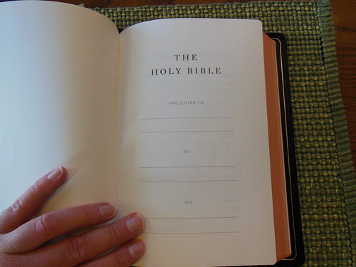
At the front you’ll find a presentation page and some family records pages.
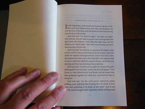
The Omega Heirloom Bible employs a 28gsm PDL paper that has a opacity rating of 79. The Omega uses a 10-pt. Lexicon font for the main text.
With one page singled out and help up with light showing through from behind you can see how well the line matching was used. It is exceedingly effective in reducing eye strain, and making this Bible a pleasure to read. This coupled with the high quality print job that Jongbloed did makes this a most legible Bible.
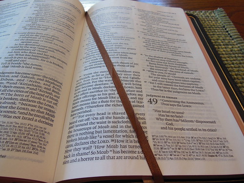
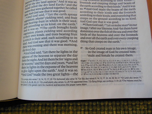
It is a double column, paragraph format layout with drop cap style numbers for the chapters. The book titles appear at the top of the first page of each book. Page numbers are placed at the top and justified to the center of the head. The text is some of the boldest I’ve seen and is very sharp. It contrasts well against the paper and also is a tremendous feature making the Omega a great Bible.
To make space for the text, the cross references and notes are printed at the bottom of the page. This layout is becoming more and more popular because of its effect on text real estate on the page.
For you note takers who dare to write in such a lovely Bible 🙂 there is about a half inch margin available. I don’t see much note taking going on here, but if you must…
As you’ve come to expect on premium Bibles, the page edges are art gilt with red under gold.
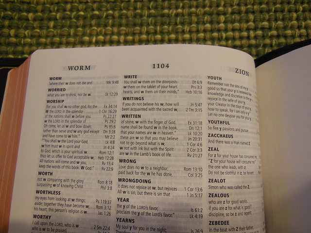
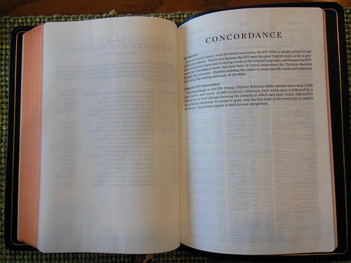
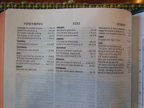
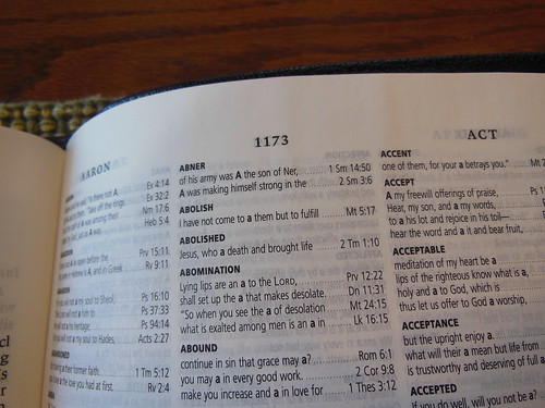
There is a useful 41 page, 3 column concordance in the back of the Omega. Make sure to take advantage of it. It can be a helpful tool.
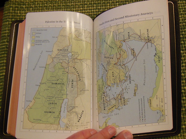
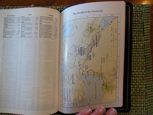
You’ll find the obligatory maps from Crossway in the back. Their’s are some of the best.
With the sewn spine, and edge lined binding this Bible is nice and flexible. Notice how well it drapes over my hand.
Here it is compared to my R. L. Allan NASB Reader’s Edition. The Omega is a bit shorter, thinner, and more narrow. It is much easier for me to handle than the Allan.
Below you’ll see on the left a page from the Omega, and on the right the Allan. The Allan doesn’t use line matching. Even though it is a great paper, there still is a bit of ghosting. This makes the Omega the winner.
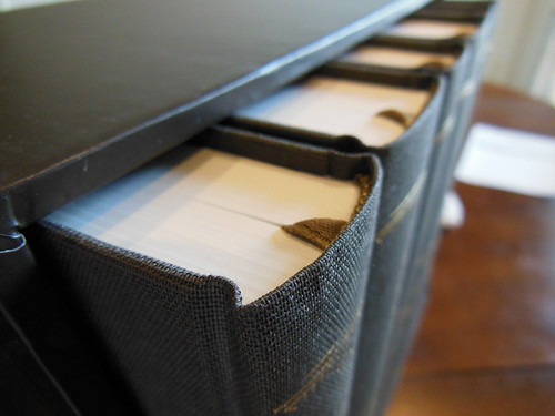
Here we have the Thinline Heirloom, Omega, and Study Bible from Crossway.
I think you’ll be very happy should you decide to purchase an Omega Reference Bible from Crossway. I don’t think there are very many Bibles out there that are any better. It is one of the best. This Bible would make an excellent gift to a person graduating from seminary, a Preacher in your Church, or anyone who enjoys well built Bibles. Make sure to check out the rest of the pictures on my flickr page.
It is difficult to find that perfect Bible, but this is where many of us start out. When you finally decide to get a high quality Bible, you want to get all of the features you like in one edition. The problem is that rarely is there one Bible that will satisfy all of your requirements. In this article we are going to look at some of these features, a few of the pros and cons of the features, and a little basic Bible design and layout. Hopefully this will help you make an informed purchase, and keep you from having unrealistic expectations.
I know many people ooh and ah over floppy, natural hide, edge lined covers, but these aren’t always the best Bibles to have. There are also a bunch of folks who have no idea what the difference is between bonded leather, genuine leather, and calf skin leather. So, let’s start off by learning about covers. After all, it is the first part of the Bible a person sees and touches.
The least expensive covers are equivalent to those you’d find on a paperback book. Not much to know here. Some of the pros are that they are inexpensive to mass produce. Usually you find these covers on evangelism Bibles. Perhaps you’ve been handed a Bible with a paperback cover? They are only a couple of bucks to buy, and they get the job done. The biggest con is that they are not durable. They tear and dog-ear very easily.
Hardback covers are next. These types of covers are common and inexpensive like the paperback covers. Everyone should be familiar with them. They are a cardboard sheet known as a book board, that is underneath a paper, cloth, or hide cover. In the past these were often made out of wood. They provide rigidity to the text block so the book can be stored standing on its edge. They also support the pages while you hold them. One of the problems with a rigid board is that if you drop it on a corner it will deform and stay that way. If you do store it on a shelf, as you take off the shelf, and replace it on the shelf, the edge will become worn. Also the text blocks tend to pull away from the book boards over time and require repair.
Synthetic covers are the next step up. They offer a wide range of appearances and styles. They are also inexpensive to make. They can be made to simulate leather or just about anything else you might cover a book with. They can be made with various designs in them making them very attractive compared to paperback and hardback Bibles. The covers don’t stand up to skin oils, sunlight, and other environmental hazards like being scratched or scraped when compared to the durability of a good quality hide cover. They also lack the smell and texture of real leather.
Bonded leather used to be one of the most common inexpensive covers before the rise of synthetic covers. I would just like to say, there are no pros to bonded leather… Ok fine, maybe they were not as expensive as a genuine leather cover, but come on! They are basically leather sawdust and scraps, bonded together with adhesive and dye, and then they have a fake leather grain stamped into them. They are generally not very flexible either. They are more durable than paper or had back. They are even more scratch and scuff resistant than synthetic covers, but when the surface is compromised, the oils and salts from your skin will sink in and make the damage worse. It will swell, and flake apart where the crease or cut is. There is a new bonded leather called Cromwell bonded leather that is supposed to be a very durable, long lasting bonded leather. I’ve just never liked the feel or smell of the bonded leather covers.
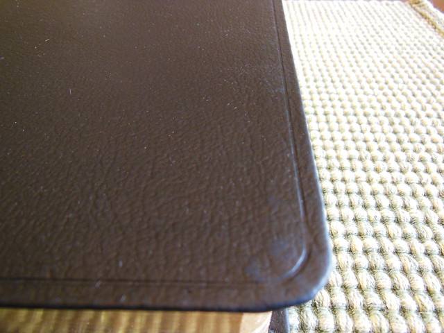
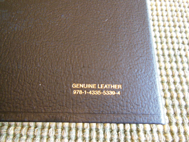
Now for the genuine leather covers, but wait, all is not as it seems! You might think that if it is labeled, “Genuine Leather” that it is cow leather, but you’d be wrong! Oh no my friends, don’t be deceived by this clever marketing. Many of the bibles sold in the $40-$80 range listed as genuine leather are actually… pig skin leather. Yep, pig skin leather is much less expensive than cowhide leather. It is split thinner, it is colored, and gets a grain stamped into it, and it is shiny like plastic, and not that flexible. These covers are pretty tough though. I have to give that to them. They don’t smell as good as cowhide leather either due to all the processing they go through. Because the pig skin is so tough they can use very very thin splits of it.
Just under the premium category of covers are the calfsplit leather, French Morocco leather, and genuine cowhide leather covers. There is not a market standard on this so there is quite a bit of variance from publisher to publisher. For instance a cowhide leather cover from TBS feels like the French Morocco leather from Cambridge. Basically they take the section under the top grain and stamp a grain pattern into it. It is stiffer and more fibrous, but still smells like cowhide leather because it is. You get all of the great durability of a good cowhide leather cover at a lower price. Honestly this is probably the lowest quality leather I would want on a Bible. All of the others I mentioned before this I would not buy for myself. I expect a Bible to be something I can hand down to my kids and hopefully my grandkids. I won’t buy anything under this. I recommend shopping calfsplit/genuine cowhide and above. French Morocco leather doesn’t necessarily have to be from a cow either. It is also split thinner typically than calfsplit. Don’t get French Morocco mixed up with Moroccan either. Moroccan leather is much higher quality goatskins from Nigeria that are imported and finished in Europe.
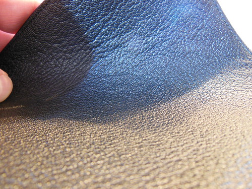
The next class of covers is the premium range. It includes top grain cowhide, calf hide, Vachetta calfskin, Buttero calfskin, and goatskin. There are other hides that are available from rebinders and are occasionally available from publishers. I am not going to address those as they are not commonly available from mass produced Bibles from major publishers.
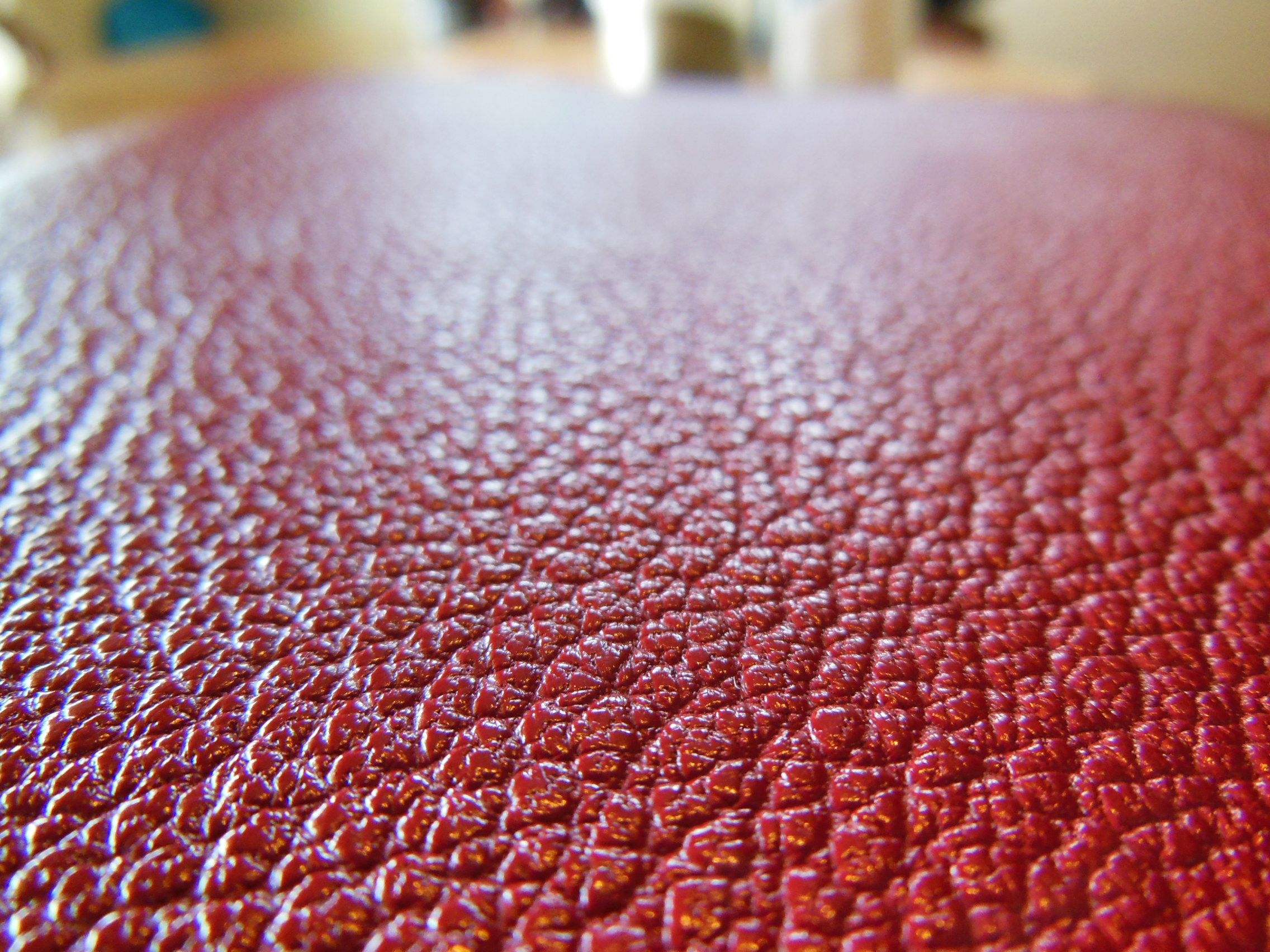
The top grain cowhides can have natural grain, they can be ironed flat to reduce the grain, they are generally tough and supple, which is a good combination. Calfskin is even softer because it is taken from well, young cows. It is also a bit thinner. It isn’t as resistant to scratches and scuffs as the top grain cowhide. All of these leathers take color during processing very well. Goatskin covers usually have a nicely pebbled grain to them making them aesthetically pleasing. They can be dyed in a wide range of colors, are supple, durable, and more expensive. You don’t get as many covers out of a goat hide. Goats are smaller than cows 🙂
Keep in mind this is just about covers. The next article will be about the difference between case bound and edge lined Bibles. Thanks again for reading, and if you haven’t already make sure to follow my blog. God bless!
I recently had someone ask, “Did they censored out the tetragrammaton?” on one youtube. Sometimes folks get hung up on using Hebrew wherever it can be used. Sometimes folks would just like the Hebrew names of God used so they can tell better what is being said. For some it is a matter of heresy. For others it is more scholastic. I honestly don’t know anything about the person who asked the question. I have no idea where they stand on translation philosophy, but they did ask a common question. Here is the answer I gave him;
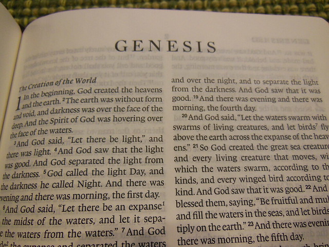
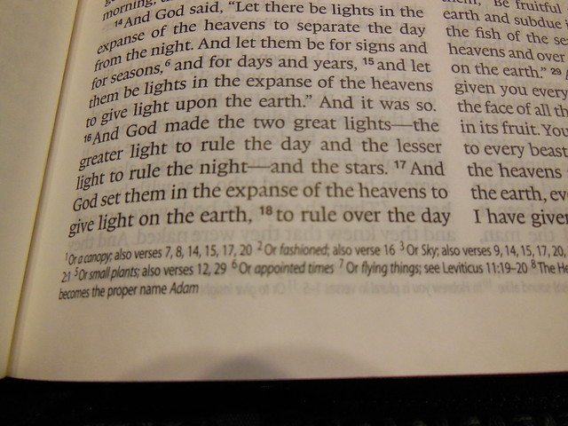
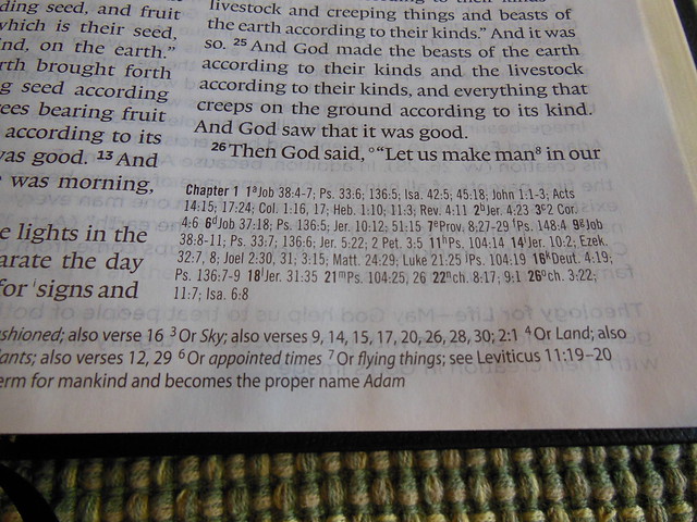
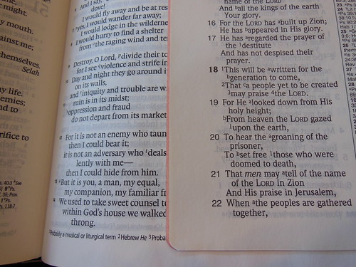
“They didn’t, “censor” it out. They used a standard translation convention of, “LORD.” I am in favor of them translating it into English. They could render it, “Self existent one.” Here is how they chose to translate the following words; Elohim=God, YHWH=LORD, Adonai=Lord, Adonai YHWH=Lord GOD, YHWH Sabaoth=LORD of Armies, El Shaddai=God Almighty. It is interesting to understand that in the New Testament the Greek words used for God are kurios=Lord, or Theos=God. When Jesus makes some statements identifying Himself as the, “self existent one” He says, “ego eimi”, or “I am” in English. He is also called, “Xpistos” which means anointed. Christos would have been the same as Messiah in Hebrew. So in the Greek if God, inspiring men to write His word was using generic names for Himself, I don’t think we have to get to overly critical of the translators doing the same thing.”
We might want them to just render the Hebrew words into English if they have a direct translation, but if they do not perhaps the conventions they employ are sufficient. I’m going to give you an example of the difficulties in trying to find direct correlations from ancient Hebrew into modern English. Here is what the word, “Elohim” means;
[466] אֱלֹהִים ʼelōhîm 2,602x God (plural of majesty: plural in form but singular in meaning, with a focus on great power); gods (true grammatical plural); any person characterized by greatness or power: mighty one, great one, judge [430] See angel; God; judge. (MED)
The first part of elohim is a prefix, “el” which means power. It is often used for, “god” in Hebrew.
How would you render that in English? Is there one English word that means all of that? Would you just leave the Hebrew word, and expect people to know what it means, or would you make some sort of translation convention?
Here is another example,
h7706. שַׁדַּי šaḏay; from 7703; the Almighty: — Almighty.
AV (48) – Almighty 48;
almighty, most powerfulShaddai, the Almighty (of God) (Olive Tree Enhanced Strong’s Dictionary)
It is often prefixed with,
h0410. אֵל ’êl; shortened from 352; strength; as adjective, mighty; especially the Almighty (but used also of any deity): — God (god), x goodly, x great, idol, might(-y one), power, strong. Compare names in “-el.”
AV (245) – God 213, god 16, power 4, mighty 5, goodly 1, great 1, idols 1, Immanuel + h6005 2, might 1, strong 1;
god, god-like one, mighty onemighty men, men of rank, mighty heroesangelsgod, false god, (demons, imaginations)God, the one true God, Jehovah
mighty things in naturestrength, power
When you add the two together for El Shaddai, we render it, “all sufficient one.” Translation isn’t a neat, tidy, word for word affair all of the time. There are concepts that don’ t have direct translations into English. We have to do some studying on our parts to make sure we aren’t too quick to judge.
I’ve handled quite a few different edge lined Bibles over the years. Most of them have used something other than the same leather that was on the outside of the the Bible. They use bonded leather, or some kind of synthetic polyurethane material. The bonded leather concerns me because it is basically made from leather sawdust and glue. The inner liner is also what makes the hinge on an edge lined Bible. The repetitive opening and closing, over a long period of time, might cause the bonded leather to come apart. The synthetics could stretch out of shape, or deteriorate at a different rate than the natural materials.
This Bible uses top grain cowhide leather for both the inner and outer cover. Using the same materials ensures a uniform wear throughout. The leather that Crossway chose for this Bible is not soft. It doesn’t feel like it will snag and scratch easily like some of the goatskin leather covers. What is the purpose of the cover after all? It is to protect the text block and provide structure. The cover on this Bible is very flexible, don’t get me wrong, but if you are looking for something soft like garment leather, you are looking in the wrong place.
The size of this Bible is another subjective quality. Everyone has their own favorite size of Bible to read from. I personally like smaller, personal sized Bibles, but I loathe the small font in most of them. This Thinline is truly a Thinline Bible. It measures in at approximately 3/4″ thick.
This fact necessitates thinner paper and smaller font. In most Bibles that translates to readability issues. Not so much in this one. Since Crossway always uses impeccable paper, and they employed an 8 pt. font, this Bible is very legible.
The size of this Heirloom Thinline lends itself to being held in several different ways to suite your comfort. I prefer to fold one side over and hold it in one hand. Other people might hold it at the bottom center. While others might prefer to hold it in both hands, or rest it on the table. Since the binding is sewn it will lay flat.
The hinge plays a big part in how the Bible opens and lays when being read. On top of having a sewn spine, Crossway didn’t go hog wild with the binding tape. Many of your lower priced premium Bibles that are edge lined, employ a lot of binding tape, that is thick and covered in adhesive. They use it along the hinge of the Bible to join the cover and text block. Sometimes they use way too much, or too thick of a binding tape that actually makes what should be a very flexible Bible into a very awkward one. The rest of the cover and text block could be nice and flexible, but the inch or inch and a half or so, right at the hinge is all rigid and thick. It pretty much negates the purpose of doing an edge lined binding. They might as well simply just have done a case bound Bible instead.
Since Crossway did the right thing here by not using too thick a gooey binding tape in the hinge, and instead used the real leather liner, they avoid problems with adhesion and can make a nice durable and flexible hinge.(albeit not so flexible right out of the box) The hinge will take a bit of breaking in, because it is made of leather, but it should last much longer.
The leather hinge might take a bit more work, but that is why you pay a premium price. This Bible is made to outlast you. Many Bibles come with a lifetime warranty, and the publishers never expect you to use them, while fully expecting the Bible to fall apart in a few years. The Heirloom Thinline ESV from Crossway will not. It is called, “Heirloom” for a reason. It will hold up and become a family heirloom. I love the idea of having a Bible passed down to me or one that I can pass down to my children. There is a tremendous sense of a family Christian heritage that can be gifted to the next generations. All it takes on our part is an effort to do better, to make better Bibles, and to show our kids how much God’s word really means to us.(You don’t have to have a premium Bible to do that so don’t feel bad if you can’t justify the expenditure. Crossway makes durable Bibles in all price ranges.)
The ESV Heirloom Thinline Bible in brown calfskin leather arrived at my home in perfect condition. It was packaged in a white cardboard box for shipping.
Inside the shipping box, the Bible was inside a black, two piece, presentation box, that should be retained for storage, should you ever put this Bible away for a while.
The Heirloom is also wrapped in paper. I believe that was done to protect it, as the hide cover is more flexible and has a larger yap than other Bibles.
Another nice feature is the perimeter stitching of the cover. Some people don’t like this, but I do. I like to know there is more than just glue holding the cover together.
It is evident when you examine the inside cover at the corners that Crossway did an excellent job paring the leather down thin enough to make a nice corner. The perimeter stitching can also be seen well from the inside.
There is also an attractive looking gold gilt line around the perimeter of the inner cover.
Usually on thin Bibles they don’t bother rounding the spine. On the Heirloom it appears they rounded the spine and the page corners. I think that shows a bit more attention to quality. So does the art gilt page edges. Extra attention to details and added features are what we’ve come to expect from Crossway’s premium models.
The front and back, outside covers are blank. The inside back cover has, “calfskin leather” printed on it at the bottom.
The spine is decorated with 6 spine hub lines, and the words, “Holy Bible” at the head, “ESV” under that, the ESV logo towards the middle, “English Standard Version” and then the Crossway logo at the tail, in gold stamping.
When you open the Bible up, you’ll notice there is a page that is glued part of the way up. That is to keep the text block and cover from falling apart.
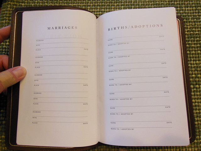
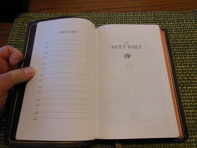
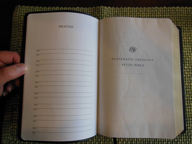
In the front of this Bible is a Presentation page,
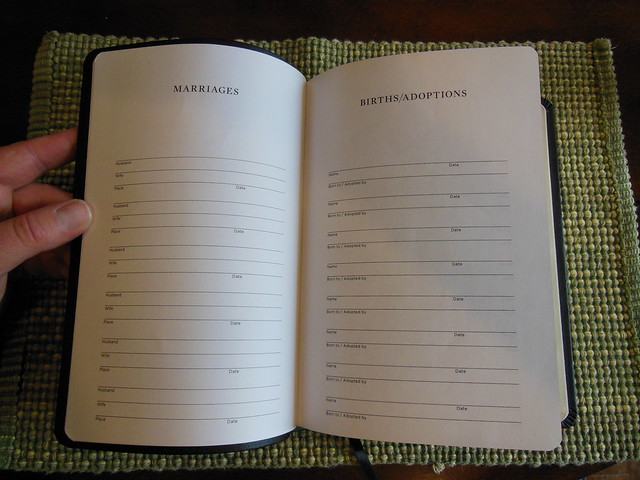
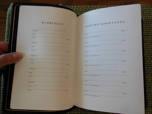
Marriages, Births/Adoptions,
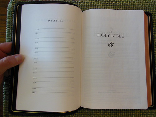
and Deaths.
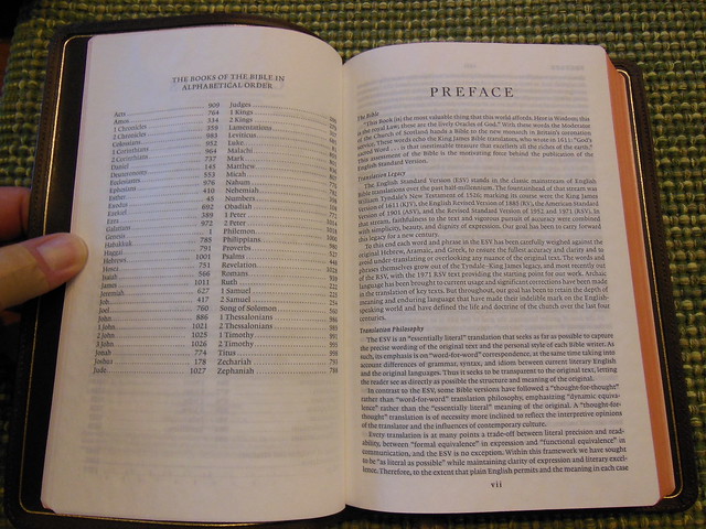
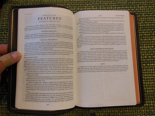
On the copyright page you’ll notice that this Bible is not printed in China. It is printed in the Netherlands, by Jongbloed. (not indicated, but verified.) Jongbloed is the premier Bible bindery and printer. They are the the people you go to if you want to print a top notch premium Bible. That is why Crossway used them to print their Heirloom Thinline. This is the 2011 ESV. After that you’ll notice a Table of Contents, List of the books in alphabetical order, Preface, and Features section.
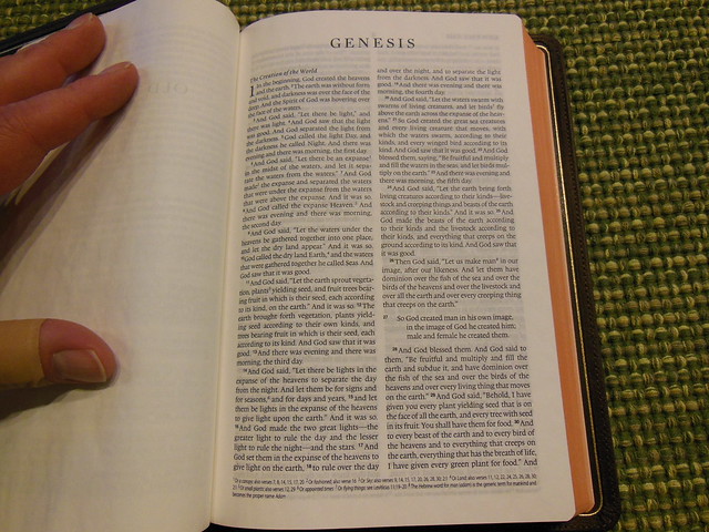
The Books of the Bible begin with the name of the book in bold large print at the head of the page aligned to the center. The text is laid out in a double column, paragraph format, with foot notes. The section headings are also in bold. The chapter numbers are in drop cap to set them apart. Page numbers are found at the top, center part of the page.
The Heirloom Thinline also comes with head and tail bands, and two ribbon markers that match the color of the cover.
This Bible is a black letter edition with 8 pt. Lexicon font. It is printed uniformly with sharp contrast against the 28 g.s.m. PDL Indopaque European Bible paper. The paper has an opacity rating of 79 which is pretty good considering the weight of the paper.
In the back you’ll find, Weights and Measures, Abbreviations, Concordance, and Maps. The concordance is a three column format and pretty decent for a thinline edition.
In the back there are 8 color maps.
Here are some pictures highlighting the flexibility of this Bible.
There is no reason this Bible should wear out in your lifetime, but if it does fail due to materials or workmanship, it has a lifetime warranty from Crossway. I doubt you’ll have to use it. This is a high quality, premium Bible. The cover is flexible and so is the text block, due to the sewn spine. Whether you are holding it, or reading it while it lays on a desk or table you won’t have to fight against the cover. (after the hinge is broken in.) It is comfortable to hold due to it’s size and weight. The font is big enough to read without undue eyestrain. The opacity of the paper aids in the legibility as well. The bottom line, if you are looking for a high quality, edge lined, thinline Bible look no more. You can pick up a copy direct from Crossway, or purchase one from any of these online retailers, Amazon, Christianbook, or Evangelicalbible. Make sure to check out the rest of the pictures on my Flickr page.


 It is difficult to find that perfect Bible, but this is where many of us start out. When you finally decide to get a high quality Bible, you want to get all of the features you like in one edition. The problem is that rarely is there one Bible that will satisfy all of your requirements. In this article we are going to look at some of these features, a few of the pros and cons of the features, and a little basic Bible design and layout. Hopefully this will help you make an informed purchase, and keep you from having unrealistic expectations.