I know you’ve heard me extol the virtues of a few different Bibles in the past. I know there are a lot of truly great editions out there. I’m not trying to take anything away from them when I say this. This is the perfect Bible. (for me.) Keep in mind that the features/attributes of any edition are appreciated subjectively by the individual. We all like different things.
I have been looking for a Bible like this for a very long time. Like you, I’ve purchased several Bibles looking for the one that satisfy most of my desired features. It never fails, I use them for a while and get irritated with one of the design, “flaws.” They aren’t really flaws folks, just features I didn’t like, or missing ones I do like. Bible design is difficult. You have to work with different finite attributes. I think it is impossible to make one edition that everyone will think is perfect for them.
This of course, is a modern problem. In the past you didn’t have much choice. You were blessed to have one. Go back far enough and it was illegal for you to own one. Thanks to God and the men of the Protestant Reformation we have God’s word available for almost anyone who wants a copy. Count your blessings folks if you have one Bible and appreciate the providence of God that you were born in a time and place such as things are where you can get picky about what features you would prefer. I know I do.
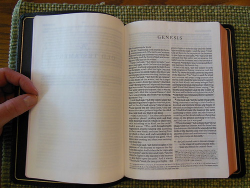
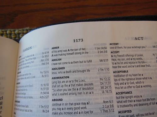
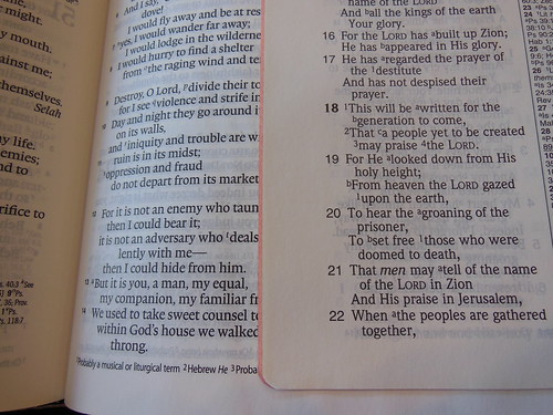
The Personal Size Quentel is just the right size to hold for long reading sessions. The font is 8.5 pt. It is a bit small for people with eye problems who don’t want to wear reading glasses or their prescription lenses, but for people like me, or folks who do wear corrective lenses, the font is clear, sharp, uniform, and overall well done. It is very legible without being too small. If they had made the font any larger they would have had to increase either the page size or number of pages. If they wanted to keep the Bible the same thickness they would have had to decrease the paper thickness. This would have made the paper less opaque. Everything is tied together.
If you are like me, the full size Quentel is just too large to drag around everywhere. Compact Bibles are too small, and their font is too small. Usually 6 pt for them. The Ultrathins and Thinlines are nice, but their length and widths are too much for holding in one hand unless you fold the cover completely over. When I saw the dimensions for this edition listed on evangelicalBible.com I was excited and hopeful. I had been waiting for a Bible with all the stats that they were posting, and it was coming out in NASB to boot! I was like, “Take my money!” All that was left now was for them to get them and ship them out.
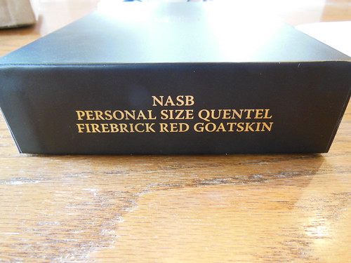
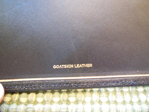
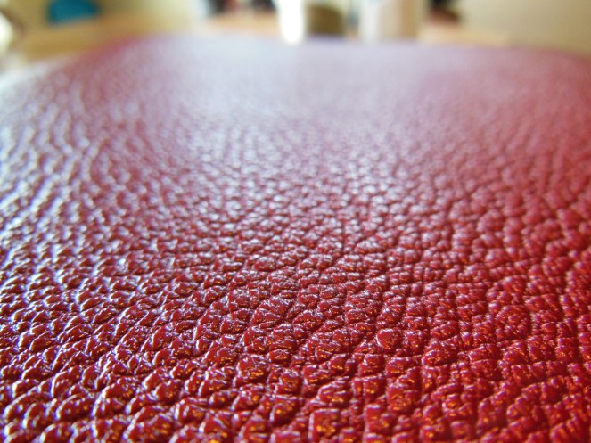
Here are the vital stats from evangelicalBible.com the ones responsible for Schuyler. Natural Grain Firebrick Red Goatskin with Dark Red Calfskin Liner
Same Pagination as the Quentel Series – (all page numbers and format will be identical)
Approximate font size: 8.5
4.7″ x 7.1″ x 1″ (120 mm x 180 mm x 25 mm)
Line Matching
28 GSM Indopaque paper
2 Ribbon Markers (Dark Red)
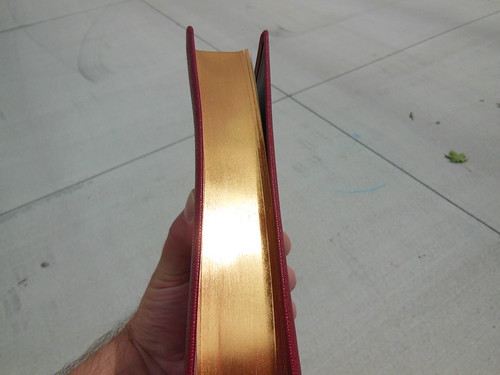
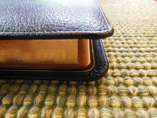
Art-Gilt edging (red under gold)
9mm yapp
Smyth Sewn
Black letter text (chapter numbers, headers and page number in red)
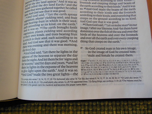
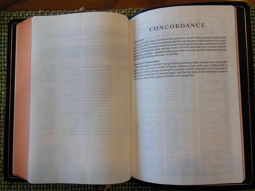
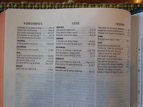
More than 95,000 entry cross references
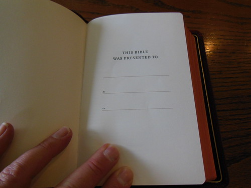
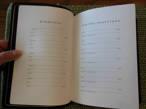
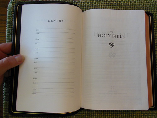
Presentation page
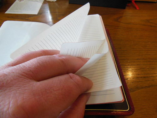
Lined note paper
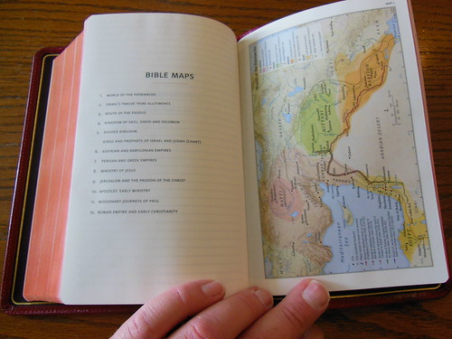
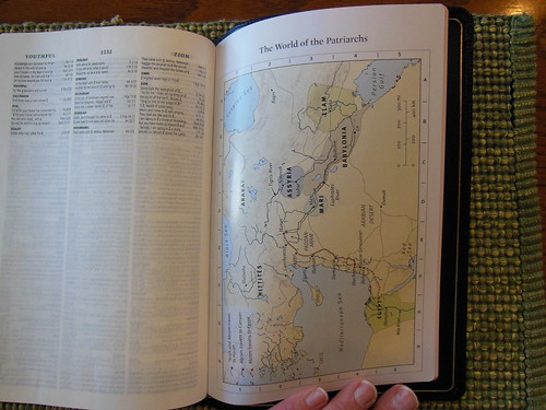
Extensive Schuyler Bible Maps
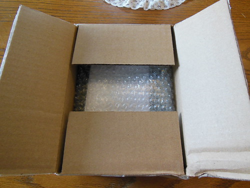
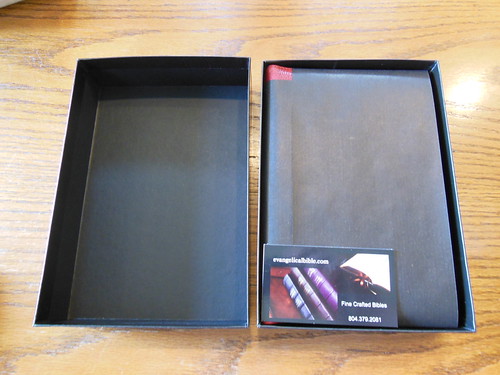
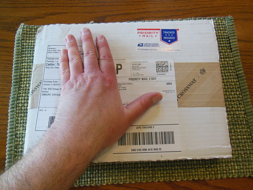
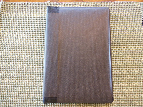
The Personal Size NASB Quentel arrived undamaged from evangelicalbible.com There was a small dent in the cardboard box, but the Bible inside was packaged in a bubble wrap. The retail two piece presentation box was not dented.
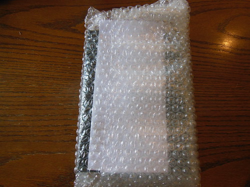
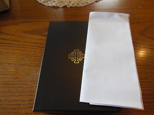
The Bible was wrapped in two pieces of paper to help the Bible keep its shape, and protect it during shipping. There was a business card from evangelicalbible.com in the box as well as a warranty card. I’ve never had any problems with a Bible from evangelicalbible.com, but I know people who have had some experience with them. I’ve heard they are always kind, and ready to replace a Bible you are not happy with.
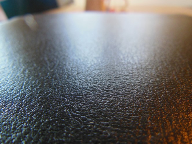
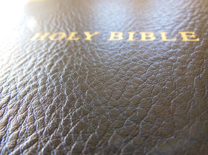
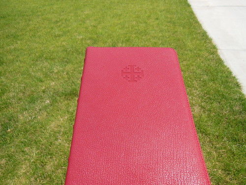
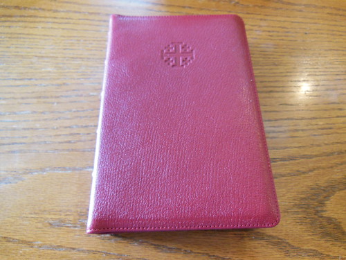
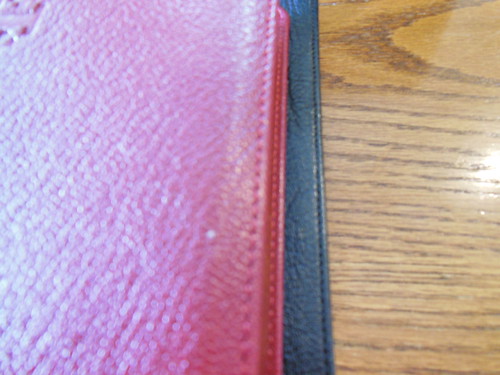
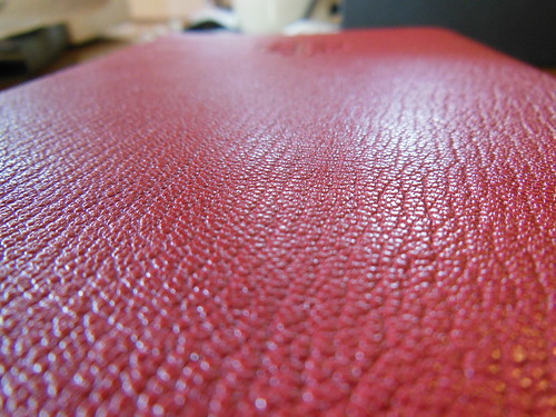
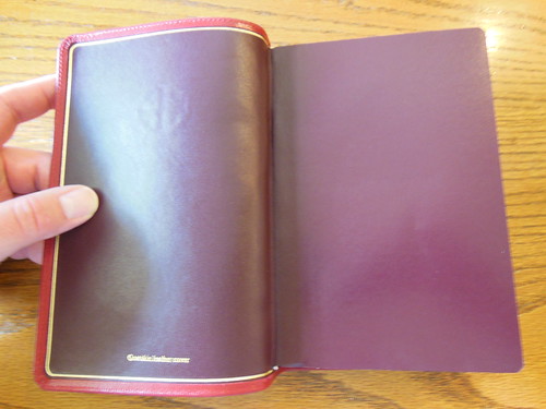
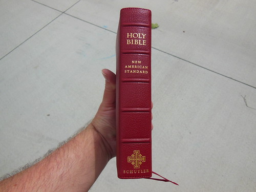
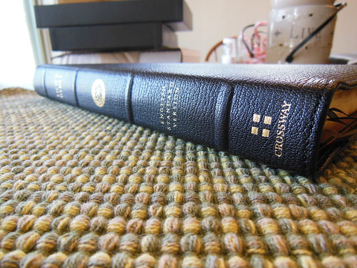
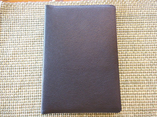
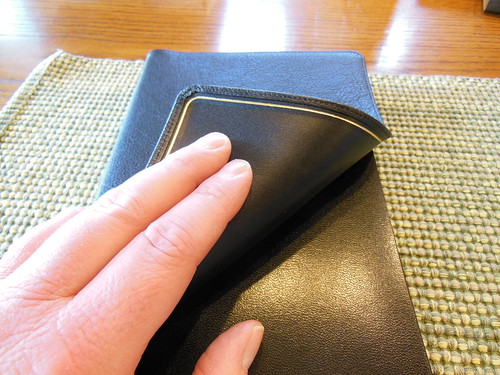
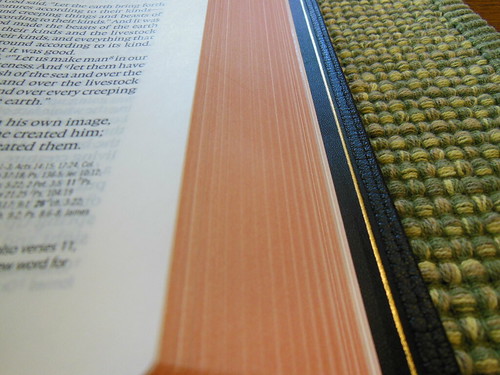
As you can see, I ordered the firebrick red. I like it a lot. It is a bit darker than my R. L. Allan NASB Reader’s edition, but I think they make a lovely couple. I find the crosses stamped into the front cover to be a pleasing feature. I don’t know how well gold stamped lettering would hold up in a cover so flexible, so the stamped crosses make sense. The perimeter stitching is executed flawlessly. There are no missed stitches, or mistakes.
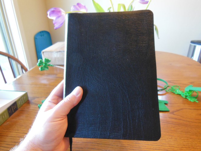
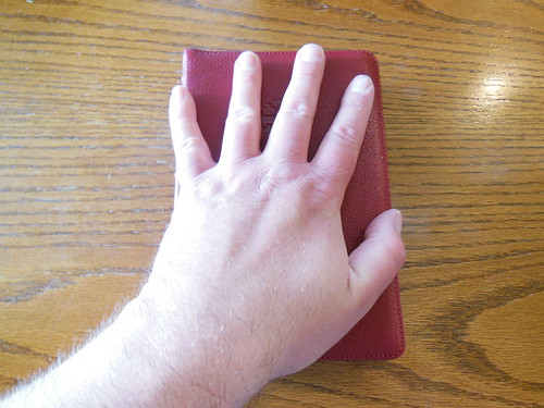
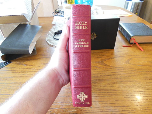
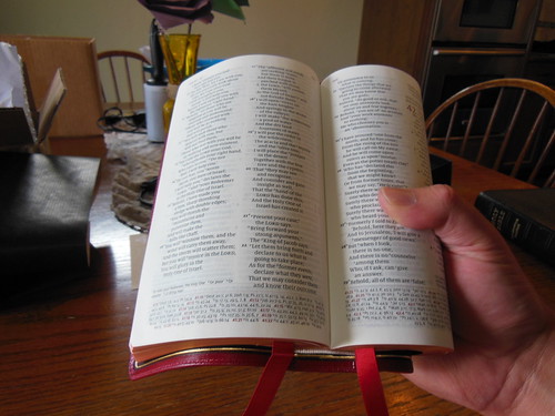
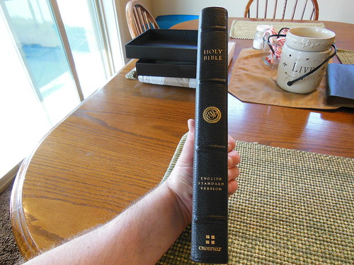
Wow, look at the size of that Bible! My hand almost covers it. Just the right size for me. You might also think that, if you are like me in your tastes.
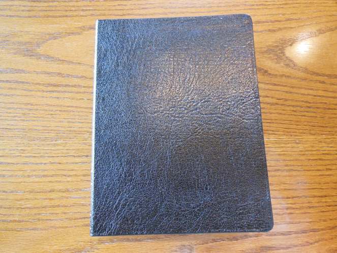
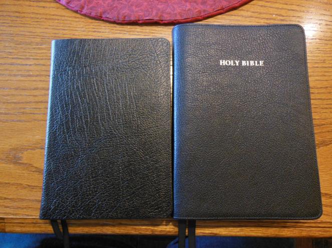
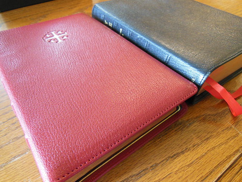
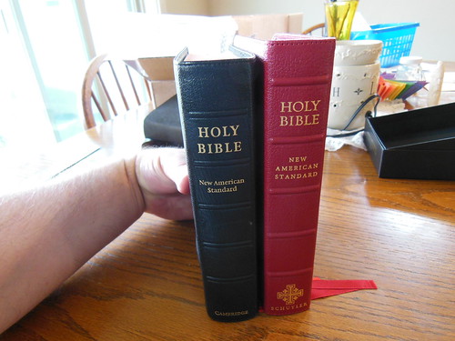
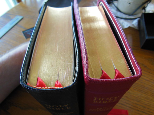
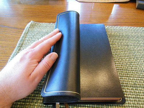
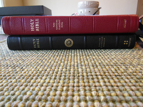
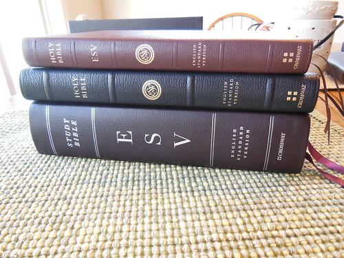
Here is an NASB Cambridge Clarion in black edge lined goatskin next to the Personal Size Quentel. The Clarion is a bit wider across. This makes it a little harder for me to hold onto with one hand, while reading.
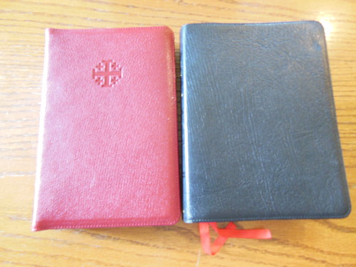
The Clarion is also quite a bit more thick when compared to the Quentel.
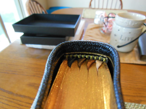
The head and tail bands are white. They are understated and clean.
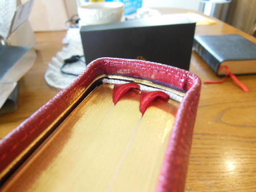
The spine has five raised spine hubs. They are all straight and parallel to each other. The gold stamping on the spine is not too busy. It gives you the information without putting too many decorations on it. As usual, Jongbloed has done a great job with this edition.
The grain of the goatskin along with the red cover is visually striking and attractive. I think it is something special.
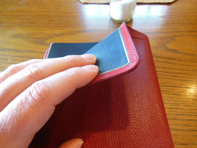
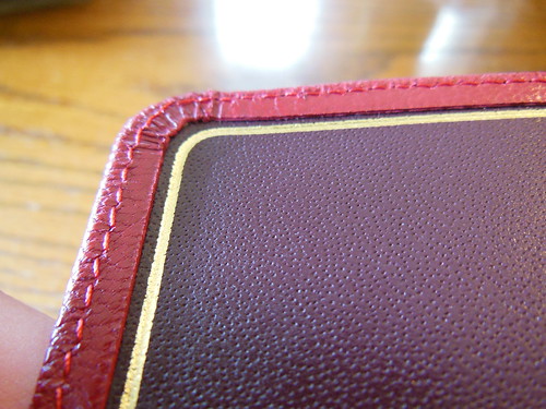
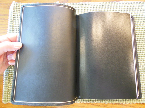
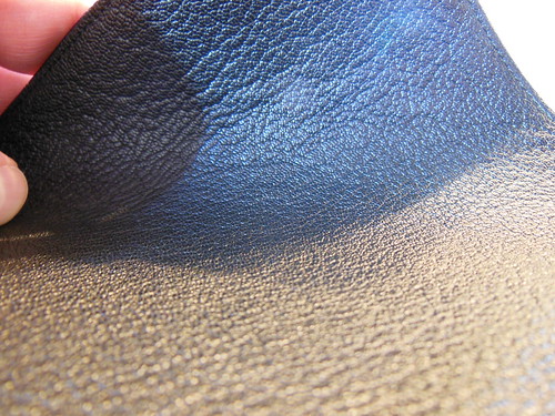
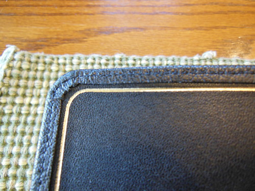
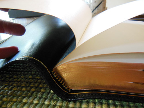
Here is another picture of the inside cover and corner. You can see up close the stitching, gilt line, and even pores of the cowhide liner. The darker maroon color of the inner liner accentuates the firebrick red of the outside.
Where the text block is attached to the cover the hearty card page stock in the front and back of the Bible are glued up further than needed to strengthen the connection. This will help your Bible last a long time. It is not a defect. 🙂

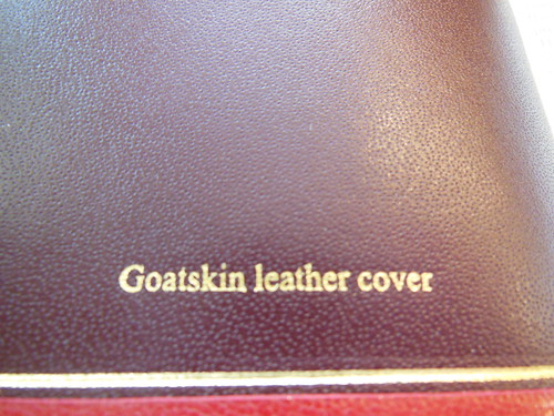
The stamp on the front cover is barely visible through the inner liner. This picture gives you a better look at it.
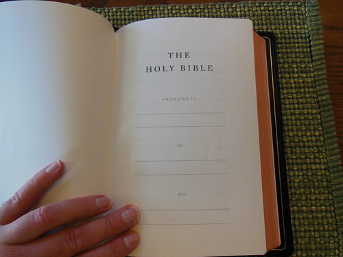
I think Schuyler did the right thing by keeping the presentation page clean and simple. I would leave the family record pages to Bibles with more room.
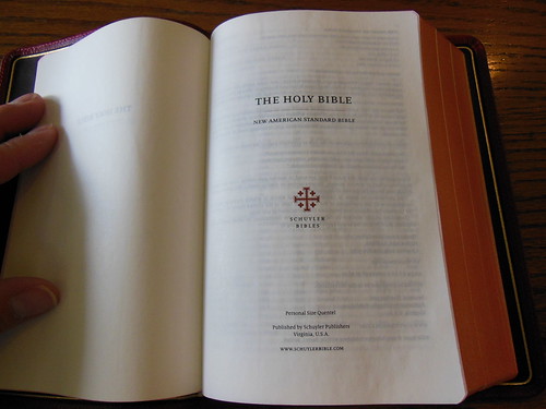
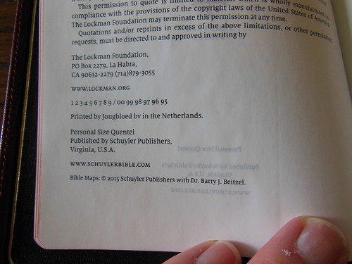
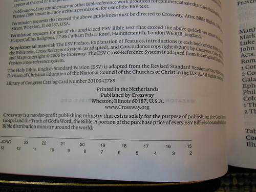
The copyright information page shows that this bible was made in the Netherlands by Jongbloed.
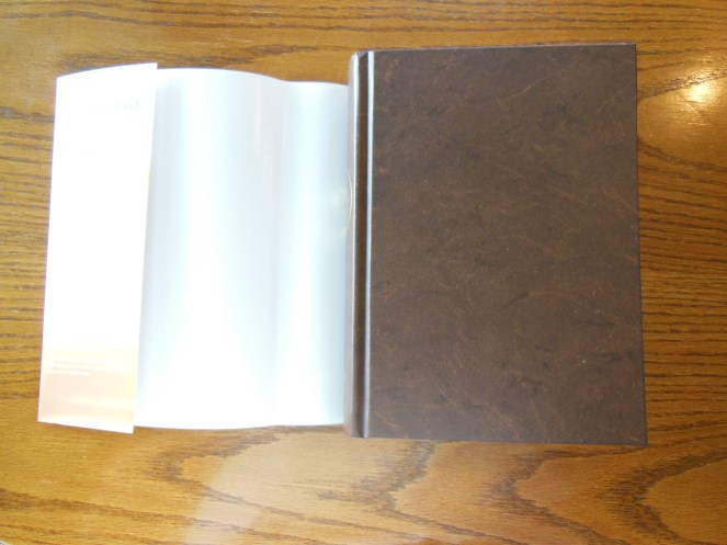
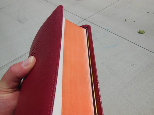
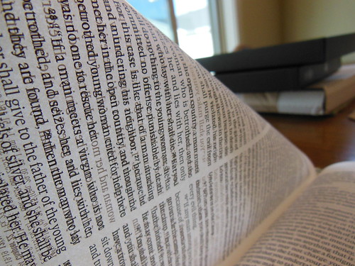
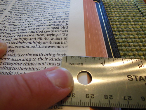
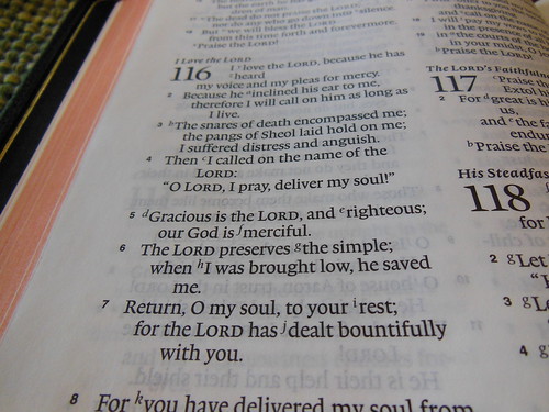
Here is a shot of one page singled out with direct light from behind it. If they had gone thicker it would have ruined the hand feel if you ask me. I am glad they didn’t. If they had gone thinner it would have been to transparent and the ghosting would have been a problem. As it is, I have not had a problem 🙂
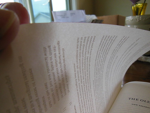
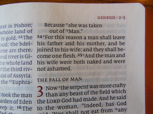
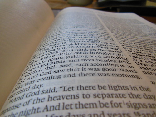
I mean, come on! Look at that page. For a Bible this small and paper this thin, for the font to be so good is a rare thing.
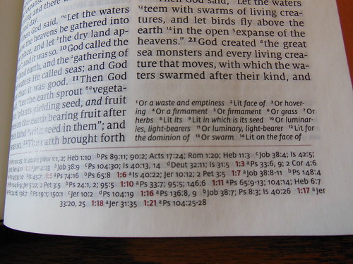
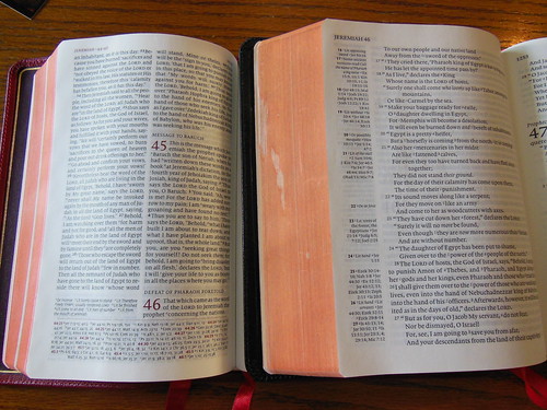
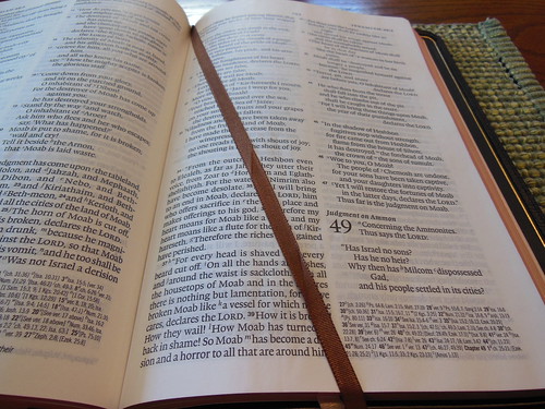
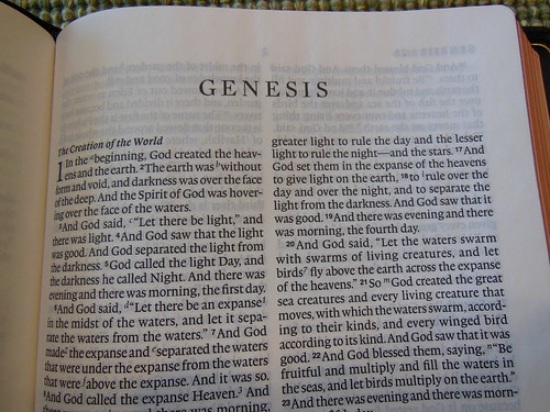
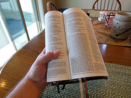
Looks like line matching to me folks. Gorgeous pages and setting. I love the use of the page by this layout. It is the same as the full size Quentel. The pagination is the same as well. It would make a terrific companion to a full size Quentel in the same color.
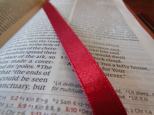
Just like its big brother, it has some red highlights on the page numbers, book and chapter information, chapter numbers, and cross references at the bottom.
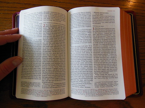
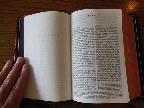
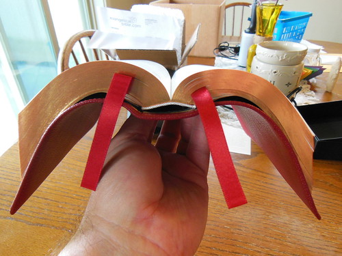
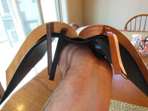
Brand new right out of the box it stays open. Not perfectly, but it does. I’m sure once it is broken in it will be better to.
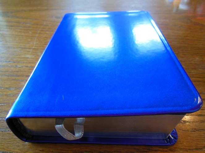
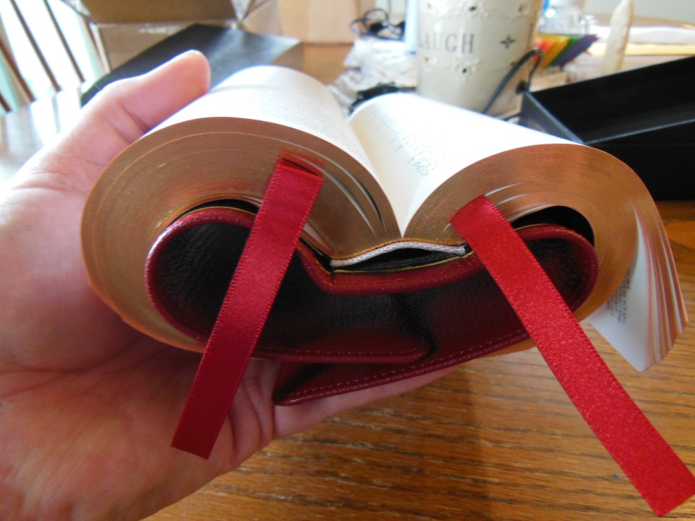
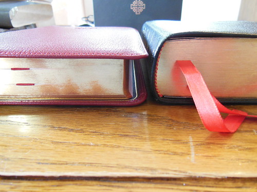
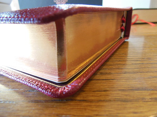
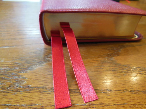
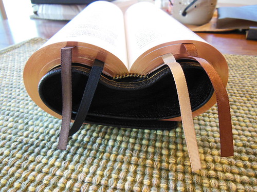
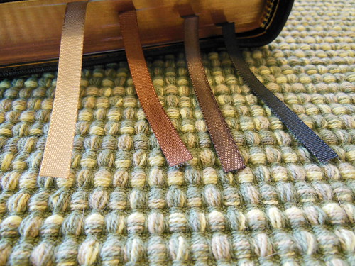
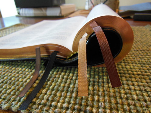
The two red ribbons are wider than what you might be accustomed to. They are also higher quality. The ends are cut and seared so as to not fray. I like them much better than the ribbons on the Clarion.
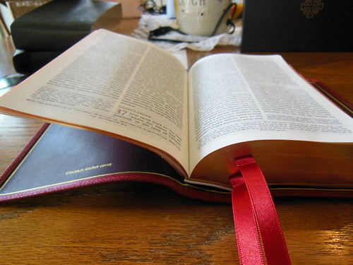
I love the way the red ribbon looks across the white page. It looks the way it should.
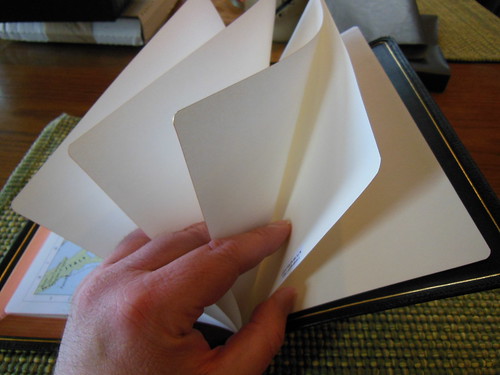
There are some pages of ruled paper in the back for limited note taking. You don’t see this that often in Bibles. It is a great feature for people who are concerned that there isn’t enough room in the margins.
Schuyler has a set of high quality maps as well. They are printed on paper that feels to be about double the thickness of the bible paper without being card paper. The maps use multiple colors and are printed nicely.
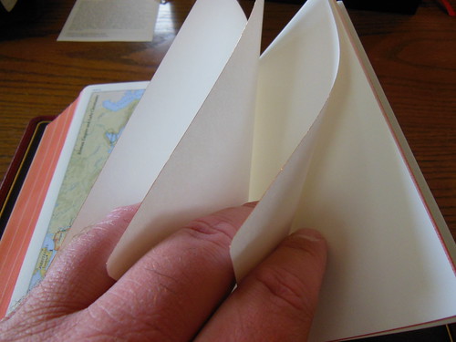
There are some card papers in the back as well. You could take some notes on it if you wanted to.
Mysterious floating Bible, oooh ahh…
As you can see the Clarion is a bit shorter than the PSQ. That necessitates it being thicker. The Clarion is a bit too thick to fold one side over and hold in one hand. The PSQ does it easily.
I spilled water on my Clarion shortly after I got it a few years ago. So the page edges are not a flaw from the publisher it was my fault.
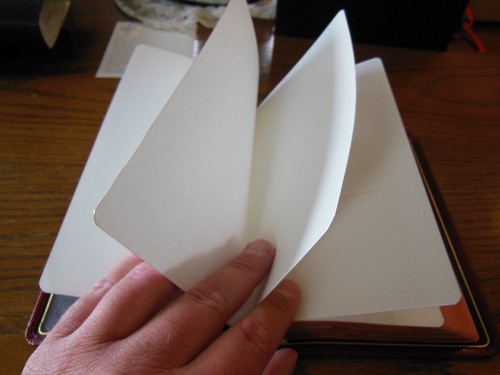
Prerequisite Bible bending…

Here it is in its natural environment.
I would highly recommend purchasing this edition if you are looking for an New American Standard Bible in a size that is between compact and full size. There aren’t very many out there in that niche. Bottom line, get one. (If you can responsibly afford it.)
As usual make sure to check out my Flickr.com page for all the pictures!
 It is difficult to find that perfect Bible, but this is where many of us start out. When you finally decide to get a high quality Bible, you want to get all of the features you like in one edition. The problem is that rarely is there one Bible that will satisfy all of your requirements. In this article we are going to look at some of these features, a few of the pros and cons of the features, and a little basic Bible design and layout. Hopefully this will help you make an informed purchase, and keep you from having unrealistic expectations.