Bible Reviews

So You Would Like to Compile Your Own Study Bible? A Review of the NASB Wide Margin Reference Bible, Black Edge-Lined Goatskin Leather, Red Letter Text Edition.

Cambridge Wide Margin NASB 004

I like to keep a few of my Bibles unsullied and free of notation.  With some high quality Bibles it seems wrong or sinful to make marks in them.  It feels like an affront to the artistry and craftsmanship that goes into them.  While other Bibles I own are marked up as if a child with a box of crayons were set free on them.  I feel no shame in marking up my $30 Chinese made NASB Ultrathin.  It is a good sturdy Bible, but obviously there are not aesthetics there demanding appreciation.  So margin notes, underlining, and highlighting abounds.

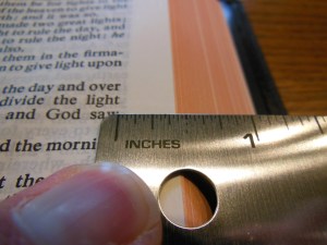
The Cambridge Wide Margin is a strange Bible.  It confounds my sensibilities.  It is a fine Bible, but it demands that you use it like a workhorse.  Moreover, the moment you start using it, you begin to appreciate the craftsmanship, as you never would have, without the resources predisposed for your notation.   Besides the 1 5/16” outside margin, you have 32 pages of ruled note paper in the back, and blank index pages with alphabetical headings, so you can compile an index of your own as well.  To have a wide margin Bible is one thing, all you need is wide margins, but to have a Bible that you can utilize to make your own study Bible is another.

When I took this Bible out of the box and first held it I was concerned that it was too wide.  That was my first impression.  I failed to take into consideration the purpose of this Bible.  I put the Wide Margin next to my MacArthur Study Bible and was a bit shocked to see that it was only very slightly wider.  This type of Bible is meant to be written in.  Its natural habitat should be a well-lit desk or table.  The type of work that is going to be needed to complete the endeavor the owner of this Bible has embarked on will take many several hour sessions of focused study and notation.  I don’t see that happening from one’s easy chair.  No, a task this daunting requires a quiet well lit sanctuary alone with God’s word.  Picture a monk hunched over, with quill in hand, doing a scribe’s work by candle light in some cold stony abbey, or perhaps his modern counterpart the scholarly theologian, at some stuffy seminary quartered away in an office, in much the same fashion as the monk, only with better lighting, heating, and cooling.  Well, that might be how you would see yourself using this Bible for its intended purpose if you were so bold.

Bold enough to actually put your thoughts down on this beautiful Bible paper.  It is nice opaque and over 30 gsm.

Cambridge Wide Margin NASB 028

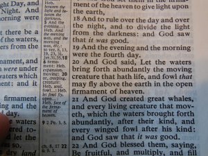
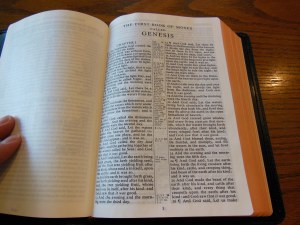
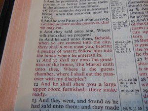
The quality of the paper will help to keep your notes from bleeding through the page.  The color of the paper is off white making for a good contrast between it and the sharply printed text.  The text is 8 point font in black and the words of Christ are in red.  The red text is printed uniformly and sharply like the black.  The text is arranged in a double column paragraph format with center column references.

Cambridge Wide Margin NASB 052

If the references weren’t there the outer margins could have been closer to two inches, giving you more room for your notes.  As it is the references are useful.  I think the only way you could do more with a Bible is if you purchased a loose leaf Bible.  Most of us will probably opt for a wide margin instead.

In the front of the Wide Margin you will find a presentation page, an introduction to the translation, and table of contents.

Cambridge Wide Margin NASB 026 Cambridge Wide Margin NASB 037

The Wide margin includes as previously mentioned 32 pages of ruled paper,

Cambridge Wide Margin NASB 061

a concordance,

Cambridge Wide Margin NASB 054 Cambridge Wide Margin NASB 057

and a blank index section along with 15 color maps and map index in the back.

Cambridge Wide Margin NASB 058 Cambridge Wide Margin NASB 059 Cambridge Wide Margin NASB 065

The maps are in color and printed on a flat paper instead of a glossy paper.  The glossy paper tends to crack and tear.  It is better to have these features printed the way they are.  There are two flat and wide ribbon markers in this Bible helping you keep your place.

Cambridge Wide Margin NASB 032

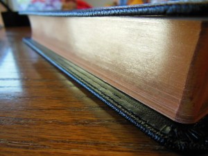
This is especially helpful considering the kind of work one would be doing with this Bible.  The page edges are art gilded with red under gold.

Cambridge Wide Margin NASB 031


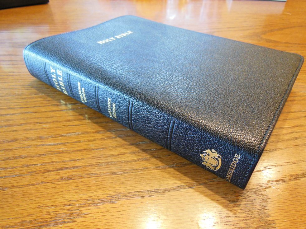
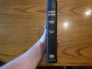
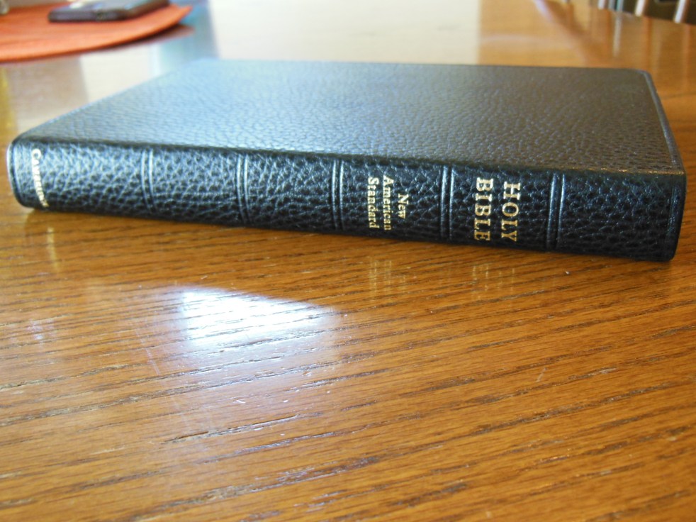
The front cover is imprinted with the words, “Holy Bible” in gold and the spine is imprinted with, “Holy Bible” at the top, “New American Standard” immediately under that, “Wide Margin Edition” in the middle, and “Cambridge” at the bottom.  These are all printed in gold.

Cambridge Wide Margin NASB 012 Cambridge Wide Margin NASB 085

The cover on this edition is crafted from black goatskin leather.  It has a natural grain that is soft to the touch and comfortable to hold.  It is not slick and shiny like some less expensive covers made from pigskin leather.

Cambridge Wide Margin NASB 013 Cambridge Wide Margin NASB 081

The inside cover is edge lined and sewn to the outer cover.

Cambridge Wide Margin NASB 019

The edge lined goatskin cover coupled with the fine smyth-sewn binding make this Bible very durable and supple.

Cambridge Wide Margin NASB 078

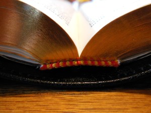
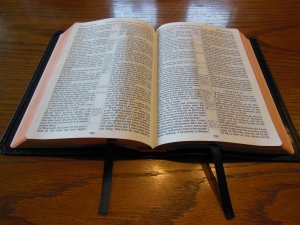
This Bible opens easily no matter where you start and lays flat fresh out of the box.

Cambridge Wide Margin NASB 034

If hold it in one hand you will find that it drapes over your hand.

Cambridge Wide Margin NASB 077

The Wide Margin is printed and bound by Jongbloed of the Netherlands.  They are known for their craftsmanship in printing and binding fine Bibles.

Cambridge Wide Margin NASB 038

As usual Cambridge has excelled in producing a high quality Bible that will set the standard for all other wide margin editions from other publishers.  They have provided a target to aim for with their NASB Wide Margin in black goatskin leather.  I have seen very few wide margin editions that come close to the Cambridge one.  I hope that other publishers will rise to the challenge and start manufacturing their Bibles with the concept that it is God’s word and not solely a product to be carelessly mass produced.

In the picture below you can see the Wide Margin compared to the NASB MacArthur Study Bible.  This should give you an idea about the size of it.

Evidence KJV LCBP Red Wide Margin LCBP Black  Hand Size 004

In these pictures you can see the Wide Margin on the bottom of a stack of Cambridge Bibles.  On top is the NASB Clarion, then the KJV Concord, and finally the Wide Margin.

Evidence KJV LCBP Red Wide Margin LCBP Black  Hand Size 002


Here are some links to retailers selling this Bible

amazon.com

Christianbook.com

evangelicalbible.com

NS746:XRME

isbn: 9780521702652

Uncategorized

Update on the Cambridge Concord and Transetto Shipping Damage.

I was contacted by an employee of Cambridge Press. (I didn’t get permission to use their name or quote them so I’ll use general references.)  They told me they would be looking into how the two Bibles came to be packed improperly and incurred damage during shipping due to the improper packaging.  I promptly received an e-mail back from my contact at Cambridge Press.  They concluded during their investigation that it was indeed a training issue and have resolved the problem.  I commend them on their efforts to maintain high standards.  You can read about the damage here.

Bible Reviews

The Perfect Size Bible to Sit and Read, The Cambridge KJV Concord Reference Bible in Black Edge-Lined Goatskin Leather, Red Letter Edition.

cambridge kjv, holman ministers kjv and funky lil kjv 011

Before I get into the vital features of this Bible I want to expound on its subjective qualities that have endeared it to me. At first glance most people won’t notice the exceptional quality of this Bible until they pick it up and give it a closer look.  Some folks won’t even notice even after picking it up.  That is not to say the Cambridge Concord Reference Bible is average or plain.  It is because the Concord is how a Bible is supposed to be.  It is the quintessential archetype of reference Bibles.  It smells like a Bible, it looks like a Bible, and it feels like a Bible.  When I pick it up to read from, I don’t have to struggle with it.  It does exactly what it should do.  It stays out of the way and allows me to focus on reading God’s word.  Everything about it is conducive to that end.

For me, it is the perfect size and weight to hold in one hand. I can comfortably read it while sitting in my favorite chair.  It isn’t heavy or unwieldy enough to require being laid on a table or desk.  It isn’t so small as to necessitate being held close.  It is not a thick Bible, yet contains many references and some helps.

cambridge kjv, holman ministers kjv and funky lil kjv 012

It is not printed on such light paper that the pages curl up and blow around while you are trying to read.  The pages are not a bright white.  They are off white.  Bright white pages tend to make my eyes strain during long durations of reading the word.  The India paper is strong and opaque.

There is approximately 7/16ths of an inch in the margins for note taking.

cambridge kjv, holman ministers kjv and funky lil kjv 044

The text is a nine point font that is printed appears pretty bold.

cambridge kjv, holman ministers kjv and funky lil kjv 043

The Concord is a double column verse format with pronunciations.  It has the references in the center column.

cambridge kjv, holman ministers kjv and funky lil kjv 041

Even with the references, 128 page Bible Dictionary, Concordance, Glossary, and 15 color maps, the Concord maintains a thin profile without sacrificing paper quality.  The pages are art gilded.  An art gilded page edge compared to a gilded page edge looks a bit more attractive.  It gives the page edges a red tint behind the gold color.  Before they put the gold colored aluminum foil on the page edges they first coat them with a red ink.  Then they apply the gold color gilding.  When the Bible is closed the edges show gold, when the Bible is open you can see the red show through the gold.

cambridge kjv, holman ministers kjv and funky lil kjv 015

The binding, outside cover, and inside liner, make it supple and comfortable to hold.  This one is edge lined not case bound.  It is rigid enough to not flop around like some unlined Bibles do, while it maintains flexibility with its synthetic liner that is stitched to the outside cover edges with black thread.

cambridge kjv, holman ministers kjv and funky lil kjv 016

The Binding is a smyth-sewn binding done by Jongbloed in the Netherlands.  They are famous for their quality work and history of Binding Bibles.  Currently, most luxury Bibles are bound by Jongbloed.  A sewn binding is a must in my opinion.  If you hope to hand a Bible down to your children and for them to use it a sewn binding is the only option.  With a sewn edge lined binding all of the pages are stacked in separate pamphlets called signatures.  These are then stacked and sewn to tapes or strings in the spine of the Bible as well as being sewn to each other.  This is why you don’t have the front and back pages falling out of a sewn binding like you would with a glued case bound perfect binding where the pages are cut, then stacked, then rubber cemented together.  Those pages are not connected to each other in any way.  If you bend the spine in a glued Bible, eventually pages will start falling out.  Not so with a sewn binding.  If you take care of it and treat it with respect it will last and last.  The other benefit of this binding is the functionality of it.  The Concord lays flat right out of the box.

cambridge kjv, holman ministers kjv and funky lil kjv 047

The cover doesn’t flop up and get in the way.  The covers can be rolled backwards and out of the way even.  I wouldn’t do this as a practice, but that is how flexible this Bible is.  This particular Bible is a red letter edition.

cambridge kjv, holman ministers kjv and funky lil kjv 048

That simply means that the words of Jesus are printed in red text, including places where He is quoted by the apostles.  Some people find this to be a very helpful feature.  The Concord has two black ribbon markers.  They are good quality without being too thick.

cambridge kjv, holman ministers kjv and funky lil kjv 046

I have had some Bibles with thicker markers that actually imprint on the pages they are between.  I have had other Bibles with markers that were so thin that they crinkled up and are almost useless.  It is very unattractive to open the Bible up to crinkled pages or markers.  The Concord has neither problem.  The Bible ships in a clamshell type retail box.  I would keep the Box for storage.  This Bible is to supple to stand on its edge.  It should be laid flat on a flat surface when not in use.  There was a slight problem with the shipping.  You can read about that here.

cambridge kjv, holman ministers kjv and funky lil kjv 004

Cambridge has assured me they are looking into this and it shouldn’t happen again.  This Bible is as pretty close to being perfect.  If Cambridge would produce this in an NASB I would be satisfied.

Here are a few good places on the web to purchase this Bible if you are in the market.

evangelicalbible.com

Amazon.com

Christianbook.com

Cambridge.org

Here are a few pictures of the Concord compared to the TBS Westminster

1599geneva 010 1599geneva 009 1599geneva 008 1599geneva 007 1599geneva 006 1599geneva 005 1599geneva 004 1599geneva 003 1599geneva 002 1599geneva 001

Over all, I found the Concord to be a superlative Bible. It stands out from the mass produced Chinese and Korean Bibles as an example of what they should be aiming for.

KJV Concord Reference Bible, Black Edge-Lined Goatskin Leather, Red Letter Text KJ566:XRE

Black Goatskin Leather RCD266

isbn: 9780521512978

Bible Reviews

Intriguing, a Bible that opens from top to bottom you say? Review of the Cambridge KJV Transetto Text Edition Bible

cambridge kjv, holman ministers kjv and funky lil kjv 005

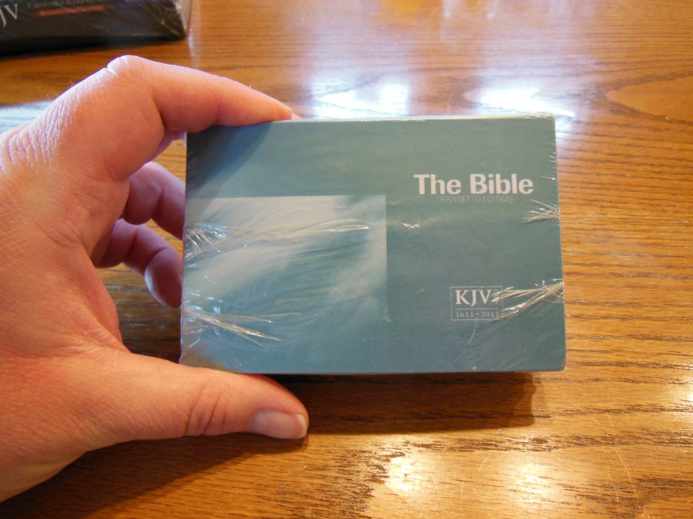
I saw this Bible on the publisher’s web site and was intrigued by it. It was a very novel idea at least and a practical one at best.  Unlike traditionally bound compact or pocket editions this Bible does not open and read like the same.  With a traditionally bound book you would open the front cover from the right to the left and read from the top left to the right and proceed down the page until you move on to the next page to the right and then you would turn the page and continue.

cambridge kjv, holman ministers kjv and funky lil kjv 134

In the picture above I have it laid open on top of a Cambridge Pitt Minion NASB.

In the Transetto you lift the front cover up and you are presented with the two pages becoming one book width page laid out as a double column text format to be read as one page, from to left to right all the way to the bottom of the other open page. Then you would flip up the next page and continue in the same way.

cambridge kjv, holman ministers kjv and funky lil kjv 116 cambridge kjv, holman ministers kjv and funky lil kjv 117 cambridge kjv, holman ministers kjv and funky lil kjv 124

The way you read it is not the only unconventional thing about this Bible. The cover is made of a reinforced card paper.  It is not connected to the text block all the way around like a regular book.  It is only glued to the text block on one side while the rest floats freely around the Bible when closed.  When opened and laid flat you can see the individual signatures and how they are sewn together in the spine.  When opened towards the middle of the Bible you can see how the sewn binding allows the Bible’s spine to bend all the way around and back into itself.  This is critical for the success of this kind of binding.

cambridge kjv, holman ministers kjv and funky lil kjv 128 cambridge kjv, holman ministers kjv and funky lil kjv 120 cambridge kjv, holman ministers kjv and funky lil kjv 094 cambridge kjv, holman ministers kjv and funky lil kjv 101 cambridge kjv, holman ministers kjv and funky lil kjv 100

The only cons of this particular book that I noticed were the corners of the Bible were bent due to the lack of care involved in the shipping process, the flimsy quality of the cover material itself, turning pages up instead of right to left, and the lack of chapter and verse numbers next to the book names on the corners of the pages.

cambridge kjv, holman ministers kjv and funky lil kjv 001 cambridge kjv, holman ministers kjv and funky lil kjv 002 cambridge kjv, holman ministers kjv and funky lil kjv 003 cambridge kjv, holman ministers kjv and funky lil kjv 006 cambridge kjv, holman ministers kjv and funky lil kjv 090 cambridge kjv, holman ministers kjv and funky lil kjv 091 cambridge kjv, holman ministers kjv and funky lil kjv 089

For some reason someone in shipping at Cambridge thought it would be a good idea to package this Transetto KJV with a $250.00 KJV Concord Reference Bible in goatskin leather? The packaging would have been sufficient for just the Concord Bible by itself, but when you cram the Transetto in there on top of it all it is a different story.  The package arrived mostly open due to shipping.  The USPS put a rubber band around it to keep it together.  When I opened the package the box for the Concord Bible was caved in and creased.  Most people like to keep their Bible boxes in nice shape to store their Bibles in.  The Transetto had one corner smashed up about three quarters of an inch.  This wrinkled the pages.  If I had purchased these Bibles instead of getting them gratis for review purposes, I would have had to send the Transetto back for replacement.  This would have cost Cambridge the shipping it should have paid in the beginning as well as a Bible.  Proper shipping saves money and is better customer service and appreciation in the long run.

The cover could be made a bit more sturdy or out of a more flexible fake leather material. They just need to do something a little different to protect the text block.  It is tough to do on an inexpensive, unique binding like the Transetto’s.  It is not a big con, but one nonetheless.

The unique binding makes turning pages counter intuitive. We are all used to doing it the common way so it takes some getting used to.  That being said, it really isn’t a big con either.  How many people have gotten used to hitting a button to turn a page with e-readers?  It’s not a big deal.

It wouldn’t have taken much for Cambridge to put the chapter and verse numbers on the pages along with the book names. It would have made turning to a specific spot much faster.  I can understand why they didn’t do that.  This is a small text Bible meant for reading daily, not as a reference Bible.  We can’t expect too much from something this small and portable.  The main reason for buying this, besides novelty is portability.

cambridge kjv, holman ministers kjv and funky lil kjv 122 cambridge kjv, holman ministers kjv and funky lil kjv 121

With all of that in mind, there are more pros than cons or at least the pros are more significant than the cons in my opinion. If you are looking for as compact a Bible as you can find, that is still legible, then this is it.  The layout enables the Bible to use a 7 point font and fill most of the space on the India paper making it easier on the eyes than conventional compact Bibles.  Most conventional compacts use between a 6 point font and a 6.x size font.  You have to buy what they call a large print compact and they are usually thicker and/or bigger in width and height.  So if small, stowable, and legible are your primary concerns for a take anywhere compact then this is a very good option.

ISBN 9780521249294

Bible Reviews

Review of the Cambridge Pitt Minion Bible in Black Calf Split Leather

Cambridge pitt minion 002

The Pitt Minion Bible from Cambridge came in a clamshell type box.

Cambridge pitt minion 006 Cambridge pitt minion 001

It would be good to hold onto and use for storing this Bible. The calf split leather is much more durable and rigid than then a Bible bound in goatskin leather, or faux leather, however, it is more flexible than one bound in bonded leather. Bonded leather is made from leather scraps, and dust. It is bonded together with adhesive and formed into sheets. This type of Bible cover is usually very rigid and you have to fight against it to keep your Bible open, or to make it lay flat. Being made of scraps makes this type of cover very inexpensive. The Pitt Minion from Cambridge I received for review was covered in genuine calf split leather. It has durability and flexibility, granted it isn’t as supple as goatskin, or top grain leather but, it will hold up much better than just about anything out there. It lays flat on the table, yet it is also rigid enough to be held up and read. It is also pretty small.

Cambridge pitt minion 045

This is great if you are sitting in a chair and reading. The inside cover is lined with what appears to be typical vinyl lining.

Cambridge pitt minion 014

The binding is smyth-sewn. This is the major factor that contributes to its durability and flexibility. Sewn bindings are more expensive to manufacture do to the many steps that are taken to produce them. The pages are folded into pamphlets called journals. These are then stacked and sewn to journal tapes. These are all sewn together. This is more time and resource consuming than glued bindings. Most inexpensive Bibles that fall apart after a couple of years are made with glued bindings. Even the best glued binding cannot compete with a good sewn binding in durability and flexibility. If you want a Bible you can hand down to your children, buy one with a sewn binding.

Let’s face it, if you are interested in a Bible this size it is because you want one to carry around with you. It isn’t for the size of the font. The font for the Bible text is 6.75 point. The lexicon font is 7 point. This is pretty small. It is printed clean and sharp. It is a consistent black that contrasts well with the paper it is printed on.

Cambridge pitt minion 036

It is printed by Jongbloed (Youngblood) of the Netherlands. Jongbloed is famous for their high quality and attention to details. They have been producing luxury Bibles since 1880. The quality of the print job does make it easier to read than less expensive, lower quality printings. Other companies skimp on paper quality. The paper is too transparent and not opaque enough so the text from the other side of the page bleeds through making it more difficult to read. This is not a problem on the Cambridge Pitt Minion. Even with its small font it is easy to read compared to its competitors. I have a Trinitarian Bible Society Bible, Royal Ruby Text Bible. It is smaller and has smaller text. When you compare the two the difference in the font size is obvious. It isn’t much of a difference, but it makes a huge difference in the work you have to do to focus and read. Hopefully most of us are buying Bibles to read.

FSCN1177 DSCN1175 DSCN1174

You can see it in comparison to the Cambridge Clarion in the pictures below.

Cambridge pitt minion 050 Cambridge pitt minion 049 Cambridge pitt minion 048 Cambridge pitt minion 047

The Clarion is bigger all around.  It is more to carry and too large for some situations

The Pitt Minion has gilded page edges and spine. The spine is rounded and imprinted with, “Holy Bible” “New American Standard” at the top and “Cambridge” at the bottom.

Cambridge pitt minion 009 Cambridge pitt minion 008 Cambridge pitt minion 013

The first and last page is glued up higher to keep the text block firmly attached to the cover. This also keeps the pages in the front and back from falling out or separating as easily as they do without this detail.

Cambridge pitt minion 025

There are five blank pages and one presentation page in the front of the Bible.

Cambridge pitt minion 027

The text is arranged in paragraph format in dual columns with references in the center column. There are footnotes as well. Chapters have headings and the Chapter numbers are bold and larger in size.

Cambridge pitt minion 019

There is one black ribbon marker.

Cambridge pitt minion 017

The words of Christ are in red. The red ink is not offensive in its brightness or contrast. It blends in with the text around it. Of course the entire Bible is the word of God so highlighting part of it as the word of God can seem silly to some, yet to others it is a nice feature to have. It helps them recognize when the 2nd person of the Trinity is speaking.

Cambridge pitt minion 023

At the end of the Pitt Minion there is an 83 page concordance and color map index for the 15 pages of maps. At the end there are 7 blank pages.

Cambridge pitt minion 037 Cambridge pitt minion 040 Cambridge pitt minion 041

I have to admit, after carrying this Bible around with me for a while I can appreciate the size and convenience it offers. It has some very important features and the attention to detail makes the higher price less of an issue. The only thing that disappoints me a bit is the paragraph format. I am a fan of the verse per line or the verse format. It helps me look up and identify the verse I’m after more quickly. It is a small thing in comparison to all you get in this Bible. You can spend the money for this one up front, or buy a new $20.00 Bible every couple of years. This one makes more sense in the long run. We should invest in God’s word. I know I would have loved to receive my Fathers Bible after he died. It would be a nice feeling to read the word of God from the same Bible as he held in his hands for many years. Unfortunately, Dad never had access to Bibles of this quality. I hope to leave some well-worn Bibles to children when I go on to glory. I hope you feel that way to.

Here is a youtube video from Jongbloed’s facility; http://youtu.be/5r_CzfaCAOg

ISBN 13: 9781107686885