Bible Reviews · Bibles

A Review of the Trinitarian Bible Society’s KJV Classic Reference Bible in Black Calfskin Leather.

DSCN4862

As many of you know TBS is a Christian ministry that provides high quality, good value KJV Bibles to many Christians in need, worldwide. To support the ministry, we purchase Bibles from them and are also blessed. Not only do we get to be a part of providing God’s word to our brothers and sisters, we also get a durable, well built Bible for our own use. Knowing the proceeds go to furthering the Kingdom is a comforting thought as well. I hope you will consider purchasing your next Bible from TBS after reading my review of the Classic Reference Bible.

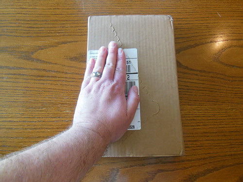
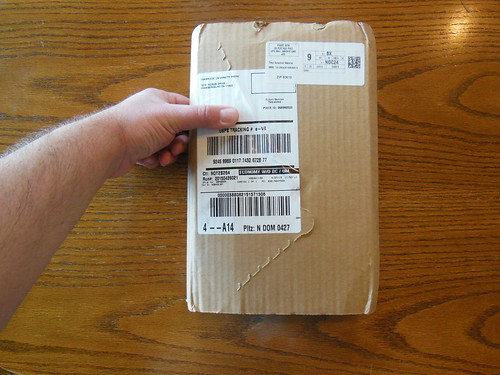
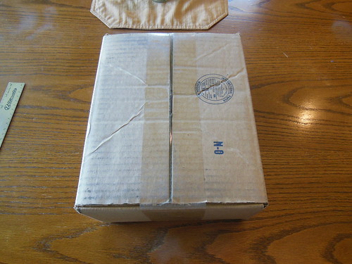
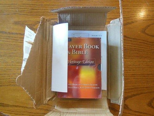
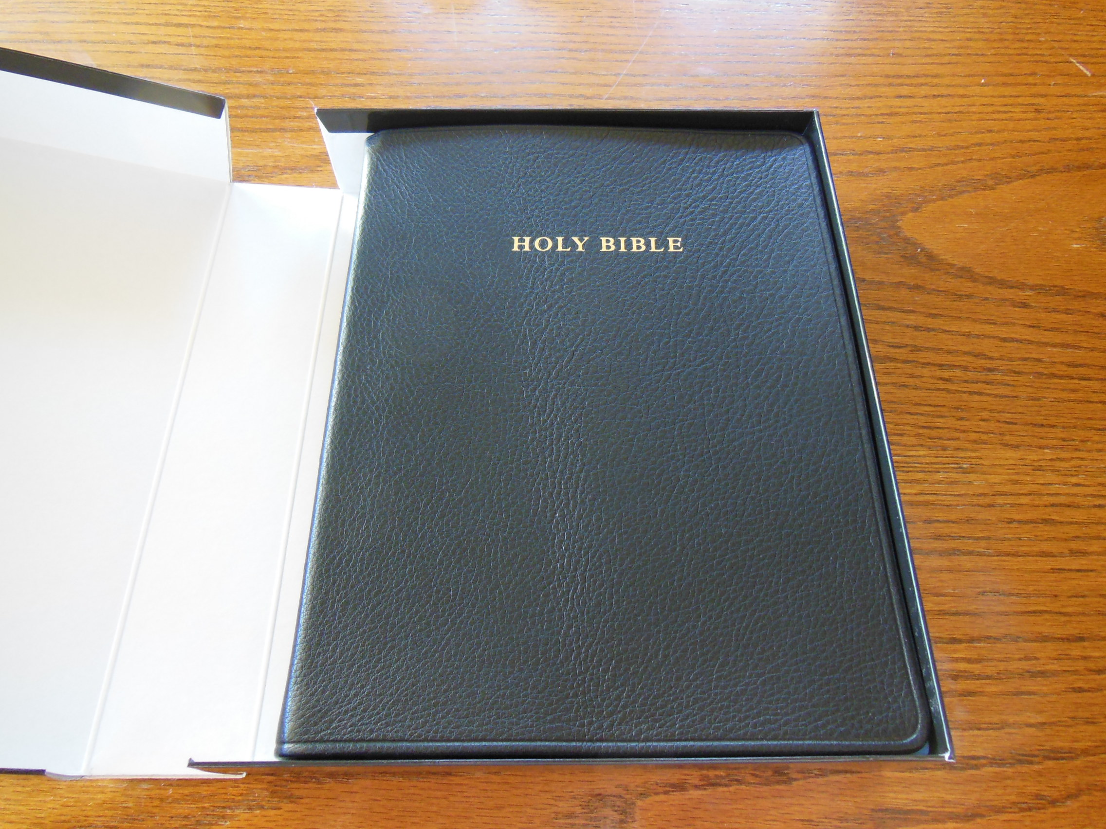
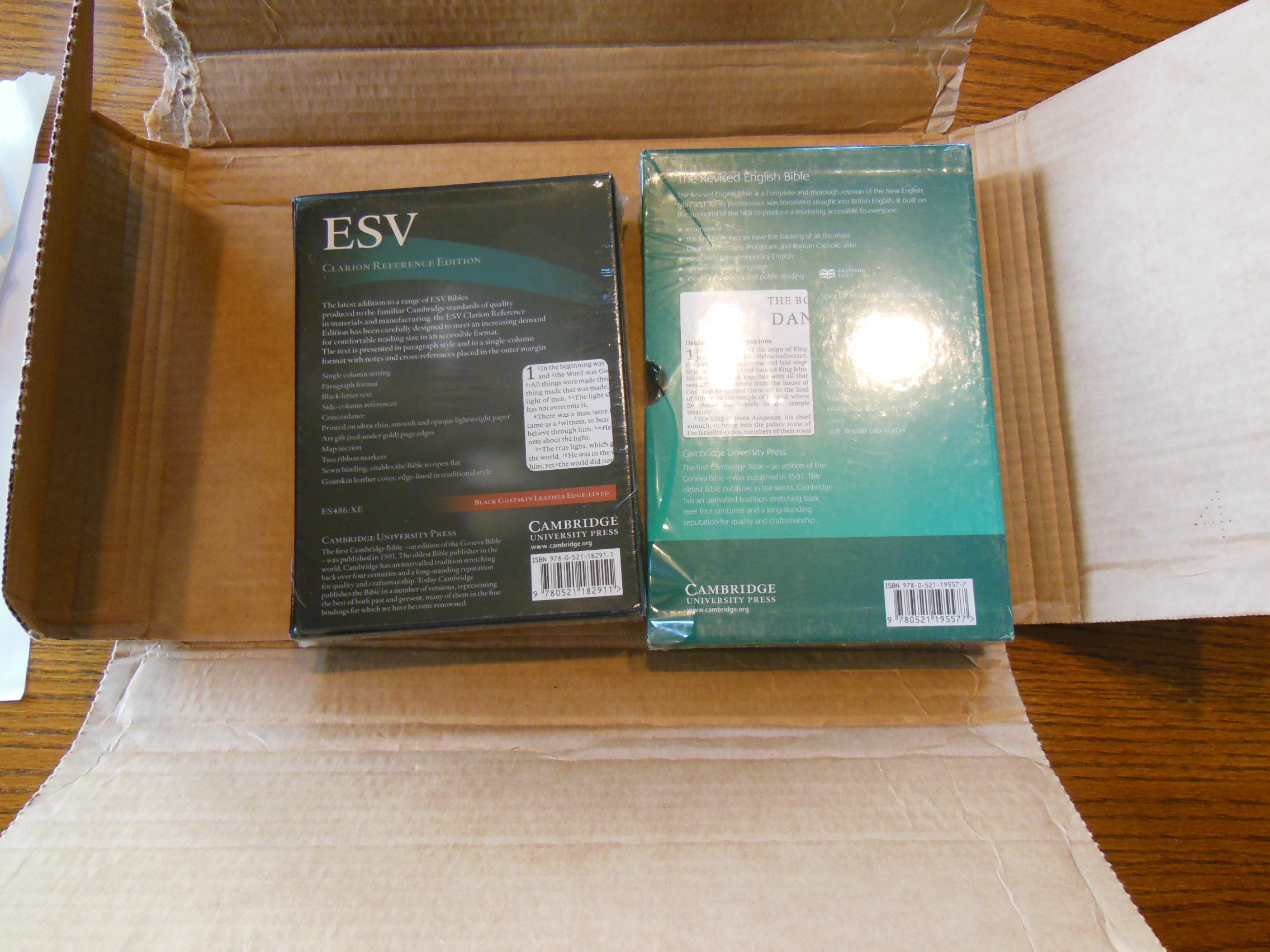
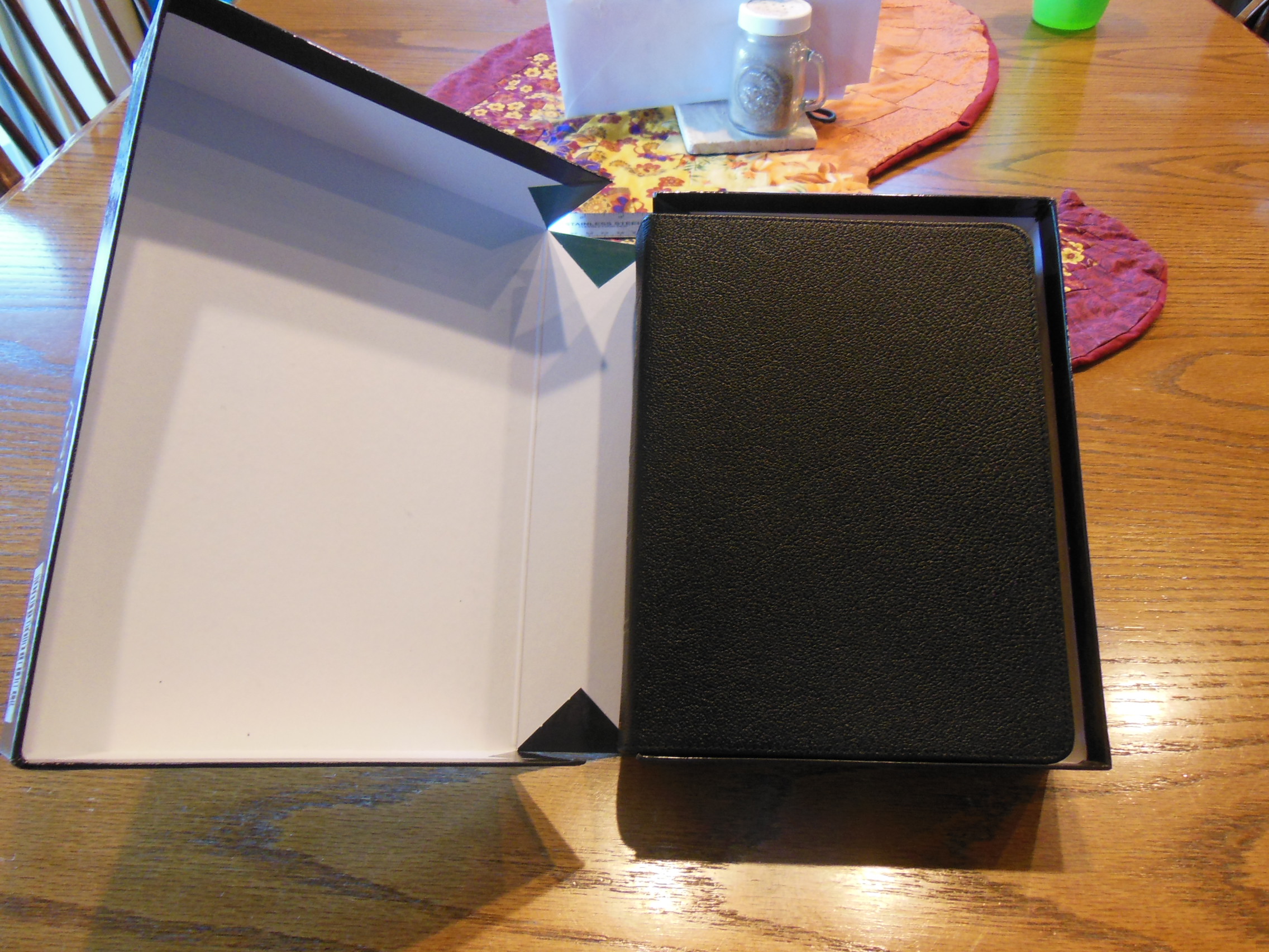
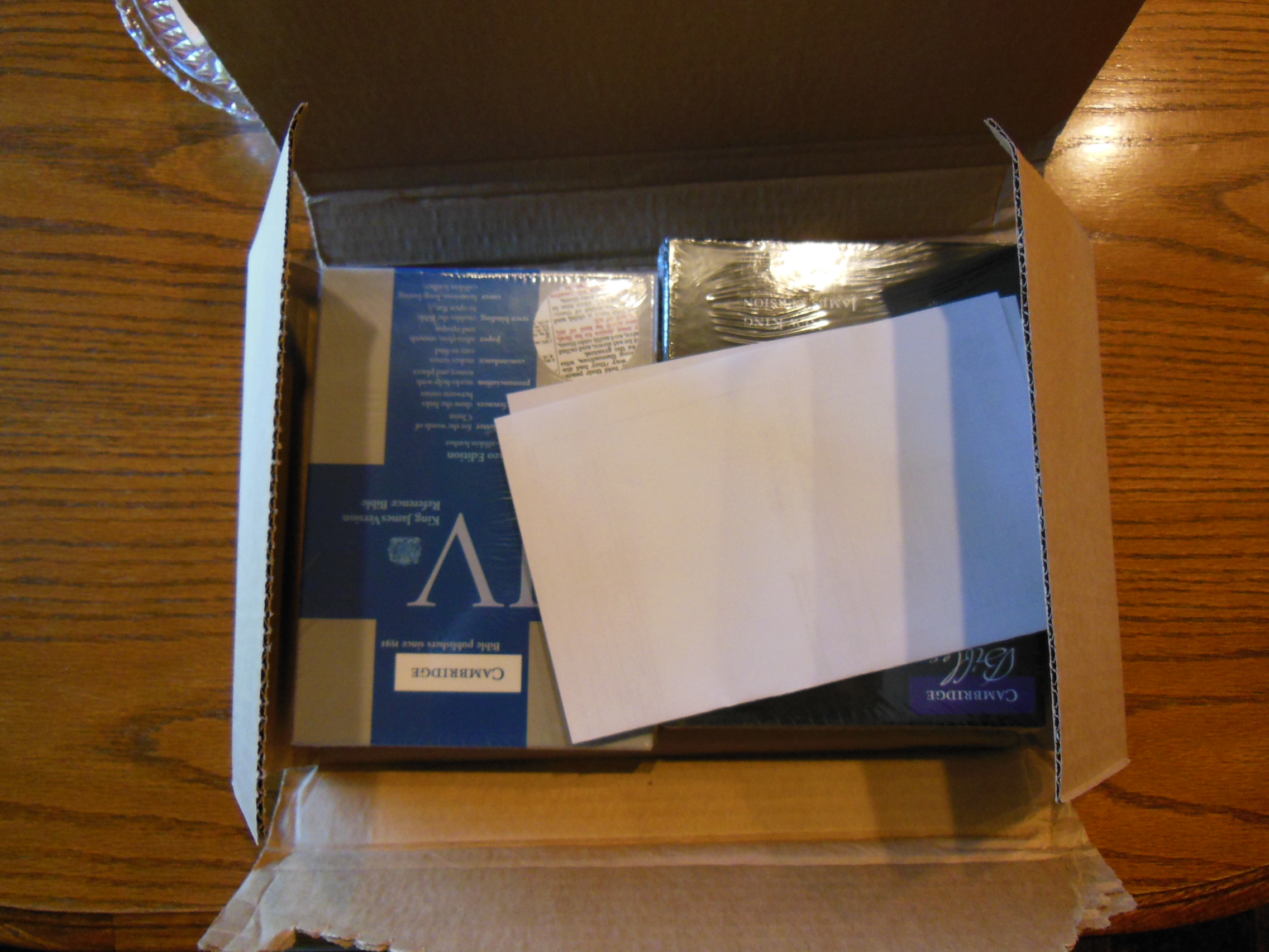
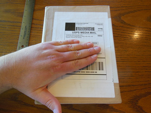
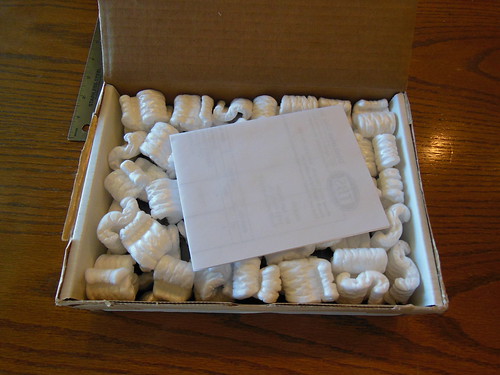
As always TBS exceeds my expectations in the packaging and shipping department. They go above and beyond to ensure that your Bible gets to you undamaged. They are the winner, hands down, when it comes to packaging. The Classic Reference Bible arrived undamaged in a heavy duty, white, cardboard box, cushioned inside with foam packing peanuts.
DSCN4859

DSCN4860

DSCN4861

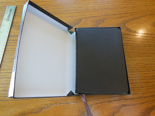
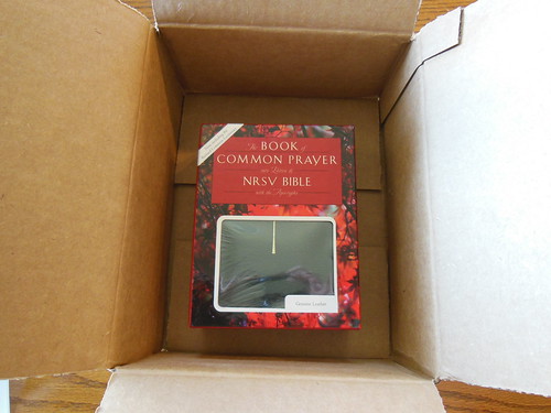
The Bible itself was inside a sturdy cardboard slipcase, that should be retained for storage.

DSCN4863

DSCN4865

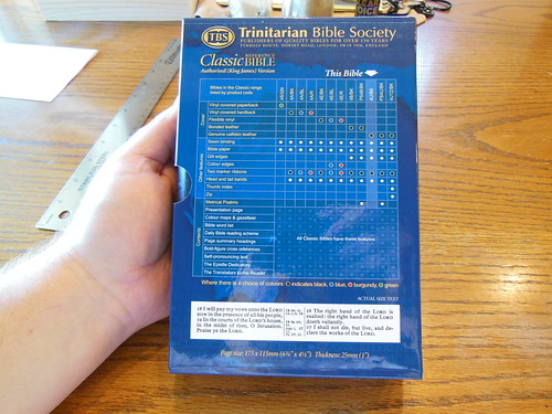
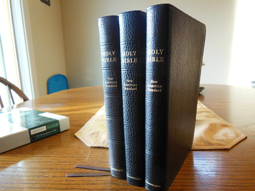
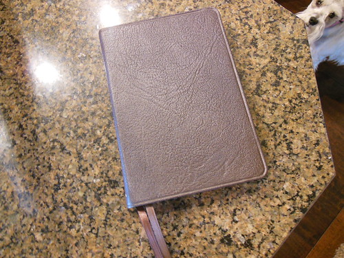
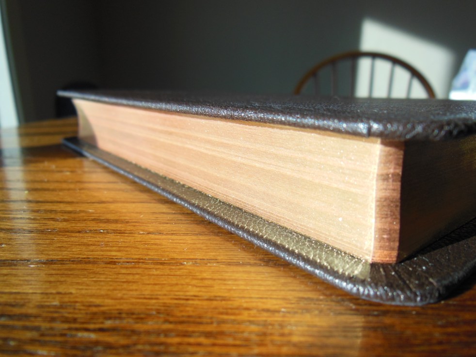
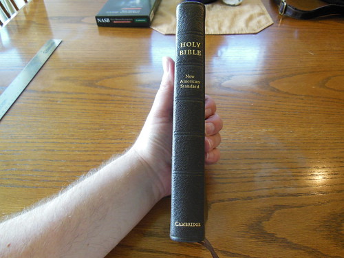
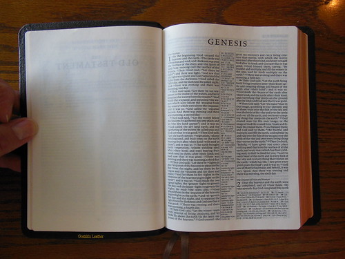
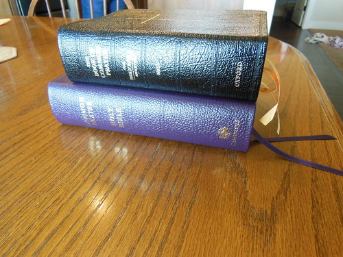
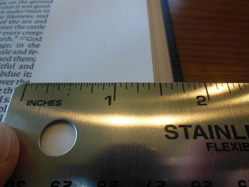
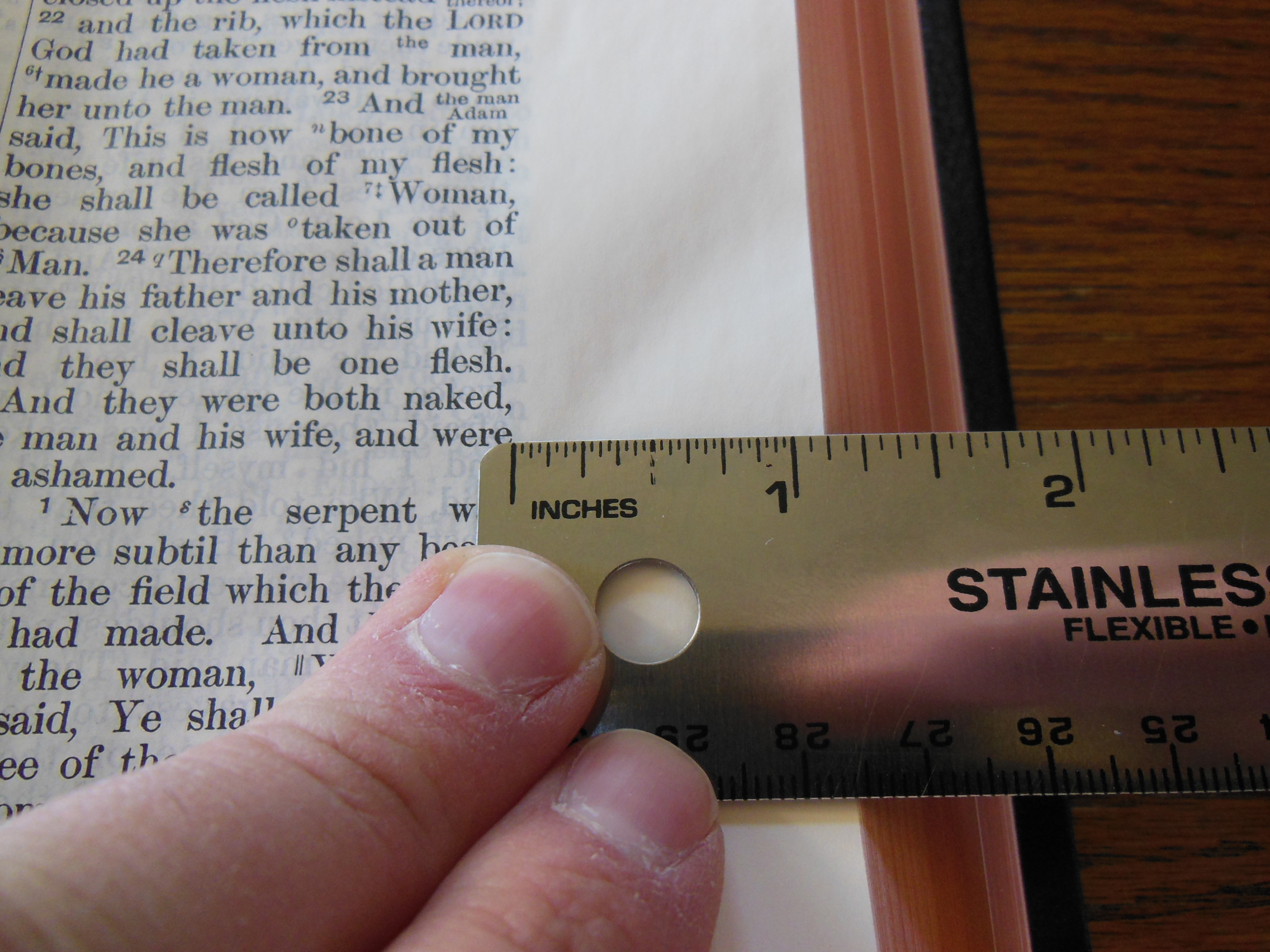
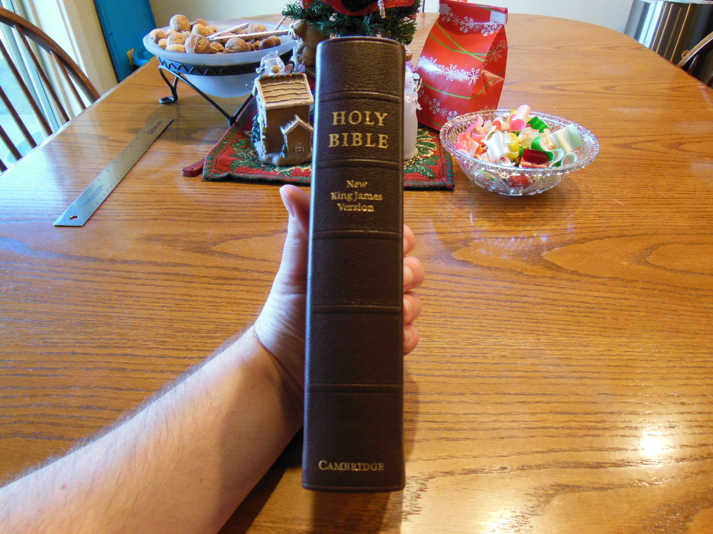
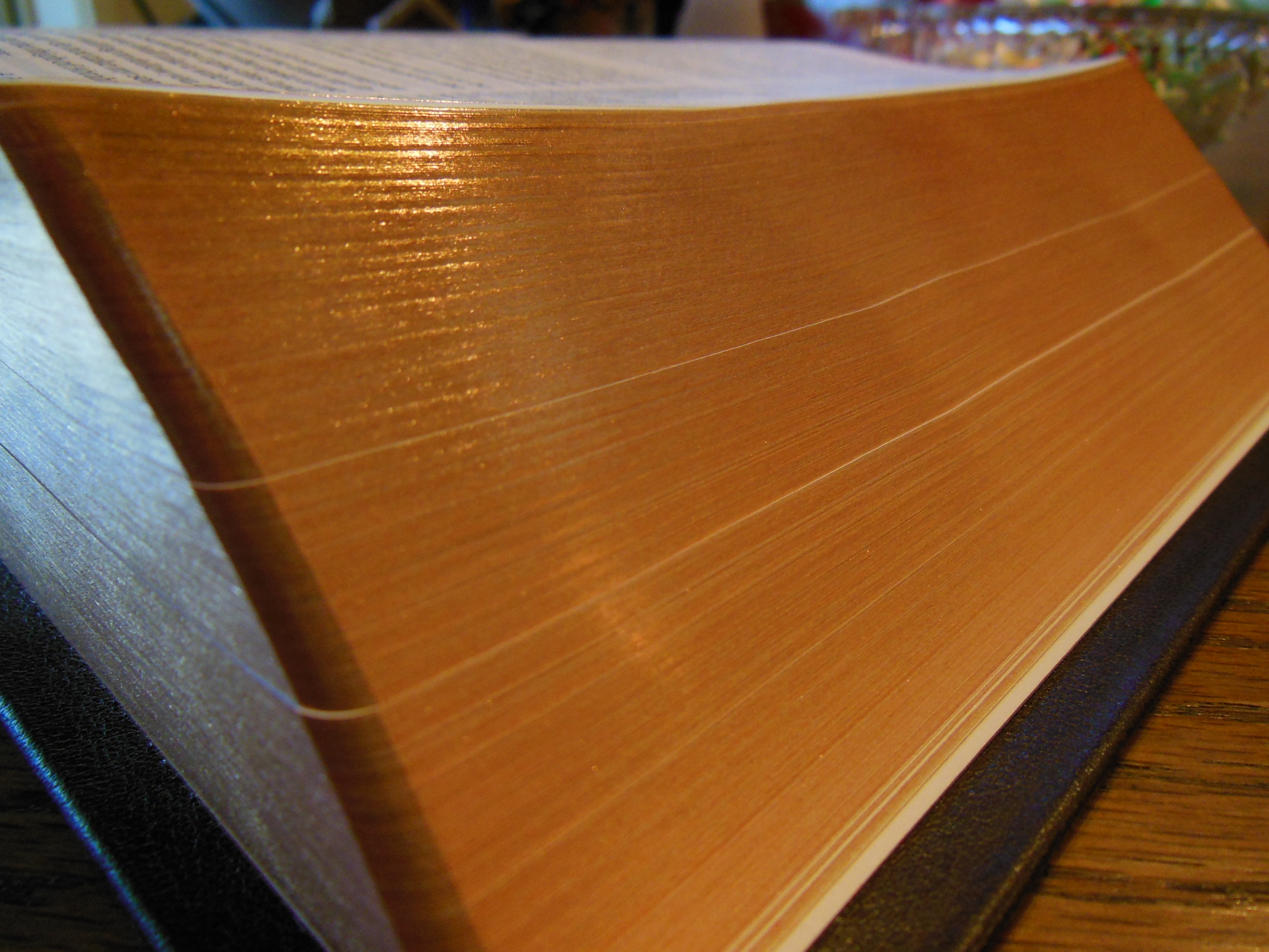
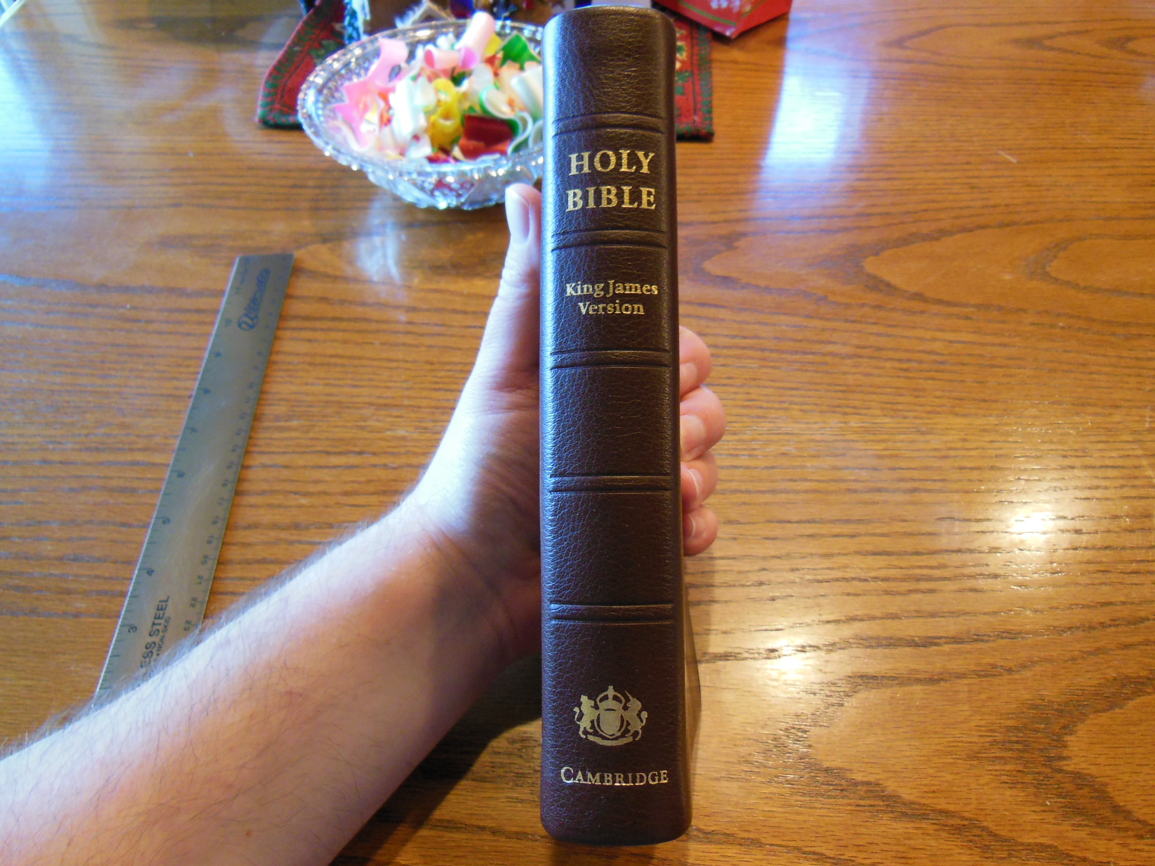
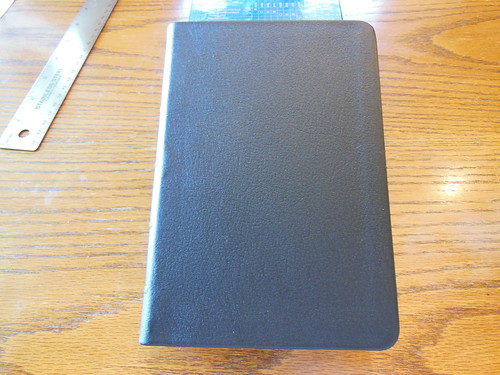
After removing the plastic wrap from the slipcase, I could take the Bible out. It is not a large Bible and it is not as small as a typical compact Bible. It is a full KJV Bible and it does have the Cambridge Concord cross references. It is just a very handy size. It measures about 4 ¾” across, by 7 ¼” tall, by 1” thick.

DSCN4866

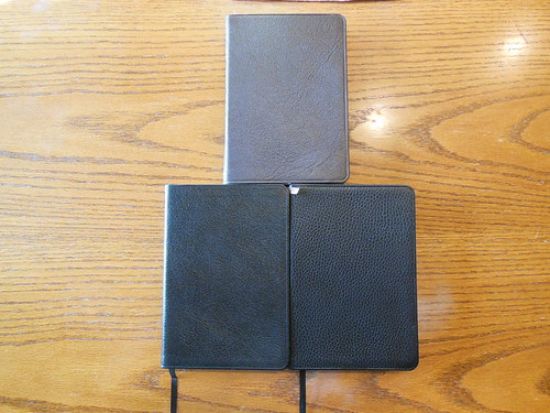
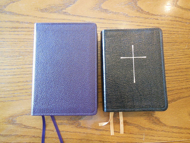
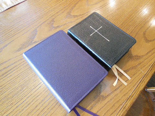
Here it is to the right of the TBS Windsor Text Bible. You can see that it is smaller than the text version while retaining the cross references.

DSCN4908

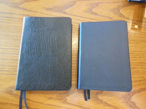
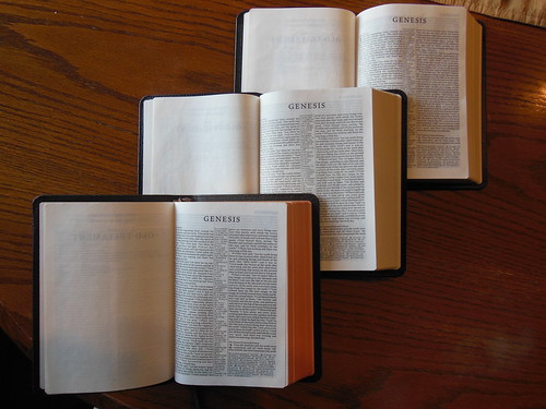
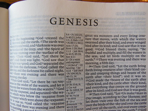
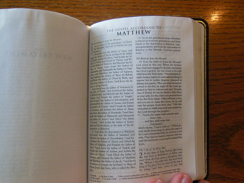
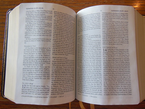
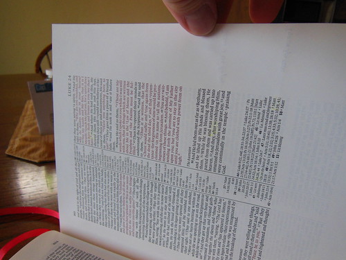
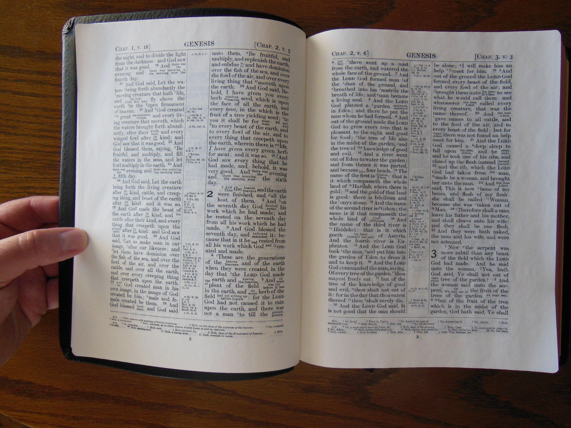
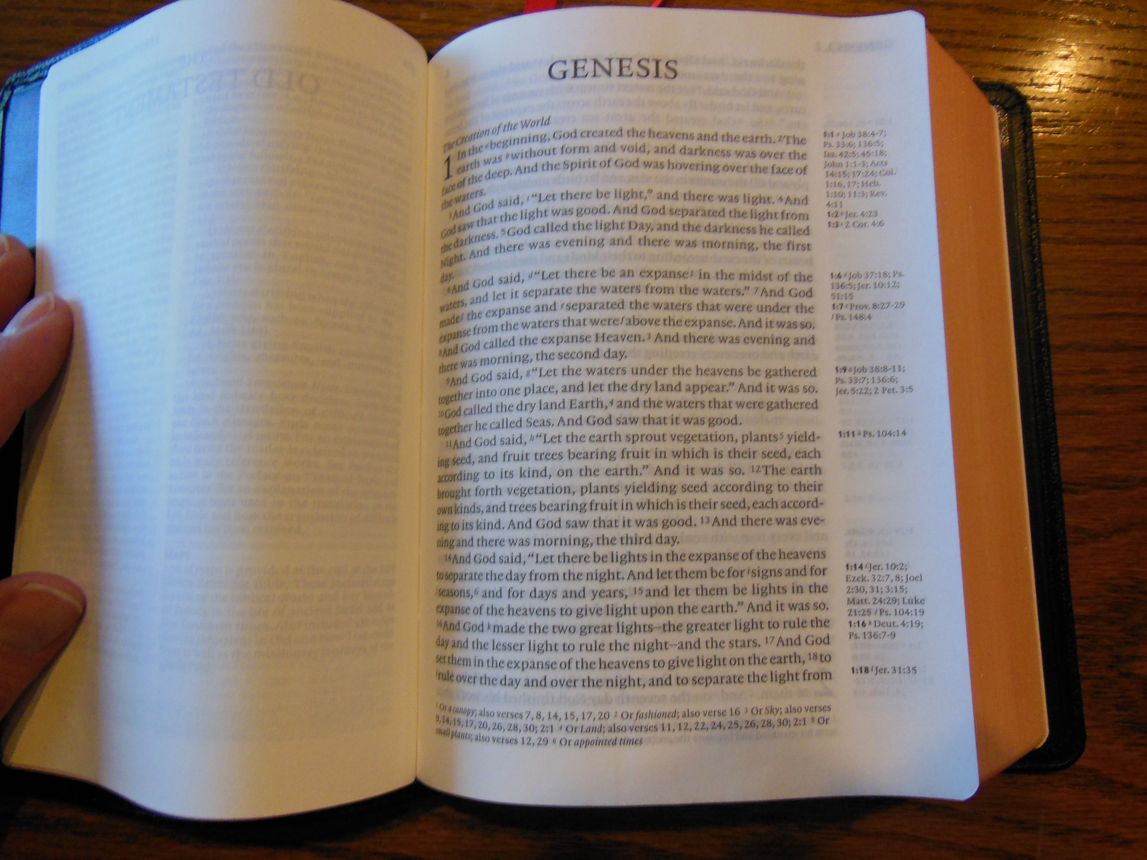
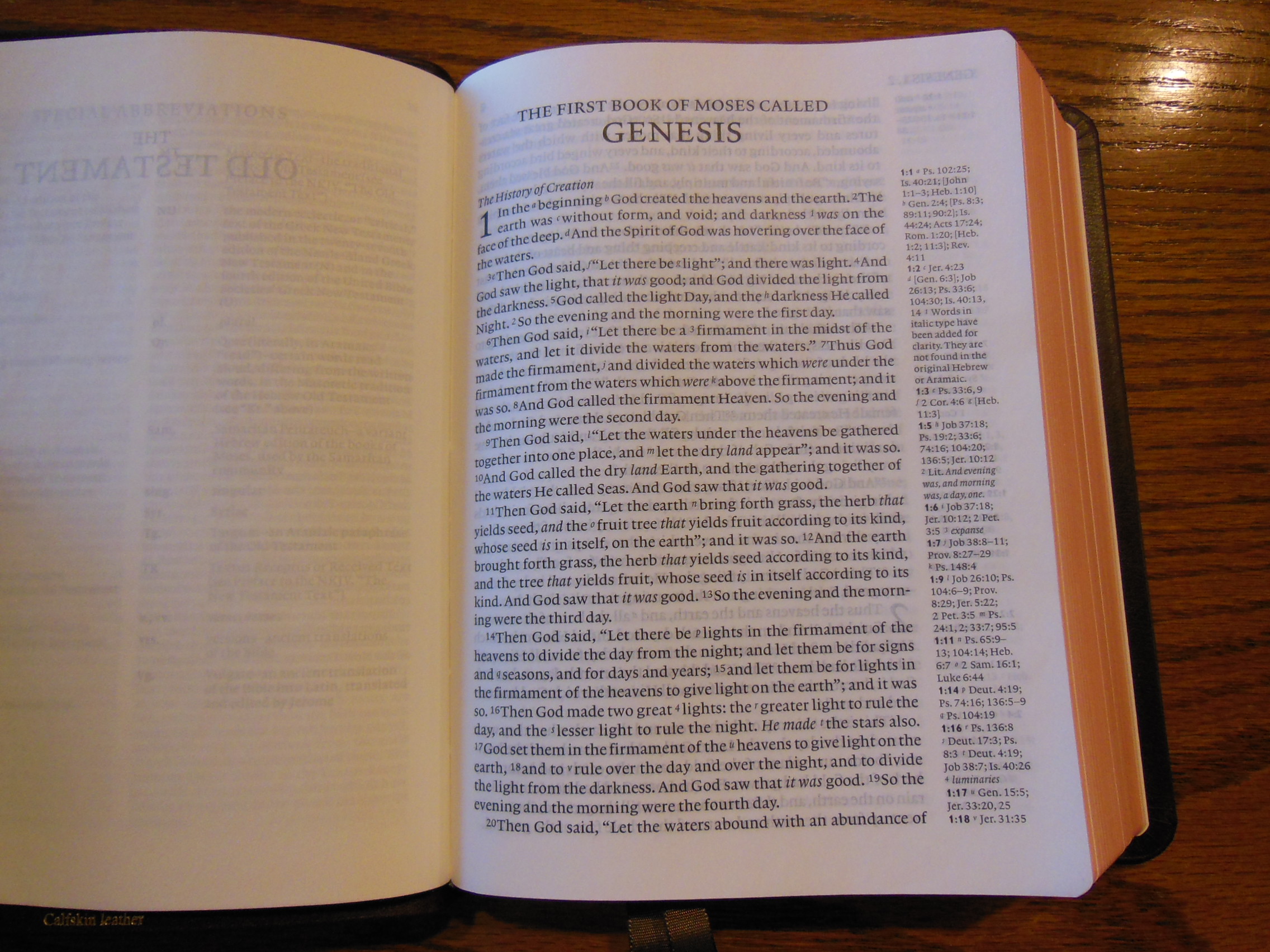
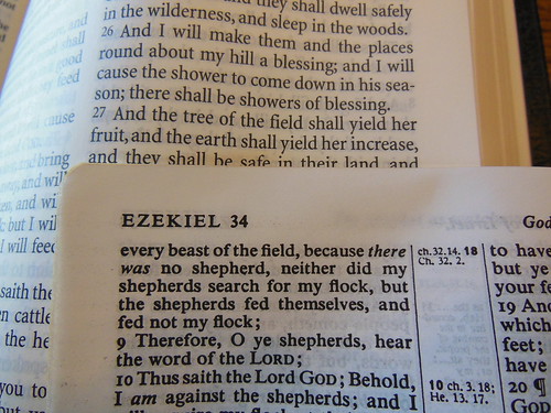
Most typical reference Bibles are around 6” across, by 9” tall, 1 ½” thick. So you can see there is a substantial difference in size. Of course a compact is smaller yet. If this Bible were the size of a typical compact the font would be too small for normal use. Fortunately, the font in this Bible is a legible 8 pt. in size. Since it is the traditional typesetting instead of a modern digital setting, the font would contrast a bit less against the page if not for its boldness.

Here it is laid over a page from the Windsor.

DSCN4909

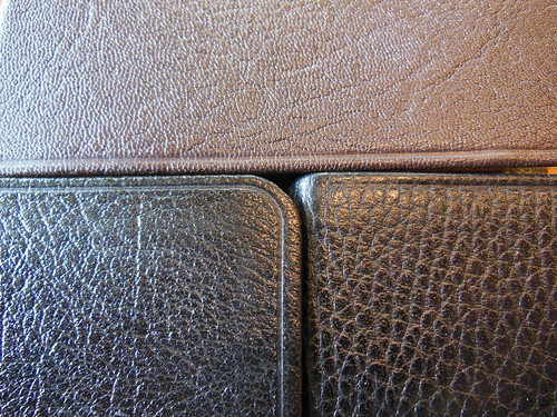
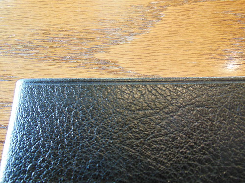
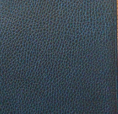
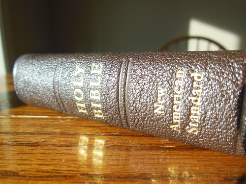
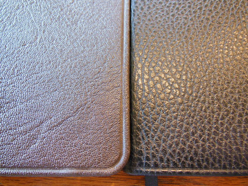
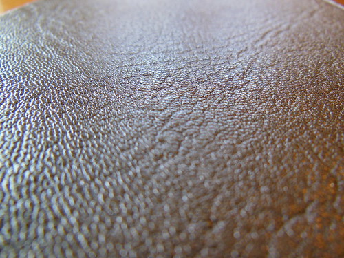
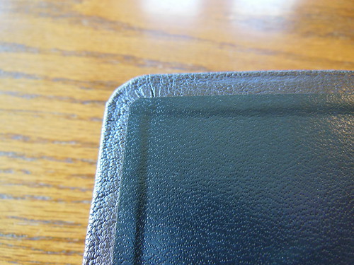
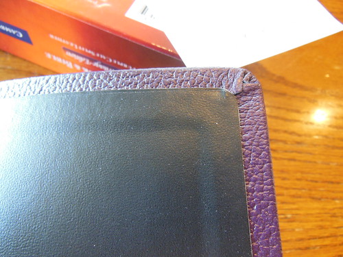
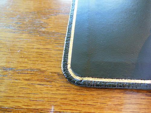
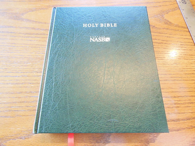
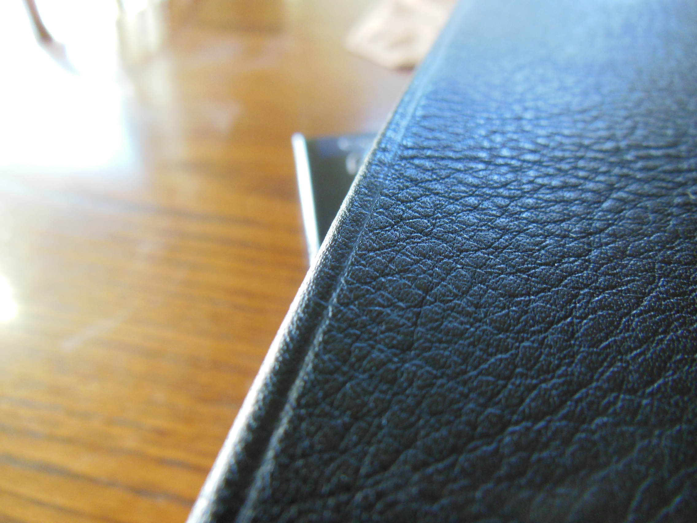
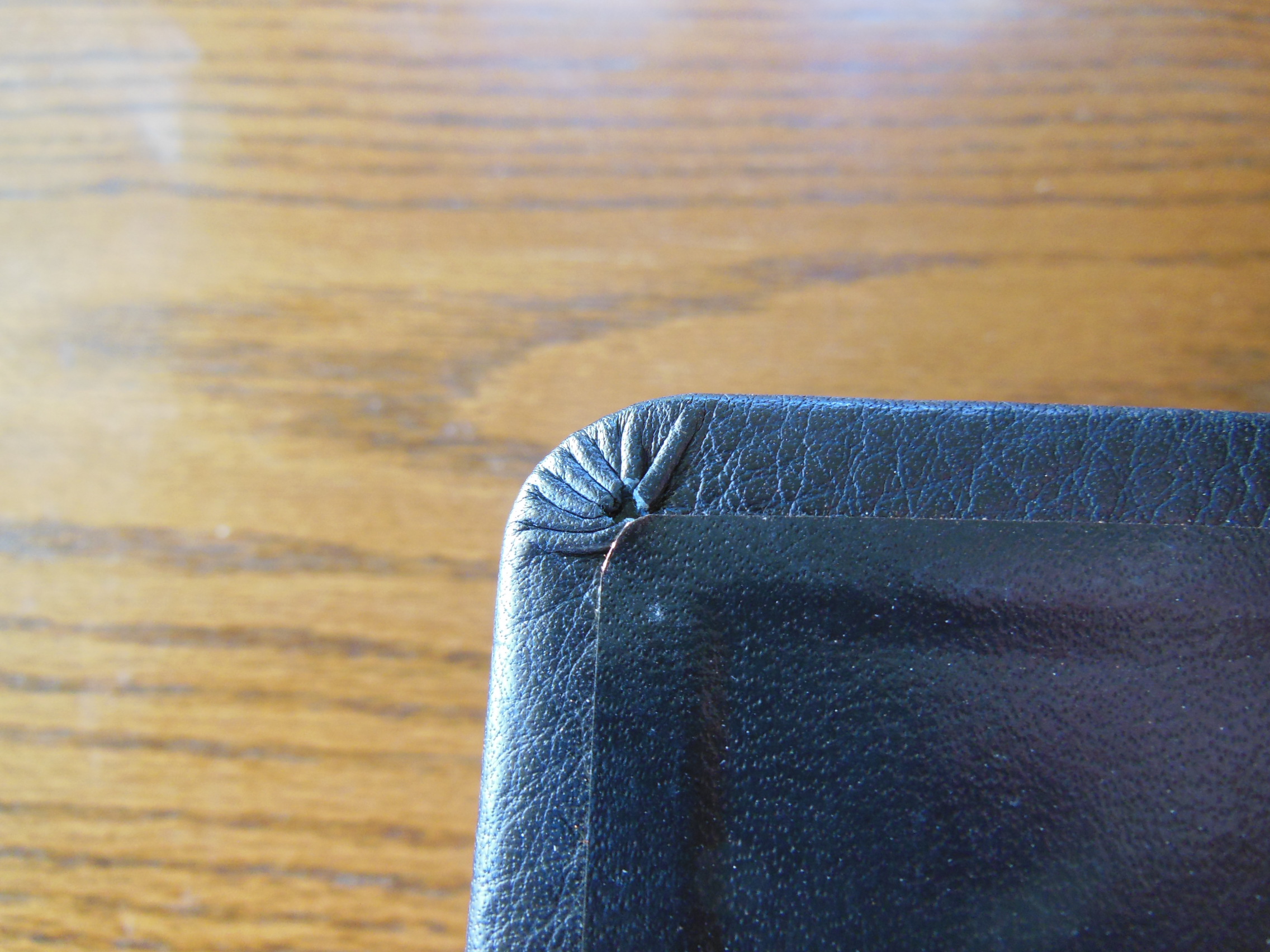
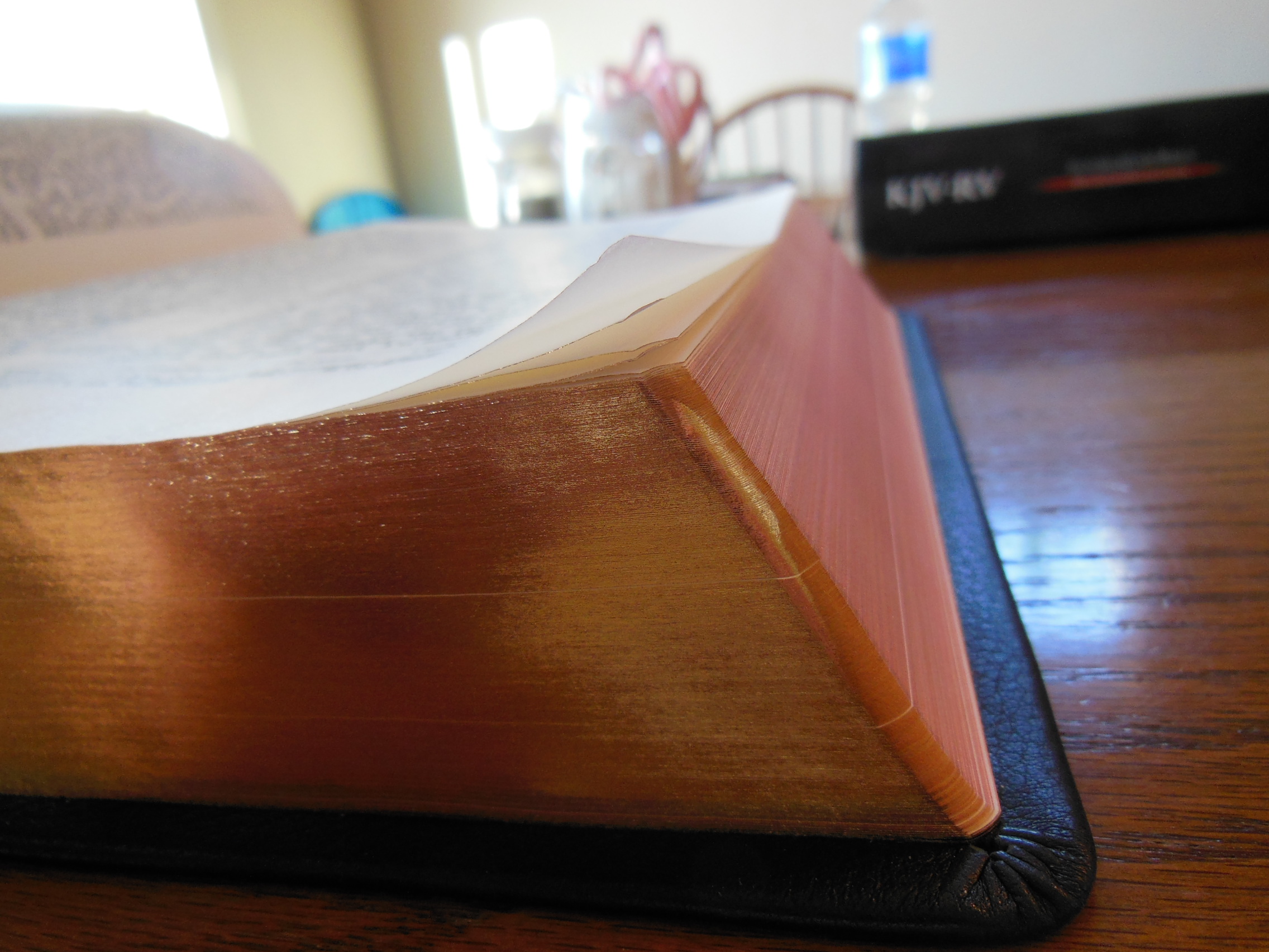
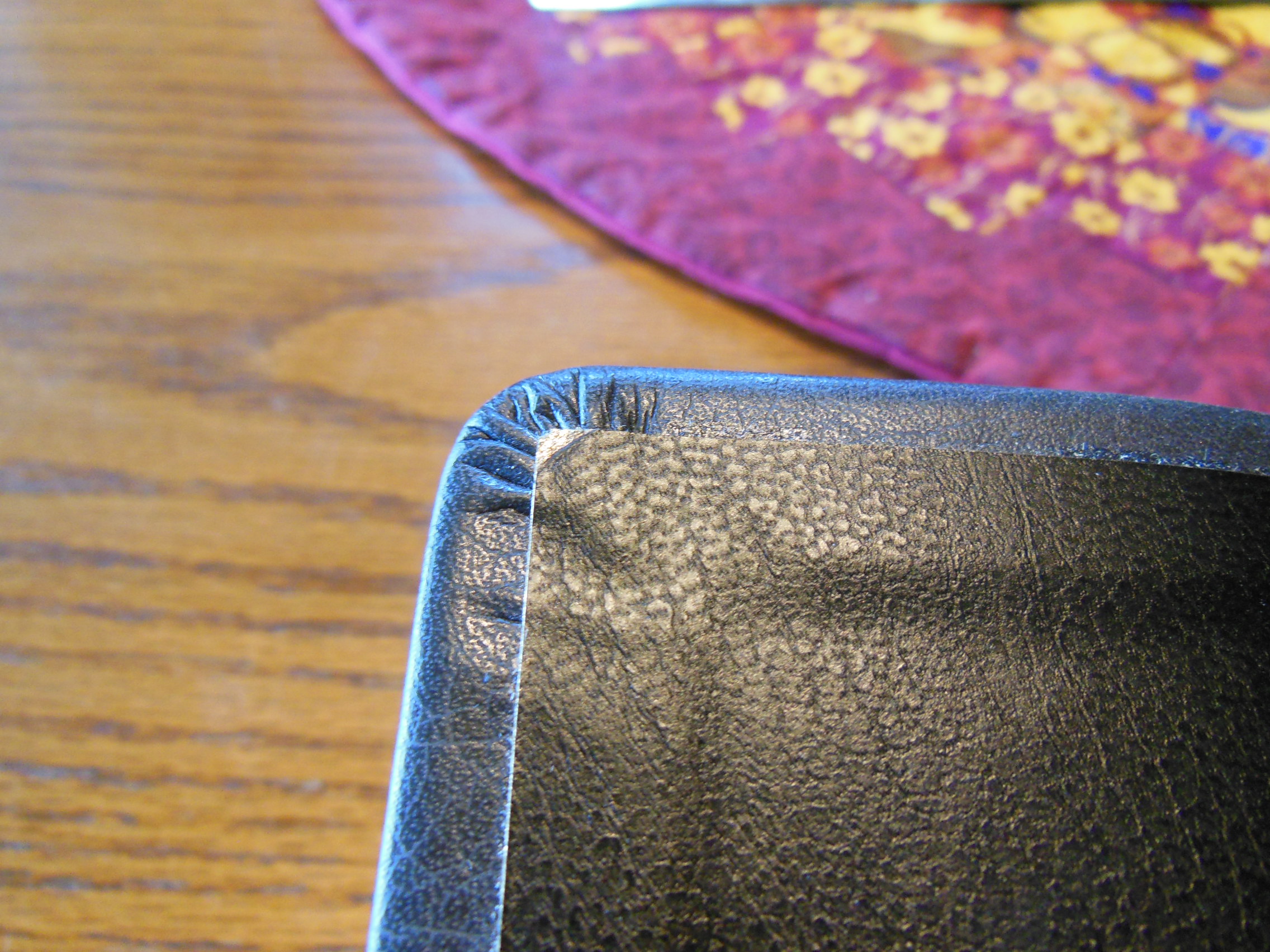
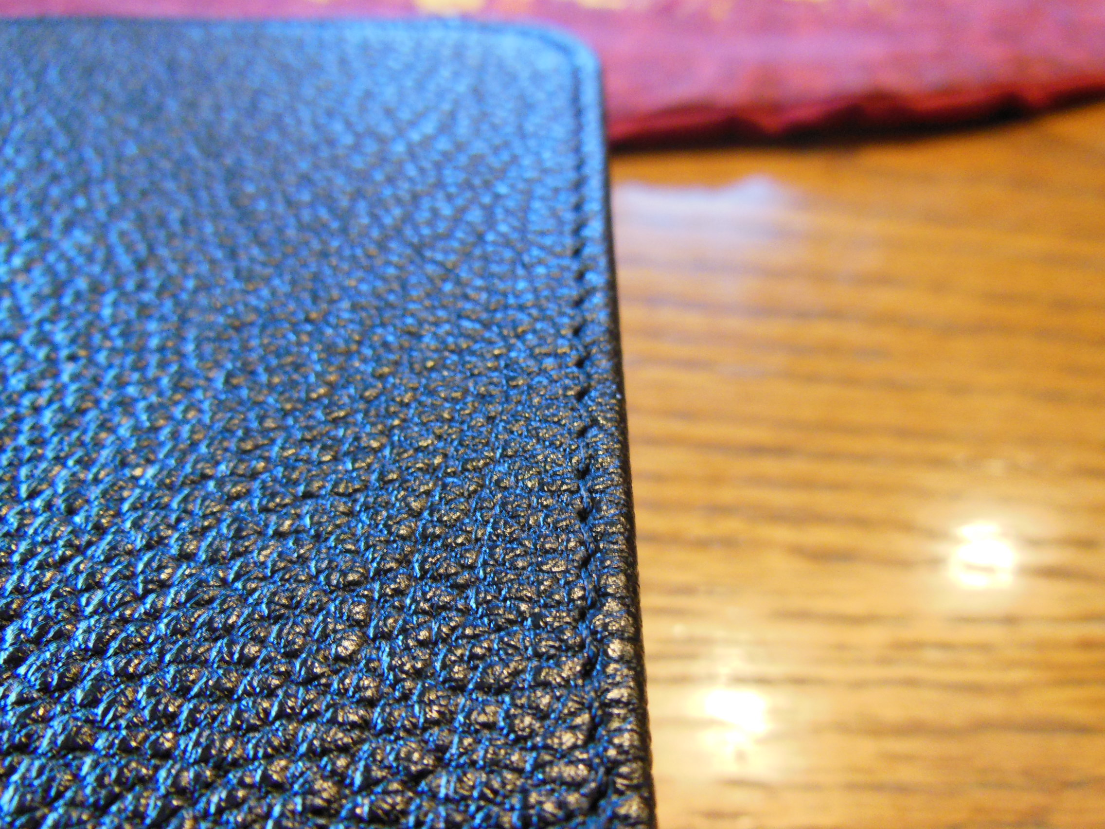
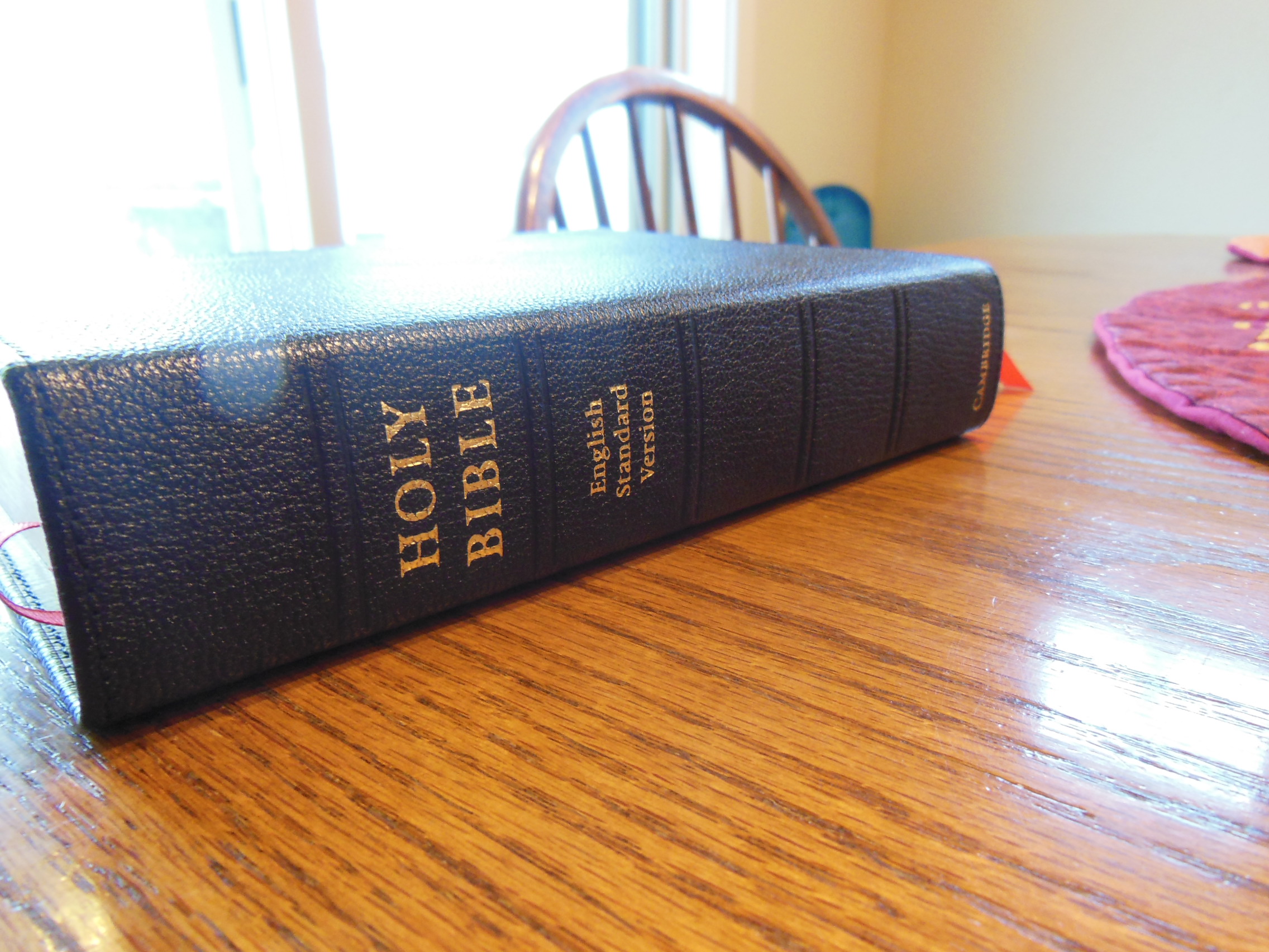
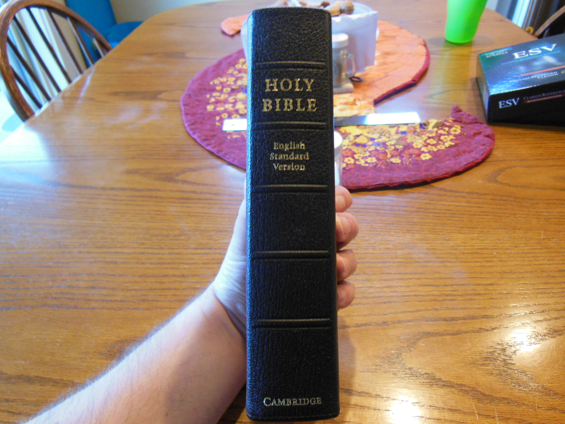
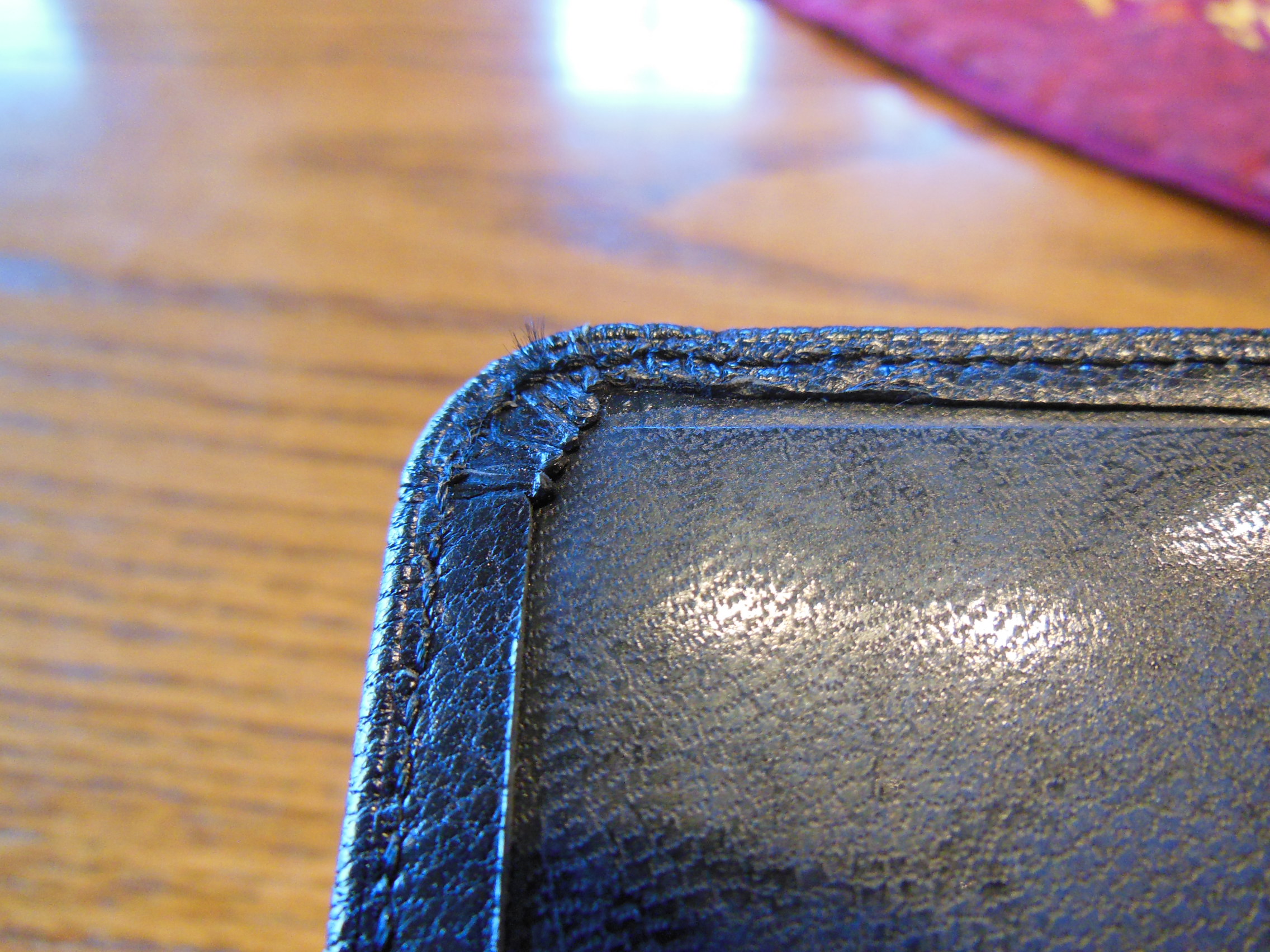
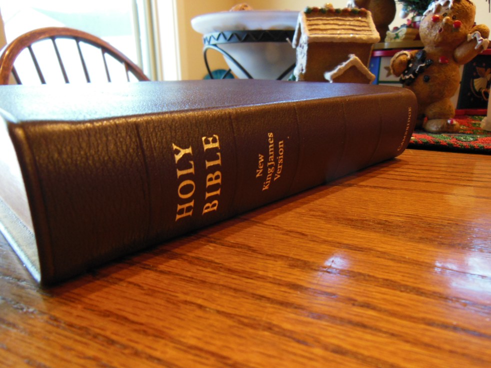
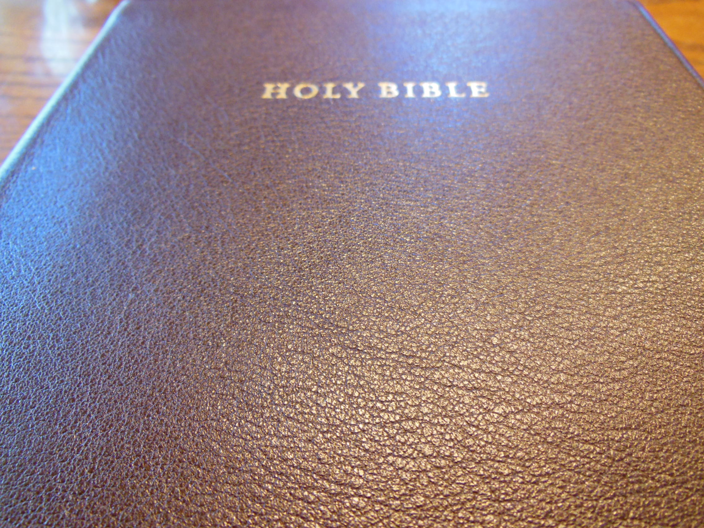
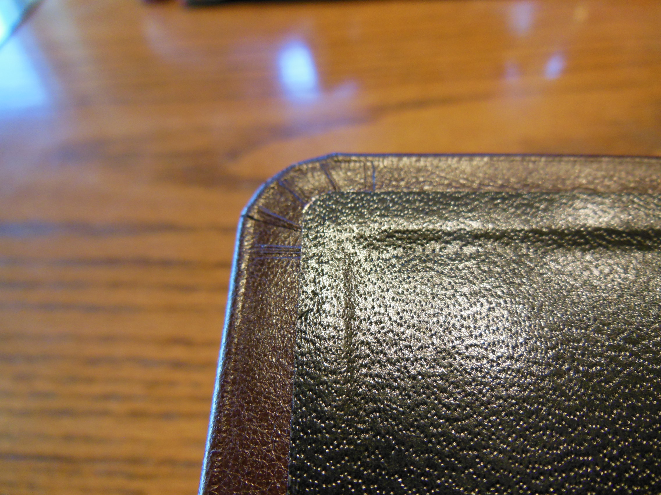
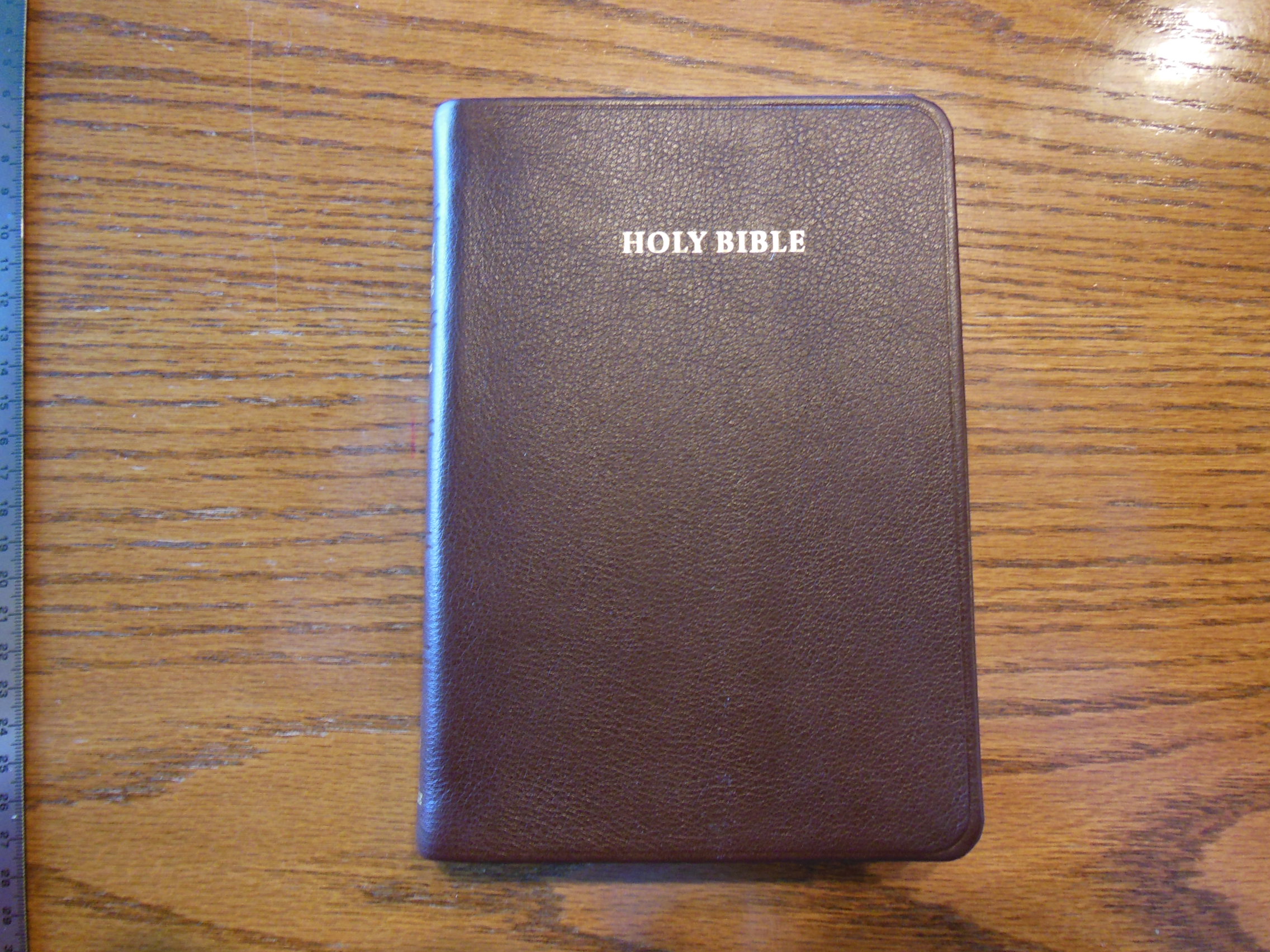
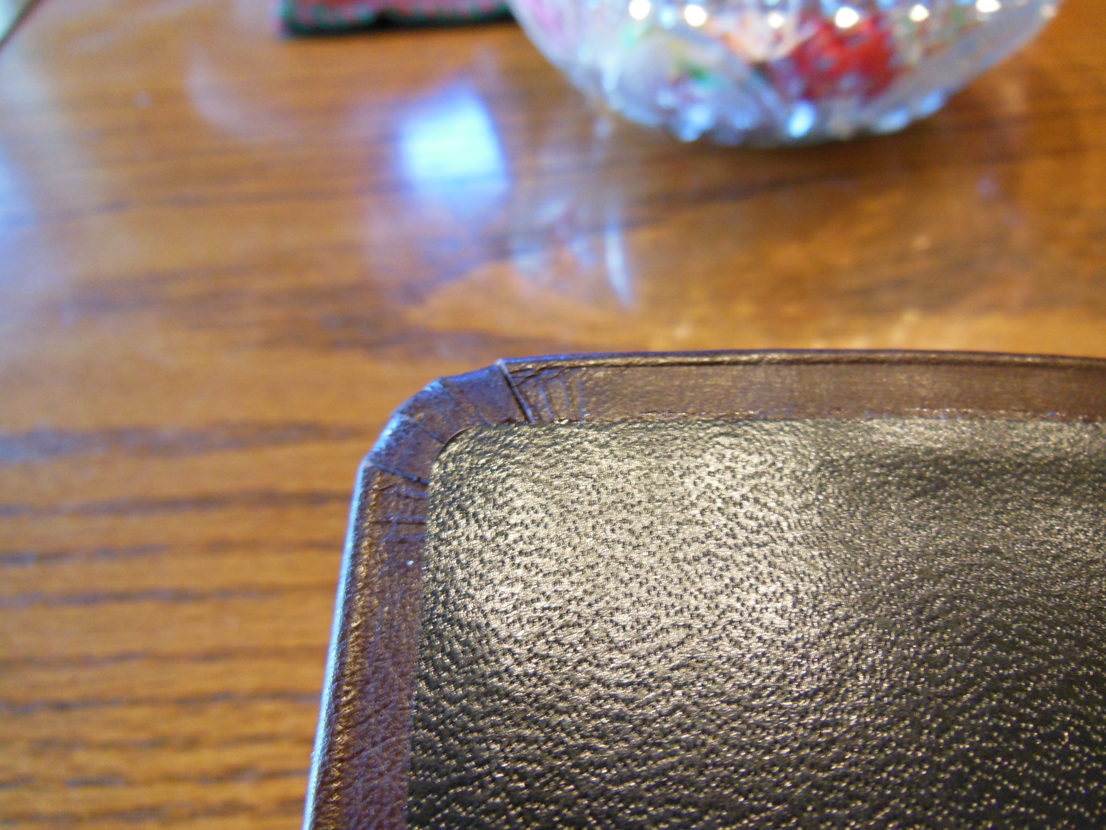
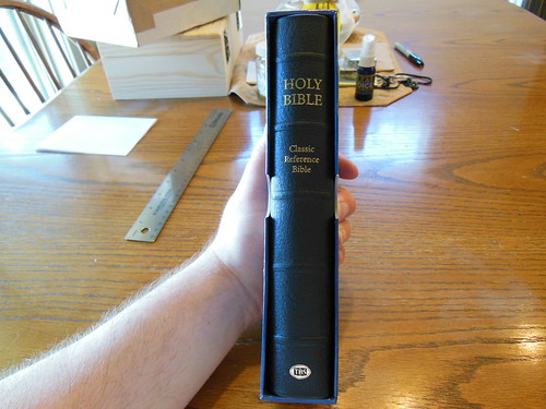
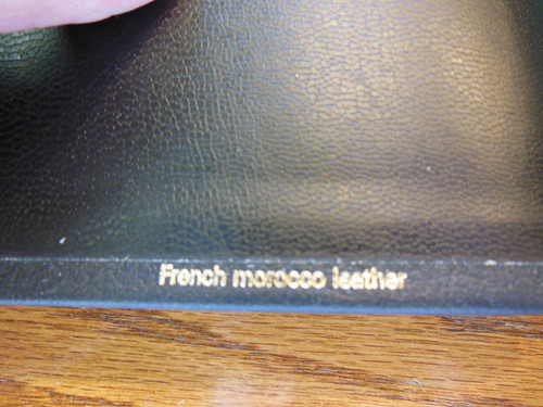
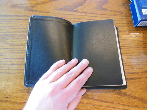
The cover is listed as, “Calfskin” on the website. Keep in mind there is no industry standard. Technically the French Morocco Leather cover is made of calfskin, so it is true, but if you are expecting supple calfskin like some premium Bibles use, you will be disappointed. I don’t know why anyone would think that though considering the value pricing of this edition. I seriously don’t understand how a person could complain about this cover. Especially in light of the low cost and how much they are getting. For under fifty dollars they are getting a full KJV reference Bible, smyth-sewn binding, and genuine leather. Even if it is French Morocco, it is far superior to the covers of other Bibles in the same price range. Other Bibles in this price range use synthetic covers or bonded leather. The front cover is blank. The only gold lettering on the outside of this Bible is on the spine. It has the words, “Holy Bible” at the head, “Classic Reference Bible” directly under that, and the TBS logo at the tail. The cover is uniform in thickness and has a nice pattern pressed into it. It is on the smooth side and feels very durable. My first impression was, “This is a tough little Bible.”

DSCN4872

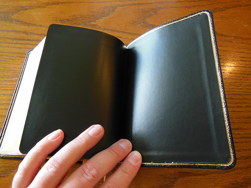
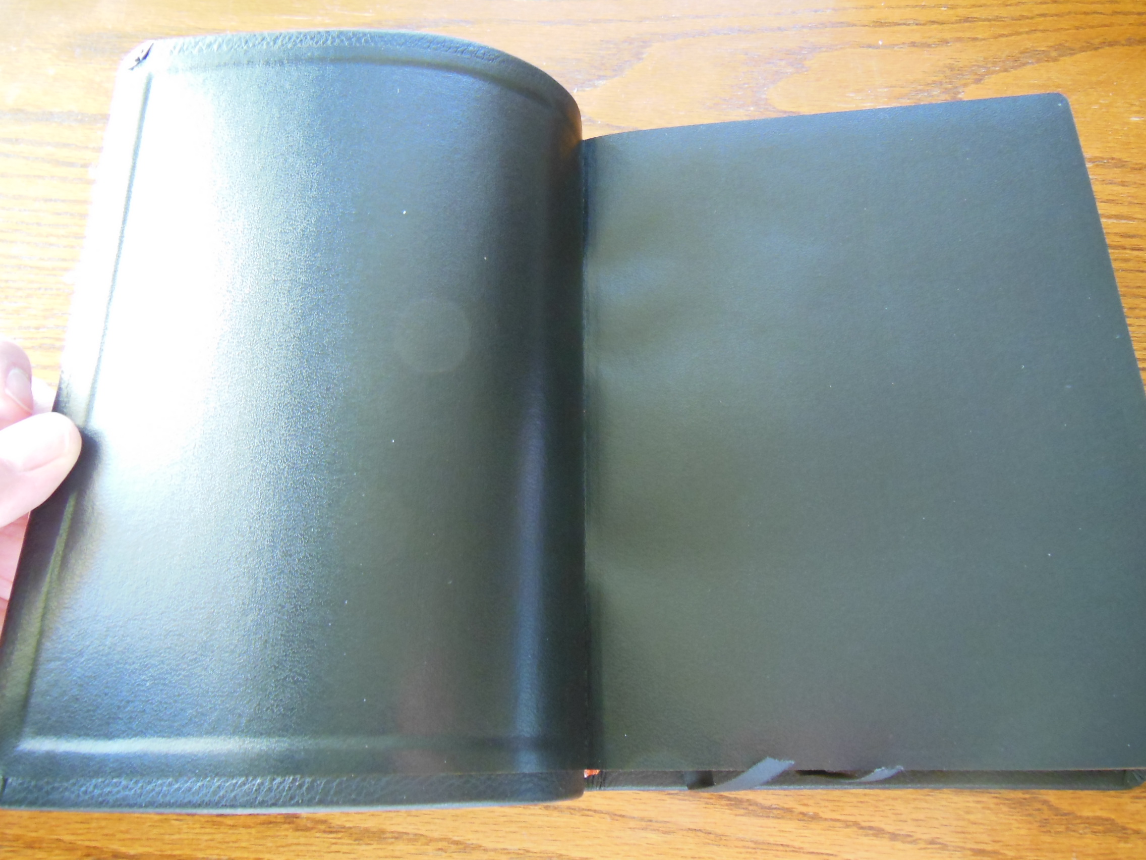
This Bible is case bound, and as such utilizes black vinyl covered paper as an interior liner and to join the cover to the text block.

DSCN4873

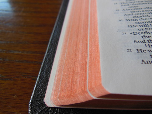
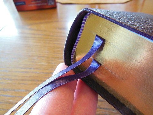
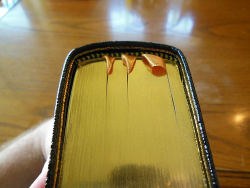
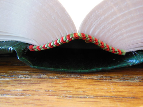
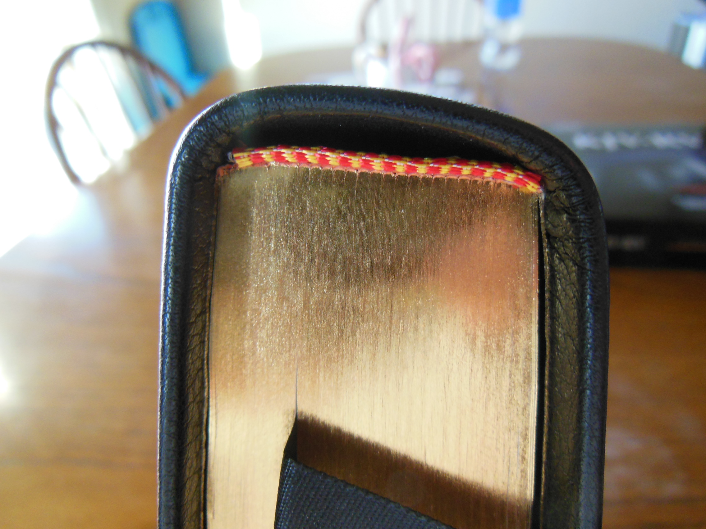
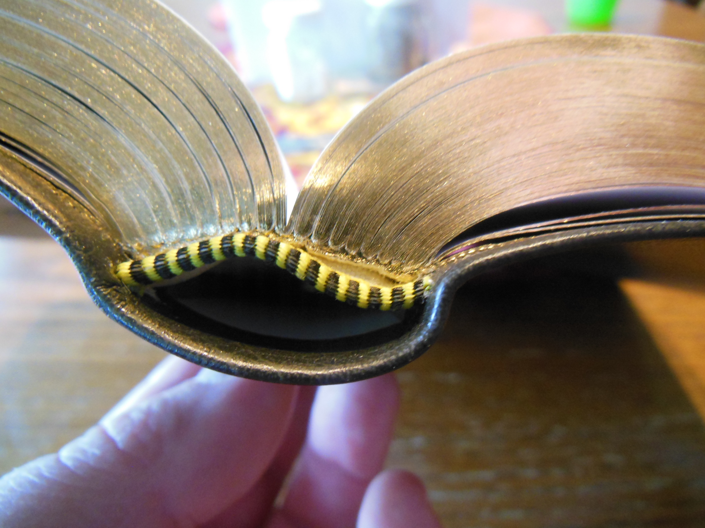
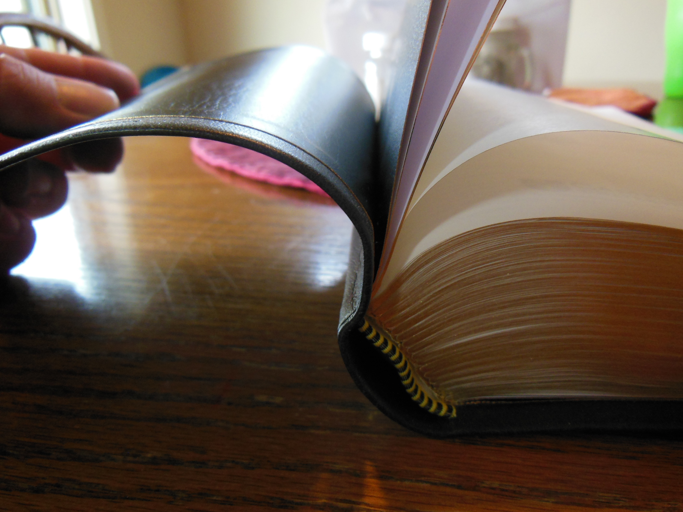
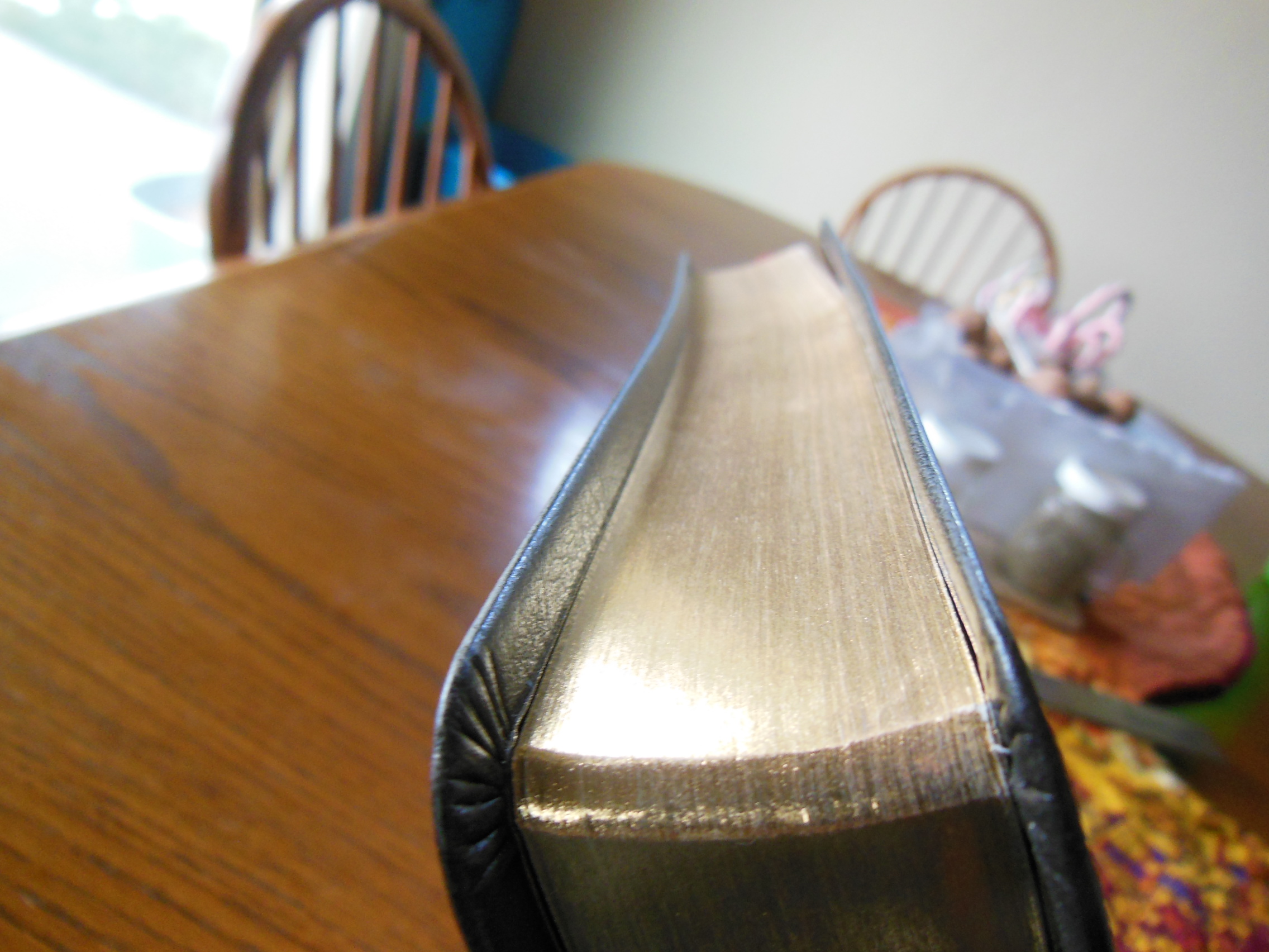
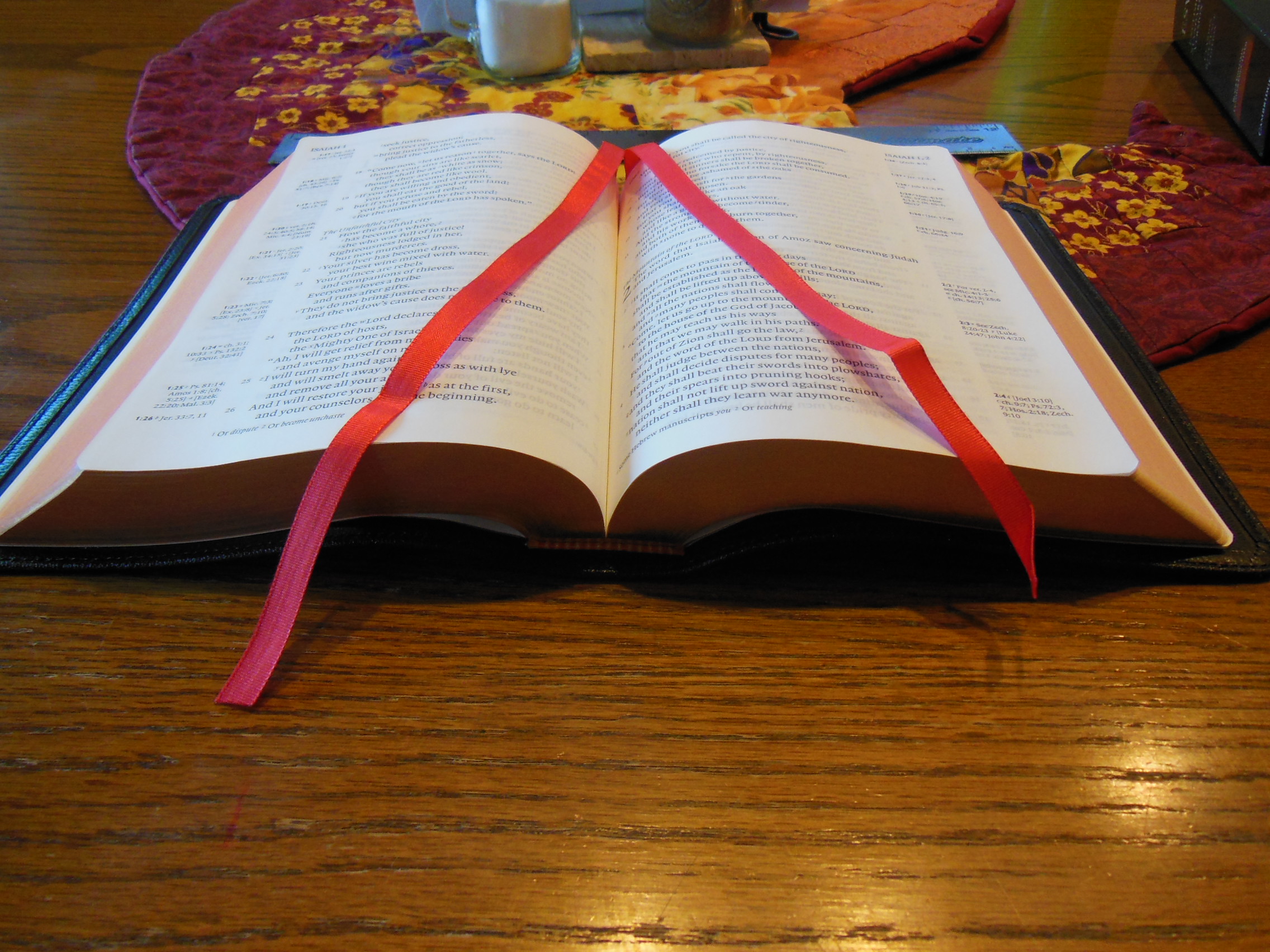
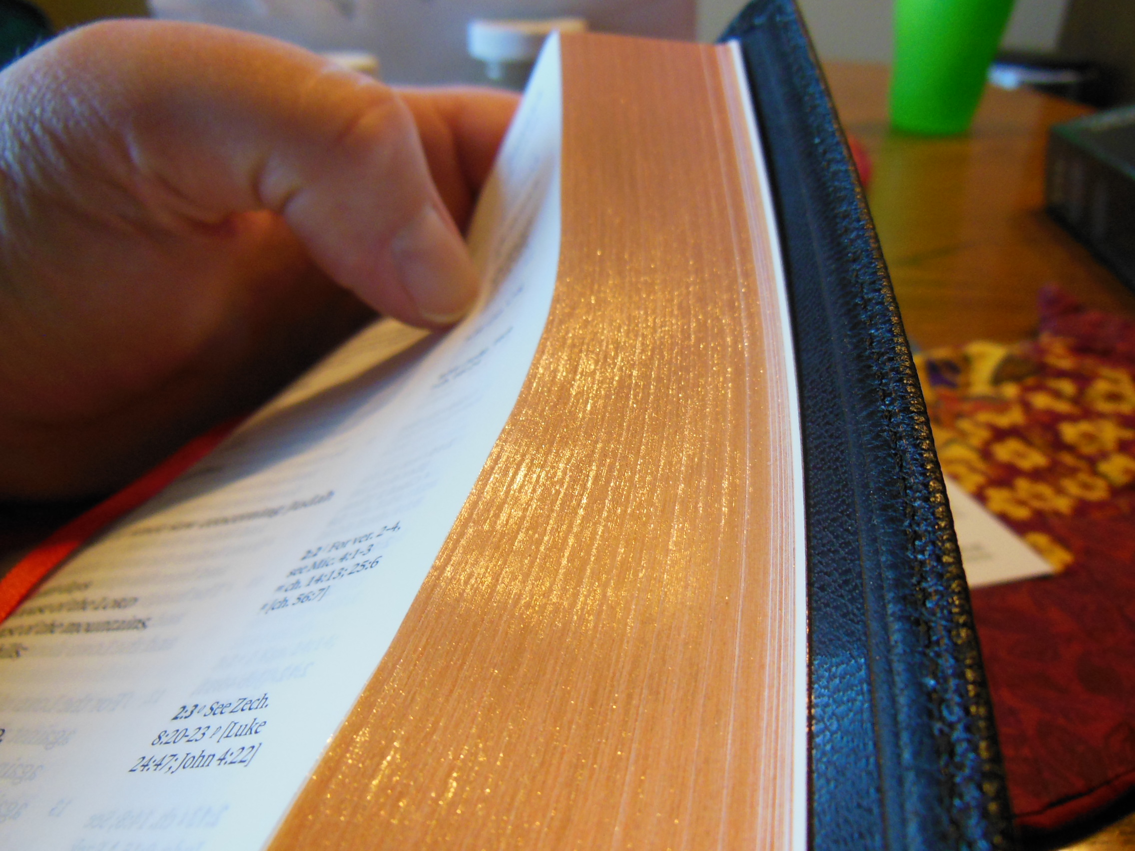
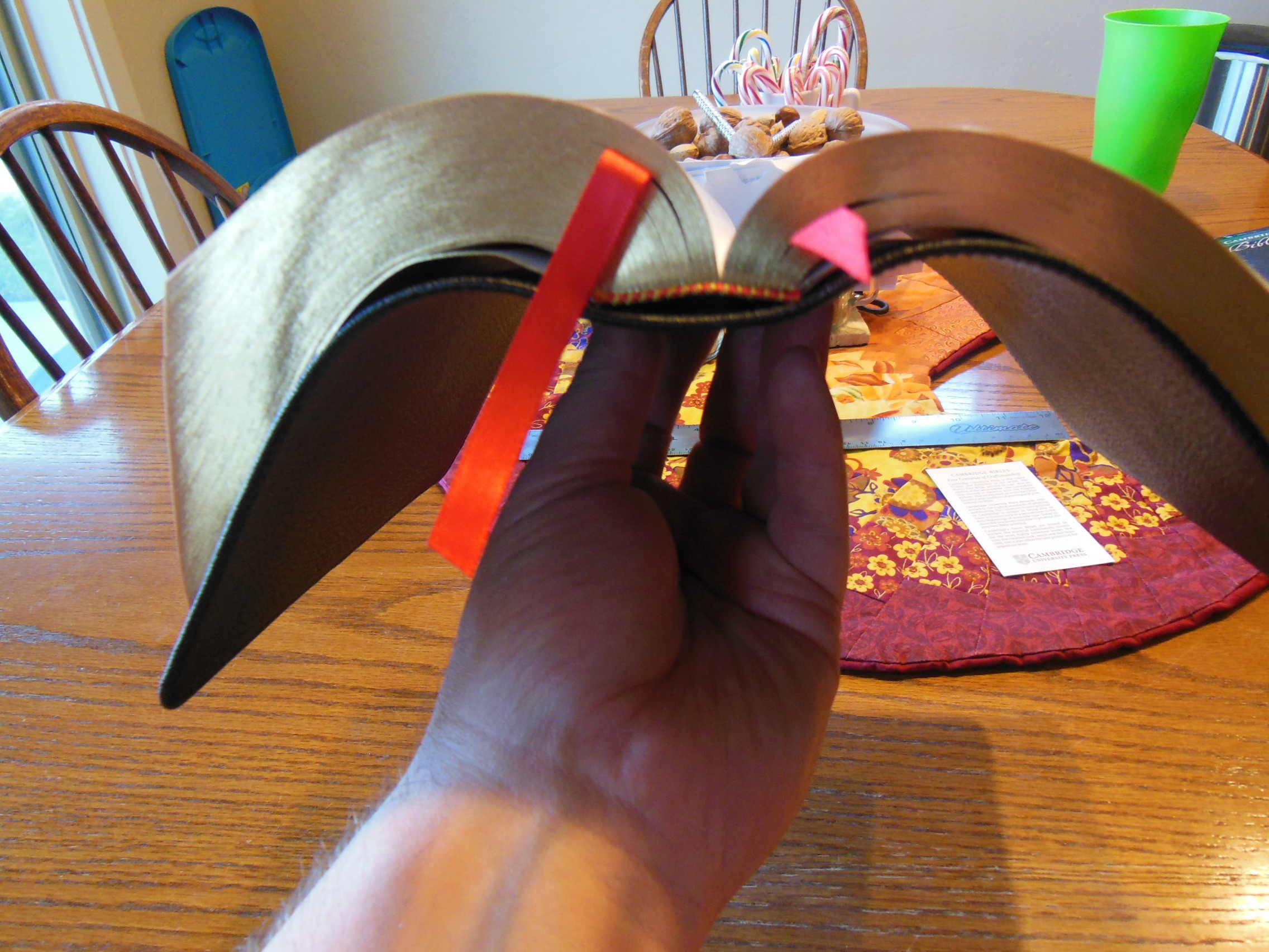
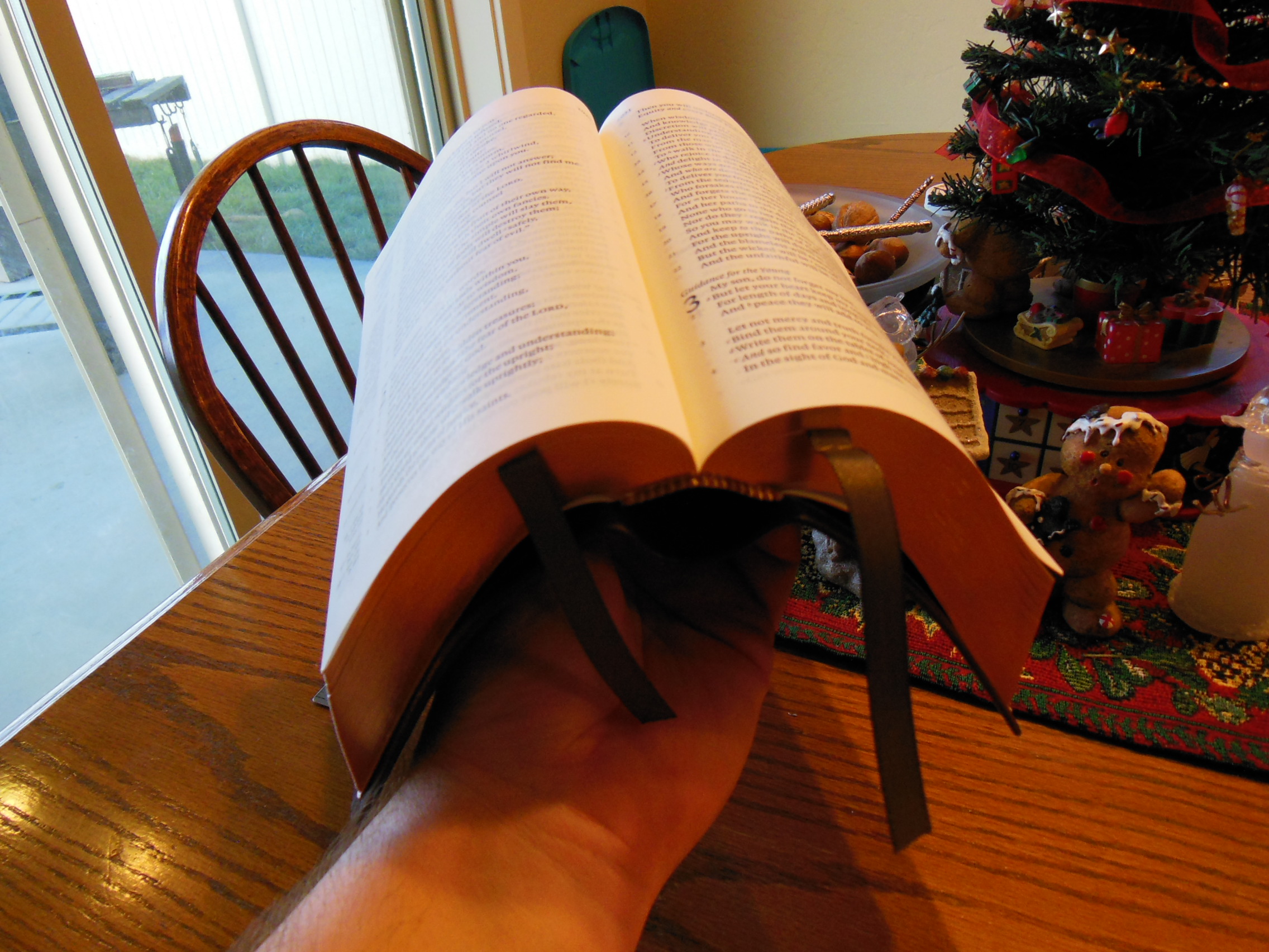
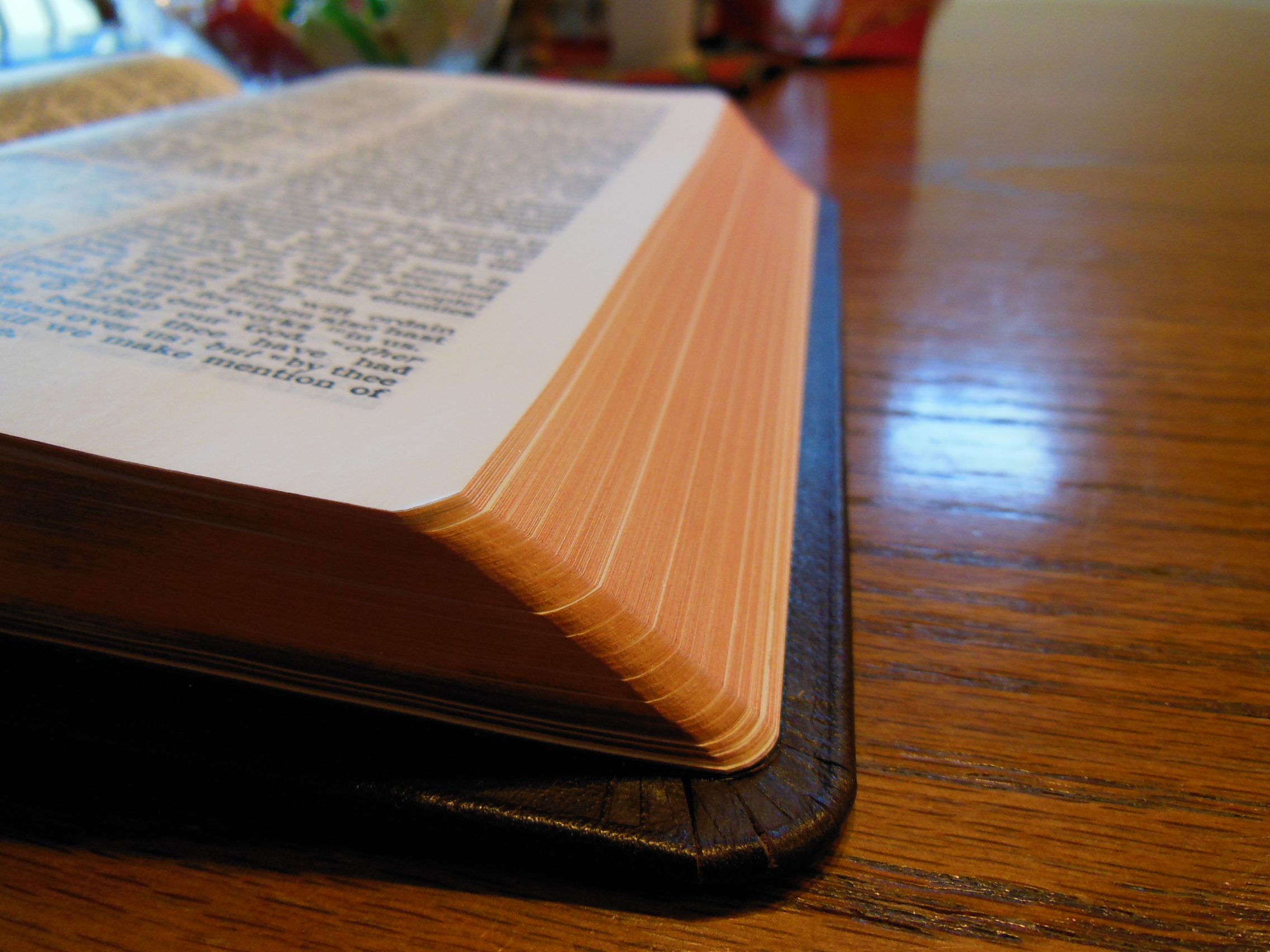
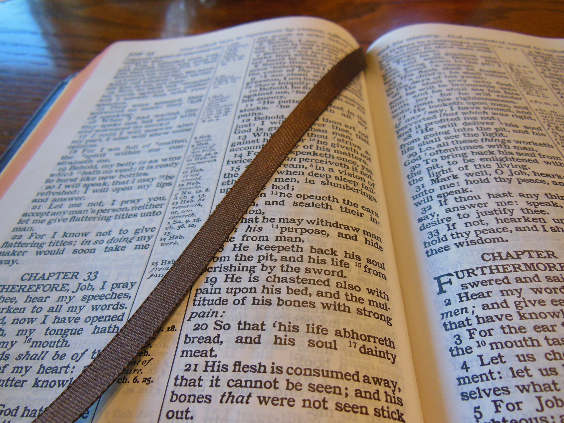
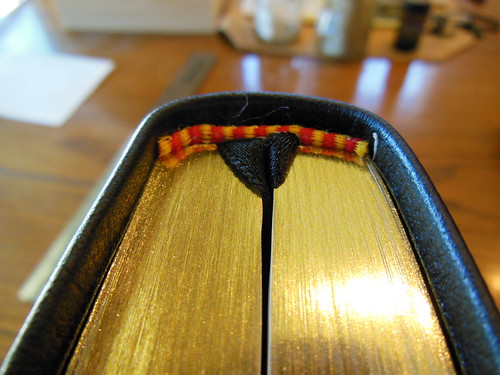
The front, inside, bottom edge has, “French Morocco Leather” in gold lettering stamped in it. Red and gold colored head and tail bands decorate this edition. It also includes two, black ribbon markers. The page edges are gold gilt. The corners and the spine are rounded. From the outside this Bible looks like what you’d expect a Bible to look like. It is a venerable style, and is very familiar.

DSCN4867

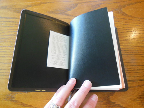
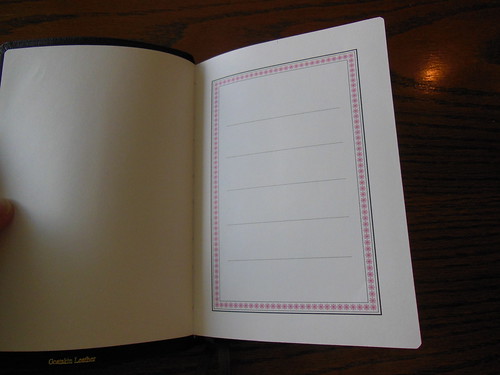
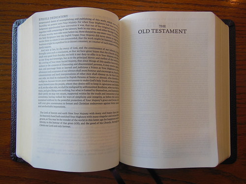
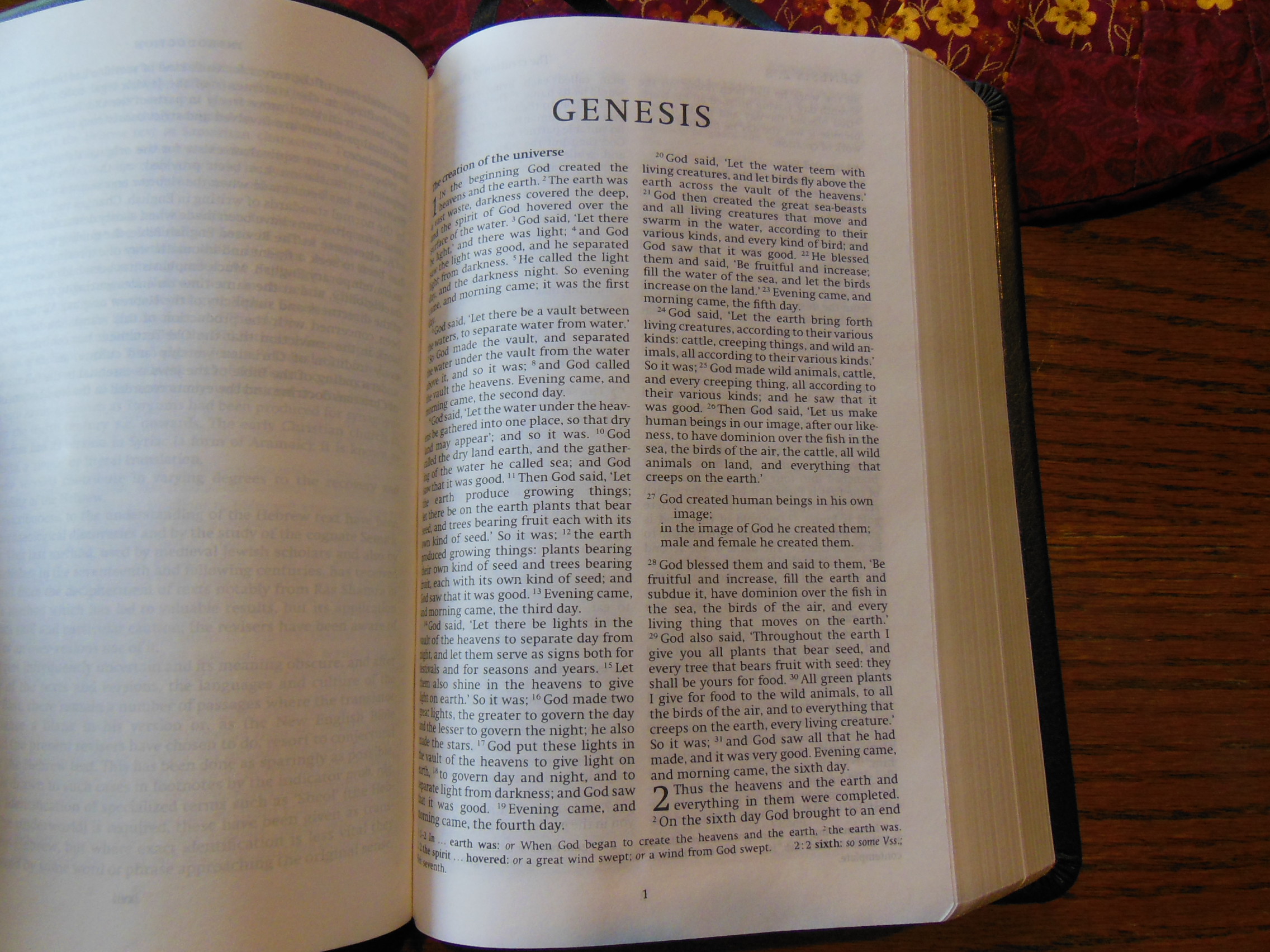
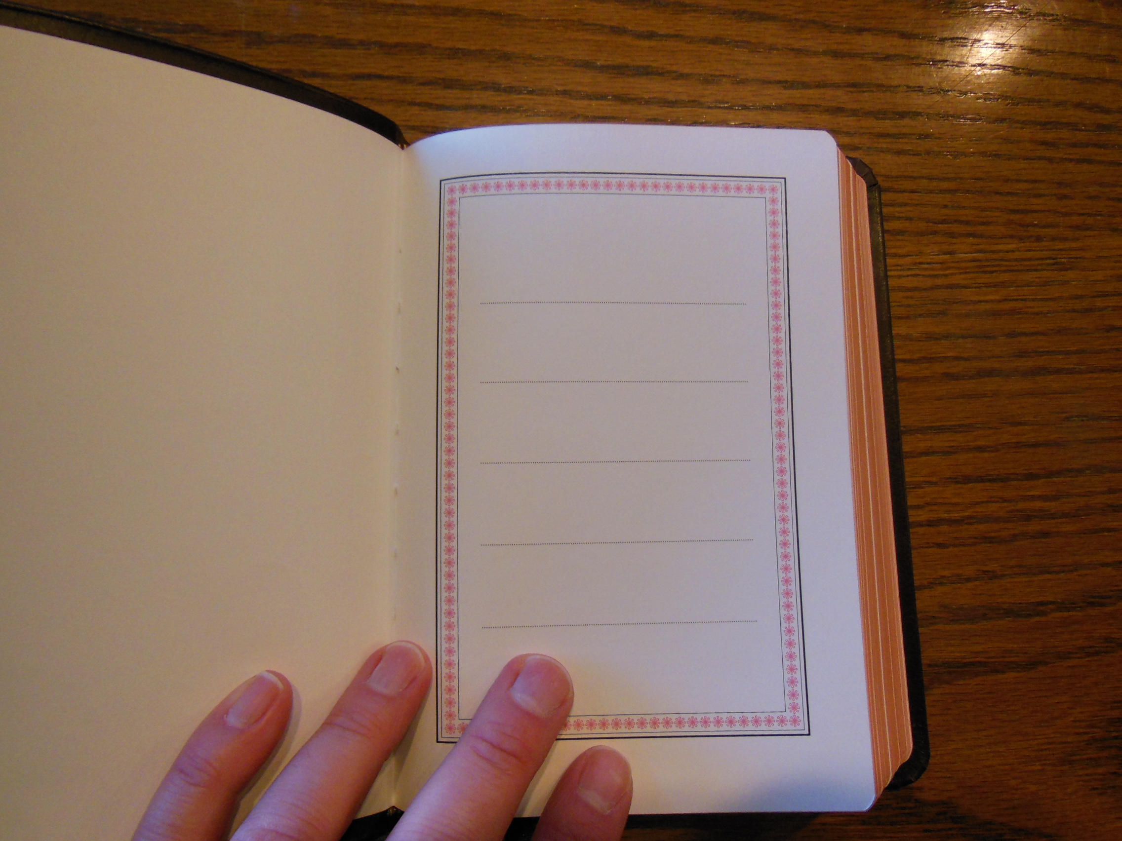
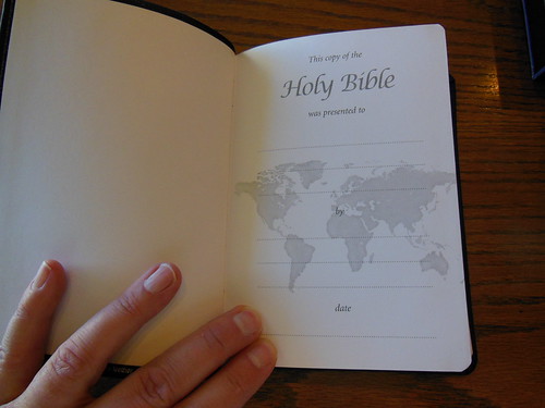
The front inside of this Bible has a nice presentation page on card paper with a couple of blank card paper pages following it. Then you have the title page and copyright/publisher’s information page.

DSCN4874

DSCN4875

DSCN4878

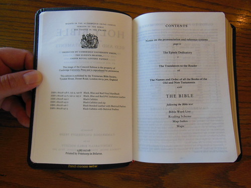
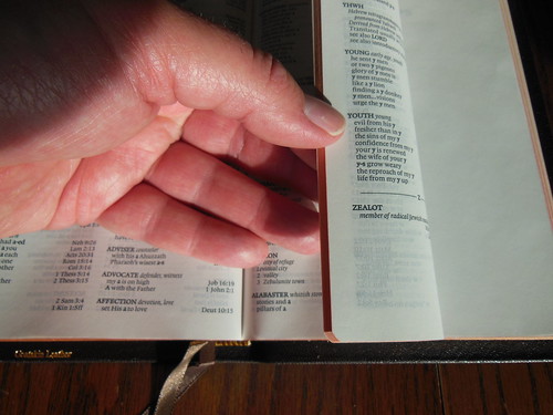
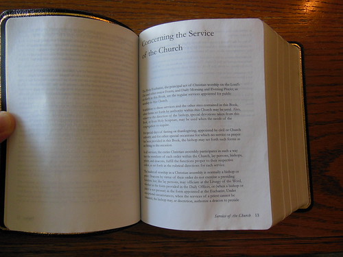
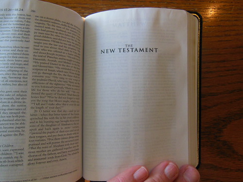
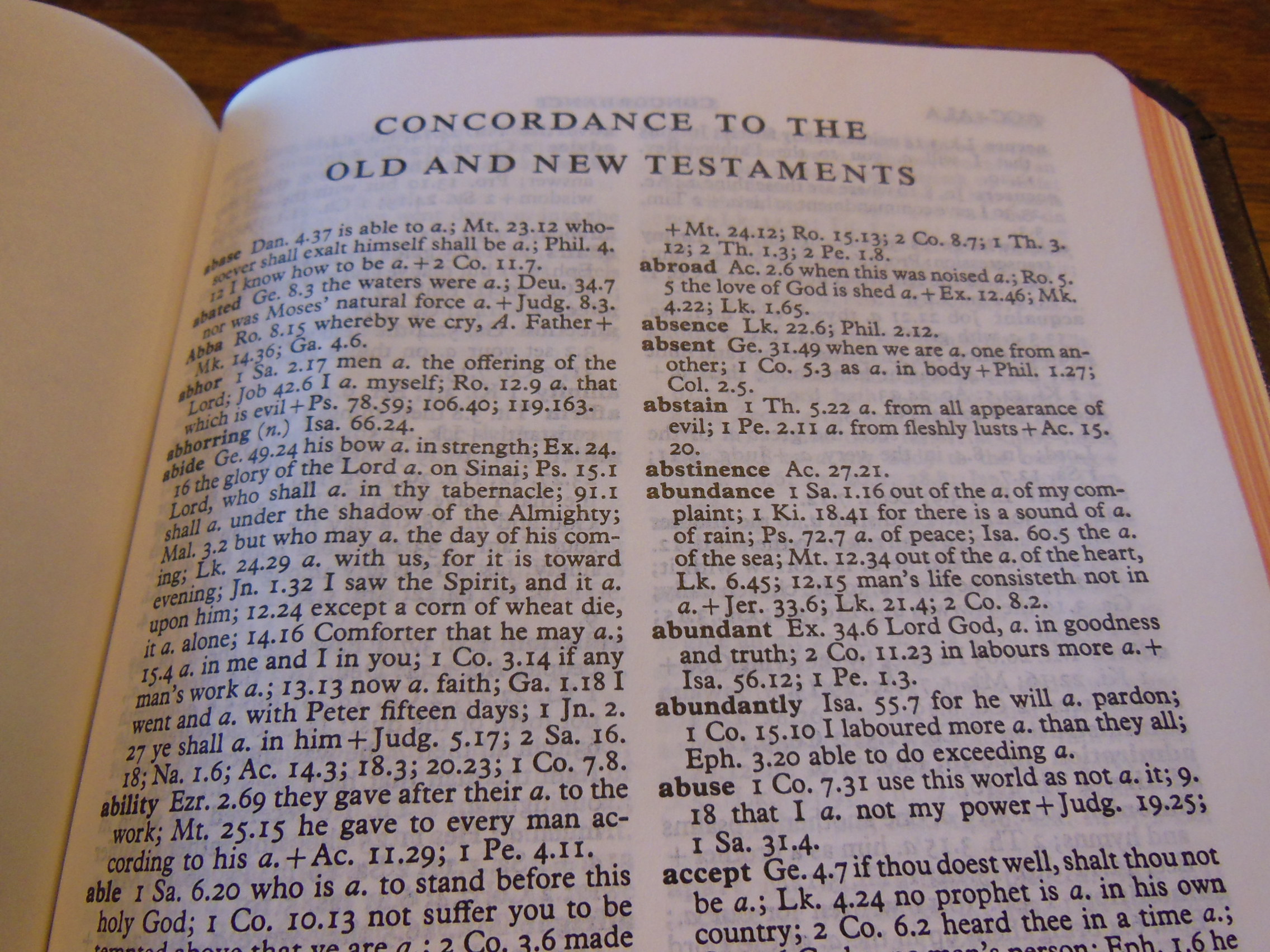
There is a list of the contents after that. It is followed by a guide to the pronunciation marks for self pronouncing text and an explanation of the bold-figure Concord cross reference system. Finally, there is the Epistle Dedicatory, the Translators to the Reader, and the list of the Books of the Bible.

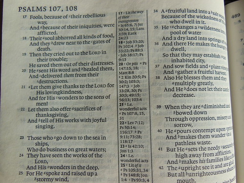
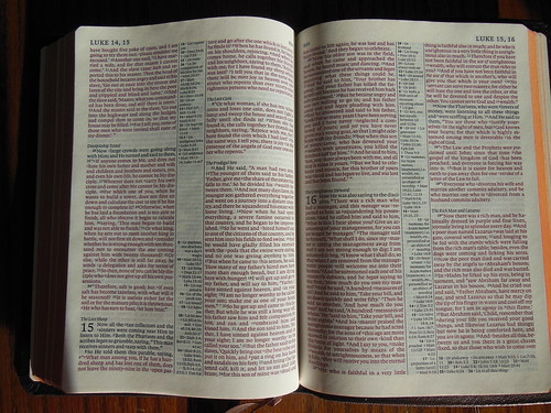
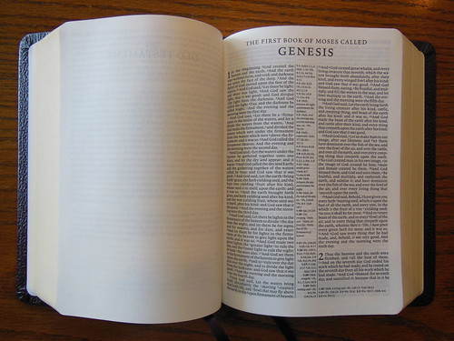
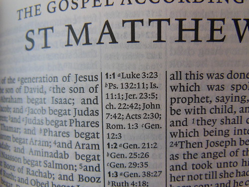
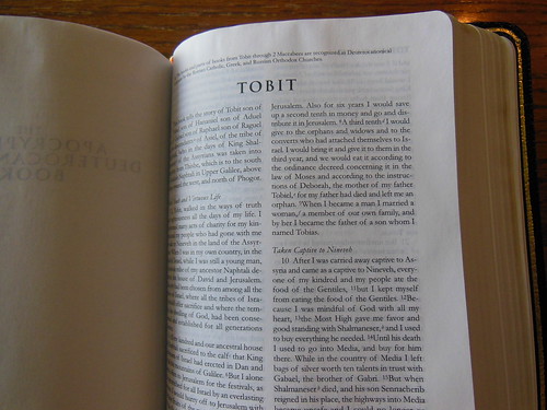
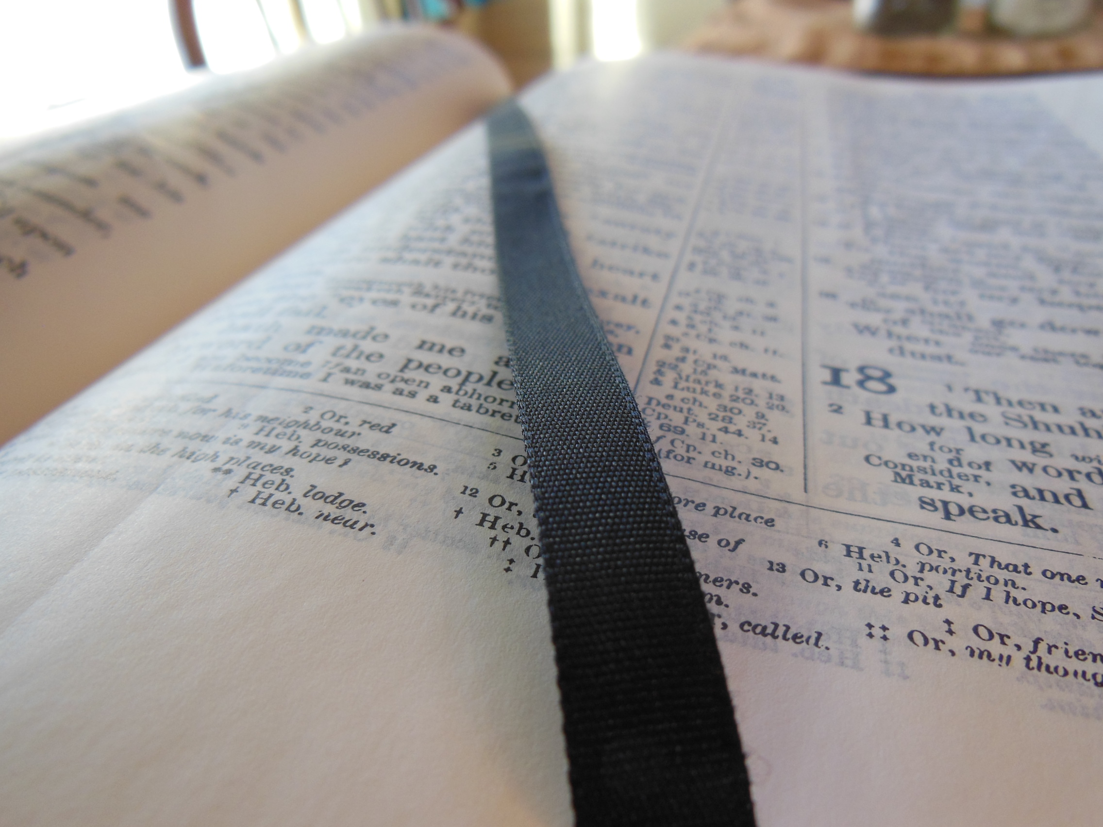
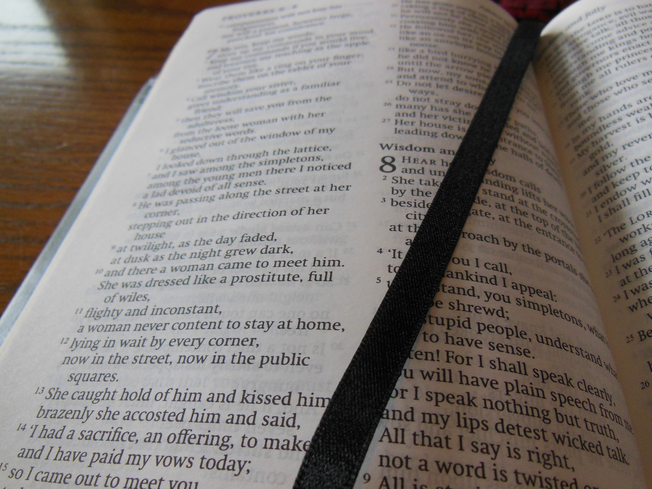
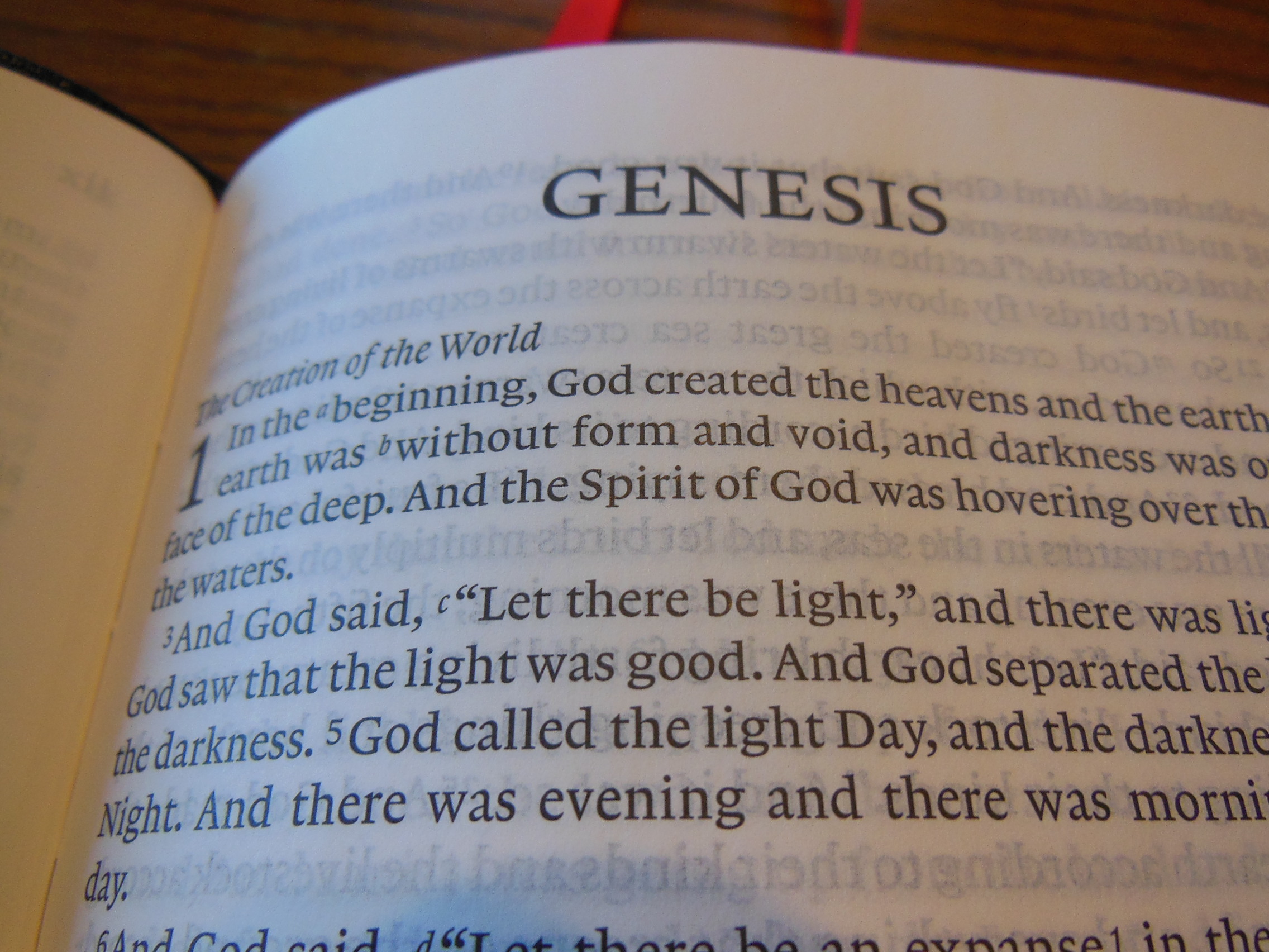
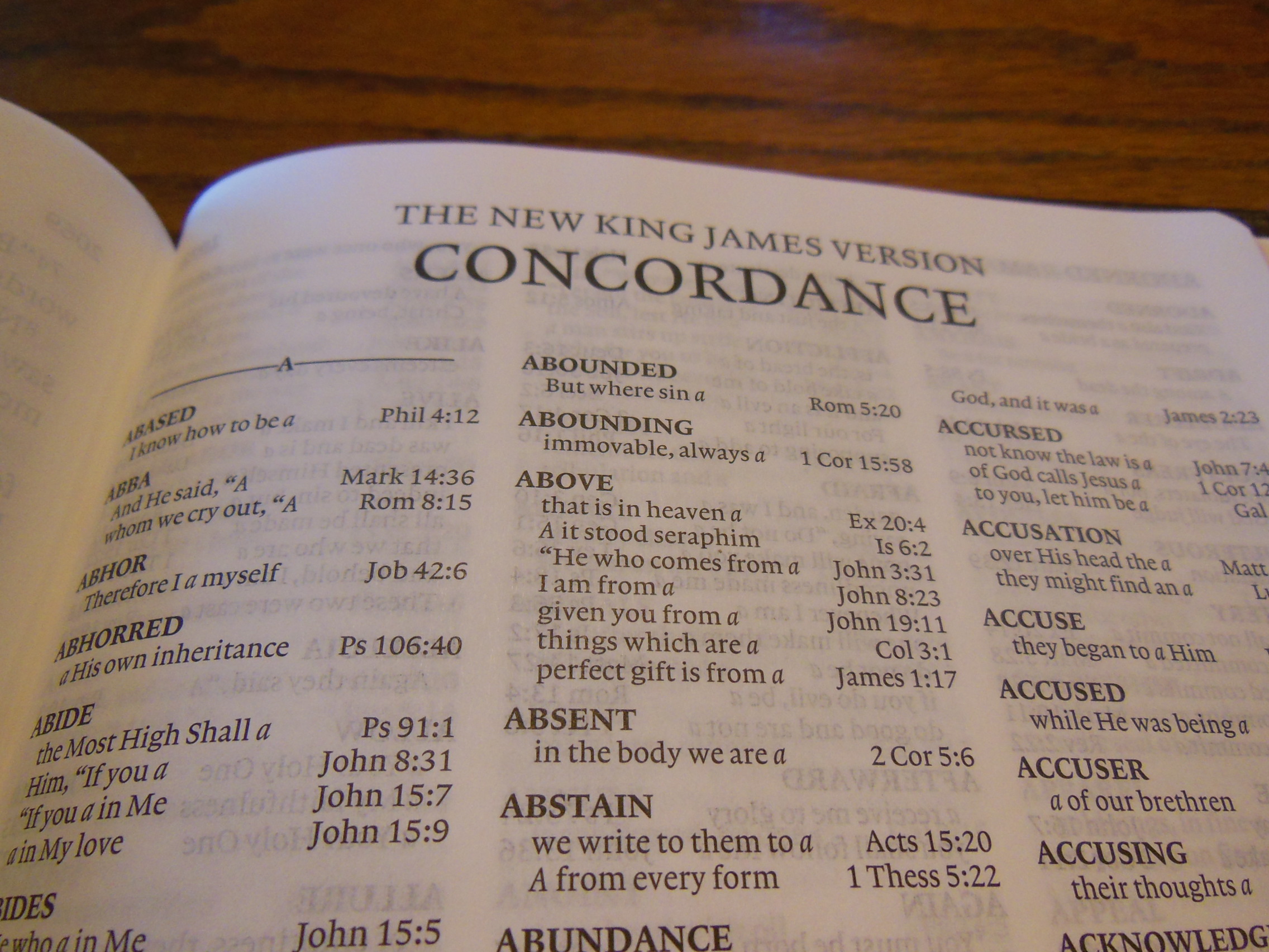
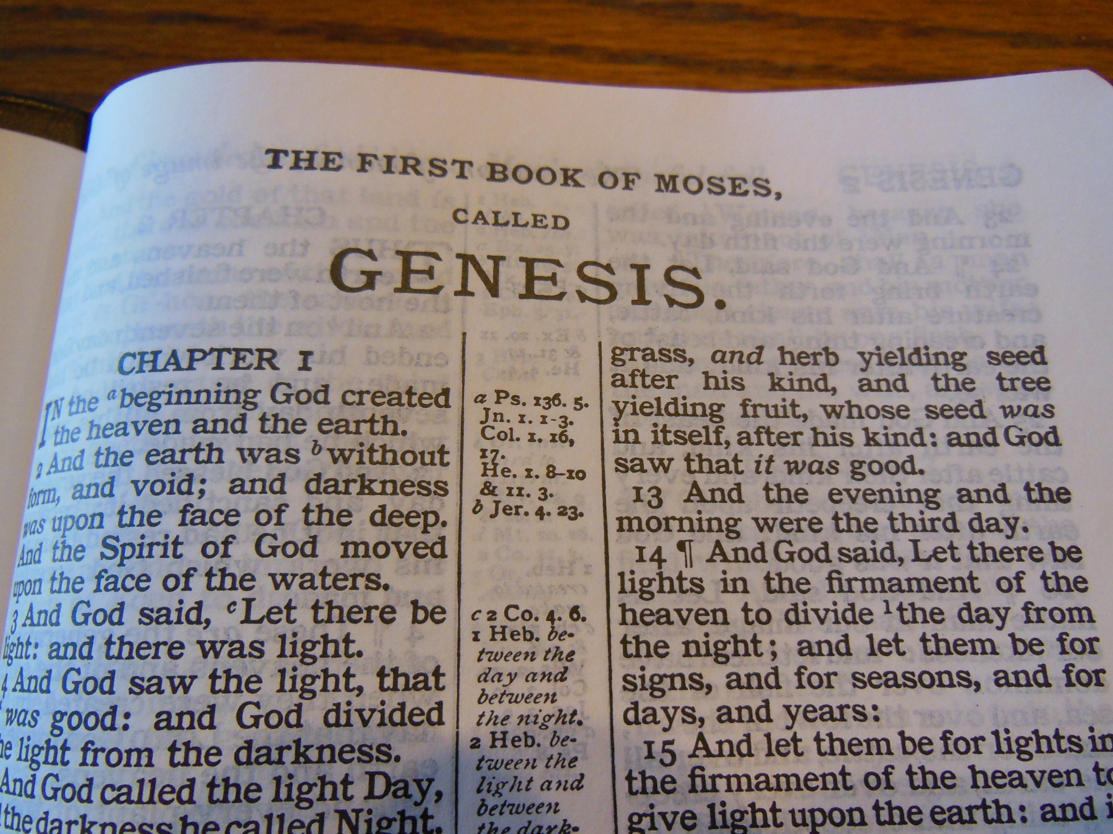
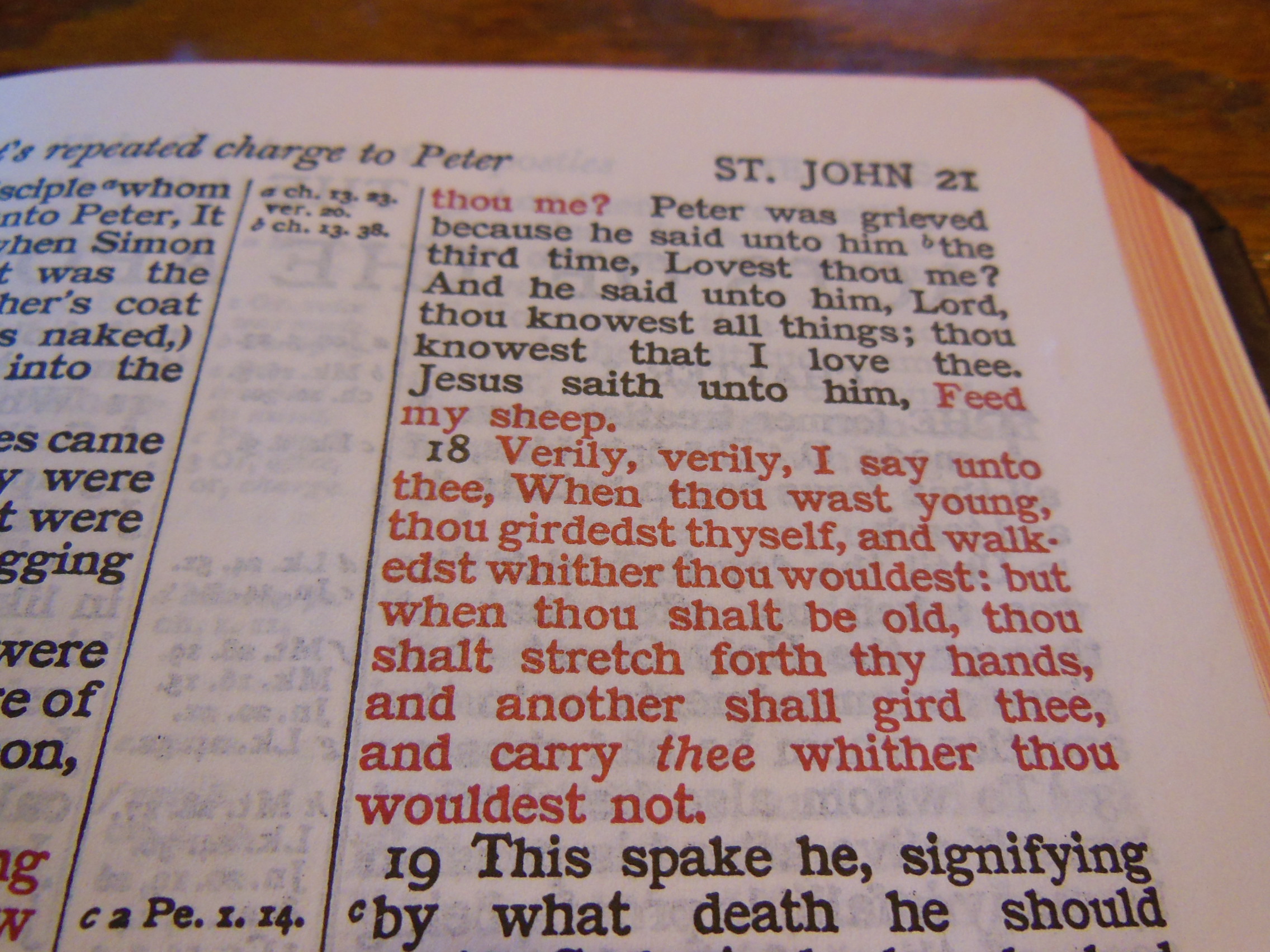
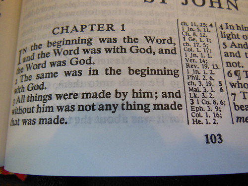
The text of this edition should be familiar to KJV readers. It won’t take anytime at all to get right into and read. It is laid out in a double column, verse format, with center column references. The font is 8 pt. in size making it easy on the eyes. The center column references are pretty small and a bit tough to see, but they are discernable. The paper is thin Bible paper. It is opaque enough that the ghosting is mitigated. It does use the self-pronouncing text. Speaking of text, this is a black letter edition. The entire word of God is all the same color.

DSCN4886

DSCN4890

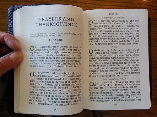
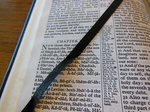
There are two black ribbon markers to help you keep your place. This is very helpful for people who read out of the Old Testament and New Testament on a daily basis.

DSCN4891

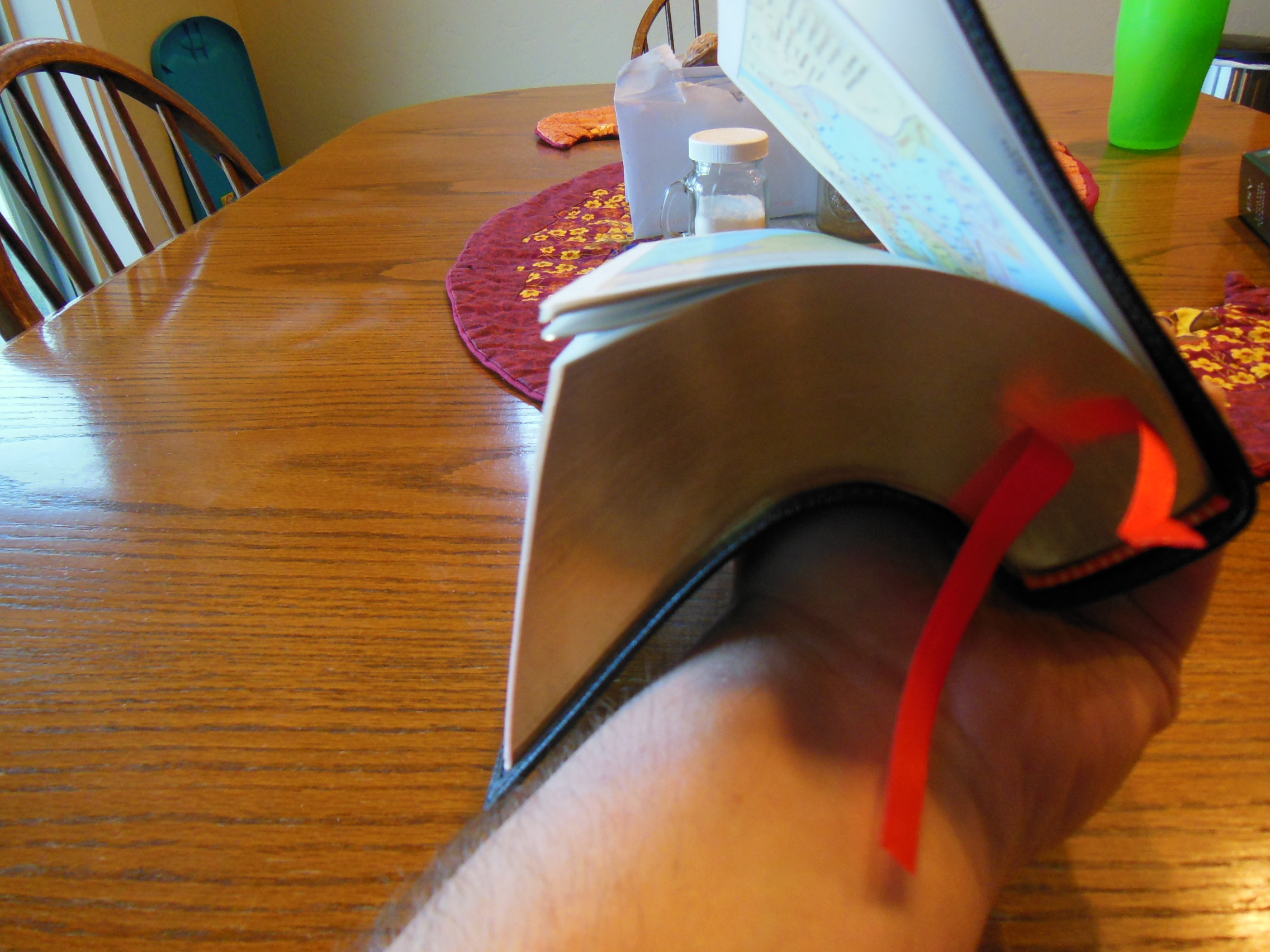
One of the more significant, yet underappreciated features of this Bible is the smyth-sewn binding. Many publishers go for a cheaper glued binding. While TBS opts for a superior sewn binding in this edition. It is a bit tight at first, but as you use this Bible, the binding loosens up. Sewn bindings are much more durable and flexible. They add to the usefulness and longevity in a way that no other features do. I would say that it should be a prerequisite.

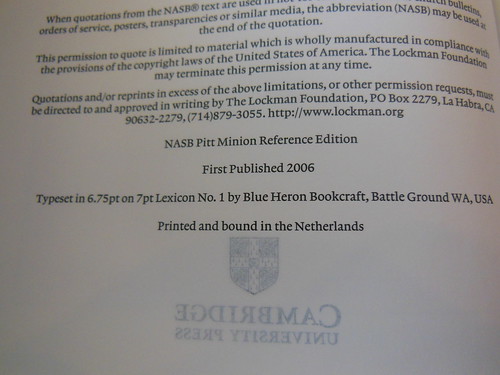
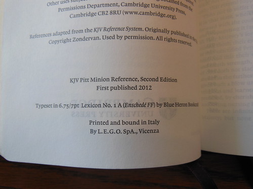
Contrary to popular belief, this edition of the Classic Reference Bible is not printed by Cambridge. Cambridge oversees the printing. It is also a typesetting of the Cambridge Concord that has been shrunk, and maintains the pagination. It is printed and bound by Printcorp in Minsk, Belarus for TBS. These distinctions can change depending on the production run at the time. It is acceptable to ask. TBS is always willing to answer specific questions. They are just an e-mail away.

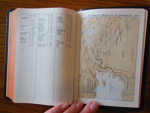
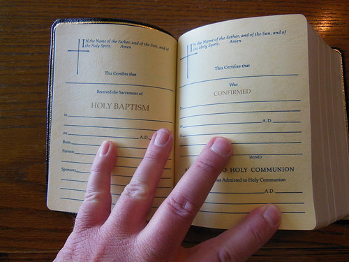
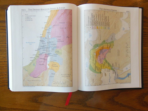
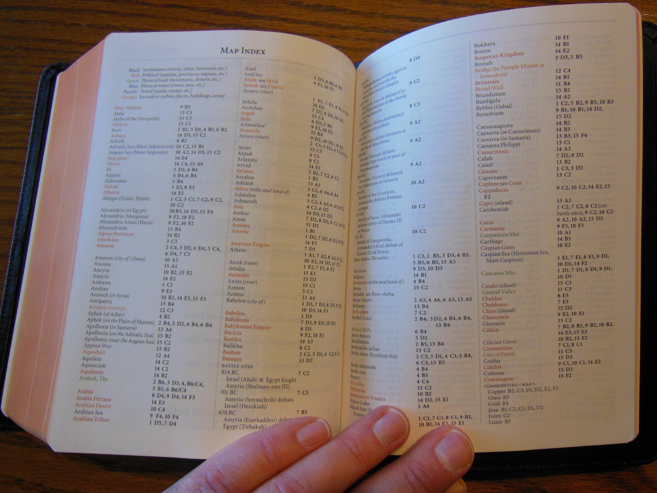
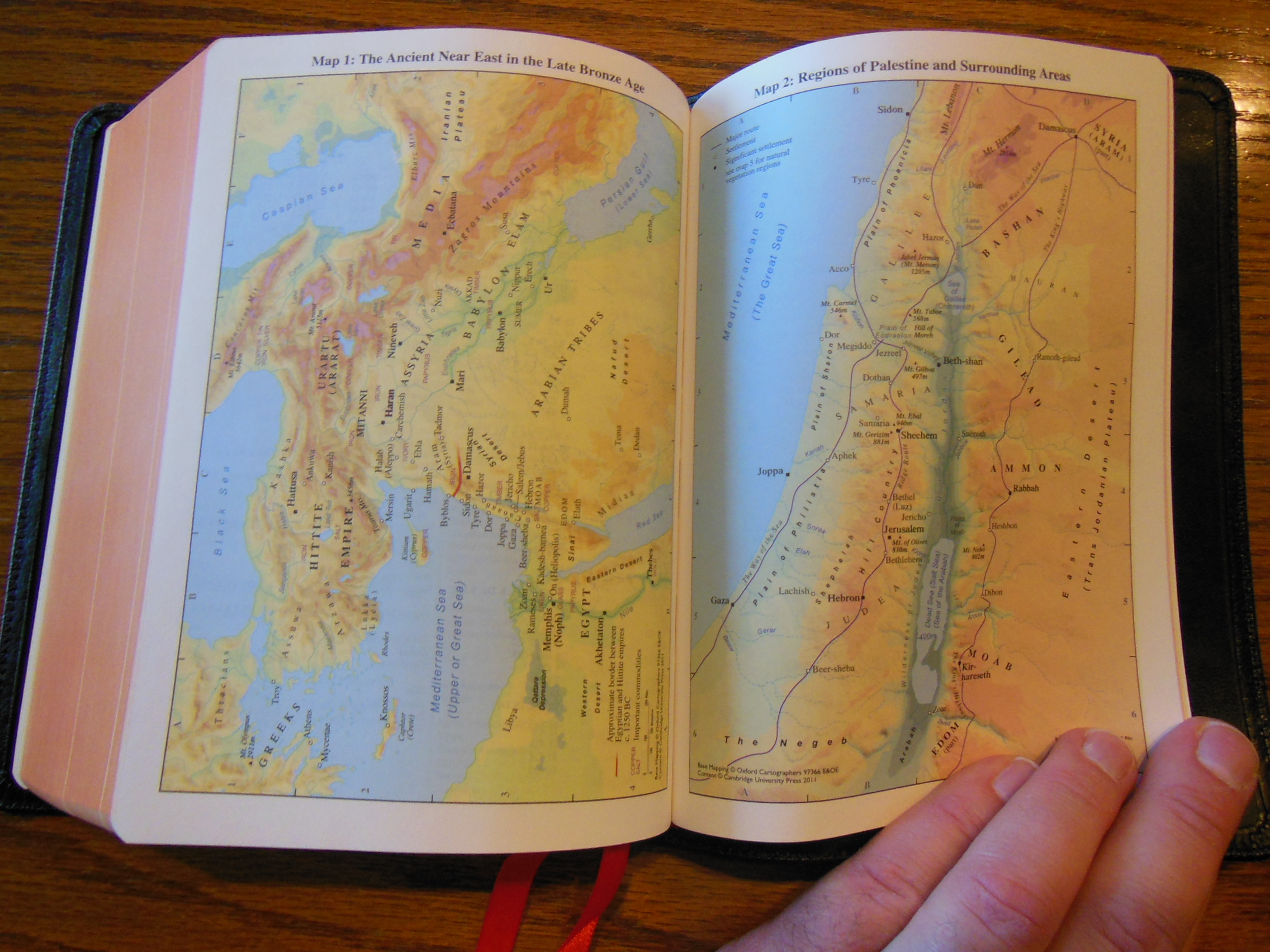
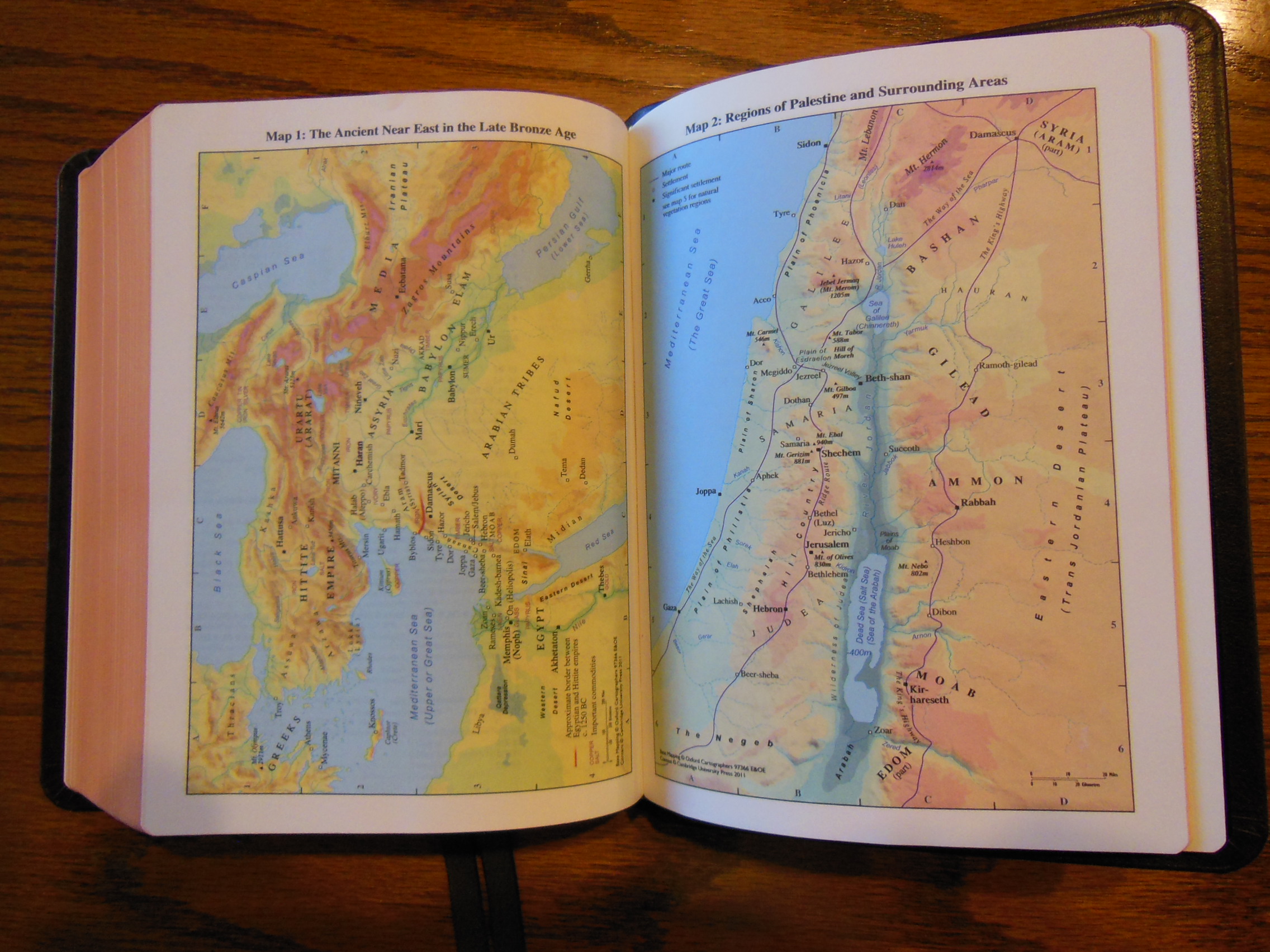
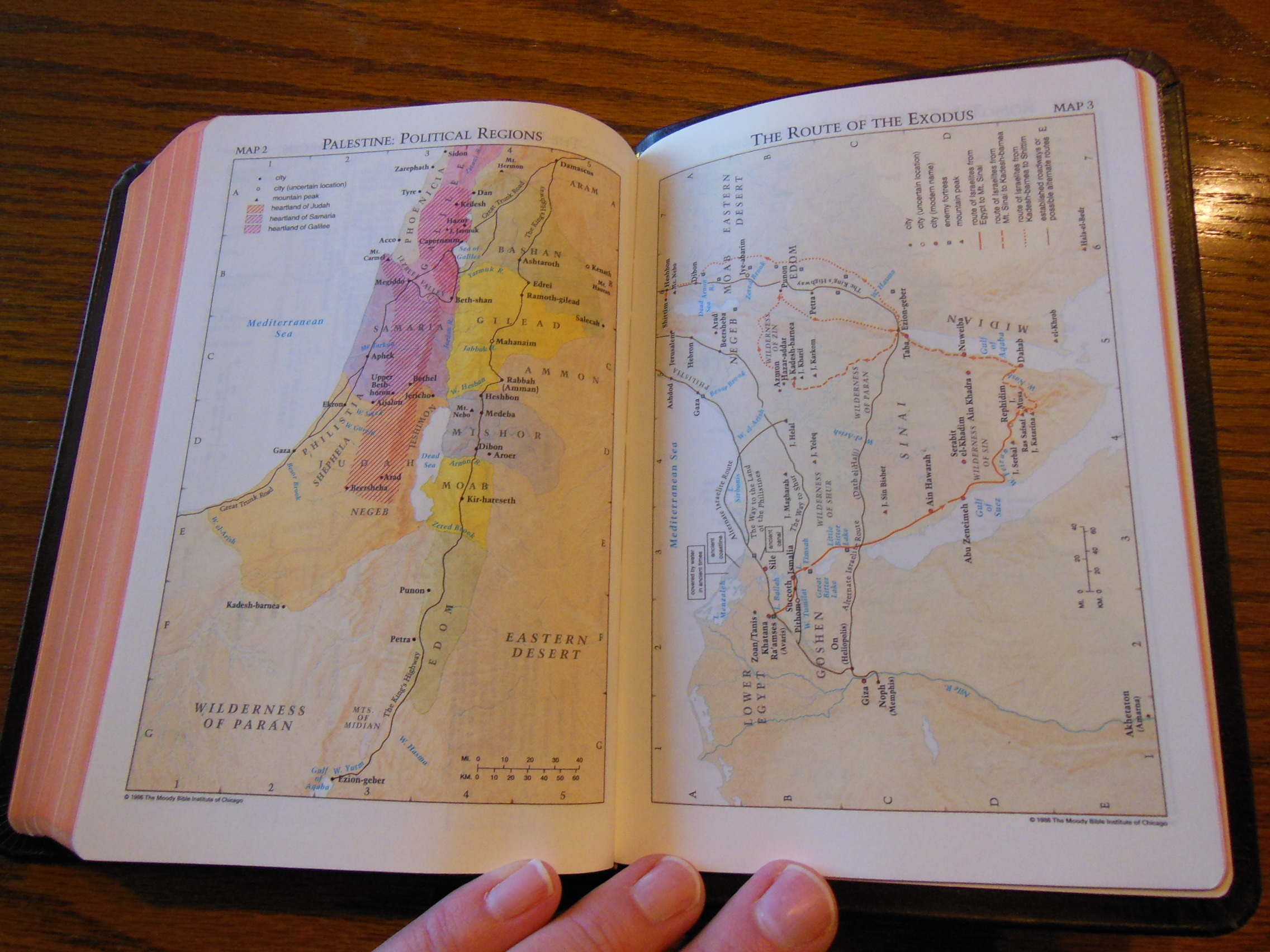
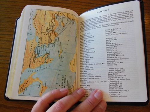
Finally, in the rear of this Bible we have, Bible word list, Daily Bible reading plan, and 8 Color maps with Gazetteer.

DSCN4903

The long list of features are understated by the very familiar appearance of this Bible. It is a conveniently sized workhorse that should provide many years of service. I recommend this Bible to anyone in the market for a reference Bible that is a tad smaller than the usual fare, but not limited in helps like a compact.

You can get one from TBS at the site, except on Sunday it is closed.

You can also purchase one from evangelicalbible.com

4U/BK (Black)
ISBN: 9781862281950

Bible Reviews

Cambridge Pitt Minions, a Tale of Three Covers.

Comparison Review of Morocco, Calf Split, and Goatskin Leather Covered Pitt Minion NASB Bibles.

DSCN4026

I’m fortunate to have been sent review copies of the same Bible, covered in three types of leather that Cambridge uses. They have sent me three Cambridge Pitt Minions in NASB Bibles. One of them is covered in black Morocco leather, another in black calf split leather, and the last one is covered in brown goatskin leather.

DSCN4024

This review will depart from my other reviews in that I am not covering the same points over again. You can read about the Pitt Minion typeset and binding information here. Instead, I am going to compare the different types of leather covers. You can view the Cambridge page with information about their leathers here.
Here is their definition of what Morocco leather is, “Leather taken from a split hide – sheepskin, calf or cowhide. Slightly thinner than the other grades of leather and therefore relatively flexible and soft even when new. A French Morocco binding offers high-quality real leather at an economical price.” This is the cover material for the lowest priced Pitt Minion at approximately $60.00 available at online retailers.

DSCN4019
Here is their definition of what calf split leather is, “A superior grade to French Morocco leather, tanned to approach the quality and feel of full-grain calfskin leather.” This is the next step up from the Morocco leather and can be purchased for about $80.00 online.

calf split

Finally, here is their definition of goatskin leather, “A beautiful and very resilient top-quality, natural grain leather. Traditionally known as ‘Morocco’ leather, it is strong yet supple and is used in the finest bindings.

The best goatskins for bookbinding come from an area of northern Nigeria where environmental conditions are ideal for producing hides with the necessary balance of strength and suppleness. Here they are partially tanned using the same vegetable materials and methods that have been used for several thousand years. Traditionally, they were transported by camel across the Sahara desert to merchants in Morocco (hence the term ‘Morocco leather’) from where they would be distributed throughout the ancient world.

Cambridge uses Nigerian goatskins finished in the United Kingdom for our top-of-the range bindings.”

I understand there can be some confusion when talking about cover materials. There really isn’t a standardized nomenclature. I hope this information clears it up for anyone with questions as to why the Morocco covers were more expensive than the calf split covers. I know I’ve been asked this question before. I’ve included plenty of pictures and a video to help you see as much of the differences for yourselves, but I have to tell you, only by handling these Bibles will you be able to appreciate the qualities of each one. All three are wonderful Bibles and offer specific benefits. The price of the Morocco covered Pitt Minion makes it exceedingly affordable. You get all of the great features of the Cambridge Pitt Minion text block, like the sewn binding, thin profile, compact size, complete Bible, clearly printed modern digital font, references, and red letter text. This cover has a bit of a glossy look to it and the grain is not pebbled. It is also quite a bit thinner than the other two. However, it is vastly superior to other Bibles on the market that advertise having, “genuine leather” covers. Many of the lower quality Bibles that claim to be genuine leather are covered in split pigskin leather with an artificial grain pressed into it. They almost look plastic and are very shiny. This Morocco cover is much better and the price has remained very affordable.

For just about $20.00 more you can get the calf split leather, again with all of the great Pitt Minion features, plus a more supple, thicker, leather with a deeper natural texture. The calf split is also less shiny or glossy than the Morocco cover. This gives it a much more tactilely pleasing feel in your hand. I’ve also noticed that it softens up quite well after it is broken in.

For about $100.00 you can acquire the Pitt Minion covered in goatskin leather.

DSCN3854

I know it seems like a lot of money, but when you pick one up you’ll understand why it is more. The goatskin covers have a finer pebbled grain that is soft to the touch. It is softer than the calf split or top grain leathers while remaining durable.

DSCN4023

If you have ever held a sheepskin leather Bible you would find that it is very supple, but susceptible to scratches and tears. The goatskin is great because it has the best features of both types of leather. It is soft and supple while remaining effective at protecting the text block. None of these three are edge lined so you won’t be doing any, “Bible yoga” with them. I wouldn’t recommend bending them that much regardless. Even if a Bible is flexible enough to bend like you might see some people do online, it isn’t a good idea.

DSCN4027

Over time it will loosen your binding too much and prematurely wear it out.
DSCN4025

No matter what your budget is you can find a Pitt Minion to fit and be assured that it will last long enough for your kids to enjoy if you treat it with respect.

Make sure to check out the rest of the pictures on the flickr page.

You can purchase these Bibles on Amazon, Christianbook, or Cambridge Press.

Bible Reviews

The NASB Pitt Minion Reference Edition NS446XR in Brown Goatskin Leather is the Best Compact NASB You Could Purchase.

DSCN3815

In my opinion this is the number one, of the top ten compact/ultrathin NASB’s you will find on the market today.  The top three are Cambridge Pitt Minions.  First place, goes to the goatskin leather.  Second place, to the calfsplit leather edition.  Third place goes to the edition covered in black French Morrocco leather.  Here is a picture of the brown goatskin Pitt with the black calfsplit one.  They are both gorgeous.

DSCN3844 (2)

I’ve reviewed Lockman Foundation Bibles. I’ve looked at cheaply constructed Zondervan’s. If R. L. Allan made a compact NASB, they would be the only serious competition on the market. That would only be true because Cambridge and R. L. Allan would be using the same printer and binder, the world famous Jongbloed of the Netherlands. They are the premier printer and binder of almost all the high quality Bibles available today. Chances are, if you have a luxury Bible it came from Jongbloed. It makes sense that the Cambridge Pitt Minions are the highest quality Bibles in this market niche. 

DSCN3799

The attention to detail and quality is what sets the Cambridge Pitt Minions apart. When you hear, “You get what you pay for.” Many times you disregard it as a sales pitch, but with Bibles it is usually quite true. I strongly urge you not to balk at the initial price. Consider how many cheaply made Bibles you will buy over the next sixty years of your life. This is assuming, of course, that you are a serious student of God’s word, and read it daily. Now, multiply the twenty to fifty dollars that you would spend on a glued together, poorly covered, mass produced Bible, times the number of replacements you would purchase of that sixty year period. Let’s arbitrarily say you’ll need to replace it 6 times, and that is a conservative estimate on my part. Thirty times six is one hundred and eighty dollars. That is less than the price of the top of the line Pitt Minion. Not to mention the amount of time and energy it will take to transfer your notes/highlights/underlines.

The Pitt minion can be handed down to your children and if taken care of I dare say their children. The Cambridge Pitt Minion comes with a lifetime warranty from Cambridge and I fully expect these Pitt Minions to outlast me. How loving would it be for you to hand down one of these to each of your Children with your personal highlights and underlines? They could read from the same Bible that you held lovingly in your hands each morning and remember how faithful you were. Your zeal for God and His word would be an inspiration to them.

My Pitt Minion arrived in a cardboard shipping box safe and sound.

DSCN3775

The retail box is a clamshell design and should be retained for storage.

DSCN3781

The first thing I noticed about this Pitt Minion when I removed it from the box was the brown goatskin leather cover. It has a simple elegant perimeter line, and a naturally soft and supple feel.
DSCN3854

Goatskin leather offers the best of both worlds. It is tough and supple, sacrificing neither quality as you might see with other leathers. The leather covered Bible smells the way a Bible should. It doesn’t reek of chemicals. The brown reminds me of a milk chocolate color. It might be difficult to see in the pictures.

DSCN3785

This Bible is a case bound one. It is not edge lined.

DSCN3793

The spine is smyth-sewn. All of the pages are part of a group of pages called a signature. These pamphlets called signatures are stacked up and then sewn together offering a supremely flexible and durable Bible.

DSCN3840

The corners are and the end pages are well done.

DSCN3791

There is a simple, yet attractive presentation page in the front.

DSCN3796

Decorative head and tail bands cap the ends.

DSCN3813

The spine is stamped with, “Holy Bible” at the top, “New American Standard” under that, “Cambridge” at the bottom in gold.

DSCN3788

The page edges are art gilt, with red under gold.

DSCN3810

There are two brown ribbon markers. I appreciate when a Bible has at least two ribbons. Many of us read daily from both the Old and New Testaments. It is very convenient to have a built in marker for each. I don’t like using a book mark for one and the ribbon for the other. I wish all Bibles would come with at least two ribbon markers and a third for the Proverbs as devotional reading. Here is a picture of the Pitt Minion on top of my Clarion. The Clarion has red ribbons. The Pitt Minion has brown to match the cover. I’m not sure which I like more 🙂

DSCN3850

Upon opening the Bible the texture and opacity of the Pitt Minion’s India paper was very impressive for a compact. It is uniform in texture and color.

DSCN3804

The typeface is 6.75pt on 7pt Lexicon No 1.

DSCN3805

Here is an excerpt from the products information page on Cambridge’s site,

…a stylish modern digital typeface which like its predecessor combines utility and elegance. It uses the Lexicon typeface, carefully chosen for its economical use of space. This is the font used for dictionaries and encyclopaedias because it accommodates a lot of characters in a small space. The result is a classic Bible for the twenty first century produced in a remarkably compact yet readable form.…

I agree with them, that it is very legible. It also employs line matching. The text on the other side of the page is printed directly behind the text on the other side. This dramatically reduces distraction while reading, which is especially important in a compact Bible.

DSCN3816

The text is laid out in a double column, center column, paragraph format in this red letter edition.

DSCN3818

Book and chapter are located on the upper, outer corners of the pages, with the page numbers on the upper inner page corners, making it much easier to look up passages as you flip through the pages.

It is remarkable to have a full reference Bible of this size, approximately 7.5″ x 5.25″ x 0.75″ that remains legible. It is a testament to the design work that went into the Pitt Minion. There is even a useful concordance in the back along with a map index and 15 color maps.

DSCN3822

DSCN3827

If you are in the market for an ultrathin or compact high quality Bible look no further. The Cambridge Pitt Minion is the only choice.

You can purchase your copy on;

evangelicalbible.com

Amazon.com

Christianbook.com

or also on Cambridge’s site

Make sure to check out all of the pictures I took of the Cambridge NASB Pitt Minion in Brown Goatskin Leather NS446:XR-B1168 on my flickr.com page.
ISBN:9780521604116

isbn: 9780521604116

Bible Reviews

A Side by Side Comparison of the Oxford NRSV with the Apocrypha and Book of Common Prayer in Black Genuine Leather, to the Cambridge KJV with the Book of Common Prayer in Purple Calfsplit Leather.

DSCN3702

You can look at all of the pictures on my Flickr page. Here is the link for the Cambridge album.  Here is the link for the Oxford album.  I received both Bibles undamaged. They were packed in their own cardboard boxes and were inside retail boxes that were both sturdy enough to be used for storing the Bible in when on the shelf.

DSCN3617

DSCN3554

DSCN3618

DSCN3556

Upon opening the boxes I was impressed with the purple color of the Cambridge Bible. The Cambridge cover was also more supple out of the box. This is due to the Cambridge being covered in calfsplit leather which is split cowhide leather as opposed to the Oxford’s cover which was your typical pigskin leather. The Oxford was ornamented with a gold stamped cross on the front cover as well as a gilt line around the inside perimeter of the cover. Both covers have a perimeter groove pressed into them.

DSCN3701

The Cambridge and the Oxford alike have gold gilt page edges. I thought the two purple ribbon markers were attractive. The Oxford has three yellow/gold ribbon markers that were pretty nice even if they were a bit more narrow. I would have liked to see three ribbon markers in the Cambridge because of the added BCP.

Here is the Cambridge

DSCN3633

Here is the Oxford

DSCN3616

The Oxford was surprisingly smaller than the Cambridge even though it had the Apocrypha and the Cambridge did not. Due to all of the added text there had to be a compromise. I don’t think it was a very wise one. The Biblical text in the NRSV is very small. At 6 pt. it is still legibly printed, but does present a strain for longer reading. I think it would be fine for carrying to Church as long as you bring your reading glasses. If you do have poor vision I would not recommend this Bible for the Bible portion.

DSCN3609

The BCP is perfectly legible being printed in 8 pt. font.

DSCN3586

The Cambridge suffers from the same problem albeit not of necessity in my opinion. Of course I am not privy to all design constraints and I am certain there are reasons for making the Biblical text 6 pt. and the BCP text a very generous 11 pt. I would have liked to see the BCP down to 8 pt. and the KJV up to 8 pt. I think that could have been achieved.

DSCN3685

DSCN3664

Both Bibles have sewn bindings and are case bound. The Cambridge is printed and bound in Italy by L.E.G.O. SpA. Vicenza. It is the KJV Pitt Minion, Reference Second Edition setting.

DSCN3682

That would be a double column, paragraph format layout with references in the center column. The small 6.75 pt. font is clearly and uniformly printed on very good and opaque Bible paper.
DSCN3693

The Book of Common Prayer is mostly single column format. It is printed in large 11 pt. font making it easy to read. It is also printed to the same standards as the rest of the text.

DSCN3678
Both Bibles were designed and had their layouts done by Blue Heron Bookcraft in Battleground Washington.

DSCN3597

When we compare the two Bibles there are some big differences in quality. The Korean printed and bound Oxford uses a less opaque paper that tends to wrinkle, while the Cambridge is very smooth.

Here is the Oxford

DSCN3608

Here is the Cambridge

DSCN3684
The print in the Oxford is not as well inked as the Cambridge. The Oxford is a double column paragraph format with very limited footnotes. It is the NRSV translation. Both Bibles are black letter editions.

DSCN3602
The Oxford does have some gold colored and heavily textured papers utilized for the presentation and family records pages. They look nice, but can be a chore to write on contrasted to the typical Cambridge presentation pages.

DSCN3579
The Book of Common Prayer is mostly single column and printed with large 8 pt. font.

DSCN3589
The Apocrypha is printed the same as the Biblical text.

DSCN3606
Neither have maps or helps in the back. The Cambridge has, “Common Prayer” at the top, “Holy Bible” in the middle and, the Cambridge logo at the foot of the spine stamped in gold. The Oxford has, “The Book of Common Prayer” at the top and, “The Holy Bible” underlined and, “Apocrypha” immediately under it in the middle, and, “Oxford” at the bottom of the spine.

DSCN3698
The Cambridge is a bit larger in length and width, but they are about the same thickness.

The Oxford might be a hair thicker. Both are aesthetically pleasing and pleasant to hold, however the Cambridge is the winner in the tactilely pleasing category. The calfsplit leather just is so much better than the shiny pigskin leather of the Oxford. I honestly thought the Oxford was bonded leather when I opened it. The head and foot bands on the Oxford were not properly glued down either. For quality of assembly I would have to give the Cambridge the win. Here is a look at the inside covers of both. You can see that they are both case bound.

Here is the Cambridge.

DSCN3696

DSCN3637

Here is the Oxford. It has a gilt line around the inside cover.

DSCN3575

DSCN3614
The Cambridge is geared more towards Anglicans and the Oxford is geared more for Episcopalians in my opinion. At least after reading much out of the BCP in each one that is my impression. The Cambridge utilizes the 1662 Book of Common Prayer while the Oxford uses 1979 Book of Common Prayer. If you are looking for an in depth list of what both BCP’s include I’m not going to do that, however I do have pictures of the table on contents pages that have those lists. You can see them on my Flickr page. Click here for the first page of the Cambridge Table of contents. Click here for the second page.  Click here for the first page of the Oxford Table of Contents. Click here for the second page.  The Cambridge is almost twice the price of the Oxford, but in my opinion it is worth it. I also like the KJV more than the NRSV. I am neither Anglican nor Episcopalian so I am not biased one way or another towards one of these Bibles. If you must have an Apocrypha in your volume then you would have to go with the Oxford. Both are sturdy and well made. They should provide years of service… as long as your eyes can take the small text. Make sure to visit the links to the Flickr photo album pages for both Bibles so you can get a good close look at all of the features.

If you are interested in purchasing either one here are some links for you,

Cambridge or Amazon or Christianbook

Oxford or Amazon or Christianbook

Bible Reviews

The Cambridge NASB Wide Margin Reference Edition NS741:XRM, is the Quintessential Wide Margin Bible for Writing in.

DSCN3304

I know this might sound like heresy on the level of Arius but, I like this Bible more than its goat skin, edge lined, art gilt, counterpart.  This has got to be about as close to perfect for note taking as one can get.  I reviewed the goat skin leather one a while back.  You can read about that edition here.  Don’t get me wrong.  I am not saying it is better quality or better in features.  What I am saying is that the goat skin leather edition was so nice that it was difficult for me to write in.  That might sound strange to you, but it wouldn’t if you held it and realized how much it cost.  It is probably the first or second best Bible I’ve ever owned.

The hard back edition has the same lovely, enlarged, Pitt Minion typeset.  It has the same generously wide margins.  It has the same durable, flexible smyth-sewn binding.  The quality binding ensures that it will open easily and lay flat right from the get go.   That means you don’t have to put a paper weight on one of the corners to keep it open, like some cheaper bindings.  It was printed and bound by Jongbloed in the Netherlands just like the luxury goat skin leather edition.  It is exactly the same except it has a hard back cover.  It is case bound.
DSCN3356

The page edges are not gilt.  There is one lovely, red ribbon marker, contrasting beautifully against the thick, white, paper.

The hard back is much less expensive.  You can buy it online for approximately $50 to $70.  I’ll include links at the end of the review.  The cover is a built in desk, for when you are in Church, or at Bible study.  With the goat skin covered edition you really can’t write in it unless it is on a desk or table.  The cover is just so flexible.  The hard back of course doesn’t have that issue.
DSCN3330

The biggest ooh and ahh feature to me is the gorgeous paper.  I just love the paper in this Bible.  Look at this close up picture of the signatures and tail band.
DSCN3328

Here is a picture of the paper from the Bible opened flat.
DSCN3335

From the pictures you can see the outstanding quality of the paper.  It is smooth, opaque, uniform in color and texture, as well as being thick.

The print is 8 point in size.  It is a larger version of the Pitt Minion.  I know some of you might expect larger text in a Bible this size, but don’t forget, this is a wide margin.  If you want room for notes and you don’t want a two inch thick Bible you have to compromise someplace.  I think the text is just the right size.  It is so wonderfully done that it is easy to read, very legible.  The printing is uniformly done and consistent throughout.  Even the red text is printed with the same quality.  Just look at the picture above closely and you will see.  The text is arranged in a double column paragraph format, with references in the center.  The margins are nice and wide.  The extensive Lockman Foundation cross references are very helpful.  I use them often.
DSCN3324

I wanted to show how well the paper took ink, pencil, and highlighter.  I used a Lammy fountain pen, with and extra fine nib, and Waterman’s black ink.  I also used a medium point ball point pen, with black ink, and a #2 graphite pencil.  You can see that neither the fountain pen or ball point ink pen showed through the page significantly.  The wet highlighter did much better than I expected.  I thought it would bleed through more than it did.  On most other Bibles it is like highlighting the verses on the other side of the page as well.  Since this paper is over 30 g.s.m. it takes the stands up to ink better.
DSCN3448

DSCN3441

DSCN3444

There is a useful concordance in the back along with 15 maps that make use of the big pages.

DSCN3347

Cambridge included several pages of ruled paper in the back for notes as well as an index section that is blank so you can fill it in yourself.  I would highly recommend this Bible for anyone looking for a wide margin.

You can purchase a copy on Amazon.com, Christianbook.com, and evangelicalbible.com

Be sure to look at all of the pictures I took of this Bible here on my Flickr page.

isbn: 9780521702638

Bible Reviews

The Cambridge KJV/RV Interlinear Bible, in Black Calfskin Leather, A Bible you might not have known that you needed.

DSCN2856

The KJV/RV Interlinear is an amazing tool.  For anyone who has had difficulties with the Early Modern English of the KJV, you are not alone.  The Revised Version was the first big translation to come from the Authorized 1611 KJV.  The 1611 KJV was in Early Modern English.  By the late 1800’s English had changed significantly.  On May 6th of 1870, at Canterbury, England, the general assembly of Episcopal clergymen, met and determined to, revise, for public use, the authorized 1611 KJV.  This was notable for a few reasons, my favorite of which is that it was a cooperative effort between British and American theologians, who were experts in the Biblical languages.  Their objective was, “From the outset the object sought by the revisers has been “to adapt King James’ version to the present state of the English language without changing the idiom and vocabulary,” and further, to adapt it to “the present standard of Biblical scholarship.” Since 1611 this latter has made great advances, especially during the last quarter century.”  Here is some information I was given from Cambridge, “A little historical data/background: The Interlinear Bible is really two Bibles in one. It combines the King James Version of 1611 with its first authorized successor, the Revised Version of 1885. This edition includes the highly respected cross-references from the Revised Version, which are considered to be among the finest ever produced. It also carries the footnotes from both versions, giving at times four different renderings of difficult passages.”

A little later in 1901 American theologians made a few more revisions to come up with the American Standard Version.  This translation of course is where we get my favorite translation the New American Standard Bible.  For all of the NASB fans out there, be glad this work was done.

When you have an interlinear Bible usually the texts are run linearly parallel with one as the superscript and the other in subscript.  When you have a parallel Bible usually there will be at least two columns of text, where one column is a translation and the other in the column running parallel to it side by side.  This gives the reader an easy way to compare the two translations.  This Bible however, is unique to my knowledge.  Where the two translations are the same you will see only one line of text.  Where they are different from one another the text will be more like an interlinear.  The Revised version text when different from the KJV will be written in superscript and the KJV will be in subscript.  It looks like this.

DSCN2897

When there are a lot of differences, in a short space, it can get a little confusing, or distracting to read.  This doesn’t happen very often.  I find that this method, with these two specific translations, works quite well.  When I come to a difficult section in the text, I have the RV to look at.  It does help.  Another attribute of this type of interlinear is that it avoids the bulk usually associated with parallel Bibles and other interlinear Bibles.  Most interlinear Bibles have both texts in their entirety.  This one only becomes interlinear when the text is divergent.  This cuts down on the space needed.

It is a nice addition to any Bible collection, and for modern application, it makes the KJV more accessible, without losing the old world style of the KJV.  Granted, there are more modern translations, and there are modern parallels, but they do make you aware that you are reading a modern translation.  So if you love the KJV, but sometimes have difficulties with it, and you love the way the English language sounded then, this is a Bible you should own.

Aesthetically, this is a very nice Bible to look at.  Cambridge has a good reputation for producing high quality Bibles that will last longer than you will.  This Bible came packaged in a cardboard box.  It arrived at my house undamaged and in good condition.

DSCN2848

It was inside of a clamshell designed retail box that should be retained for storage.

DSCN2854

The KJV/RV Interlinear is not a small Bible.  It is about the size of my NASB, MacArthur Study Bible.  The Cambridge is covered in very nice black calfskin.  The cover is obviously, leather.  There is no shiny, artificial look to it.  It doesn’t feel hard, and slick, like the cheaper, pig skin leather covers on lesser Bibles.  The leather smell also reinforces in your mind that this is not a synthetic cover or overly processed leather.

DSCN2858

The binding is smyth-sewn.  The Bible is case bound.  The inner cover is lined with a black vinyl adhered to it.  The corners are nicely cut and glued.

DSCN2875 DSCN2870

The cover is stamped with, “Holy Bible” in gold.  The spine also is stamped in gold with, “The Interlinear Bible” at the top, “King James Version” under it, and “Revised Version” under that.  On the bottom is the Cambridge logo with the word, “Cambridge” under it.

DSCN2867

The page edges are art-gilt.   The red under gold gives the page edges a warm look, when the Bible is open.

DSCN2900

There are decorative red and gold, head and tail bands.

DSCN2868

The two black ribbon markers are higher quality than you would find in cheap, mass produced Bibles.

DSCN2899

I know some people complain about page corners curling with some Cambridge Bibles like the Clarion.  When I first opened this Bible, the paper did seem a bit wrinkled and the page corners curled just a bit.

DSCN2896

After being out of the box and giving this Bible a while to come to a state of homeostasis with the dry Idaho air, the page edges flattened out and the wrinkles went away.  I do wish I had waited a while to take the pictures.  The paper is behaving much better now that the Bible has been opened for a while.  I personally, like the page corners to curl up just a bit.  Have you ever tried to get the pages apart to turn them, on a Bible with very thin paper, only to be frustrated page after page?  There you have it; I made a negative quality into a positive feature.  Now don’t get me wrong, I hate it when the entire page edge curls up, and interferes with my reading, but let’s not get too crazy with our demands.  After all, the paper on this Bible is very nice.  It has wide margins and is thick enough to take notes on.  The margins are about an inch.

DSCN2893

It is also a pleasant off white color that contrast well against the dark, 10/11 point Millers 2n Small Pica No.4 (small body) typeface.  It does look like an older typeset, but unlike some of the very old ones it has held up pretty good.  It is also a larger size which helps.  Again, thanks to the way this interlinear is set up.  This is a black text edition.

In the front of the Interlinear you’ll find a presentation page.

DSCN2877

After that, the publication information including that the Interlinear is printed in the Netherlands.  I verified with Cambridge that Jonglboeds did the printing and binding.  They are the premier bindery for Bibles.  You can’t buy better that I know of.

DSCN2881

Then there is some information about the Interlinear and translation information about the KJV and RV.  The Old and New Testaments are both introduced with a Preface.  Usually the older type settings of the KJV are verse format.  This was one of the first editions to use paragraph format.  It does so in a double column layout with center column cross references.  Notes are at the bottom of the page.

DSCN2890

At the end of the Interlinear there is a section called the, “Bible Companion” which is basically a Bible reading plan.  Also there is an alphabetically arranged blank index.  This is great for adding your own notes and references.

DSCN2932 DSCN2928

After that we have fifteen color maps, a map index, and a large list of variant readings preferred by the American Standard Version translation committee.  All of this together makes for one highly usable, functional, and handsome Bible.  If you like the majesty of Early Modern English, but need a bit of help from time to time, or if you just like the KJV and the RV because of their rich history, the KJV/RV Interlinear Bible from Cambridge is an excellent addition to any Christians library, even if it is the only book in it.

Be sure to check out the picture gallery at the bottom.

RV655X  isbn: 9781107630932

You can purchase the Cambridge KJV/RV Interlinear in black calfskin on these online retailer’s sites,

Cambridge University Press

Amazon.com

Christianbook.com

Evangelicalbible.com

Bible Reviews

The Revised English Bible or REB, an odd thing here in the States.

Cambridge ESV Clarion and REB 010

Out of curiosity, I requested a copy of the REB from Cambridge.  I typically don’t like synthetic covers.  I was curious about the translation and the quality of the synthetic cover that Cambridge used on the REB.  I am glad I took the time to look it over a while.  Some have called the REB the UK’s equivalent to the NIV here in America.  I would have to agree, but with an exception.  I think the REB and the 2011 and newer NIV’s are similar.  They both employ some gender neutral/accurate/inclusive language.  I call it gender neutral, agenda driven translation when words are not directly translated into their English counterparts when they are available.  This is done in the NRSV extensively and for the sake of being inclusive rather than accurate.  That bothers me.  How can anyone consider it a good scholastic translation when an agenda like that has driven its translation?  There are the gender accurate ones like the NET Bible.  Where they just correct some translation errors that versions like the KJV have.  I don’t have a problem with that, as long as they are doing it for the sake of being accurate, and not for political correctness.  After all, we are to conform to the word not the other way around.  The REB doesn’t change as much as the NRSV or the NIV, but it does make an effort to be more gender neutral than what I think is acceptable.  Keep in mind, I think that if it is a correction it is acceptable, but if it is for the sake of being, “inclusive” it is not.  So that leaves us with the REB.  Kind of a, “middle of the road” little guy.

Being neither theologically conservative or liberal has placed this Bible in obscurity.  Roughly half of any given American Church is made up of liberals and the other half conservatives. We can see this demonstrated via the litmus test of gay marriage.  When a Church accepts it, about half of the people leave.  God even says He’d rather we be hot or cold instead of lukewarm.  So fence sitting isn’t a good place to be.  I’d suggest that the powers that be make this a dynamic equivalent that adheres to accurate gender pronouns, or they toss 2000 years of orthodoxy and just put in whatever pronouns they please.  I’m sure that would make the liberals happy.  After all, who are we seeking to please, God or man?  So when the Bible says something like, “man” in reference to, “mankind” and the word is translated directly as, “man” with the understood connotation in English as, “mankind” leave it, “man” don’t change it to, “mankind, humans, or people.”  We aren’t stupid.  We know from context that the meaning is all of mankind.  Anyone who would mistranslate something for the sake of inclusivity or societal acceptance should not be translating the Bible.

It’s not that this is a bad translation.  A person could get saved reading it.  It gets the concepts across.  It isn’t as bad as the NRSV or NIV.  It doesn’t mess things up near as much as they do.  It is just not what it could be.  I’d love to see a very conservative dynamic equivalent. The 1984 NIV was good.  The REB could be better, but as it is I don’t think it will ever be that popular in America.  There will always be a more conservative or liberal choice out there.  There really isn’t much room for one that sits between.  It is funny to me that the very things that this Bible lists as selling features on the back of the slipcase are the things that would stop me from buying it.  They would also stop about half of the Church goers in America from buying it.

When I read the REB my American brain stutters a bit.  It puts things an odd way.  I read John 1:1-14 and was confused about word choices as well as the way things were phrased.  ***(update/ 04/21/21 It was brought to my attention that I made a mistake here.  I inadvertently quoted from the NEB which is the text the REB updated instead of quoting from the REB.  Here is the REB text, “I copied the text from the NEB (New English Bible) and pasted it in by accident. The R.E.B. is an update of the NEB’s text. It should have read, “In the beginning the Word already was. The Word was in God’s presence, and what God was, the Word was.” I am leaving the article the way it was so that the comment about the mistake will make sense, and so people can also have the correction in the text of the article.)***  “Here is John 1:1 for your consideration, “When all things began, the Word already was. The Word dwelt with God, and what God was, the Word was. “This translation was done for English reading people in the U.K.  It doesn’t flow as easily for me.  People from the U.K. probably have no problem at all with this translation.  Being an American, it just doesn’t make sense to me.  Here is how my favorite translation renders John 1:1, “In the beginning was the Word, and the Word was with God, and the Word was God.” (NASB)  Finally let’s look at the Greek, “ἐν ἀρχῇ ἦν ὁ Λόγος καὶ ὁ Λόγος ἦν πρὸς τὸν Θεόν καὶ Θεὸς ἦν ὁ Λόγος” transliterated as, “En archē ēn ho logos kai ho logos ēn pros ton theon kai Theos ēn ho logos” or in English, “In the beginning was the Word, and the Word was with God, and the word was God.  The HCSB is a mix between formal equivalent and dynamic equivalent and it does a better job with John 1:1, “In the beginninga was the Word,and the Word was with God,and the Word was God.”

Another concern I have is the ecumenism involved for this translation.  I noticed that there were Roman Catholics involved with the translation.  That put me off right away.  There are many theologically liberal people in America who consider Roman Catholics to be fellow Christians.  I don’t know how anyone can study the RCC Catechism and come to that conclusion.  It is obvious that they do not hold to Biblical teachings as authoritative.  Consider that when the Pope speaks ex cathedra, what he says trumps the Bible.  Magisterium or RCC tradition also seems to trump the Bible.  We haven’t even mentioned Mariology.  So the squishy ecumenism is a reason for concern.  Keep in mind that I am very opinionated.  I am firmly in the conservative camp.  I have my own allegiances.  You might not agree with me or my conclusions about this translation, but that is alright.  That is what we call tolerance people.  We can disagree and not lop of peoples heads, burn a city, or politically pressure people into silence.

Now that we have dealt with the translation let’s look at the quality of construction.  It was printed by CPI William Clowes in the U.K.  William Clowes Ltd. is a British printing company that was founded by William  Clowes in 1803.  They printed reference books and catalogues.  They have been in the printing business for quite a while.  We might not be familiar with them here.  I am satisfied with the quality of this Bible.  I was a bit concerned when I read that the paper was recycled.

Cambridge ESV Clarion and REB 006

I thought perhaps it wouldn’t be opaque enough or maybe it would be to brittle or easy to tear.  Thankfully none of that was true.  The Bible was sent to me in an easy to open cardboard box along with the ESV Clarion that I reviewed here.

Cambridge ESV Clarion and REB 001

Both Bibles arrived undamaged and in good condition from Cambridge.

Cambridge ESV Clarion and REB 003

The REB comes in a stout slipcase.  It looks like it should hold up well.  Keep it for storing your Bible in.

Cambridge ESV Clarion and REB 007

Once I had the Bible out of its case I was quite anxious to look the cover, binding, and paper over.  This is the first synthetic covered Bible from Cambridge that I have reviewed.  The cover looks a lot like leather and handles like a leather cover for the most part.  It appears that attention was paid to the details.

Cambridge ESV Clarion and REB 010

The corners look good, the vinyl liner is glued down well, the binding is sewn, but it is a bit stiffer than a luxury Bible.

Cambridge ESV Clarion and REB 039 Cambridge ESV Clarion and REB 038

Don’t expect it to behave like a $200.00 Bible.  It isn’t.  It won’t open flat right out of the slipcase.

Cambridge ESV Clarion and REB 018

It takes some breaking in.  Since it does have a sewn binding it will be nice after it is broke in.  There is a design stamped into the front.  I have no opinion one way or the other about it.  There is one ribbon marker, page edges are gilded, and the weight and size make this convenient for taking with you to Church.

Cambridge ESV Clarion and REB 016 Cambridge ESV Clarion and REB 014

This is a two column, paragraph, format text Bible, black letter edition.

Cambridge ESV Clarion and REB 030

The paper is less flexible than the paper used by Jongbloed on the other Cambridge Bibles I’ve reviewed.  It seems a bit more stiff.  Like the cleaner put extra starch in your shirt.  The pages are off white and the font is nicely printed in 8 point, “Swift” typeface.

Cambridge ESV Clarion and REB 024

There is a, Preface, Measures and Weights, and a Presentation Page, at the beginning of this Bible.  Even though I am not a fan of the translation there is nothing wrong with the quality of this Bible.  They did a good job of putting together a durable Bible with a synthetic cover and recycled paper.  The retail price online is too high for a Bible with a synthetic cover.

Amazon

Christianbook

I don’t foresee that many Americans shelling out their hard earned dollars for a synthetic leather cover and recycled paper.  For the same amount they can get a Bible with genuine leather, albeit pigskin leather, and a sewn binding.  So if Cambridge wants this Bible to make it in America they should either go full liberal or full conservative, put a leather cover on this, and by all means kill some trees.  After all we aren’t going to destroy the planet like the Emergent church lunatics tell us.  God will destroy it with fire like He says in His word.  (disclaimer-I am not advocating and abdication of our God ordained duties of being in dominion of the Earth and the creatures thereof.  I am asserting that quality paper for the word of God to be printed on is an honorable end for a tree.  I was also attempting humor.)

***Addendum 02/18/15  “On a technical point the paper used in the REB is not ‘re-cycled’  –  The FSC (Forest Stewardship Council) reference denotes that the wood pulp used in the making of the paper comes from forests that are environmentally managed (cut trees replaced by new) and where the supply chain can be clearly identified  i.e. we can be confident that no illegal logging has been involved. Although ‘re-cycled’ is mentioned, it does not form a part of this particular sub-group of papers.” ***

REB Standard Text Edition RE532:T Imitation Leather

ISBN-13: 9780521195577

Bible Reviews

They don’t get much better than this! The Cambridge Clarion, ESV Bible in black edge-lined goatskin leather.

Cambridge ESV Clarion and REB 044

What qualities do you look for in a Bible?  Clear print, font size, paper opacity, sewn binding, quality cover, solid translation, lifetime warranty that you probably won’t have to use?  Well the Cambridge Clarion, ESV Bible in black edge-lined goatskin leather has it all.  I know you are probably getting tired of me giving these Cambridge Bibles such good reviews, but if they weren’t simply better than the others I wouldn’t.  I think the other publishers might even wish I would stop reviewing Cambridge Bibles.  Their publications don’t look as good compared to the Cambridge Bibles.  Now, I know there are plenty of good Bibles out there, but when contrasted with the outstanding ones they fall short in some areas.  With Bibles I’ve noticed that you get what you pay for in general.

The ESV is a solid translation from Crossway.  Here is a link to some information about the translation.  It is not a dynamic equivalent or thought for thought translation.  It is more of a formal equivalent or word for word translation.  Hebrew and Greek don’t have the same sentence structure and grammar as English.  In translating the words are translated directly into English, but are arranged as English sentences so that we can understand them.  In a dynamic equivalent the sentence or paragraph is read and studied by the team and they basically paraphrase it in English to convey the meaning in the most accurate way they can.  The NIV is a dynamic equivalent.  Dynamic equivalents may be easier to read, but in my opinion are by nature less precise.  That is why I prefer formal equivalent translations like the ESV or NASB.

Here is a link to a chart that lists some common Bible translations and their translation philosophy.  Keep in mind that several of the translations there were translated with the added agenda of being gender neutral and going beyond gender accuracy.  They call their translations gender inclusive, but it is at the purposeful abuse of scripture.

Besides being an ESV this Bible is like Goldilocks and the baby bear’s stuff.  It is just right.  It isn’t too big, or too small.  The paper isn’t too thick or too thin.  The print isn’t too big or too small.  The cover isn’t too soft or too rigid.  It gets just about everything right.  The Clarion arrived in an easy to open cardboard box along with an REB that I will review later.

Cambridge ESV Clarion and REB 001

Cambridge ESV Clarion and REB 003

Both Bibles arrived undamaged and in good condition.  The Clarion was in a one piece clamshell box.

Cambridge ESV Clarion and REB 045

The box should be retained for storage, should you ever decide to put this Bible down for a bit to read another…  I doubt that will happen.  The first thing you’ll notice is the smell of the leather.

Cambridge ESV Clarion and REB 046

The next thing you’ll notice is the supple, perimeter stitched, edge lined, black goatskin leather cover.

Cambridge ESV Clarion and REB 048

If you have never owned a Bible with a cover like this, you don’t know what you are missing.  For durability, functionality, and comfort, you can’t beat it.  The cover works in concert with the sewn binding and quality paper to allow this Bible to open well and lay flat on a table or desk.

Cambridge ESV Clarion and REB 070

It also lays flat while held in one hand.

Cambridge ESV Clarion and REB 087

This makes it a joy to read.  I love that you forget you are holding something.  You aren’t constantly fighting the cover, the paper, or the binding.  The Spine of the Clarion has, “Holy Bible” at the top.  Under that is, “English Standard Version”.  On the bottom of the spine is, “Cambridge.”  They are all hot-stamped in gold.  There are five small decorative hubs as well.

Cambridge ESV Clarion and REB 094 Cambridge ESV Clarion and REB 047

The grain of the goatskin cover is more pebbled than a top grain cowhide.  It is softer than the shiny genuine leather covers that are made from pigskin.  The perimeter stitching is uniform and well done.

Cambridge ESV Clarion and REB 051

The corners are stitched as well so you won’t see the typical corner treatment.

When you open the Bible, you’ll see the end papers are glued to cover and text block so that they will be more durable.

Cambridge ESV Clarion and REB 054

There is a simple presentation page that is made of heavier card paper.  It has several blank lines on it.

Cambridge ESV Clarion and REB 057

Then there is a Title Page. After that is the copyright page with the font size and type.  It list the font as 8.75/10.5 pt. Lexicon No. 1 A (Enschede ff) We also can see from this page that this Bible is printed by Jongbloed in the Netherlands.

Cambridge ESV Clarion and REB 060

For those of you in the know, that is a big plus.  They have been doing great work for many years.  One truly great feature of this Bible is the line matching utilized by Jongbloed.  The lines of text are printed exactly opposite of the lines on the other side of the page so that the text isn’t distractingly visible through the paper.

Cambridge ESV Clarion and REB 068

The paper is a little off white and the black text contrasts against it nicely.  It is printed clearly and uniformly throughout.  The text is laid out in a single column paragraph format with the cross-references on the outside edge of the page in the margin.

Cambridge ESV Clarion and REB 067

This layout is conducive to long sessions of uninterrupted reading.  The paper is smooth.  The page edges are art gilded with red under gold.  I think this is a pleasing aesthetic.  When the Bible is open the red shows through and while it is closed the gold is prominent.

Cambridge ESV Clarion and REB 071

There are two red ribbon markers for keeping your place.  Most other Bibles only give you one ribbon.  It is nice to have to so you can mark your reading in the Old and New Testaments.

Cambridge ESV Clarion and REB 089

There is a useful concordance in the end with a map index and 15 color maps printed on a heavier card paper.  I like this approach better than the glossy maps as the high clay content in their paper makes them crack easier.

Cambridge ESV Clarion and REB 076 Cambridge ESV Clarion and REB 077

With all of the features like, quality construction, quality materials, attention in design, you can tell why I love the Clarion Bibles from Cambridge.  If you are in the market for a premium Bible, look no further.  You can purchase them on these sites;

Christianbook.com

Amazon.com

evangelicalbibles.com

9780521182911

ESV Clarion Reference Edition ES486:XE
Black Goatskin Leather

Bible Reviews

Another Excellent Bible from Cambridge, the Clarion NKJV Bible in Brown Genuine Calfskin.

cambridge nkjv clarion and kjv cameo 046

I begin by referring you to my previous review of the Cameo from Cambridge.  The two Bibles were delivered in the same packaging from Cambridge.   Both have the sewn bindings and both are covered with the same brown calfskin.  You can read about those aspects in that review.

The Clarion from Cambridge is an example of modern Bible design done right.  Here is a quote from the Cambridge website about the Clarion in NKJV;

A Cambridge Clarion edition represents an unusual and attractive combination of features – a very readable text in a paragraph style, with a single-column layout – all within a personal size reference Bible format. Here, the NKJV text is presented in a single column with the cross-references in the outer margin, giving the page a very well laid out appearance. The font size is a little under 9 point with generous line spacing. It is typeset in Lexicon No.1, a modern digital font which has many of the characteristics usually associated with traditional Bible typefaces – in particular, a degree of readability more usually associated with much larger type. The Bible has 15 new colour maps and a concordance. There are two ribbons to keep the place in different parts of the Bible. This is a Bible of the very highest quality, printed on India paper with art-gilt edges, Smyth-sewn for flexibility and endurance, and bound in brown calfskin leather

Chances are if you are considering the purchase of the Clarion NKJV Bible in brown calfskin, you have a list of desired attributes in mind; manageable size, legibility, quality sewn binding, beautiful and durable cover, and so on.  The Clarion fits the niche almost perfectly in my opinion.  It brings together many desirable features without sacrificing too much in the other areas of design.  The Clarion is larger than the Cameo.  It is definitely thicker.  The thickness of the Clarion does make it a bit more to hold than the Cameo, but the font is so much more legible.  The tradeoff is well worth it.  Because of the thicker format the Clarion can use a larger font.  It is a modern font, printed with modern technology making it very clear and sharp.  The Cameo’s font was cleaned up, but still doesn’t compare to the font of the Clarion.

Another wonderful attribute is that you can get the Clarion in different translations.  Currently it is available in the New American Standard Bible (NASB), the English Standard Version (ESV), the King James Version (KJV), and the New King James Version (NKJV), which I am reviewing.

So besides the size, font, and available modern translations, the Clarion also breaks in very well.  I have been using an NASB Clarion in goatskin for my daily reading and it has become my standard for comparison.  The NKJV in calfskin adds some rigidity to the cover.  Instead of being edge lined and perimeter stitched with a very flexible material it uses a more common process of vinyl inner liners glued down to the outer cover.  The added structure can be a pro to some and a con to others.  In my opinion, if this Bible were thinner the stiffer cover would be a pro, but it is just a bit too thick.  I can’t roll the cover all the way around like I can with the goatskin covered Clarion.  It makes it a little less comfortable for me.  The cameo gets the size right for this type of cover, but at the sacrifice of font size, line spacing.  These all have an effect on the ease of reading.  If you are going to buy the Clarion, I’d suggest the goatskin.  Of course this is just my opinion.  Everyone has different sized hands and preferences.  I suggest looking one over in the Christian book store, or getting your friend to let you borrow theirs for a few minutes.  It is not a small investment for most people.  Because of the quality of craftsmanship and materials used it will be with you for a long time.  So it is important that you do your research before buying a lifetime companion like the Cambridge Clarion.

This Bible is covered with a genuine calfskin in brown.

cambridge nkjv clarion and kjv cameo 050

It is very supple and soft.  On the front of this Bible is hot stamped, “Holy Bible” in gold.  The spine of the cover has, “Holy Bible” at the top, “New King James Version” immediately under that.  At the bottom of the spine is, “Cambridge” in gold as well.  There are modest hubs worked into the spine as well.

cambridge nkjv clarion and kjv cameo 052

The inner vinyl liners are black and glued neatly to the calfskin.

cambridge nkjv clarion and kjv cameo 053

The calfskin has been folded over and finished uniformly.  The corners are all perfectly finished.  There are two ribbon markers that are color matched to the cover.  The ribbon markers are about a quarter inch wide.

cambridge nkjv clarion and kjv cameo 067

The page edges are art gilded.  This gives them a distinctive look that you won’t find on less expensive Bibles.

cambridge nkjv clarion and kjv cameo 065

The paper is high quality opaque paper.  It is slightly off white and contrasts with the black font nicely.  The text is printed in a single column, paragraph format with line matching.  Line matching is when the lines of text are printed in such a way so as to make the text on one side of the page directly opposite of the text on the other side of the page.  This aids in legibility.  The font is large enough to be easily read yet small enough to keep the size of the Clarion down.  It is clearly, and uniformly printed.

cambridge nkjv clarion and kjv cameo 062

It has a useful concordance and the maps are printed on a heavier paper with a  matte finish.

cambridge nkjv clarion and kjv cameo 069 cambridge nkjv clarion and kjv cameo 073

The sewn binding is of the quality I’ve come to expect from Cambridge.  The Clarion opens well and lays flat when opened.

To sum up, the Clarion is an excellent Bible that fills a big niche in the Bible market.  Many Christians are on the lookout for a Bible that travels well, is easy on the eyes while reading, and is well made.  The Clarion fits the bill and is available in some great translations.  Check out Cambridge Press’ Page.  You can pick up a copy of this Bible on evangelicalbible.com for about $140.00 and you can also get it from Amazon for about $120.00 and Christianbook for about $155.00

ISBN-13: 9781107664425

isbn: 9781107664425

ISBN: 110766442X

NKJV Clarion Reference Bible NK485:X Brown Calfskin Leather

Bible Reviews

Wow, the Cambridge Cameo KJV Bible in Brown Vachetta Calfskin Leather is a Triumph of Form and Function!

cambridge nkjv clarion and kjv cameo 007

I received this Bible from Cambridge gratis for review purposes.  It arrived sufficiently packaged in a cardboard box with one other Bible.

cambridge nkjv clarion and kjv cameo 001

They did not deform or break through their packaging and the Bibles were in perfect shape when they were delivered.

Upon opening the box I was presented with the clamshell retail box, which should be retained for storage purposes.  The Bible inside the box was instantly striking in appearance.  I am accustomed to many different qualities of cover material.  When I picked the Cameo up out of the box I was struck by the soft texture of this type of calfskin leather.  The grain was smoother with smaller pebbling compared to goatskin leather.

cambridge nkjv clarion and kjv cameo 008

I was expecting a darker brown with a texture like other top grain cowhide Bibles.  I was pleasantly surprised.  This calfskin was smoother and soft.  The front of the Cameo is hot stamped with, “Holy Bible” in gold.  There is a channel pressed into the leather around the perimeter of the cover.

cambridge nkjv clarion and kjv cameo 007

On the spine of the Cameo is, “Holy Bible” at the top, “King James Version” in the middle, and the Cambridge Logo at the bottom.  They are all hot stamped in gold.

cambridge nkjv clarion and kjv cameo 009

The page edges are beautifully art gilded with red under gold.

cambridge nkjv clarion and kjv cameo 024

The construction of the Cameo is top-notch.  In addition to having a wonderful cover that will last a lifetime, it has a sewn binding that will last as long as the cover.  Because of these two fine qualities the Cameo is a pleasure to hold and read.  The Bible opens well and lays flat easily without being overly flexible.

cambridge nkjv clarion and kjv cameo 023

This edition does everything right.  The only way this could be any better is if it were in NASB.

The inside cover is lined with vinyl that is glued down.  The corners are finished nicely.

cambridge nkjv clarion and kjv cameo 013

There are two ribbon markers that match the color of the cover as well.

cambridge nkjv clarion and kjv cameo 045

Some less expensive Chinese or Korean Bibles try to entice you with a very supple calfskin cover lined with calfskin or another very flexible material.  Then, they drop the ball with either the paper or the fit and finish.  That is not so with the Cameo from Cambridge.  The paper is nice and opaque.  The font is a cleaned up 8 point, Petit Medieval Clarendon type.  It is bold and easy to read.  The text is arranged in a double column verse format with center column references.

cambridge nkjv clarion and kjv cameo 022 cambridge nkjv clarion and kjv cameo 026

In the front of the Cameo you have publication information page followed by a nice presentation page.

cambridge nkjv clarion and kjv cameo 015 cambridge nkjv clarion and kjv cameo 018

After that is the text of the KJV.  Lastly, there is a very useful concordance in the back along with 15 color maps that are indexed.

cambridge nkjv clarion and kjv cameo 028 cambridge nkjv clarion and kjv cameo 033

I know there is a big trend now for the single column paragraph formats.  Personally, I find it more difficult to focus on during reading in my home.  I have a busy house and am always getting interrupted.  As a consequence I routinely lose my place and have to look for where I left off so that I can resume reading.  The paragraph format has all of the tiny verse numbers dispersed through the text and finding them or remembering where you left off can be a bit more tedious.  I find it easier to pick up where I left off if I can find the verse quickly.  This is my personal preference.

The Cameo is a delightful size Bible to hold and read anywhere.  I can sit in my recliner and read it, I can read it in bed, I can read it on my work break, and I can read it while I drive…  I was just checking to see if you were still awake.  Never read and drive!   Seriously, seldom will you find a combination of form and function like the Cameo.

Here the Cameo is compared to the Concord.

ISBN: 0521146100

isbn: 9780521146104

KJV Cameo Reference Red Letter Edition KJ455:XR Brown Calfskin Leather