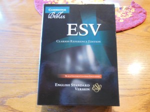
What qualities do you look for in a Bible? Clear print, font size, paper opacity, sewn binding, quality cover, solid translation, lifetime warranty that you probably won’t have to use? Well the Cambridge Clarion, ESV Bible in black edge-lined goatskin leather has it all. I know you are probably getting tired of me giving these Cambridge Bibles such good reviews, but if they weren’t simply better than the others I wouldn’t. I think the other publishers might even wish I would stop reviewing Cambridge Bibles. Their publications don’t look as good compared to the Cambridge Bibles. Now, I know there are plenty of good Bibles out there, but when contrasted with the outstanding ones they fall short in some areas. With Bibles I’ve noticed that you get what you pay for in general.
The ESV is a solid translation from Crossway. Here is a link to some information about the translation. It is not a dynamic equivalent or thought for thought translation. It is more of a formal equivalent or word for word translation. Hebrew and Greek don’t have the same sentence structure and grammar as English. In translating the words are translated directly into English, but are arranged as English sentences so that we can understand them. In a dynamic equivalent the sentence or paragraph is read and studied by the team and they basically paraphrase it in English to convey the meaning in the most accurate way they can. The NIV is a dynamic equivalent. Dynamic equivalents may be easier to read, but in my opinion are by nature less precise. That is why I prefer formal equivalent translations like the ESV or NASB.
Here is a link to a chart that lists some common Bible translations and their translation philosophy. Keep in mind that several of the translations there were translated with the added agenda of being gender neutral and going beyond gender accuracy. They call their translations gender inclusive, but it is at the purposeful abuse of scripture.
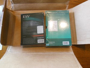
Besides being an ESV this Bible is like Goldilocks and the baby bear’s stuff. It is just right. It isn’t too big, or too small. The paper isn’t too thick or too thin. The print isn’t too big or too small. The cover isn’t too soft or too rigid. It gets just about everything right. The Clarion arrived in an easy to open cardboard box along with an REB that I will review later.
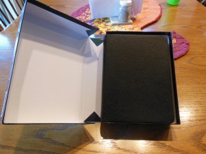
Both Bibles arrived undamaged and in good condition. The Clarion was in a one piece clamshell box.
The box should be retained for storage, should you ever decide to put this Bible down for a bit to read another… I doubt that will happen. The first thing you’ll notice is the smell of the leather.
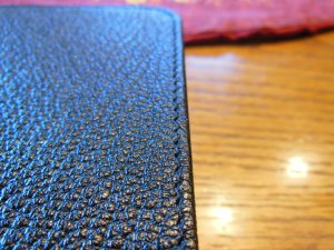
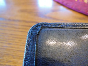
The next thing you’ll notice is the supple, perimeter stitched, edge lined, black goatskin leather cover.
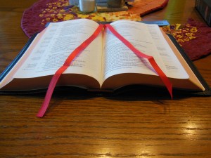
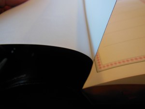
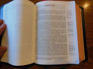
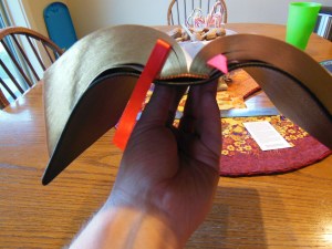
If you have never owned a Bible with a cover like this, you don’t know what you are missing. For durability, functionality, and comfort, you can’t beat it. The cover works in concert with the sewn binding and quality paper to allow this Bible to open well and lay flat on a table or desk.
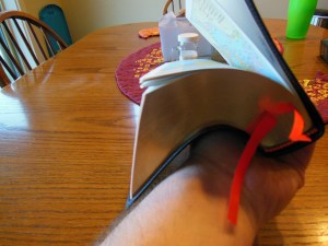
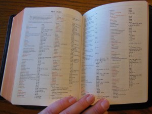
It also lays flat while held in one hand.
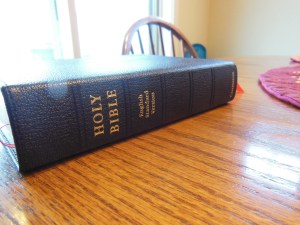
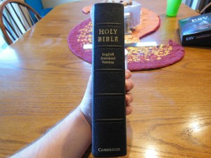
This makes it a joy to read. I love that you forget you are holding something. You aren’t constantly fighting the cover, the paper, or the binding. The Spine of the Clarion has, “Holy Bible” at the top. Under that is, “English Standard Version”. On the bottom of the spine is, “Cambridge.” They are all hot-stamped in gold. There are five small decorative hubs as well.
The grain of the goatskin cover is more pebbled than a top grain cowhide. It is softer than the shiny genuine leather covers that are made from pigskin. The perimeter stitching is uniform and well done.
The corners are stitched as well so you won’t see the typical corner treatment.
When you open the Bible, you’ll see the end papers are glued to cover and text block so that they will be more durable.
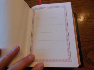
There is a simple presentation page that is made of heavier card paper. It has several blank lines on it.
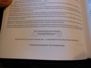
Then there is a Title Page. After that is the copyright page with the font size and type. It list the font as 8.75/10.5 pt. Lexicon No. 1 A (Enschede ff) We also can see from this page that this Bible is printed by Jongbloed in the Netherlands.
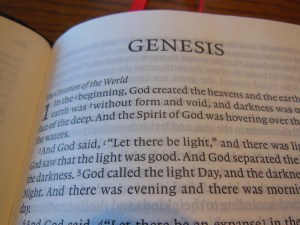
For those of you in the know, that is a big plus. They have been doing great work for many years. One truly great feature of this Bible is the line matching utilized by Jongbloed. The lines of text are printed exactly opposite of the lines on the other side of the page so that the text isn’t distractingly visible through the paper.
The paper is a little off white and the black text contrasts against it nicely. It is printed clearly and uniformly throughout. The text is laid out in a single column paragraph format with the cross-references on the outside edge of the page in the margin.
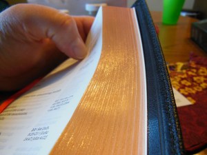
This layout is conducive to long sessions of uninterrupted reading. The paper is smooth. The page edges are art gilded with red under gold. I think this is a pleasing aesthetic. When the Bible is open the red shows through and while it is closed the gold is prominent.
There are two red ribbon markers for keeping your place. Most other Bibles only give you one ribbon. It is nice to have to so you can mark your reading in the Old and New Testaments.
There is a useful concordance in the end with a map index and 15 color maps printed on a heavier card paper. I like this approach better than the glossy maps as the high clay content in their paper makes them crack easier.
With all of the features like, quality construction, quality materials, attention in design, you can tell why I love the Clarion Bibles from Cambridge. If you are in the market for a premium Bible, look no further. You can purchase them on these sites;
9780521182911
ESV Clarion Reference Edition ES486:XE
Black Goatskin Leather






The pages of my Clarion tend to curl a bit at the edges in the right environment, have you experienced this?
LikeLike
It is a complaint I’ve heard before. I live in a very dry climate. I have not had that problem.
LikeLike
I have a clarion ESB and find a section of the pages curl terribly, for no explicable reason. It’s a very precise section of the Bible, so I imagine it corresponds to several of the signatures that are sown together. I replaced it but got the same result. Have you had any issues with page curl? It is very thin, 27gsm I think
LikeLike
The Clarion does have a known problem with page curl. Some folks have a more severe problem than others. I happen to like the page curling that I have happen. The paper is just thin enough to make it difficult to turn the page. The page curls just enough for me to get the page turned without tearing it. Humidity can play a part in the problem I hear. If you just can’t live with the page curl, Schuyler is coming out with a personal sized NASB Quentel very soon. It might be an option for you.
LikeLike