Bible Reviews

They don’t get much better than this! The Cambridge Clarion, ESV Bible in black edge-lined goatskin leather.

Cambridge ESV Clarion and REB 044

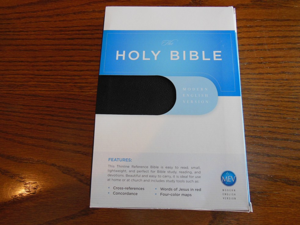
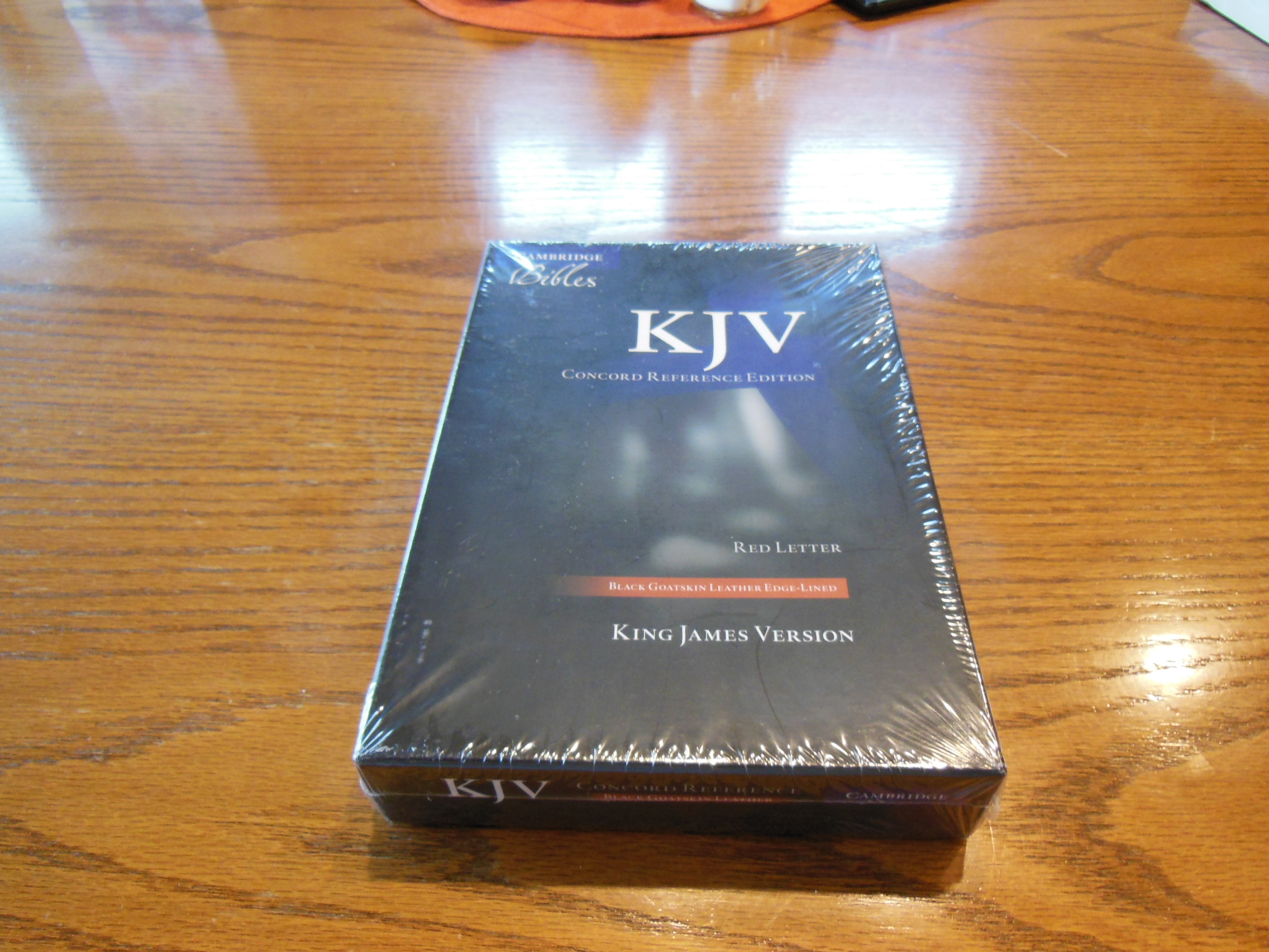
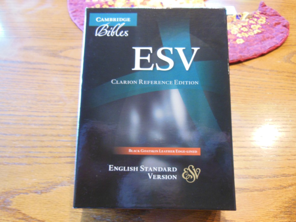
What qualities do you look for in a Bible?  Clear print, font size, paper opacity, sewn binding, quality cover, solid translation, lifetime warranty that you probably won’t have to use?  Well the Cambridge Clarion, ESV Bible in black edge-lined goatskin leather has it all.  I know you are probably getting tired of me giving these Cambridge Bibles such good reviews, but if they weren’t simply better than the others I wouldn’t.  I think the other publishers might even wish I would stop reviewing Cambridge Bibles.  Their publications don’t look as good compared to the Cambridge Bibles.  Now, I know there are plenty of good Bibles out there, but when contrasted with the outstanding ones they fall short in some areas.  With Bibles I’ve noticed that you get what you pay for in general.

The ESV is a solid translation from Crossway.  Here is a link to some information about the translation.  It is not a dynamic equivalent or thought for thought translation.  It is more of a formal equivalent or word for word translation.  Hebrew and Greek don’t have the same sentence structure and grammar as English.  In translating the words are translated directly into English, but are arranged as English sentences so that we can understand them.  In a dynamic equivalent the sentence or paragraph is read and studied by the team and they basically paraphrase it in English to convey the meaning in the most accurate way they can.  The NIV is a dynamic equivalent.  Dynamic equivalents may be easier to read, but in my opinion are by nature less precise.  That is why I prefer formal equivalent translations like the ESV or NASB.

Here is a link to a chart that lists some common Bible translations and their translation philosophy.  Keep in mind that several of the translations there were translated with the added agenda of being gender neutral and going beyond gender accuracy.  They call their translations gender inclusive, but it is at the purposeful abuse of scripture.

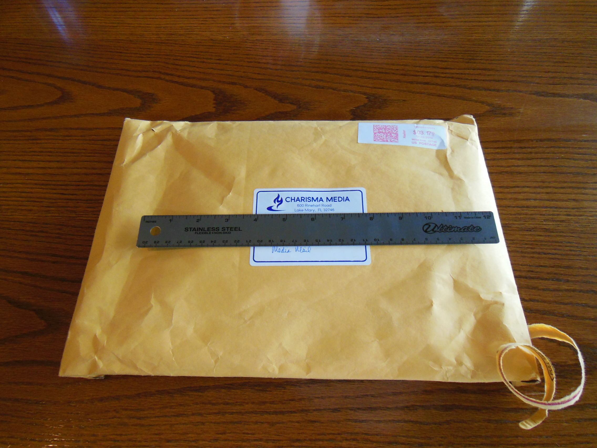
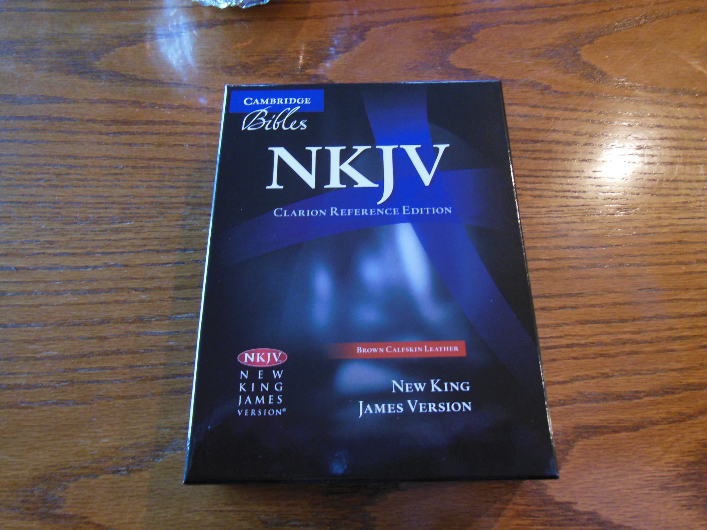
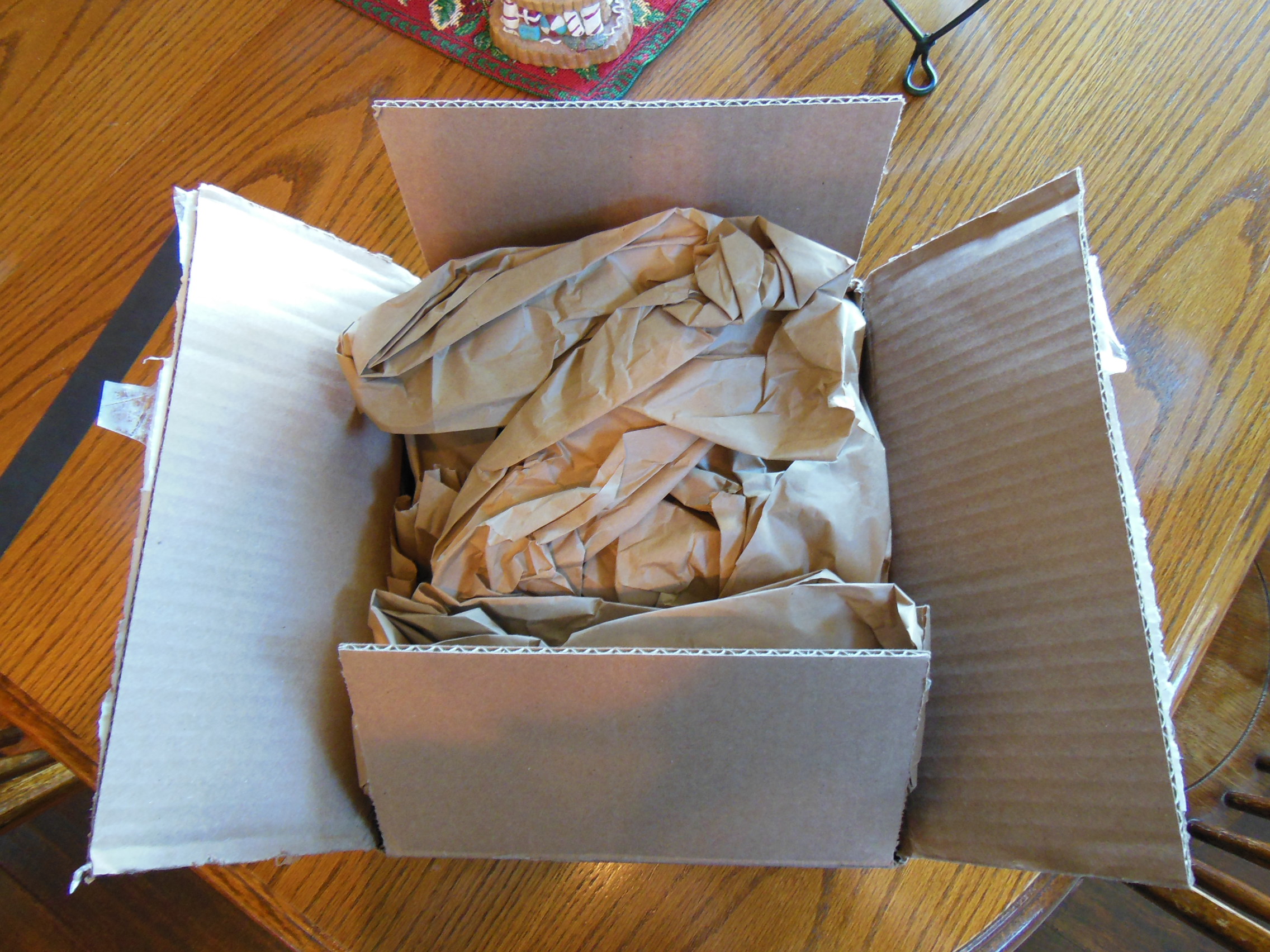
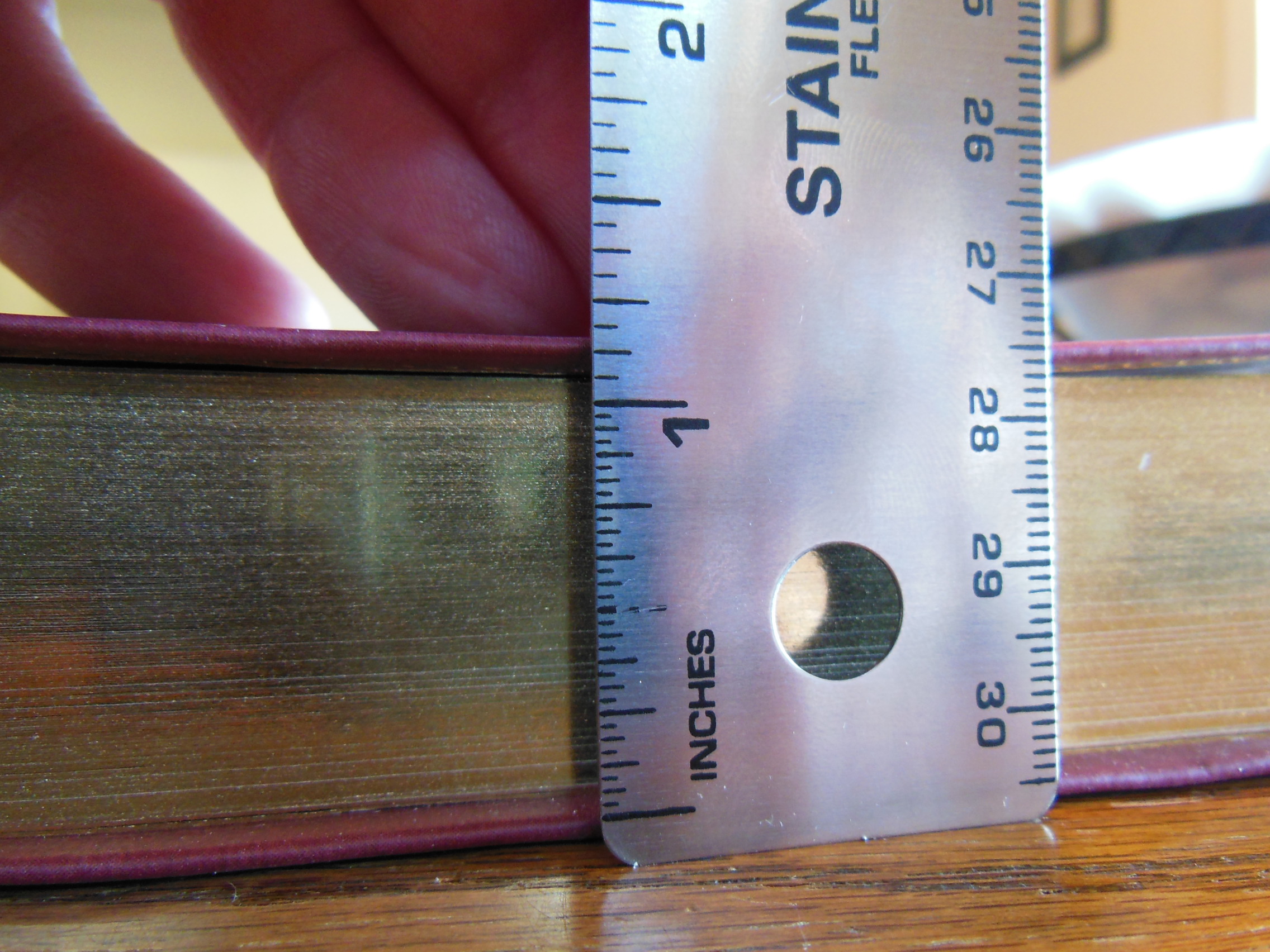
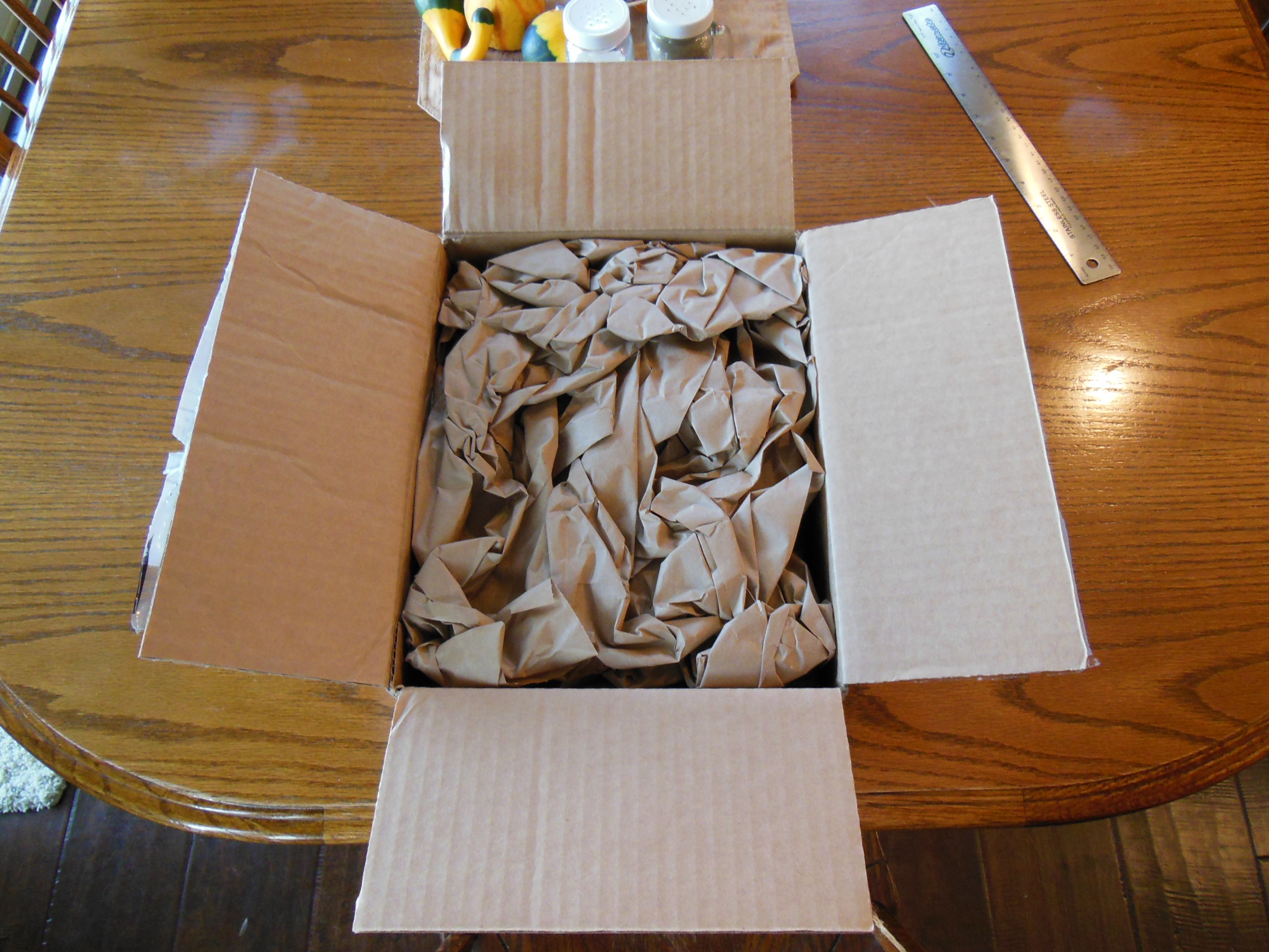
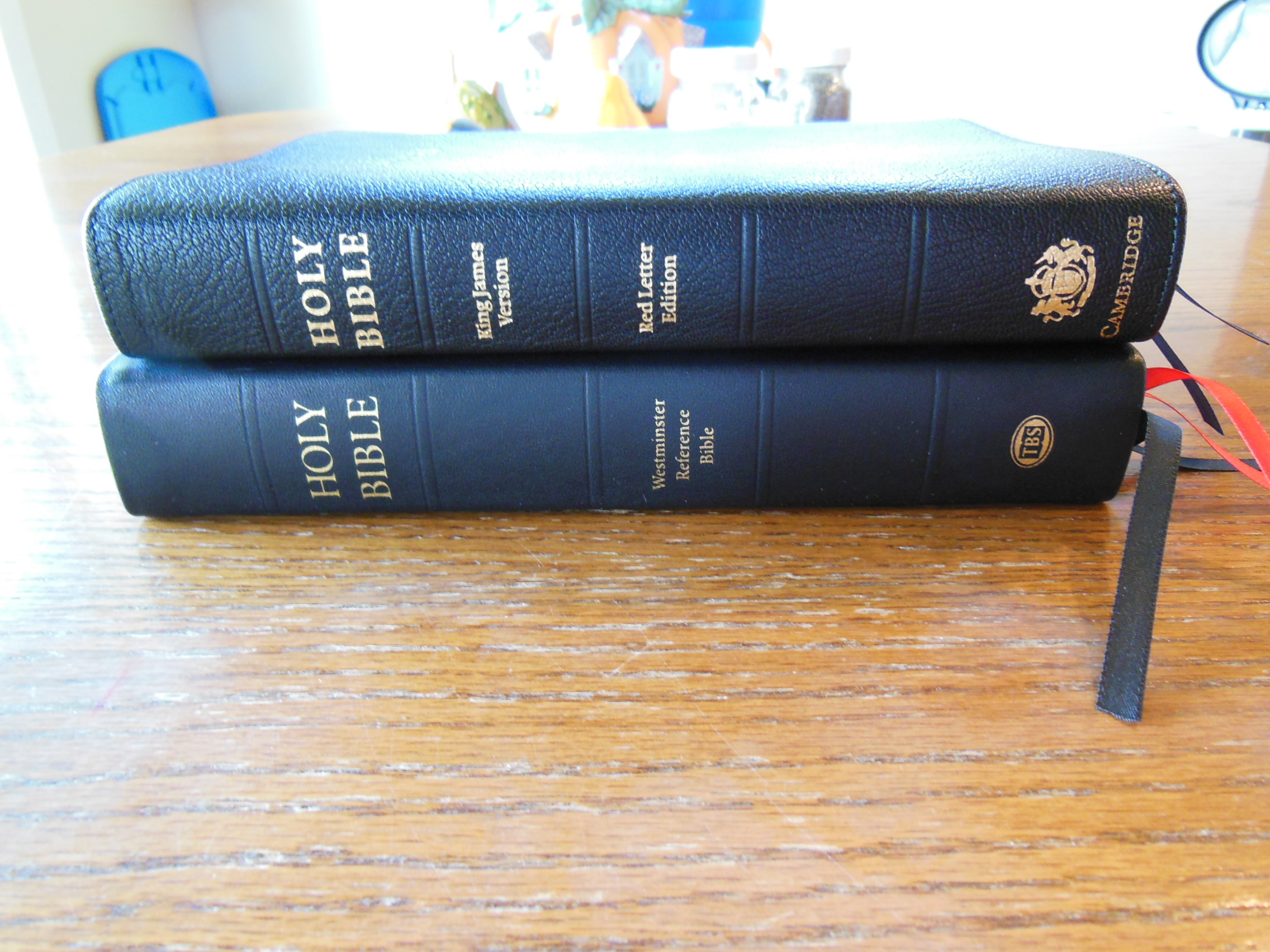
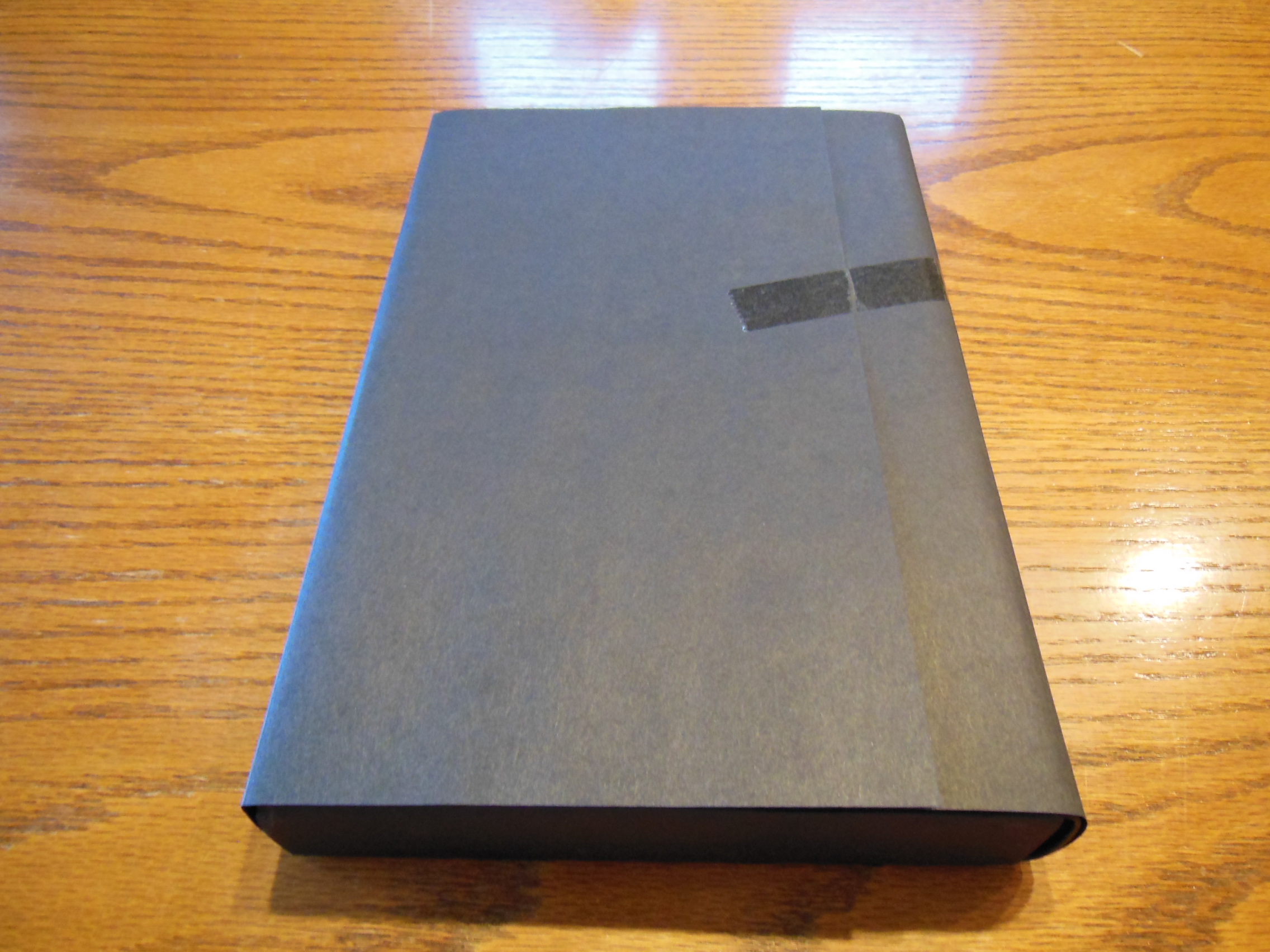
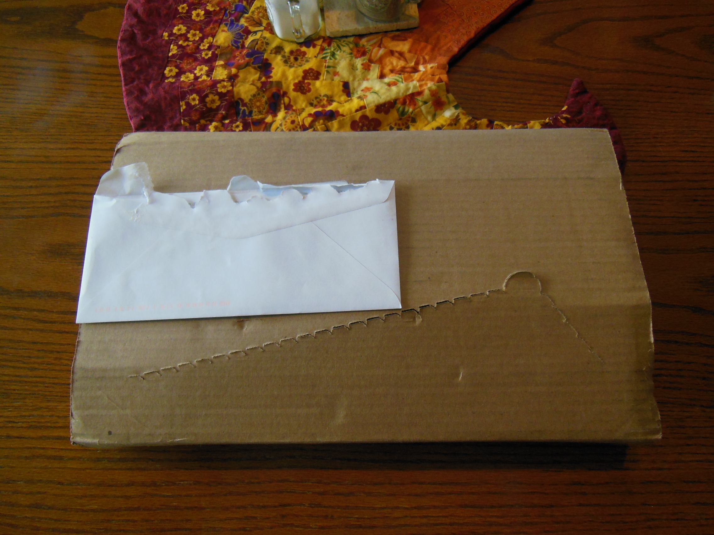
Besides being an ESV this Bible is like Goldilocks and the baby bear’s stuff.  It is just right.  It isn’t too big, or too small.  The paper isn’t too thick or too thin.  The print isn’t too big or too small.  The cover isn’t too soft or too rigid.  It gets just about everything right.  The Clarion arrived in an easy to open cardboard box along with an REB that I will review later.

Cambridge ESV Clarion and REB 001

Cambridge ESV Clarion and REB 003

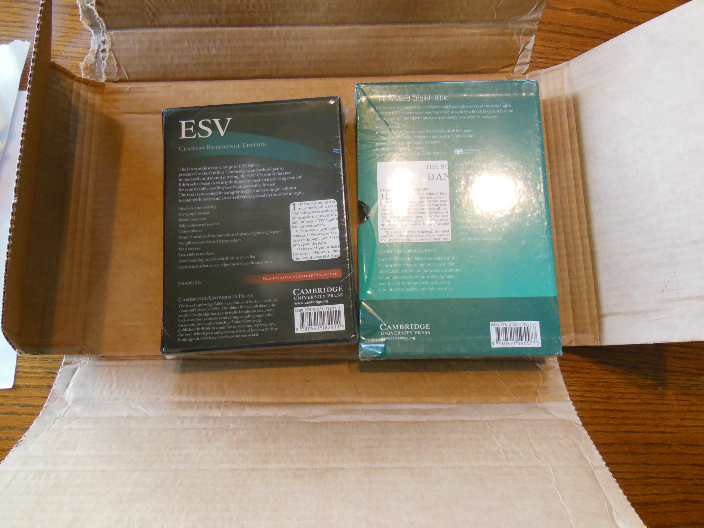
Both Bibles arrived undamaged and in good condition.  The Clarion was in a one piece clamshell box.

Cambridge ESV Clarion and REB 045

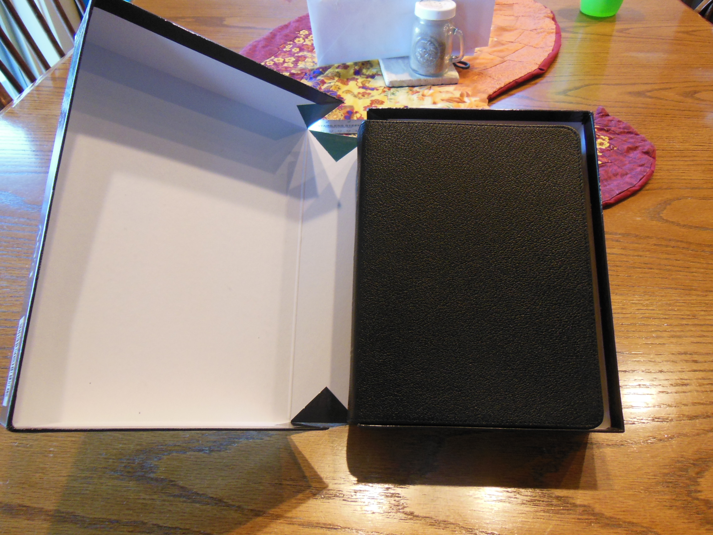
The box should be retained for storage, should you ever decide to put this Bible down for a bit to read another…  I doubt that will happen.  The first thing you’ll notice is the smell of the leather.

Cambridge ESV Clarion and REB 046

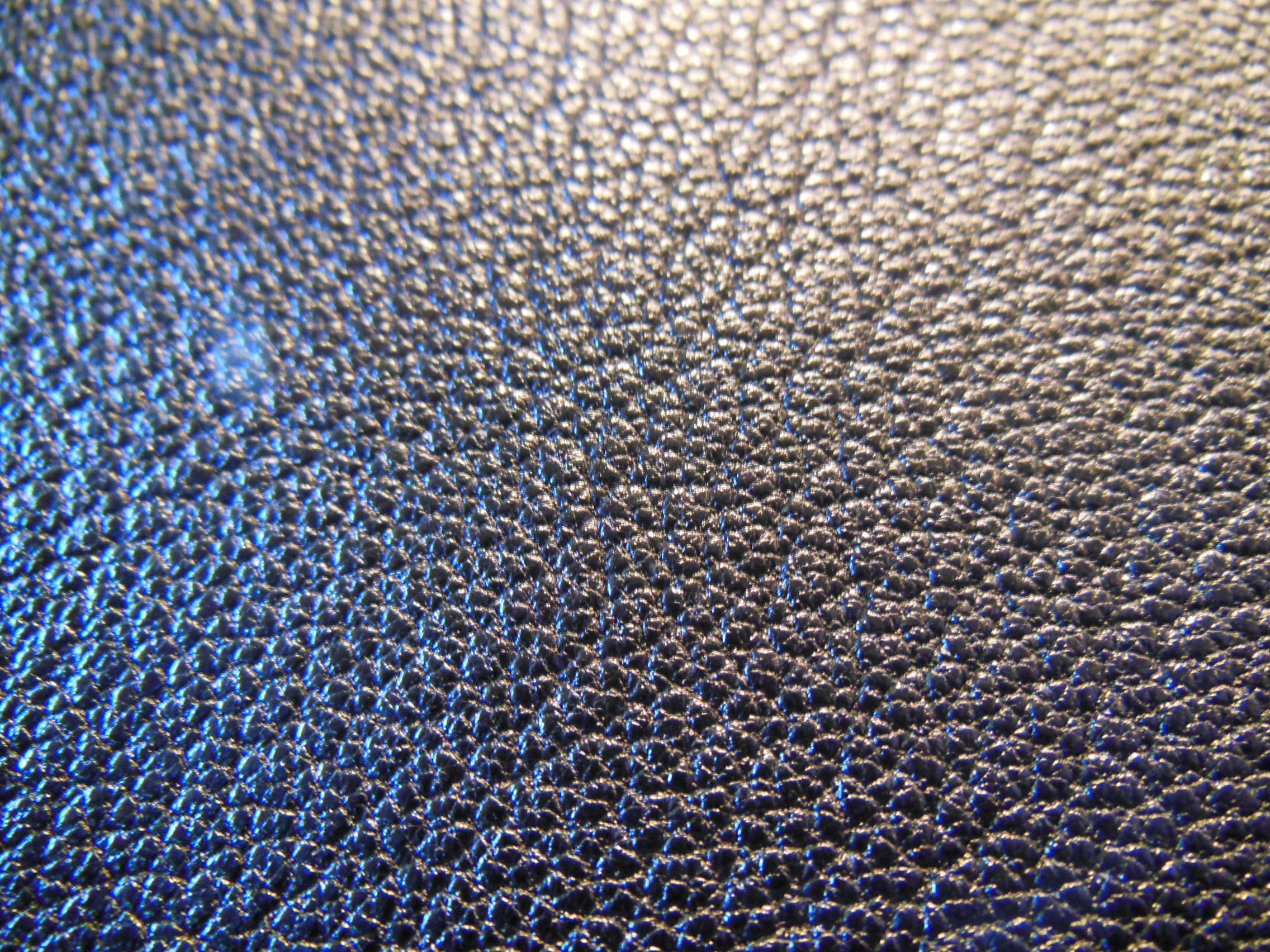
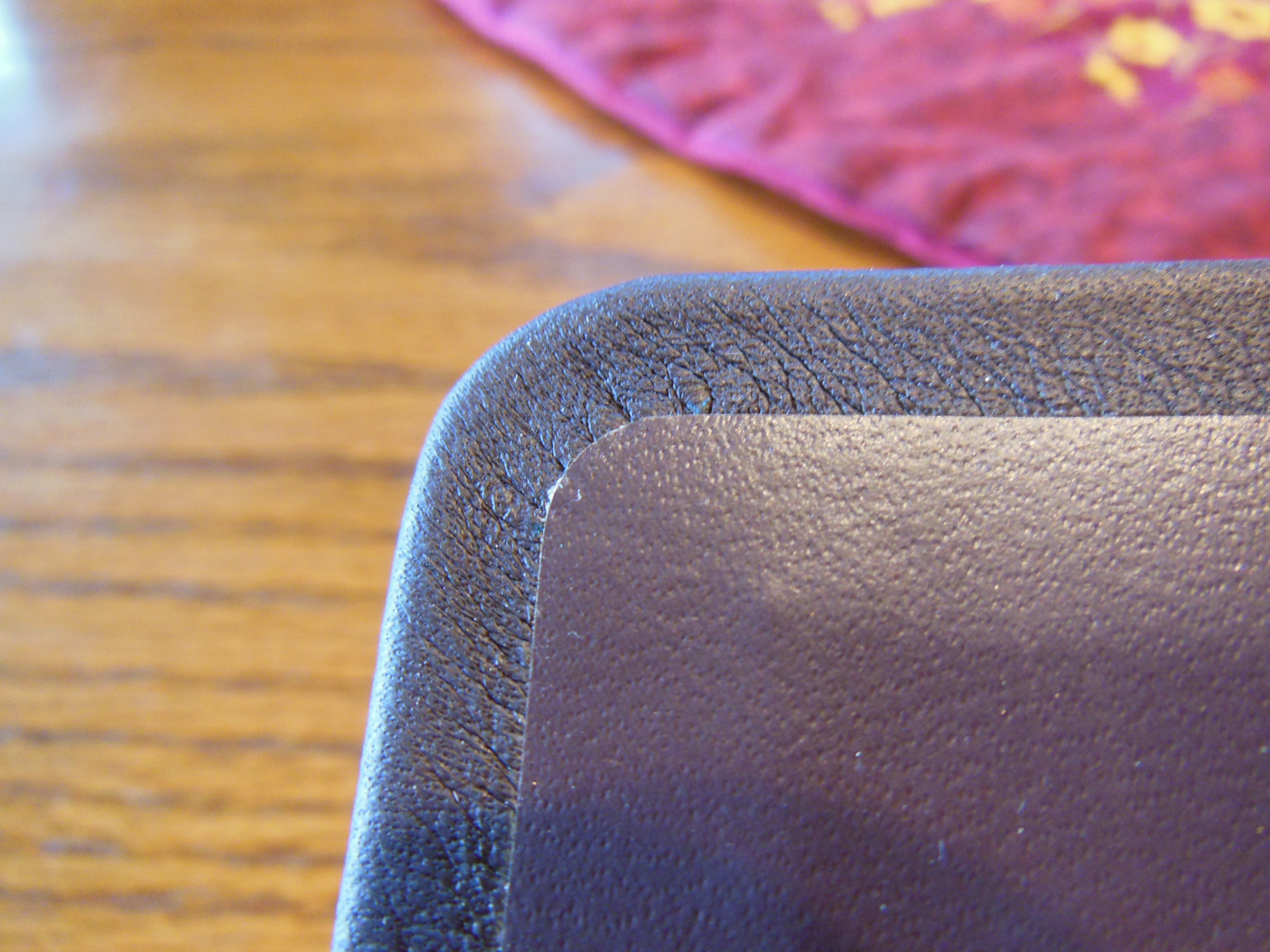
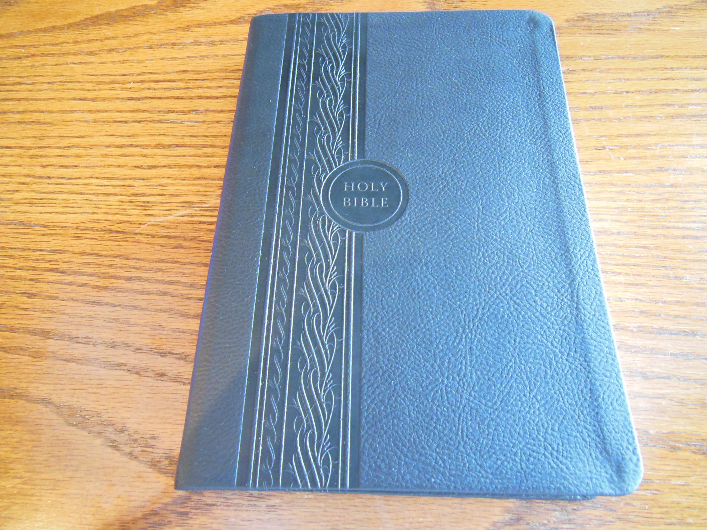
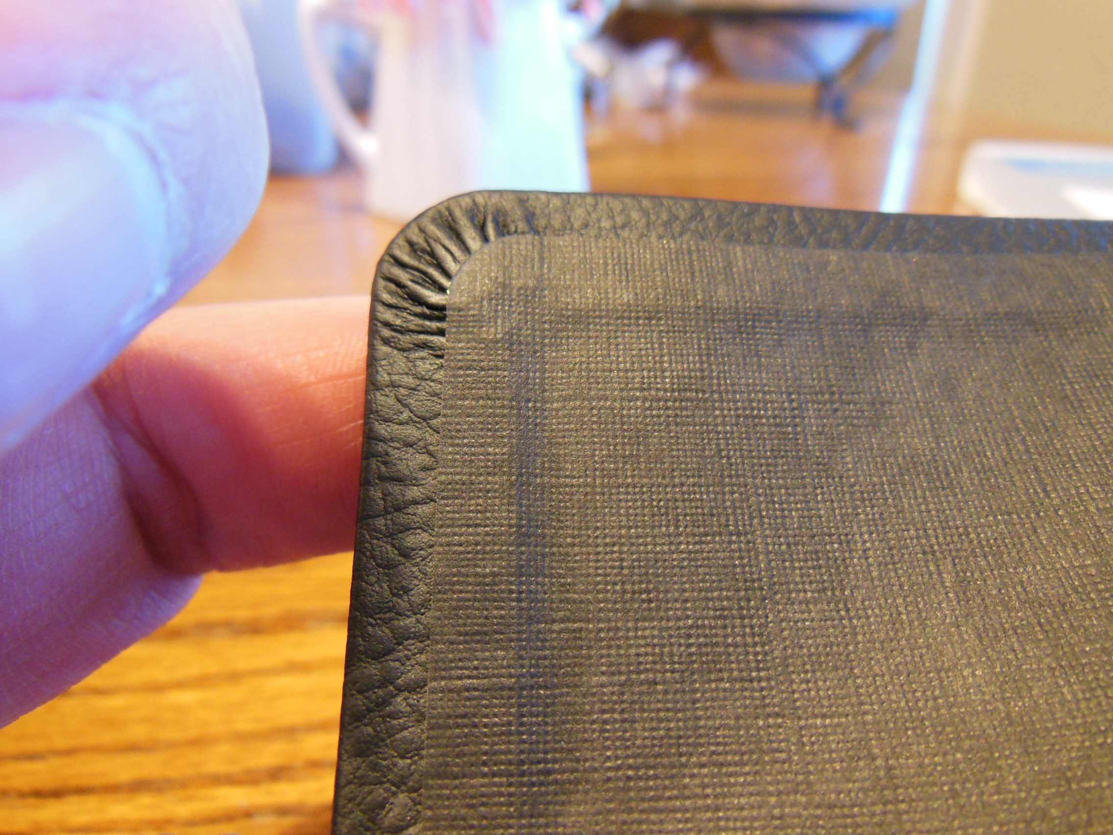
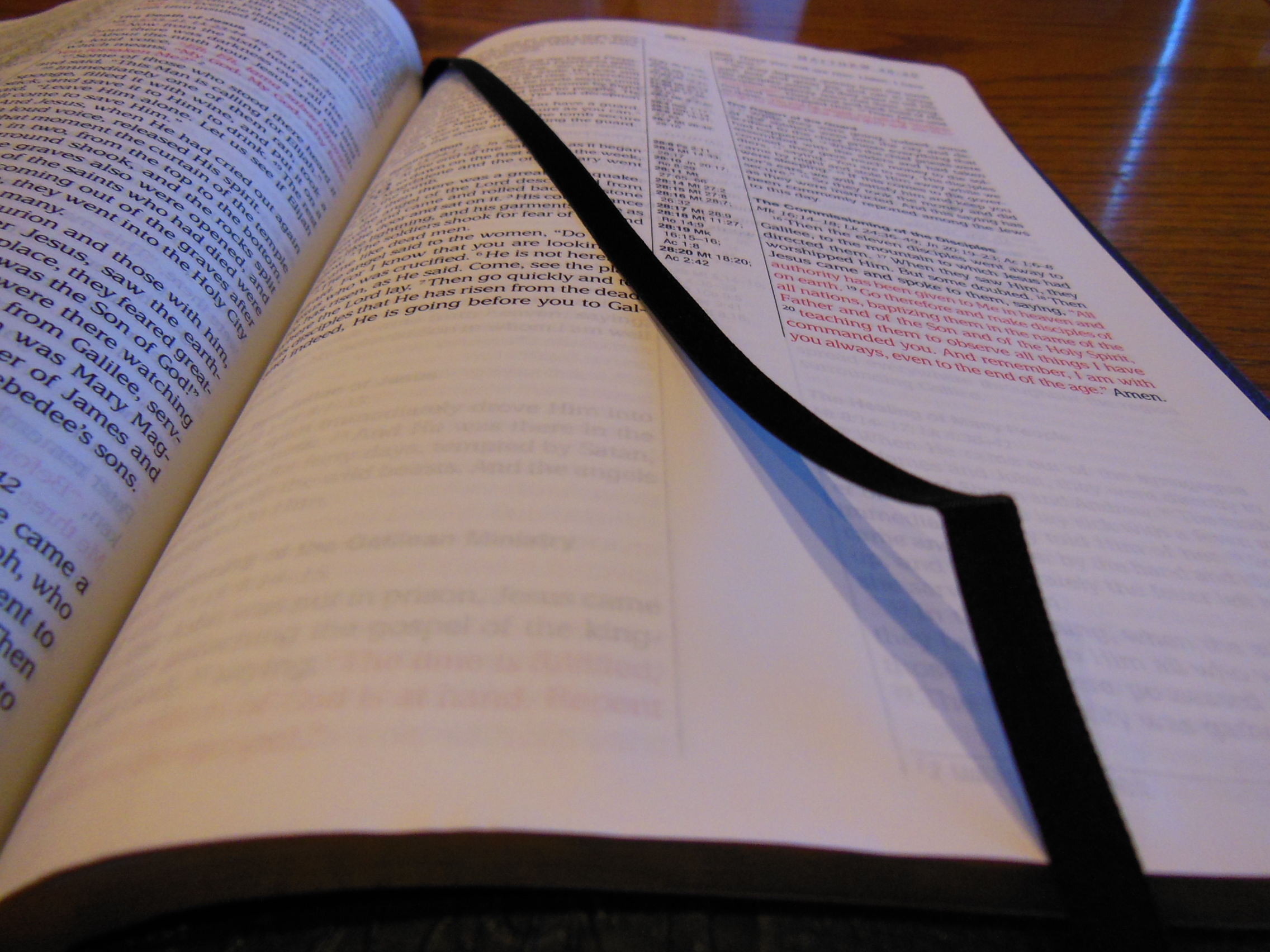
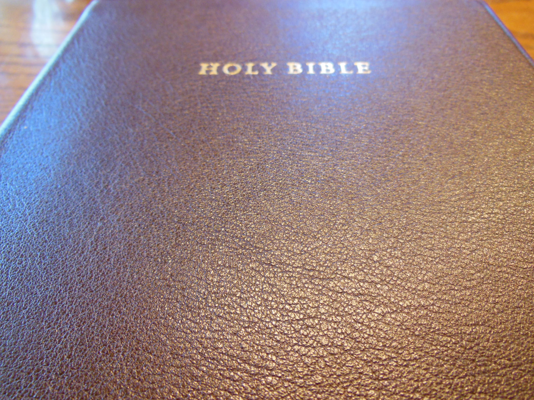
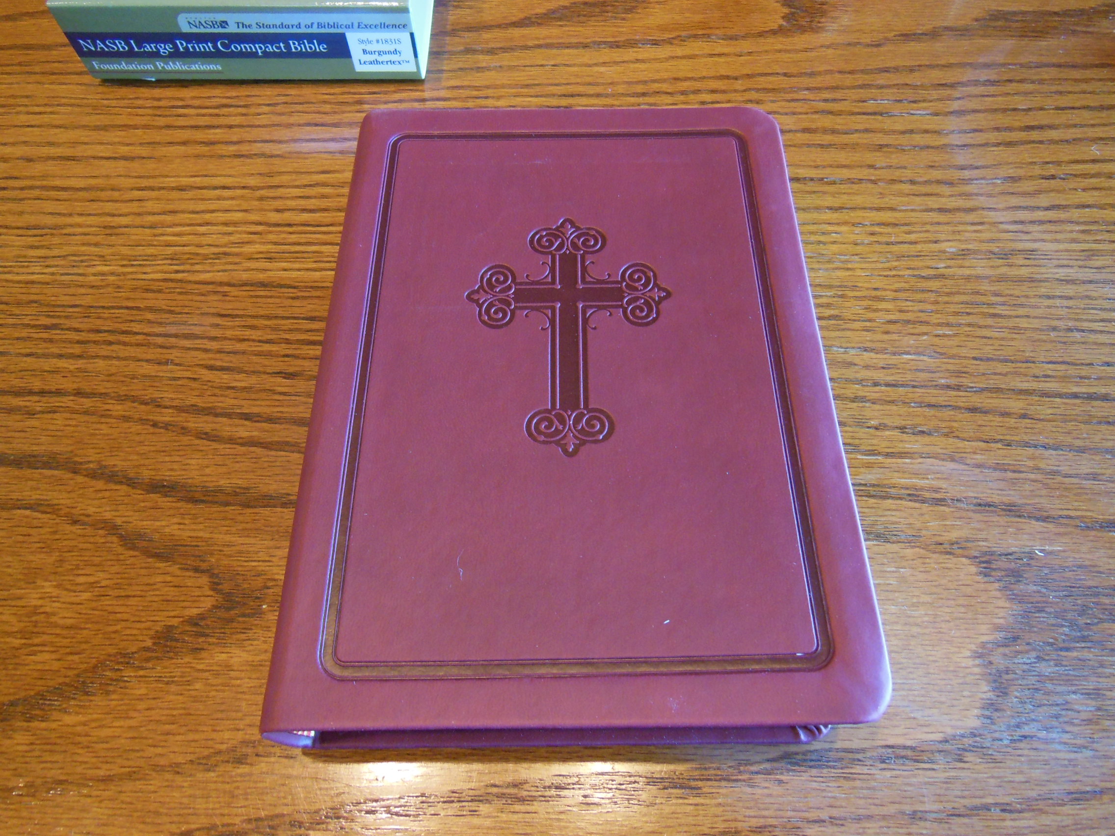
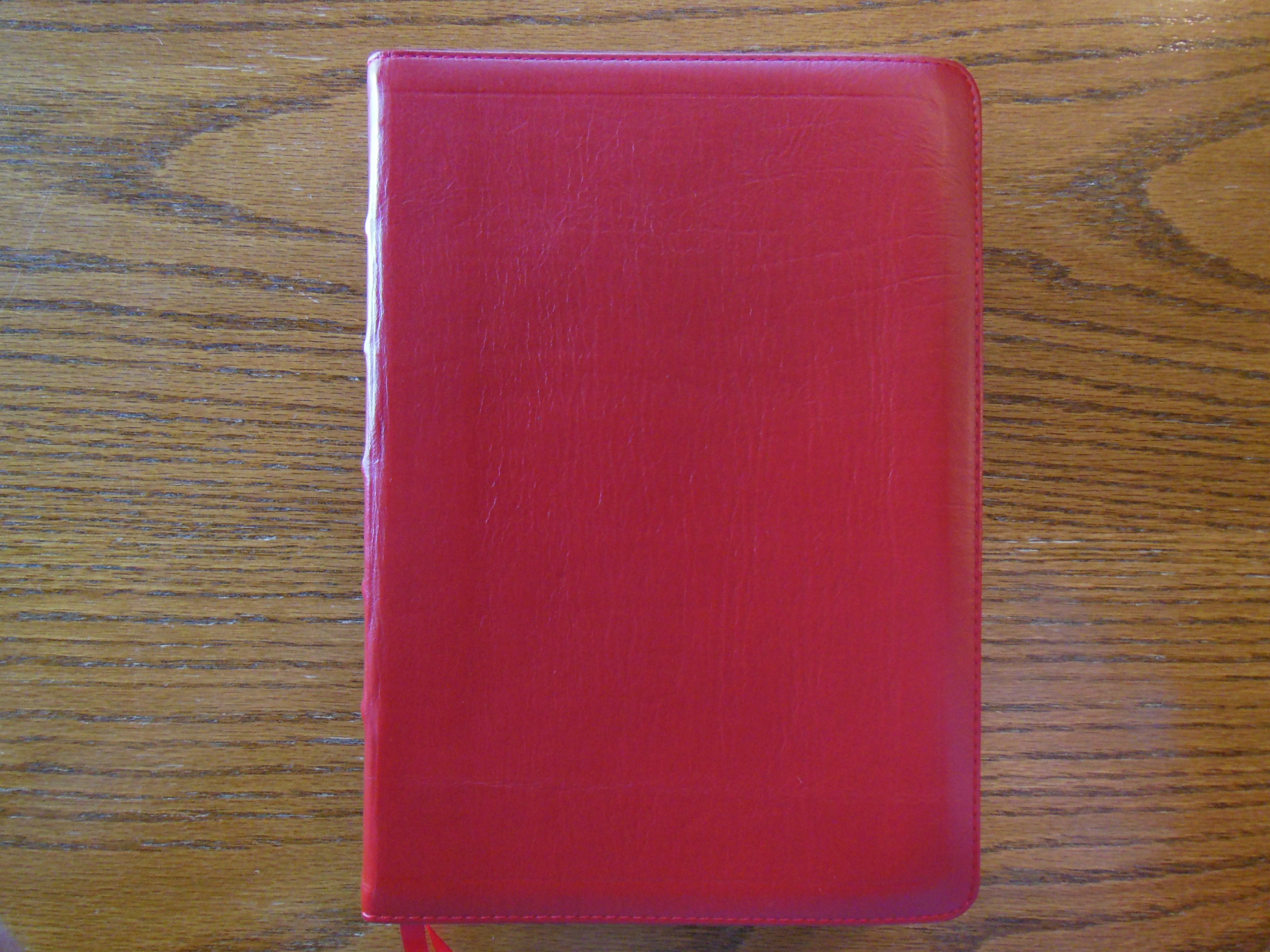
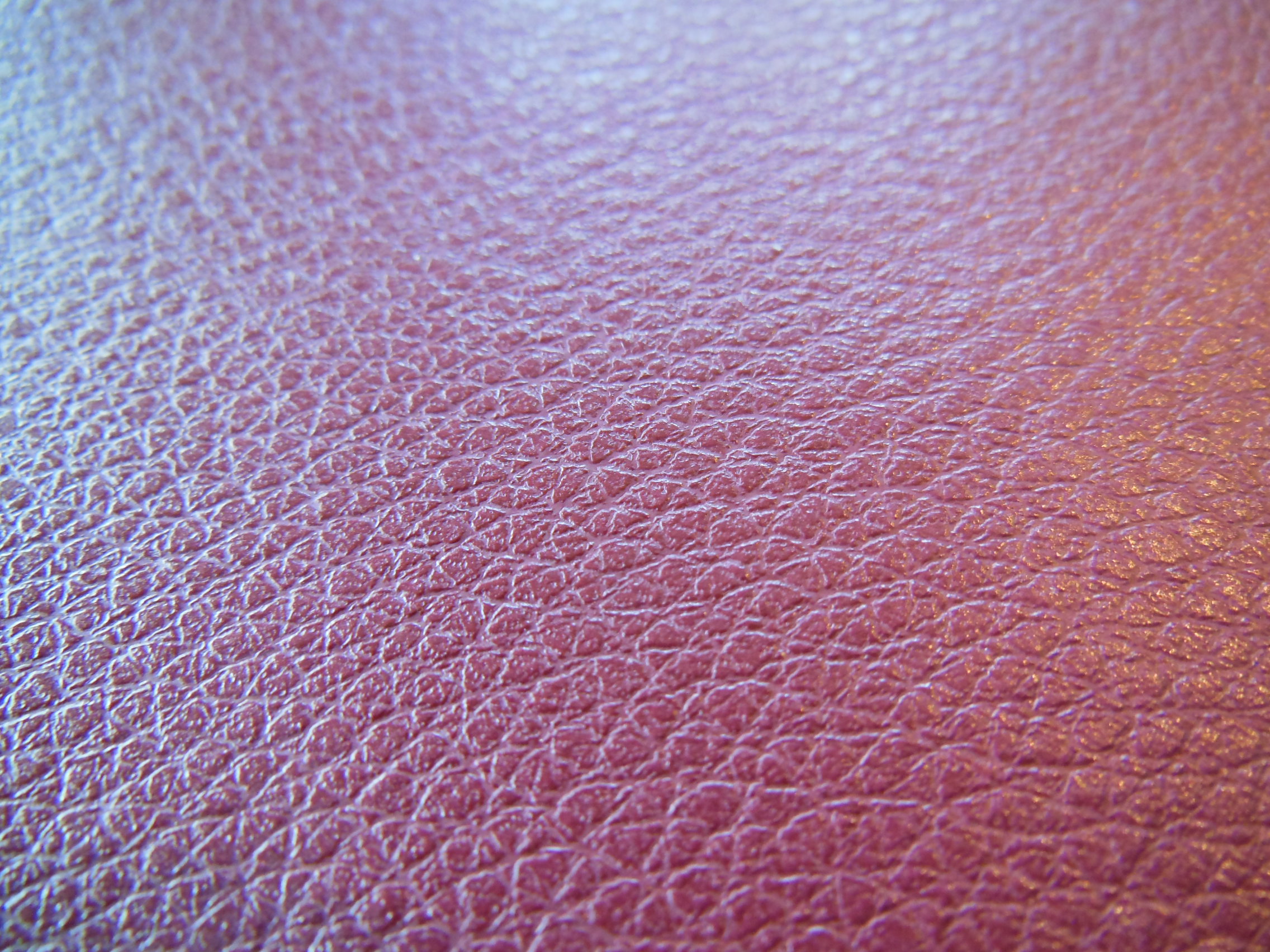
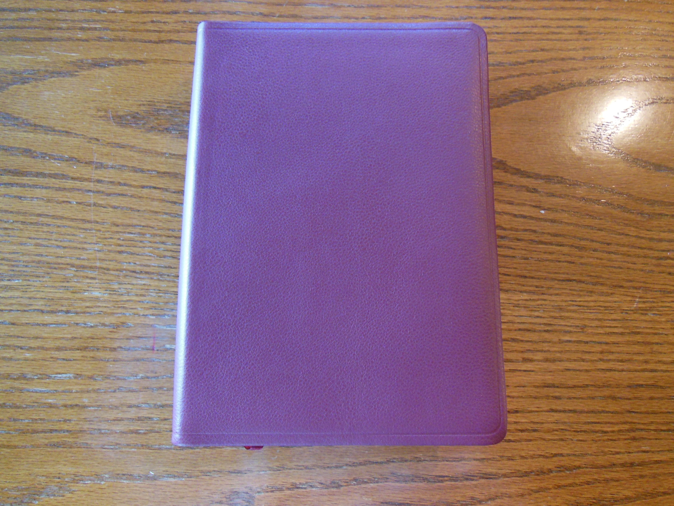
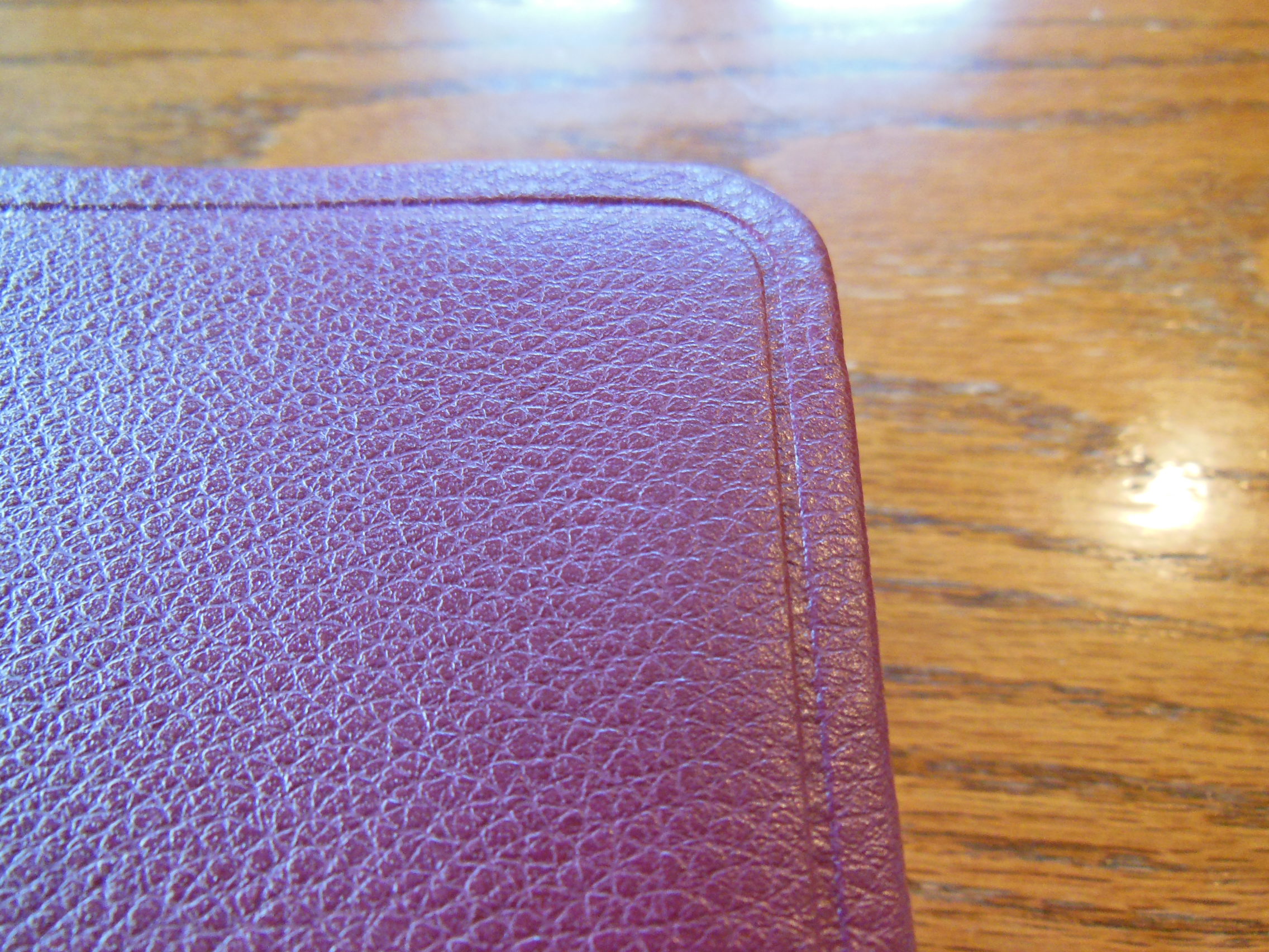
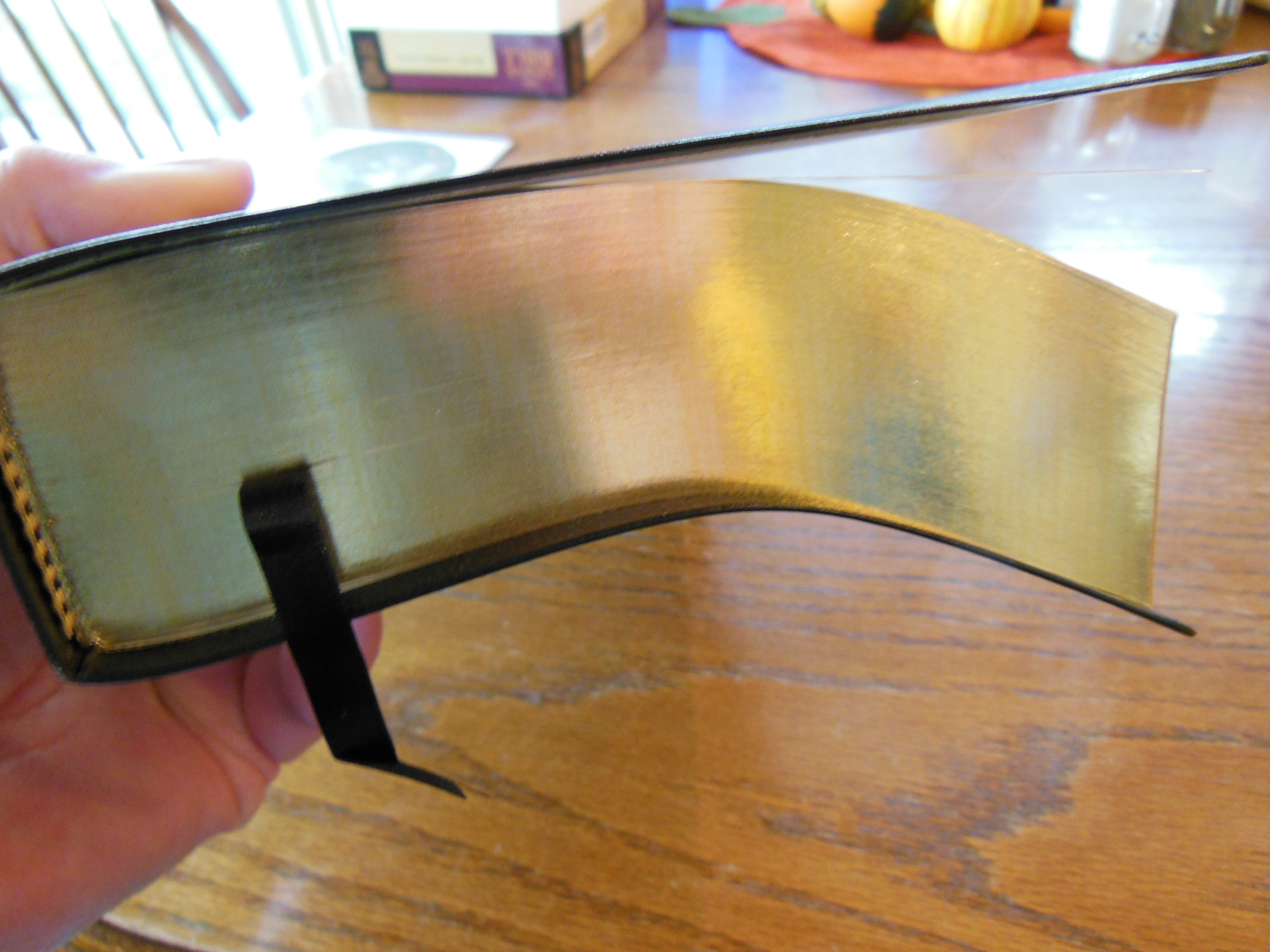
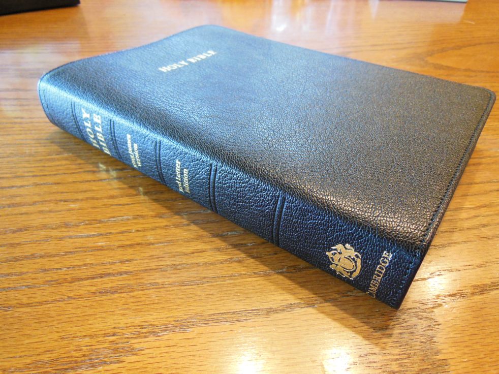
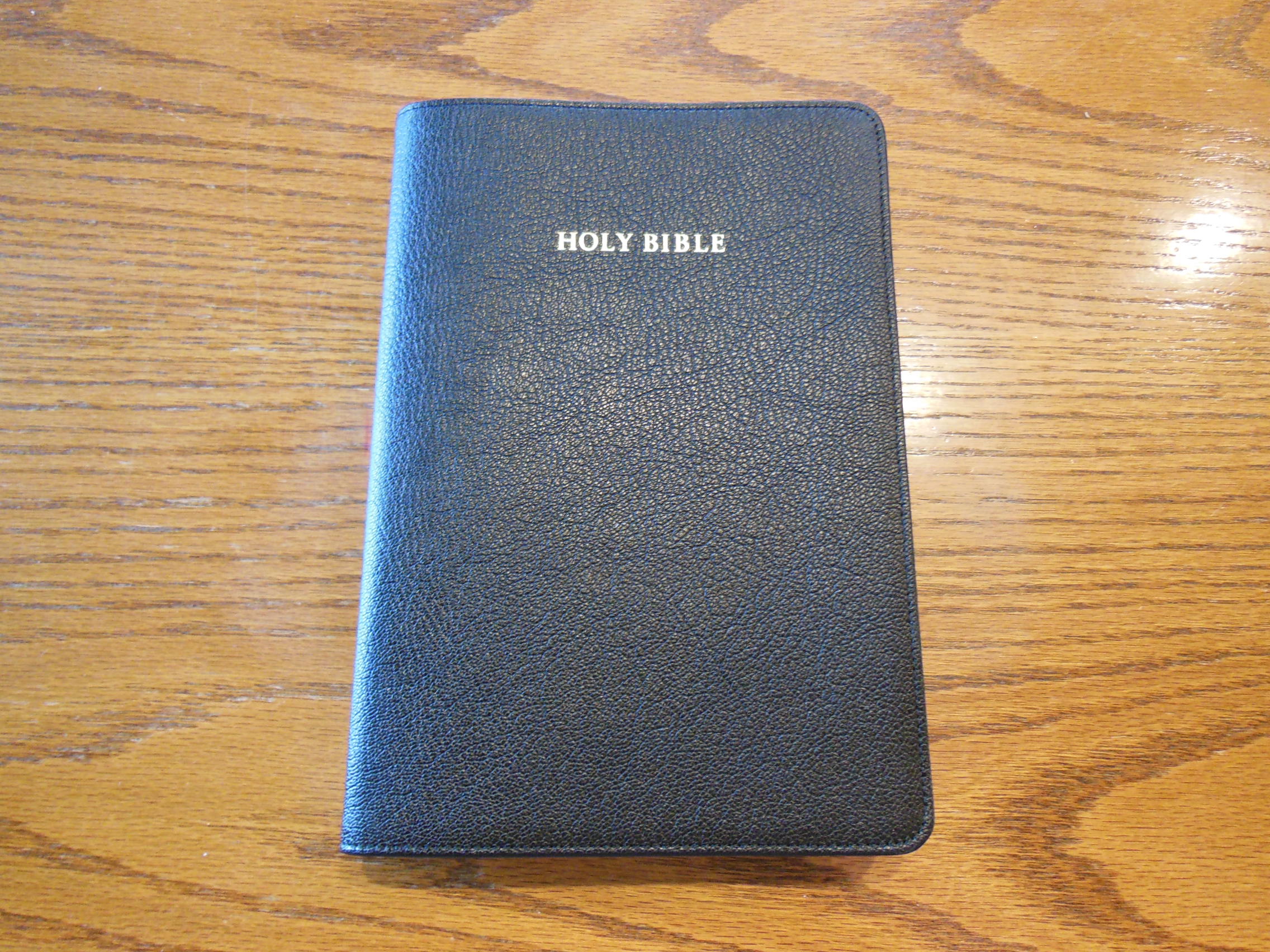
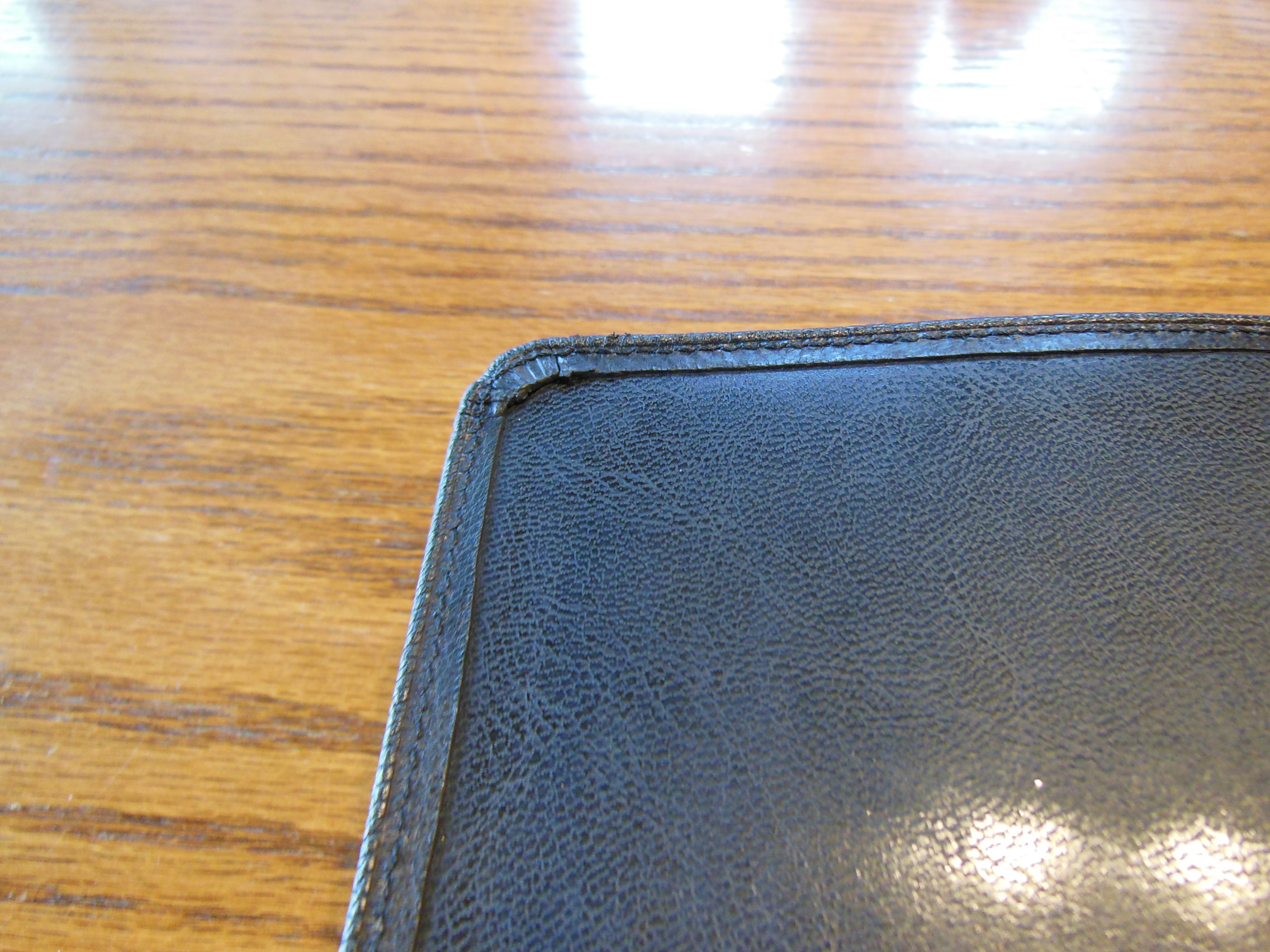
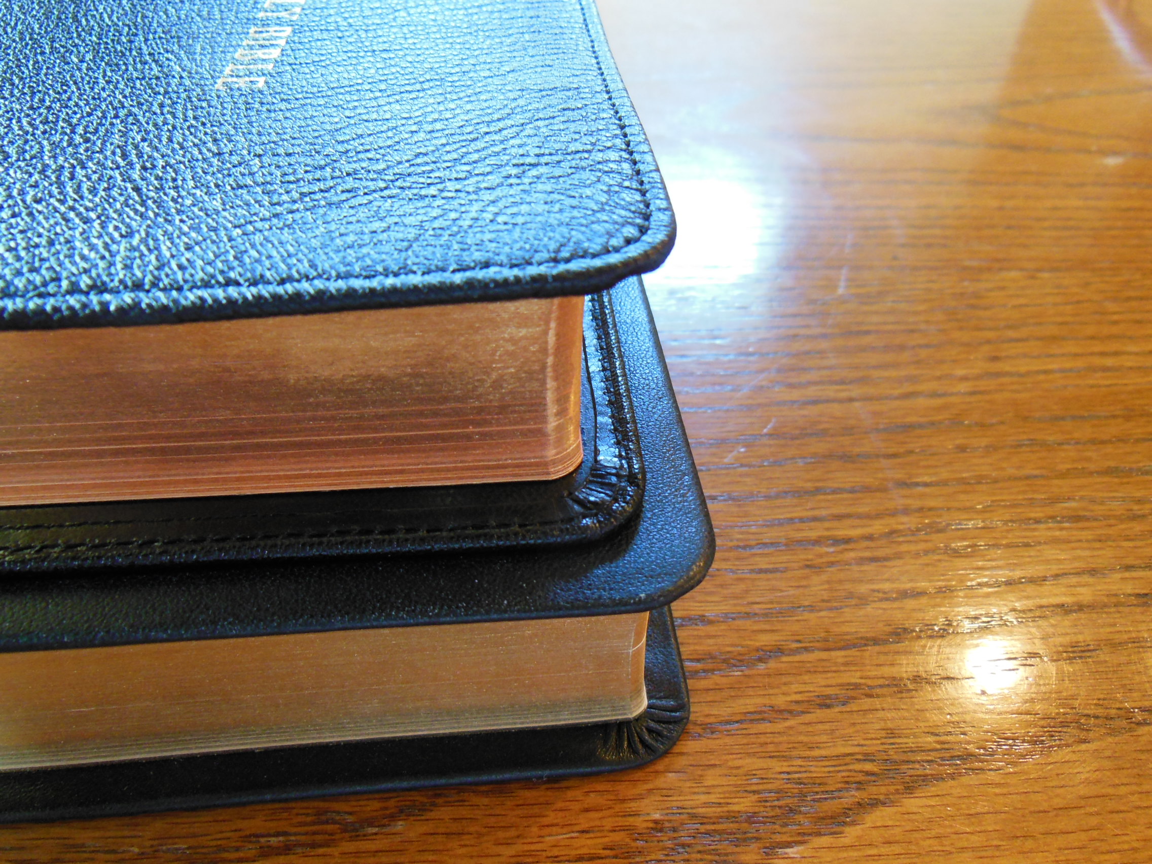
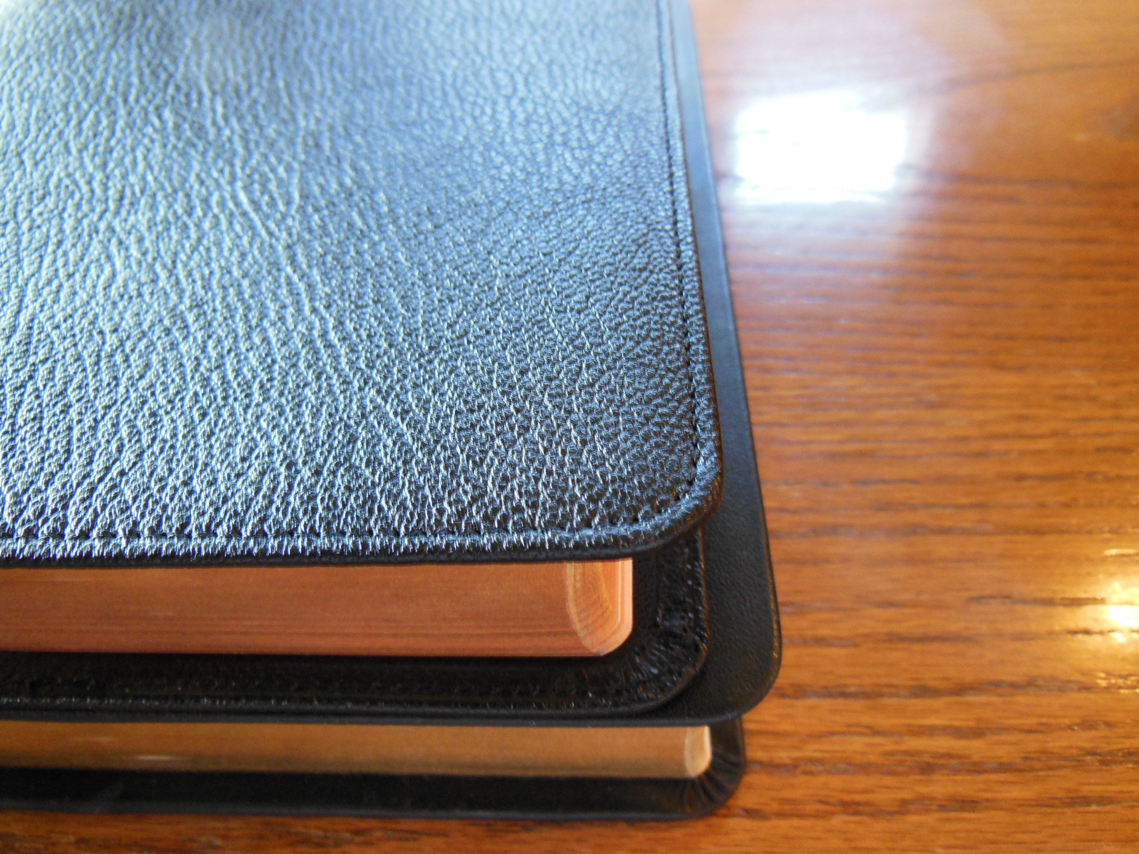
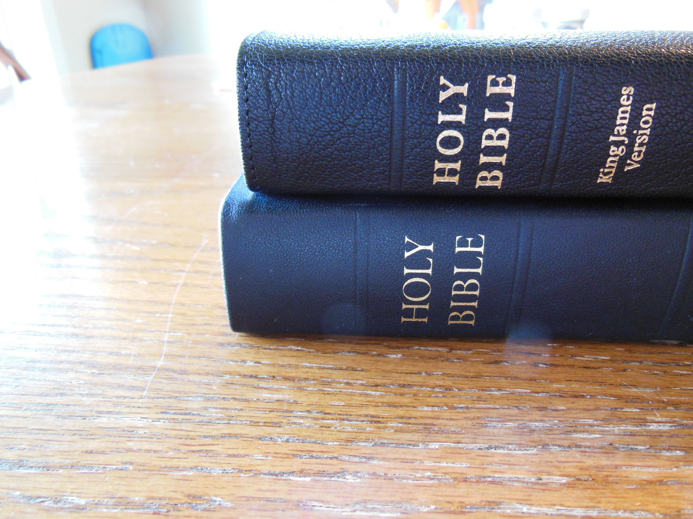
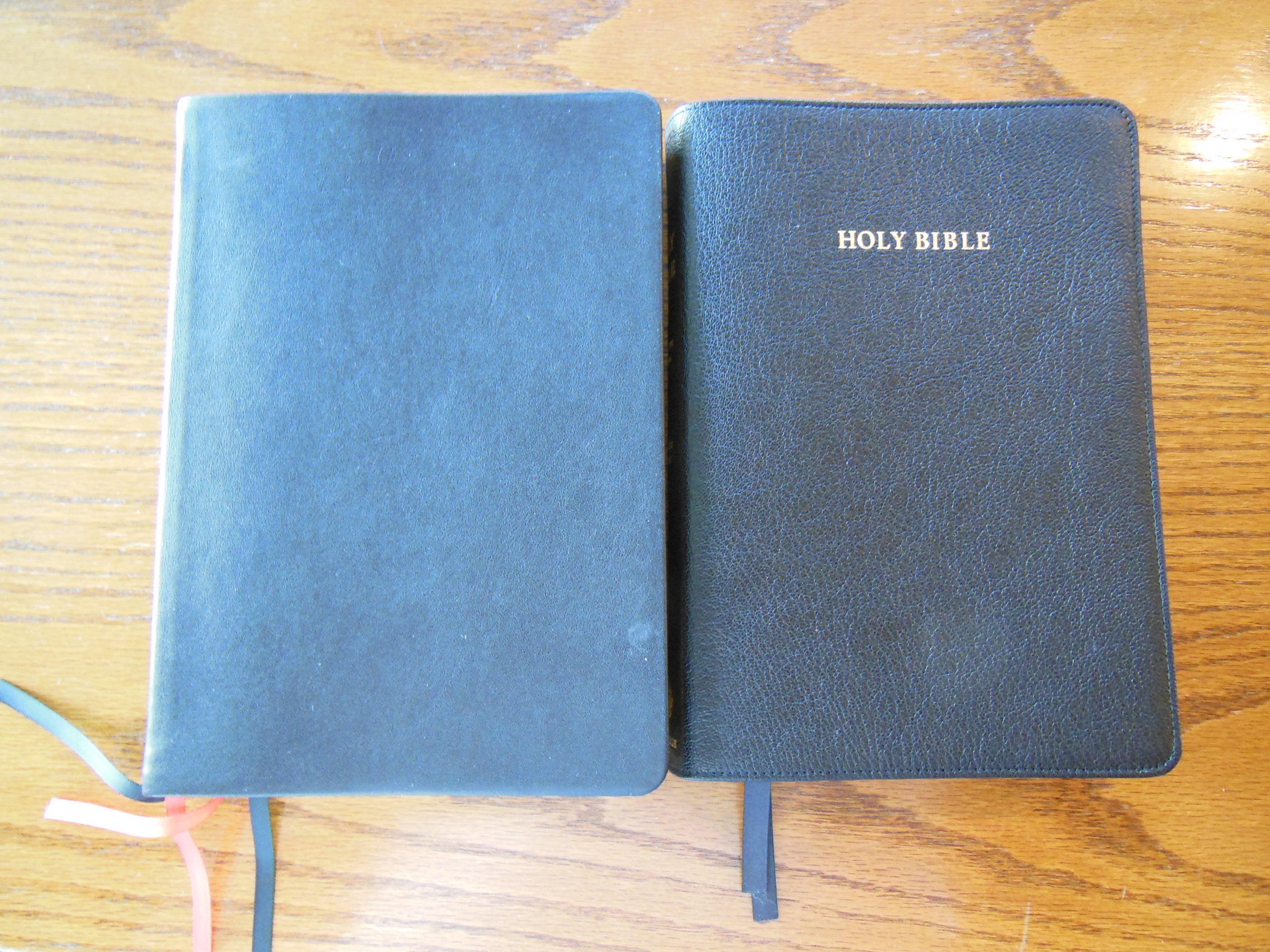
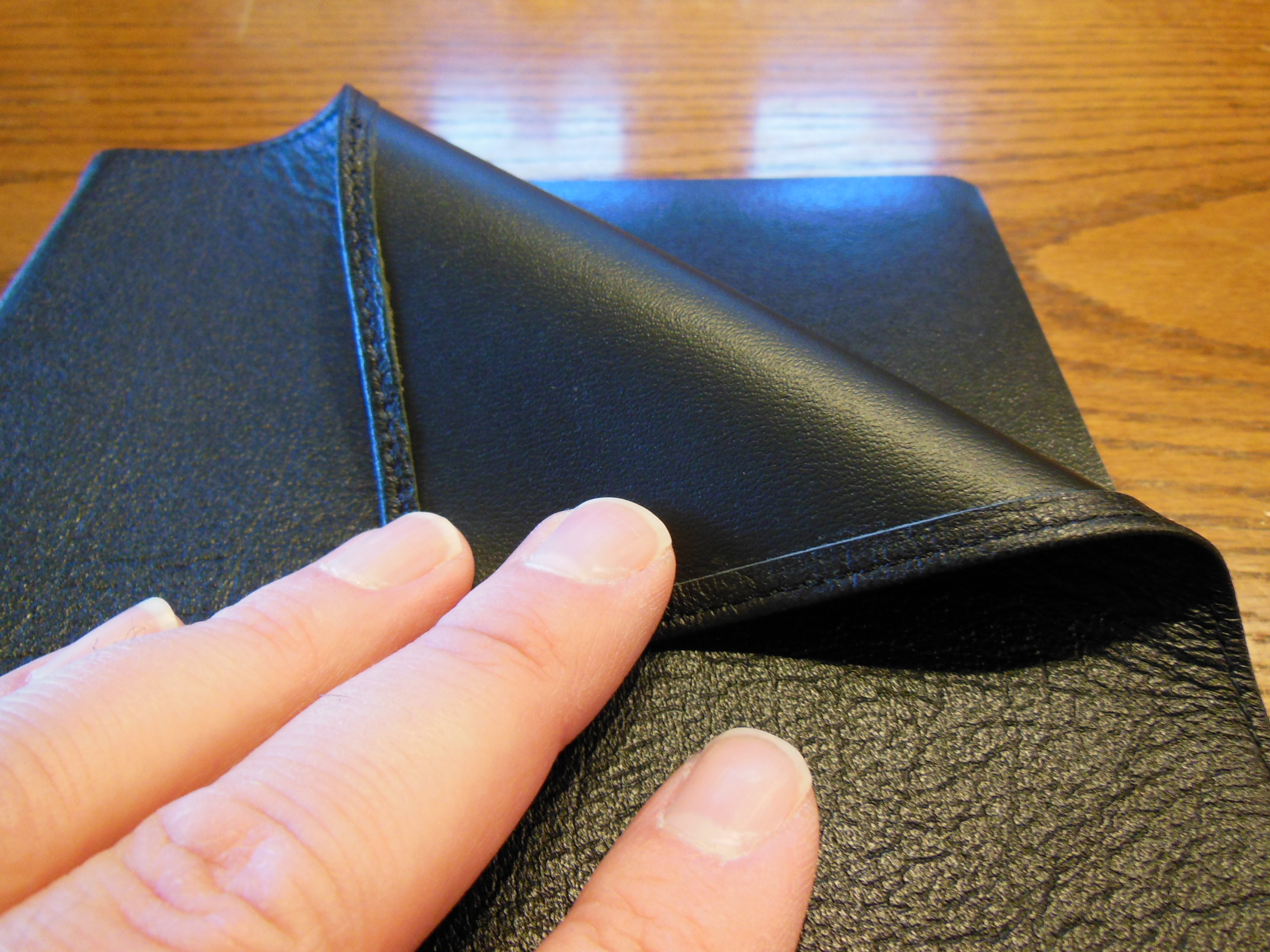
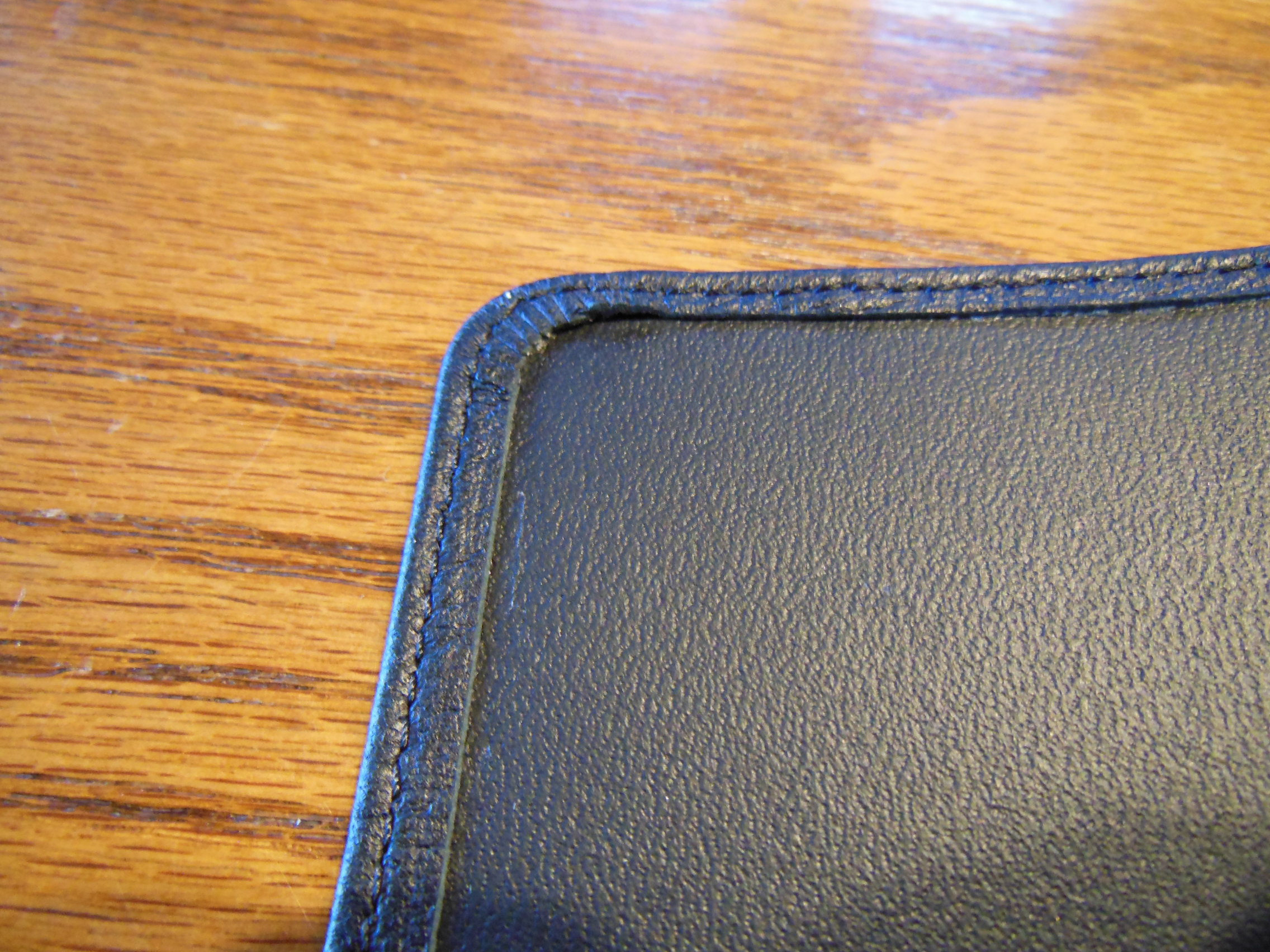
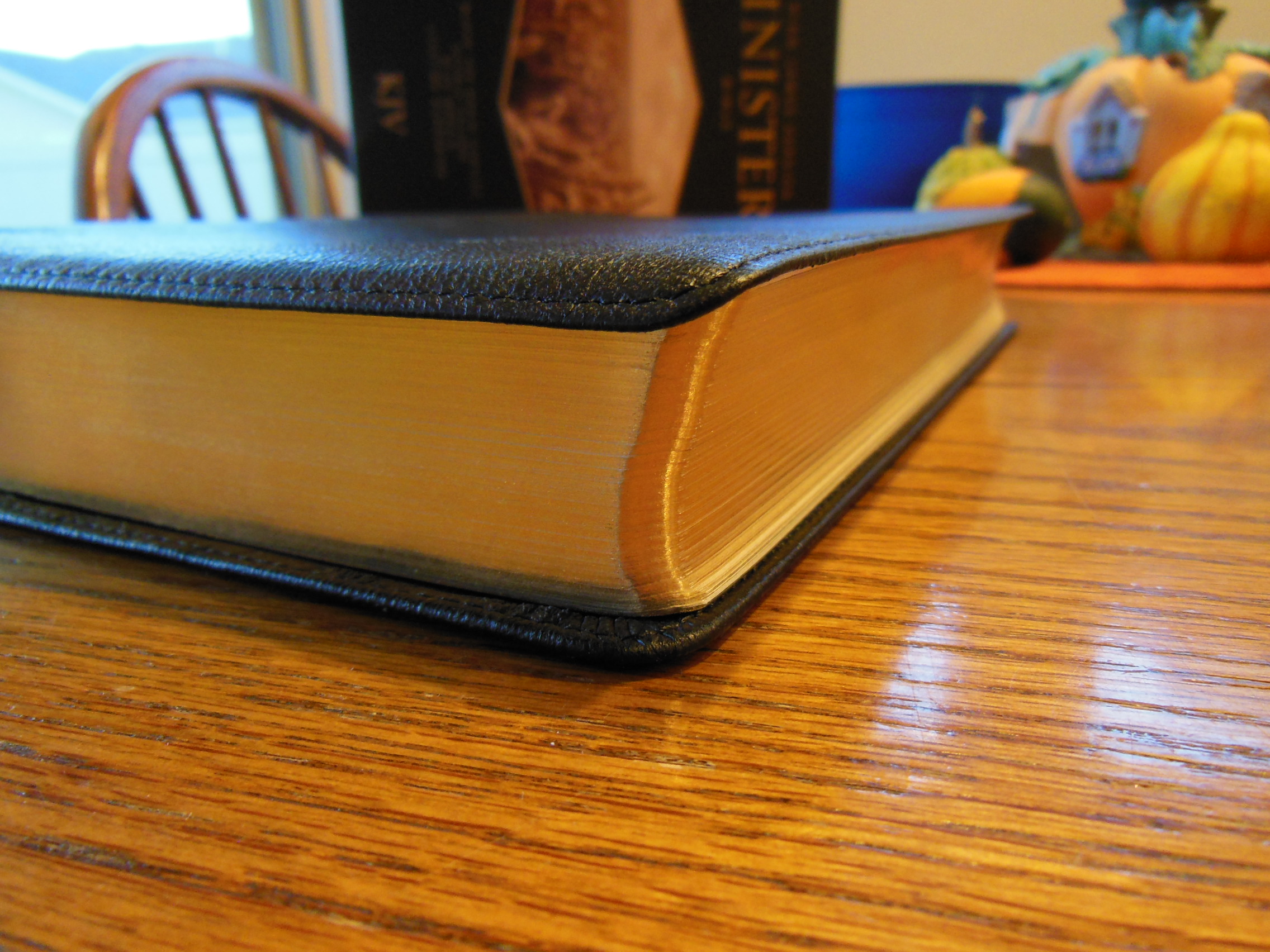
The next thing you’ll notice is the supple, perimeter stitched, edge lined, black goatskin leather cover.

Cambridge ESV Clarion and REB 048

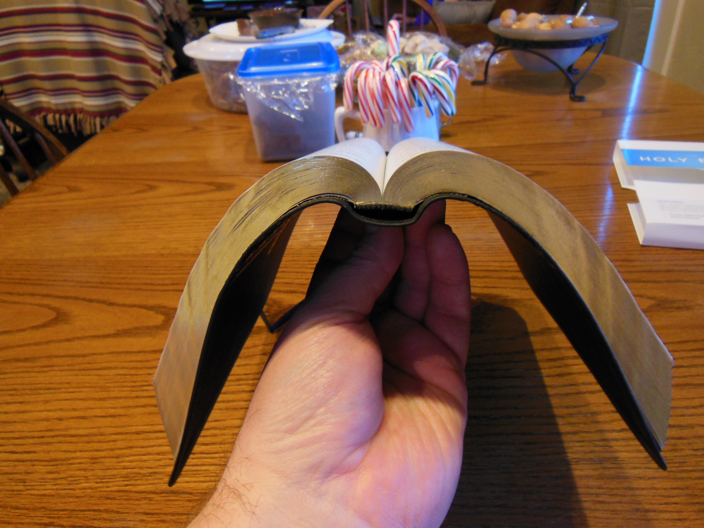
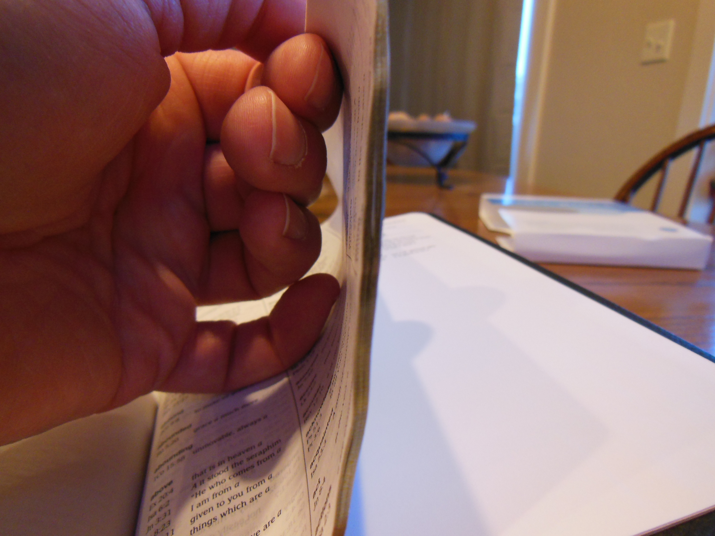
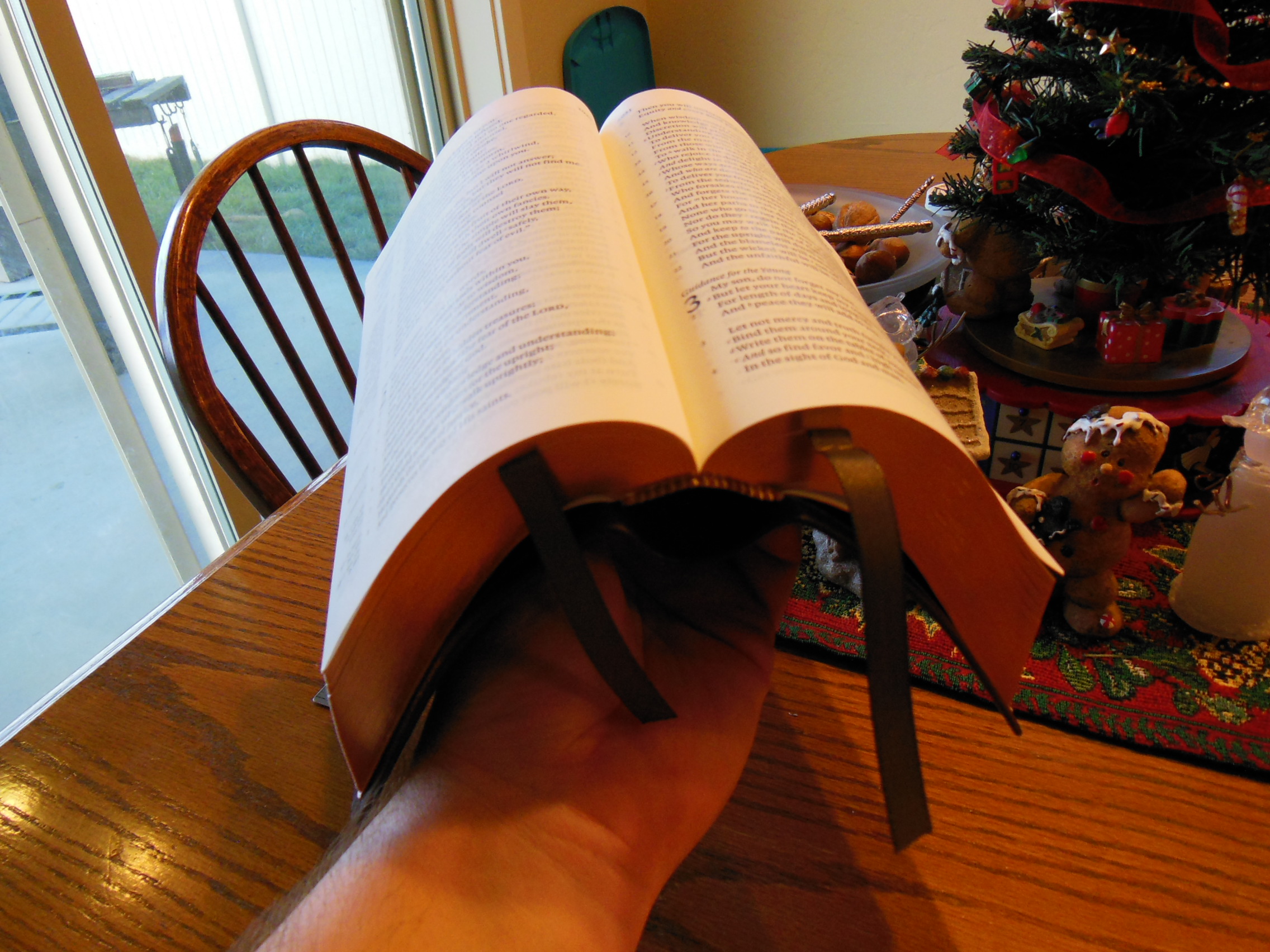
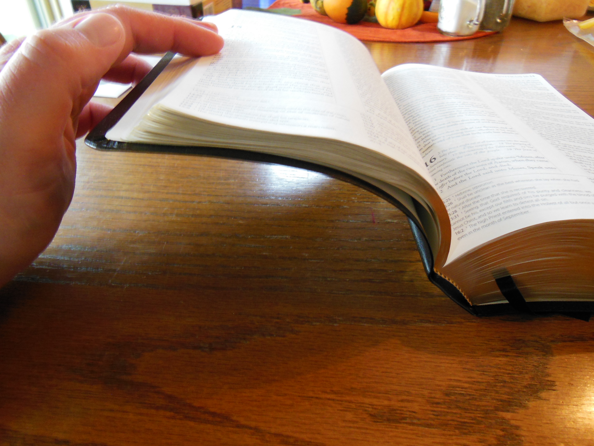
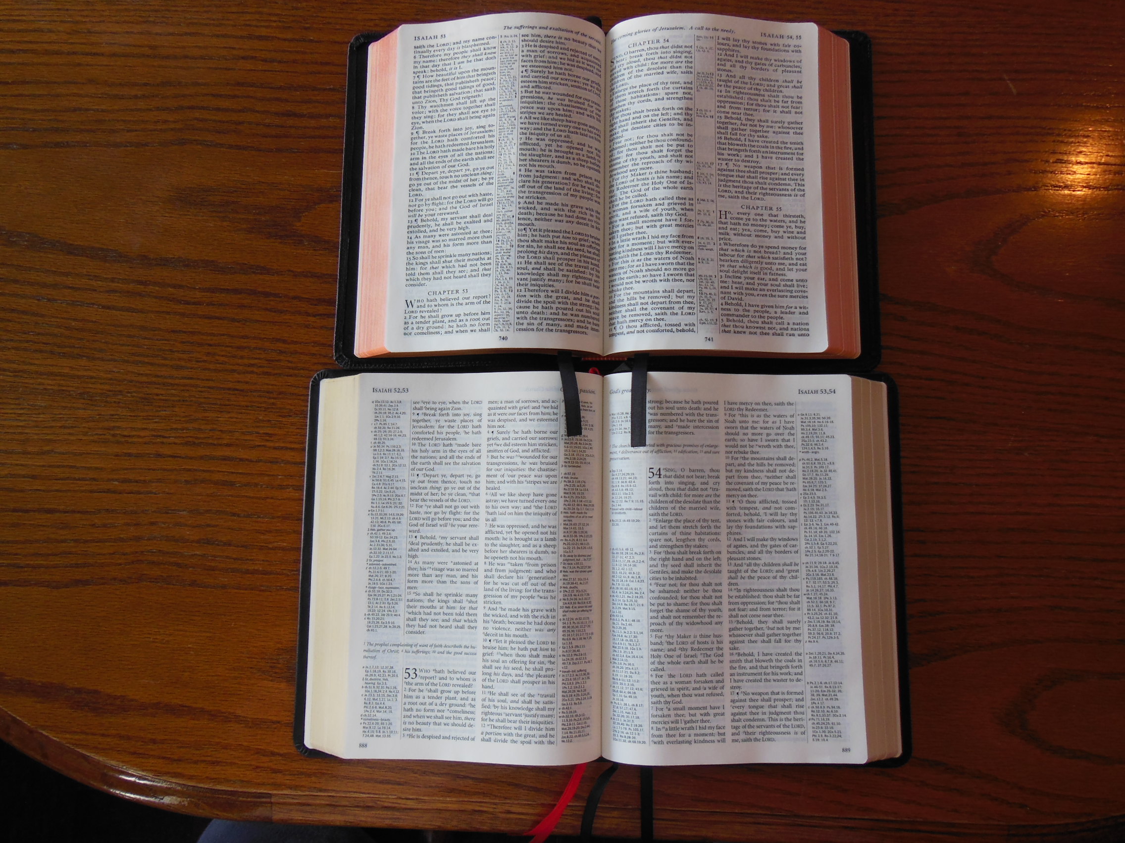
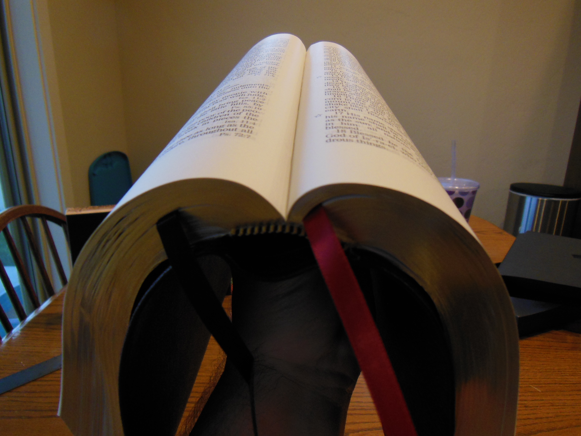
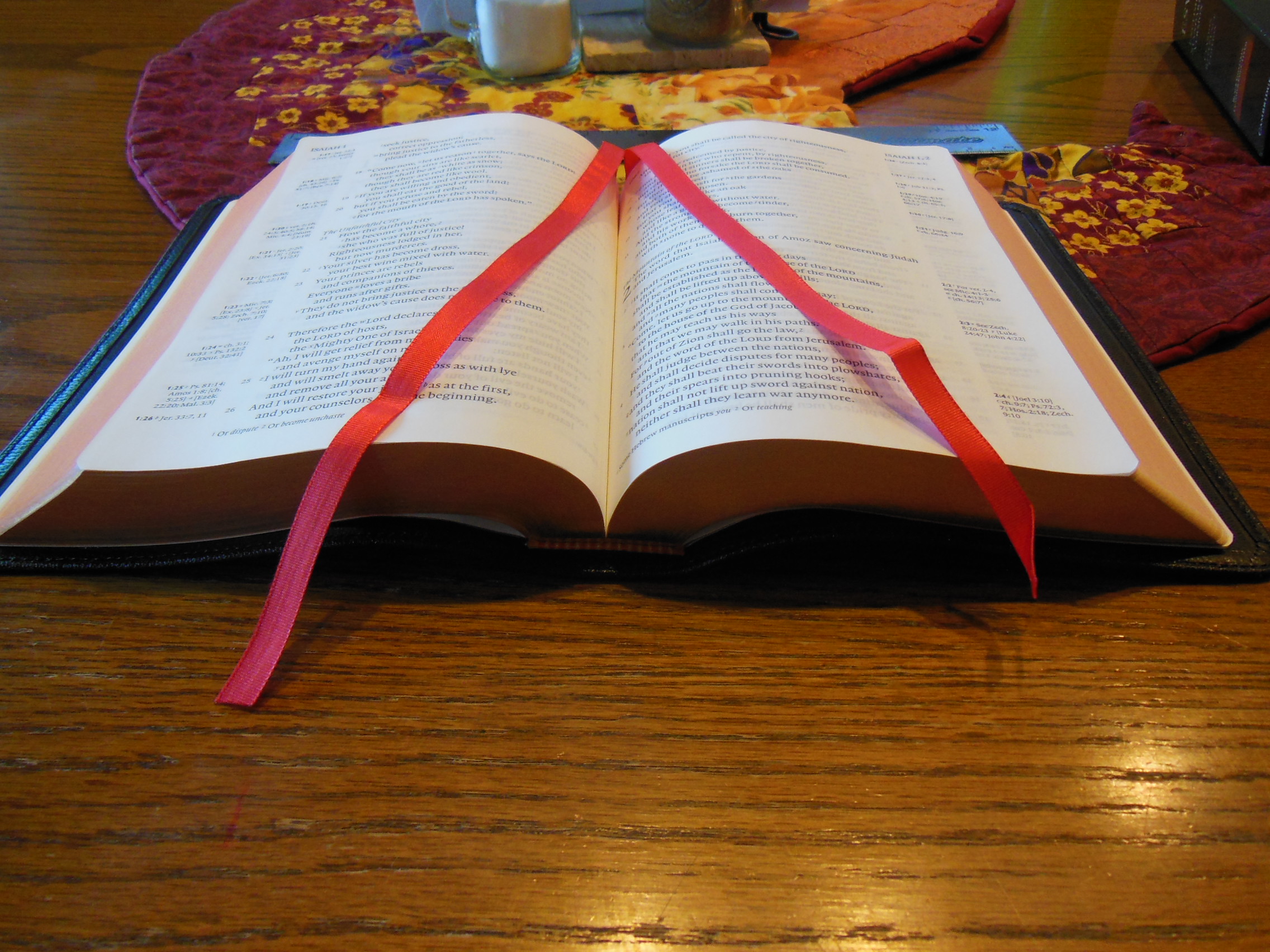
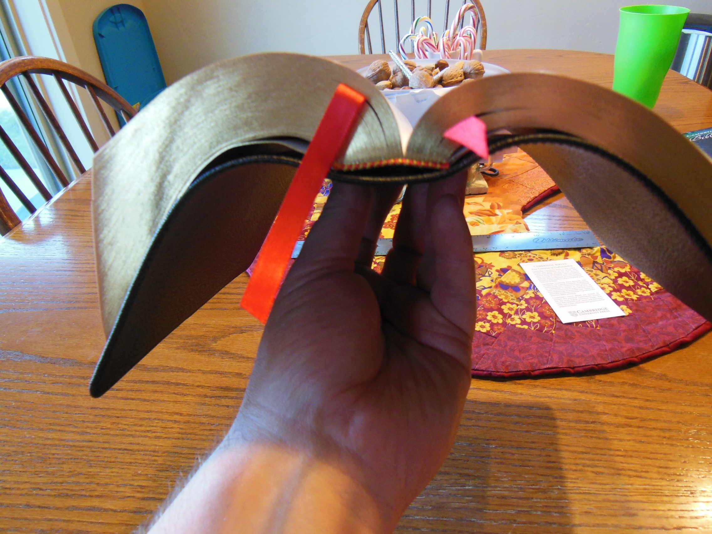
If you have never owned a Bible with a cover like this, you don’t know what you are missing.  For durability, functionality, and comfort, you can’t beat it.  The cover works in concert with the sewn binding and quality paper to allow this Bible to open well and lay flat on a table or desk.

Cambridge ESV Clarion and REB 070

It also lays flat while held in one hand.

Cambridge ESV Clarion and REB 087

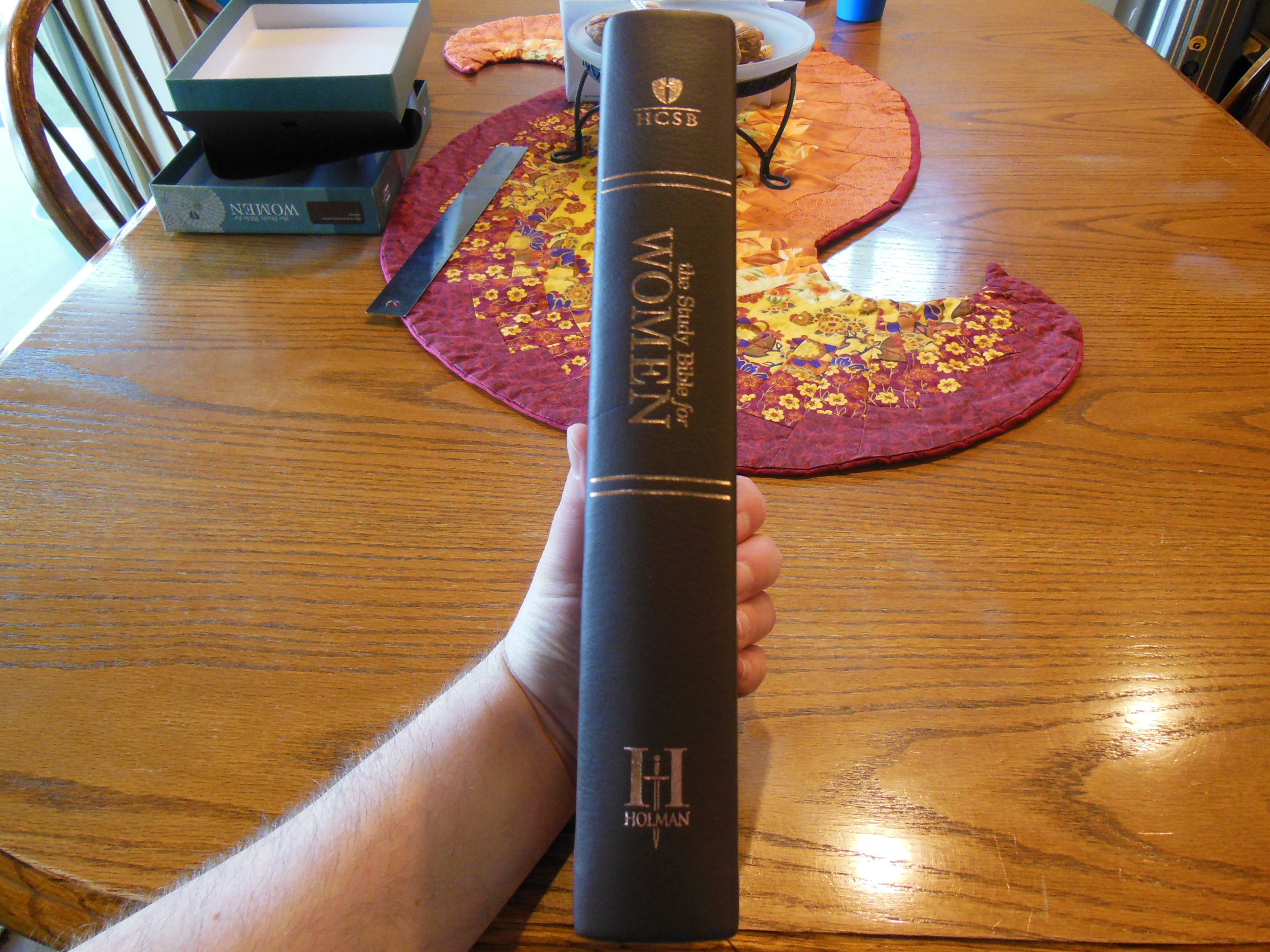
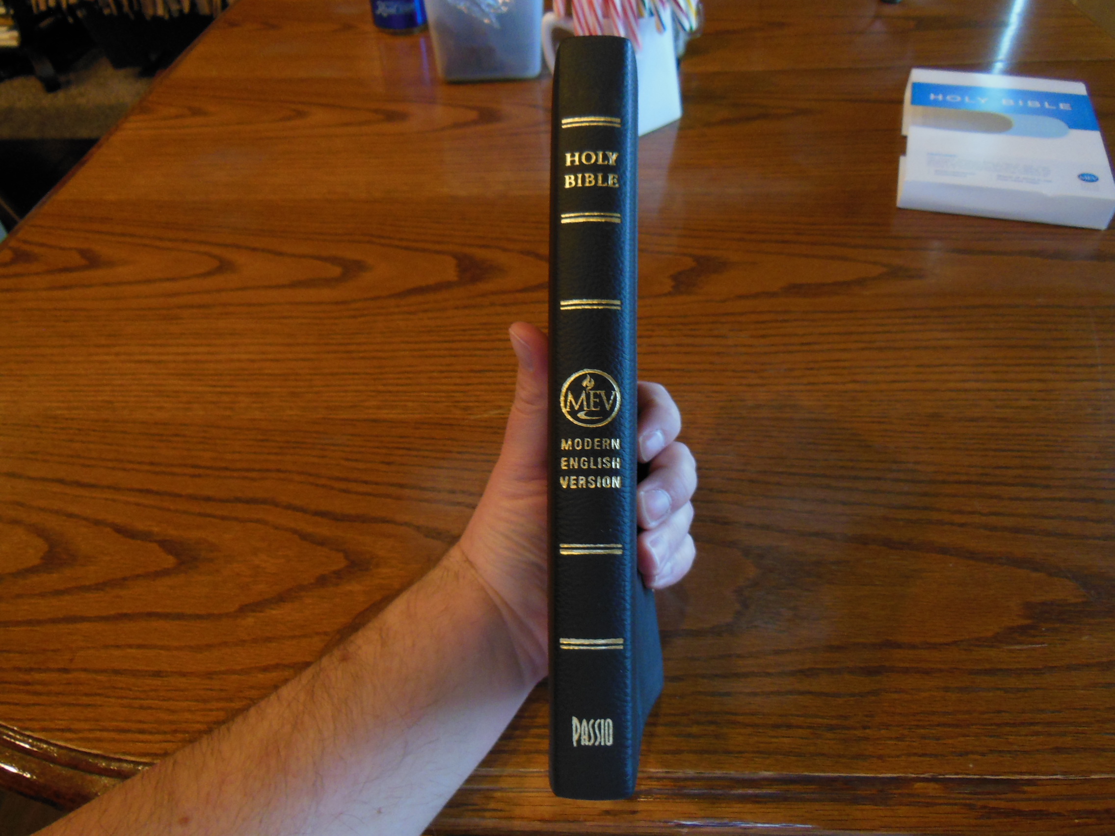
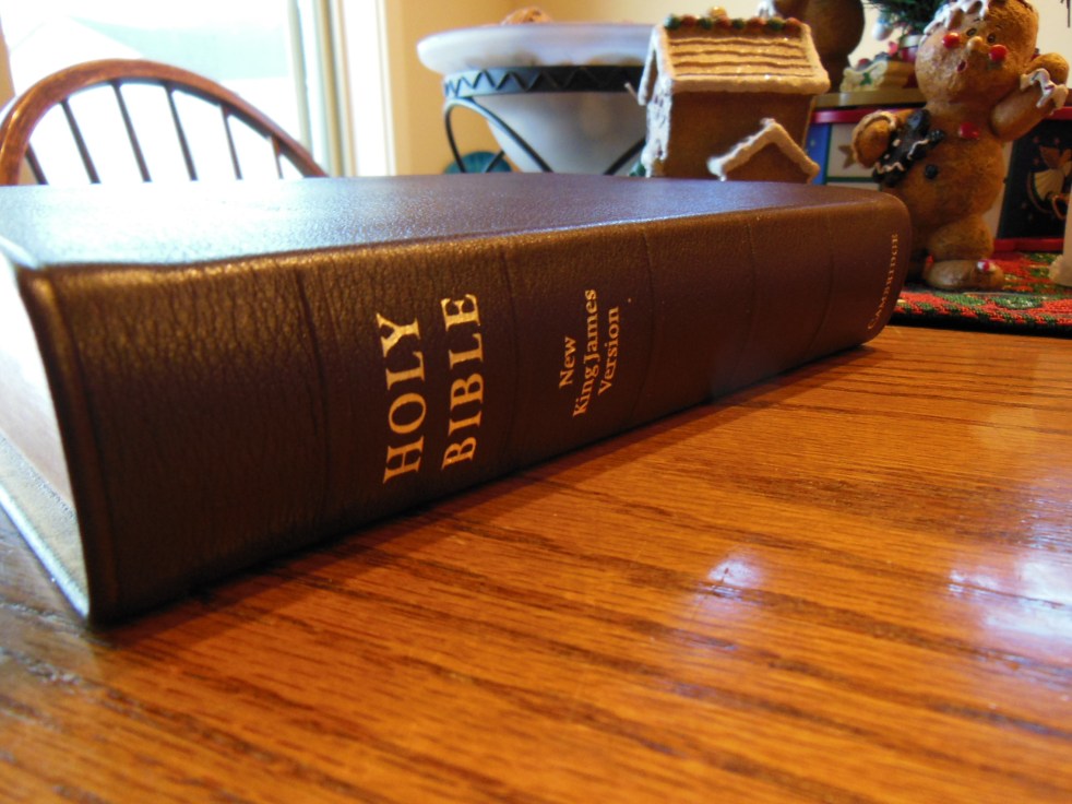
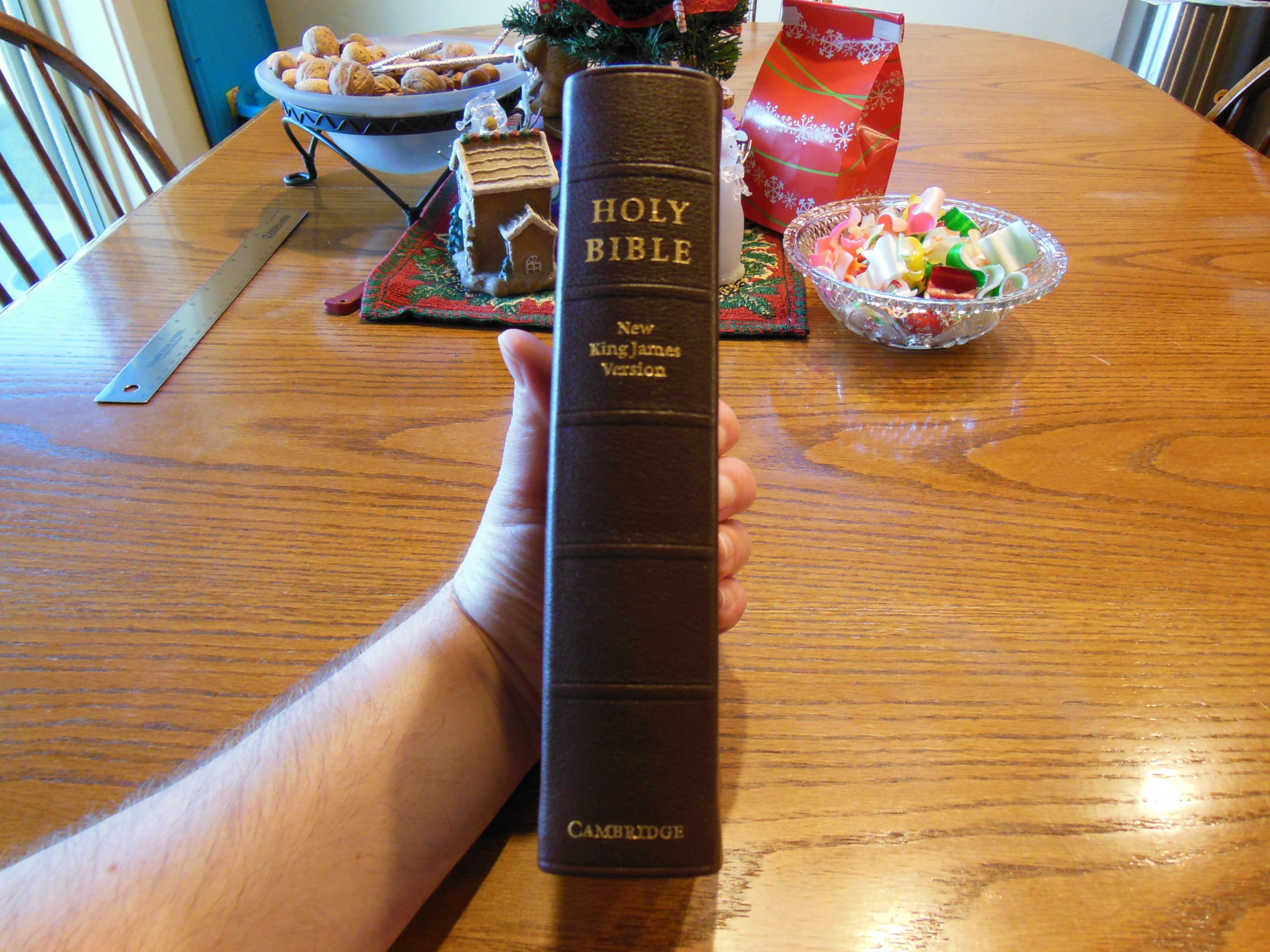
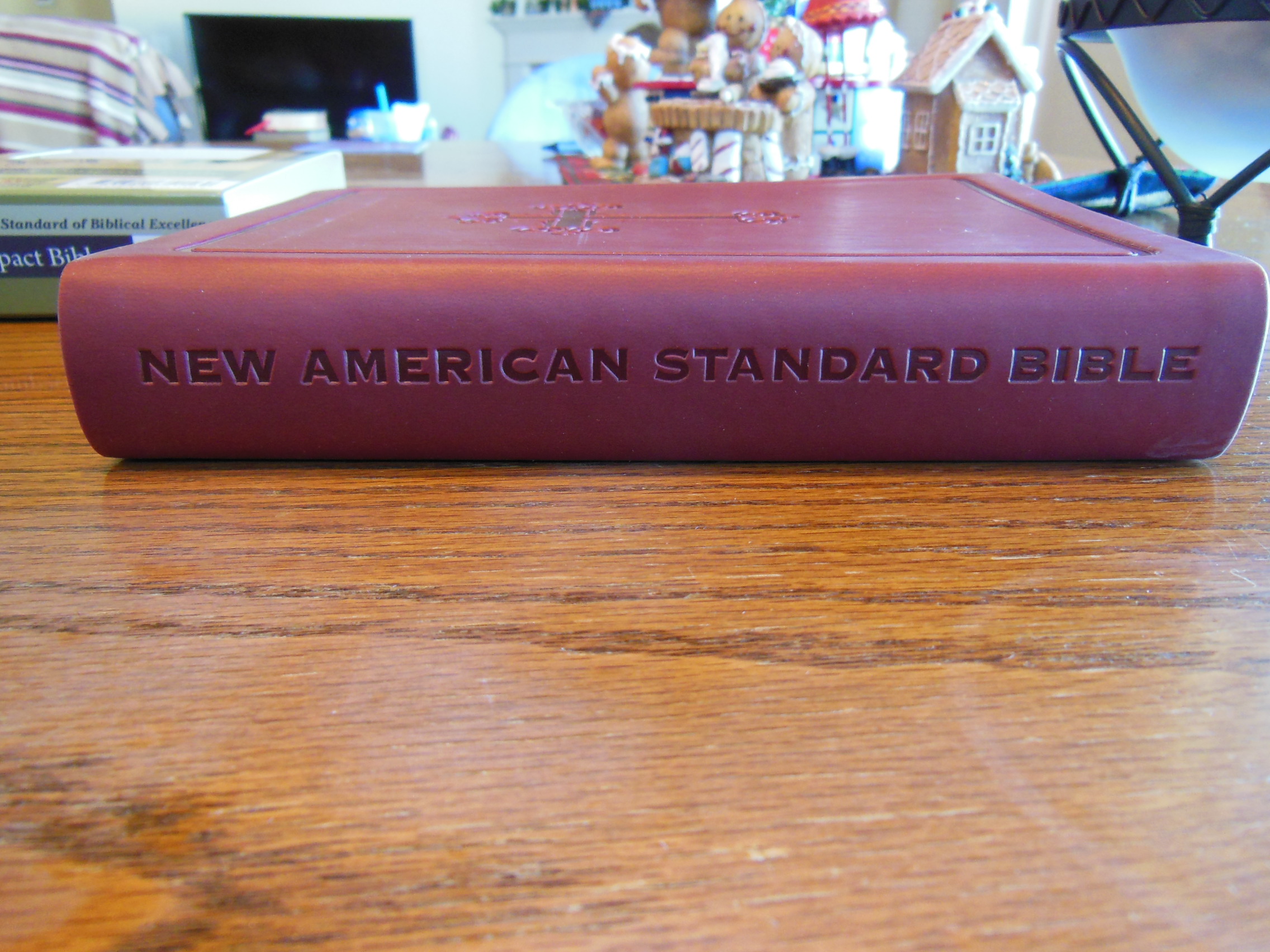
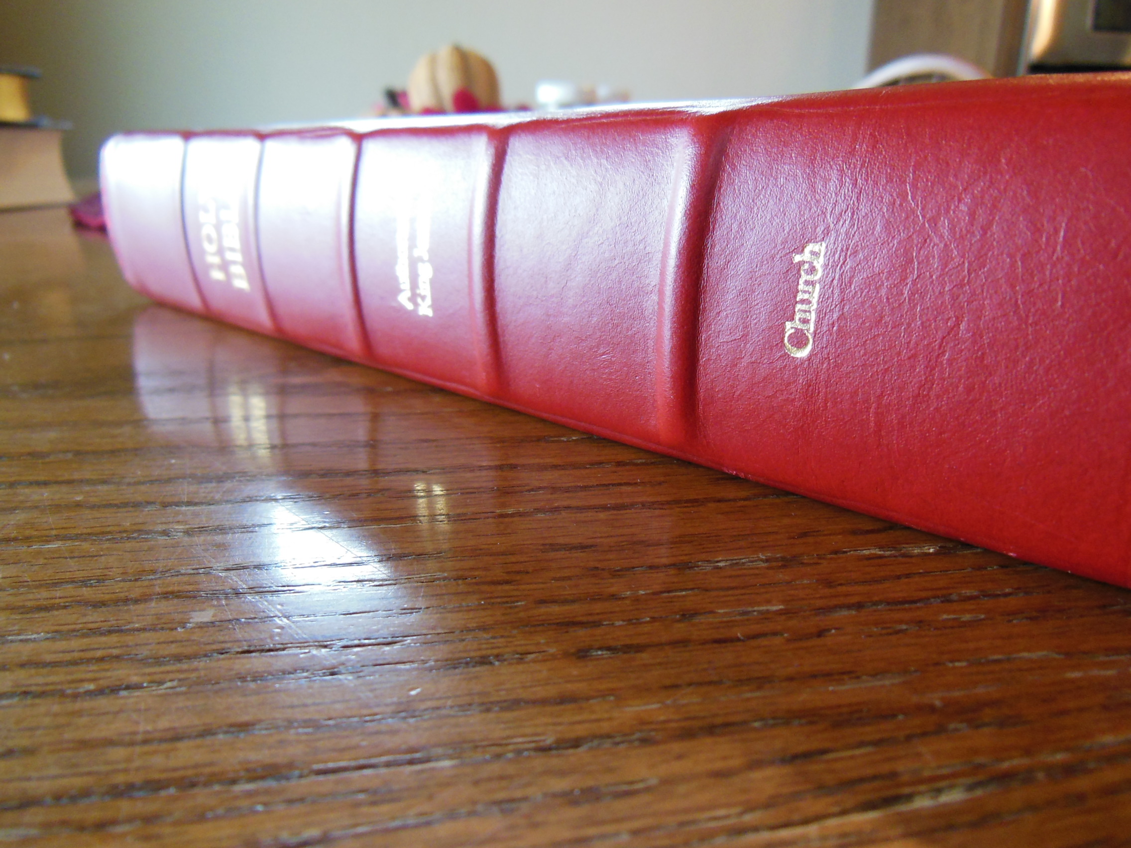
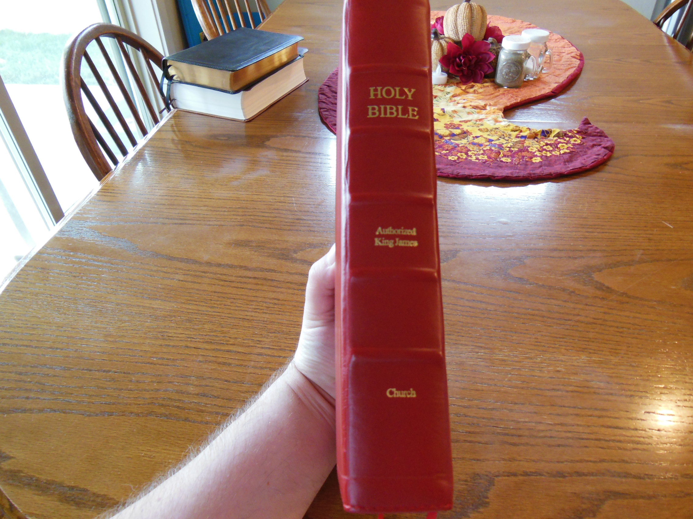
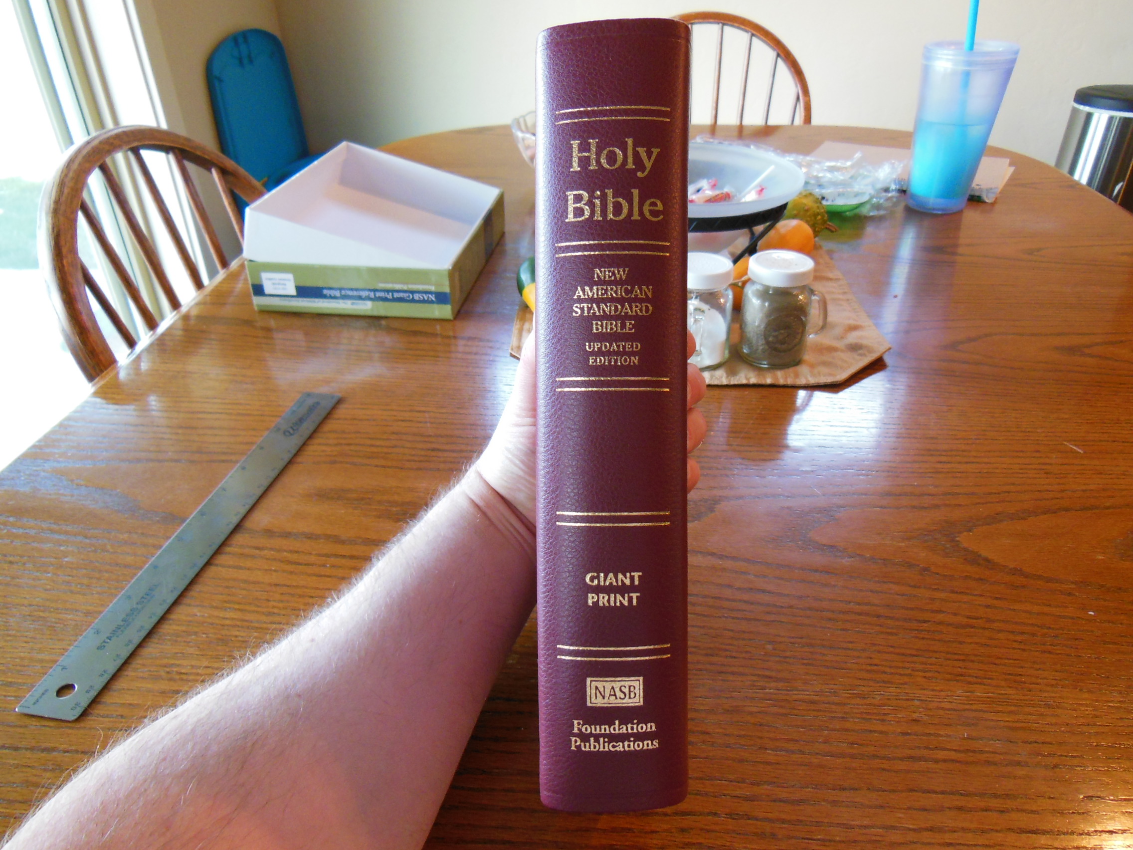
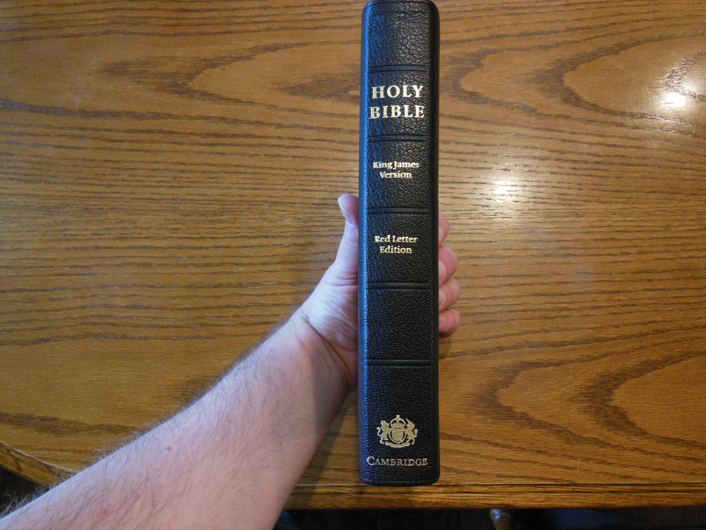
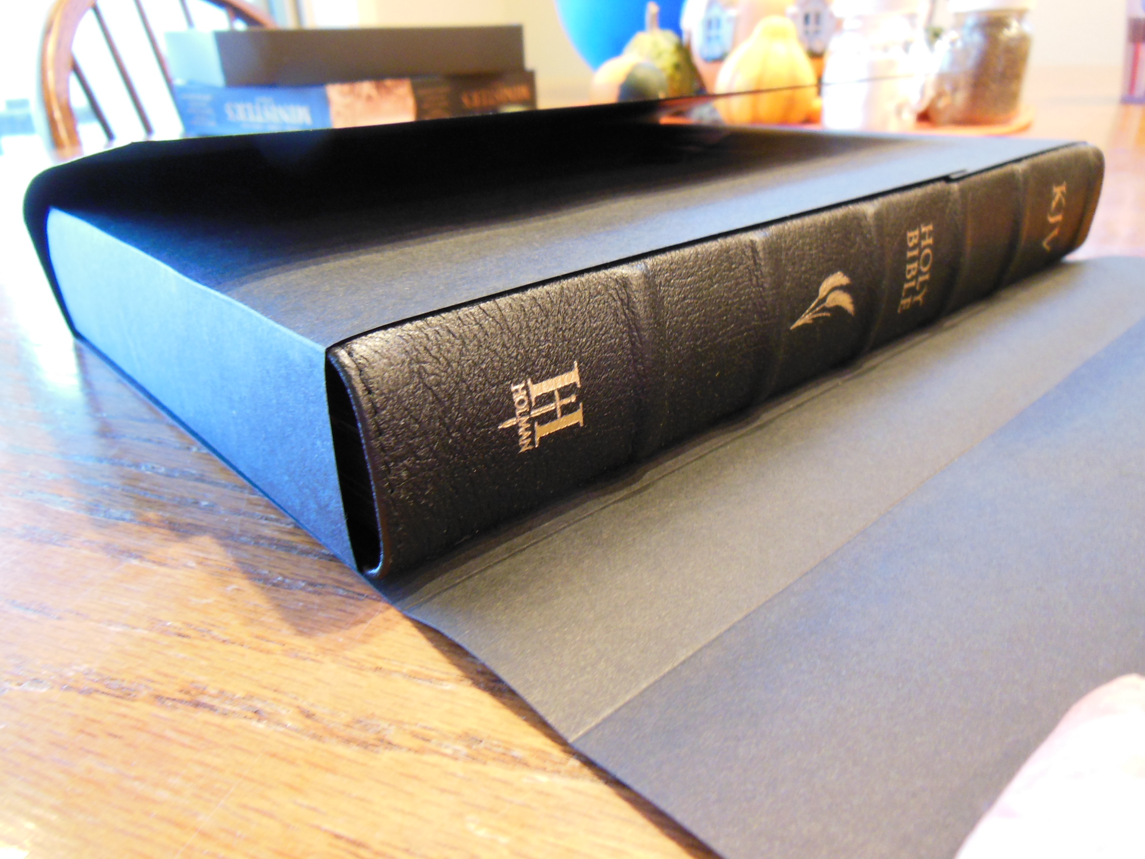
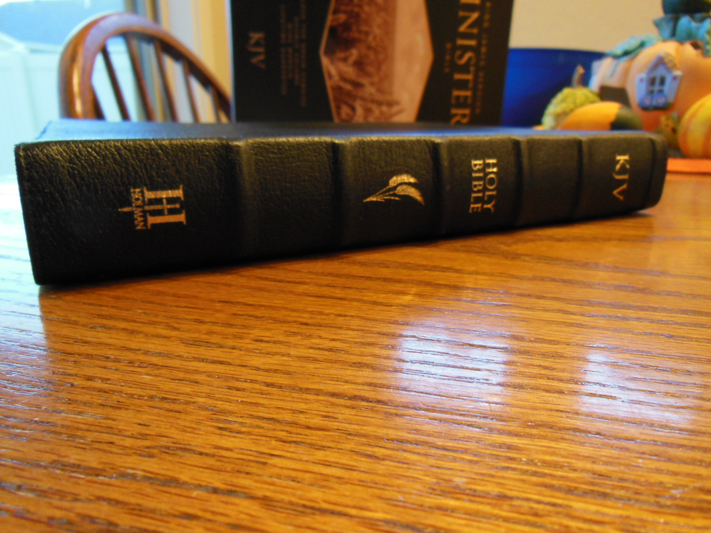
This makes it a joy to read.  I love that you forget you are holding something.  You aren’t constantly fighting the cover, the paper, or the binding.  The Spine of the Clarion has, “Holy Bible” at the top.  Under that is, “English Standard Version”.  On the bottom of the spine is, “Cambridge.”  They are all hot-stamped in gold.  There are five small decorative hubs as well.

Cambridge ESV Clarion and REB 094 Cambridge ESV Clarion and REB 047

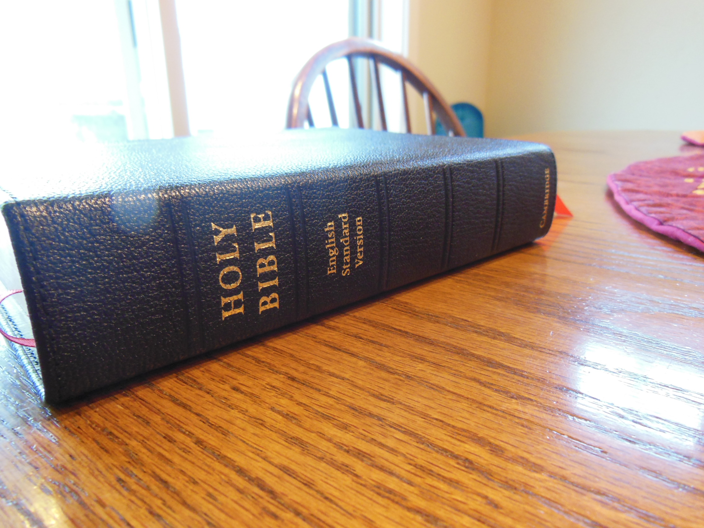
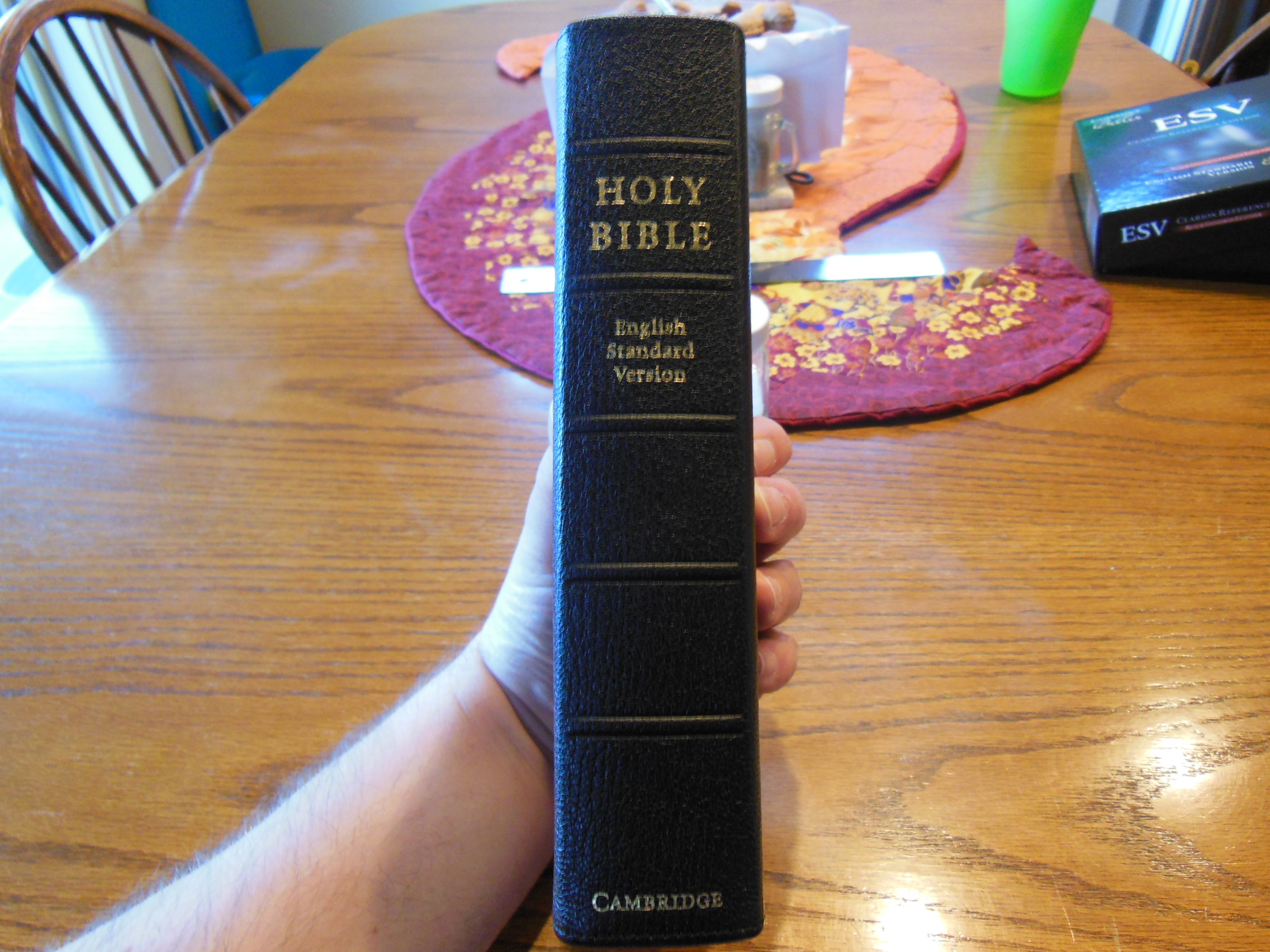
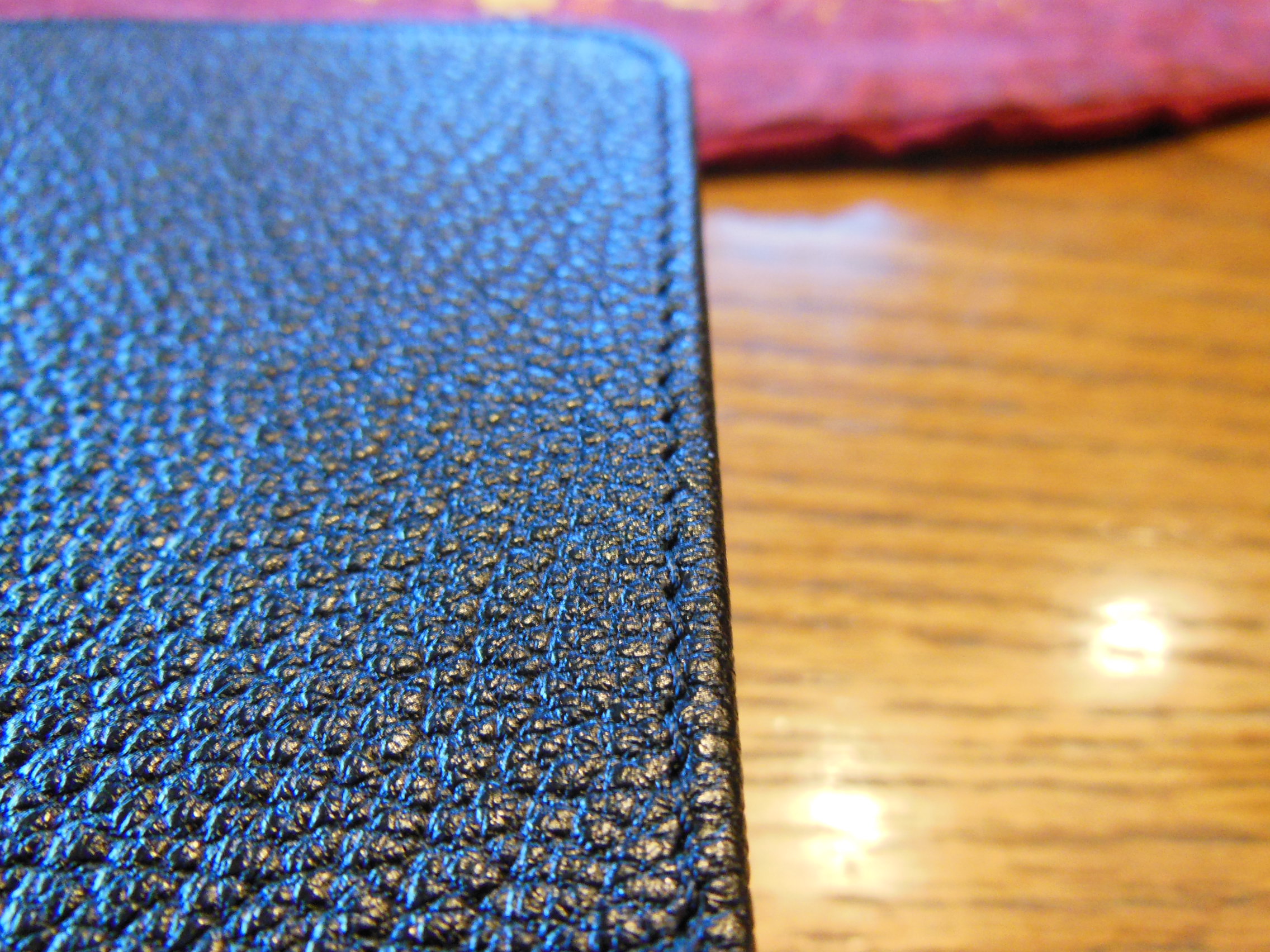
The grain of the goatskin cover is more pebbled than a top grain cowhide.  It is softer than the shiny genuine leather covers that are made from pigskin.  The perimeter stitching is uniform and well done.

Cambridge ESV Clarion and REB 051

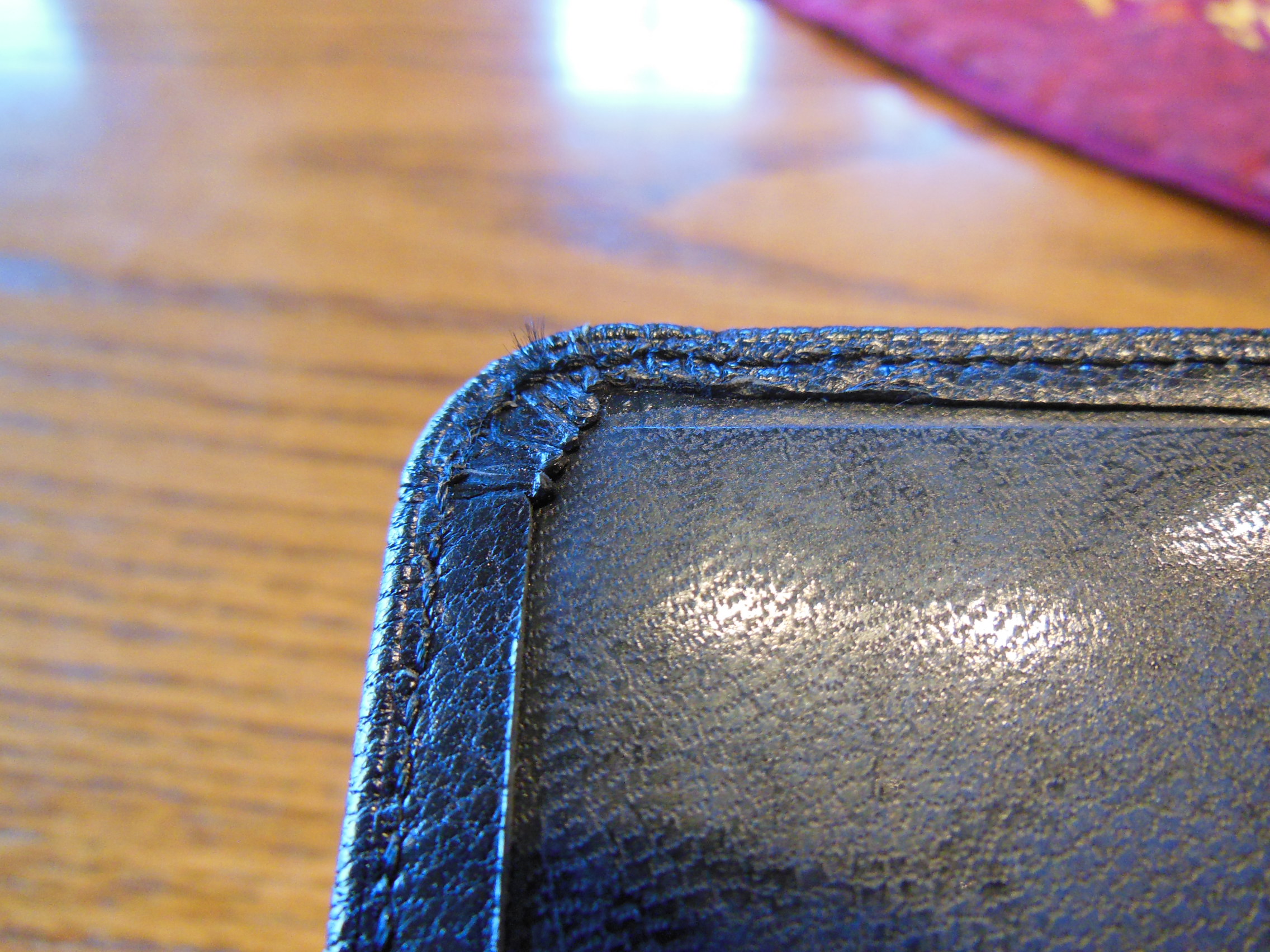
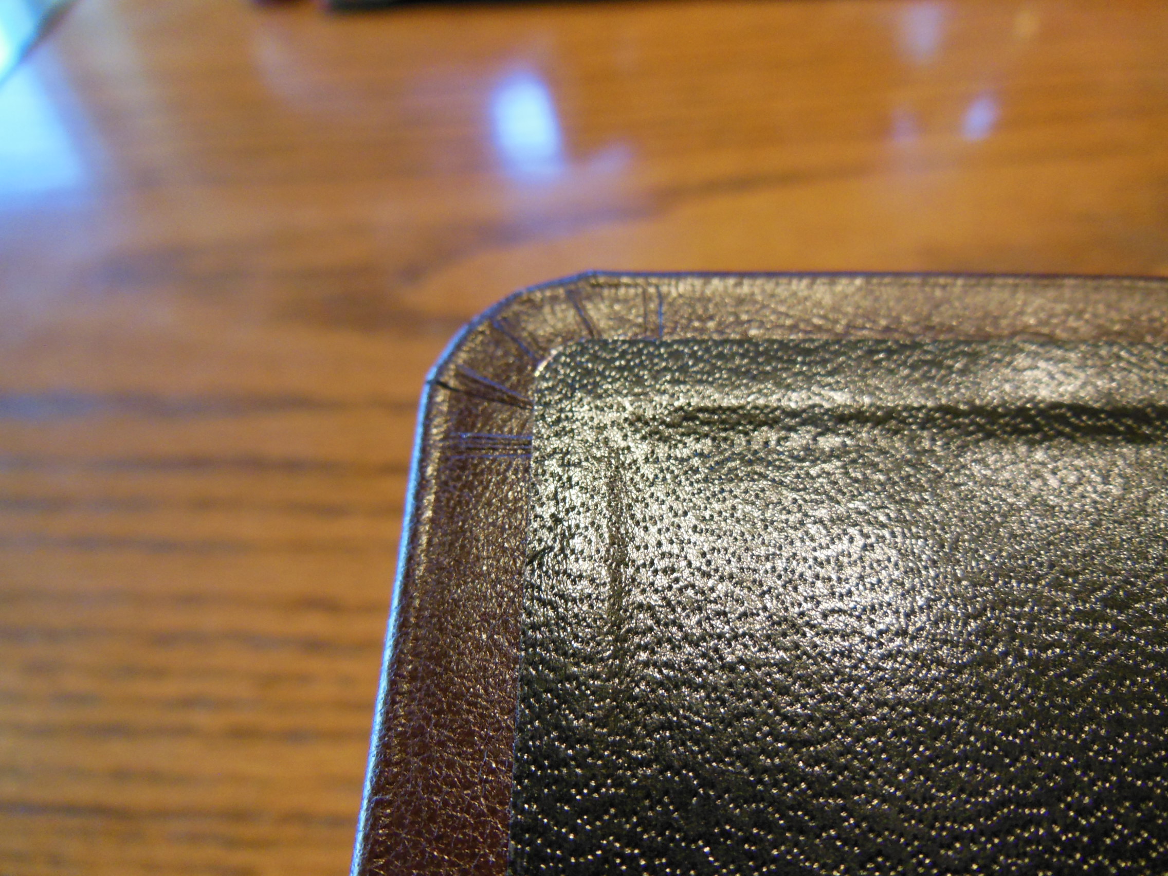
The corners are stitched as well so you won’t see the typical corner treatment.

When you open the Bible, you’ll see the end papers are glued to cover and text block so that they will be more durable.

Cambridge ESV Clarion and REB 054

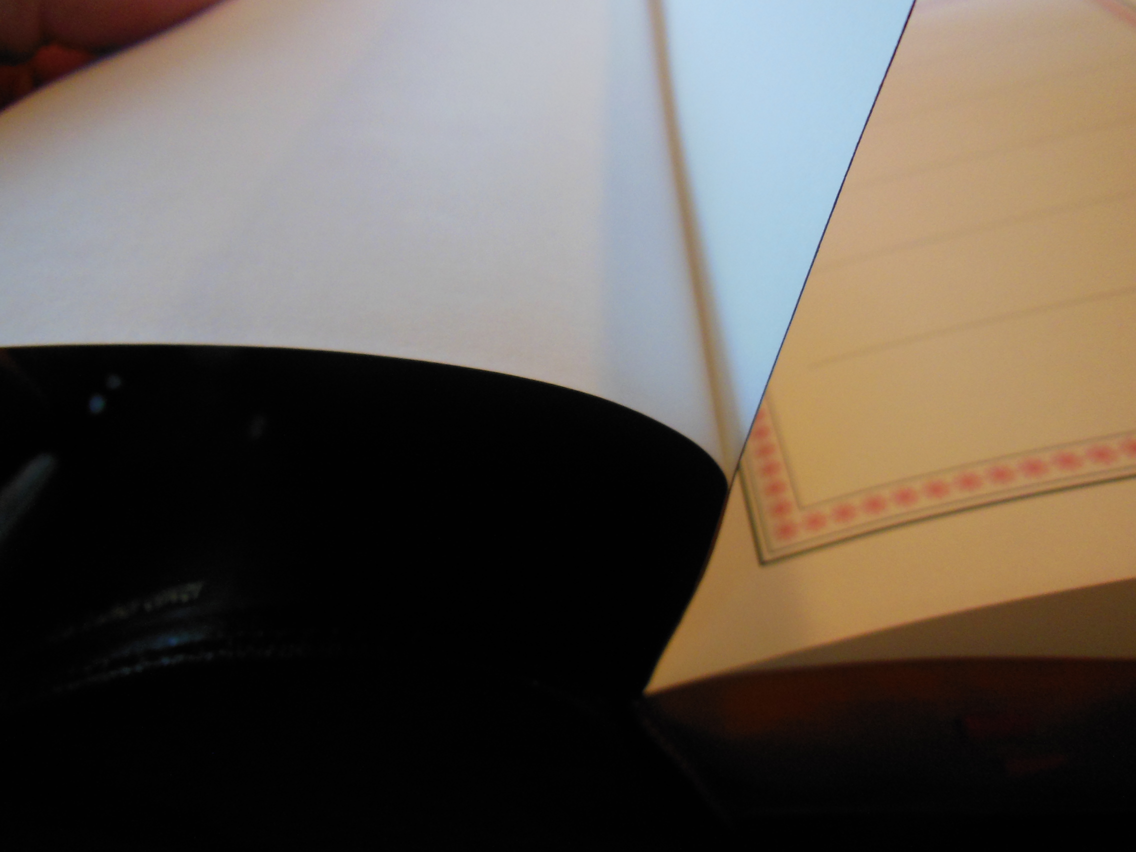
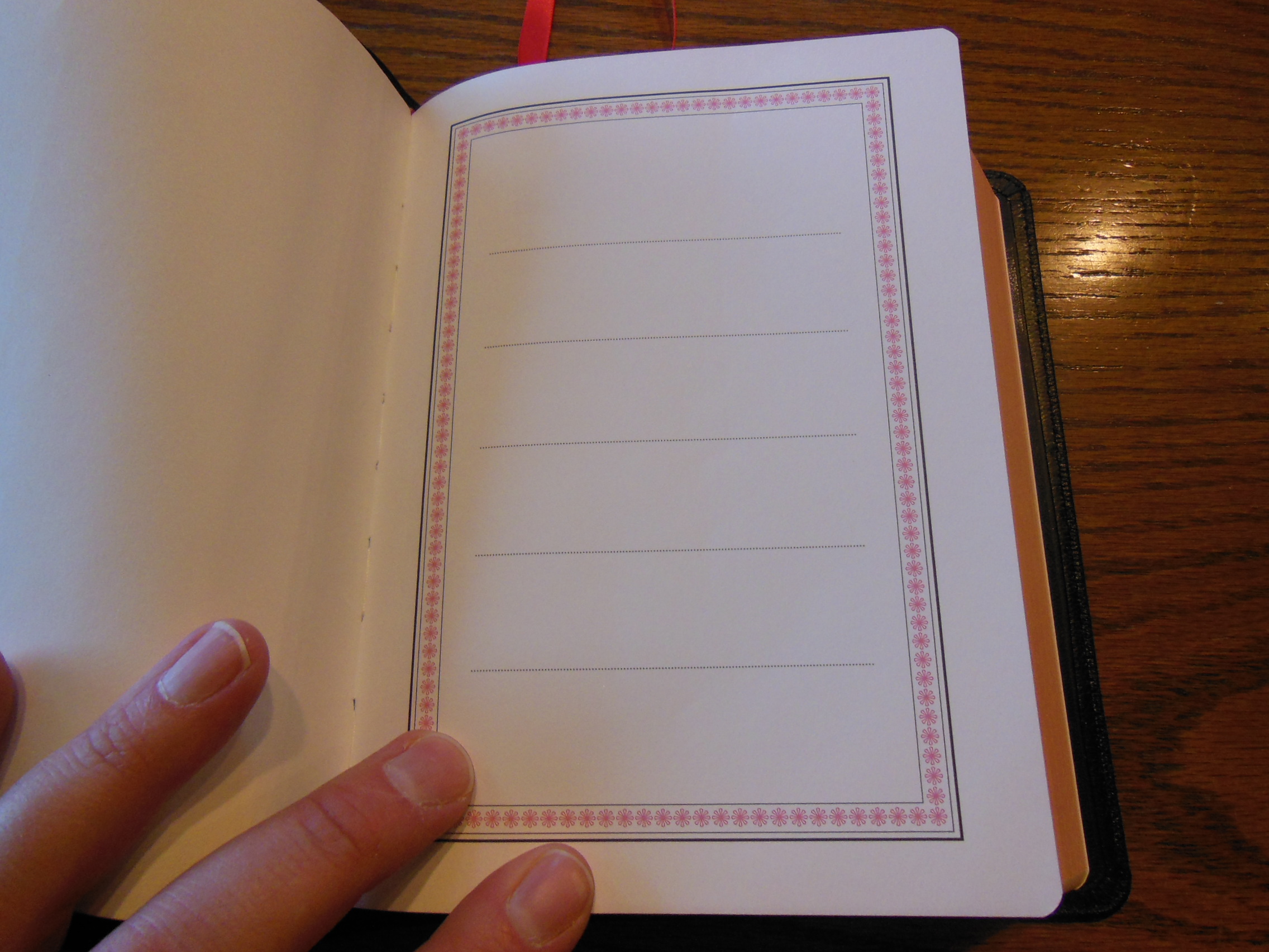
There is a simple presentation page that is made of heavier card paper.  It has several blank lines on it.

Cambridge ESV Clarion and REB 057

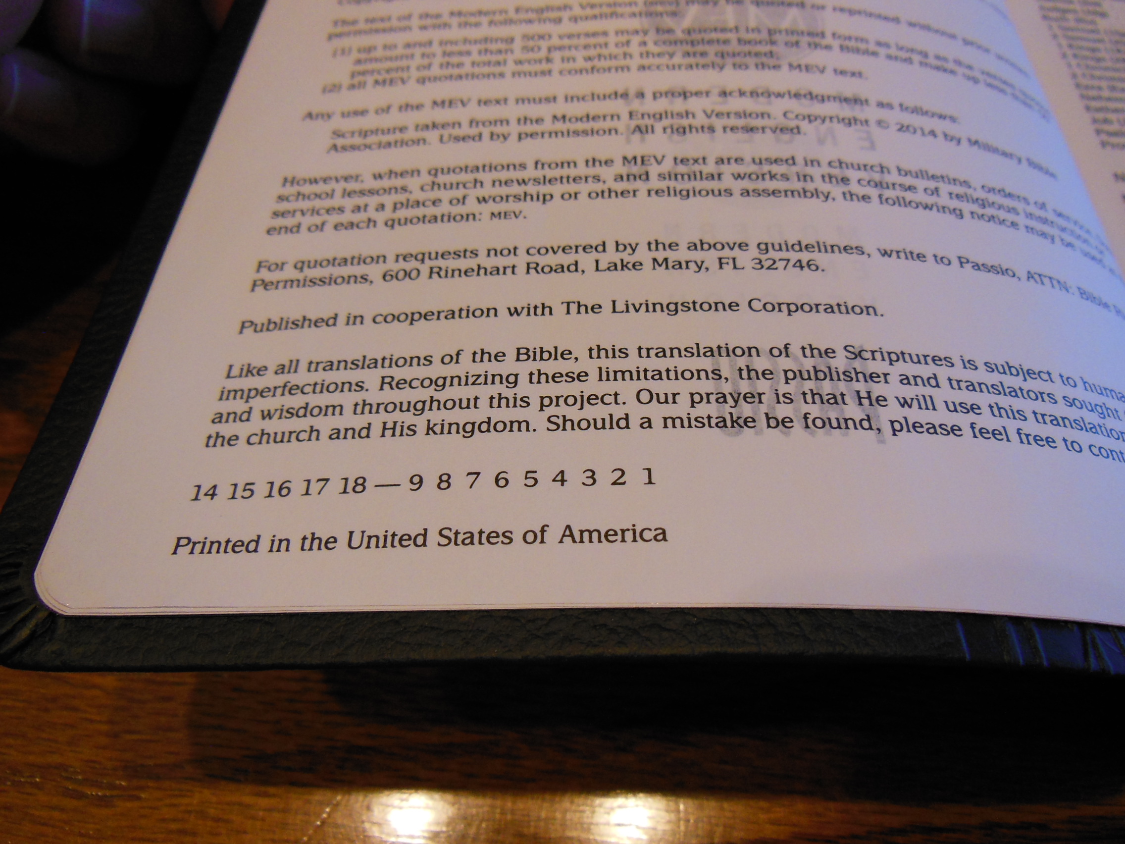
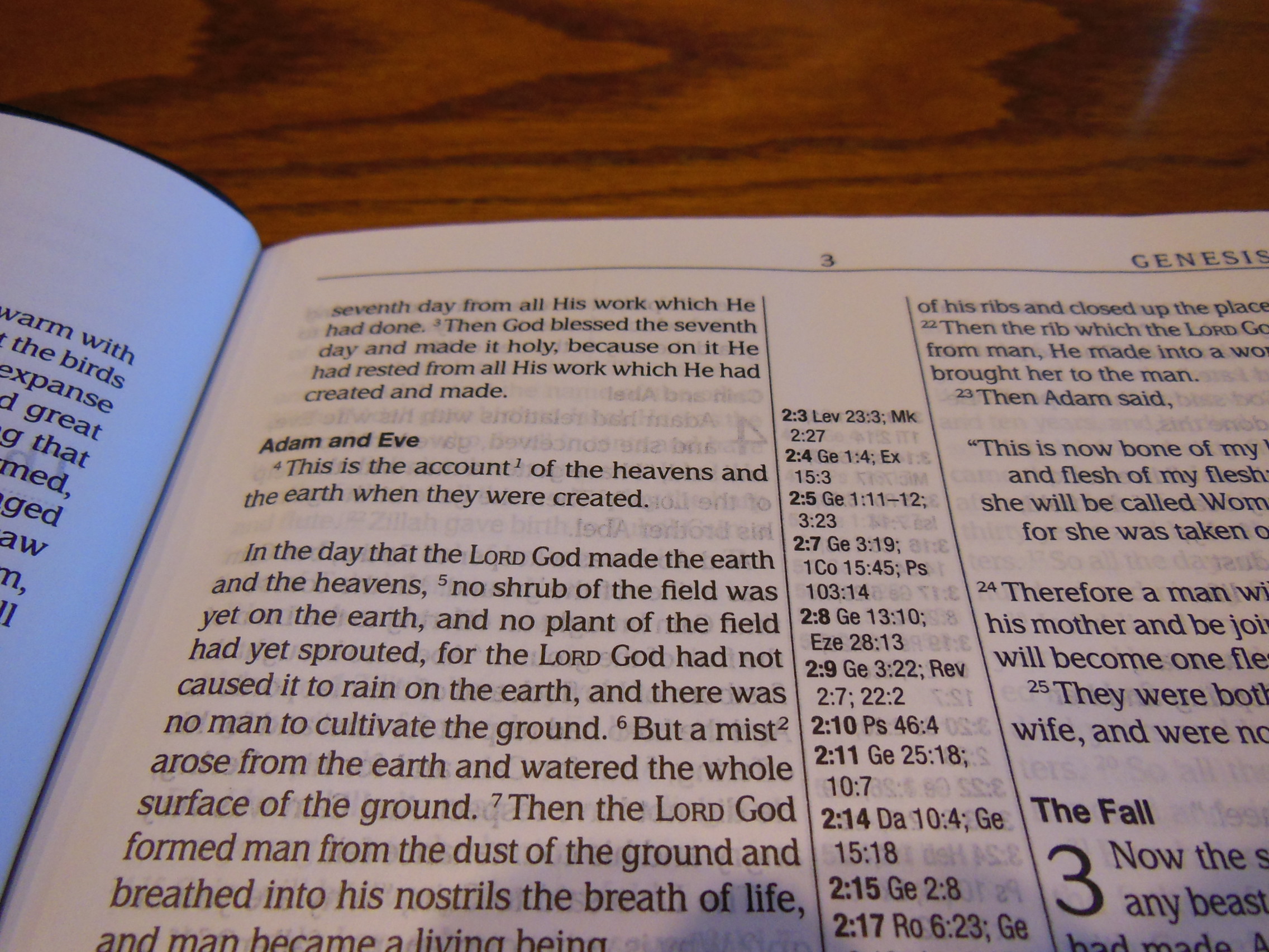
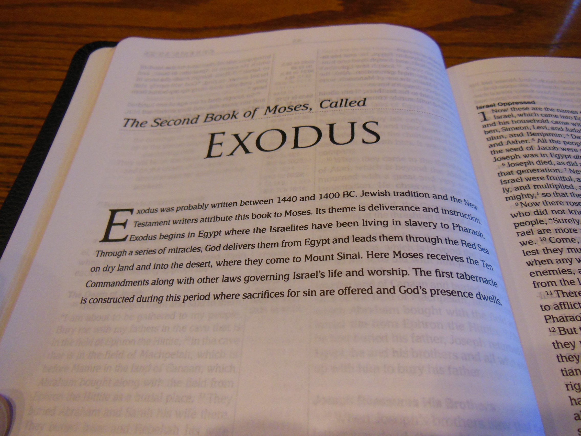
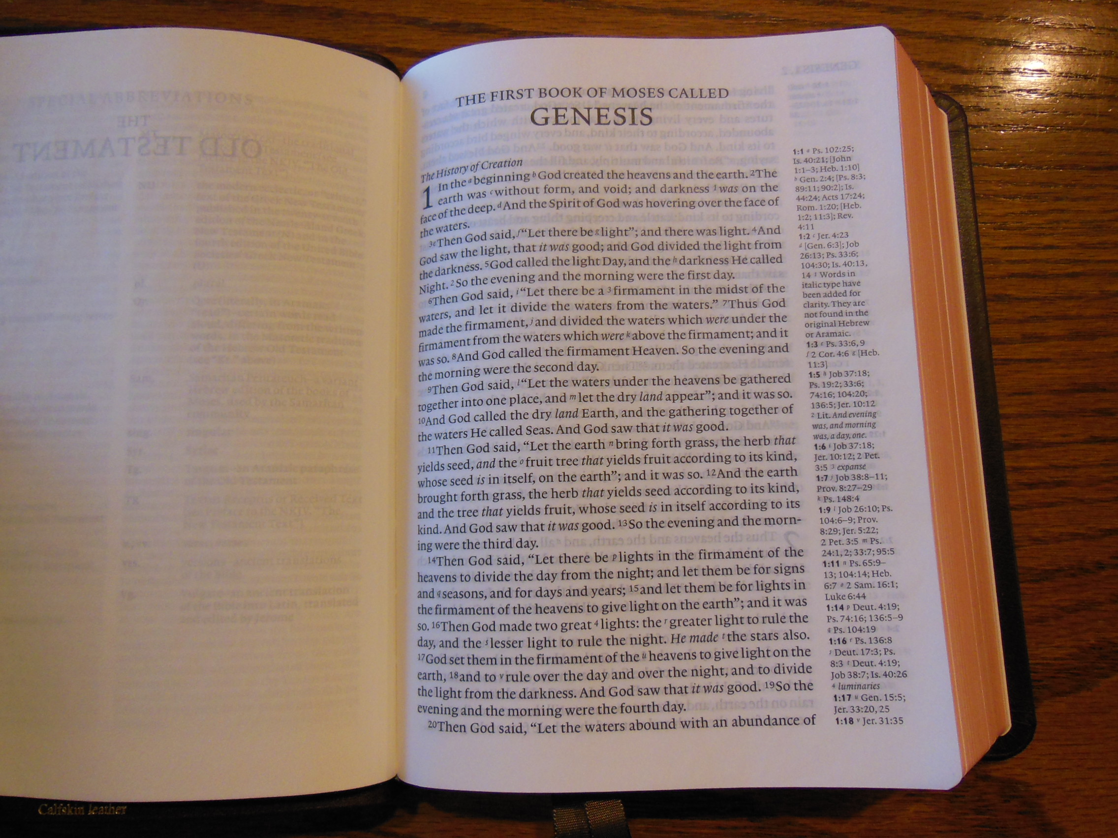
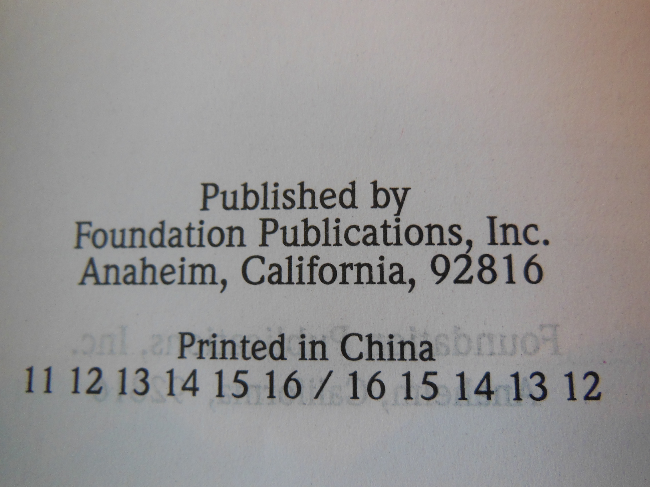
Then there is a Title Page. After that is the copyright page with the font size and type.  It list the font as 8.75/10.5 pt. Lexicon No. 1 A (Enschede ff) We also can see from this page that this Bible is printed by Jongbloed in the Netherlands.

Cambridge ESV Clarion and REB 060

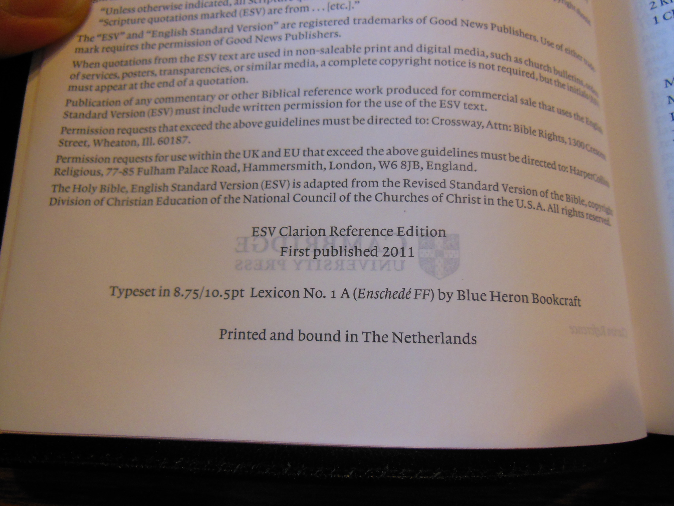
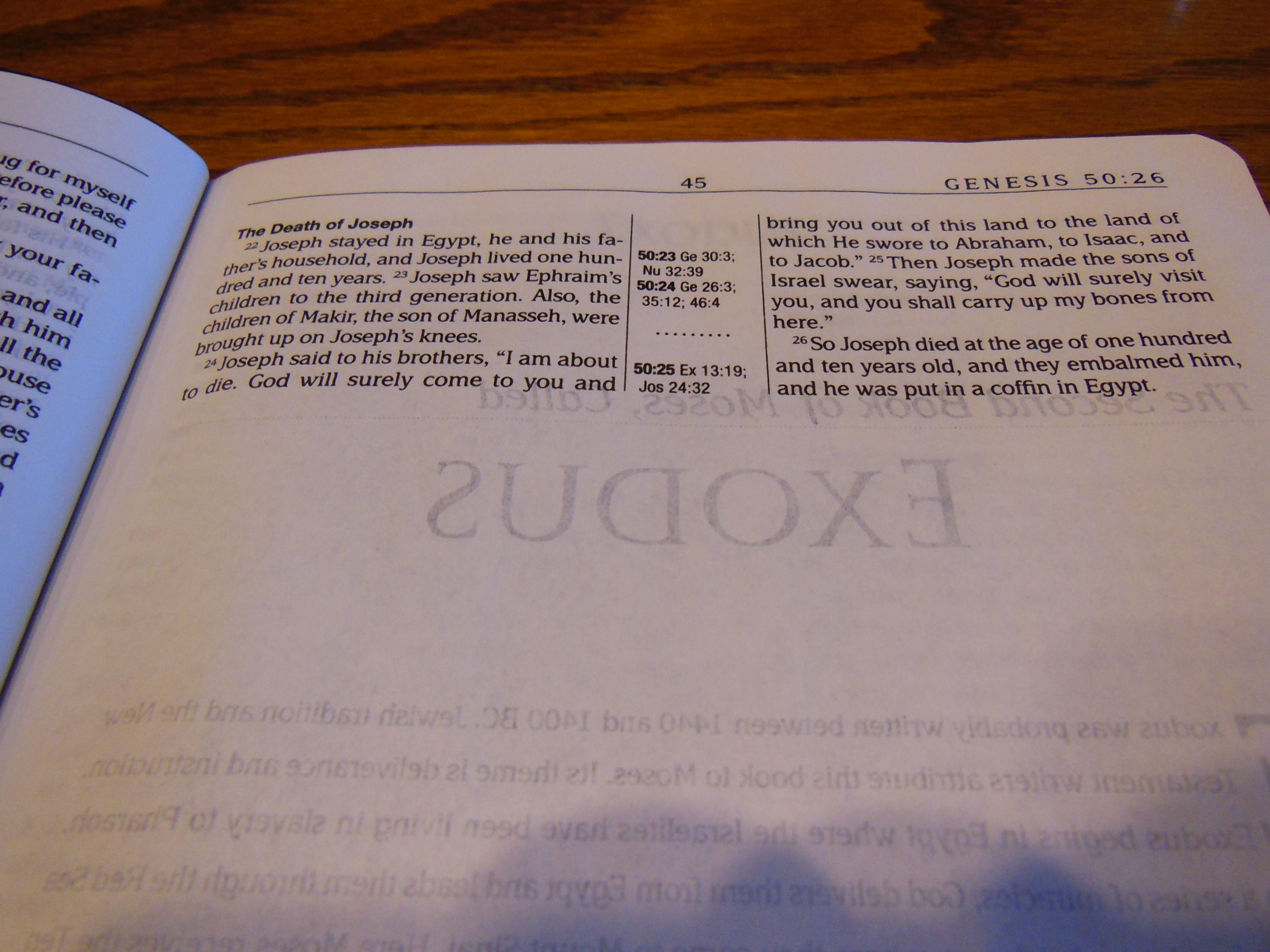
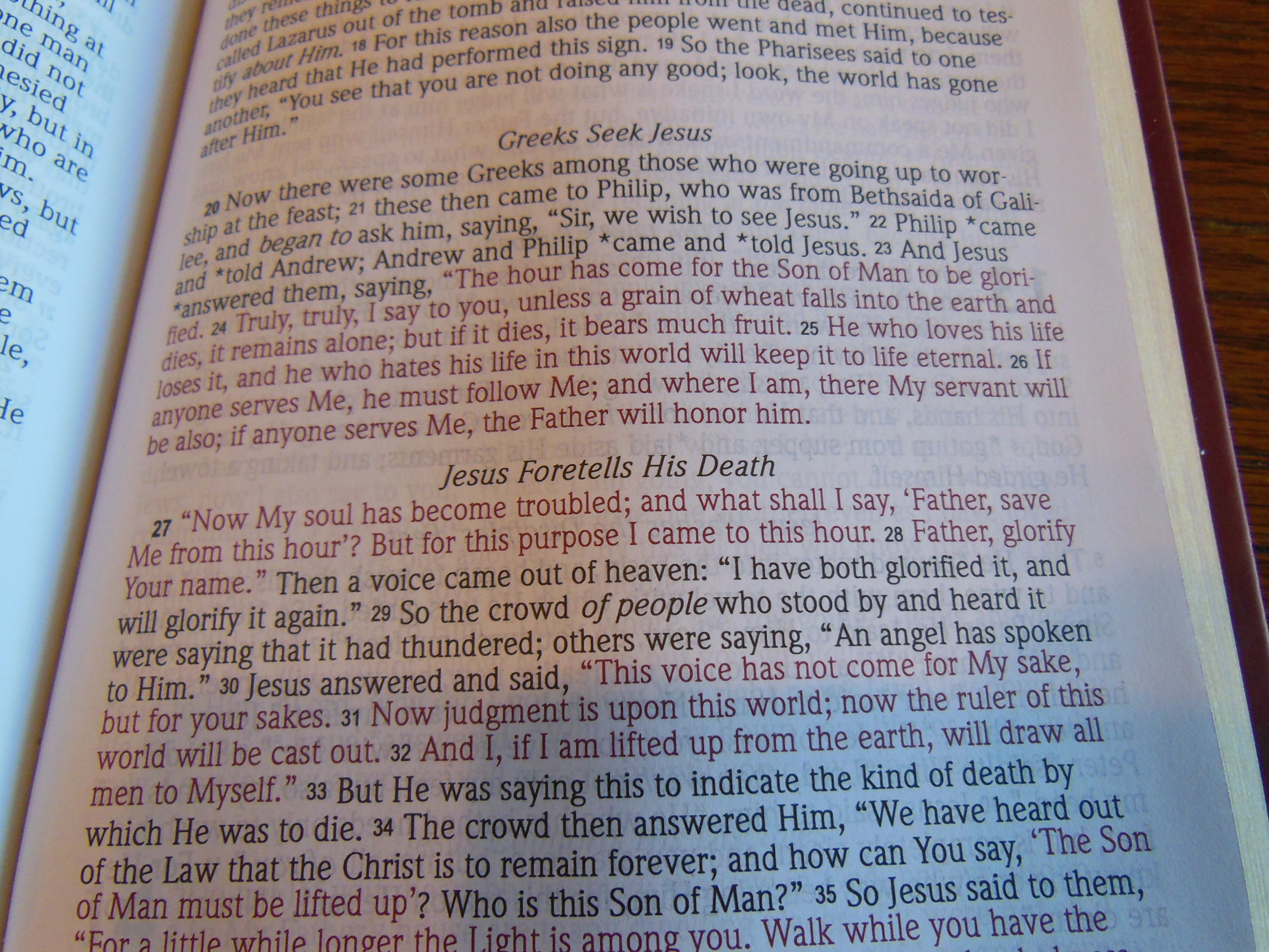
For those of you in the know, that is a big plus.  They have been doing great work for many years.  One truly great feature of this Bible is the line matching utilized by Jongbloed.  The lines of text are printed exactly opposite of the lines on the other side of the page so that the text isn’t distractingly visible through the paper.

Cambridge ESV Clarion and REB 068

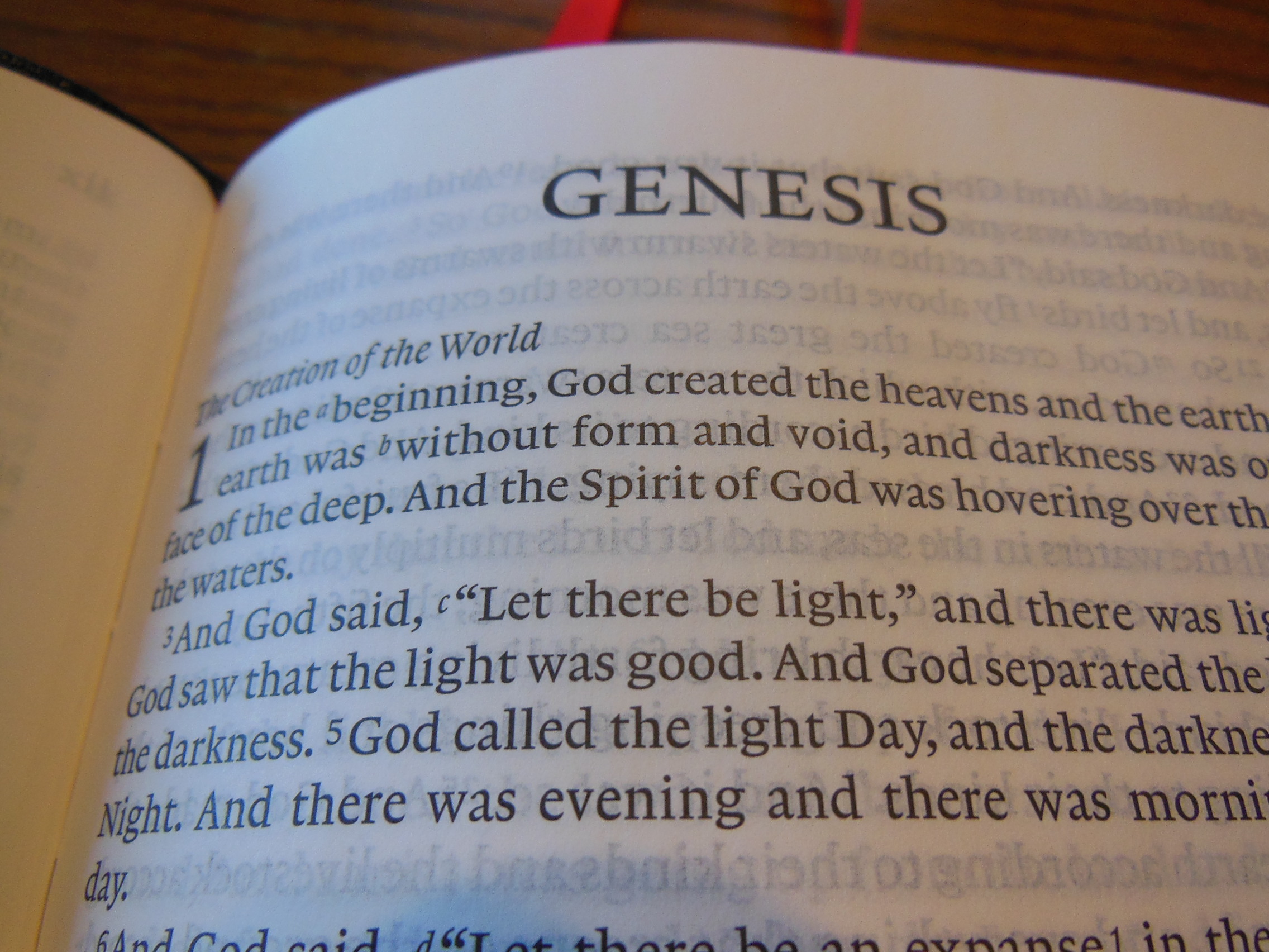
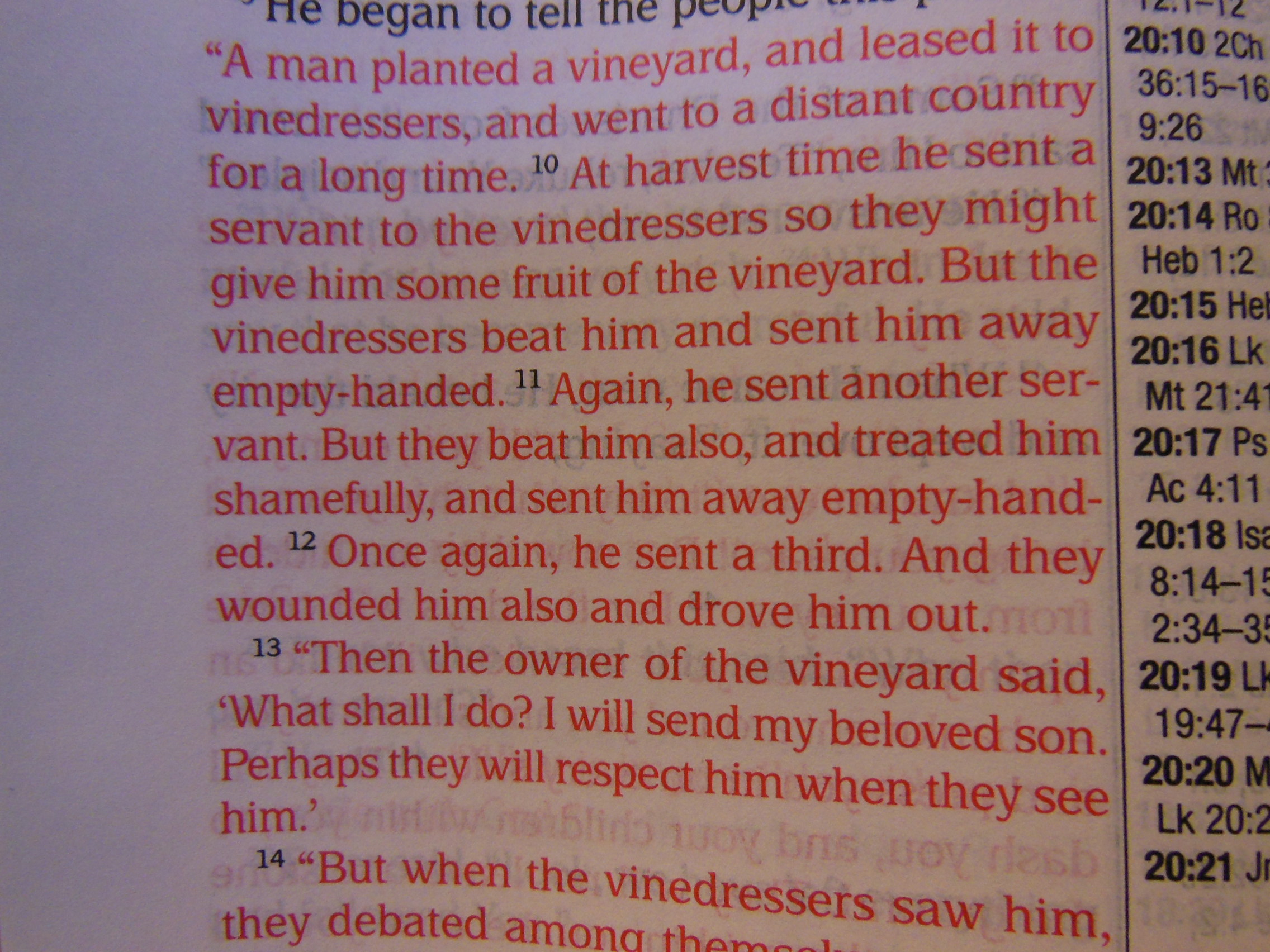
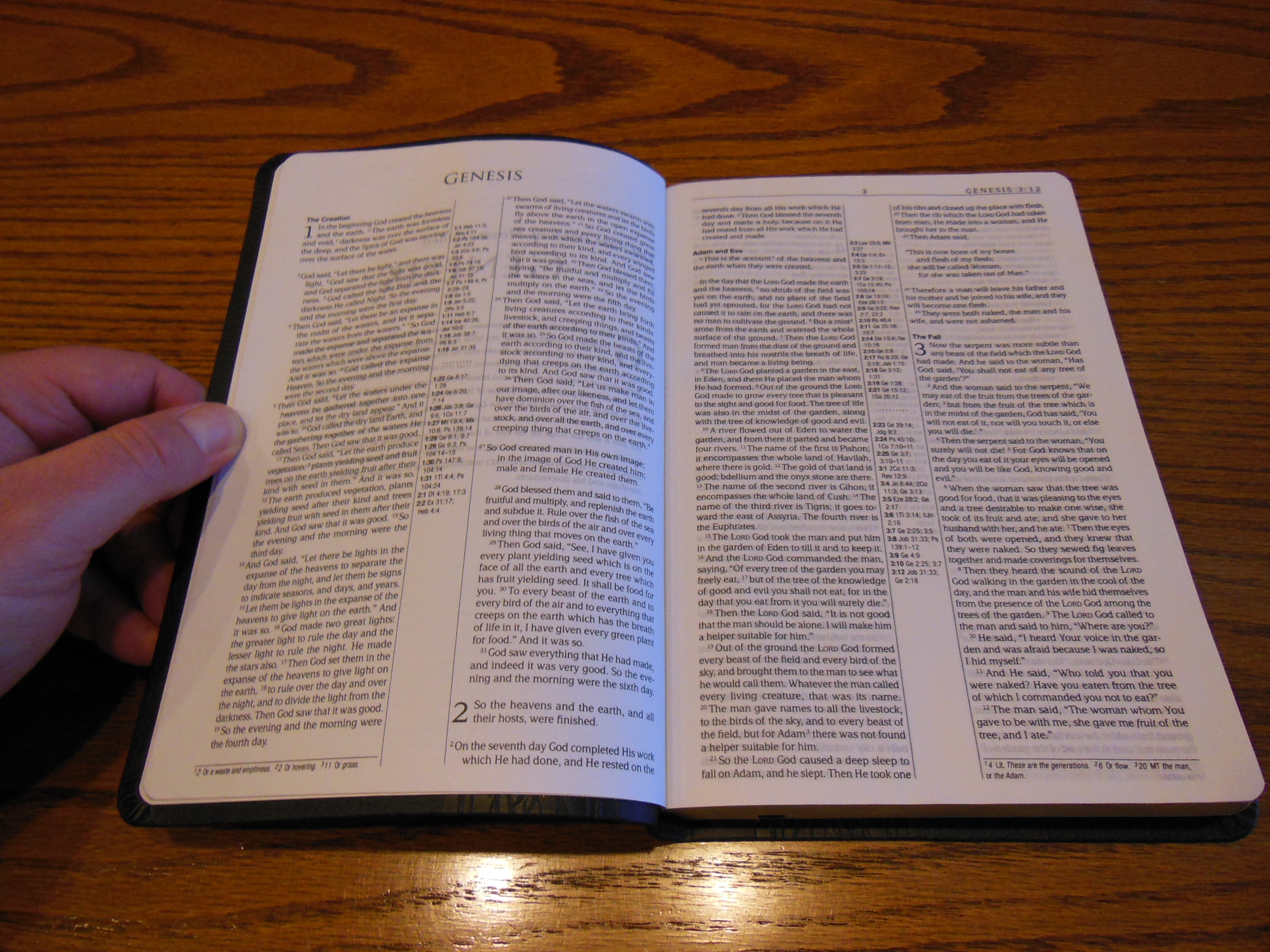
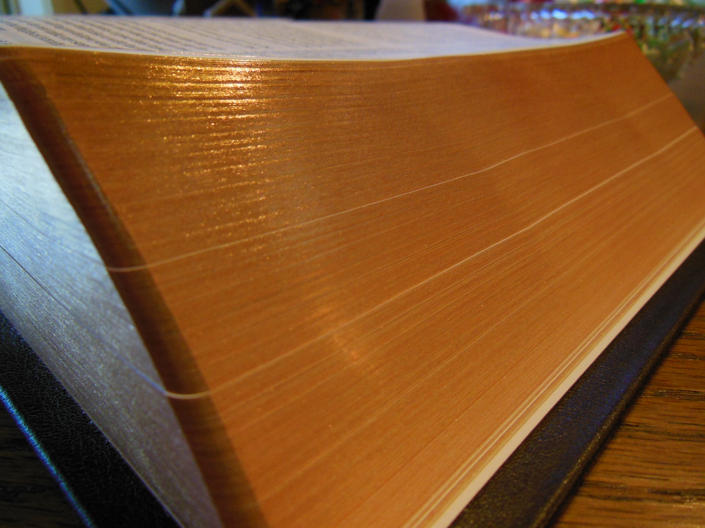
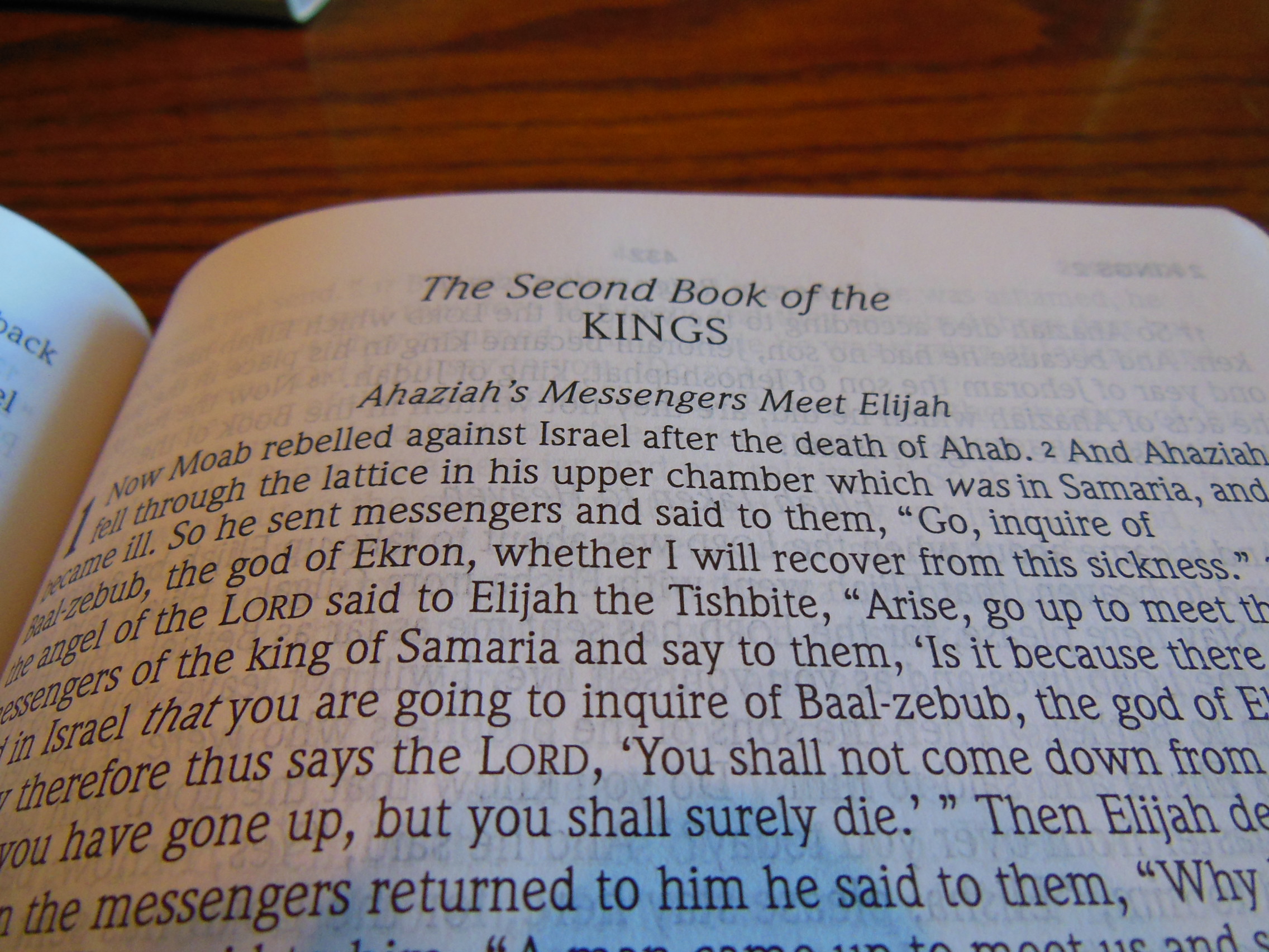
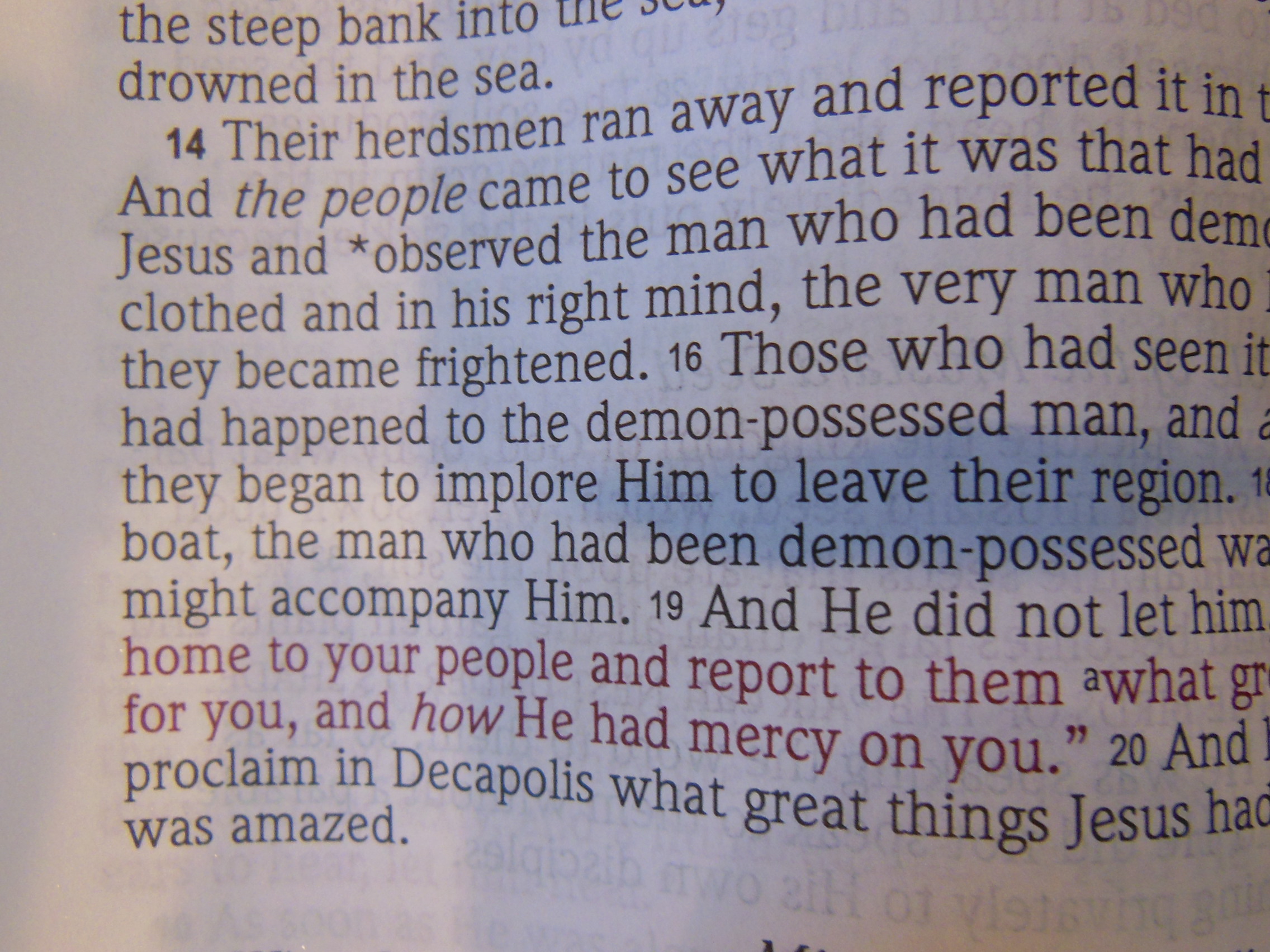
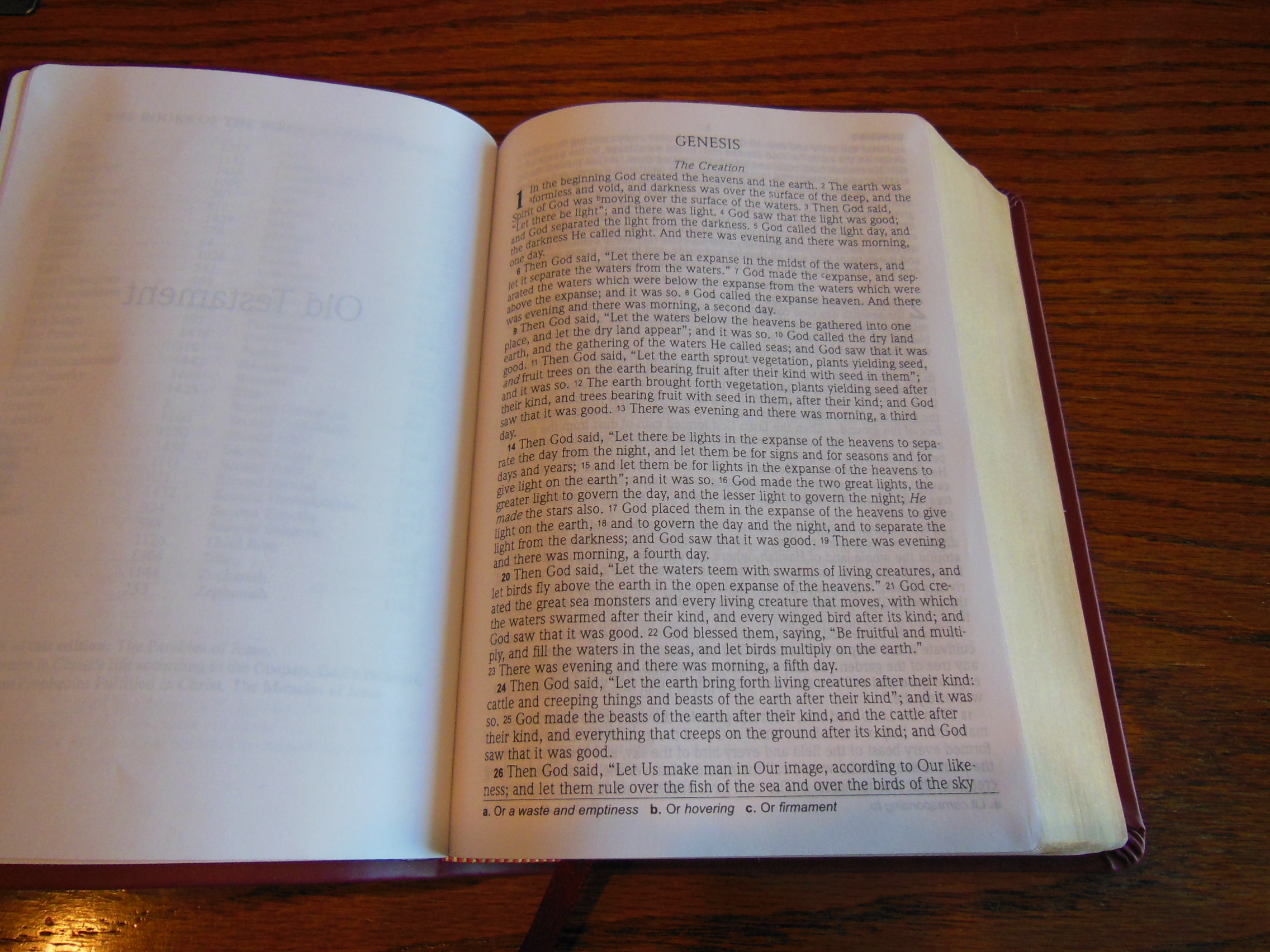
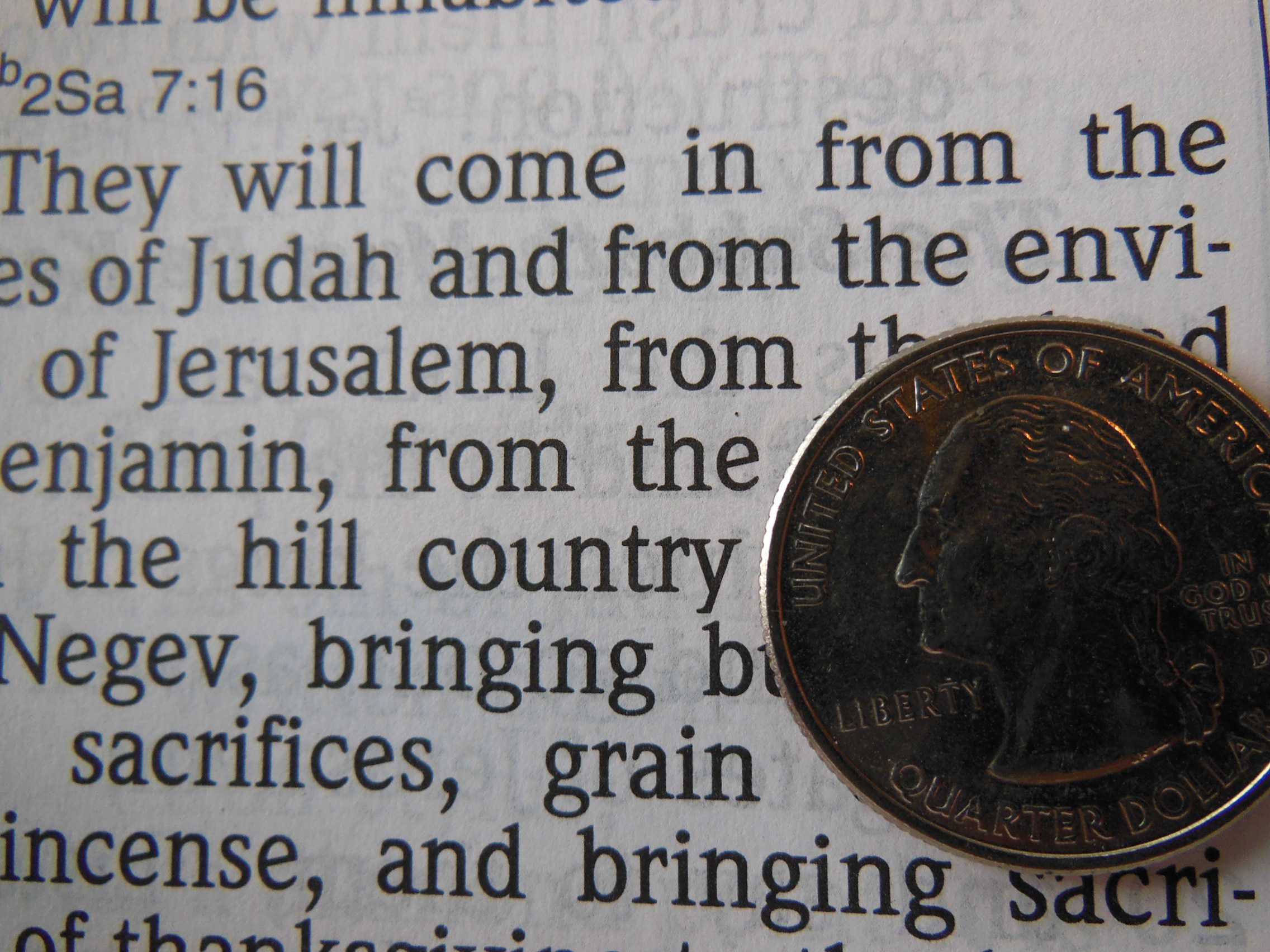
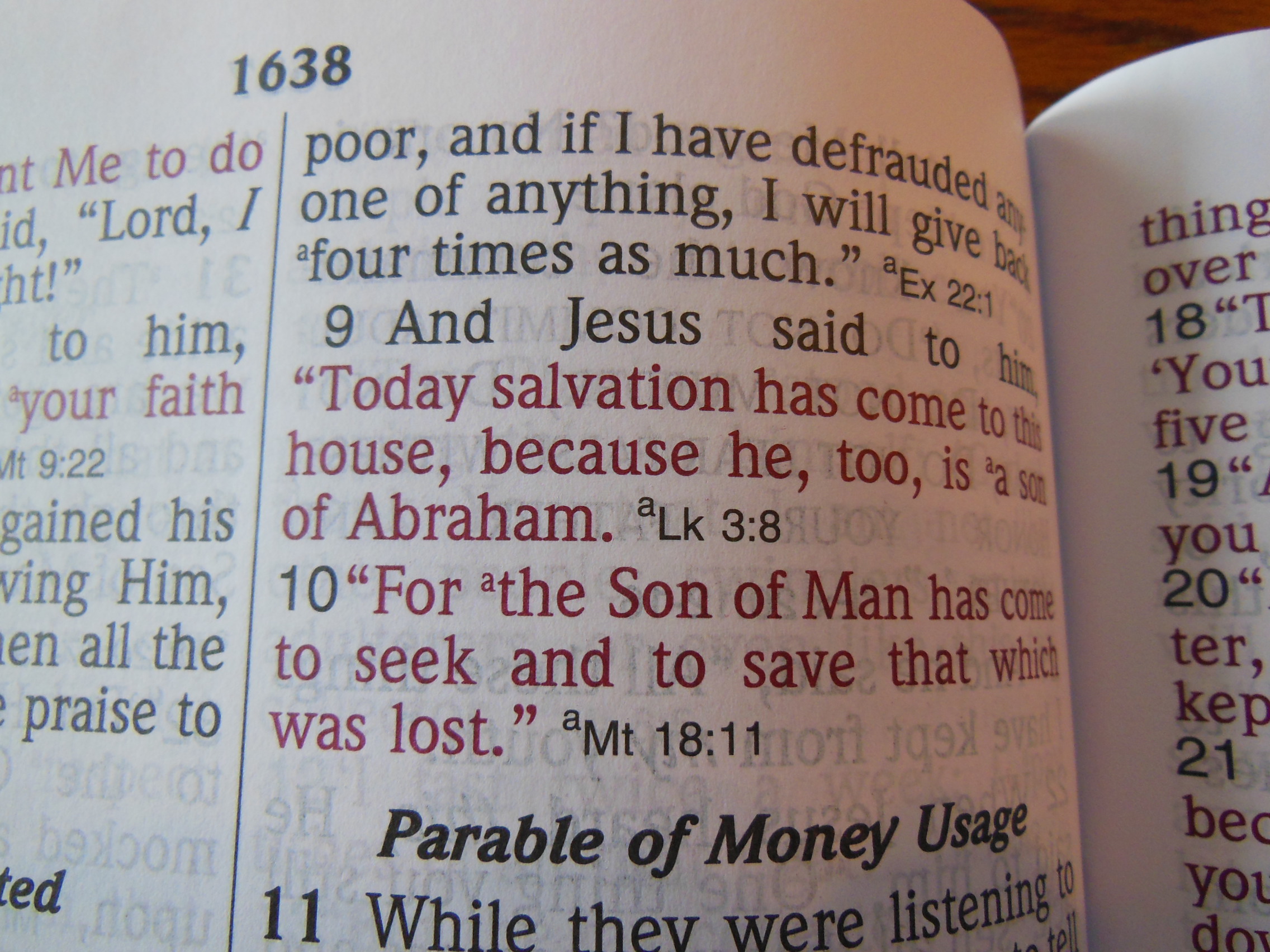
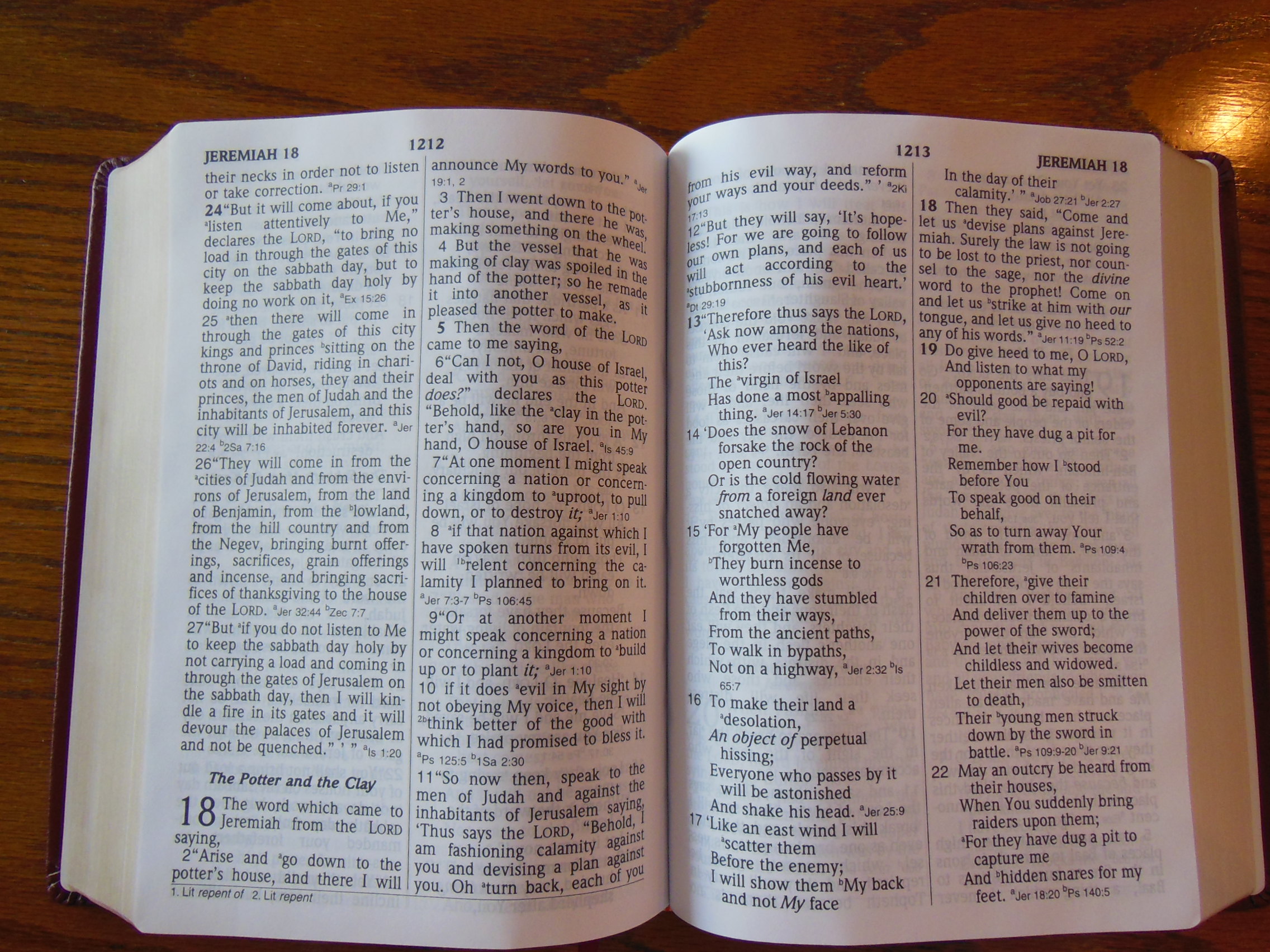
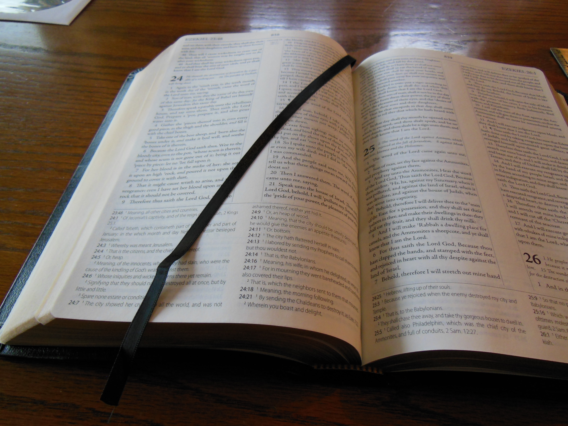
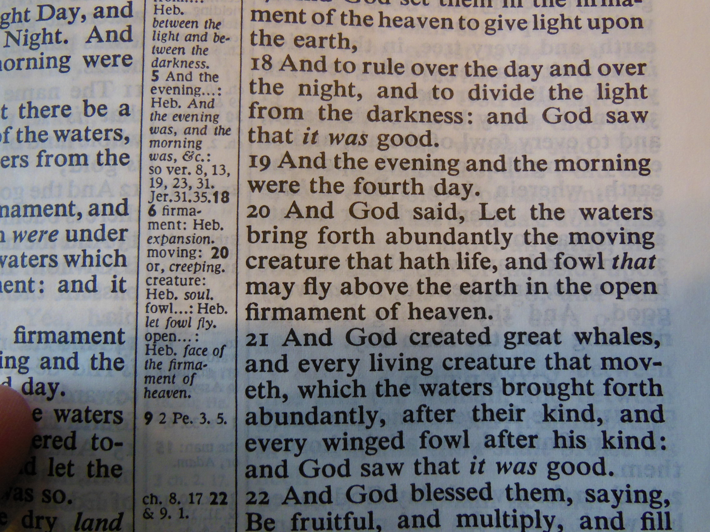
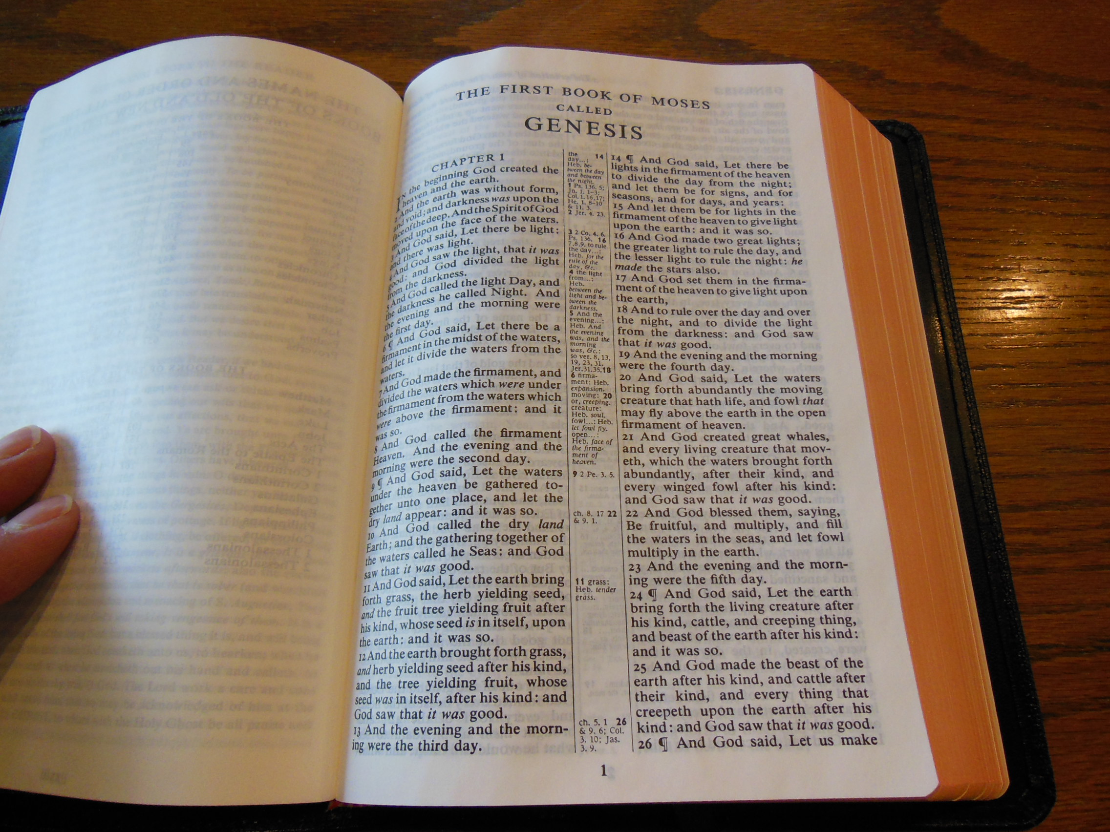
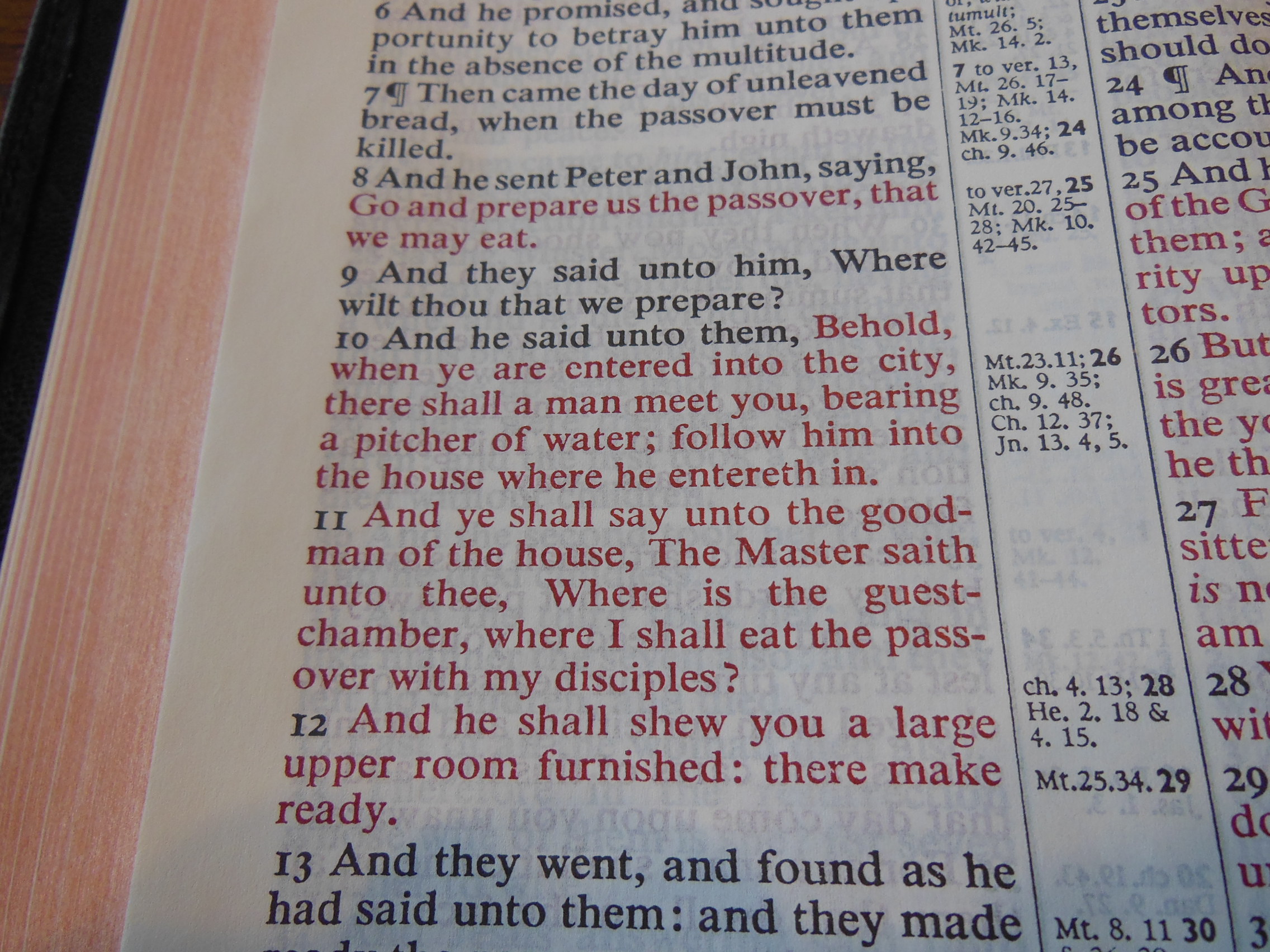
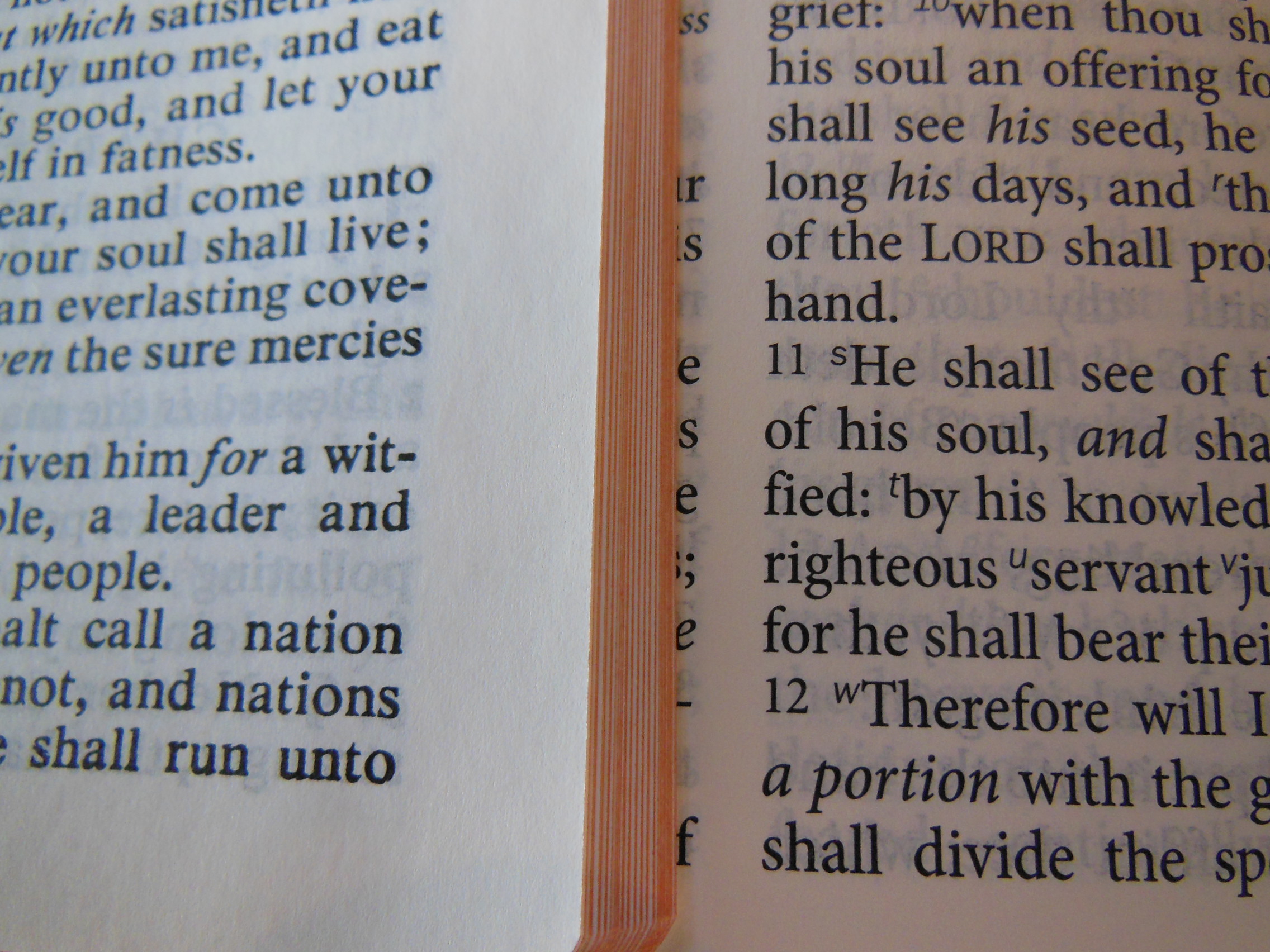
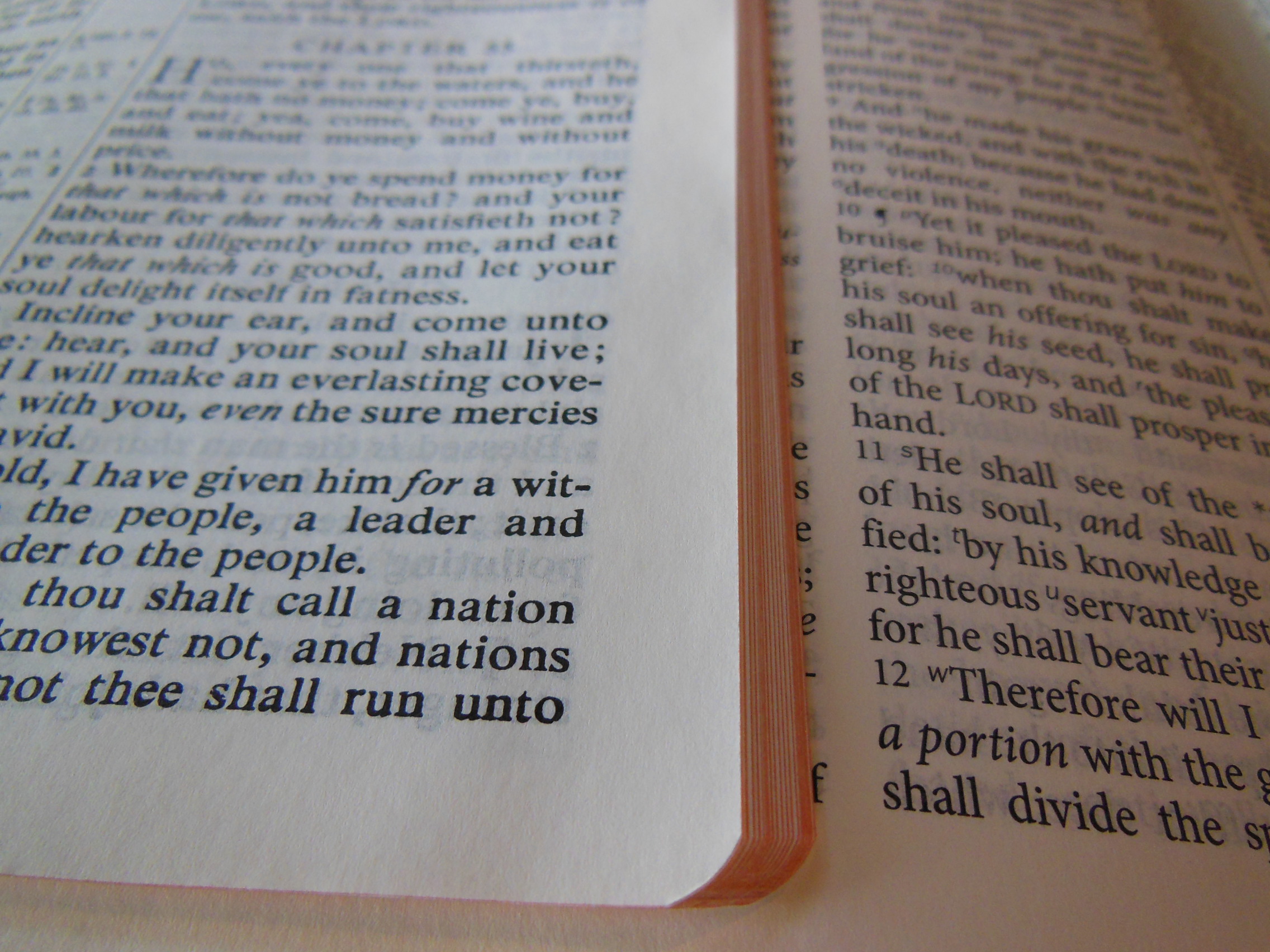
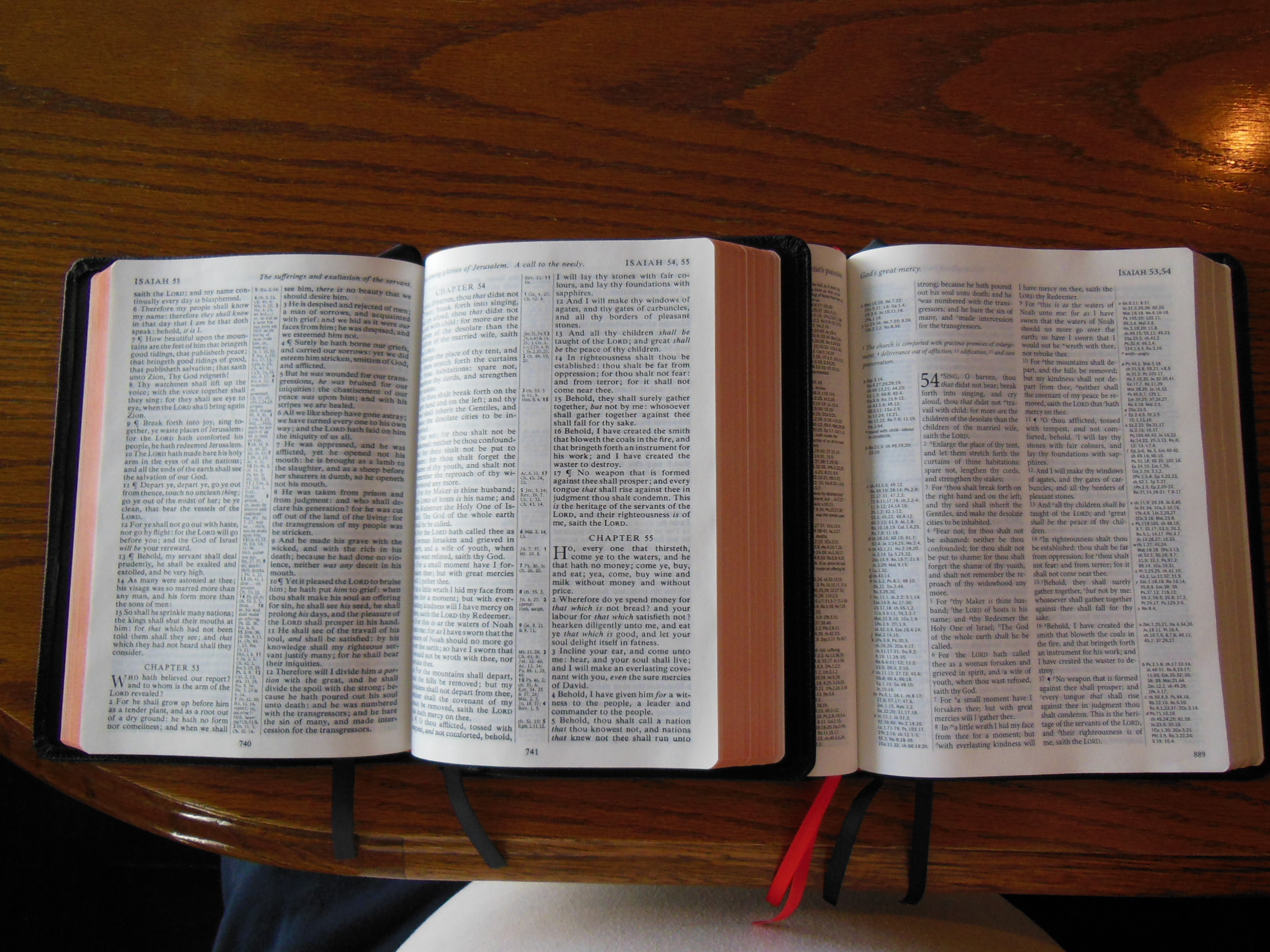
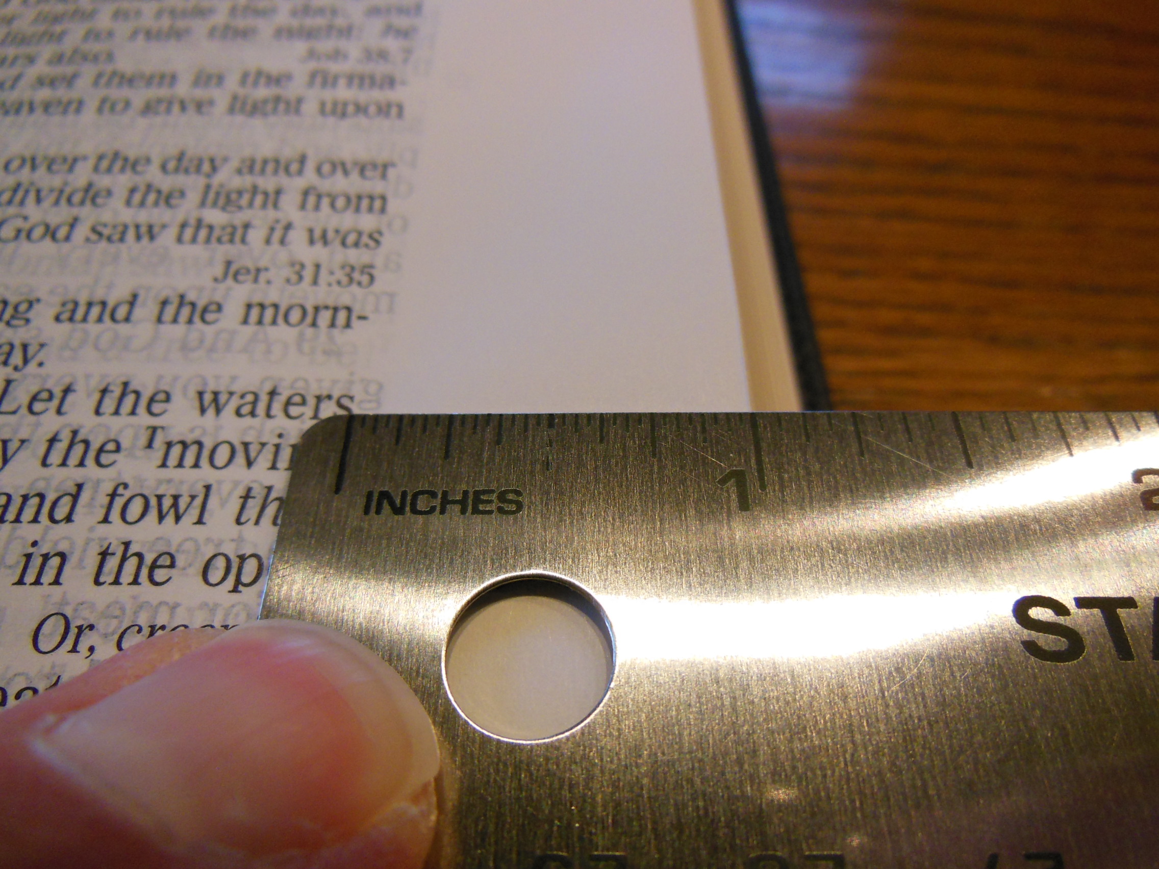
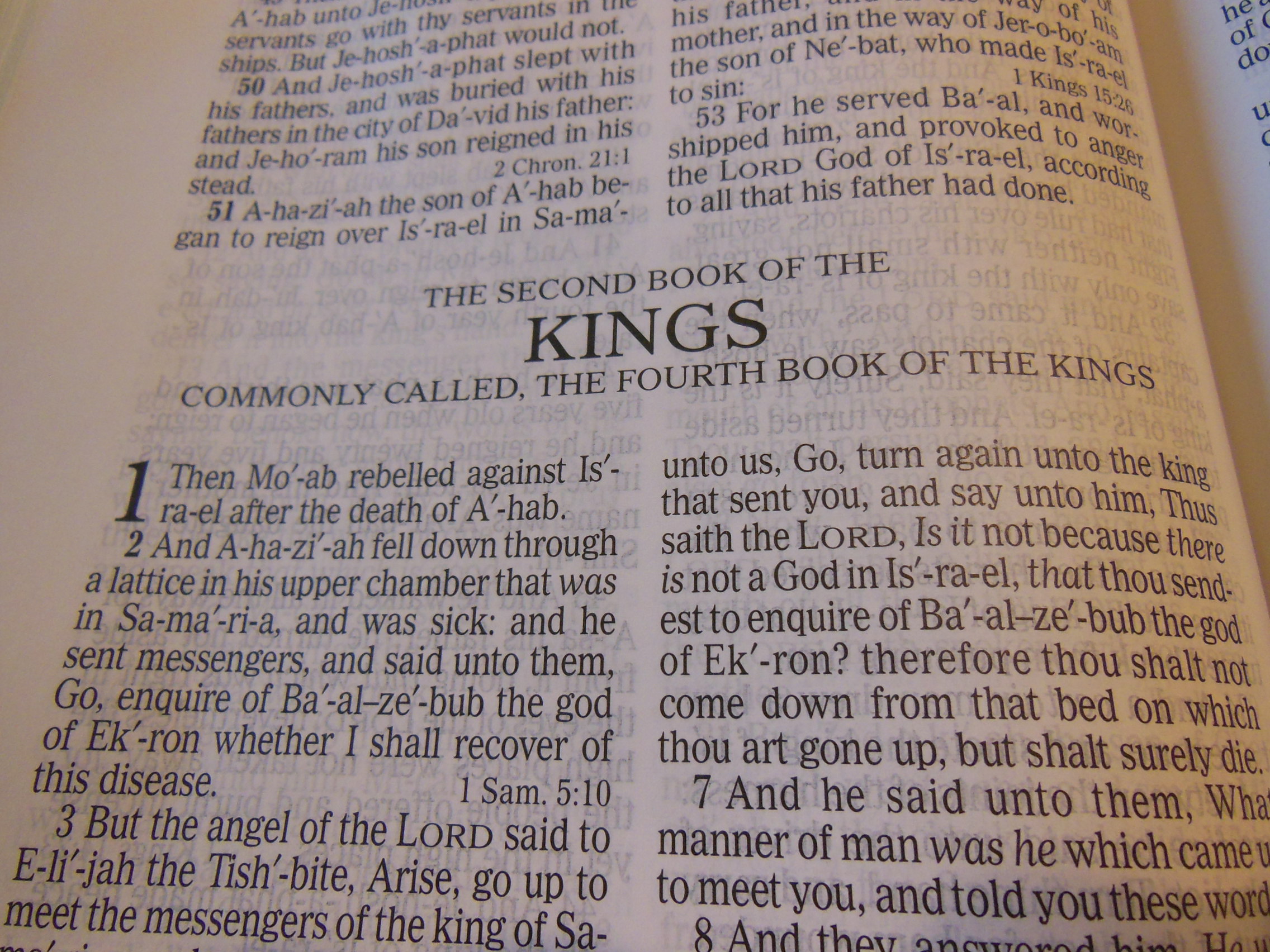
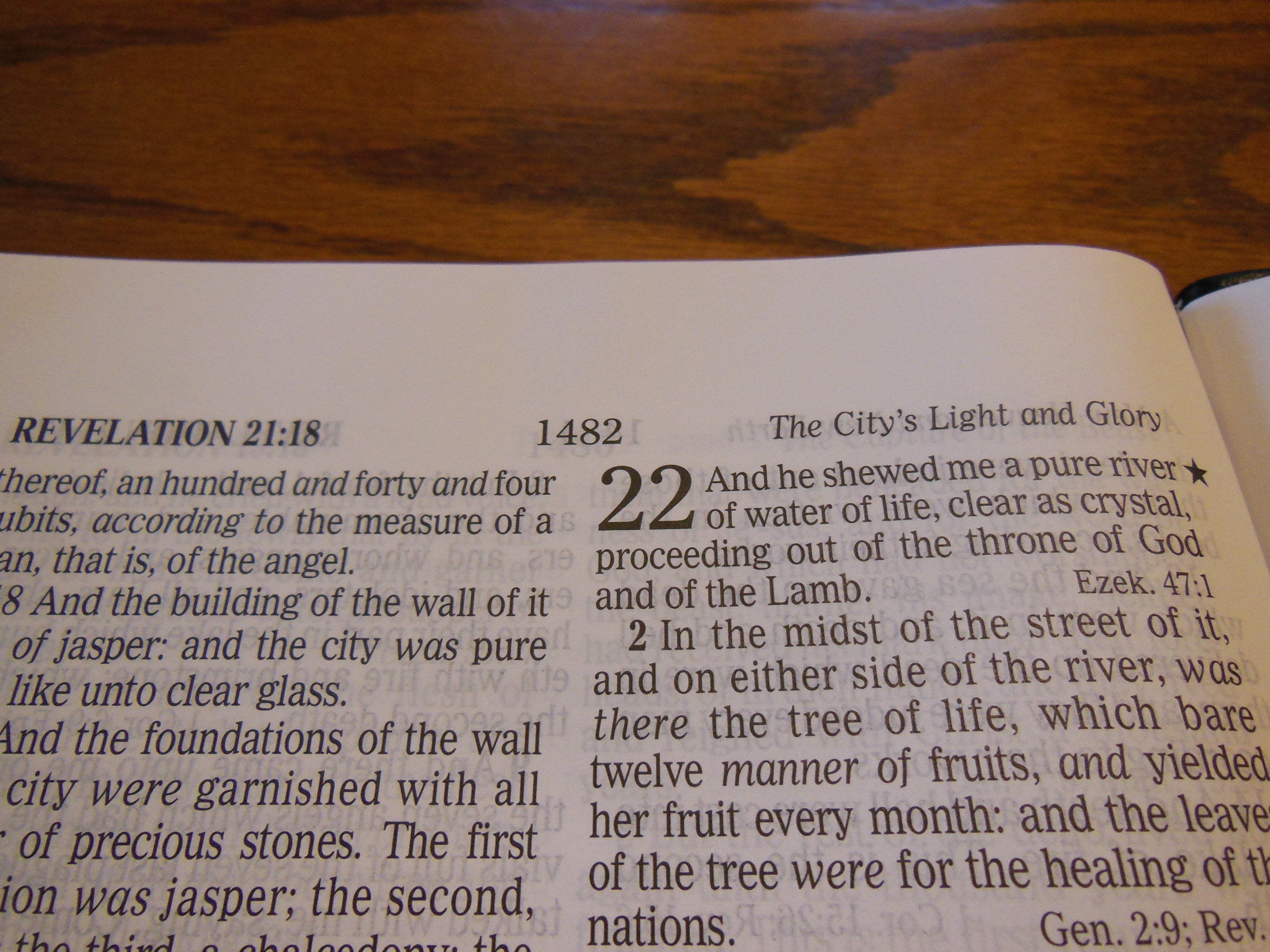
The paper is a little off white and the black text contrasts against it nicely.  It is printed clearly and uniformly throughout.  The text is laid out in a single column paragraph format with the cross-references on the outside edge of the page in the margin.

Cambridge ESV Clarion and REB 067

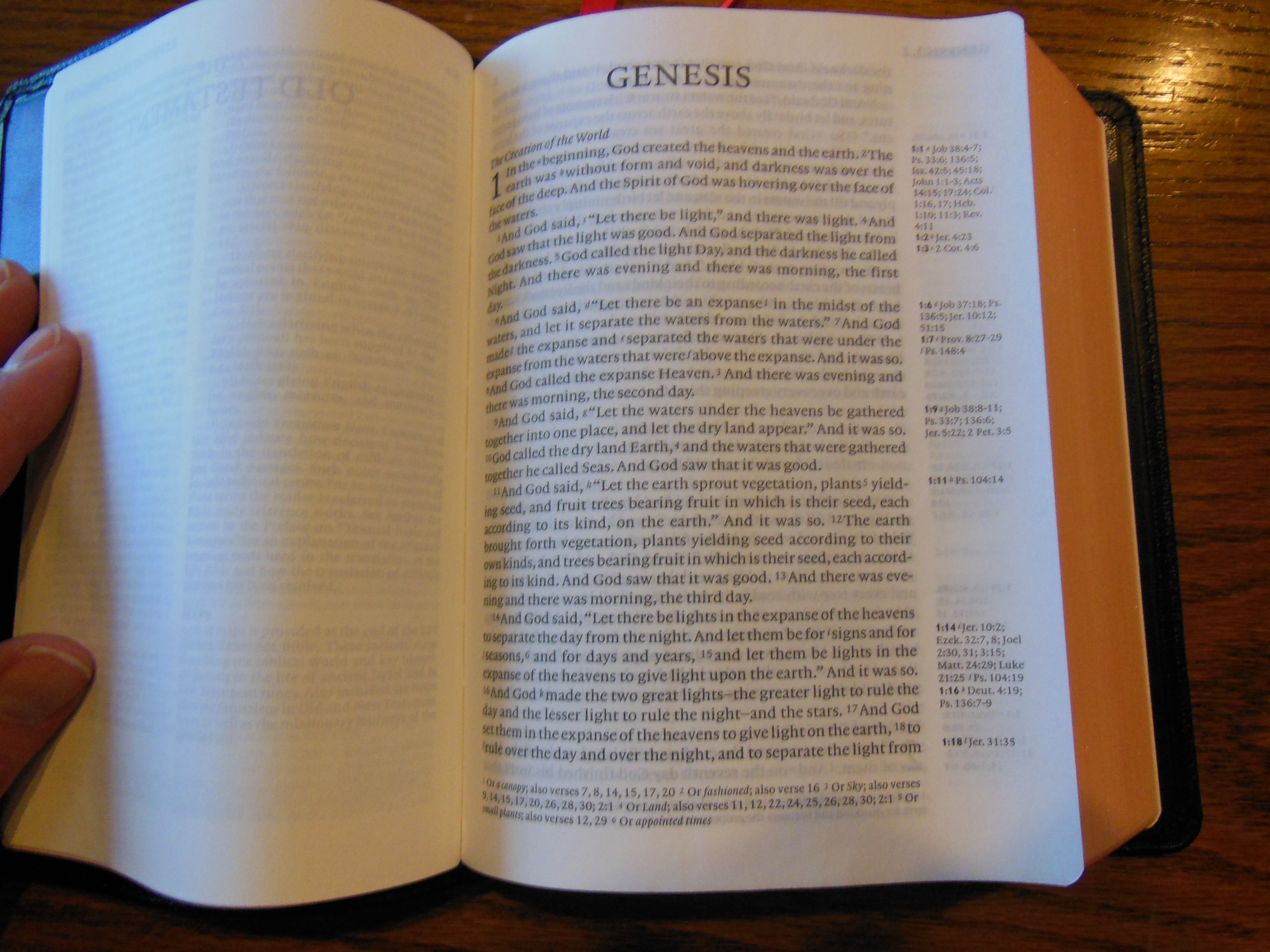
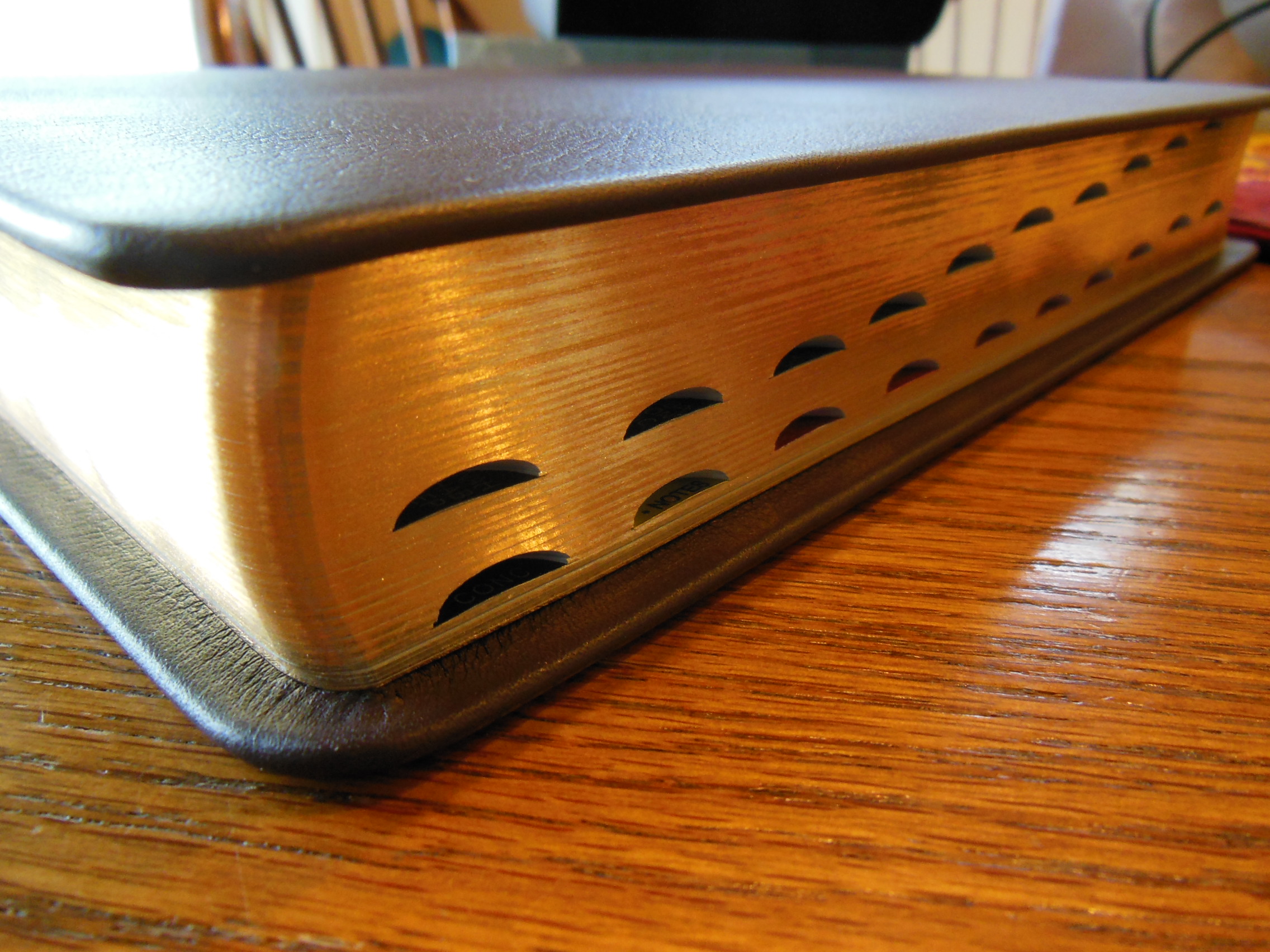
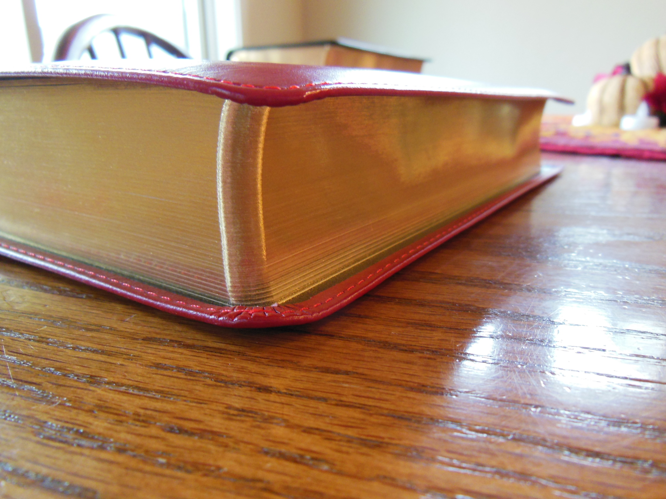
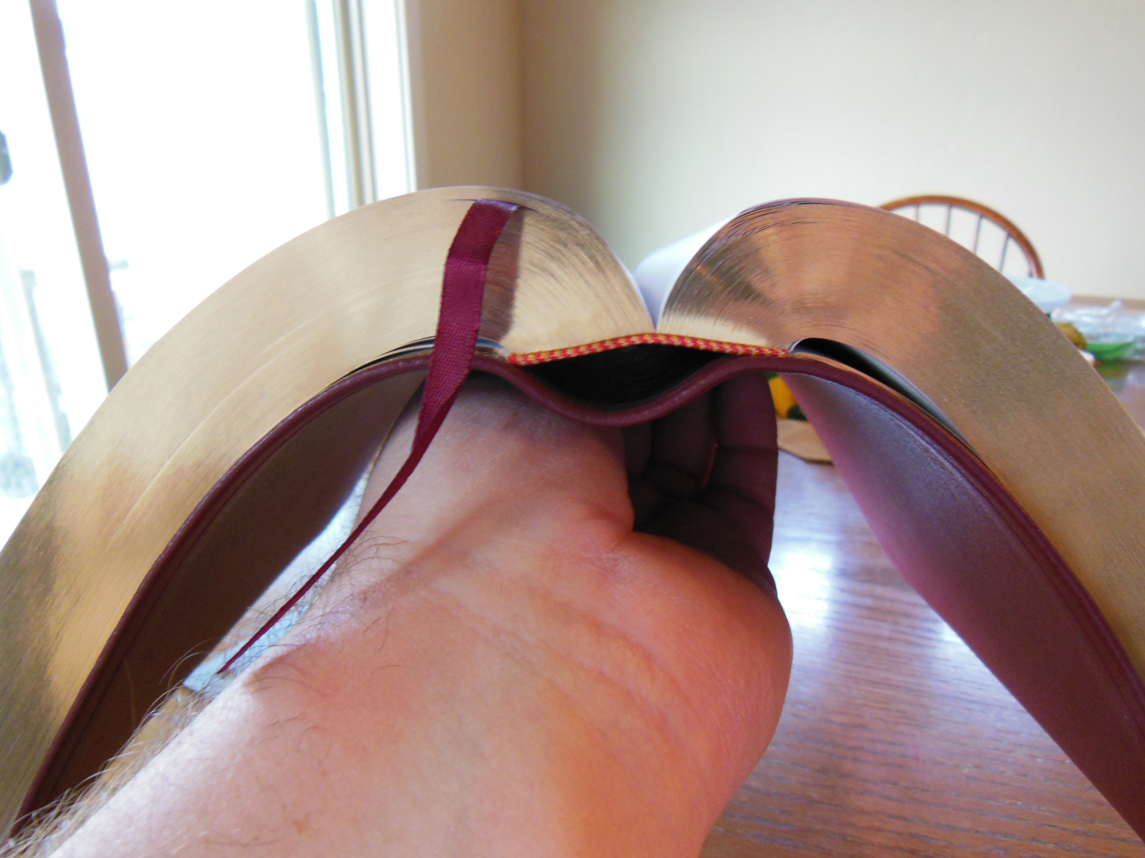
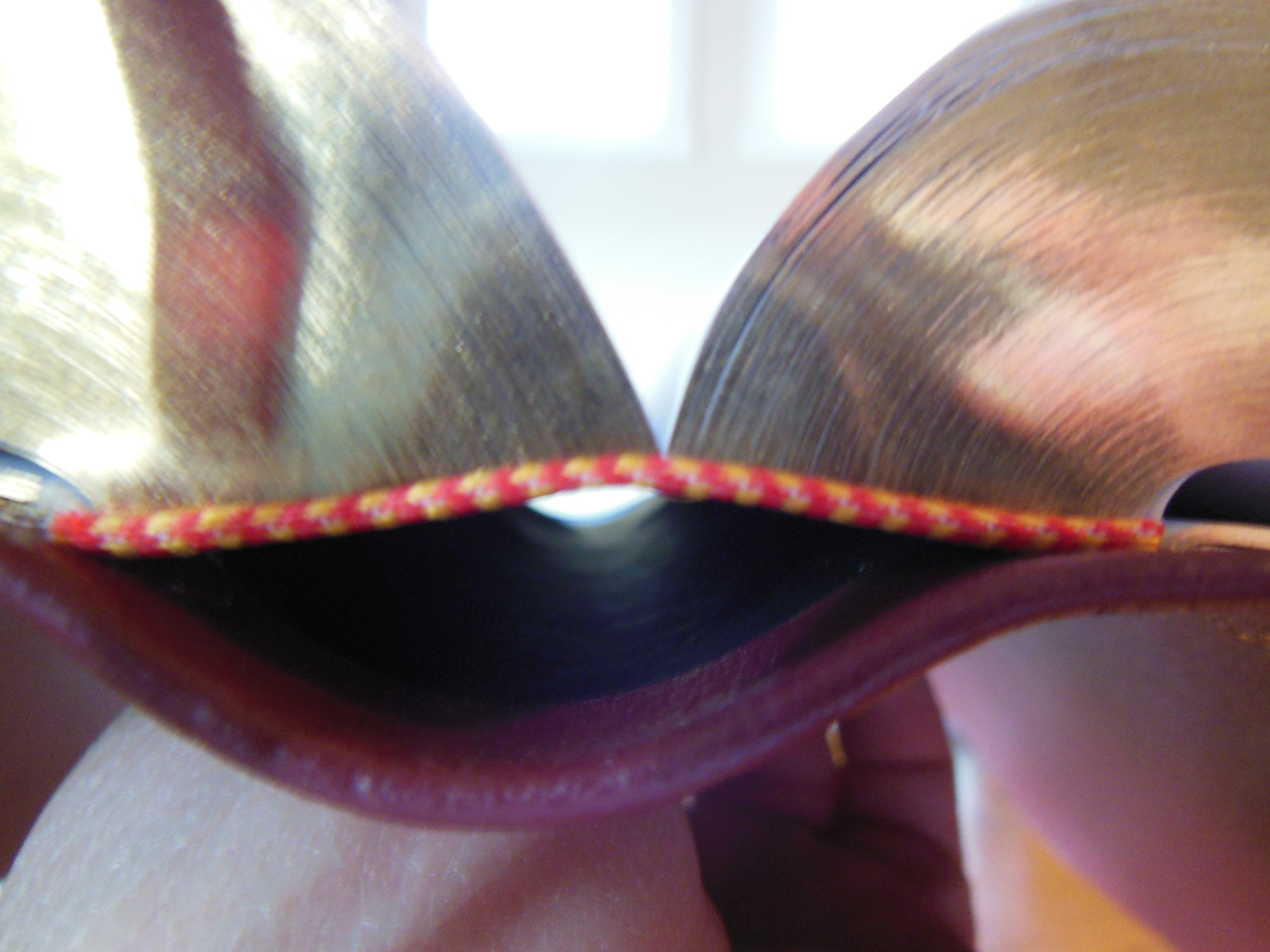
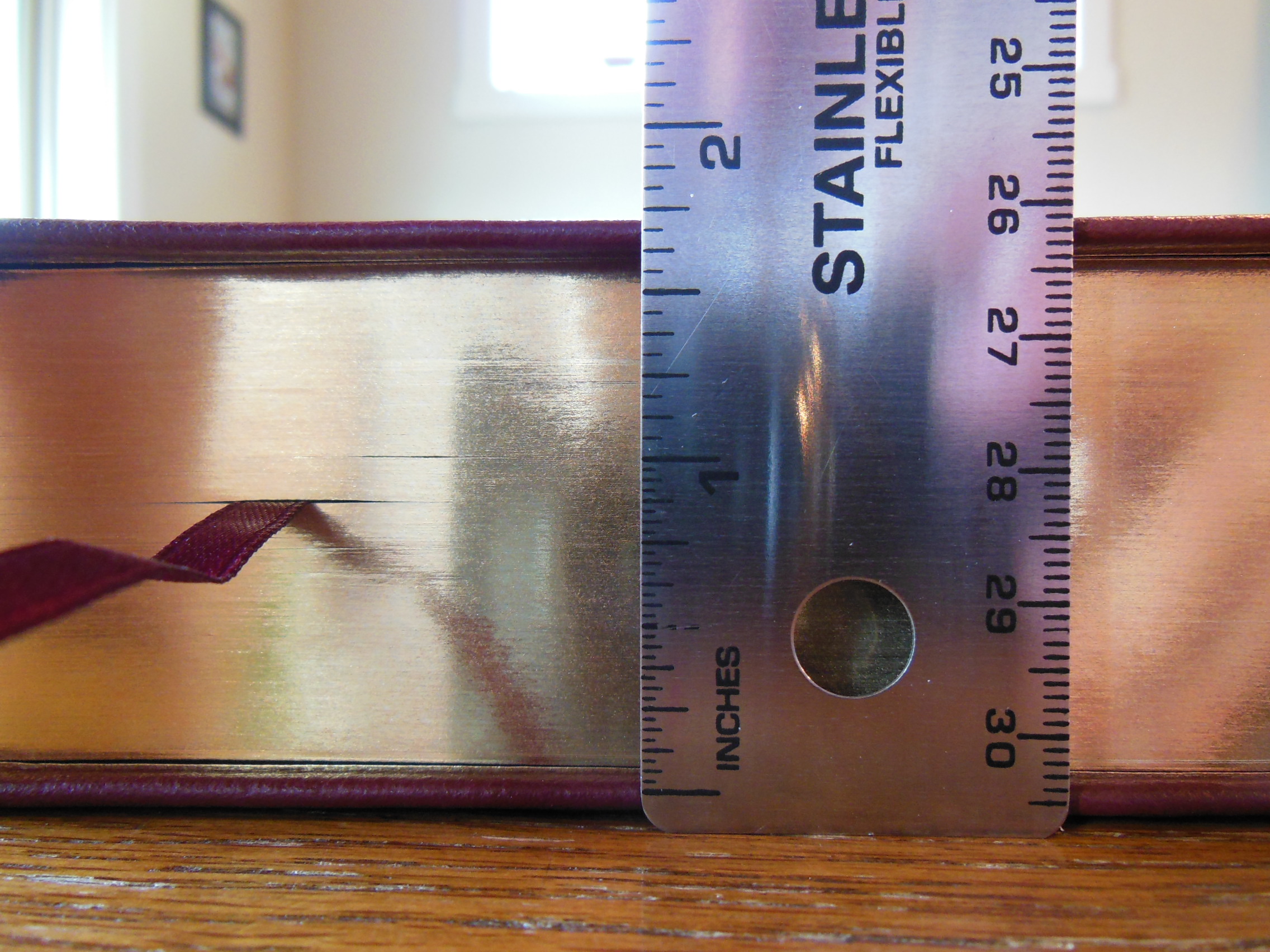
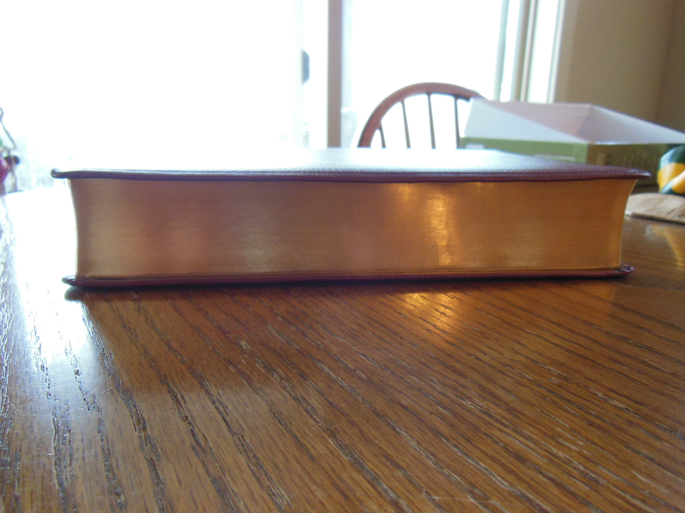
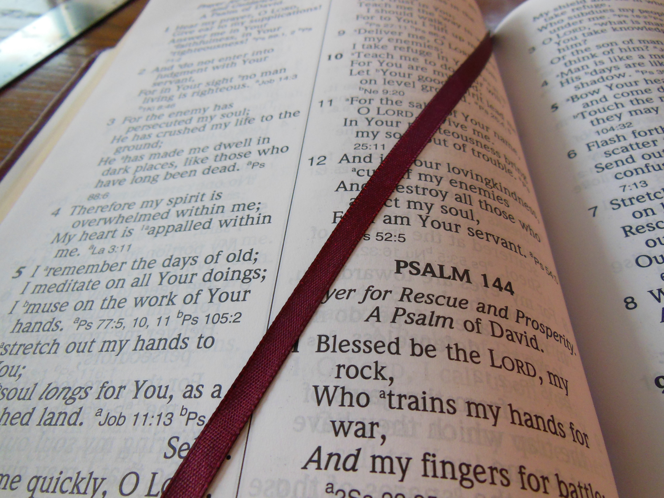
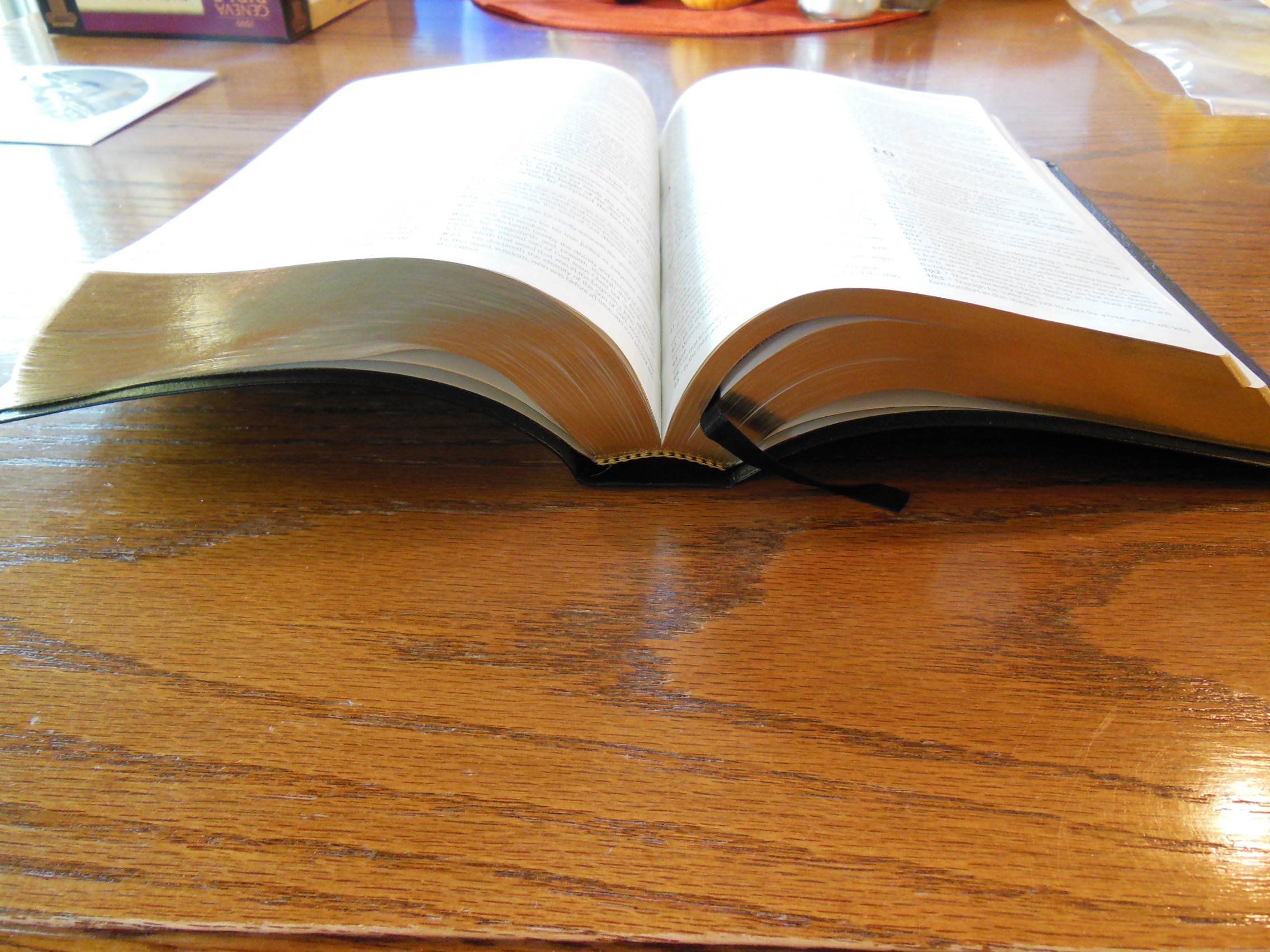
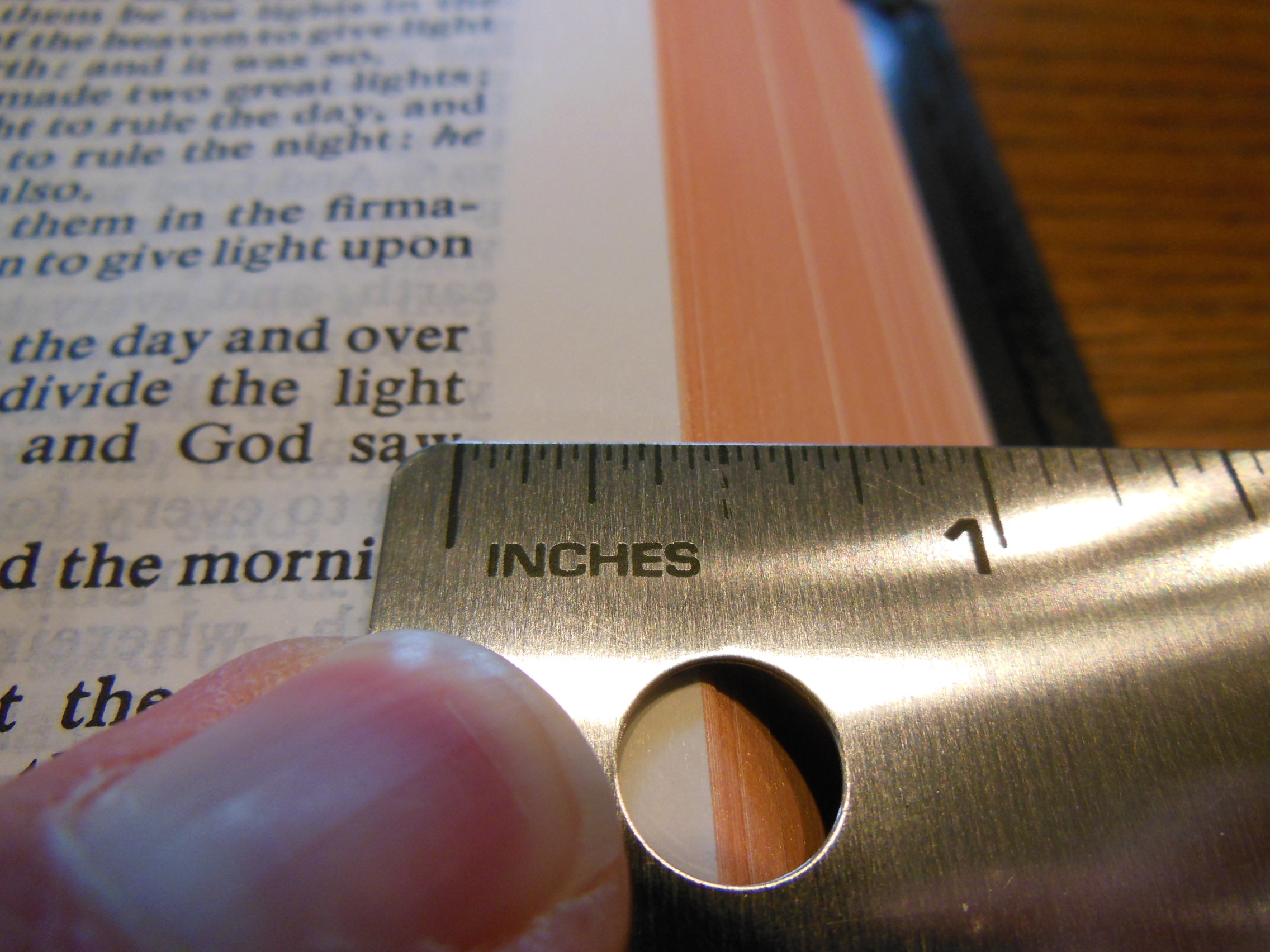
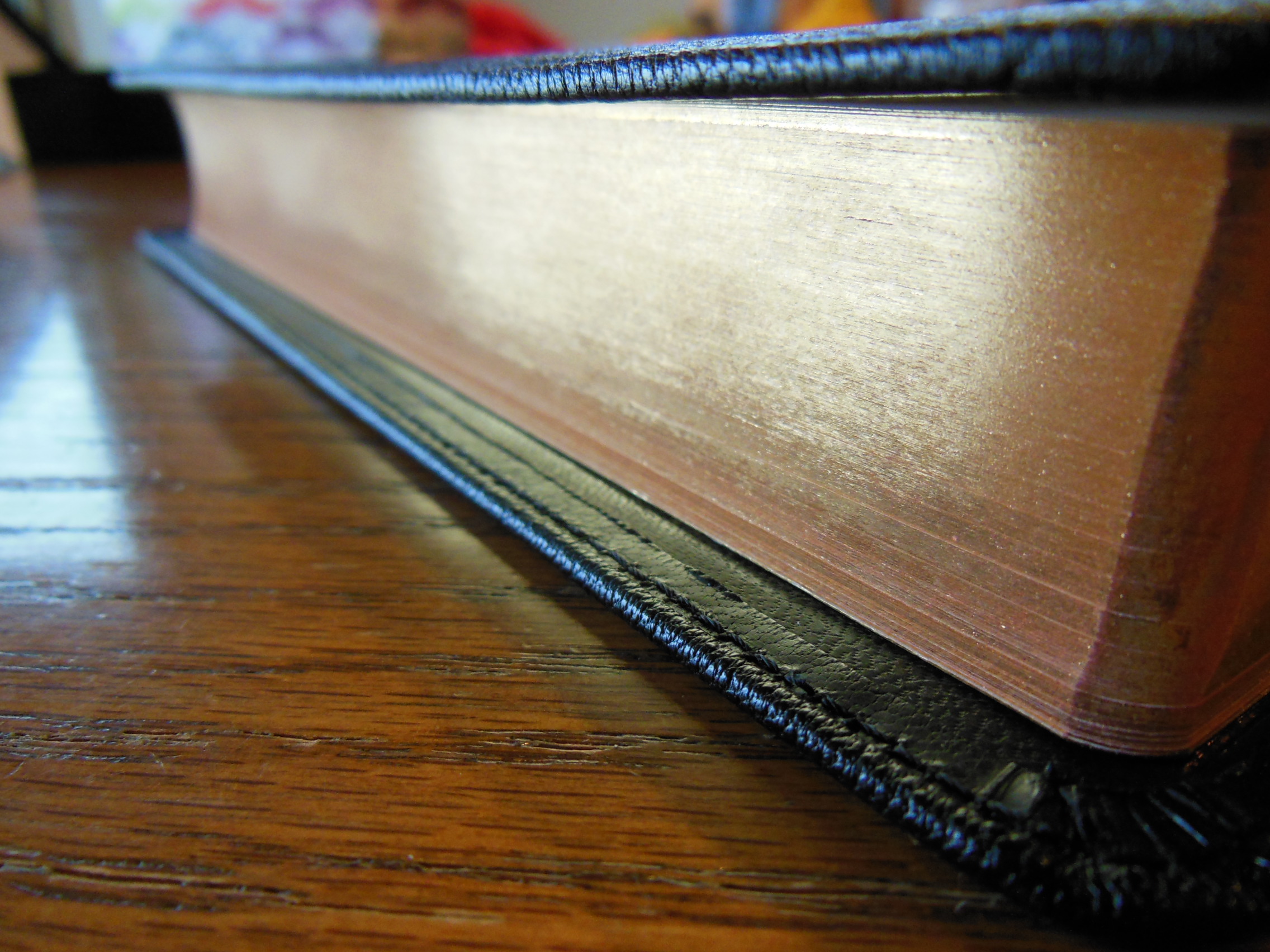
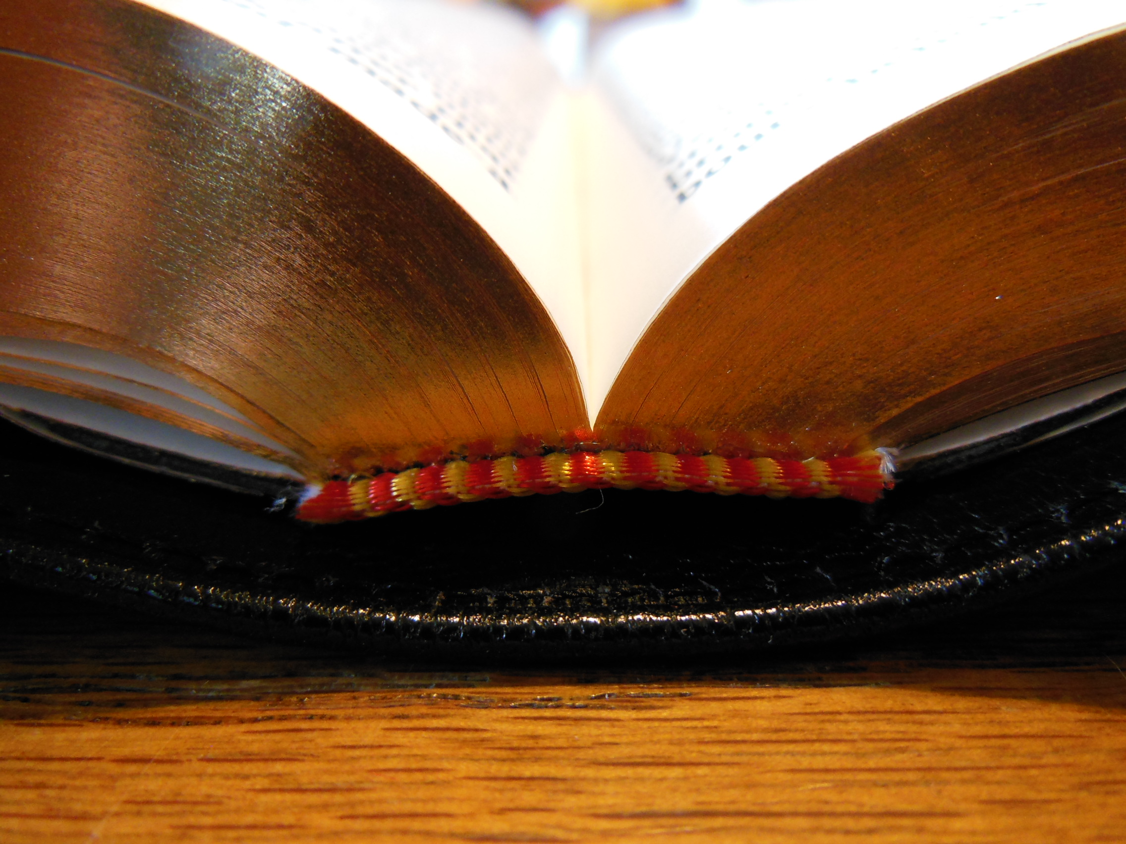
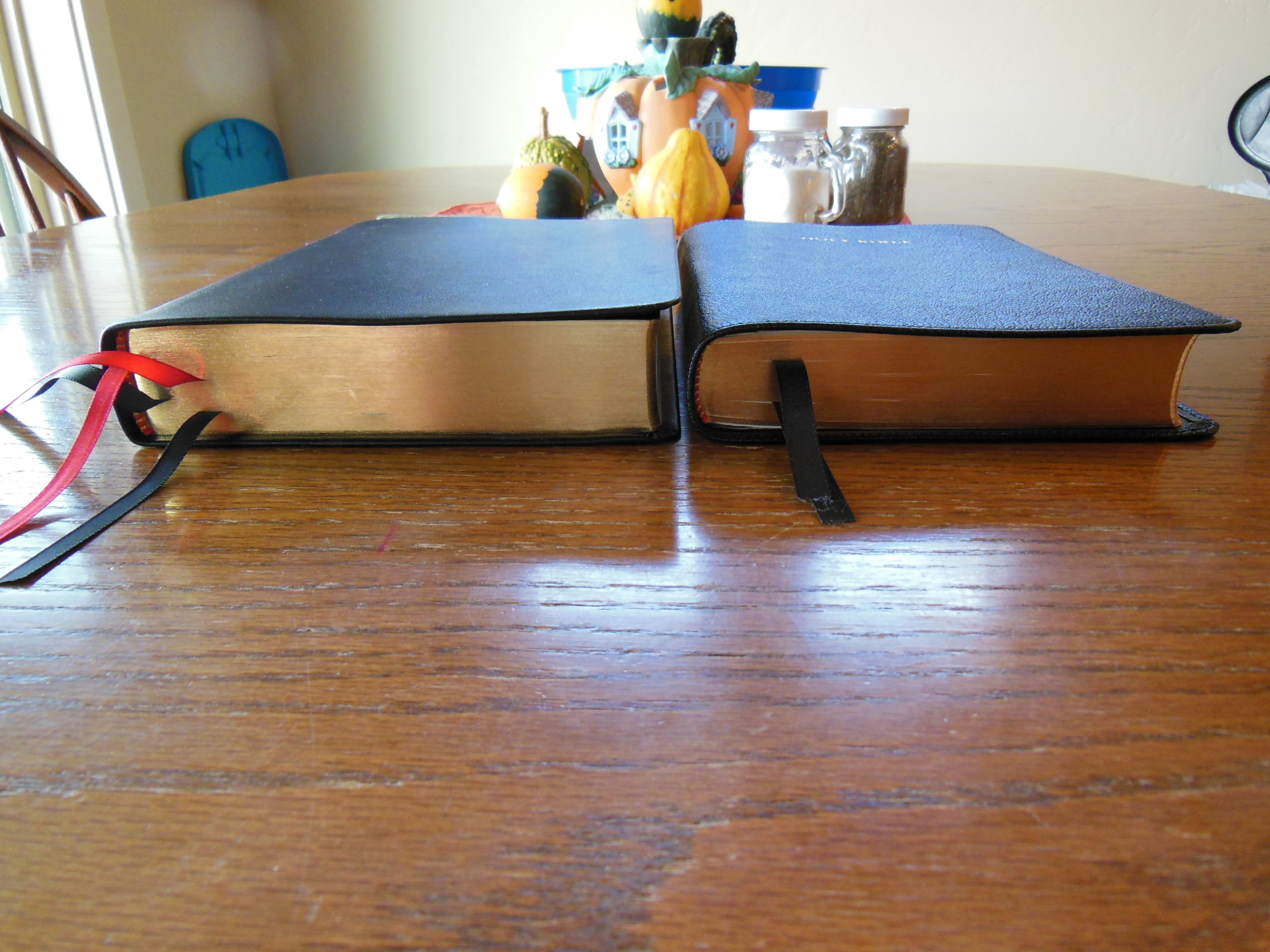
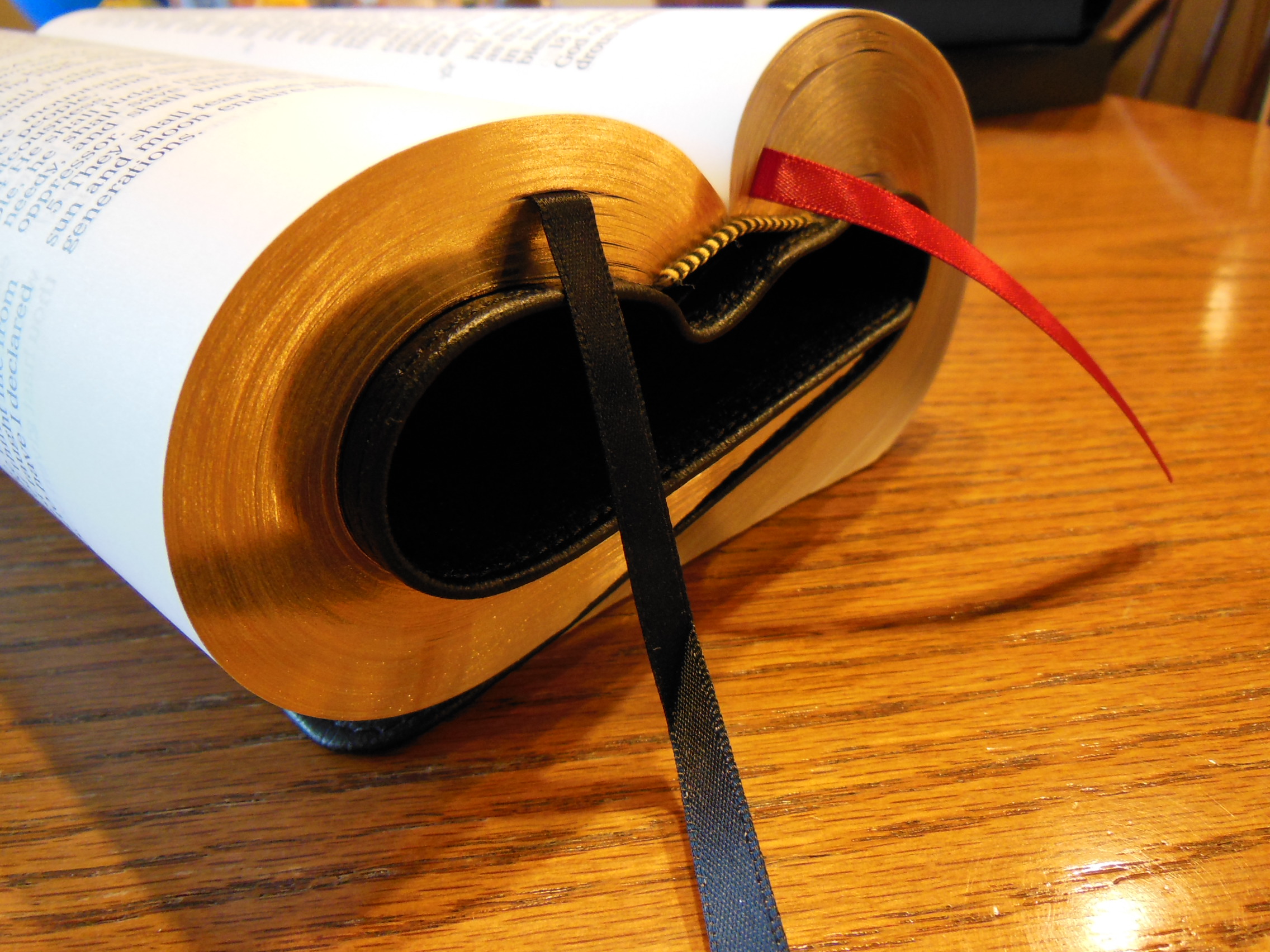
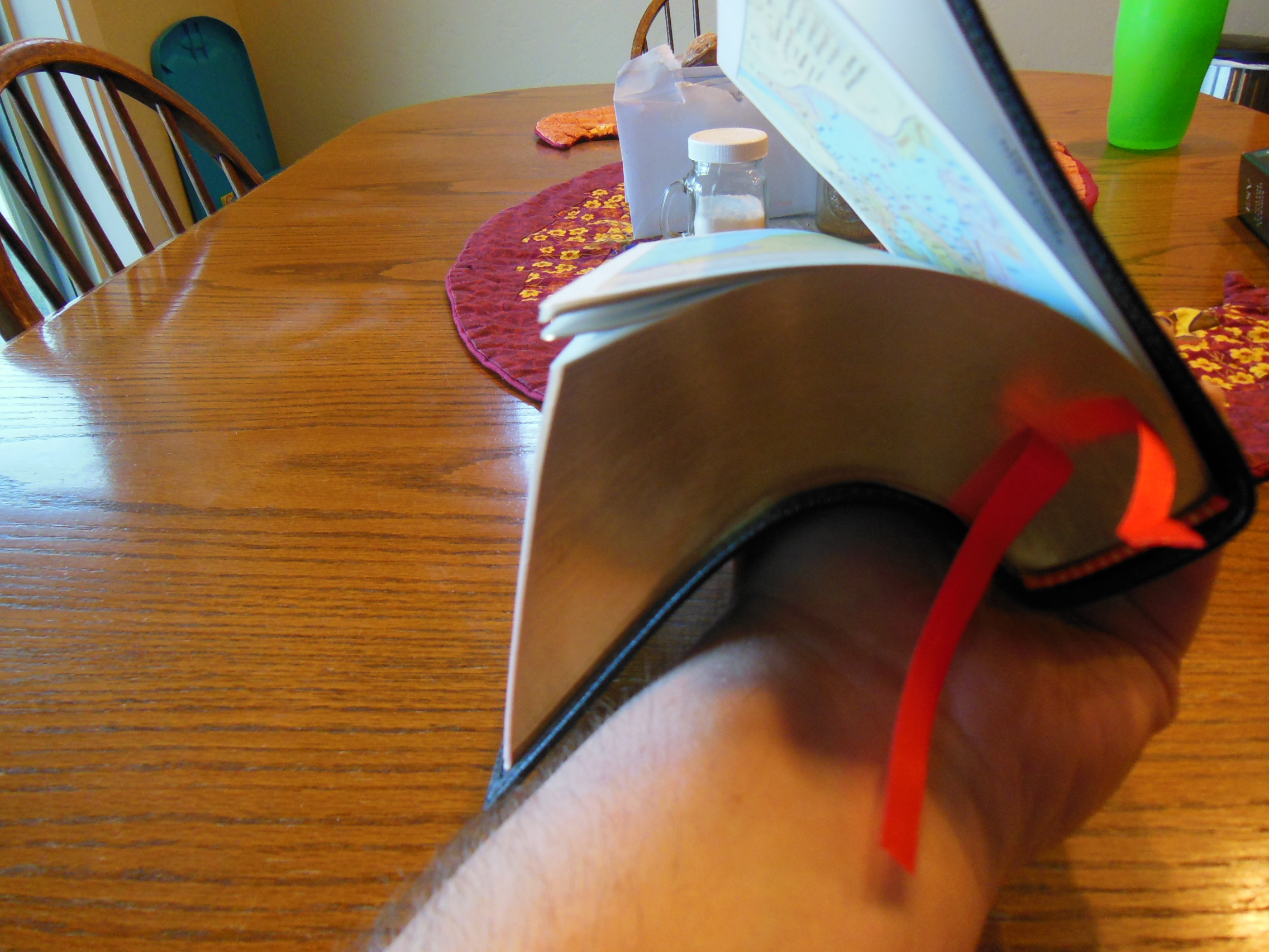
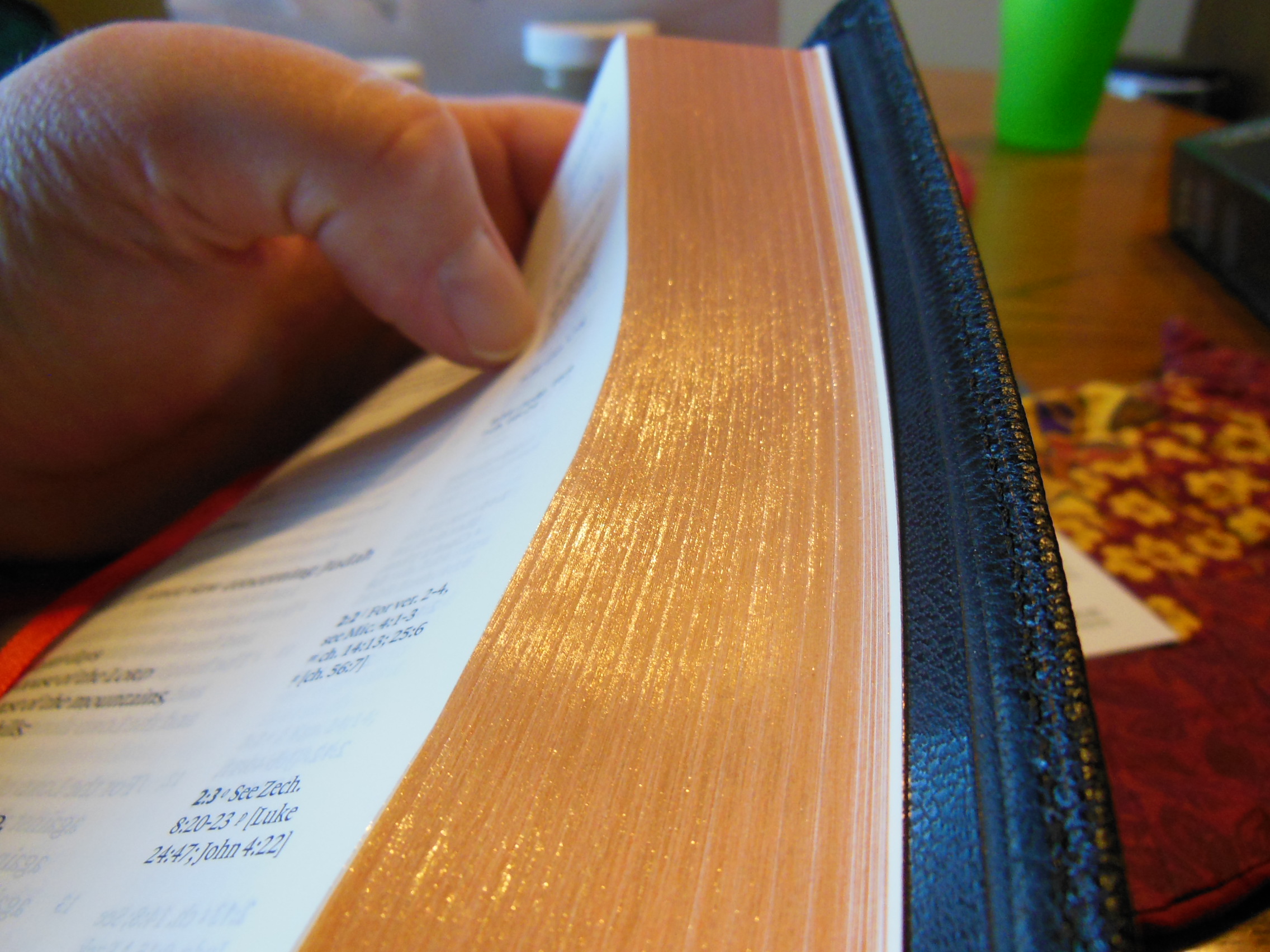
This layout is conducive to long sessions of uninterrupted reading.  The paper is smooth.  The page edges are art gilded with red under gold.  I think this is a pleasing aesthetic.  When the Bible is open the red shows through and while it is closed the gold is prominent.

Cambridge ESV Clarion and REB 071

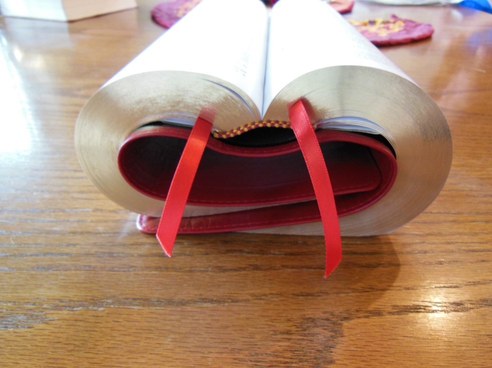
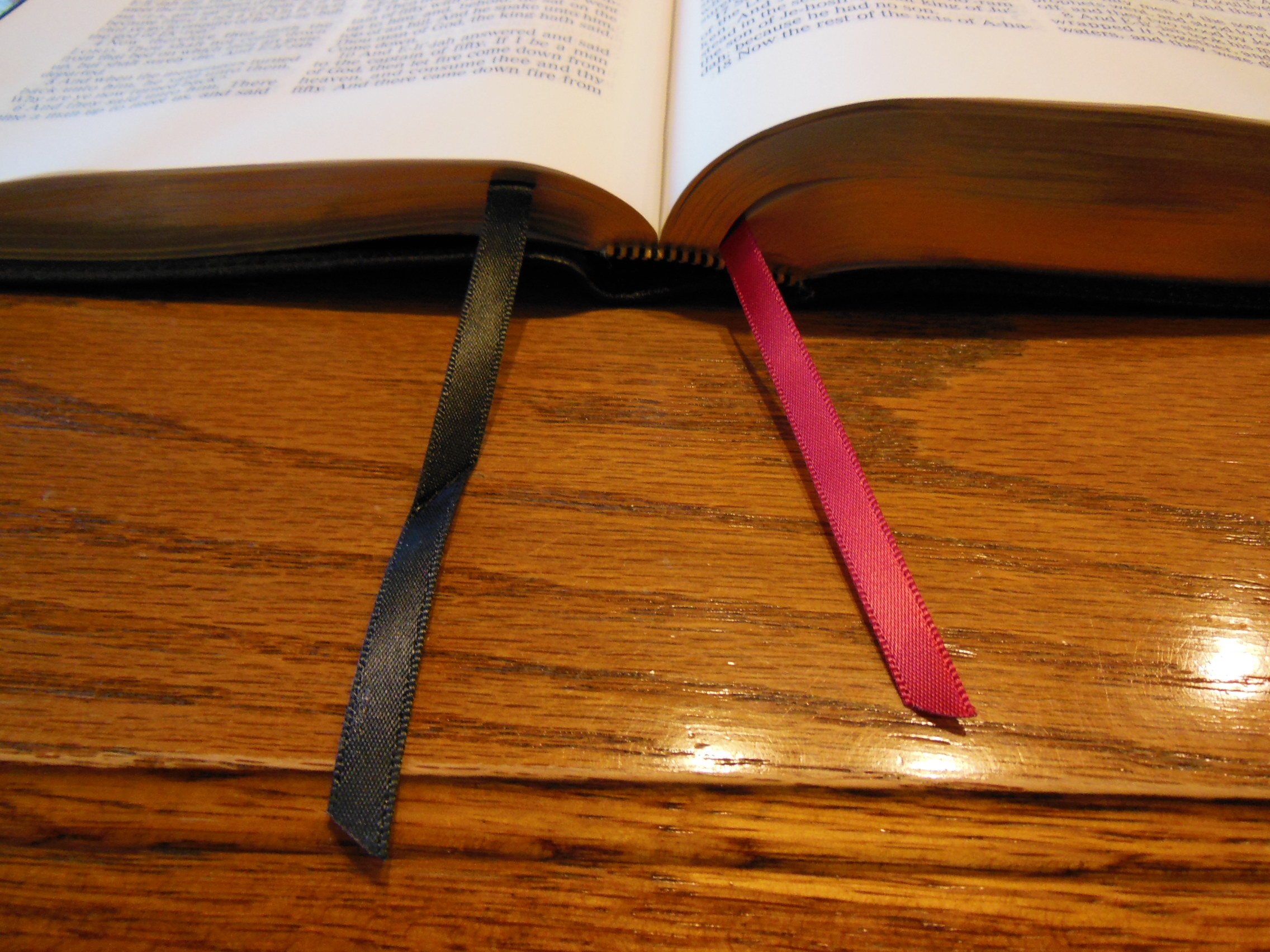
There are two red ribbon markers for keeping your place.  Most other Bibles only give you one ribbon.  It is nice to have to so you can mark your reading in the Old and New Testaments.

Cambridge ESV Clarion and REB 089

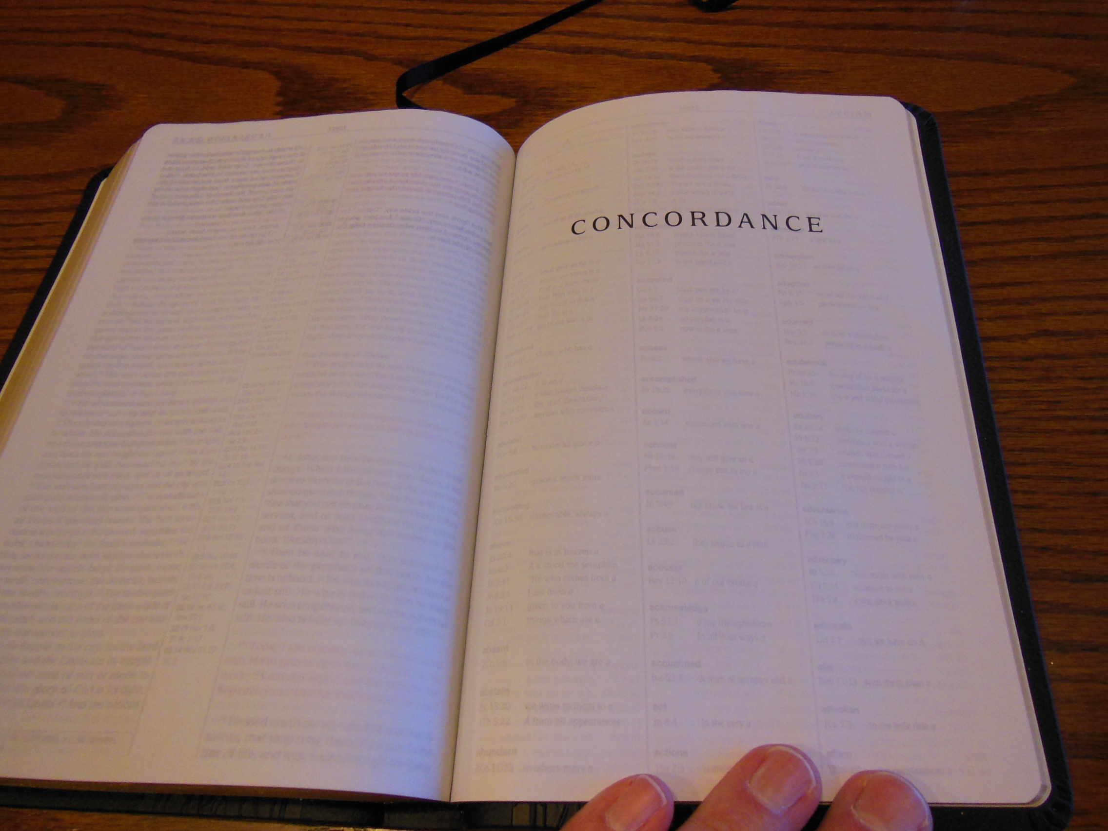
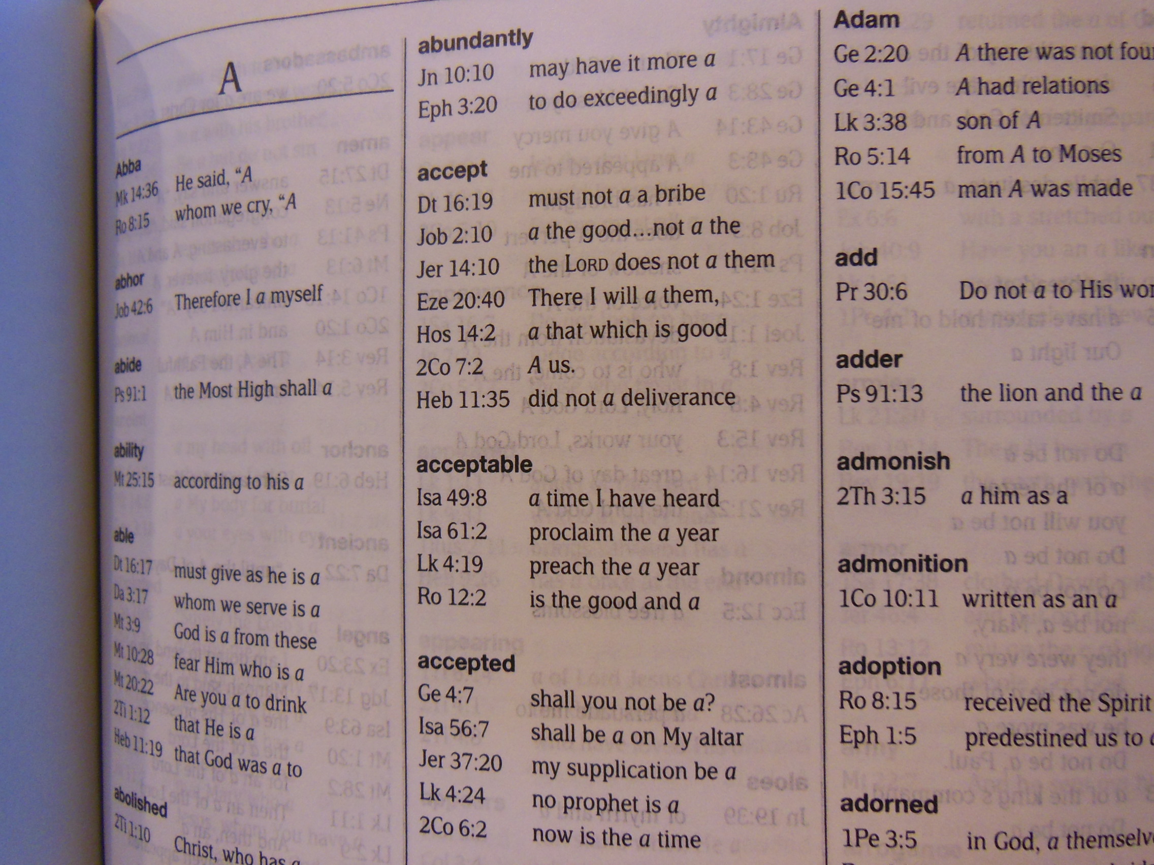
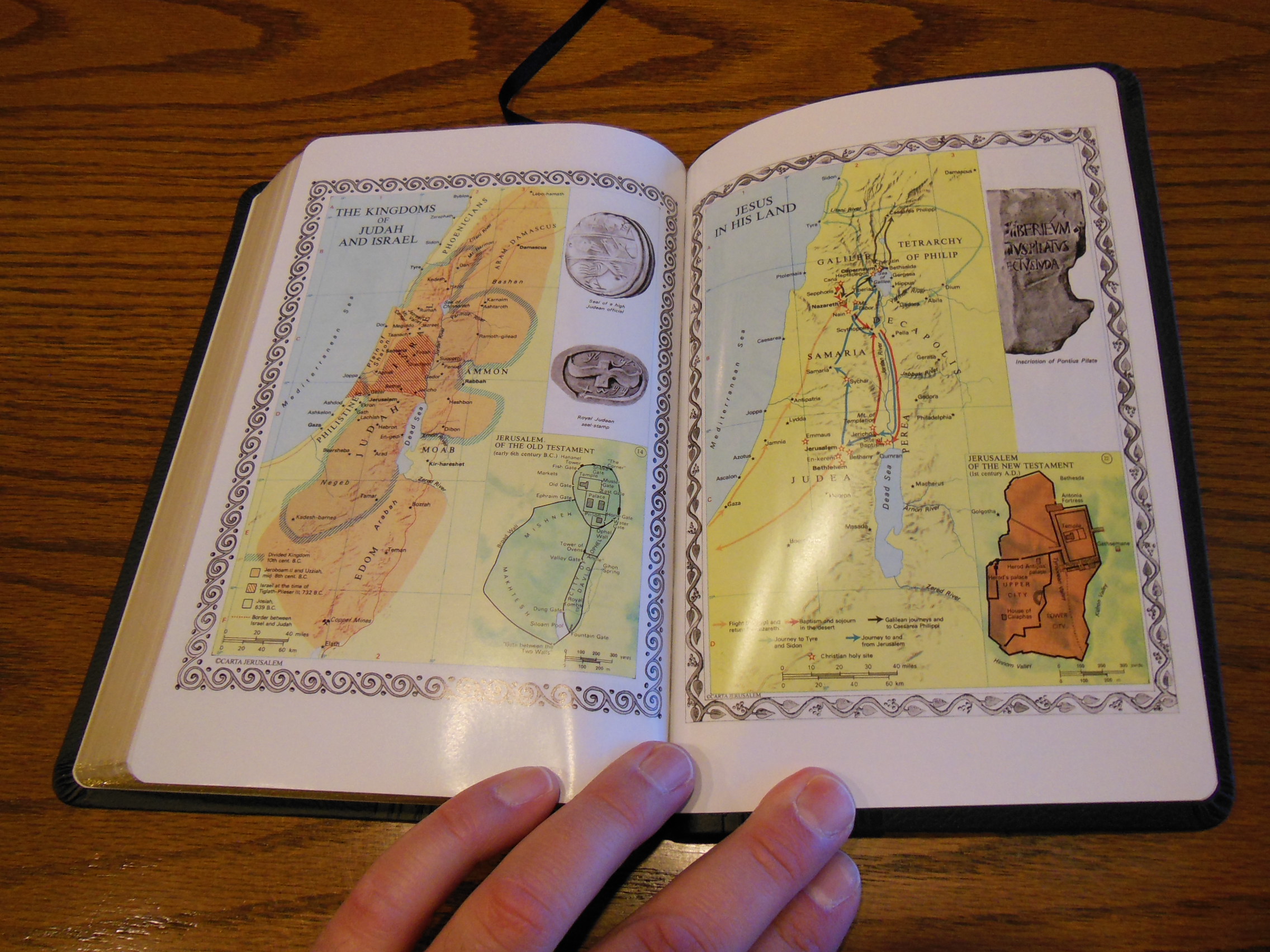
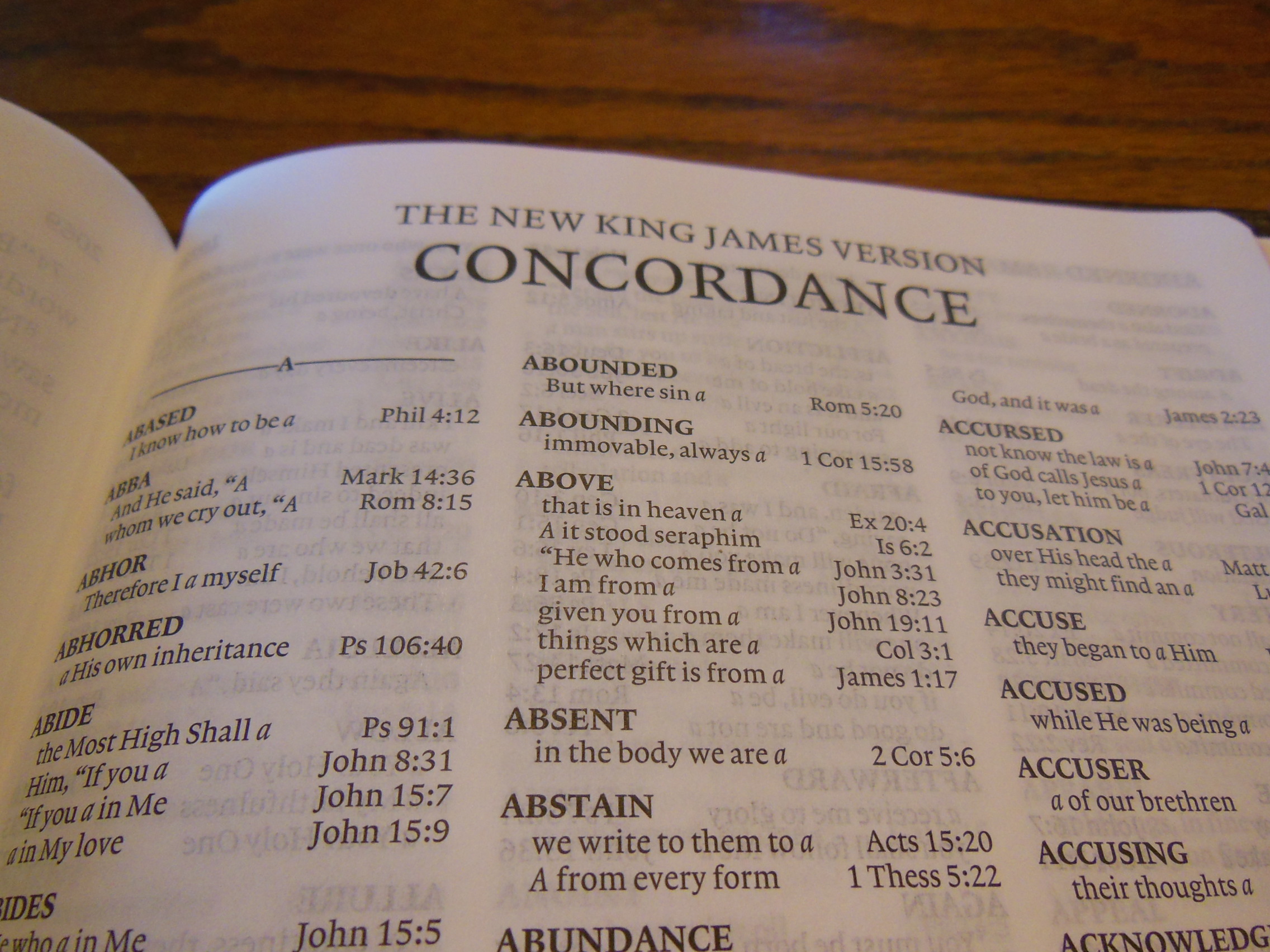
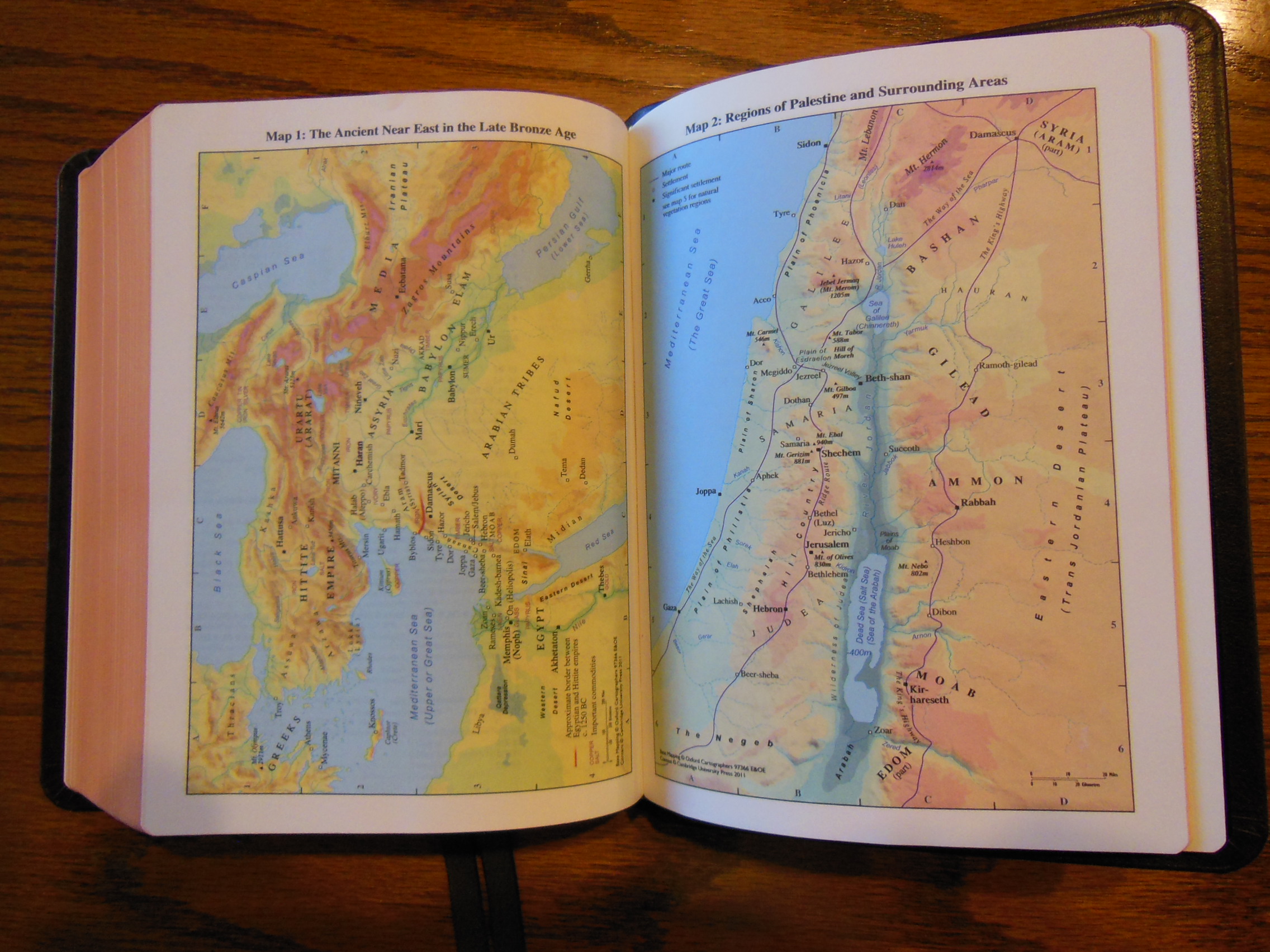
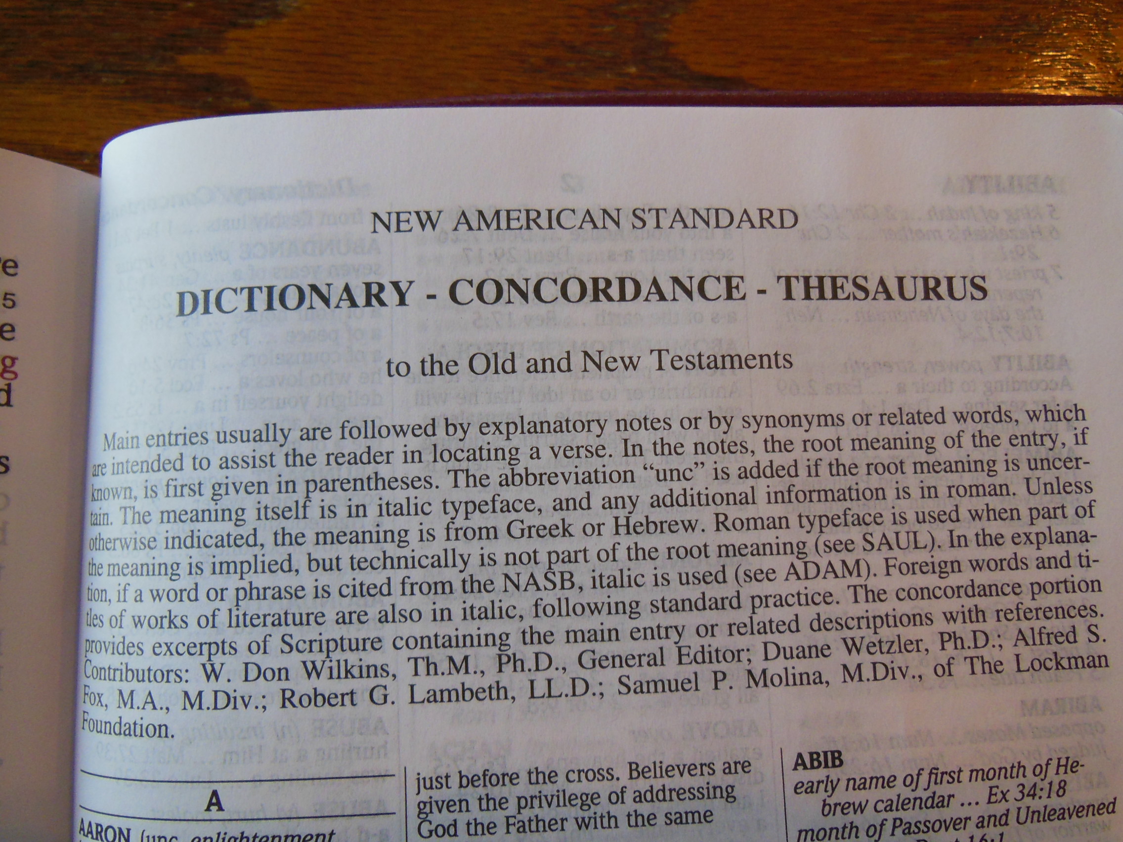
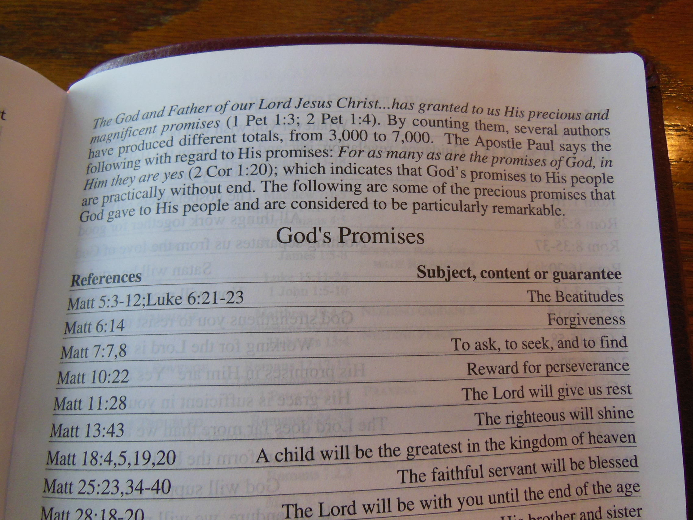
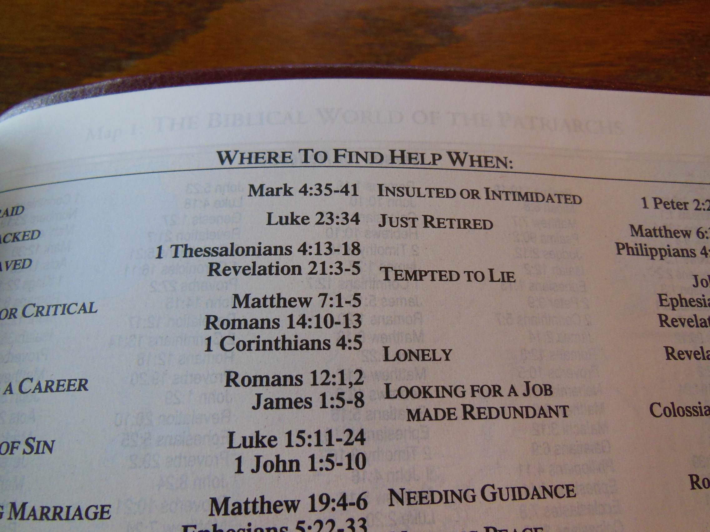
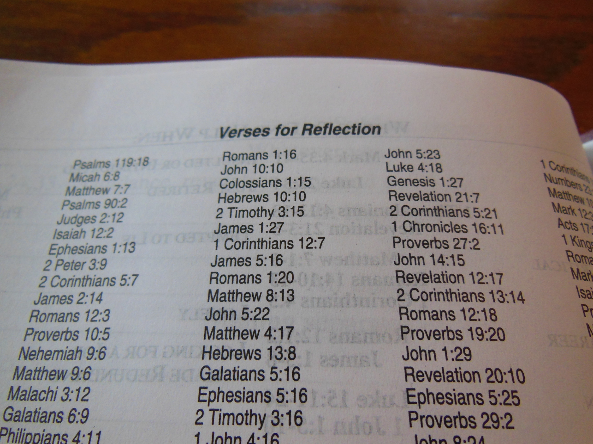
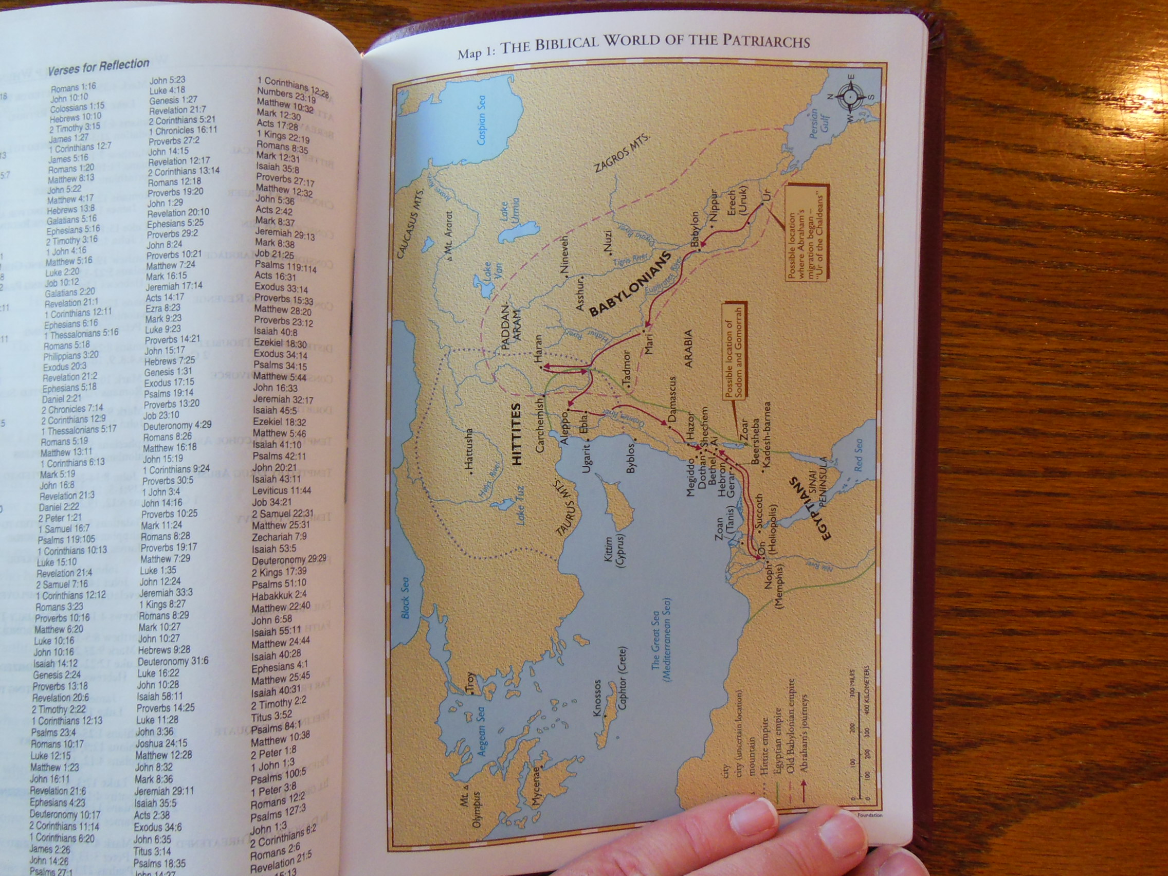
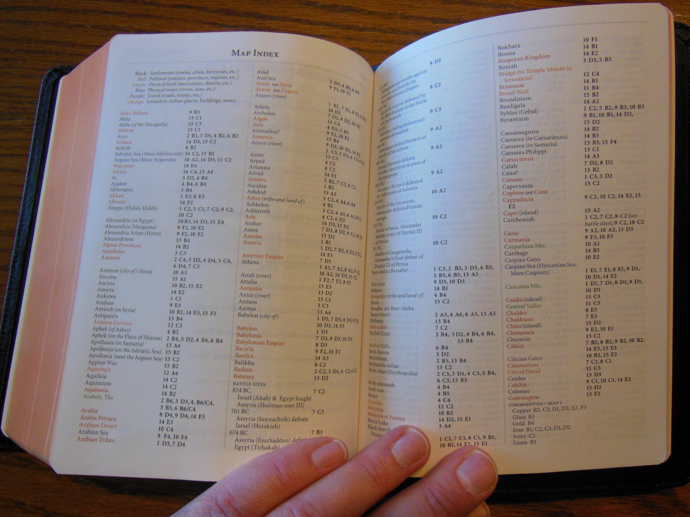
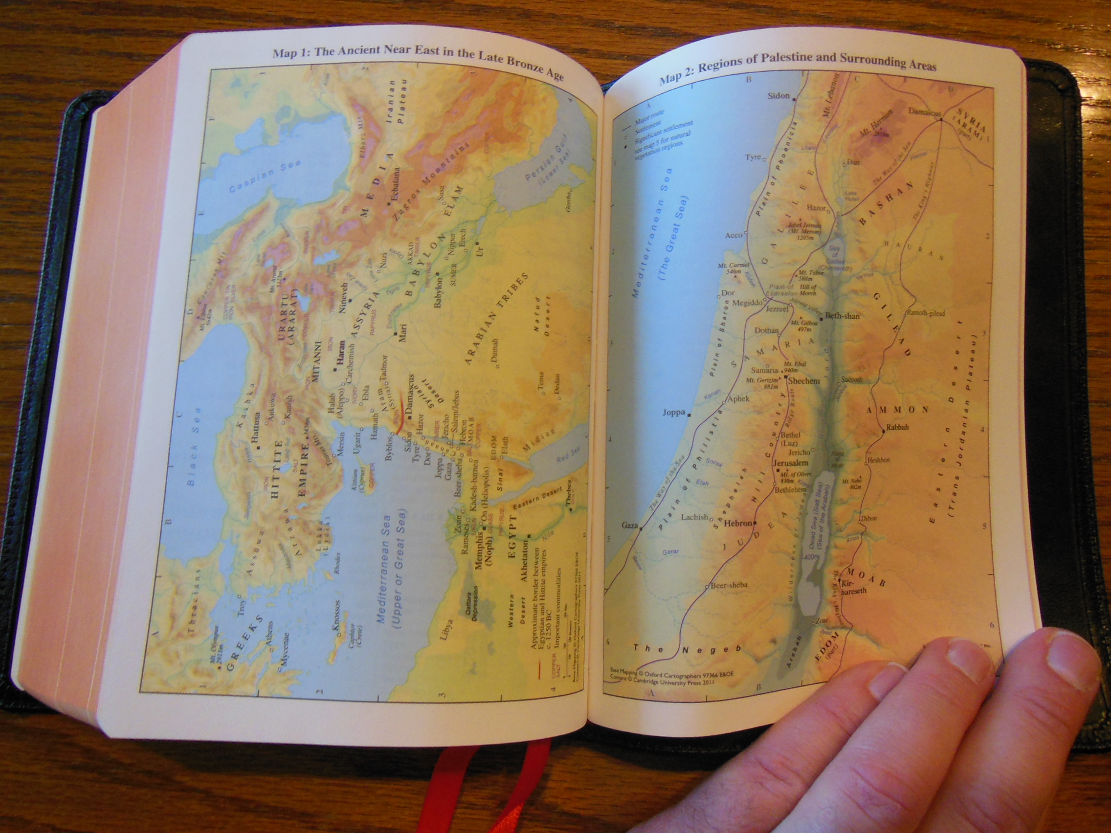
There is a useful concordance in the end with a map index and 15 color maps printed on a heavier card paper.  I like this approach better than the glossy maps as the high clay content in their paper makes them crack easier.

Cambridge ESV Clarion and REB 076 Cambridge ESV Clarion and REB 077

With all of the features like, quality construction, quality materials, attention in design, you can tell why I love the Clarion Bibles from Cambridge.  If you are in the market for a premium Bible, look no further.  You can purchase them on these sites;
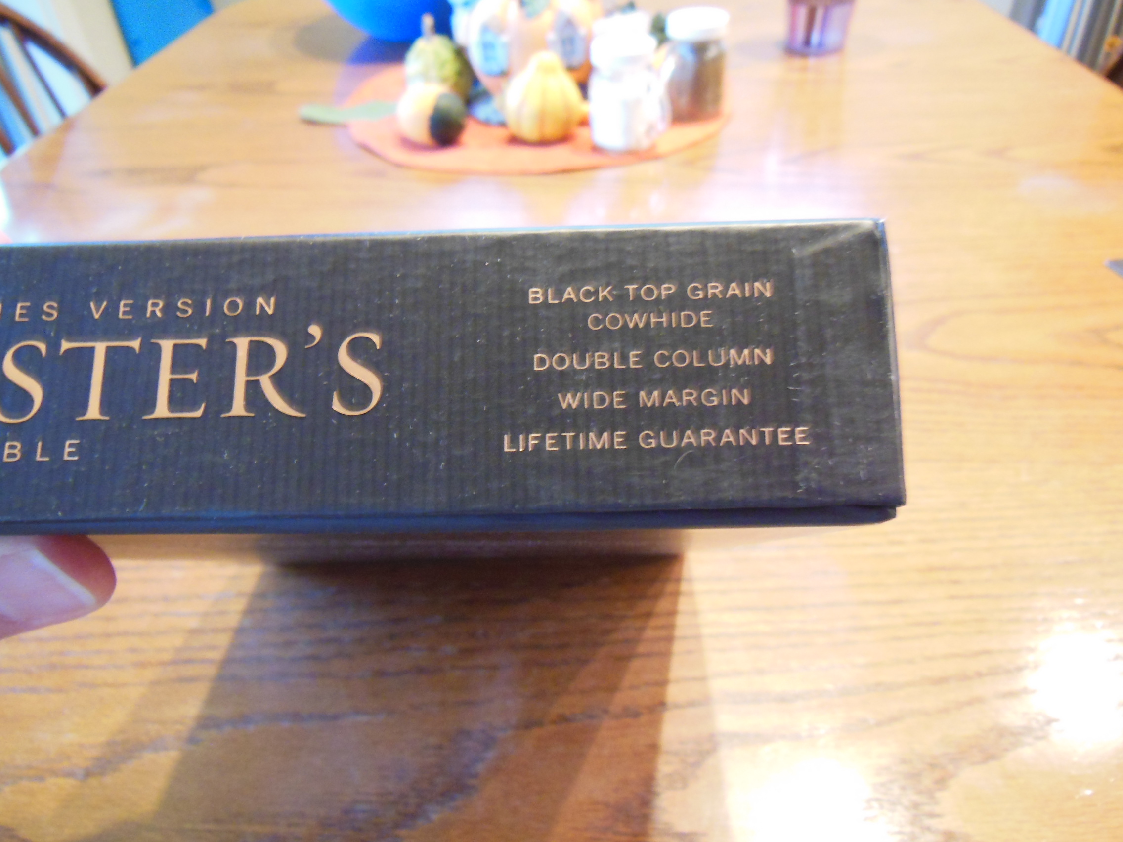
Christianbook.com

Amazon.com

evangelicalbibles.com

9780521182911

ESV Clarion Reference Edition ES486:XE
Black Goatskin Leather

Bible Reviews

Hey women! Are you tired of the pink, “so-called” Study Bibles, that are full of fluffy self-esteem candy?

Holman woman's hcsb study bible 003

Well, Holman has got a surprise for you!  Their, “Study Bible for Women” in the HCSB translation.  It comes in this quality chocolate color, genuine cowhide leather, with thumb indexes.  It was a very pleasant surprise to see some actual study aids as opposed to junk food.  There is academic quality here.  There are some notes on hermeneutics, theology, some original language notes and transliteration help.  Most women’s Bibles are pink and have a bunch of Osteen-esque, self help, self-esteem, feel good, prattle in them with little in the way of useful exegesis of scripture or how to apply it today.  This study Bible has significant work in it from two established Christian women.  Here are short bio’s from Holman’s site,

Dorothy Kelley Patterson is Professor of Theology in Women’s Studies at Southwestern Baptist Theological Seminary in Fort Worth, Texas. She is a homemaker, popular speaker, and successful writer, editor, and compiler of numerous books including A Handbook for Ministers’ Wives, The Family, BeAttitudes for Women, and Touched by Greatness: Women in the Life of Moses. She is co-editor of the two volume Women’s Evangelical Commentary:Old Testament and New Testament. Her husband Paige is President of Southwester Baptist Theological Seminary.”

and,

Rhonda Harrington Kelley is President’s wife and Adjunct Professor of Women’s Ministry at New Orleans Baptist Theological Seminary in New Orleans, Louisiana. She is a frequent speaker for women as well as an author of books including Divine Disciple, Life Lessons for Women of the Bible, and Personal Holiness: A Biblical Study for Developing a Holy Lifestyle. She is co-editor of the three volume Women’s Evangelical Library including Women’s Evangelical Commentary: Old Testament, New Testament, and The Study Bible for Women. Her husband Chuck Kelley is President of New Orleans Baptist Theological Seminary.”

There is some of the fluff, don’t get me wrong.  It is just kept in its proper place and proportion.  I think that women should find this very helpful.  However, I am not a woman and am just commenting because I want one like this for men.

Here is what the Publisher has to say about this Bible,

Publisher’s Description

The Study Bible for Women will equip you to reach deep into God’s Word.  Perhaps the single most powerful aspect of this Bible are the “threads” of specialized study thoughtfully woven throughout, pointing you to God’s larger story and allowing the Holy Spirit to write His revealed truths on your heart.In The Study Bible for Women, you’ll join a host of other women, all academically trained in the original languages of the Bible and passionate about God’s Word, for an intimately deep dive into Scripture that will equip you to unlock the riches and majesty of His Word, and ignite a passion to mentor others in your life to do the same.  The Study Bible for Women includes the full text of the Holman Christian Standard Bible, a clear, contemporary English translation that’s faithful to the original languages of the Bible.

Features include extensive commentary notes, word studies, answers to hard questions, doctrinal notes, Biblical womanhood articles, character profiles, Written on My Heart applications, extensive book introductions, presentation pages, in-text maps, charts & timelines, full-color maps section and concordance.”

The Bible was shipped in a cardboard box with paper packing material.

Holman woman's hcsb study bible 001

The Bible was inside a two piece retail box.  It arrived undamaged and in good condition.

Holman woman's hcsb study bible 002

Inside the retail packaging it was wrapped in two pieces of black construction paper to keep it from getting bent corners.

Holman woman's hcsb study bible 006

The genuine cowhide is a chocolate brown color with a soft texture.  I can’t stress enough that this is not some cheap synthetic leather, nor is it some hard, shiny, pigskin leather you would find on other Bibles in this price range.  This is a soft and supple cowhide leather.

Holman woman's hcsb study bible 018

The spine is hot stamped with, “HCSB” at the top, “The Study Bible for Women” orientated horizontally along the spine in the middle, and at the bottom is the Holman logo.

Holman woman's hcsb study bible 013

The page edges are gilded gold.  The Bible is thumb indexed with gold text on black for the Old Testament and gold text on Red for the New Testament.

Holman woman's hcsb study bible 009

The pages are white with a faded blue color that becomes more solid as you approach the page edges and perimeter of the page.

Holman woman's hcsb study bible 015

It kind of gives it an art gilded look of blue under gold.  It might have been better to gild this with silver instead.  However, the effect is minimal so as not to be unattractive.  The paper is 30 g.s.m. making it pretty opaque.  Lighter paper would not have been good.  With this weight of paper you don’t have much in the way of ghosting (seeing the text on the backside of the page show through)

Holman woman's hcsb study bible 045

There are numerous decorative designs throughout.  I don’t know what your opinion is of that, but I could do without them.  The font used for the main text is 10 point in ITC Clearface Standard. (Open-type)  This makes it easy on they eyes unless you have bad eyesight.  The coloring of the page perimeters could cut down on the contrast of the text to the paper.  The paper could be a little brighter white where the text is, but then the perimeter effect would be lost.  The text is laid out in a double column, paragraph format with the cross-references on the outside of the page instead of at the bottom or in a center column.

Holman woman's hcsb study bible 042

Interspersed throughout are other features.  The inside cover is made of vinyl of the same color and glued down.  They did a good job with the corners.

Holman woman's hcsb study bible 017

There is one ribbon marker and it is matching in color as well.

Holman woman's hcsb study bible 051

The binding on this Bible is a South Korean, sewn binding. They have been doing a lot of Holman’s bindings and are holding up quite well. This also makes them flexible on top of being durable. Way better than a glued binding.

Even though this is a study Bible, I don’t want you to be afraid that it is a behemoth. (funny right?)  For a study Bible this thing is very manageable.  It is just the right size for ladies who don’t want to use a hand-truck to carry their study Bibles to Wednesday night Bible Study.  I think it is a very good investment if you are looking for a women’s study Bible that has good content instead of the motivational junk you get pushed on you nowadays.

ISBN: 9781586400941

http://www.bhpublishinggroup.com/products/the-study-bible-for-women-chocolate-genuine-leather-indexed/

You can purchase this Bible on Amazon  or on Christianbook

Bible Reviews

The Modern English Version (MEV) a Curious and Surprising Translation.

Passio MEV Bible 009

I came across the MEV by chance while searching for different translations.  I was curious because I have never heard of the MEV before.  When looking into it I found out some more details that made me even more curious.  I found out that it is a modern translation that seeks to be as “word for word” accurate as it can be while maintaining the King James text in modern English.  I was a bit puzzled by this as we now have many more manuscripts, some are older and some are more reliable than the Textus Receptus. As for a modern version of the KJV, well we already have the New King James Version (NKJV) as for modern translations, I prefer the NASB as it makes use of many of the manuscripts we have discovered over the last couple hundred years without including the errors Erasmus made for the sake of expediency.  This is one of the differences between the MEV and other modern translations.  It is kind of like building a modern car, but using an old flat head motor.  The Textus Receptus isn’t horrible, it just isn’t as good as the manuscripts we now have.

With those concerns considered I turned my attention to the actual translation of the MEV.  I’m glad to say, that so far this has turned out to be pretty accurate and reliable.  I’ve been reading it with my NA28, NASB, KJV, and NKJV side by side.  I actually prefer the way the MEV renders some words over the NASB.  For instance, in the New Testament the NASB renders, “Χριστός” as, “Messiah” instead of, “Christ” where the MEV renders it as, “Christ.”  The MEV makes us of capital letters when referring to God, but not as much as the NASB.  The NASB does a better job in other areas as well.  For instance in John 1:5 I like the rendering of, “κατέλαβεν” as, “comprehend” more than, “overcome.”  I understand that there is the implication in the Greek of struggling with a concept to finally comprehend it or overcome it.  I just think that the English word, “overcome” has connotations that could lead one to think of a contest, battle, or race, without and missing out on the more important implication of comprehension.

Here is an excerpt from the MEV page, “The MEV is a translation of the Textus Receptus and the Jacob ben Hayyim edition of the Masoretic Text, using the King James Version as the base manuscript.  The MEV is a literal translation. It is also often referred to as a formal correspondence translation.  The Committee on Bible Translation began their work on the MEV in 2005 and completed it in 2013.”  It also appears that some of the endorsers mention that this is the 1611 authorized with modern language.  These lead me to believe that they haven’t fixed the problems that Erasmus introduced.  Here are the last 8 verses from Revelation out of the 1611 Authorized KJV, the Cambridge KJV, The MEV, and the NASB, in that order:

“14 Blessed are they that do his commandements, that they may haue right to the tree of life, and may enter in thorow the gates into the citie.

14Blessed are they that do his commandments, that they may have right to the tree of life, and may enter in through the gates into the city.

14 Blessed are those who do His commandments, that they may have the right to the tree of life, and may enter through the gates into the city.

14 Blessed are those who wash their robes, so that they may have the right to the tree of life, and may enter by the gates into the city.

15 For without are dogs, and sorcerers, and whoremongers, and murderers, and idolaters, and whosoeuer loueth and maketh a lie.

15For without are dogs, and sorcerers, and whoremongers, and murderers, and idolaters, and whosoever loveth and maketh a lie.

15 Outside are dogs and sorcerers and the sexually immoral and murderers and idolaters and everyone who loves and practices a lie.

15 Outside are the dogs and the sorcerers and the immoral persons and the murderers and the idolaters, and everyone who loves and practices lying.

16 I Iesus haue sent mine Angel, to testifie vnto you these things in the Churches. I am the roote and the offspring of Dauid, and the bright and morning starre.

16I Jesus have sent mine angel to testify unto you these things in the churches. I am the root and the offspring of David, and the bright and morning star.

16 “I, Jesus, have sent My angel to you with this testimony for the churches. I am the Root and the Offspring of David, the Bright and Morning Star.”

16 “I, Jesus, have sent My angel to testify to you these things  [fn]for the churches. I am the root and the descendant of David, the bright morning star.”

17 And the Spirit and the Bride say, Come. And let him that heareth, say, Come. And let him that is a thirst, come. And whosoeuer will, let him take the water of life freely.

17And the Spirit and the bride say, Come. And let him that heareth say, Come. And let him that is athirst come. And whosoever will, let him take the water of life freely.

17 The Spirit and the bride say, “Come.” Let him who hears say, “Come.” Let him who is thirsty come. Let him who desires take the water of life freely.

17 The Spirit and the bride say, “Come.” And let the one who hears say, “Come.” And let the one who is thirsty come; let the one who wishes take the water of life without cost.

18 For I testifie vnto euery man that heareth the wordes of the prophesie of this booke, If any man shal adde vnto these things, God shall adde vnto him the plagues, that are written in this booke.

18For I testify unto every man that heareth the words of the prophecy of this book, If any man shall add unto these things, God shall add unto him the plagues that are written in this book:

18 I testify to everyone who hears the words of the prophecy of this book: If anyone adds to these things, God shall add to him the plagues that are written in this book.

18I testify to everyone who hears the words of the prophecy of this book: if anyone adds to them, God will add to him the plagues which are written in this book;

19 And if any man shall take away from the wordes of the booke of this prophesie, God shal take away his part out of the booke of life, and out of the holy citie, and from the things which are written in this booke.

19And if any man shall take away from the words of the book of this prophecy, God shall take away his part out of the book of life, and out of the holy city, and from the things which are written in this book.

19 And if anyone takes away from the words of the book of this prophecy, God shall take away his part out of the Book of Life and out of the Holy City and out of the things which are written in this book.

19 and if anyone takes away from the words of the book of this prophecy, God will take away his part from the tree of life and  [fn]from the holy city, which are written in this book.

20 Hee which testifieth these things, saith, Surely, I come quickly. Amen. Euen so, Come Lord Iesus.

20He which testifieth these things saith, Surely I come quickly. Amen. Even so, come, Lord Jesus.

20 He who testifies to these things says, “Surely I am coming soon.”

Amen. Even so, come Lord Jesus!

20 He who testifies to these things says, “Yes, I am coming quickly.” Amen. Come, Lord Jesus.

21 The grace of our Lord Iesus Christ be with you all. Amen.”

21The grace of our Lord Jesus Christ be with you all. Amen. {THE END.}

21 The grace of our Lord Jesus Christ be with you all. Amen.

21 The grace of the Lord Jesus be with  [fn]all. Amen.

You can see some of the differences between translations due to the error of Erasmus in the above verses.  Of course the first three translations will look more alike when compared to the last one.  The NASB is a modern translation that utilized more than just the Textus Receptus.  It used the third edition of Rudolf Kittel’s Biblia Hebraica, the Dead Sea Scrolls, and the Biblia Hebraica Stuttgartensia for the Hebrew.  It used the Eberhard Nestle’s Novum Testamentum Graece for the Greek.

According to their web page they were not allowing any cultural or theological agendas to dictate how they did their translation.  I’m glad to see that there isn’t any gender neutral nonsense so far as I have read.

Overall it accomplishes what it sets out to do.  It brings the KJV into modern English.  I think it does a better job in some areas and could be better in others.  I think they should fix the problems with the work of Erasmus.

The Bible Passio sent me to review is a Thinline Reference Bible.  Here is an excerpt from their product page, “Thinline Reference Bible Black Leatherlike ATTRACTIVE AND LIGHTWEIGHT, this Thinline Reference Bible is a Bible your customers can take anywhere. Complete with study tools such as cross-references, a concordance, and four-color maps, it is sure to be a favorite for home, church, or giving as a gift.” The Bible was provided gratis for the purpose of review by Passio.  It arrived in an envelope.

Passio MEV Bible 001

It was packaged in a card-paper sleeve.  The sleeve or slipcase is not heavy enough to use for storage and actually was bent quite a bit from being mailed.

Passio MEV Bible 005 Passio MEV Bible 003

The Bible itself didn’t suffer too much, just some bent corners.  The MEV was printed and bound in America.

Passio MEV Bible 019

I found this refreshing.  So many of the Bibles I review are imported from China and South Korea.  The Bible was covered with what they call a black leatherlike cover.  It was black.  It was textured.  That was about where the similarities ended.  This had some of the cheapest cover material I’ve ever seen.

Passio MEV Bible 009 Passio MEV Bible 010

The inside cover is lined with paper.

Passio MEV Bible 012 Passio MEV Bible 013

Keep in mind that this Bible has a very low price, very white opaque paper with sharply printed text.

Passio MEV Bible 040

We have to be fair.  You can pick up a copy for around $20.00 online.  The paper is 19.8 lb basis weight Tervakoski.  According to the publisher it is the equivalent of approximately 29.3 gsm.  Having used this Bible for a couple of weeks now, I’d have to agree.  The paper is pretty opaque given its light weight and how thin it is.  The font is an 8 point Delima MT Std regular.  The words of Christ are in red.

Passio MEV Bible 032

The text is arranged in a typical double column format with center column references.  There are not as many cross references as I’d like to see.

Passio MEV Bible 025 Passio MEV Bible 026

I have a feeling that there will be more as the translation matures.  The page edges are gilded.

Passio MEV Bible 041

There is one black ribbon marker.  The ribbon is narrow, thick, and seems to be better quality than most of the Bibles in the same price range.

Passio MEV Bible 029

There are short book introductions before each book and when a book ends the next book starts on a new page sometimes giving you room for notes at the end of the book.

Passio MEV Bible 028 Passio MEV Bible 027

There is a helpful concordance in the back and after that 4 color maps.

Passio MEV Bible 033 Passio MEV Bible 034 Passio MEV Bible 037 Passio MEV Bible 035

Now keeping in mind that this is a $20 Thinline Bible I want to tell you how impressed I am with its flexibility.  After only a couple of hours of use this thing is flexible enough to double over and to wrap around itself.  It is great for carrying with you in a bag or lunch box.  It isn’t so expensive as to make you afraid to use it.  It isn’t so small you can’t read the text.  It is a very practical Bible if you are looking for an inexpensive Thinline to carry and read.

Amazon has them here.

  • ISBN-13: 978-1621369967
Bible Reviews

Another Excellent Bible from Cambridge, the Clarion NKJV Bible in Brown Genuine Calfskin.

cambridge nkjv clarion and kjv cameo 046

I begin by referring you to my previous review of the Cameo from Cambridge.  The two Bibles were delivered in the same packaging from Cambridge.   Both have the sewn bindings and both are covered with the same brown calfskin.  You can read about those aspects in that review.

The Clarion from Cambridge is an example of modern Bible design done right.  Here is a quote from the Cambridge website about the Clarion in NKJV;

A Cambridge Clarion edition represents an unusual and attractive combination of features – a very readable text in a paragraph style, with a single-column layout – all within a personal size reference Bible format. Here, the NKJV text is presented in a single column with the cross-references in the outer margin, giving the page a very well laid out appearance. The font size is a little under 9 point with generous line spacing. It is typeset in Lexicon No.1, a modern digital font which has many of the characteristics usually associated with traditional Bible typefaces – in particular, a degree of readability more usually associated with much larger type. The Bible has 15 new colour maps and a concordance. There are two ribbons to keep the place in different parts of the Bible. This is a Bible of the very highest quality, printed on India paper with art-gilt edges, Smyth-sewn for flexibility and endurance, and bound in brown calfskin leather

Chances are if you are considering the purchase of the Clarion NKJV Bible in brown calfskin, you have a list of desired attributes in mind; manageable size, legibility, quality sewn binding, beautiful and durable cover, and so on.  The Clarion fits the niche almost perfectly in my opinion.  It brings together many desirable features without sacrificing too much in the other areas of design.  The Clarion is larger than the Cameo.  It is definitely thicker.  The thickness of the Clarion does make it a bit more to hold than the Cameo, but the font is so much more legible.  The tradeoff is well worth it.  Because of the thicker format the Clarion can use a larger font.  It is a modern font, printed with modern technology making it very clear and sharp.  The Cameo’s font was cleaned up, but still doesn’t compare to the font of the Clarion.

Another wonderful attribute is that you can get the Clarion in different translations.  Currently it is available in the New American Standard Bible (NASB), the English Standard Version (ESV), the King James Version (KJV), and the New King James Version (NKJV), which I am reviewing.

So besides the size, font, and available modern translations, the Clarion also breaks in very well.  I have been using an NASB Clarion in goatskin for my daily reading and it has become my standard for comparison.  The NKJV in calfskin adds some rigidity to the cover.  Instead of being edge lined and perimeter stitched with a very flexible material it uses a more common process of vinyl inner liners glued down to the outer cover.  The added structure can be a pro to some and a con to others.  In my opinion, if this Bible were thinner the stiffer cover would be a pro, but it is just a bit too thick.  I can’t roll the cover all the way around like I can with the goatskin covered Clarion.  It makes it a little less comfortable for me.  The cameo gets the size right for this type of cover, but at the sacrifice of font size, line spacing.  These all have an effect on the ease of reading.  If you are going to buy the Clarion, I’d suggest the goatskin.  Of course this is just my opinion.  Everyone has different sized hands and preferences.  I suggest looking one over in the Christian book store, or getting your friend to let you borrow theirs for a few minutes.  It is not a small investment for most people.  Because of the quality of craftsmanship and materials used it will be with you for a long time.  So it is important that you do your research before buying a lifetime companion like the Cambridge Clarion.

This Bible is covered with a genuine calfskin in brown.

cambridge nkjv clarion and kjv cameo 050

It is very supple and soft.  On the front of this Bible is hot stamped, “Holy Bible” in gold.  The spine of the cover has, “Holy Bible” at the top, “New King James Version” immediately under that.  At the bottom of the spine is, “Cambridge” in gold as well.  There are modest hubs worked into the spine as well.

cambridge nkjv clarion and kjv cameo 052

The inner vinyl liners are black and glued neatly to the calfskin.

cambridge nkjv clarion and kjv cameo 053

The calfskin has been folded over and finished uniformly.  The corners are all perfectly finished.  There are two ribbon markers that are color matched to the cover.  The ribbon markers are about a quarter inch wide.

cambridge nkjv clarion and kjv cameo 067

The page edges are art gilded.  This gives them a distinctive look that you won’t find on less expensive Bibles.

cambridge nkjv clarion and kjv cameo 065

The paper is high quality opaque paper.  It is slightly off white and contrasts with the black font nicely.  The text is printed in a single column, paragraph format with line matching.  Line matching is when the lines of text are printed in such a way so as to make the text on one side of the page directly opposite of the text on the other side of the page.  This aids in legibility.  The font is large enough to be easily read yet small enough to keep the size of the Clarion down.  It is clearly, and uniformly printed.

cambridge nkjv clarion and kjv cameo 062

It has a useful concordance and the maps are printed on a heavier paper with a  matte finish.

cambridge nkjv clarion and kjv cameo 069 cambridge nkjv clarion and kjv cameo 073

The sewn binding is of the quality I’ve come to expect from Cambridge.  The Clarion opens well and lays flat when opened.

To sum up, the Clarion is an excellent Bible that fills a big niche in the Bible market.  Many Christians are on the lookout for a Bible that travels well, is easy on the eyes while reading, and is well made.  The Clarion fits the bill and is available in some great translations.  Check out Cambridge Press’ Page.  You can pick up a copy of this Bible on evangelicalbible.com for about $140.00 and you can also get it from Amazon for about $120.00 and Christianbook for about $155.00

ISBN-13: 9781107664425

isbn: 9781107664425

ISBN: 110766442X

NKJV Clarion Reference Bible NK485:X Brown Calfskin Leather

Bible Reviews

Do you want a large print compact NASB? Review of the Lockman Foundation Large Print Compact Text Edition in Burgundy Leathertex.

nasb large print compact 003

Review of the Lockman Foundation Large Print Compact Text Edition in Burgundy Leathertex.

As usual Lockman did a fine job of packing and shipping the Bible to me.

nasb large print compact 001

This edition is not expensive.  If you have high expectations you will be disappointed.  This Bible sells for about $20.00 it is produced in China.

nasb large print compact 019

I’m not making excuses here, but there are some things you need to consider when criticizing a Bible.  I know some people have complained about the print and the paper on this edition.  They aren’t wrong.  The paper could be a bit more opaque or the print could be a bolder type face.  It would be much easier on the eyes if that were the case.

nasb large print compact 025

What would the consequences of that be?  Well, if the font were a bolder type face and stayed 9 point, it would take up more space on the page necessitating more pages.  This edition is already pretty thick at about 1 3/16” not to mention that they have already taken out the references and made it single column paragraph format.

nasb large print compact 012

There isn’t much in the way of helps either.  There aren’t any maps to remove to make this thinner.  So what about the paper?  Well, same problem if you make a thicker paper that is a higher g.s.m. then the Bible gets thicker.  It’s just the laws of physics in a finite world folks.  I hate to be a bummer.

This Bible tries to fill a niche that definitely is there.  I’ve heard many people complain that they want a nice clean, compact, text edition of the NASB in paragraph format.  The Cambridge Clarion is pretty close, but it costs almost $200 dollars in goatskin.  You could opt for the calf split leather for around $105-$115 but that is still pretty expensive.  So let’s look at what you are getting for $20.00 instead of what you aren’t getting.

This edition has 9 point font, the words of Christ in red arranged in a single column text format with limited footnotes at the bottom of the page.

nasb large print compact 036 nasb large print compact 024 nasb large print compact 027

It has a sewn binding and is covered in leathertex which is modern synthetic leather.  It has a cross stamped on the front with a channel around the perimeter.

nasb large print compact 007

On the spine is printed, “New American Standard Bible” in large letters from one end to the other.

nasb large print compact 008

The page edges are gilded.  There is one ribbon marker that matches the burgundy color of the cover.  The ribbon is pretty thin and narrow.  The inner liner is vinyl and color matched to the cover.  It is glued down.  There are decorative head and foot bands.  You have a presentation page printed on Bible paper and not card paper.  Then, you have the copyright page, followed by the foreword with translation explanation.  Before the text begins you have a table of contents.  After the text of the Bible you have one page of the, “Parables of Jesus” then, four pages of, “Important Events in Christ’s Life According to the Gospels” three pages of, “God’s Promises” and next, two pages of, “Old Testament Prophecies Fulfilled in Christ” and lastly, one page of, “The Miracles of Jesus.”  The outside cover closed measures 7 5/16” long by 5 1/4” wide by 1 3/16” thick.

This is exactly what it is labeled.  You can’t expect it to be everything you wanted in a Bible.  There are going to be compromises when you make a large print, compact, text edition.  I know this review sounds like an apology.  I really wanted to like this Bible, but the truth is that it is a bit hard on the eyes due to the seemingly skinny font and thin paper.

For the money though, it is an excellent value and the perfect size to carry with you.  The font is much larger than a 6 point font and you really haven’t gained that much in size over a traditional compact edition.  I would recommend this Bible for people with good eyes that aren’t going to do long reading sessions.  It would be good for break room reading or whenever you have a few minutes.

ISBN: 1581351569

ISBN-13: 9781581351569

Bible Reviews

Local Church Bible Publishers, The Best Authorized KJV Publisher You’ve Never Heard of.

Evidence KJV LCBP Red Wide Margin LCBP Black  Hand Size 009

A Review of the, “400E1R Mid-Size Note Takers Red 1 Piece (Executive)”

First a little about Local Church Bible Publishers, if you are like me, I had never heard of them, until I did a search on youtube for quality leather covered, sewn binding Bibles.  Then I was confronted with what seemed to be southern brother touting the virtues of his LCBP Bible.  I was a curious.  The cover looked pretty good and the inside cover was edge lined as well as perimeter stitched.

Evidence KJV LCBP Red Wide Margin LCBP Black  Hand Size 015

I searched some more and found the video of their manufacture process.  I was pretty impressed, but then I found out that they only make the authorized 1611 King James.  Now, I don’t have a problem with using a 1611 King James, I just happen to like the NASB and a couple other modern translations better.  Now all you KJV onlyists settle down out there, and stop calling me a heretic long enough to read about the positive features of the LCBP Mid-Size Note Takers wide margin Bible.  If you want to find out what LCBP is all about you can follow this link to their about page.

As for their products, I have a couple of their Bibles and have found them to be generally superior to all other Bibles in their price range as far as the construction and materials go.  The Mid-Size Note Takers in Red Leather came in a cardboard box.  The Bible inside was wrapped horizontally and vertically with paper.  It was not damaged at all in the shipping process.  The first couple of things I noticed when I took it out of the packaging was the smell of leather and the bright red cover.  It was very red.  It stands out.  You don’t see many Bibles as red as this one.

Evidence KJV LCBP Red Wide Margin LCBP Black  Hand Size 011

I’ve seen burgundy Bibles, but this is straight, bright, and red.  I also noticed that the cover was very soft.  It wasn’t shiny and slick like cheaper pigskin leather.  I also noticed that it didn’t have much of a texture to it.  At first when I went to open the Bible I was being careful turning the pages because I didn’t want to tear the pages if they were stuck together, but me apprehensions were unfounded.  The gold gilded page edges didn’t stick together at all.

Evidence KJV LCBP Red Wide Margin LCBP Black  Hand Size 035

The cover is very supple and can be rolled up without hurting it.

Evidence KJV LCBP Red Wide Margin LCBP Black  Hand Size 019

The inside cover lining is perimeter stitched to the outer cover and is just as flexible as the outer cover.  The liner is black.  The perimeter stitching is red like the cover and two matching ribbon markers.  This is an edge lined Bible.  The Bible, despite its name is not mid-size.  It is 9.9″ x 6.75″ x 1.75″

Evidence KJV LCBP Red Wide Margin LCBP Black  Hand Size 008

I think that their designation of mid-size is in relation to the Bibles they produce and not representative of what we see in the market.  The spine has the words, “Holy Bible” at the top and, “Authorized King James” in the middle, and then at the bottom, “Church” heat stamped in gold foil.

Evidence KJV LCBP Red Wide Margin LCBP Black  Hand Size 012

The Paper is opaque and thick.  There are generous 2.5” margins for note taking.

Evidence KJV LCBP Red Wide Margin LCBP Black  Hand Size 036 Evidence KJV LCBP Red Wide Margin LCBP Black  Hand Size 040

The paper is thick enough to endure being written on and have minimal show through.  The 11 point font is printed clear and sharp.  This is a black letter edition all text is black.  The text is arranged in a single column verse format.  This aids in ease of use and lends itself to note taking and referencing.

The binding is sewn giving this Bible durability and flexibility.

Evidence KJV LCBP Red Wide Margin LCBP Black  Hand Size 045

It has a concordance and maps in the back.  This Bible is printed and bound in the U.S.A. by LCBP as ministry.  You can purchase it at the link below.

http://localchurchbiblepublishers.com/product/400e1r-mid-size-note-takers-red-1-piecered-thread-executive/

Bible Reviews

A Review of the NASB Giant Print Reference Bible, in Genuine Leather, Burgundy.

NASB Giant Print Burgundy 003

Hello, 14 point font! This is definitely what the Doctor ordered if your eyes aren’t what they used to be.

The giant print NASB was delivered to my house, as usual from Lockman Foundation’s sales branch, www.americanbiblesales.com  it was packed in a cardboard box with paper as packaging material.  It was sufficiently safe from harm.

NASB Giant Print Burgundy 001

Inside the box was a two piece retail box.  I would suggest holding onto it for storage.  Once opened, I was presented with a layer of plastic wrapping that had to be defeated before I could get this beauty out to examine it.

NASB Giant Print Burgundy 004

Once the plastic was discarded, I was pleasantly greeted by the familiar smell of a nice leather cover.  There are numerous Bibles out there that say they have a genuine leather cover, but they look like and feel like bonded leather.  They have a fake grain pressed into them and their covers look shiny.  Not this big boy, the cover on this has nice texture and tactile feel to it.  Honestly, for the small price of this Bible I’d expect a cheaper feeling cover.  I thought the burgundy color was just right as well, not brazen, but still different than the venerable black.

NASB Giant Print Burgundy 034 NASB Giant Print Burgundy 006

The spine of the Bible has the words, “Holy Bible” at the top.  Immediately below is, “New American Standard Bible Updated Edition.”  At the bottom is, “Foundation Publications” and the NASB logo.  Above them are the words, “Giant Print.”  There are decorative lines separating the words.

NASB Giant Print Burgundy 011

The cover has a lined pressed into it around its perimeter for decorative purposes.  It adds a nice touch to finish it off.

NASB Giant Print Burgundy 033

The inside cover is lined with a vinyl liner that is color matched to the cover. It is glued down over the corners and edges of the cover.

NASB Giant Print Burgundy 022

The text block is firmly attached to the cover.  I noticed no problems with fit and finish.  It looked pretty good for a Bible printed and bound in China.

NASB Giant Print Burgundy 028

The binding for that matter is a sewn binding.  It is a tad bit tighter than some of the other ones that Lockman Foundation puts out.  This is neither a draw back or a benefit as far as function goes.  The Giant Print edition opens flat and is pleasant to use.

NASB Giant Print Burgundy 038 NASB Giant Print Burgundy 037

The sewn binding will help ensure years of use.  The Giant Print Bible maintains typical 6 ½” x 9 ¼” for the width and height, but is a tad bit thicker at 1 ¾” It is a little heavier than your typical reference Bible, but not by much.  Even with the slight size difference it is still pretty easy to hold and read.

NASB Giant Print Burgundy 035

The page edges are gold gilded.

NASB Giant Print Burgundy 008

The paper is a decent quality standard Bible paper 28 gsm.  It doesn’t have a problem with text ghosting.  I think Lockman must have realized that if you are buying a Bible with humongous font it isn’t because you have good eyesight.  The Bible paper, 14 point font, and uniformly printed text, all aid in making this a very legible Bible without making it too cumbersome.

NASB Giant Print Burgundy 020

Also you should note that this is a red letter edition.

NASB Giant Print Burgundy 039

The text is in a double column verse format with references at the end of each paragraph. There are limited references, for a reference Bible.  This one has about 13,000 references.  I doubt that anyone considering a 14 point font giant print edition is worried about having a ton of references though.

NASB Giant Print Burgundy 017

There is a ribbon marker that matches the color of the cover.  It is of average quality as far as ribbon markers go.

NASB Giant Print Burgundy 053

In the end there is a 146 page Dictionary/Thesaurus/Concordance. It should come in handy.  There is enough there to be useful, but not so much as to unnecessarily add to the bulk.

NASB Giant Print Burgundy 040

After that we have a section devoted to book introductions.  Each book in the Bible has a nice introduction to aid the reader in their studies.

NASB Giant Print Burgundy 042

Also, a section on God’s promises is provided after the book introductions.

NASB Giant Print Burgundy 043

“Where to find help when” and “Verses for reflection” appear at the very end before the color maps.

NASB Giant Print Burgundy 044 NASB Giant Print Burgundy 046 NASB Giant Print Burgundy 047

I think the biggest cons here would be the size of the Bible. For the very frail and elderly this would have to rest on a table for them to read it.  However, most elderly people won’t have any trouble holding this Bible to read.  The con is a very slight one.  We all have to obey physics here.  If you want giant text you have to sacrifice something.  I don’t think I’ve seen a better job on a giant print edition to date.

The pros here are of course the 14 point font and the wonderful cover at a very reasonable price.   Could hardly believe I was holding a $50 Bible.  It could have been twice that.  A noteworthy thing is that the presentation and records pages in the front seem to be a flat paper as opposed to the glossy paper they have been made out of.  I hope that Lockman carries this over to the maps as well.  This flat paper doesn’t crack or tear as easy as the glossy paper they have been made of in the past.

If you are in the market for one of these Giant Print Bibles they can be had for around $50. If you are lucky you might find them on sale for less.  Here are a couple of links to make it easier.

http://www.americanbiblesales.com/search/isbnlist1.php?ISBN=1581351100&hilite=yes

http://www.amazon.com/Giant-Print-Reference-Burgundy-Genuine-Leather/dp/1581351097/ref=sr_1_1?s=books&ie=UTF8&qid=1417034883&sr=1-1&keywords=9781581351095&pebp=1417034894361

http://www.christianbook.com/nas-giant-print-reference-leather-burgundy/9781581351095/pd/51097?product_redirect=1&Ntt=%209781581351095%20&item_code=&Ntk=keywords&event=ESRCG

ISBN: 1581351097

Bible Reviews

Puritans, Pilgrims, and Reformers, a Review of the 1599 Geneva Bible from Tolle Lege Press.

1599geneva 019

Tolle Lege Press is responsible for the rejuvenating the 1599 Geneva Bible. Unfortunately not many people know about this or seem to care. (Except for Kirk Cameron)  I say it is unfortunate because I truly believe the historical importance of this translation has been overlooked for a blind allegiance to the KJV.  Many people don’t know anything about the Geneva translation.  They are happy with their King James versions.  I’ve always wondered why the KJV onlyists are so loyal to a version that was translated by order of the King to conform to the ecclesiology of the Church of England.  The royals and Church leaders were afraid of losing their grip on power.  The Bibles of that time period all relied on the Latin Vulgate to some degree as a resource for translation.  The Geneva and the KJV were no exceptions.  The KJV relied on the Geneva for reference during its translation.  The KJV onlyists are always spewing their venomous polemics towards all other versions being Papal translations from Rome.  It is disturbing that they can suspend rational thought in regards to the KJV, but seem rational most other times.

The Geneva was translated by the Reformers. They had to flee to Geneva so that they wouldn’t be martyred by the Roman Catholic Church and Bloody Mary.   John Calvin and John Knox are most often credited for the Geneva translation.  There were other individuals working with them in Geneva to make this translation.  The notes and references of this Bible are retained and printed in modern font.  They are printed on the bottom of the page like a modern study Bible.  These notes are what made this translation such an enemy to the Crowns of the King and the Pope.  You have to understand that the Roman Catholic Church was in the business of hunting down and killing the reformers.  Then Puritans were persecuted for believing what the reformation brought to fruition.  This is what led to them becoming pilgrims.  They fled to America hoping to live God honoring lives obedient to His word.  The Bible they took with them was the Geneva Bible.

For more on the Geneva’s history visit this site; http://genevabible.com/

Here is a short youtube video about it as well; http://youtu.be/Nq1YhU8cGko

Don’t mind the trolls. They keep complaining about some pagan imagery on the cover, but I don’t see any.  I’ve asked them specifically and really haven’t gotten any answers other than, “You’re going to Hell for using anything but the KJV heretic!!!”  and now for something completely different, how about the review of the 1599 Geneva Bible?

The 1599 arrived in a cardboard box.

1599geneva 011

Inside was the Bible in its retail 2 piece box.  The cd-rom contains searchable, printable PDFs of the Geneva Bible, plus the Apocryphal Books and Metrical Psalms, was also in the retail box.

1599geneva 018

The packaging was sufficient to ensure the Bible was delivered without being damaged.  Tolle Lege did a wonderful job of giving the 1599 a modern typography.  They placed all of the references and notes at the bottom like a modern day study Bible.

1599geneva 043

The Bible is printed on some pretty opaque paper.  It is off white and a bit more rigid than most Bible papers I’ve seen.  I don’t know what kind of paper it is for sure, but it seems suitable.  The text is printed in a double column verse format with an 8 point font.  The notes are printed at the bottom of the page like a modern study Bible.  Chapter numbers are larger and in bold print.  The pages are bound in a sewn binding done here in America.

1599geneva 027

The sewn binding makes up for the bonded leather cover.  I can’t begin to tell you how much I detest bonded leather.  I would much rather see a hardcover or trutone fake leather cover.  Of course if this Bible came in a top grain cowhide or goatskin cover with sewn edge lining of leather it would be great.  The cover is lined on the inside with white paper that is glued down.

1599geneva 028

The front outer cover is decorated with, “1599 Geneva Bible” at the top and some kind of flower on the bottom.

1599geneva 019

I imagine that these are the pagan symbols the kooks are upset about.  Who knows?  The spine is also gilded with the same as is on the cover except on the bottom of the spine is the Tolle Lege logo.

1599geneva 020

The sewn binding makes this Bible open better than it would without it.  It doesn’t open as nicely as it could with a better cover.

1599geneva 025 1599geneva 026

The binding doesn’t completely stop the pages from folding closed on you while you are reading.  This is only just out of the box, brand new.  As I used it this problem went away.  It also will make this Bible hold up much better.

1599geneva 056

There is one black ribbon marker.  The page edges are gilded.

1599geneva 022

There is a Middle English Glossary in the back and several prayers including morning and evening.  There is a purely subjective quality about this Bible that makes me want to sit and read it.  The combination of the size, weight, paper, and layout, make sense to me and I find it easy to read.  Now just because that is the experience I have with it doesn’t mean I expect everyone to agree with me so don’t go launching fiery darts at me.  This Bible should be a part of every Christian’s library.  If you don’t have one, go get one.

Don’t get this Bible confused with the 1560 facsimile Geneva Bible.  This one is actually useful for daily reading.  The 1560 is a little tedious.

Bible Reviews

The Perfect Size Bible to Sit and Read, The Cambridge KJV Concord Reference Bible in Black Edge-Lined Goatskin Leather, Red Letter Edition.

cambridge kjv, holman ministers kjv and funky lil kjv 011

Before I get into the vital features of this Bible I want to expound on its subjective qualities that have endeared it to me. At first glance most people won’t notice the exceptional quality of this Bible until they pick it up and give it a closer look.  Some folks won’t even notice even after picking it up.  That is not to say the Cambridge Concord Reference Bible is average or plain.  It is because the Concord is how a Bible is supposed to be.  It is the quintessential archetype of reference Bibles.  It smells like a Bible, it looks like a Bible, and it feels like a Bible.  When I pick it up to read from, I don’t have to struggle with it.  It does exactly what it should do.  It stays out of the way and allows me to focus on reading God’s word.  Everything about it is conducive to that end.

For me, it is the perfect size and weight to hold in one hand. I can comfortably read it while sitting in my favorite chair.  It isn’t heavy or unwieldy enough to require being laid on a table or desk.  It isn’t so small as to necessitate being held close.  It is not a thick Bible, yet contains many references and some helps.

cambridge kjv, holman ministers kjv and funky lil kjv 012

It is not printed on such light paper that the pages curl up and blow around while you are trying to read.  The pages are not a bright white.  They are off white.  Bright white pages tend to make my eyes strain during long durations of reading the word.  The India paper is strong and opaque.

There is approximately 7/16ths of an inch in the margins for note taking.

cambridge kjv, holman ministers kjv and funky lil kjv 044

The text is a nine point font that is printed appears pretty bold.

cambridge kjv, holman ministers kjv and funky lil kjv 043

The Concord is a double column verse format with pronunciations.  It has the references in the center column.

cambridge kjv, holman ministers kjv and funky lil kjv 041

Even with the references, 128 page Bible Dictionary, Concordance, Glossary, and 15 color maps, the Concord maintains a thin profile without sacrificing paper quality.  The pages are art gilded.  An art gilded page edge compared to a gilded page edge looks a bit more attractive.  It gives the page edges a red tint behind the gold color.  Before they put the gold colored aluminum foil on the page edges they first coat them with a red ink.  Then they apply the gold color gilding.  When the Bible is closed the edges show gold, when the Bible is open you can see the red show through the gold.

cambridge kjv, holman ministers kjv and funky lil kjv 015

The binding, outside cover, and inside liner, make it supple and comfortable to hold.  This one is edge lined not case bound.  It is rigid enough to not flop around like some unlined Bibles do, while it maintains flexibility with its synthetic liner that is stitched to the outside cover edges with black thread.

cambridge kjv, holman ministers kjv and funky lil kjv 016

The Binding is a smyth-sewn binding done by Jongbloed in the Netherlands.  They are famous for their quality work and history of Binding Bibles.  Currently, most luxury Bibles are bound by Jongbloed.  A sewn binding is a must in my opinion.  If you hope to hand a Bible down to your children and for them to use it a sewn binding is the only option.  With a sewn edge lined binding all of the pages are stacked in separate pamphlets called signatures.  These are then stacked and sewn to tapes or strings in the spine of the Bible as well as being sewn to each other.  This is why you don’t have the front and back pages falling out of a sewn binding like you would with a glued case bound perfect binding where the pages are cut, then stacked, then rubber cemented together.  Those pages are not connected to each other in any way.  If you bend the spine in a glued Bible, eventually pages will start falling out.  Not so with a sewn binding.  If you take care of it and treat it with respect it will last and last.  The other benefit of this binding is the functionality of it.  The Concord lays flat right out of the box.

cambridge kjv, holman ministers kjv and funky lil kjv 047

The cover doesn’t flop up and get in the way.  The covers can be rolled backwards and out of the way even.  I wouldn’t do this as a practice, but that is how flexible this Bible is.  This particular Bible is a red letter edition.

cambridge kjv, holman ministers kjv and funky lil kjv 048

That simply means that the words of Jesus are printed in red text, including places where He is quoted by the apostles.  Some people find this to be a very helpful feature.  The Concord has two black ribbon markers.  They are good quality without being too thick.

cambridge kjv, holman ministers kjv and funky lil kjv 046

I have had some Bibles with thicker markers that actually imprint on the pages they are between.  I have had other Bibles with markers that were so thin that they crinkled up and are almost useless.  It is very unattractive to open the Bible up to crinkled pages or markers.  The Concord has neither problem.  The Bible ships in a clamshell type retail box.  I would keep the Box for storage.  This Bible is to supple to stand on its edge.  It should be laid flat on a flat surface when not in use.  There was a slight problem with the shipping.  You can read about that here.

cambridge kjv, holman ministers kjv and funky lil kjv 004

Cambridge has assured me they are looking into this and it shouldn’t happen again.  This Bible is as pretty close to being perfect.  If Cambridge would produce this in an NASB I would be satisfied.

Here are a few good places on the web to purchase this Bible if you are in the market.

evangelicalbible.com

Amazon.com

Christianbook.com

Cambridge.org

Here are a few pictures of the Concord compared to the TBS Westminster

1599geneva 010 1599geneva 009 1599geneva 008 1599geneva 007 1599geneva 006 1599geneva 005 1599geneva 004 1599geneva 003 1599geneva 002 1599geneva 001

Over all, I found the Concord to be a superlative Bible. It stands out from the mass produced Chinese and Korean Bibles as an example of what they should be aiming for.

KJV Concord Reference Bible, Black Edge-Lined Goatskin Leather, Red Letter Text KJ566:XRE

Black Goatskin Leather RCD266

isbn: 9780521512978

Bible Reviews

A Pleasant Surprise from Holman, Review of the Holman KJV Minister’s Bible in Black Genuine Cowhide.

cambridge kjv, holman ministers kjv and funky lil kjv 151

Holman sent this Bible packaged in a cardboard box with some paper padding it.

cambridge kjv, holman ministers kjv and funky lil kjv 137

The retail box was inside.

cambridge kjv, holman ministers kjv and funky lil kjv 139

I had no idea which Bible they had sent me.  I didn’t remember requesting one for review.  I was pleasantly surprised by the arrival of the KJV Minister’s Bible.  When I had originally requested it they were out of stock.  It seems that Holman remembered and sent it when it became available.

When I opened the shipping box I found the retail packaging inside. Keep the two piece gift-box to store your Bible.  This Bible is so supple that it will need to be laid flat for storage.  When I opened the retail box I could see that the Bible was wrapped in a dark colored construction paper to keep it safe from being deformed.

cambridge kjv, holman ministers kjv and funky lil kjv 146 cambridge kjv, holman ministers kjv and funky lil kjv 147

I like this better than being, “shrink wrapped” with plastic wrap.  Plastic wrap has the tendency to pull the corners down and deform the cover and text block.  If the Bible arrives damaged or during use develops premature wear rest assured, Holman has a lifetime warranty on this product.

cambridge kjv, holman ministers kjv and funky lil kjv 141

I was impressed by the feel of the genuine cowhide leather cover. It was soft and supple.

cambridge kjv, holman ministers kjv and funky lil kjv 157

The Bible is edge lined not case bound.

cambridge kjv, holman ministers kjv and funky lil kjv 153

The edges of the outer cover are rolled over and sewn down.  The spine of the Bible has decorative spine hubs.  They used to be where the signature tapes or ribbons were sewn to the signatures.  The cover would have to be fitted over them which produced the raised hubs.  Now it isn’t an indicator of a sewn binding or not.  You’ll be glad to know this one does have a very flexible sewn binding.  It allows this Bible to do some pretty amazing things and come out unscathed.  It lays flat right out of the box and can even curl back under the spine with both covers at the same time.

cambridge kjv, holman ministers kjv and funky lil kjv 179

I wouldn’t make a practice of that, but it can do it.  When held open with one hand it drapes over your hand.

cambridge kjv, holman ministers kjv and funky lil kjv 177

The spine of the Bible is imprinted with, “KJV” at the top, “Holy Bible” in the Middle, and Holman’s logo at the bottom.

cambridge kjv, holman ministers kjv and funky lil kjv 149

The pages are edge gild with gold colored foil.

cambridge kjv, holman ministers kjv and funky lil kjv 150

There are two very nice quality ribbon markers in this Bible, one is red and the other is black.

cambridge kjv, holman ministers kjv and funky lil kjv 174

The pages are opaque, but could be a little more so.  They have a generous inch wide margin for adding your own notes.

cambridge kjv, holman ministers kjv and funky lil kjv 169

Wide margins are quite helpful for Pastors.  The opacity of the paper is important so that text doesn’t show through the page.

cambridge kjv, holman ministers kjv and funky lil kjv 175

While preaching and looking down at this Bible you should be able to focus on the text and not what is behind it.  The font is equally conducive to preaching.  It is a neat and clean 12 point font that is consistently inked throughout the Bible in this black text edition.  The text is arranged in a double column verse format making it easy to quickly locate verses.  Book names, chapter, and verse are printed on the top of the page along with headings.

cambridge kjv, holman ministers kjv and funky lil kjv 182

There are many aids for Pastors included in this Bible.  Here is a list of some of them; Sixty-six page KJV concordance, eight maps, Where to Turn When, Plan of Salvation, color presentation page, Various wedding and funeral outlines by Jim Henry, “Why Read the King James Version?” by Calvin Miller, “8 Traits of Effective Church Leaders” by Thom S. Rainer, “21 Essentials of Authentic Ministry” by James T. Draper, “Four Kinds of Expositional Preaching” by Ed Stetzer, “30 Keys to Giving an Invitation” by O. S. Hawkins, “Leading a Child to Christ” by Bill Emeott, “Reaching Students with the Gospel” by Lynn H. Pryor, “The Importance of Baptism and Communion” by Rick White, Commitment Counseling, The Christian Year and Church Calendar, The Apostles and Their History, and Table of Weights and Measures.  With all that this Bible offers it would be a wonderful blessing for your Pastor as a gift, even if the Pastor is your Dad.  Pastors shouldn’t feel bad about buying such a nice Bible.  It is money well spent on a product that should last for a long time.

You can purchase it on Christianbook.com, Amazon.com, or direct from Holman.

ISBN-10: 1586409301

ISBN-13: 978-1586409302

Product Dimensions: 5.5 x 1.1 x 8 inches

Shipping Weight: 2.2 pounds