The perfect Bible… For me, that is. Let’s face it, perfection can be subjective, when it comes to Bibles. Everyone has different deal breakers and necessities, when it comes to features. I know for me, a glued binding is a deal breaker. It is the unpardonable sin amongst Bible publishers. They really need to just stop trying to save a buck and do it right. Of course that is my opinion. Many people don’t even know the difference between a sewn binding and a glued one. To them other features are more important. They might insist on having a specific study Bible.
There are three premier brands today that I know of, Cambridge Press, Schuyler(skyler), and R. L. Allan. I’ve done reviews of Cambridge Bibles. They have been very generous providing me with review copies. Schuyler does not provide gratis review copies and neither does R. L. Allan. I had to wait for a time when I could afford to purchase one. I had seen a Schuyler. Our Pastor at Church received one for his Ordination. His is an E.S.V. Quentel in green goatskin. Reviewing Bibles exposes you to the differences between materials, features, and manufacturing methods.
With the knowledge gained by reviewing so many Bibles, I knew the attributes I wanted. I knew that first of all, it must be as legible as possible. I’ve reviewed several Bibles that either used paper that isn’t opaque enough, old typesets with edges that are not sharp, small font, thin font, poorly inked and inconsistently printed font, and cheap paper that offers little contrast.
Second, it had to have a sewn binding. Without a sewn binding it would not be flexible enough to make it easy to read, and it would not be durable enough to last a lifetime.

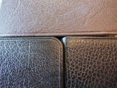
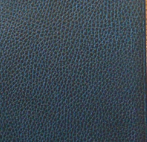
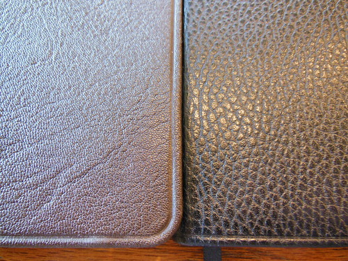
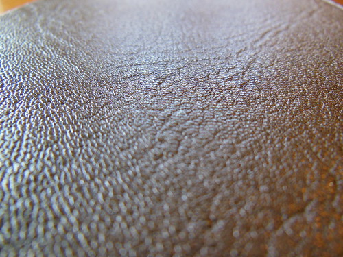
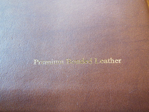
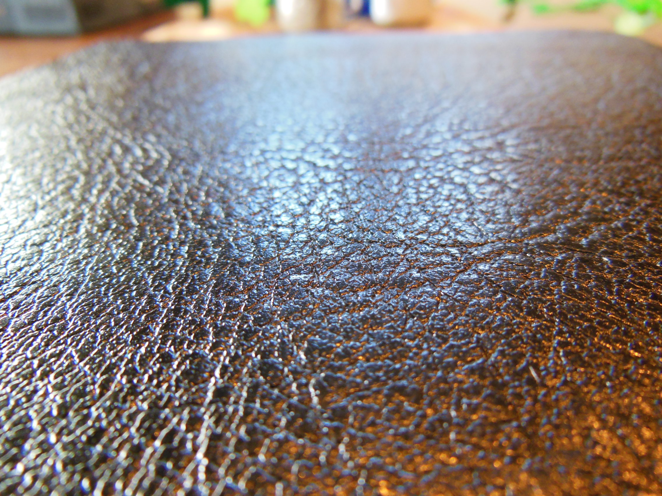
Third, it had to have a high quality, edge lined, goatskin cover. This might not seem like a must, but if you have held one of these Bibles before, you would agree. It is durable, flexible, and the grain is tactilely pleasing.
Fourth, it had to be in the New American Standard Bible translation.(NASB) This is by far my favorite translation, to both read and study. If you haven’t read this translation, you should. It is a formal equivalent, and very accurate. This is the translation to read, if you have ever wanted to get as close to the original languages, without learning them yourself.
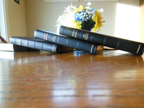
Fifth, I wanted a double column, verse format, with center column references. I know, I know, it is old fashioned of me, and I need to get with the times, but it is so much easier to find a verse, in a verse format Bible. I have the Cambridge Clarion. It is a single column, paragraph format Bible, with references on the outside of the page. People informed me that this is the easiest to just sit and read. Well, that might be so, IF your brain, and eyes haven’t been trained to read a double column, verse format, over the years. I tried to teach an old dog a new trick, and it just didn’t work out for me. So this was a necessary feature.
Sixth, was size. I wanted a Bible for reading out of in my chair. It couldn’t be too heavy or big. Arm fatigue is a real thing people. Perhaps I’m just getting old, but if you are holding a big Bible in your hands for an hour or so, it gets heavy. Plus they can be downright unwieldy. I despise fighting against a Bible or the cover while trying to read.
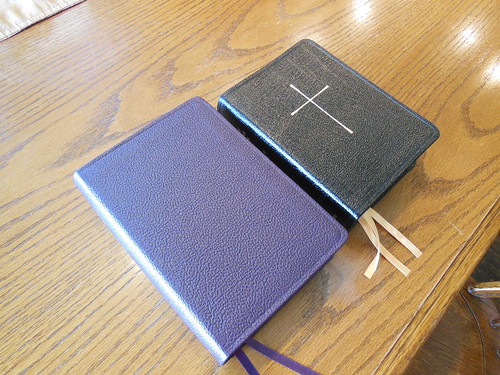
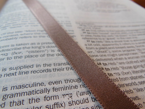
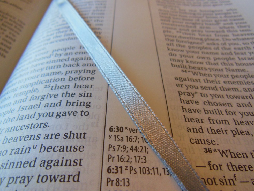
Finally, it had to have more than one, crumby, cheap, nasty, ribbon marker. I know it seems minor, but I like to follow Ligonier’s TableTalk reading plan. It has readings out of the Old and New Testaments, daily. For that, I need, at least two ribbons. I didn’t want a Bible with the cheap, thin, anemic, looking ribbons, that fold over, and get wrinkled either. I wanted some ribbons of substance that would lay flat and help me turn to the page, without tearing the paper or rubbing the gilt off of the page edges.
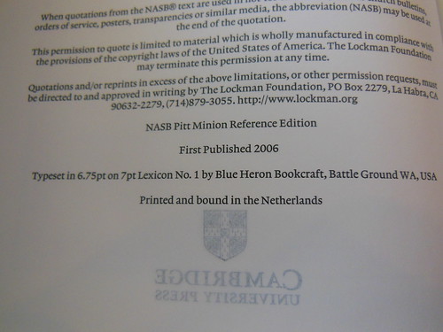
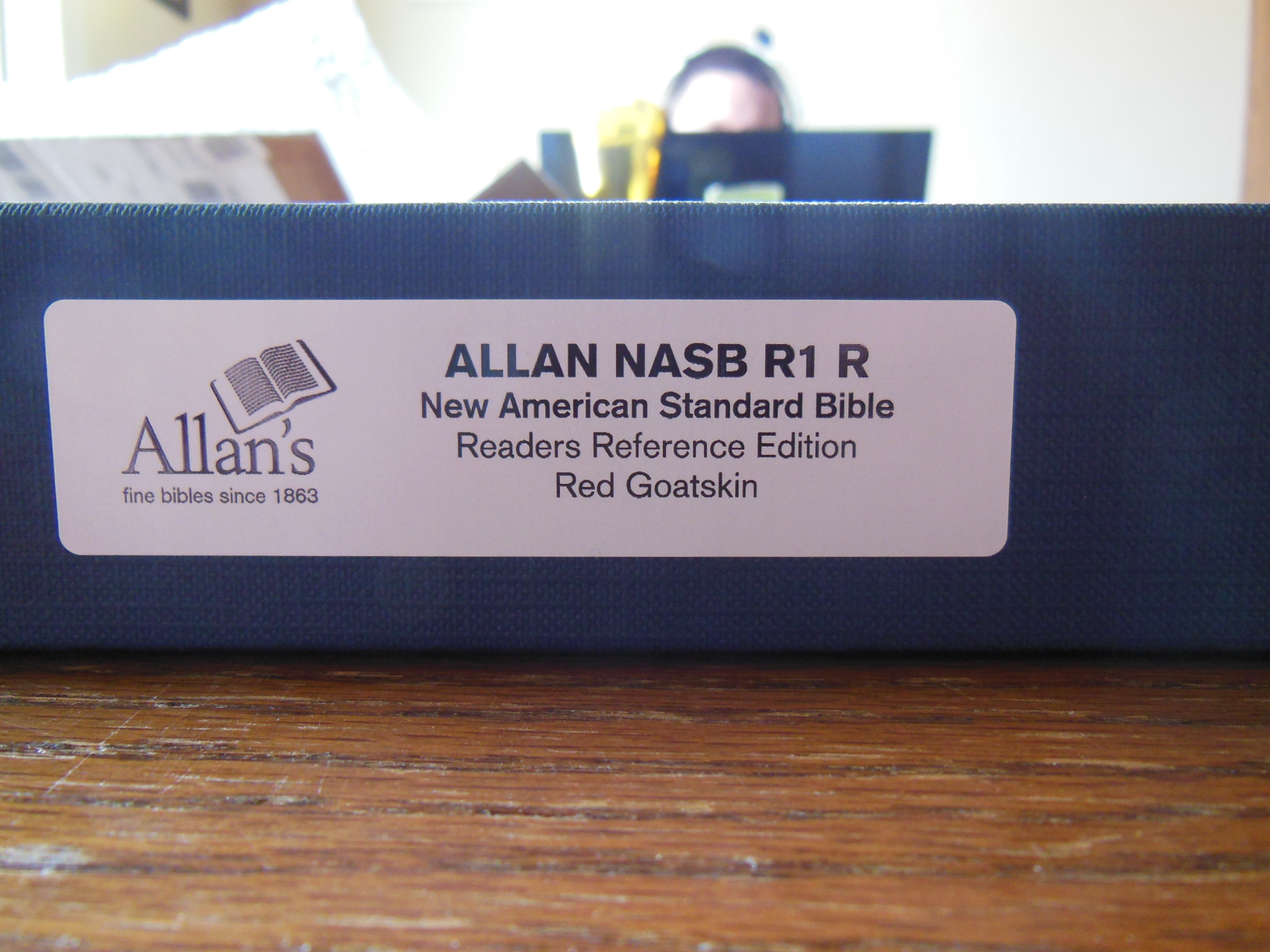
The only publisher to publish a Bible that met all of my demands is R. L. Allan formerly of Scotland, now located in London. Robert Allan established R. L. Allan’s in 1863. They are still making some of the finest Bibles in the world. In 2013 they moved to London. The NASB R1 R uses the Lockman Foundation’s NASB double column, verse format, reference Bible, typeset. The reason I didn’t purchase the Lockman Foundation produced Bible is quality. Lockman is printing and binding their Bibles in China. Although they are less expensive to purchase, they did not measure up to the standards that I set for my, “perfect Bible.” R. L. Allan’s NASB R1 R is printed and bound in the Netherlands by Jongbloed. Jongbloed is, in my estimation, the premier Bible printer and bindery in the world. Cambridge Press, and Schuyler, use Jongbloeds as well. It is no coincidence that the three Best Bible publishers use the same printer and bindery. They all use Jongbloeds because of their continued excellence.
My choices were limited right off the bat. There are literally no other publishers making the Bible I was after. I could have compromised on a couple of things like, cover material, or case bound instead of edge lined. Providentially, I didn’t have to compromise. It really is a blessing to be able to find a Bible just like I wanted. I feel so very blessed to be living in a country, during a time, like this. The Reformers went through much persecution to get us translations in our native tongues. There are people today, deprived of God’s word by law of their governments. So I don’t take the blessing lightly.
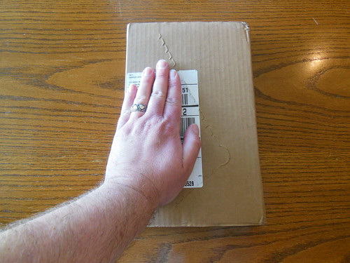
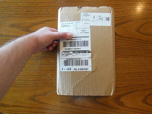
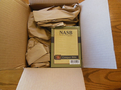
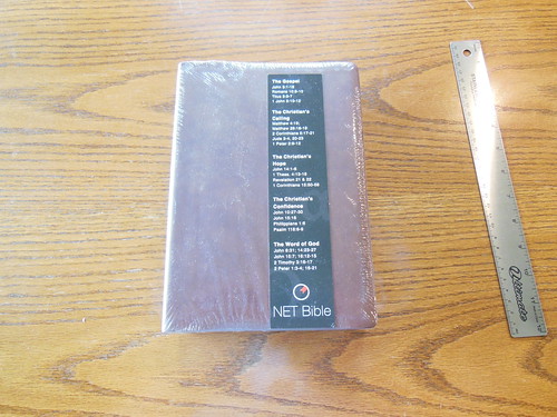
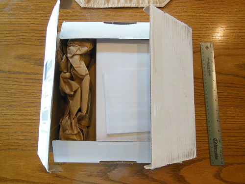
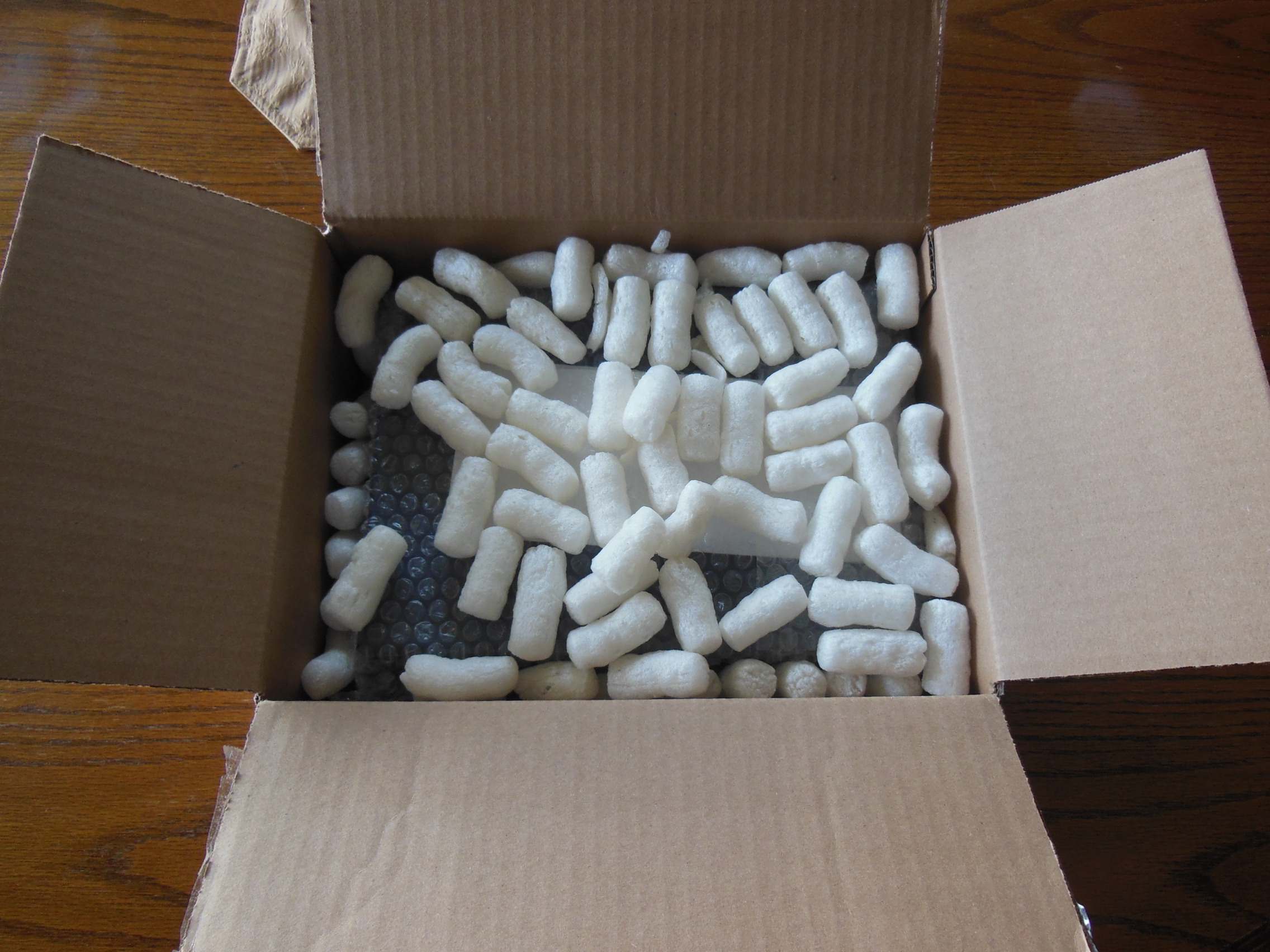
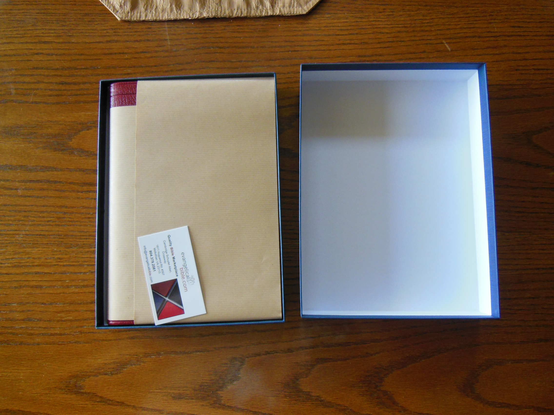
I received my order less than two weeks after I placed it. It arrived in a cardboard box. It was cushioned with bubble wrap and little foam puffs.


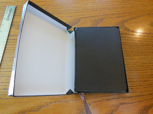
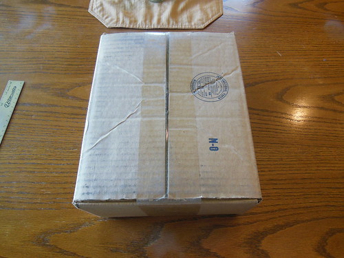
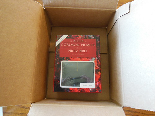
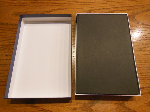
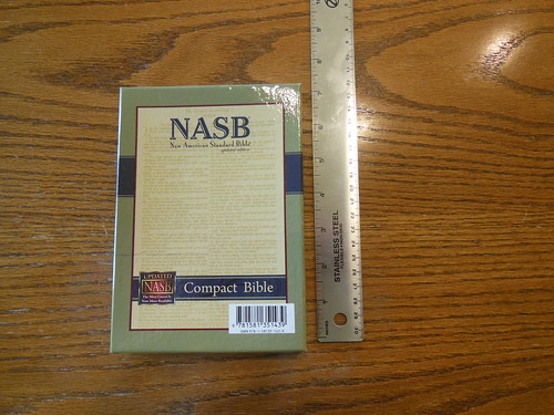
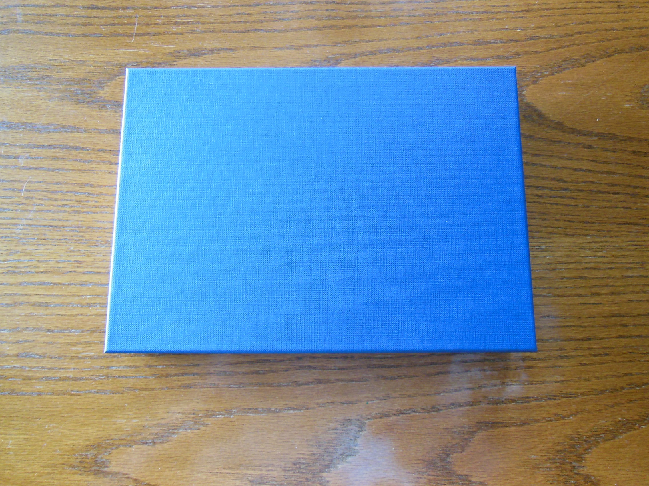
The Bible was in a two piece box. The box is covered with a woven blue material. I am keeping it to put my Bible in when I am not using it. It will sit by my chair safe and sound.


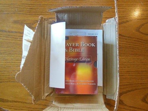
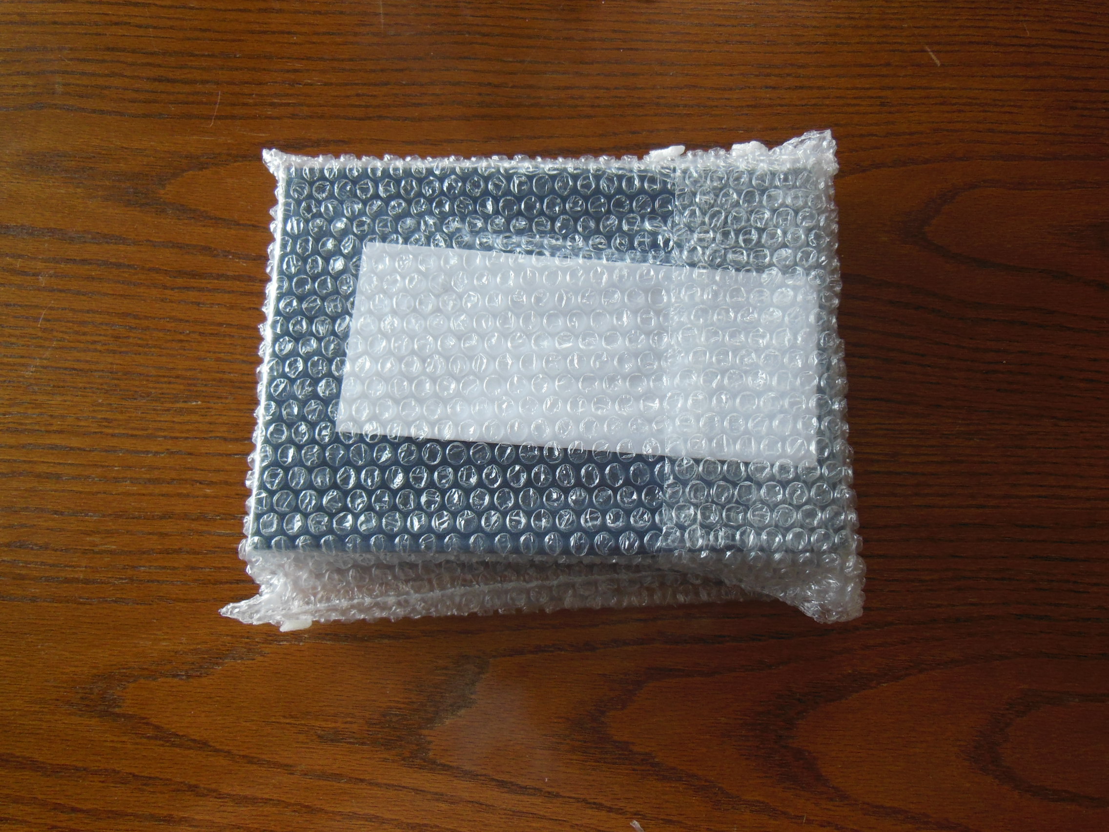
It was wrapped in paper inside the box.

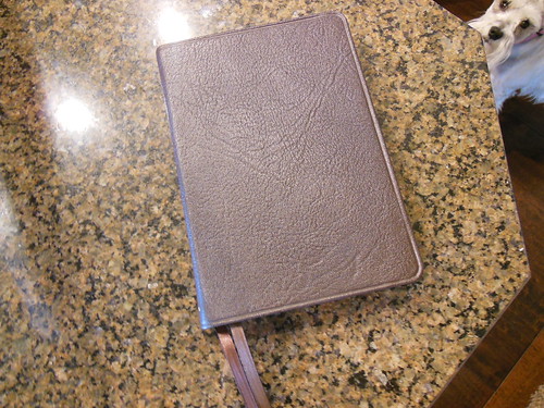
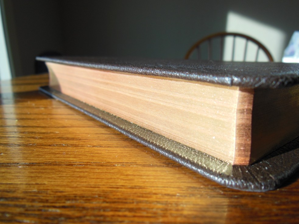
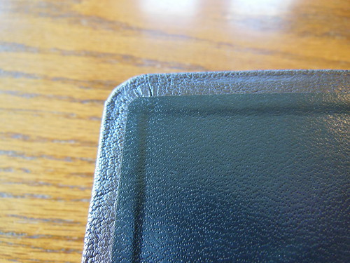
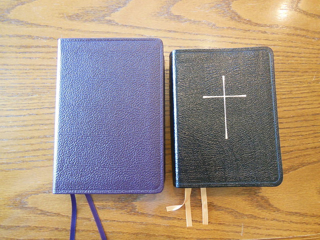
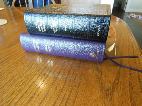
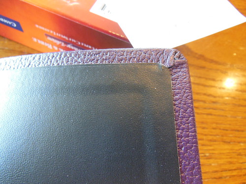
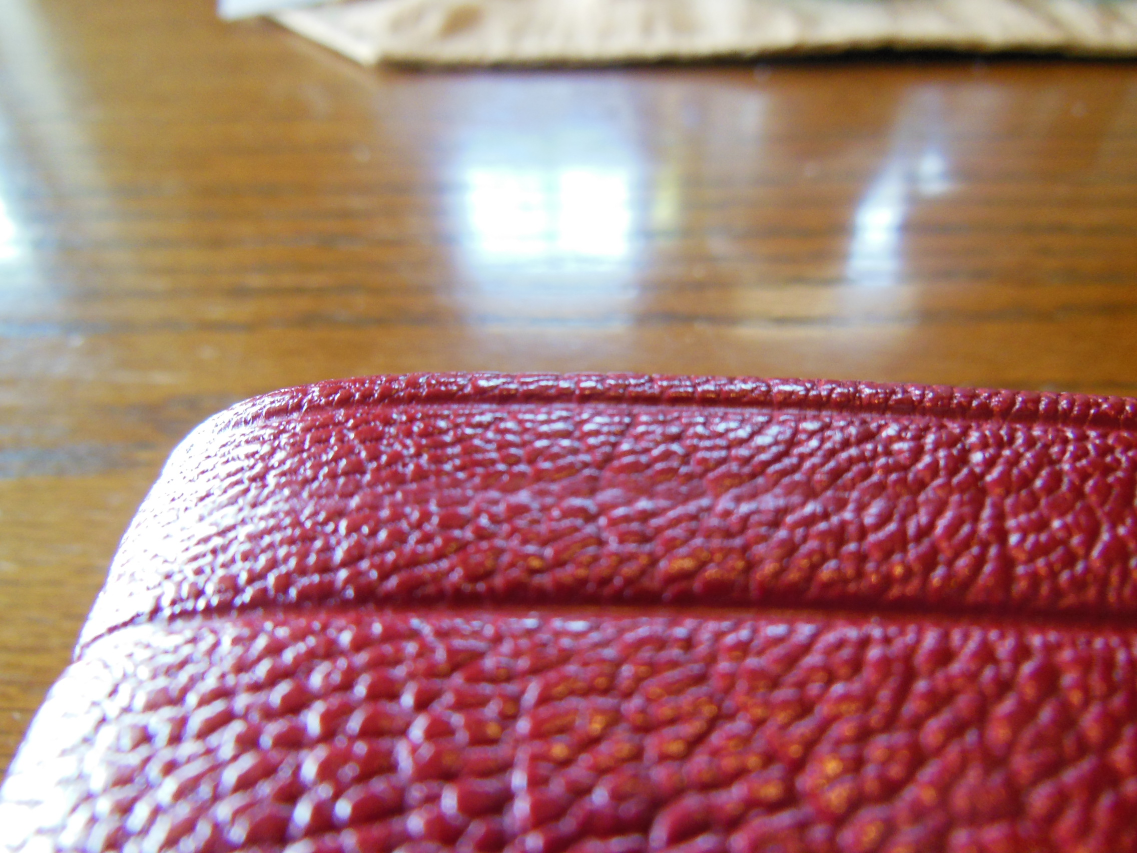
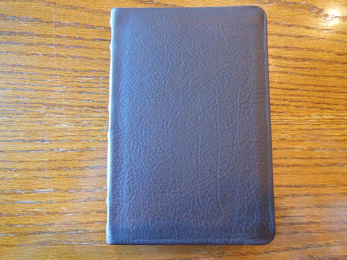
It arrived undamaged from shipping. While unwrapping the Bible I was welcomed with the aroma of quality goatskin leather. Some Bibles smell like chemicals and adhesives. The cover is thicker than I expected. It is a rich crimson red. There are two channels around the perimeter of the cover.

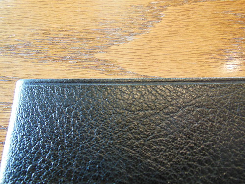
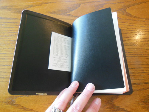
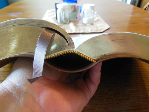
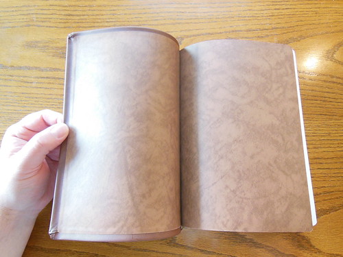
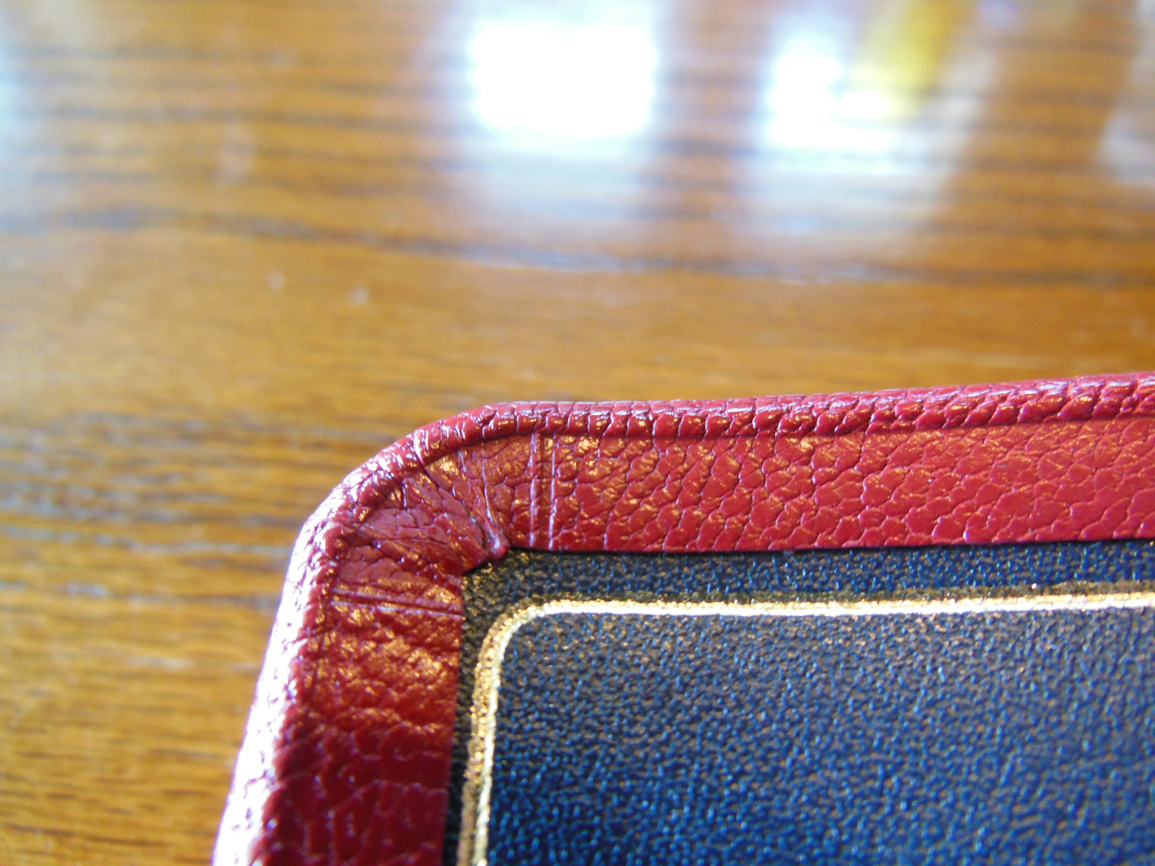
It has a wide yapp, that is the overhang of the cover. It protects the page edges. The inside cover is lined with dark blue leather. There is a gilt line around the inside perimeter.

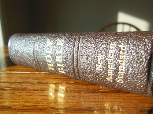
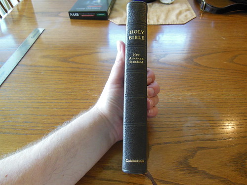
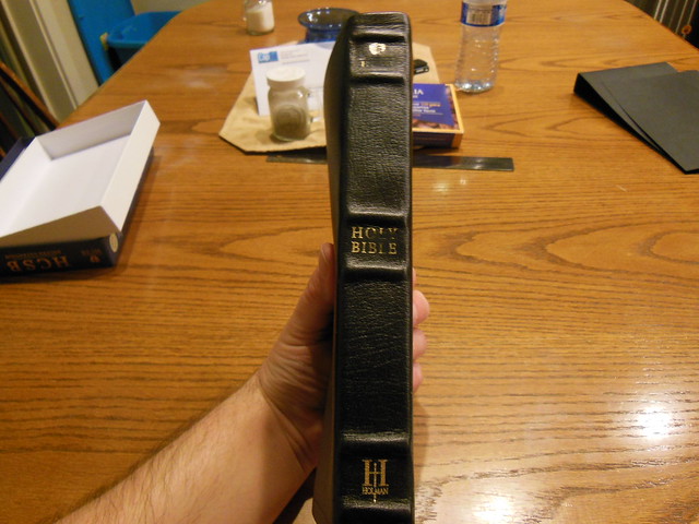
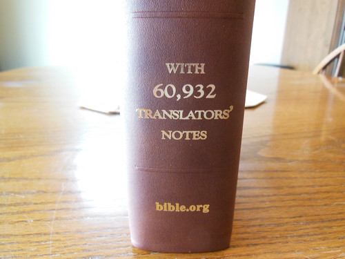
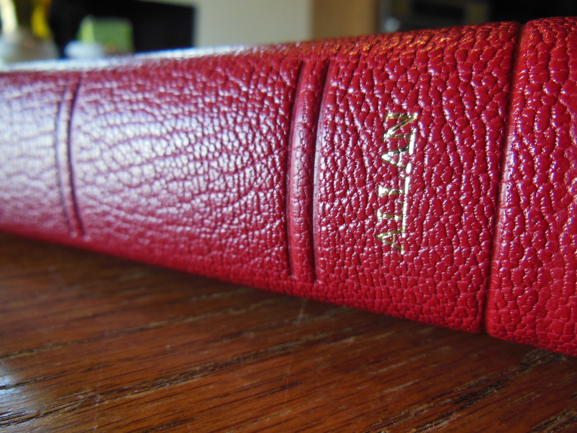
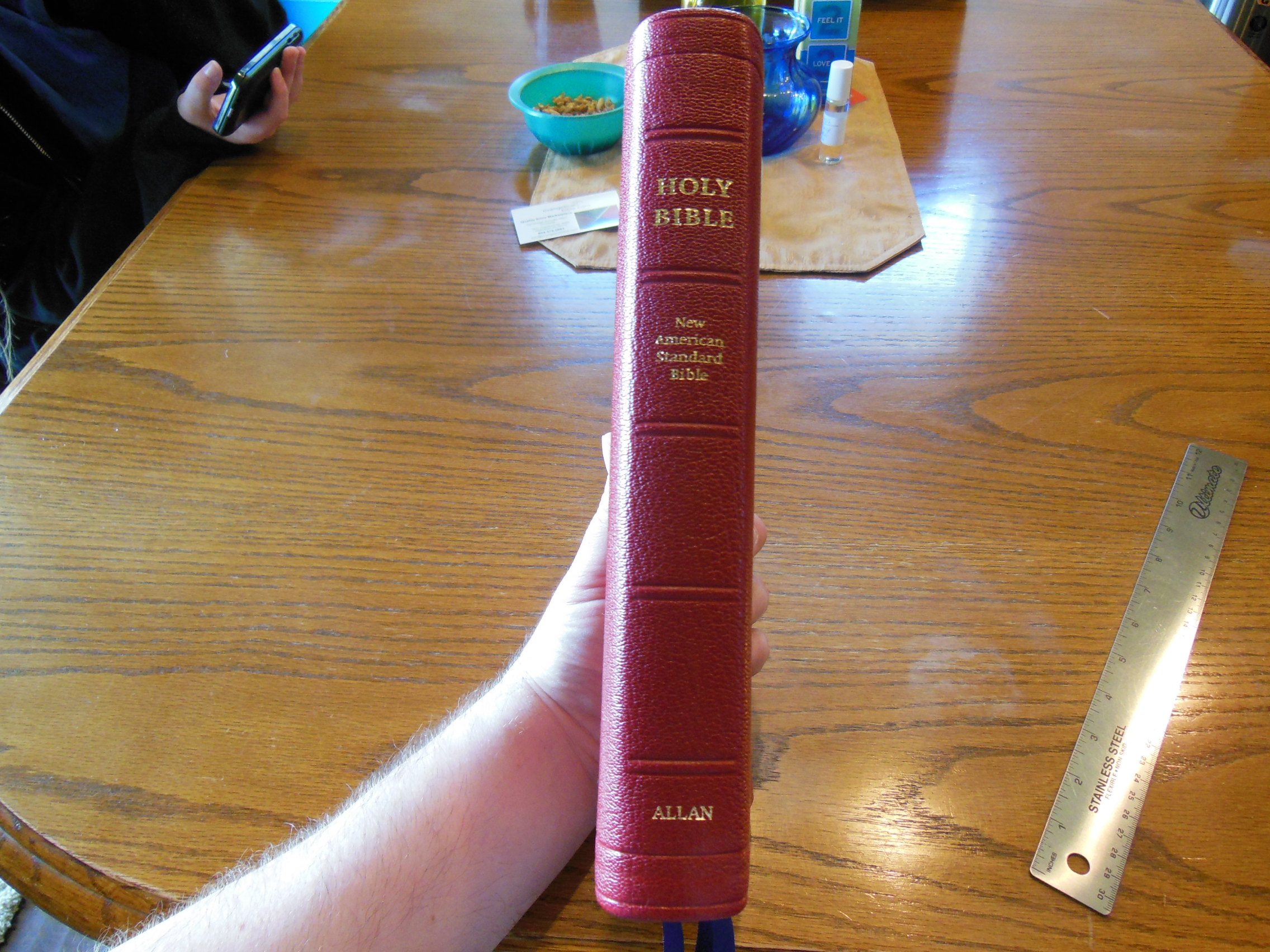
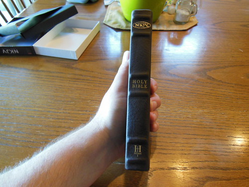
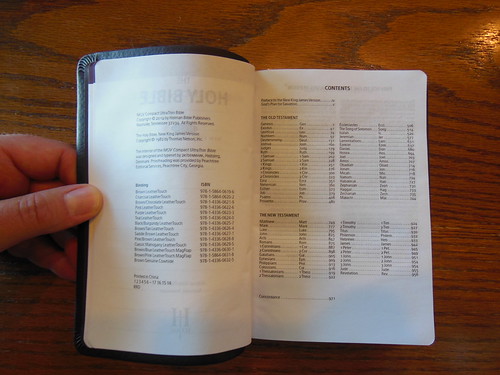
The edges of the cover are folded over and glued perfectly. The corners are nice, neat, and tight. The spine of the Bible is stamped in gold with, “Holy Bible” at the top, “New American Standard Bible” under that, and, “Allan” at the bottom.

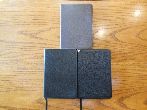
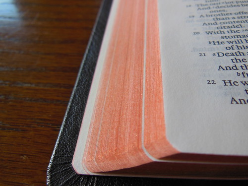
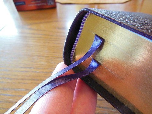
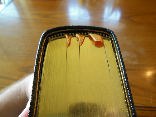
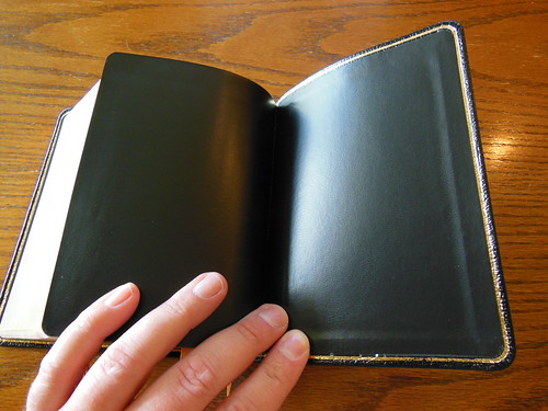
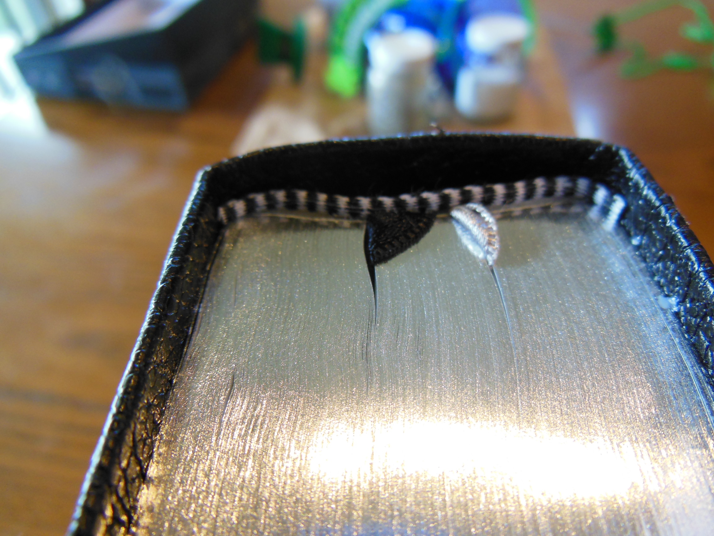
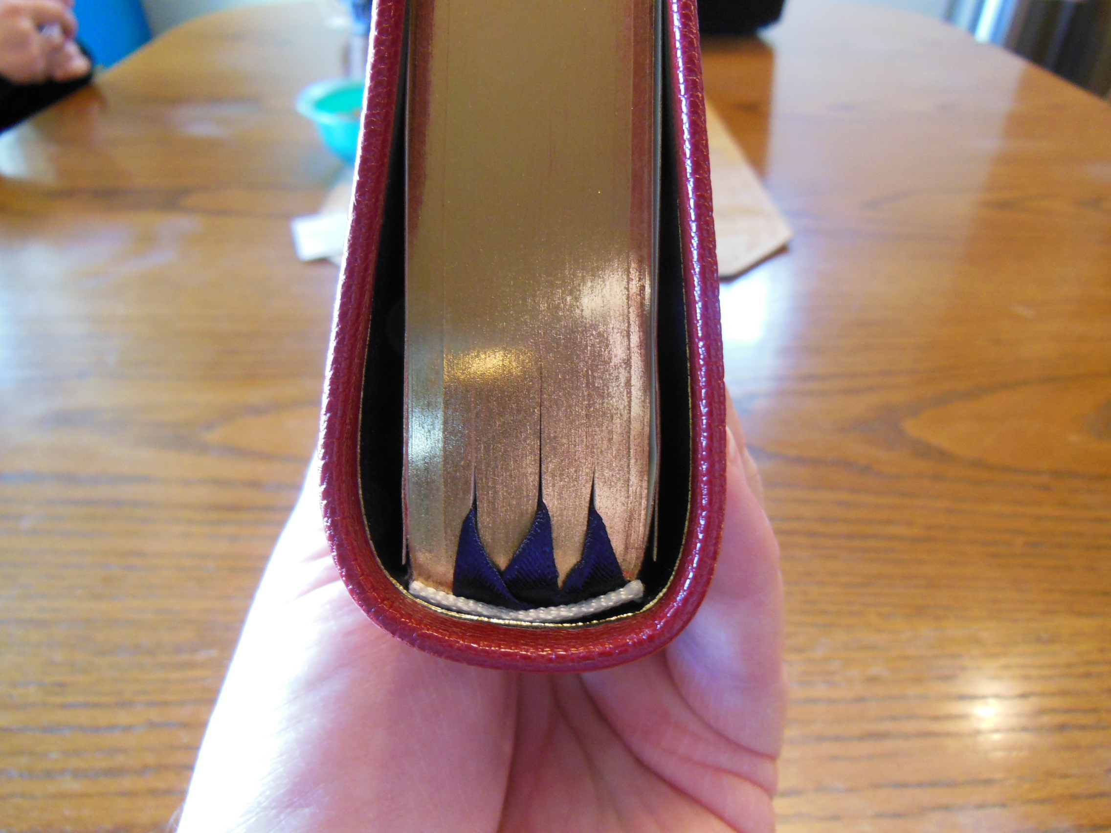
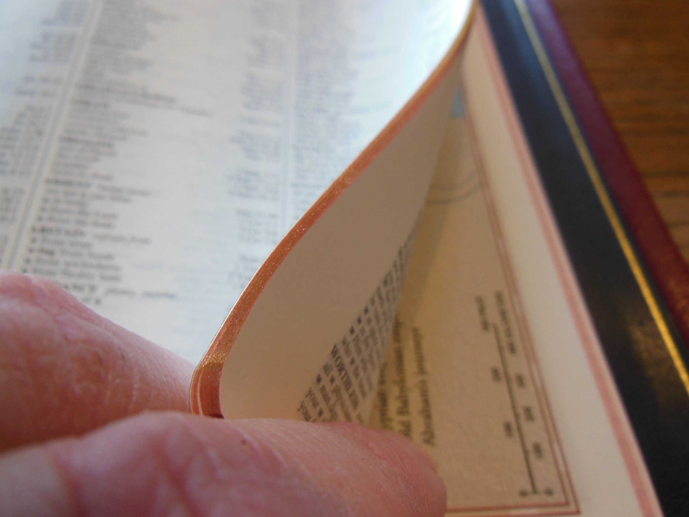
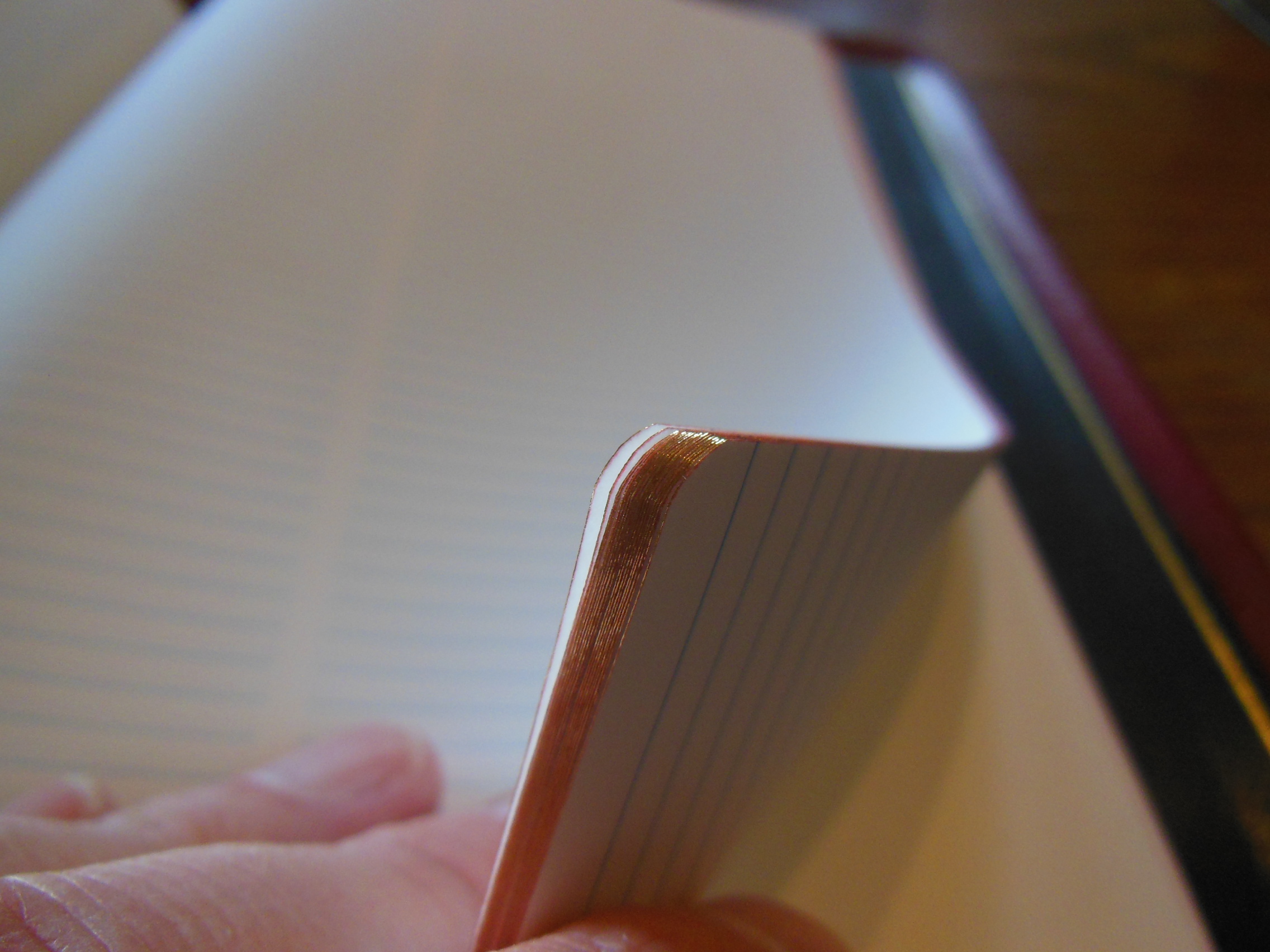
It has white, head and tail bands, art-gilt page edges, and three lovely, navy blue ribbon markers.

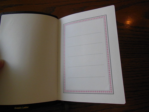
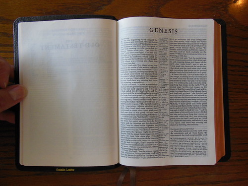
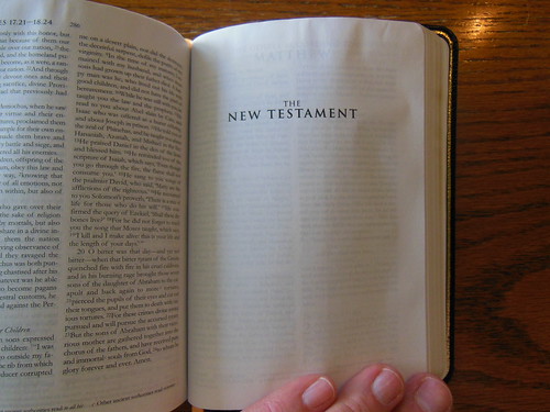
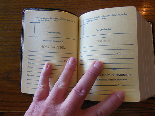
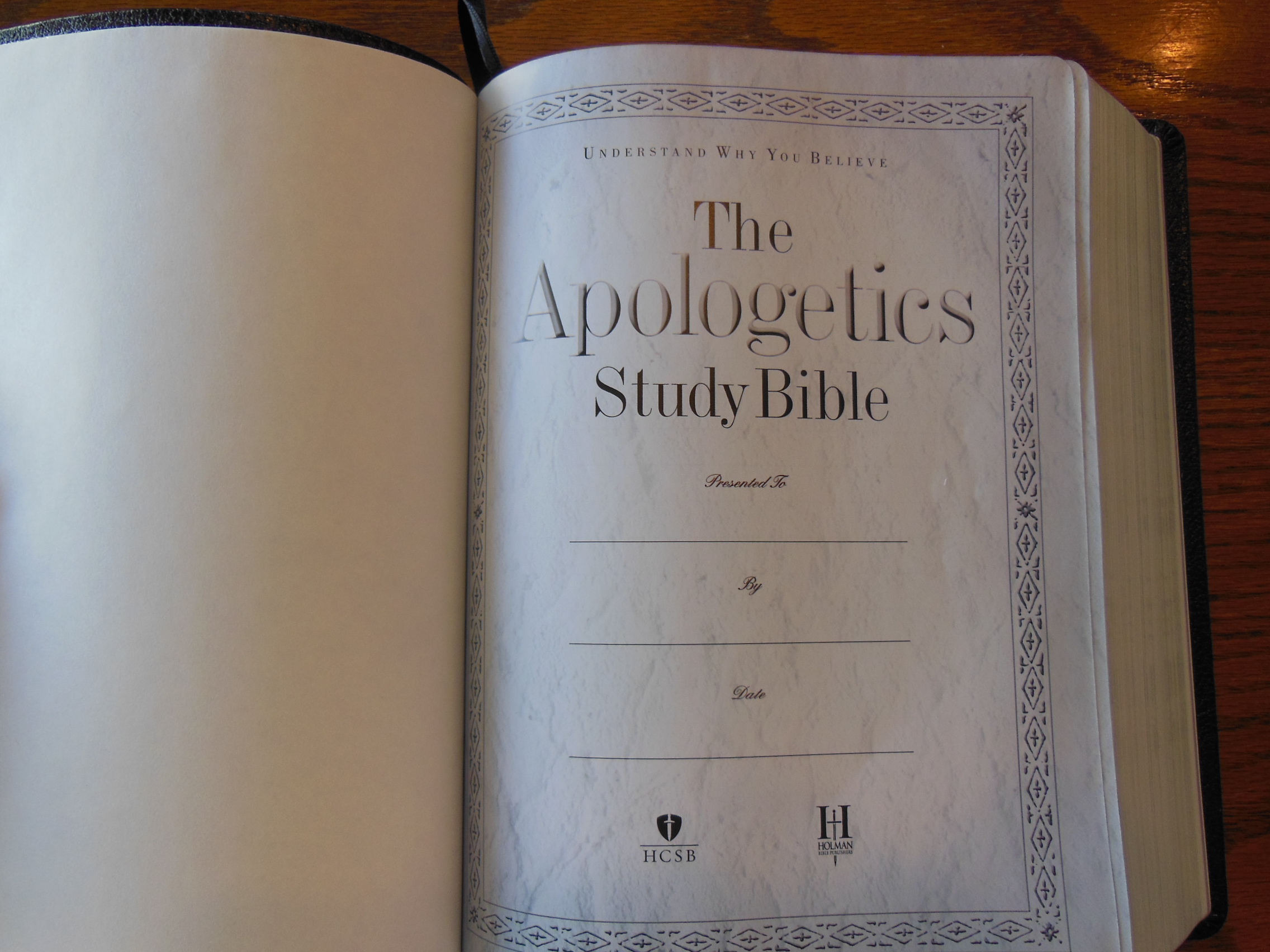
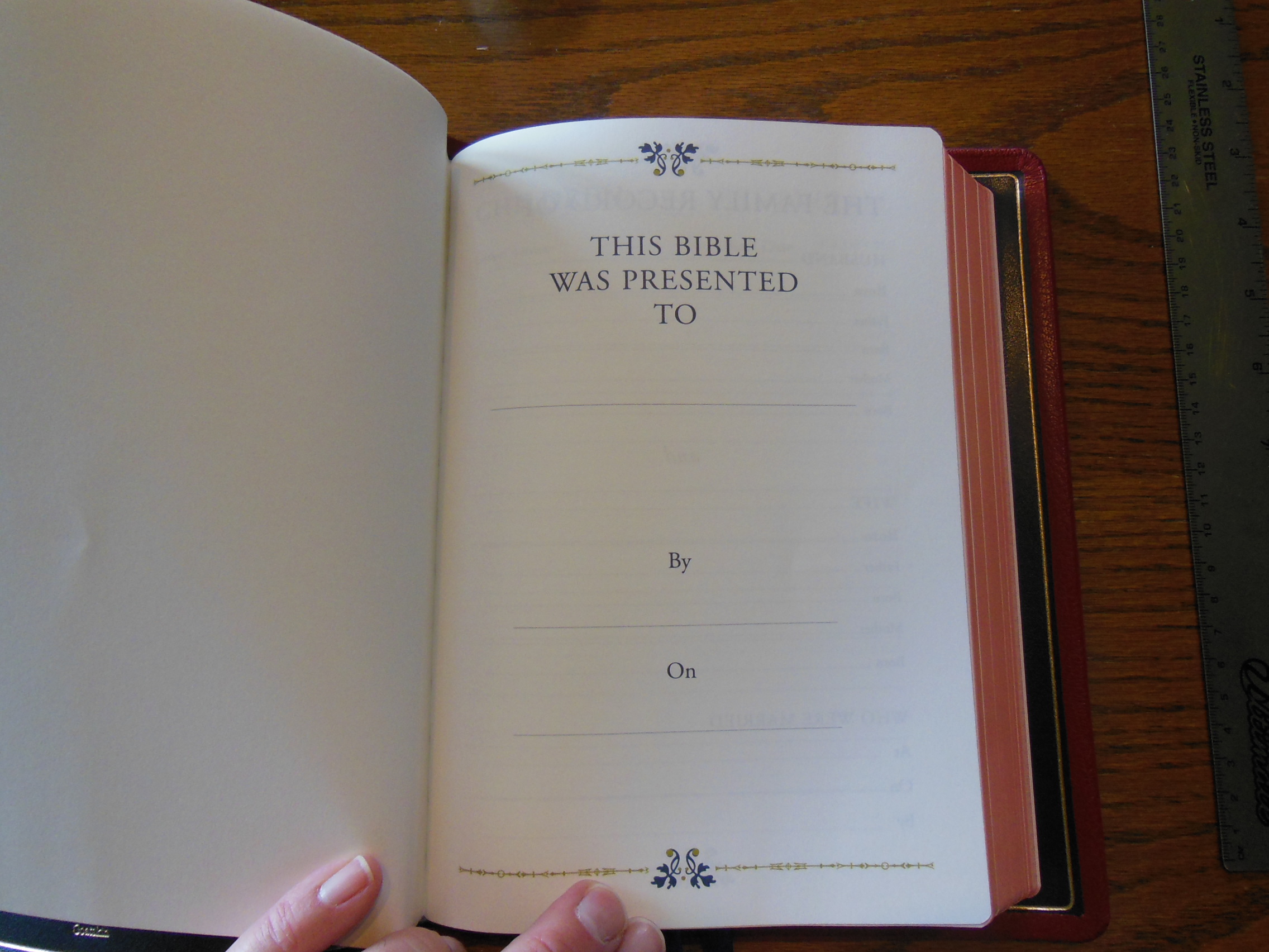
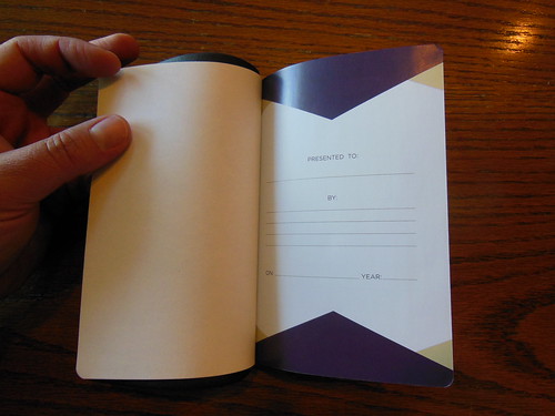
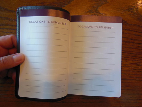
In the front you’ll find the presentation page, family records pages for parents, children, marriages, grandchildren, and deaths. These are printed on heavier paper, but not so heavy as to inhibit the opening of the Bible. Then, there is the Title page, Publishers info,Foreward, and a list of the Books of the Bible.

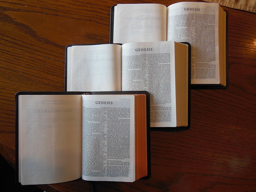
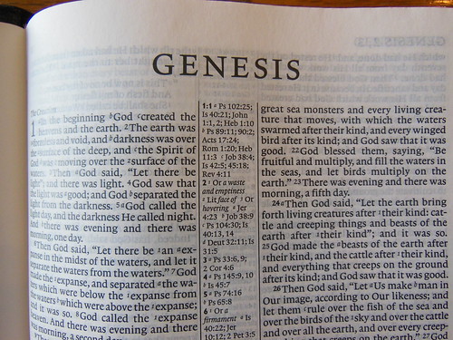
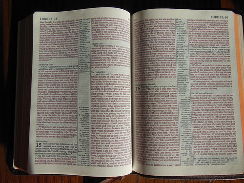
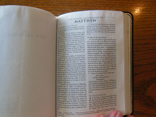
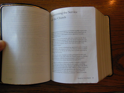
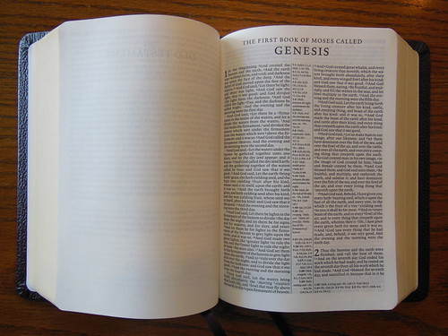
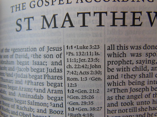
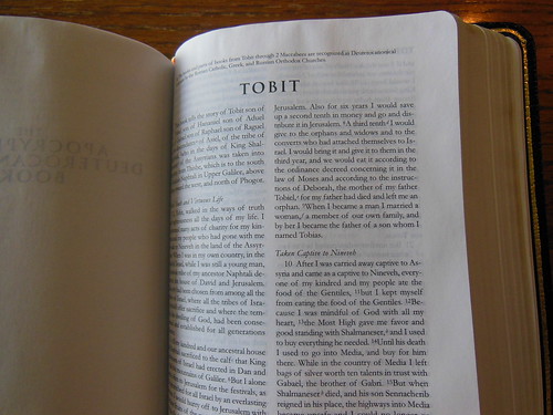
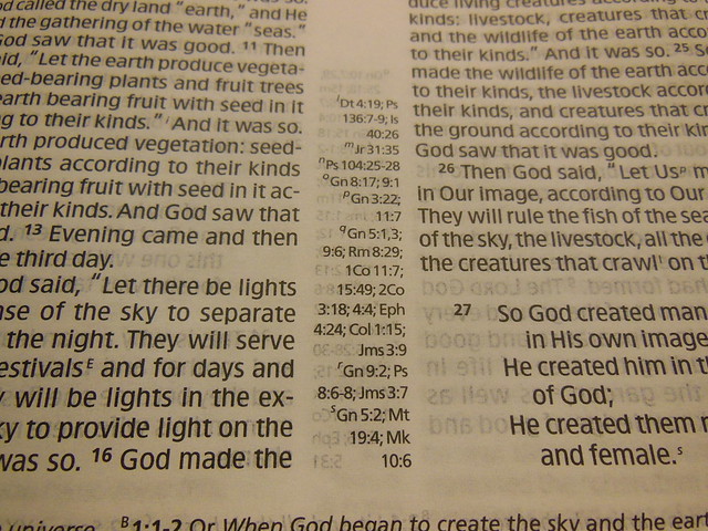
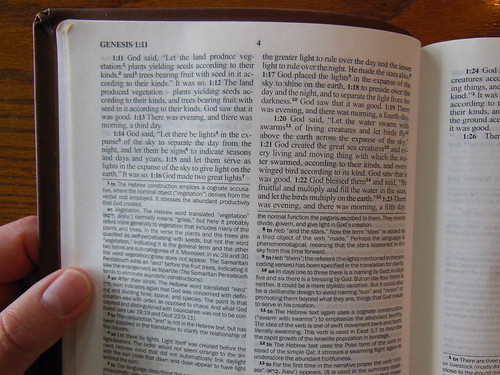
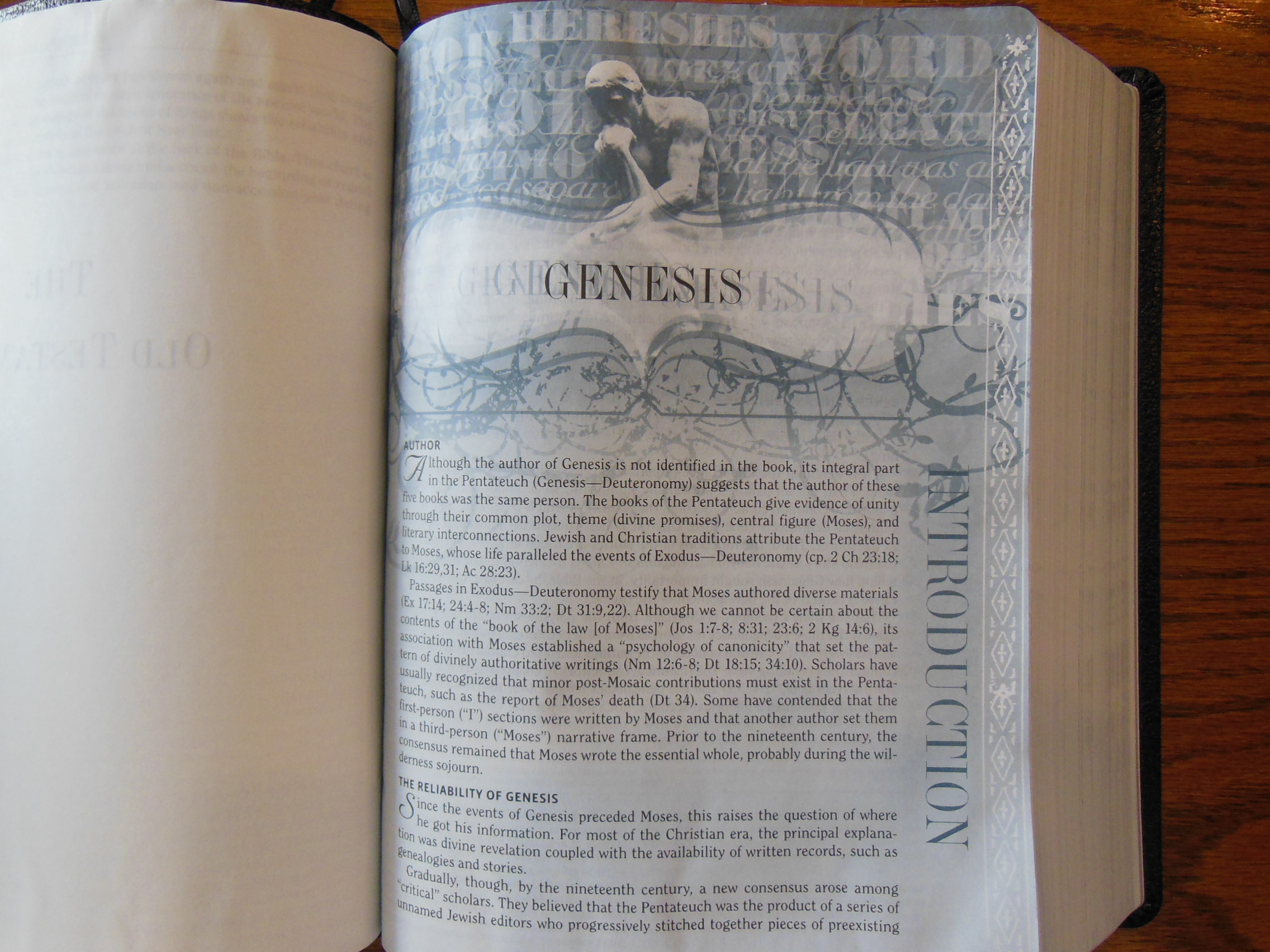
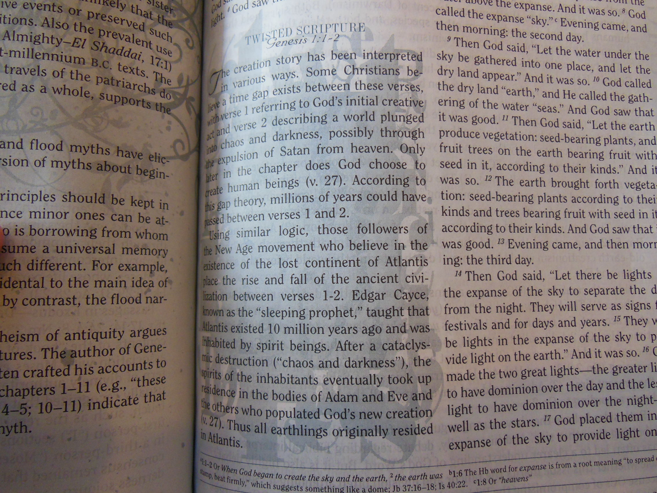
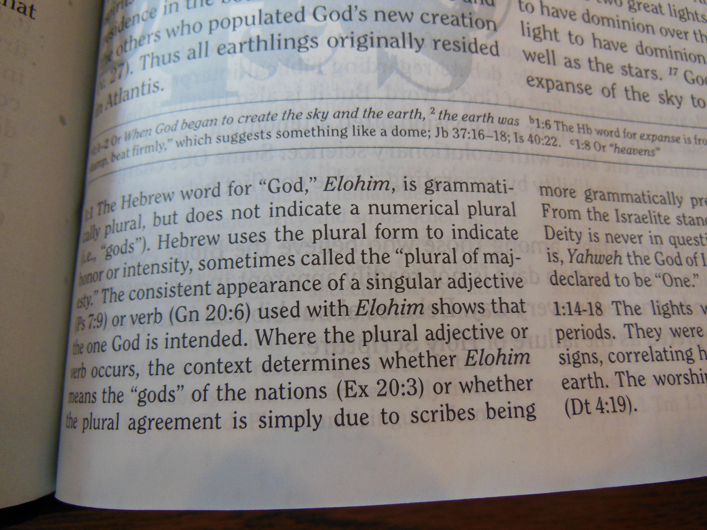
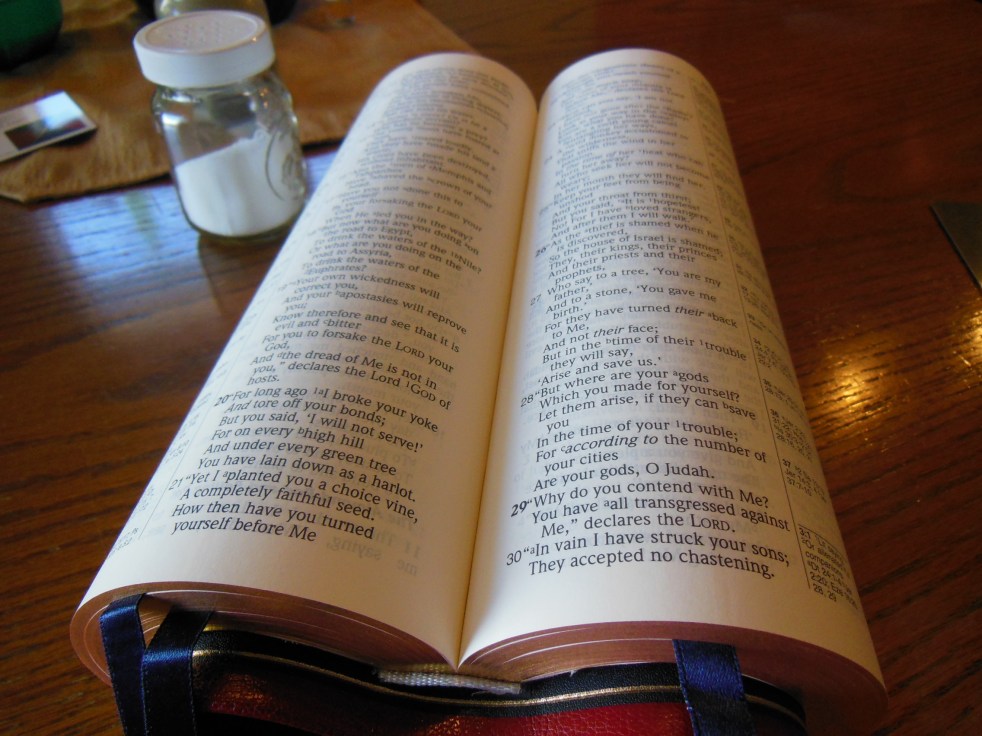
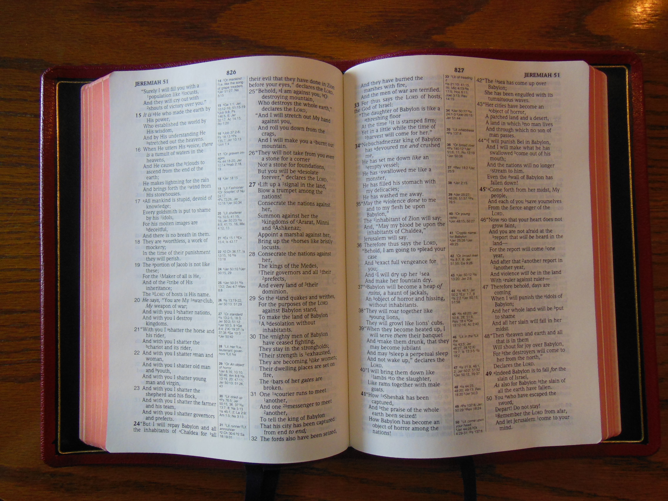
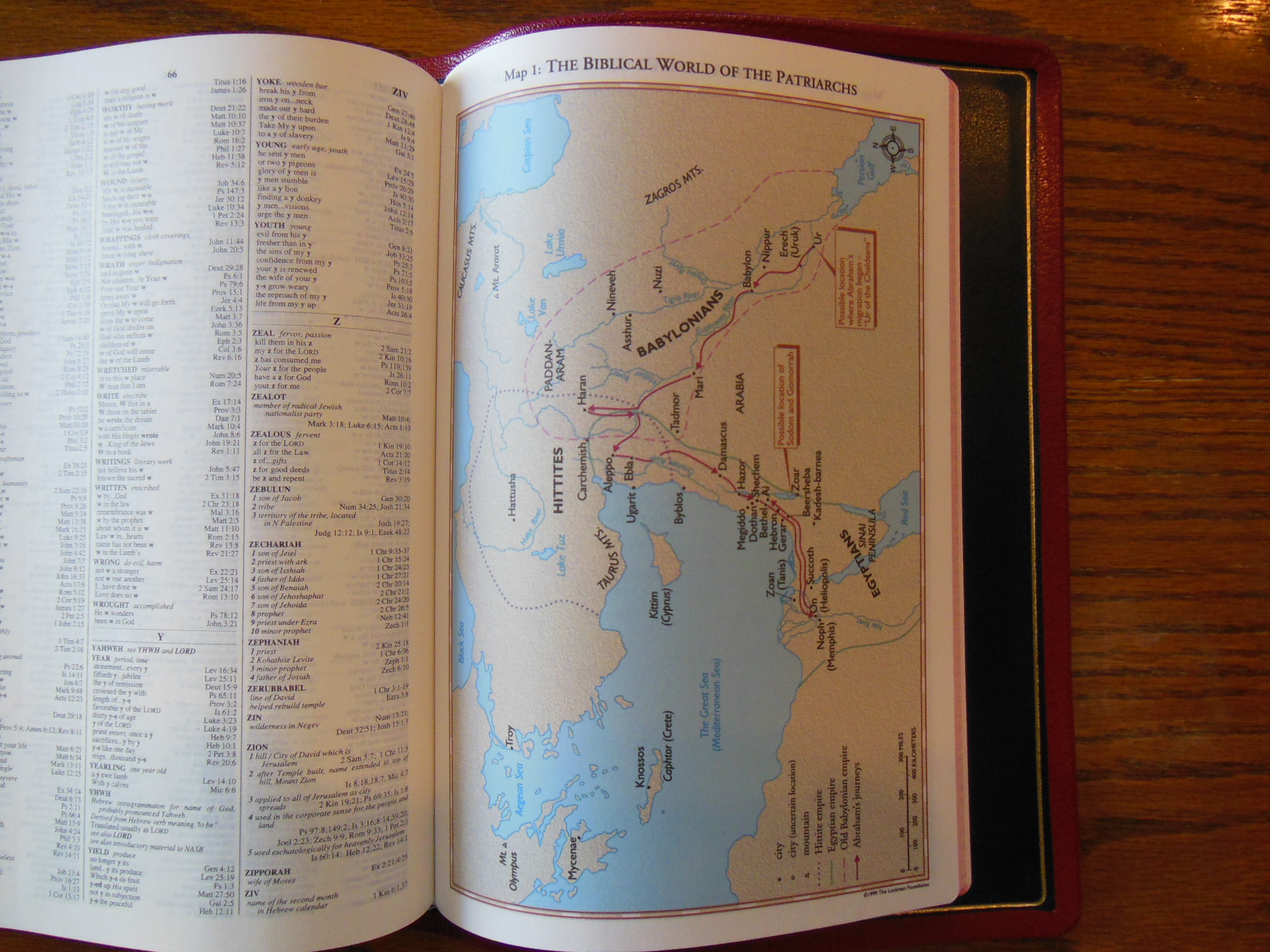
As I mentioned earlier, the Bible is in a double column, verse format, with center column references. The center column is bordered by a single line on either side of it. The chapter numbers are bold and large. There are topic headings throughout. This is a black letter edition. Lockman has over 95,000 cross references in this luxurious publication from R. L. Allan.

The font is 10 point in size. It is one of the sharpest and uniformly printed Bibles I’ve seen. The black contrasts against the off-white Bible paper, making it very legible. The paper is beautiful and opaque.
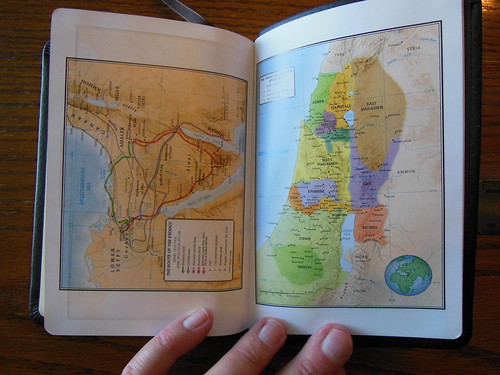
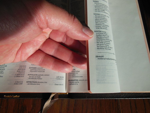
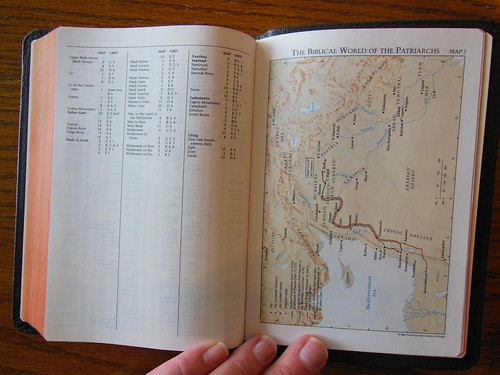
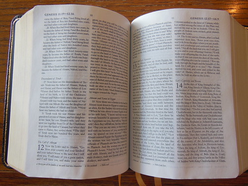
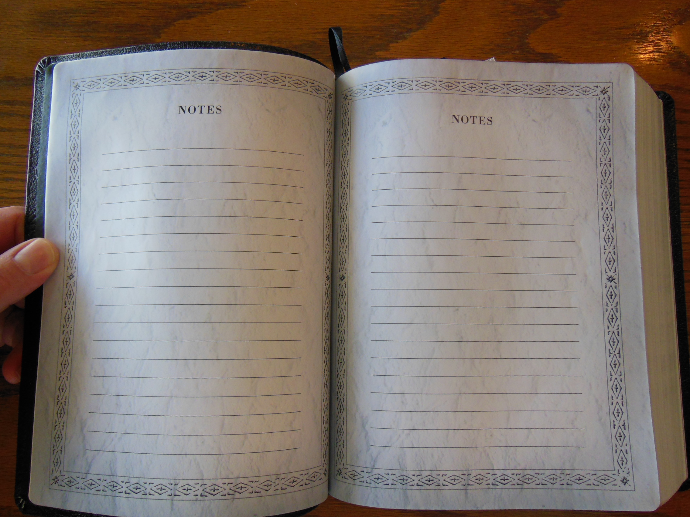
The concordance in the back is large enough to be useful, but not so large as to bulk it up. There is 40 pages of lined writing paper in the back for notes. Lockman’s colored maps are retained, but printed on the same type of paper that is used in the front for the records pages, instead of the glossy paper that Lockman uses. There are 8 maps. The glossy paper tends to crack and tear, so I am glad to see that it was not used in this edition.


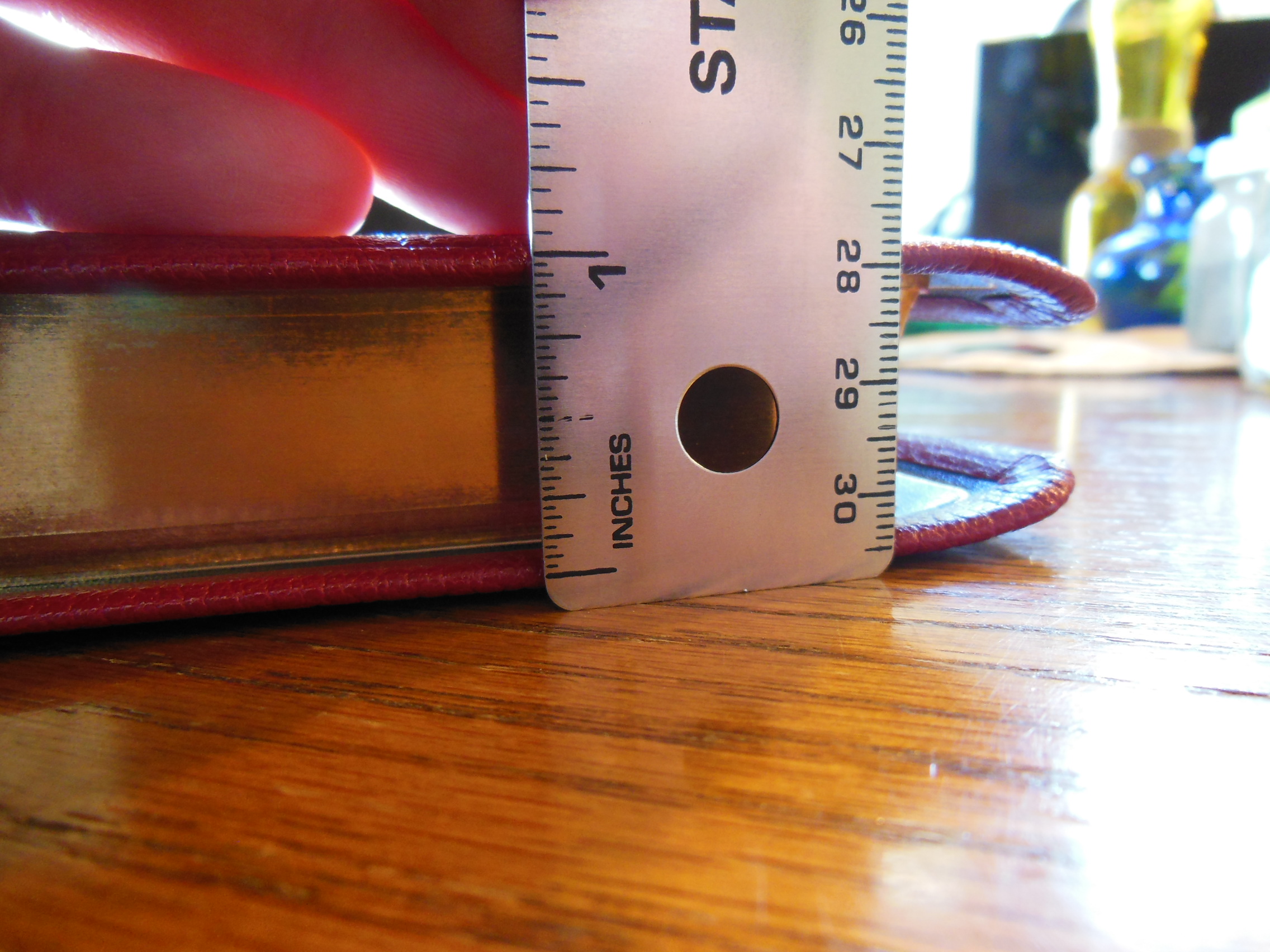
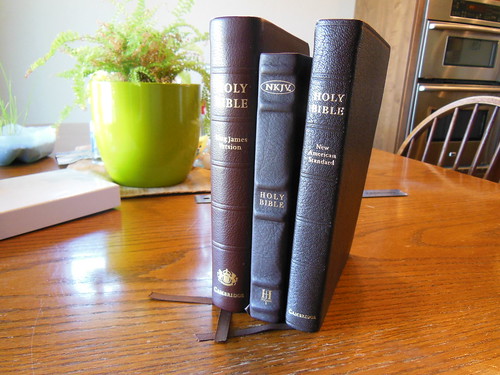
This is a pretty thin Bible. It measures 1″ thick. The text block is 9″ tall by 6 1/4″ the Bible when closed measures almost 10″ tall by 7″ across. It is very handy. Just the right size to contain all of my desired attributes, while not growing too large with undesired features.

Since this Bible has everything I could want in a Bible it is no surprise that I would think so highly of it. I can’t get over how satisfied I am with it. I am so happy with it that I mailed several of my other Bibles to friends. This one replaces about 5 others I was holding on to for various uses. I have taken some ribbing that was unexpected. It was brought to my attention that this should be called the, “Spiderman Bible” due to the red and blue colors. I thought that was amusing, but come one? If I’m going to associate it with a super hero it would be Superman not Spiderman lol. In all seriousness, this is probably the best Bible I’ve ever owned. That is saying a lot, because I’ve been sent some pretty good Bibles.
If you decide you need a premium Bible, you should purchase one from
evangelicalbible.com They are the best online retailer of premium Bibles.
https://www.flickr.com/photos/snyderssoapbox/sets/72157651327362360/
43.981125
-116.915257

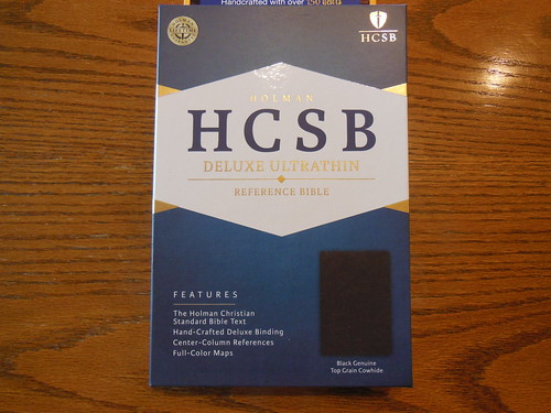
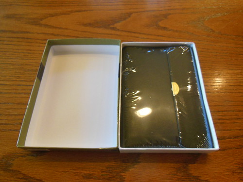
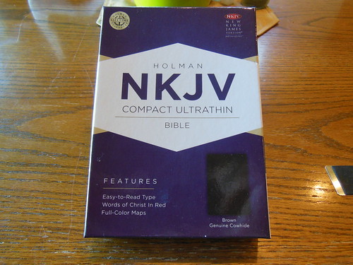 The Compact Ultrathin from Holman arrived at my porch, well packed in a cardboard box, with paper packing.
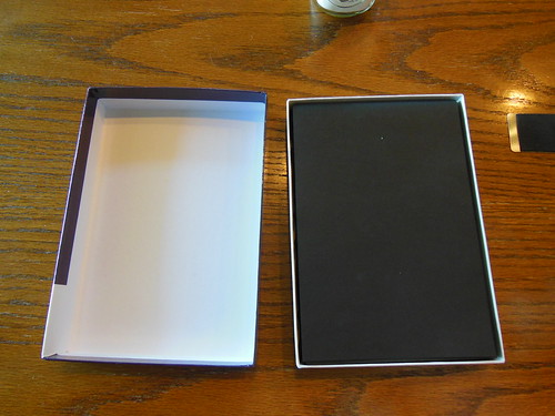 Inside the box the Compact Ultrathin is wrapped in black construction paper to protect it during shipping.
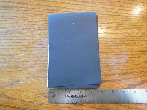
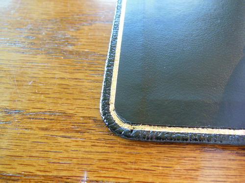
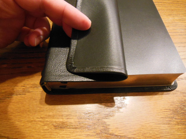
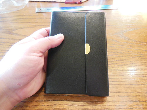
 The covers corners are mechanically folded with precision.
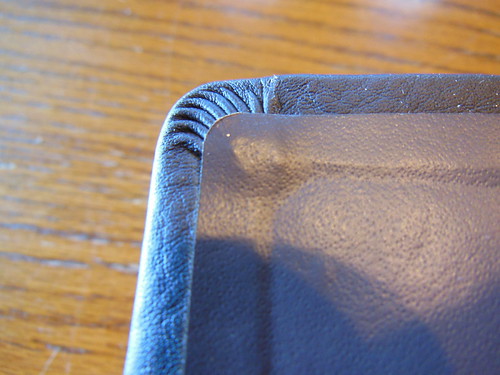
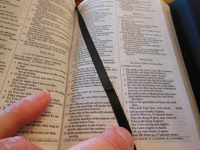
 The print of this red letter edition is arranged in a double column, paragraph format, with limited notes on the foot of the page.
 The individual word entries are in red while their concordance information is in black. This makes looking up words quick. It is easy to distinguish between the word you are looking for and the concordance information.