Bible Reviews

Cambridge Pitt Minions, a Tale of Three Covers.

Comparison Review of Morocco, Calf Split, and Goatskin Leather Covered Pitt Minion NASB Bibles.

DSCN4026

I’m fortunate to have been sent review copies of the same Bible, covered in three types of leather that Cambridge uses. They have sent me three Cambridge Pitt Minions in NASB Bibles. One of them is covered in black Morocco leather, another in black calf split leather, and the last one is covered in brown goatskin leather.

DSCN4024

This review will depart from my other reviews in that I am not covering the same points over again. You can read about the Pitt Minion typeset and binding information here. Instead, I am going to compare the different types of leather covers. You can view the Cambridge page with information about their leathers here.
Here is their definition of what Morocco leather is, “Leather taken from a split hide – sheepskin, calf or cowhide. Slightly thinner than the other grades of leather and therefore relatively flexible and soft even when new. A French Morocco binding offers high-quality real leather at an economical price.” This is the cover material for the lowest priced Pitt Minion at approximately $60.00 available at online retailers.

DSCN4019
Here is their definition of what calf split leather is, “A superior grade to French Morocco leather, tanned to approach the quality and feel of full-grain calfskin leather.” This is the next step up from the Morocco leather and can be purchased for about $80.00 online.

calf split

Finally, here is their definition of goatskin leather, “A beautiful and very resilient top-quality, natural grain leather. Traditionally known as ‘Morocco’ leather, it is strong yet supple and is used in the finest bindings.

The best goatskins for bookbinding come from an area of northern Nigeria where environmental conditions are ideal for producing hides with the necessary balance of strength and suppleness. Here they are partially tanned using the same vegetable materials and methods that have been used for several thousand years. Traditionally, they were transported by camel across the Sahara desert to merchants in Morocco (hence the term ‘Morocco leather’) from where they would be distributed throughout the ancient world.

Cambridge uses Nigerian goatskins finished in the United Kingdom for our top-of-the range bindings.”

I understand there can be some confusion when talking about cover materials. There really isn’t a standardized nomenclature. I hope this information clears it up for anyone with questions as to why the Morocco covers were more expensive than the calf split covers. I know I’ve been asked this question before. I’ve included plenty of pictures and a video to help you see as much of the differences for yourselves, but I have to tell you, only by handling these Bibles will you be able to appreciate the qualities of each one. All three are wonderful Bibles and offer specific benefits. The price of the Morocco covered Pitt Minion makes it exceedingly affordable. You get all of the great features of the Cambridge Pitt Minion text block, like the sewn binding, thin profile, compact size, complete Bible, clearly printed modern digital font, references, and red letter text. This cover has a bit of a glossy look to it and the grain is not pebbled. It is also quite a bit thinner than the other two. However, it is vastly superior to other Bibles on the market that advertise having, “genuine leather” covers. Many of the lower quality Bibles that claim to be genuine leather are covered in split pigskin leather with an artificial grain pressed into it. They almost look plastic and are very shiny. This Morocco cover is much better and the price has remained very affordable.

For just about $20.00 more you can get the calf split leather, again with all of the great Pitt Minion features, plus a more supple, thicker, leather with a deeper natural texture. The calf split is also less shiny or glossy than the Morocco cover. This gives it a much more tactilely pleasing feel in your hand. I’ve also noticed that it softens up quite well after it is broken in.

For about $100.00 you can acquire the Pitt Minion covered in goatskin leather.

DSCN3854

I know it seems like a lot of money, but when you pick one up you’ll understand why it is more. The goatskin covers have a finer pebbled grain that is soft to the touch. It is softer than the calf split or top grain leathers while remaining durable.

DSCN4023

If you have ever held a sheepskin leather Bible you would find that it is very supple, but susceptible to scratches and tears. The goatskin is great because it has the best features of both types of leather. It is soft and supple while remaining effective at protecting the text block. None of these three are edge lined so you won’t be doing any, “Bible yoga” with them. I wouldn’t recommend bending them that much regardless. Even if a Bible is flexible enough to bend like you might see some people do online, it isn’t a good idea.

DSCN4027

Over time it will loosen your binding too much and prematurely wear it out.
DSCN4025

No matter what your budget is you can find a Pitt Minion to fit and be assured that it will last long enough for your kids to enjoy if you treat it with respect.

Make sure to check out the rest of the pictures on the flickr page.

You can purchase these Bibles on Amazon, Christianbook, or Cambridge Press.

Bible Reviews

The NASB Pitt Minion Reference Edition NS446XR in Brown Goatskin Leather is the Best Compact NASB You Could Purchase.

DSCN3815

In my opinion this is the number one, of the top ten compact/ultrathin NASB’s you will find on the market today.  The top three are Cambridge Pitt Minions.  First place, goes to the goatskin leather.  Second place, to the calfsplit leather edition.  Third place goes to the edition covered in black French Morrocco leather.  Here is a picture of the brown goatskin Pitt with the black calfsplit one.  They are both gorgeous.

DSCN3844 (2)

I’ve reviewed Lockman Foundation Bibles. I’ve looked at cheaply constructed Zondervan’s. If R. L. Allan made a compact NASB, they would be the only serious competition on the market. That would only be true because Cambridge and R. L. Allan would be using the same printer and binder, the world famous Jongbloed of the Netherlands. They are the premier printer and binder of almost all the high quality Bibles available today. Chances are, if you have a luxury Bible it came from Jongbloed. It makes sense that the Cambridge Pitt Minions are the highest quality Bibles in this market niche. 

DSCN3799

The attention to detail and quality is what sets the Cambridge Pitt Minions apart. When you hear, “You get what you pay for.” Many times you disregard it as a sales pitch, but with Bibles it is usually quite true. I strongly urge you not to balk at the initial price. Consider how many cheaply made Bibles you will buy over the next sixty years of your life. This is assuming, of course, that you are a serious student of God’s word, and read it daily. Now, multiply the twenty to fifty dollars that you would spend on a glued together, poorly covered, mass produced Bible, times the number of replacements you would purchase of that sixty year period. Let’s arbitrarily say you’ll need to replace it 6 times, and that is a conservative estimate on my part. Thirty times six is one hundred and eighty dollars. That is less than the price of the top of the line Pitt Minion. Not to mention the amount of time and energy it will take to transfer your notes/highlights/underlines.

The Pitt minion can be handed down to your children and if taken care of I dare say their children. The Cambridge Pitt Minion comes with a lifetime warranty from Cambridge and I fully expect these Pitt Minions to outlast me. How loving would it be for you to hand down one of these to each of your Children with your personal highlights and underlines? They could read from the same Bible that you held lovingly in your hands each morning and remember how faithful you were. Your zeal for God and His word would be an inspiration to them.

My Pitt Minion arrived in a cardboard shipping box safe and sound.

DSCN3775

The retail box is a clamshell design and should be retained for storage.

DSCN3781

The first thing I noticed about this Pitt Minion when I removed it from the box was the brown goatskin leather cover. It has a simple elegant perimeter line, and a naturally soft and supple feel.
DSCN3854

Goatskin leather offers the best of both worlds. It is tough and supple, sacrificing neither quality as you might see with other leathers. The leather covered Bible smells the way a Bible should. It doesn’t reek of chemicals. The brown reminds me of a milk chocolate color. It might be difficult to see in the pictures.

DSCN3785

This Bible is a case bound one. It is not edge lined.

DSCN3793

The spine is smyth-sewn. All of the pages are part of a group of pages called a signature. These pamphlets called signatures are stacked up and then sewn together offering a supremely flexible and durable Bible.

DSCN3840

The corners are and the end pages are well done.

DSCN3791

There is a simple, yet attractive presentation page in the front.

DSCN3796

Decorative head and tail bands cap the ends.

DSCN3813

The spine is stamped with, “Holy Bible” at the top, “New American Standard” under that, “Cambridge” at the bottom in gold.

DSCN3788

The page edges are art gilt, with red under gold.

DSCN3810

There are two brown ribbon markers. I appreciate when a Bible has at least two ribbons. Many of us read daily from both the Old and New Testaments. It is very convenient to have a built in marker for each. I don’t like using a book mark for one and the ribbon for the other. I wish all Bibles would come with at least two ribbon markers and a third for the Proverbs as devotional reading. Here is a picture of the Pitt Minion on top of my Clarion. The Clarion has red ribbons. The Pitt Minion has brown to match the cover. I’m not sure which I like more 🙂

DSCN3850

Upon opening the Bible the texture and opacity of the Pitt Minion’s India paper was very impressive for a compact. It is uniform in texture and color.

DSCN3804

The typeface is 6.75pt on 7pt Lexicon No 1.

DSCN3805

Here is an excerpt from the products information page on Cambridge’s site,

…a stylish modern digital typeface which like its predecessor combines utility and elegance. It uses the Lexicon typeface, carefully chosen for its economical use of space. This is the font used for dictionaries and encyclopaedias because it accommodates a lot of characters in a small space. The result is a classic Bible for the twenty first century produced in a remarkably compact yet readable form.…

I agree with them, that it is very legible. It also employs line matching. The text on the other side of the page is printed directly behind the text on the other side. This dramatically reduces distraction while reading, which is especially important in a compact Bible.

DSCN3816

The text is laid out in a double column, center column, paragraph format in this red letter edition.

DSCN3818

Book and chapter are located on the upper, outer corners of the pages, with the page numbers on the upper inner page corners, making it much easier to look up passages as you flip through the pages.

It is remarkable to have a full reference Bible of this size, approximately 7.5″ x 5.25″ x 0.75″ that remains legible. It is a testament to the design work that went into the Pitt Minion. There is even a useful concordance in the back along with a map index and 15 color maps.

DSCN3822

DSCN3827

If you are in the market for an ultrathin or compact high quality Bible look no further. The Cambridge Pitt Minion is the only choice.

You can purchase your copy on;

evangelicalbible.com

Amazon.com

Christianbook.com

or also on Cambridge’s site

Make sure to check out all of the pictures I took of the Cambridge NASB Pitt Minion in Brown Goatskin Leather NS446:XR-B1168 on my flickr.com page.
ISBN:9780521604116

isbn: 9780521604116

Bible Reviews

The Holman HCSB, Deluxe Ultrathin Reference Bible in Black Genuine Top Grain Cowhide, is an Excellent Idea, but Poorly Executed.

DSCN3493

I would love to give this Bible a glowing review. It is a good idea. My favorite size Bibles have been ultrathins. They are generally pretty portable and handy. An ultrathin with, sewn binding, some references, top grain cowhide leather cover, edge lined binding, opaque paper, and legible typeset is a wonderful Bible to have. If done correctly, they could sell them as fast as they could make them. Like I said earlier though, the design needs to be properly executed.  There have been some problems with both review copies I was sent. The first copy arrived with the gold stamping on the spine missing in spots,

DSCN3546

the tail band was sliced, one of the end pages was dog eared, the cover was not glued down to the inside liner well enough, this allowed the pages to get between the liner and cover, and the pages were all stuck together. The gold stamping would have been enough to send this Bible back as it is fairly expensive. The second Bible sent to me to replace the first one has leather debris sandwiched between the cover and the liner, leaving two lumps on the front cover.

DSCN3551

These will cause the cover to wear out and eventually put holes in it. That would have been enough to warrant sending that Bible back as well. Generally, I am very pleased with Holman Bibles. Many of their Bibles are produced in South Korea. This one was produced in China. Almost all of the incidents I’ve had with defects in workmanship or materials, have been with Bibles made in China. It doesn’t seem to matter who the American publisher is, whether it is Lockman, B&H, or Hendrickson when they make Bibles in China the quality control is problematic.

Where Holman stands above some of the other publishers is in their customer service. They have quickly and courteously supplied me with another copy, when I brought the defect to their attention. Some publishers were unwilling to replace defective copies. Lockman has replaced defective copies as well, but this review is of B&H.

If this Bible would have been produced without defects, with a higher quality liner, and end papers, it would have been worth the retail price. I would suggest that B&H stop making this Bible in China, and move the production to someplace with higher quality standards. This would have been a great Bible considering the ambition of the design. It was shipped in a cardboard box with paper packing.

DSCN3491

The retail box inside is a two piece box, that should be retained for storage.

DSCN3497

The Bible inside the box was wrapped in black construction paper to protect it during shipping. The cover is supposed to be top grain cowhide leather. It does feel very soft,

DSCN3500

but it has been pared pretty thin.

DSCN3499

I don’t know if Holman supplied the leather or allowed the Chinese binder to provide the leather. The liner looks like a synthetic material. It doesn’t glue well to the hide cover. The end papers are very thin as well. This might have been done to increase the flexibility of this Bible given that it is edge lined bound and not case bound. I appreciate what they were attempting to do, but the end papers just came off as cheap. I love when a Bible has a genuine, high quality hide as a cover. The smell and feel of a genuine hide, not to mention the durability, ensure many years of use. Combine that with a flexible sewn binding, and you have an easy opening Bible that lies flat on your table, or can be wrapped around itself, to be held in one hand for easy reading.

The line matching helps to keep the text legible in conjunction with the uniform printing and ink consistency.

DSCN3526

This is a double column paragraph format, red letter edition Bible.

DSCN3530

There is an oddity that puzzles me. They printed the book names and chapters on the bottom of the page, instead of at the top where it typically is located. It makes you pause for a moment when trying to turn to a specific scripture.  Chances are good that I could have been sent a Bible with zero defects and my review would have been extolling the virtues of this great little Bible.  Chances are, you might order it and receive a good copy.  I just happened to get tow in a row with defects.  The good news, is that Holman will make it right if you get a bad one.  If you really want an HCSB in ultrathin that is edge lined and covered with top grain leather, this is about one of your only choices.

Make sure to check out all of the pictures I took of this Bible and its replacement on my flickr page.

9781586404314

Bible Reviews

Need a Complete Bible in a Handy Size to Slide into a Pocket? The NASB Compact Bible in Black Bonded Leather with a Snap-Flap Fills the Niche at a Great Value.

DSCN3454
As a fan of the NASB translation, I find myself needing a copy of it for several applications.  The problem is that my choices are limited once I demand a sewn binding.  If I want a compact NASB with a sewn binding, I can either spend around a hundred dollars for a Cambridge, or I can spend around twenty for a Chinese made Lockman Foundation.  I know how nice a Cambridge can be, but I there are some benefits to spending less, especially when you are getting a compact Bible.  If you tend to carry the compact with you everywhere, it can get worn out from travel.  You might also forget it on a table somewhere after a talk.  Not to mention the accidental spills and drops.  If you spend around a hundred dollars on a Bible, and then have all of that happen, it would probably give you some heartburn.

Then there are the numerous glued Bibles from companies like Yawn-durp-ven, you know who I mean.  I can’t begin to tell you how much I hate glued bindings.  Constantly losing the front pages and pages from the back, the spine breaking in the middle, I mean, come on already!  I’ll pay the extra few bucks for a sewn binding.  Wait, what’s that?  Lockman Foundation makes a value priced, compact Bible, with a sewn binding?  Do tell.  Yes, it is true.  Now don’t get me wrong, these are not premium Bibles, but if you need to have access to the printed word and you don’t want to use an app on your phone, this little Bible could do the trick.  I know, I know, “It has rubber on the flap…  It smells funny…  The pages pucker where the treads secure the signatures…  It is covered with bonded leather…”  I understand the complaints, but there has to be a compromise.  Like I just got done explaining, do you want to lose a hundred dollar Bible at a coffee shop?  I didn’t think so.  Do you want to open your Bible up to help someone out, and have pages fall out on the ground?  I didn’t think so.  So you see there is a niche that this little Bible fills quite well.

As for some of the gripes, the rubber flap holds up much better than just having a bit of bonded leather there.  The smell is not as strong after it airs out for a couple days.  The puckers are there, you have a sewn binding, deal with it.  Better to not have pages falling out.  The bonded leather keeps the cost down.  Hides are expensive.  This is a value Bible.  You can even afford to lose them or give them away.  I think I saw this one online for like fifteen bucks.  Come on, that is extremely affordable.  So, don’t be a Bible snobs like Bob, get what works for your application.

Time for the rundown, this Bible was shipped in a cardboard box, packed with paper padding.

DSCN3453

It was in a two piece retail package.  Inside the retail package it was wrapped in plastic.

DSCN3458

Some of the features of this Bible are a sewn binding,

DSCN3490

verse format with section headings,
DSCN3481

bonded leather cover, protective snap-flap,

DSCN3463

gilded page edges, presentation page, black ribbon marker, 6.8 pt. font, and compact size. (4.5″ x 6.5″ x 0.75)

Due to the sewn binding this Bible can be opened up without hurting the spine.  The spine is stamped with, “New American Standard Bible” in gold.  The snap-flap protects the page edges, so you can just slip it in a pocket.  The verse format helps you find verses quickly.  The 6.5 pt. font makes it legible.  The end pages are a bit flimsy, but I think that is to keep this small edition from being too rigid.  Overall, this Bible performs the purpose it is intended for.  I would recommend it based on the low price and sewn binding.

be sure to check out the rest of the pictures on my flickr page

If you’d like to purchase a copy of this Bible here are a couple of links,

amazon.com

Christianbook.com


Bible Reviews

The NET Bible, Full Notes Edition, for Language Geeks or for all Bible Students?

DSCN3361
I was aware of this translation a while back, but haven’t had the time or ability to look into it until now.  I was gladly sent a copy of the, “NET Bible Full Notes Edition” covered with Tuscany style brown Cromwell bonded leather for review on my blog.  It was well packed in a cardboard box with paper packing.  Inside the shipping box was another two piece box containing the Bible.  The two piece box was not your typical retail box.  It was less sturdy.  You could retain it for storage, but I don’t think it will make a difference either way.
DSCN3358
The NET Bible was also wrapped in plastic, and was shipped with a book mark.
I was very curious about the notes and the results of the translation methods.  Let me begin by saying that I am a big fan of open access, whether it is software or public domain books and music.  The NET translation is available for free on the internet.  You can read their copyright information on their page.  With the knowledge that this work has been made available for free, I was inspired to do a little more research.  I found that there are some groups that hate this translation.  That would be you KJV onlyists, and some of your folks who are like me with their love for formal equivalent translations.  The formal equivalent lovers usually love formal equivalent translations because they love the word of God, and appreciate the hard work of translators.  Sometimes they are just Bible snobs. (Myself included)  The NET Bible doesn’t seek to be a formal equivalent, but I wouldn’t lump it in with agenda driven dynamic equivalents like the NRSV, NIV, or NLT.  The NRSV has, as part of their translation agenda, the direction to be gender inclusive, even if the text does not indicate doing so.  In my opinion the NIV has the same type of agenda, but watered down and minimized, so as to keep selling copies to the folks who don’t know anything about the agenda.  I thought the NLT was just extremely dumbed down, until I obtained a review copy.  It is just as gender inclusive as the NIV, if not worse.  The NET however, seems to be concerned with accurately conveying the intent of God in His progressive revelation.  So rather than changing a word based on a gender agenda, the translators would make changes based on how they understood the intended communication.  I guess what I am trying to say is that I believe they are honestly attempting to make a genuine dynamic equivalent true to God’s word.  It reminds me of the 1984 NIV in that regard, but not in how it reads.

From looking at this Bible’s size you might erroneously assume it is a study Bible.  With a cursory perusal you might think it is a reference Bible.  Both assumptions are somewhat incorrect.  Unlike a conventional study Bible this one is full of translation notes.  Notes that cite Hebrew and Greek texts, with explanations as to how and why the translators translated a passage the way they did.  There are notes besides the translation notes, but predominately the notes are about the translations.  These notes are not just every few pages, but instead are extensive.  There are approximately 60,932 notes.

DSCN3365

I couldn’t find any information about where the NET Bible was printed and bound.  I e-mailed the publisher and asked them.  They informed me that the, “NET Bibles were printed by World Wide Printing whose office is in Dallas, but the actual printing was done in Belarus.”  I thought that was interesting.  I have a TBS ruby text KJV that was printed in Belarus.  I wonder if they used the same printer.  I was pretty happy with the smyth-sewn binding.  It is a large Bible and the binding is good and flexible.

DSCN3396

There is one ribbon marker that matches the color of the cover.  It is a pretty good ribbon compared to the anemic, twisted, little things you find in most Bibles.

DSCN3391

The paper is as thick as it can be at 28 g.s.m. considering the bulk of this volume.  If it were thicker, this Bible would be as well, and it is already quite thick.  The paper is just opaque enough.  The page edges are gold gilt.

DSCN3367

The layout is double column, paragraph format, with the notes underneath.

DSCN3390

The font is a good compromise in size and legibility at 9.5 pt.  The notes are 7.5 pt. making them easy to read as well.  Since there are so many of them it is a good thing they are very legible.  The face is Times New Roman.  It works.  There are certain finite qualities that when changed cause necessary changes in other qualities.  If they would have used a larger or different font, then the Bible would have been even bigger.  Considering the publisher’s goal, I agree with their choices in design.

The end pages are marbled brown pattern, and pasted down to the bonded leather cover.

DSCN3369
The cover has an artificial texture to it.  It feels like it will withstand scratches, and abrasions better than some natural hide covers.  According to the publisher, the bonded leather used for this cover is the top of the line for this type of application.  They say the modern bonded leather is not the same old bonded leather of the past, that we have all come to dislike.  I am told that the leather fibers are bonded to polymer instead of paper like in the old fashioned bonded leather and that this cover could last more than 100 years.

DSCN3394

The corners are pretty typical.  This is a case bound Bible.  The spine is stamped with, “The NET Bible, with 60,932 notes, Bible.org.”

There are five sheets of card paper in the front and in the back, that could be utilized for notes.  Hebrew and Greek alphabet charts are included in the back.  The black and white maps in the back are nice, and they are bolstered by a unique set of satellite image maps printed in full color on a glossy paper.  These include a fold out to.

DSCN3432
Here is an excerpt from their description page,

“Full Notes Edition

The NET Bible is a completely new translation with tens of thousands of notes! Completed by more than 25 scholars working directly from the best available Hebrew, Aramaic, and Greek texts this translation is the most accessible ever due to the unparalleled detailing in the notes and up-to-date language.

To read this translation along with all the notes go to net.bible.org where it was the first translation to be made available free online. You can read more about the NET Bible translation process, see sample pages and view the state of the art maps on bible.org. Or check out the short video about the development of the NET Bible.

“The NET Bible is ingenious. Its continuously updated translation, supported by an array of quality footnotes on the original languages, will be an invaluable resource for pastors, missionaries and well-trained laymen. Bringing instant access to the best research with just a few clicks, the NET Bible has truly brought a visionary form to a timeless function. It’s a great step in the Church’s preparation for the next millennium.” — Dr.Gene Getz

Full Notes Features: • All 60,932 translators’ notes
• Full color satellite maps of the Holy Lands
• 9.5 point font
Print Bible features: • Premium Cromwell Leather
• Premium Bible paper
• Premium Smyth sewn binding
• Gold gilded edges and a premium ribbon
Bible Specifications •Width – 6 3/4″
•Length – 9 5/8″
•Thickness – 2″ ”

This Bible seems to be for a niche of Greek and Hebrew students at first glance, but after using it for a while I can say that all Bible students could use the Full Notes edition of the NET Bible.  They have done an excellent job at explaining why they chose the words they chose during the translation.  You might not agree with them all of the time depending on your expertise or lack there of, but you can’t deny that they have well documented their work.  I would recommend this to any serious Bible student.  It comes in very handy.

Make sure to look at all of the pictures I took of this Bible on my flickr album.

ISBN-13: 978-0737501933

You can purchase your own copy at these sites,

Christianbook.com  Amazon.com  and the publisher’s site Bible.org

Apologetics · Bible Reviews · Theology

Not a Study Bible, Rather an NIV Reference Bible.

DSCN3113

On the front of the dust jacket of this Bible, the testimonial from Tim Keller is featured, “There are many Study Bibles, but none better.”  This is very misleading.  I have no idea why this quote is featured.  I would hope that there is some good reason why Zondervan did this.  Unfortunately, I can think of one and none has been provided.  This is most definitely not a Study Bible.  It is simply a Reference Bible with Book introductions, Concordance, and Maps.  In no twist of the imagination could this be considered a Study Bible.  If you are looking for a Study Bible, this is NOT one.

My guess, in my opinion, is that Zondervan knows the NIV has taken a serious hit, and as a result has a black eye.  It no longer has the credibility it once enjoyed.  It is not as popular as it once was.  Back in 2011 Zondervan released this gender inclusive mess of a dynamic equivalent in an attempt to sneak it by everyone.  They had the TNIV, and simply dropped the, “T” and changed a few more things to further comply with the translation agenda.  The Southern Baptist Convention caught on to what was happening and officially disavowed the translation.  Here is their resolution,

“WHEREAS, Many Southern Baptist pastors and laypeople have trusted and used the 1984 New International Version (NIV) translation to the great benefit of the Kingdom; and

WHEREAS, Biblica and Zondervan Publishing House are publishing an updated version of the New International Version (NIV) which incorporates gender neutral methods of translation; and

WHEREAS, Southern Baptists repeatedly have affirmed our commitment to the full inspiration and authority of Scripture (2 Timothy 3:15-16) and, in 1997, urged every Bible publisher and translation group to resist “gender-neutral” translation of Scripture; and

WHEREAS, This translation alters the meaning of hundreds of verses, most significantly by erasing gender-specific details which appear in the original language; and

WHEREAS, Although it is possible for Bible scholars to disagree about translation methods or which English words best translate the original languages, the 2011 NIV has gone beyond acceptable translation standards; and

WHEREAS, Seventy-five percent of the inaccurate gender language found in the TNIV is retained in the 2011 NIV; and

WHEREAS, The Southern Baptist Convention has passed a similar resolution concerning the TNIV in 2002; now, therefore, be it

RESOLVED, That the messengers of the Southern Baptist Convention meeting in Phoenix, Arizona, June 14-15, 2011 express profound disappointment with Biblica and Zondervan Publishing House for this inaccurate translation of God’s inspired Scripture; and be it further

RESOLVED, That we encourage pastors to make their congregations aware of the translation errors found in the 2011 NIV; and be it further

RESOLVED, That we respectfully request that LifeWay not make this inaccurate translation available for sale in their bookstores; and be it finally

RESOLVED, That we cannot commend the 2011 NIV to Southern Baptists or the larger Christian community.”

Shortly after the Lutheran Missouri Synod did the same.  Here is the most important part of their statement as I see it,

“We find the NIV’s Committee on Bible Translation decision to substitute plural nouns and pronouns for masculine singular nouns and pronouns to be a serious theological weakness and a misguided attempt to make the truth of God’s Word more easily understood. The use of inclusive language in NIV 2011 creates the potential for minimizing the particularity of biblical revelation and, more seriously, at times undermines the saving revelation of Christ as the promised Savior of humankind. Pastors and congregations of the LCMS should be aware of this serious weakness. In our judgment this makes it inappropriate for NIV 2011 to be used as a lectionary Bible or as a Bible to be generally recommended to the laity of our church. This is not a judgment on the entirety of NIV 2011 as a translation—a task that would require a much more extensive study of NIV 2011—but an opinion as to a specific editorial decision which has serious theological implications”  You can read the entire statement here.

Here is a link to an excellent paper in the Westminster Theological Journal.   The article was written by Dr. Vern Poythress of Westminster Theological Seminary.  Dr. Poythress was also part of the Translation Oversight Committee for the English Standard Version.  By prominently featuring Timothy Keller’s testimonial on the front of this Bible edition Zondervan is trying to do some damage control.  As most of you know Tim Keller also was faculty at Westminster Theological Seminary.  He and Poythress share much in the field of theology.  By getting his stamp of approval on this Bible I believe they were hoping to bring some of us back.  Admittedly, the only reason I requested this Bible for review, over the other ones offered is that his name was on the front.  I was curious if something had changed for the better.  I was disappointed.  Not only was this the same NIV, with all of the gender inclusive language, but it was NOT a Study Bible.

As far as the physical attributes of this Bible go, it is a pretty average to above average publication.  It is blue hard back.  It has a dust jacket.  It is printed in China.  It has two mediocre silver ribbon book markers.  It is a sewn, case bound book binding.  It is printed on good quality paper that is pretty opaque.  The type is clear and uniform.  It is 9 point font.  There is limited ghosting.  It is a double column, paragraph format, with references, concordance, and 14 color maps.  It is nothing special, nothing distinctive, just a good quality hardback.  If only they would revert back to the 1984 NIV and leave these other agendas behind.


ISBN-13: 9780310437956

Bible Reviews

The Cambridge KJV/RV Interlinear Bible, in Black Calfskin Leather, A Bible you might not have known that you needed.

DSCN2856

The KJV/RV Interlinear is an amazing tool.  For anyone who has had difficulties with the Early Modern English of the KJV, you are not alone.  The Revised Version was the first big translation to come from the Authorized 1611 KJV.  The 1611 KJV was in Early Modern English.  By the late 1800’s English had changed significantly.  On May 6th of 1870, at Canterbury, England, the general assembly of Episcopal clergymen, met and determined to, revise, for public use, the authorized 1611 KJV.  This was notable for a few reasons, my favorite of which is that it was a cooperative effort between British and American theologians, who were experts in the Biblical languages.  Their objective was, “From the outset the object sought by the revisers has been “to adapt King James’ version to the present state of the English language without changing the idiom and vocabulary,” and further, to adapt it to “the present standard of Biblical scholarship.” Since 1611 this latter has made great advances, especially during the last quarter century.”  Here is some information I was given from Cambridge, “A little historical data/background: The Interlinear Bible is really two Bibles in one. It combines the King James Version of 1611 with its first authorized successor, the Revised Version of 1885. This edition includes the highly respected cross-references from the Revised Version, which are considered to be among the finest ever produced. It also carries the footnotes from both versions, giving at times four different renderings of difficult passages.”

A little later in 1901 American theologians made a few more revisions to come up with the American Standard Version.  This translation of course is where we get my favorite translation the New American Standard Bible.  For all of the NASB fans out there, be glad this work was done.

When you have an interlinear Bible usually the texts are run linearly parallel with one as the superscript and the other in subscript.  When you have a parallel Bible usually there will be at least two columns of text, where one column is a translation and the other in the column running parallel to it side by side.  This gives the reader an easy way to compare the two translations.  This Bible however, is unique to my knowledge.  Where the two translations are the same you will see only one line of text.  Where they are different from one another the text will be more like an interlinear.  The Revised version text when different from the KJV will be written in superscript and the KJV will be in subscript.  It looks like this.

DSCN2897

When there are a lot of differences, in a short space, it can get a little confusing, or distracting to read.  This doesn’t happen very often.  I find that this method, with these two specific translations, works quite well.  When I come to a difficult section in the text, I have the RV to look at.  It does help.  Another attribute of this type of interlinear is that it avoids the bulk usually associated with parallel Bibles and other interlinear Bibles.  Most interlinear Bibles have both texts in their entirety.  This one only becomes interlinear when the text is divergent.  This cuts down on the space needed.

It is a nice addition to any Bible collection, and for modern application, it makes the KJV more accessible, without losing the old world style of the KJV.  Granted, there are more modern translations, and there are modern parallels, but they do make you aware that you are reading a modern translation.  So if you love the KJV, but sometimes have difficulties with it, and you love the way the English language sounded then, this is a Bible you should own.

Aesthetically, this is a very nice Bible to look at.  Cambridge has a good reputation for producing high quality Bibles that will last longer than you will.  This Bible came packaged in a cardboard box.  It arrived at my house undamaged and in good condition.

DSCN2848

It was inside of a clamshell designed retail box that should be retained for storage.

DSCN2854

The KJV/RV Interlinear is not a small Bible.  It is about the size of my NASB, MacArthur Study Bible.  The Cambridge is covered in very nice black calfskin.  The cover is obviously, leather.  There is no shiny, artificial look to it.  It doesn’t feel hard, and slick, like the cheaper, pig skin leather covers on lesser Bibles.  The leather smell also reinforces in your mind that this is not a synthetic cover or overly processed leather.

DSCN2858

The binding is smyth-sewn.  The Bible is case bound.  The inner cover is lined with a black vinyl adhered to it.  The corners are nicely cut and glued.

DSCN2875 DSCN2870

The cover is stamped with, “Holy Bible” in gold.  The spine also is stamped in gold with, “The Interlinear Bible” at the top, “King James Version” under it, and “Revised Version” under that.  On the bottom is the Cambridge logo with the word, “Cambridge” under it.

DSCN2867

The page edges are art-gilt.   The red under gold gives the page edges a warm look, when the Bible is open.

DSCN2900

There are decorative red and gold, head and tail bands.

DSCN2868

The two black ribbon markers are higher quality than you would find in cheap, mass produced Bibles.

DSCN2899

I know some people complain about page corners curling with some Cambridge Bibles like the Clarion.  When I first opened this Bible, the paper did seem a bit wrinkled and the page corners curled just a bit.

DSCN2896

After being out of the box and giving this Bible a while to come to a state of homeostasis with the dry Idaho air, the page edges flattened out and the wrinkles went away.  I do wish I had waited a while to take the pictures.  The paper is behaving much better now that the Bible has been opened for a while.  I personally, like the page corners to curl up just a bit.  Have you ever tried to get the pages apart to turn them, on a Bible with very thin paper, only to be frustrated page after page?  There you have it; I made a negative quality into a positive feature.  Now don’t get me wrong, I hate it when the entire page edge curls up, and interferes with my reading, but let’s not get too crazy with our demands.  After all, the paper on this Bible is very nice.  It has wide margins and is thick enough to take notes on.  The margins are about an inch.

DSCN2893

It is also a pleasant off white color that contrast well against the dark, 10/11 point Millers 2n Small Pica No.4 (small body) typeface.  It does look like an older typeset, but unlike some of the very old ones it has held up pretty good.  It is also a larger size which helps.  Again, thanks to the way this interlinear is set up.  This is a black text edition.

In the front of the Interlinear you’ll find a presentation page.

DSCN2877

After that, the publication information including that the Interlinear is printed in the Netherlands.  I verified with Cambridge that Jonglboeds did the printing and binding.  They are the premier bindery for Bibles.  You can’t buy better that I know of.

DSCN2881

Then there is some information about the Interlinear and translation information about the KJV and RV.  The Old and New Testaments are both introduced with a Preface.  Usually the older type settings of the KJV are verse format.  This was one of the first editions to use paragraph format.  It does so in a double column layout with center column cross references.  Notes are at the bottom of the page.

DSCN2890

At the end of the Interlinear there is a section called the, “Bible Companion” which is basically a Bible reading plan.  Also there is an alphabetically arranged blank index.  This is great for adding your own notes and references.

DSCN2932 DSCN2928

After that we have fifteen color maps, a map index, and a large list of variant readings preferred by the American Standard Version translation committee.  All of this together makes for one highly usable, functional, and handsome Bible.  If you like the majesty of Early Modern English, but need a bit of help from time to time, or if you just like the KJV and the RV because of their rich history, the KJV/RV Interlinear Bible from Cambridge is an excellent addition to any Christians library, even if it is the only book in it.

Be sure to check out the picture gallery at the bottom.

RV655X  isbn: 9781107630932

You can purchase the Cambridge KJV/RV Interlinear in black calfskin on these online retailer’s sites,

Cambridge University Press

Amazon.com

Christianbook.com

Evangelicalbible.com

Bible Reviews

The Modern English Version (MEV) a Curious and Surprising Translation.

Passio MEV Bible 009

I came across the MEV by chance while searching for different translations.  I was curious because I have never heard of the MEV before.  When looking into it I found out some more details that made me even more curious.  I found out that it is a modern translation that seeks to be as “word for word” accurate as it can be while maintaining the King James text in modern English.  I was a bit puzzled by this as we now have many more manuscripts, some are older and some are more reliable than the Textus Receptus. As for a modern version of the KJV, well we already have the New King James Version (NKJV) as for modern translations, I prefer the NASB as it makes use of many of the manuscripts we have discovered over the last couple hundred years without including the errors Erasmus made for the sake of expediency.  This is one of the differences between the MEV and other modern translations.  It is kind of like building a modern car, but using an old flat head motor.  The Textus Receptus isn’t horrible, it just isn’t as good as the manuscripts we now have.

With those concerns considered I turned my attention to the actual translation of the MEV.  I’m glad to say, that so far this has turned out to be pretty accurate and reliable.  I’ve been reading it with my NA28, NASB, KJV, and NKJV side by side.  I actually prefer the way the MEV renders some words over the NASB.  For instance, in the New Testament the NASB renders, “Χριστός” as, “Messiah” instead of, “Christ” where the MEV renders it as, “Christ.”  The MEV makes us of capital letters when referring to God, but not as much as the NASB.  The NASB does a better job in other areas as well.  For instance in John 1:5 I like the rendering of, “κατέλαβεν” as, “comprehend” more than, “overcome.”  I understand that there is the implication in the Greek of struggling with a concept to finally comprehend it or overcome it.  I just think that the English word, “overcome” has connotations that could lead one to think of a contest, battle, or race, without and missing out on the more important implication of comprehension.

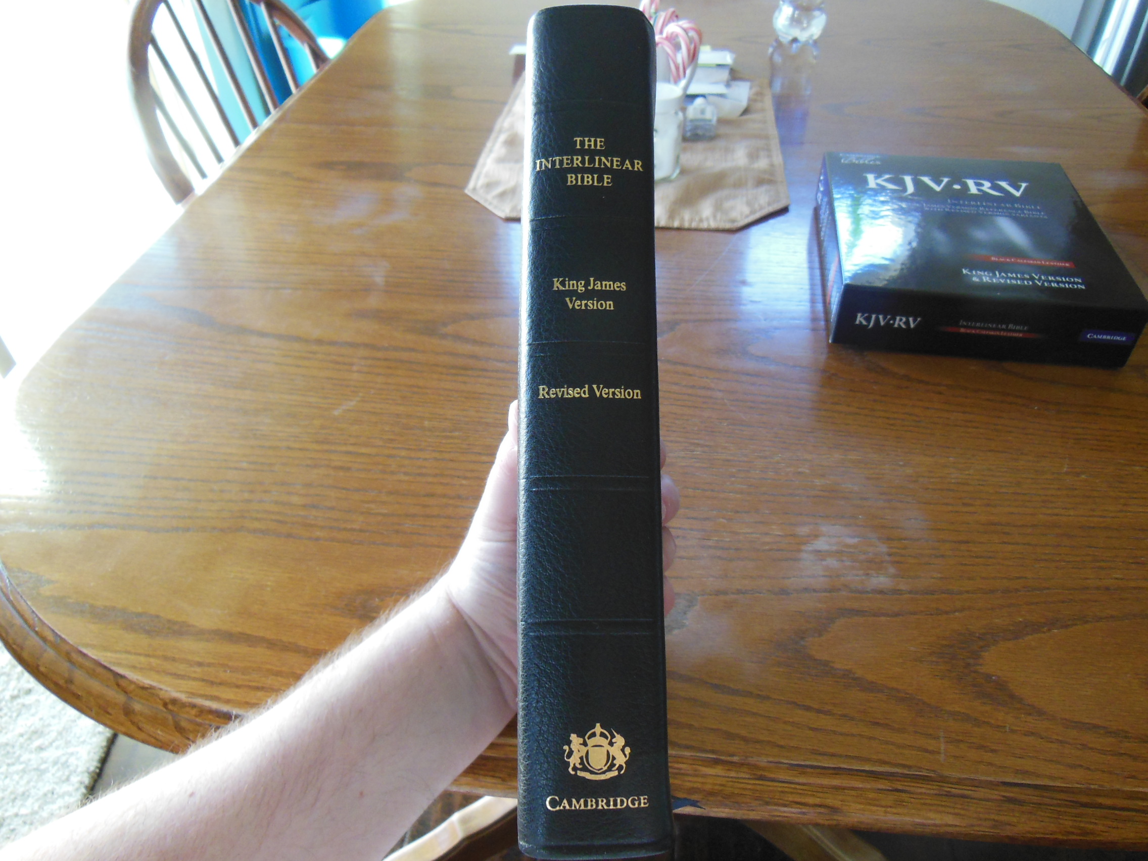
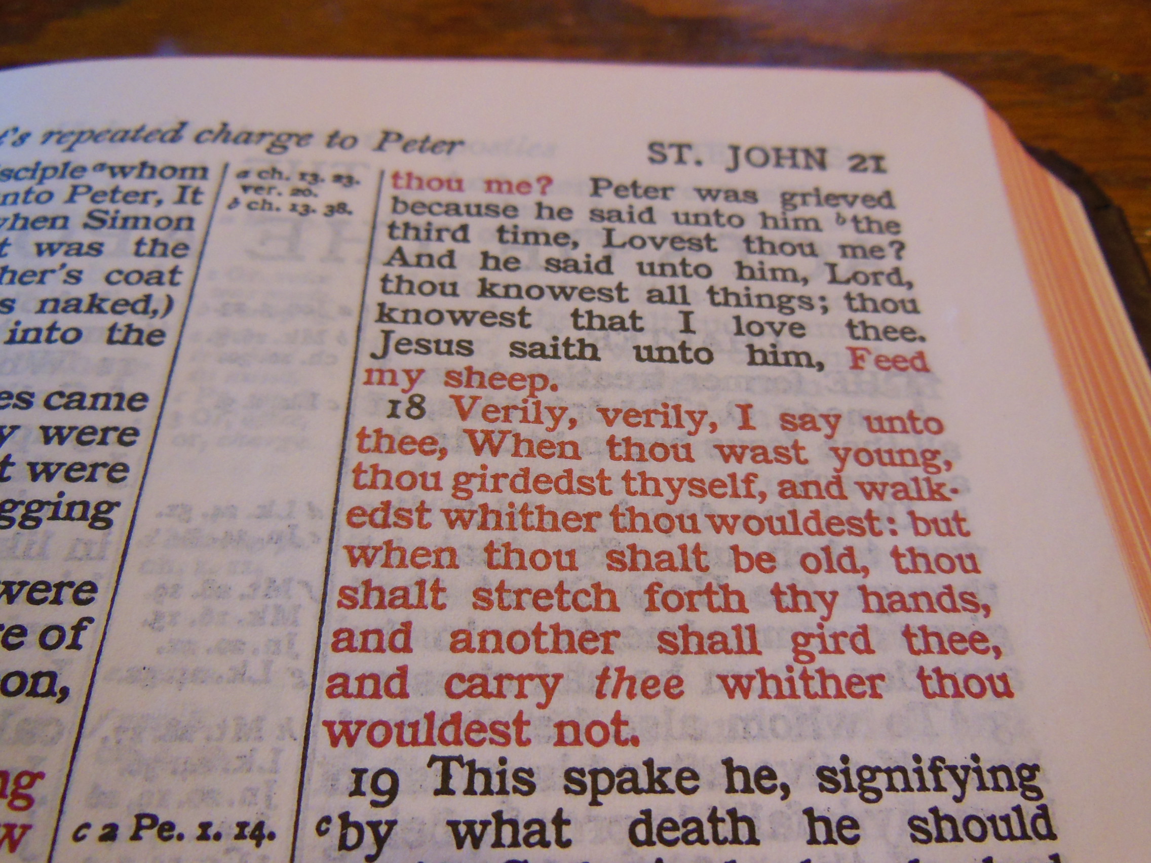
Here is an excerpt from the MEV page, “The MEV is a translation of the Textus Receptus and the Jacob ben Hayyim edition of the Masoretic Text, using the King James Version as the base manuscript.  The MEV is a literal translation. It is also often referred to as a formal correspondence translation.  The Committee on Bible Translation began their work on the MEV in 2005 and completed it in 2013.”  It also appears that some of the endorsers mention that this is the 1611 authorized with modern language.  These lead me to believe that they haven’t fixed the problems that Erasmus introduced.  Here are the last 8 verses from Revelation out of the 1611 Authorized KJV, the Cambridge KJV, The MEV, and the NASB, in that order:

“14 Blessed are they that do his commandements, that they may haue right to the tree of life, and may enter in thorow the gates into the citie.

14Blessed are they that do his commandments, that they may have right to the tree of life, and may enter in through the gates into the city.

14 Blessed are those who do His commandments, that they may have the right to the tree of life, and may enter through the gates into the city.

14 Blessed are those who wash their robes, so that they may have the right to the tree of life, and may enter by the gates into the city.

15 For without are dogs, and sorcerers, and whoremongers, and murderers, and idolaters, and whosoeuer loueth and maketh a lie.

15For without are dogs, and sorcerers, and whoremongers, and murderers, and idolaters, and whosoever loveth and maketh a lie.

15 Outside are dogs and sorcerers and the sexually immoral and murderers and idolaters and everyone who loves and practices a lie.

15 Outside are the dogs and the sorcerers and the immoral persons and the murderers and the idolaters, and everyone who loves and practices lying.

16 I Iesus haue sent mine Angel, to testifie vnto you these things in the Churches. I am the roote and the offspring of Dauid, and the bright and morning starre.

16I Jesus have sent mine angel to testify unto you these things in the churches. I am the root and the offspring of David, and the bright and morning star.

16 “I, Jesus, have sent My angel to you with this testimony for the churches. I am the Root and the Offspring of David, the Bright and Morning Star.”

16 “I, Jesus, have sent My angel to testify to you these things  [fn]for the churches. I am the root and the descendant of David, the bright morning star.”

17 And the Spirit and the Bride say, Come. And let him that heareth, say, Come. And let him that is a thirst, come. And whosoeuer will, let him take the water of life freely.

17And the Spirit and the bride say, Come. And let him that heareth say, Come. And let him that is athirst come. And whosoever will, let him take the water of life freely.

17 The Spirit and the bride say, “Come.” Let him who hears say, “Come.” Let him who is thirsty come. Let him who desires take the water of life freely.

17 The Spirit and the bride say, “Come.” And let the one who hears say, “Come.” And let the one who is thirsty come; let the one who wishes take the water of life without cost.

18 For I testifie vnto euery man that heareth the wordes of the prophesie of this booke, If any man shal adde vnto these things, God shall adde vnto him the plagues, that are written in this booke.

18For I testify unto every man that heareth the words of the prophecy of this book, If any man shall add unto these things, God shall add unto him the plagues that are written in this book:

18 I testify to everyone who hears the words of the prophecy of this book: If anyone adds to these things, God shall add to him the plagues that are written in this book.

18I testify to everyone who hears the words of the prophecy of this book: if anyone adds to them, God will add to him the plagues which are written in this book;

19 And if any man shall take away from the wordes of the booke of this prophesie, God shal take away his part out of the booke of life, and out of the holy citie, and from the things which are written in this booke.

19And if any man shall take away from the words of the book of this prophecy, God shall take away his part out of the book of life, and out of the holy city, and from the things which are written in this book.

19 And if anyone takes away from the words of the book of this prophecy, God shall take away his part out of the Book of Life and out of the Holy City and out of the things which are written in this book.

19 and if anyone takes away from the words of the book of this prophecy, God will take away his part from the tree of life and  [fn]from the holy city, which are written in this book.

20 Hee which testifieth these things, saith, Surely, I come quickly. Amen. Euen so, Come Lord Iesus.

20He which testifieth these things saith, Surely I come quickly. Amen. Even so, come, Lord Jesus.

20 He who testifies to these things says, “Surely I am coming soon.”

Amen. Even so, come Lord Jesus!

20 He who testifies to these things says, “Yes, I am coming quickly.” Amen. Come, Lord Jesus.

21 The grace of our Lord Iesus Christ be with you all. Amen.”

21The grace of our Lord Jesus Christ be with you all. Amen. {THE END.}

21 The grace of our Lord Jesus Christ be with you all. Amen.

21 The grace of the Lord Jesus be with  [fn]all. Amen.

You can see some of the differences between translations due to the error of Erasmus in the above verses.  Of course the first three translations will look more alike when compared to the last one.  The NASB is a modern translation that utilized more than just the Textus Receptus.  It used the third edition of Rudolf Kittel’s Biblia Hebraica, the Dead Sea Scrolls, and the Biblia Hebraica Stuttgartensia for the Hebrew.  It used the Eberhard Nestle’s Novum Testamentum Graece for the Greek.

According to their web page they were not allowing any cultural or theological agendas to dictate how they did their translation.  I’m glad to see that there isn’t any gender neutral nonsense so far as I have read.

Overall it accomplishes what it sets out to do.  It brings the KJV into modern English.  I think it does a better job in some areas and could be better in others.  I think they should fix the problems with the work of Erasmus.

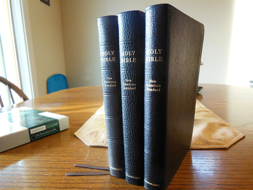
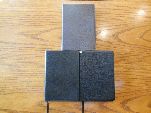
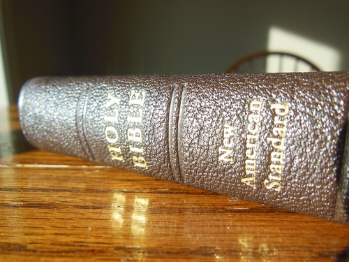
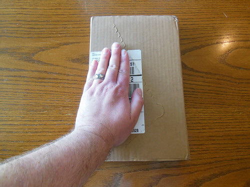
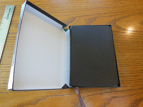
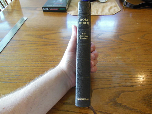
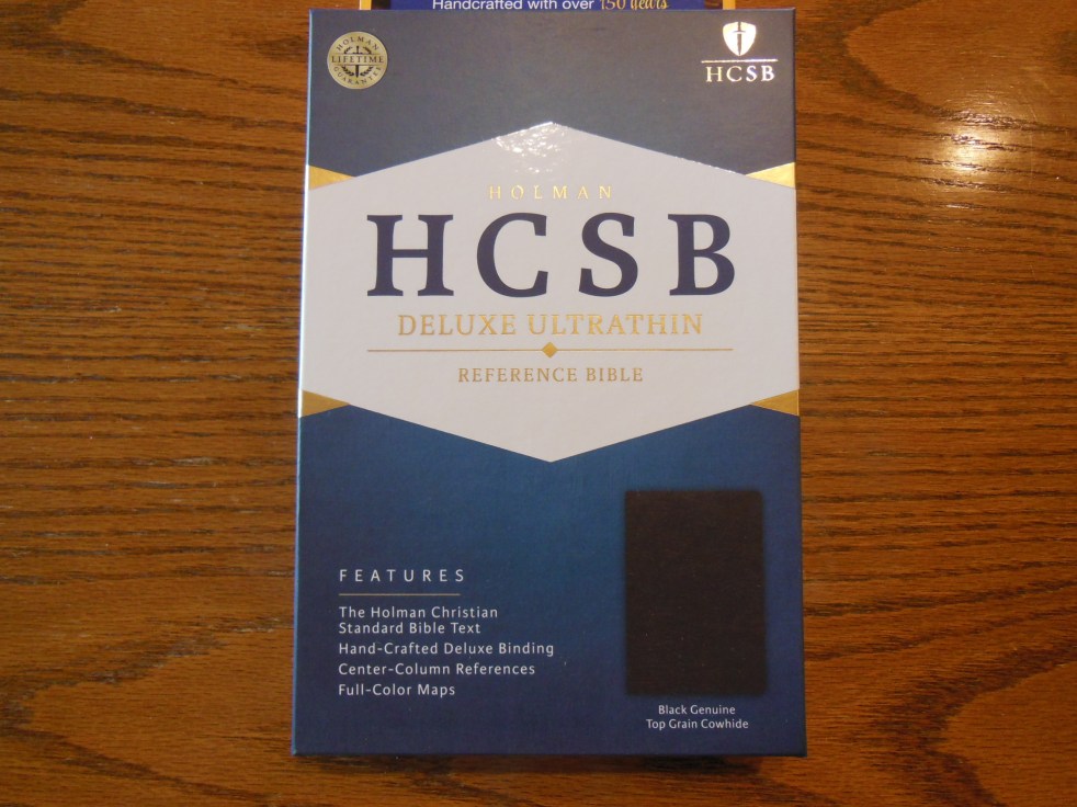
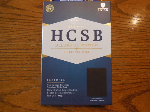
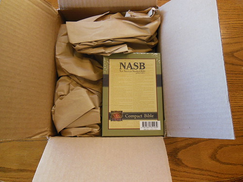
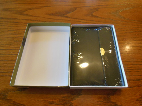
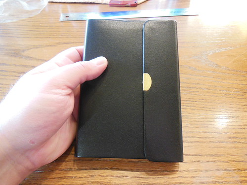
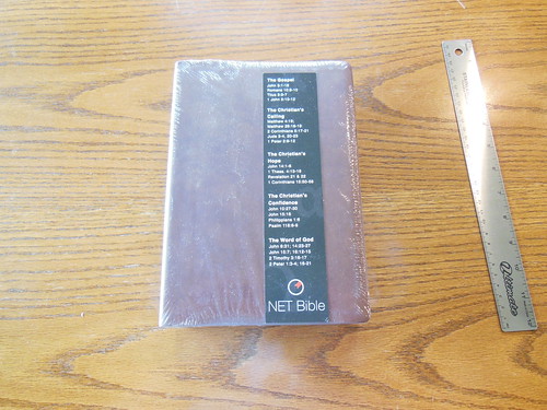
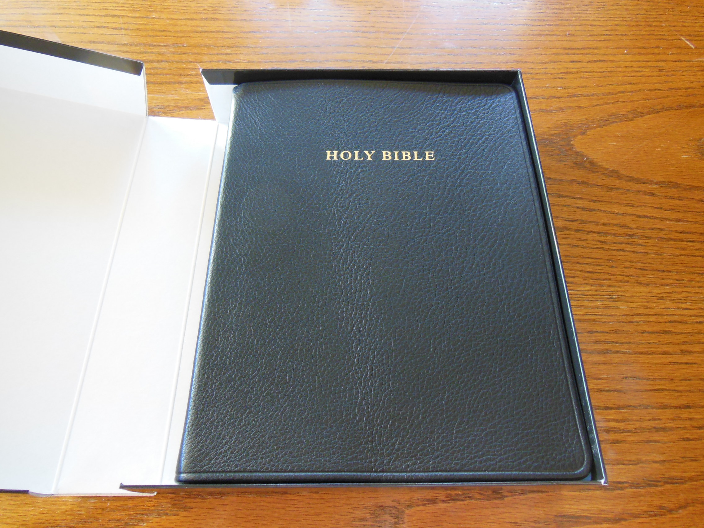
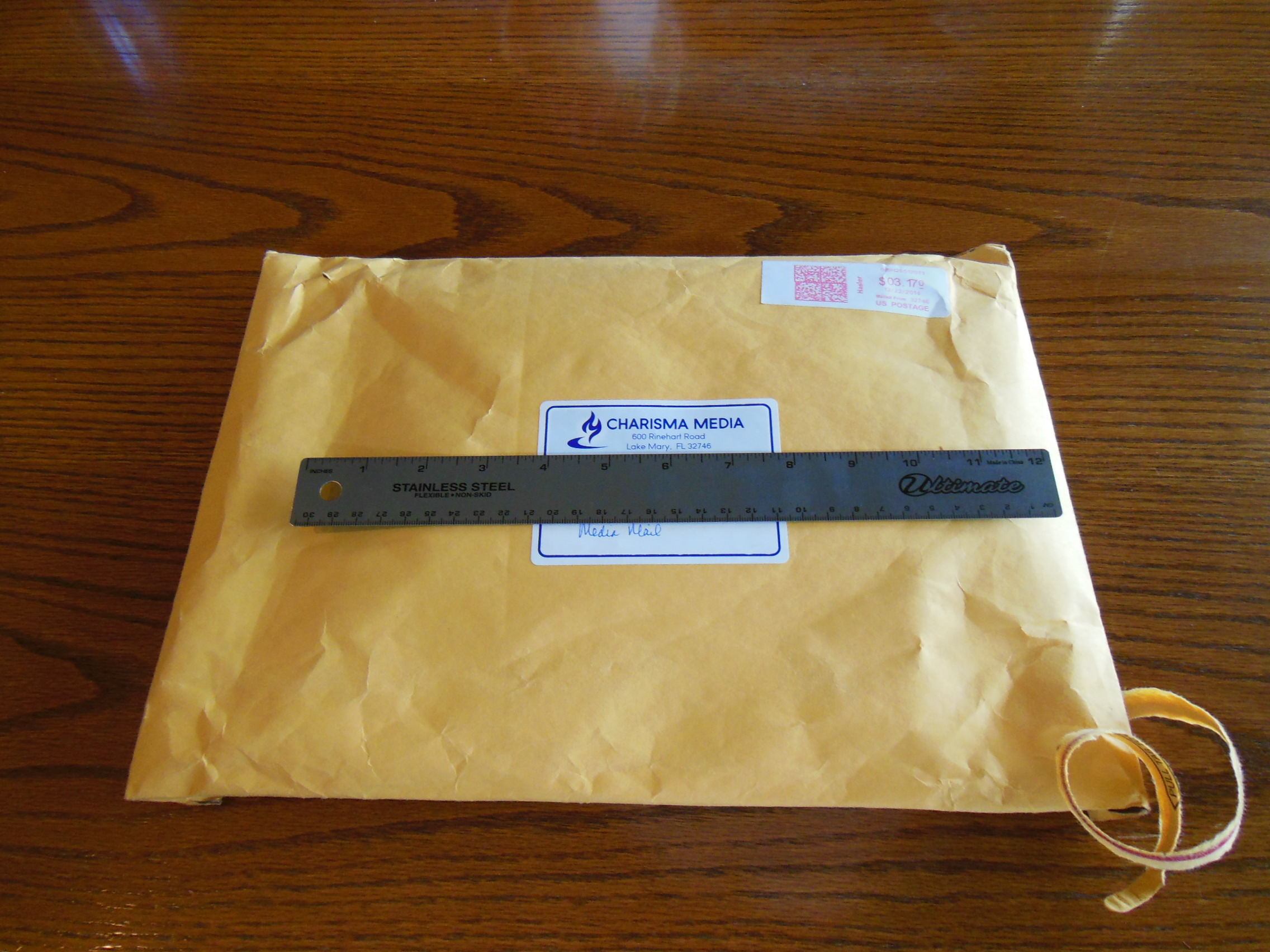
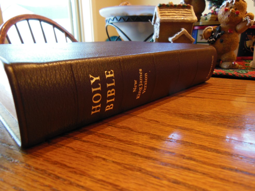
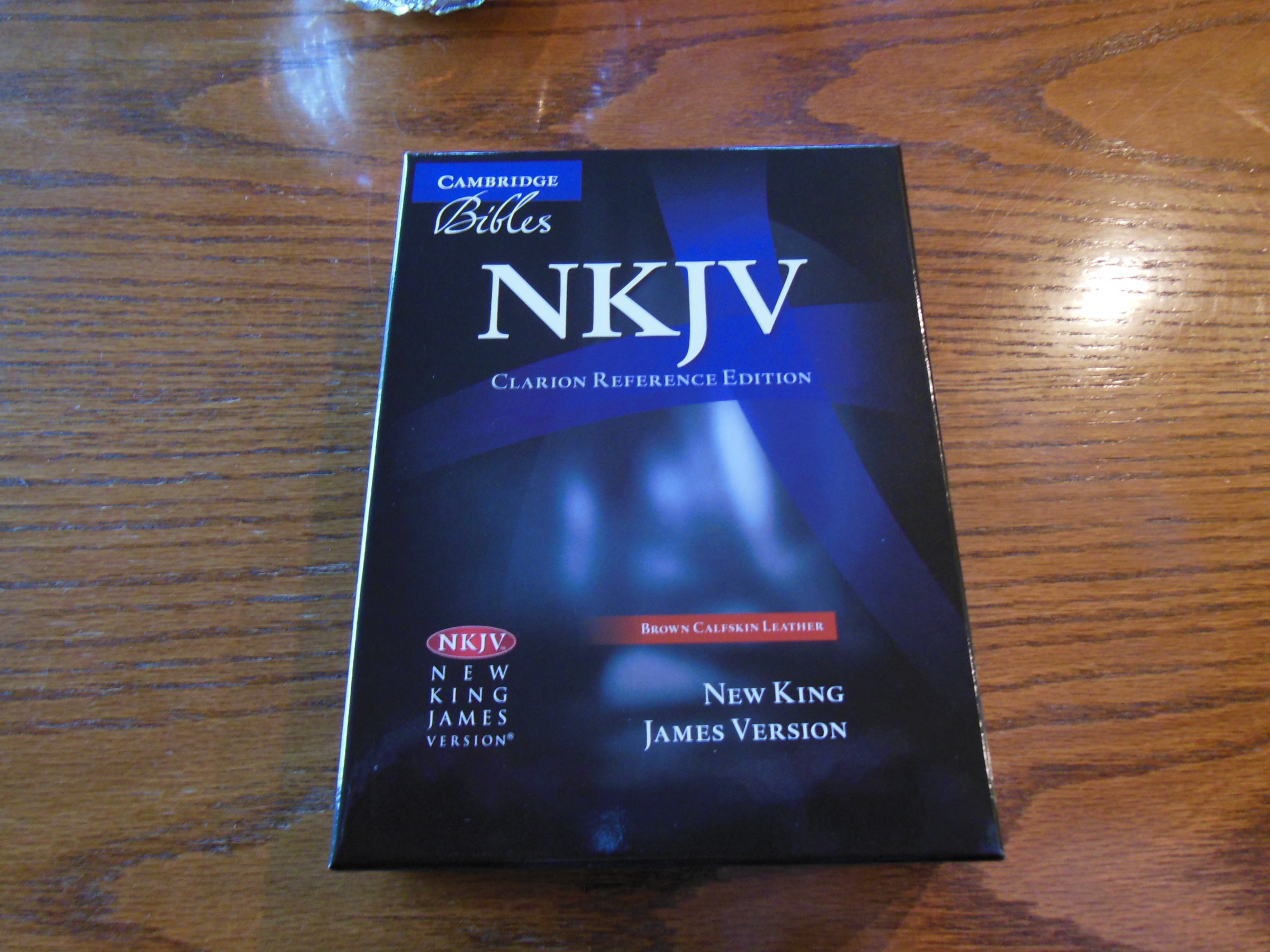
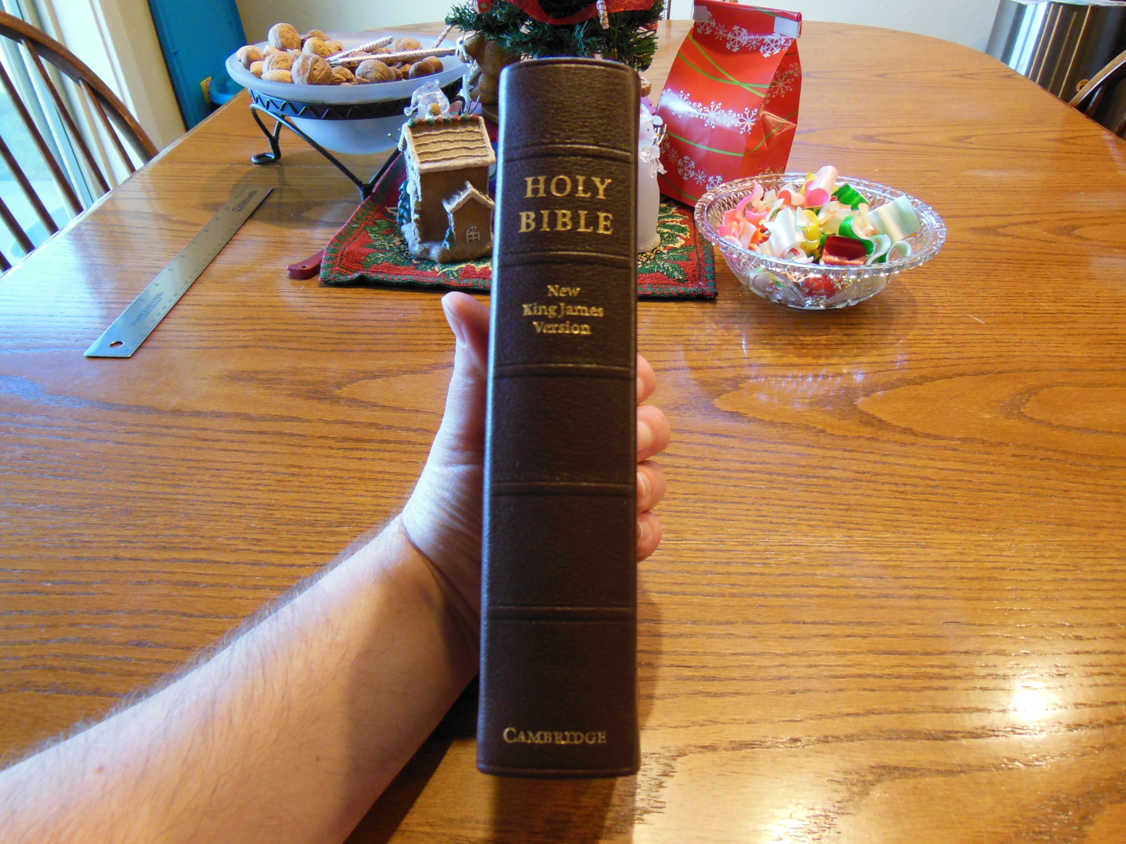
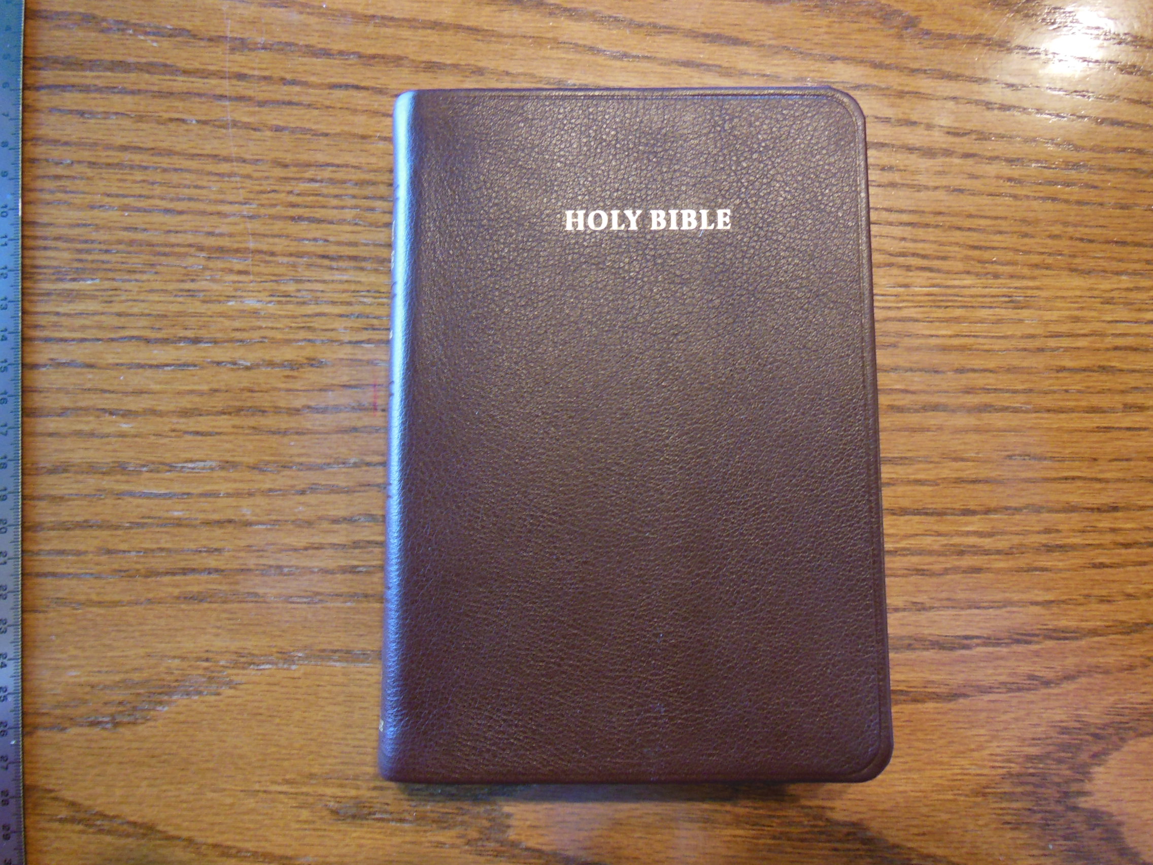
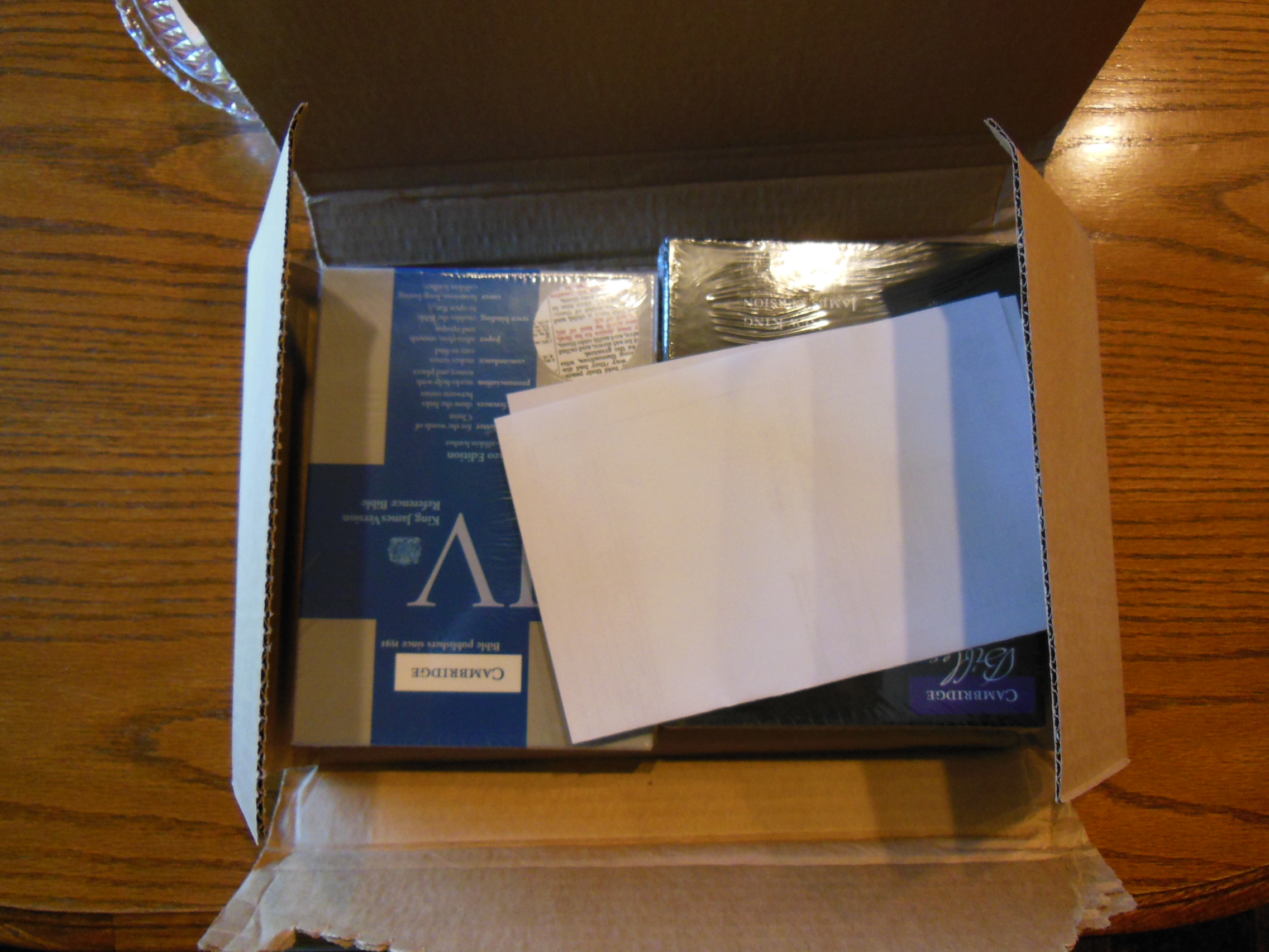
The Bible Passio sent me to review is a Thinline Reference Bible.  Here is an excerpt from their product page, “Thinline Reference Bible Black Leatherlike ATTRACTIVE AND LIGHTWEIGHT, this Thinline Reference Bible is a Bible your customers can take anywhere. Complete with study tools such as cross-references, a concordance, and four-color maps, it is sure to be a favorite for home, church, or giving as a gift.” The Bible was provided gratis for the purpose of review by Passio.  It arrived in an envelope.

Passio MEV Bible 001

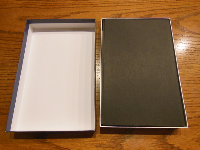
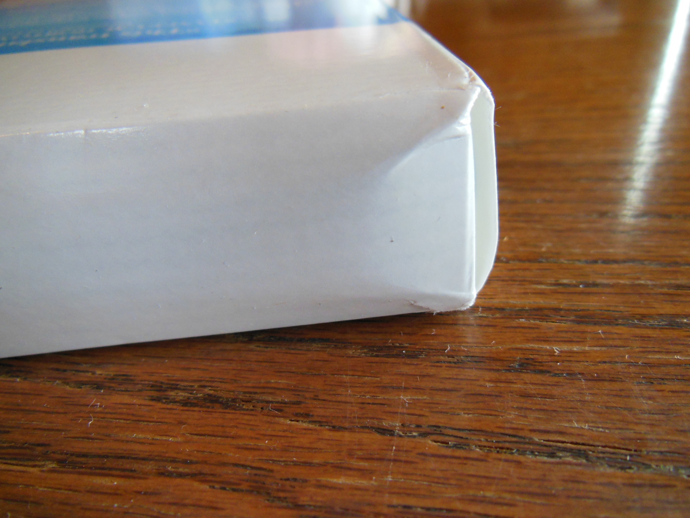
It was packaged in a card-paper sleeve.  The sleeve or slipcase is not heavy enough to use for storage and actually was bent quite a bit from being mailed.

Passio MEV Bible 005 Passio MEV Bible 003

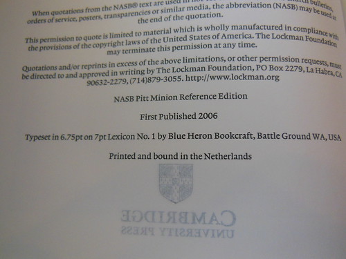
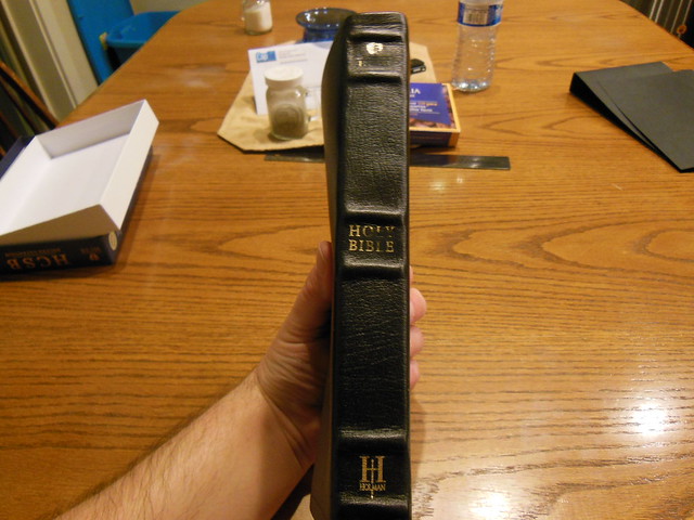
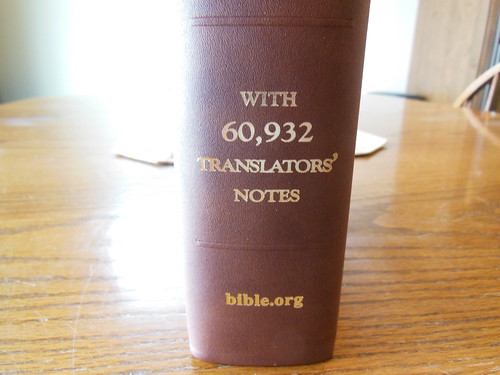
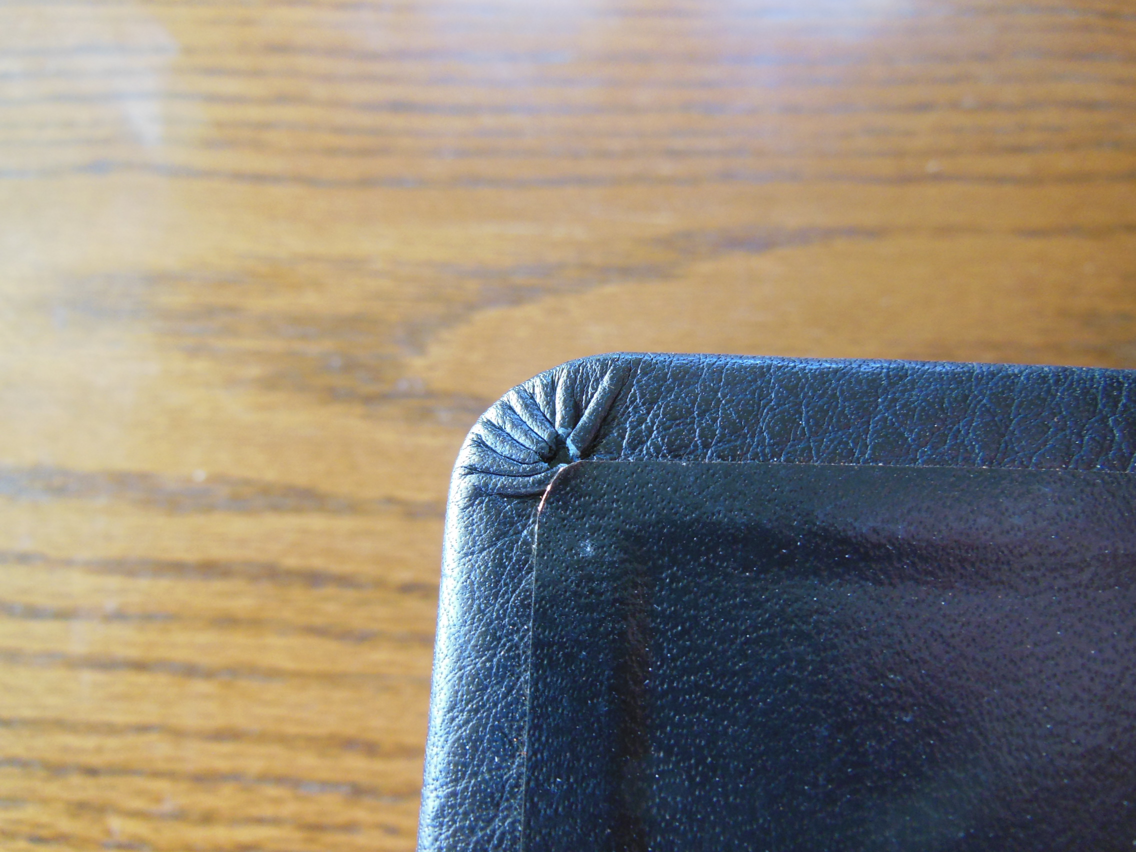
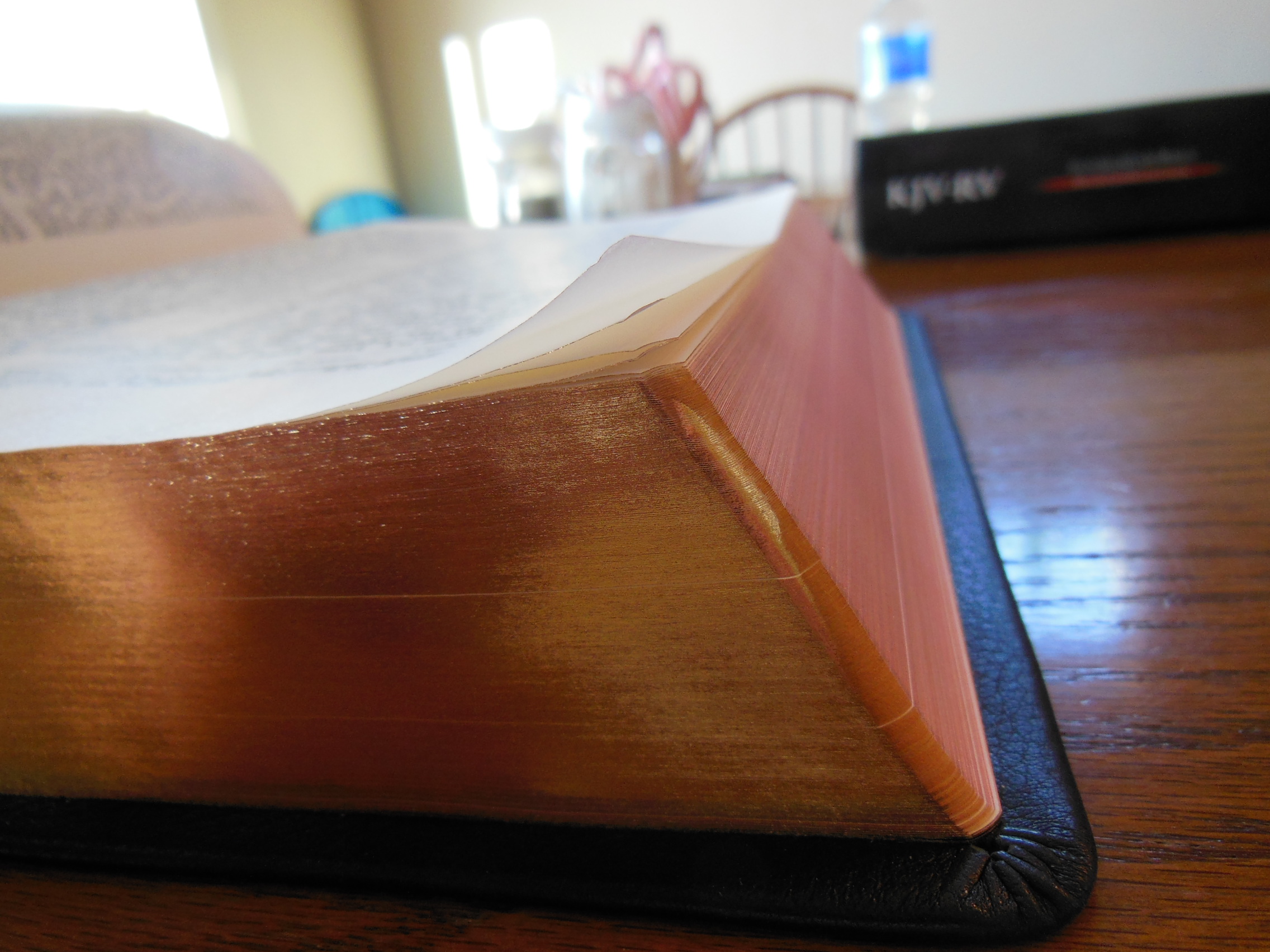
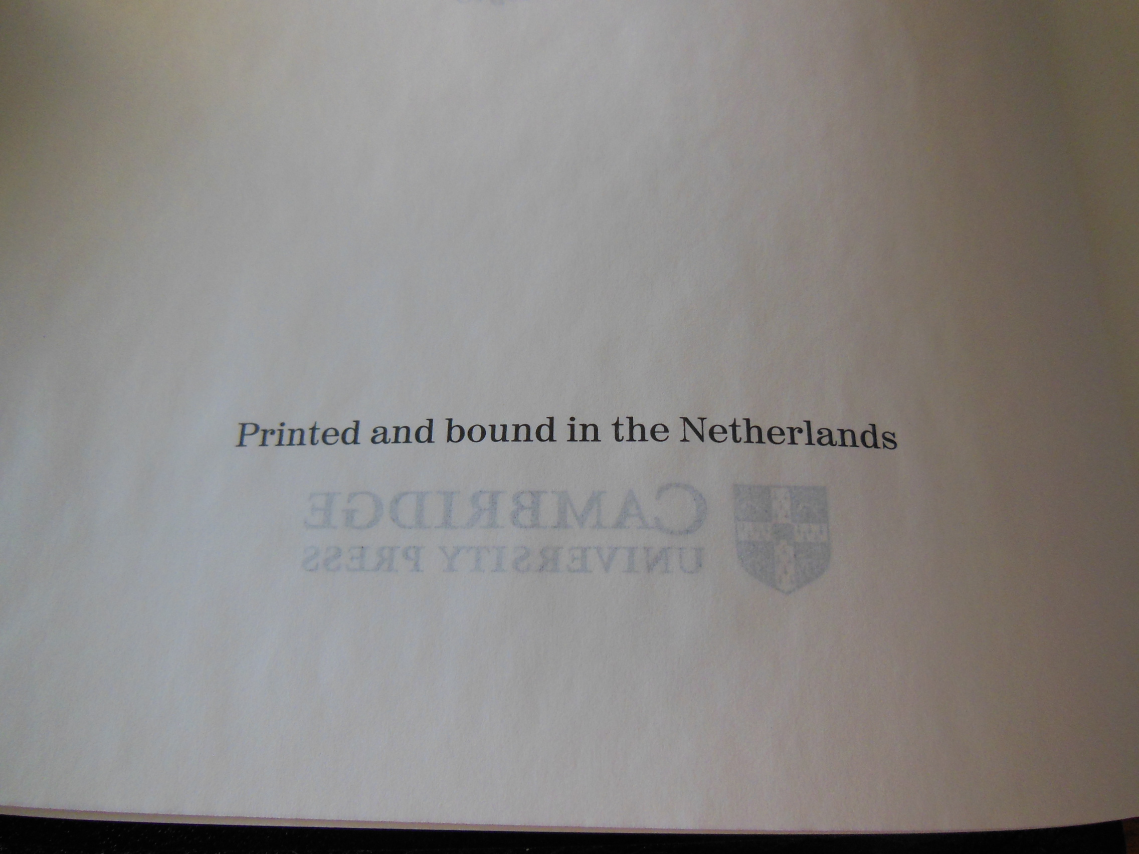
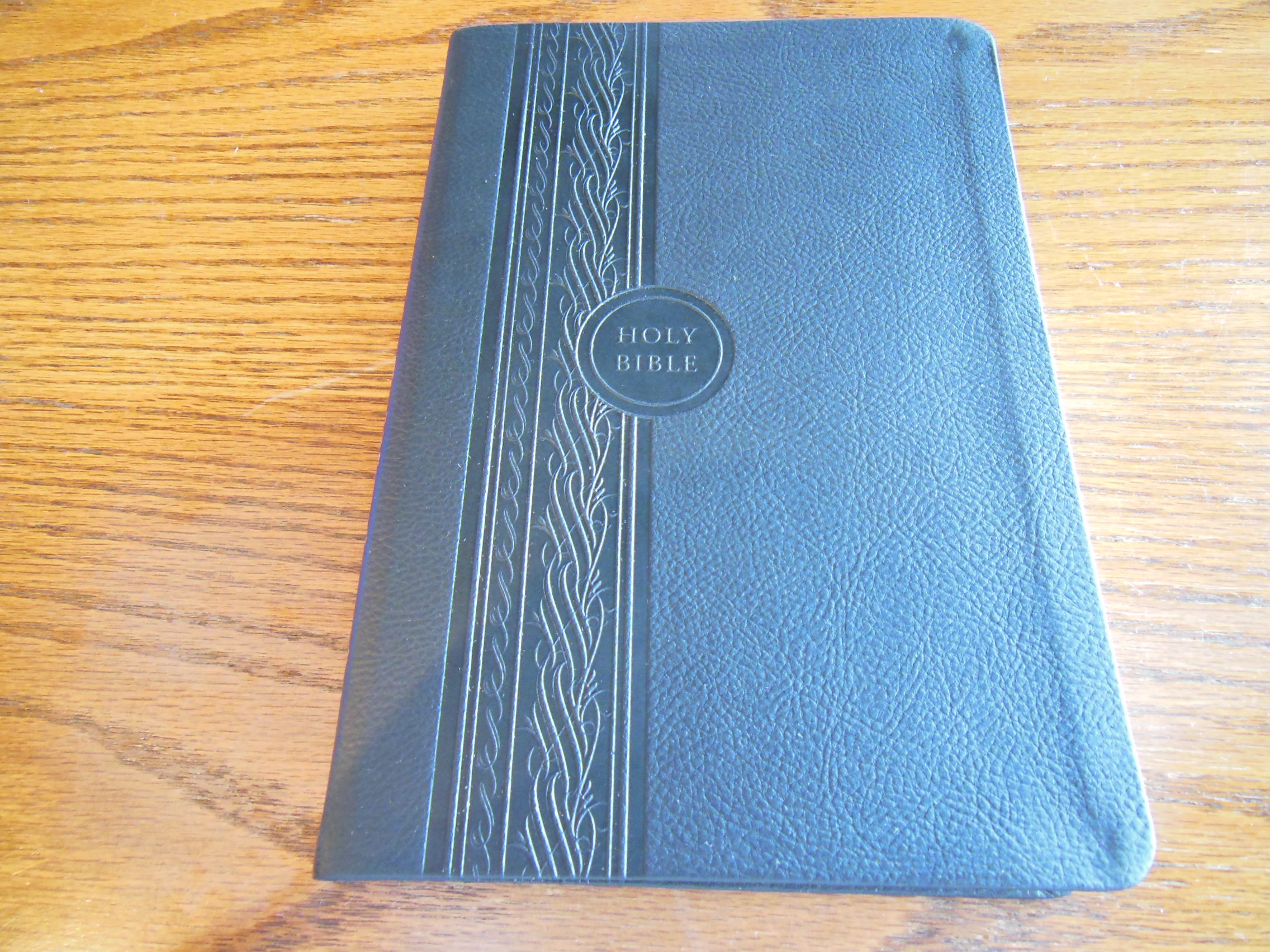
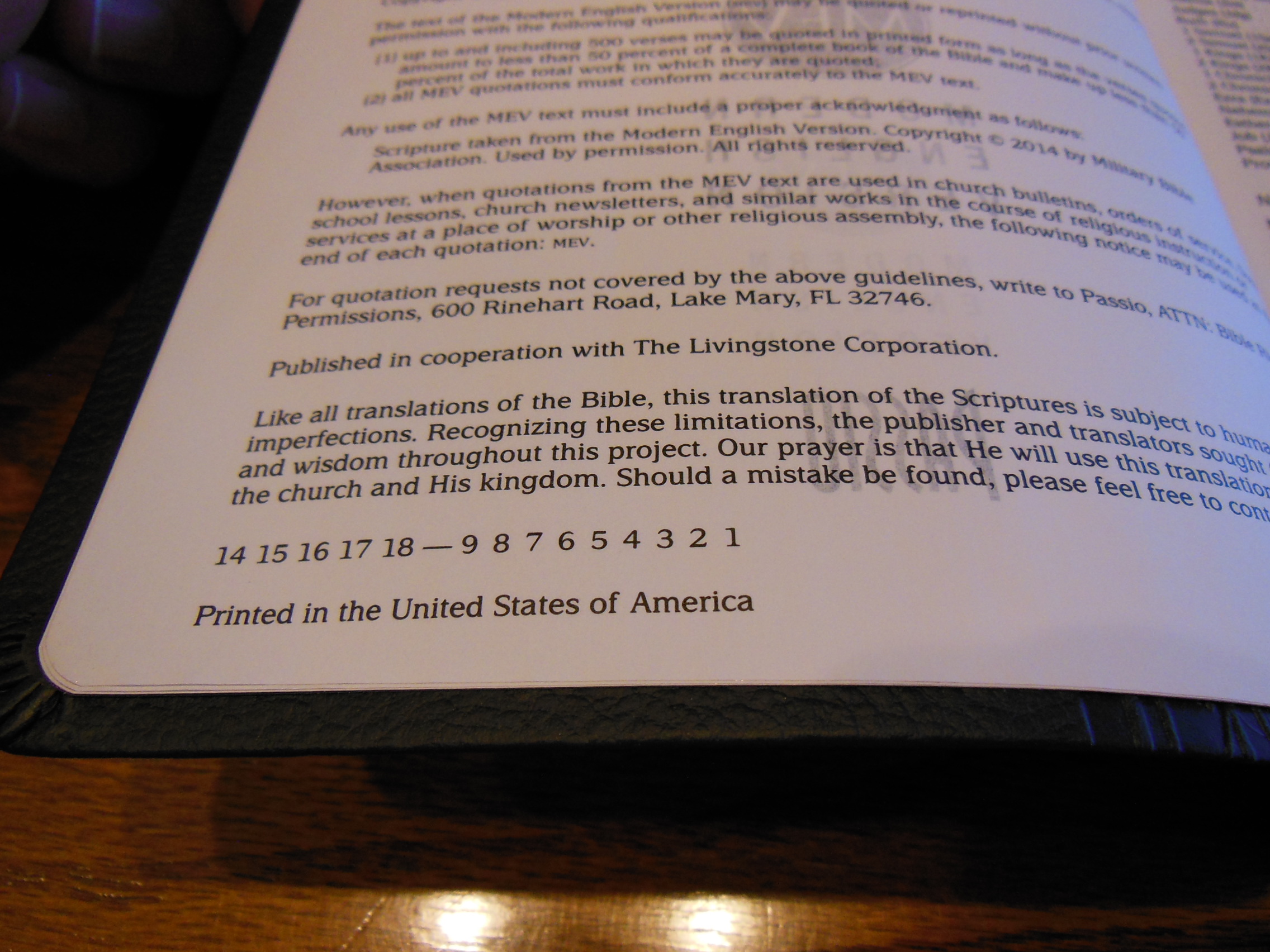
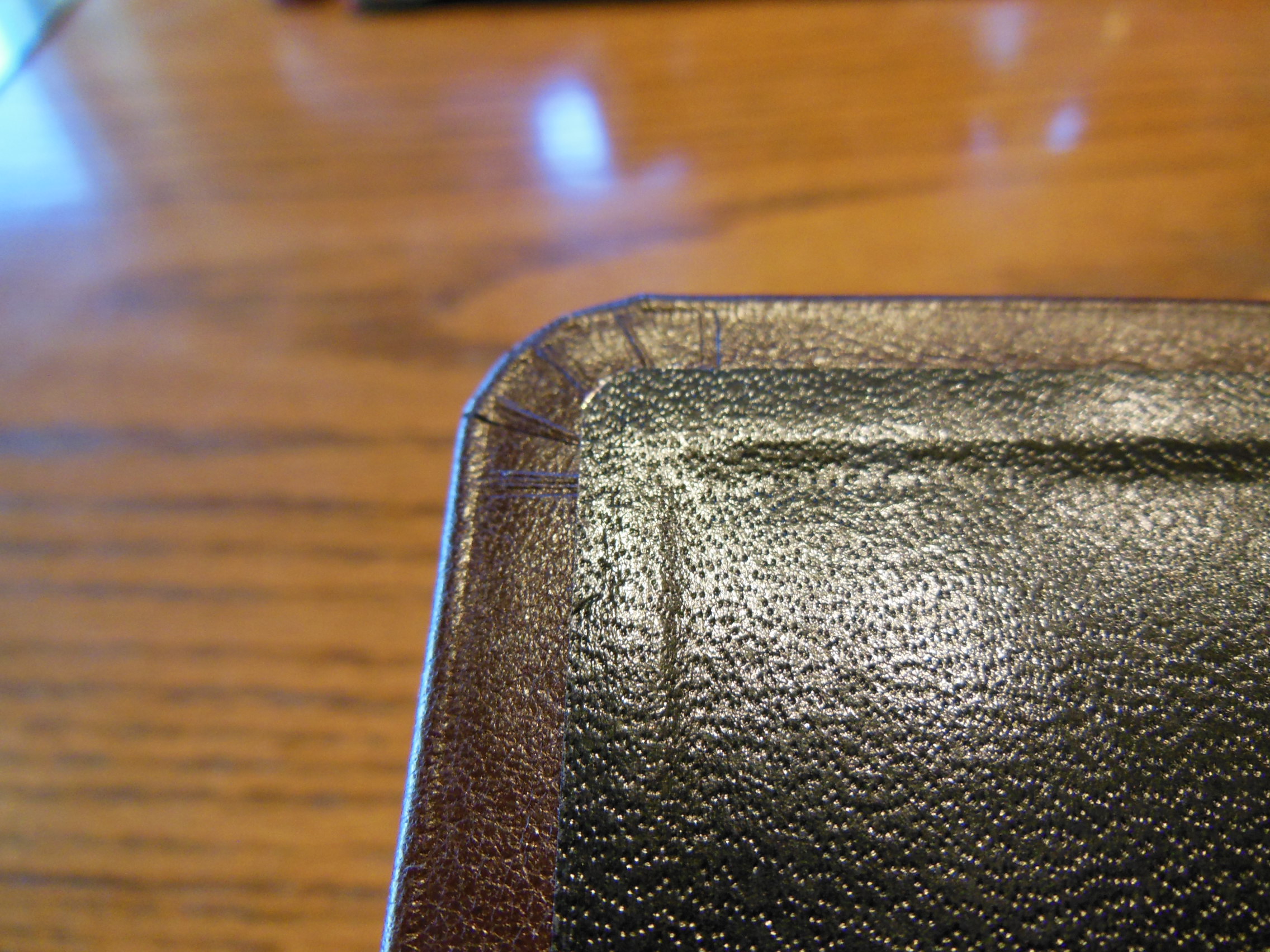
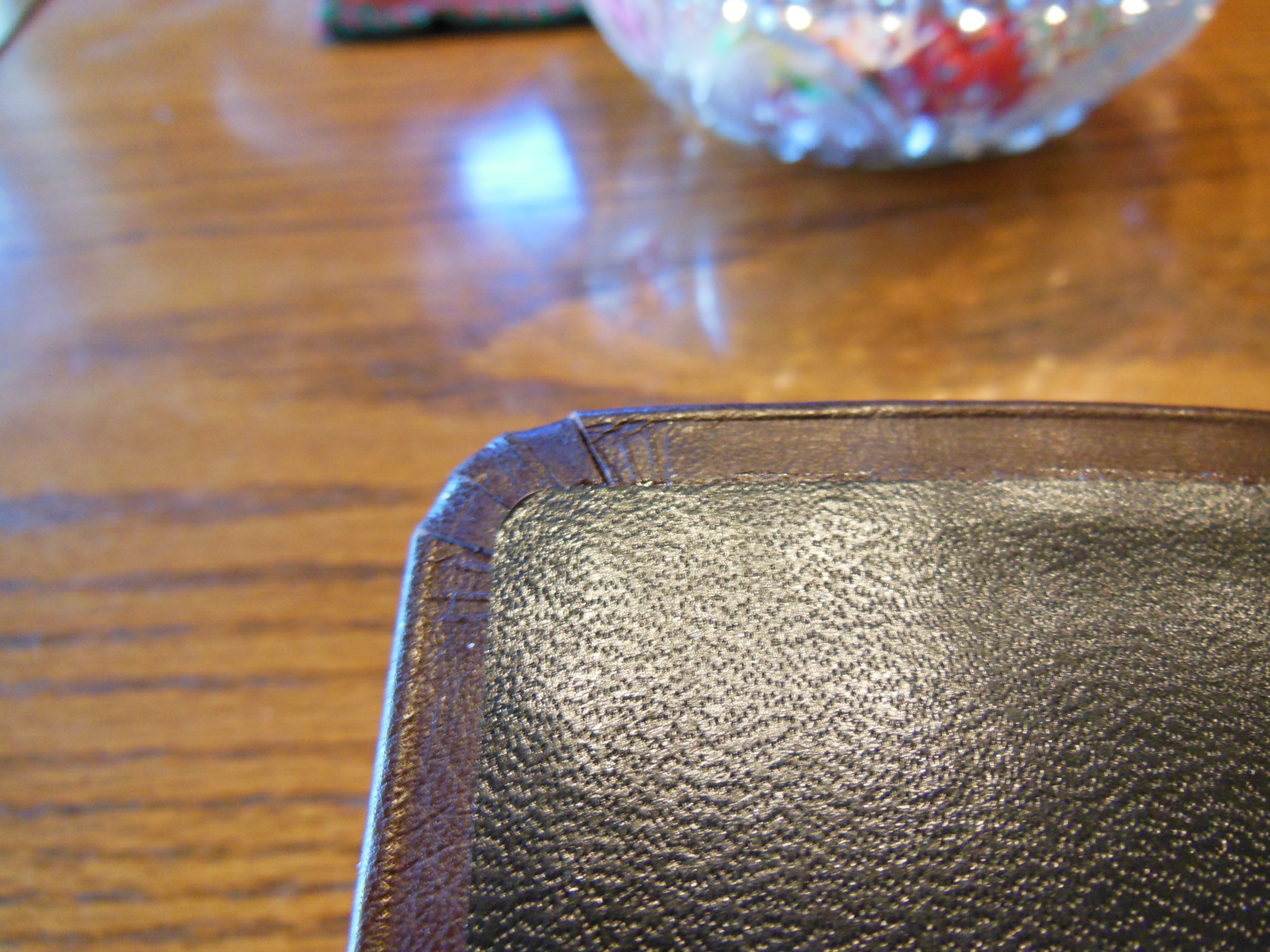
The Bible itself didn’t suffer too much, just some bent corners.  The MEV was printed and bound in America.

Passio MEV Bible 019

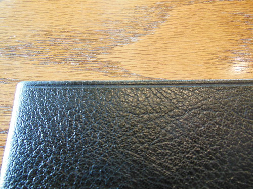
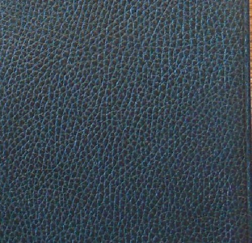
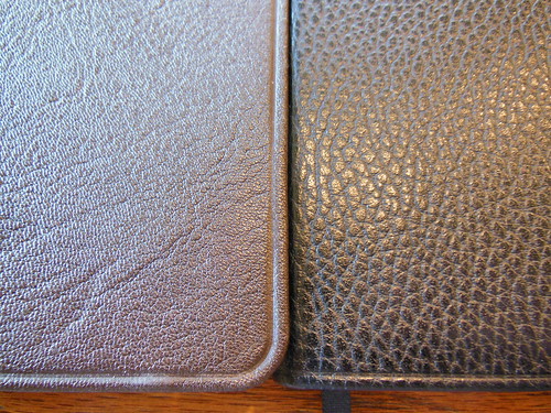
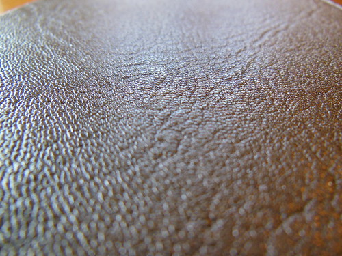
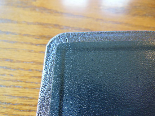
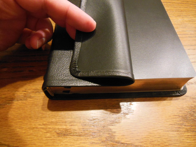
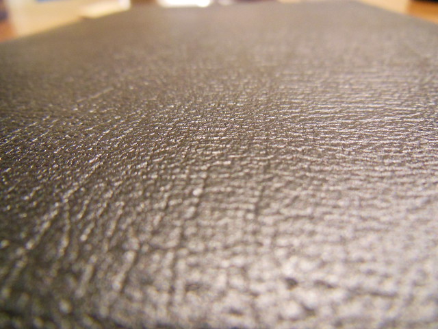
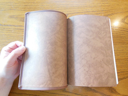
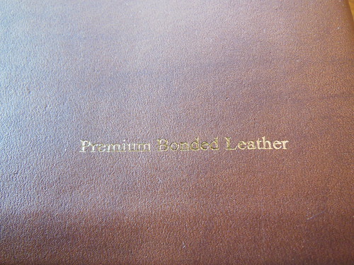
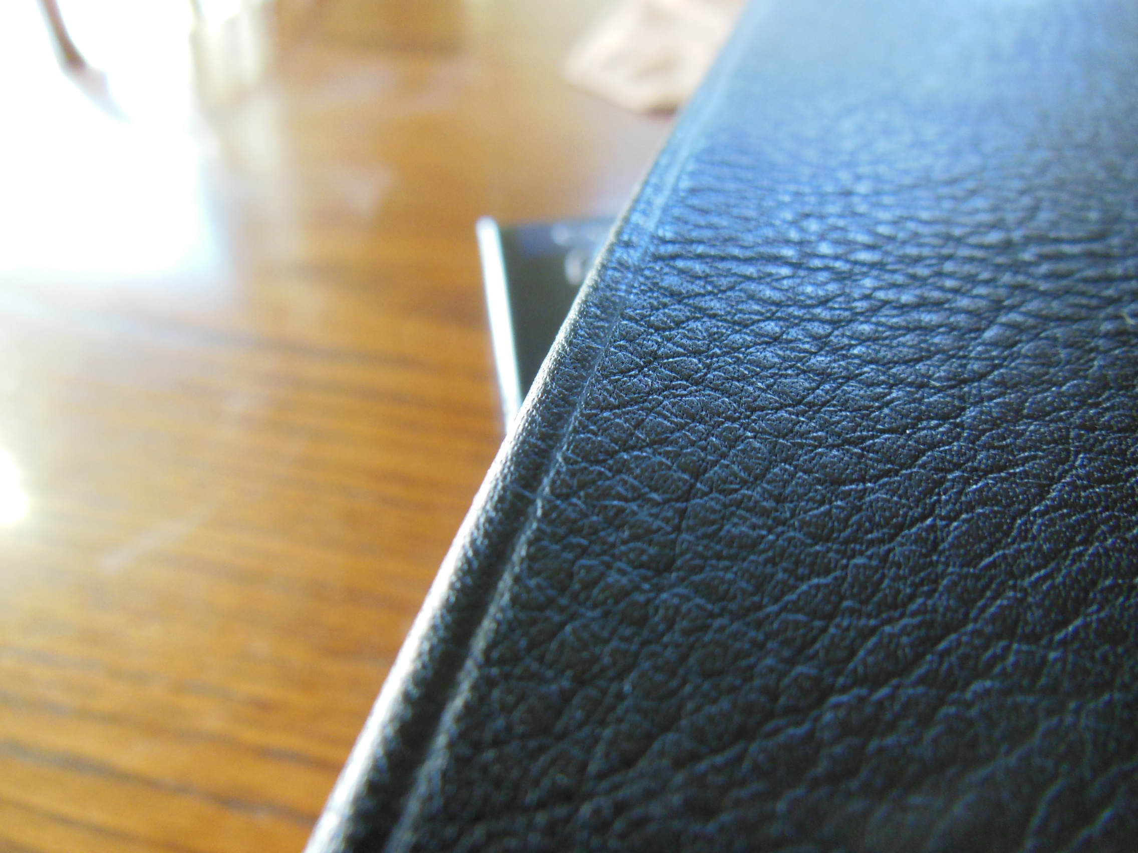
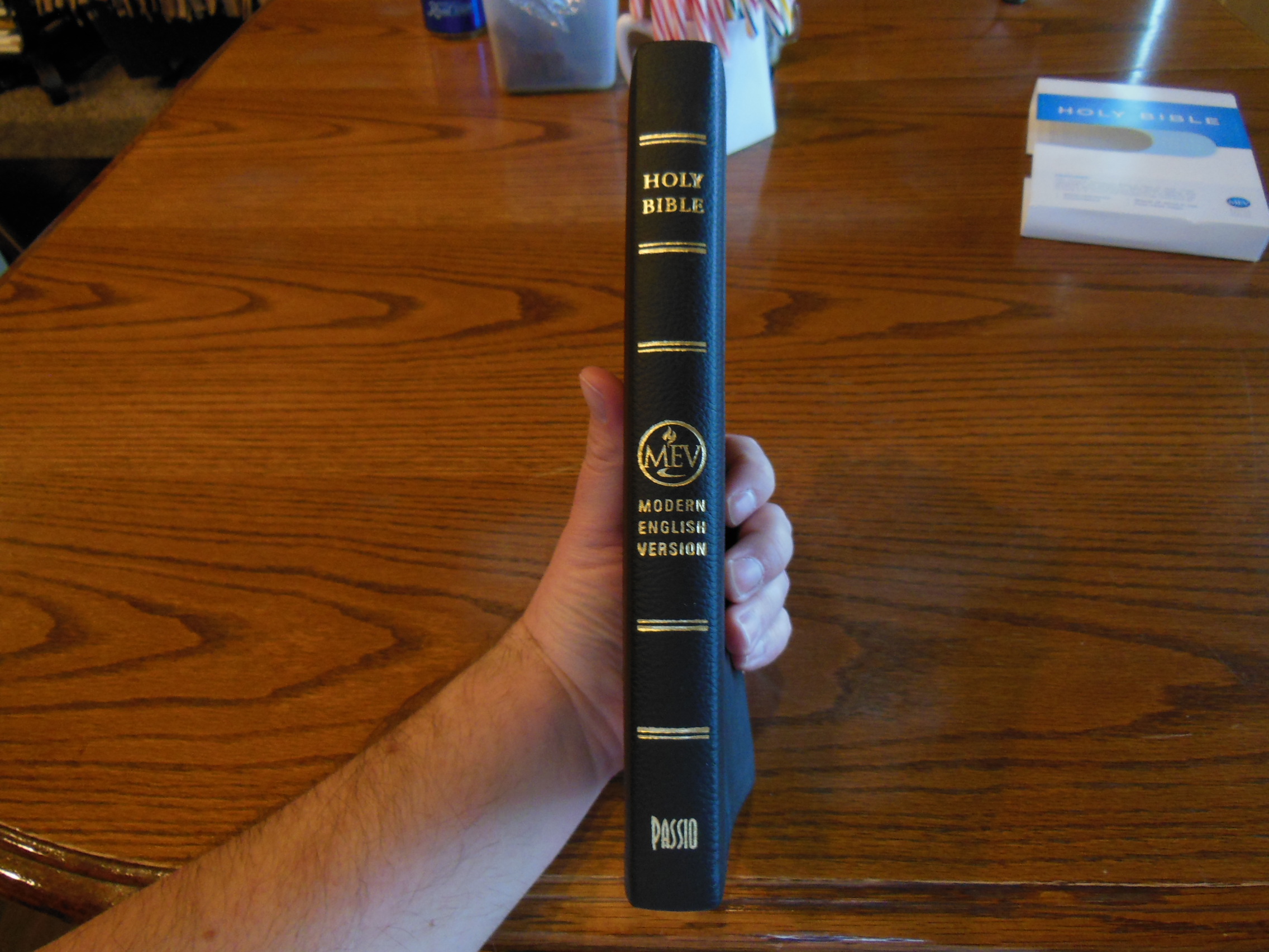
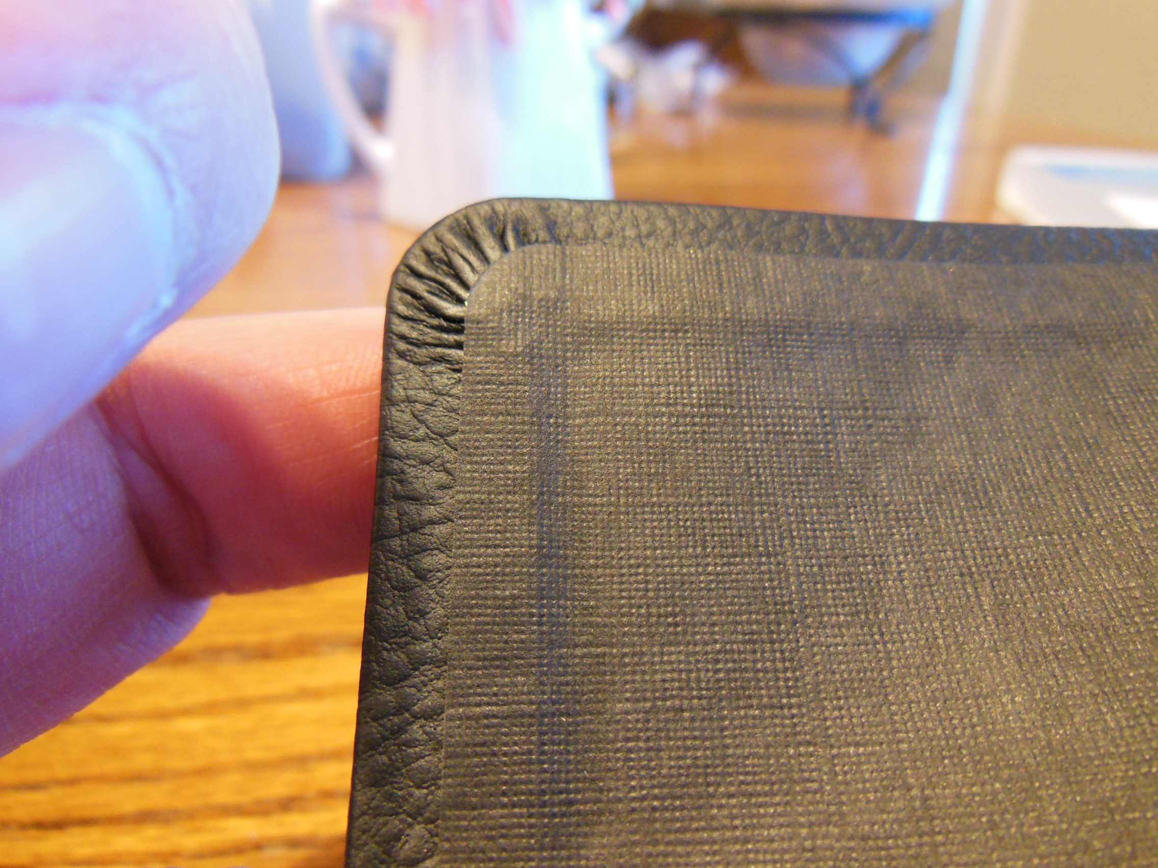
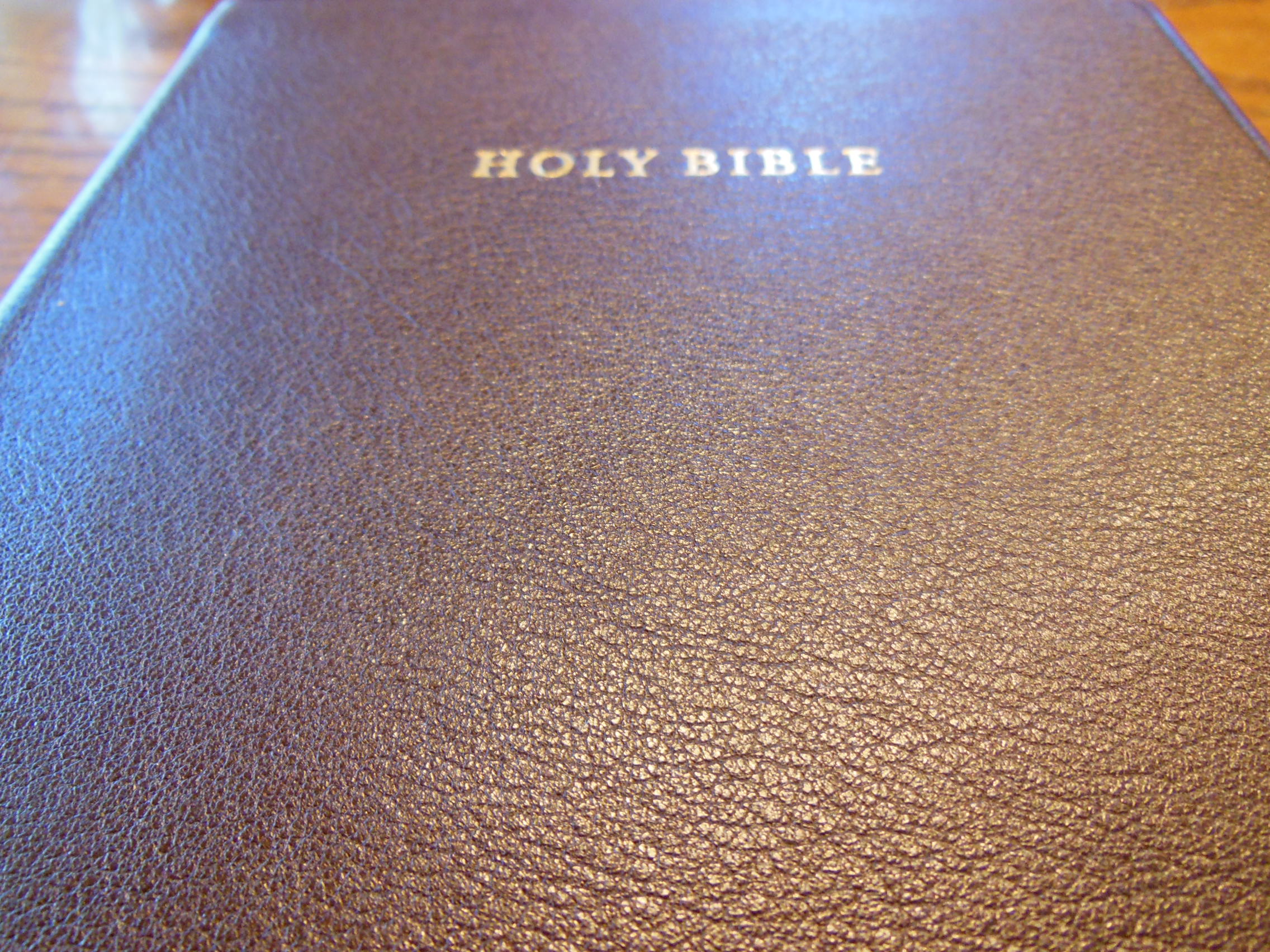
I found this refreshing.  So many of the Bibles I review are imported from China and South Korea.  The Bible was covered with what they call a black leatherlike cover.  It was black.  It was textured.  That was about where the similarities ended.  This had some of the cheapest cover material I’ve ever seen.

Passio MEV Bible 009 Passio MEV Bible 010

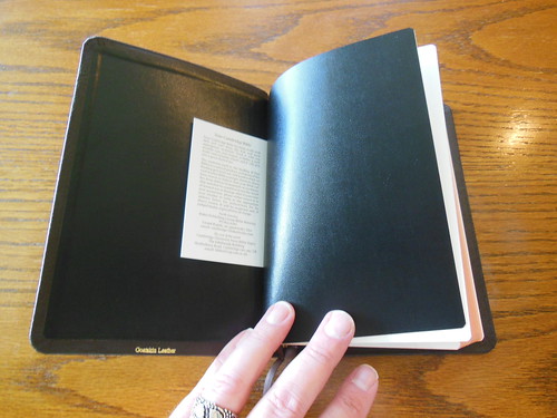
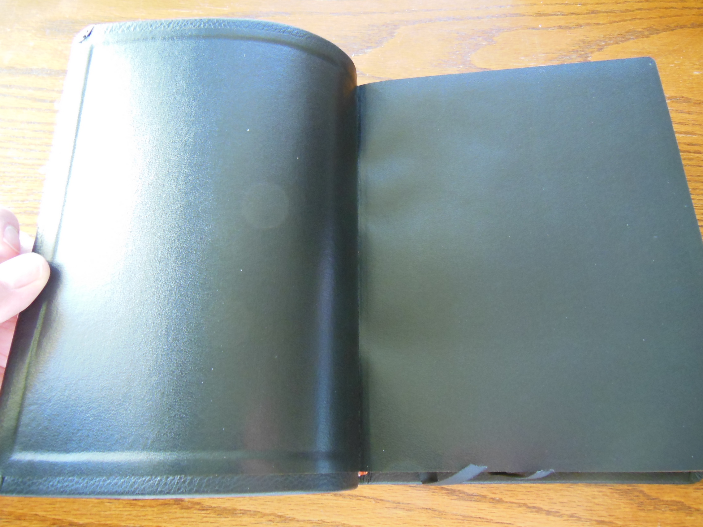
The inside cover is lined with paper.

Passio MEV Bible 012 Passio MEV Bible 013

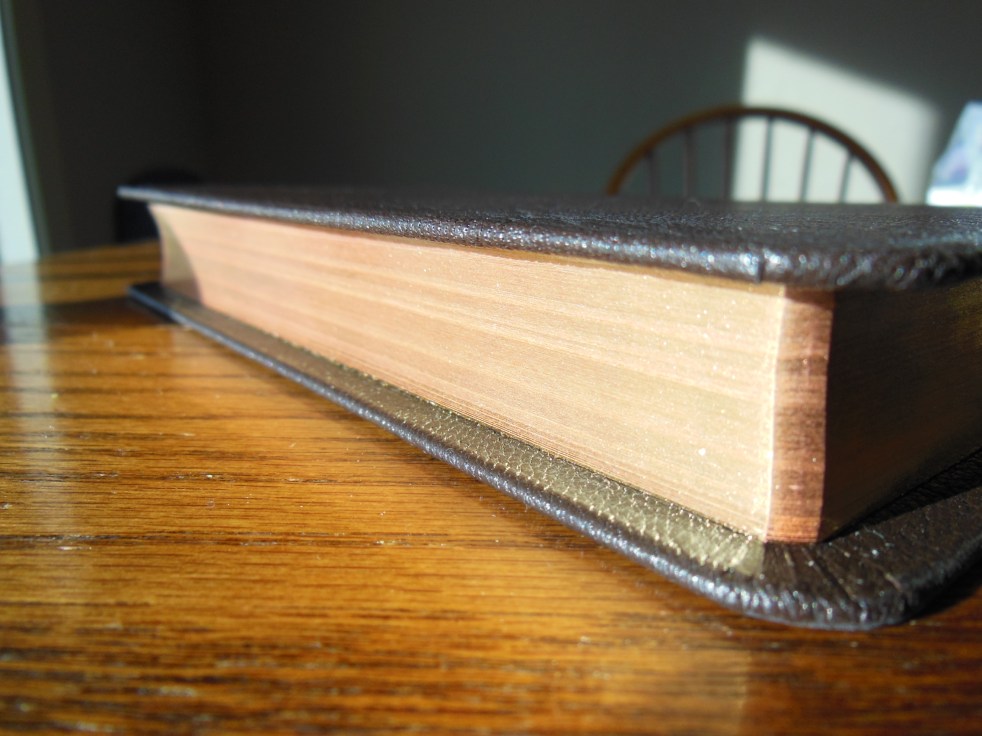
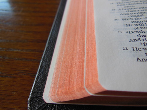
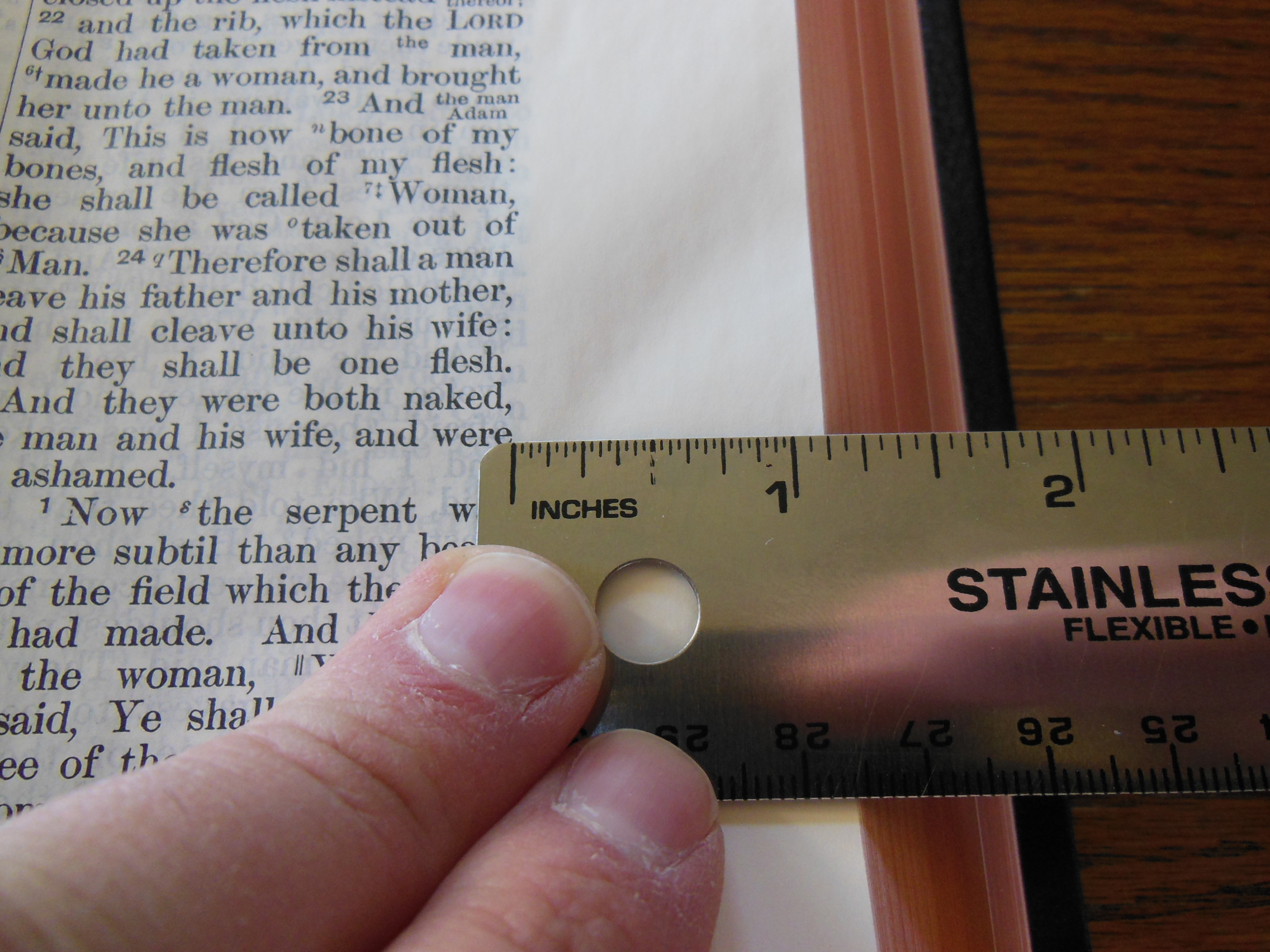
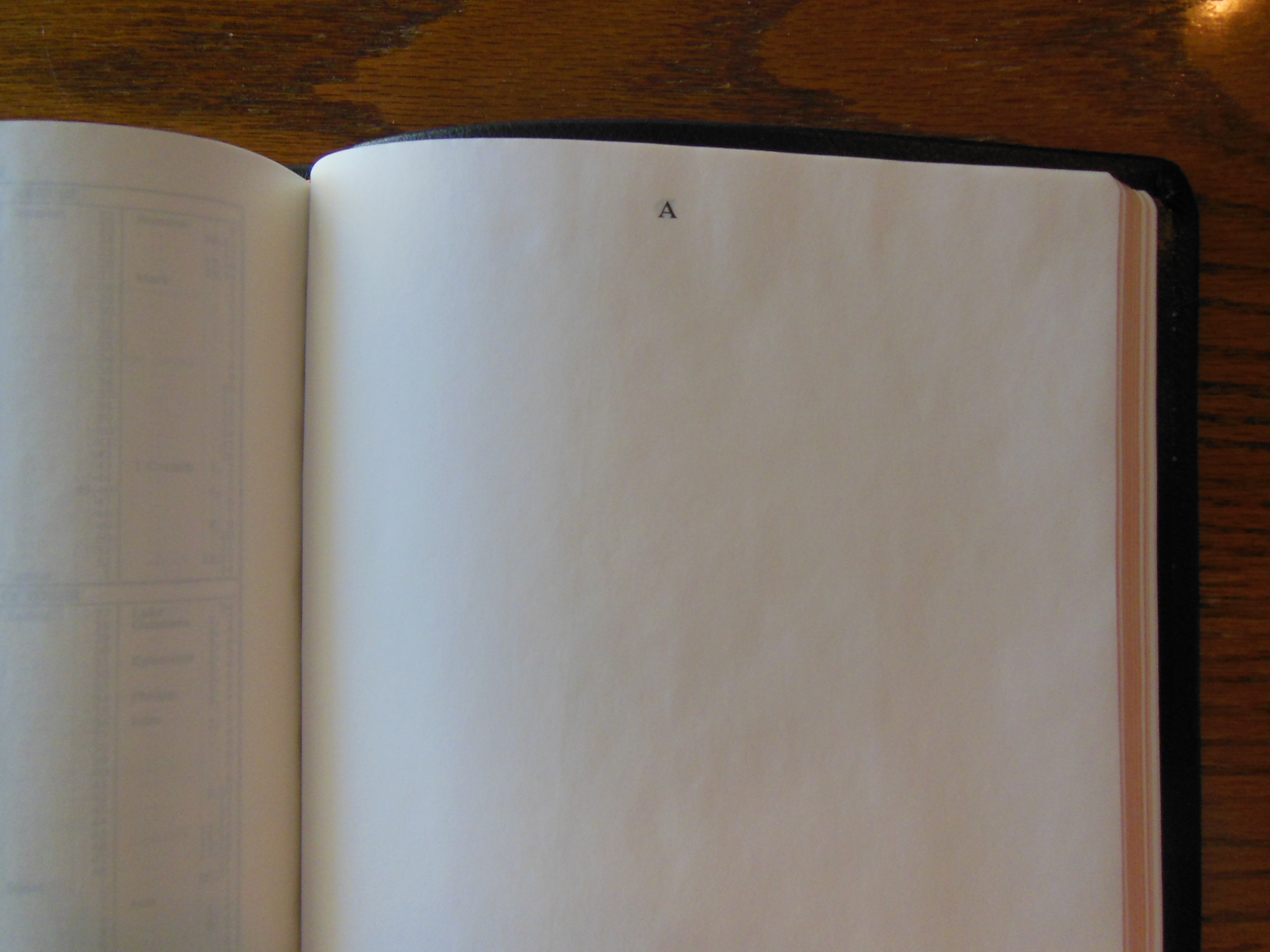
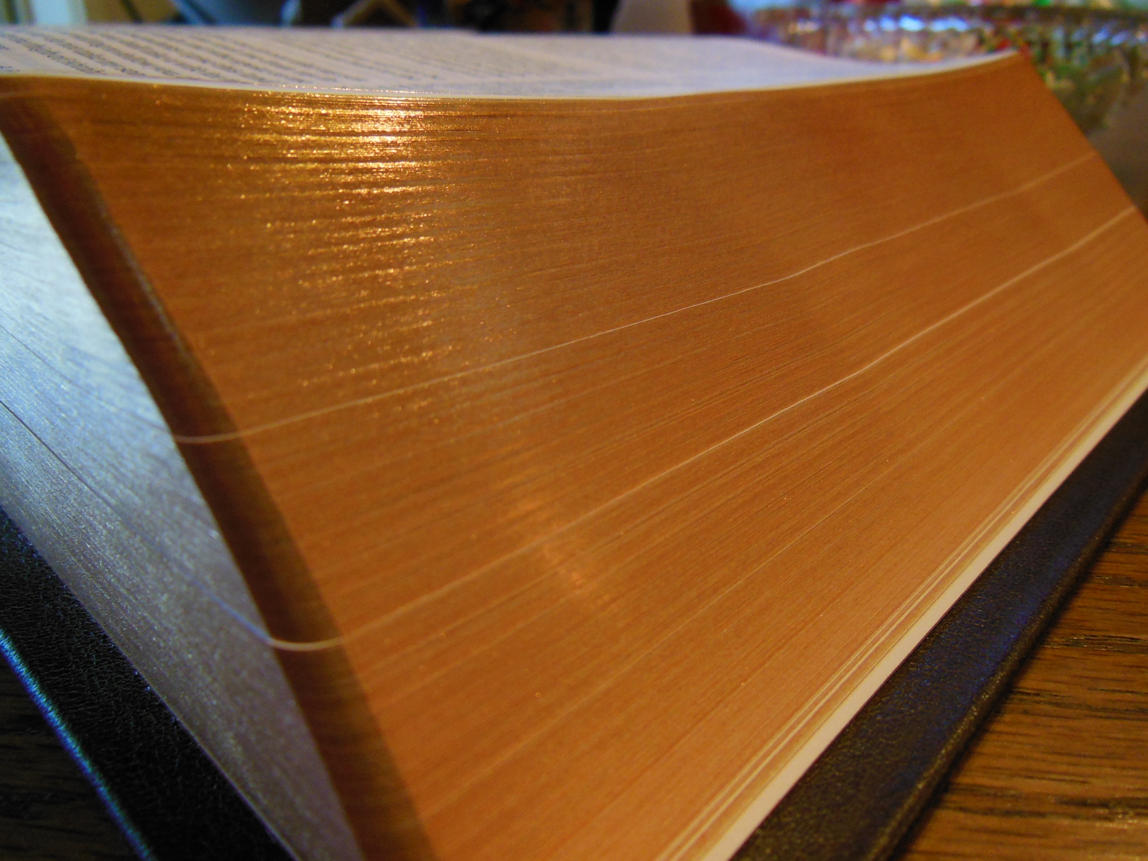
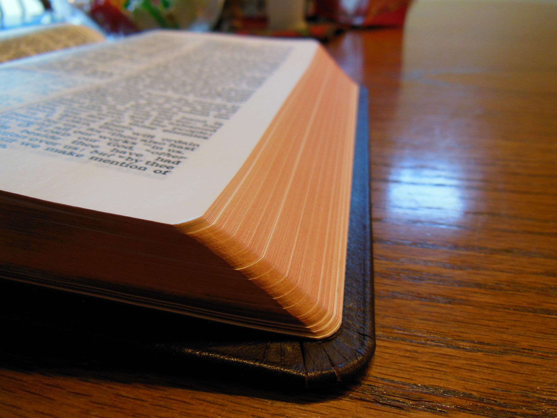
Keep in mind that this Bible has a very low price, very white opaque paper with sharply printed text.

Passio MEV Bible 040

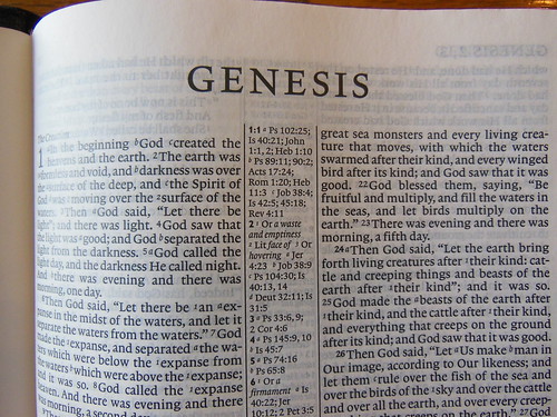
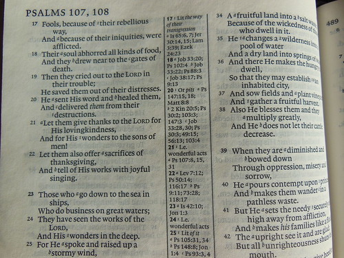
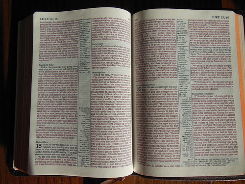
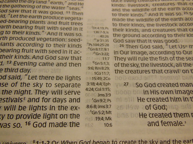
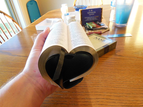
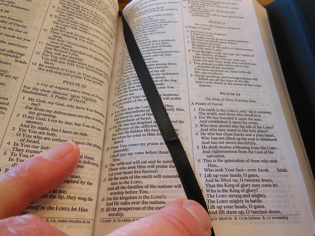
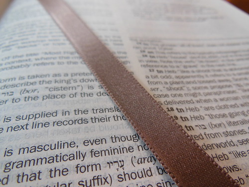
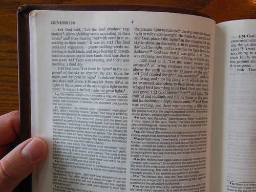
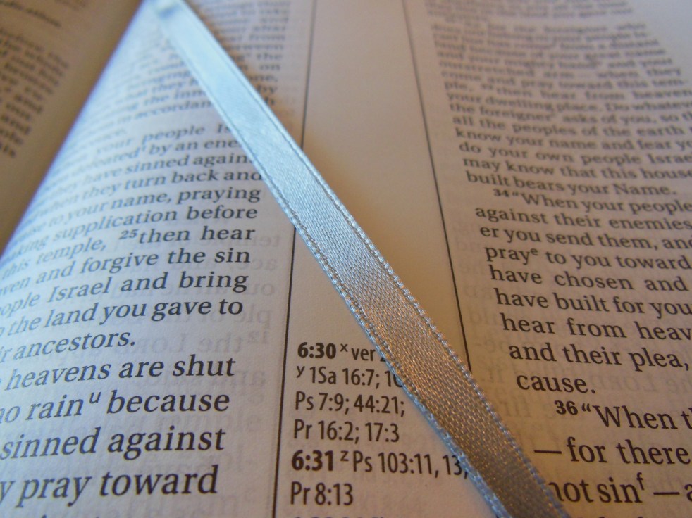
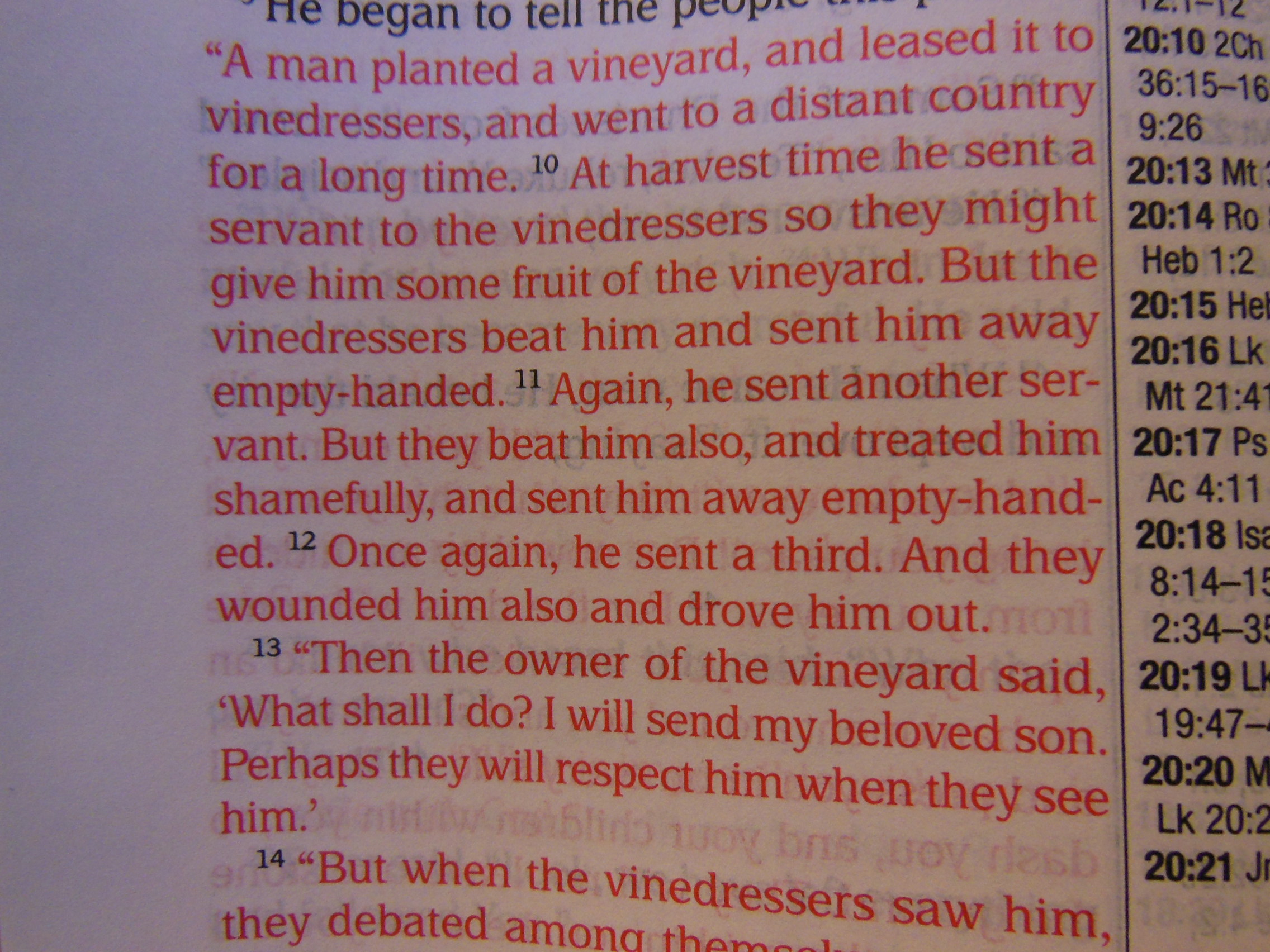
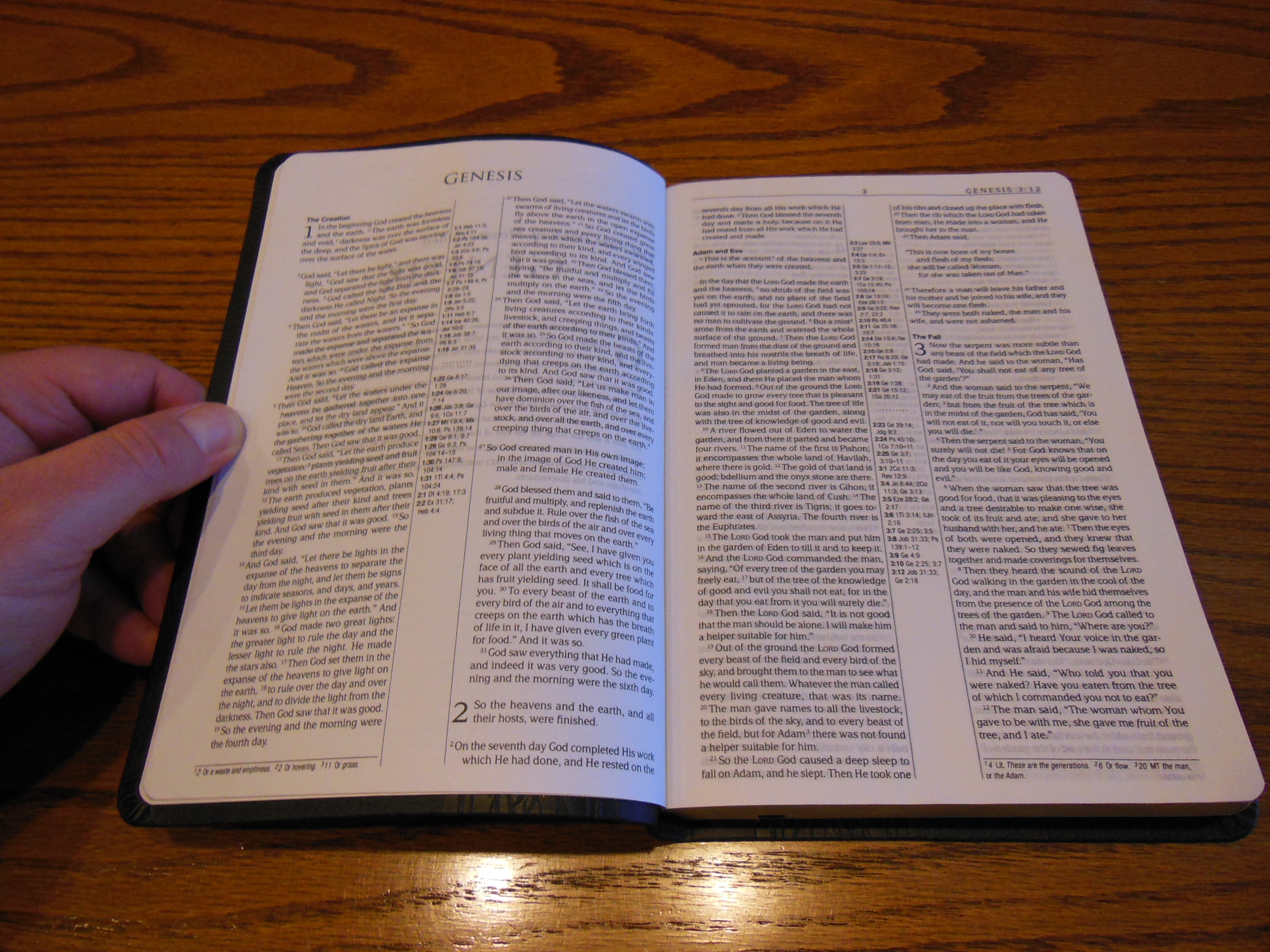
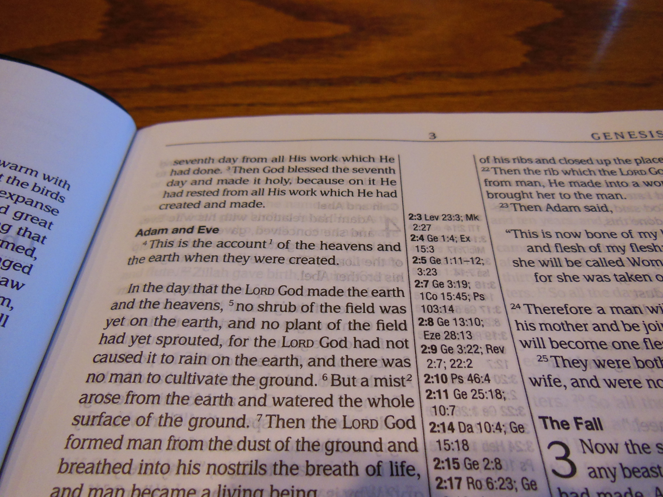
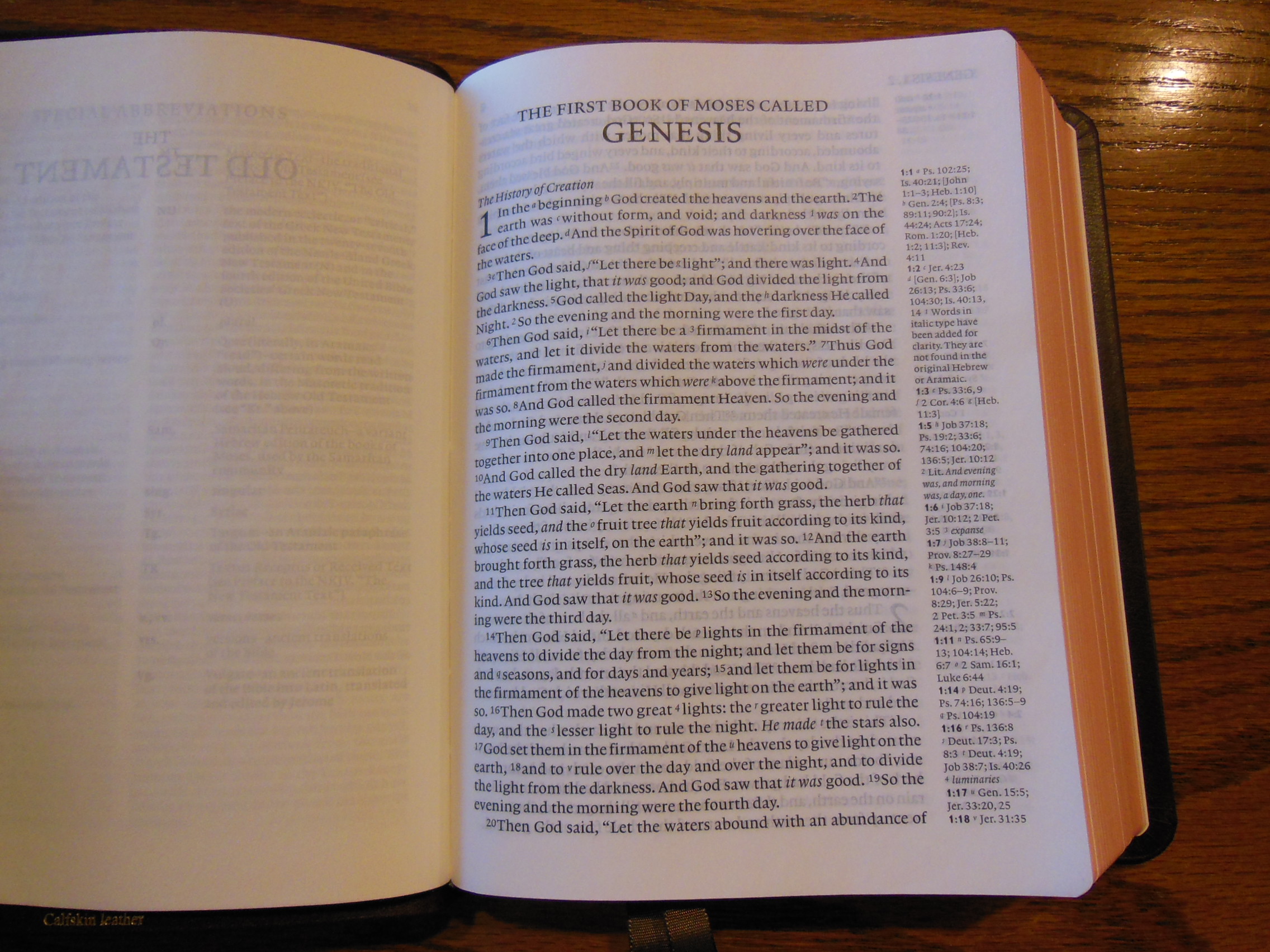
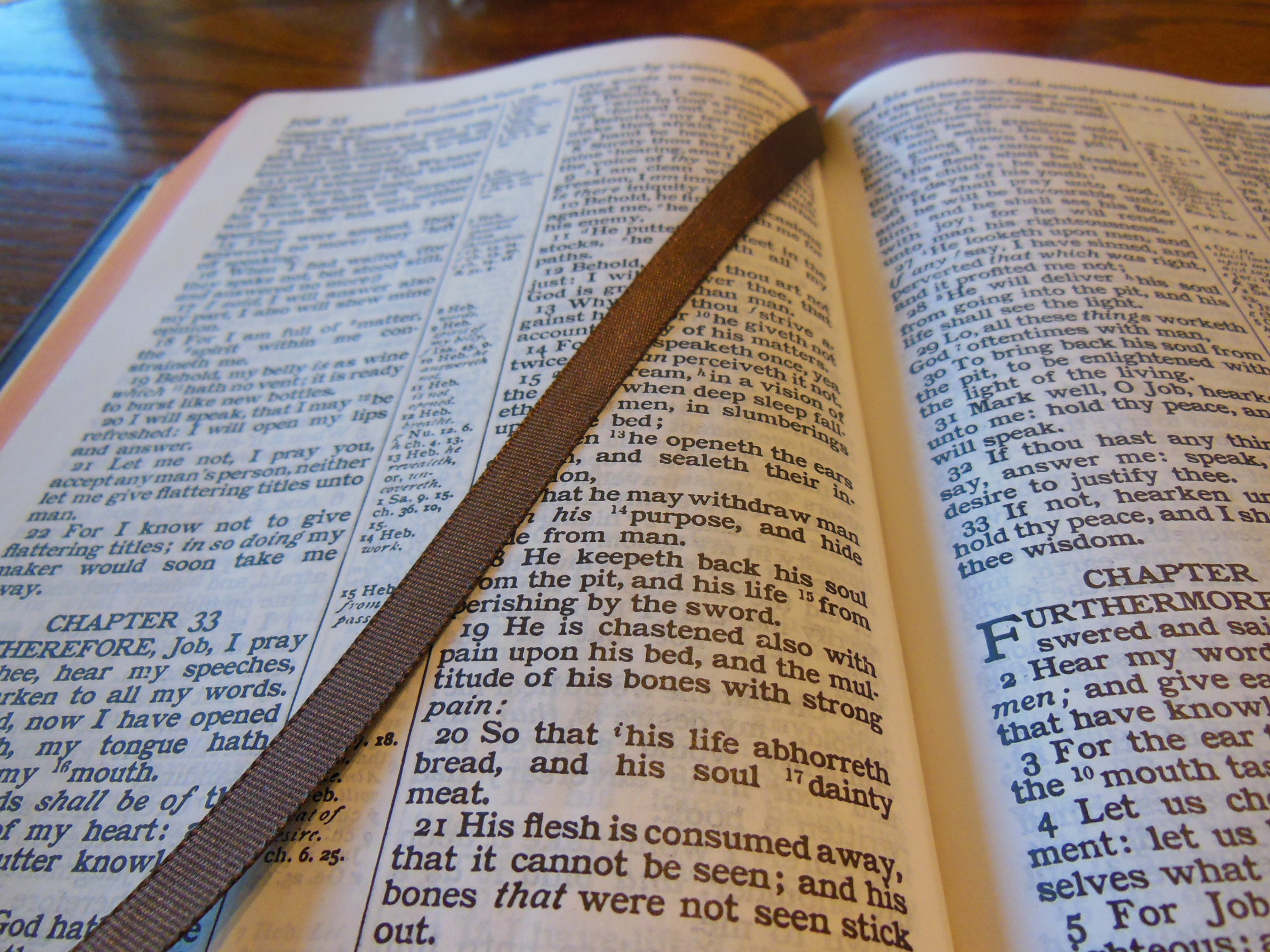
We have to be fair.  You can pick up a copy for around $20.00 online.  The paper is 19.8 lb basis weight Tervakoski.  According to the publisher it is the equivalent of approximately 29.3 gsm.  Having used this Bible for a couple of weeks now, I’d have to agree.  The paper is pretty opaque given its light weight and how thin it is.  The font is an 8 point Delima MT Std regular.  The words of Christ are in red.

Passio MEV Bible 032

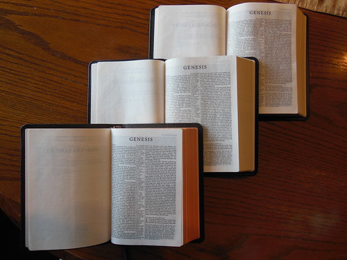
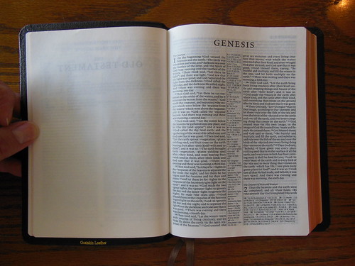
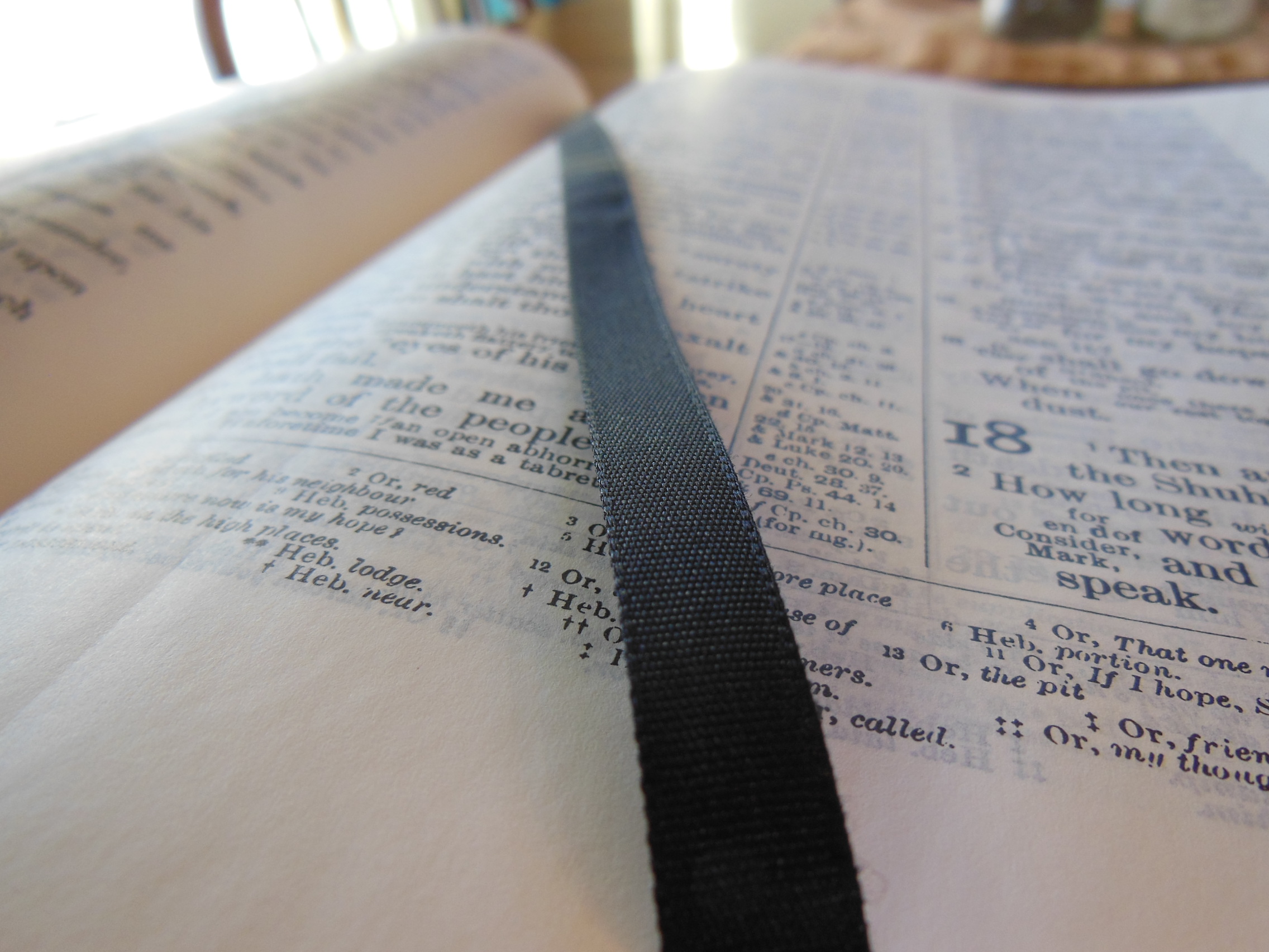
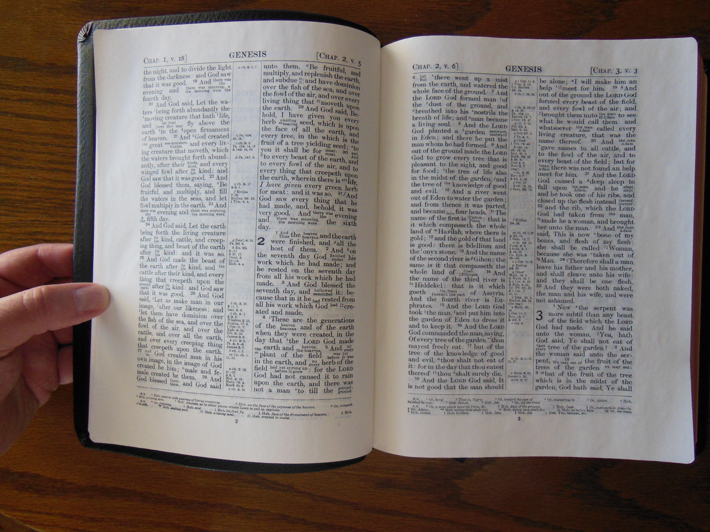
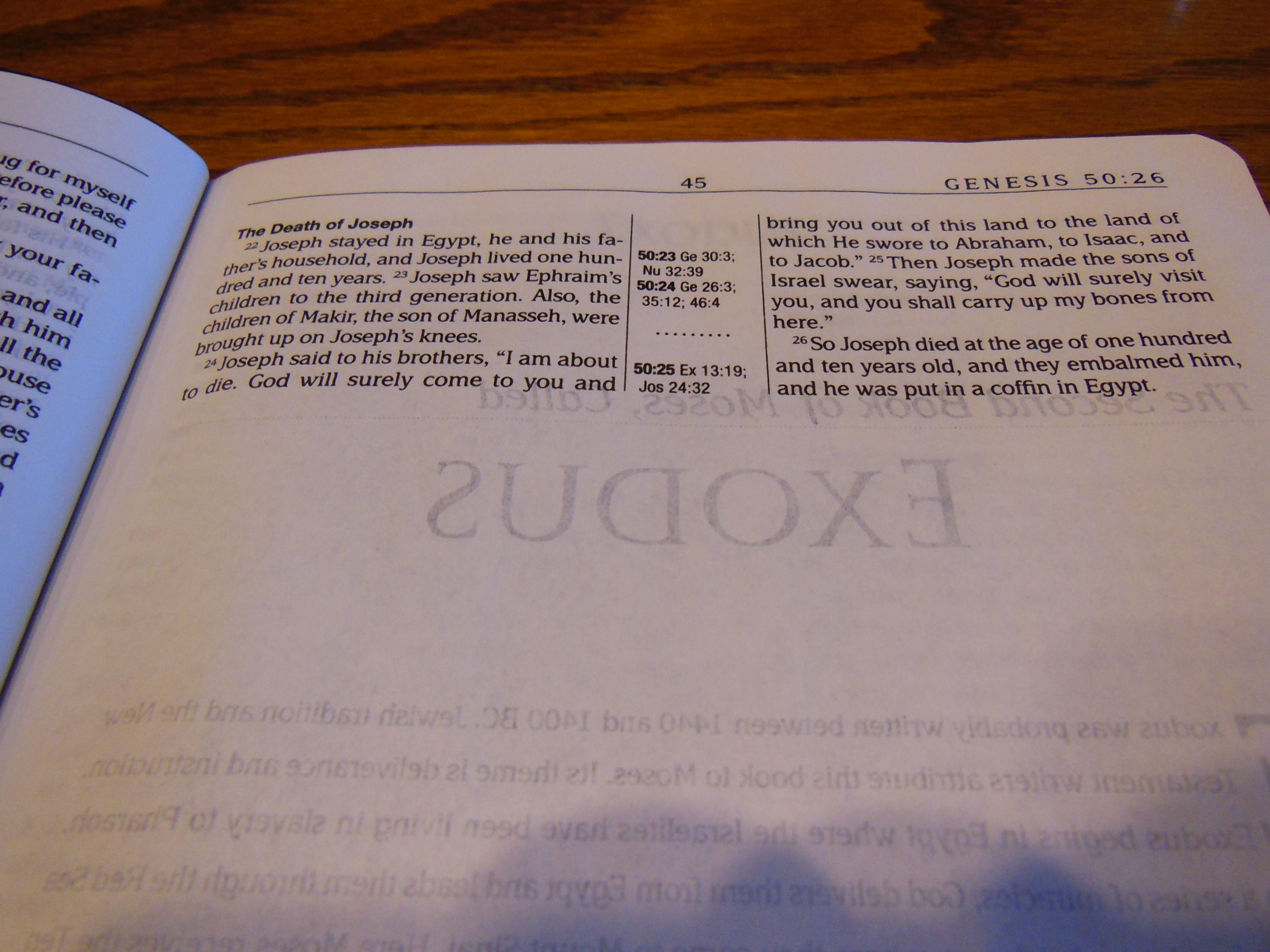
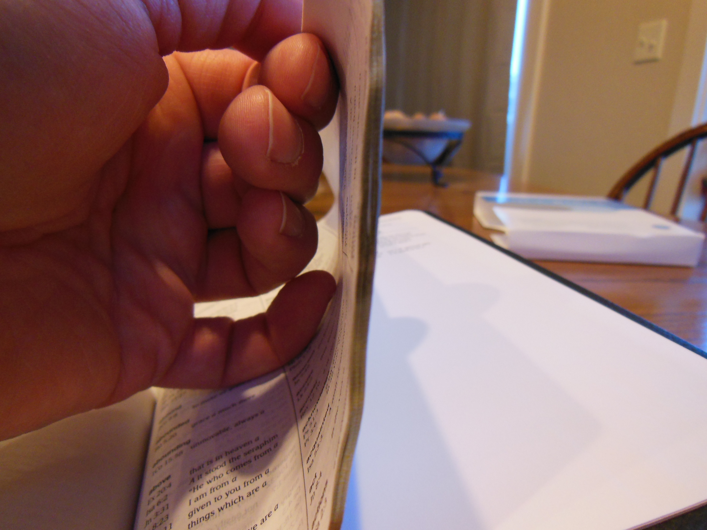
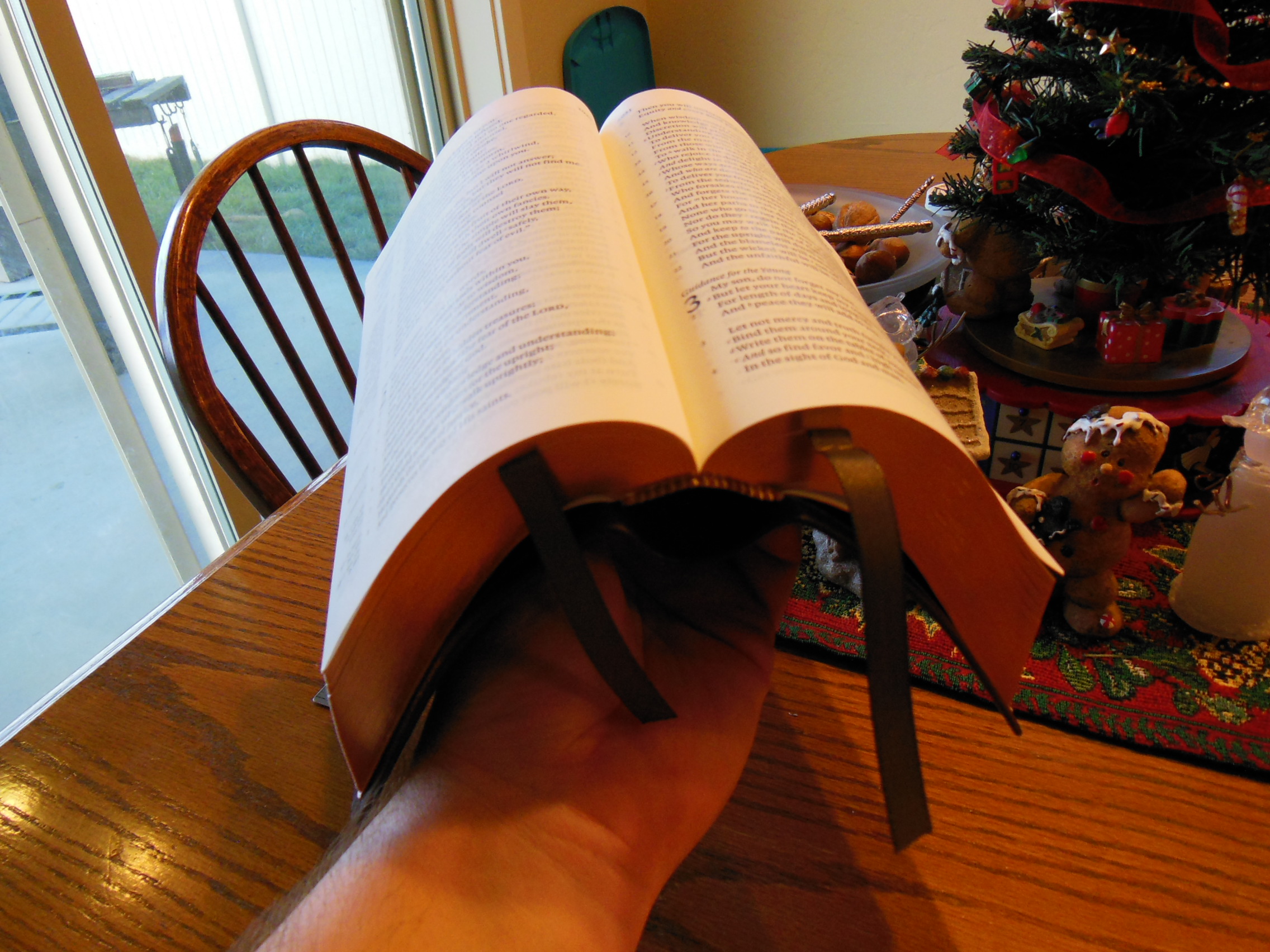
The text is arranged in a typical double column format with center column references.  There are not as many cross references as I’d like to see.

Passio MEV Bible 025 Passio MEV Bible 026

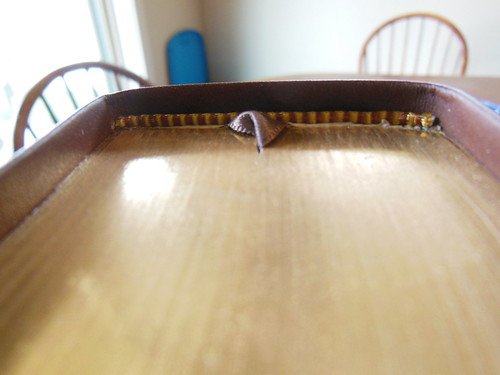
I have a feeling that there will be more as the translation matures.  The page edges are gilded.

Passio MEV Bible 041

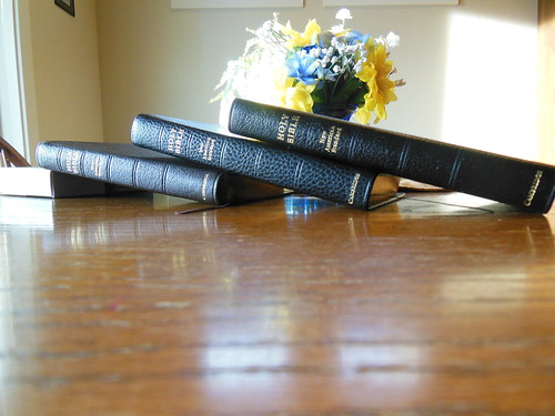
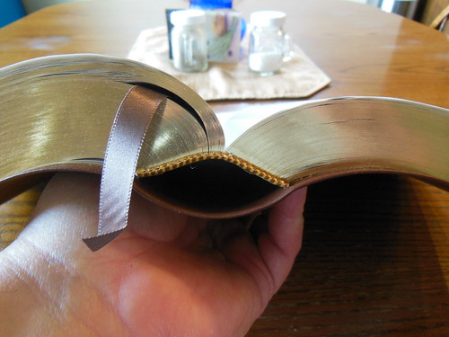
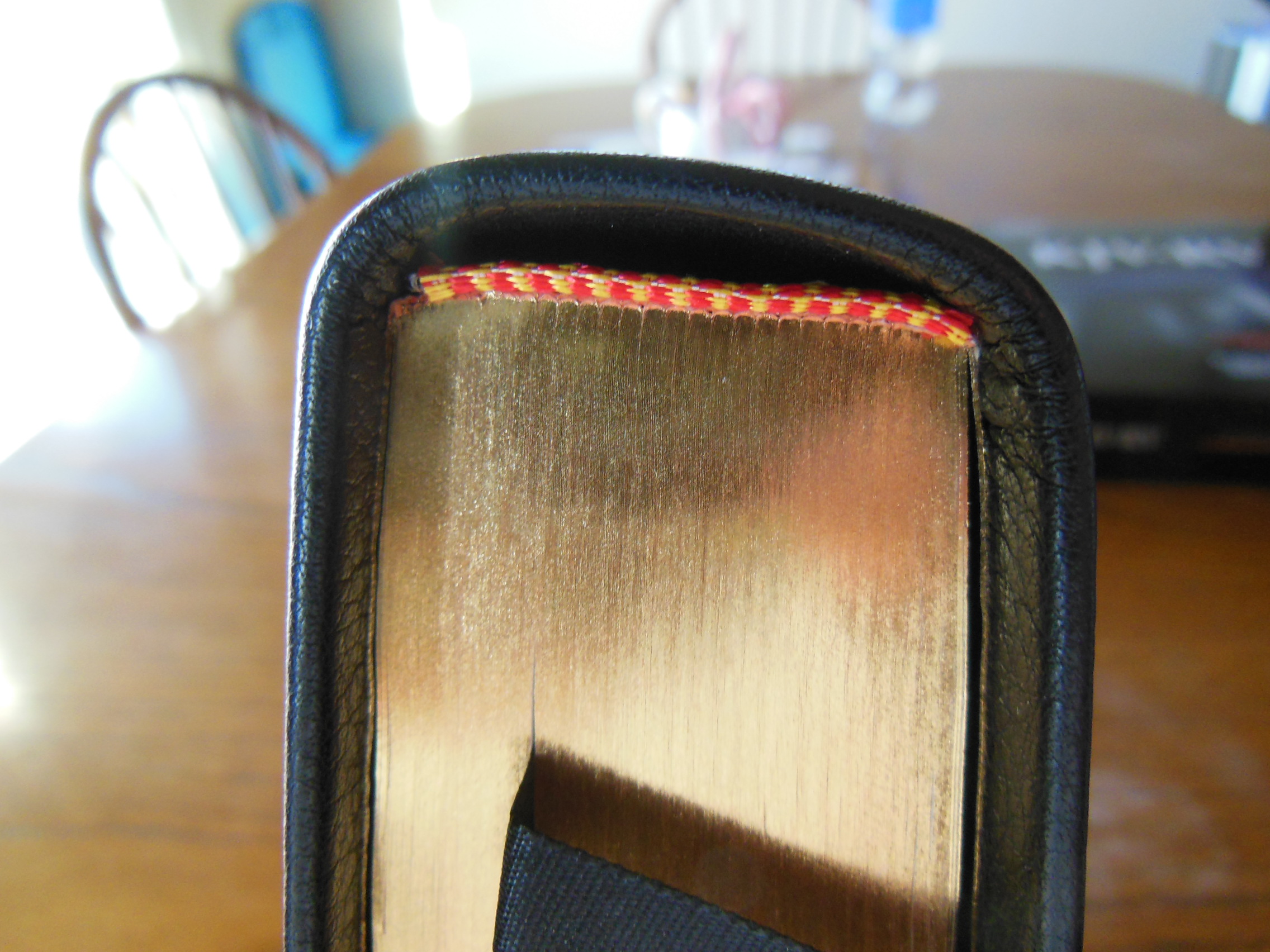
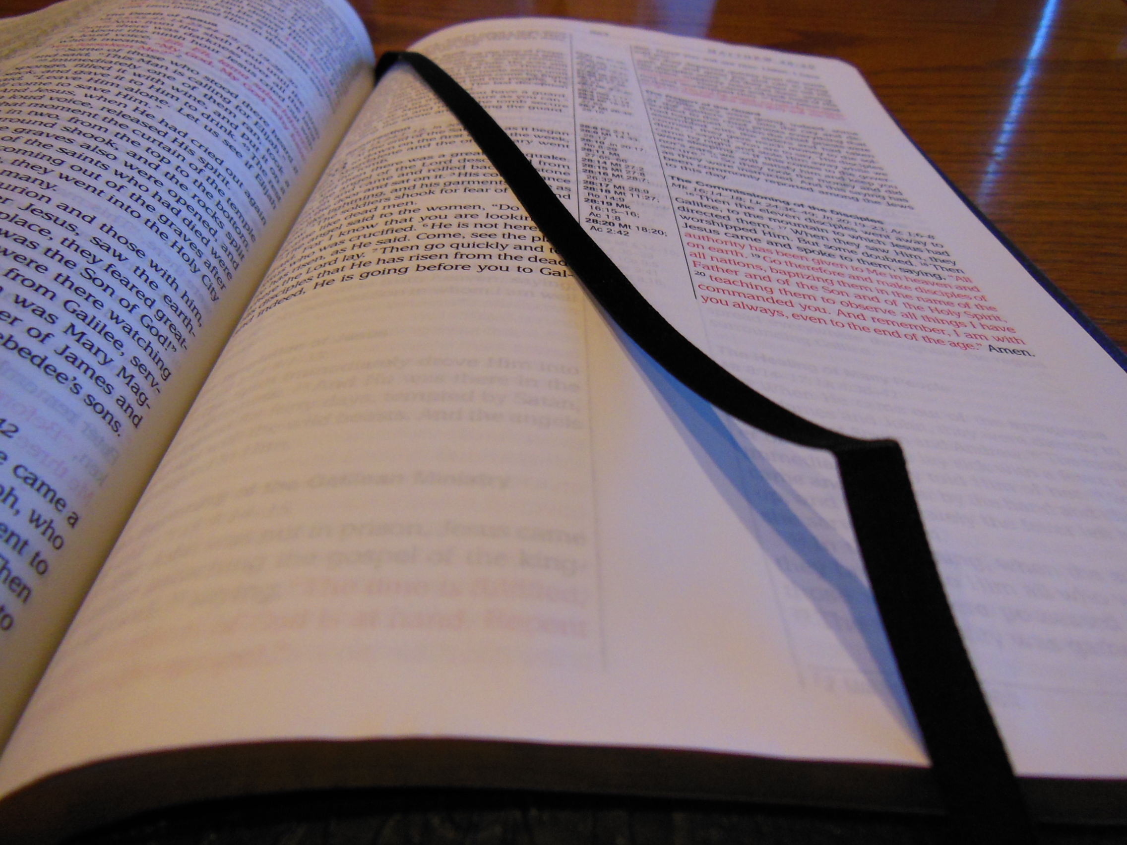
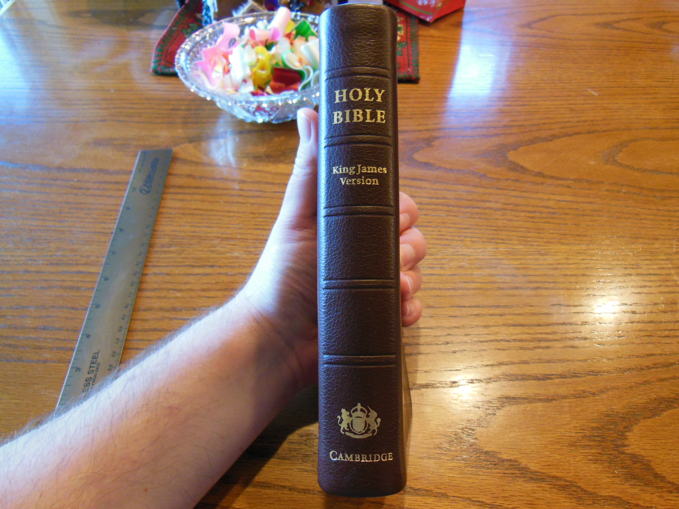
There is one black ribbon marker.  The ribbon is narrow, thick, and seems to be better quality than most of the Bibles in the same price range.

Passio MEV Bible 029

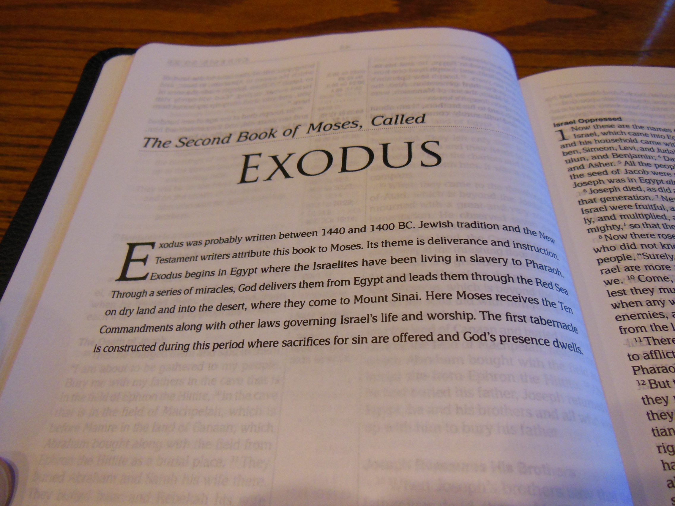
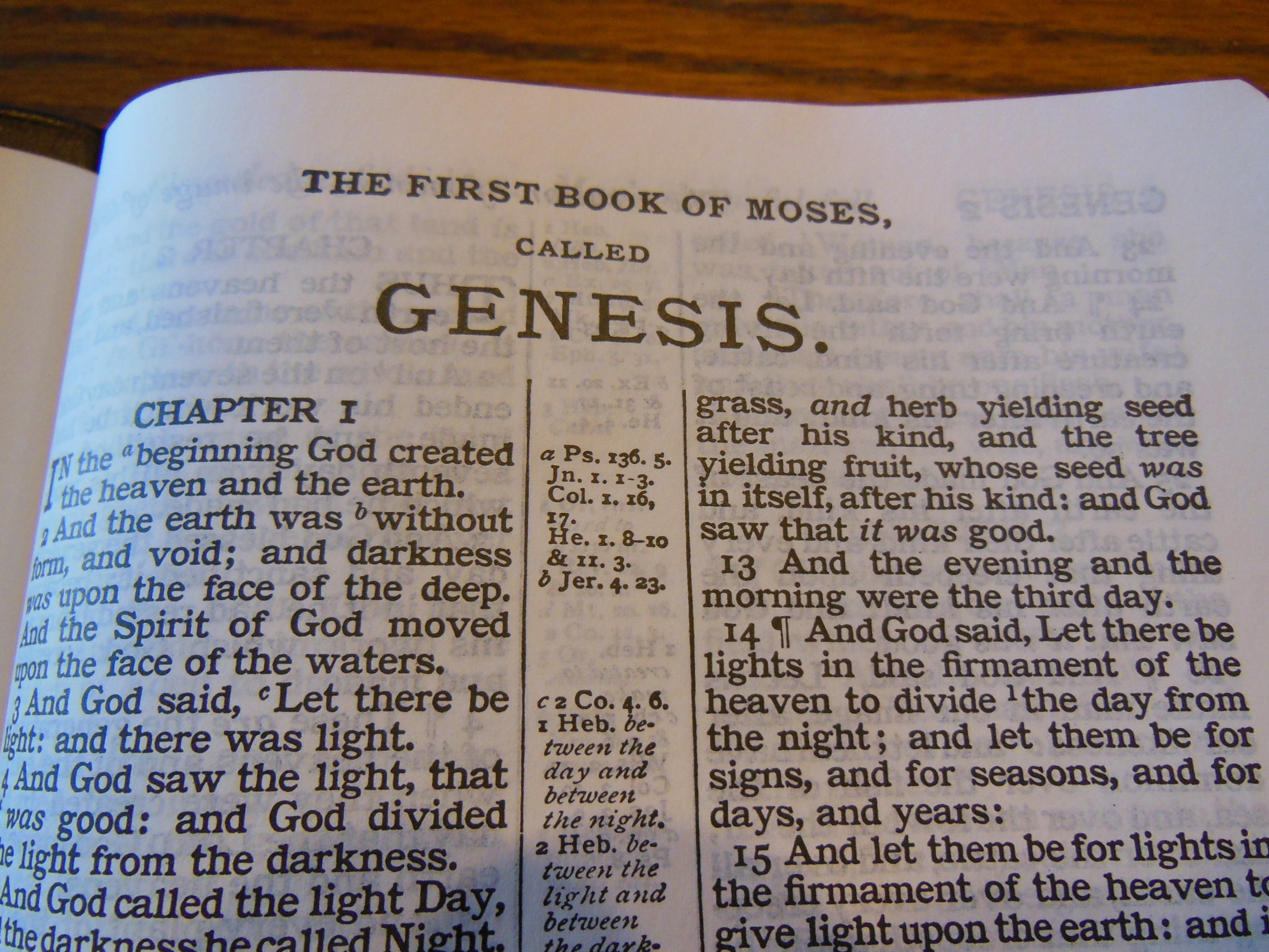
There are short book introductions before each book and when a book ends the next book starts on a new page sometimes giving you room for notes at the end of the book.

Passio MEV Bible 028 Passio MEV Bible 027

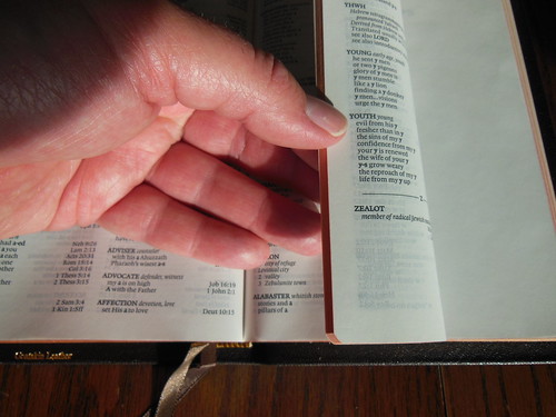
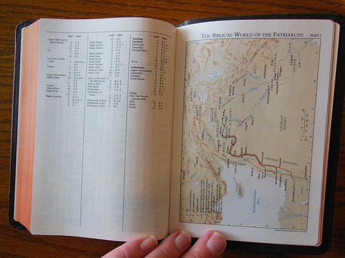
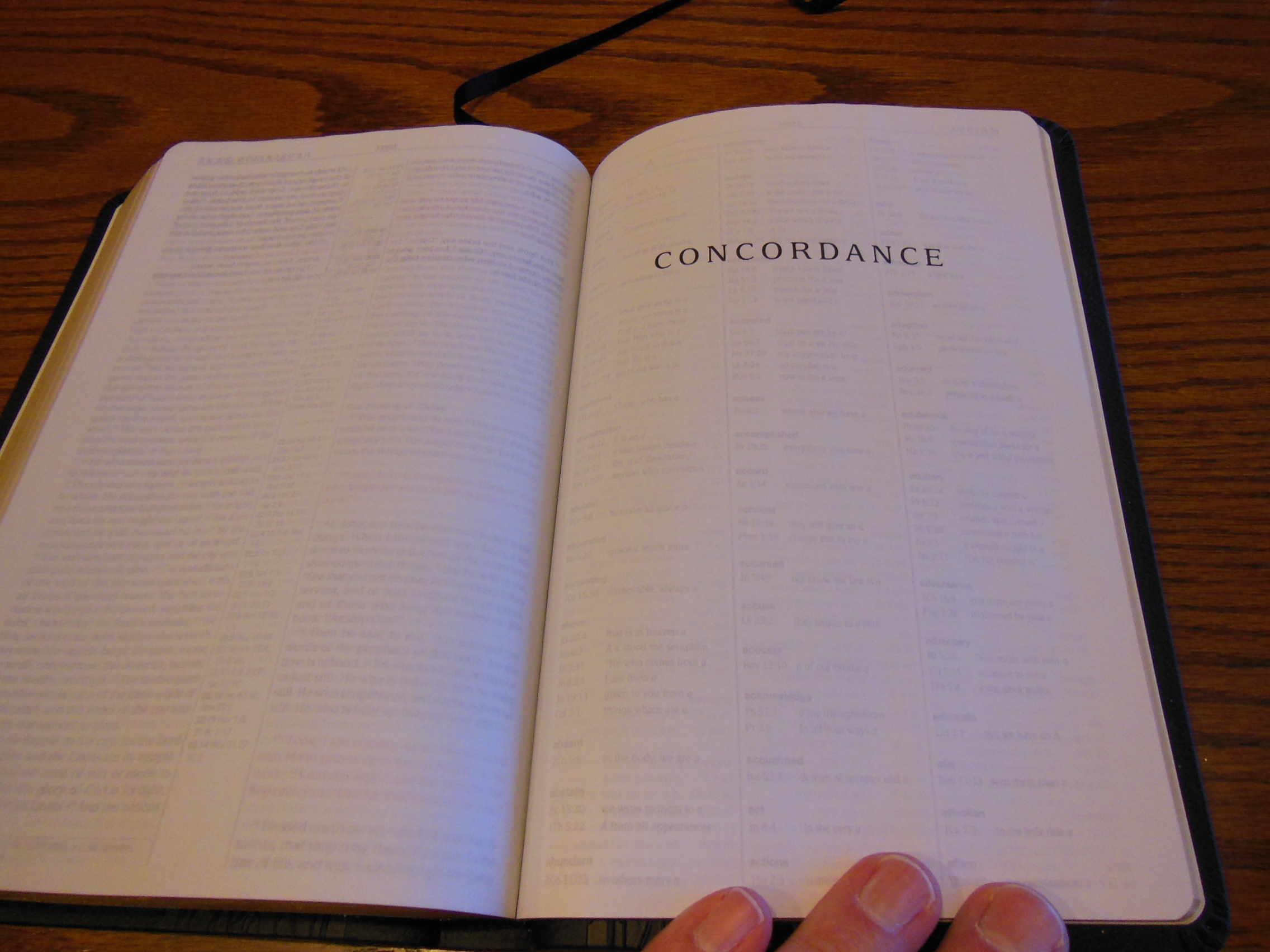
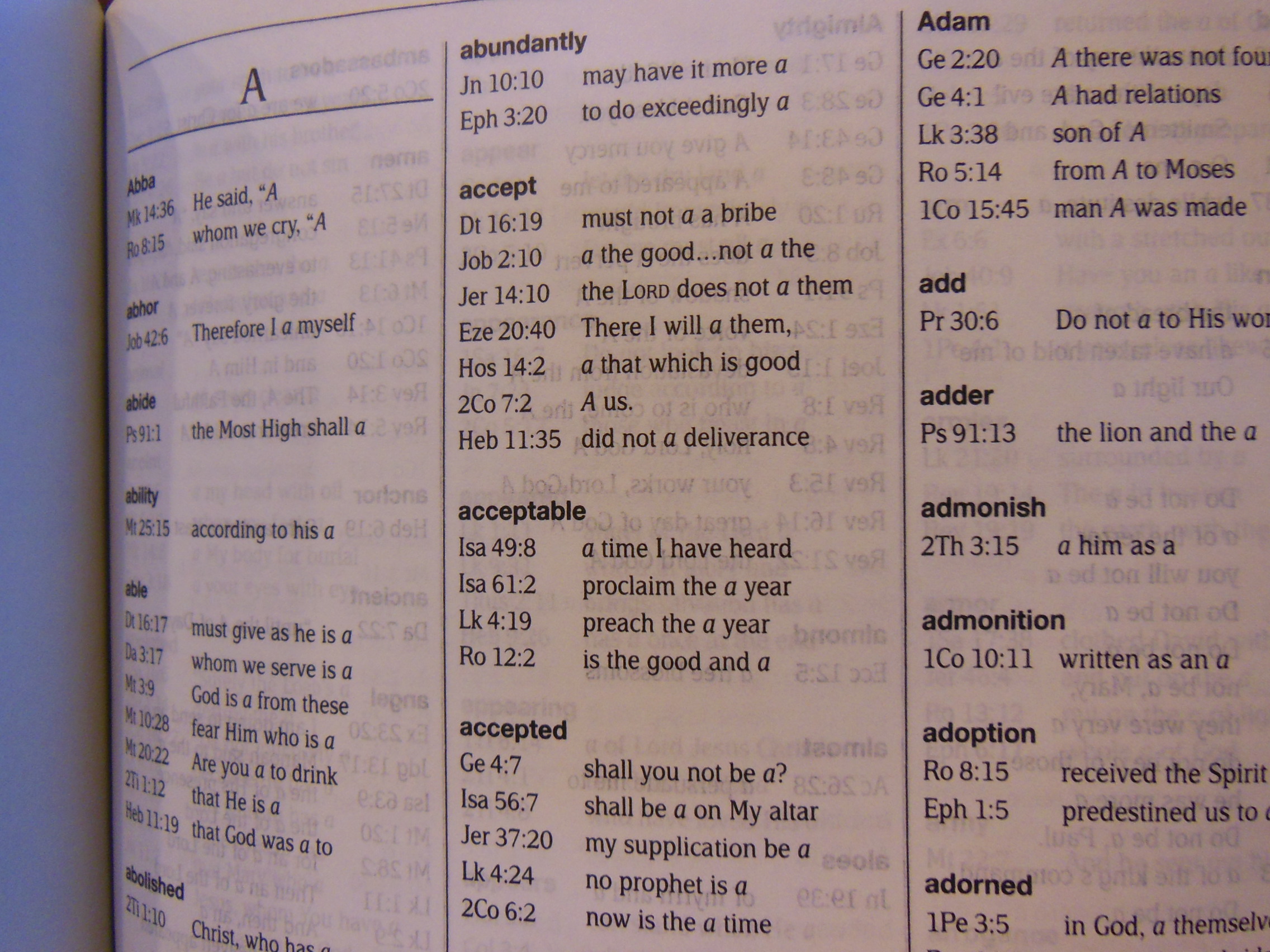
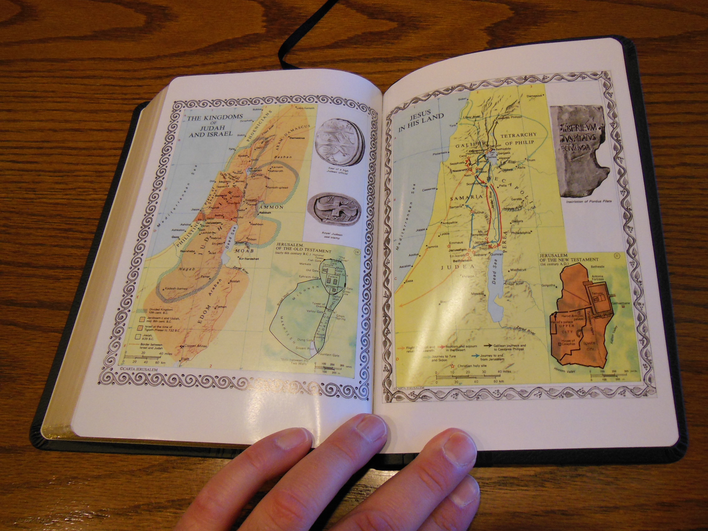
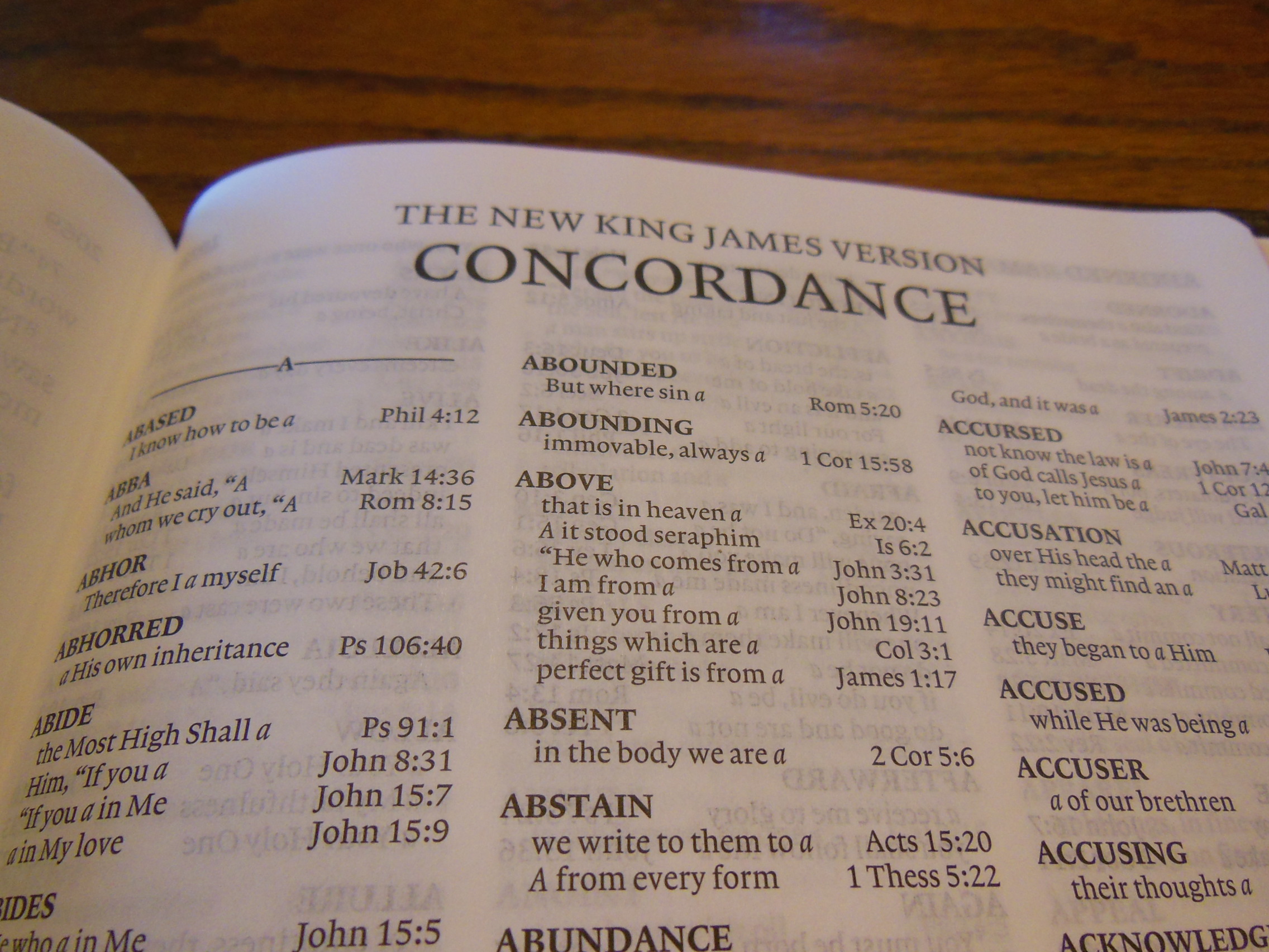
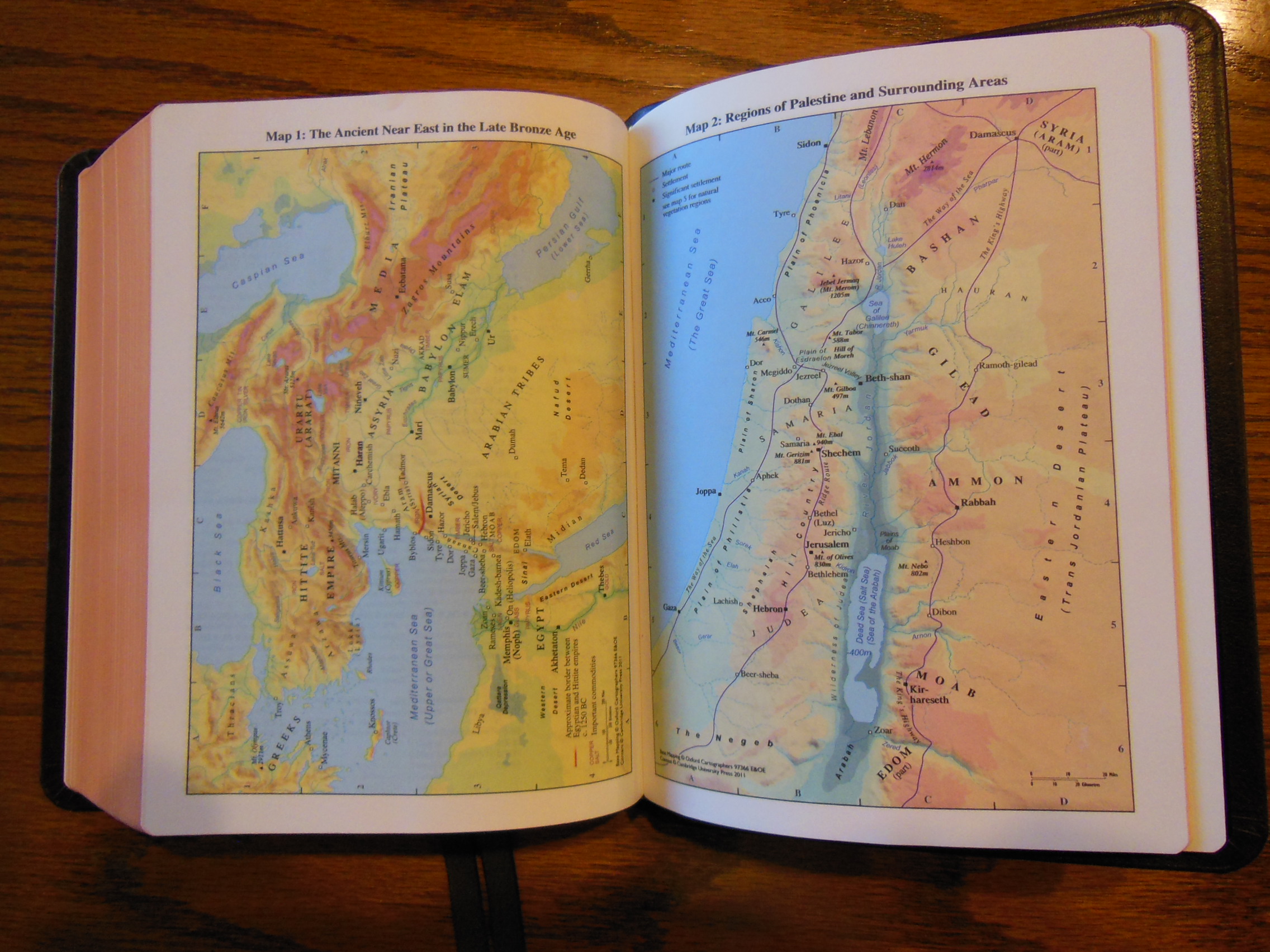
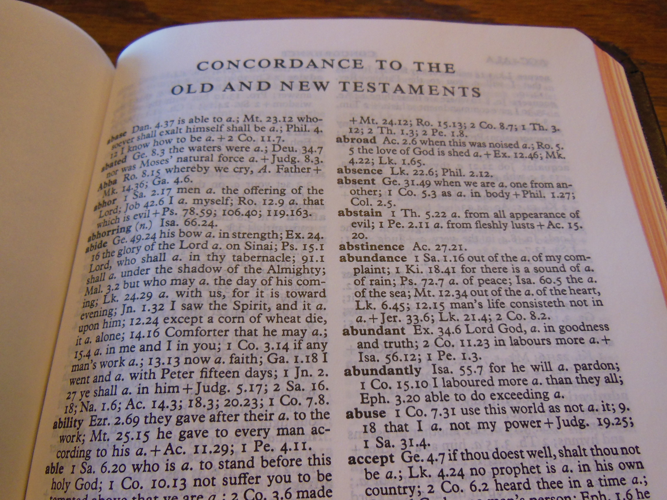
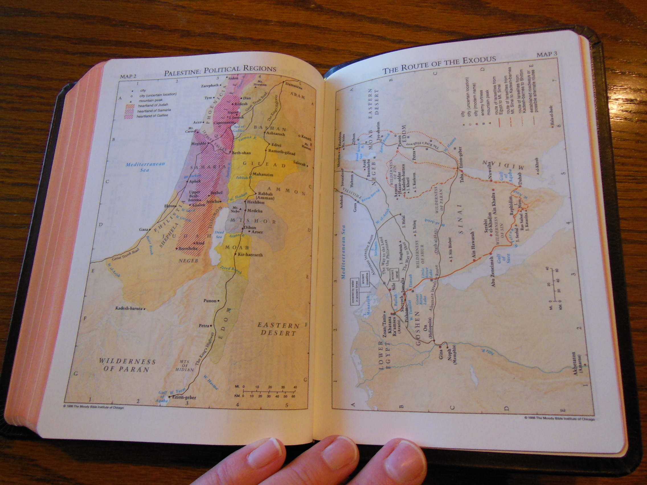
There is a helpful concordance in the back and after that 4 color maps.

Passio MEV Bible 033 Passio MEV Bible 034 Passio MEV Bible 037 Passio MEV Bible 035

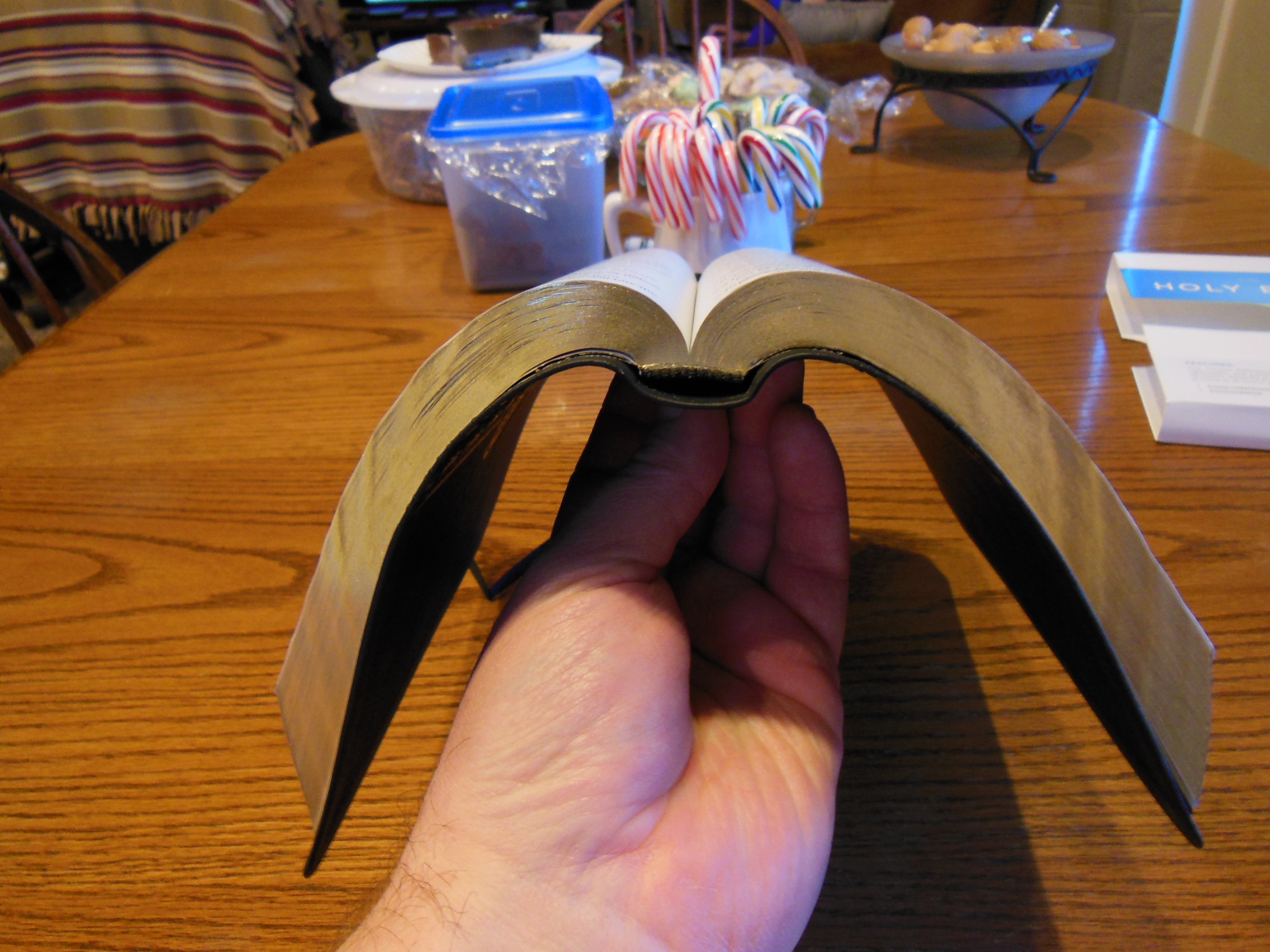
Now keeping in mind that this is a $20 Thinline Bible I want to tell you how impressed I am with its flexibility.  After only a couple of hours of use this thing is flexible enough to double over and to wrap around itself.  It is great for carrying with you in a bag or lunch box.  It isn’t so expensive as to make you afraid to use it.  It isn’t so small you can’t read the text.  It is a very practical Bible if you are looking for an inexpensive Thinline to carry and read.

Amazon has them here.

  • ISBN-13: 978-1621369967
Bible Reviews

Another Excellent Bible from Cambridge, the Clarion NKJV Bible in Brown Genuine Calfskin.

cambridge nkjv clarion and kjv cameo 046

I begin by referring you to my previous review of the Cameo from Cambridge.  The two Bibles were delivered in the same packaging from Cambridge.   Both have the sewn bindings and both are covered with the same brown calfskin.  You can read about those aspects in that review.

The Clarion from Cambridge is an example of modern Bible design done right.  Here is a quote from the Cambridge website about the Clarion in NKJV;

A Cambridge Clarion edition represents an unusual and attractive combination of features – a very readable text in a paragraph style, with a single-column layout – all within a personal size reference Bible format. Here, the NKJV text is presented in a single column with the cross-references in the outer margin, giving the page a very well laid out appearance. The font size is a little under 9 point with generous line spacing. It is typeset in Lexicon No.1, a modern digital font which has many of the characteristics usually associated with traditional Bible typefaces – in particular, a degree of readability more usually associated with much larger type. The Bible has 15 new colour maps and a concordance. There are two ribbons to keep the place in different parts of the Bible. This is a Bible of the very highest quality, printed on India paper with art-gilt edges, Smyth-sewn for flexibility and endurance, and bound in brown calfskin leather

Chances are if you are considering the purchase of the Clarion NKJV Bible in brown calfskin, you have a list of desired attributes in mind; manageable size, legibility, quality sewn binding, beautiful and durable cover, and so on.  The Clarion fits the niche almost perfectly in my opinion.  It brings together many desirable features without sacrificing too much in the other areas of design.  The Clarion is larger than the Cameo.  It is definitely thicker.  The thickness of the Clarion does make it a bit more to hold than the Cameo, but the font is so much more legible.  The tradeoff is well worth it.  Because of the thicker format the Clarion can use a larger font.  It is a modern font, printed with modern technology making it very clear and sharp.  The Cameo’s font was cleaned up, but still doesn’t compare to the font of the Clarion.

Another wonderful attribute is that you can get the Clarion in different translations.  Currently it is available in the New American Standard Bible (NASB), the English Standard Version (ESV), the King James Version (KJV), and the New King James Version (NKJV), which I am reviewing.

So besides the size, font, and available modern translations, the Clarion also breaks in very well.  I have been using an NASB Clarion in goatskin for my daily reading and it has become my standard for comparison.  The NKJV in calfskin adds some rigidity to the cover.  Instead of being edge lined and perimeter stitched with a very flexible material it uses a more common process of vinyl inner liners glued down to the outer cover.  The added structure can be a pro to some and a con to others.  In my opinion, if this Bible were thinner the stiffer cover would be a pro, but it is just a bit too thick.  I can’t roll the cover all the way around like I can with the goatskin covered Clarion.  It makes it a little less comfortable for me.  The cameo gets the size right for this type of cover, but at the sacrifice of font size, line spacing.  These all have an effect on the ease of reading.  If you are going to buy the Clarion, I’d suggest the goatskin.  Of course this is just my opinion.  Everyone has different sized hands and preferences.  I suggest looking one over in the Christian book store, or getting your friend to let you borrow theirs for a few minutes.  It is not a small investment for most people.  Because of the quality of craftsmanship and materials used it will be with you for a long time.  So it is important that you do your research before buying a lifetime companion like the Cambridge Clarion.

This Bible is covered with a genuine calfskin in brown.

cambridge nkjv clarion and kjv cameo 050

It is very supple and soft.  On the front of this Bible is hot stamped, “Holy Bible” in gold.  The spine of the cover has, “Holy Bible” at the top, “New King James Version” immediately under that.  At the bottom of the spine is, “Cambridge” in gold as well.  There are modest hubs worked into the spine as well.

cambridge nkjv clarion and kjv cameo 052

The inner vinyl liners are black and glued neatly to the calfskin.

cambridge nkjv clarion and kjv cameo 053

The calfskin has been folded over and finished uniformly.  The corners are all perfectly finished.  There are two ribbon markers that are color matched to the cover.  The ribbon markers are about a quarter inch wide.

cambridge nkjv clarion and kjv cameo 067

The page edges are art gilded.  This gives them a distinctive look that you won’t find on less expensive Bibles.

cambridge nkjv clarion and kjv cameo 065

The paper is high quality opaque paper.  It is slightly off white and contrasts with the black font nicely.  The text is printed in a single column, paragraph format with line matching.  Line matching is when the lines of text are printed in such a way so as to make the text on one side of the page directly opposite of the text on the other side of the page.  This aids in legibility.  The font is large enough to be easily read yet small enough to keep the size of the Clarion down.  It is clearly, and uniformly printed.

cambridge nkjv clarion and kjv cameo 062

It has a useful concordance and the maps are printed on a heavier paper with a  matte finish.

cambridge nkjv clarion and kjv cameo 069 cambridge nkjv clarion and kjv cameo 073

The sewn binding is of the quality I’ve come to expect from Cambridge.  The Clarion opens well and lays flat when opened.

To sum up, the Clarion is an excellent Bible that fills a big niche in the Bible market.  Many Christians are on the lookout for a Bible that travels well, is easy on the eyes while reading, and is well made.  The Clarion fits the bill and is available in some great translations.  Check out Cambridge Press’ Page.  You can pick up a copy of this Bible on evangelicalbible.com for about $140.00 and you can also get it from Amazon for about $120.00 and Christianbook for about $155.00

ISBN-13: 9781107664425

isbn: 9781107664425

ISBN: 110766442X

NKJV Clarion Reference Bible NK485:X Brown Calfskin Leather

Bible Reviews

Wow, the Cambridge Cameo KJV Bible in Brown Vachetta Calfskin Leather is a Triumph of Form and Function!

cambridge nkjv clarion and kjv cameo 007

I received this Bible from Cambridge gratis for review purposes.  It arrived sufficiently packaged in a cardboard box with one other Bible.

cambridge nkjv clarion and kjv cameo 001

They did not deform or break through their packaging and the Bibles were in perfect shape when they were delivered.

Upon opening the box I was presented with the clamshell retail box, which should be retained for storage purposes.  The Bible inside the box was instantly striking in appearance.  I am accustomed to many different qualities of cover material.  When I picked the Cameo up out of the box I was struck by the soft texture of this type of calfskin leather.  The grain was smoother with smaller pebbling compared to goatskin leather.

cambridge nkjv clarion and kjv cameo 008

I was expecting a darker brown with a texture like other top grain cowhide Bibles.  I was pleasantly surprised.  This calfskin was smoother and soft.  The front of the Cameo is hot stamped with, “Holy Bible” in gold.  There is a channel pressed into the leather around the perimeter of the cover.

cambridge nkjv clarion and kjv cameo 007

On the spine of the Cameo is, “Holy Bible” at the top, “King James Version” in the middle, and the Cambridge Logo at the bottom.  They are all hot stamped in gold.

cambridge nkjv clarion and kjv cameo 009

The page edges are beautifully art gilded with red under gold.

cambridge nkjv clarion and kjv cameo 024

The construction of the Cameo is top-notch.  In addition to having a wonderful cover that will last a lifetime, it has a sewn binding that will last as long as the cover.  Because of these two fine qualities the Cameo is a pleasure to hold and read.  The Bible opens well and lays flat easily without being overly flexible.

cambridge nkjv clarion and kjv cameo 023

This edition does everything right.  The only way this could be any better is if it were in NASB.

The inside cover is lined with vinyl that is glued down.  The corners are finished nicely.

cambridge nkjv clarion and kjv cameo 013

There are two ribbon markers that match the color of the cover as well.

cambridge nkjv clarion and kjv cameo 045

Some less expensive Chinese or Korean Bibles try to entice you with a very supple calfskin cover lined with calfskin or another very flexible material.  Then, they drop the ball with either the paper or the fit and finish.  That is not so with the Cameo from Cambridge.  The paper is nice and opaque.  The font is a cleaned up 8 point, Petit Medieval Clarendon type.  It is bold and easy to read.  The text is arranged in a double column verse format with center column references.

cambridge nkjv clarion and kjv cameo 022 cambridge nkjv clarion and kjv cameo 026

In the front of the Cameo you have publication information page followed by a nice presentation page.

cambridge nkjv clarion and kjv cameo 015 cambridge nkjv clarion and kjv cameo 018

After that is the text of the KJV.  Lastly, there is a very useful concordance in the back along with 15 color maps that are indexed.

cambridge nkjv clarion and kjv cameo 028 cambridge nkjv clarion and kjv cameo 033

I know there is a big trend now for the single column paragraph formats.  Personally, I find it more difficult to focus on during reading in my home.  I have a busy house and am always getting interrupted.  As a consequence I routinely lose my place and have to look for where I left off so that I can resume reading.  The paragraph format has all of the tiny verse numbers dispersed through the text and finding them or remembering where you left off can be a bit more tedious.  I find it easier to pick up where I left off if I can find the verse quickly.  This is my personal preference.

The Cameo is a delightful size Bible to hold and read anywhere.  I can sit in my recliner and read it, I can read it in bed, I can read it on my work break, and I can read it while I drive…  I was just checking to see if you were still awake.  Never read and drive!   Seriously, seldom will you find a combination of form and function like the Cameo.

Here the Cameo is compared to the Concord.

ISBN: 0521146100

isbn: 9780521146104

KJV Cameo Reference Red Letter Edition KJ455:XR Brown Calfskin Leather