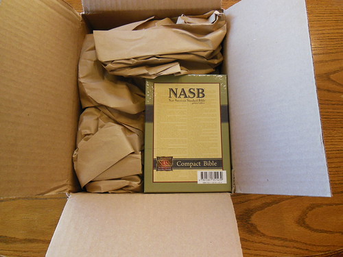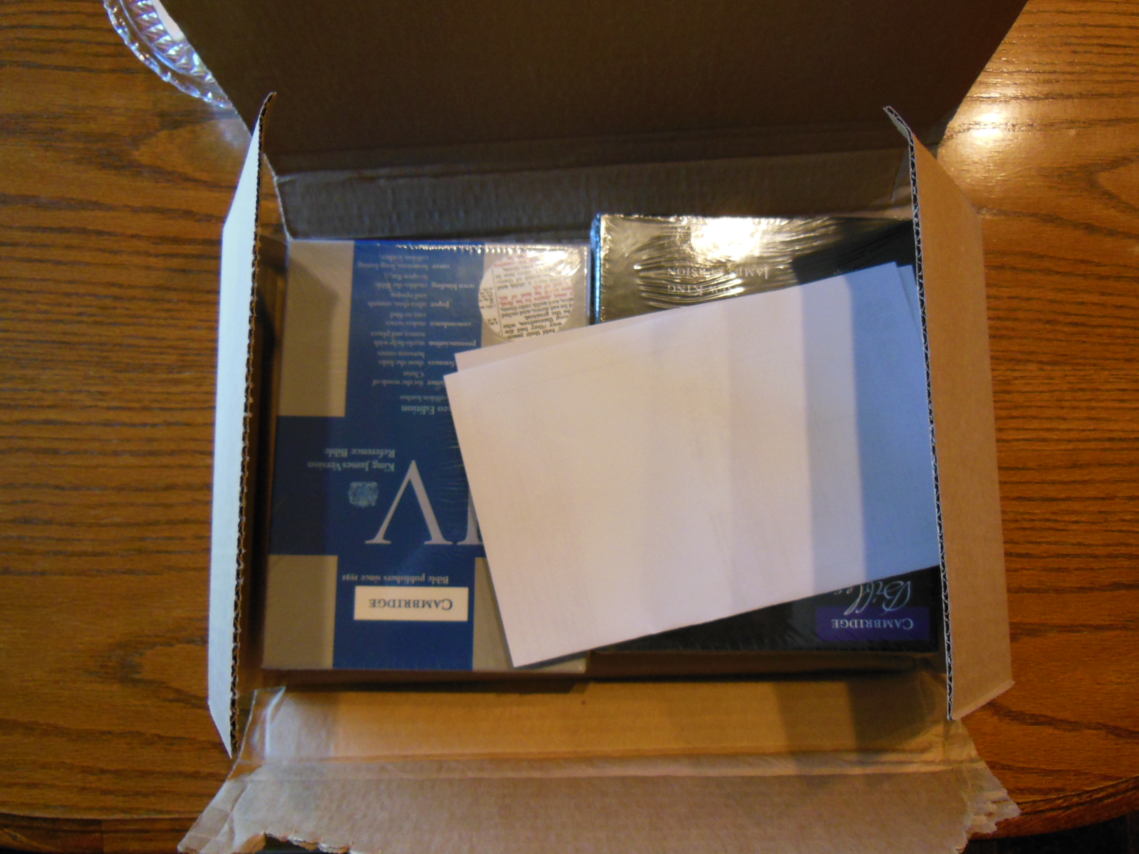
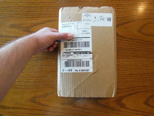
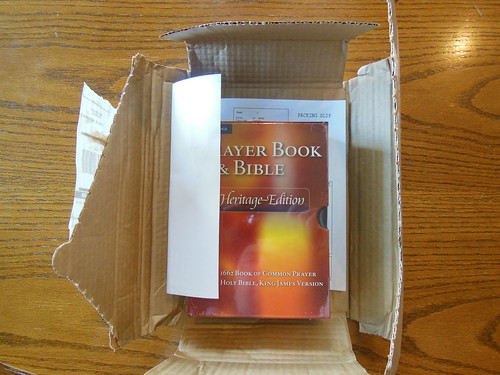
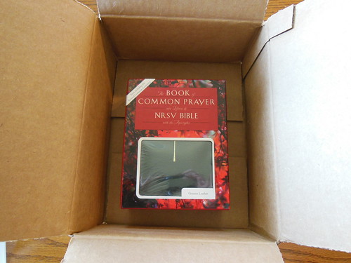
You can look at all of the pictures on my Flickr page. Here is the link for the Cambridge album. Here is the link for the Oxford album. I received both Bibles undamaged. They were packed in their own cardboard boxes and were inside retail boxes that were both sturdy enough to be used for storing the Bible in when on the shelf.
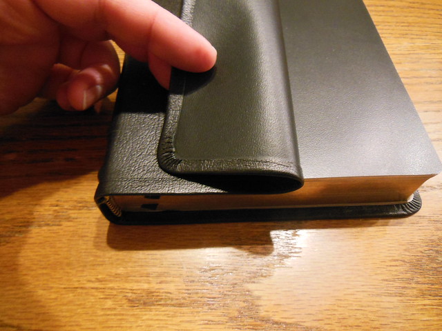
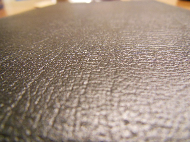
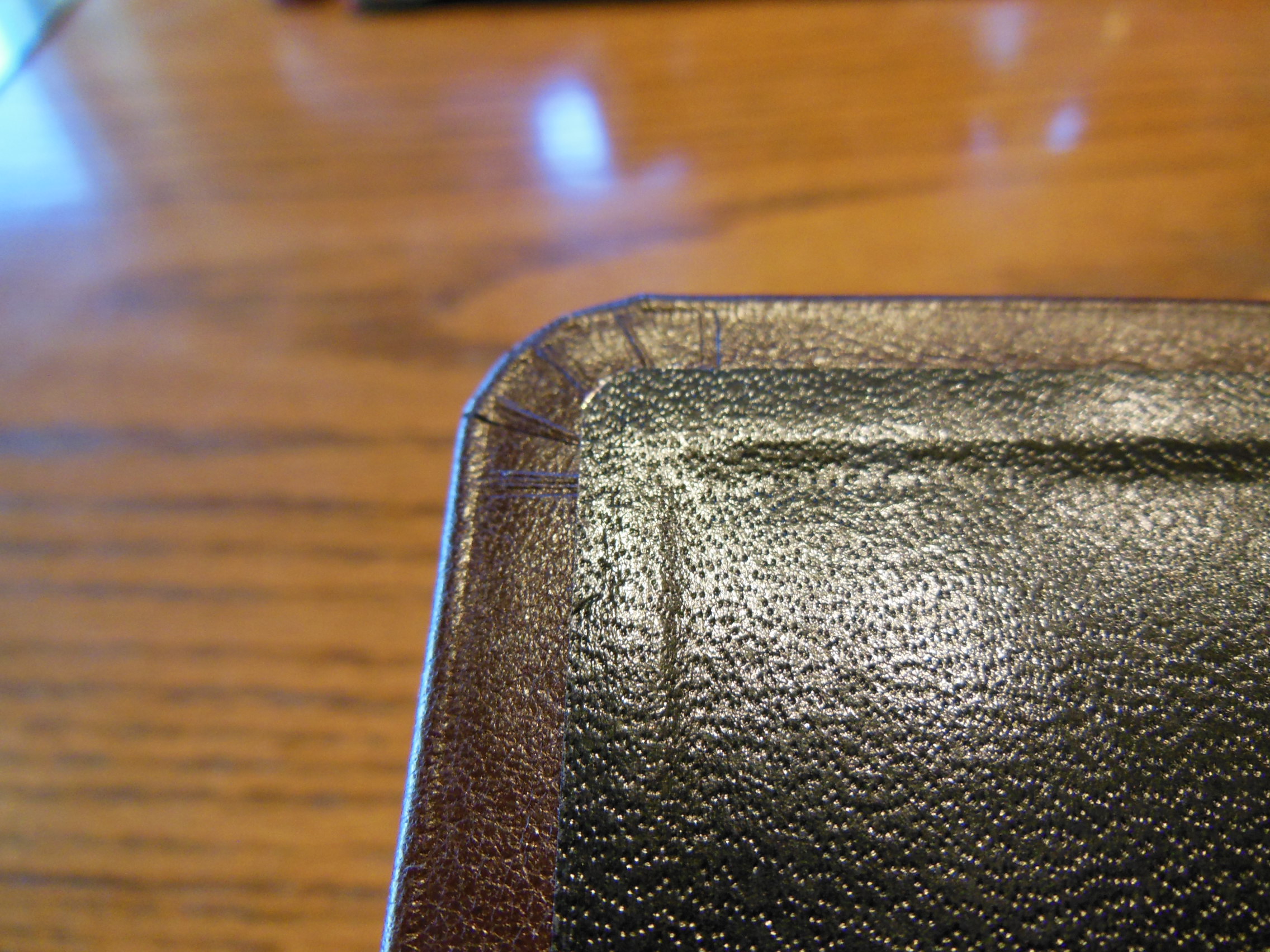
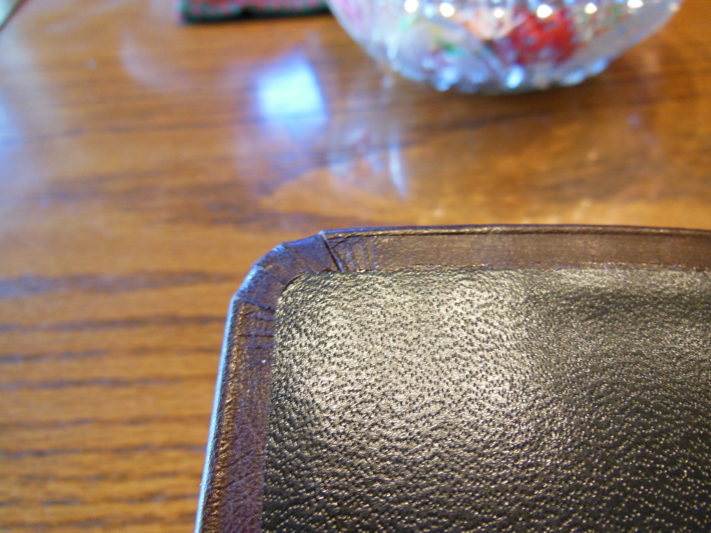
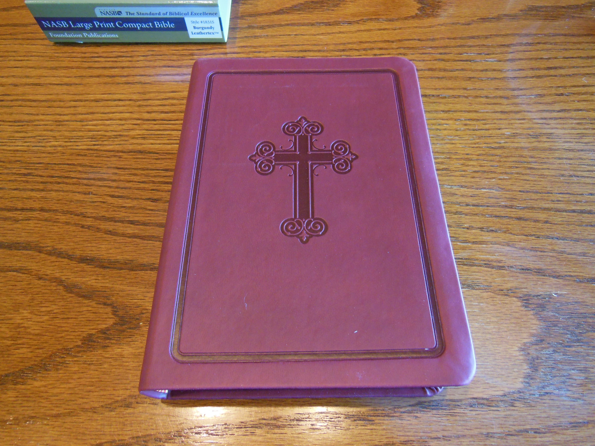
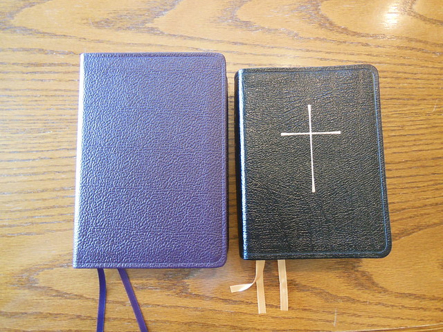
Upon opening the boxes I was impressed with the purple color of the Cambridge Bible. The Cambridge cover was also more supple out of the box. This is due to the Cambridge being covered in calfsplit leather which is split cowhide leather as opposed to the Oxford’s cover which was your typical pigskin leather. The Oxford was ornamented with a gold stamped cross on the front cover as well as a gilt line around the inside perimeter of the cover. Both covers have a perimeter groove pressed into them.
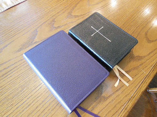
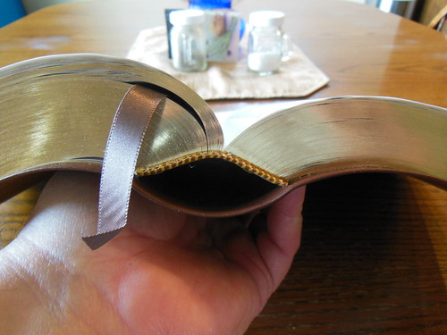
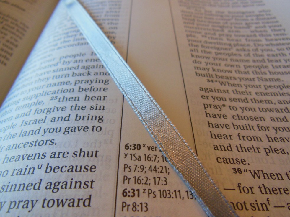
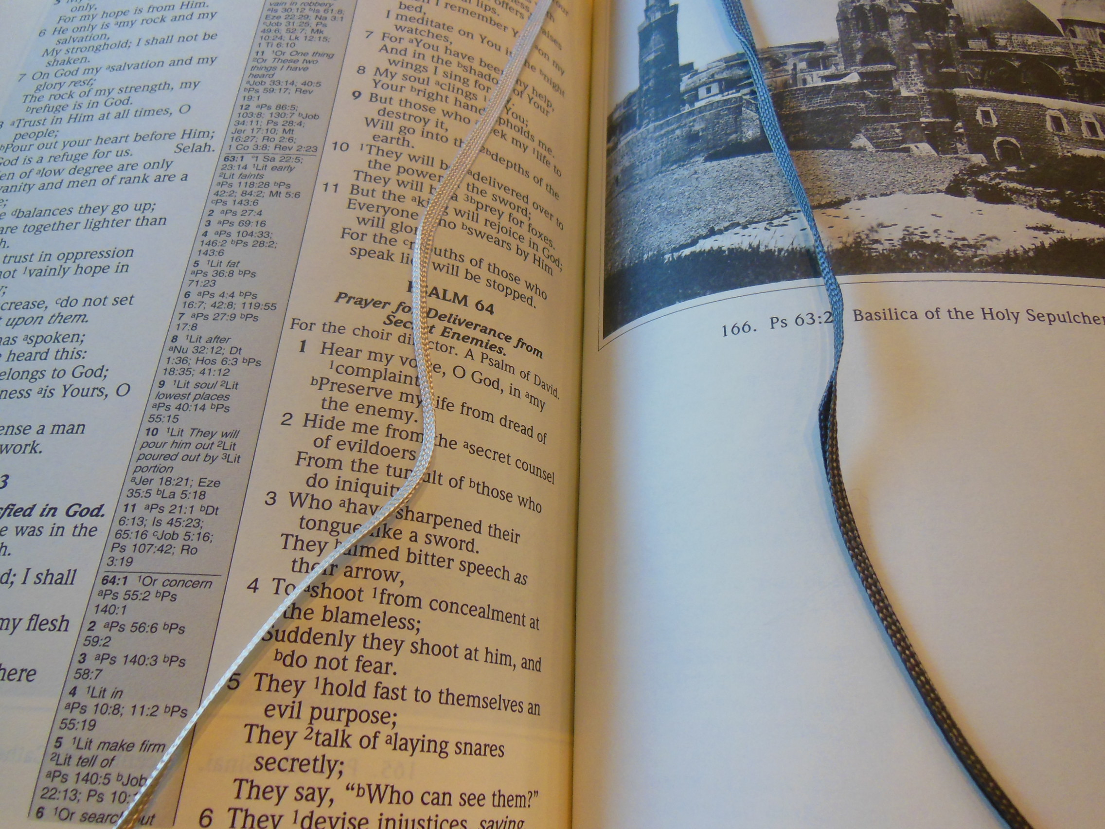
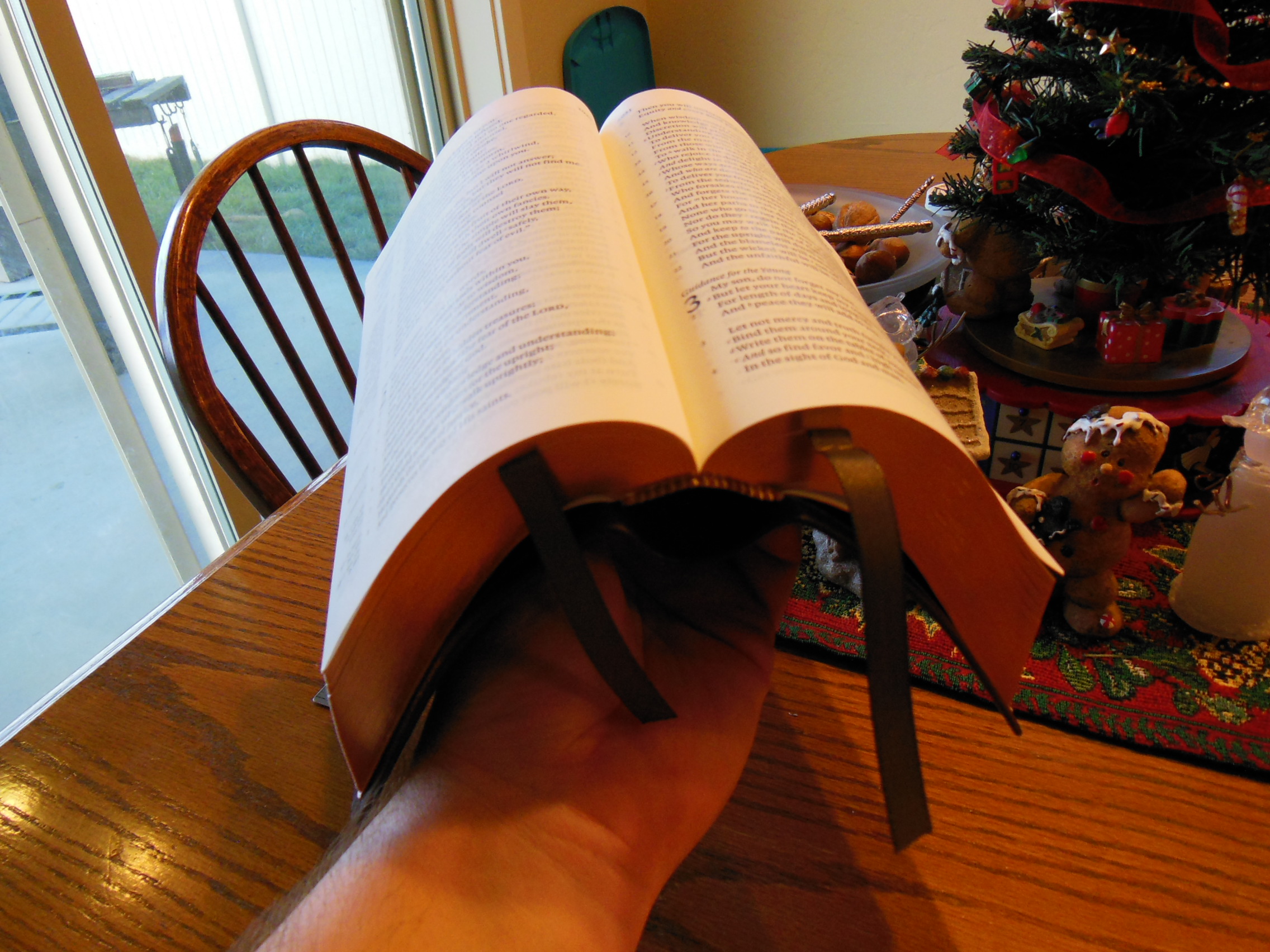
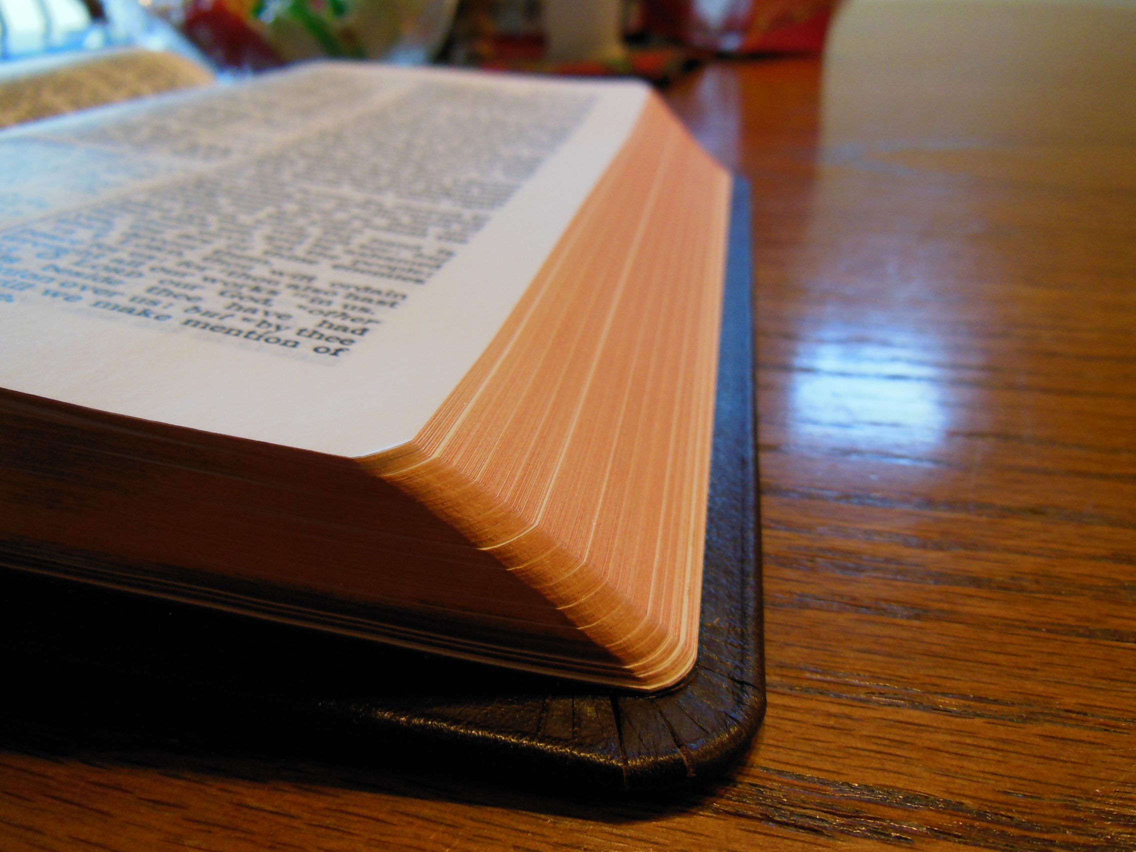
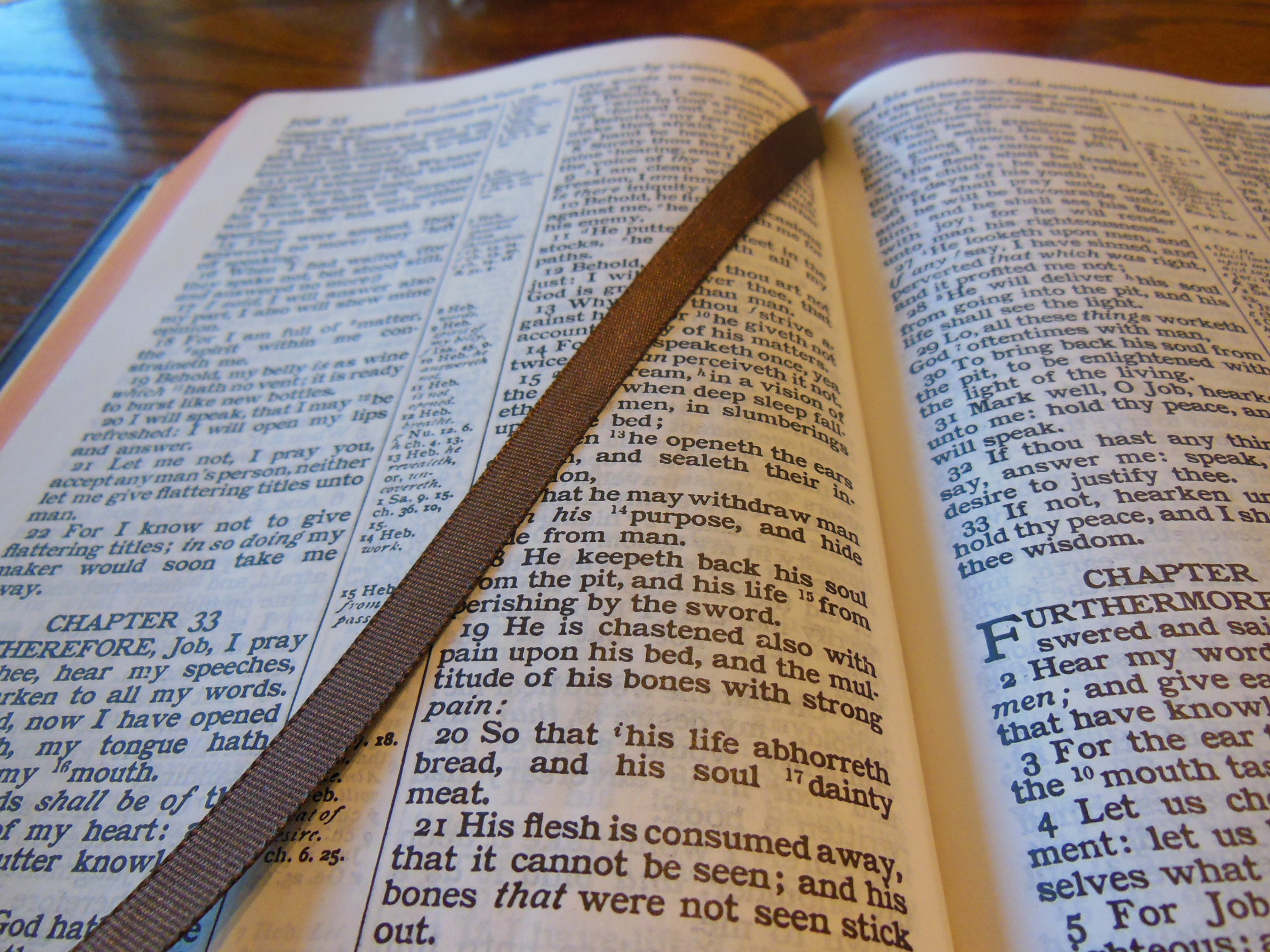
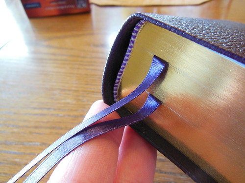
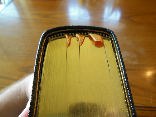
The Cambridge and the Oxford alike have gold gilt page edges. I thought the two purple ribbon markers were attractive. The Oxford has three yellow/gold ribbon markers that were pretty nice even if they were a bit more narrow. I would have liked to see three ribbon markers in the Cambridge because of the added BCP.
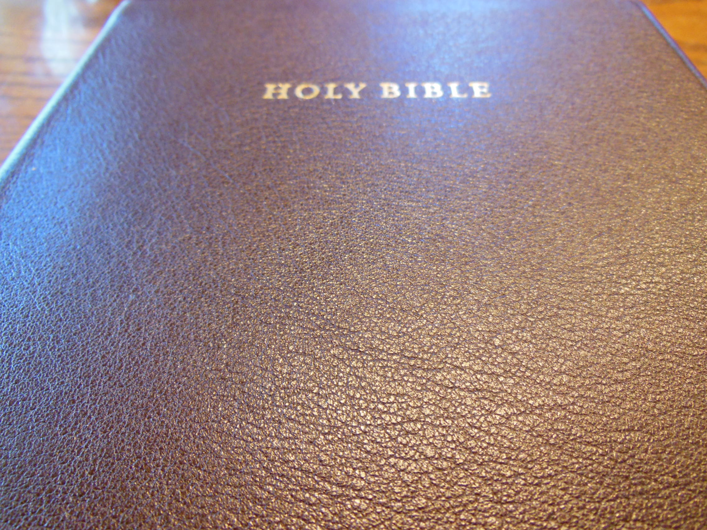
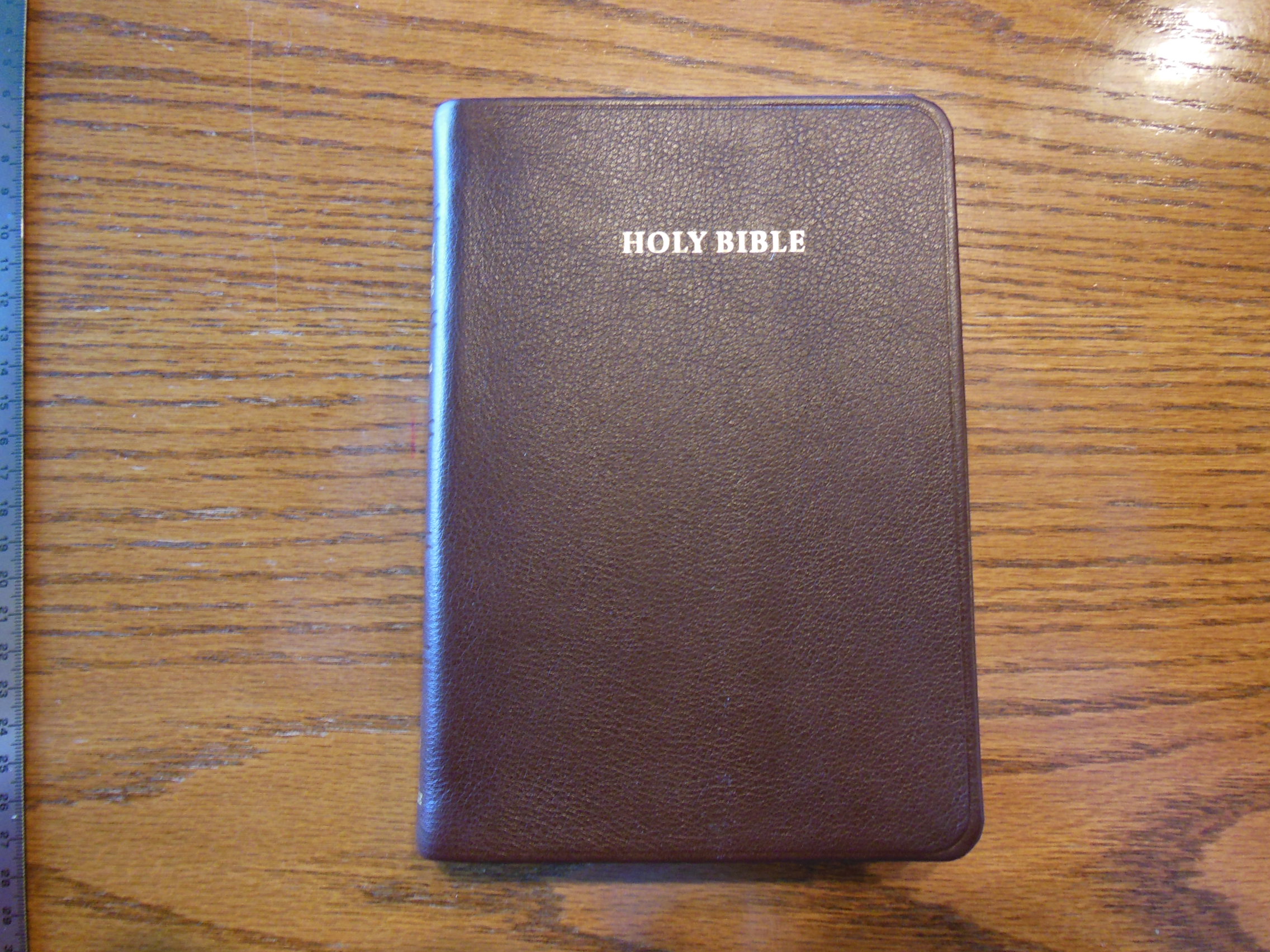
Here is the Cambridge
Here is the Oxford
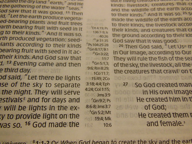
The Oxford was surprisingly smaller than the Cambridge even though it had the Apocrypha and the Cambridge did not. Due to all of the added text there had to be a compromise. I don’t think it was a very wise one. The Biblical text in the NRSV is very small. At 6 pt. it is still legibly printed, but does present a strain for longer reading. I think it would be fine for carrying to Church as long as you bring your reading glasses. If you do have poor vision I would not recommend this Bible for the Bible portion.
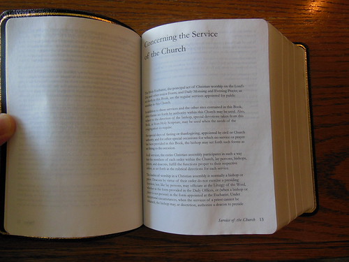
The BCP is perfectly legible being printed in 8 pt. font.
The Cambridge suffers from the same problem albeit not of necessity in my opinion. Of course I am not privy to all design constraints and I am certain there are reasons for making the Biblical text 6 pt. and the BCP text a very generous 11 pt. I would have liked to see the BCP down to 8 pt. and the KJV up to 8 pt. I think that could have been achieved.
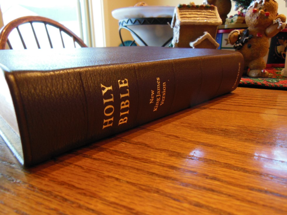
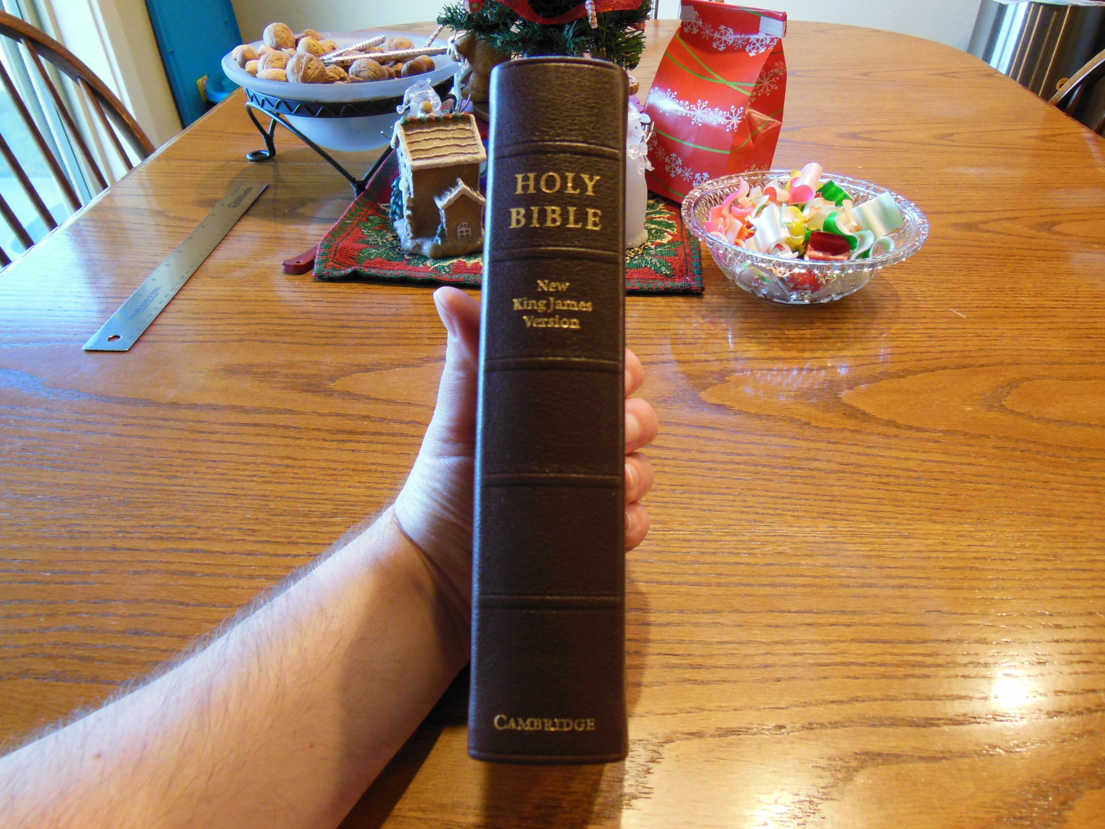
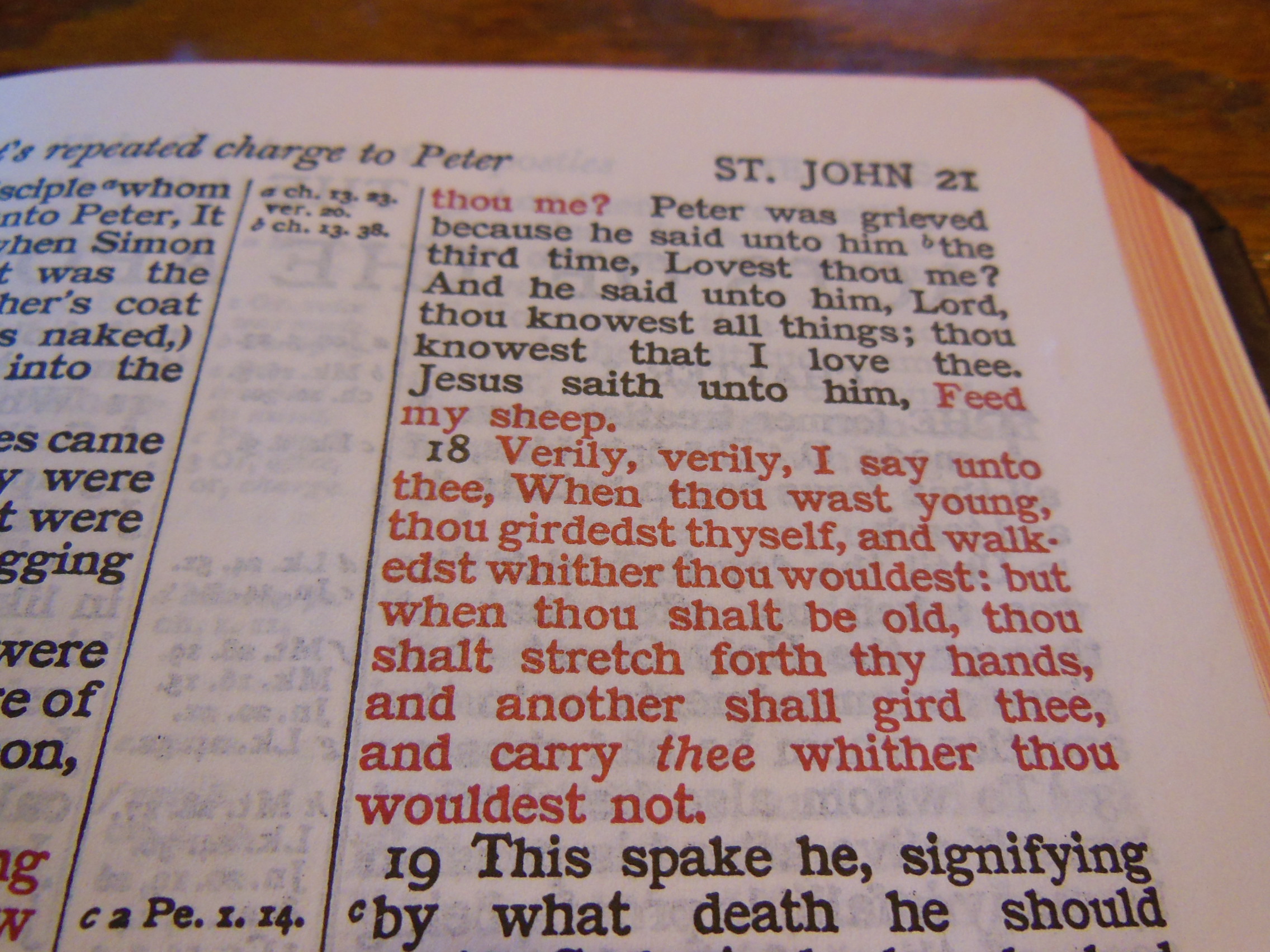
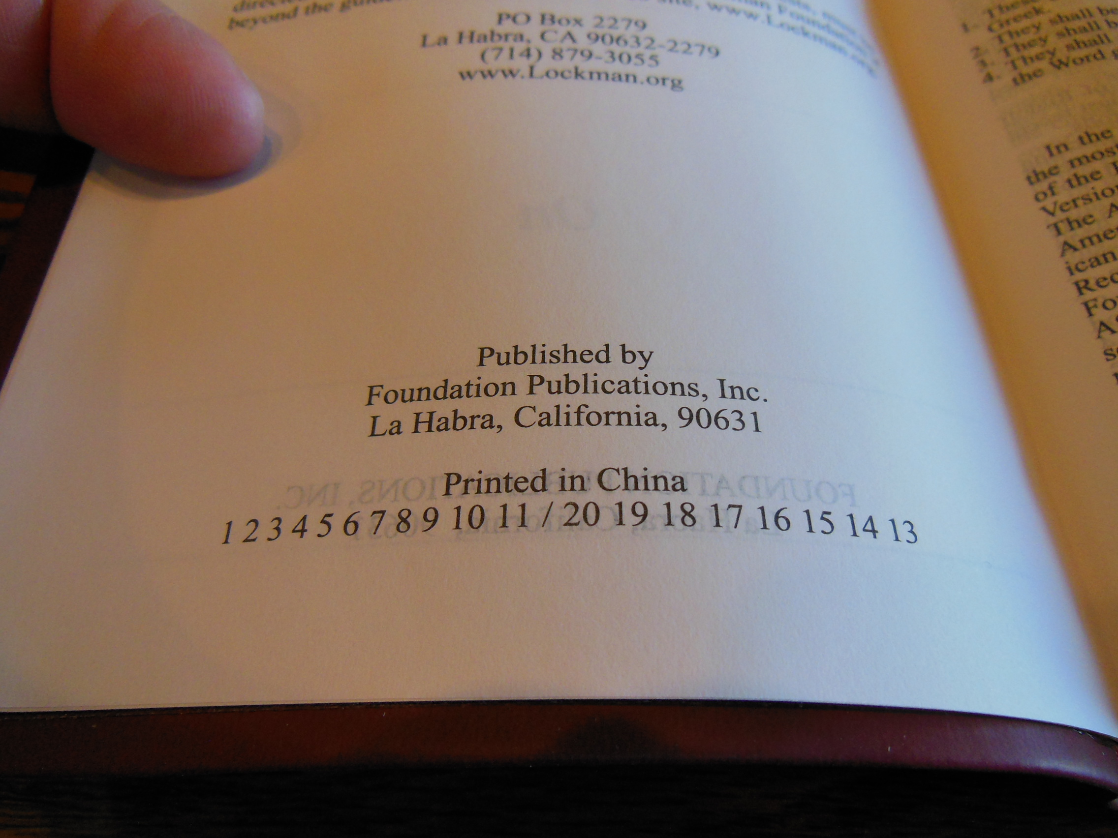
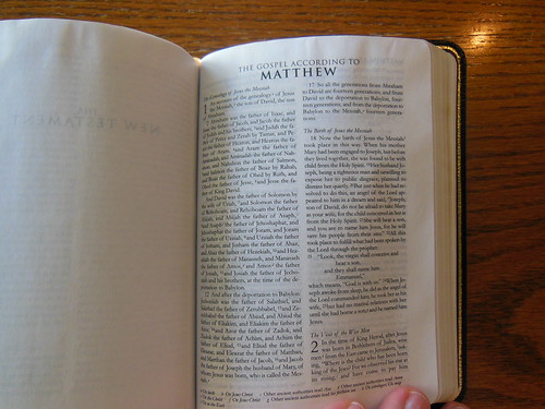
Both Bibles have sewn bindings and are case bound. The Cambridge is printed and bound in Italy by L.E.G.O. SpA. Vicenza. It is the KJV Pitt Minion, Reference Second Edition setting.
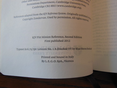
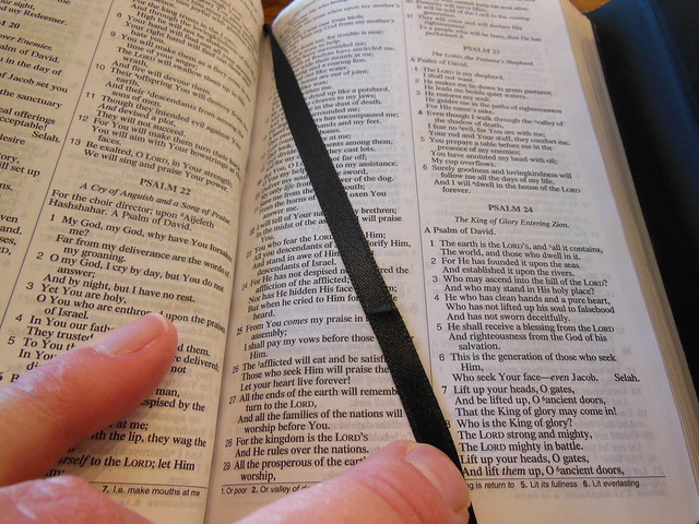
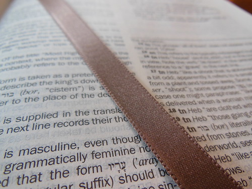
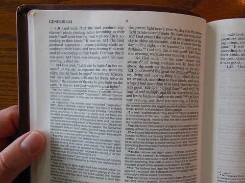
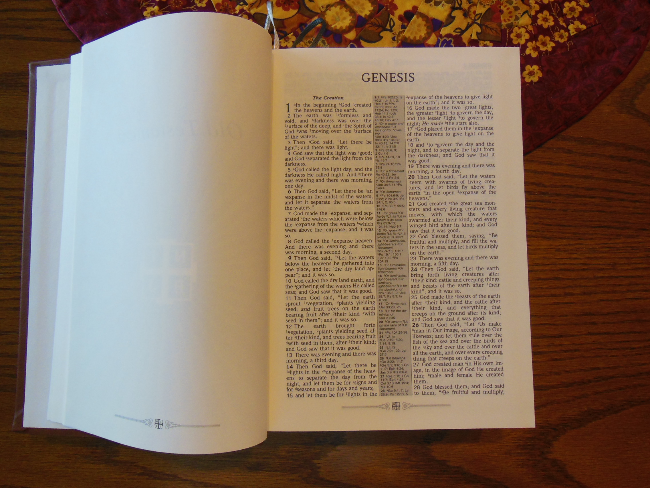
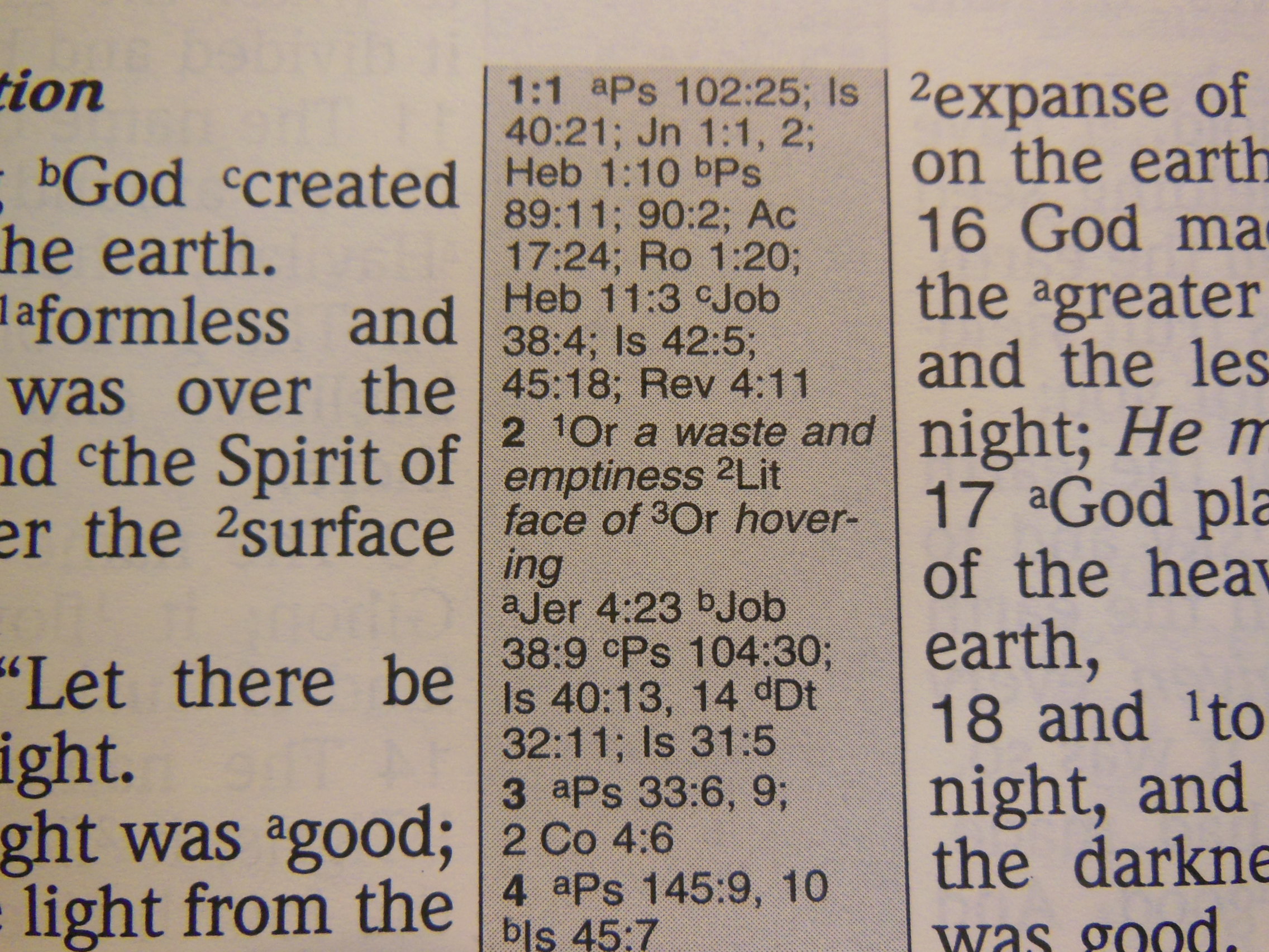
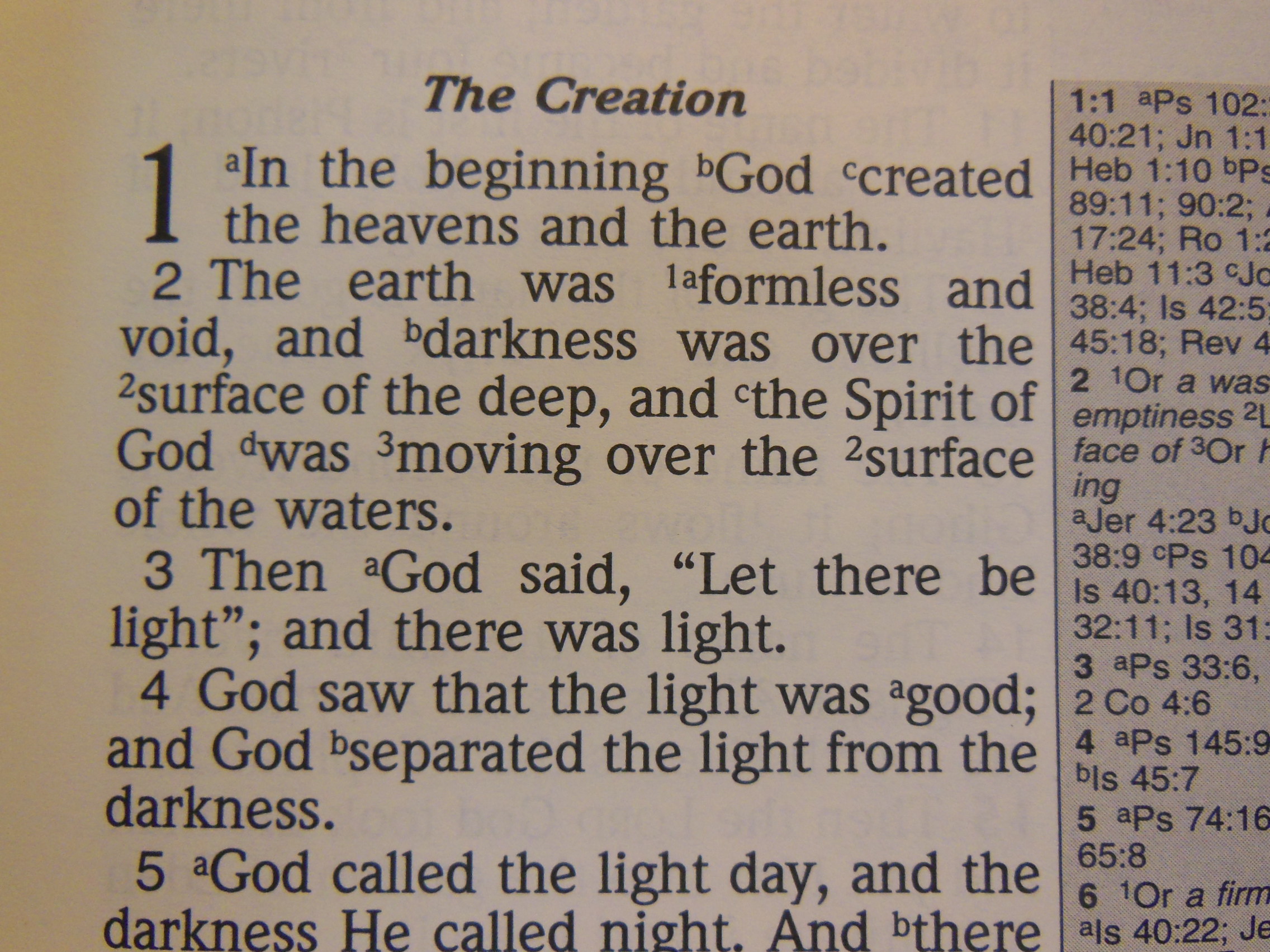
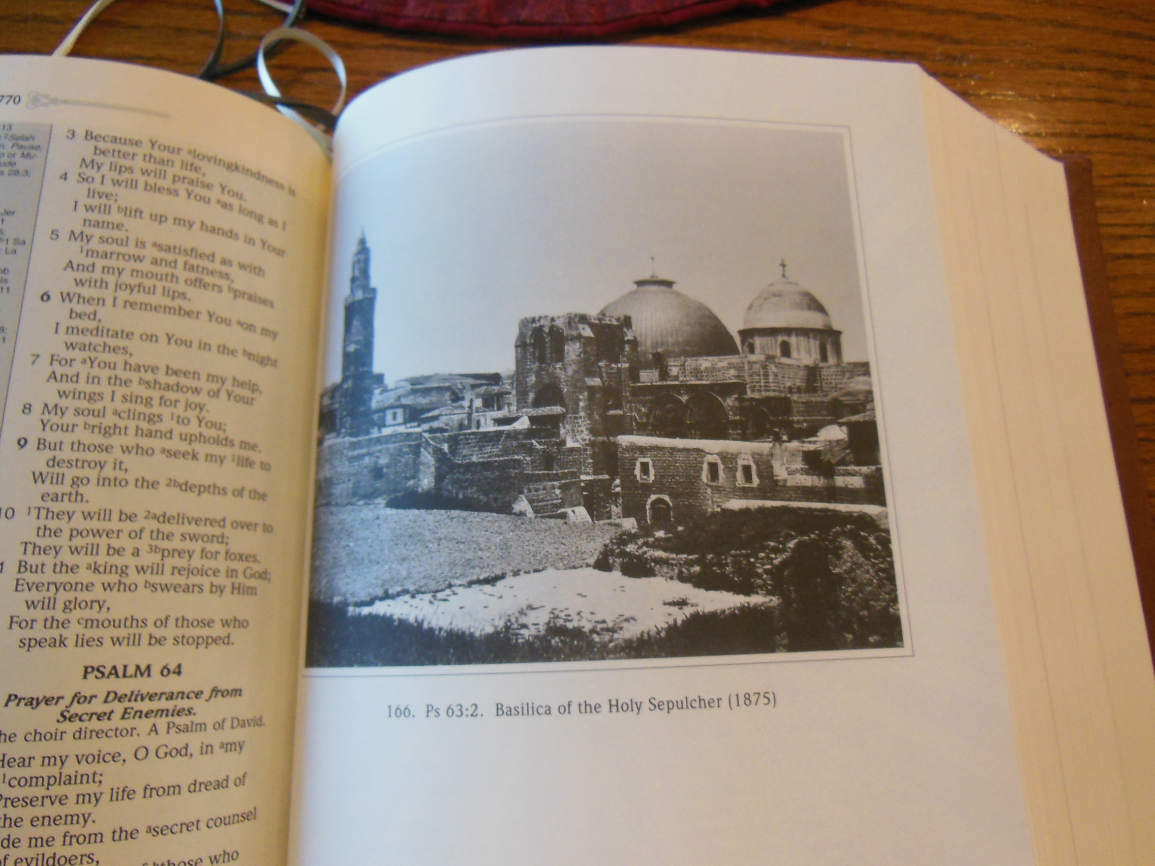
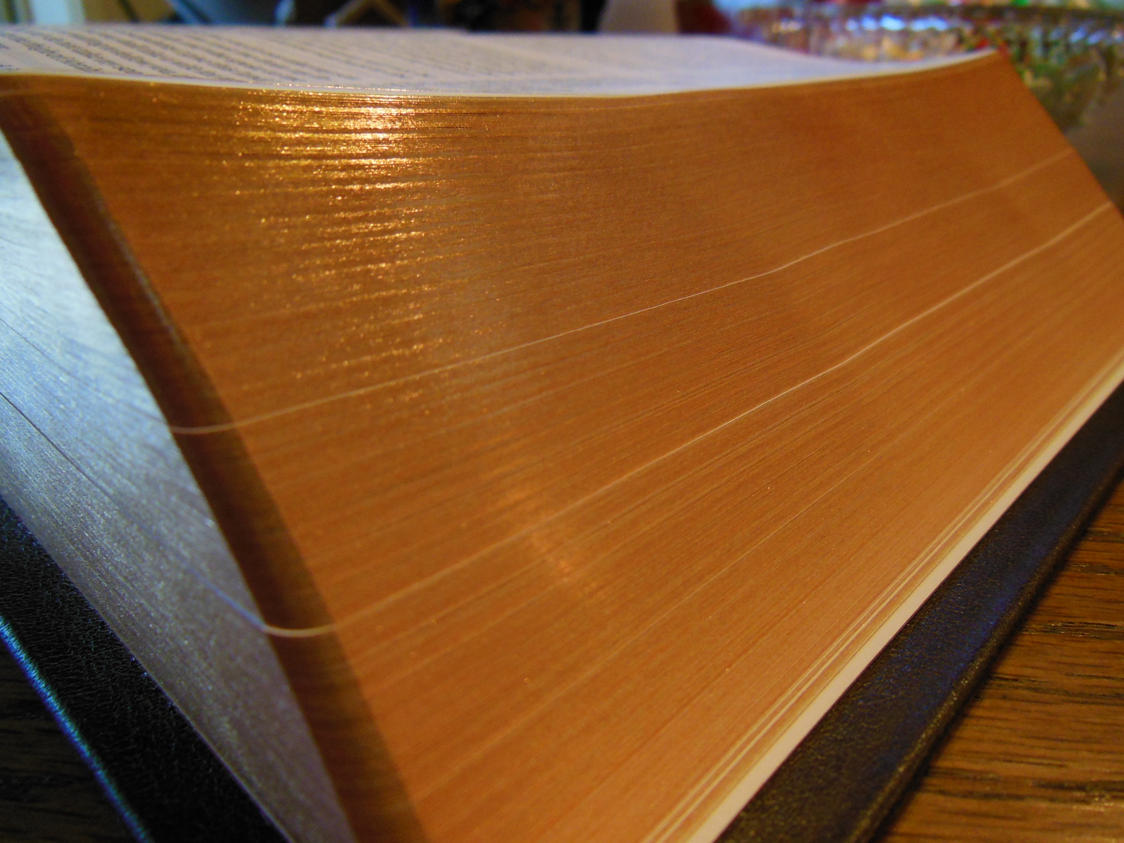
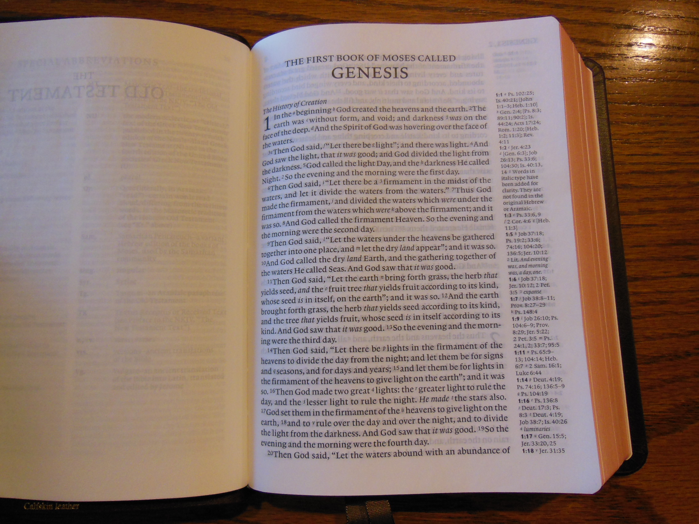
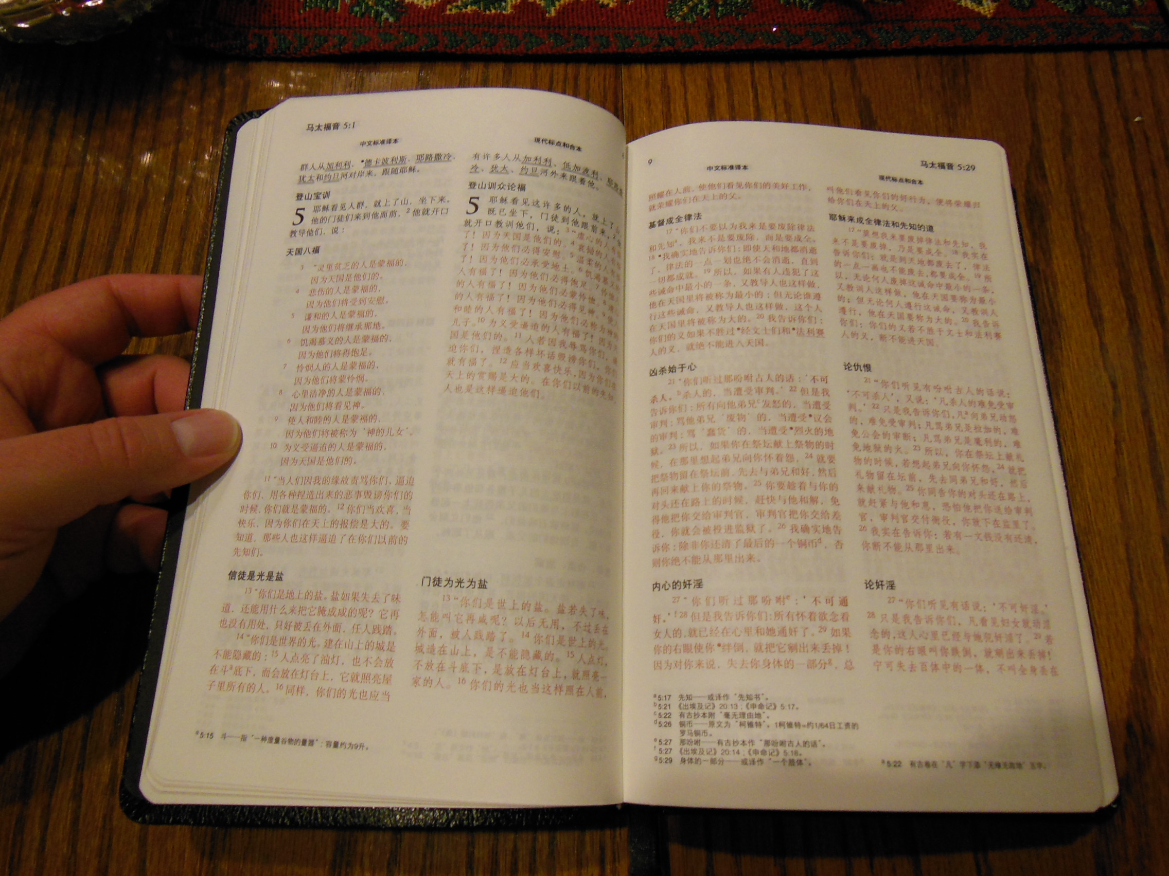
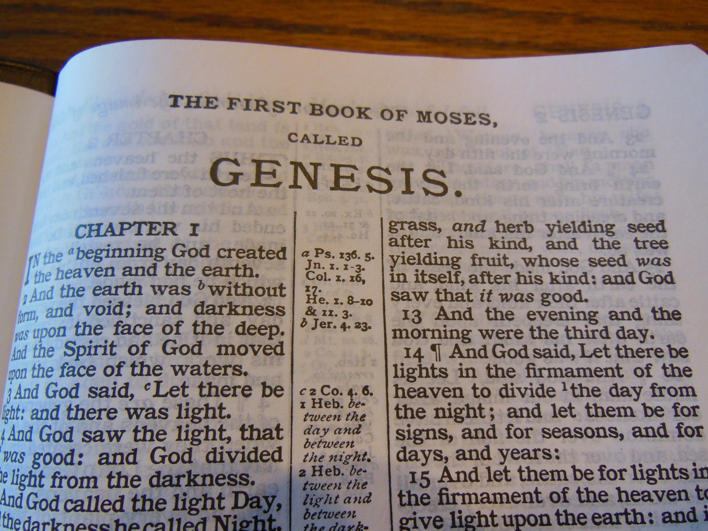
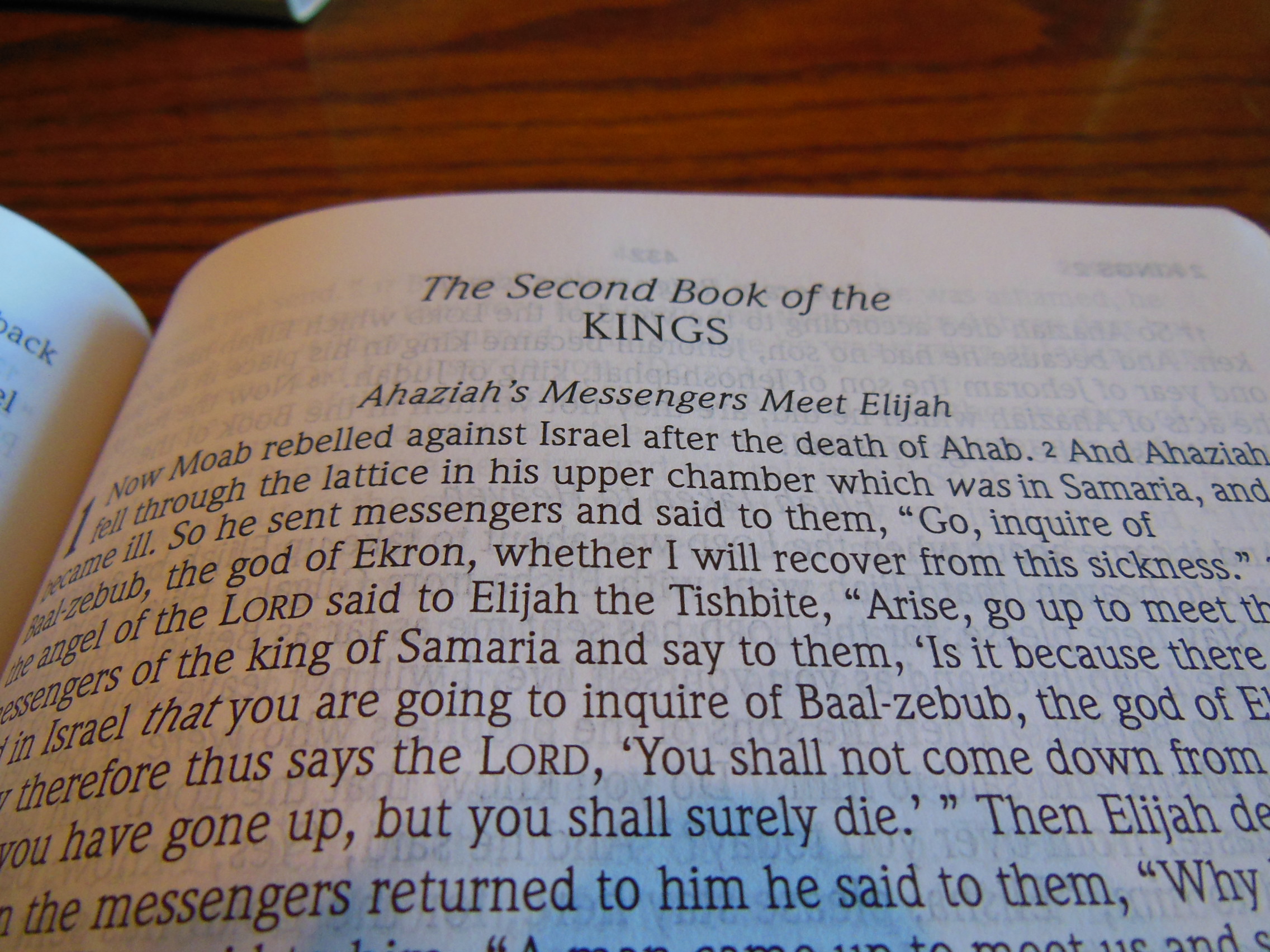
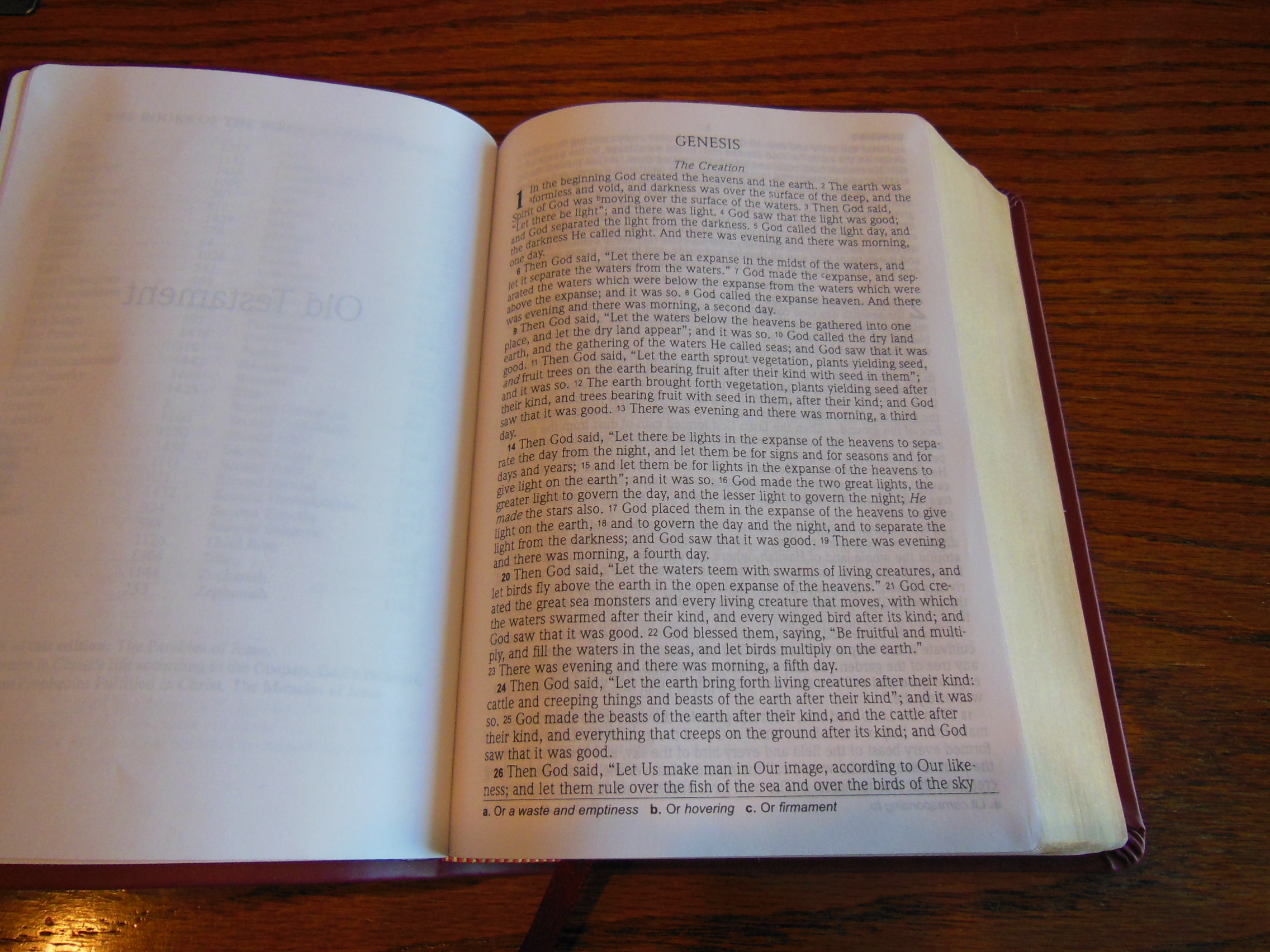
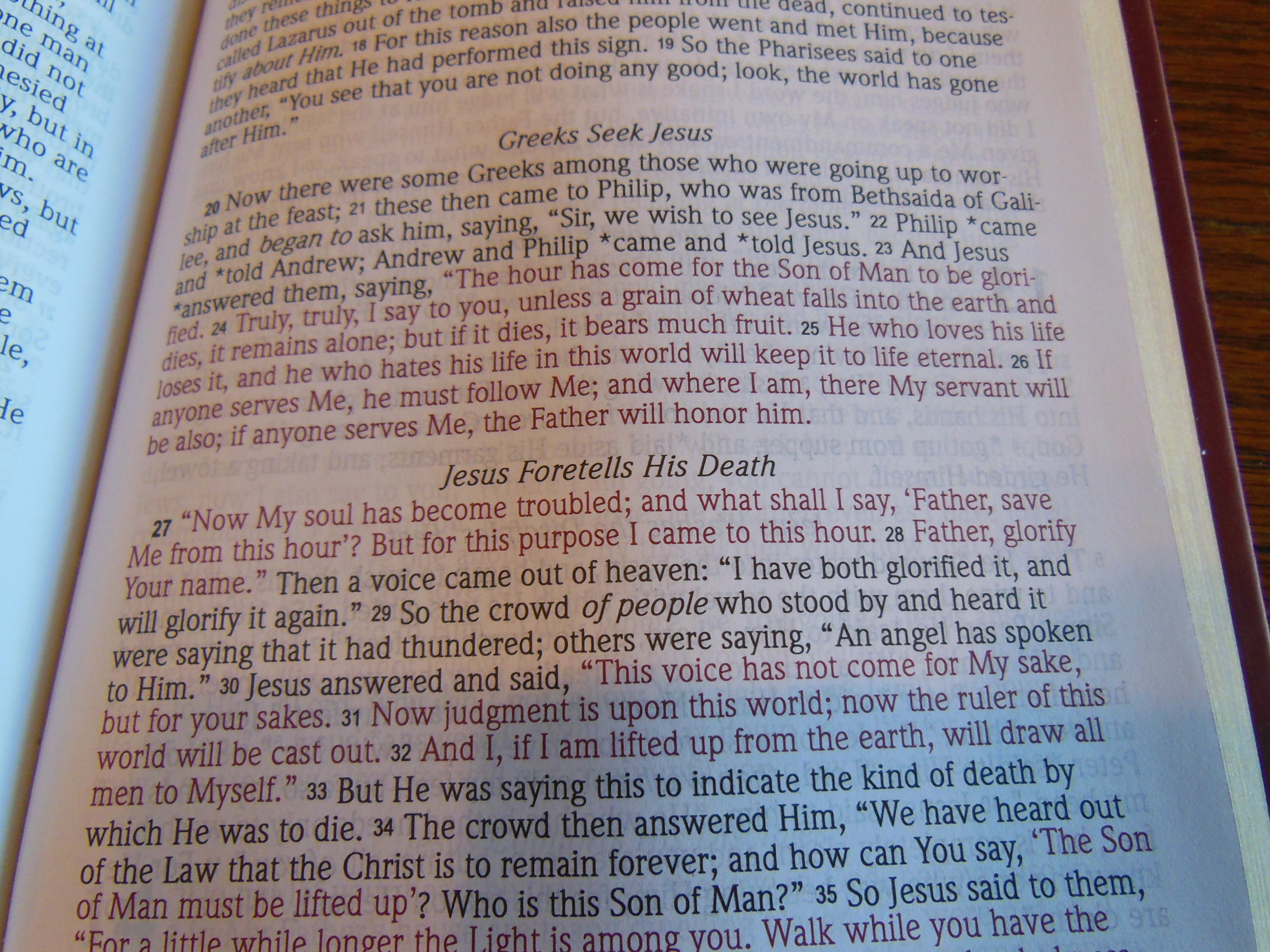
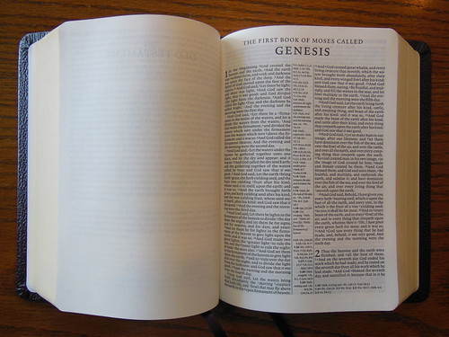
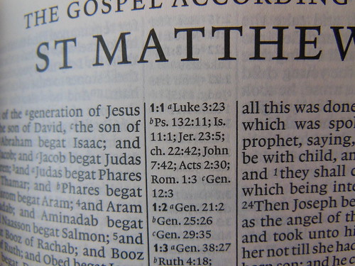
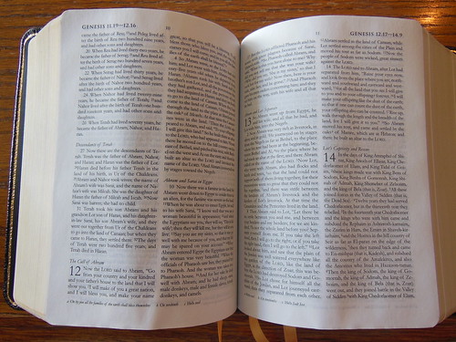
That would be a double column, paragraph format layout with references in the center column. The small 6.75 pt. font is clearly and uniformly printed on very good and opaque Bible paper.
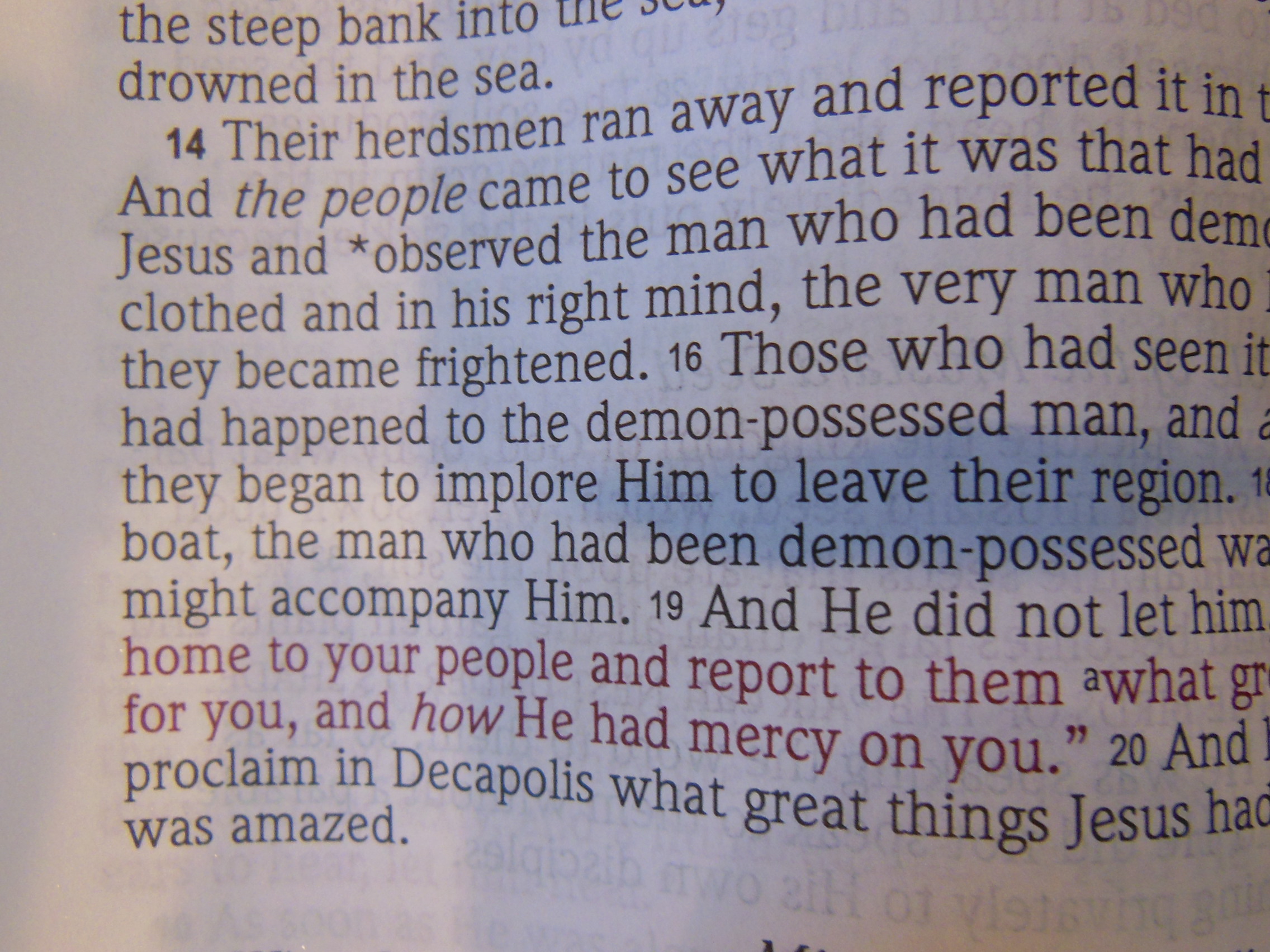
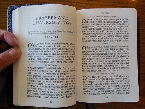
The Book of Common Prayer is mostly single column format. It is printed in large 11 pt. font making it easy to read. It is also printed to the same standards as the rest of the text.

Both Bibles were designed and had their layouts done by Blue Heron Bookcraft in Battleground Washington.

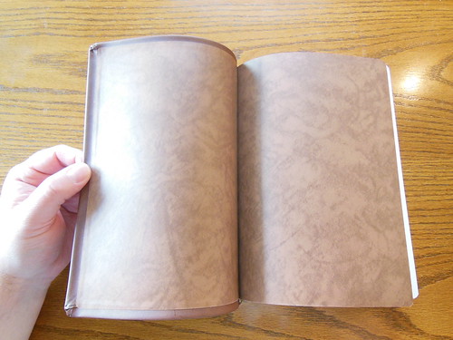
When we compare the two Bibles there are some big differences in quality. The Korean printed and bound Oxford uses a less opaque paper that tends to wrinkle, while the Cambridge is very smooth.
Here is the Oxford
Here is the Cambridge
The print in the Oxford is not as well inked as the Cambridge. The Oxford is a double column paragraph format with very limited footnotes. It is the NRSV translation. Both Bibles are black letter editions.
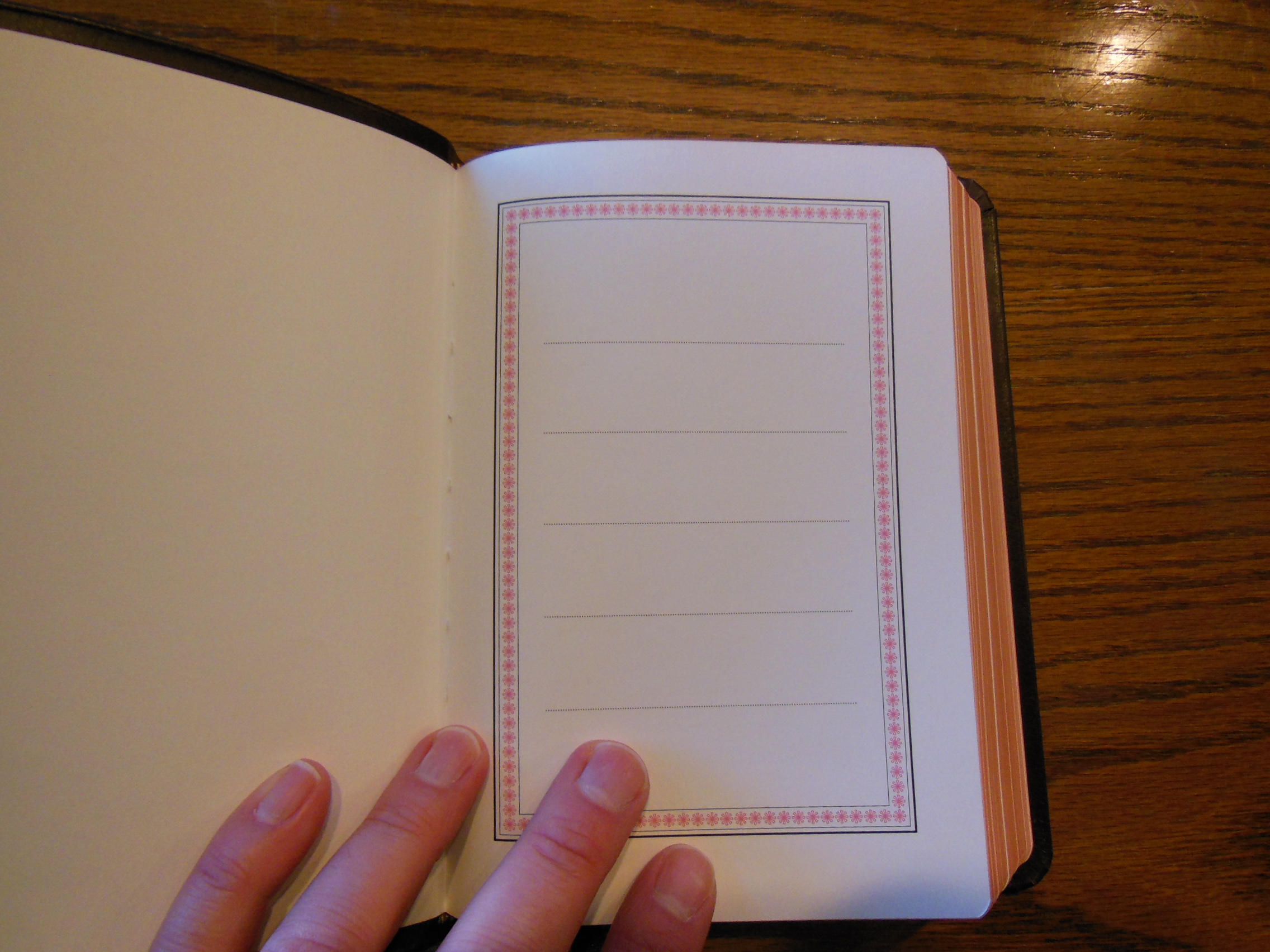
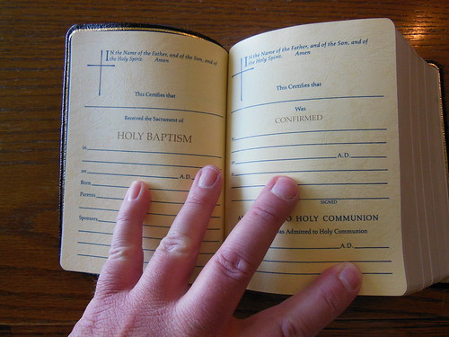
The Oxford does have some gold colored and heavily textured papers utilized for the presentation and family records pages. They look nice, but can be a chore to write on contrasted to the typical Cambridge presentation pages.
The Book of Common Prayer is mostly single column and printed with large 8 pt. font.
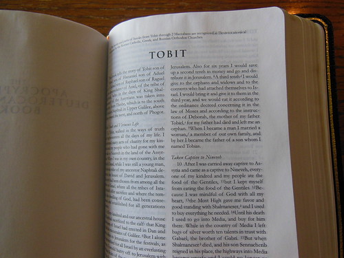
The Apocrypha is printed the same as the Biblical text.
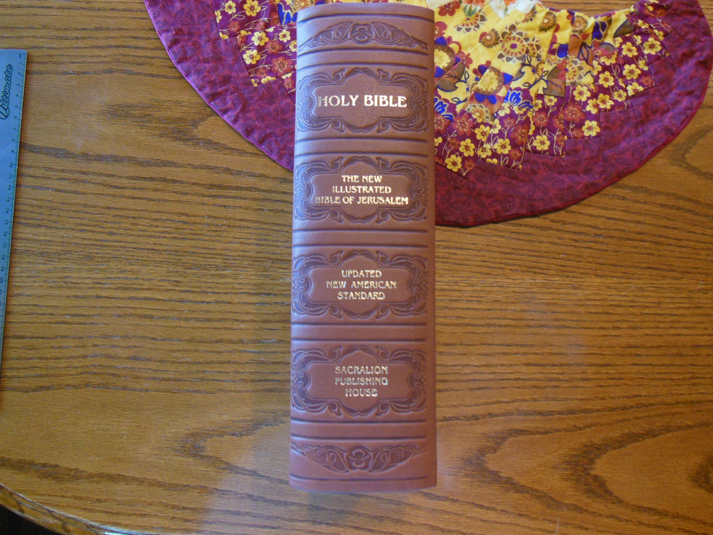
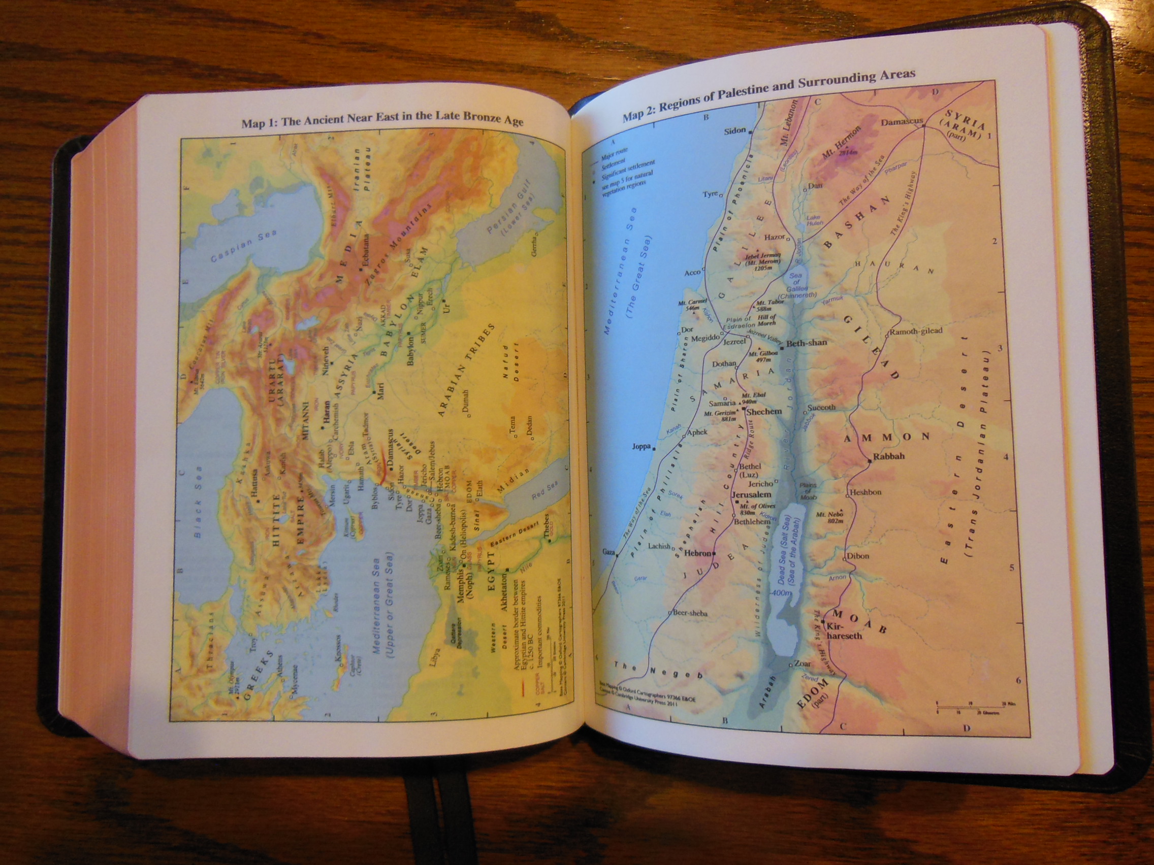
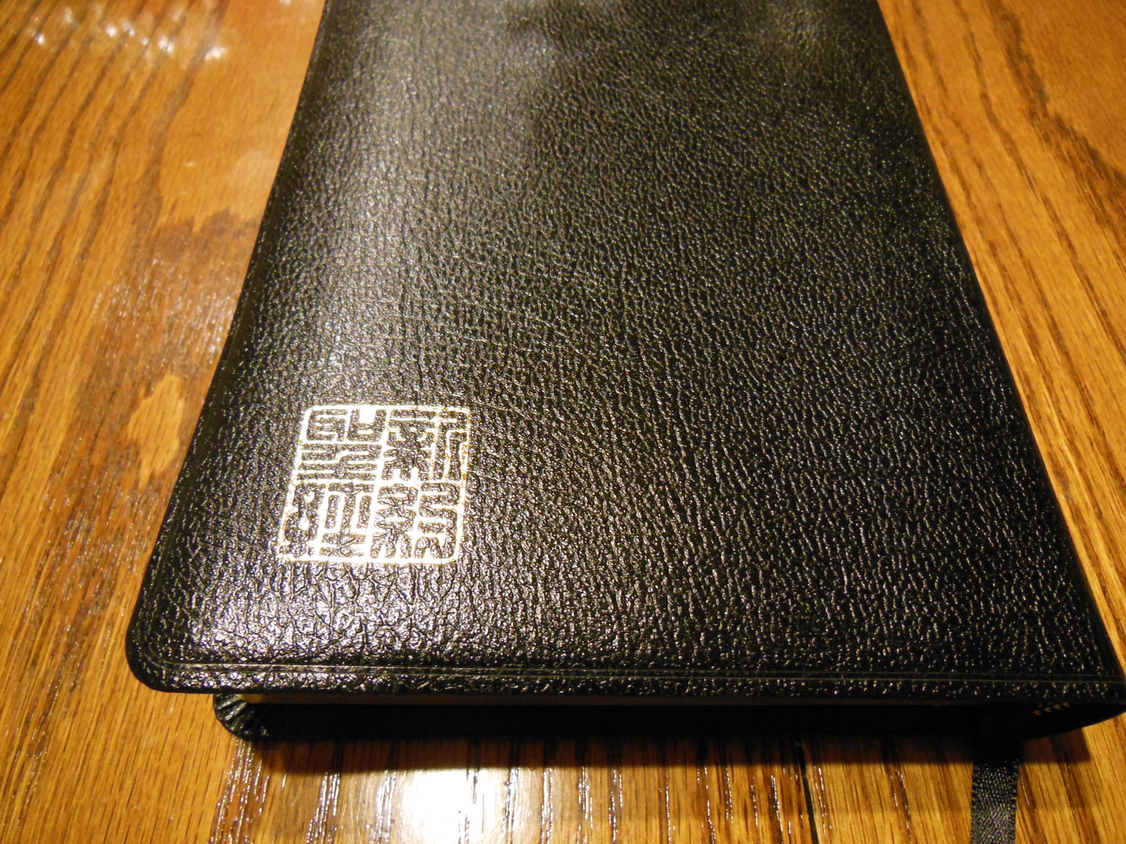
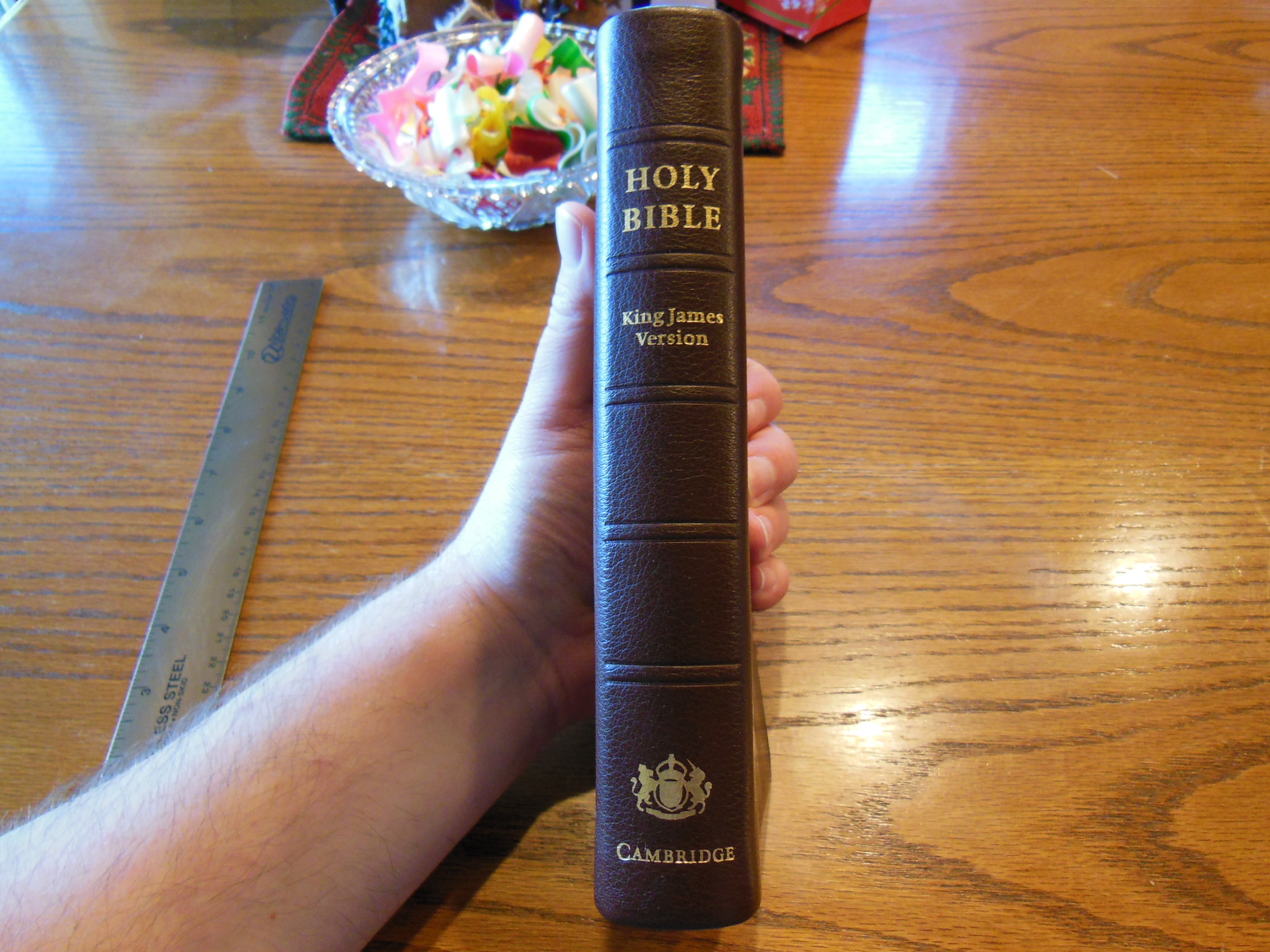
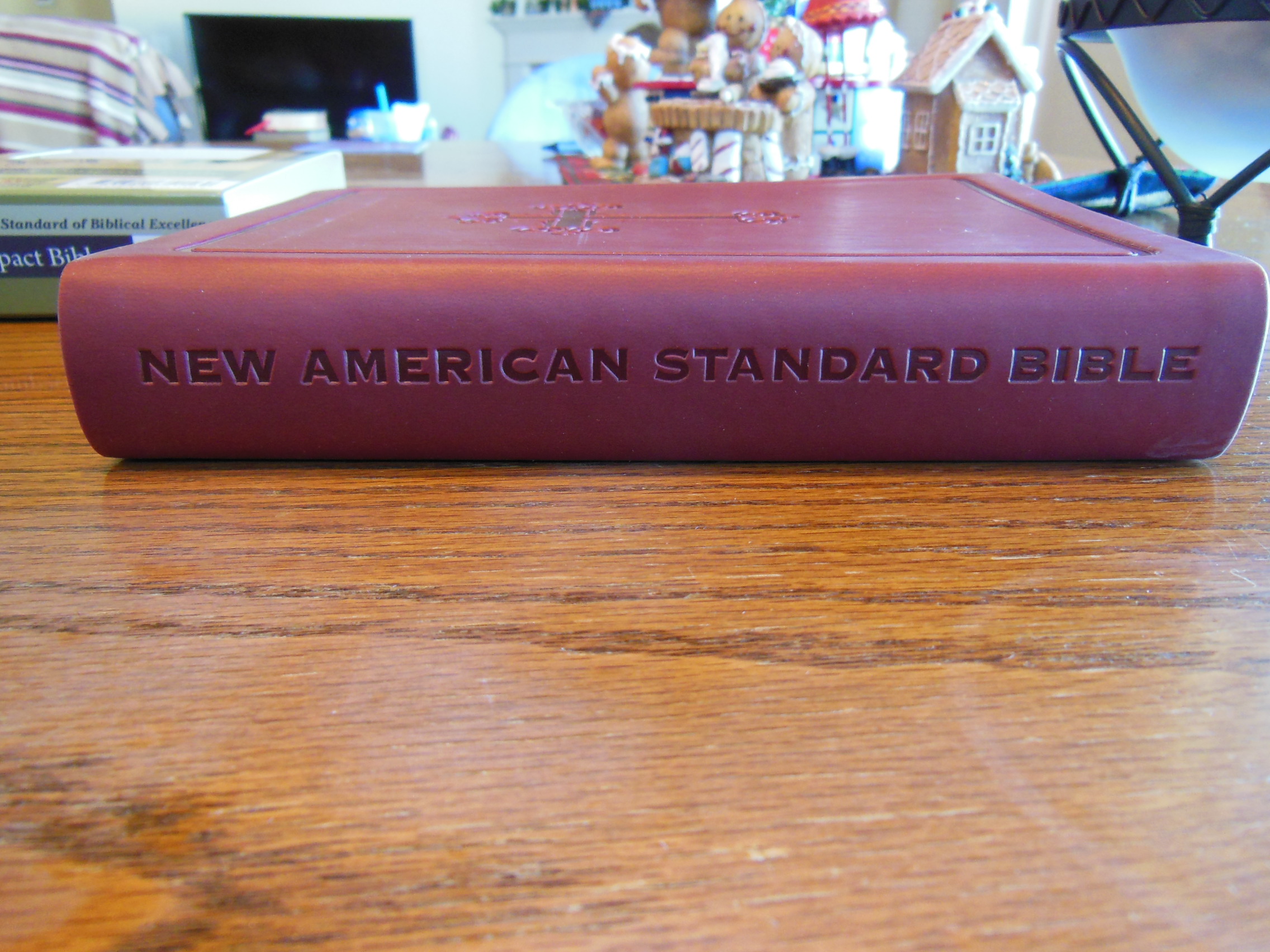
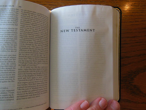
Neither have maps or helps in the back. The Cambridge has, “Common Prayer” at the top, “Holy Bible” in the middle and, the Cambridge logo at the foot of the spine stamped in gold. The Oxford has, “The Book of Common Prayer” at the top and, “The Holy Bible” underlined and, “Apocrypha” immediately under it in the middle, and, “Oxford” at the bottom of the spine.
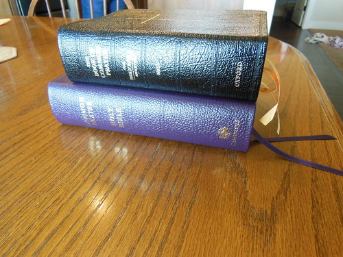
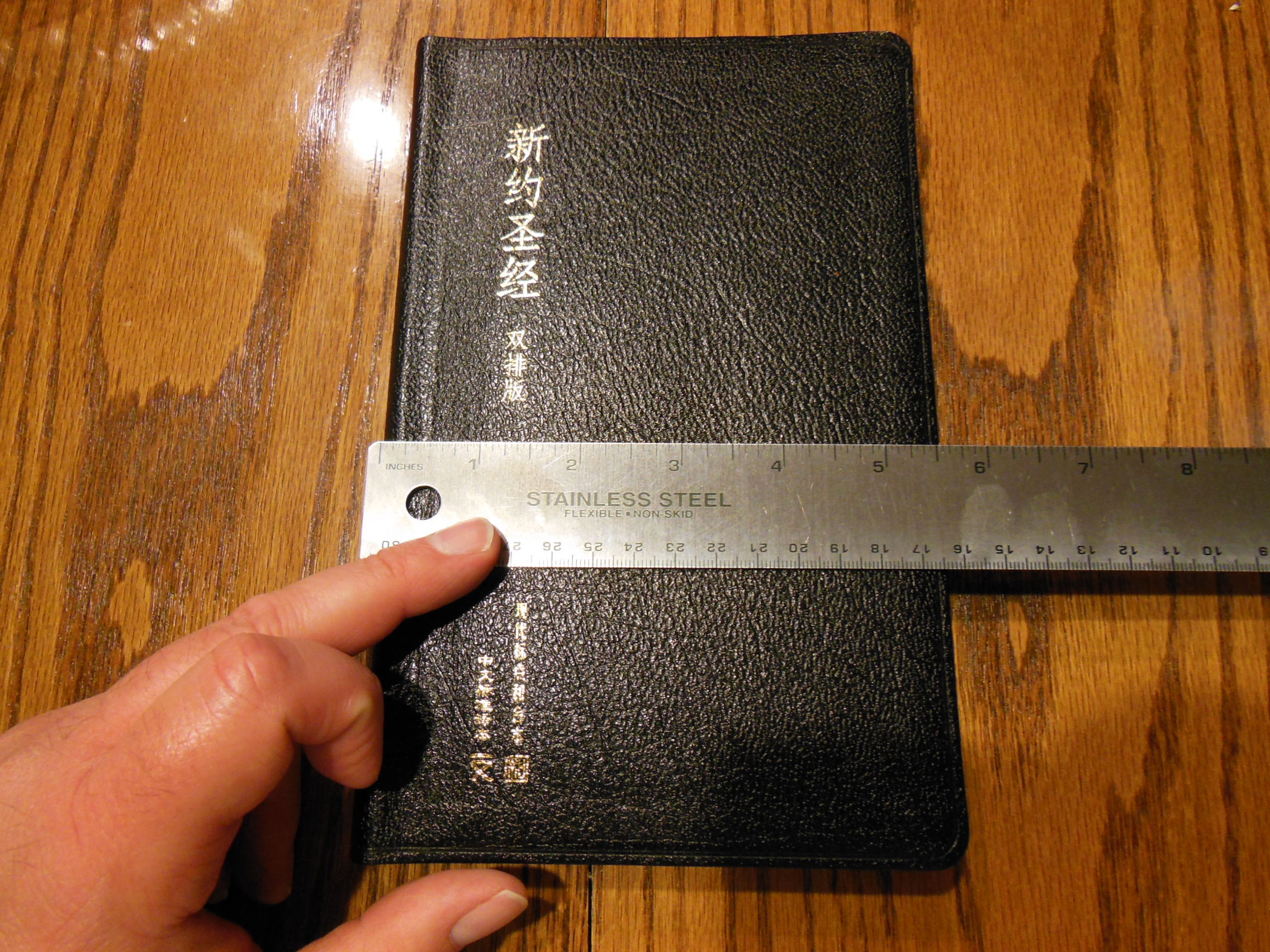
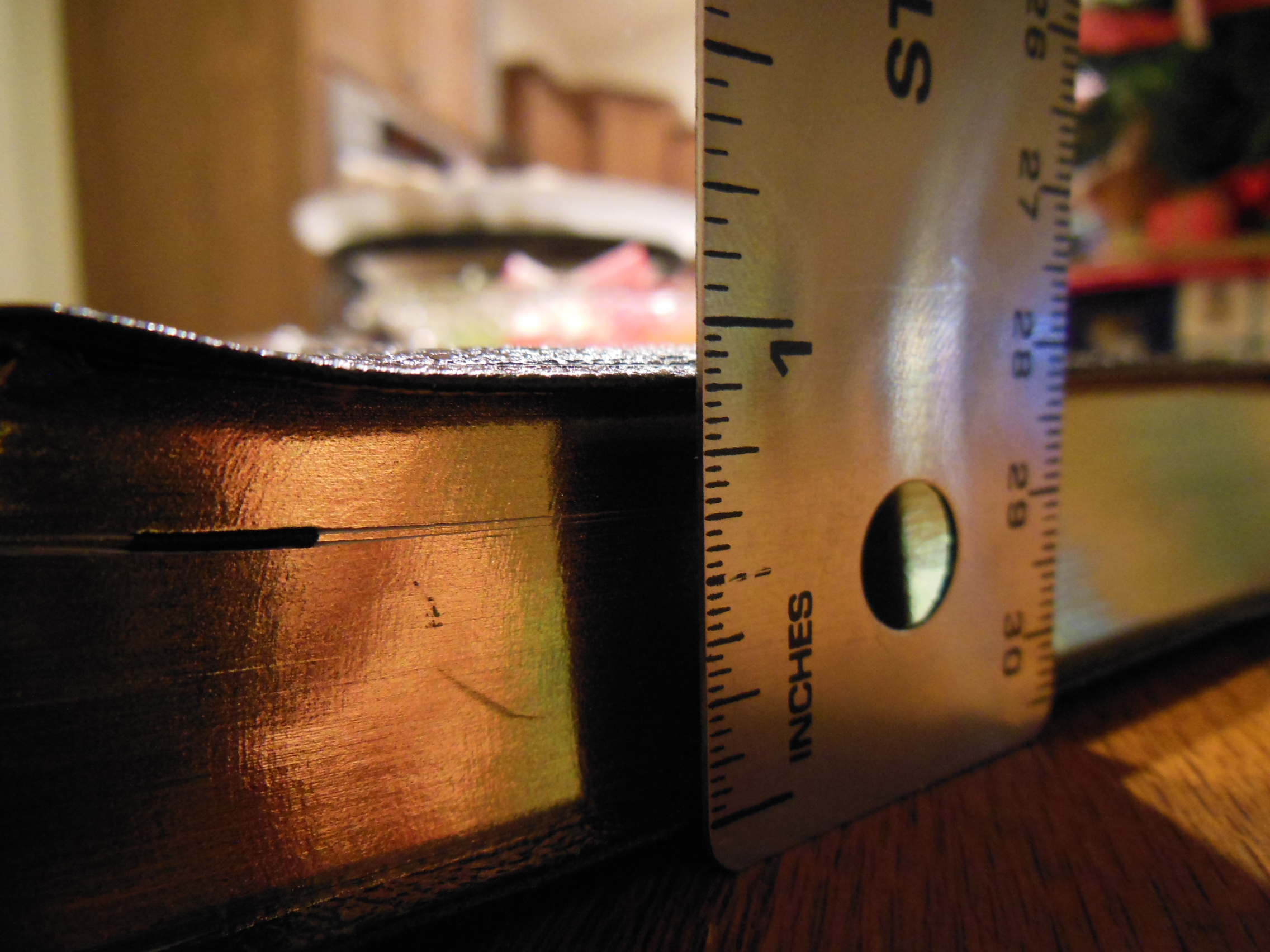
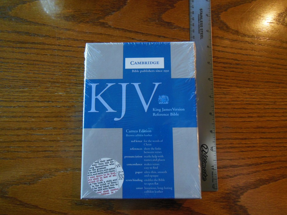
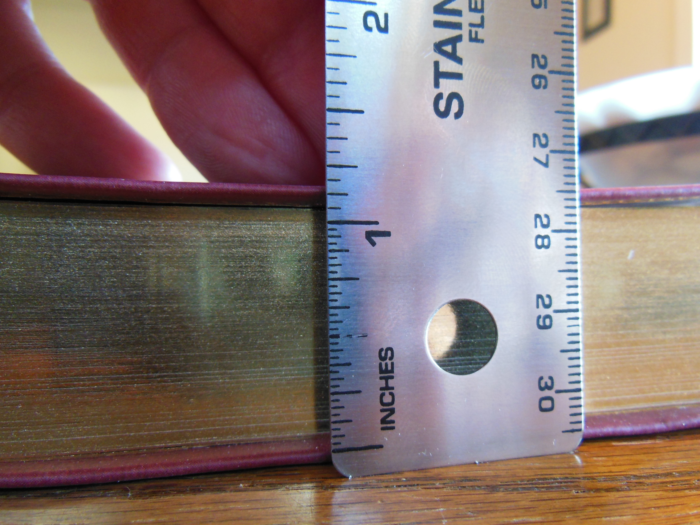
The Cambridge is a bit larger in length and width, but they are about the same thickness.
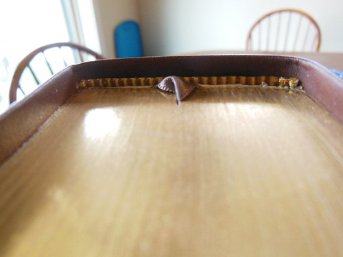
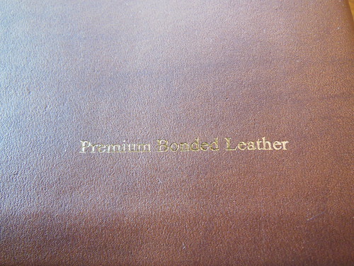
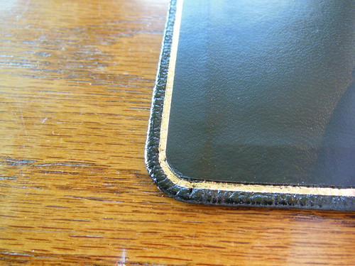
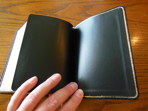
The Oxford might be a hair thicker. Both are aesthetically pleasing and pleasant to hold, however the Cambridge is the winner in the tactilely pleasing category. The calfsplit leather just is so much better than the shiny pigskin leather of the Oxford. I honestly thought the Oxford was bonded leather when I opened it. The head and foot bands on the Oxford were not properly glued down either. For quality of assembly I would have to give the Cambridge the win. Here is a look at the inside covers of both. You can see that they are both case bound.
Here is the Cambridge.
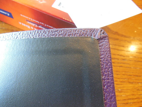

Here is the Oxford. It has a gilt line around the inside cover.
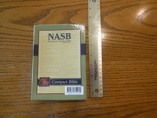
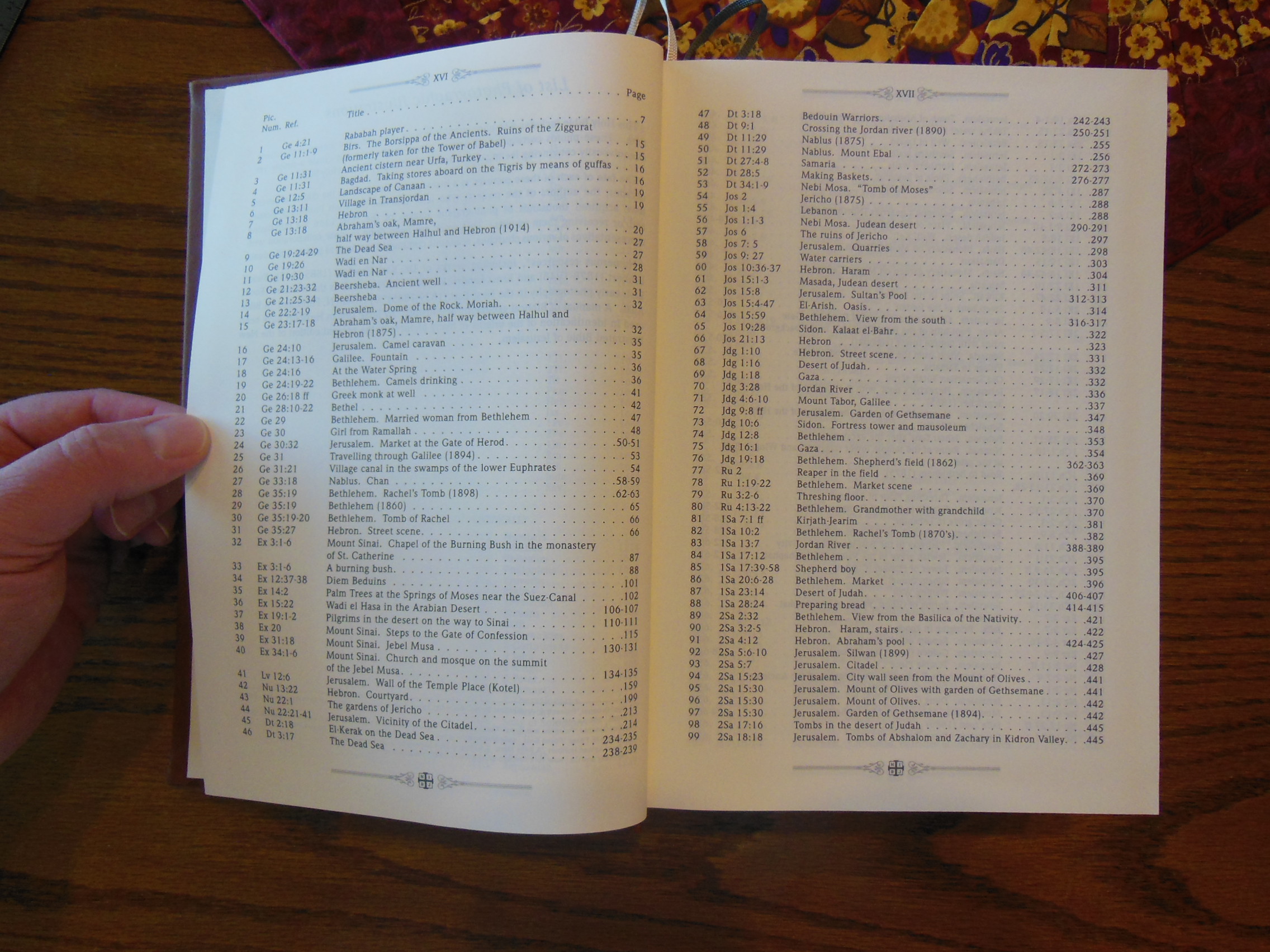
The Cambridge is geared more towards Anglicans and the Oxford is geared more for Episcopalians in my opinion. At least after reading much out of the BCP in each one that is my impression. The Cambridge utilizes the 1662 Book of Common Prayer while the Oxford uses 1979 Book of Common Prayer. If you are looking for an in depth list of what both BCP’s include I’m not going to do that, however I do have pictures of the table on contents pages that have those lists. You can see them on my Flickr page. Click here for the first page of the Cambridge Table of contents. Click here for the second page. Click here for the first page of the Oxford Table of Contents. Click here for the second page. The Cambridge is almost twice the price of the Oxford, but in my opinion it is worth it. I also like the KJV more than the NRSV. I am neither Anglican nor Episcopalian so I am not biased one way or another towards one of these Bibles. If you must have an Apocrypha in your volume then you would have to go with the Oxford. Both are sturdy and well made. They should provide years of service… as long as your eyes can take the small text. Make sure to visit the links to the Flickr photo album pages for both Bibles so you can get a good close look at all of the features.
If you are interested in purchasing either one here are some links for you,
Cambridge or Amazon or Christianbook
Oxford or Amazon or Christianbook