Bible Reviews

Wow, the Cambridge Cameo KJV Bible in Brown Vachetta Calfskin Leather is a Triumph of Form and Function!

cambridge nkjv clarion and kjv cameo 007

I received this Bible from Cambridge gratis for review purposes.  It arrived sufficiently packaged in a cardboard box with one other Bible.

cambridge nkjv clarion and kjv cameo 001

They did not deform or break through their packaging and the Bibles were in perfect shape when they were delivered.

Upon opening the box I was presented with the clamshell retail box, which should be retained for storage purposes.  The Bible inside the box was instantly striking in appearance.  I am accustomed to many different qualities of cover material.  When I picked the Cameo up out of the box I was struck by the soft texture of this type of calfskin leather.  The grain was smoother with smaller pebbling compared to goatskin leather.

cambridge nkjv clarion and kjv cameo 008

I was expecting a darker brown with a texture like other top grain cowhide Bibles.  I was pleasantly surprised.  This calfskin was smoother and soft.  The front of the Cameo is hot stamped with, “Holy Bible” in gold.  There is a channel pressed into the leather around the perimeter of the cover.

cambridge nkjv clarion and kjv cameo 007

On the spine of the Cameo is, “Holy Bible” at the top, “King James Version” in the middle, and the Cambridge Logo at the bottom.  They are all hot stamped in gold.

cambridge nkjv clarion and kjv cameo 009

The page edges are beautifully art gilded with red under gold.

cambridge nkjv clarion and kjv cameo 024

The construction of the Cameo is top-notch.  In addition to having a wonderful cover that will last a lifetime, it has a sewn binding that will last as long as the cover.  Because of these two fine qualities the Cameo is a pleasure to hold and read.  The Bible opens well and lays flat easily without being overly flexible.

cambridge nkjv clarion and kjv cameo 023

This edition does everything right.  The only way this could be any better is if it were in NASB.

The inside cover is lined with vinyl that is glued down.  The corners are finished nicely.

cambridge nkjv clarion and kjv cameo 013

There are two ribbon markers that match the color of the cover as well.

cambridge nkjv clarion and kjv cameo 045

Some less expensive Chinese or Korean Bibles try to entice you with a very supple calfskin cover lined with calfskin or another very flexible material.  Then, they drop the ball with either the paper or the fit and finish.  That is not so with the Cameo from Cambridge.  The paper is nice and opaque.  The font is a cleaned up 8 point, Petit Medieval Clarendon type.  It is bold and easy to read.  The text is arranged in a double column verse format with center column references.

cambridge nkjv clarion and kjv cameo 022 cambridge nkjv clarion and kjv cameo 026

In the front of the Cameo you have publication information page followed by a nice presentation page.

cambridge nkjv clarion and kjv cameo 015 cambridge nkjv clarion and kjv cameo 018

After that is the text of the KJV.  Lastly, there is a very useful concordance in the back along with 15 color maps that are indexed.

cambridge nkjv clarion and kjv cameo 028 cambridge nkjv clarion and kjv cameo 033

I know there is a big trend now for the single column paragraph formats.  Personally, I find it more difficult to focus on during reading in my home.  I have a busy house and am always getting interrupted.  As a consequence I routinely lose my place and have to look for where I left off so that I can resume reading.  The paragraph format has all of the tiny verse numbers dispersed through the text and finding them or remembering where you left off can be a bit more tedious.  I find it easier to pick up where I left off if I can find the verse quickly.  This is my personal preference.

The Cameo is a delightful size Bible to hold and read anywhere.  I can sit in my recliner and read it, I can read it in bed, I can read it on my work break, and I can read it while I drive…  I was just checking to see if you were still awake.  Never read and drive!   Seriously, seldom will you find a combination of form and function like the Cameo.

Here the Cameo is compared to the Concord.

ISBN: 0521146100

isbn: 9780521146104

KJV Cameo Reference Red Letter Edition KJ455:XR Brown Calfskin Leather

Bible Reviews

Do you want a large print compact NASB? Review of the Lockman Foundation Large Print Compact Text Edition in Burgundy Leathertex.

nasb large print compact 003

Review of the Lockman Foundation Large Print Compact Text Edition in Burgundy Leathertex.

As usual Lockman did a fine job of packing and shipping the Bible to me.

nasb large print compact 001

This edition is not expensive.  If you have high expectations you will be disappointed.  This Bible sells for about $20.00 it is produced in China.

nasb large print compact 019

I’m not making excuses here, but there are some things you need to consider when criticizing a Bible.  I know some people have complained about the print and the paper on this edition.  They aren’t wrong.  The paper could be a bit more opaque or the print could be a bolder type face.  It would be much easier on the eyes if that were the case.

nasb large print compact 025

What would the consequences of that be?  Well, if the font were a bolder type face and stayed 9 point, it would take up more space on the page necessitating more pages.  This edition is already pretty thick at about 1 3/16” not to mention that they have already taken out the references and made it single column paragraph format.

nasb large print compact 012

There isn’t much in the way of helps either.  There aren’t any maps to remove to make this thinner.  So what about the paper?  Well, same problem if you make a thicker paper that is a higher g.s.m. then the Bible gets thicker.  It’s just the laws of physics in a finite world folks.  I hate to be a bummer.

This Bible tries to fill a niche that definitely is there.  I’ve heard many people complain that they want a nice clean, compact, text edition of the NASB in paragraph format.  The Cambridge Clarion is pretty close, but it costs almost $200 dollars in goatskin.  You could opt for the calf split leather for around $105-$115 but that is still pretty expensive.  So let’s look at what you are getting for $20.00 instead of what you aren’t getting.

This edition has 9 point font, the words of Christ in red arranged in a single column text format with limited footnotes at the bottom of the page.

nasb large print compact 036 nasb large print compact 024 nasb large print compact 027

It has a sewn binding and is covered in leathertex which is modern synthetic leather.  It has a cross stamped on the front with a channel around the perimeter.

nasb large print compact 007

On the spine is printed, “New American Standard Bible” in large letters from one end to the other.

nasb large print compact 008

The page edges are gilded.  There is one ribbon marker that matches the burgundy color of the cover.  The ribbon is pretty thin and narrow.  The inner liner is vinyl and color matched to the cover.  It is glued down.  There are decorative head and foot bands.  You have a presentation page printed on Bible paper and not card paper.  Then, you have the copyright page, followed by the foreword with translation explanation.  Before the text begins you have a table of contents.  After the text of the Bible you have one page of the, “Parables of Jesus” then, four pages of, “Important Events in Christ’s Life According to the Gospels” three pages of, “God’s Promises” and next, two pages of, “Old Testament Prophecies Fulfilled in Christ” and lastly, one page of, “The Miracles of Jesus.”  The outside cover closed measures 7 5/16” long by 5 1/4” wide by 1 3/16” thick.

This is exactly what it is labeled.  You can’t expect it to be everything you wanted in a Bible.  There are going to be compromises when you make a large print, compact, text edition.  I know this review sounds like an apology.  I really wanted to like this Bible, but the truth is that it is a bit hard on the eyes due to the seemingly skinny font and thin paper.

For the money though, it is an excellent value and the perfect size to carry with you.  The font is much larger than a 6 point font and you really haven’t gained that much in size over a traditional compact edition.  I would recommend this Bible for people with good eyes that aren’t going to do long reading sessions.  It would be good for break room reading or whenever you have a few minutes.

ISBN: 1581351569

ISBN-13: 9781581351569

Bible Reviews

Local Church Bible Publishers, The Best Authorized KJV Publisher You’ve Never Heard of.

Evidence KJV LCBP Red Wide Margin LCBP Black  Hand Size 009

A Review of the, “400E1R Mid-Size Note Takers Red 1 Piece (Executive)”

First a little about Local Church Bible Publishers, if you are like me, I had never heard of them, until I did a search on youtube for quality leather covered, sewn binding Bibles.  Then I was confronted with what seemed to be southern brother touting the virtues of his LCBP Bible.  I was a curious.  The cover looked pretty good and the inside cover was edge lined as well as perimeter stitched.

Evidence KJV LCBP Red Wide Margin LCBP Black  Hand Size 015

I searched some more and found the video of their manufacture process.  I was pretty impressed, but then I found out that they only make the authorized 1611 King James.  Now, I don’t have a problem with using a 1611 King James, I just happen to like the NASB and a couple other modern translations better.  Now all you KJV onlyists settle down out there, and stop calling me a heretic long enough to read about the positive features of the LCBP Mid-Size Note Takers wide margin Bible.  If you want to find out what LCBP is all about you can follow this link to their about page.

As for their products, I have a couple of their Bibles and have found them to be generally superior to all other Bibles in their price range as far as the construction and materials go.  The Mid-Size Note Takers in Red Leather came in a cardboard box.  The Bible inside was wrapped horizontally and vertically with paper.  It was not damaged at all in the shipping process.  The first couple of things I noticed when I took it out of the packaging was the smell of leather and the bright red cover.  It was very red.  It stands out.  You don’t see many Bibles as red as this one.

Evidence KJV LCBP Red Wide Margin LCBP Black  Hand Size 011

I’ve seen burgundy Bibles, but this is straight, bright, and red.  I also noticed that the cover was very soft.  It wasn’t shiny and slick like cheaper pigskin leather.  I also noticed that it didn’t have much of a texture to it.  At first when I went to open the Bible I was being careful turning the pages because I didn’t want to tear the pages if they were stuck together, but me apprehensions were unfounded.  The gold gilded page edges didn’t stick together at all.

Evidence KJV LCBP Red Wide Margin LCBP Black  Hand Size 035

The cover is very supple and can be rolled up without hurting it.

Evidence KJV LCBP Red Wide Margin LCBP Black  Hand Size 019

The inside cover lining is perimeter stitched to the outer cover and is just as flexible as the outer cover.  The liner is black.  The perimeter stitching is red like the cover and two matching ribbon markers.  This is an edge lined Bible.  The Bible, despite its name is not mid-size.  It is 9.9″ x 6.75″ x 1.75″

Evidence KJV LCBP Red Wide Margin LCBP Black  Hand Size 008

I think that their designation of mid-size is in relation to the Bibles they produce and not representative of what we see in the market.  The spine has the words, “Holy Bible” at the top and, “Authorized King James” in the middle, and then at the bottom, “Church” heat stamped in gold foil.

Evidence KJV LCBP Red Wide Margin LCBP Black  Hand Size 012

The Paper is opaque and thick.  There are generous 2.5” margins for note taking.

Evidence KJV LCBP Red Wide Margin LCBP Black  Hand Size 036 Evidence KJV LCBP Red Wide Margin LCBP Black  Hand Size 040

The paper is thick enough to endure being written on and have minimal show through.  The 11 point font is printed clear and sharp.  This is a black letter edition all text is black.  The text is arranged in a single column verse format.  This aids in ease of use and lends itself to note taking and referencing.

The binding is sewn giving this Bible durability and flexibility.

Evidence KJV LCBP Red Wide Margin LCBP Black  Hand Size 045

It has a concordance and maps in the back.  This Bible is printed and bound in the U.S.A. by LCBP as ministry.  You can purchase it at the link below.

http://localchurchbiblepublishers.com/product/400e1r-mid-size-note-takers-red-1-piecered-thread-executive/

Bible Reviews

So You Would Like to Compile Your Own Study Bible? A Review of the NASB Wide Margin Reference Bible, Black Edge-Lined Goatskin Leather, Red Letter Text Edition.

Cambridge Wide Margin NASB 004

I like to keep a few of my Bibles unsullied and free of notation.  With some high quality Bibles it seems wrong or sinful to make marks in them.  It feels like an affront to the artistry and craftsmanship that goes into them.  While other Bibles I own are marked up as if a child with a box of crayons were set free on them.  I feel no shame in marking up my $30 Chinese made NASB Ultrathin.  It is a good sturdy Bible, but obviously there are not aesthetics there demanding appreciation.  So margin notes, underlining, and highlighting abounds.

The Cambridge Wide Margin is a strange Bible.  It confounds my sensibilities.  It is a fine Bible, but it demands that you use it like a workhorse.  Moreover, the moment you start using it, you begin to appreciate the craftsmanship, as you never would have, without the resources predisposed for your notation.   Besides the 1 5/16” outside margin, you have 32 pages of ruled note paper in the back, and blank index pages with alphabetical headings, so you can compile an index of your own as well.  To have a wide margin Bible is one thing, all you need is wide margins, but to have a Bible that you can utilize to make your own study Bible is another.

When I took this Bible out of the box and first held it I was concerned that it was too wide.  That was my first impression.  I failed to take into consideration the purpose of this Bible.  I put the Wide Margin next to my MacArthur Study Bible and was a bit shocked to see that it was only very slightly wider.  This type of Bible is meant to be written in.  Its natural habitat should be a well-lit desk or table.  The type of work that is going to be needed to complete the endeavor the owner of this Bible has embarked on will take many several hour sessions of focused study and notation.  I don’t see that happening from one’s easy chair.  No, a task this daunting requires a quiet well lit sanctuary alone with God’s word.  Picture a monk hunched over, with quill in hand, doing a scribe’s work by candle light in some cold stony abbey, or perhaps his modern counterpart the scholarly theologian, at some stuffy seminary quartered away in an office, in much the same fashion as the monk, only with better lighting, heating, and cooling.  Well, that might be how you would see yourself using this Bible for its intended purpose if you were so bold.

Bold enough to actually put your thoughts down on this beautiful Bible paper.  It is nice opaque and over 30 gsm.

Cambridge Wide Margin NASB 028

The quality of the paper will help to keep your notes from bleeding through the page.  The color of the paper is off white making for a good contrast between it and the sharply printed text.  The text is 8 point font in black and the words of Christ are in red.  The red text is printed uniformly and sharply like the black.  The text is arranged in a double column paragraph format with center column references.

Cambridge Wide Margin NASB 052

If the references weren’t there the outer margins could have been closer to two inches, giving you more room for your notes.  As it is the references are useful.  I think the only way you could do more with a Bible is if you purchased a loose leaf Bible.  Most of us will probably opt for a wide margin instead.

In the front of the Wide Margin you will find a presentation page, an introduction to the translation, and table of contents.

Cambridge Wide Margin NASB 026 Cambridge Wide Margin NASB 037

The Wide margin includes as previously mentioned 32 pages of ruled paper,

Cambridge Wide Margin NASB 061

a concordance,

Cambridge Wide Margin NASB 054 Cambridge Wide Margin NASB 057

and a blank index section along with 15 color maps and map index in the back.

Cambridge Wide Margin NASB 058 Cambridge Wide Margin NASB 059 Cambridge Wide Margin NASB 065

The maps are in color and printed on a flat paper instead of a glossy paper.  The glossy paper tends to crack and tear.  It is better to have these features printed the way they are.  There are two flat and wide ribbon markers in this Bible helping you keep your place.

Cambridge Wide Margin NASB 032

This is especially helpful considering the kind of work one would be doing with this Bible.  The page edges are art gilded with red under gold.

Cambridge Wide Margin NASB 031


The front cover is imprinted with the words, “Holy Bible” in gold and the spine is imprinted with, “Holy Bible” at the top, “New American Standard” immediately under that, “Wide Margin Edition” in the middle, and “Cambridge” at the bottom.  These are all printed in gold.

Cambridge Wide Margin NASB 012 Cambridge Wide Margin NASB 085

The cover on this edition is crafted from black goatskin leather.  It has a natural grain that is soft to the touch and comfortable to hold.  It is not slick and shiny like some less expensive covers made from pigskin leather.

Cambridge Wide Margin NASB 013 Cambridge Wide Margin NASB 081

The inside cover is edge lined and sewn to the outer cover.

Cambridge Wide Margin NASB 019

The edge lined goatskin cover coupled with the fine smyth-sewn binding make this Bible very durable and supple.

Cambridge Wide Margin NASB 078

This Bible opens easily no matter where you start and lays flat fresh out of the box.

Cambridge Wide Margin NASB 034

If hold it in one hand you will find that it drapes over your hand.

Cambridge Wide Margin NASB 077

The Wide Margin is printed and bound by Jongbloed of the Netherlands.  They are known for their craftsmanship in printing and binding fine Bibles.

Cambridge Wide Margin NASB 038

As usual Cambridge has excelled in producing a high quality Bible that will set the standard for all other wide margin editions from other publishers.  They have provided a target to aim for with their NASB Wide Margin in black goatskin leather.  I have seen very few wide margin editions that come close to the Cambridge one.  I hope that other publishers will rise to the challenge and start manufacturing their Bibles with the concept that it is God’s word and not solely a product to be carelessly mass produced.

In the picture below you can see the Wide Margin compared to the NASB MacArthur Study Bible.  This should give you an idea about the size of it.

Evidence KJV LCBP Red Wide Margin LCBP Black  Hand Size 004

In these pictures you can see the Wide Margin on the bottom of a stack of Cambridge Bibles.  On top is the NASB Clarion, then the KJV Concord, and finally the Wide Margin.

Evidence KJV LCBP Red Wide Margin LCBP Black  Hand Size 002


Here are some links to retailers selling this Bible

amazon.com

Christianbook.com

evangelicalbible.com

NS746:XRME

isbn: 9780521702652

Bible Reviews

A Review of the NASB Giant Print Reference Bible, in Genuine Leather, Burgundy.

NASB Giant Print Burgundy 003

Hello, 14 point font! This is definitely what the Doctor ordered if your eyes aren’t what they used to be.

The giant print NASB was delivered to my house, as usual from Lockman Foundation’s sales branch, www.americanbiblesales.com  it was packed in a cardboard box with paper as packaging material.  It was sufficiently safe from harm.

NASB Giant Print Burgundy 001

Inside the box was a two piece retail box.  I would suggest holding onto it for storage.  Once opened, I was presented with a layer of plastic wrapping that had to be defeated before I could get this beauty out to examine it.

NASB Giant Print Burgundy 004

Once the plastic was discarded, I was pleasantly greeted by the familiar smell of a nice leather cover.  There are numerous Bibles out there that say they have a genuine leather cover, but they look like and feel like bonded leather.  They have a fake grain pressed into them and their covers look shiny.  Not this big boy, the cover on this has nice texture and tactile feel to it.  Honestly, for the small price of this Bible I’d expect a cheaper feeling cover.  I thought the burgundy color was just right as well, not brazen, but still different than the venerable black.

NASB Giant Print Burgundy 034 NASB Giant Print Burgundy 006

The spine of the Bible has the words, “Holy Bible” at the top.  Immediately below is, “New American Standard Bible Updated Edition.”  At the bottom is, “Foundation Publications” and the NASB logo.  Above them are the words, “Giant Print.”  There are decorative lines separating the words.

NASB Giant Print Burgundy 011

The cover has a lined pressed into it around its perimeter for decorative purposes.  It adds a nice touch to finish it off.

NASB Giant Print Burgundy 033

The inside cover is lined with a vinyl liner that is color matched to the cover. It is glued down over the corners and edges of the cover.

NASB Giant Print Burgundy 022

The text block is firmly attached to the cover.  I noticed no problems with fit and finish.  It looked pretty good for a Bible printed and bound in China.

NASB Giant Print Burgundy 028

The binding for that matter is a sewn binding.  It is a tad bit tighter than some of the other ones that Lockman Foundation puts out.  This is neither a draw back or a benefit as far as function goes.  The Giant Print edition opens flat and is pleasant to use.

NASB Giant Print Burgundy 038 NASB Giant Print Burgundy 037

The sewn binding will help ensure years of use.  The Giant Print Bible maintains typical 6 ½” x 9 ¼” for the width and height, but is a tad bit thicker at 1 ¾” It is a little heavier than your typical reference Bible, but not by much.  Even with the slight size difference it is still pretty easy to hold and read.

NASB Giant Print Burgundy 035

The page edges are gold gilded.

NASB Giant Print Burgundy 008

The paper is a decent quality standard Bible paper 28 gsm.  It doesn’t have a problem with text ghosting.  I think Lockman must have realized that if you are buying a Bible with humongous font it isn’t because you have good eyesight.  The Bible paper, 14 point font, and uniformly printed text, all aid in making this a very legible Bible without making it too cumbersome.

NASB Giant Print Burgundy 020

Also you should note that this is a red letter edition.

NASB Giant Print Burgundy 039

The text is in a double column verse format with references at the end of each paragraph. There are limited references, for a reference Bible.  This one has about 13,000 references.  I doubt that anyone considering a 14 point font giant print edition is worried about having a ton of references though.

NASB Giant Print Burgundy 017

There is a ribbon marker that matches the color of the cover.  It is of average quality as far as ribbon markers go.

NASB Giant Print Burgundy 053

In the end there is a 146 page Dictionary/Thesaurus/Concordance. It should come in handy.  There is enough there to be useful, but not so much as to unnecessarily add to the bulk.

NASB Giant Print Burgundy 040

After that we have a section devoted to book introductions.  Each book in the Bible has a nice introduction to aid the reader in their studies.

NASB Giant Print Burgundy 042

Also, a section on God’s promises is provided after the book introductions.

NASB Giant Print Burgundy 043

“Where to find help when” and “Verses for reflection” appear at the very end before the color maps.

NASB Giant Print Burgundy 044 NASB Giant Print Burgundy 046 NASB Giant Print Burgundy 047

I think the biggest cons here would be the size of the Bible. For the very frail and elderly this would have to rest on a table for them to read it.  However, most elderly people won’t have any trouble holding this Bible to read.  The con is a very slight one.  We all have to obey physics here.  If you want giant text you have to sacrifice something.  I don’t think I’ve seen a better job on a giant print edition to date.

The pros here are of course the 14 point font and the wonderful cover at a very reasonable price.   Could hardly believe I was holding a $50 Bible.  It could have been twice that.  A noteworthy thing is that the presentation and records pages in the front seem to be a flat paper as opposed to the glossy paper they have been made out of.  I hope that Lockman carries this over to the maps as well.  This flat paper doesn’t crack or tear as easy as the glossy paper they have been made of in the past.

If you are in the market for one of these Giant Print Bibles they can be had for around $50. If you are lucky you might find them on sale for less.  Here are a couple of links to make it easier.

http://www.americanbiblesales.com/search/isbnlist1.php?ISBN=1581351100&hilite=yes

http://www.amazon.com/Giant-Print-Reference-Burgundy-Genuine-Leather/dp/1581351097/ref=sr_1_1?s=books&ie=UTF8&qid=1417034883&sr=1-1&keywords=9781581351095&pebp=1417034894361

http://www.christianbook.com/nas-giant-print-reference-leather-burgundy/9781581351095/pd/51097?product_redirect=1&Ntt=%209781581351095%20&item_code=&Ntk=keywords&event=ESRCG

ISBN: 1581351097

Theology

Silly liberals, Theology is for Reasonable People. Egalitarians are at it again…

How many of you have heard this left-wing liberal theological stance that Adam was not a man, but a he/she with the genetic info for both sexes within itself? Yeah, I know right?  They call it, “The Adam” and then their story goes something like this; God made it from the dirt, thus its name, because the Hebrew word for dirt is, “’adamah” so that is why that he/she creature was called, “Adam.”  Then God put it to sleep and didn’t literally make females from its rib but more figuratively created the separate genders at that point.  If you are laughing like I was when I first heard this nonsense, stop!  This is the garbage they are teaching in seminaries.  I may not have represented their position the way they would like, but this is how I understand what they are saying.

So how about all the verses talking about gender roles, authority, submission, shadows and types that depend on these concepts, and the authority of scripture? Well, no problem for the liberal theologians, they just call what they don’t like allegory and when they can’t, they say that the Bible isn’t really fully the word of God, and it can’t be fully relied on.  Well, not to sound like, “The Church Lady” but who does that remind you of?  Hmm?  Someone with a serpent sounding hissing voice in the garden maybe?  Well, I wonder who that could be?  I wonder who casts doubt on God’s word?  Who could it be?  Does it remind you of…  SATAN!!!?

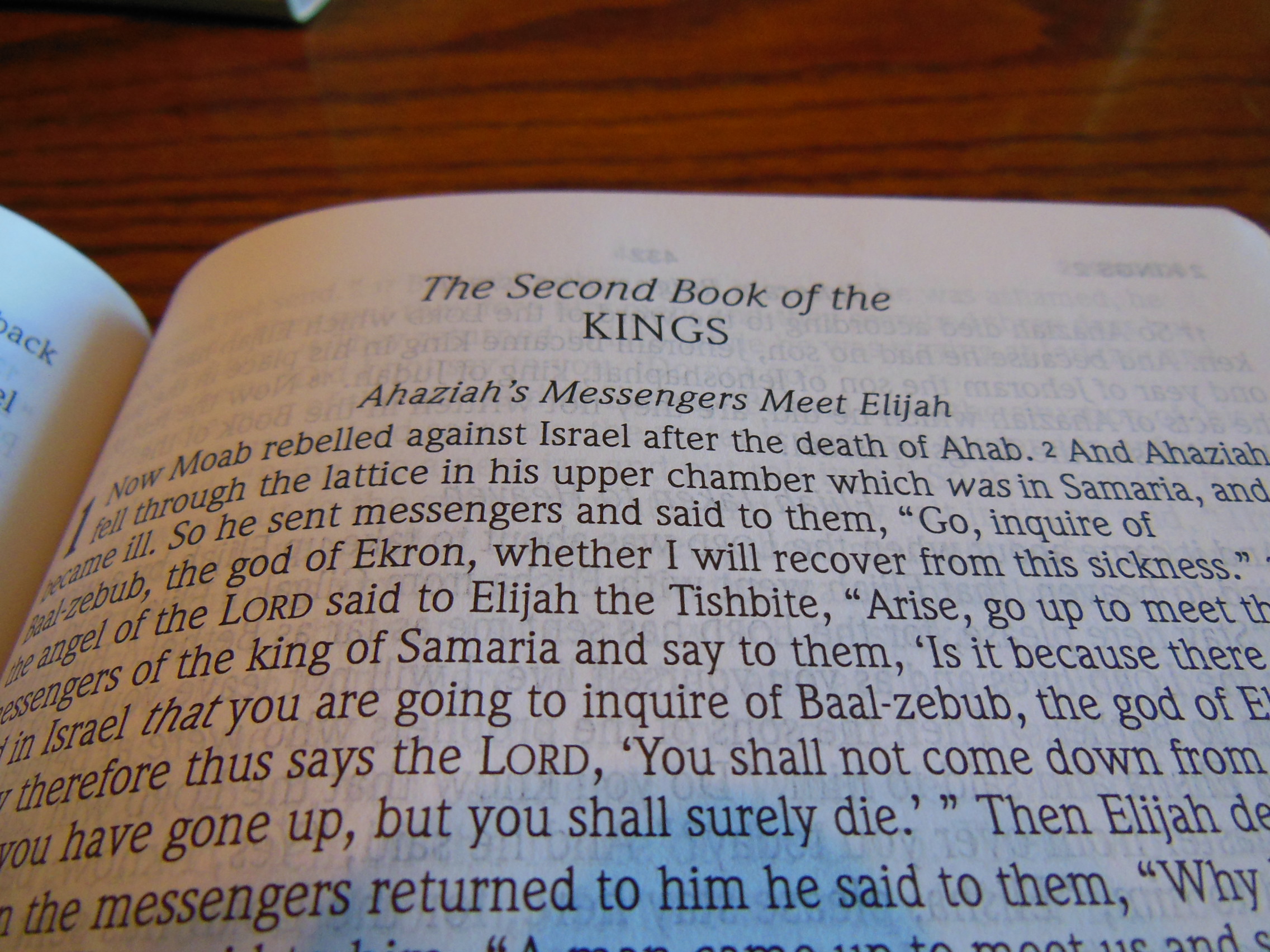
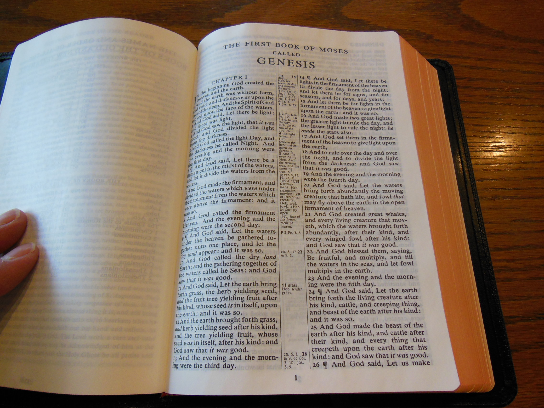
Surely God made Adam, the first human as a male from the start. Surely Eve was made from and for Adam as the word of God says.  In 1 Corinthians 11:1-15 we can even read what God said about it as Paul restates the creation of man and woman in the New Covenant for a group of believers who were falling into egalitarianism just like we are today.  They needed a correction from God then as we do now.

Here is a section of an article arguing for the erring position posted on http://newlife.id.au/ the link to the original article is, http://newlife.id.au/equality-and-gender-issues/human-man-woman-genesis-2/

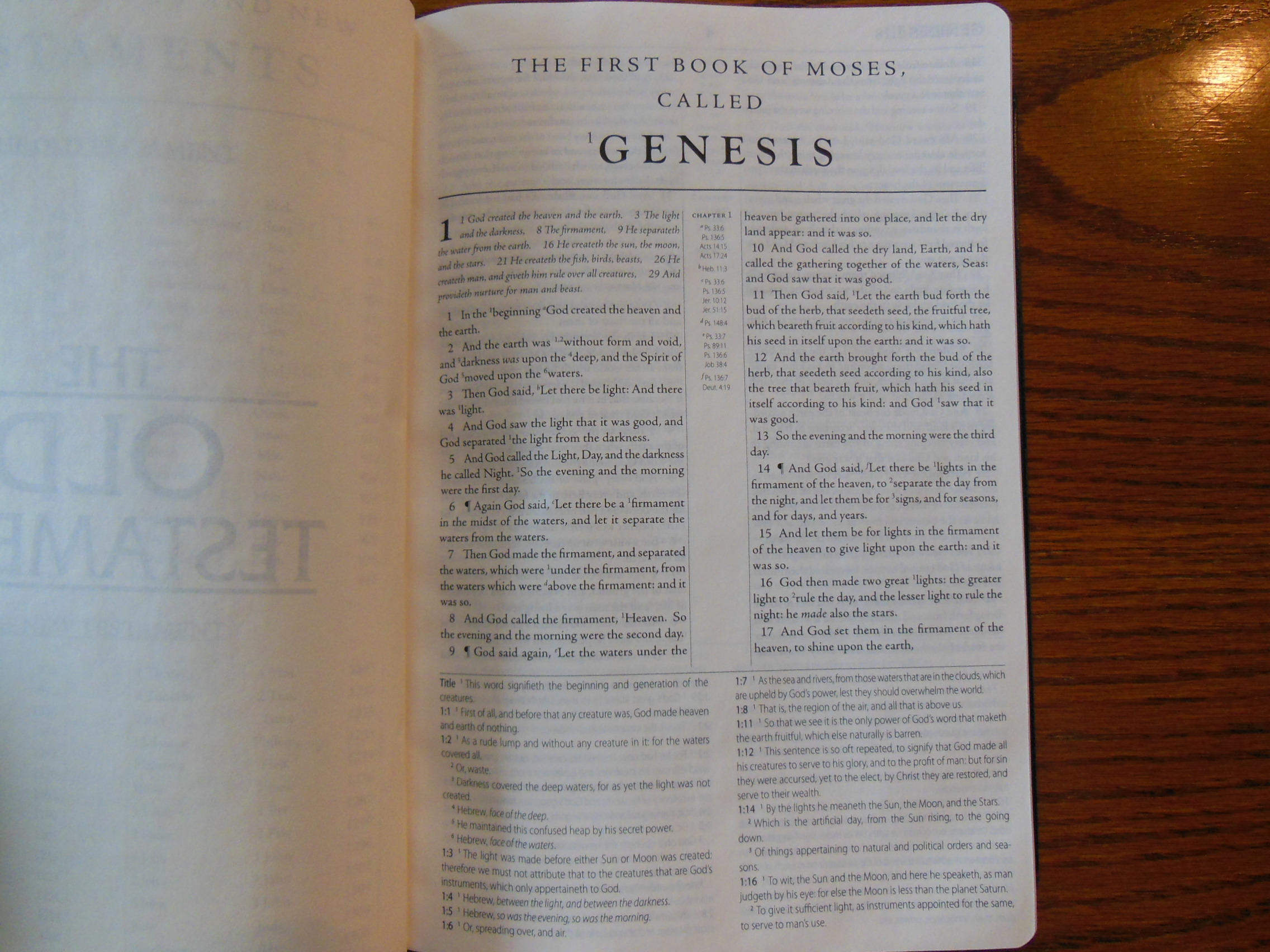
“In Genesis 2 we have the creation account of the very first human being.  In English translations of Genesis 2 this first human is simply called “man”.  This “man” is understood by most people as referring to a male human rather than to a generic human.  However, in the Hebrew text, the first “man” is not specifically referred to as a male human (ish) until after the “operation” mentioned in Genesis 2:21-22.

After the “operation”, the now male human sees the female human and says, “This one is bone of my bone, and flesh of my flesh!  She will be called ‘woman’ (ishshah) because she was taken out of ‘man’ (ish).”  The first woman (ishshah) and the first man (ish) had both been a part of, or one side of, the first human being (ha’adam).[1]  In Genesis 2:23 the man indicates that they shared the same flesh and bone.

The Hebrew word adam means “human being” – and not necessarily a male human being.  In the early chapters of Genesis it is often used with the definite article = ha’adam (הָאָדָם)  meaning “the human being” (cf Gen. 5:2).  Occasionally it serves as a proper name “Adam”, usually written without the article.[2]

In the screenshots below, I have highlighted every incidence of ha’adam (the human being) in yellow.  (N.B. In verse 5 there is no article but the context indicates that adam is not a proper noun.)[3]

I have also highlighted every incidence of ish (man) with blue, and ishshah (woman) with pink.  By looking at the screenshots below it is evident that it is not until the woman is taken out of the first human that we clearly see an ish, a male person, and not before.

Have a look.  Is it clear?”

Just because what is implied by the author could be so, doesn’t mean that it is. This is an error in logic that she has made without considering the rest of scripture.  Let’s take a look at the problem.  She assumes that the first of mankind was a creature containing both sexes or neither and that God did an, “operation” on this creature to turn the source creature into a masculine one as it was not before and then to make a feminine one from that source creature.  The scripture doesn’t support this furthermore, it definitely repudiates it in 1 Corinthians 11:1-16.  Don’t take my word for it look for yourself.

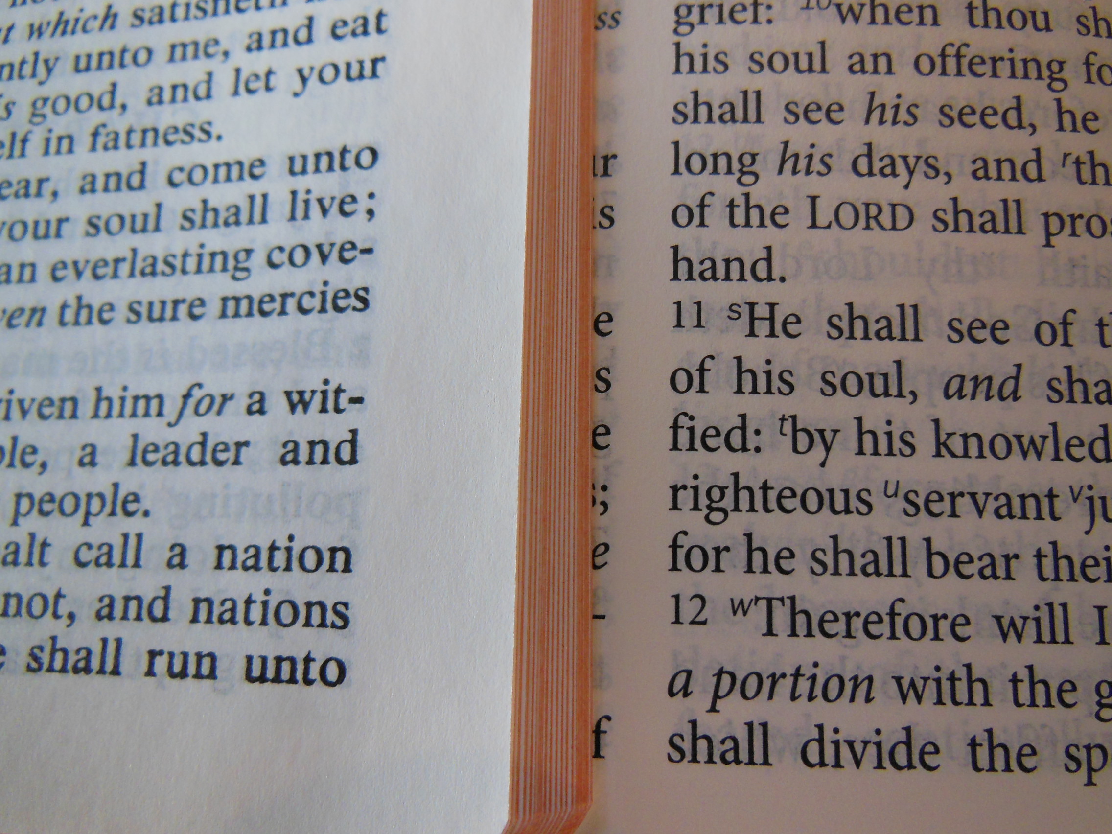
1Be imitators of me, just as I also am of Christ.  2Now I praise you because you remember me in everything and hold firmly to the traditions, just as I delivered them to you. 3But I want you to understand that Christ is the head of every man, and the man is the head of a woman, and God is the head of Christ. 4Every man who has something on his head while praying or prophesying disgraces his head. 5But every woman who has her head uncovered while praying or prophesying disgraces her head, for she is one and the same as the woman whose head is shaved. 6For if a woman does not cover her head, let her also have her hair cut off; but if it is disgraceful for a woman to have her hair cut off or her head shaved, let her cover her head. 7For a man ought not to have his head covered, since he is the image and glory of God; but the woman is the glory of man. 8For man does not originate from woman, but woman from man; 9for indeed man was not created for the woman’s sake, but woman for the man’s sake. 10Therefore the woman ought to have a symbol of authority on her head, because of the angels. 11However, in the Lord, neither is woman independent of man, nor is man independent of woman. 12For as the woman originates from the man, so also the man has his birth through the woman; and all things originate from God. 13Judge for yourselves: is it proper for a woman to pray to God with her head uncovered? 14Does not even nature itself teach you that if a man has long hair, it is a dishonor to him, 15but if a woman has long hair, it is a glory to her? For her hair is given to her for a covering. 16But if one is inclined to be contentious, we have no other practice, nor have the churches of God.

In v. 7 God explains that man is the image and glory of God; but woman is the glory of man. We can see the plain meaning of scripture here.  Then the Greek word, “ἀνὴρ aner” is used in v. 8  it is specifically, “man.”  Read how woman came from man according to God through Paul.  So either God is confused or the egalitarians are willfully in rebellion against the God of scripture and their God given roles, or God is confused and doesn’t remember what He said in Genesis, or Paul was just a sexist member of the patriarchy trying to keep women down…  Really people?…  I mean, seriously?  Just repent, accept what God says in His word and conform to His word and will.  Then v.9 hammers it home, “9for indeed man was not created for the woman’s sake, but woman for the man’s sake.”  It is that simple.  To go a bit further so that the liberals don’t try to eisegete vv. 11-16 yes, men and women in Christ are all dependent on Him, and men are born of mothers, but the point in context is not the condition of procreation stated here, but rather God’s creation and it’s total dependency on Him.  If you still want to be a whiny baby I refer you to v. 16. Basically this is how it is and if you don’t like it tough.  Paul is putting it simply, “You are wrong.”  Have a good day.

p.s. if my tone seems a bit abrasive, that’s because I am irritated by all of the nonsense we have to entertain and argue against.  It seems ludicrous to me that people would keep rehashing all of the old heresies with new labels and faces.  It agitates me that people have to make apologetic answers instead of just saying, “You’re and idiot.  Sit down and be quite Sir/Ma’am.”  Ignorant people listen to these misguided guides and follow them into folly, so we have no choice, but to speak up.

Apologetics · Theology

The gospel of Jesus

what-is-the-gospel1

The gospel of Jesus. We are a sinners who deserve death and hell. He is God incarnate. He is righteous and holy. He deserves all of the majesty of Heaven and our praise. In His longsuffering He endures our hatred of Him and His law. He condescends to save us from the condemnation of hell. He is raised upon a cross, thereupon crucified. He takes our punishment upon Himself, thus satisfying the justice of God. The wrath of God is assuaged by His atoning work. We hear about what He has done for us and either believe it or not. If not, then the flames of hell are waiting for us, and rightly so, for we are fully culpable for our transgressions. If we believe, then repentance is our faith revealed and testimony to the dying world. We hate our sins and turn to Christ our redeemer, who purchased us with His sacrifice upon the cross. He becomes our Lord and Master. Sin no longer rules us. Our minds are being renewed by the reading of His word. Our hearts are transformed into new living hearts with God honoring desires. He sanctifies us as we grow in faith and knowledge of Him. We are born again. Not to live as slaves to sin and death, but to live as bondservants of Christ and holiness. Love Jesus with all of your heart, for He is the Savior!

Bible Reviews

Puritans, Pilgrims, and Reformers, a Review of the 1599 Geneva Bible from Tolle Lege Press.

1599geneva 019

Tolle Lege Press is responsible for the rejuvenating the 1599 Geneva Bible. Unfortunately not many people know about this or seem to care. (Except for Kirk Cameron)  I say it is unfortunate because I truly believe the historical importance of this translation has been overlooked for a blind allegiance to the KJV.  Many people don’t know anything about the Geneva translation.  They are happy with their King James versions.  I’ve always wondered why the KJV onlyists are so loyal to a version that was translated by order of the King to conform to the ecclesiology of the Church of England.  The royals and Church leaders were afraid of losing their grip on power.  The Bibles of that time period all relied on the Latin Vulgate to some degree as a resource for translation.  The Geneva and the KJV were no exceptions.  The KJV relied on the Geneva for reference during its translation.  The KJV onlyists are always spewing their venomous polemics towards all other versions being Papal translations from Rome.  It is disturbing that they can suspend rational thought in regards to the KJV, but seem rational most other times.

The Geneva was translated by the Reformers. They had to flee to Geneva so that they wouldn’t be martyred by the Roman Catholic Church and Bloody Mary.   John Calvin and John Knox are most often credited for the Geneva translation.  There were other individuals working with them in Geneva to make this translation.  The notes and references of this Bible are retained and printed in modern font.  They are printed on the bottom of the page like a modern study Bible.  These notes are what made this translation such an enemy to the Crowns of the King and the Pope.  You have to understand that the Roman Catholic Church was in the business of hunting down and killing the reformers.  Then Puritans were persecuted for believing what the reformation brought to fruition.  This is what led to them becoming pilgrims.  They fled to America hoping to live God honoring lives obedient to His word.  The Bible they took with them was the Geneva Bible.

For more on the Geneva’s history visit this site; http://genevabible.com/

Here is a short youtube video about it as well; http://youtu.be/Nq1YhU8cGko

Don’t mind the trolls. They keep complaining about some pagan imagery on the cover, but I don’t see any.  I’ve asked them specifically and really haven’t gotten any answers other than, “You’re going to Hell for using anything but the KJV heretic!!!”  and now for something completely different, how about the review of the 1599 Geneva Bible?

The 1599 arrived in a cardboard box.

1599geneva 011

Inside was the Bible in its retail 2 piece box.  The cd-rom contains searchable, printable PDFs of the Geneva Bible, plus the Apocryphal Books and Metrical Psalms, was also in the retail box.

1599geneva 018

The packaging was sufficient to ensure the Bible was delivered without being damaged.  Tolle Lege did a wonderful job of giving the 1599 a modern typography.  They placed all of the references and notes at the bottom like a modern day study Bible.

1599geneva 043

The Bible is printed on some pretty opaque paper.  It is off white and a bit more rigid than most Bible papers I’ve seen.  I don’t know what kind of paper it is for sure, but it seems suitable.  The text is printed in a double column verse format with an 8 point font.  The notes are printed at the bottom of the page like a modern study Bible.  Chapter numbers are larger and in bold print.  The pages are bound in a sewn binding done here in America.

1599geneva 027

The sewn binding makes up for the bonded leather cover.  I can’t begin to tell you how much I detest bonded leather.  I would much rather see a hardcover or trutone fake leather cover.  Of course if this Bible came in a top grain cowhide or goatskin cover with sewn edge lining of leather it would be great.  The cover is lined on the inside with white paper that is glued down.

1599geneva 028

The front outer cover is decorated with, “1599 Geneva Bible” at the top and some kind of flower on the bottom.

1599geneva 019

I imagine that these are the pagan symbols the kooks are upset about.  Who knows?  The spine is also gilded with the same as is on the cover except on the bottom of the spine is the Tolle Lege logo.

1599geneva 020

The sewn binding makes this Bible open better than it would without it.  It doesn’t open as nicely as it could with a better cover.

1599geneva 025 1599geneva 026

The binding doesn’t completely stop the pages from folding closed on you while you are reading.  This is only just out of the box, brand new.  As I used it this problem went away.  It also will make this Bible hold up much better.

1599geneva 056

There is one black ribbon marker.  The page edges are gilded.

1599geneva 022

There is a Middle English Glossary in the back and several prayers including morning and evening.  There is a purely subjective quality about this Bible that makes me want to sit and read it.  The combination of the size, weight, paper, and layout, make sense to me and I find it easy to read.  Now just because that is the experience I have with it doesn’t mean I expect everyone to agree with me so don’t go launching fiery darts at me.  This Bible should be a part of every Christian’s library.  If you don’t have one, go get one.

Don’t get this Bible confused with the 1560 facsimile Geneva Bible.  This one is actually useful for daily reading.  The 1560 is a little tedious.

Bible Reviews

The Perfect Size Bible to Sit and Read, The Cambridge KJV Concord Reference Bible in Black Edge-Lined Goatskin Leather, Red Letter Edition.

cambridge kjv, holman ministers kjv and funky lil kjv 011

Before I get into the vital features of this Bible I want to expound on its subjective qualities that have endeared it to me. At first glance most people won’t notice the exceptional quality of this Bible until they pick it up and give it a closer look.  Some folks won’t even notice even after picking it up.  That is not to say the Cambridge Concord Reference Bible is average or plain.  It is because the Concord is how a Bible is supposed to be.  It is the quintessential archetype of reference Bibles.  It smells like a Bible, it looks like a Bible, and it feels like a Bible.  When I pick it up to read from, I don’t have to struggle with it.  It does exactly what it should do.  It stays out of the way and allows me to focus on reading God’s word.  Everything about it is conducive to that end.

For me, it is the perfect size and weight to hold in one hand. I can comfortably read it while sitting in my favorite chair.  It isn’t heavy or unwieldy enough to require being laid on a table or desk.  It isn’t so small as to necessitate being held close.  It is not a thick Bible, yet contains many references and some helps.

cambridge kjv, holman ministers kjv and funky lil kjv 012

It is not printed on such light paper that the pages curl up and blow around while you are trying to read.  The pages are not a bright white.  They are off white.  Bright white pages tend to make my eyes strain during long durations of reading the word.  The India paper is strong and opaque.

There is approximately 7/16ths of an inch in the margins for note taking.

cambridge kjv, holman ministers kjv and funky lil kjv 044

The text is a nine point font that is printed appears pretty bold.

cambridge kjv, holman ministers kjv and funky lil kjv 043

The Concord is a double column verse format with pronunciations.  It has the references in the center column.

cambridge kjv, holman ministers kjv and funky lil kjv 041

Even with the references, 128 page Bible Dictionary, Concordance, Glossary, and 15 color maps, the Concord maintains a thin profile without sacrificing paper quality.  The pages are art gilded.  An art gilded page edge compared to a gilded page edge looks a bit more attractive.  It gives the page edges a red tint behind the gold color.  Before they put the gold colored aluminum foil on the page edges they first coat them with a red ink.  Then they apply the gold color gilding.  When the Bible is closed the edges show gold, when the Bible is open you can see the red show through the gold.

cambridge kjv, holman ministers kjv and funky lil kjv 015

The binding, outside cover, and inside liner, make it supple and comfortable to hold.  This one is edge lined not case bound.  It is rigid enough to not flop around like some unlined Bibles do, while it maintains flexibility with its synthetic liner that is stitched to the outside cover edges with black thread.

cambridge kjv, holman ministers kjv and funky lil kjv 016

The Binding is a smyth-sewn binding done by Jongbloed in the Netherlands.  They are famous for their quality work and history of Binding Bibles.  Currently, most luxury Bibles are bound by Jongbloed.  A sewn binding is a must in my opinion.  If you hope to hand a Bible down to your children and for them to use it a sewn binding is the only option.  With a sewn edge lined binding all of the pages are stacked in separate pamphlets called signatures.  These are then stacked and sewn to tapes or strings in the spine of the Bible as well as being sewn to each other.  This is why you don’t have the front and back pages falling out of a sewn binding like you would with a glued case bound perfect binding where the pages are cut, then stacked, then rubber cemented together.  Those pages are not connected to each other in any way.  If you bend the spine in a glued Bible, eventually pages will start falling out.  Not so with a sewn binding.  If you take care of it and treat it with respect it will last and last.  The other benefit of this binding is the functionality of it.  The Concord lays flat right out of the box.

cambridge kjv, holman ministers kjv and funky lil kjv 047

The cover doesn’t flop up and get in the way.  The covers can be rolled backwards and out of the way even.  I wouldn’t do this as a practice, but that is how flexible this Bible is.  This particular Bible is a red letter edition.

cambridge kjv, holman ministers kjv and funky lil kjv 048

That simply means that the words of Jesus are printed in red text, including places where He is quoted by the apostles.  Some people find this to be a very helpful feature.  The Concord has two black ribbon markers.  They are good quality without being too thick.

cambridge kjv, holman ministers kjv and funky lil kjv 046

I have had some Bibles with thicker markers that actually imprint on the pages they are between.  I have had other Bibles with markers that were so thin that they crinkled up and are almost useless.  It is very unattractive to open the Bible up to crinkled pages or markers.  The Concord has neither problem.  The Bible ships in a clamshell type retail box.  I would keep the Box for storage.  This Bible is to supple to stand on its edge.  It should be laid flat on a flat surface when not in use.  There was a slight problem with the shipping.  You can read about that here.

cambridge kjv, holman ministers kjv and funky lil kjv 004

Cambridge has assured me they are looking into this and it shouldn’t happen again.  This Bible is as pretty close to being perfect.  If Cambridge would produce this in an NASB I would be satisfied.

Here are a few good places on the web to purchase this Bible if you are in the market.

evangelicalbible.com

Amazon.com

Christianbook.com

Cambridge.org

Here are a few pictures of the Concord compared to the TBS Westminster

1599geneva 010 1599geneva 009 1599geneva 008 1599geneva 007 1599geneva 006 1599geneva 005 1599geneva 004 1599geneva 003 1599geneva 002 1599geneva 001

Over all, I found the Concord to be a superlative Bible. It stands out from the mass produced Chinese and Korean Bibles as an example of what they should be aiming for.

KJV Concord Reference Bible, Black Edge-Lined Goatskin Leather, Red Letter Text KJ566:XRE

Black Goatskin Leather RCD266

isbn: 9780521512978

Bible Reviews

A Pleasant Surprise from Holman, Review of the Holman KJV Minister’s Bible in Black Genuine Cowhide.

cambridge kjv, holman ministers kjv and funky lil kjv 151

Holman sent this Bible packaged in a cardboard box with some paper padding it.

cambridge kjv, holman ministers kjv and funky lil kjv 137

The retail box was inside.

cambridge kjv, holman ministers kjv and funky lil kjv 139

I had no idea which Bible they had sent me.  I didn’t remember requesting one for review.  I was pleasantly surprised by the arrival of the KJV Minister’s Bible.  When I had originally requested it they were out of stock.  It seems that Holman remembered and sent it when it became available.

When I opened the shipping box I found the retail packaging inside. Keep the two piece gift-box to store your Bible.  This Bible is so supple that it will need to be laid flat for storage.  When I opened the retail box I could see that the Bible was wrapped in a dark colored construction paper to keep it safe from being deformed.

cambridge kjv, holman ministers kjv and funky lil kjv 146 cambridge kjv, holman ministers kjv and funky lil kjv 147

I like this better than being, “shrink wrapped” with plastic wrap.  Plastic wrap has the tendency to pull the corners down and deform the cover and text block.  If the Bible arrives damaged or during use develops premature wear rest assured, Holman has a lifetime warranty on this product.

cambridge kjv, holman ministers kjv and funky lil kjv 141

I was impressed by the feel of the genuine cowhide leather cover. It was soft and supple.

cambridge kjv, holman ministers kjv and funky lil kjv 157

The Bible is edge lined not case bound.

cambridge kjv, holman ministers kjv and funky lil kjv 153

The edges of the outer cover are rolled over and sewn down.  The spine of the Bible has decorative spine hubs.  They used to be where the signature tapes or ribbons were sewn to the signatures.  The cover would have to be fitted over them which produced the raised hubs.  Now it isn’t an indicator of a sewn binding or not.  You’ll be glad to know this one does have a very flexible sewn binding.  It allows this Bible to do some pretty amazing things and come out unscathed.  It lays flat right out of the box and can even curl back under the spine with both covers at the same time.

cambridge kjv, holman ministers kjv and funky lil kjv 179

I wouldn’t make a practice of that, but it can do it.  When held open with one hand it drapes over your hand.

cambridge kjv, holman ministers kjv and funky lil kjv 177

The spine of the Bible is imprinted with, “KJV” at the top, “Holy Bible” in the Middle, and Holman’s logo at the bottom.

cambridge kjv, holman ministers kjv and funky lil kjv 149

The pages are edge gild with gold colored foil.

cambridge kjv, holman ministers kjv and funky lil kjv 150

There are two very nice quality ribbon markers in this Bible, one is red and the other is black.

cambridge kjv, holman ministers kjv and funky lil kjv 174

The pages are opaque, but could be a little more so.  They have a generous inch wide margin for adding your own notes.

cambridge kjv, holman ministers kjv and funky lil kjv 169

Wide margins are quite helpful for Pastors.  The opacity of the paper is important so that text doesn’t show through the page.

cambridge kjv, holman ministers kjv and funky lil kjv 175

While preaching and looking down at this Bible you should be able to focus on the text and not what is behind it.  The font is equally conducive to preaching.  It is a neat and clean 12 point font that is consistently inked throughout the Bible in this black text edition.  The text is arranged in a double column verse format making it easy to quickly locate verses.  Book names, chapter, and verse are printed on the top of the page along with headings.

cambridge kjv, holman ministers kjv and funky lil kjv 182

There are many aids for Pastors included in this Bible.  Here is a list of some of them; Sixty-six page KJV concordance, eight maps, Where to Turn When, Plan of Salvation, color presentation page, Various wedding and funeral outlines by Jim Henry, “Why Read the King James Version?” by Calvin Miller, “8 Traits of Effective Church Leaders” by Thom S. Rainer, “21 Essentials of Authentic Ministry” by James T. Draper, “Four Kinds of Expositional Preaching” by Ed Stetzer, “30 Keys to Giving an Invitation” by O. S. Hawkins, “Leading a Child to Christ” by Bill Emeott, “Reaching Students with the Gospel” by Lynn H. Pryor, “The Importance of Baptism and Communion” by Rick White, Commitment Counseling, The Christian Year and Church Calendar, The Apostles and Their History, and Table of Weights and Measures.  With all that this Bible offers it would be a wonderful blessing for your Pastor as a gift, even if the Pastor is your Dad.  Pastors shouldn’t feel bad about buying such a nice Bible.  It is money well spent on a product that should last for a long time.

You can purchase it on Christianbook.com, Amazon.com, or direct from Holman.

ISBN-10: 1586409301

ISBN-13: 978-1586409302

Product Dimensions: 5.5 x 1.1 x 8 inches

Shipping Weight: 2.2 pounds