I like to keep a few of my Bibles unsullied and free of notation. With some high quality Bibles it seems wrong or sinful to make marks in them. It feels like an affront to the artistry and craftsmanship that goes into them. While other Bibles I own are marked up as if a child with a box of crayons were set free on them. I feel no shame in marking up my $30 Chinese made NASB Ultrathin. It is a good sturdy Bible, but obviously there are not aesthetics there demanding appreciation. So margin notes, underlining, and highlighting abounds.
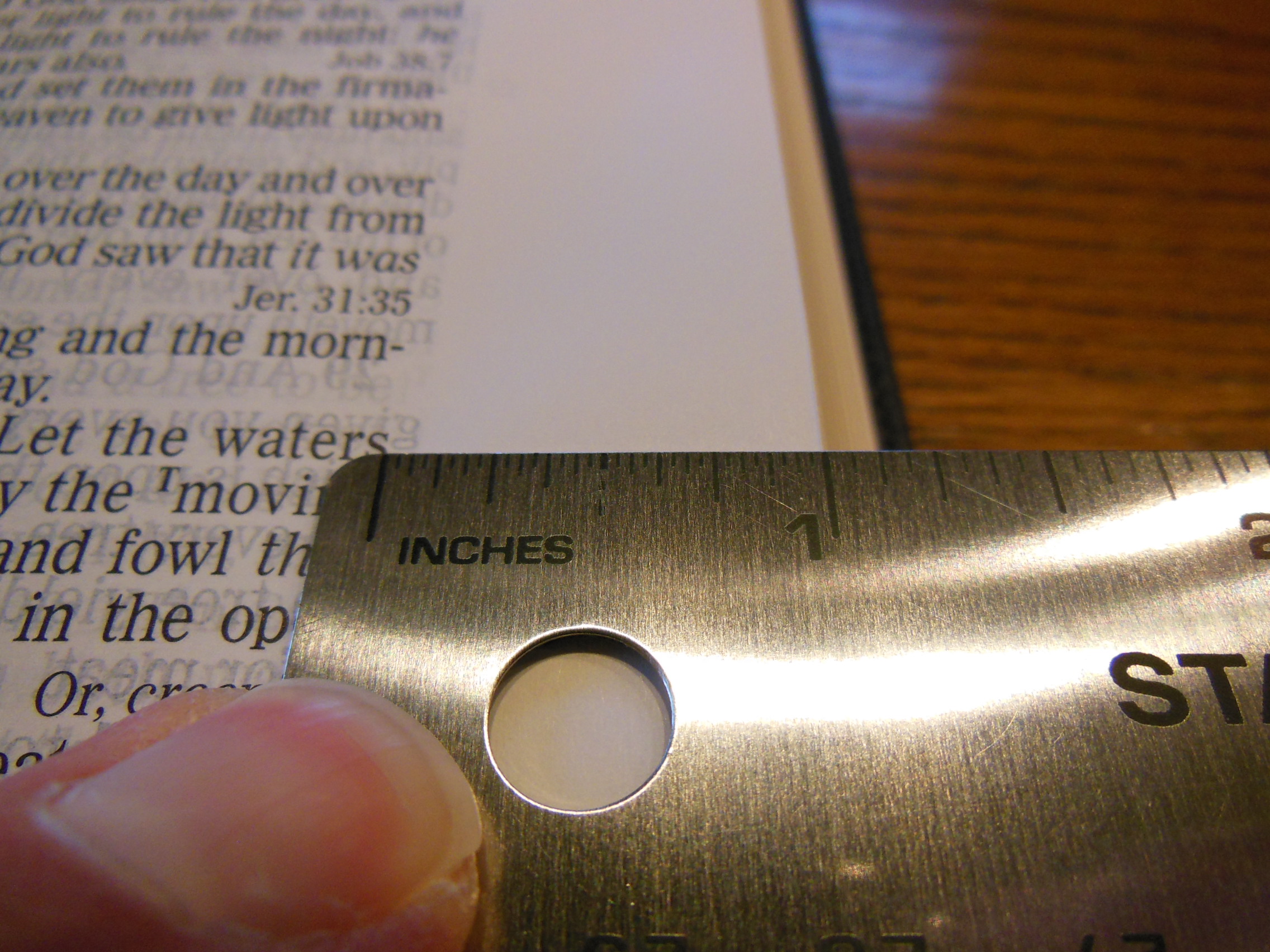
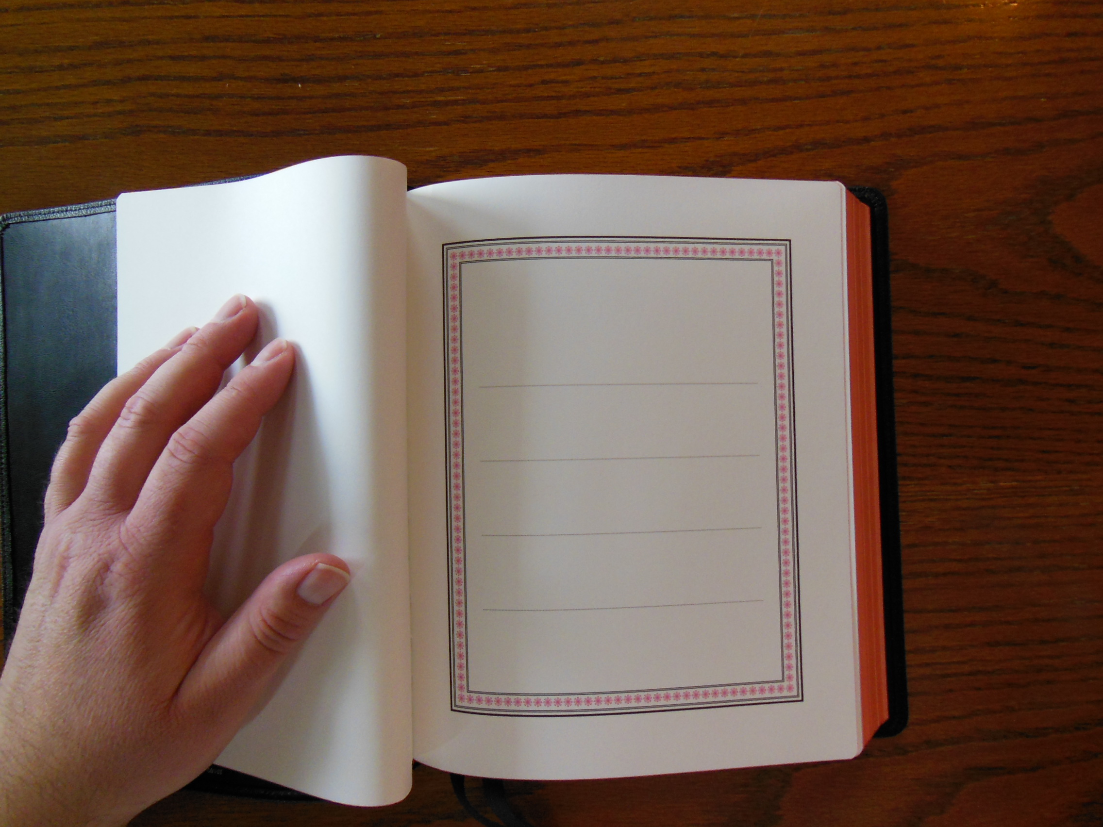
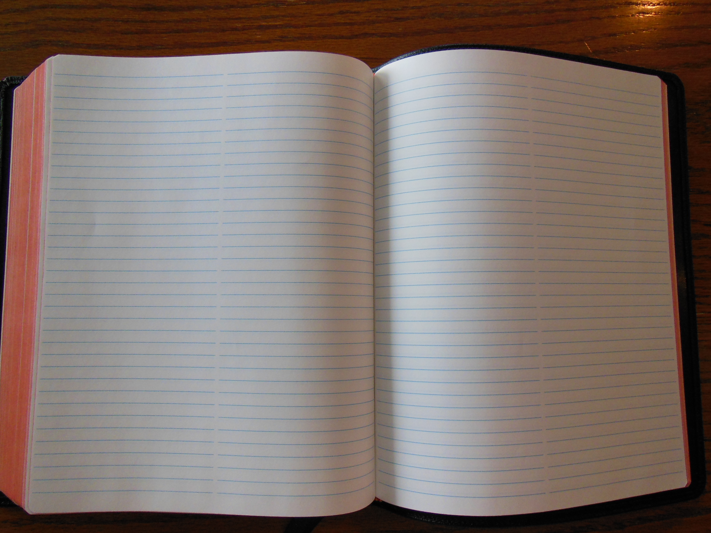
The Cambridge Wide Margin is a strange Bible. It confounds my sensibilities. It is a fine Bible, but it demands that you use it like a workhorse. Moreover, the moment you start using it, you begin to appreciate the craftsmanship, as you never would have, without the resources predisposed for your notation. Besides the 1 5/16” outside margin, you have 32 pages of ruled note paper in the back, and blank index pages with alphabetical headings, so you can compile an index of your own as well. To have a wide margin Bible is one thing, all you need is wide margins, but to have a Bible that you can utilize to make your own study Bible is another.
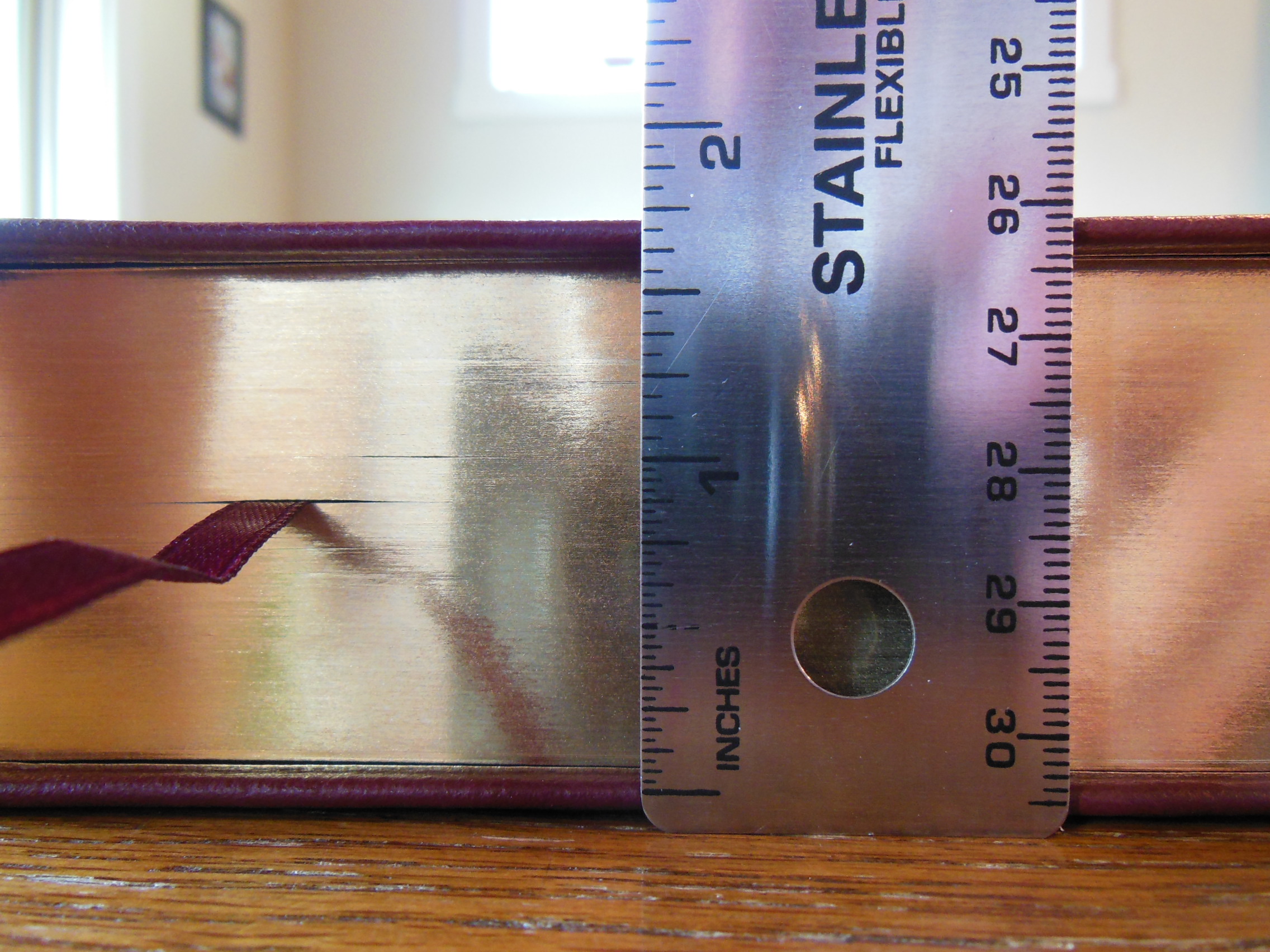
When I took this Bible out of the box and first held it I was concerned that it was too wide. That was my first impression. I failed to take into consideration the purpose of this Bible. I put the Wide Margin next to my MacArthur Study Bible and was a bit shocked to see that it was only very slightly wider. This type of Bible is meant to be written in. Its natural habitat should be a well-lit desk or table. The type of work that is going to be needed to complete the endeavor the owner of this Bible has embarked on will take many several hour sessions of focused study and notation. I don’t see that happening from one’s easy chair. No, a task this daunting requires a quiet well lit sanctuary alone with God’s word. Picture a monk hunched over, with quill in hand, doing a scribe’s work by candle light in some cold stony abbey, or perhaps his modern counterpart the scholarly theologian, at some stuffy seminary quartered away in an office, in much the same fashion as the monk, only with better lighting, heating, and cooling. Well, that might be how you would see yourself using this Bible for its intended purpose if you were so bold.
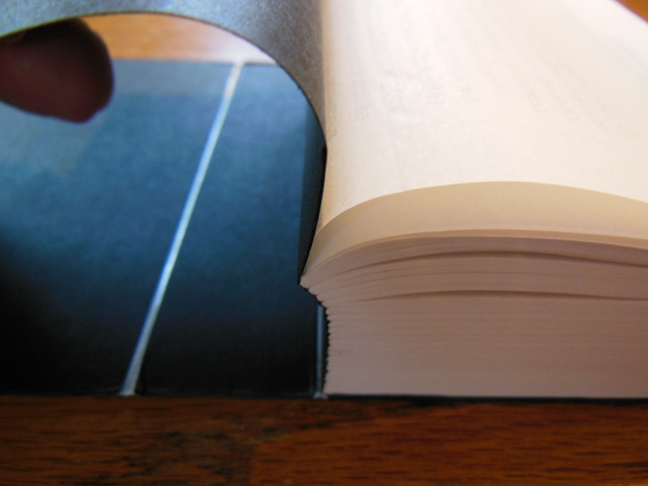
Bold enough to actually put your thoughts down on this beautiful Bible paper. It is nice opaque and over 30 gsm.
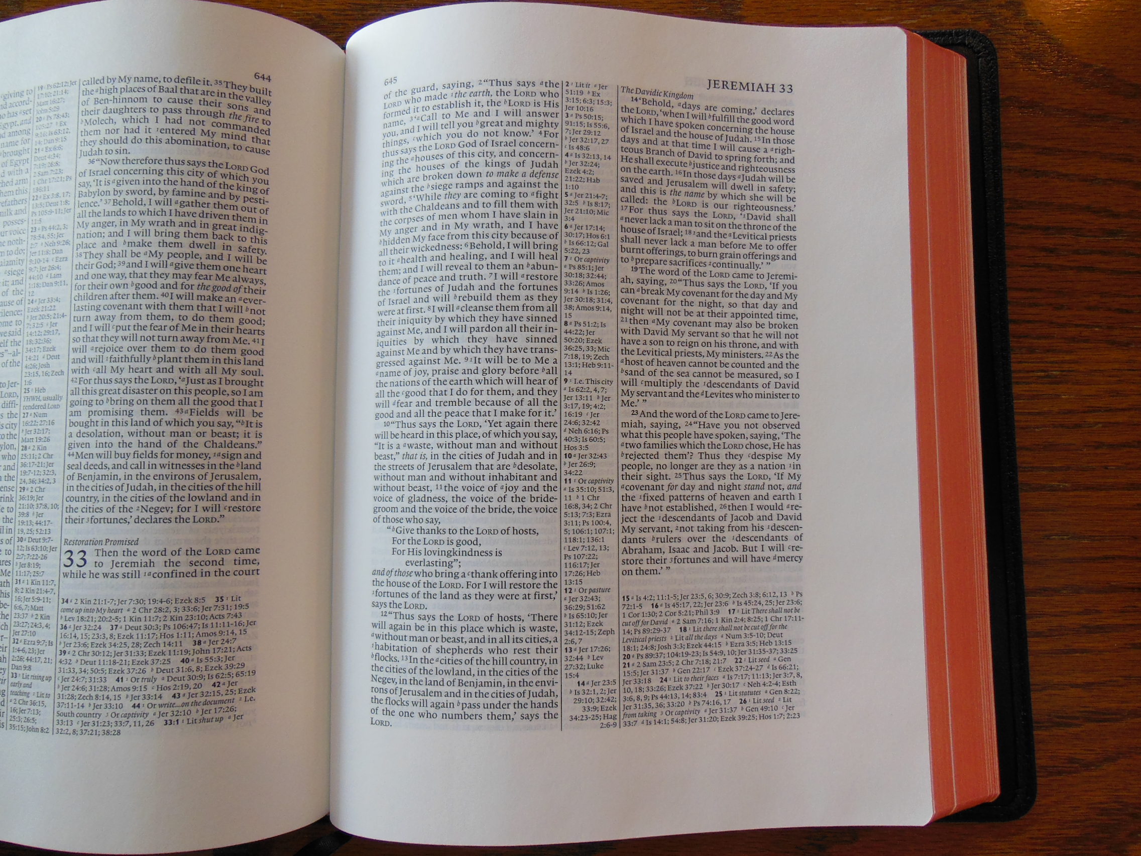
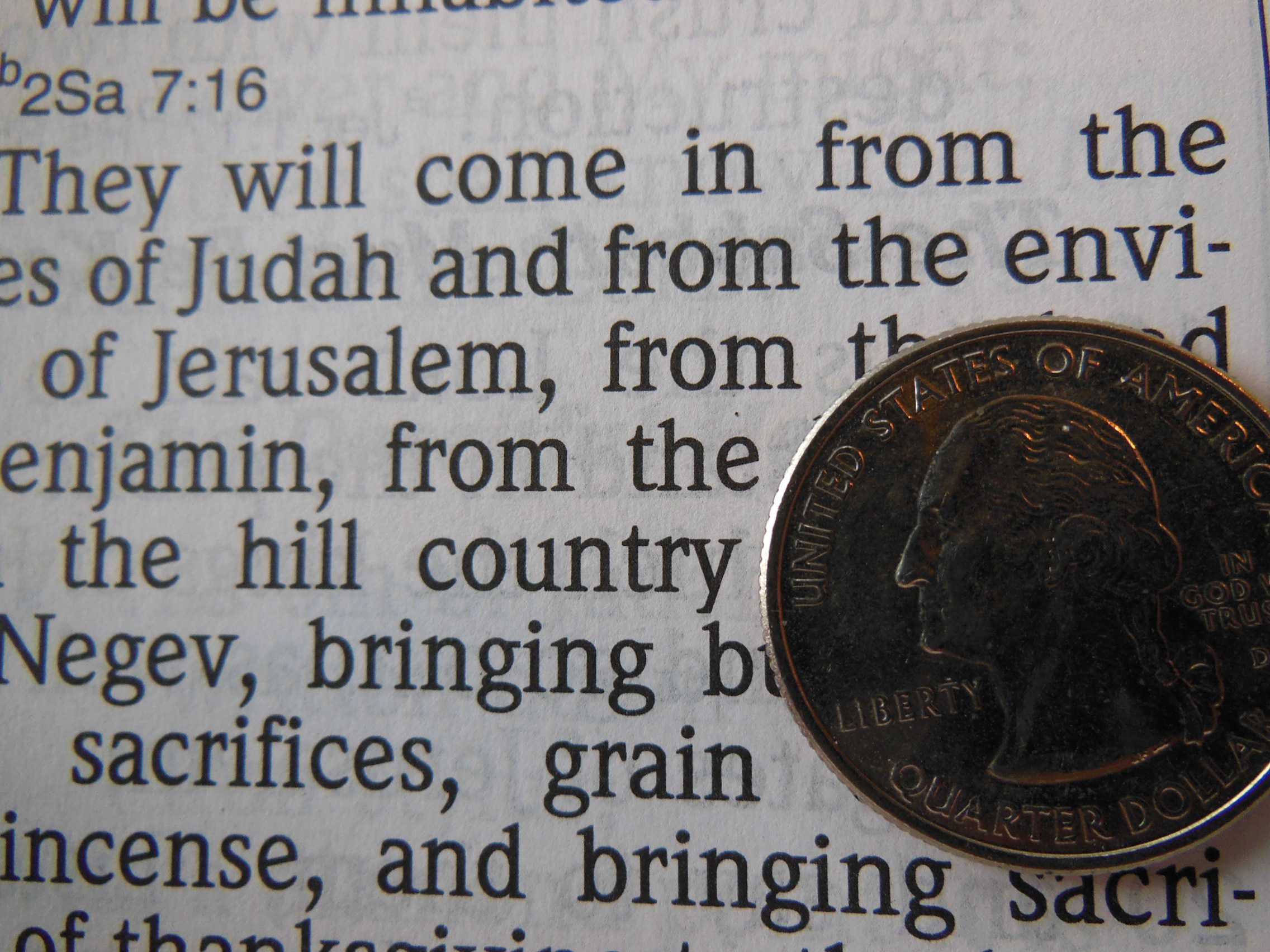
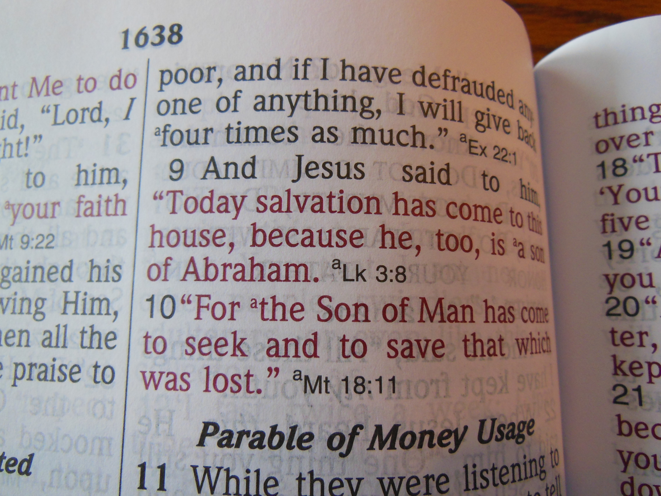
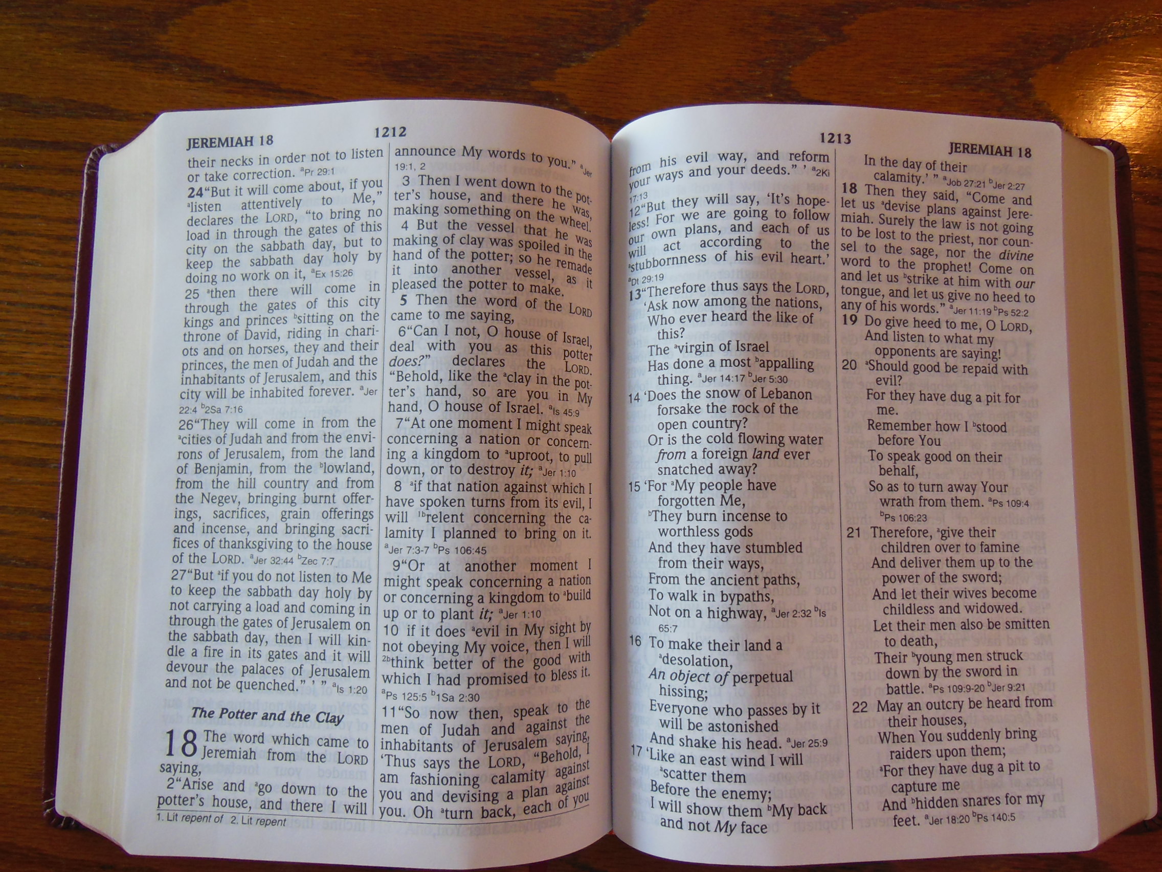
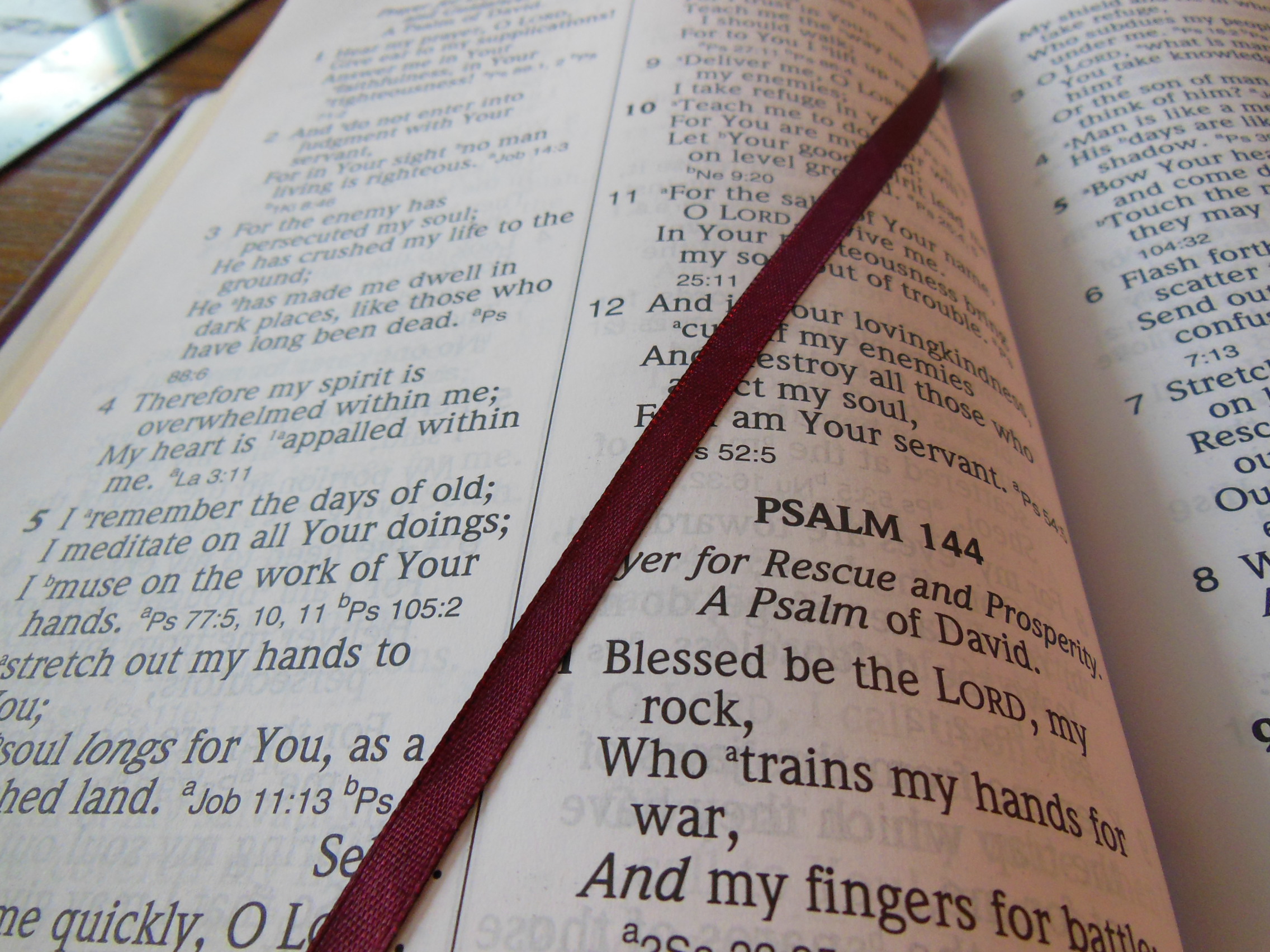
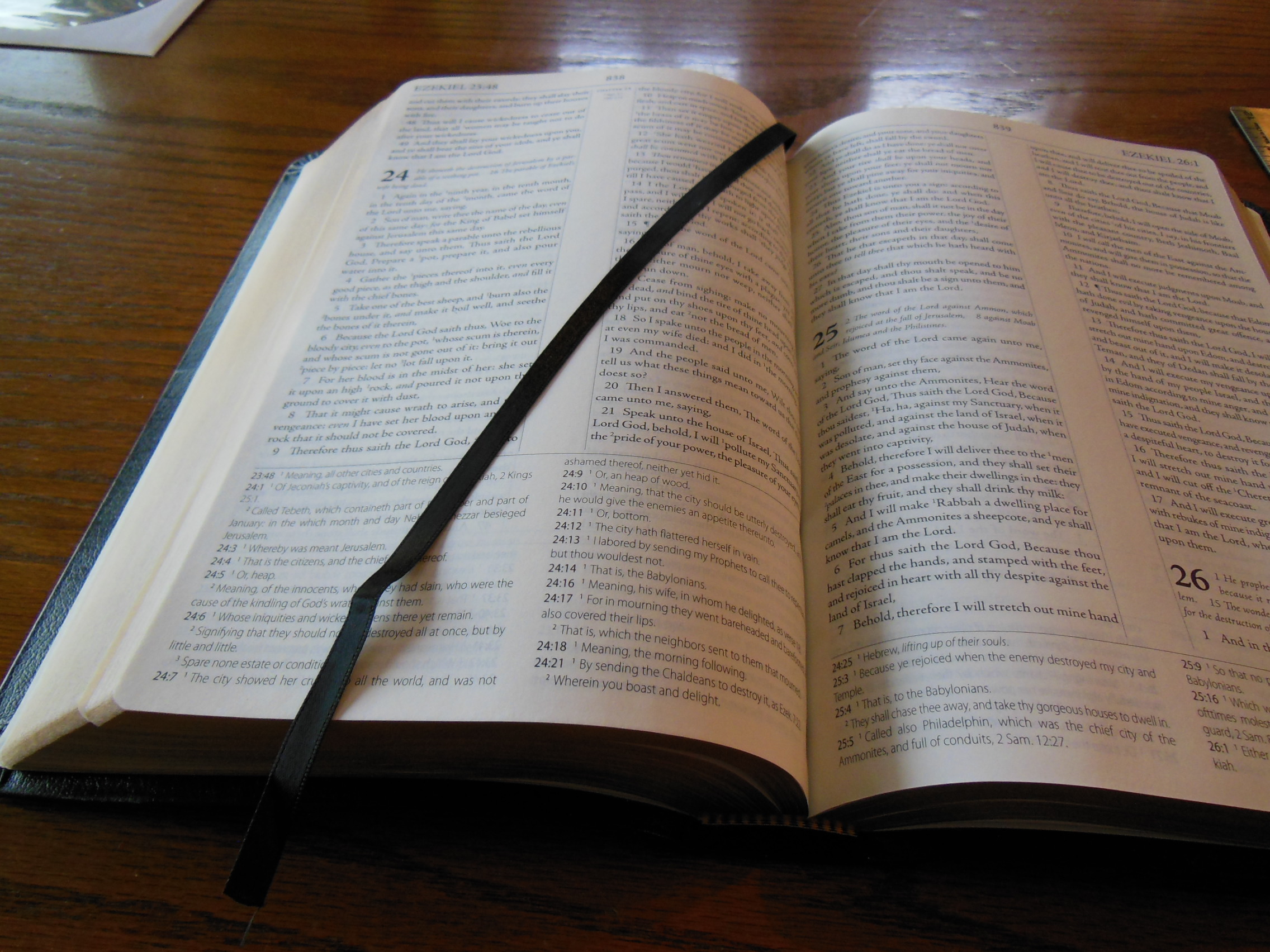
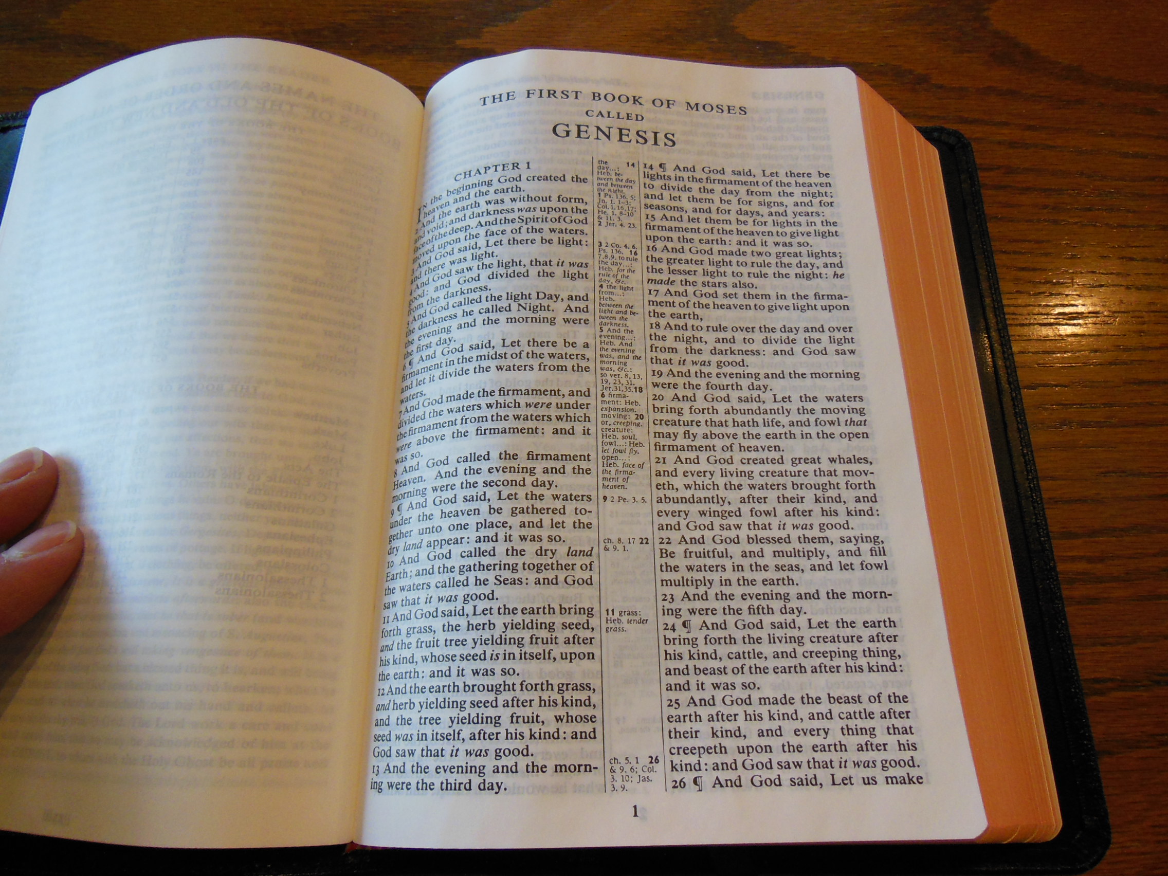
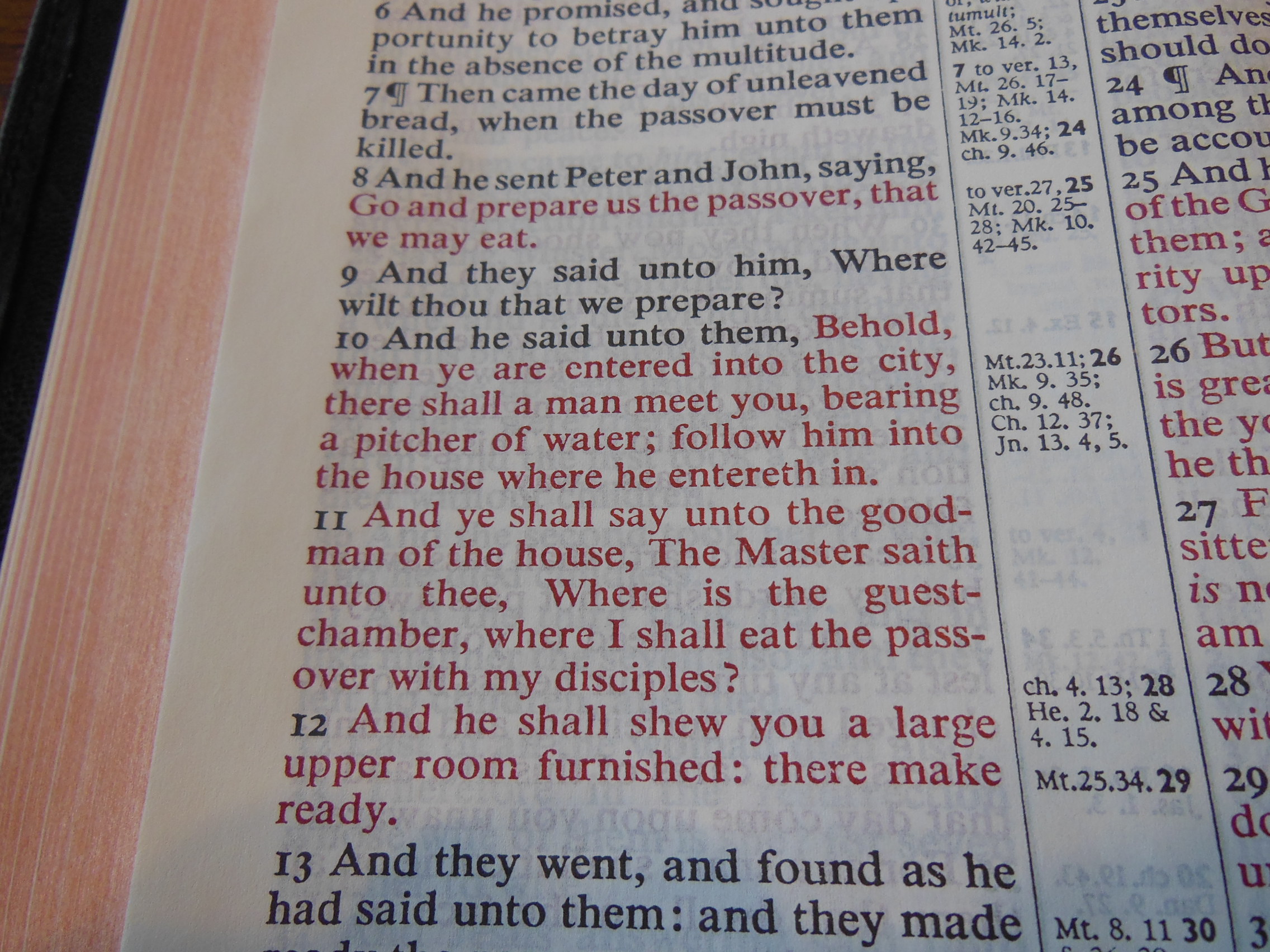
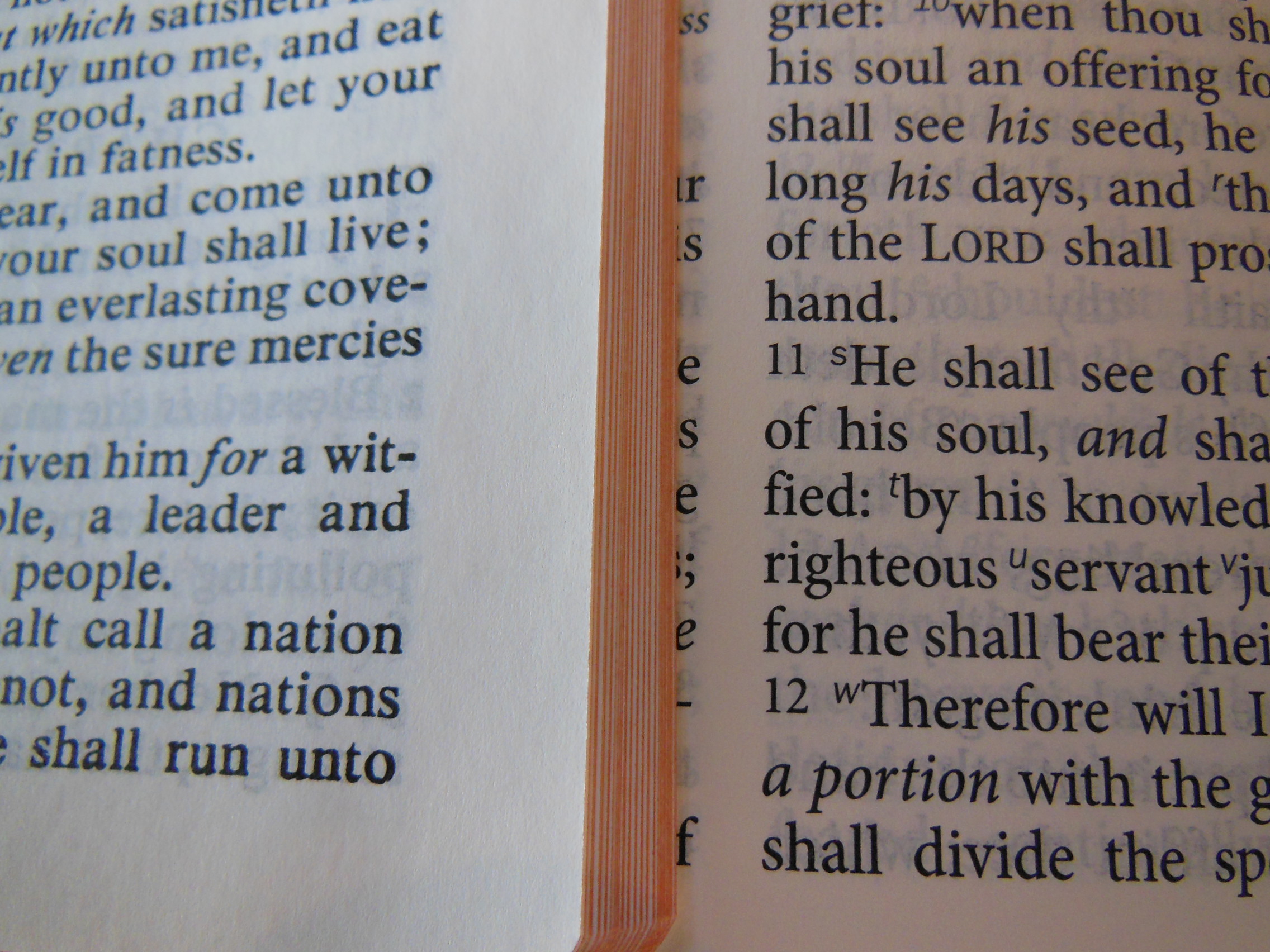
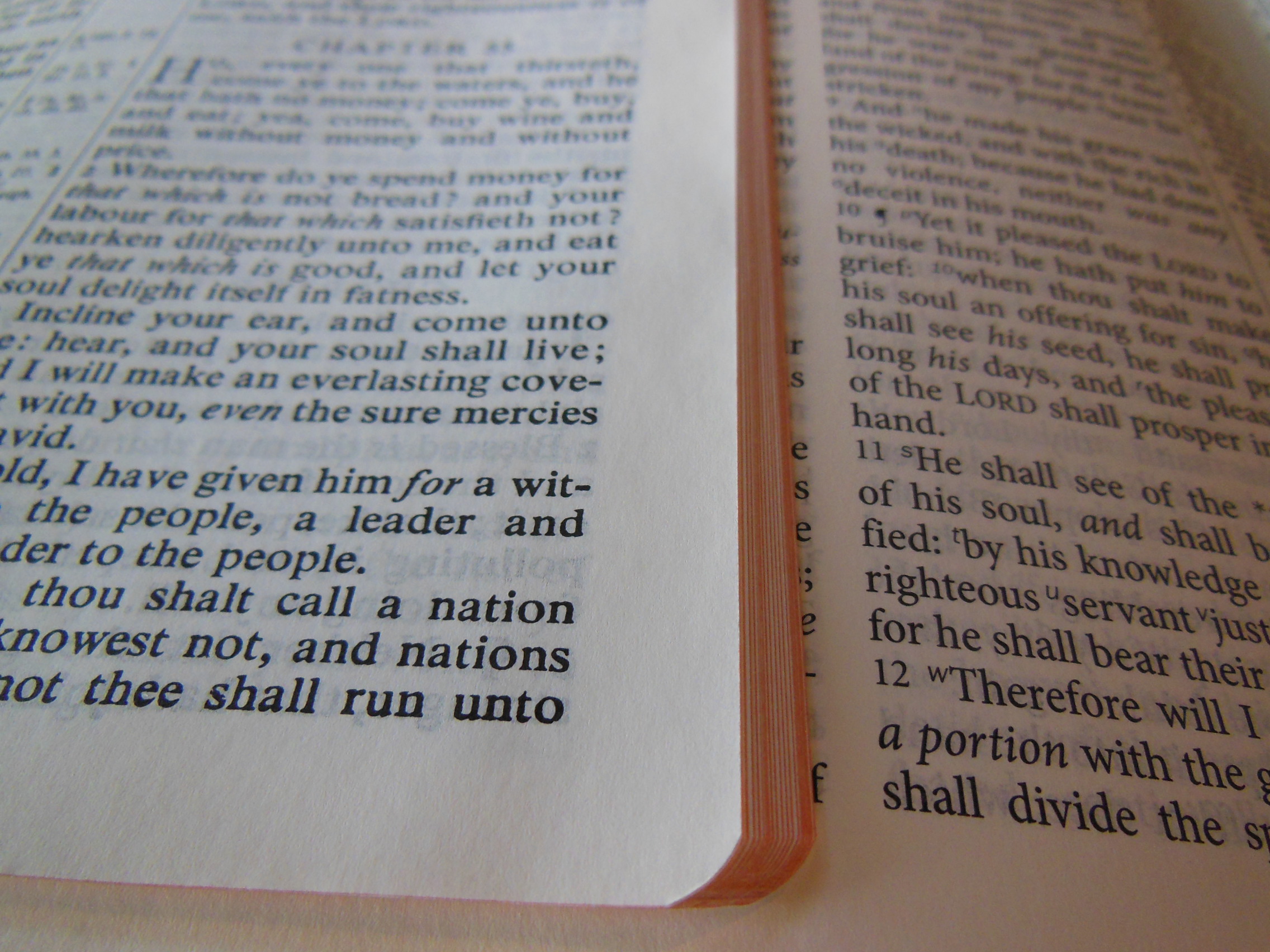
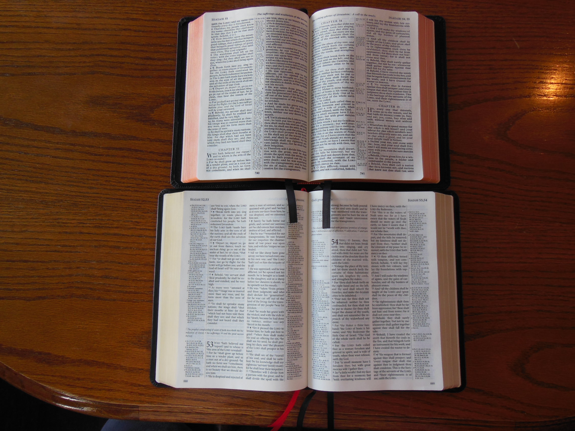
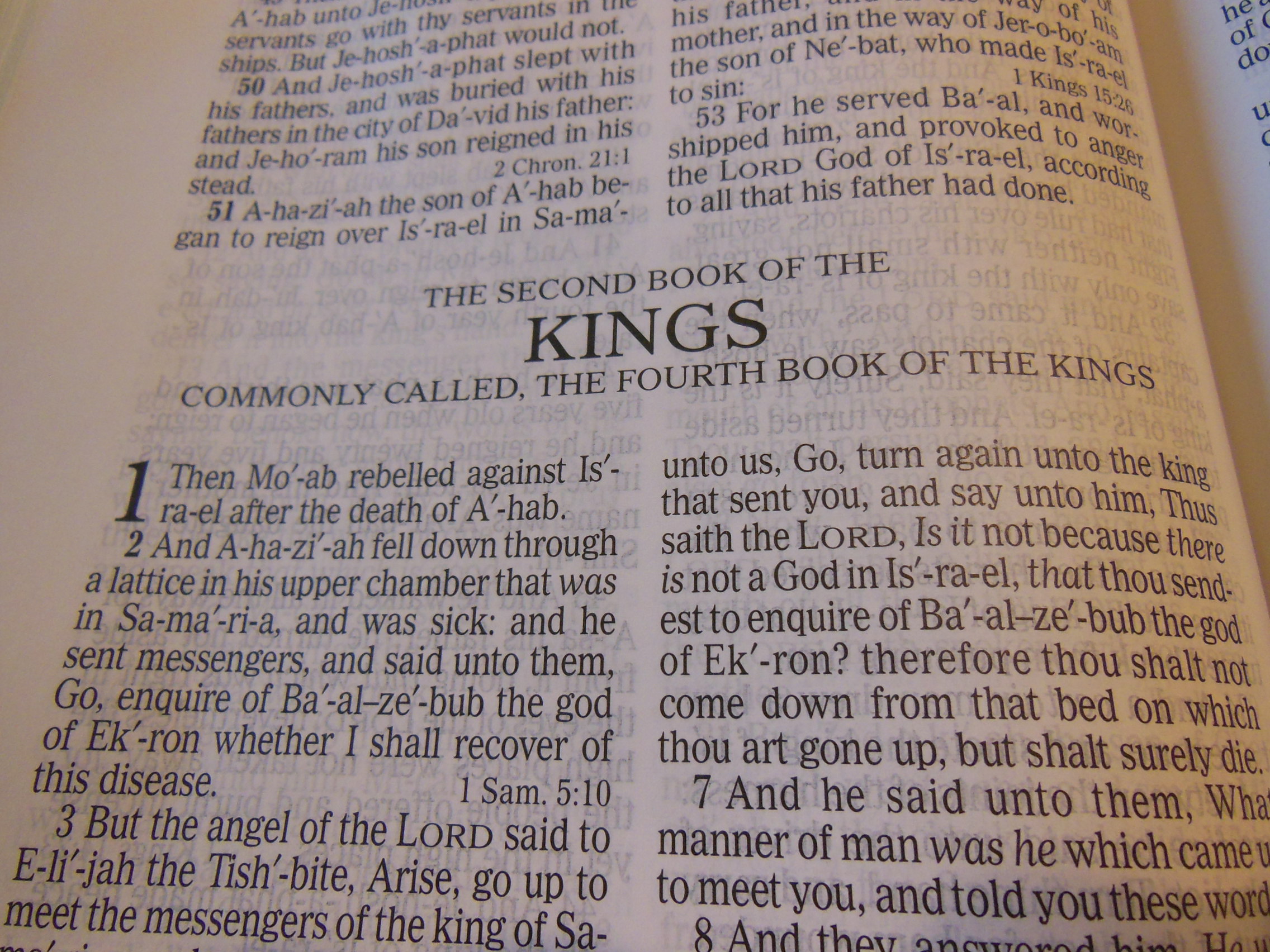
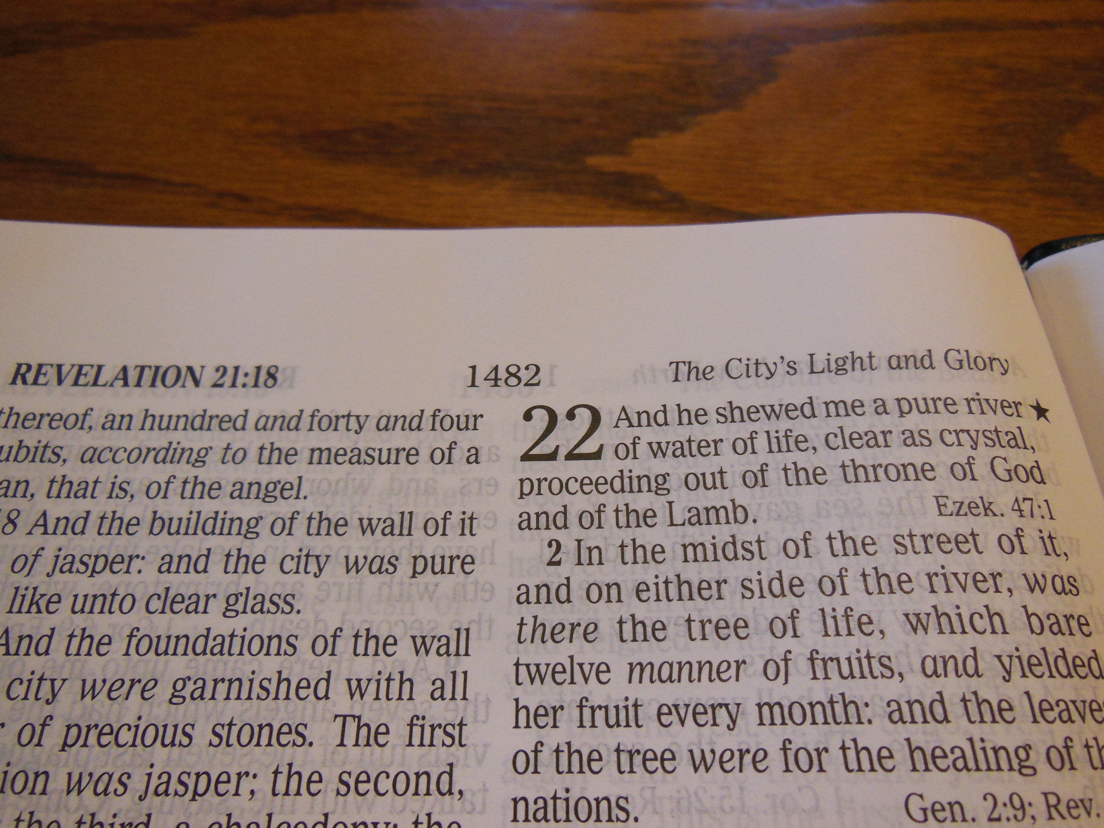
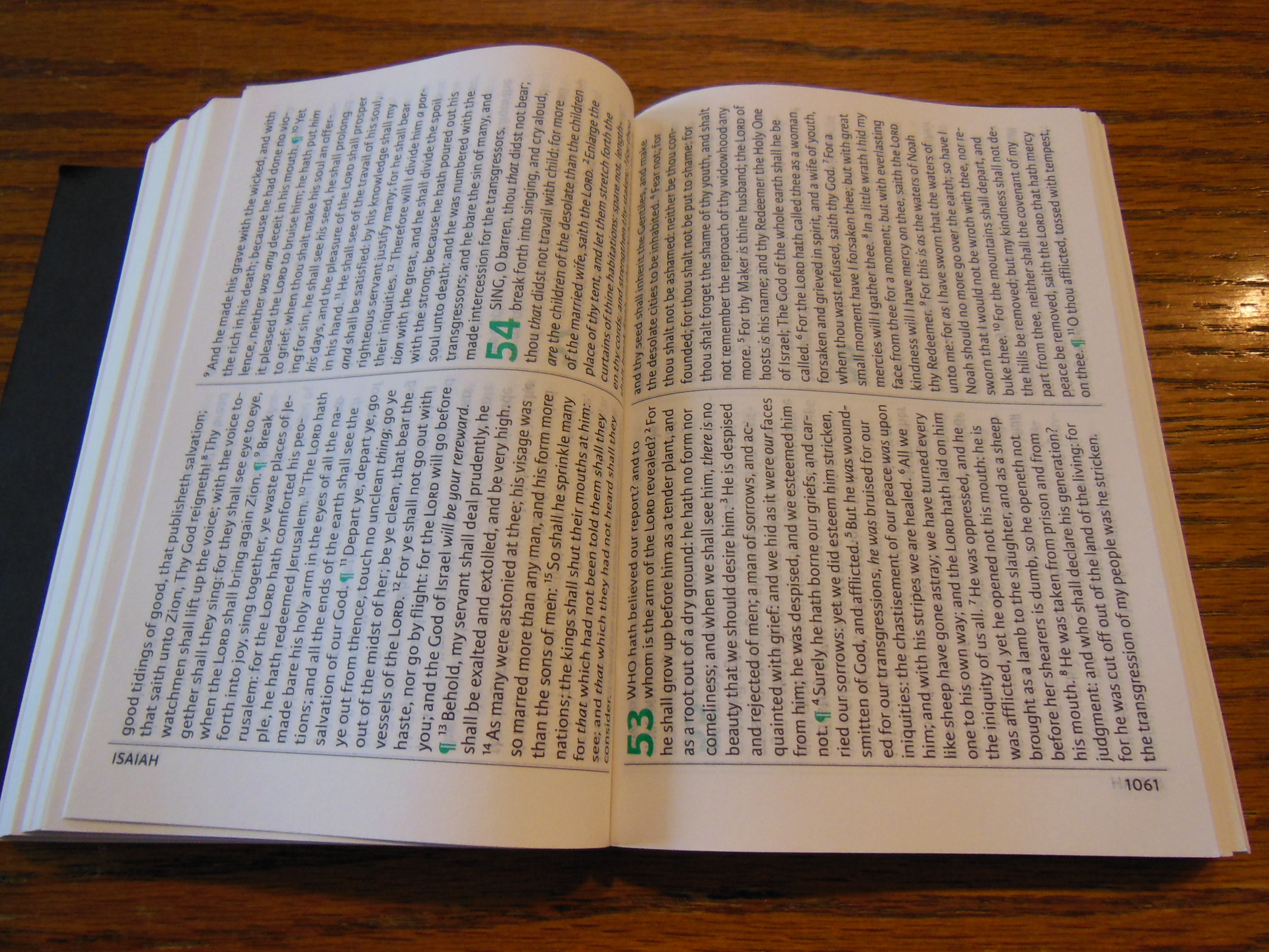
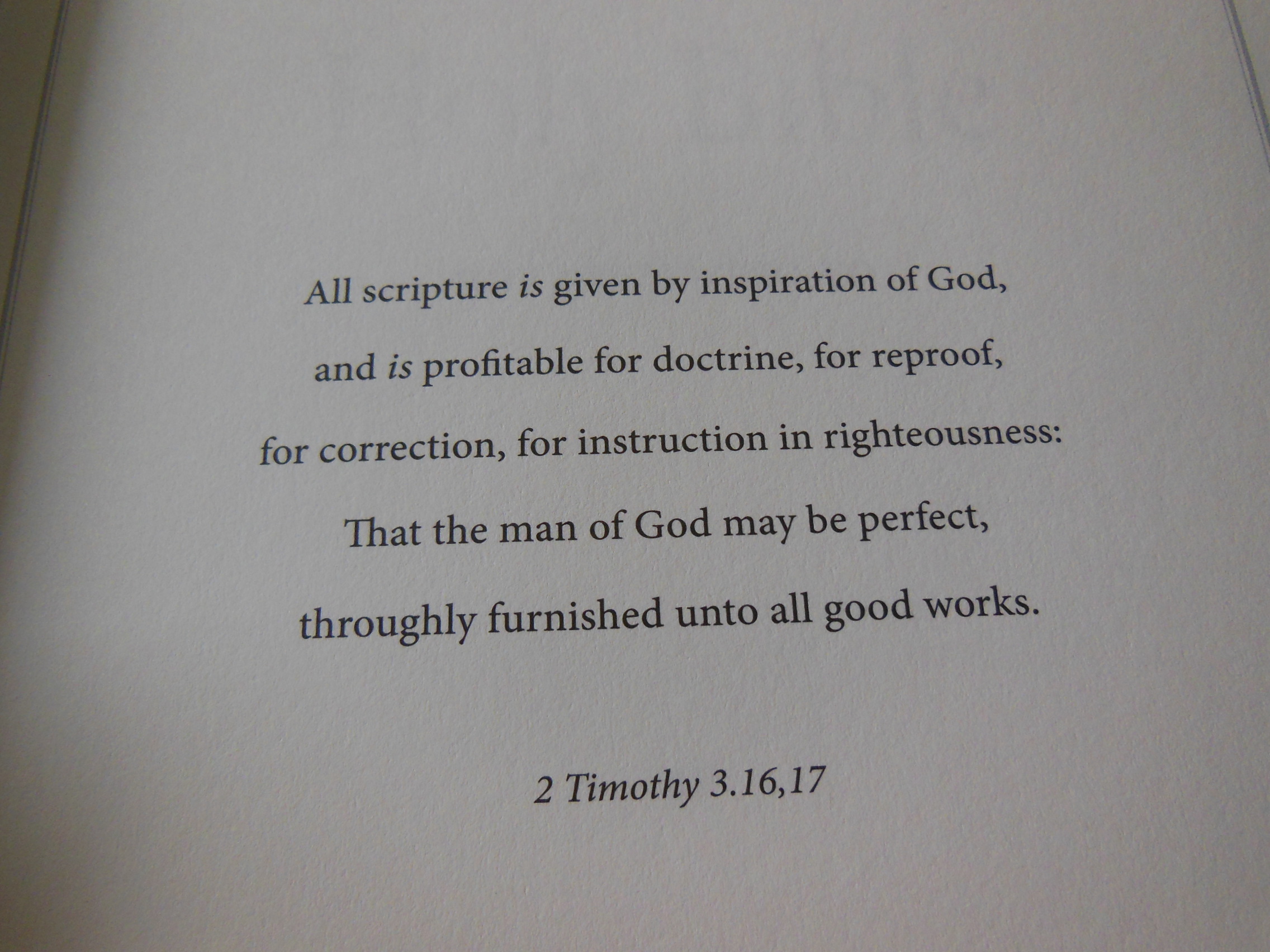
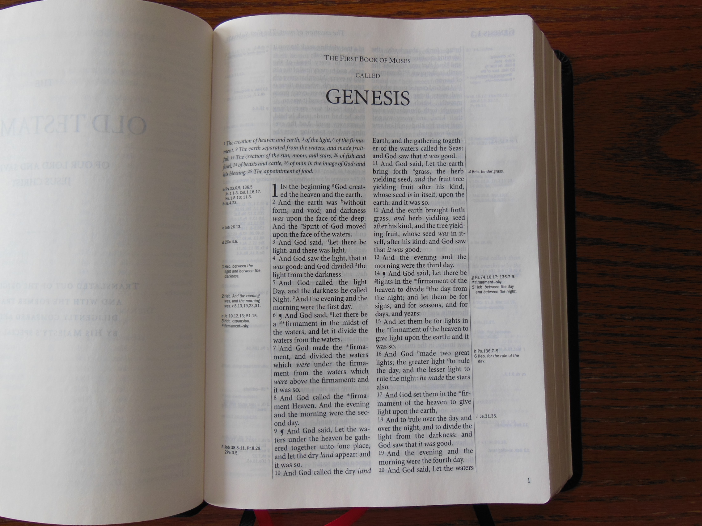
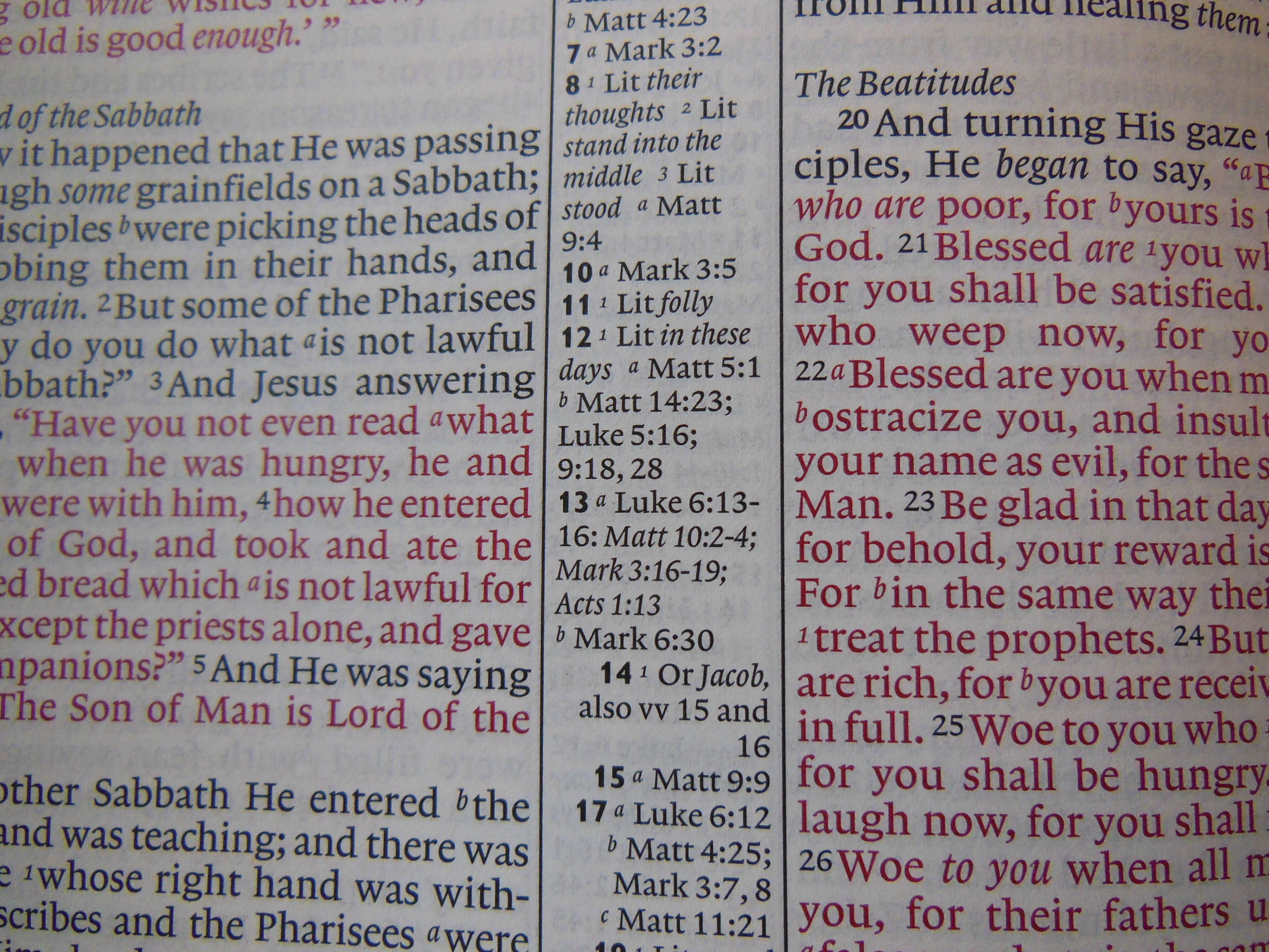
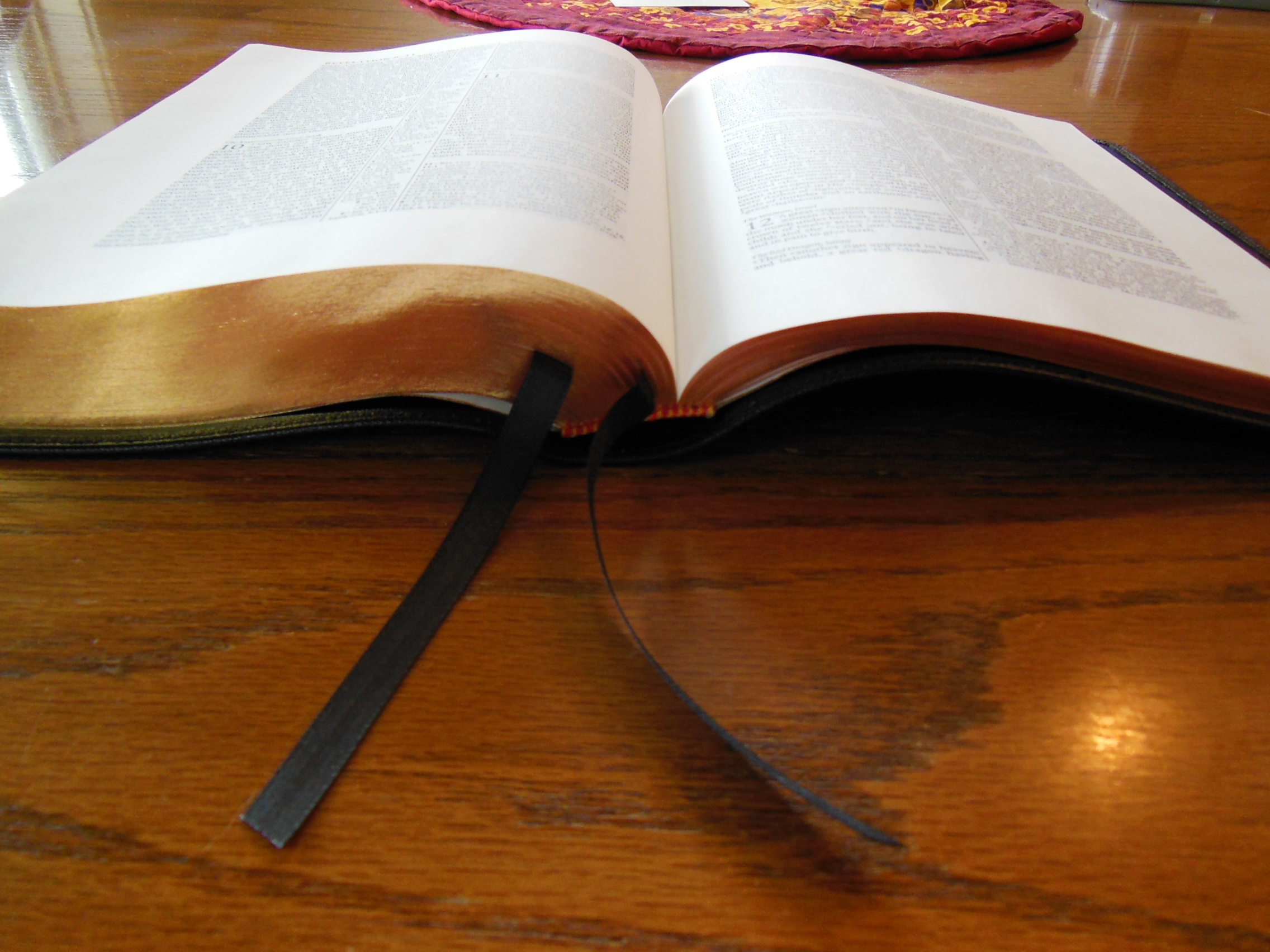
The quality of the paper will help to keep your notes from bleeding through the page. The color of the paper is off white making for a good contrast between it and the sharply printed text. The text is 8 point font in black and the words of Christ are in red. The red text is printed uniformly and sharply like the black. The text is arranged in a double column paragraph format with center column references.
If the references weren’t there the outer margins could have been closer to two inches, giving you more room for your notes. As it is the references are useful. I think the only way you could do more with a Bible is if you purchased a loose leaf Bible. Most of us will probably opt for a wide margin instead.
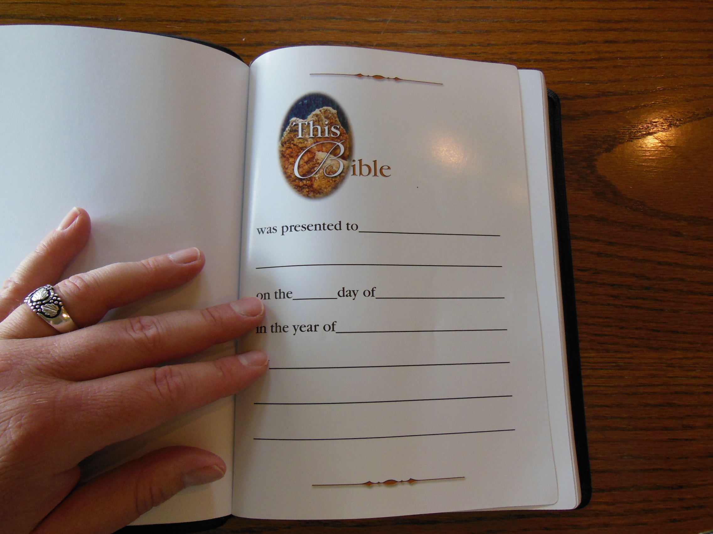
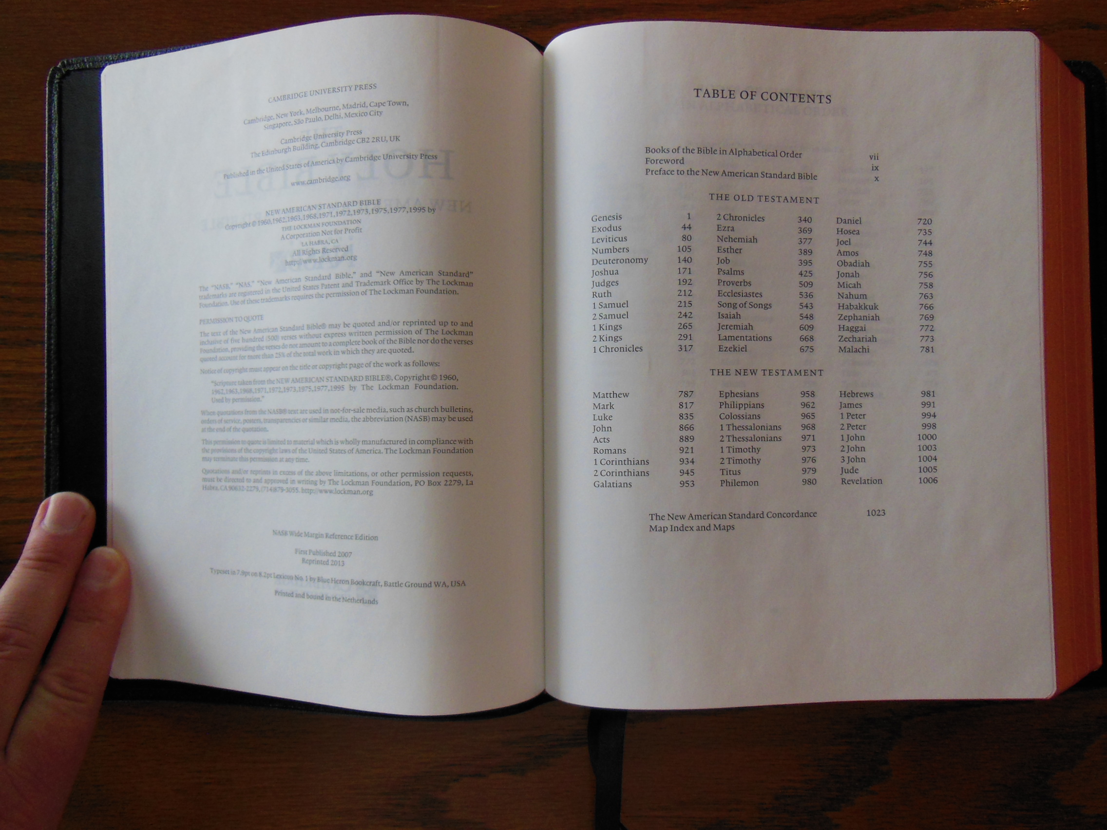
In the front of the Wide Margin you will find a presentation page, an introduction to the translation, and table of contents.
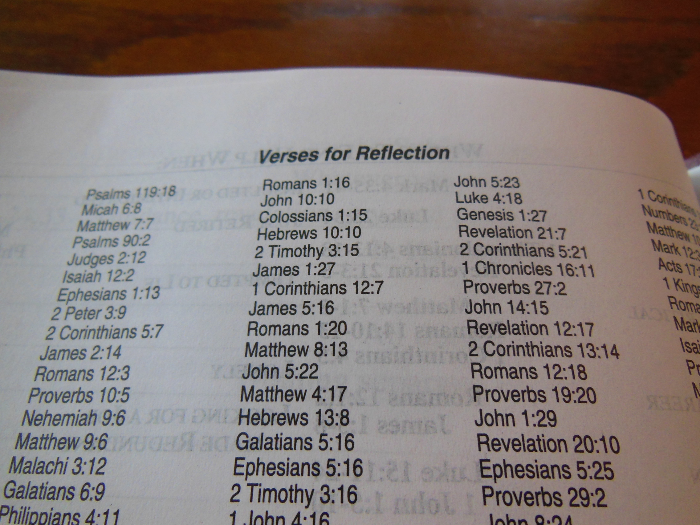
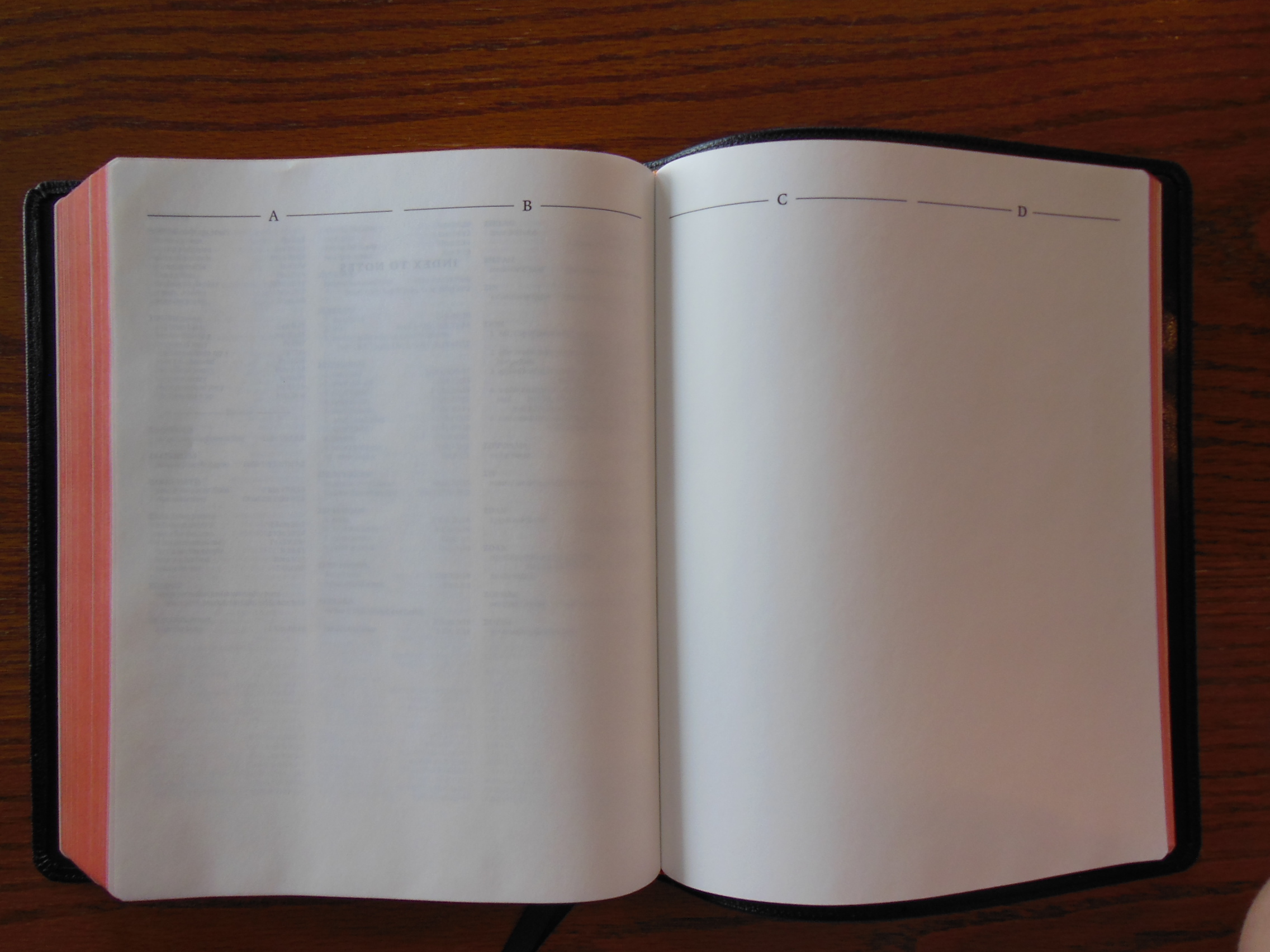
The Wide margin includes as previously mentioned 32 pages of ruled paper,
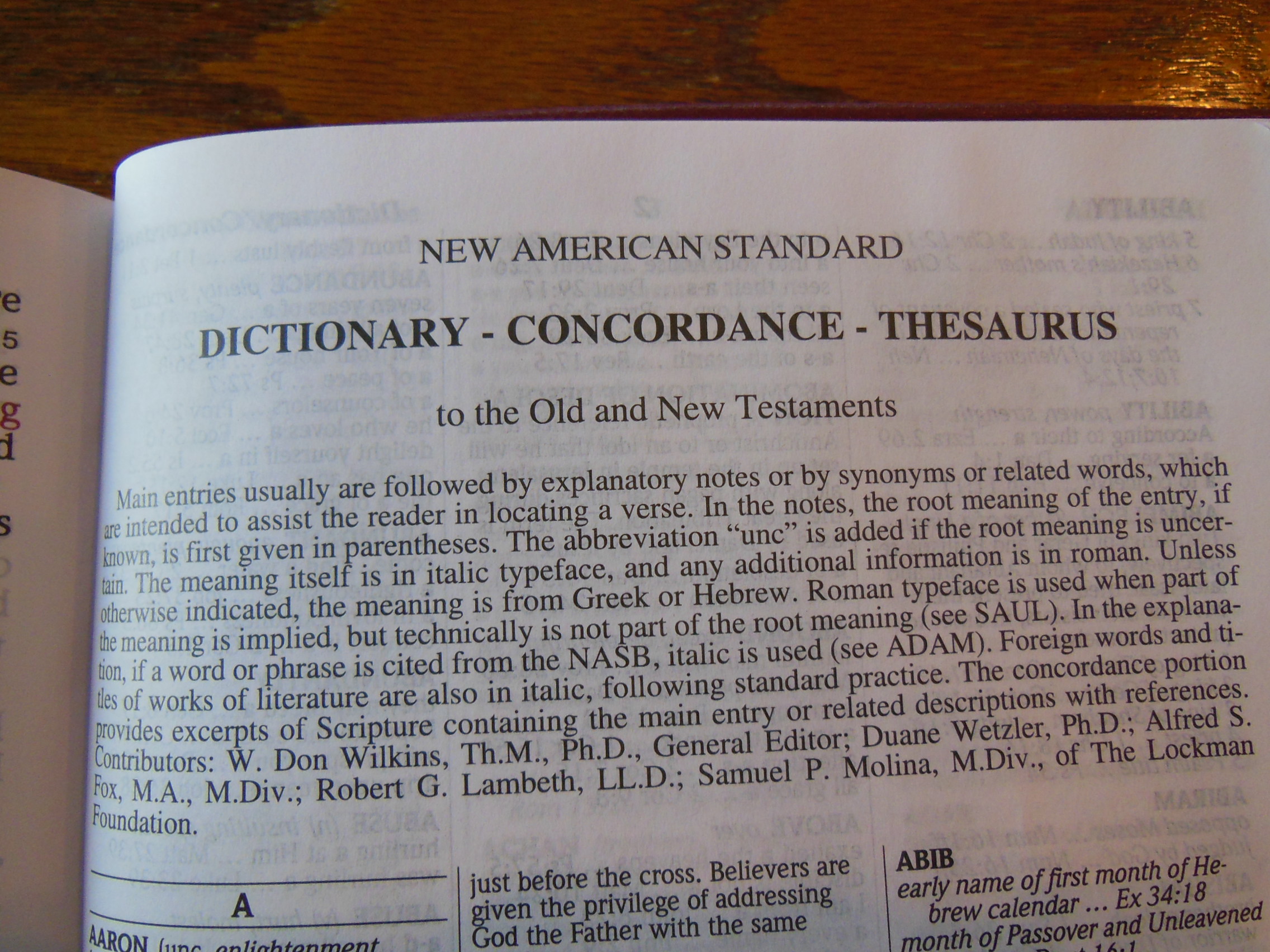
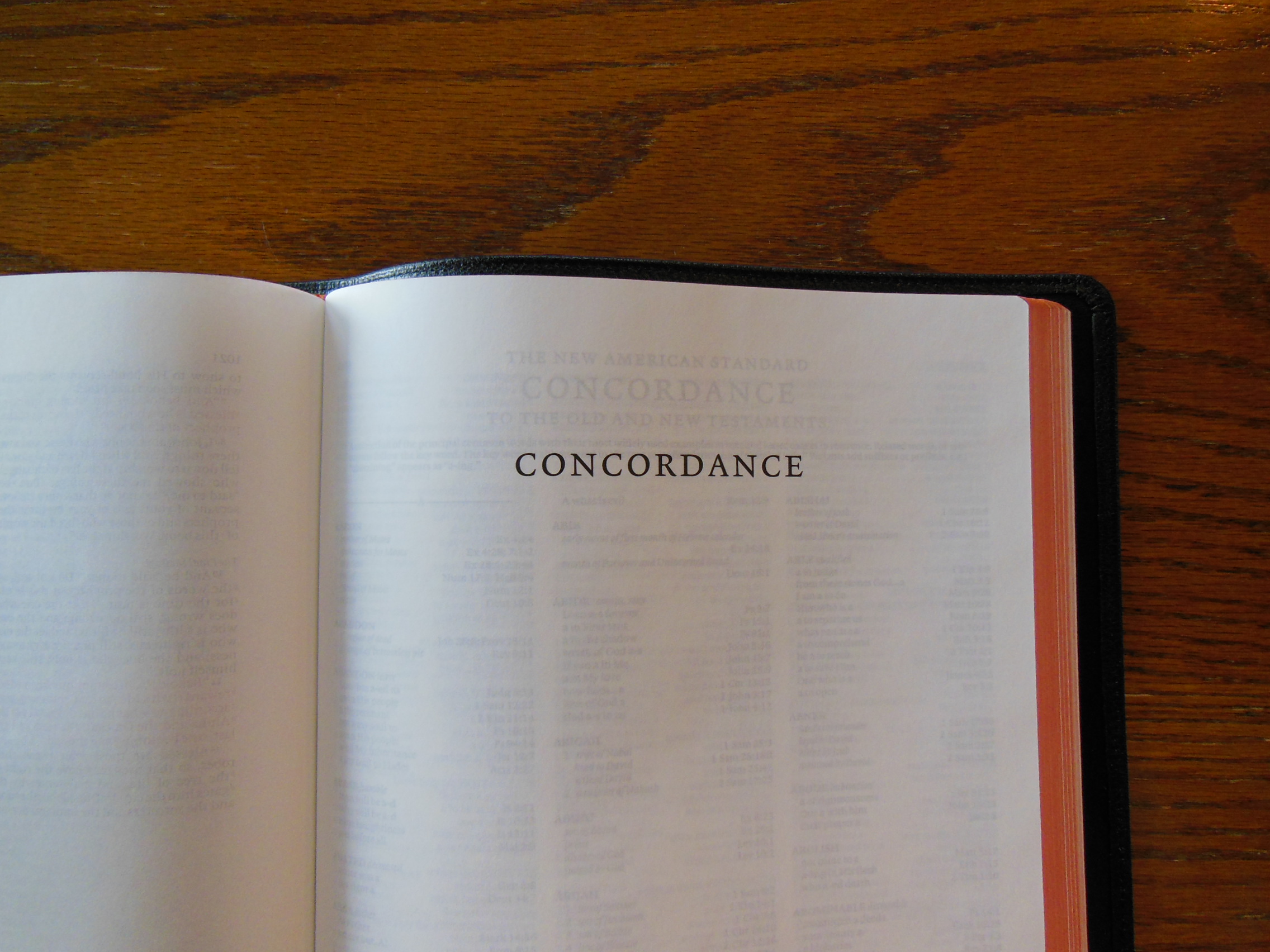
a concordance,
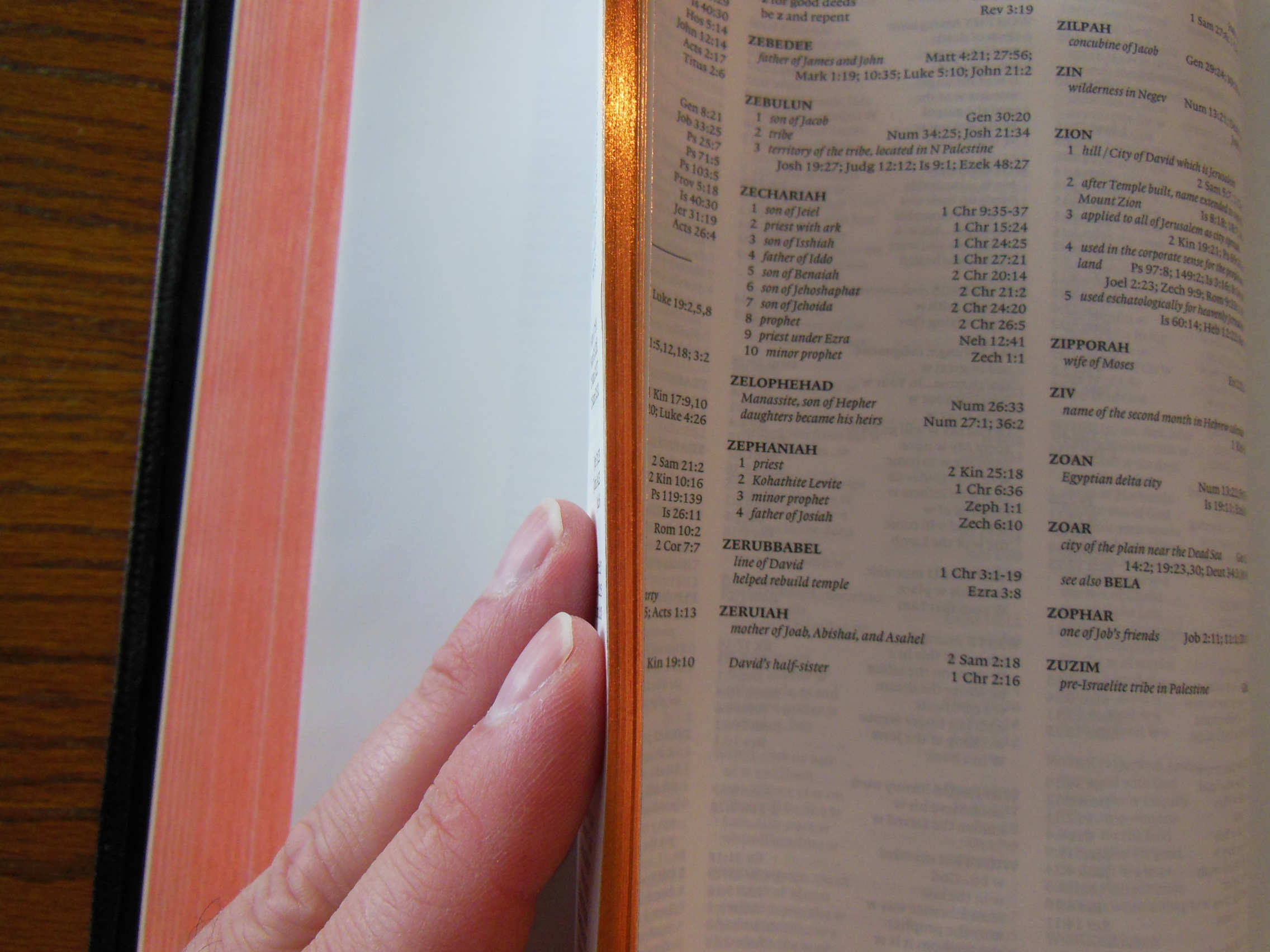
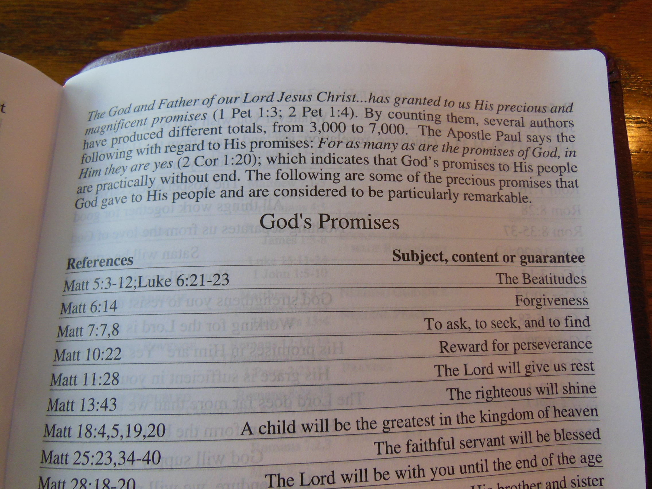
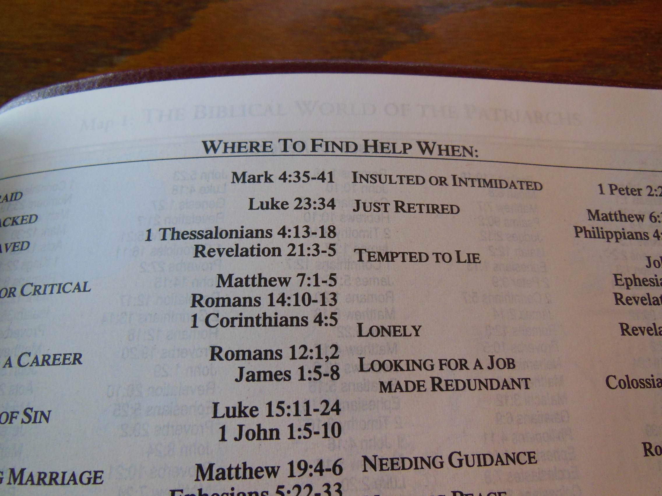
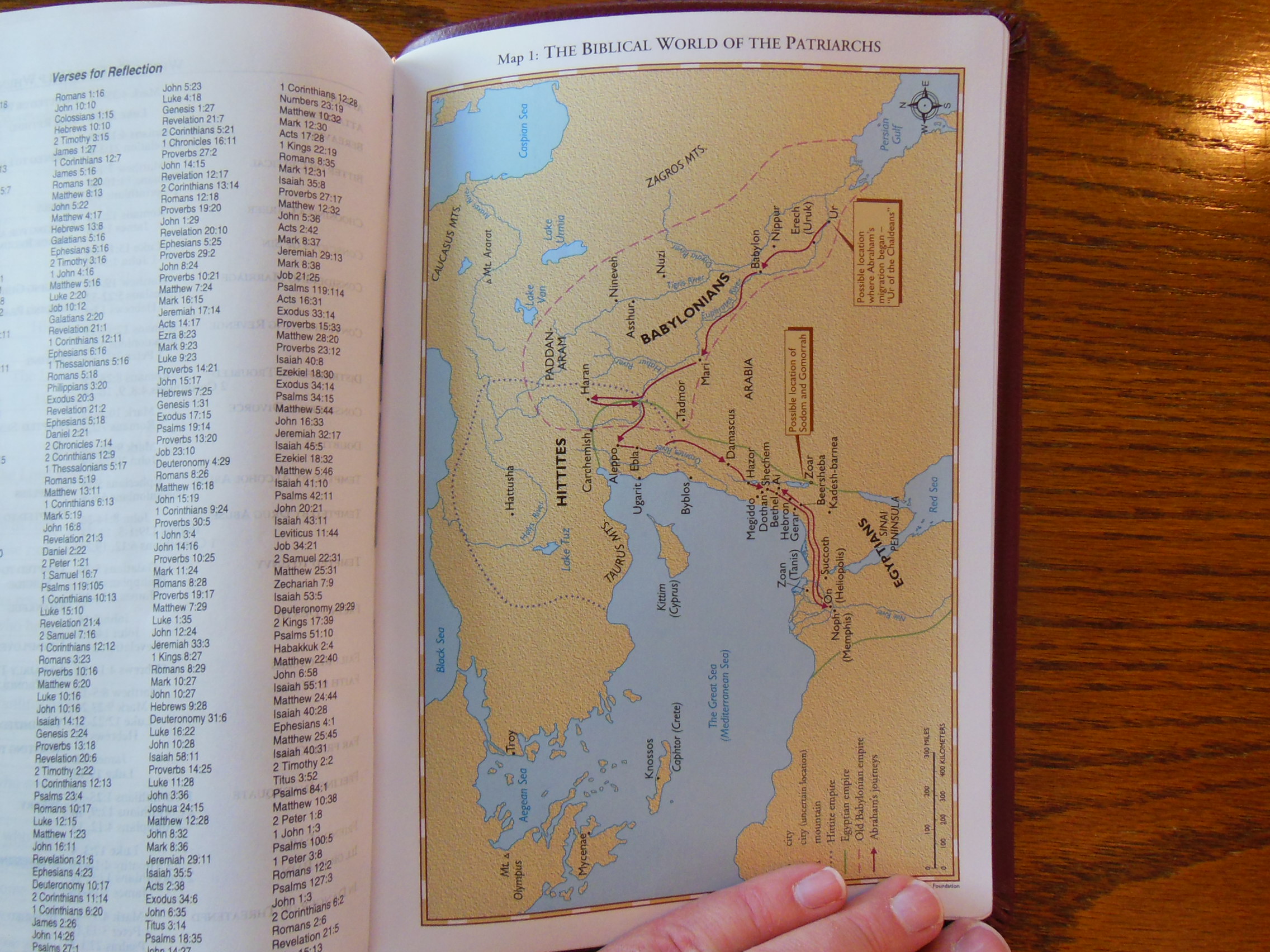
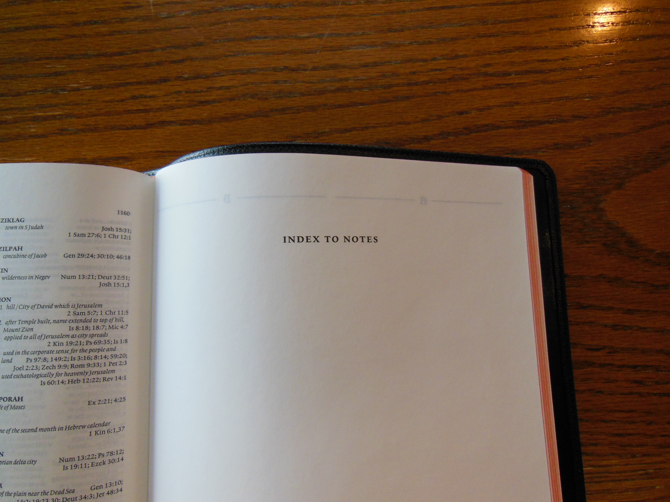
and a blank index section along with 15 color maps and map index in the back.
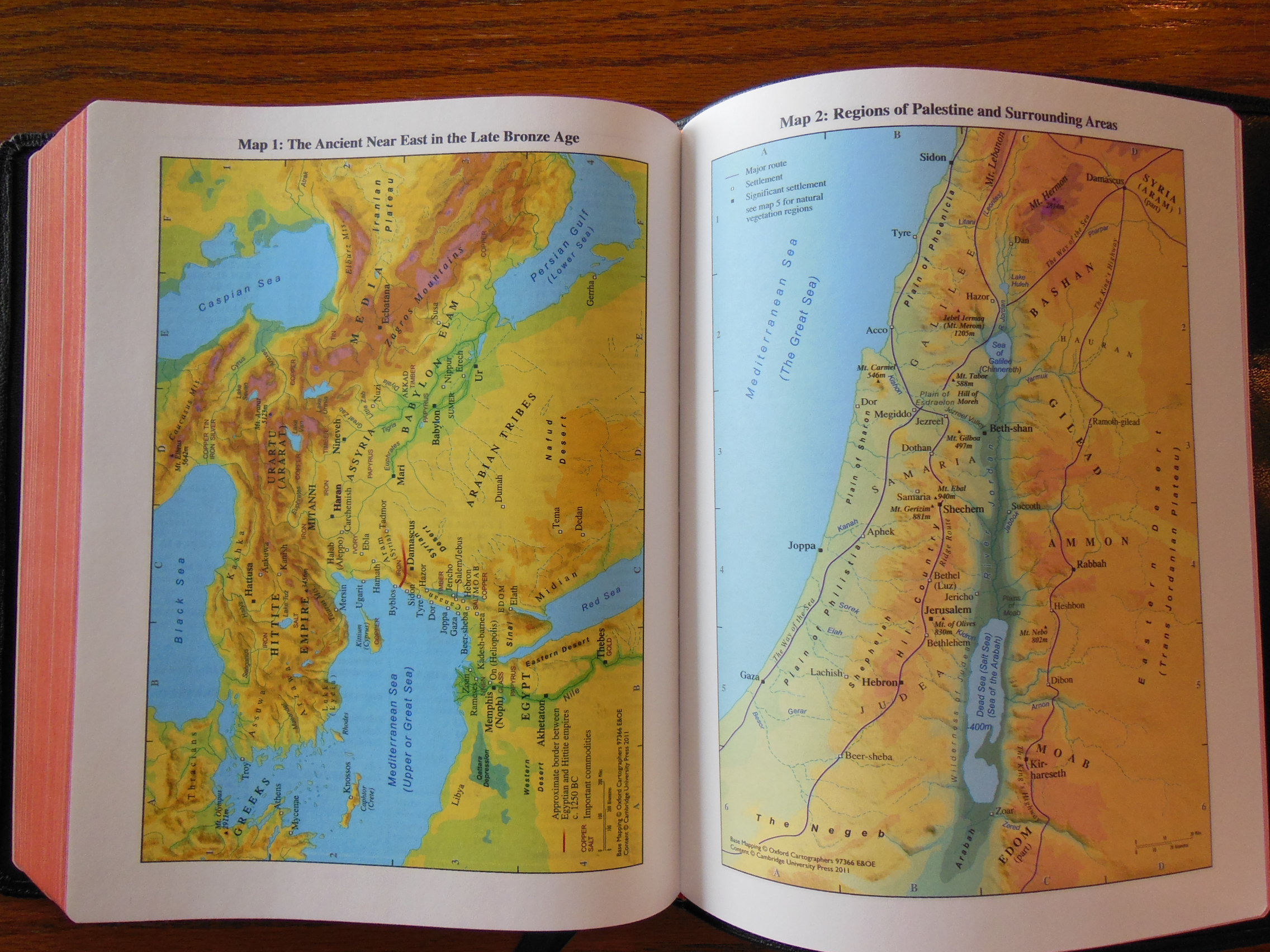
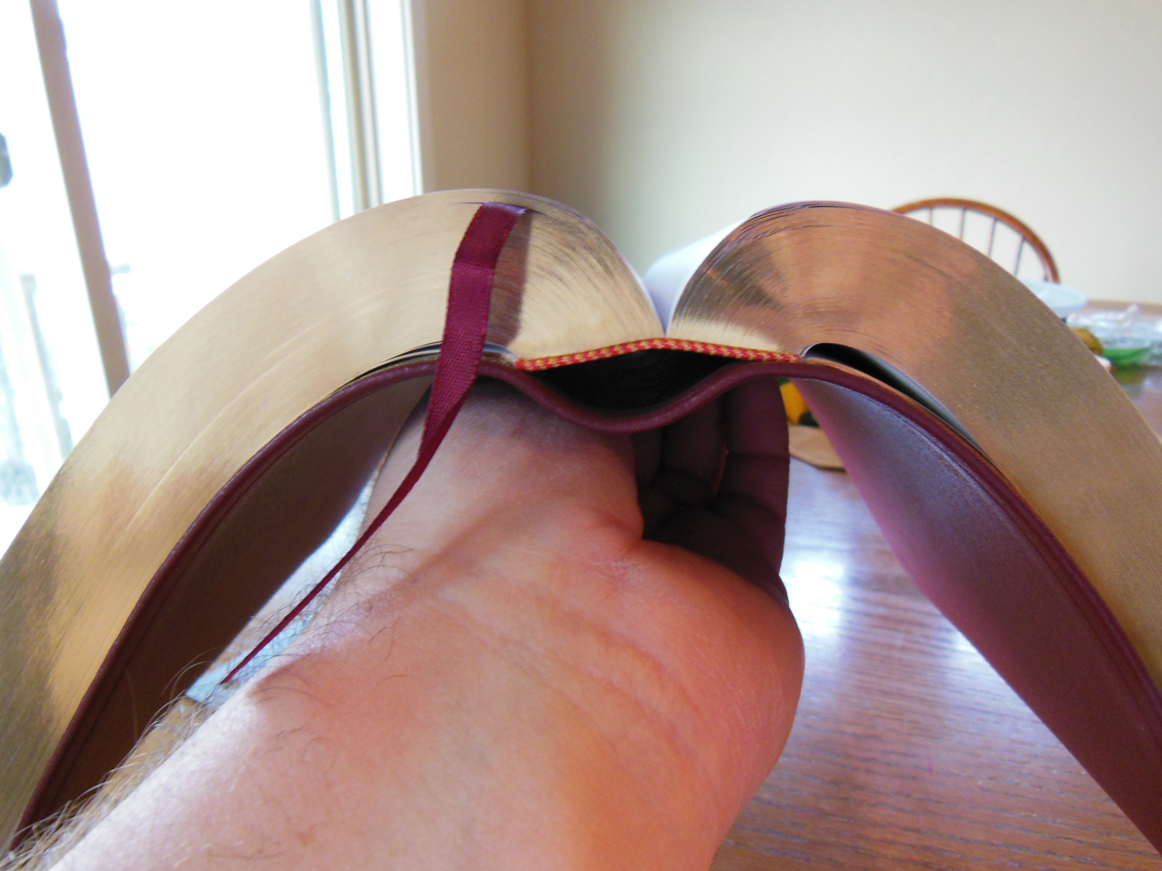
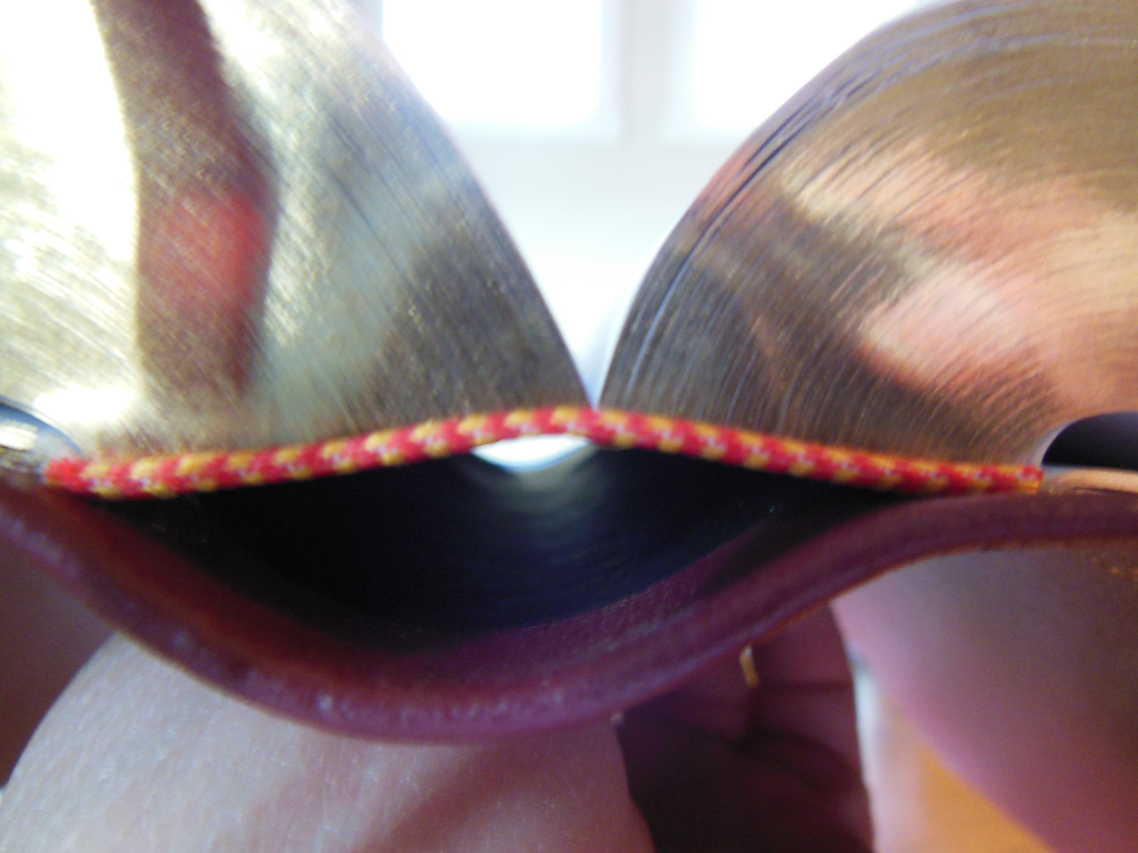
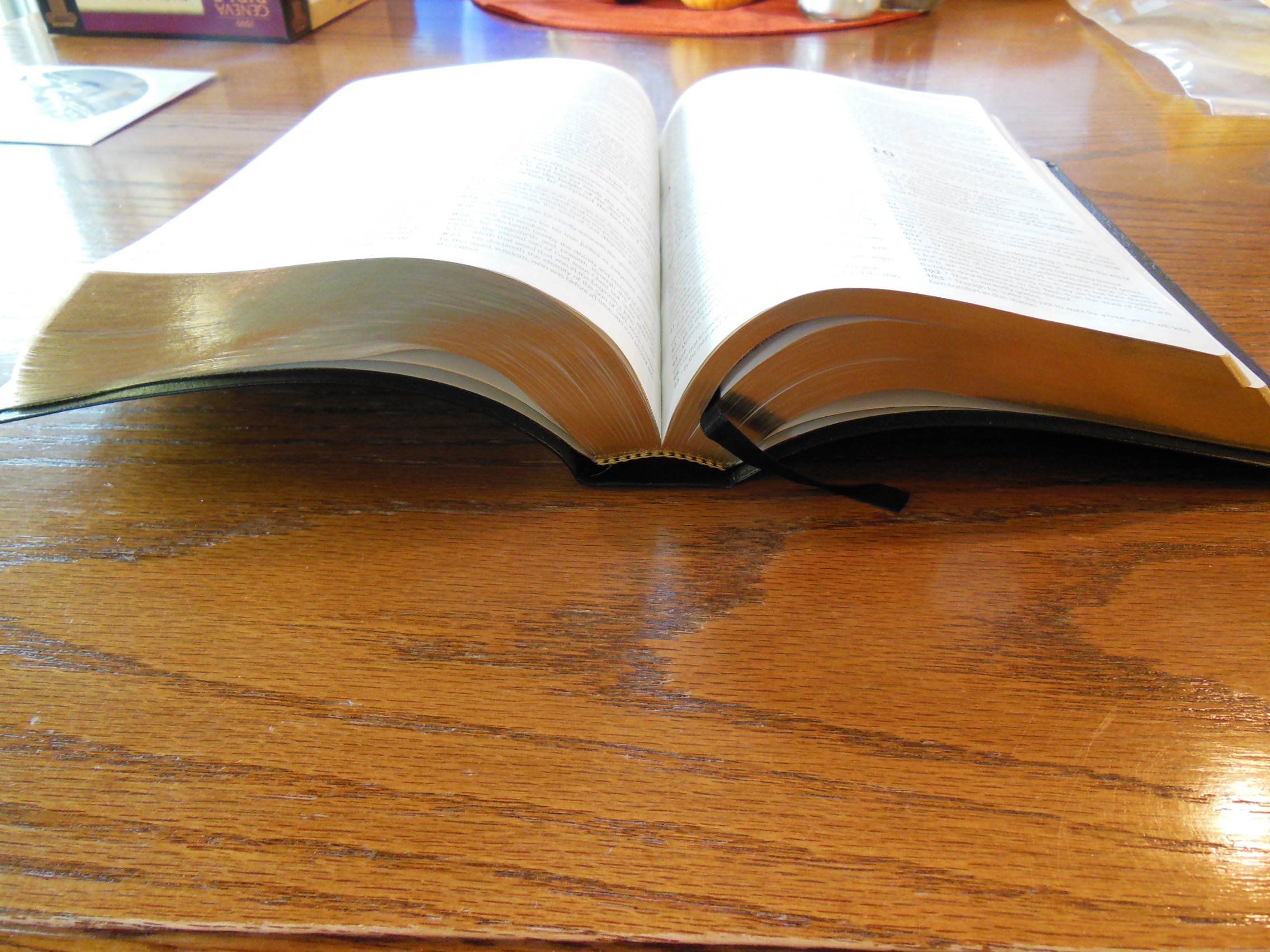
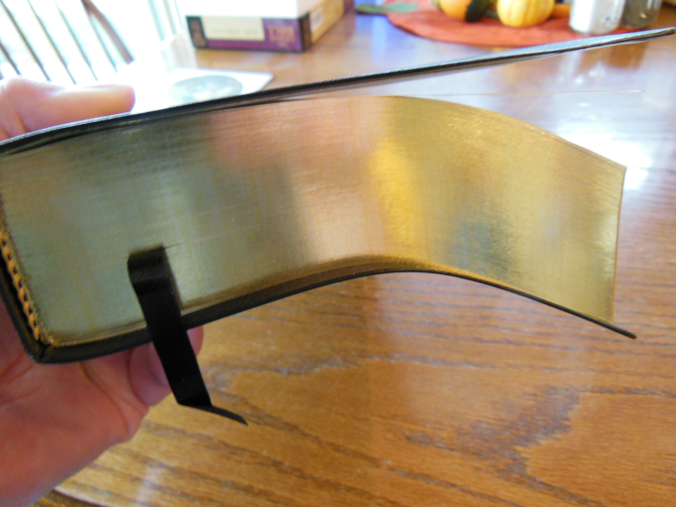
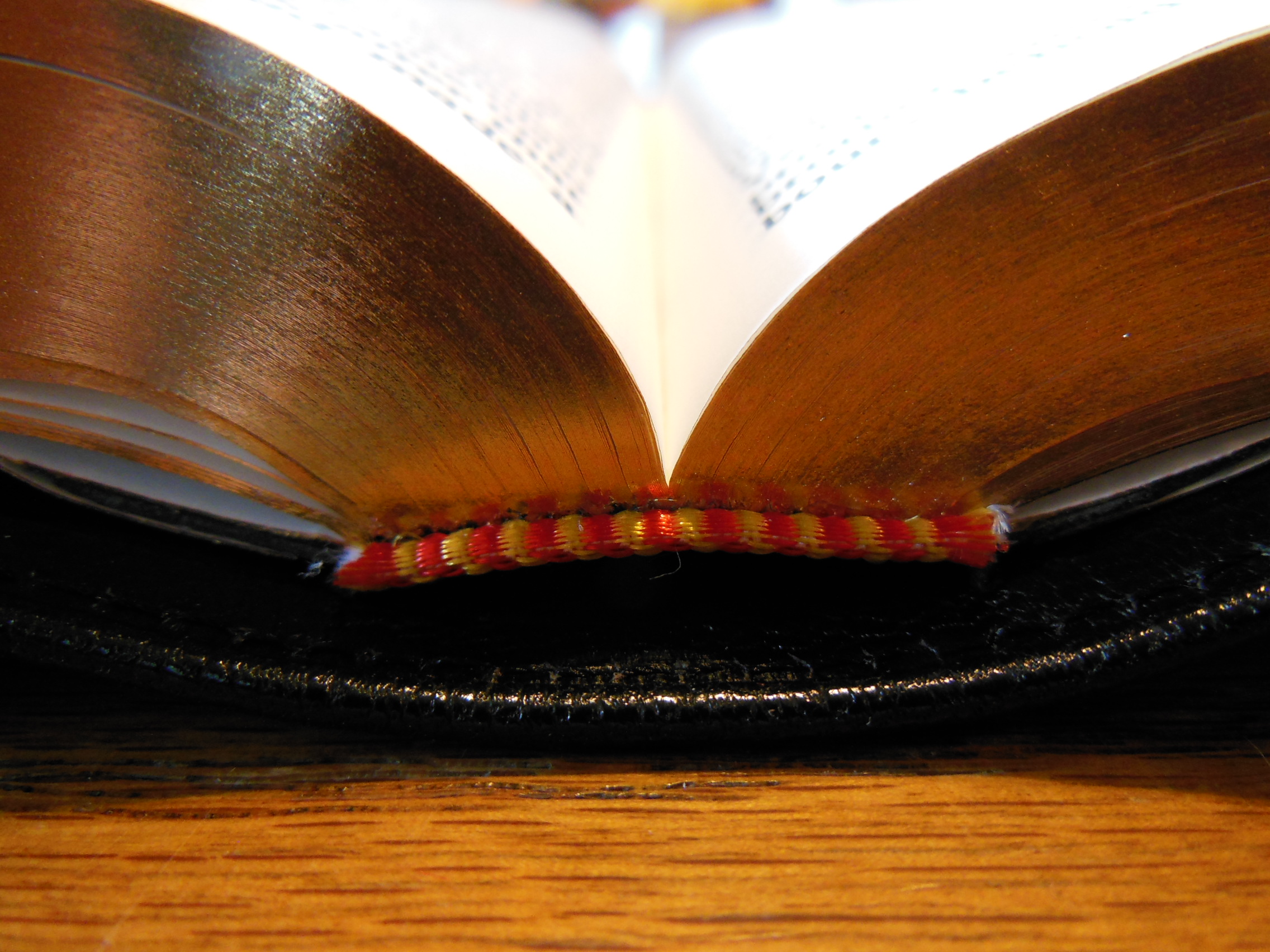
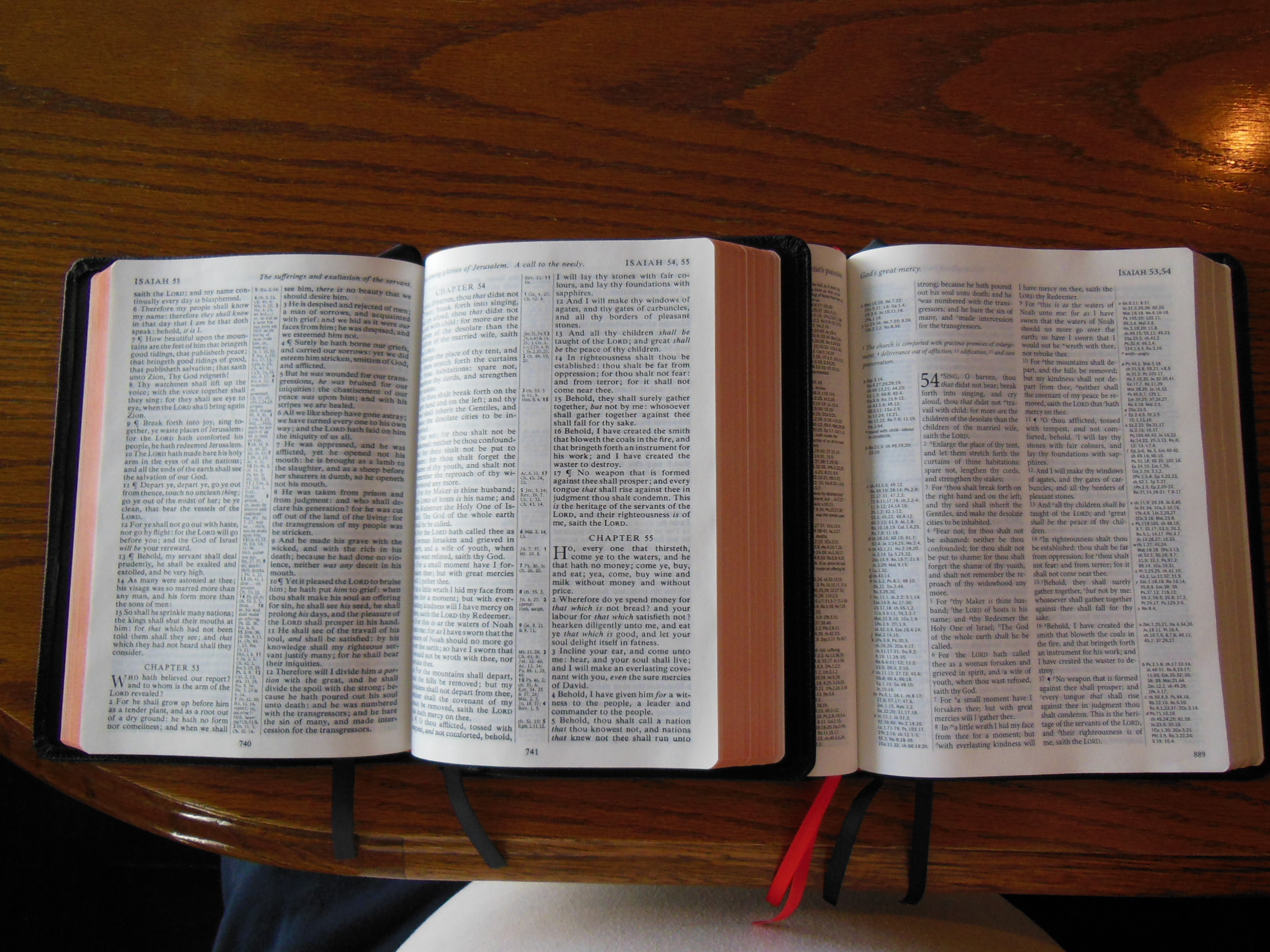
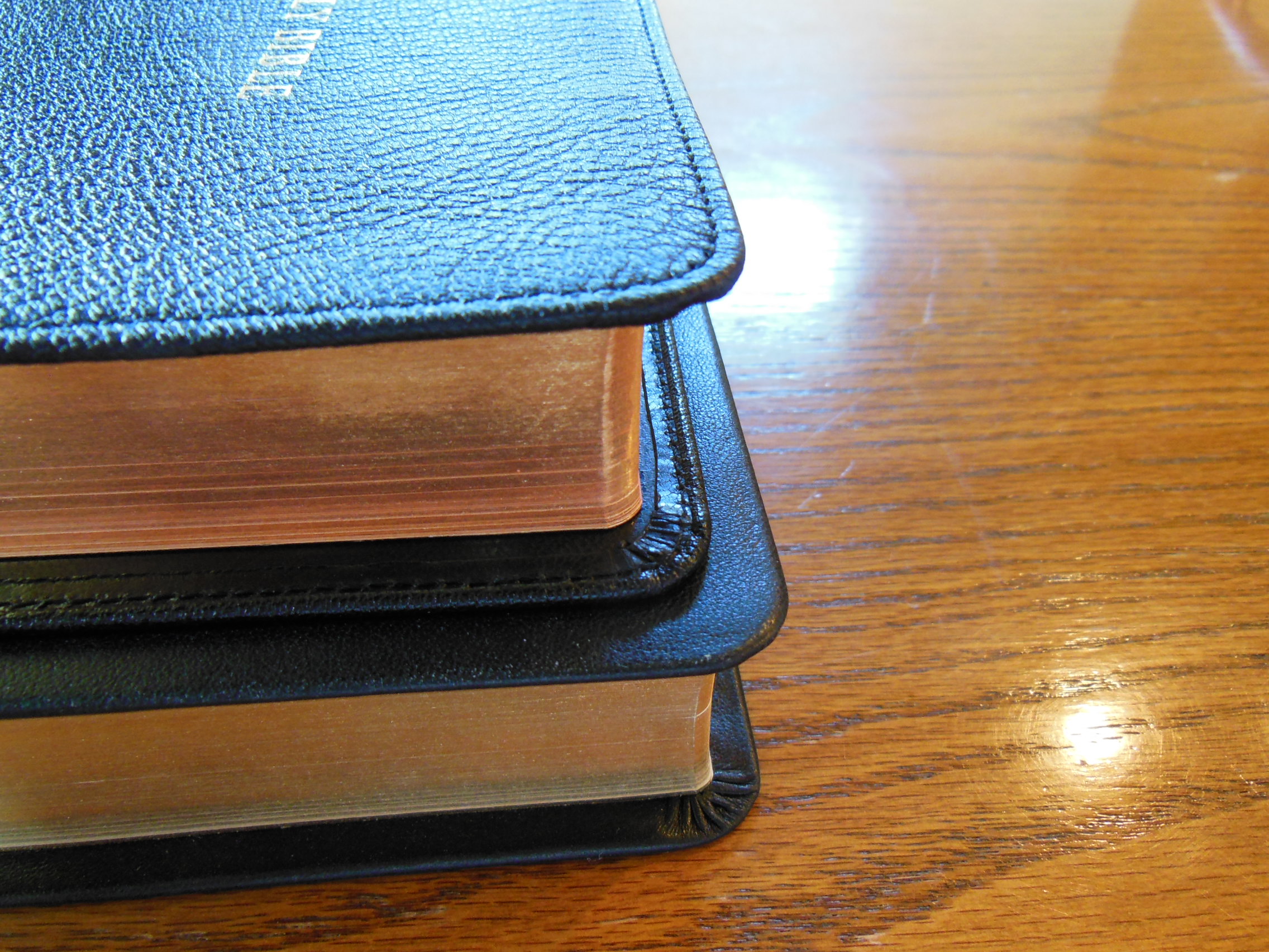
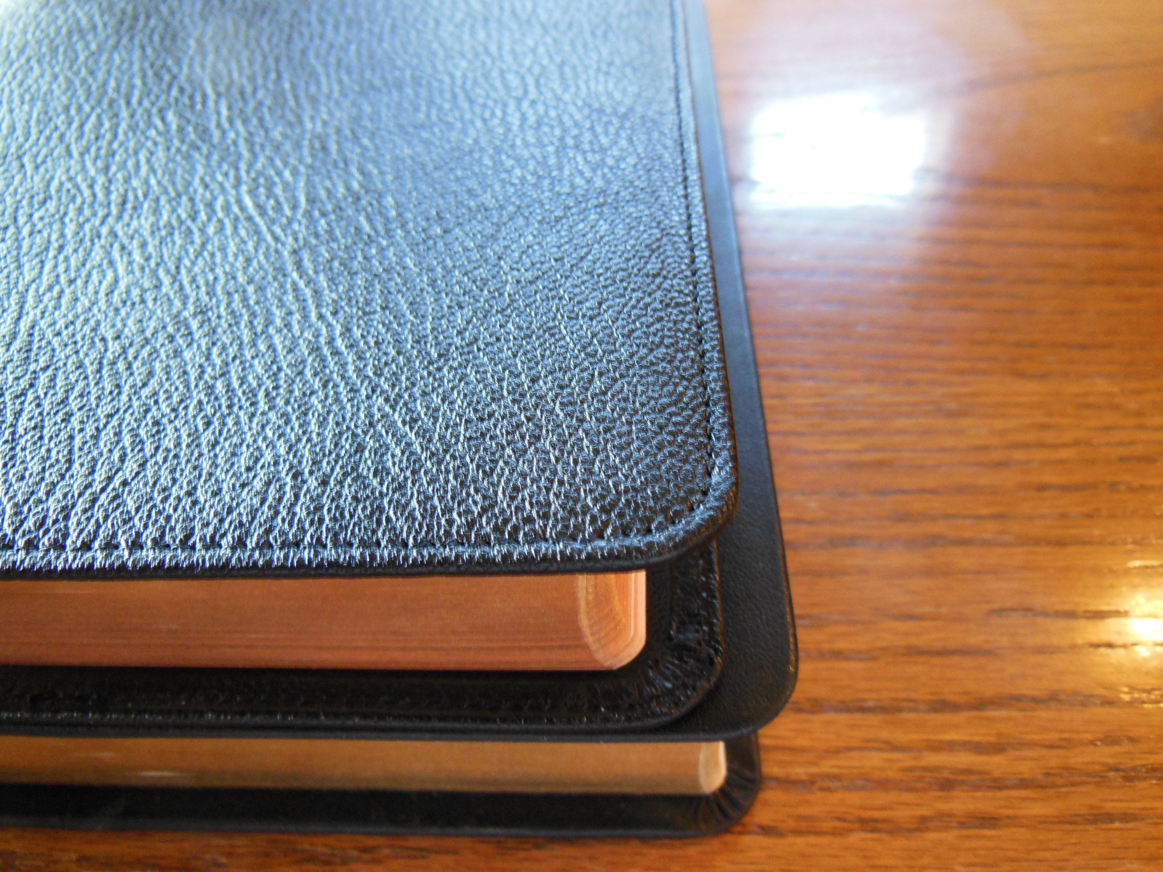
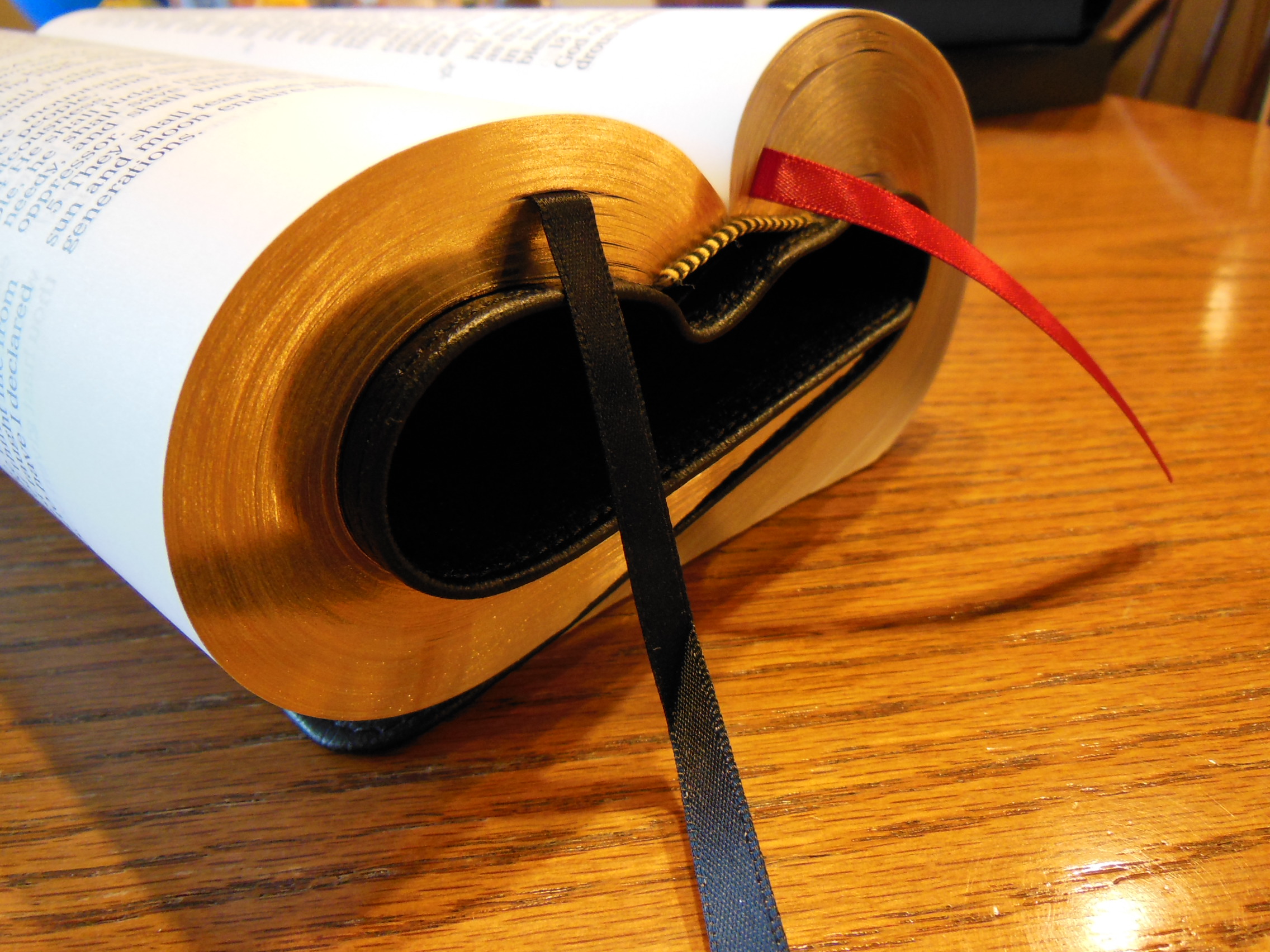
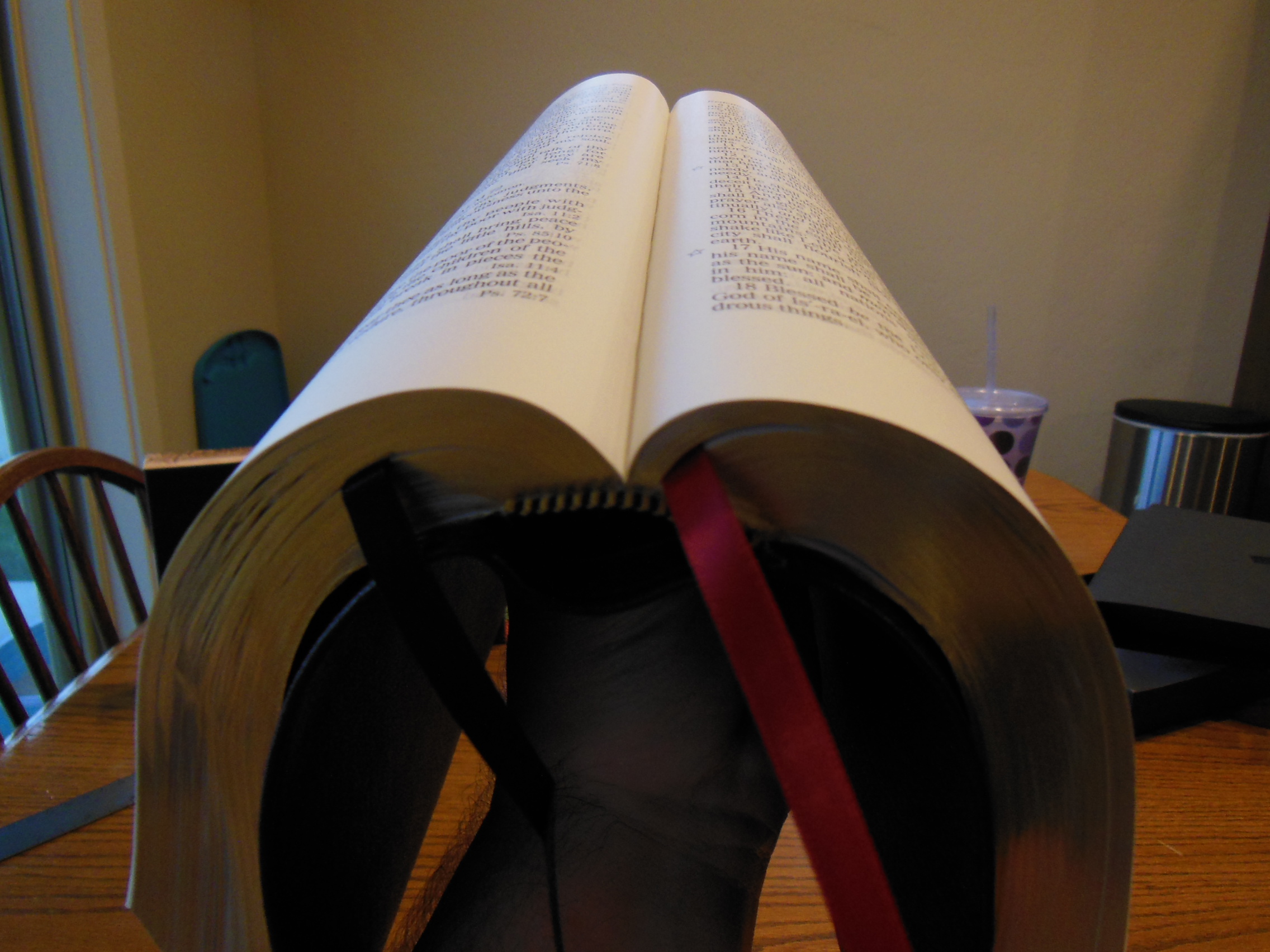
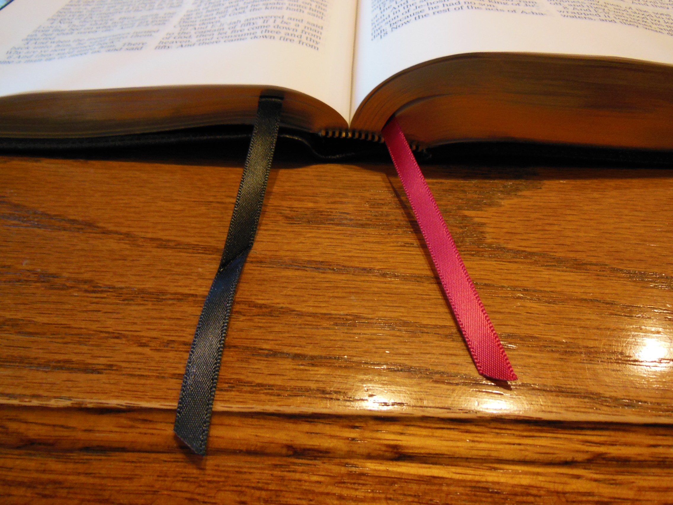
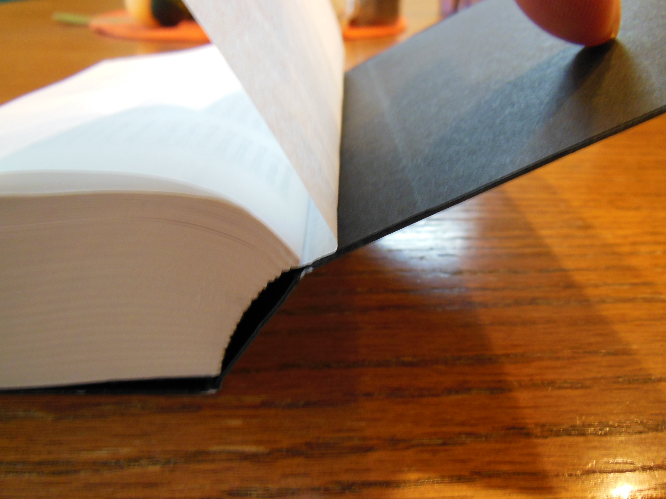
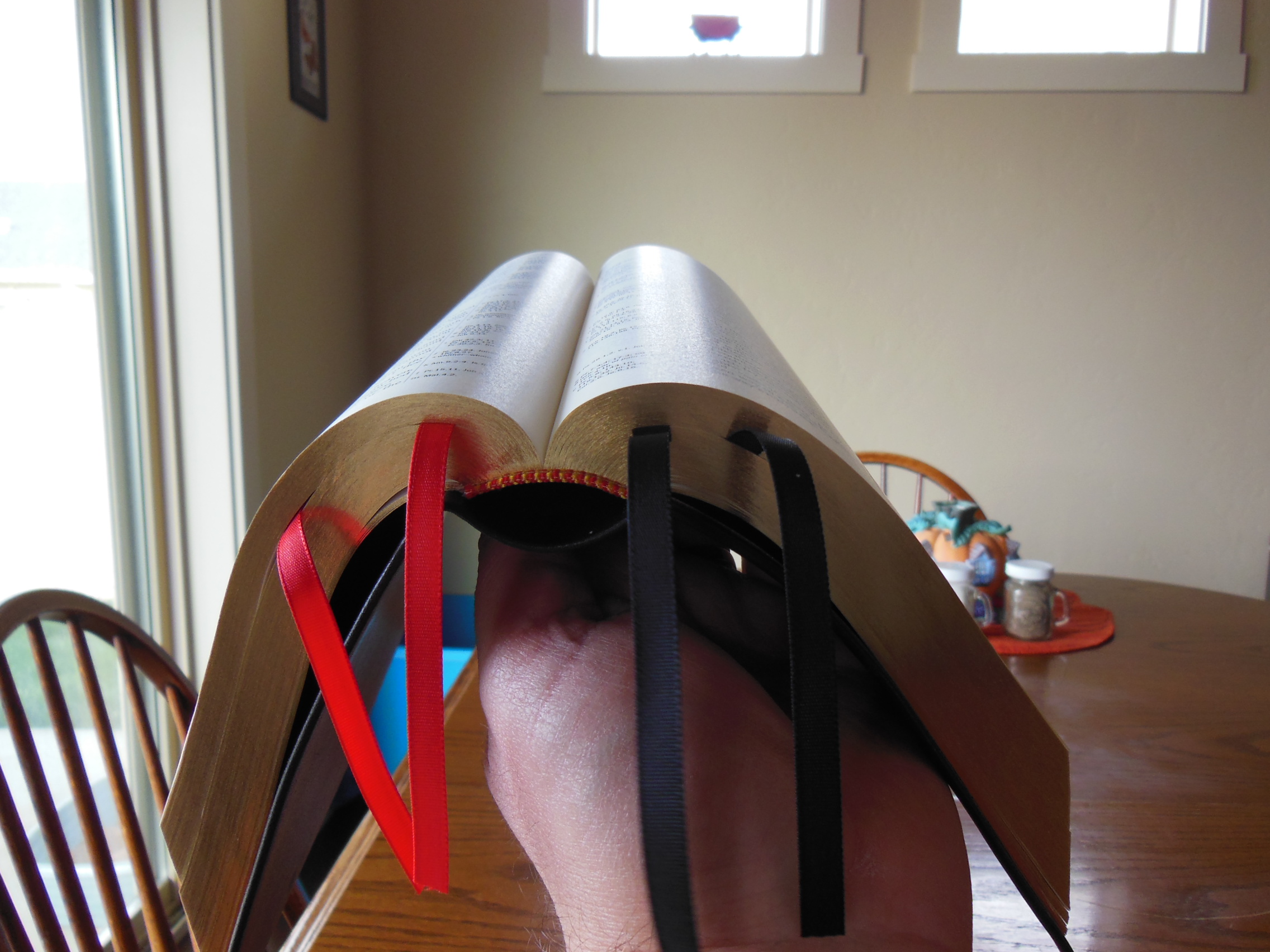
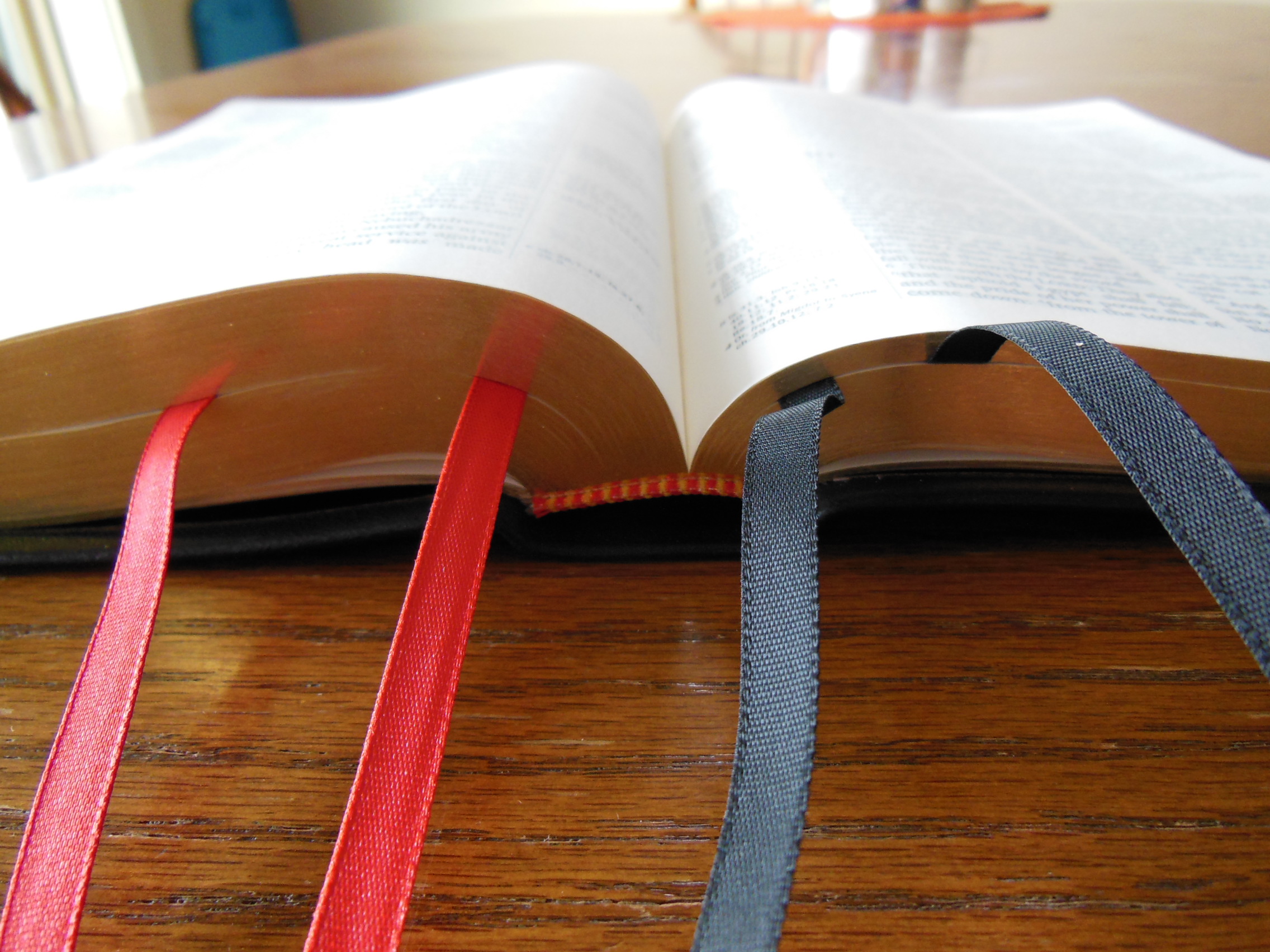
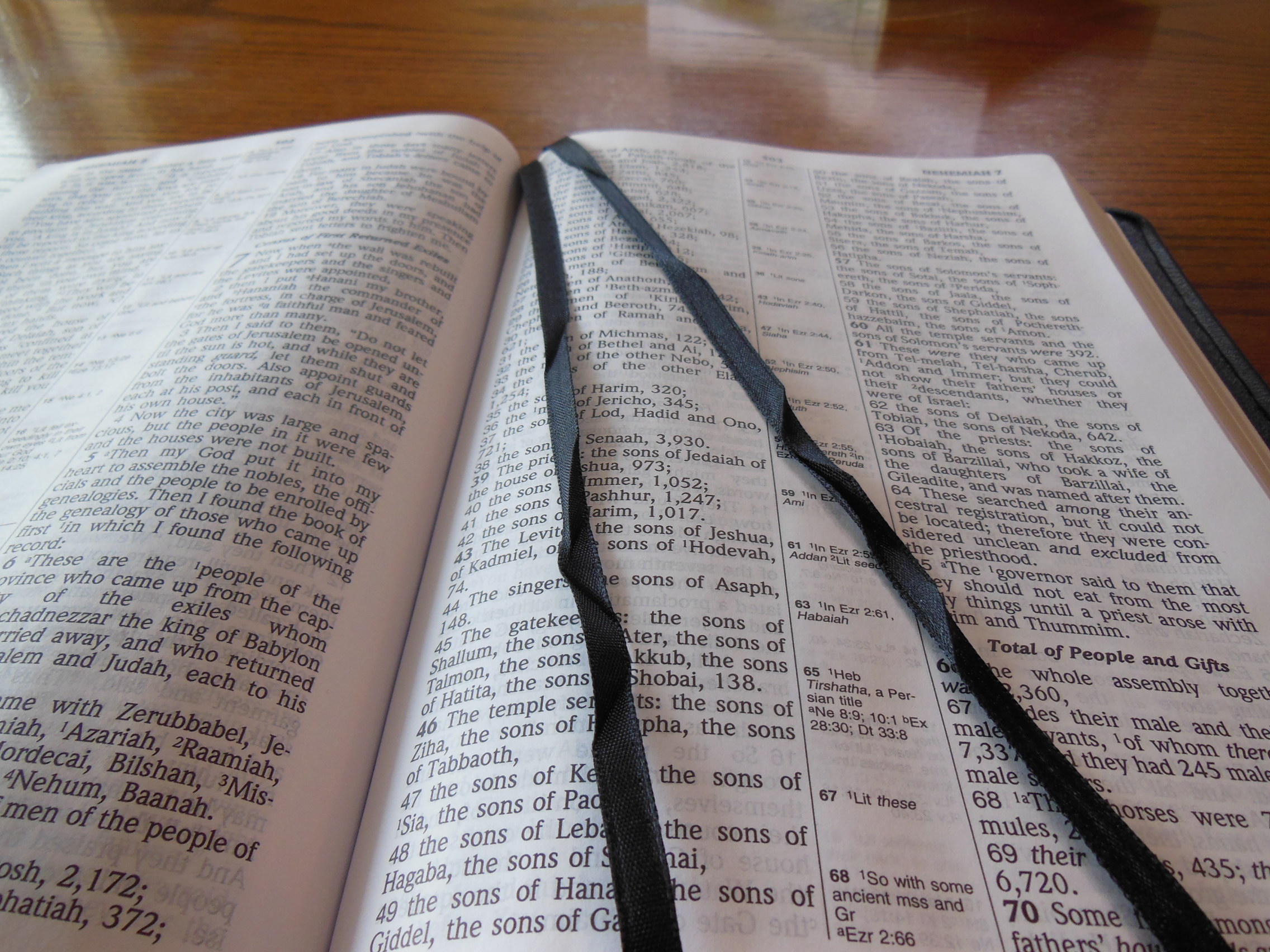
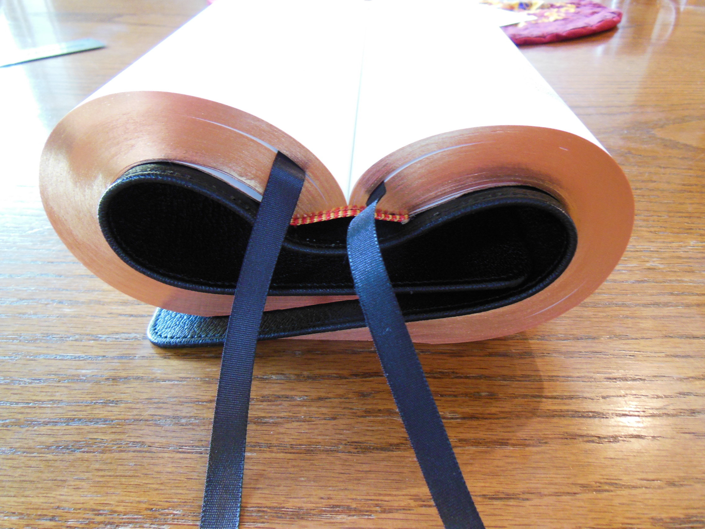
The maps are in color and printed on a flat paper instead of a glossy paper. The glossy paper tends to crack and tear. It is better to have these features printed the way they are. There are two flat and wide ribbon markers in this Bible helping you keep your place.
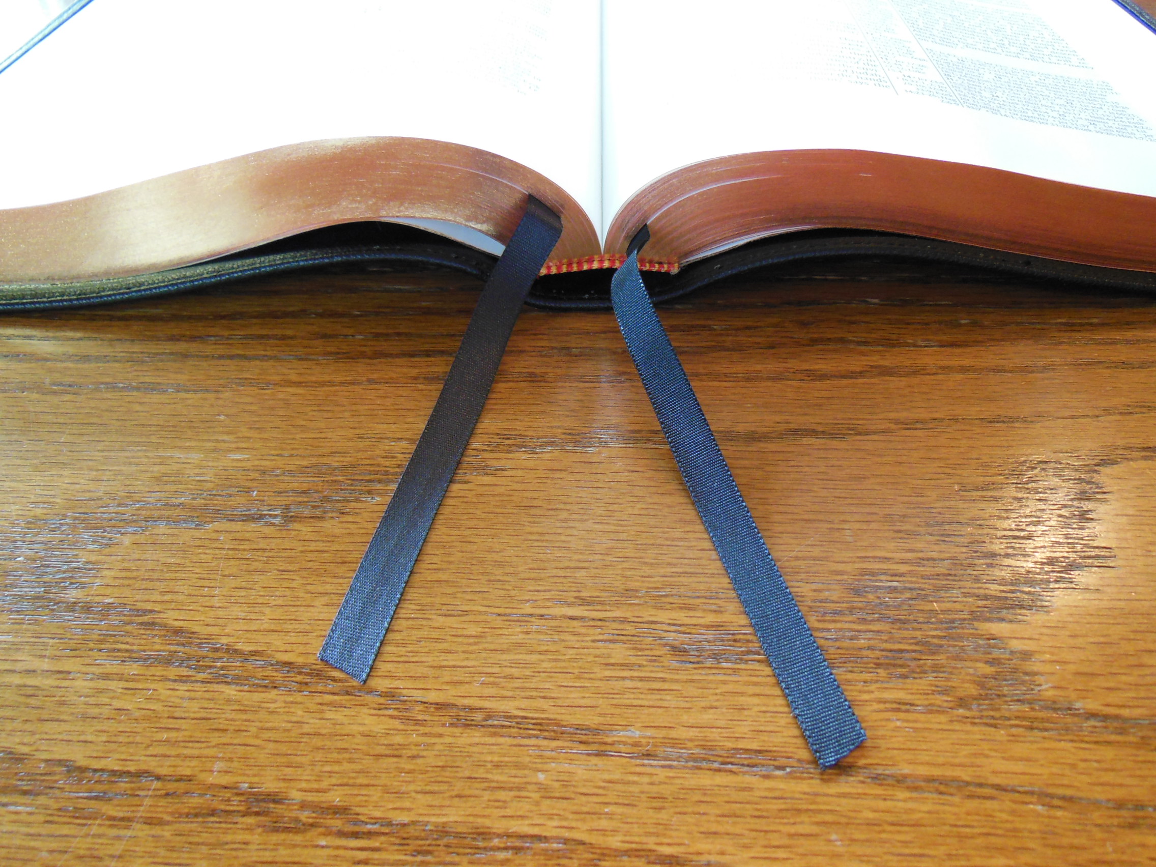
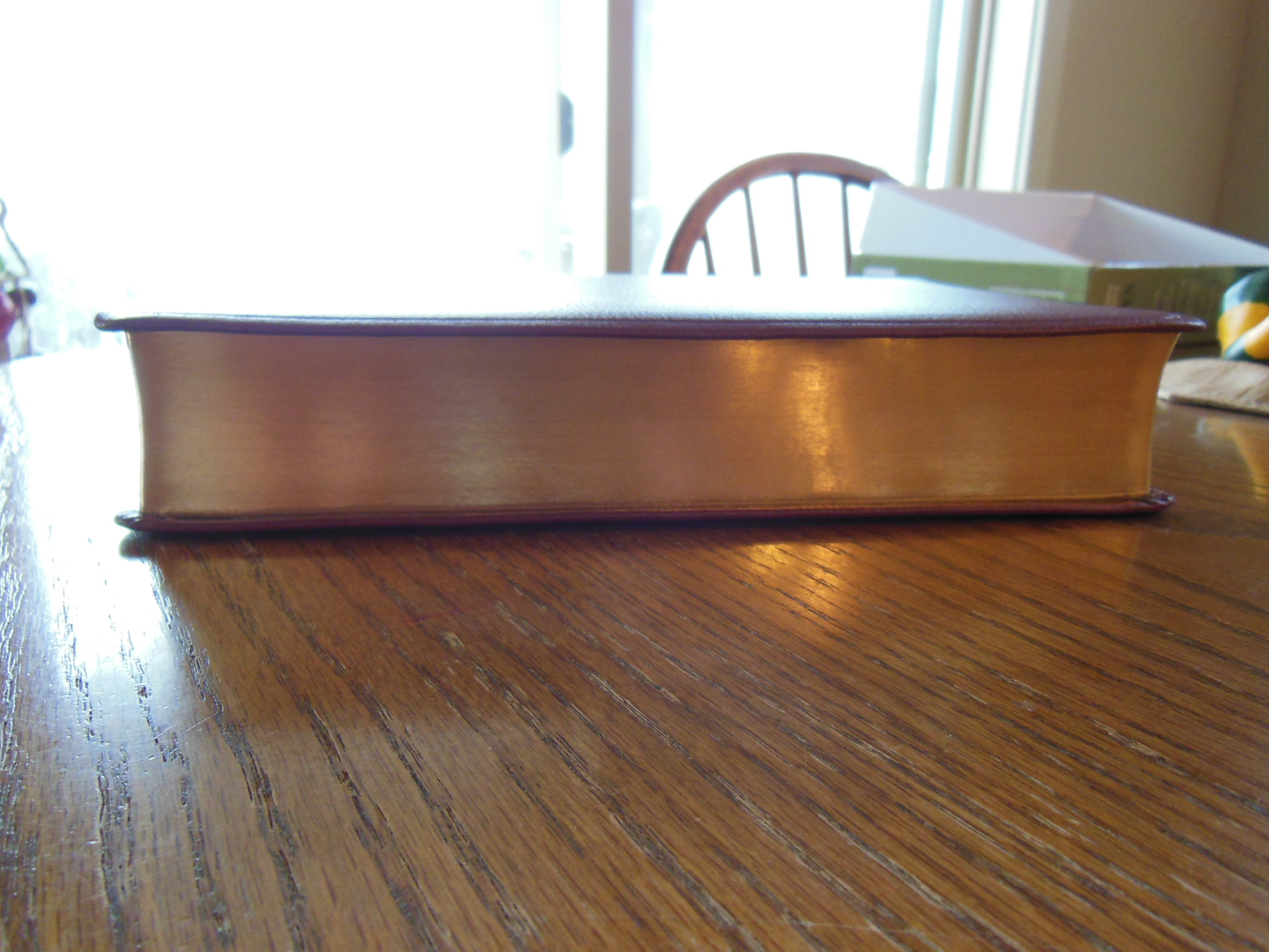
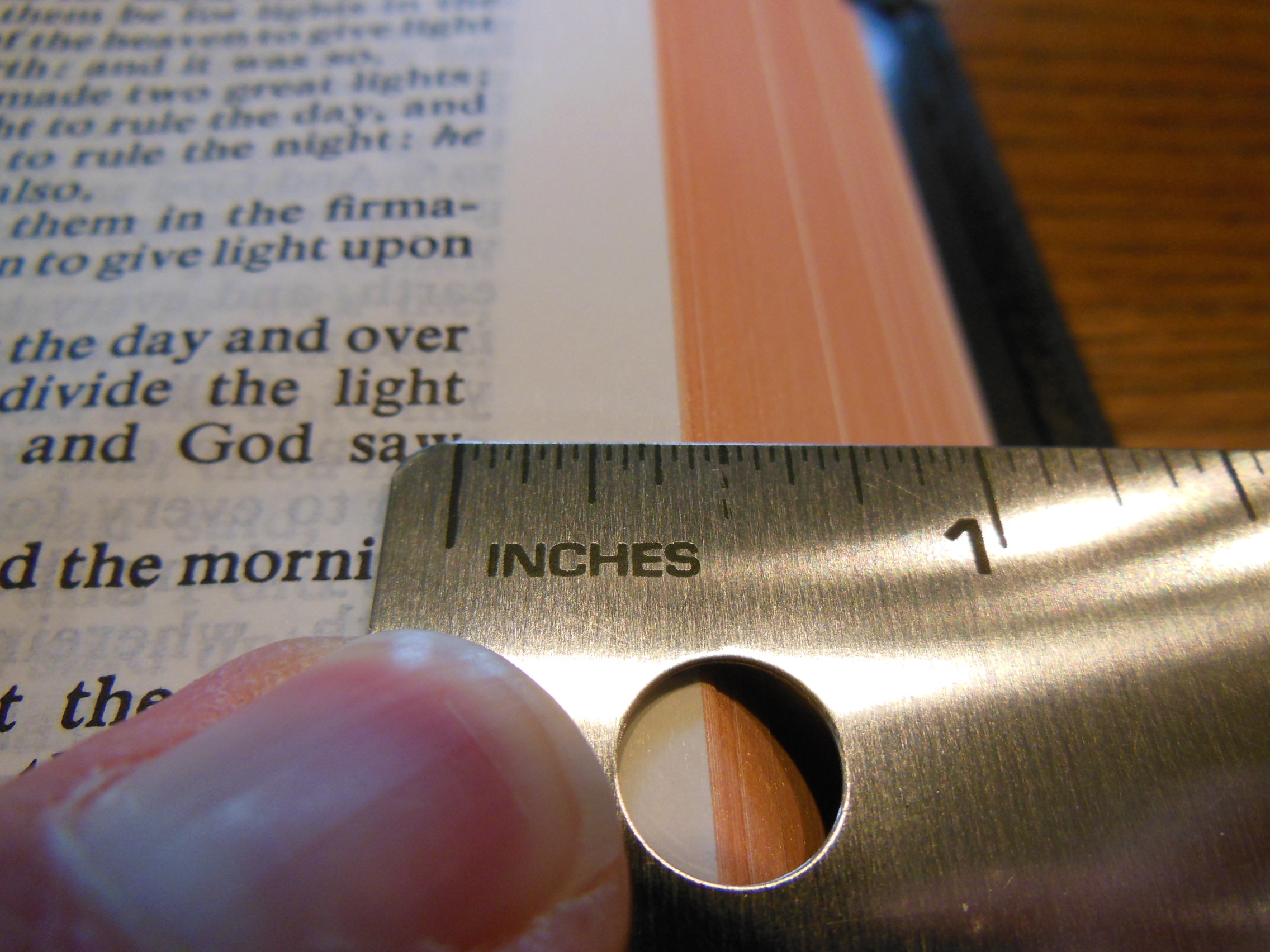
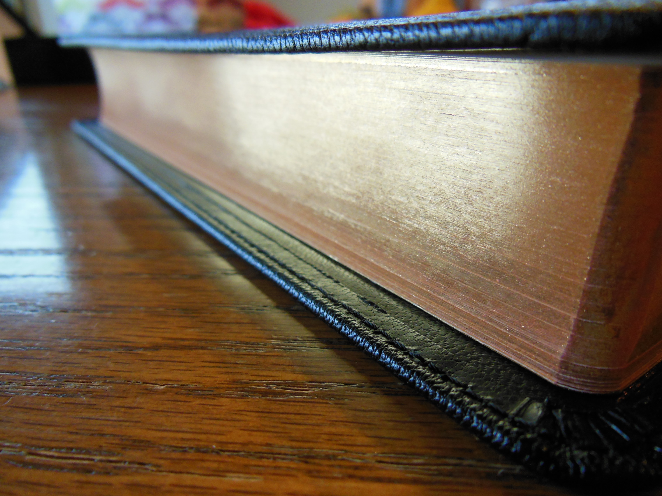
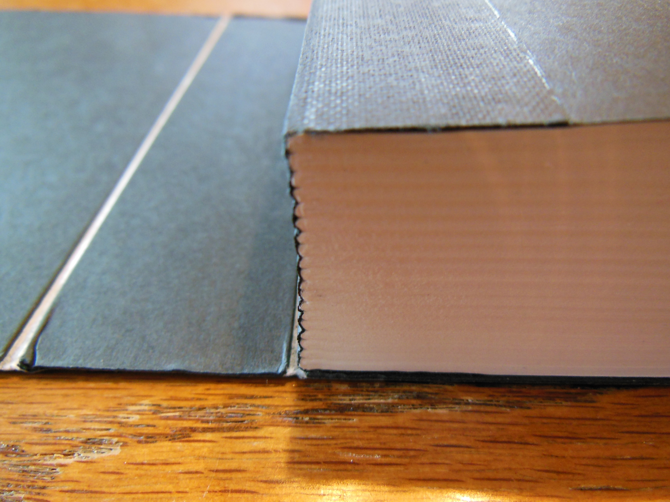
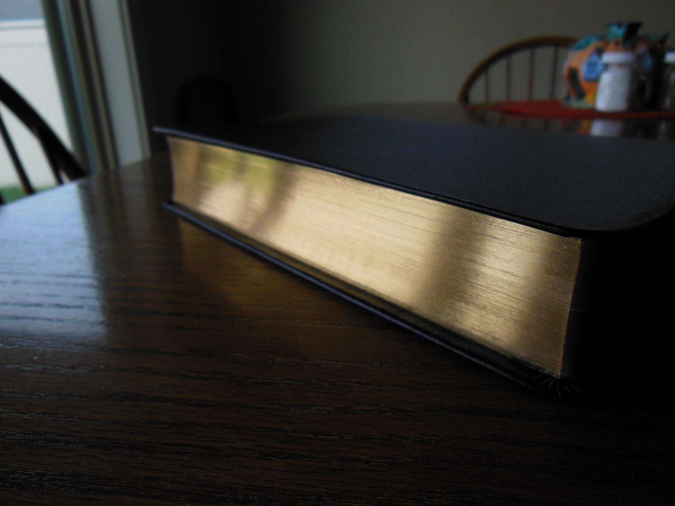
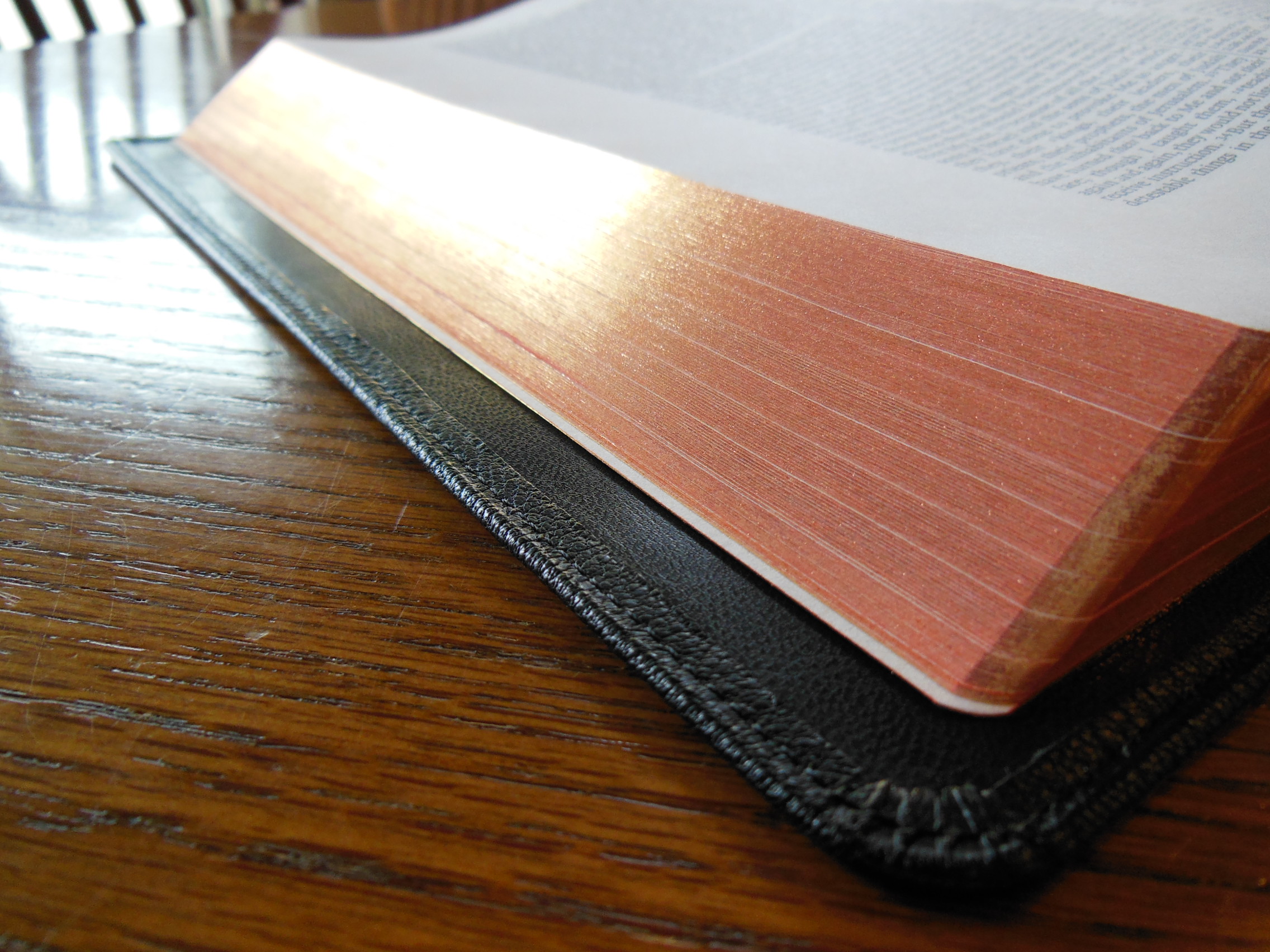
This is especially helpful considering the kind of work one would be doing with this Bible. The page edges are art gilded with red under gold.
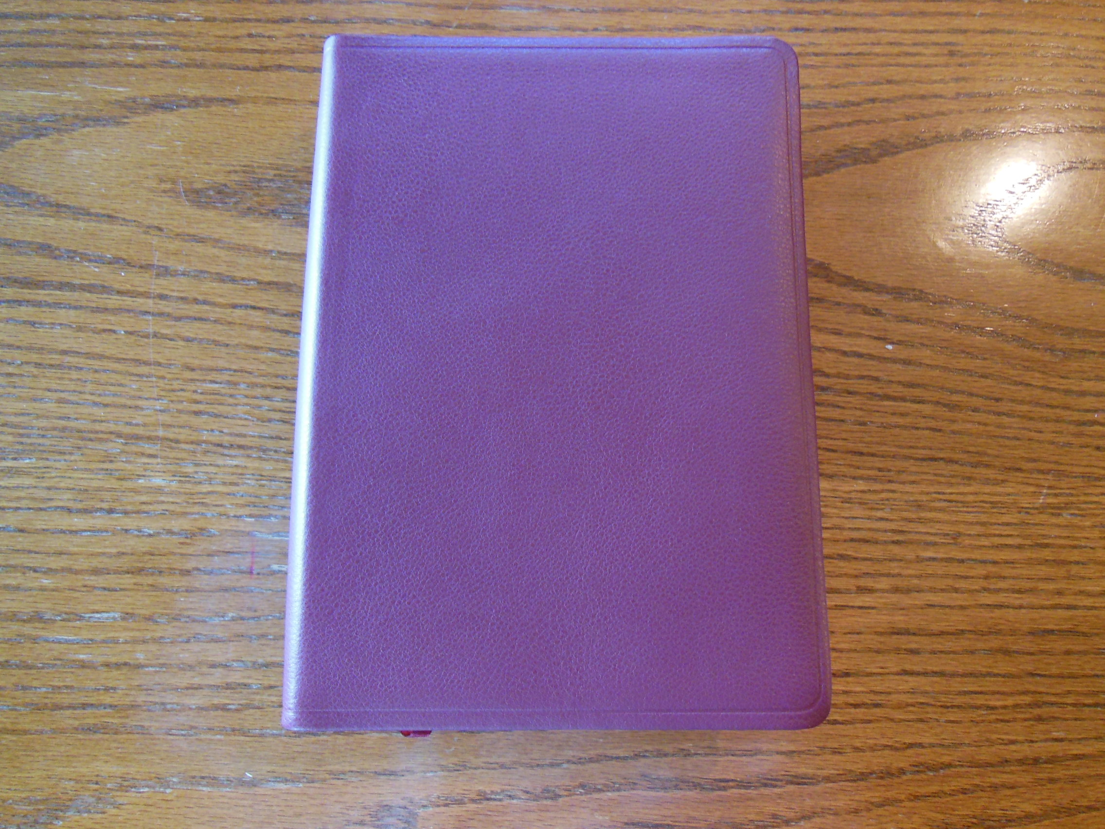
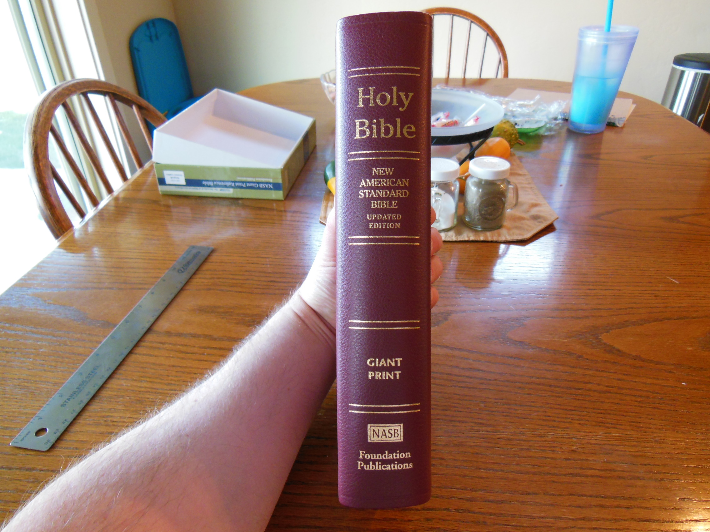
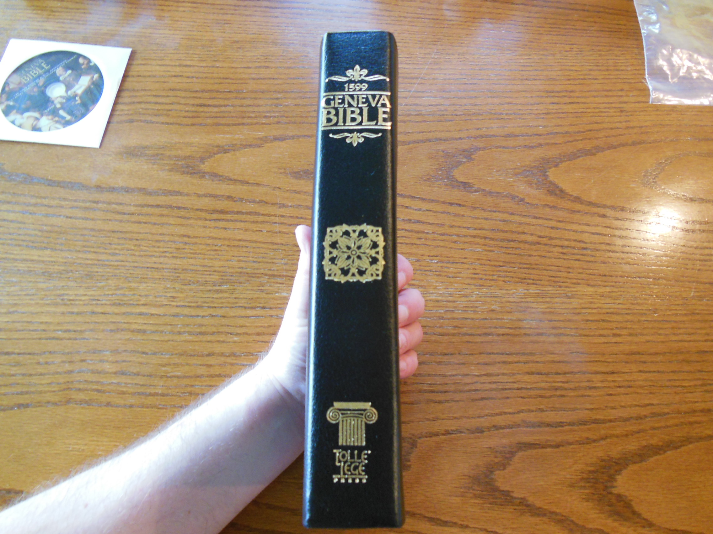
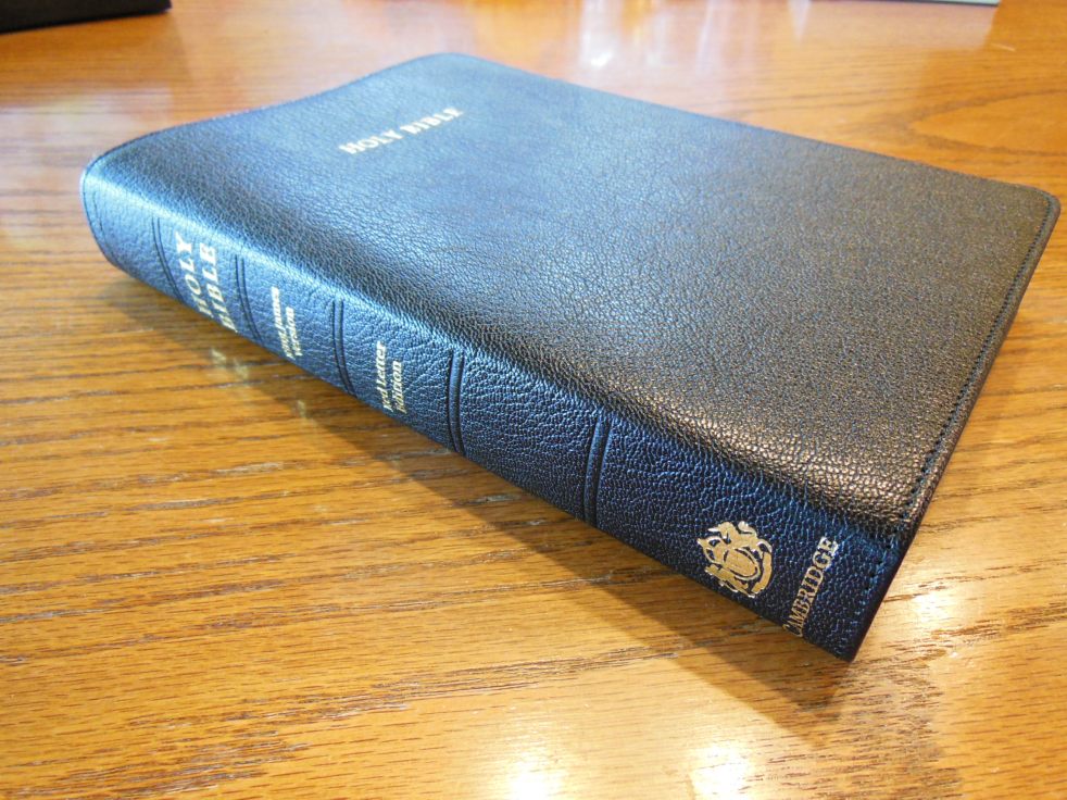
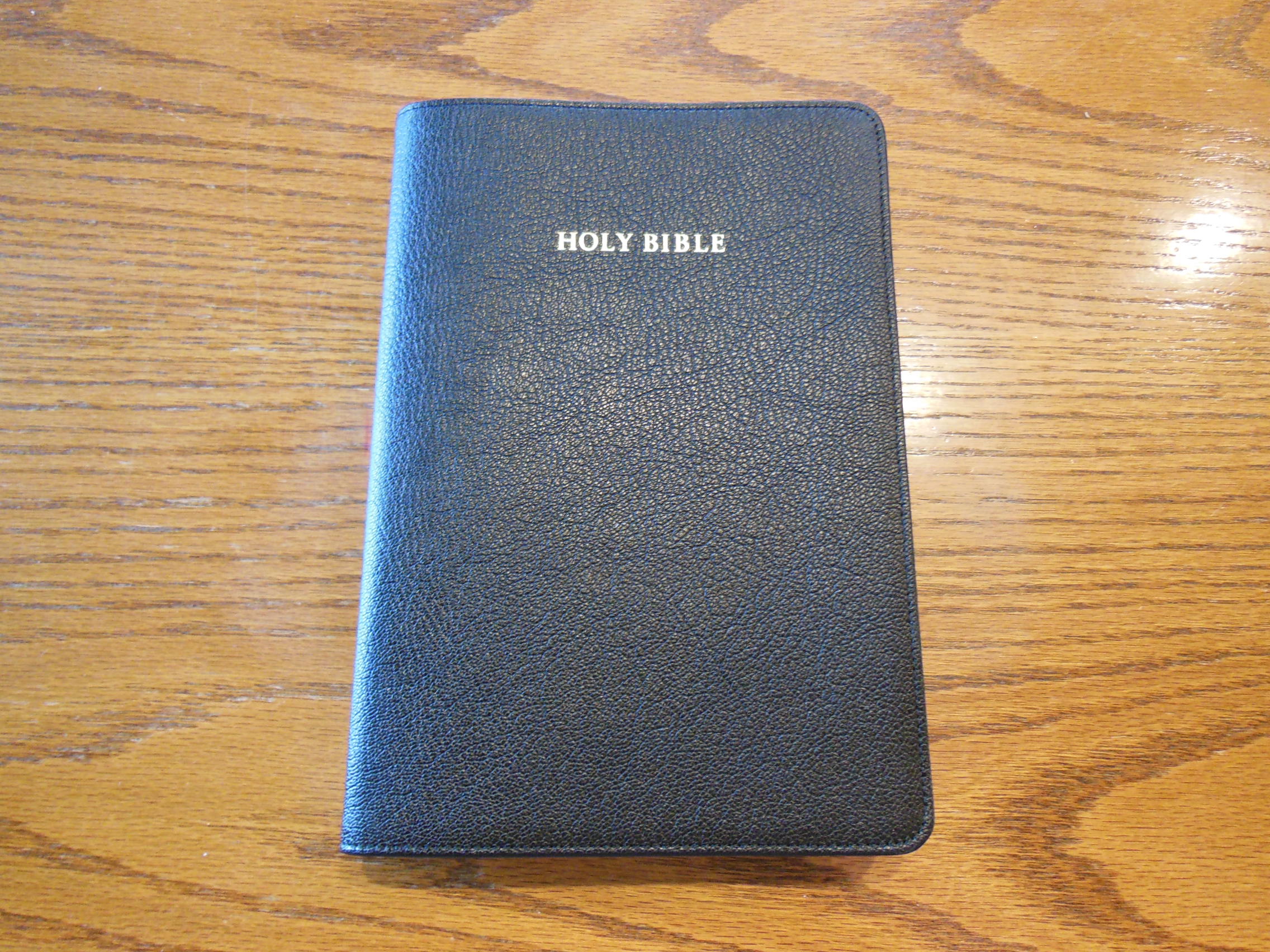
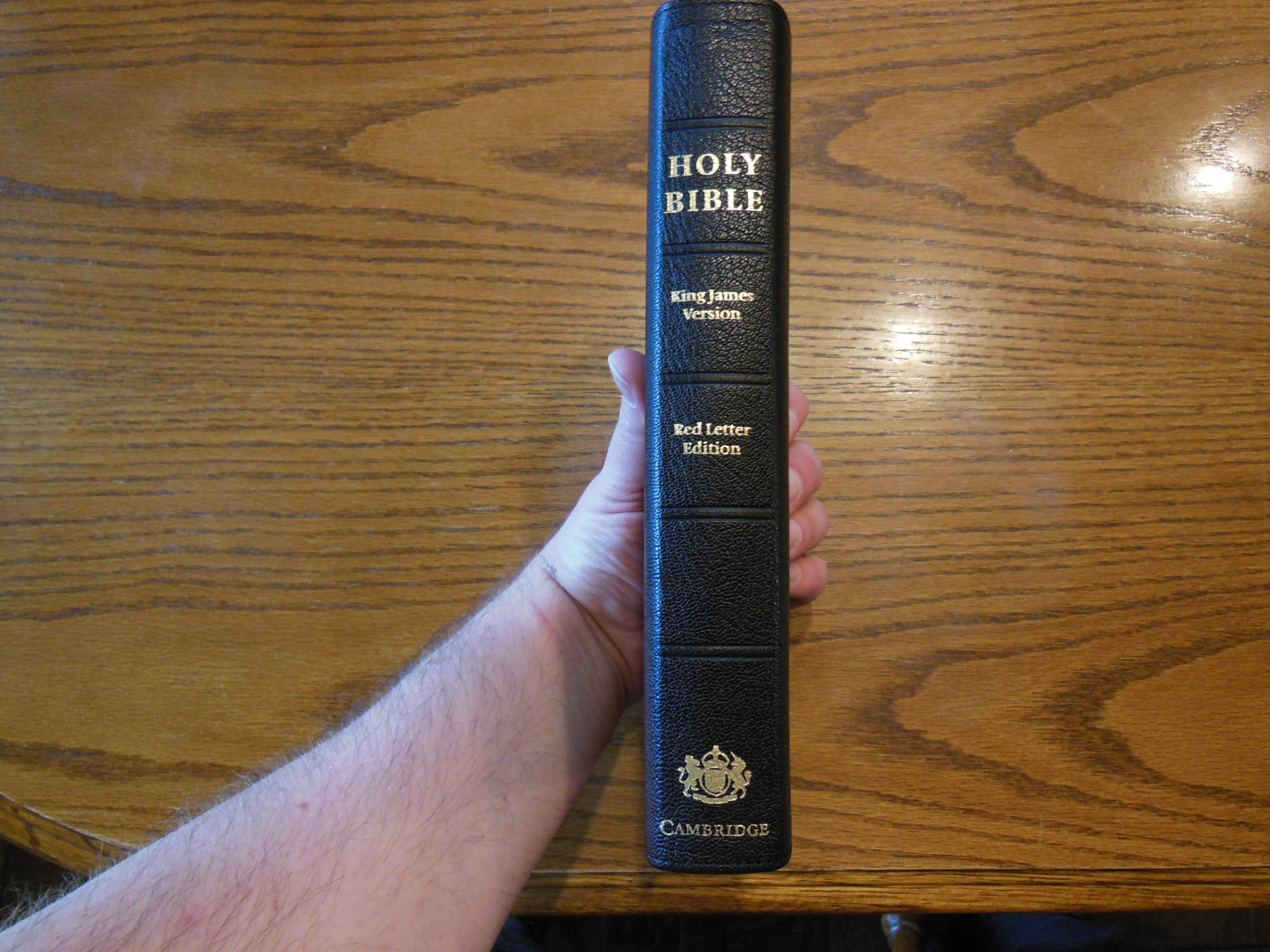
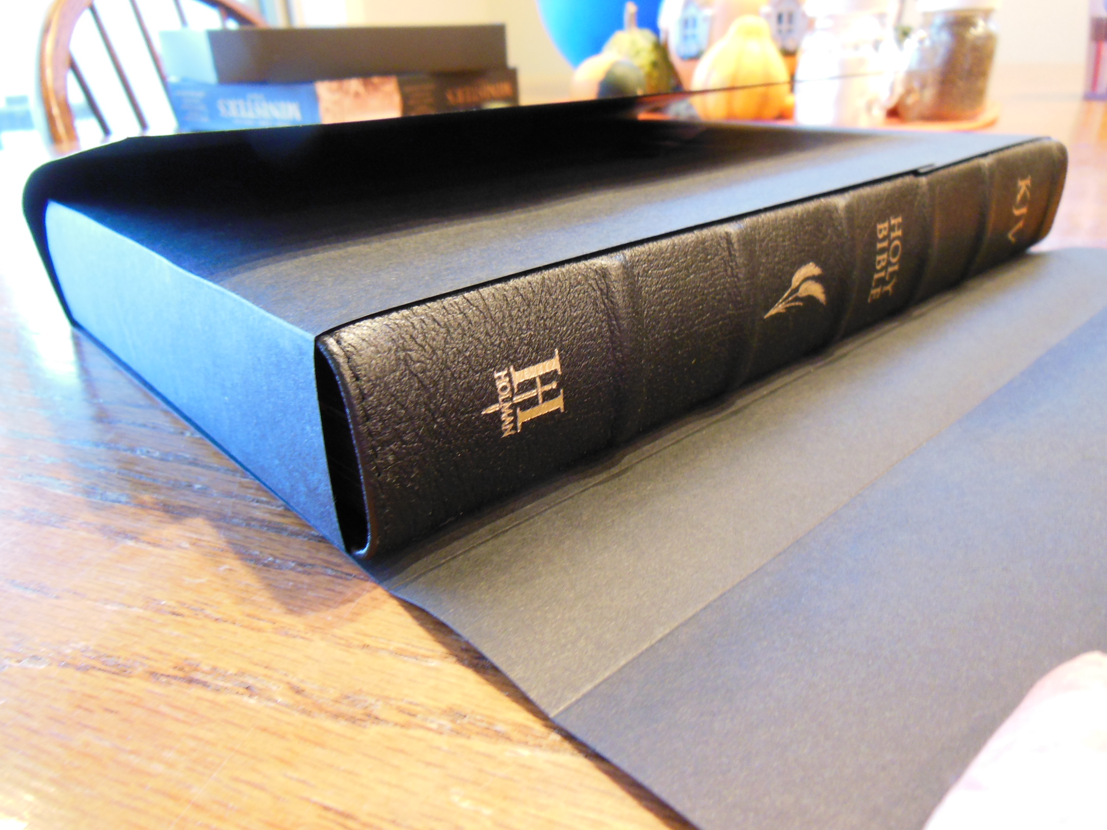
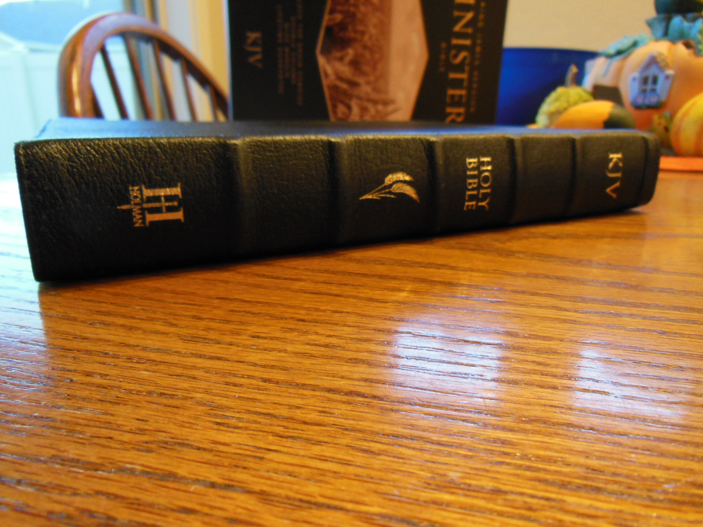
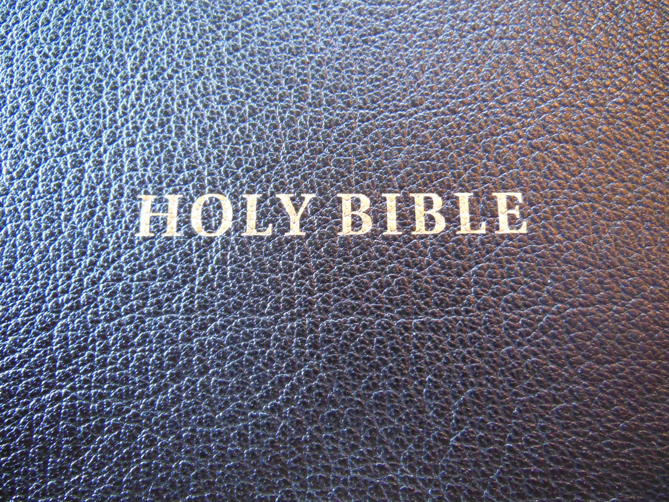
The front cover is imprinted with the words, “Holy Bible” in gold and the spine is imprinted with, “Holy Bible” at the top, “New American Standard” immediately under that, “Wide Margin Edition” in the middle, and “Cambridge” at the bottom. These are all printed in gold.

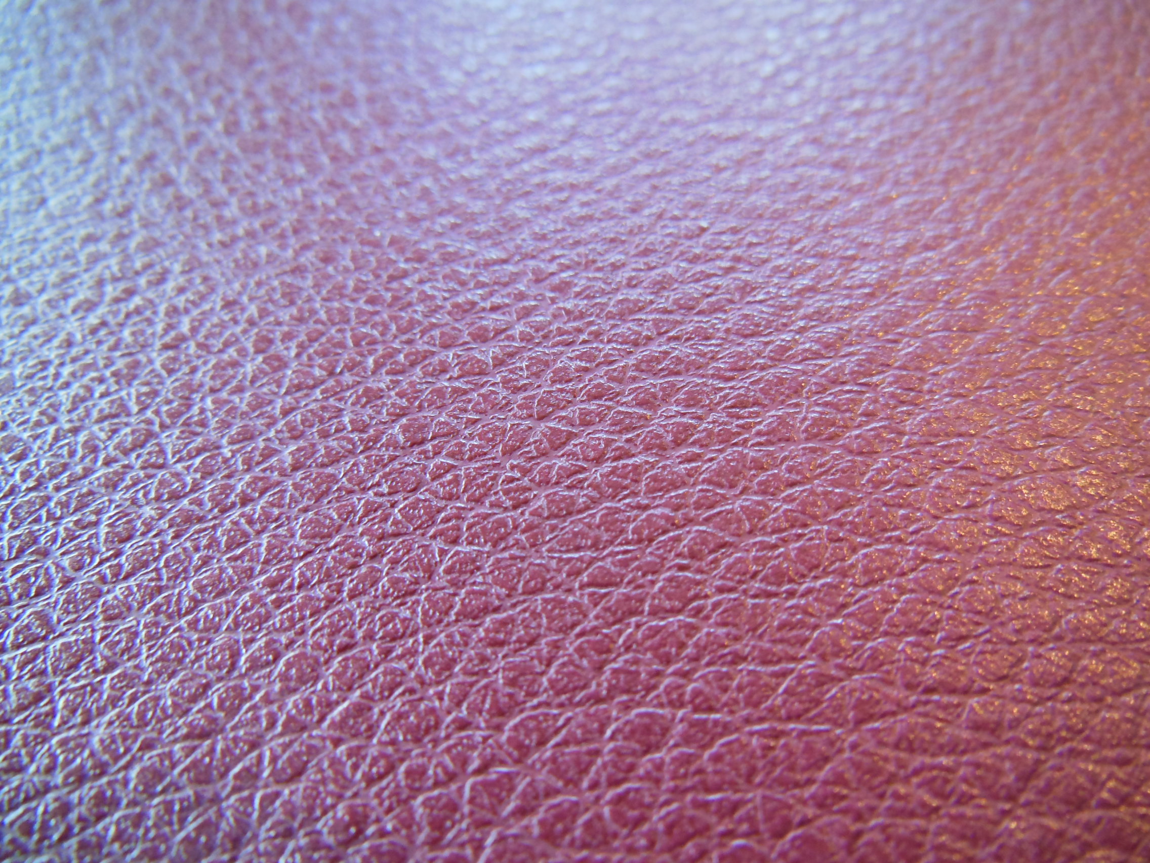
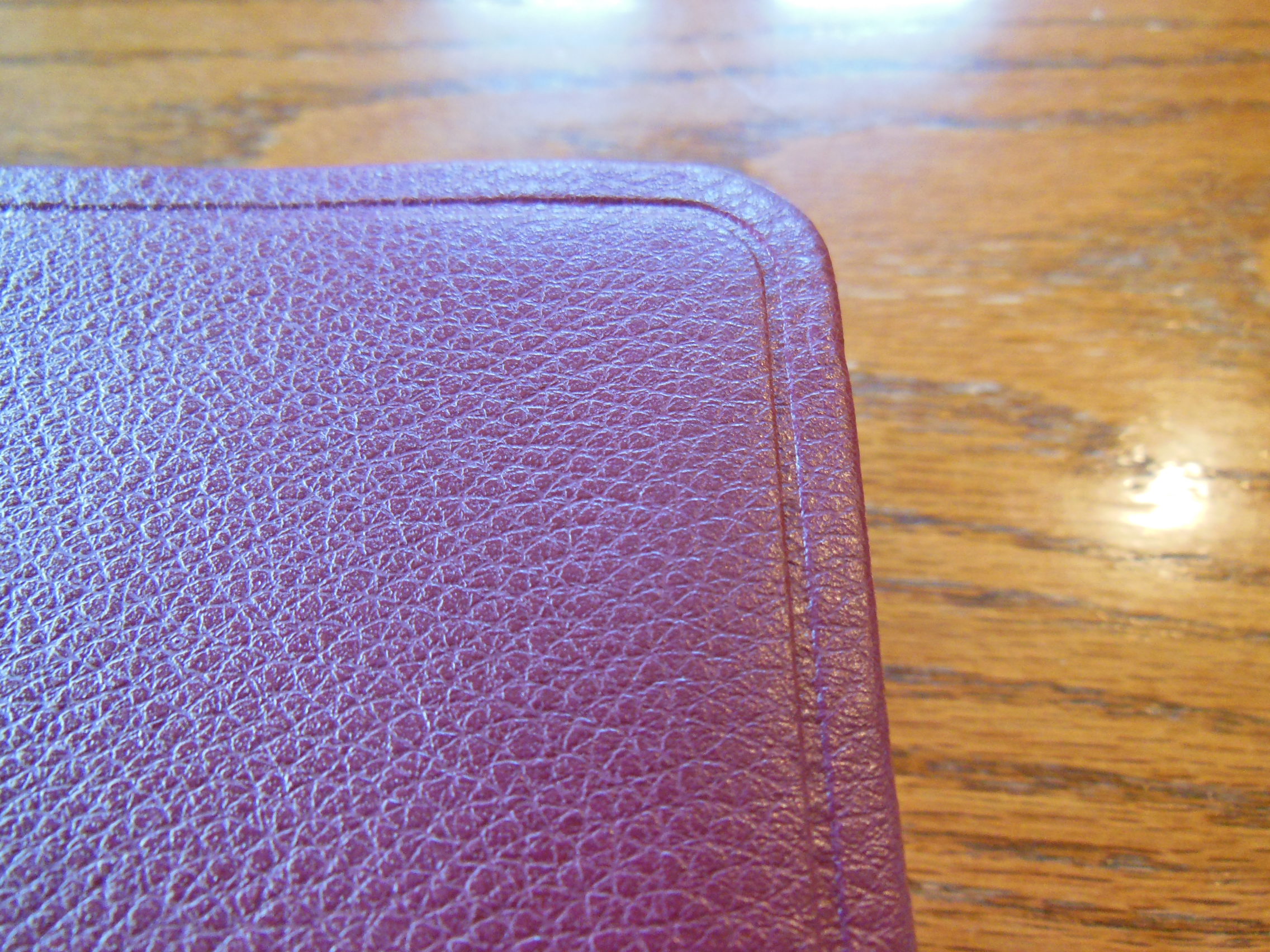
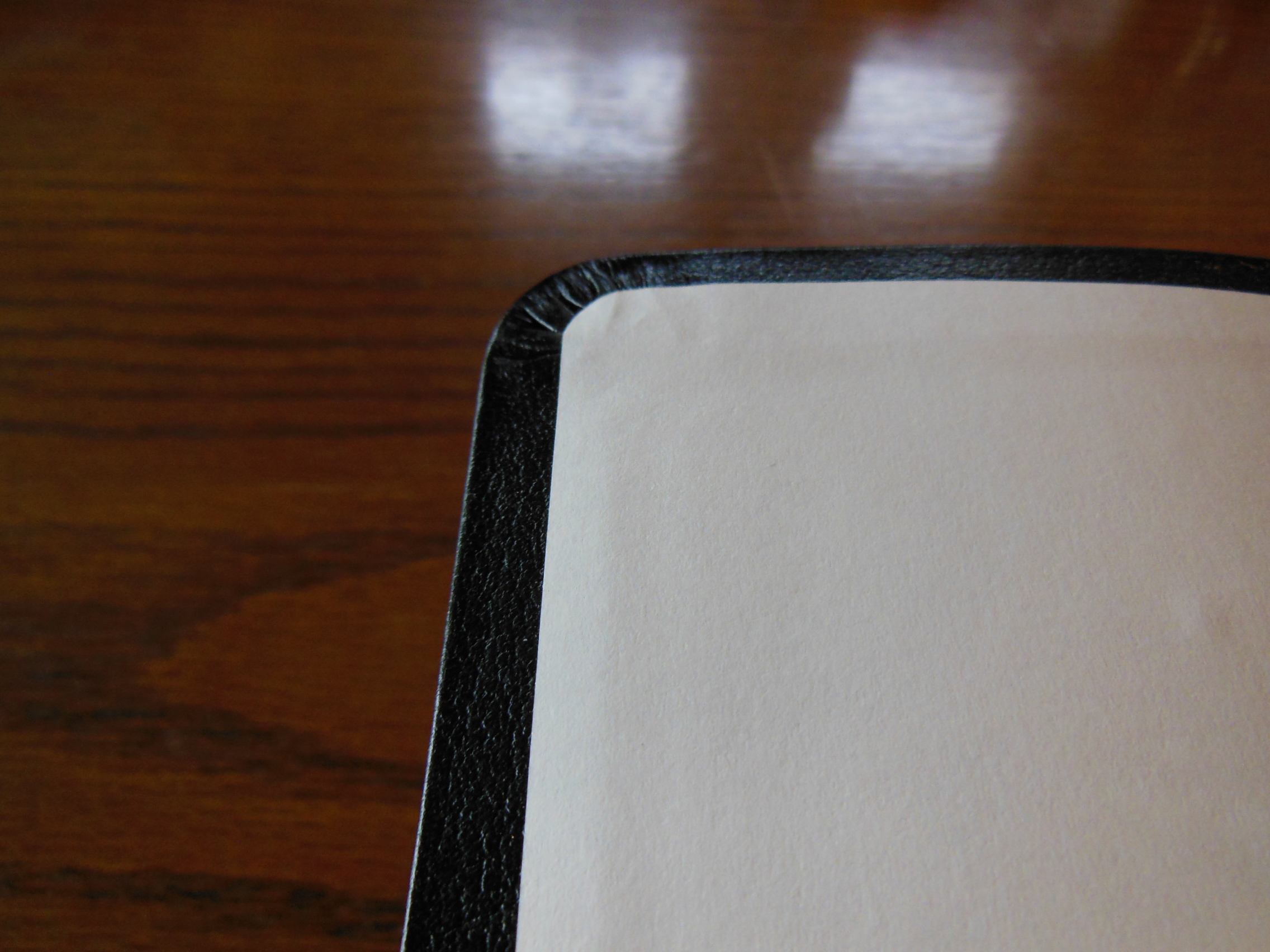
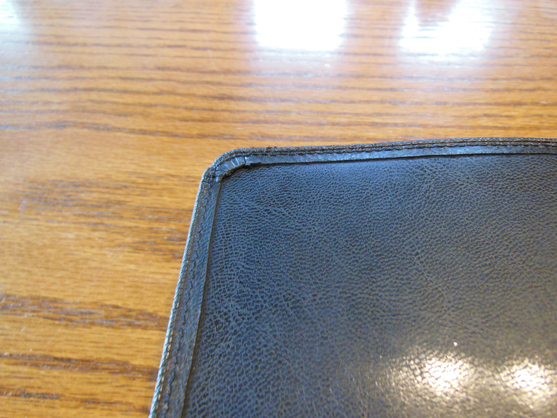
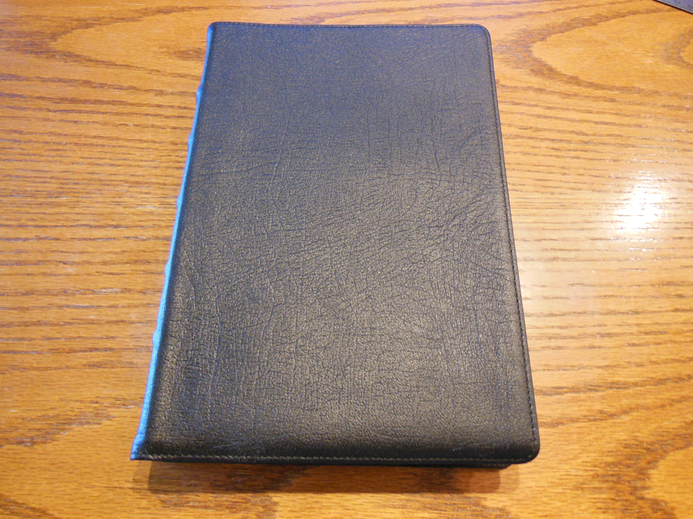
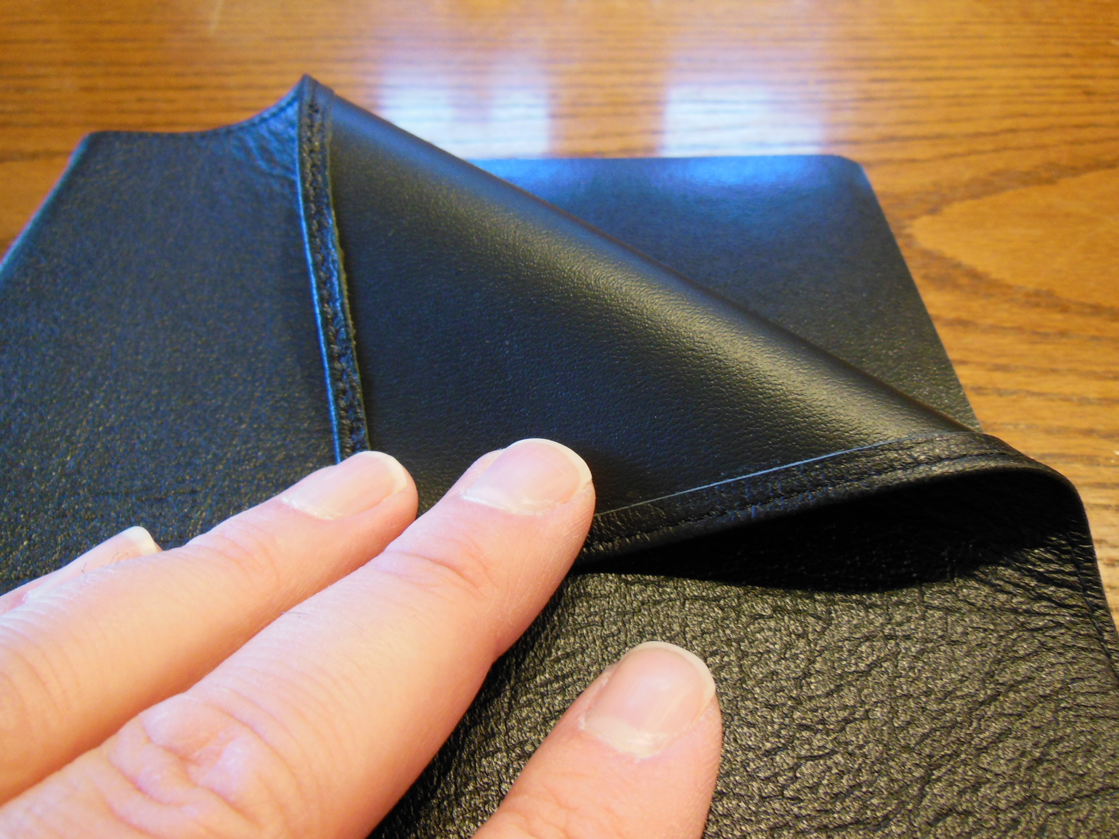
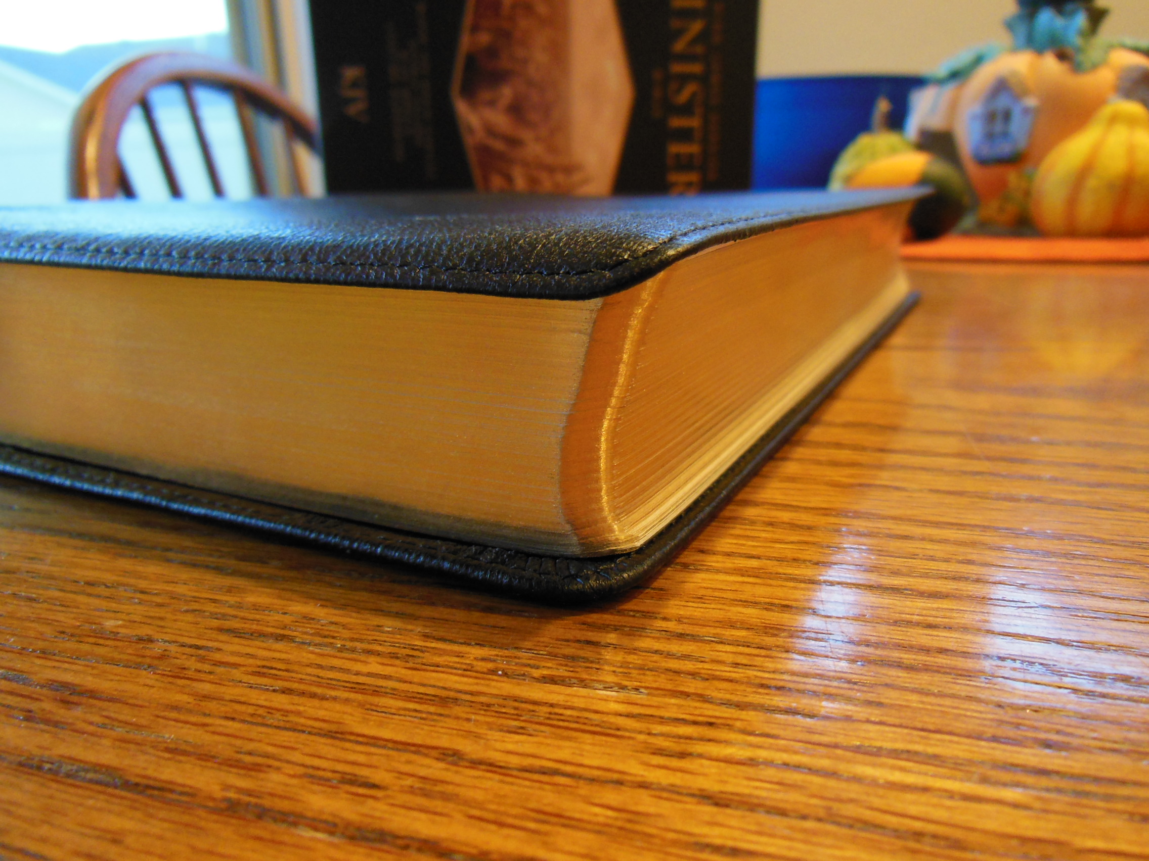
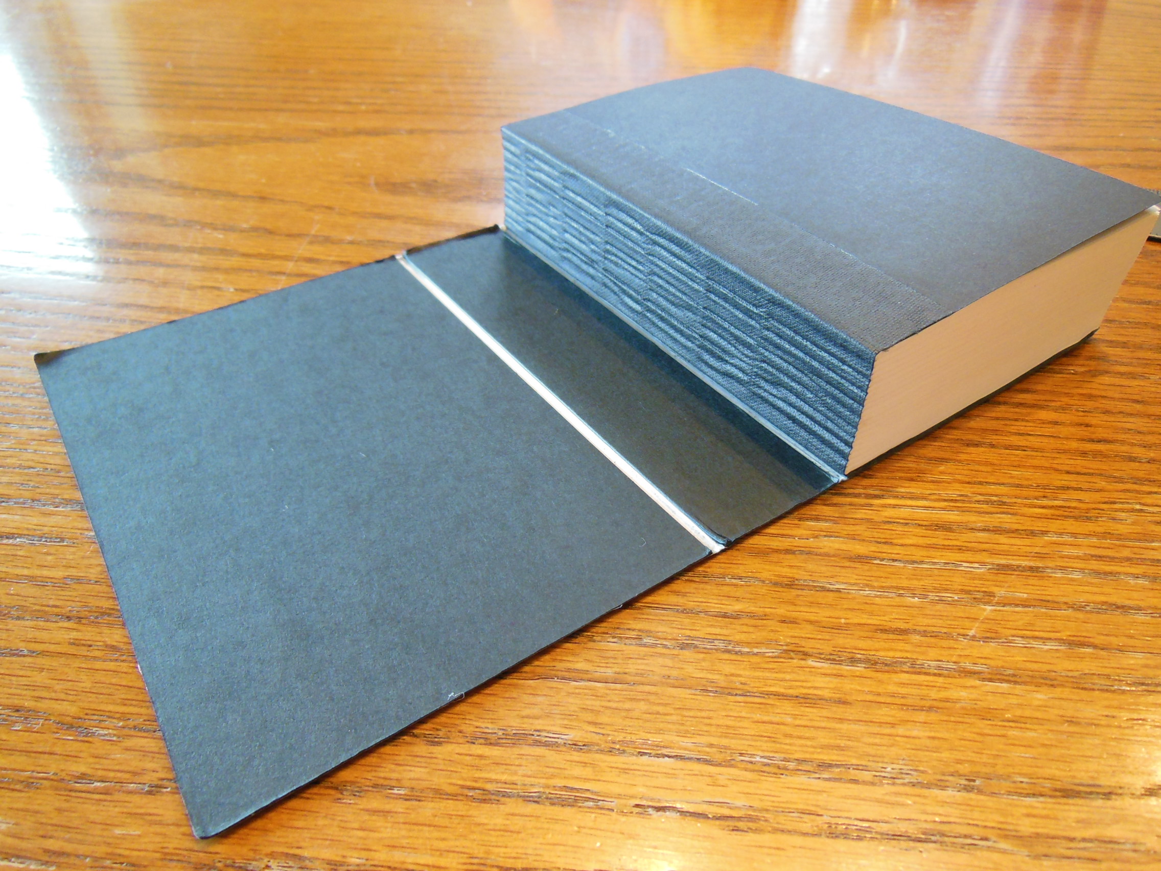
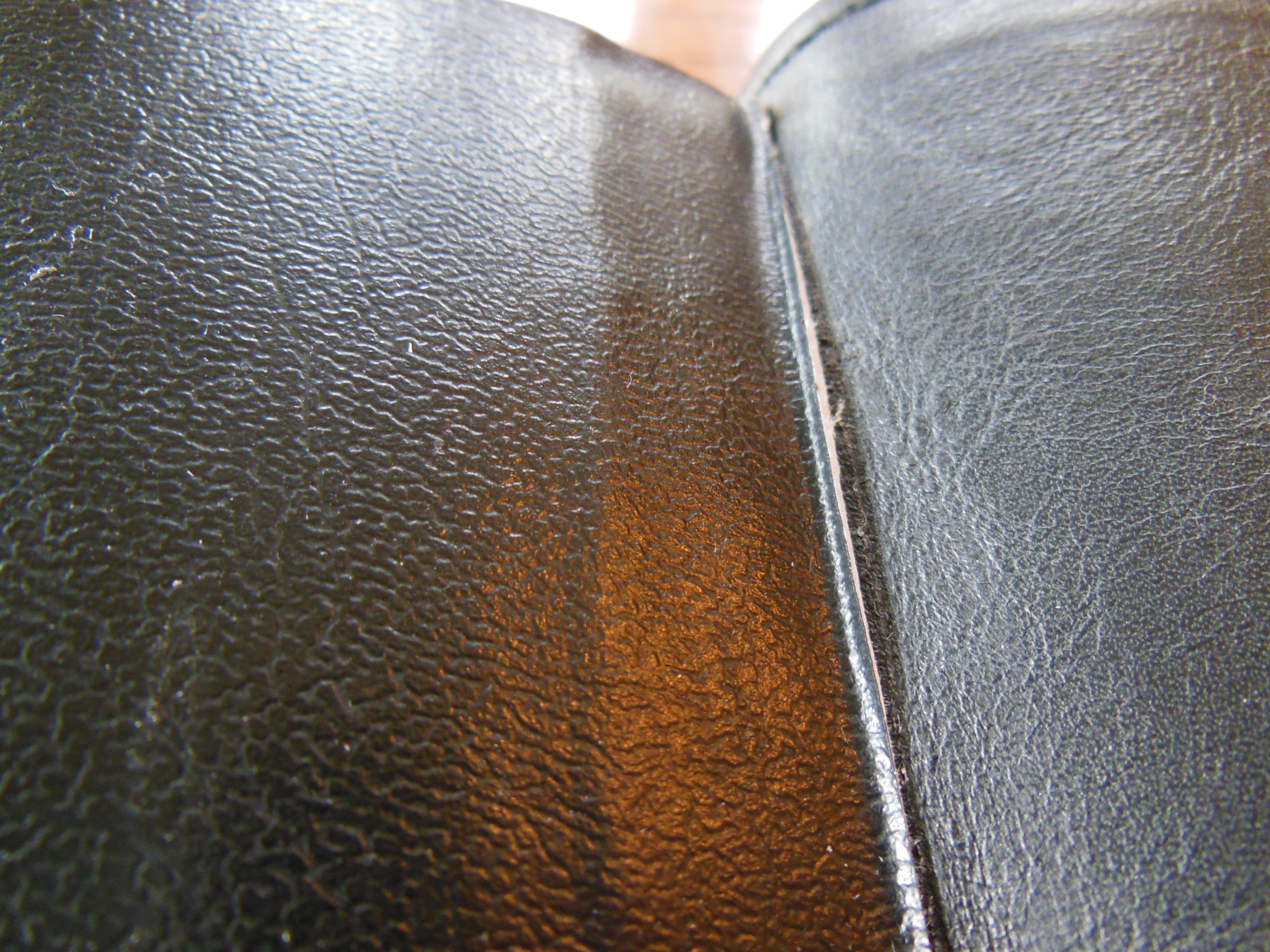
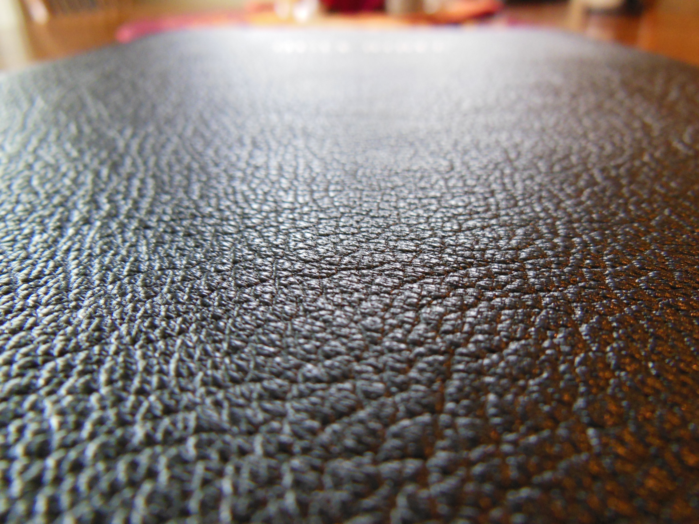
The cover on this edition is crafted from black goatskin leather. It has a natural grain that is soft to the touch and comfortable to hold. It is not slick and shiny like some less expensive covers made from pigskin leather.
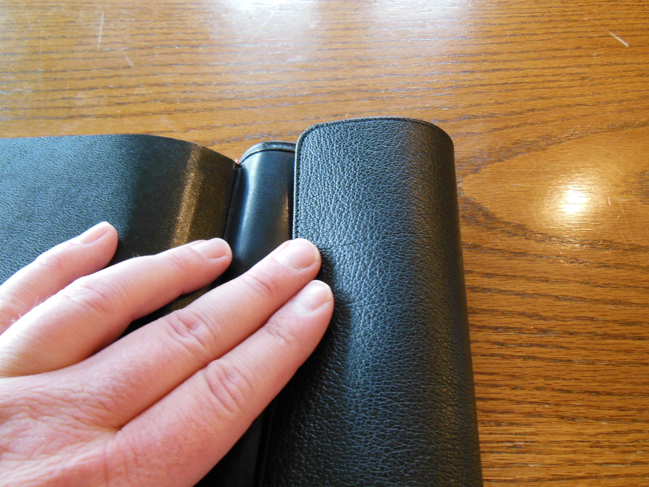
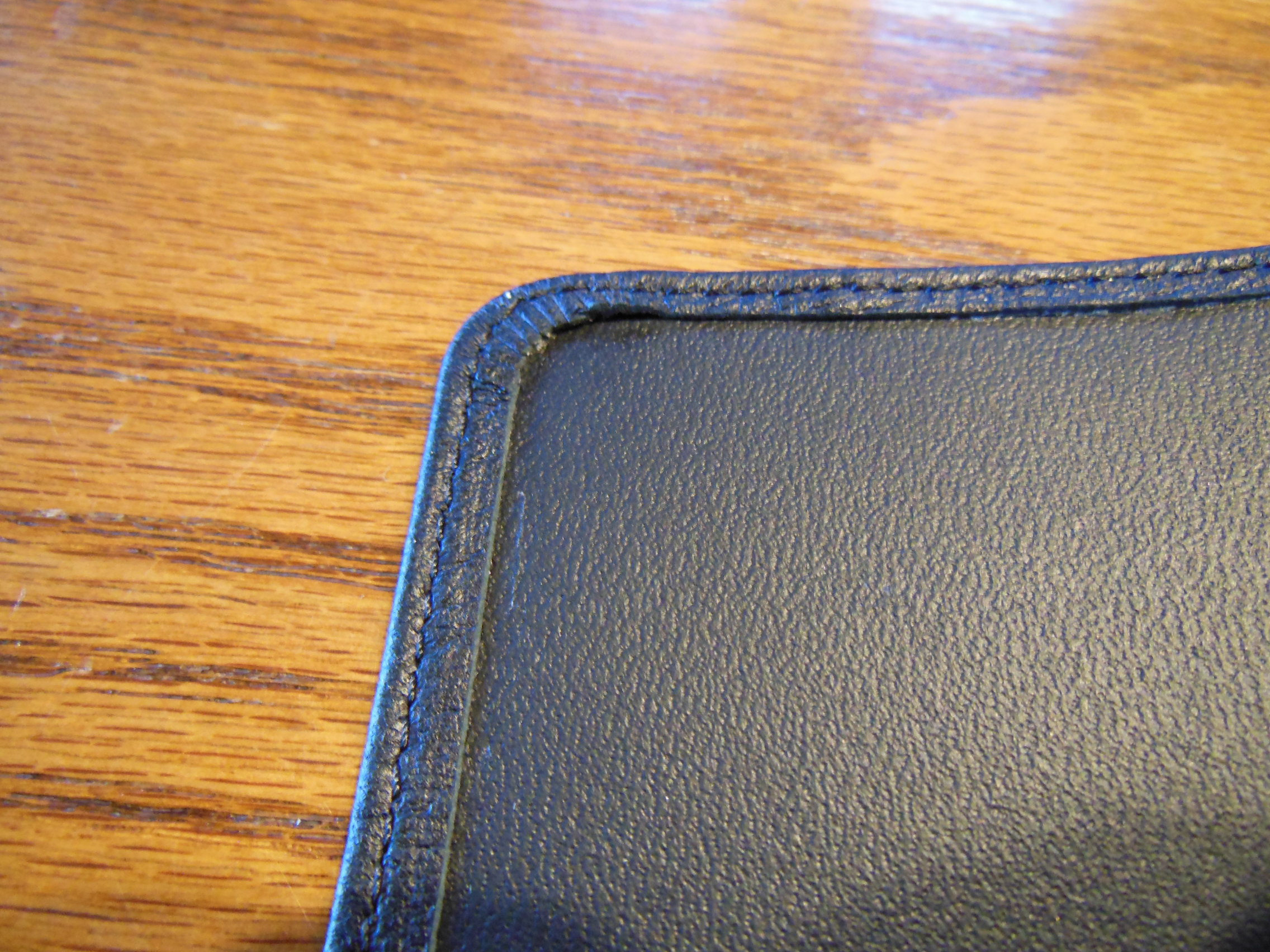
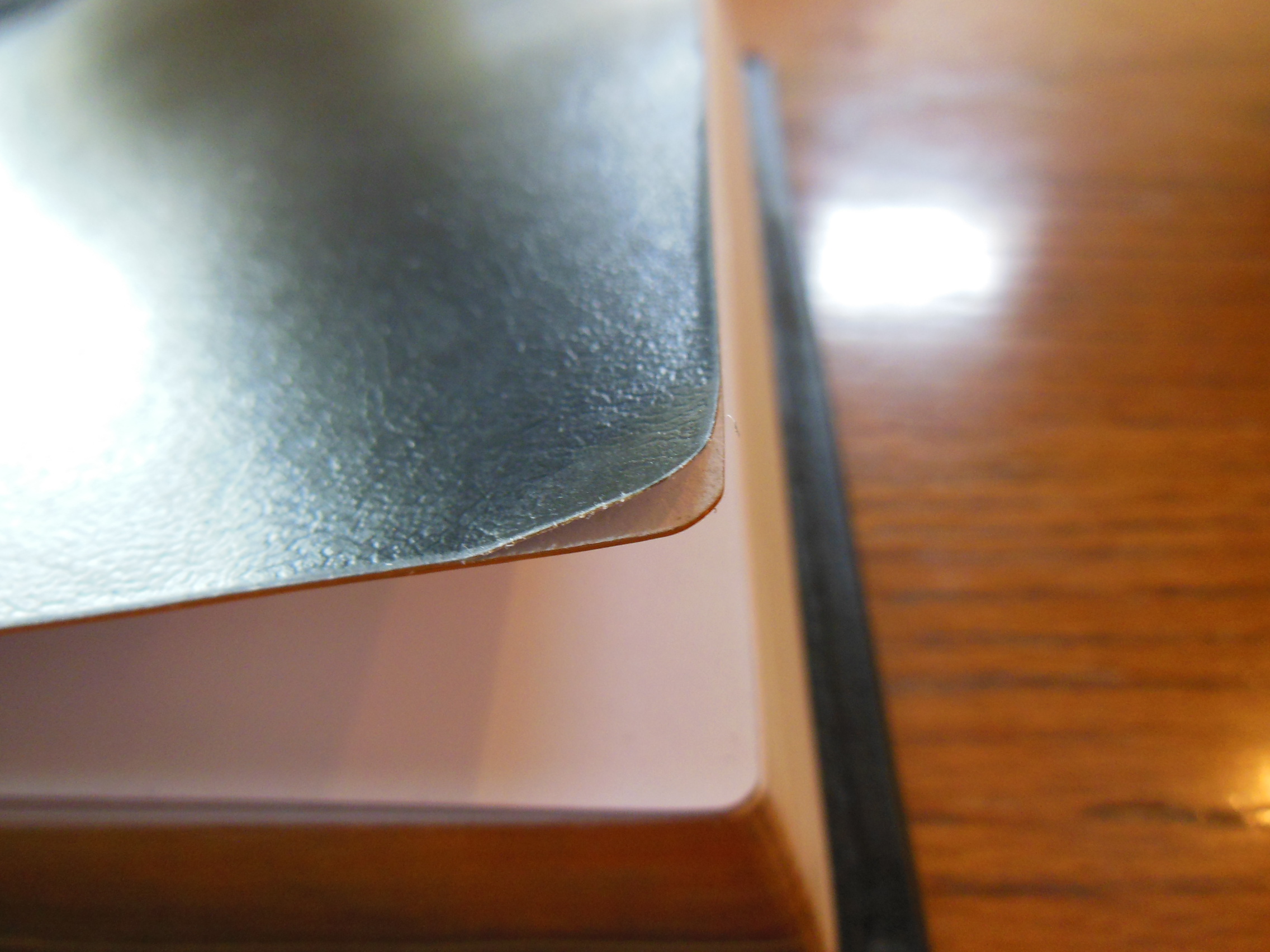
The inside cover is edge lined and sewn to the outer cover.
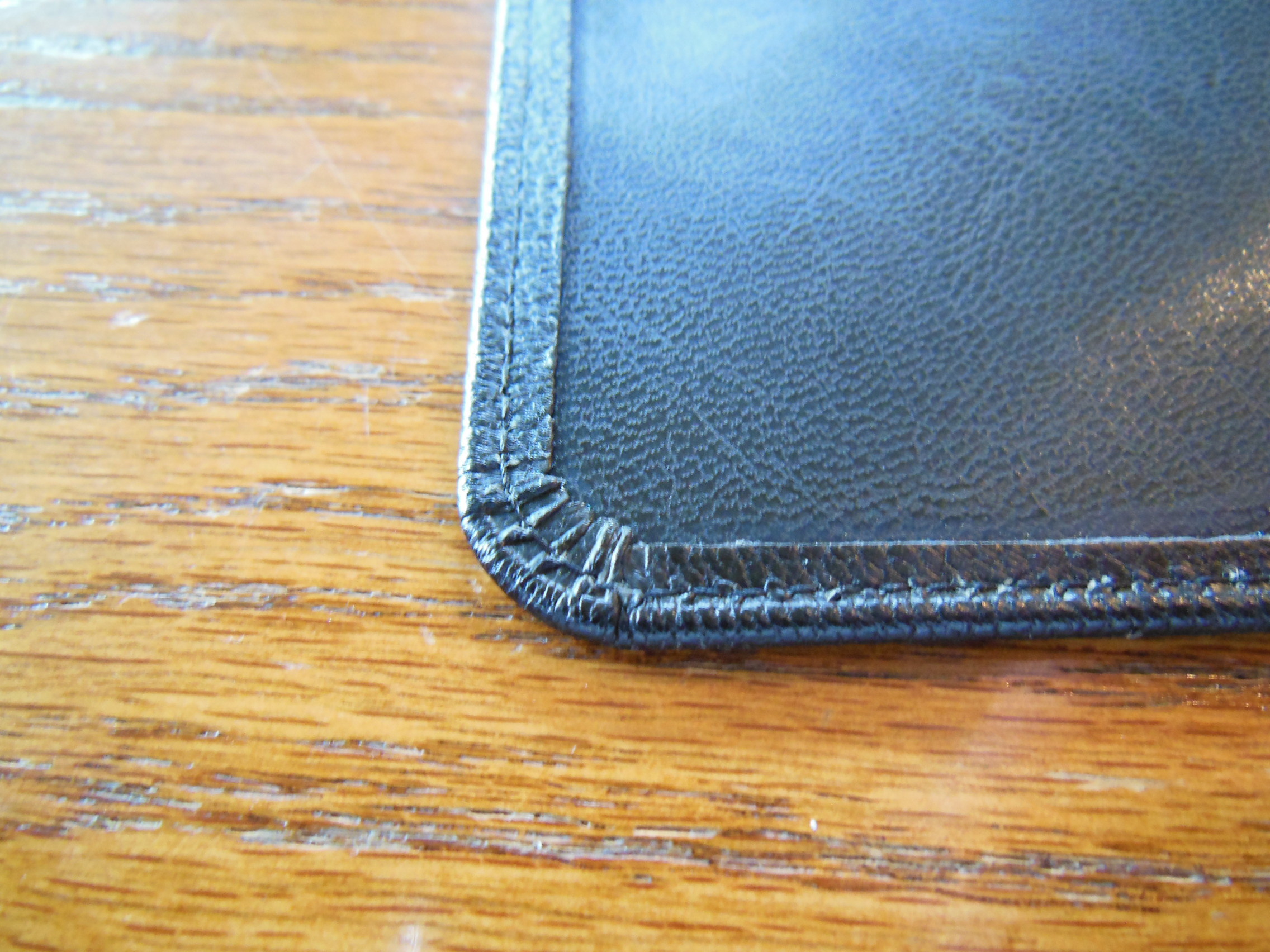
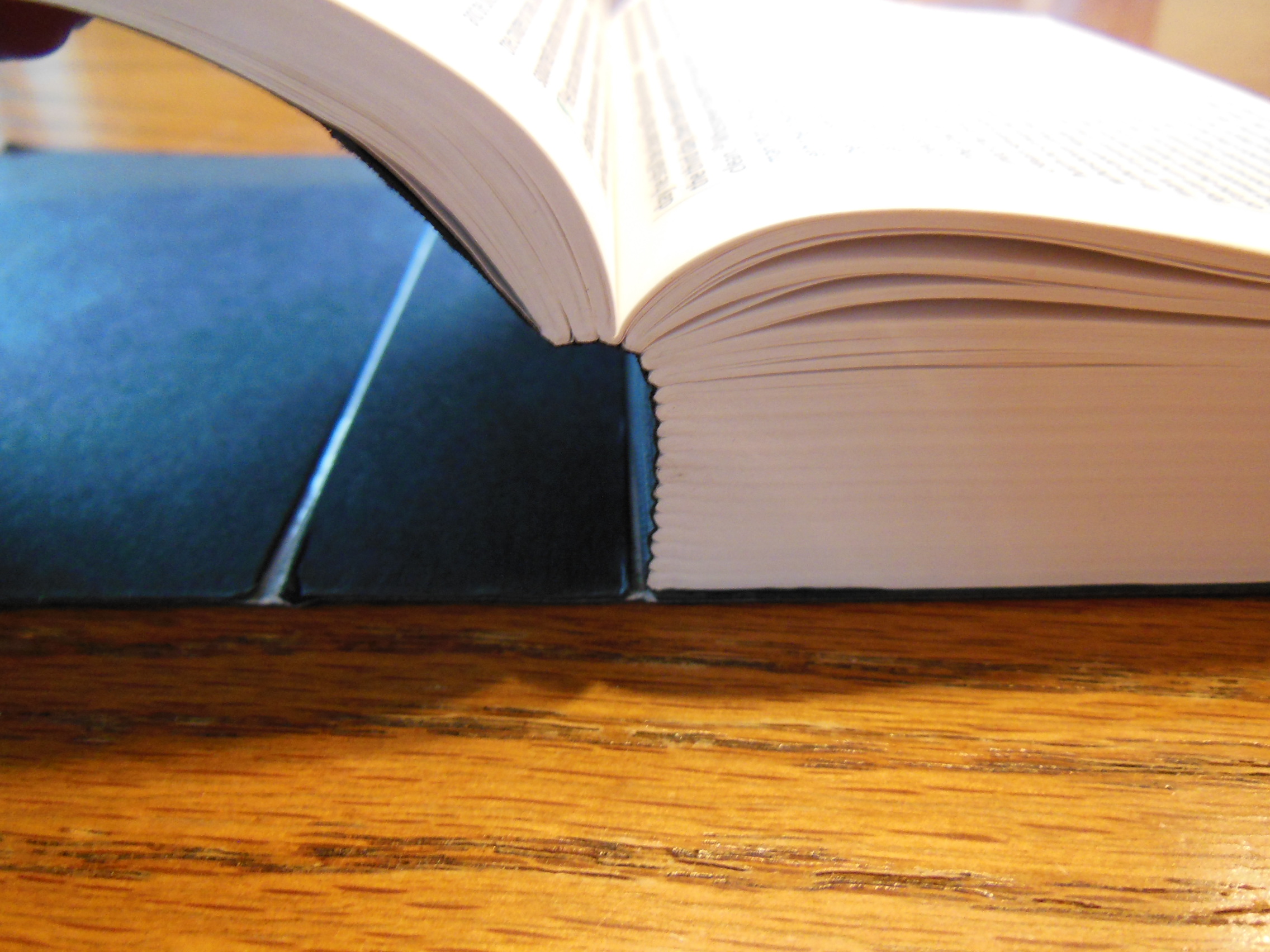
The edge lined goatskin cover coupled with the fine smyth-sewn binding make this Bible very durable and supple.
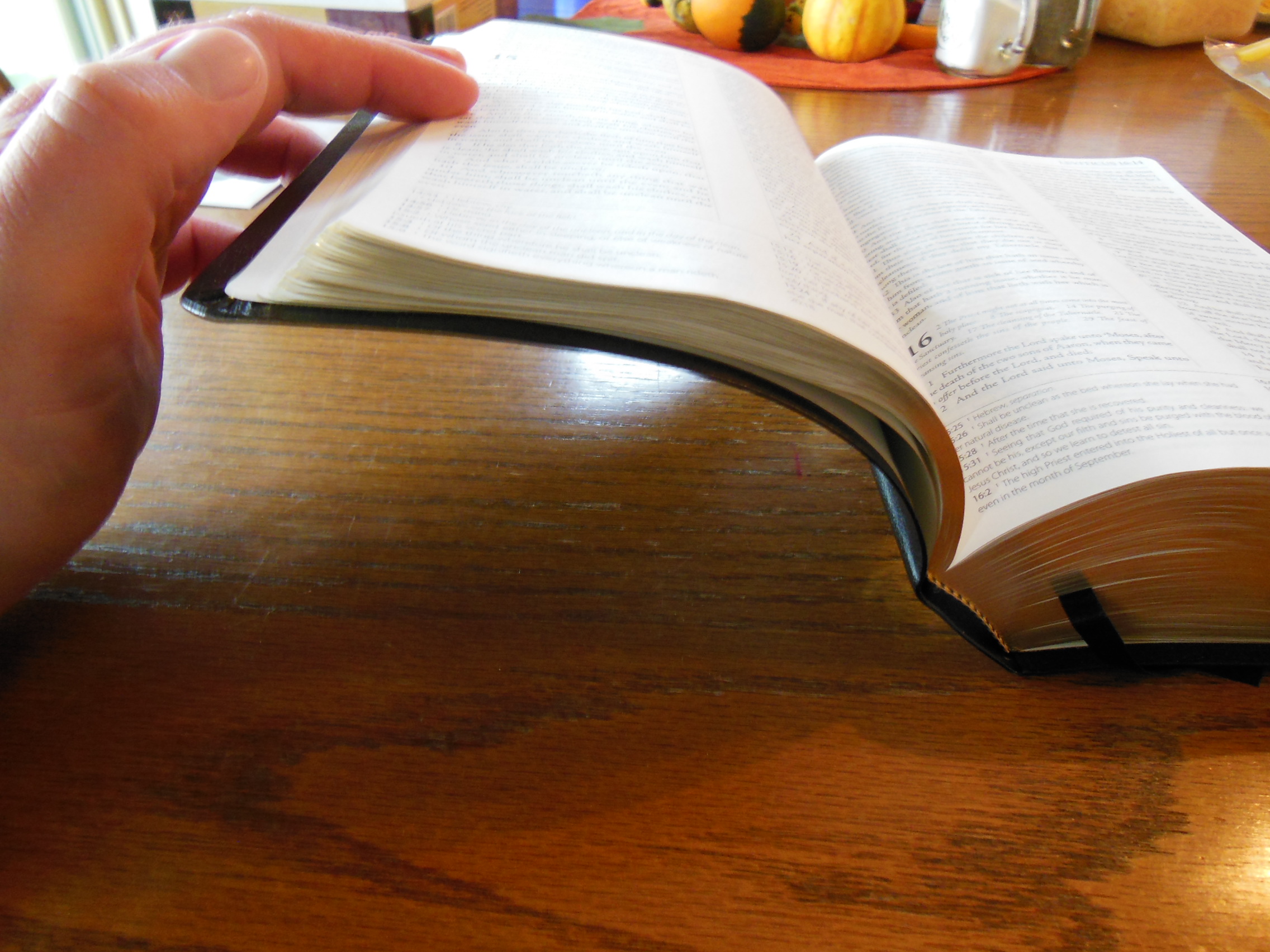
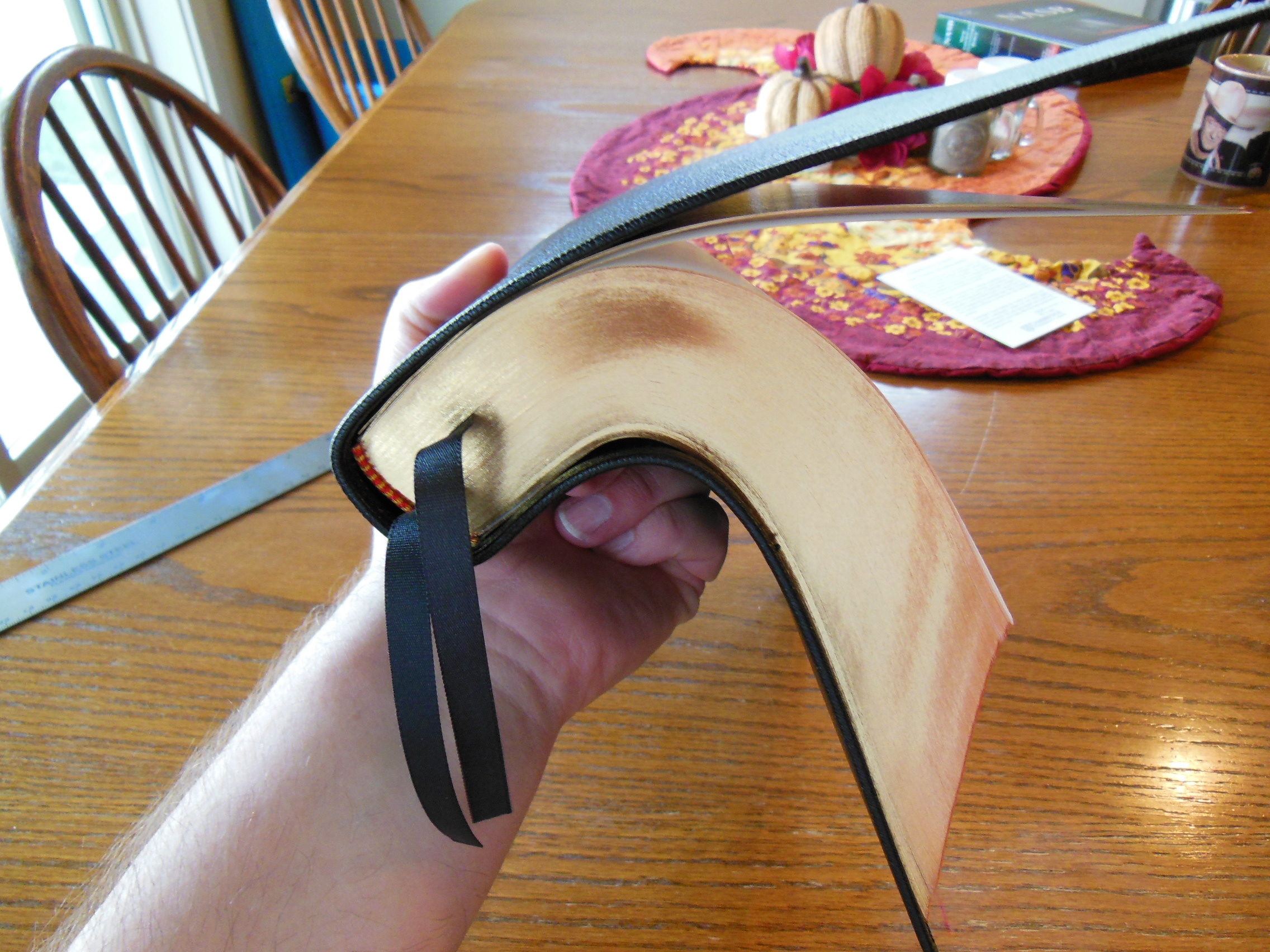
This Bible opens easily no matter where you start and lays flat fresh out of the box.
If hold it in one hand you will find that it drapes over your hand.
The Wide Margin is printed and bound by Jongbloed of the Netherlands. They are known for their craftsmanship in printing and binding fine Bibles.
As usual Cambridge has excelled in producing a high quality Bible that will set the standard for all other wide margin editions from other publishers. They have provided a target to aim for with their NASB Wide Margin in black goatskin leather. I have seen very few wide margin editions that come close to the Cambridge one. I hope that other publishers will rise to the challenge and start manufacturing their Bibles with the concept that it is God’s word and not solely a product to be carelessly mass produced.
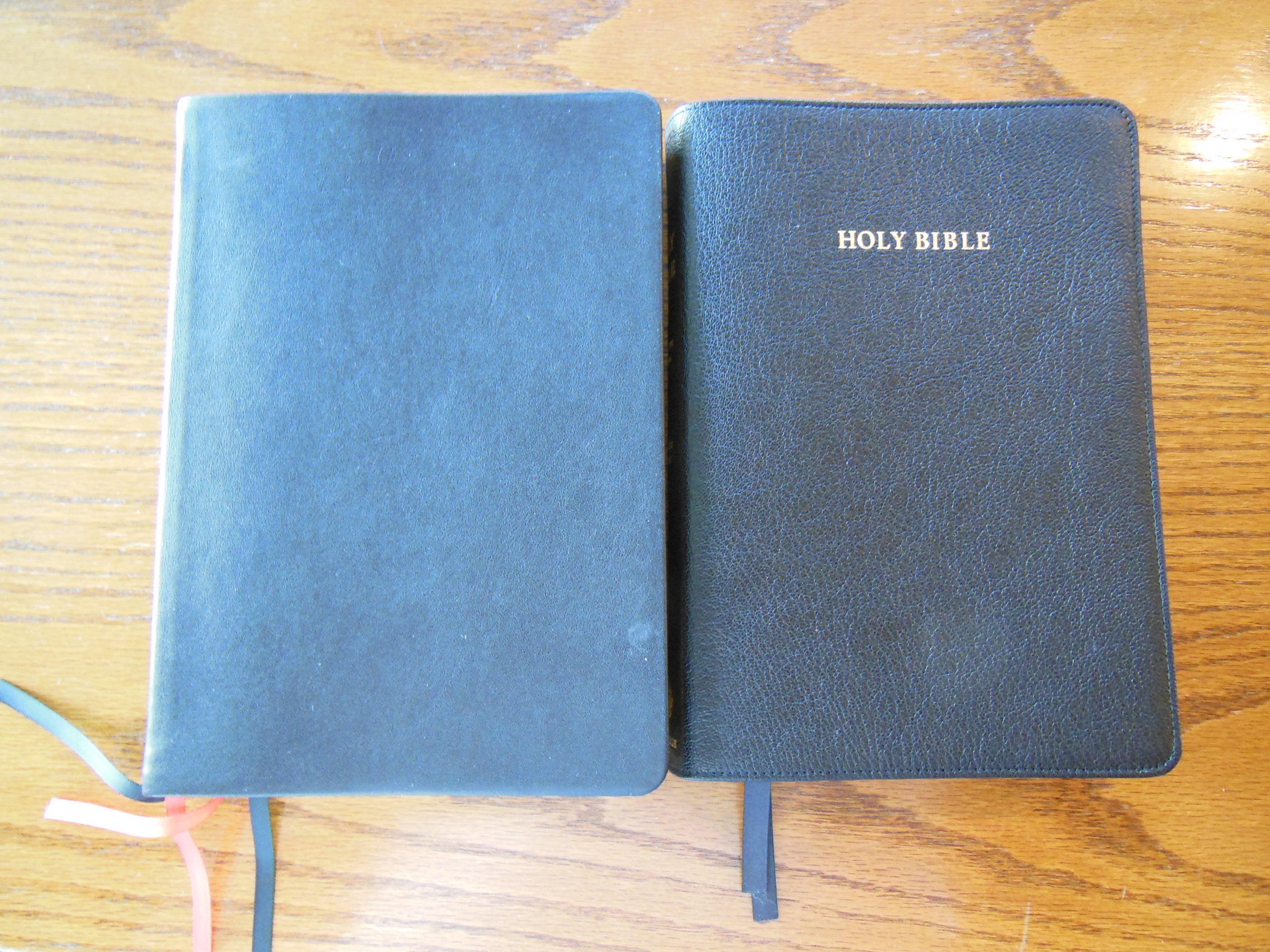
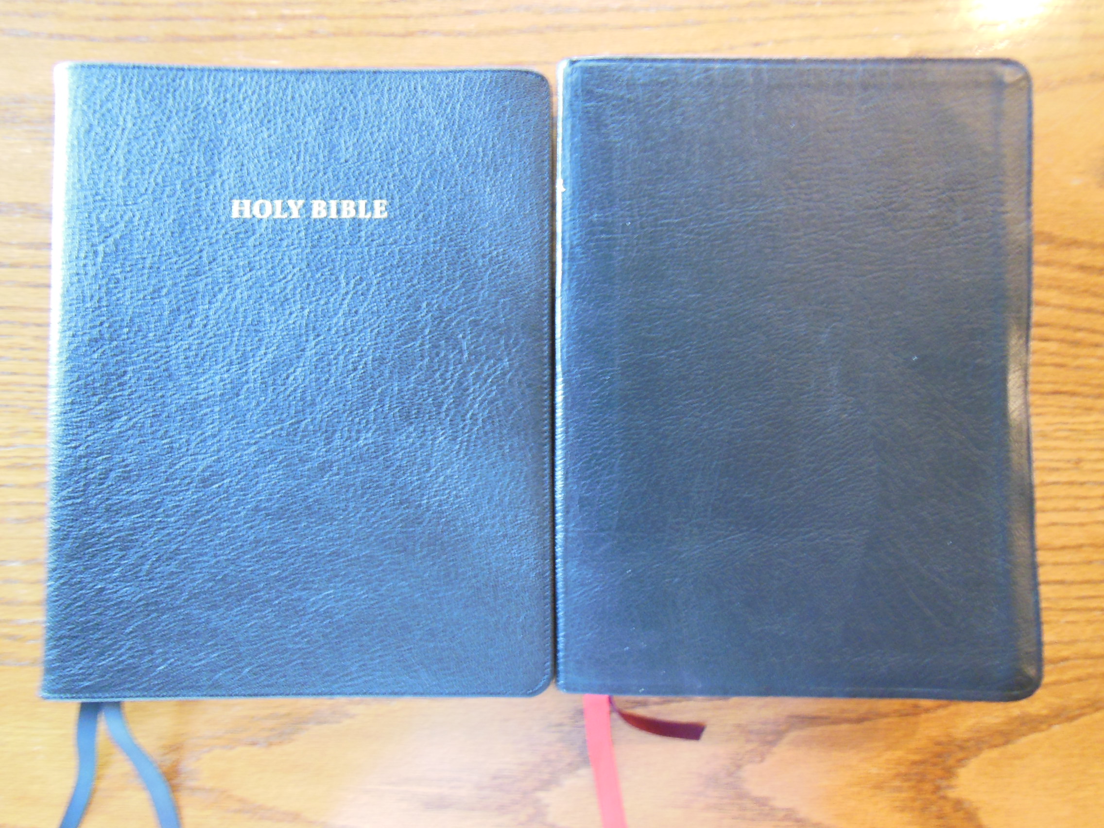
In the picture below you can see the Wide Margin compared to the NASB MacArthur Study Bible. This should give you an idea about the size of it.
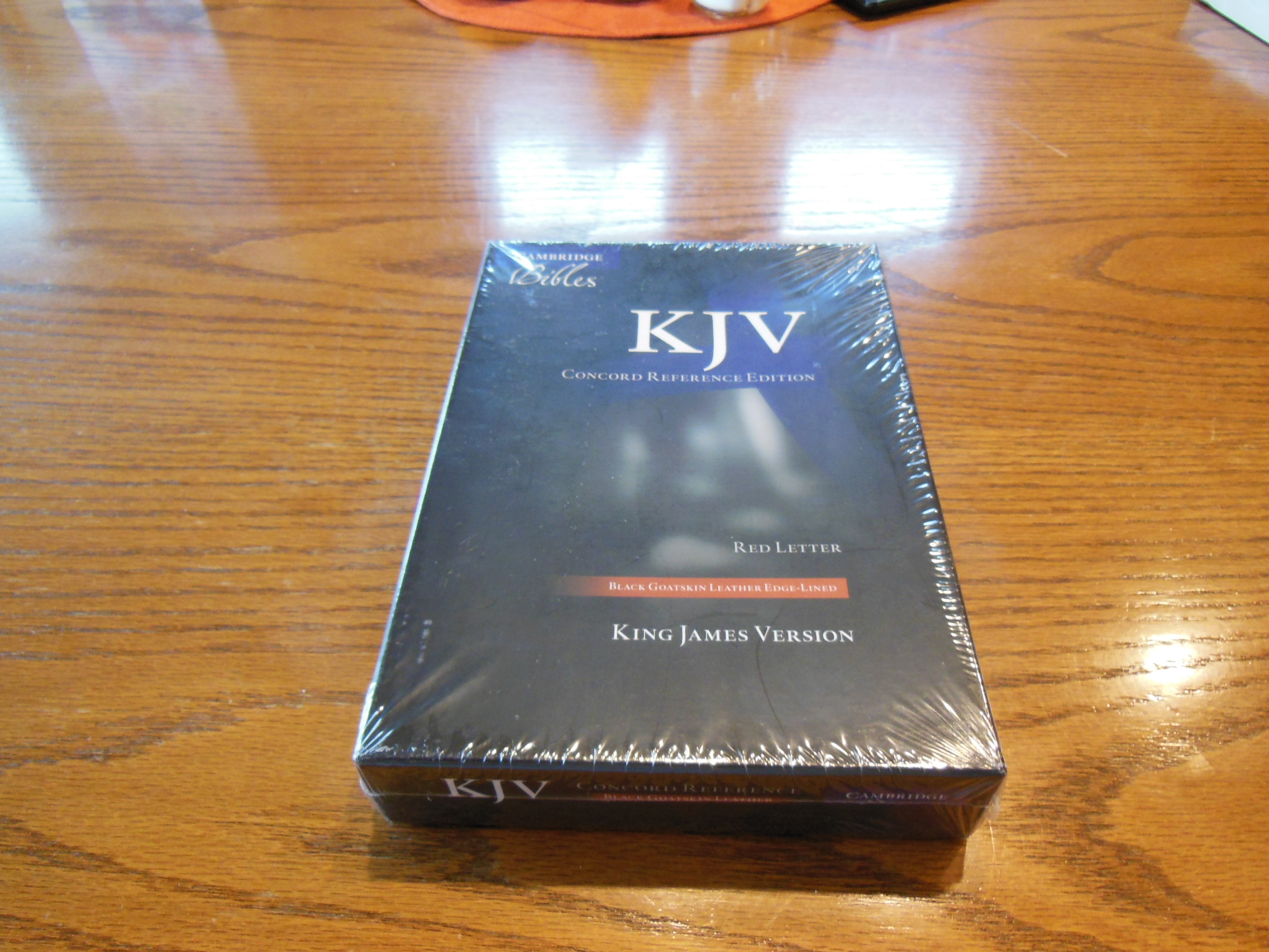
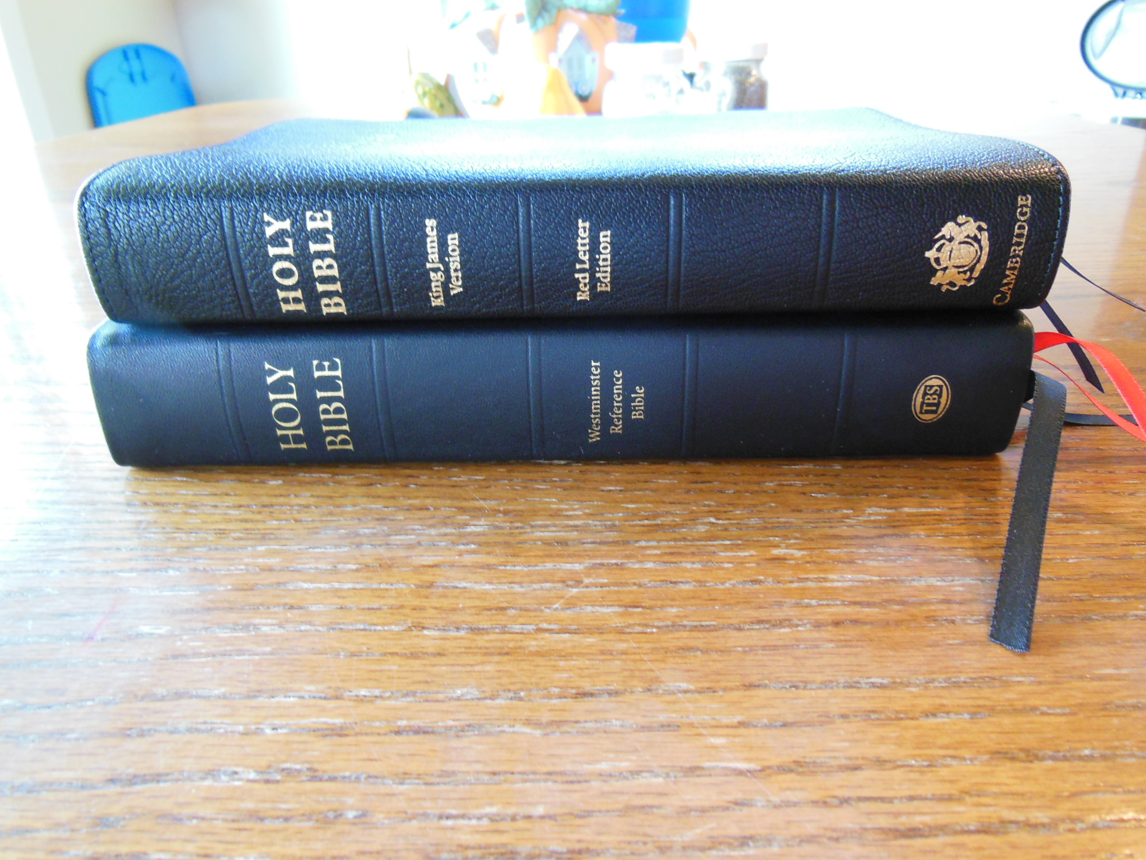
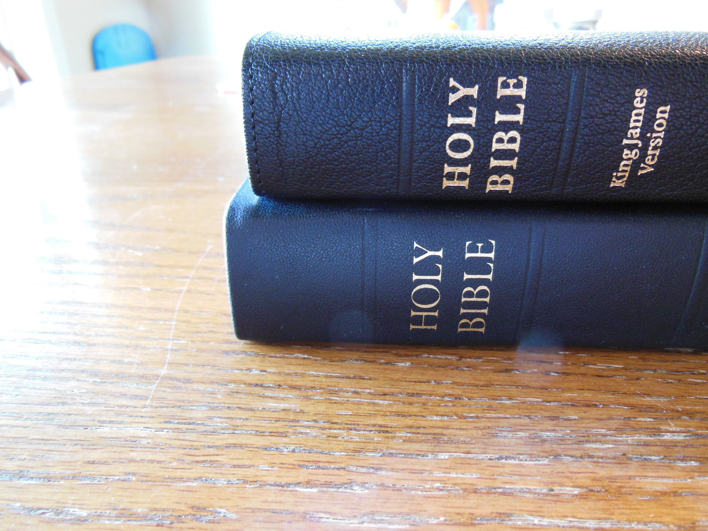
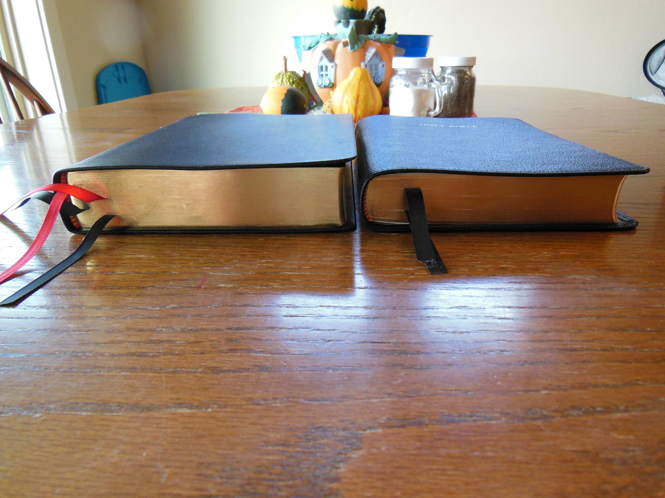
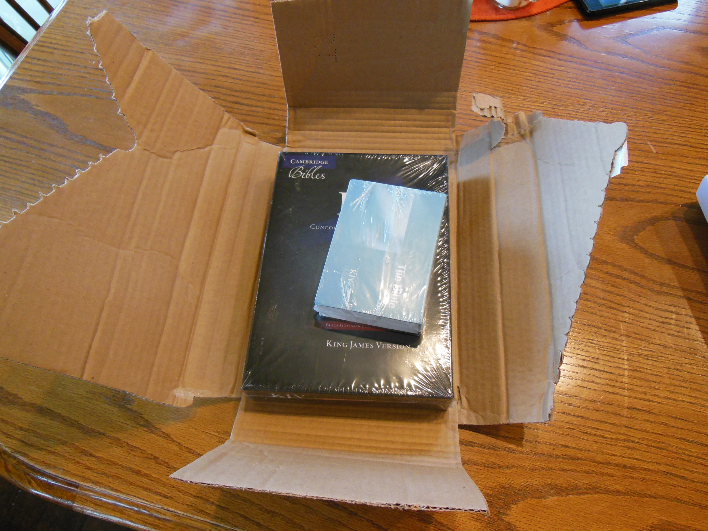
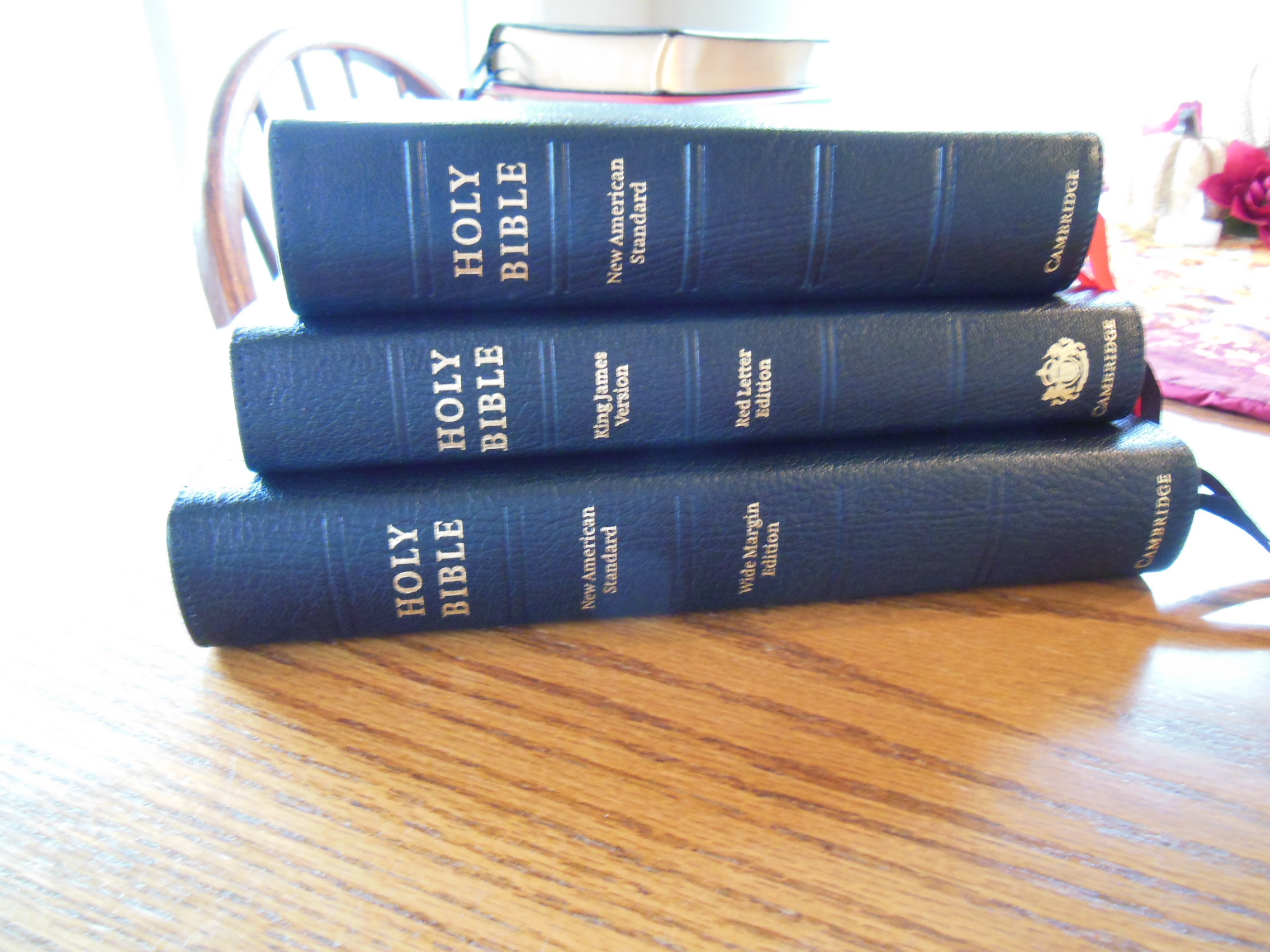
In these pictures you can see the Wide Margin on the bottom of a stack of Cambridge Bibles. On top is the NASB Clarion, then the KJV Concord, and finally the Wide Margin.


Here are some links to retailers selling this Bible
NS746:XRME
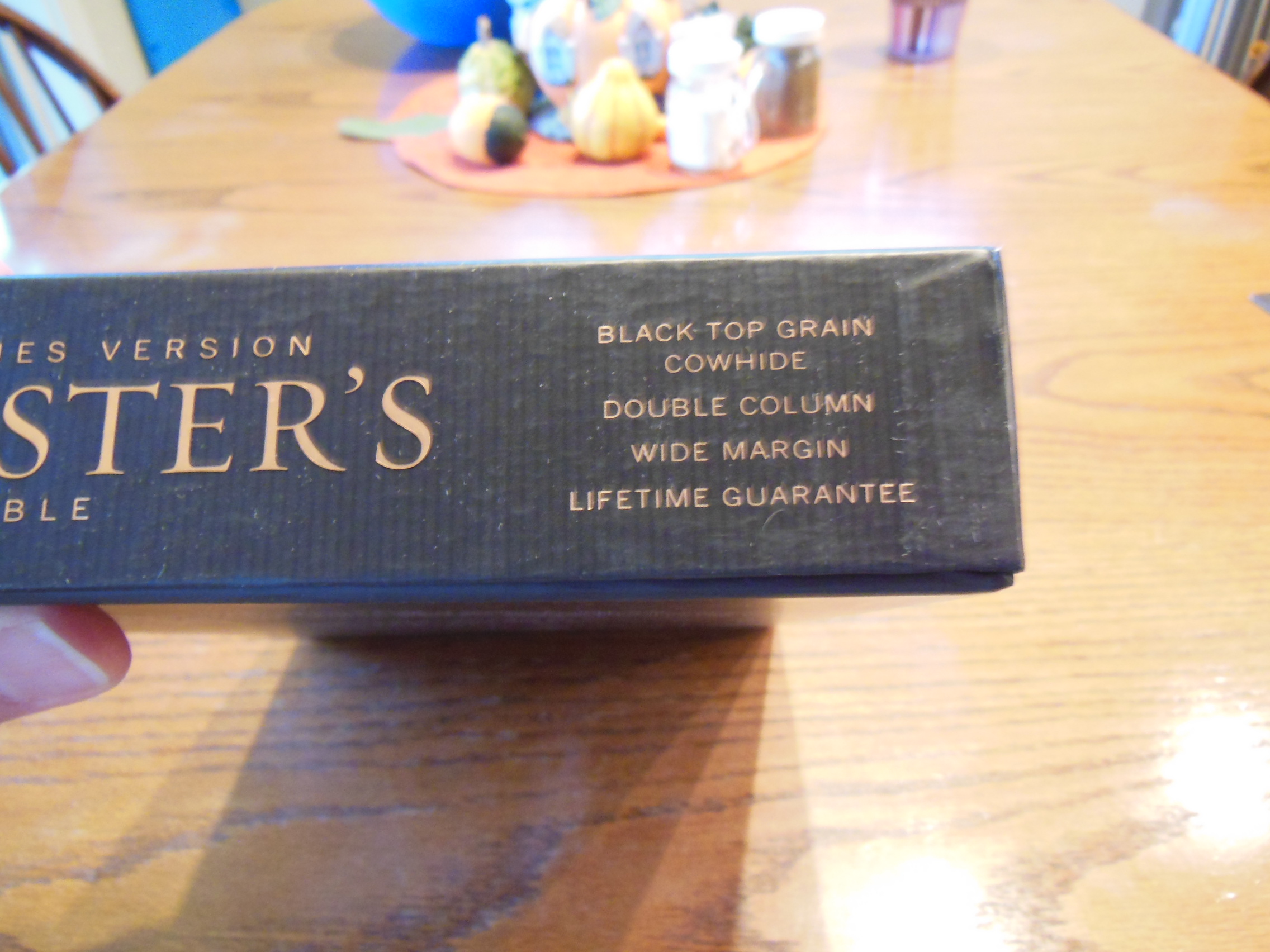
isbn: 9780521702652