Bible Reviews

The Cambridge KJV/RV Interlinear Bible, in Black Calfskin Leather, A Bible you might not have known that you needed.

DSCN2856

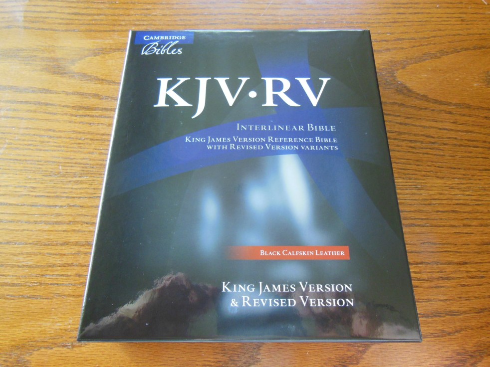
The KJV/RV Interlinear is an amazing tool.  For anyone who has had difficulties with the Early Modern English of the KJV, you are not alone.  The Revised Version was the first big translation to come from the Authorized 1611 KJV.  The 1611 KJV was in Early Modern English.  By the late 1800’s English had changed significantly.  On May 6th of 1870, at Canterbury, England, the general assembly of Episcopal clergymen, met and determined to, revise, for public use, the authorized 1611 KJV.  This was notable for a few reasons, my favorite of which is that it was a cooperative effort between British and American theologians, who were experts in the Biblical languages.  Their objective was, “From the outset the object sought by the revisers has been “to adapt King James’ version to the present state of the English language without changing the idiom and vocabulary,” and further, to adapt it to “the present standard of Biblical scholarship.” Since 1611 this latter has made great advances, especially during the last quarter century.”  Here is some information I was given from Cambridge, “A little historical data/background: The Interlinear Bible is really two Bibles in one. It combines the King James Version of 1611 with its first authorized successor, the Revised Version of 1885. This edition includes the highly respected cross-references from the Revised Version, which are considered to be among the finest ever produced. It also carries the footnotes from both versions, giving at times four different renderings of difficult passages.”

A little later in 1901 American theologians made a few more revisions to come up with the American Standard Version.  This translation of course is where we get my favorite translation the New American Standard Bible.  For all of the NASB fans out there, be glad this work was done.

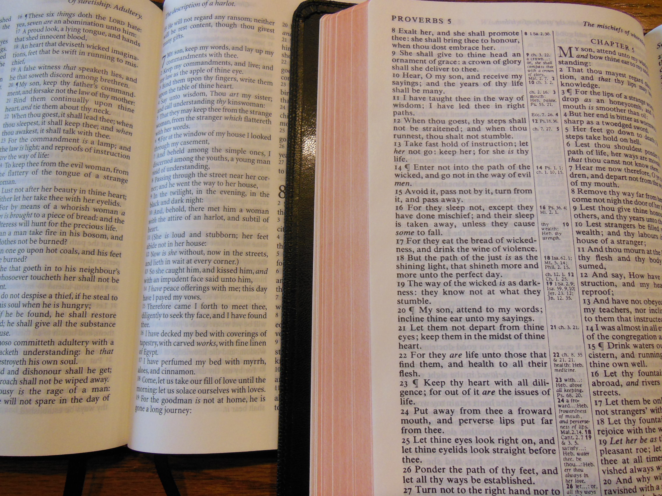
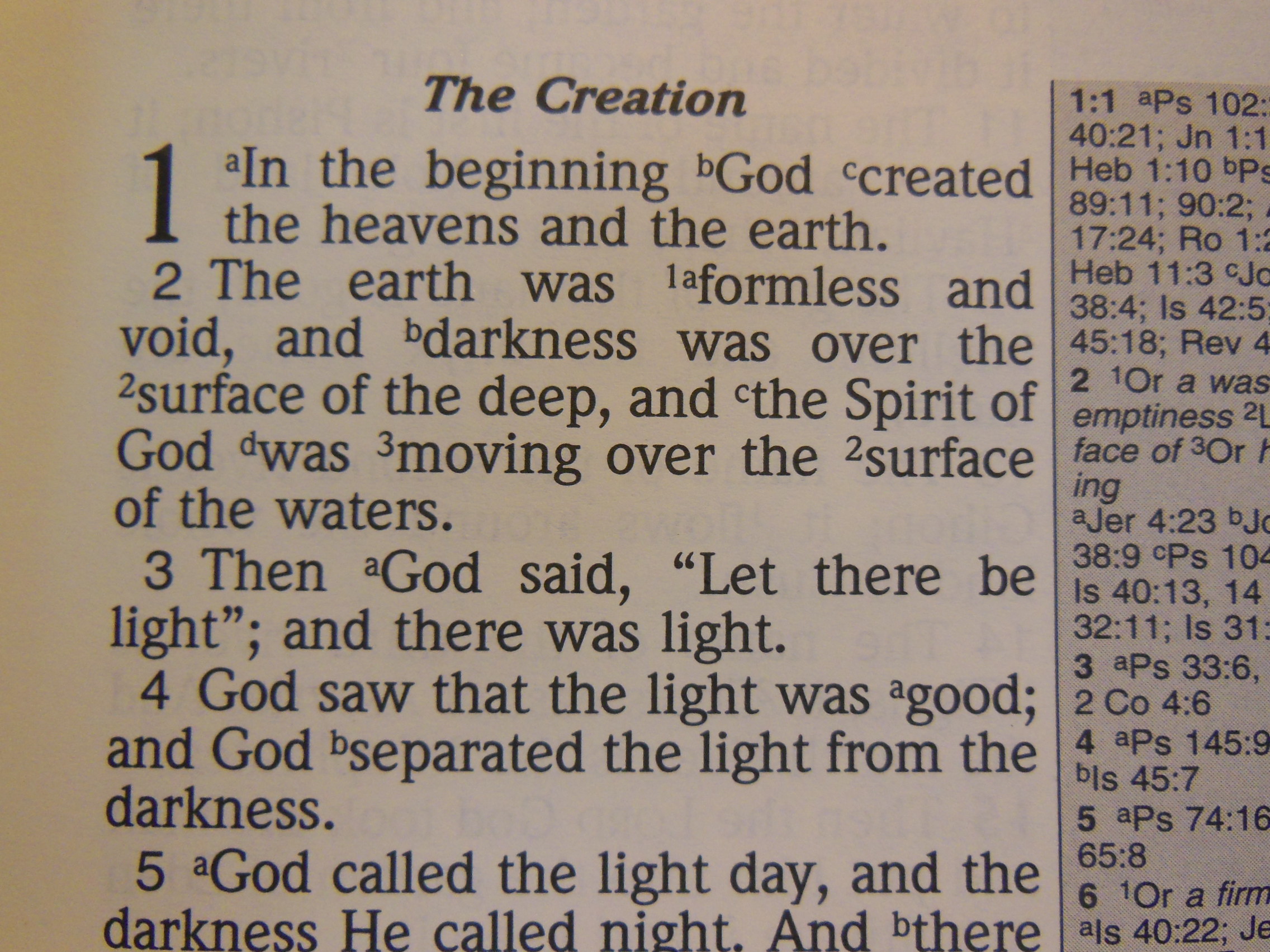
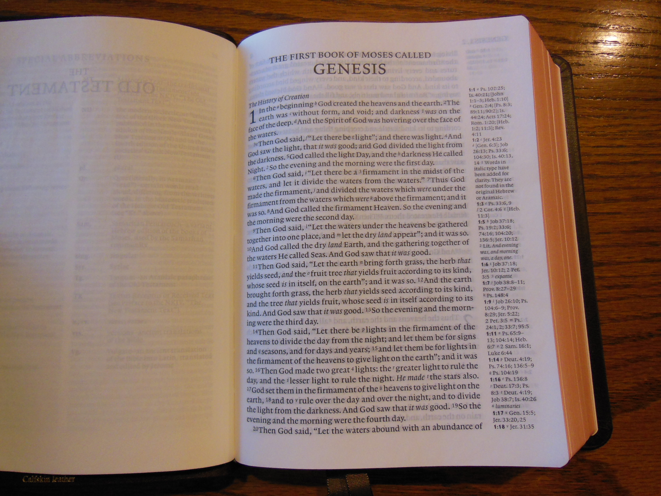
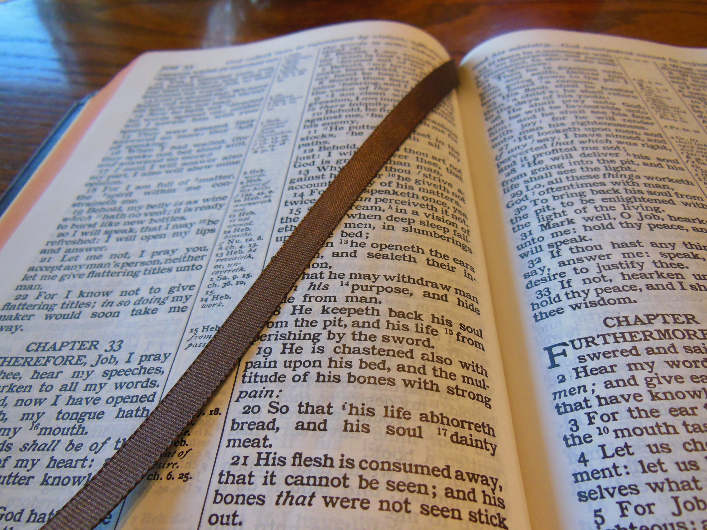
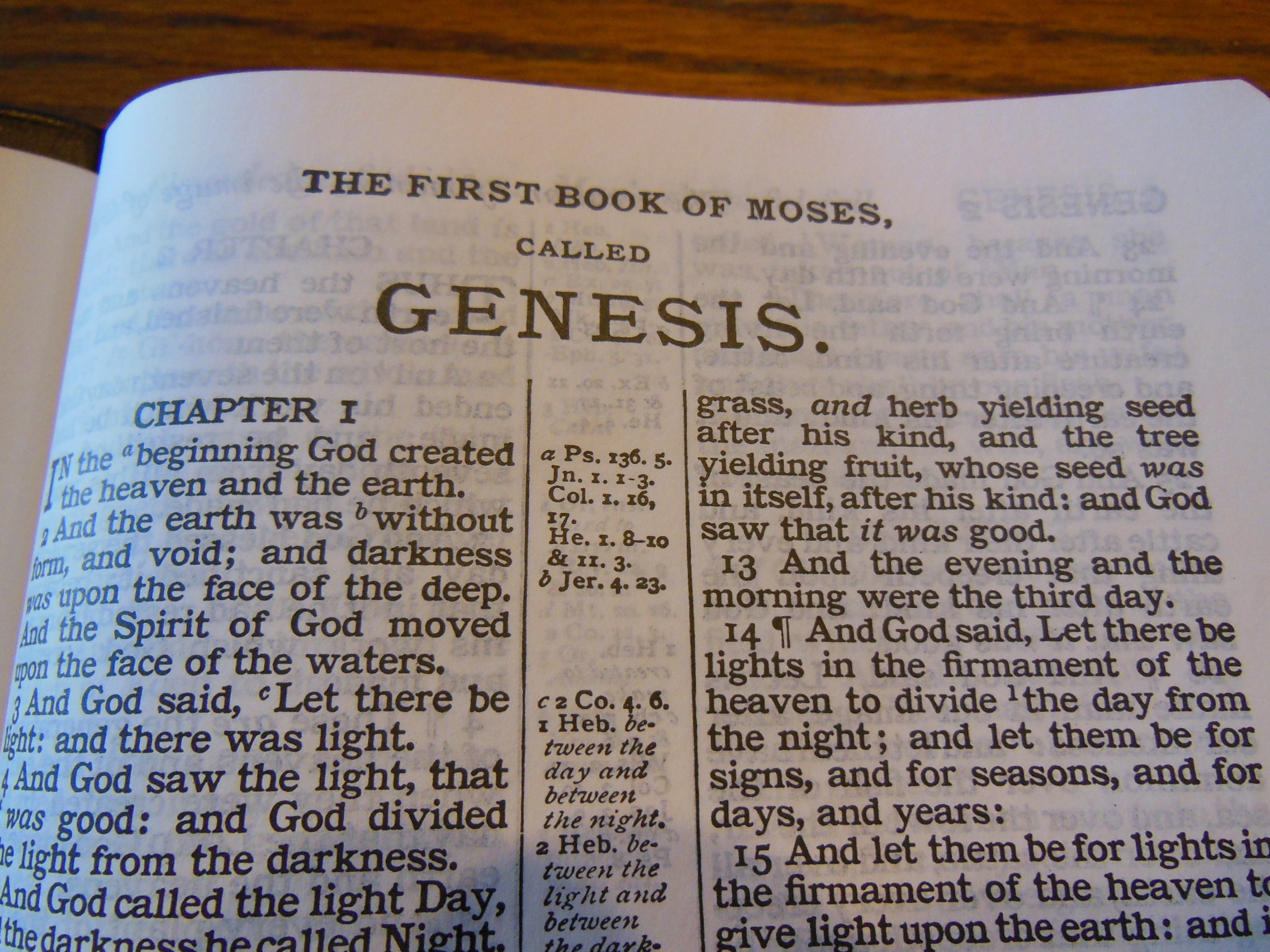
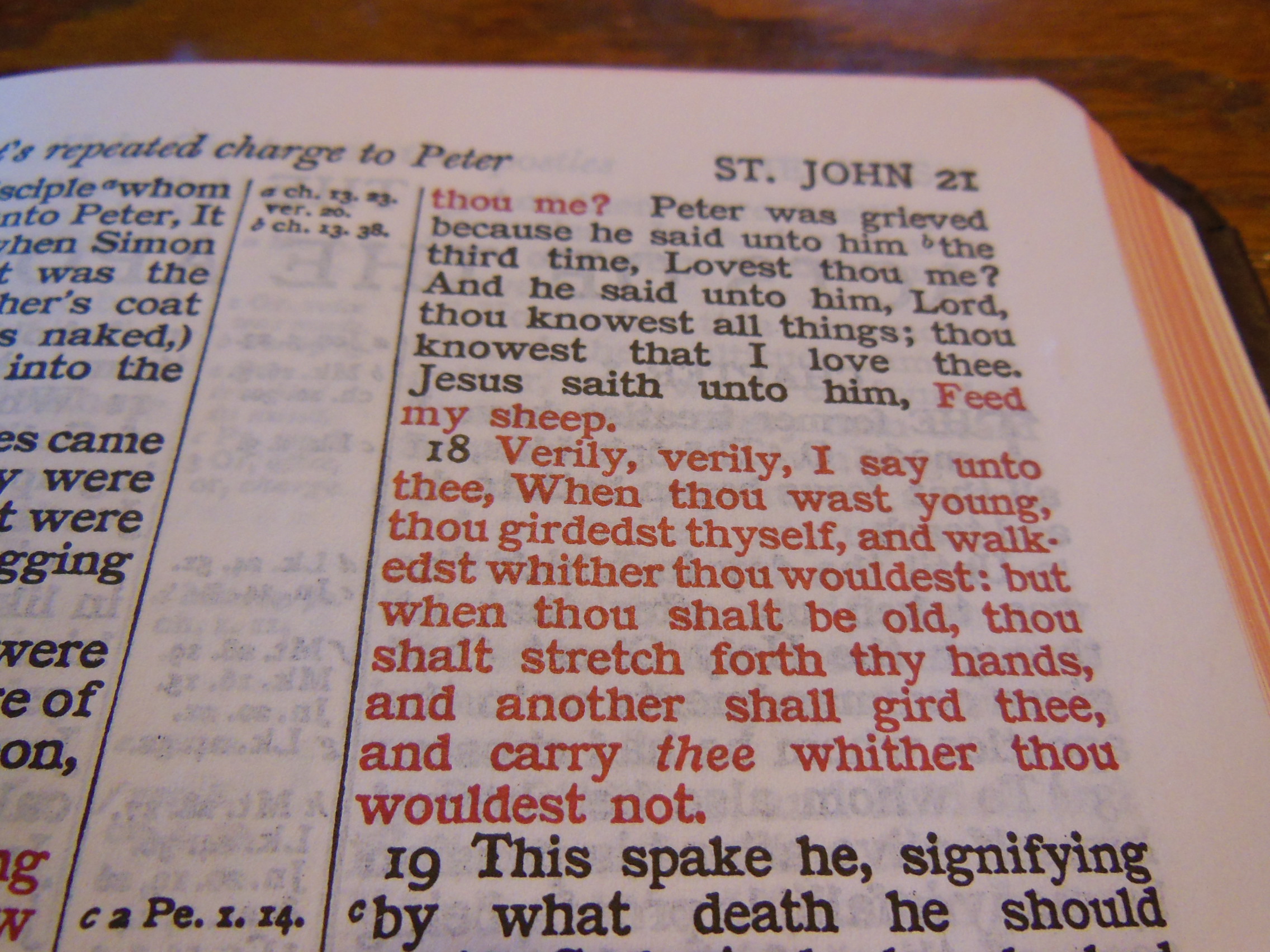
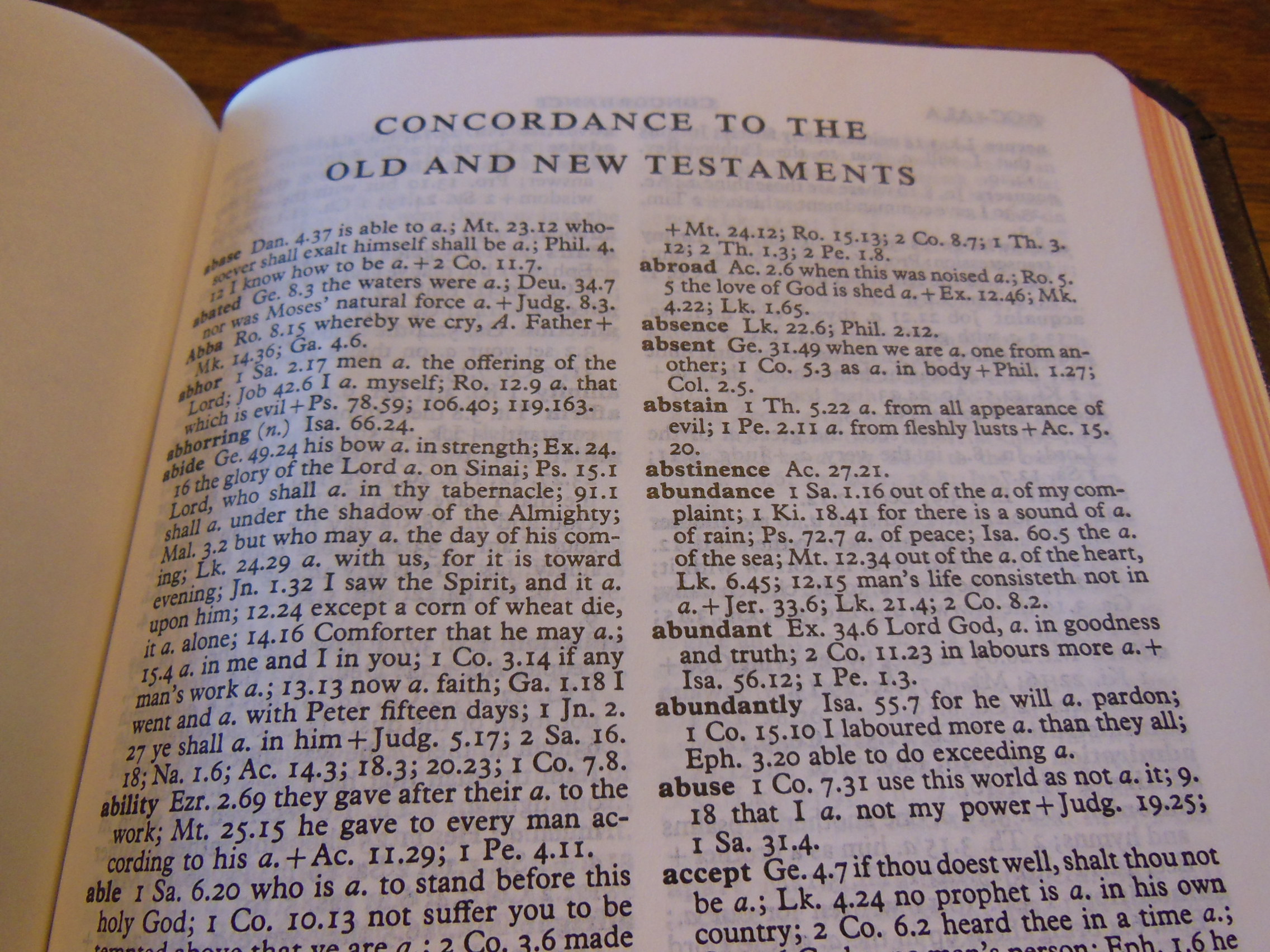
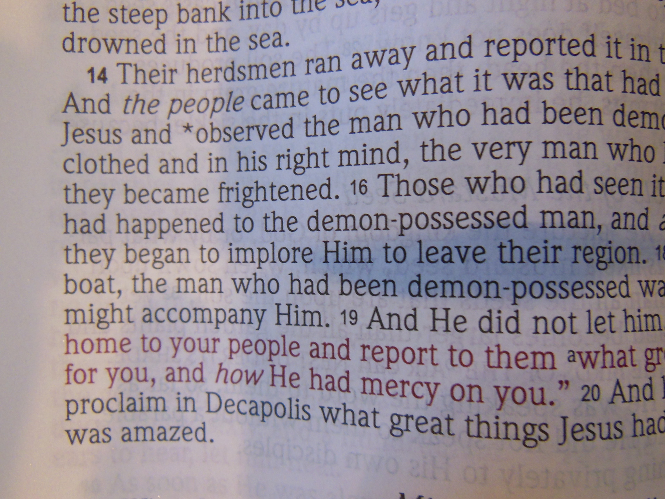
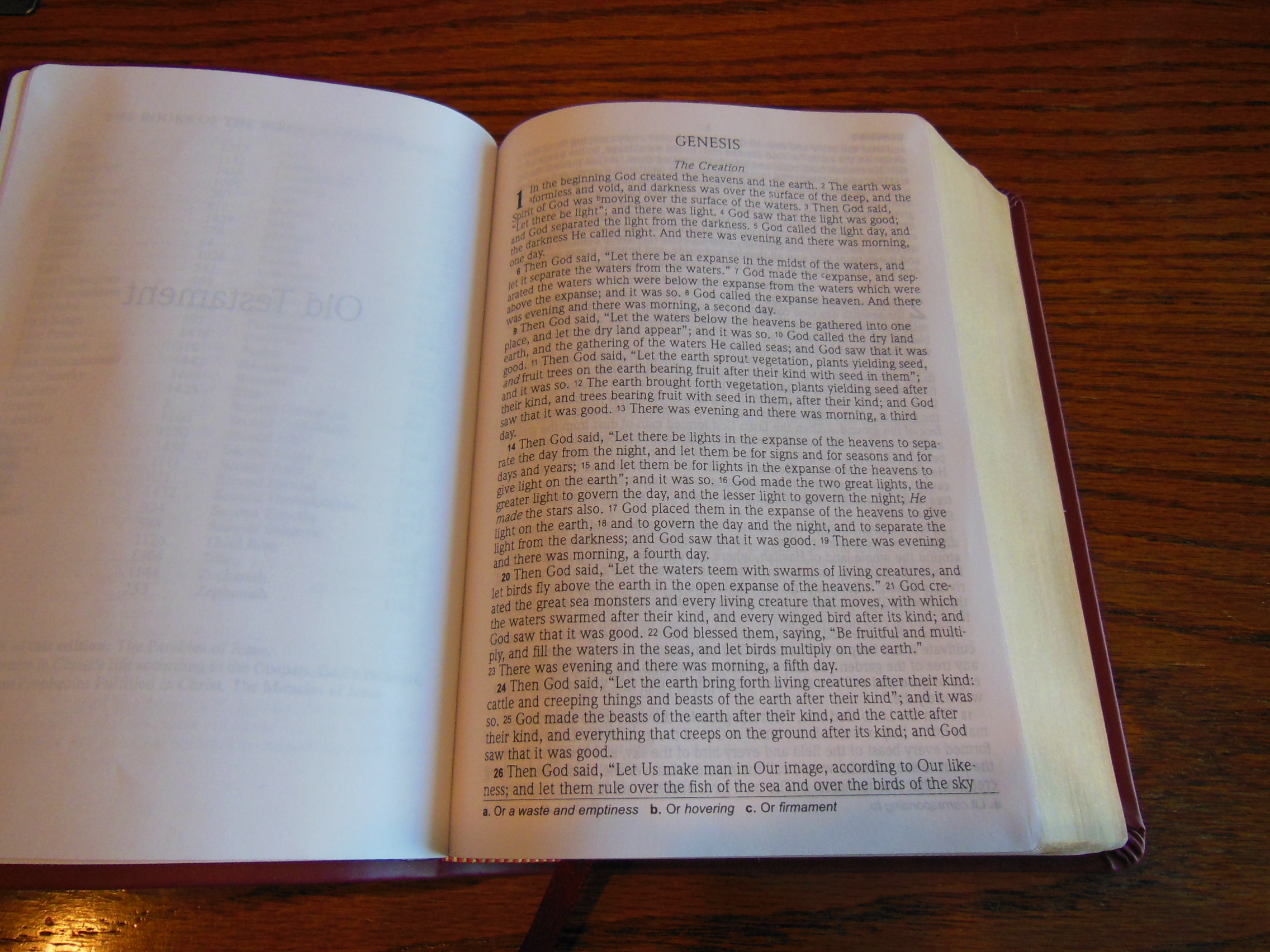
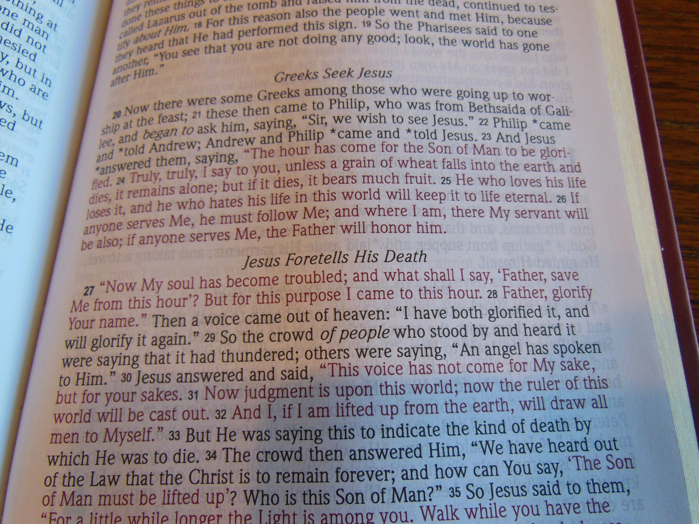
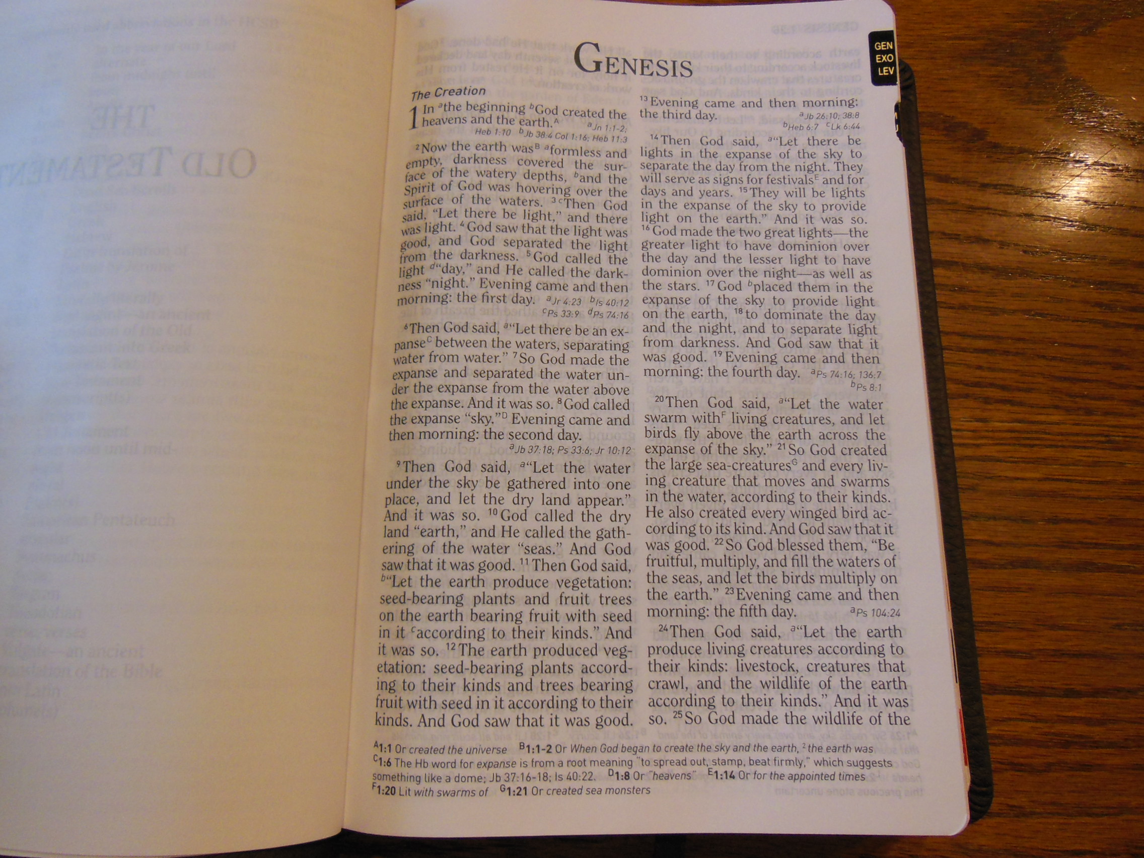
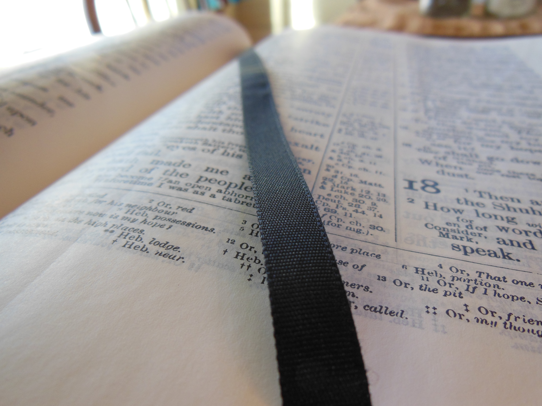
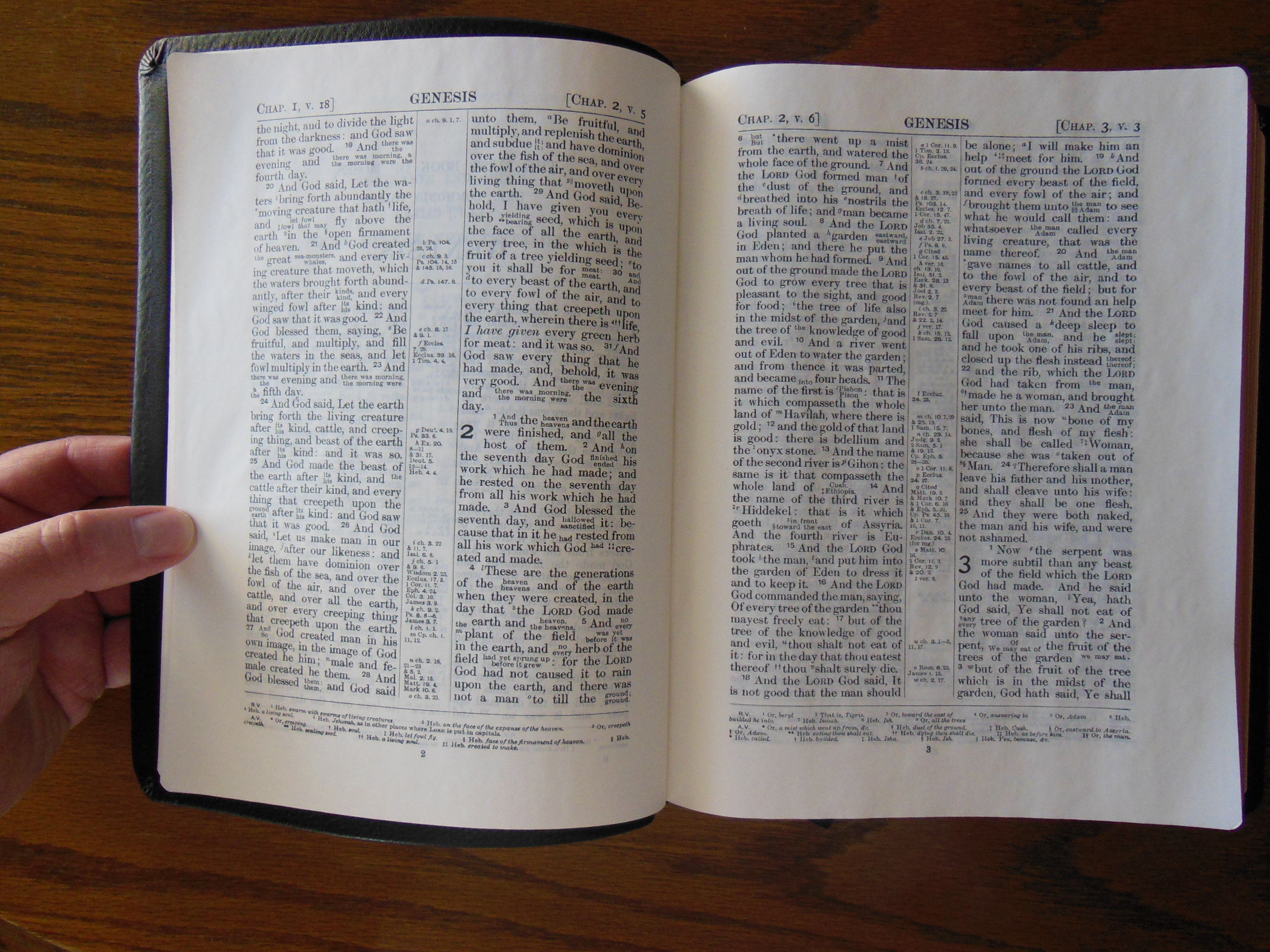
When you have an interlinear Bible usually the texts are run linearly parallel with one as the superscript and the other in subscript.  When you have a parallel Bible usually there will be at least two columns of text, where one column is a translation and the other in the column running parallel to it side by side.  This gives the reader an easy way to compare the two translations.  This Bible however, is unique to my knowledge.  Where the two translations are the same you will see only one line of text.  Where they are different from one another the text will be more like an interlinear.  The Revised version text when different from the KJV will be written in superscript and the KJV will be in subscript.  It looks like this.

DSCN2897

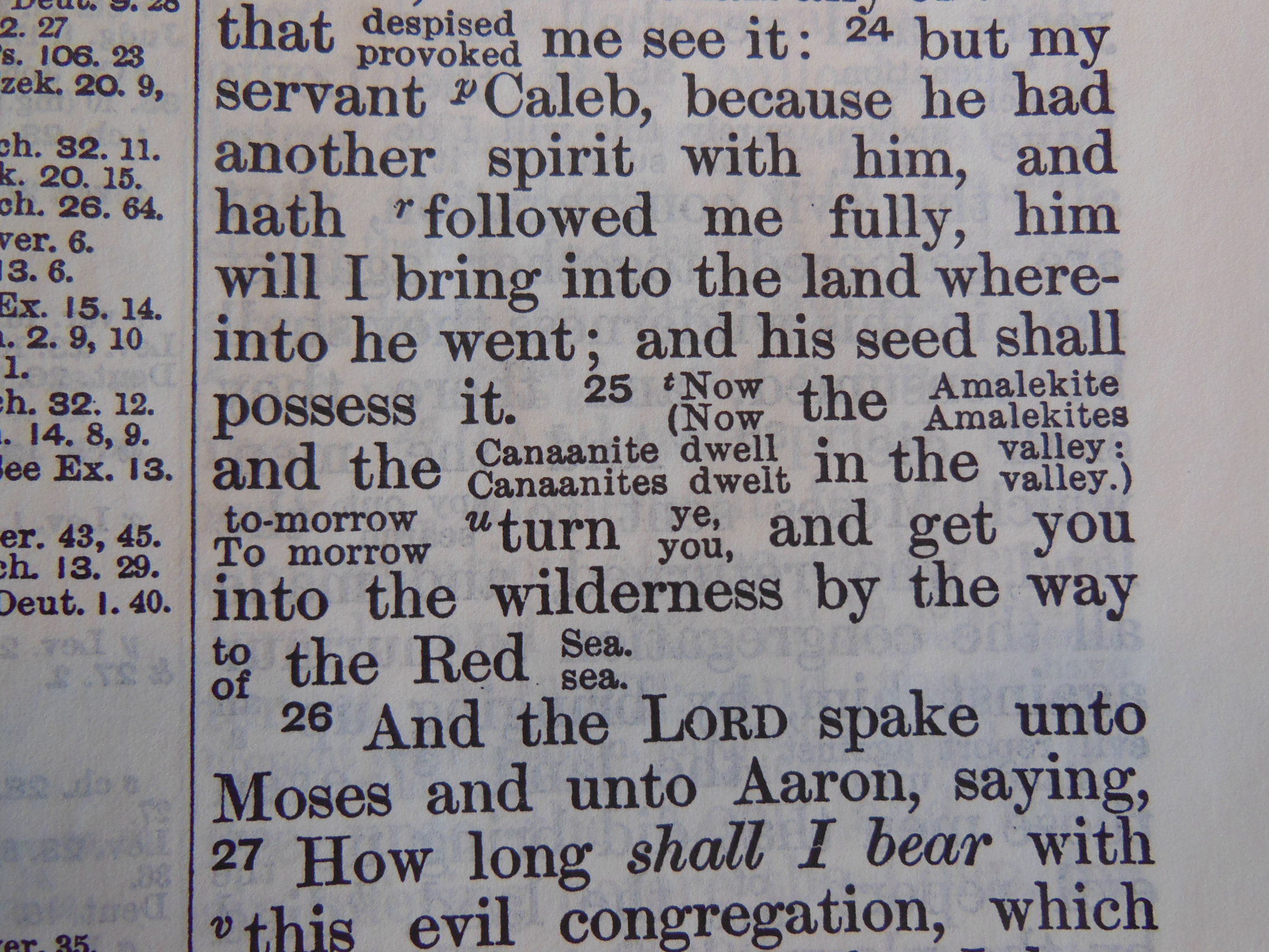
When there are a lot of differences, in a short space, it can get a little confusing, or distracting to read.  This doesn’t happen very often.  I find that this method, with these two specific translations, works quite well.  When I come to a difficult section in the text, I have the RV to look at.  It does help.  Another attribute of this type of interlinear is that it avoids the bulk usually associated with parallel Bibles and other interlinear Bibles.  Most interlinear Bibles have both texts in their entirety.  This one only becomes interlinear when the text is divergent.  This cuts down on the space needed.

It is a nice addition to any Bible collection, and for modern application, it makes the KJV more accessible, without losing the old world style of the KJV.  Granted, there are more modern translations, and there are modern parallels, but they do make you aware that you are reading a modern translation.  So if you love the KJV, but sometimes have difficulties with it, and you love the way the English language sounded then, this is a Bible you should own.

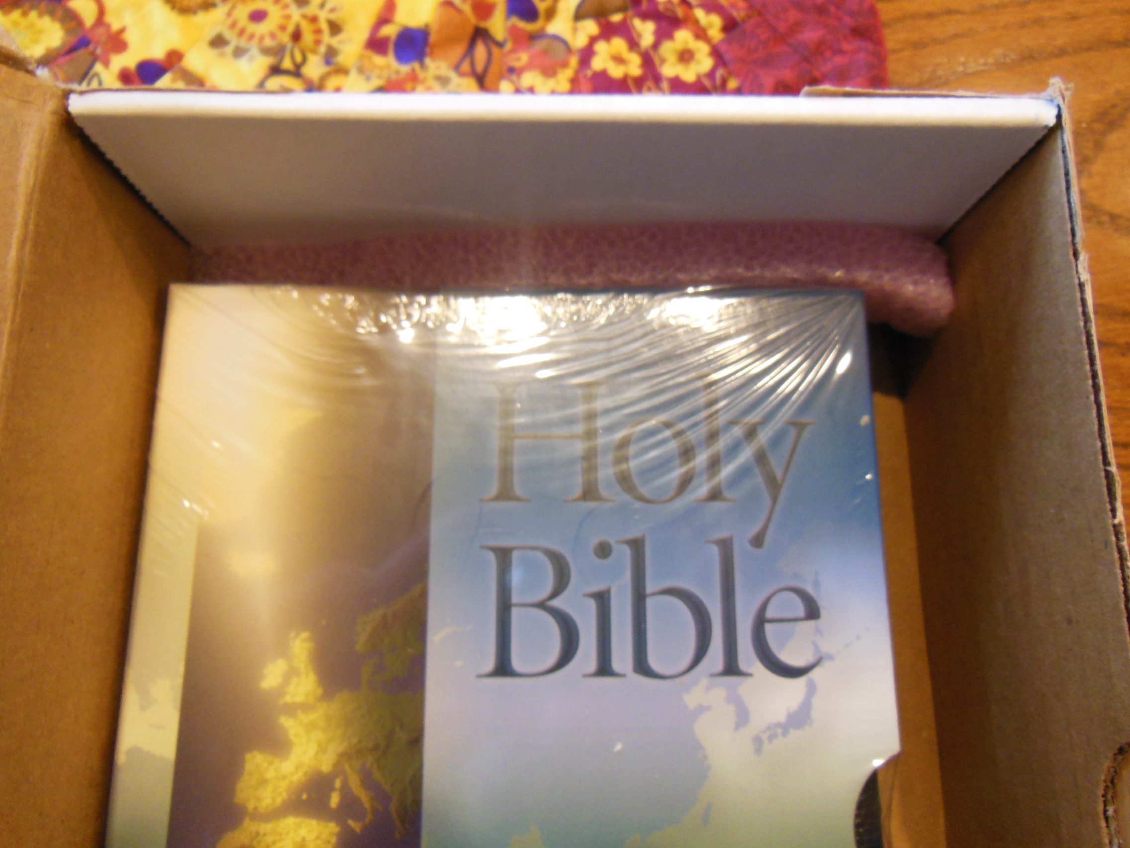
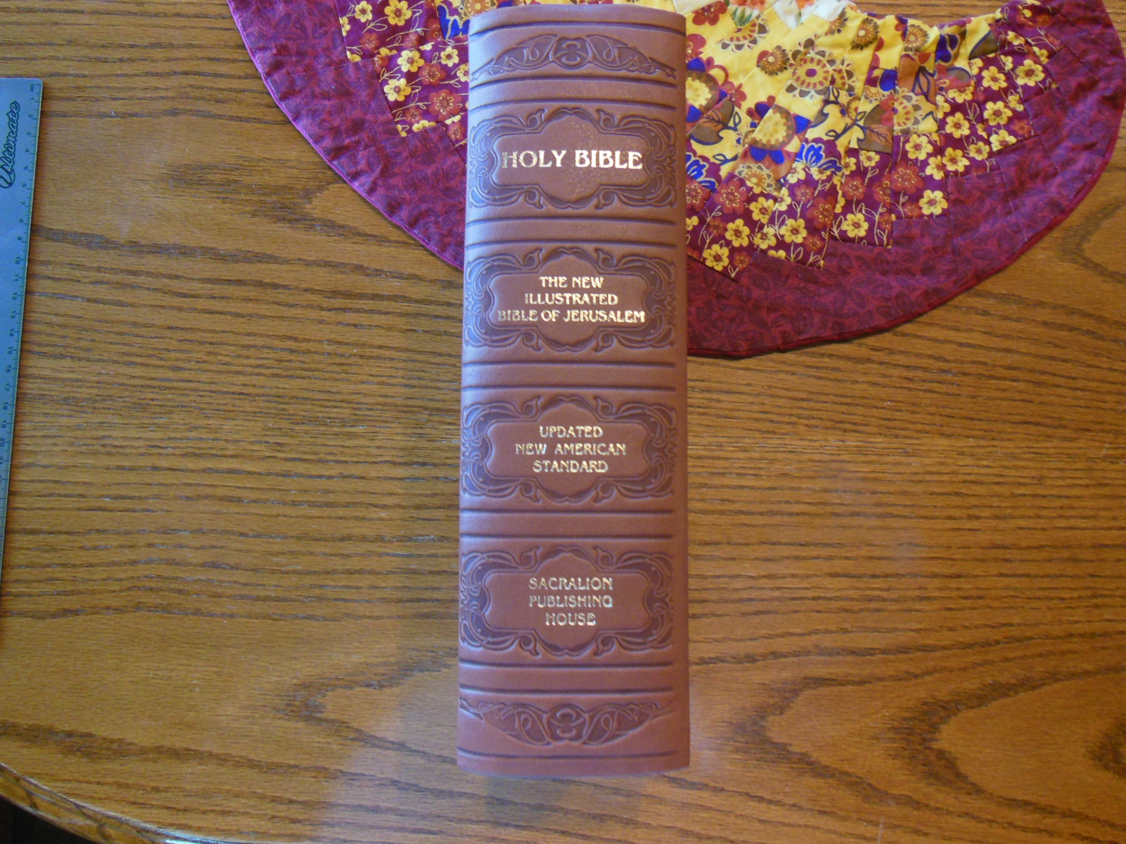
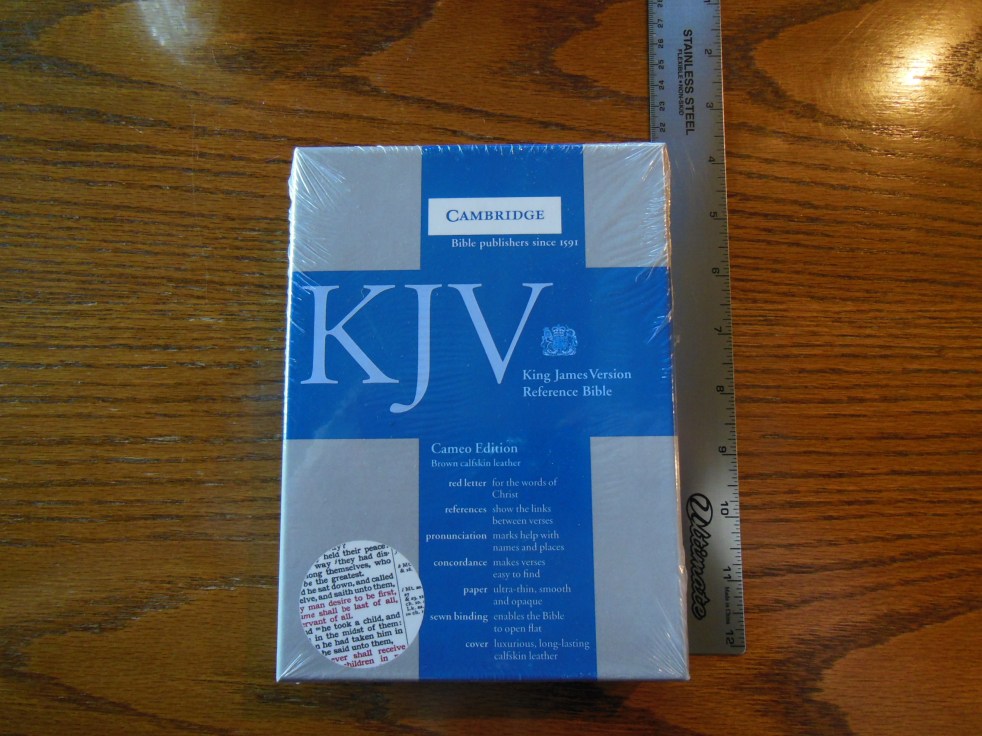
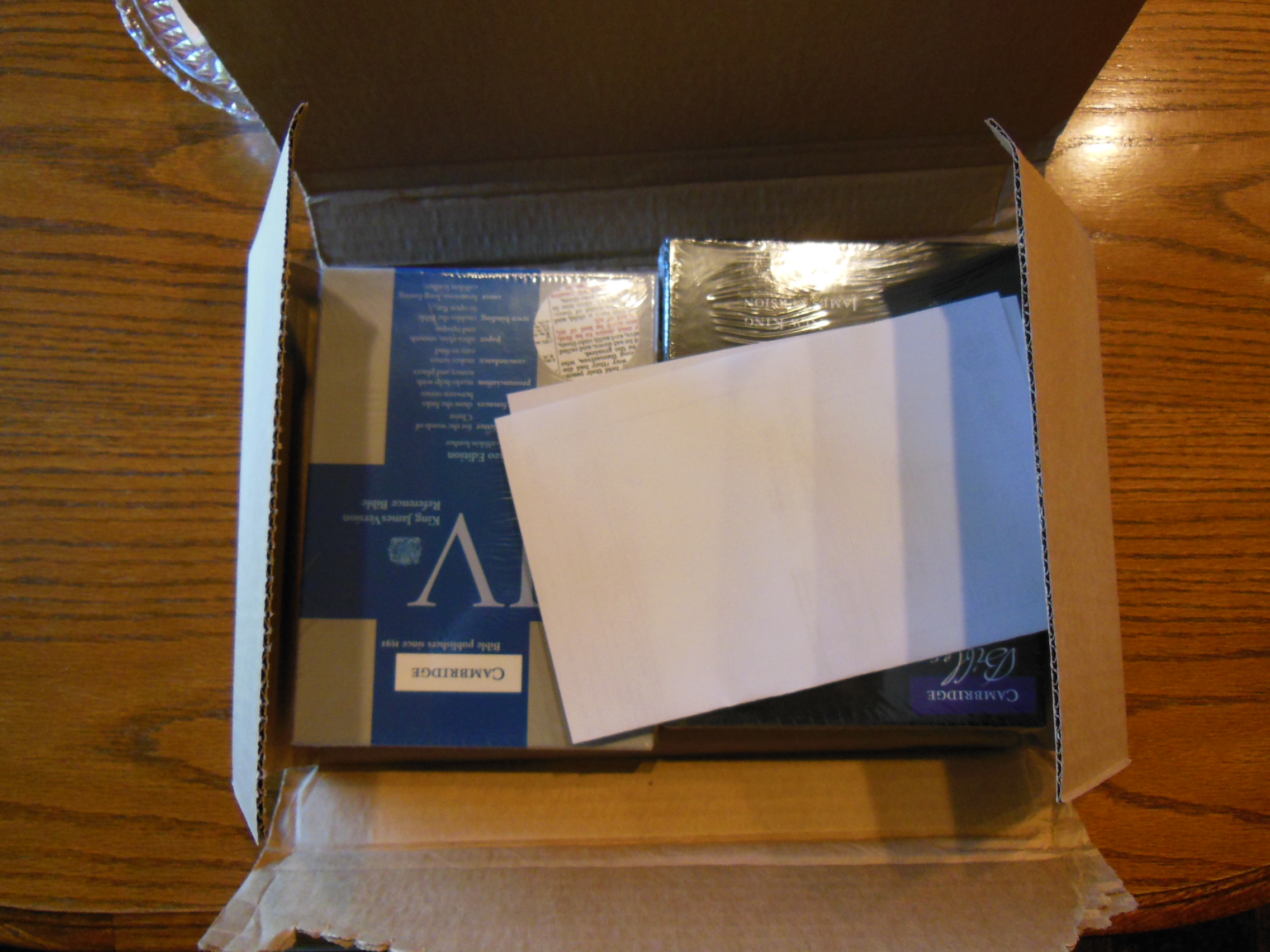
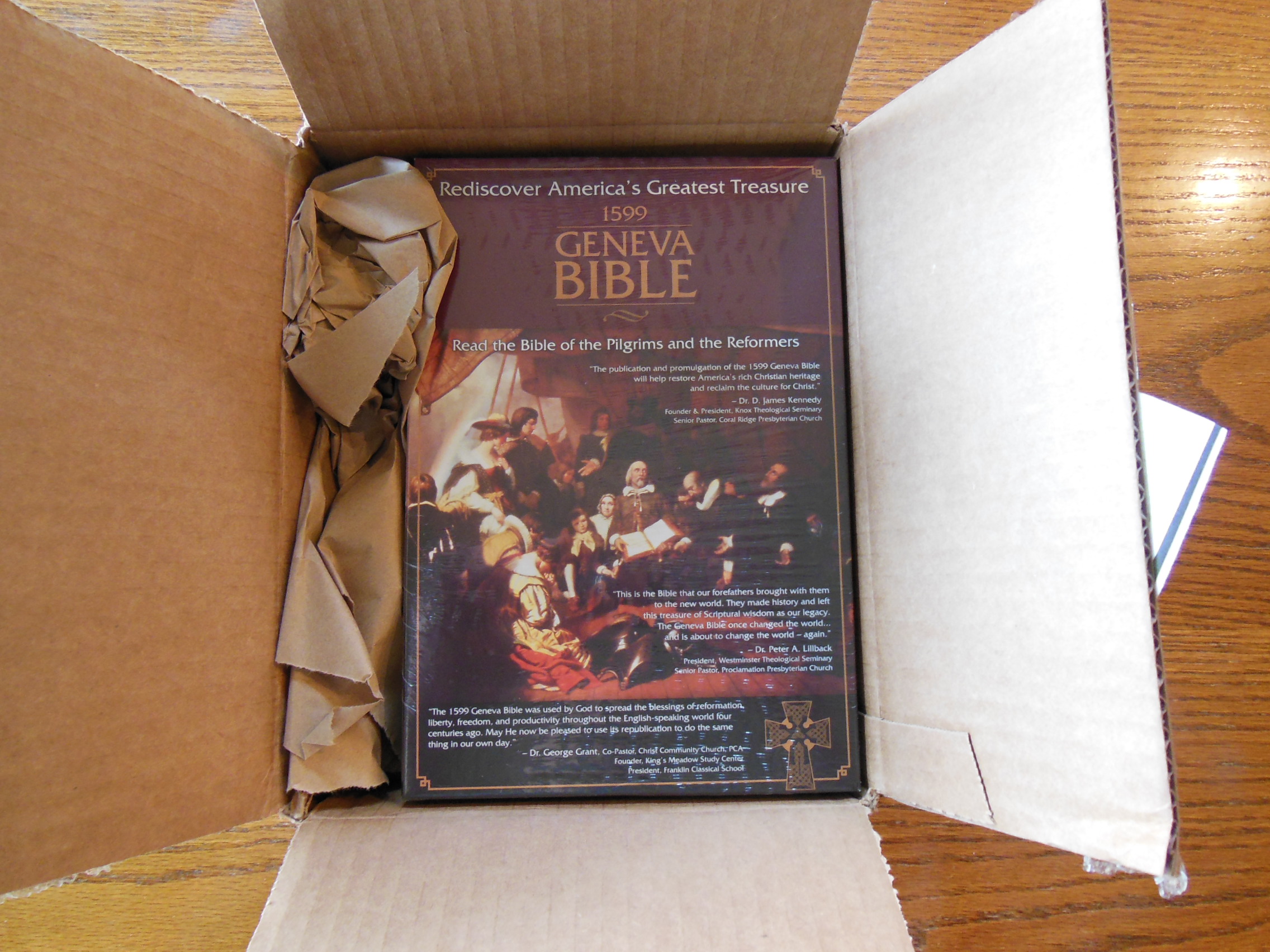
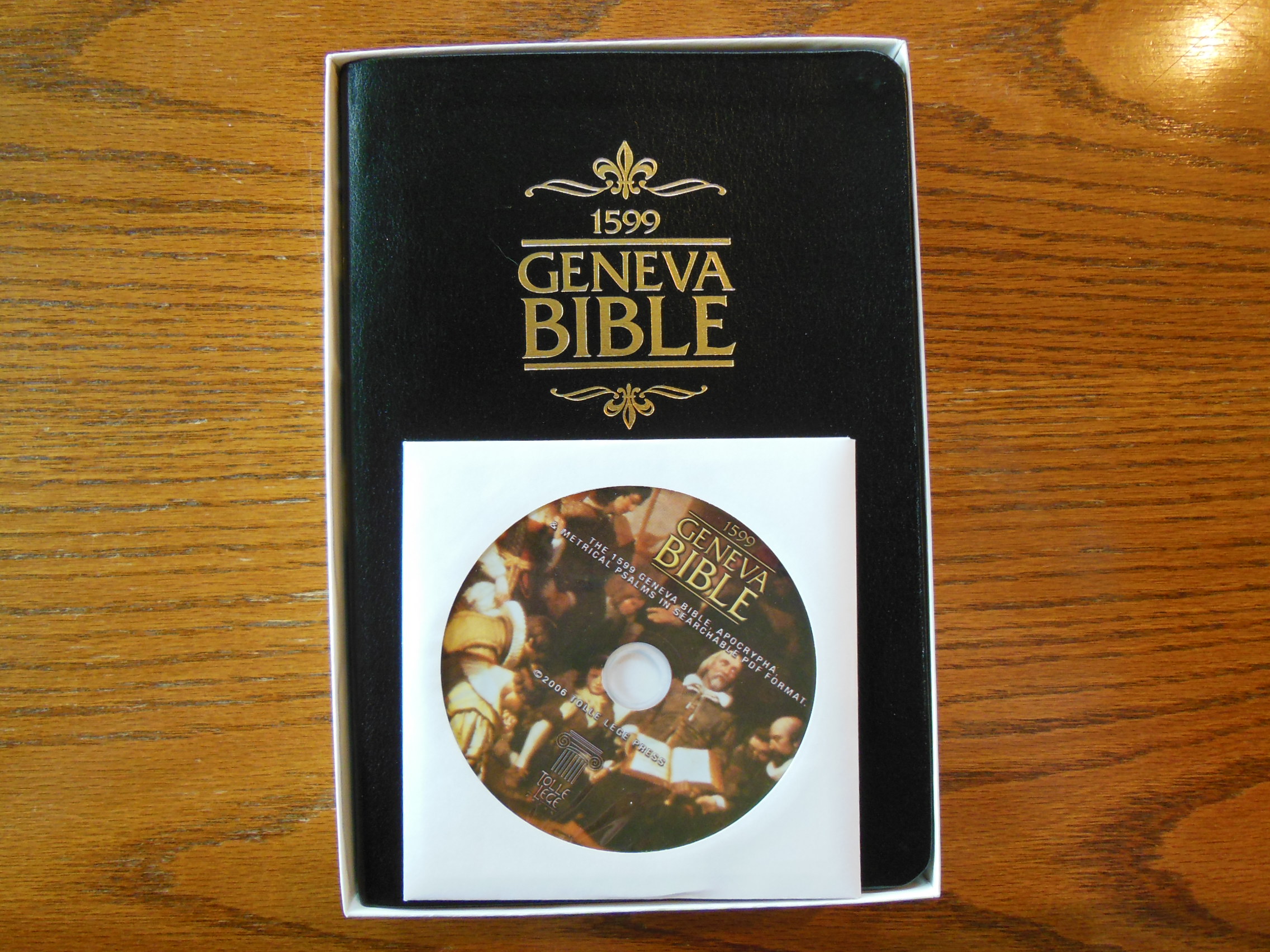
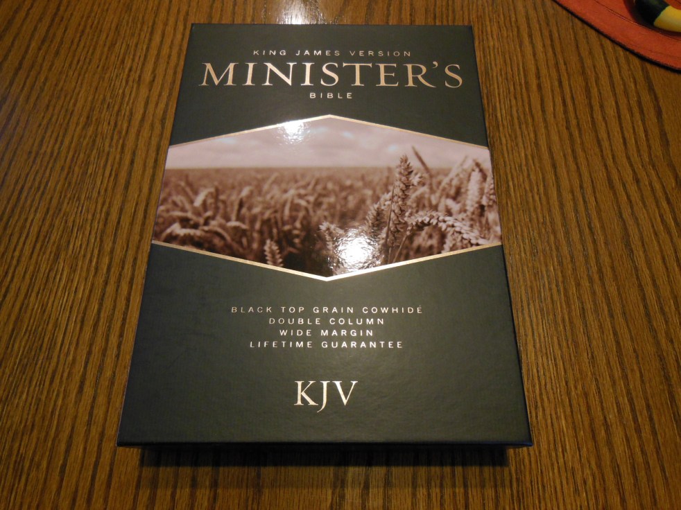
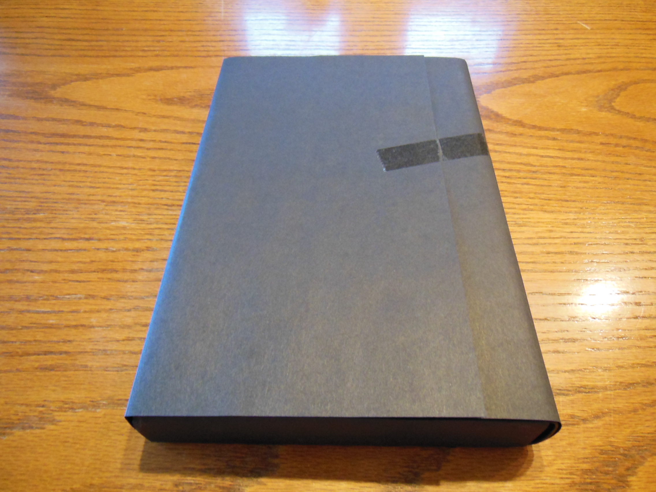
Aesthetically, this is a very nice Bible to look at.  Cambridge has a good reputation for producing high quality Bibles that will last longer than you will.  This Bible came packaged in a cardboard box.  It arrived at my house undamaged and in good condition.

DSCN2848

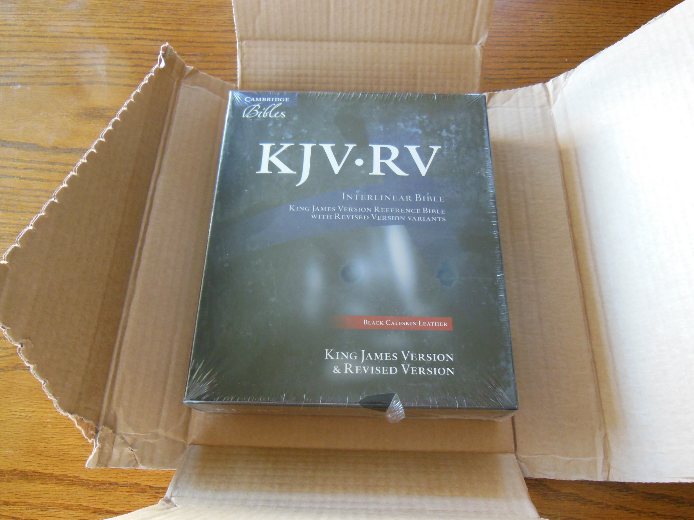
It was inside of a clamshell designed retail box that should be retained for storage.

DSCN2854

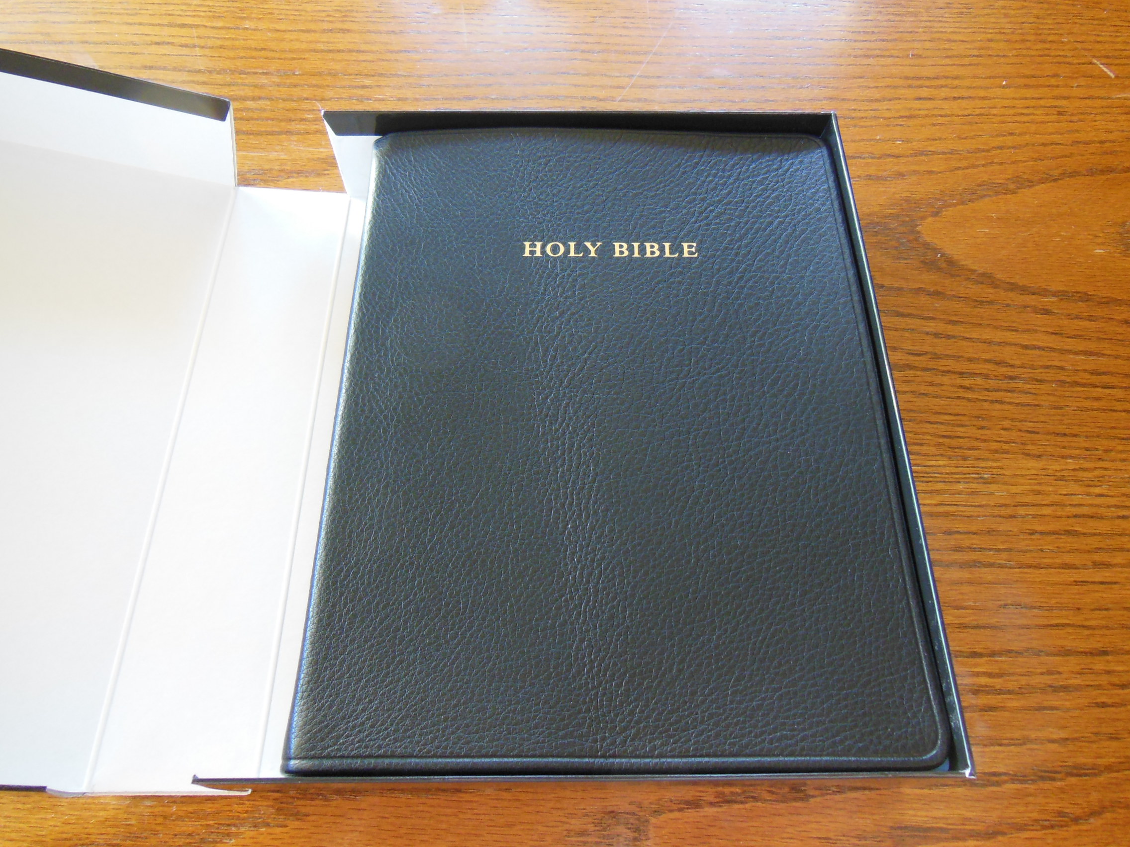
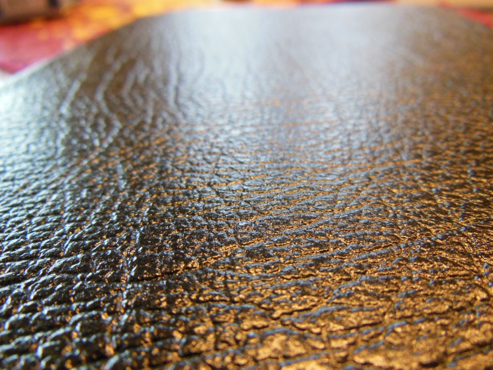
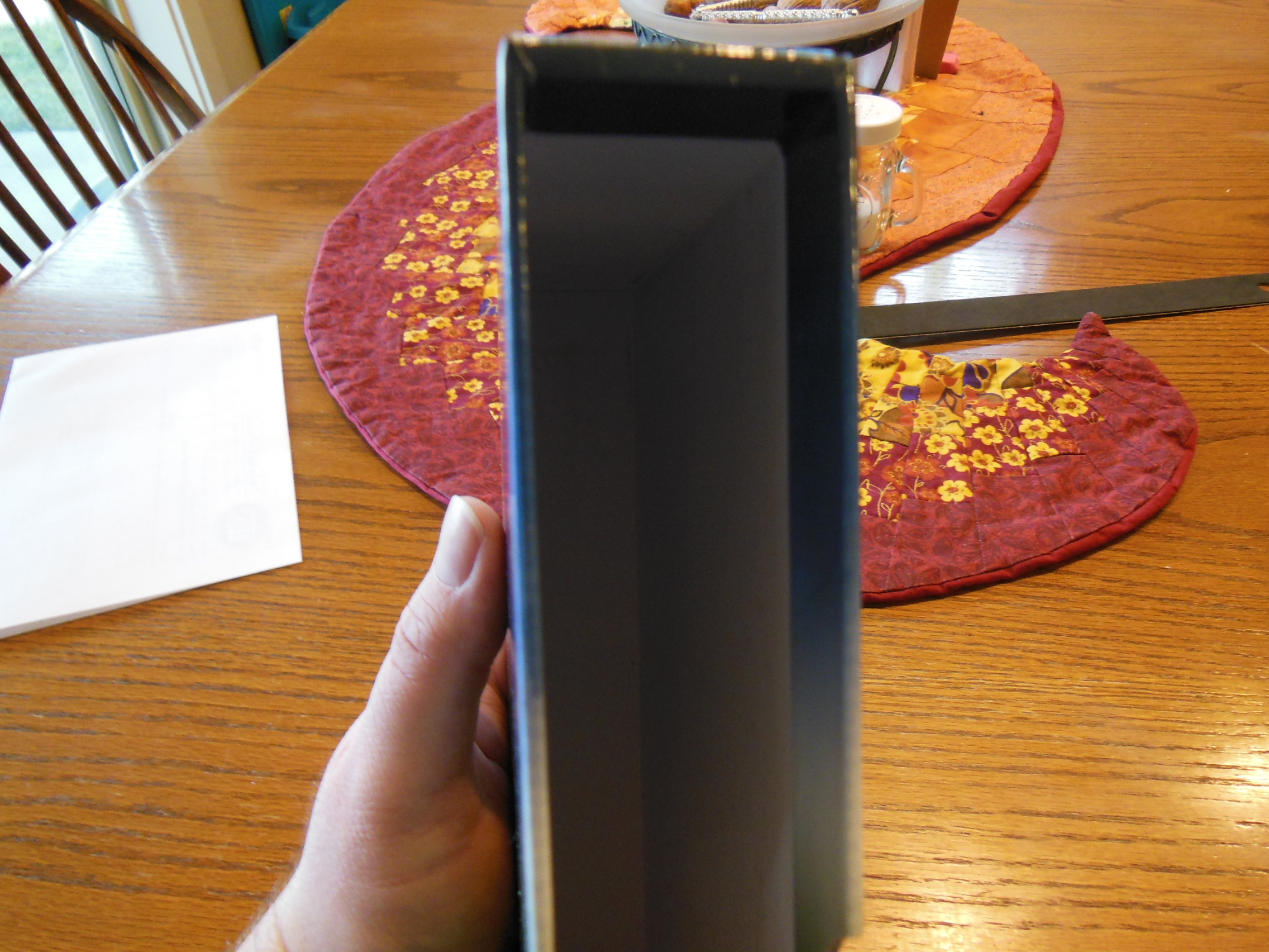
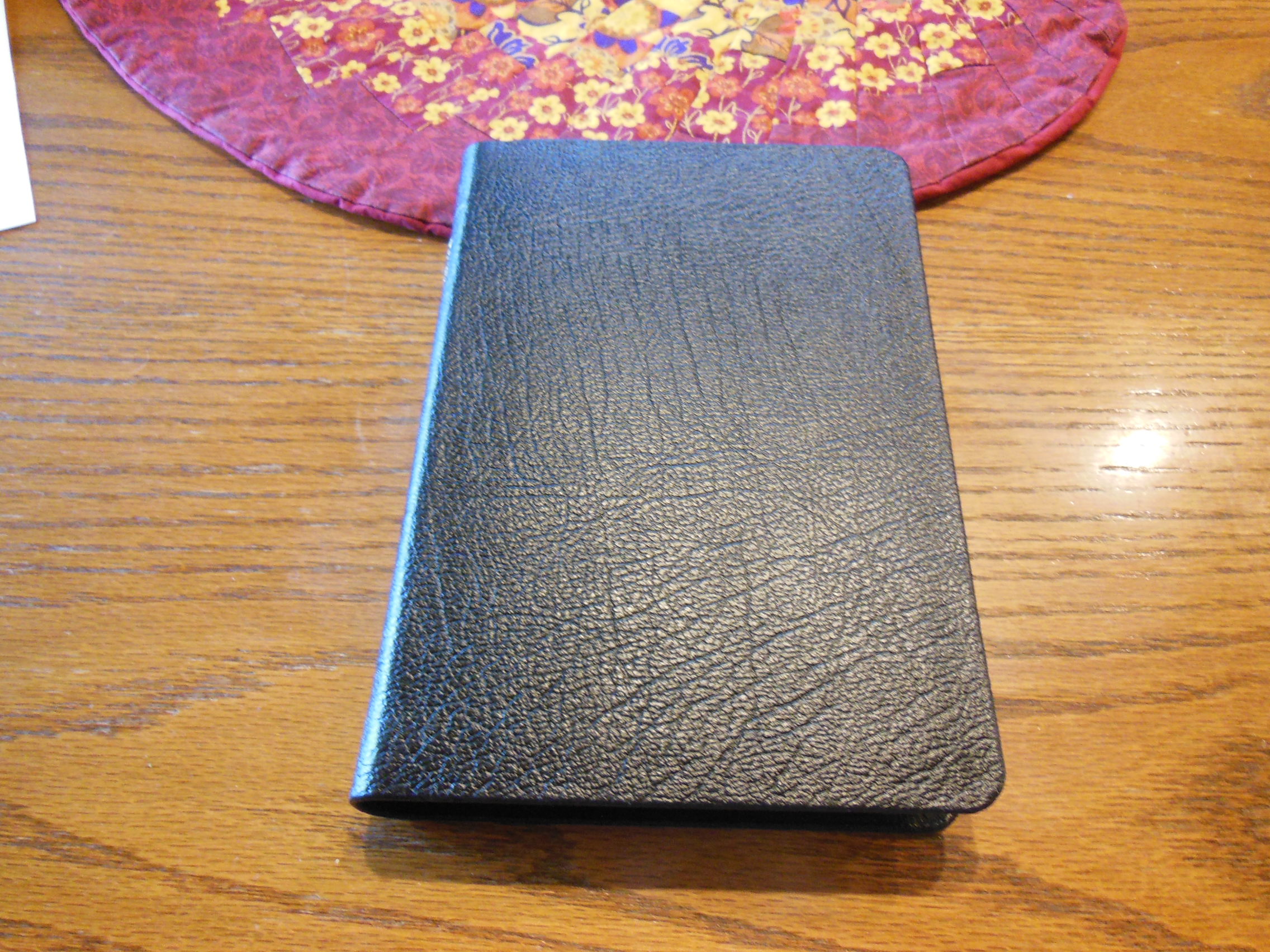
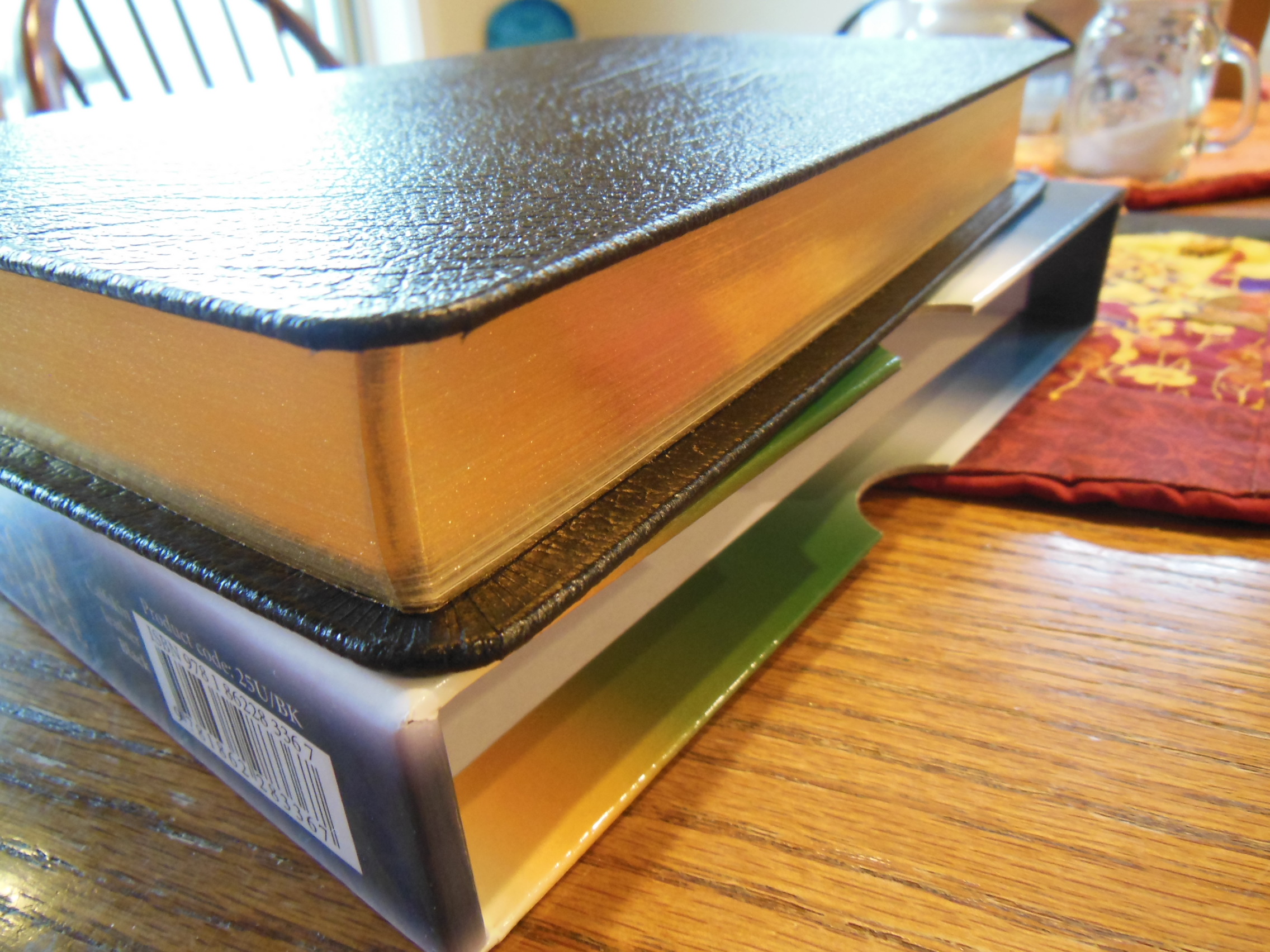
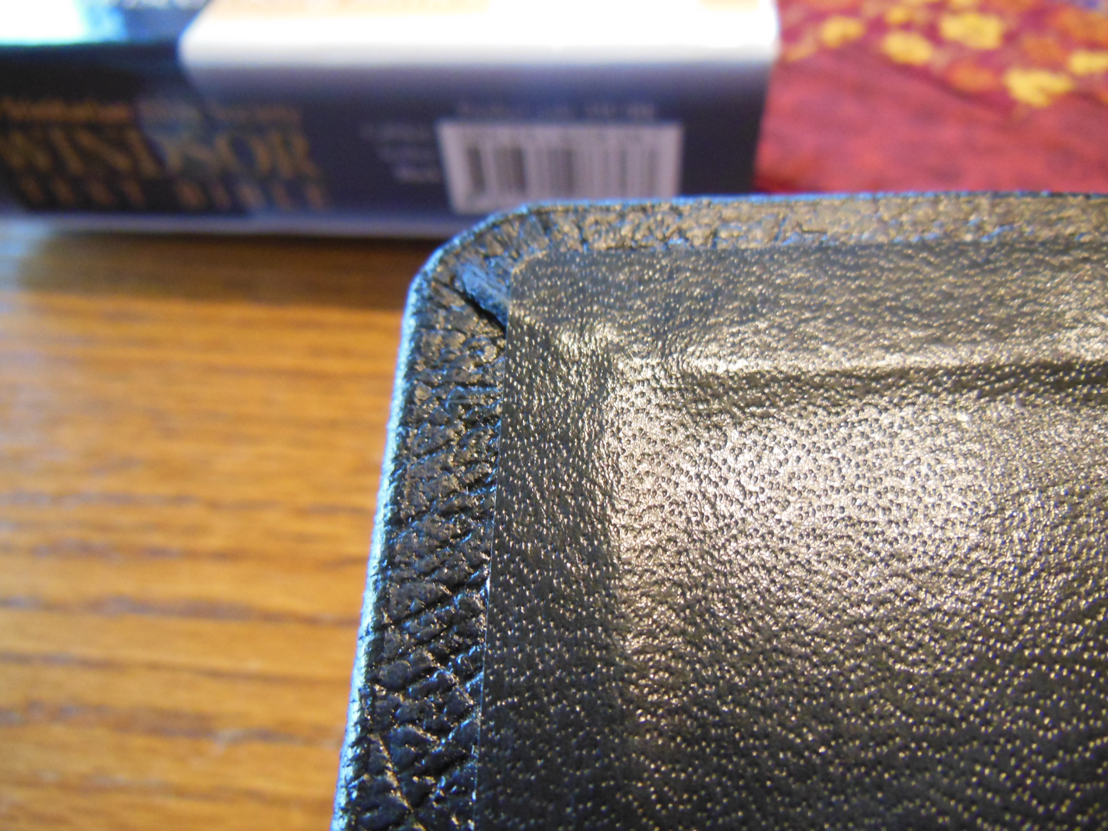
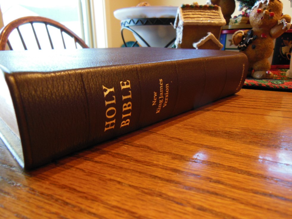
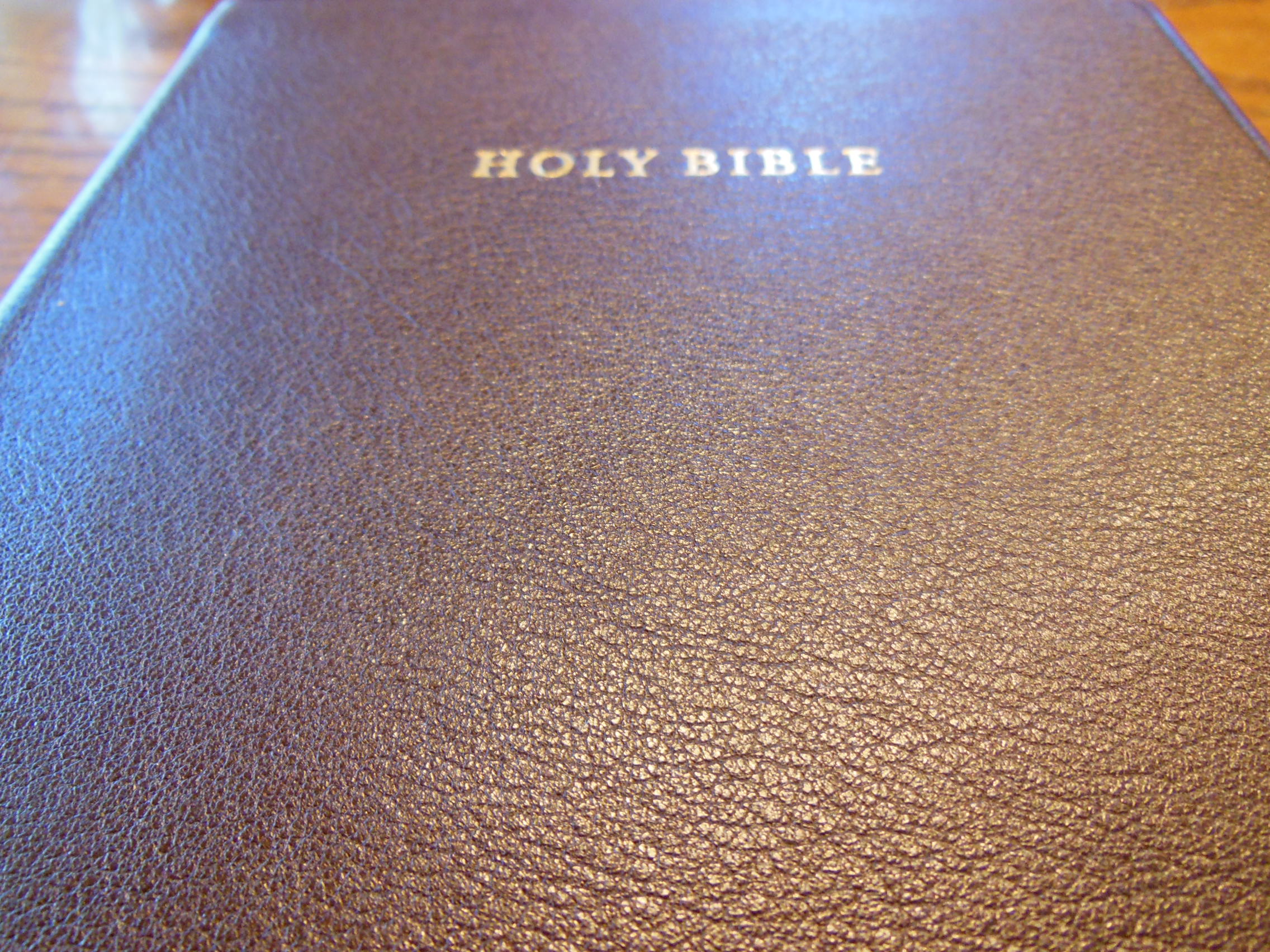
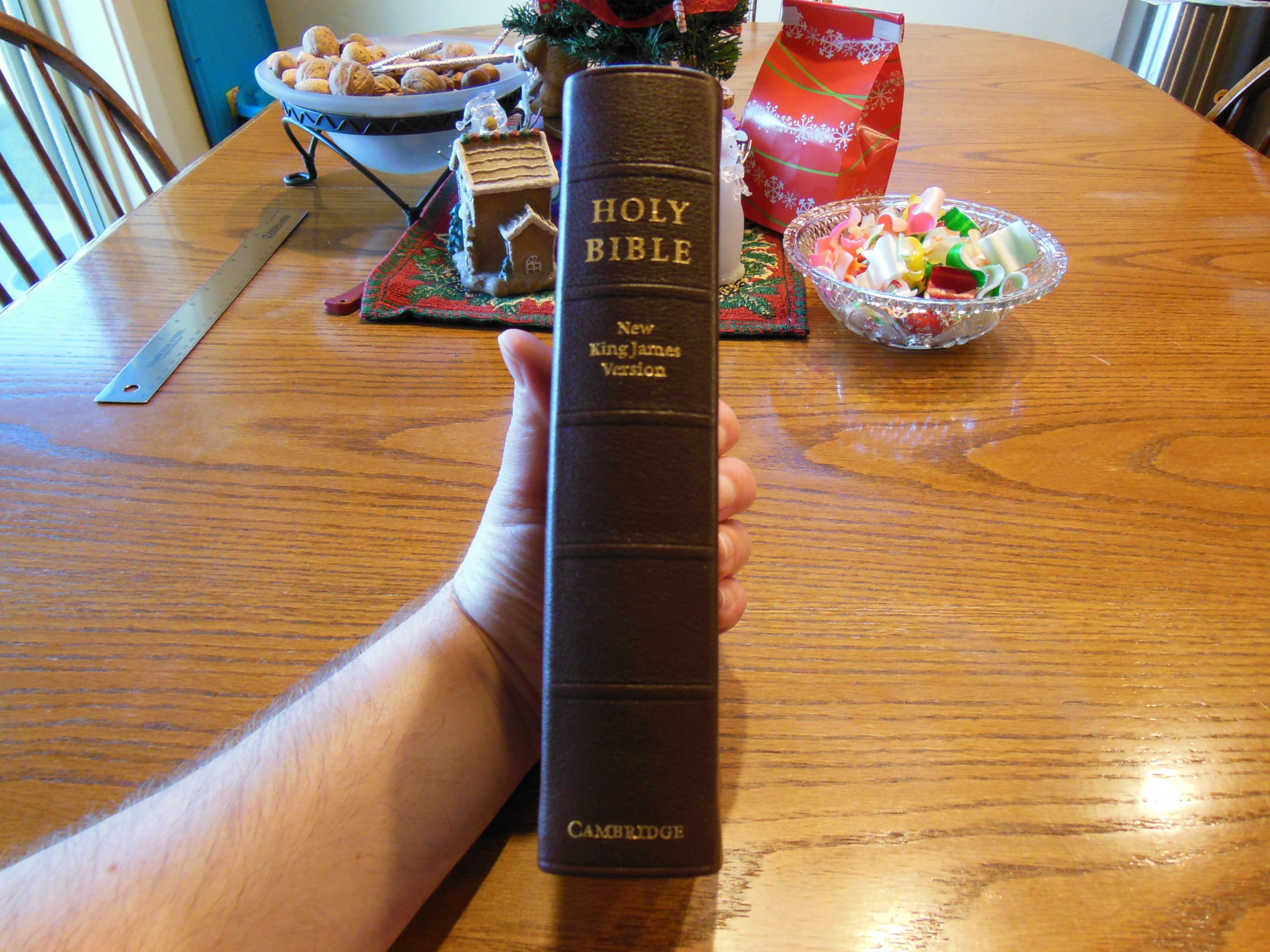
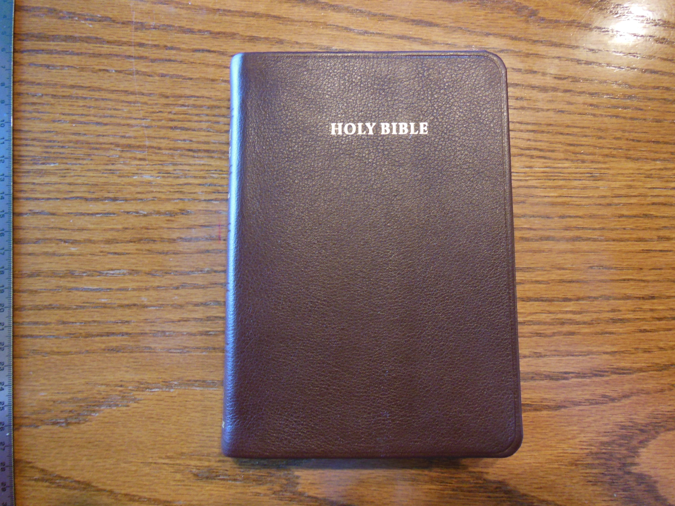
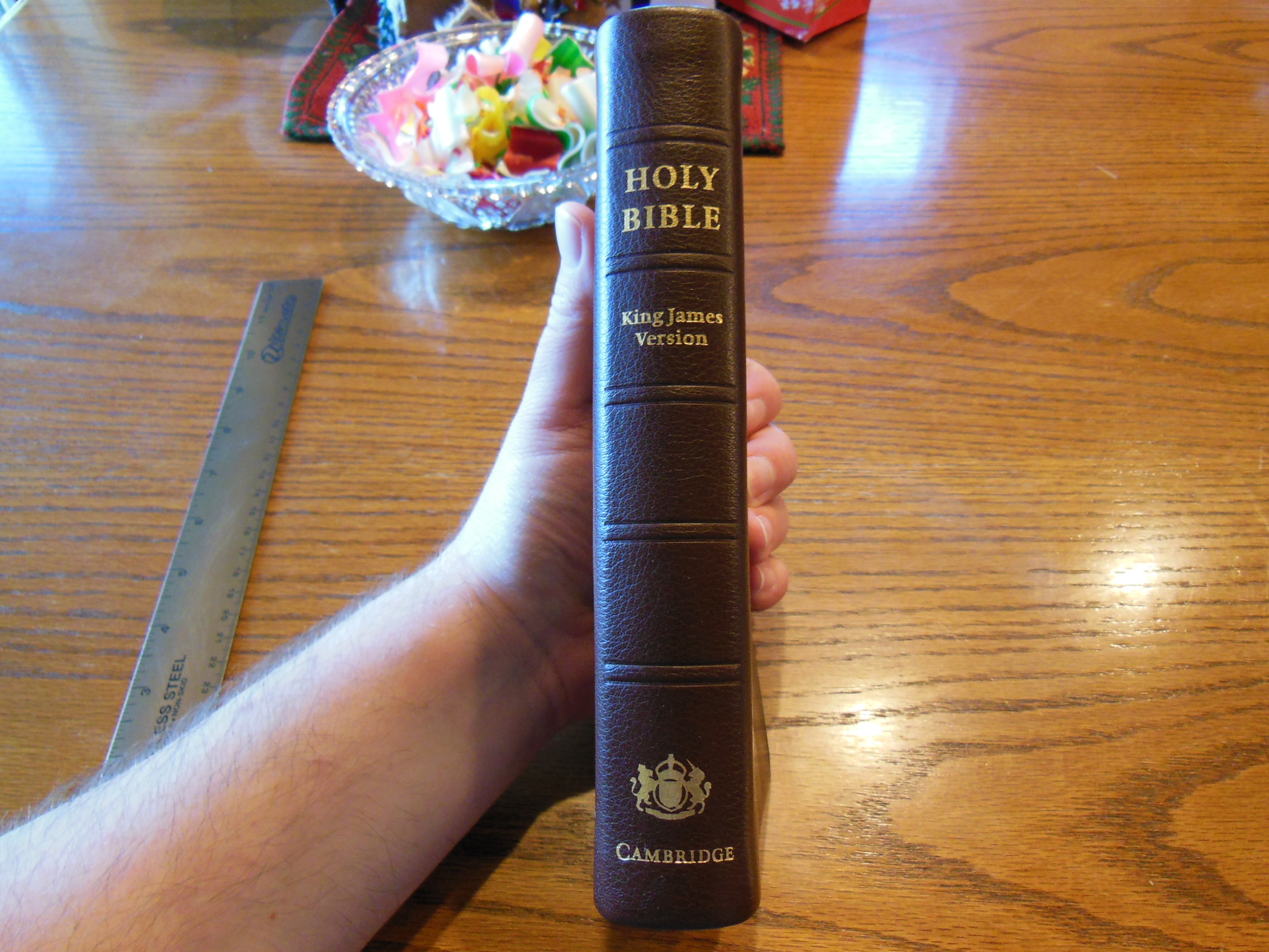
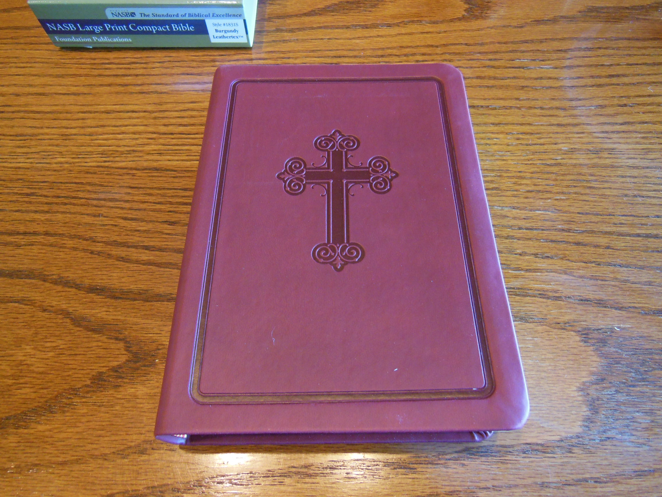
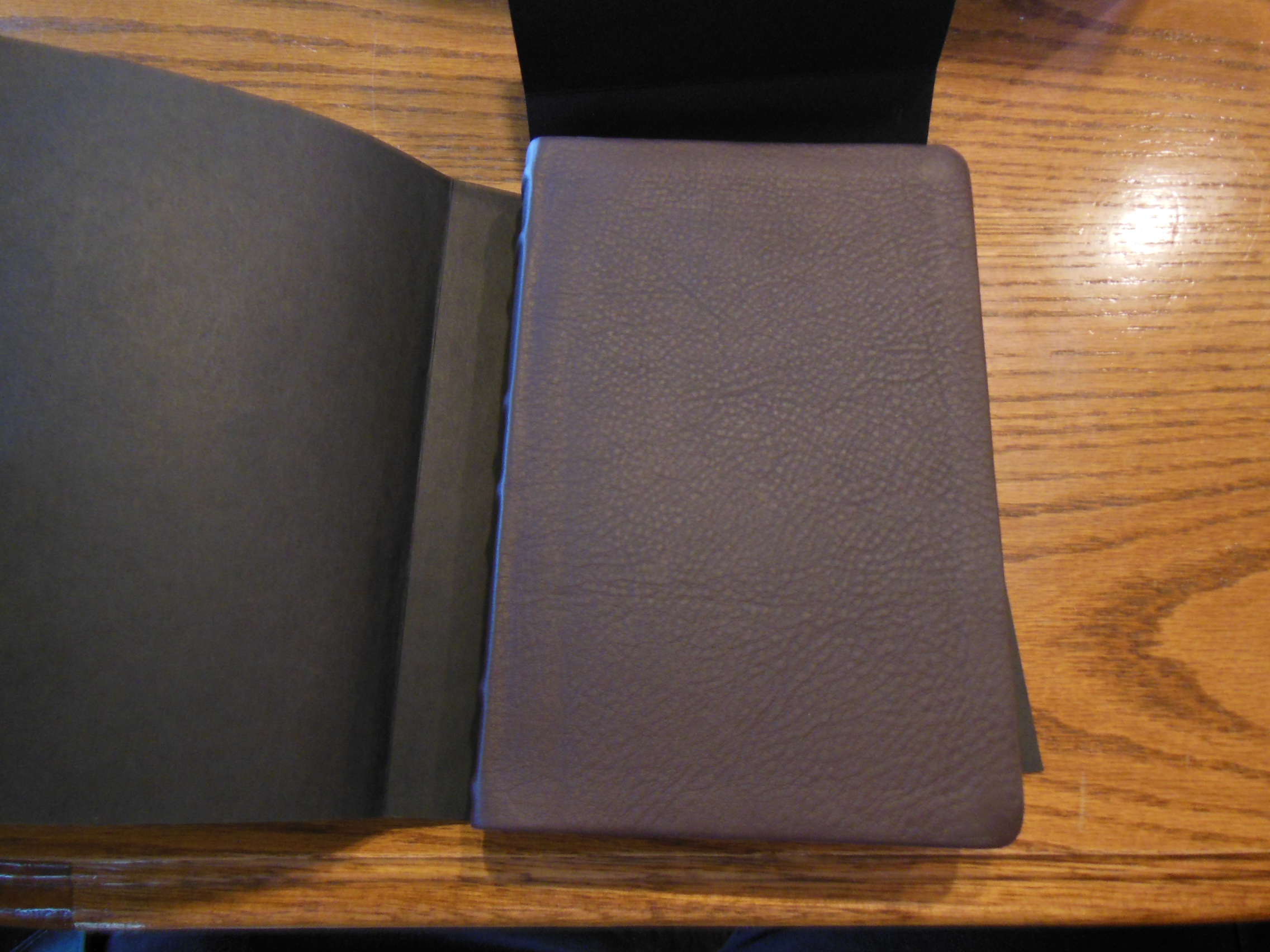
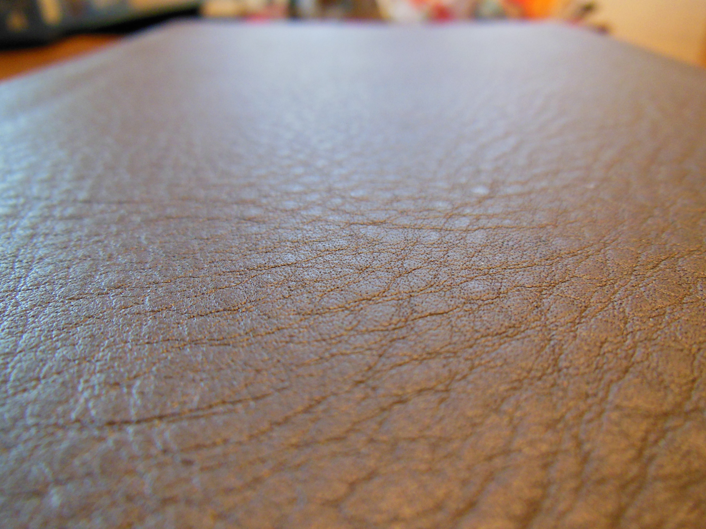
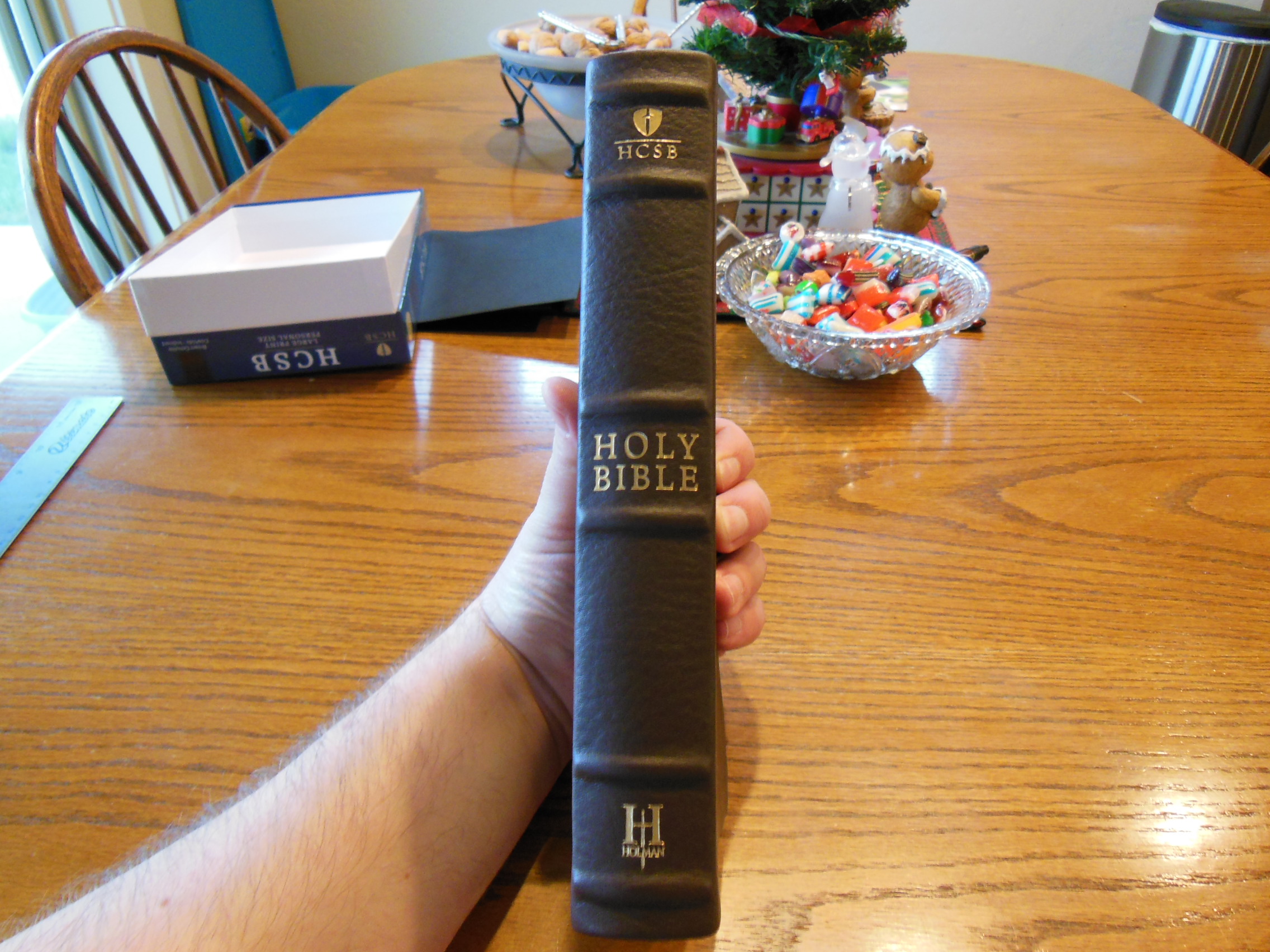
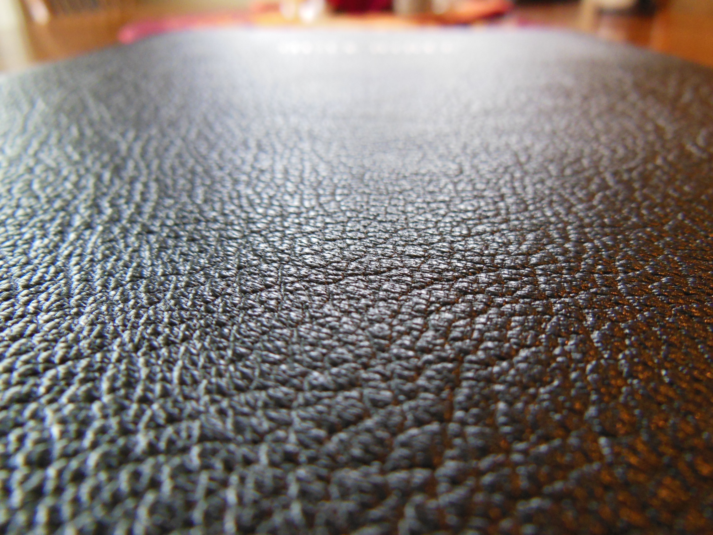
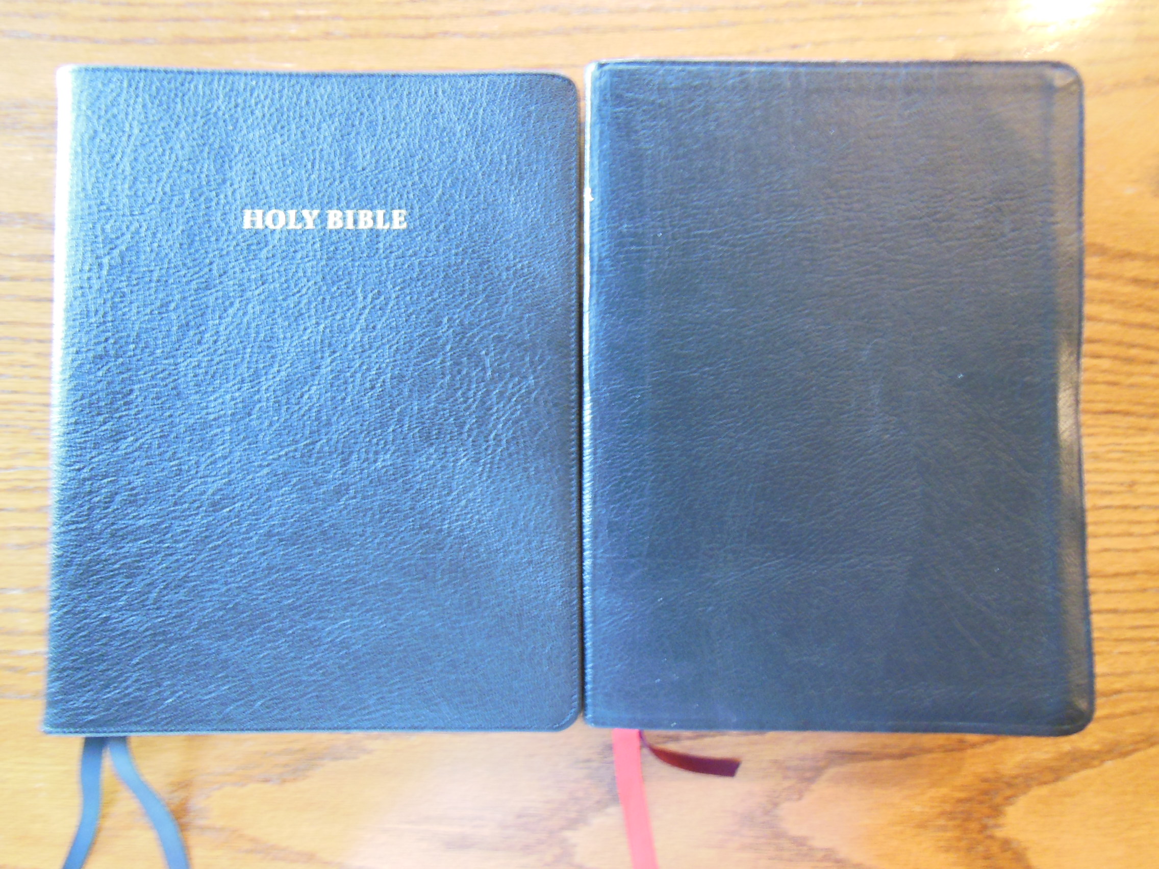
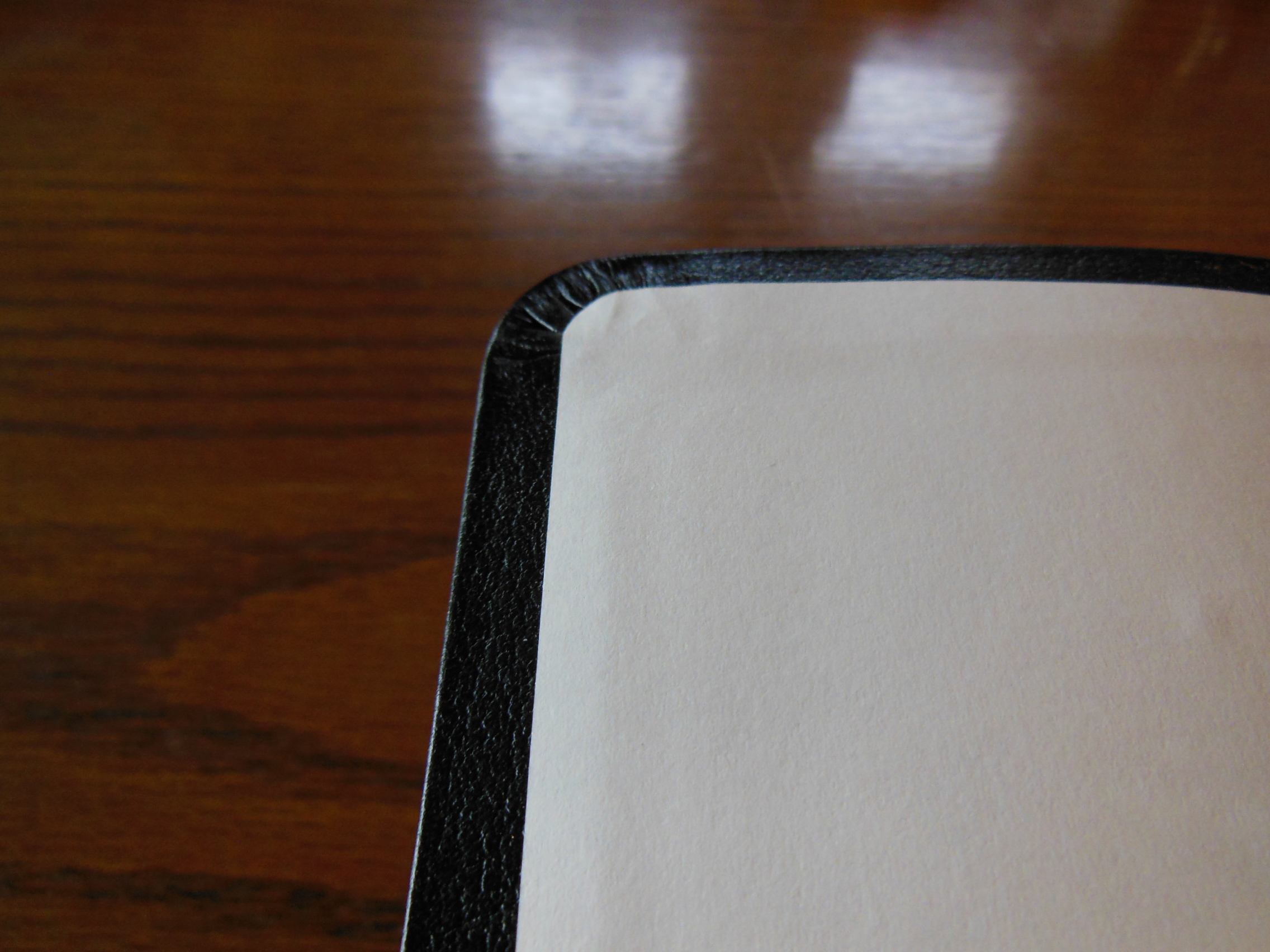
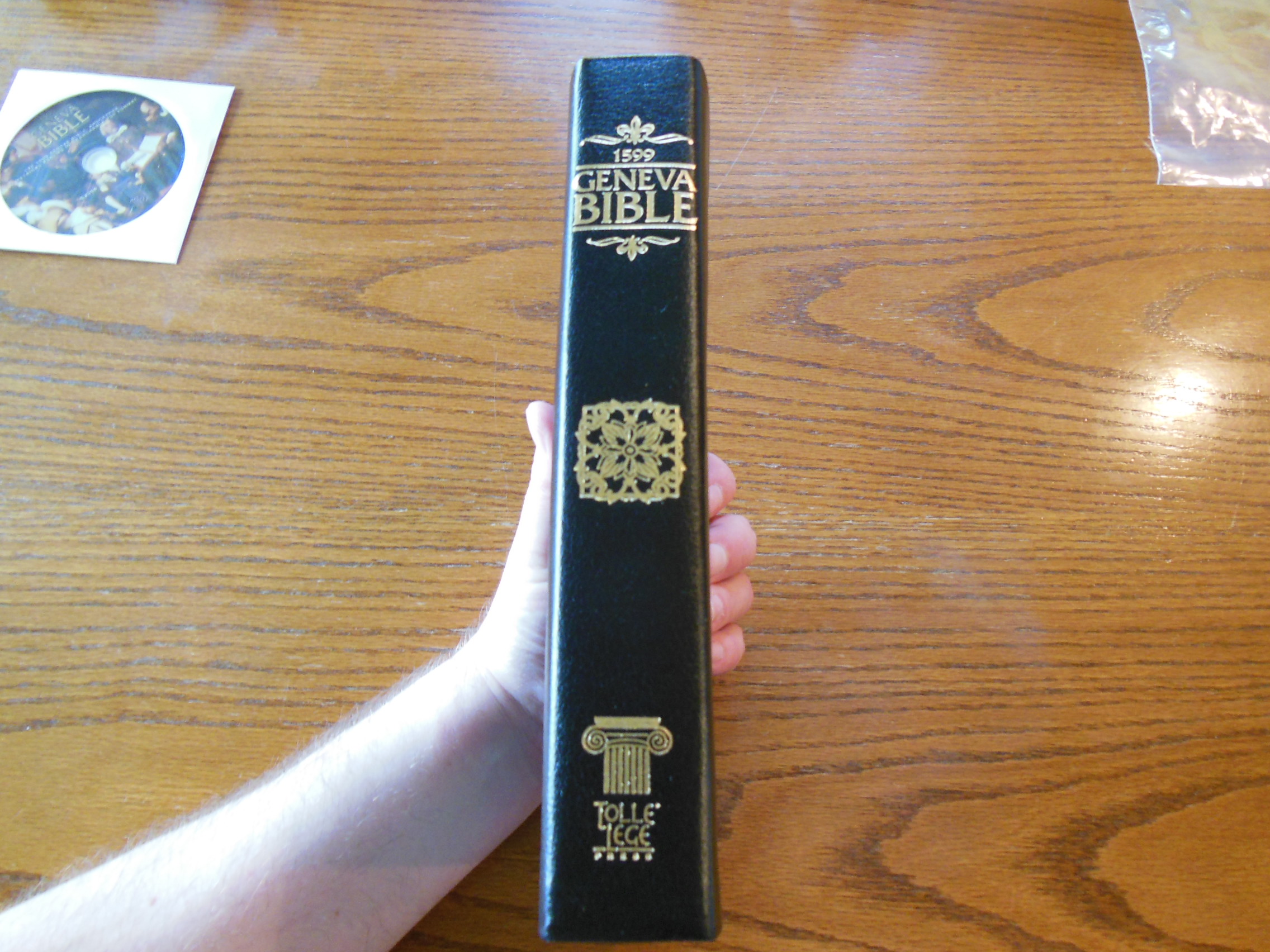
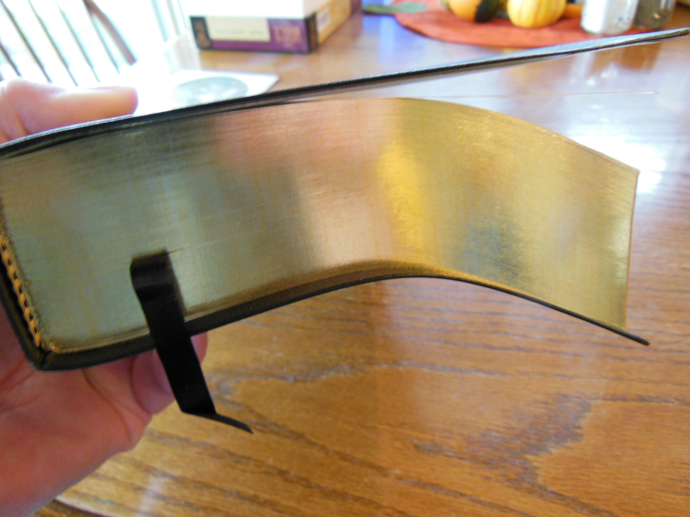
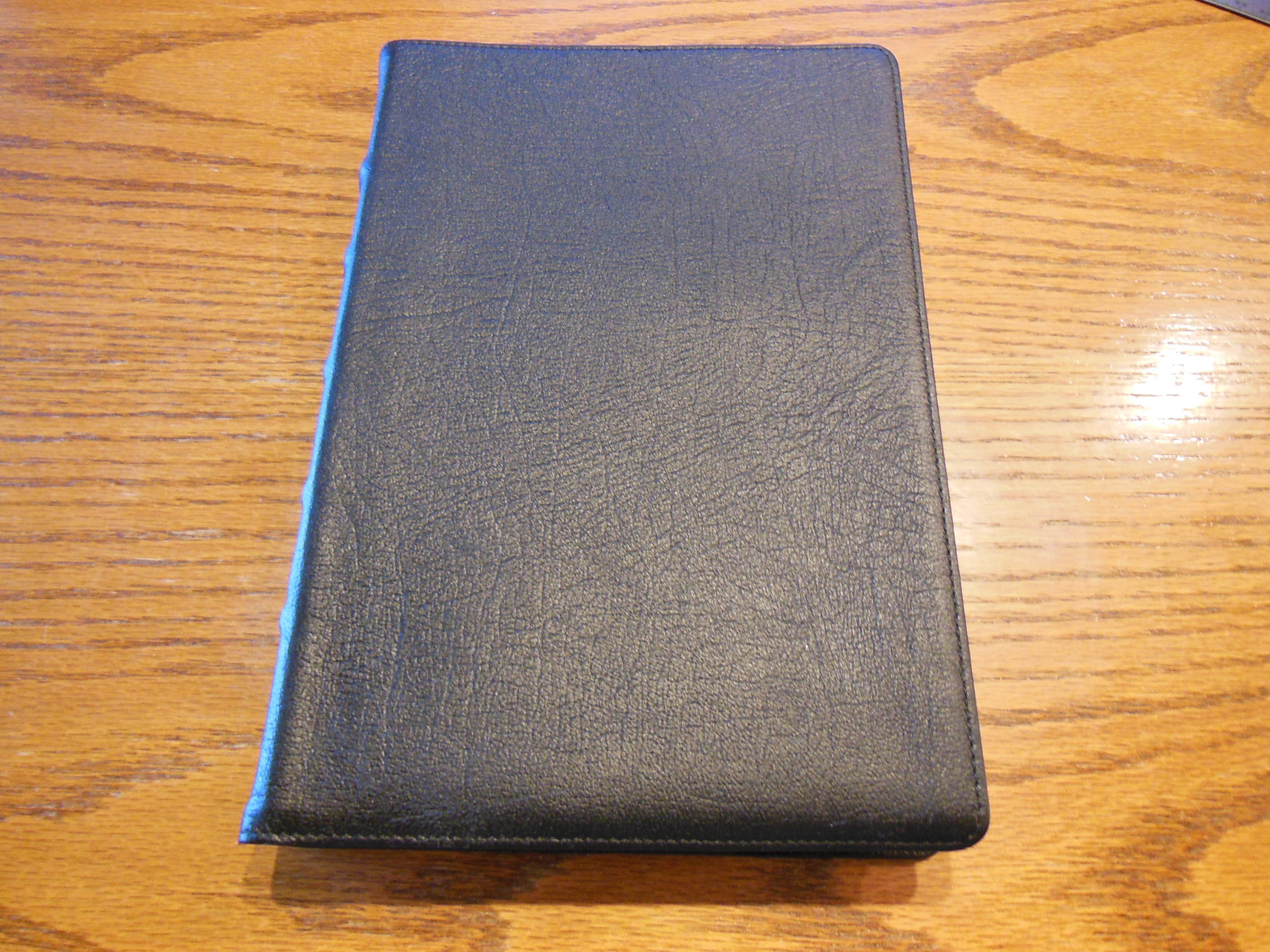
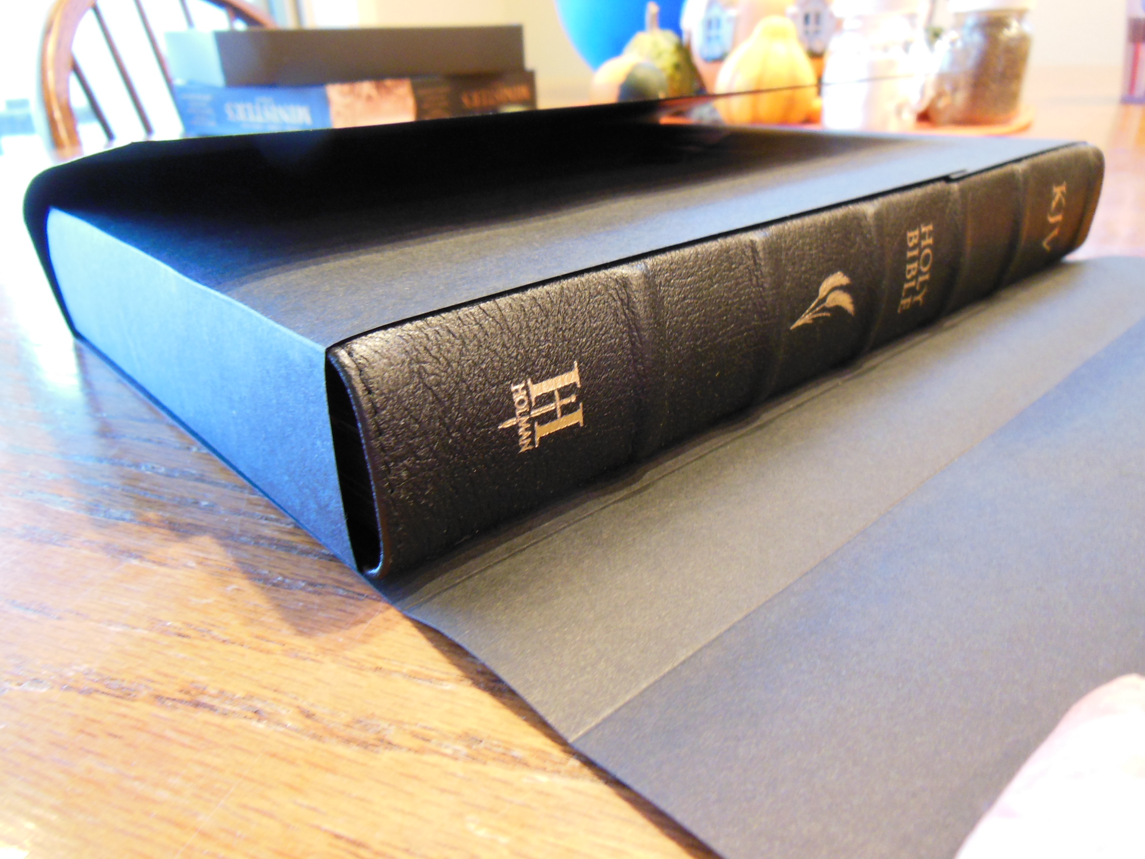
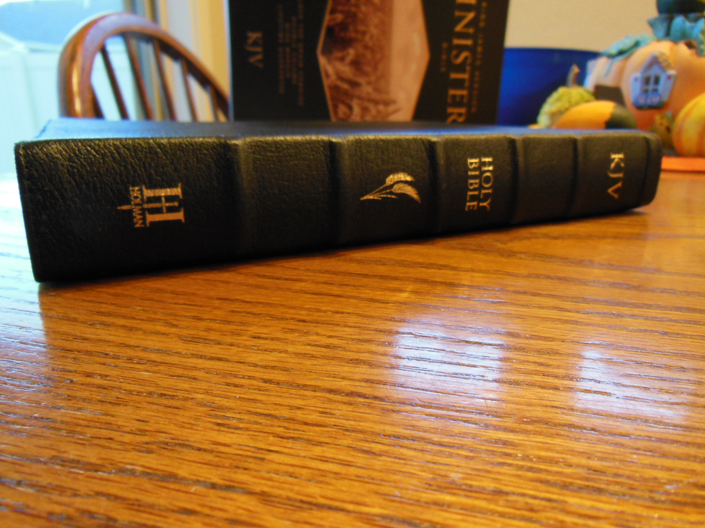
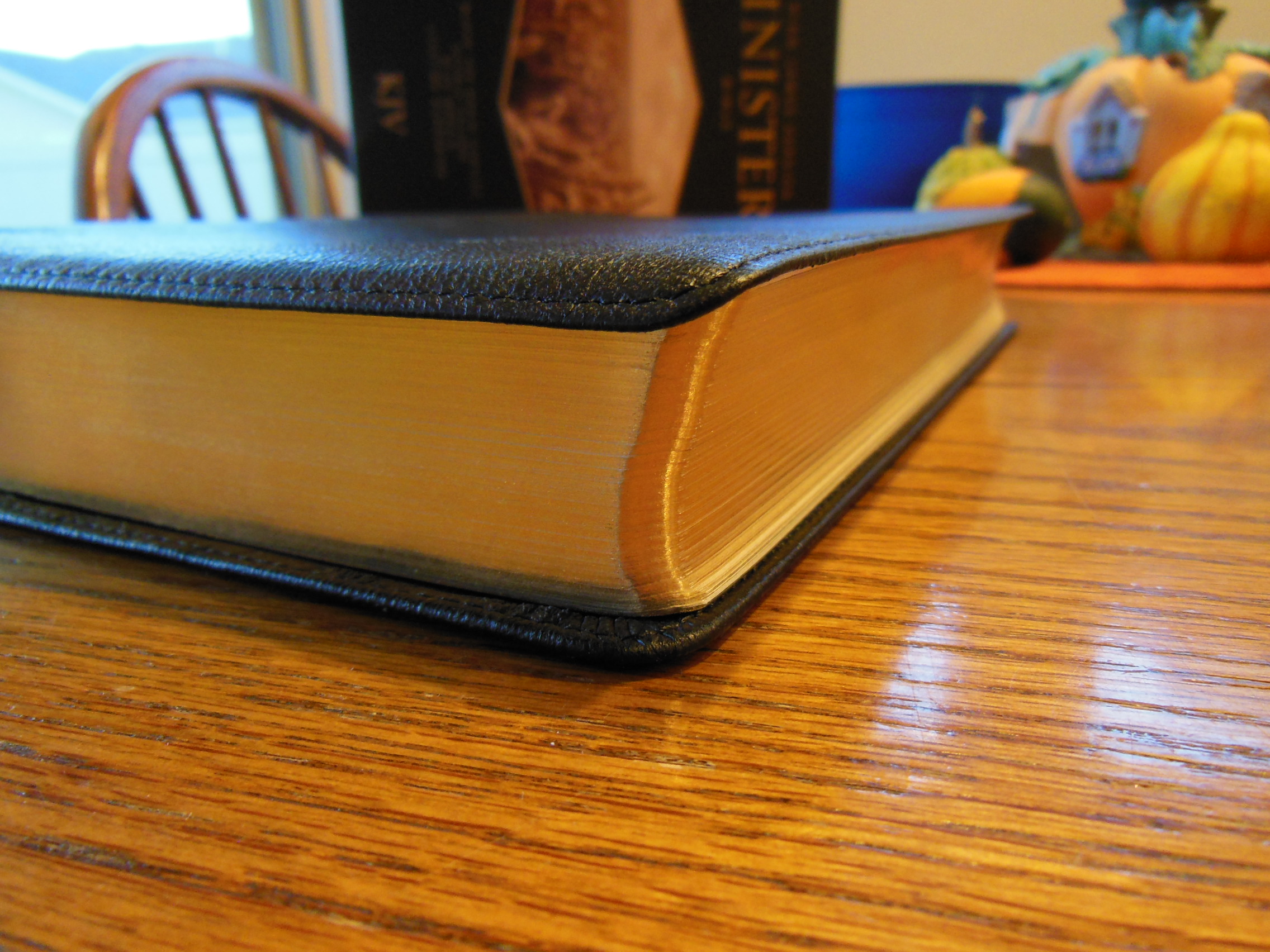
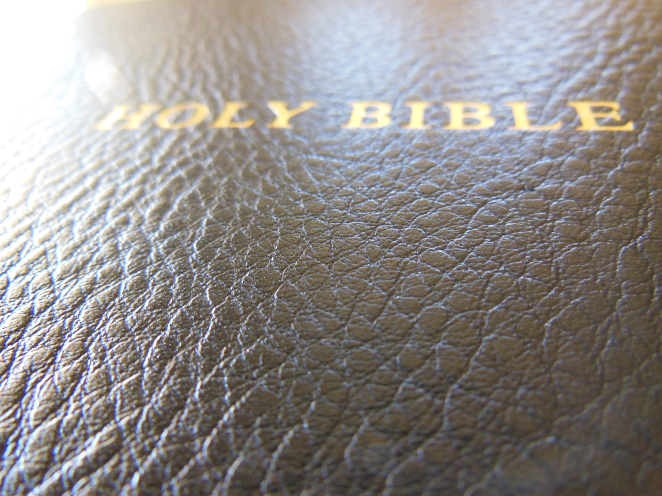
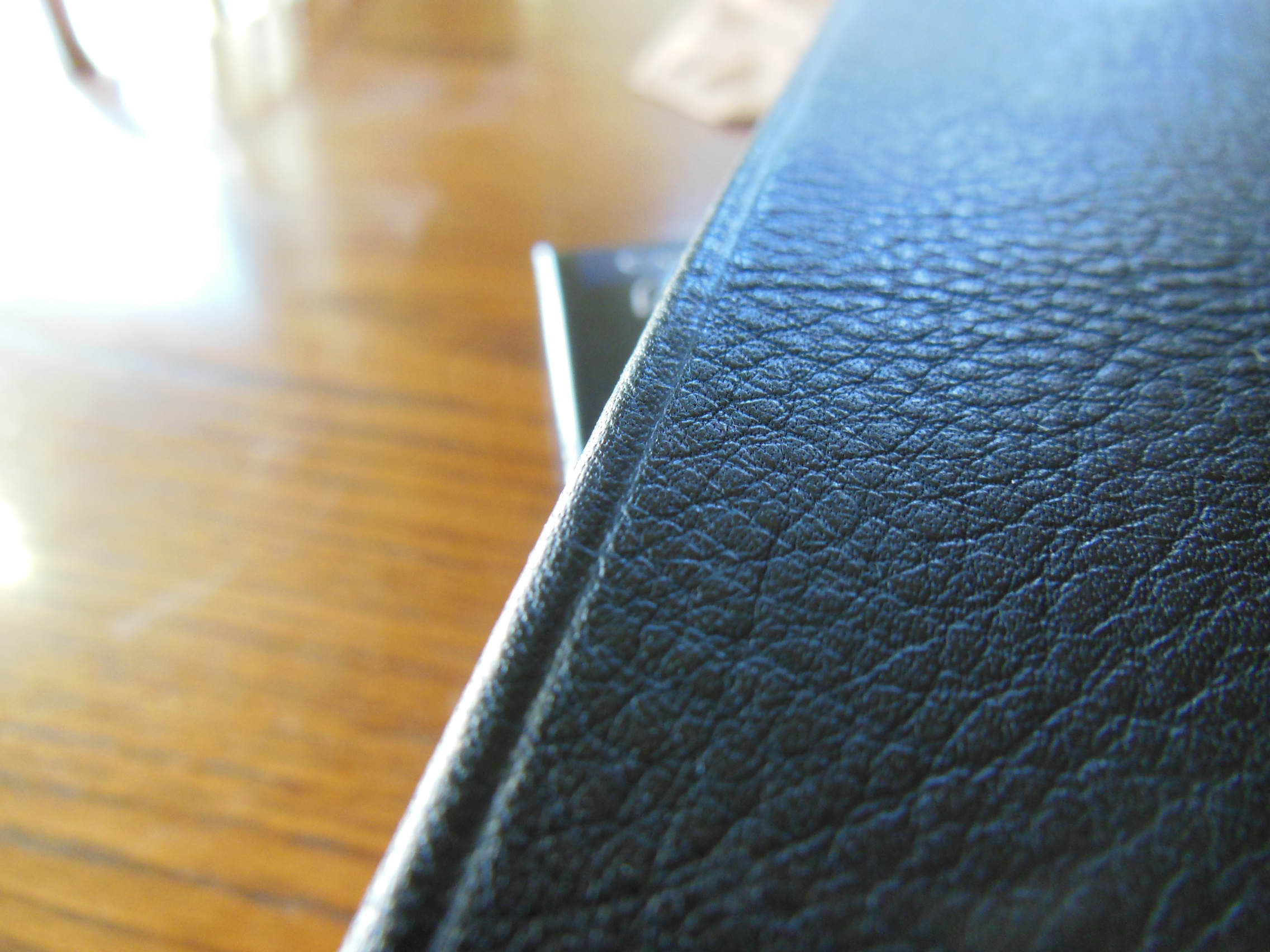
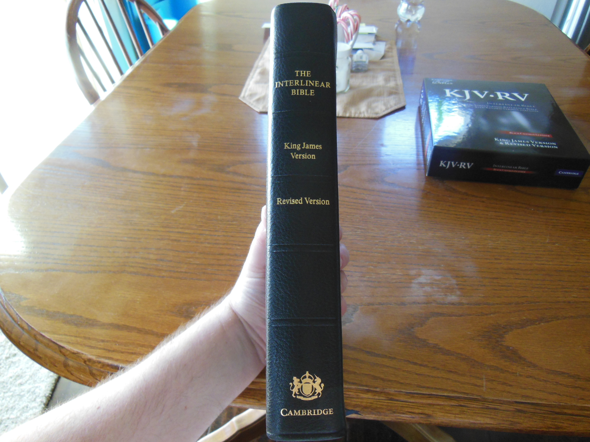
The KJV/RV Interlinear is not a small Bible.  It is about the size of my NASB, MacArthur Study Bible.  The Cambridge is covered in very nice black calfskin.  The cover is obviously, leather.  There is no shiny, artificial look to it.  It doesn’t feel hard, and slick, like the cheaper, pig skin leather covers on lesser Bibles.  The leather smell also reinforces in your mind that this is not a synthetic cover or overly processed leather.

DSCN2858

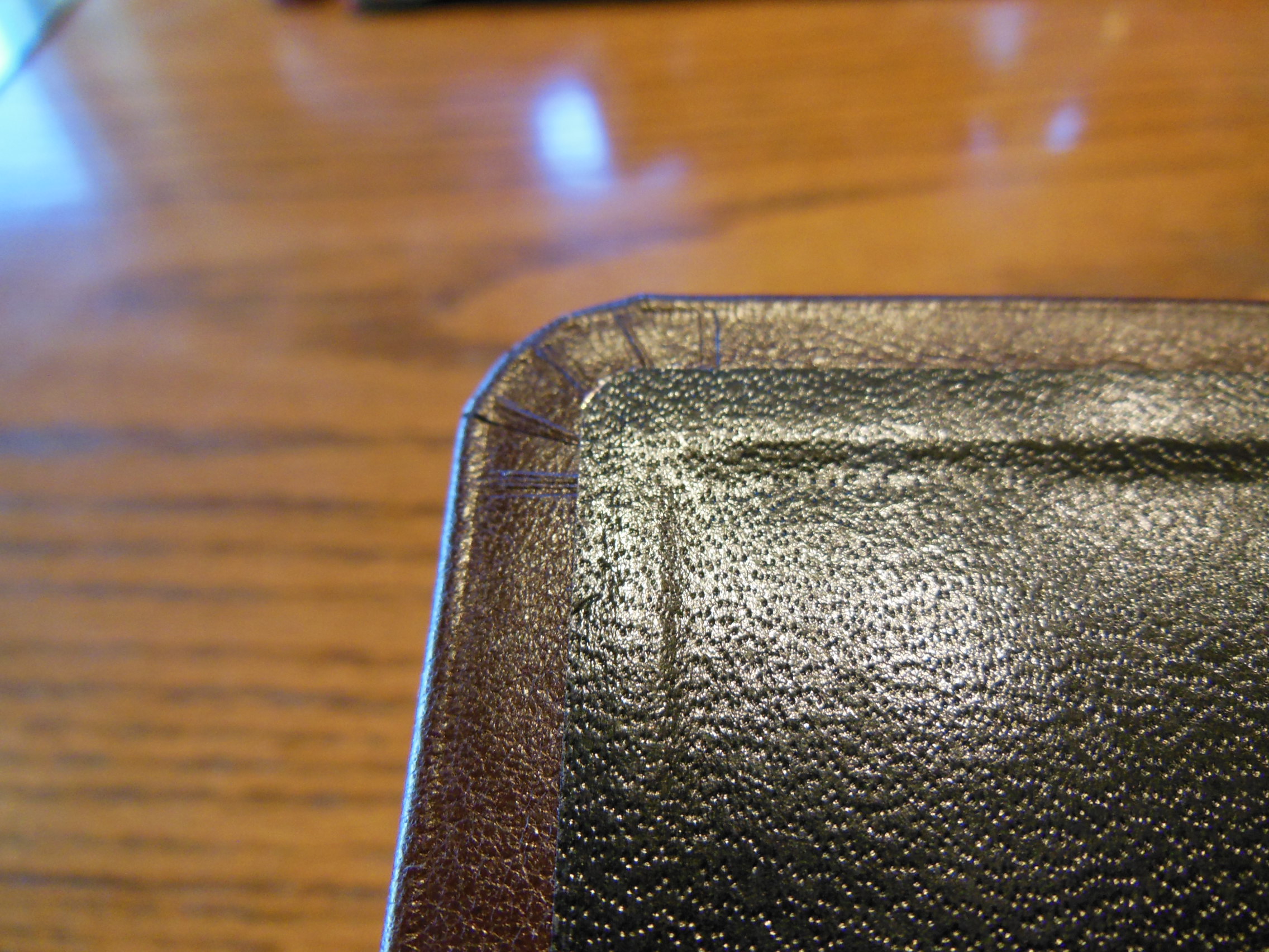
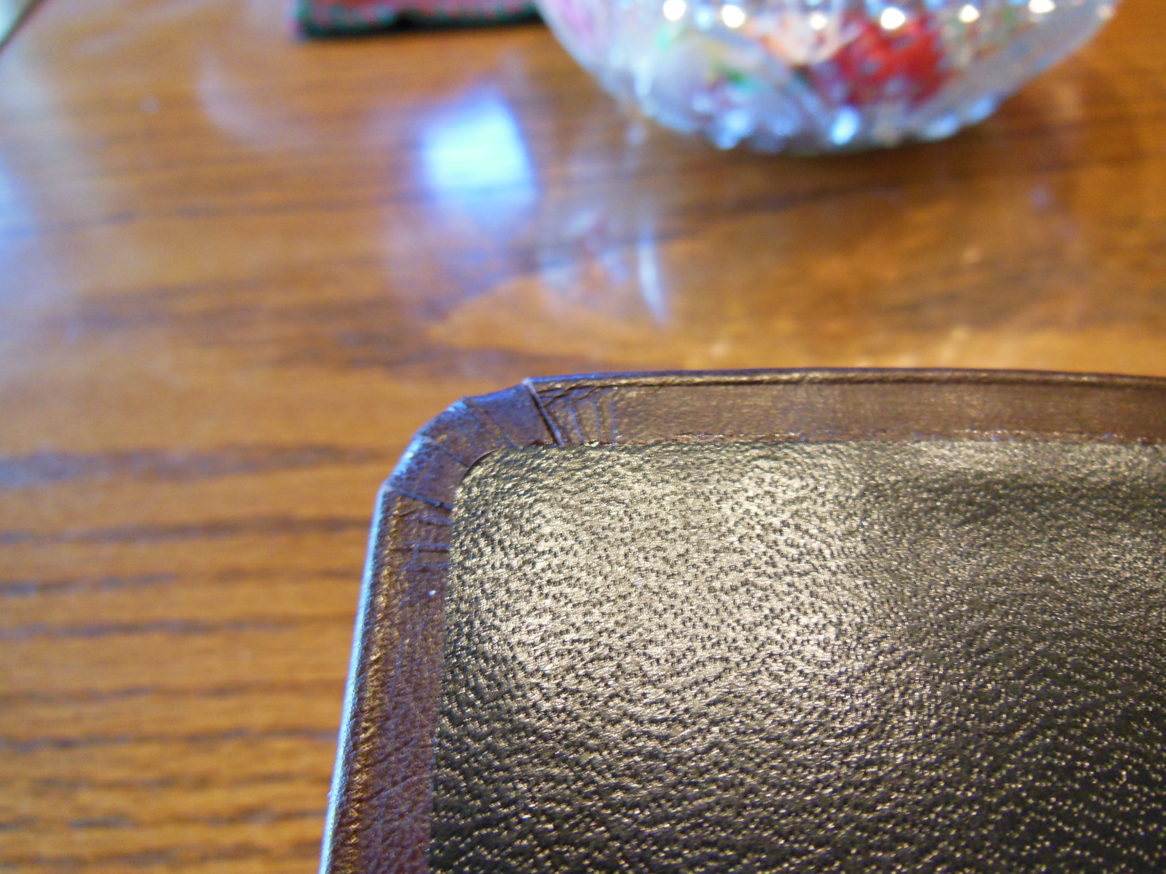
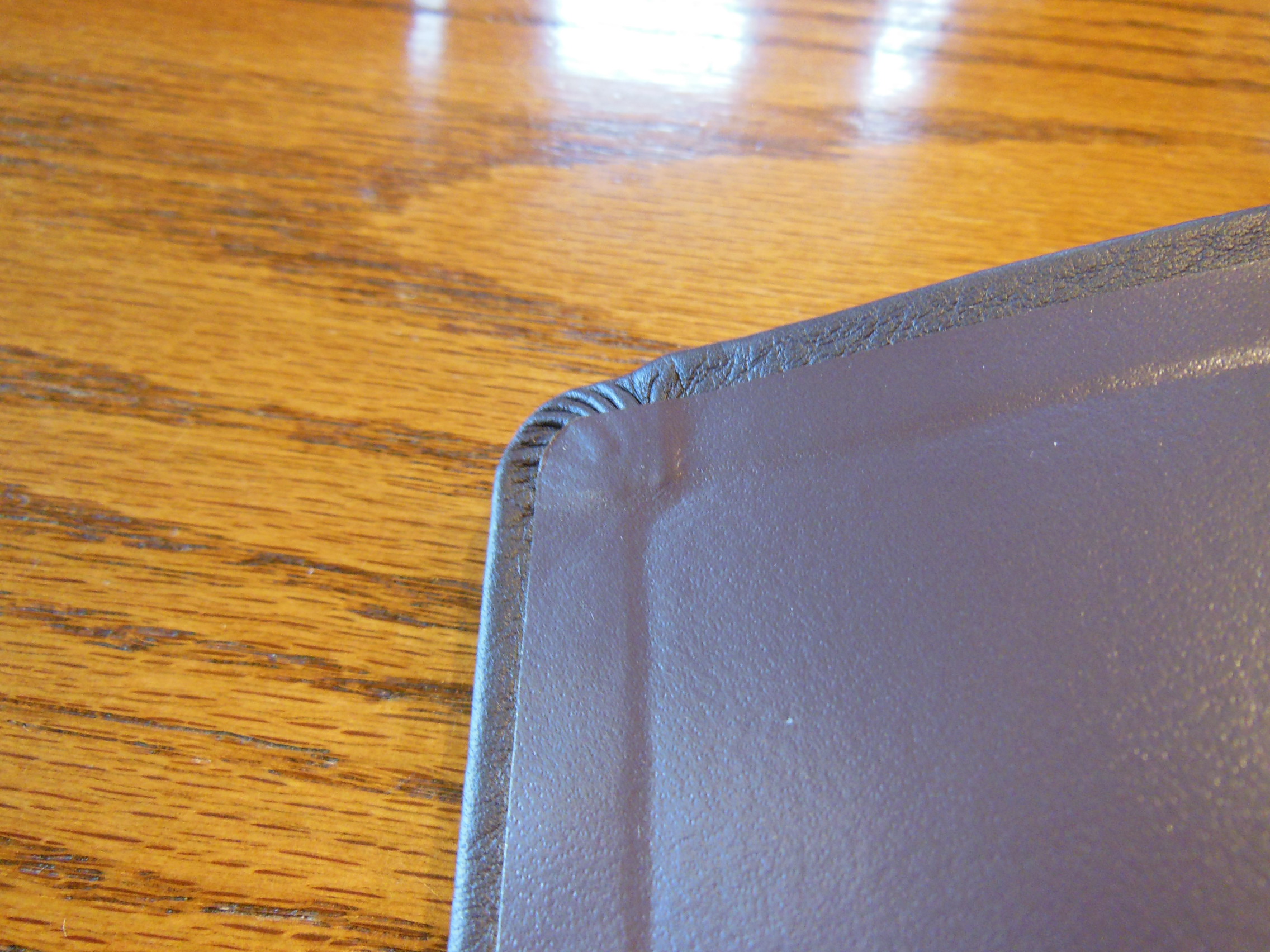
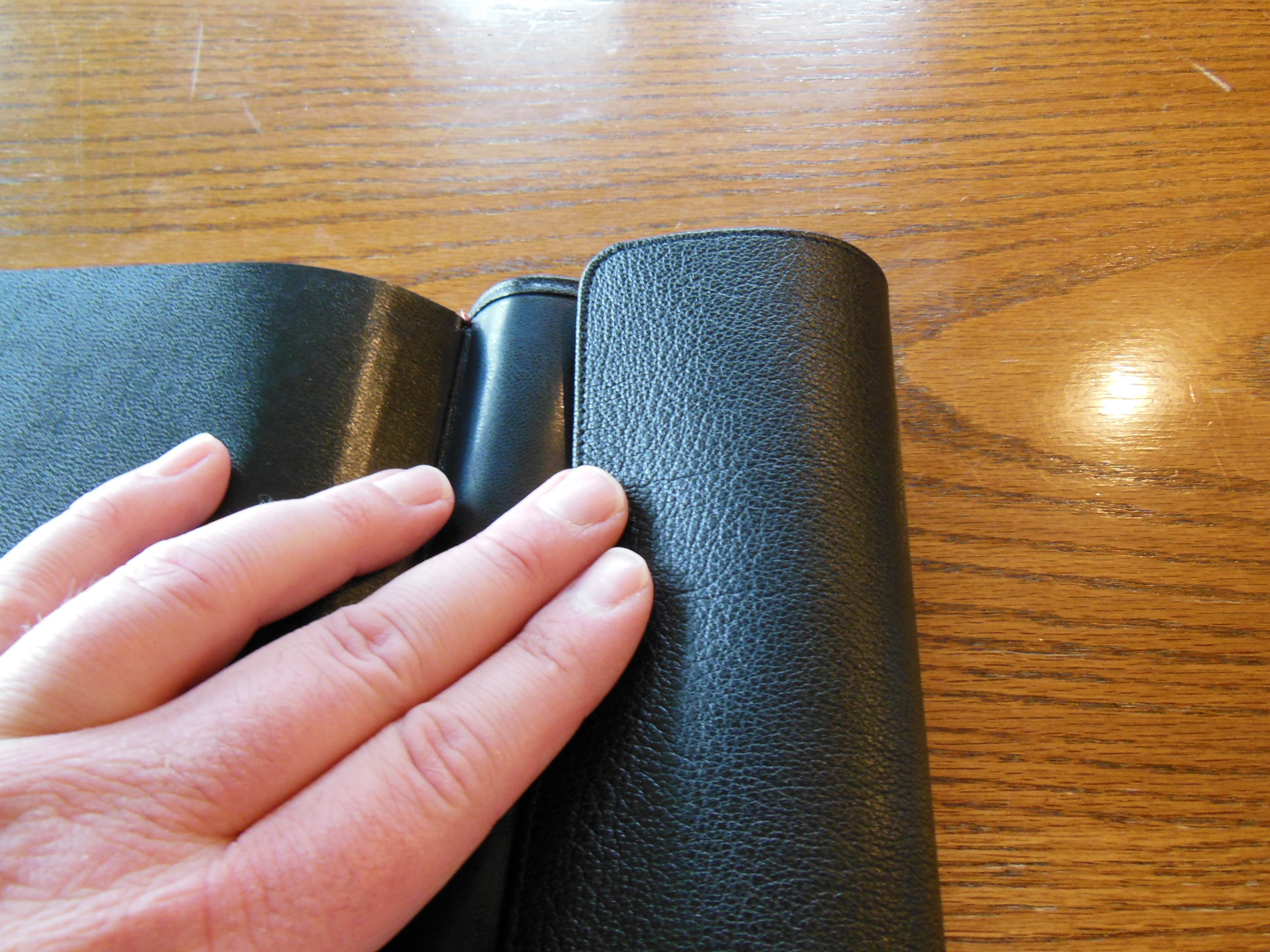
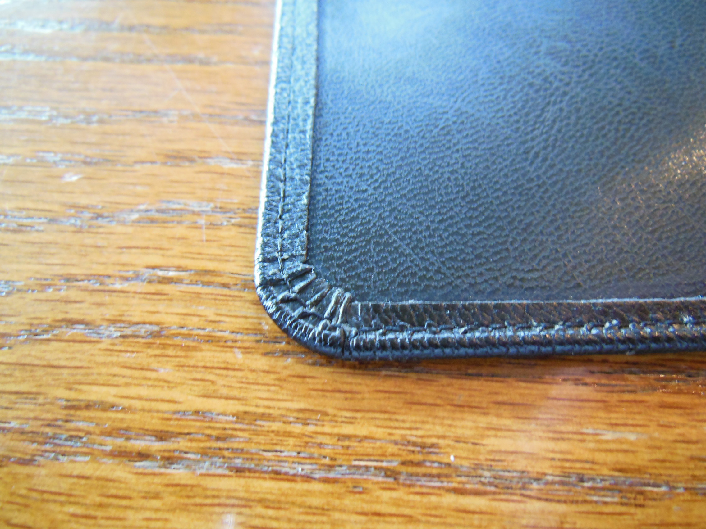
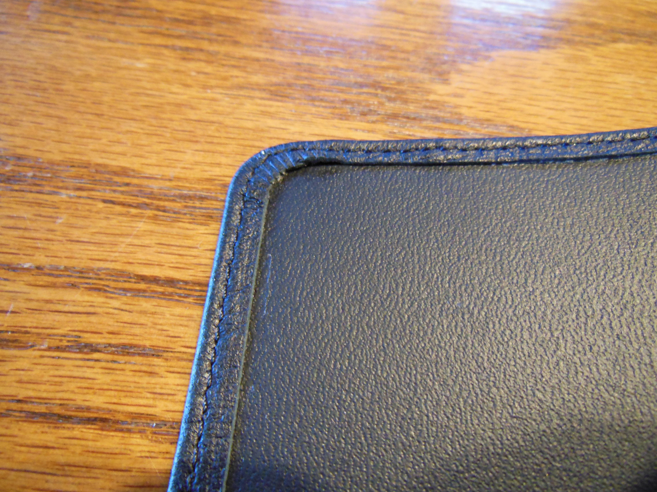
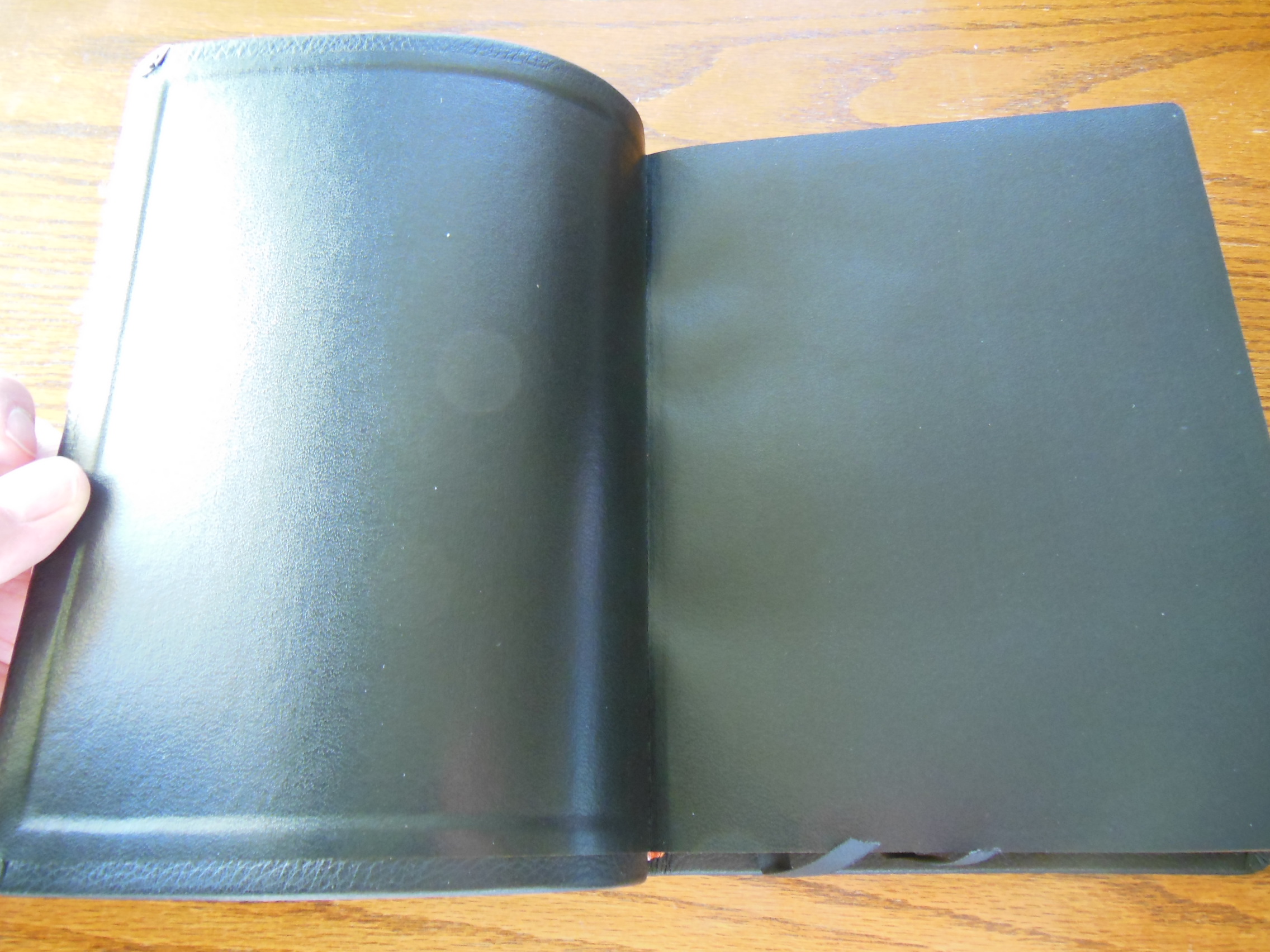
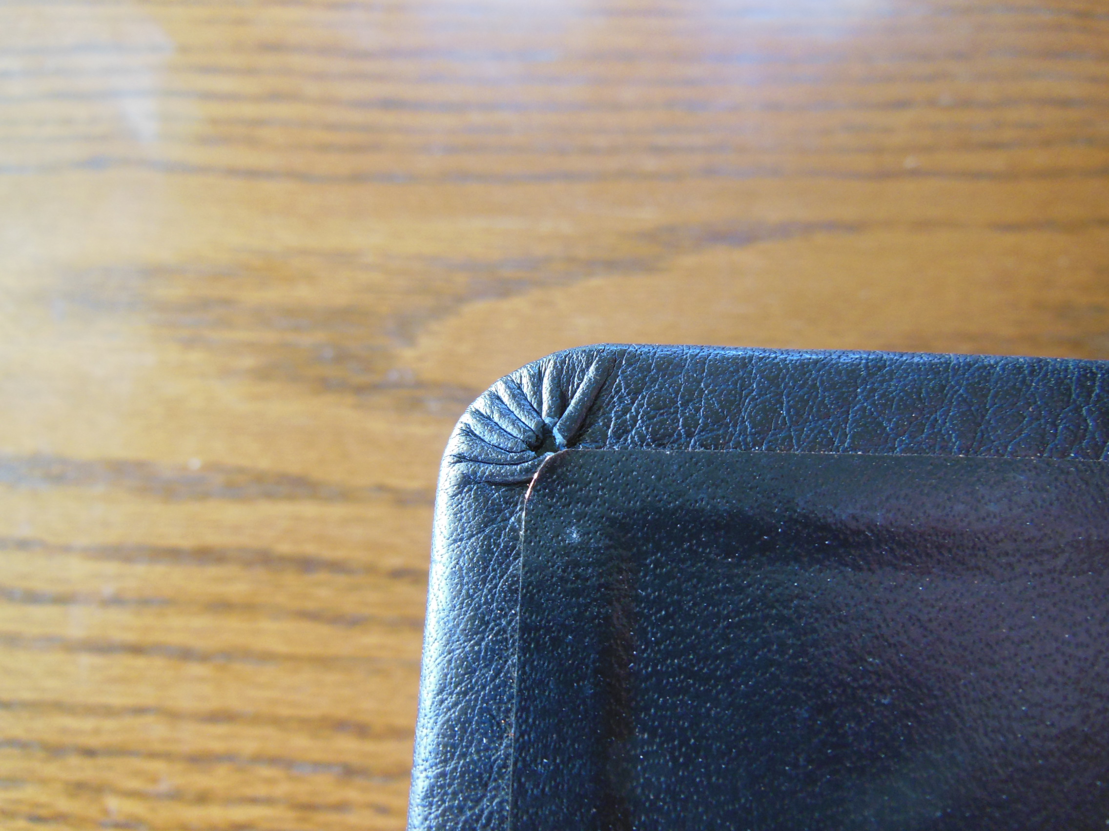
The binding is smyth-sewn.  The Bible is case bound.  The inner cover is lined with a black vinyl adhered to it.  The corners are nicely cut and glued.

DSCN2875 DSCN2870

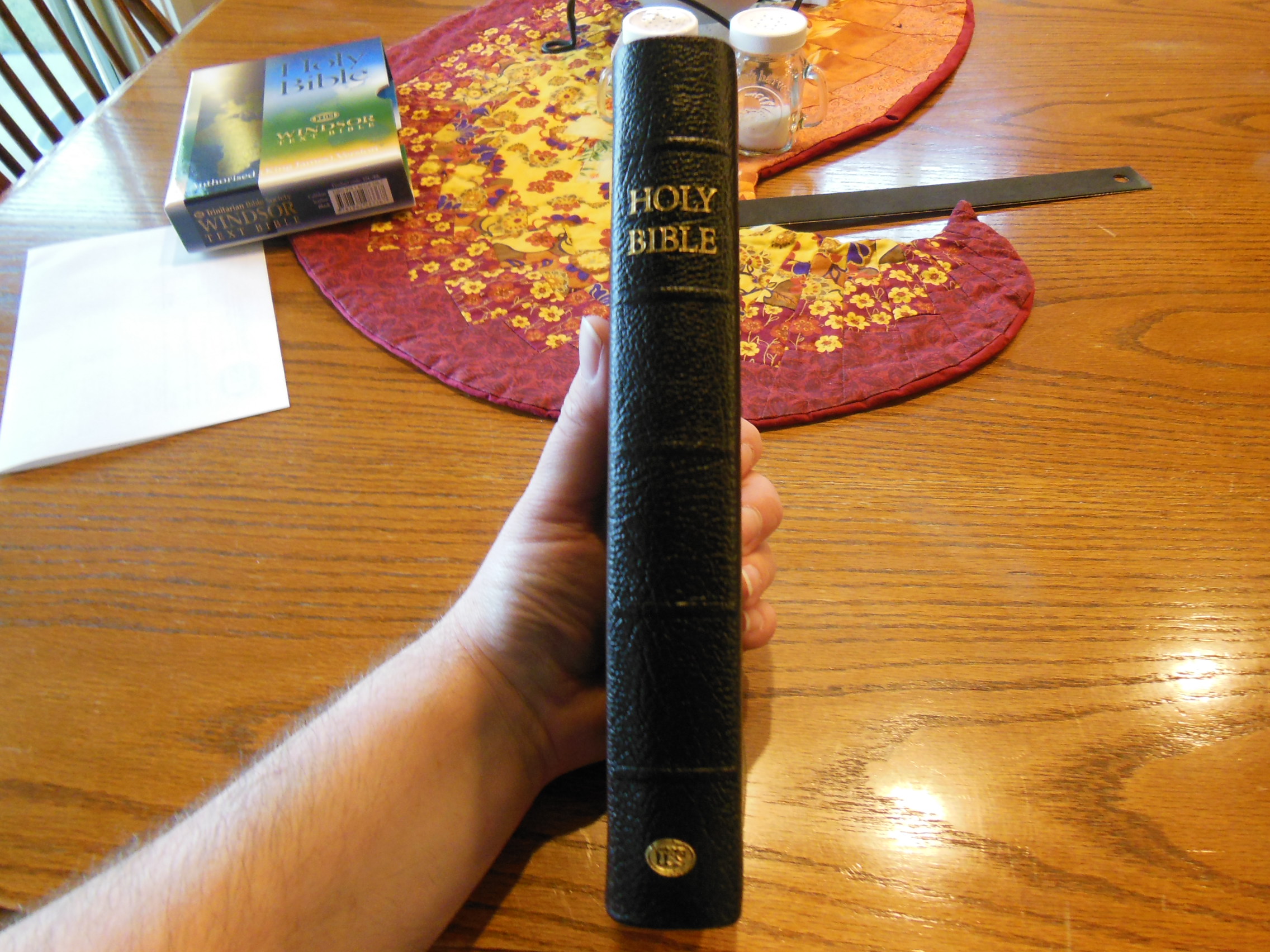
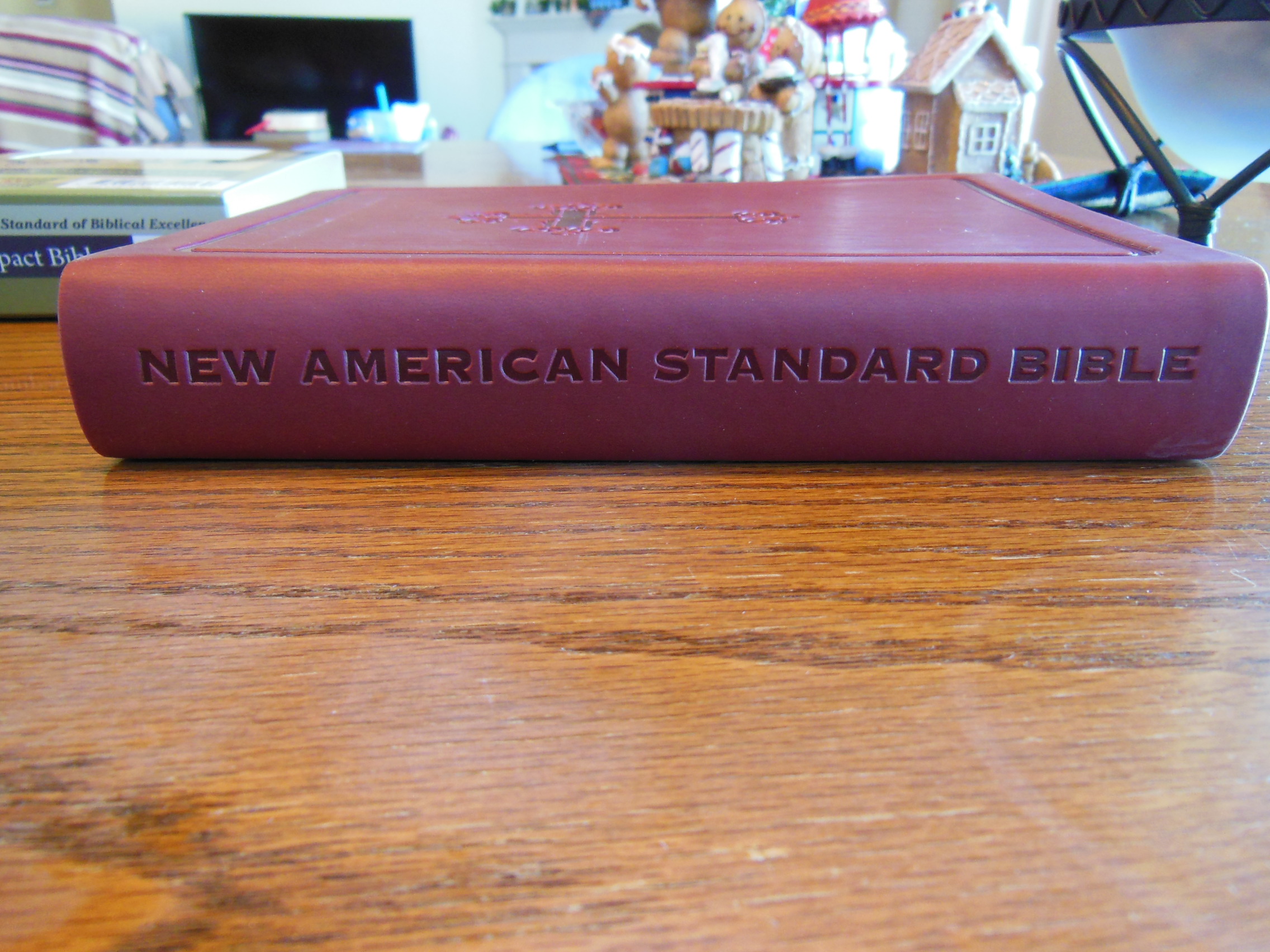
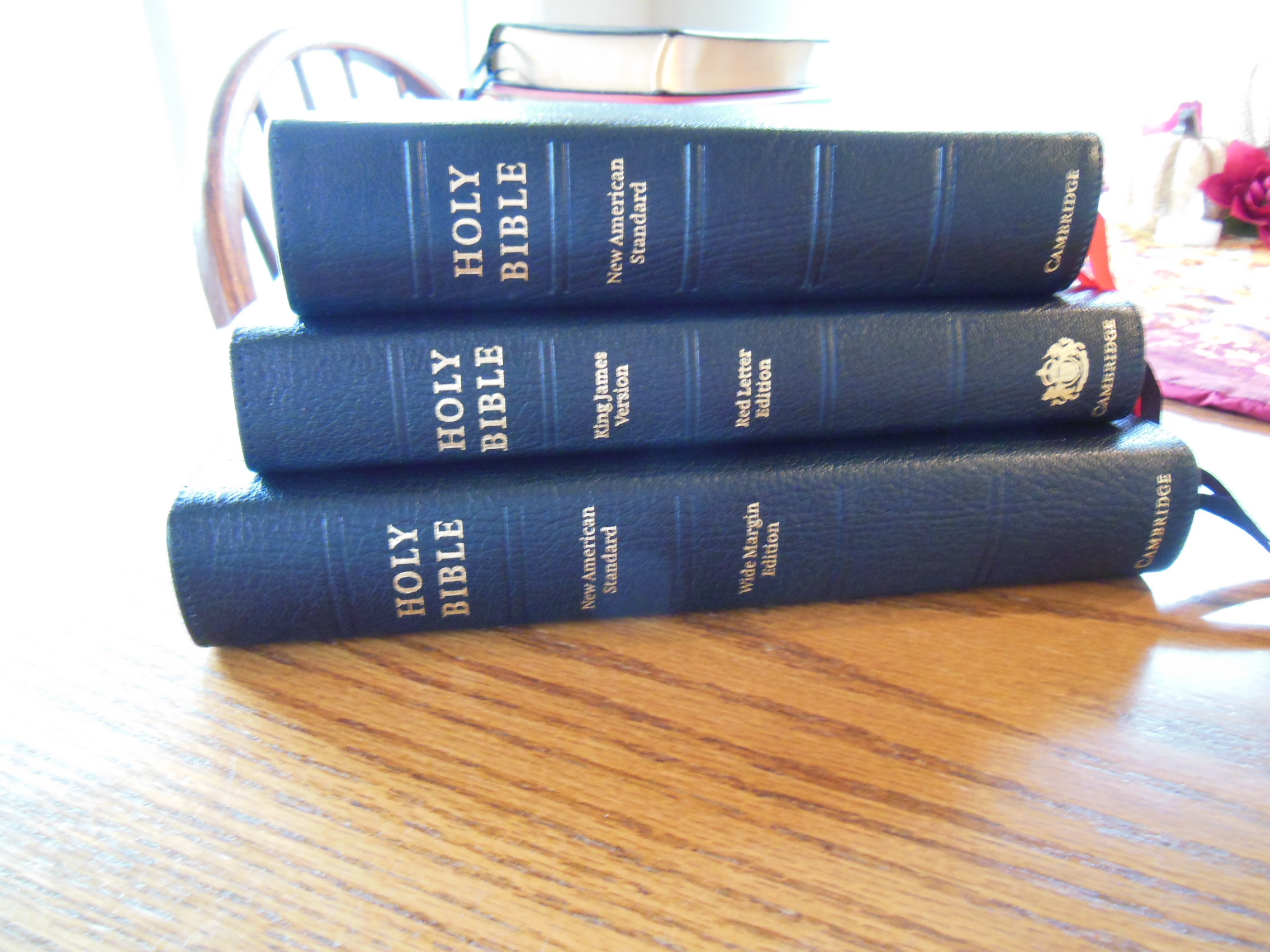
The cover is stamped with, “Holy Bible” in gold.  The spine also is stamped in gold with, “The Interlinear Bible” at the top, “King James Version” under it, and “Revised Version” under that.  On the bottom is the Cambridge logo with the word, “Cambridge” under it.

DSCN2867

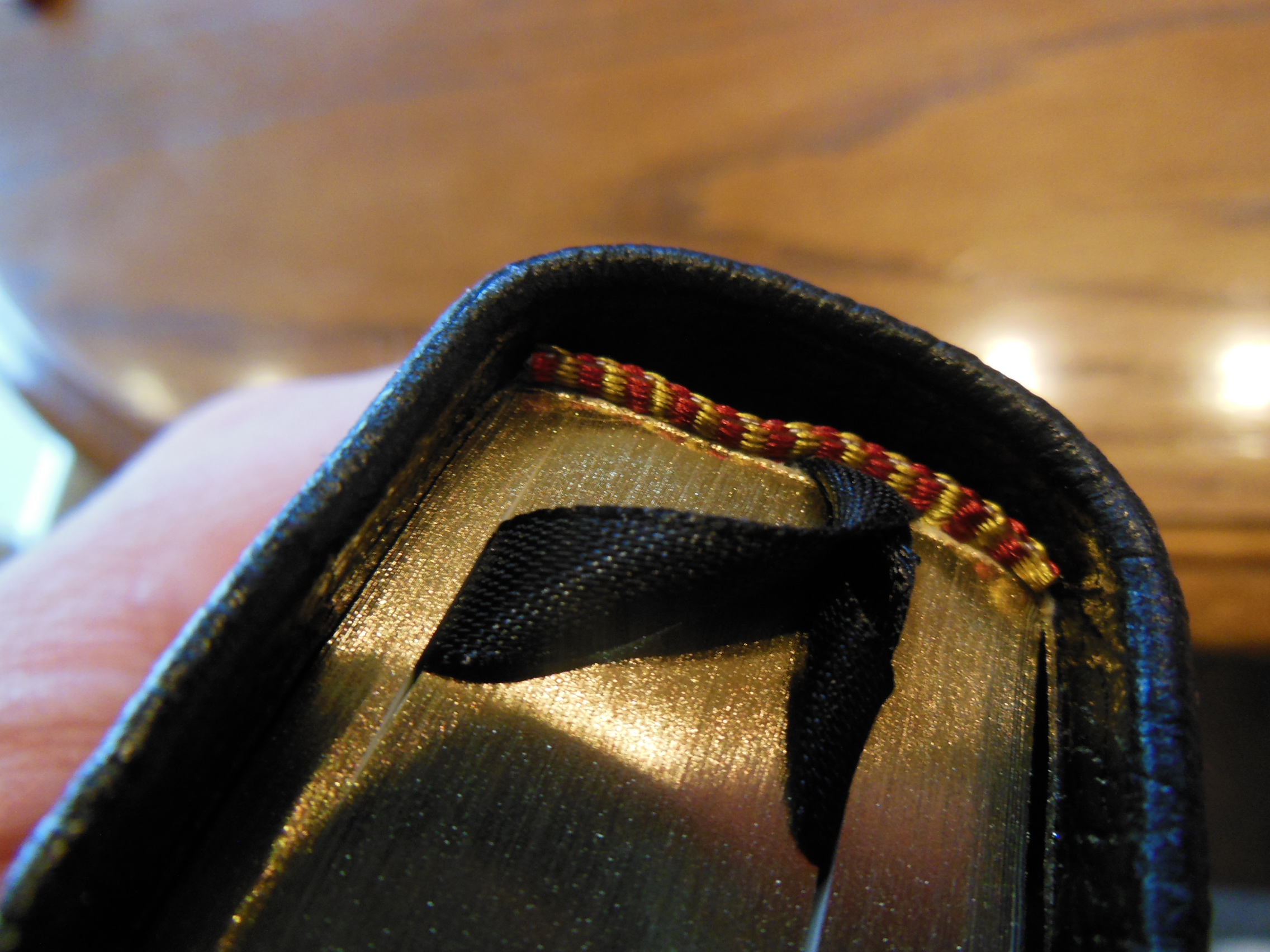
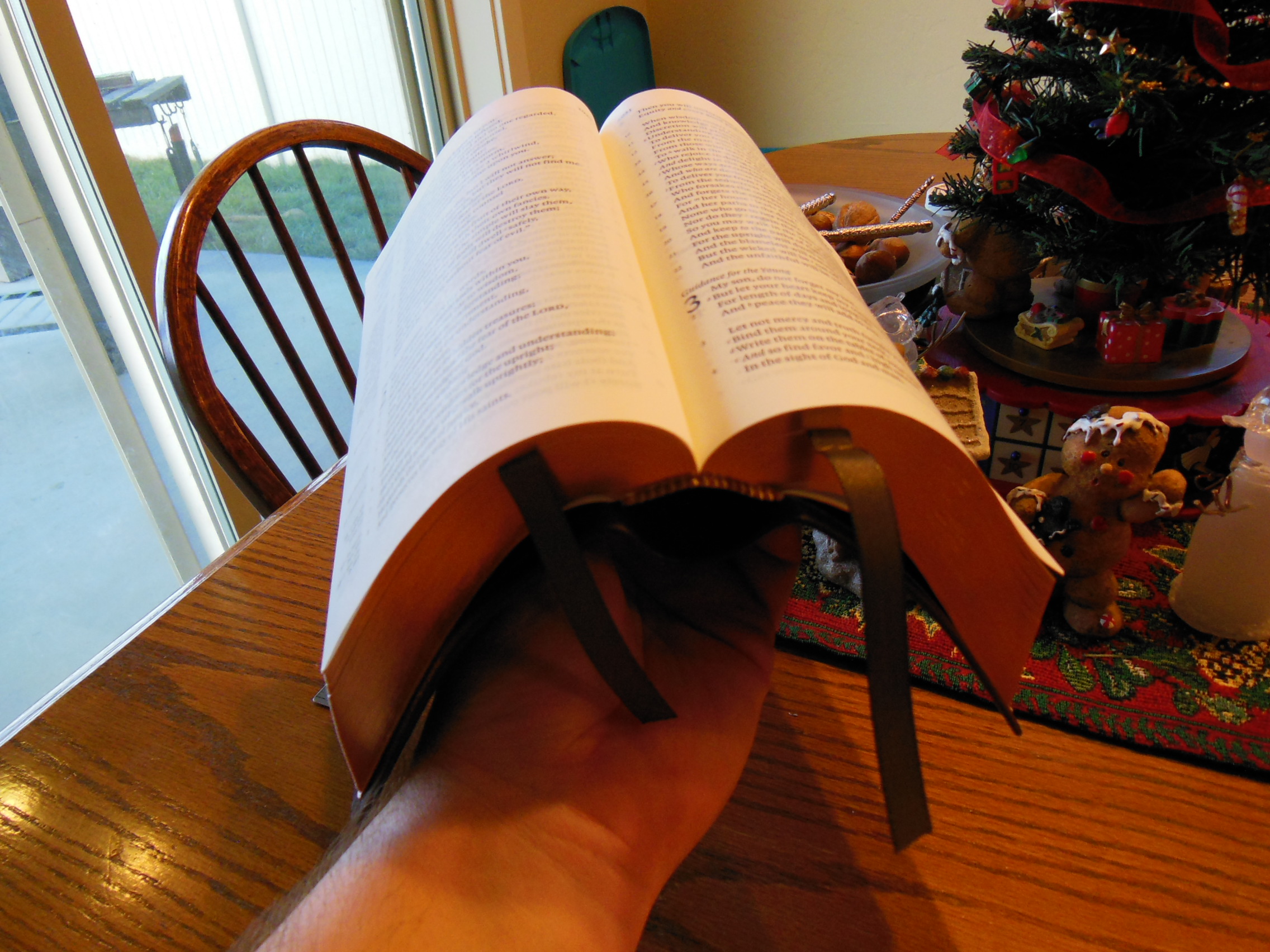
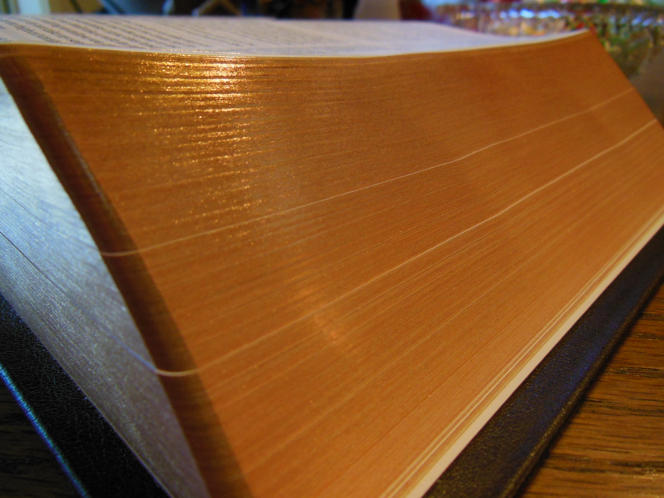
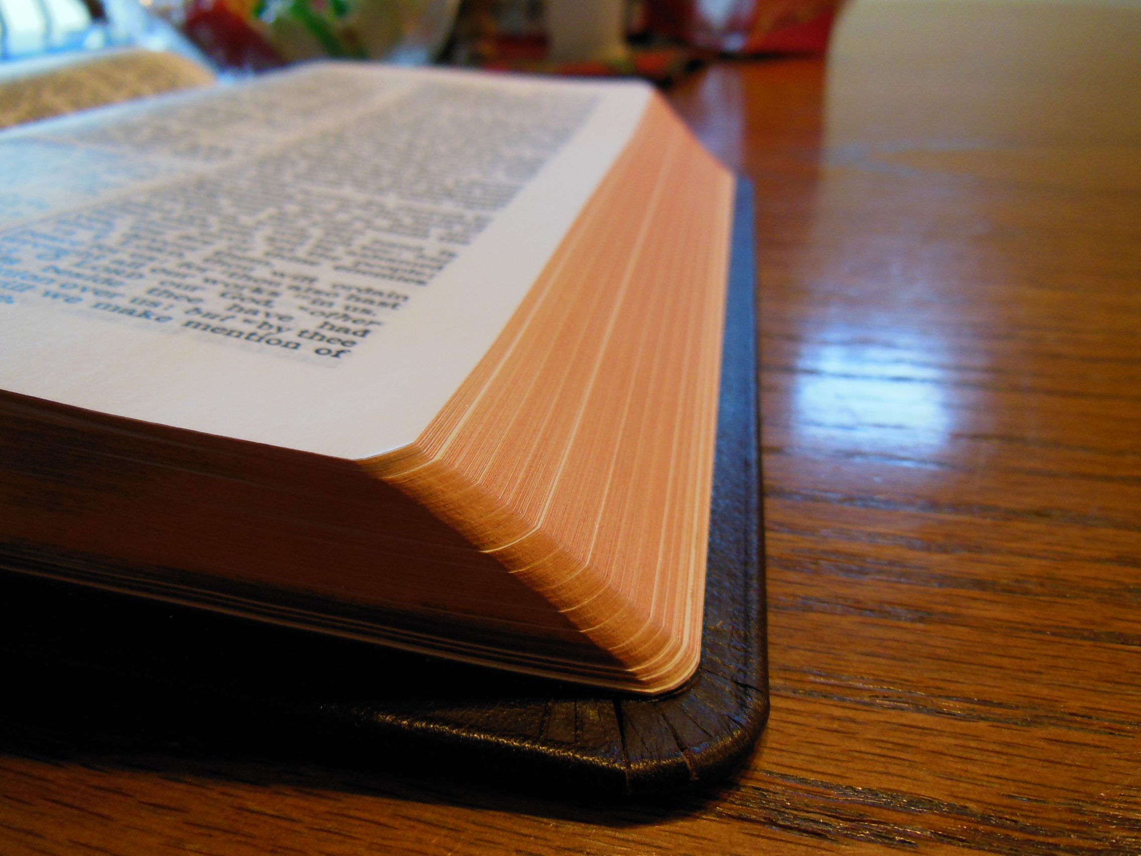
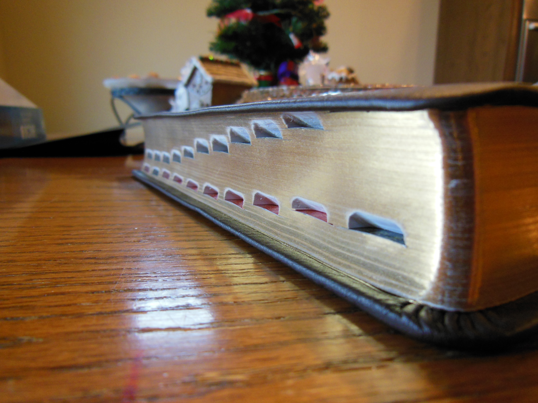
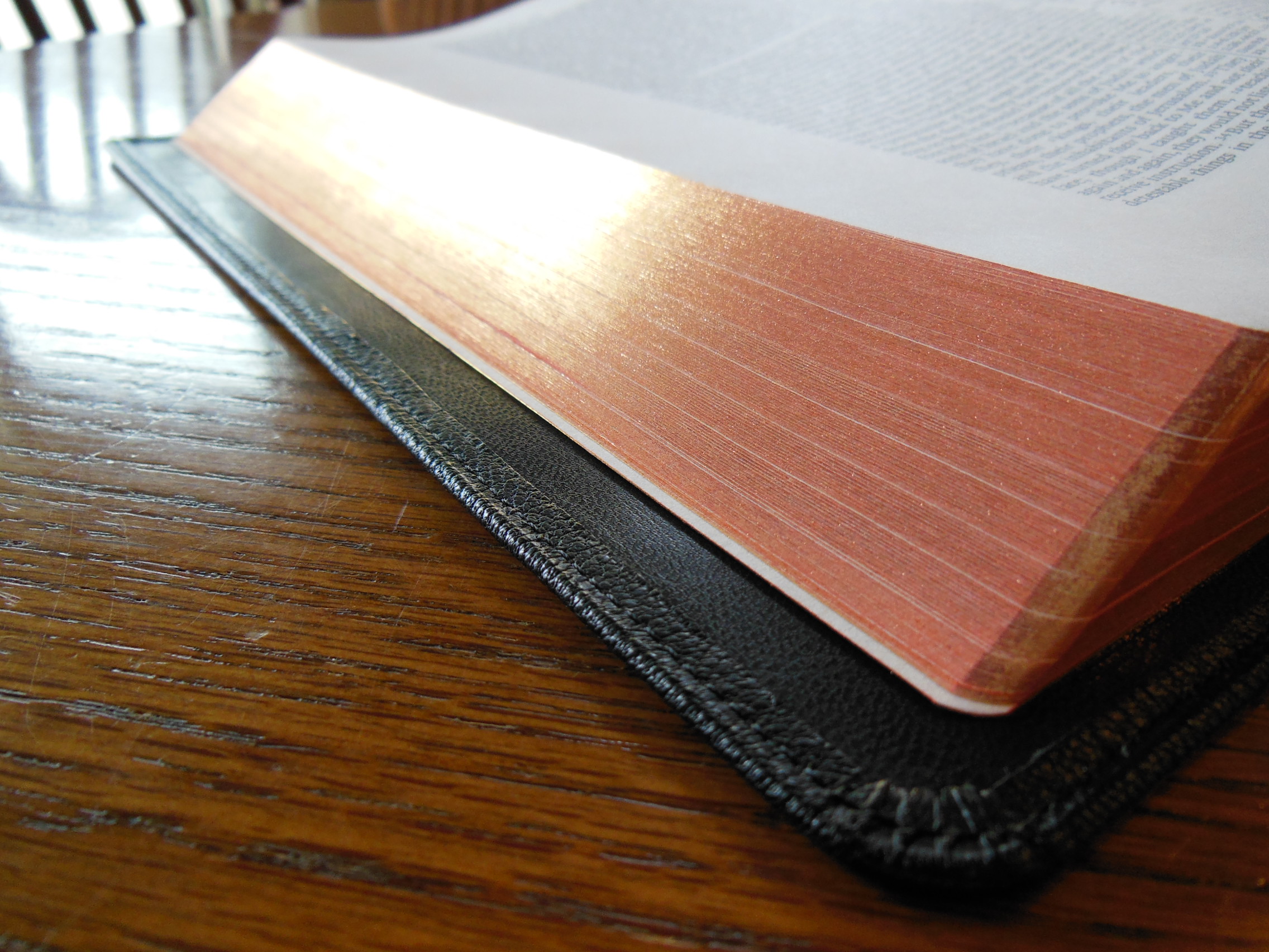
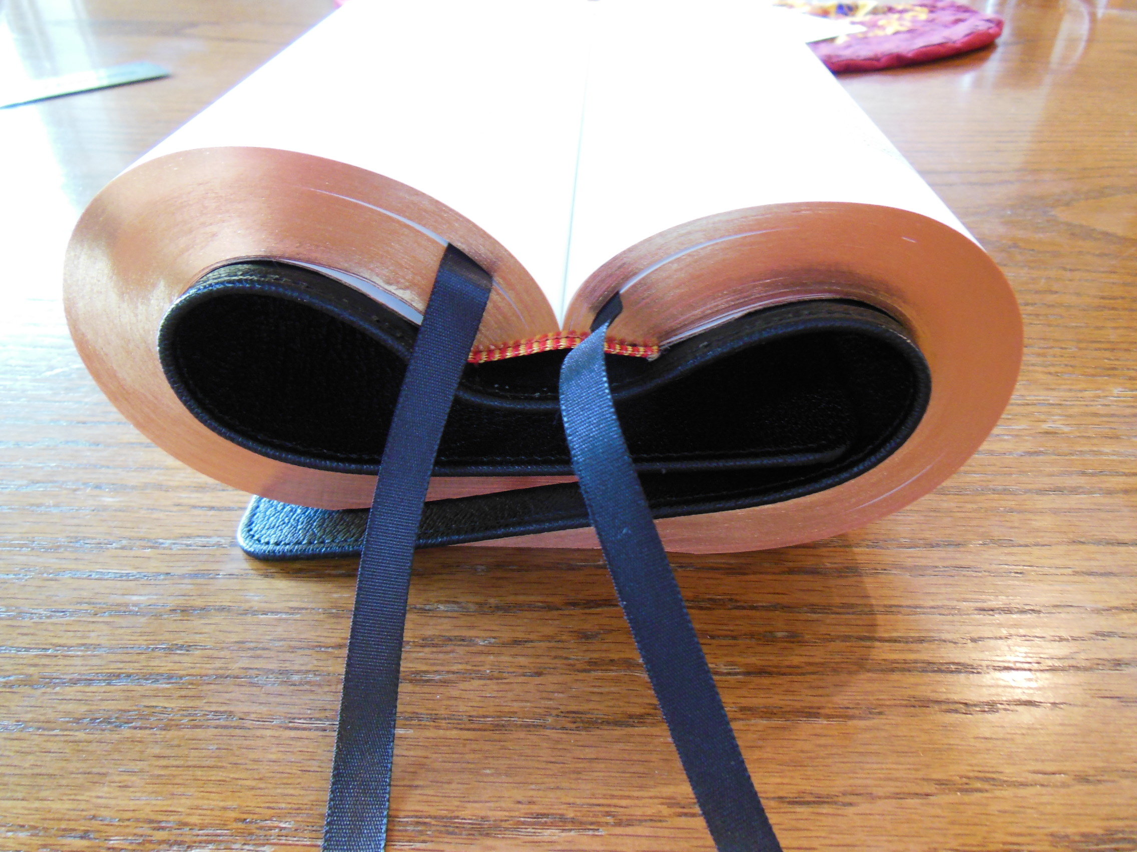
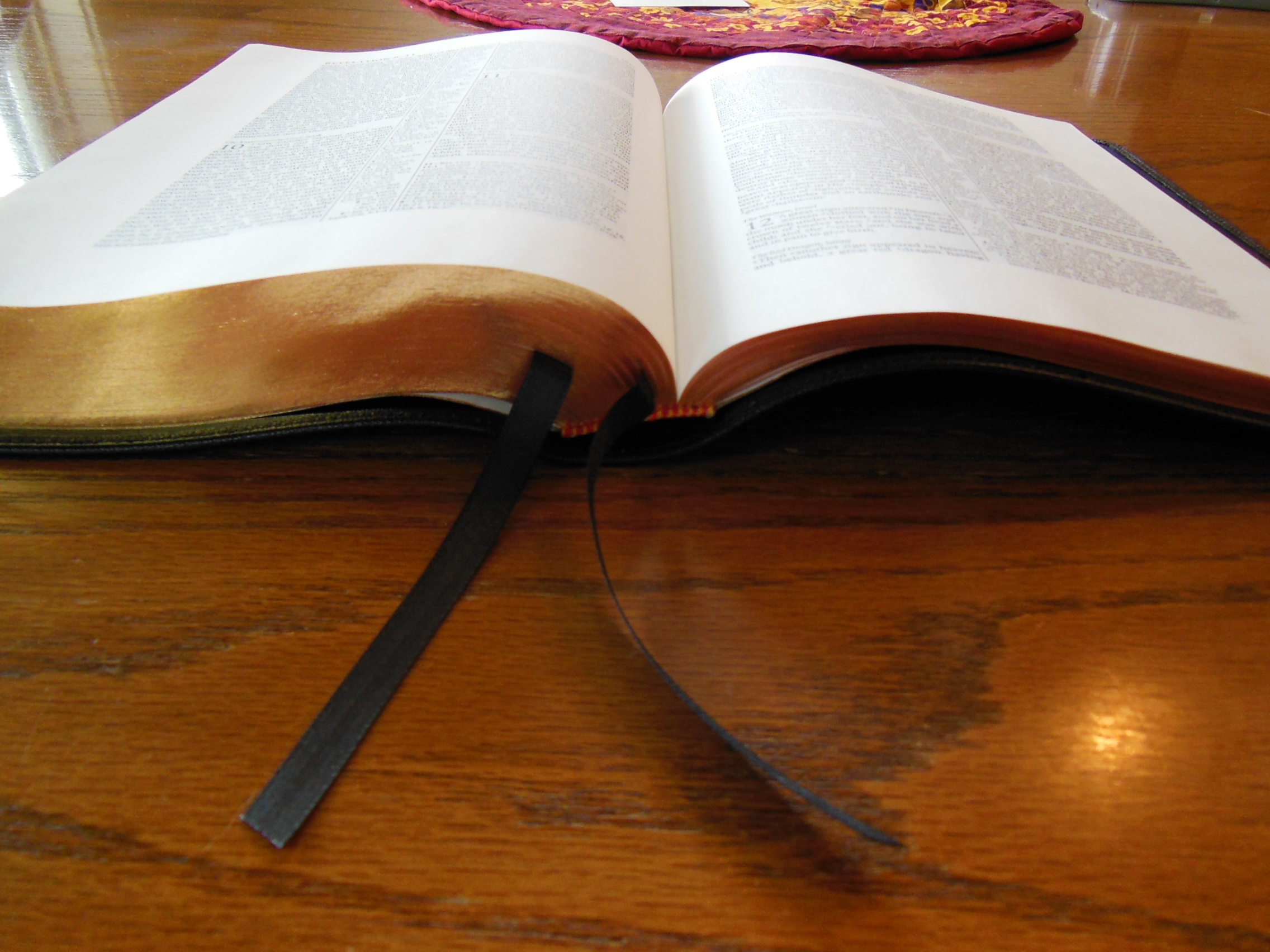
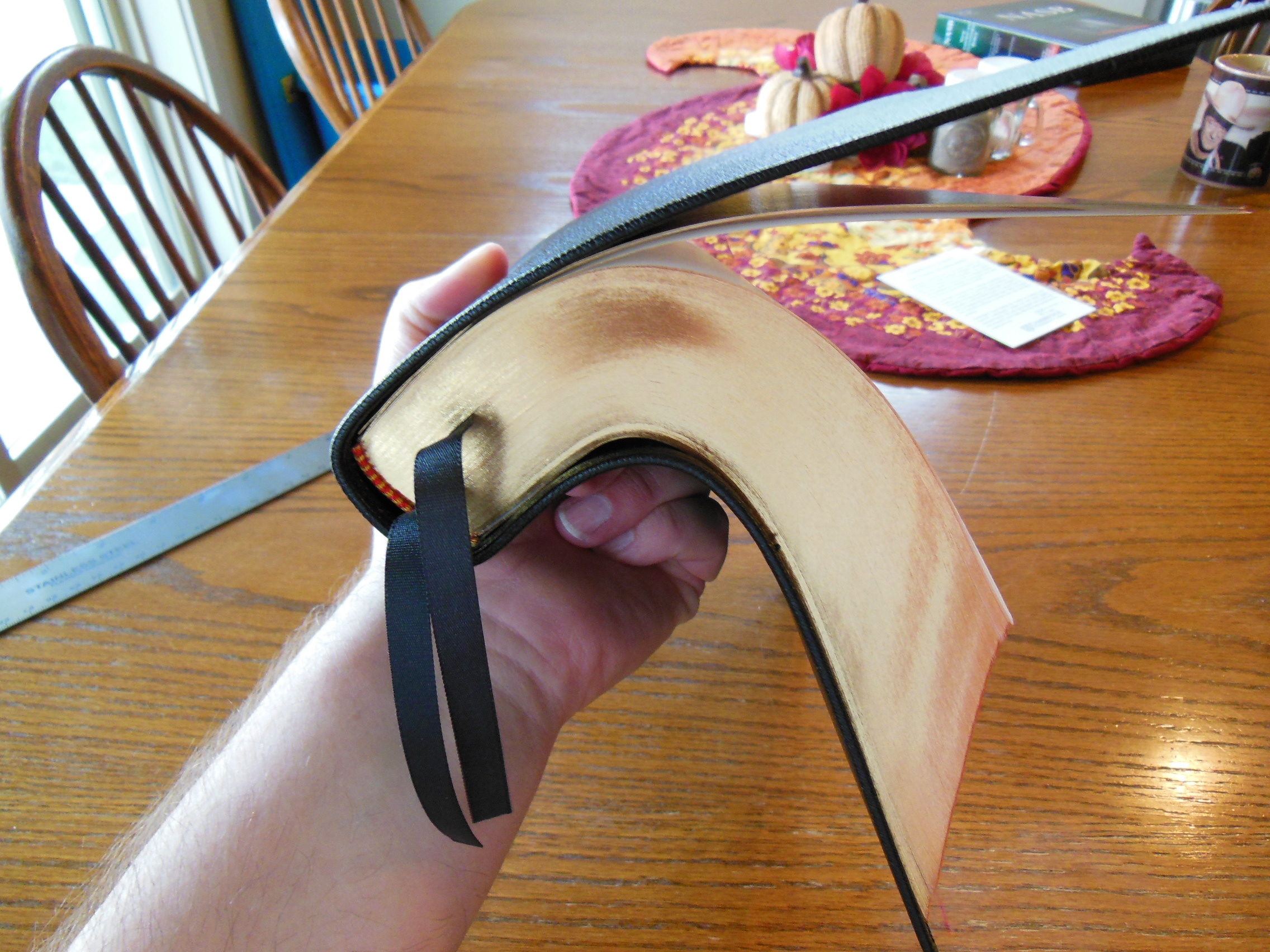
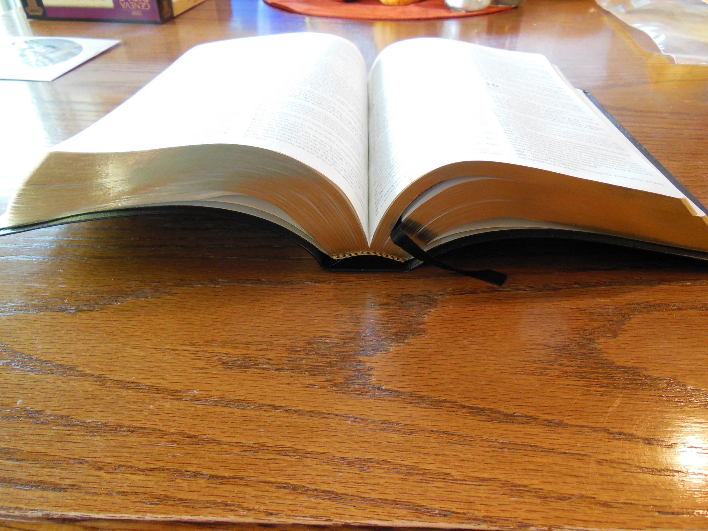
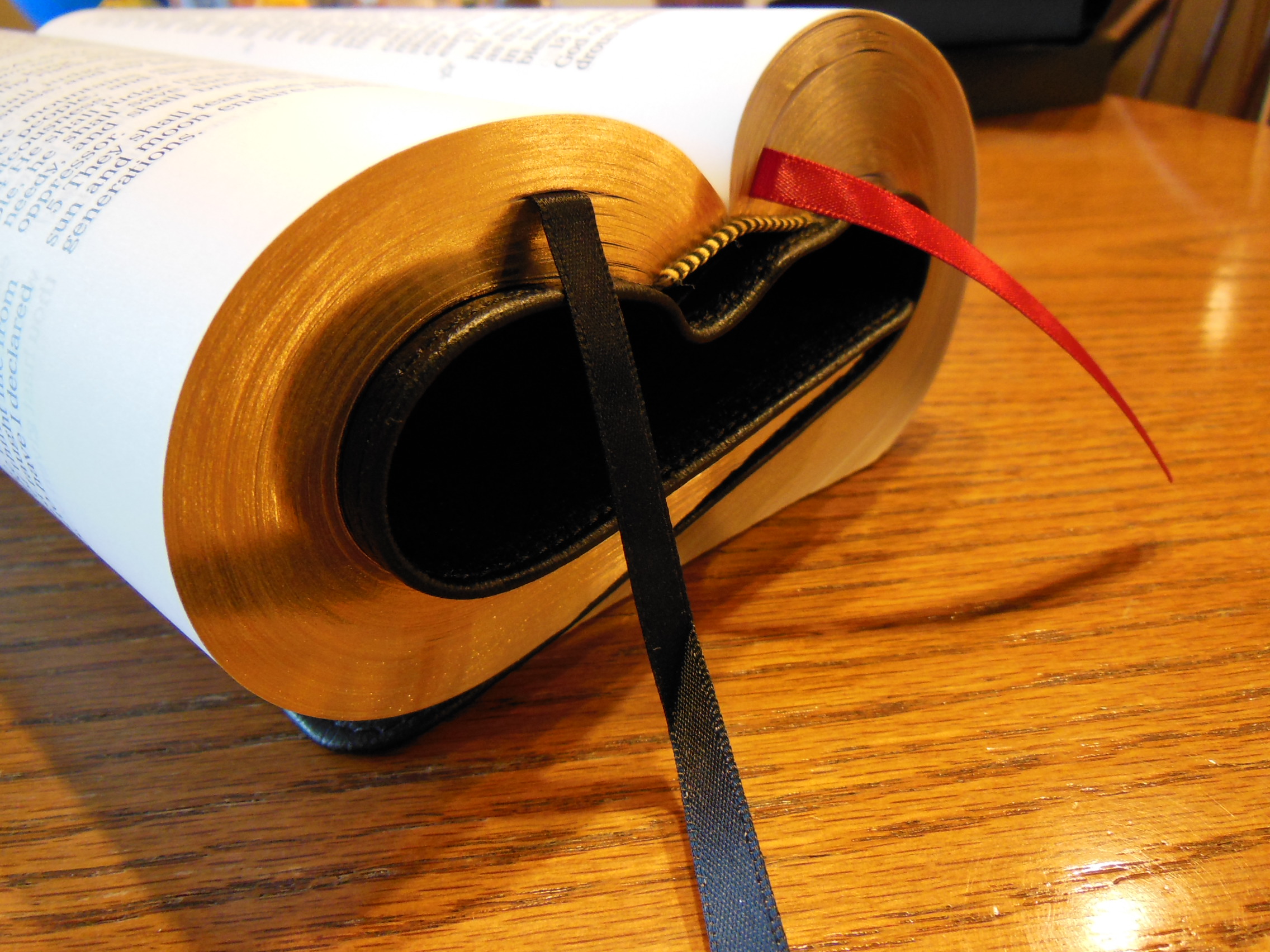
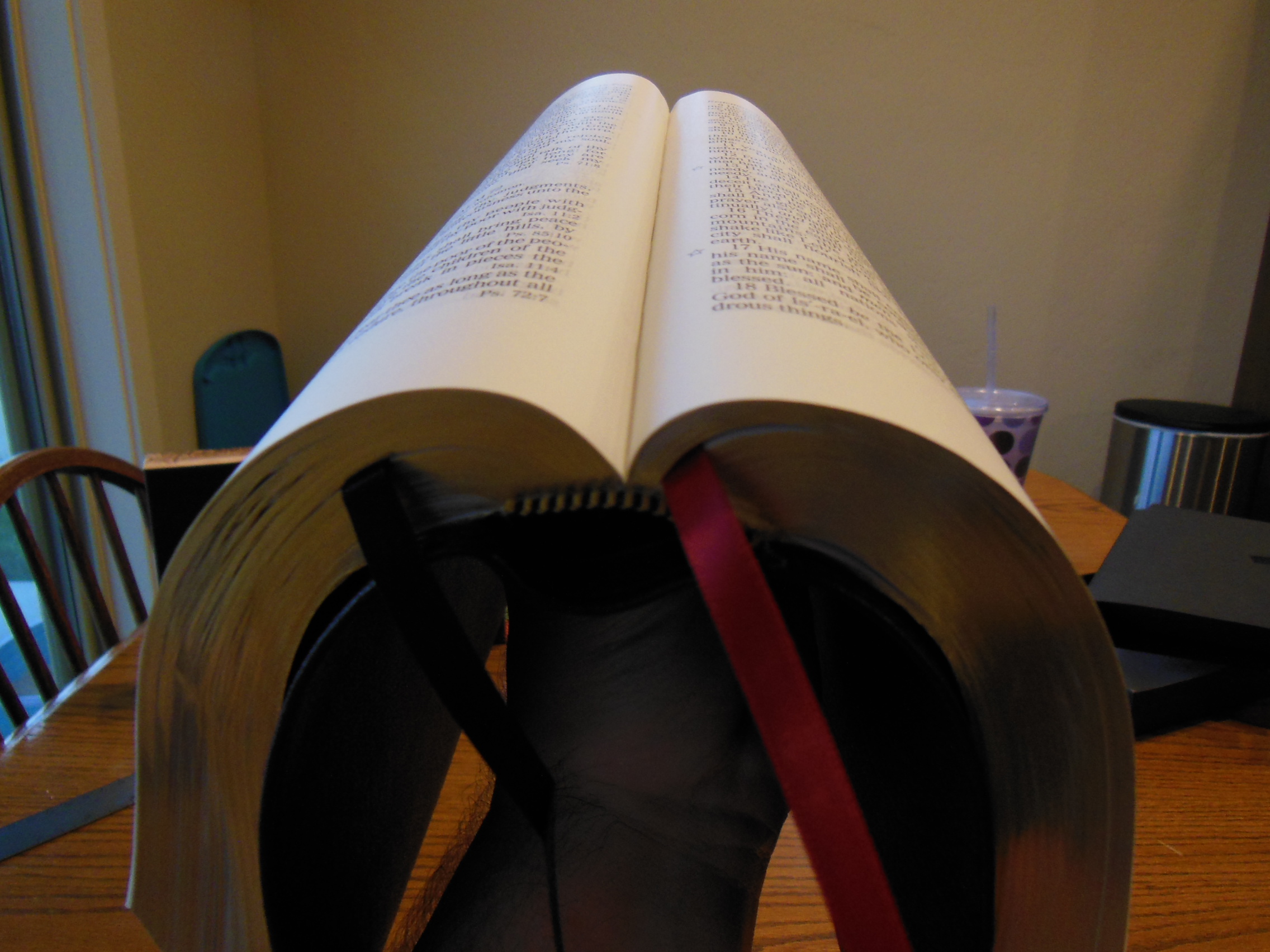
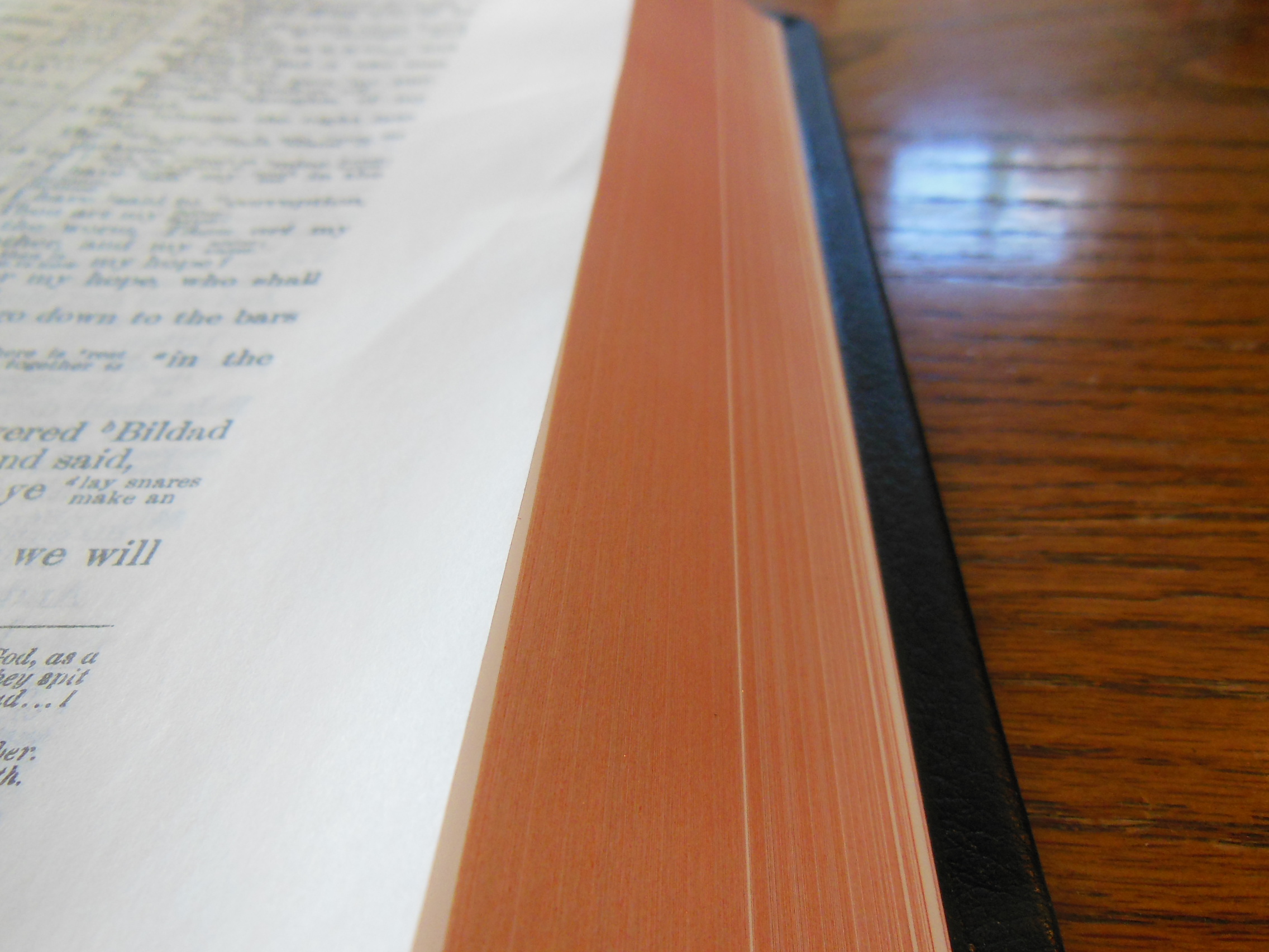
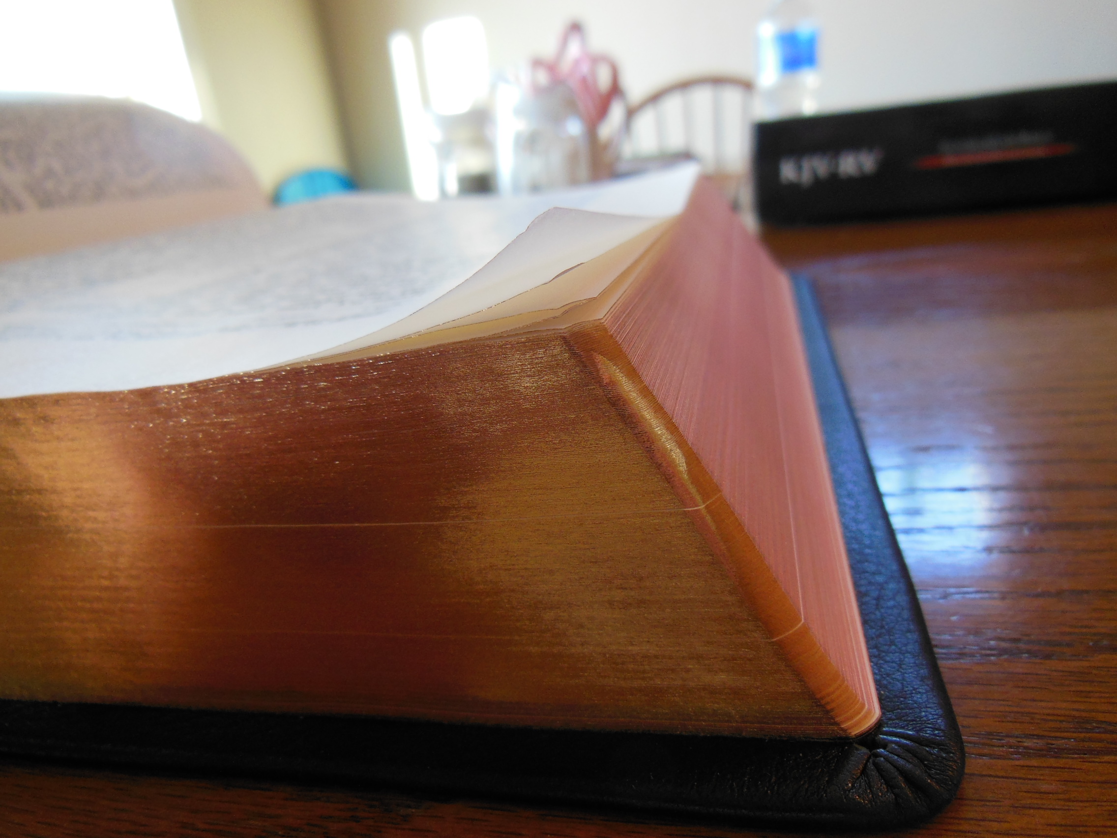
The page edges are art-gilt.   The red under gold gives the page edges a warm look, when the Bible is open.

DSCN2900

There are decorative red and gold, head and tail bands.

DSCN2868

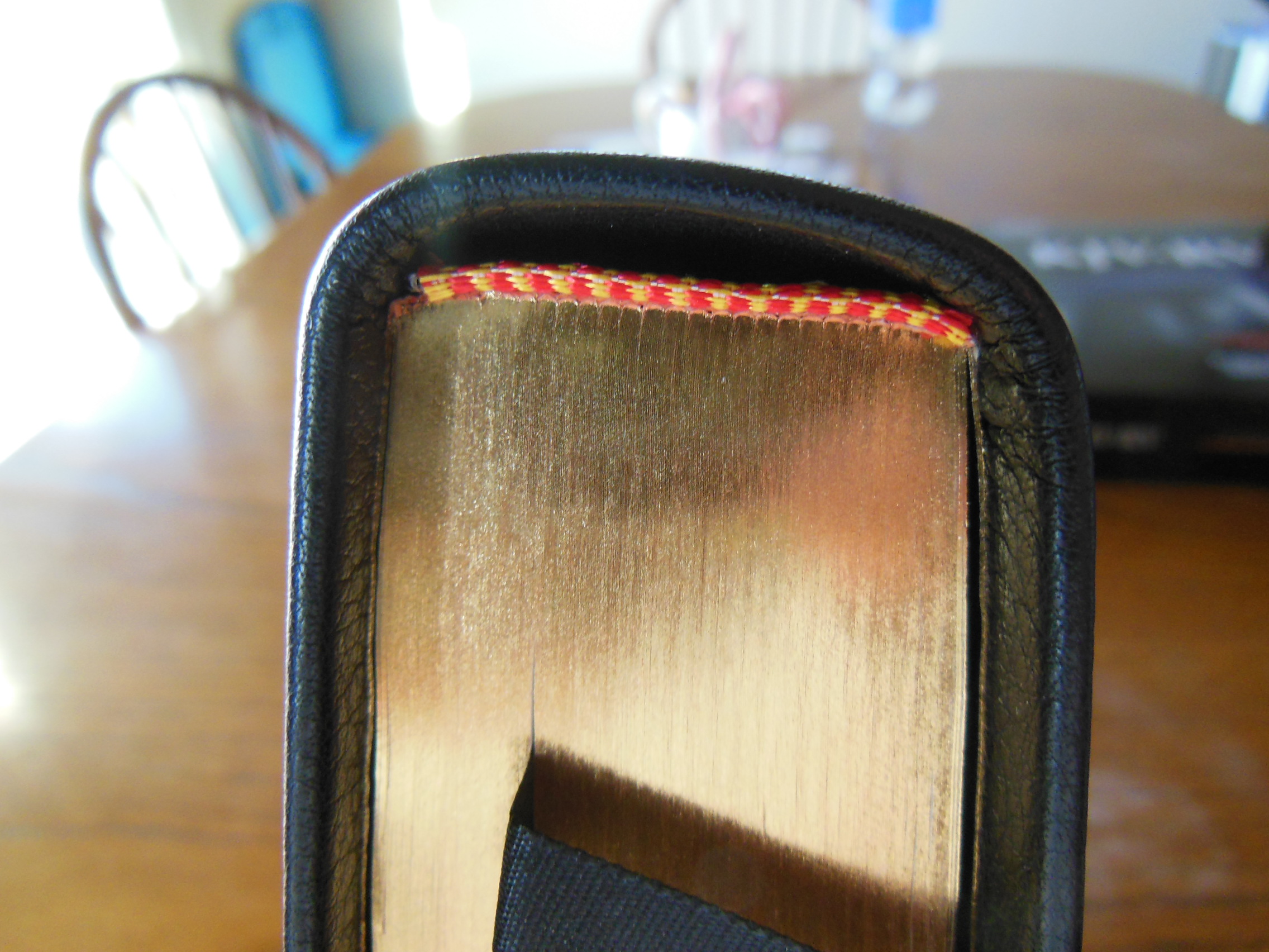
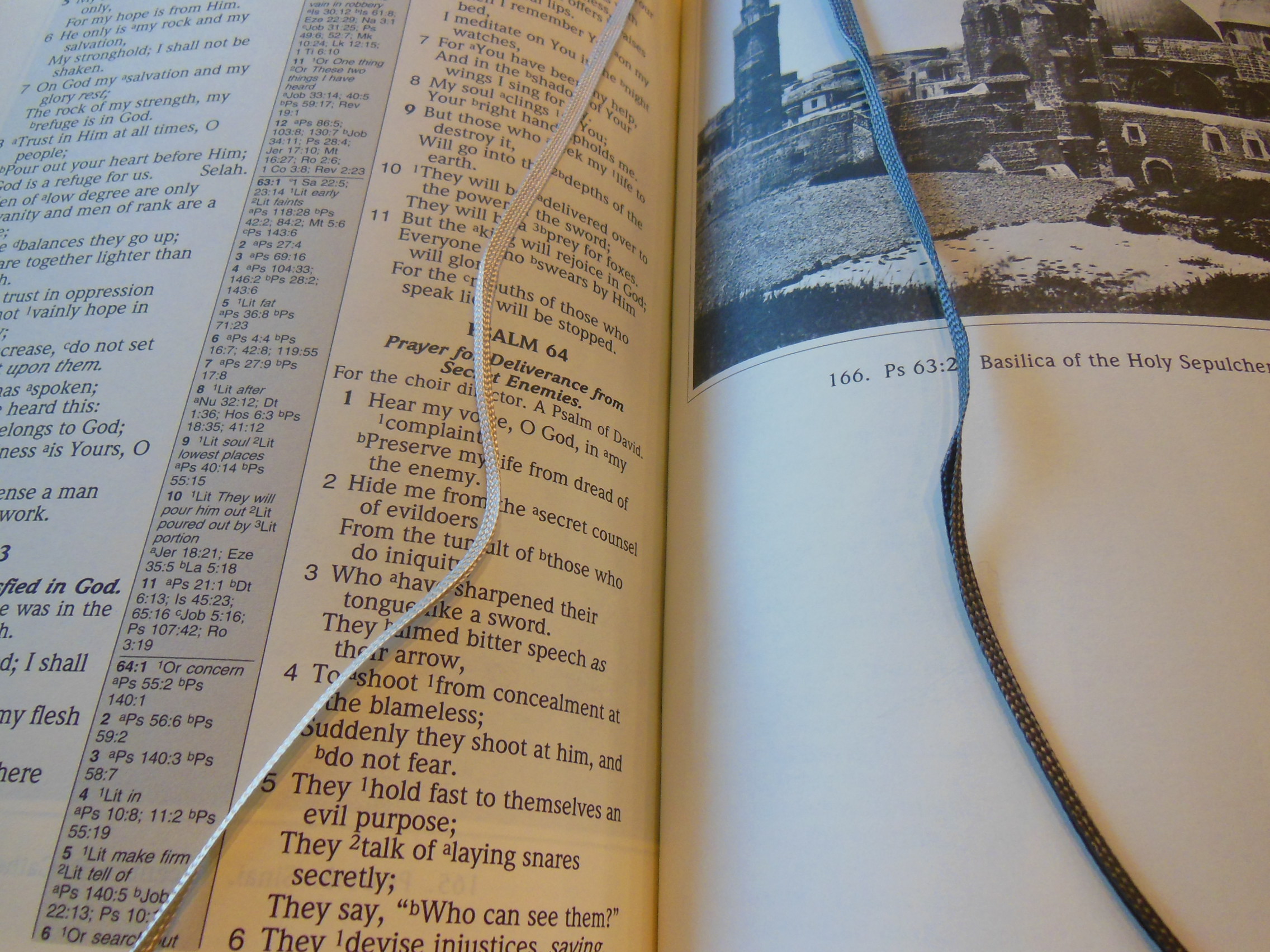
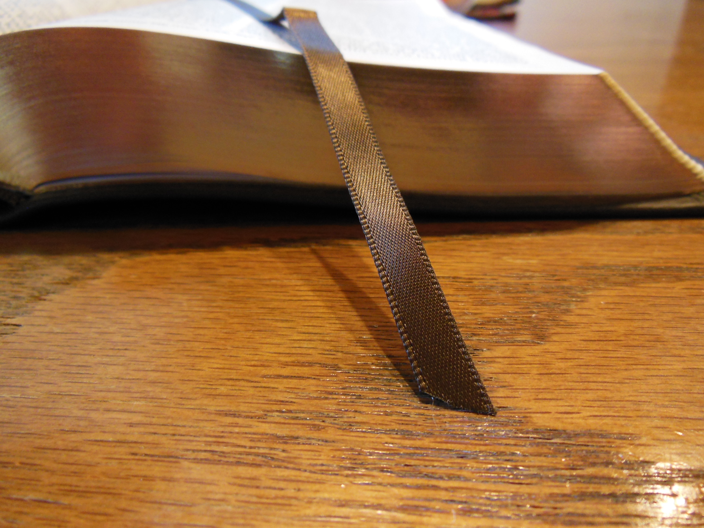
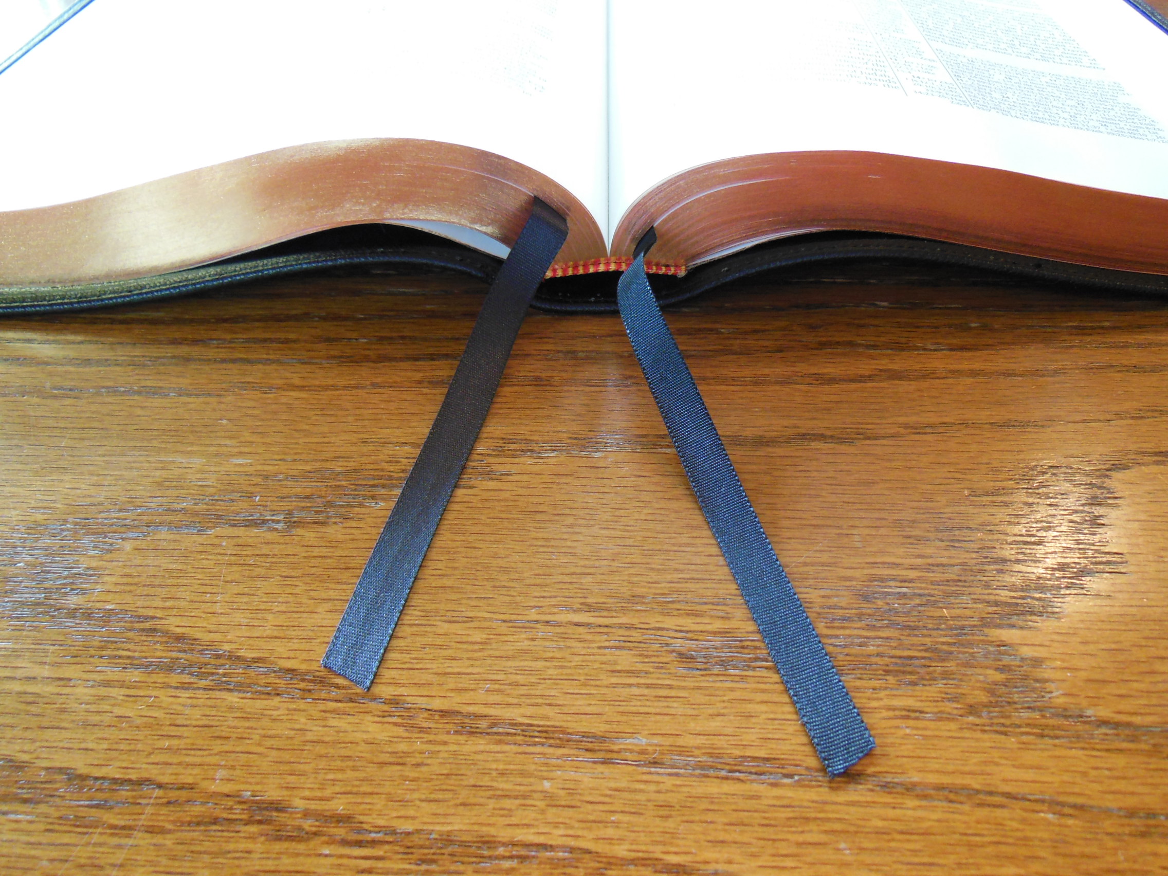
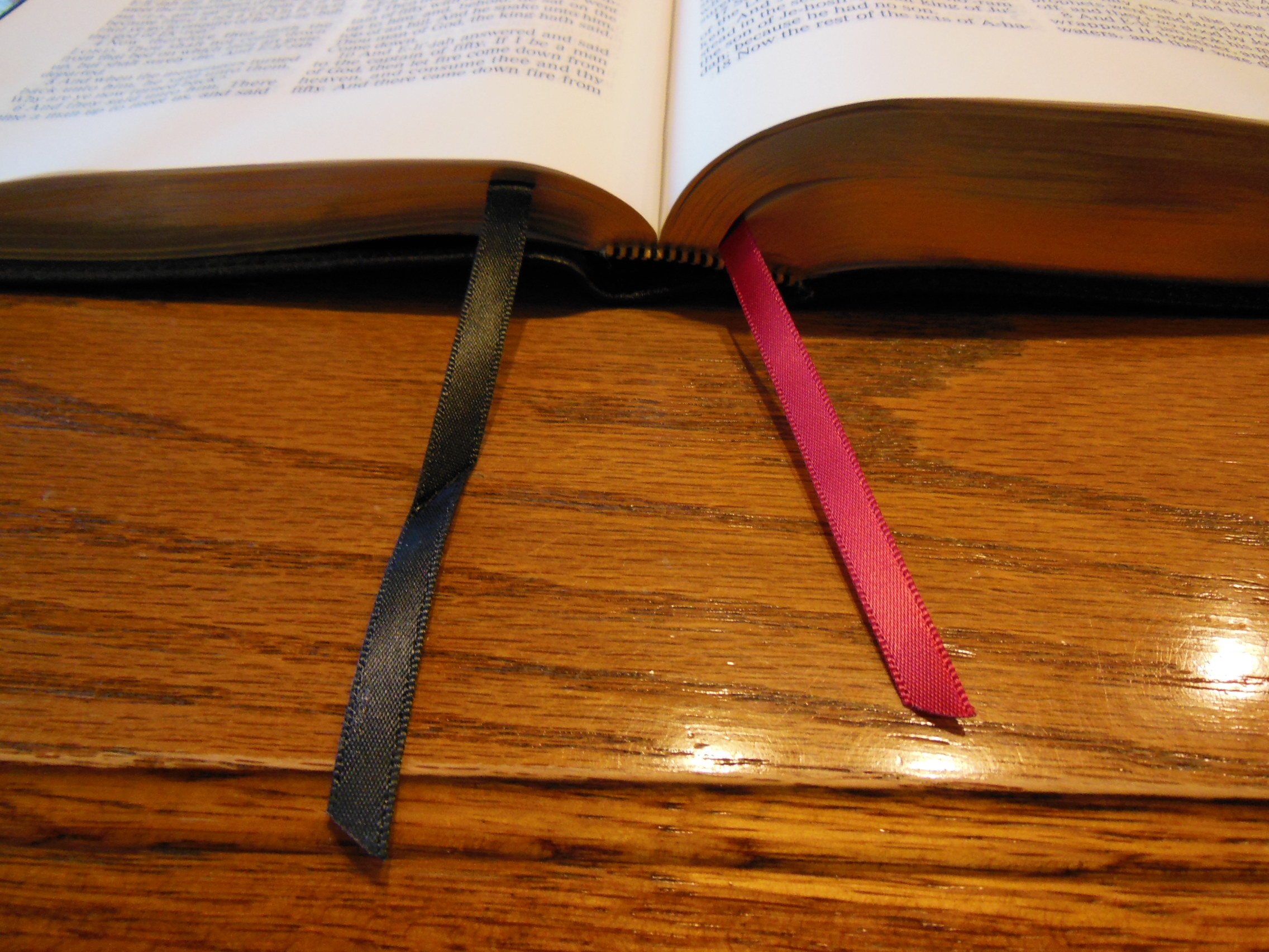
The two black ribbon markers are higher quality than you would find in cheap, mass produced Bibles.

DSCN2899

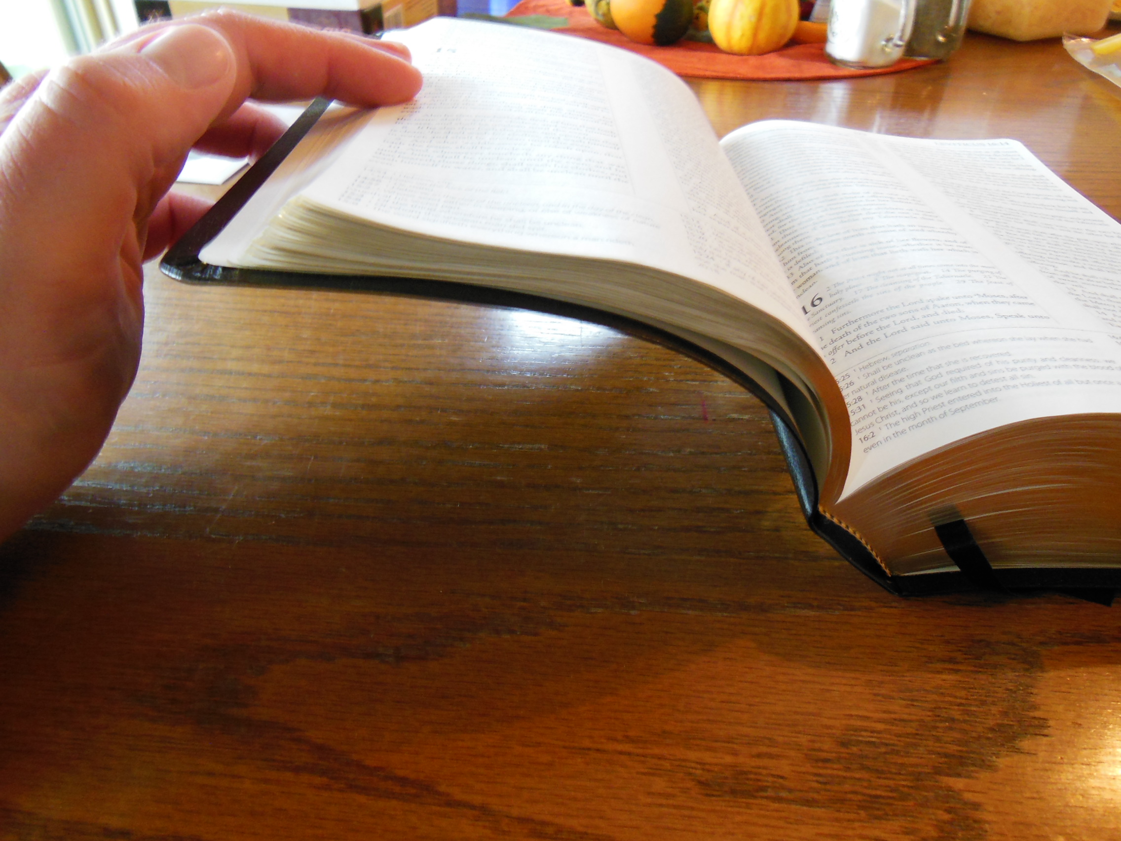
I know some people complain about page corners curling with some Cambridge Bibles like the Clarion.  When I first opened this Bible, the paper did seem a bit wrinkled and the page corners curled just a bit.

DSCN2896

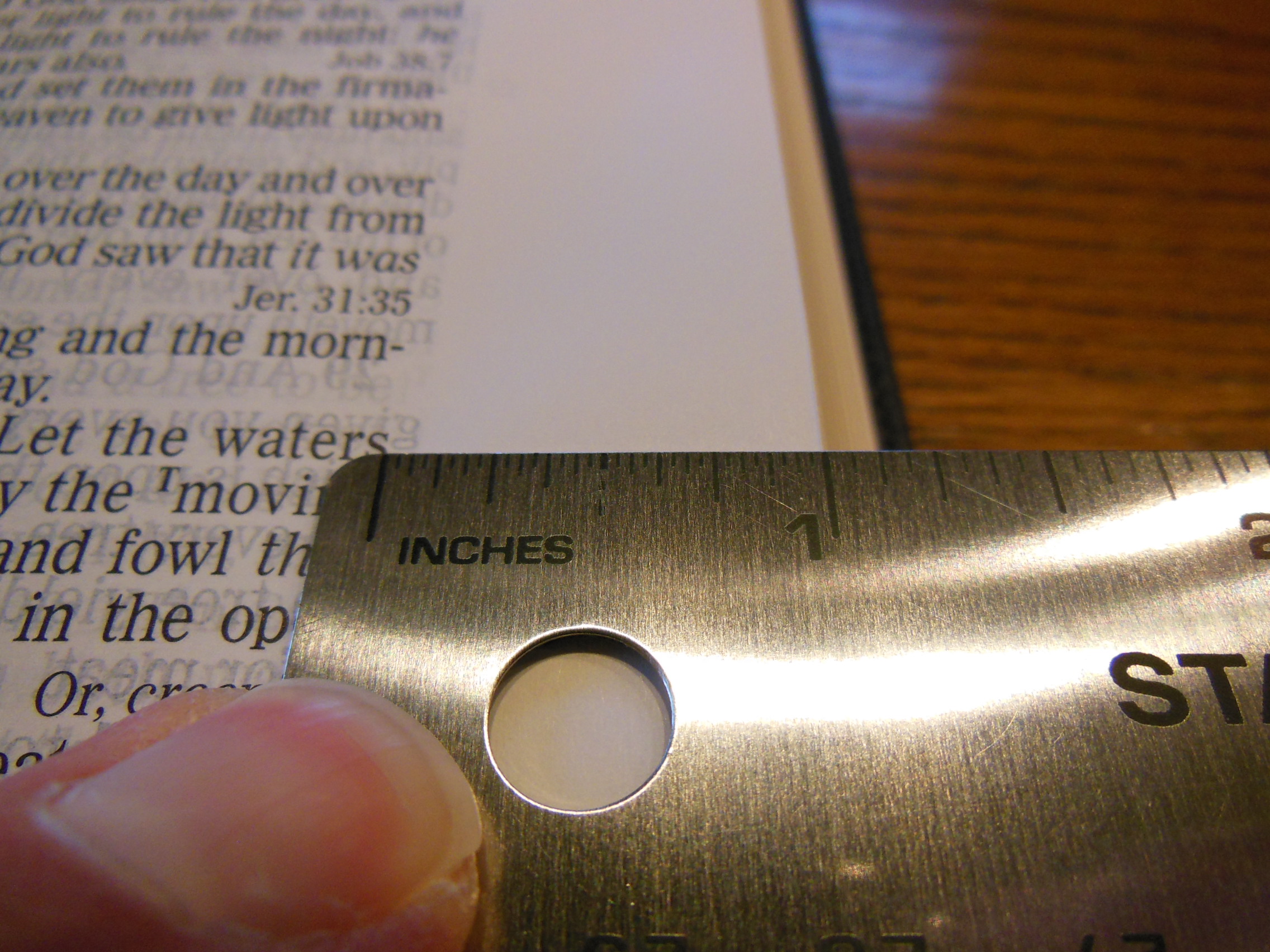
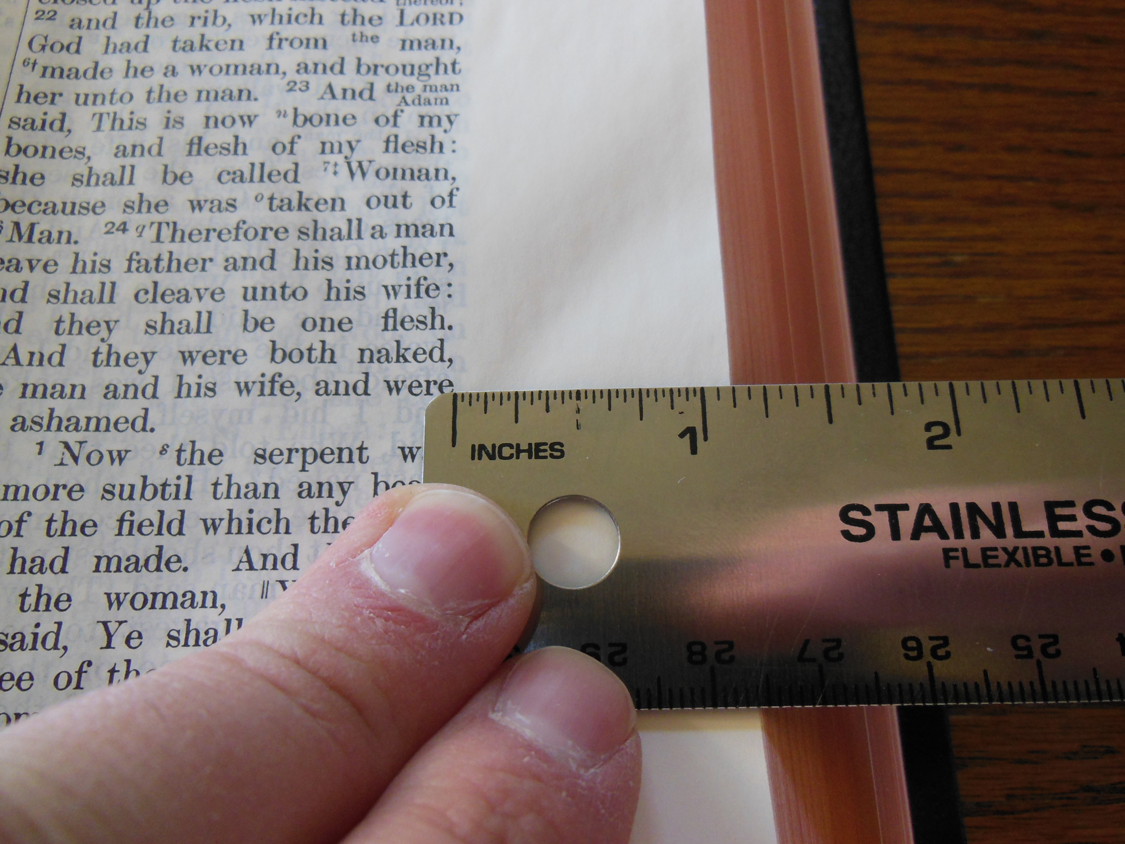
After being out of the box and giving this Bible a while to come to a state of homeostasis with the dry Idaho air, the page edges flattened out and the wrinkles went away.  I do wish I had waited a while to take the pictures.  The paper is behaving much better now that the Bible has been opened for a while.  I personally, like the page corners to curl up just a bit.  Have you ever tried to get the pages apart to turn them, on a Bible with very thin paper, only to be frustrated page after page?  There you have it; I made a negative quality into a positive feature.  Now don’t get me wrong, I hate it when the entire page edge curls up, and interferes with my reading, but let’s not get too crazy with our demands.  After all, the paper on this Bible is very nice.  It has wide margins and is thick enough to take notes on.  The margins are about an inch.

DSCN2893

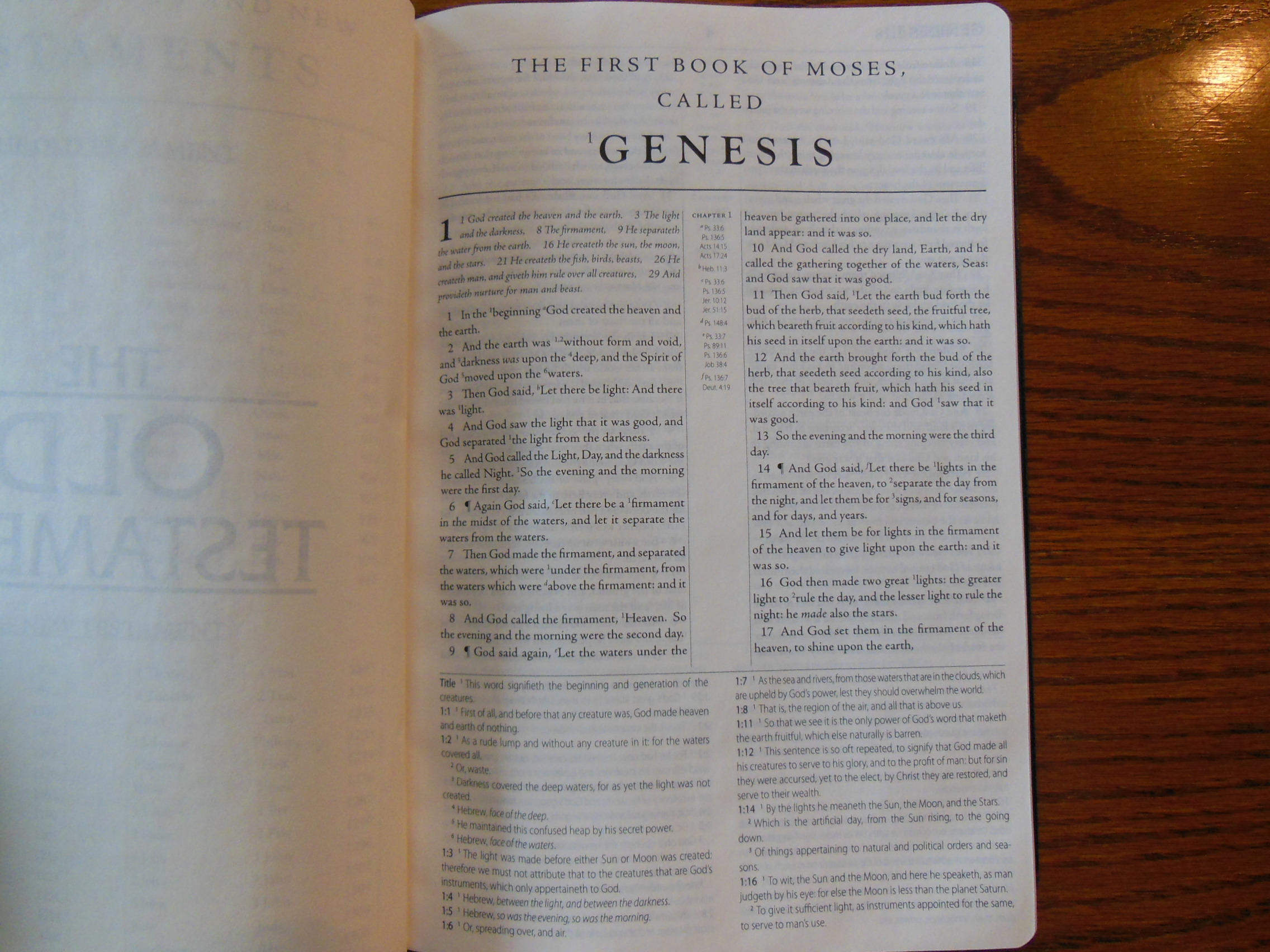
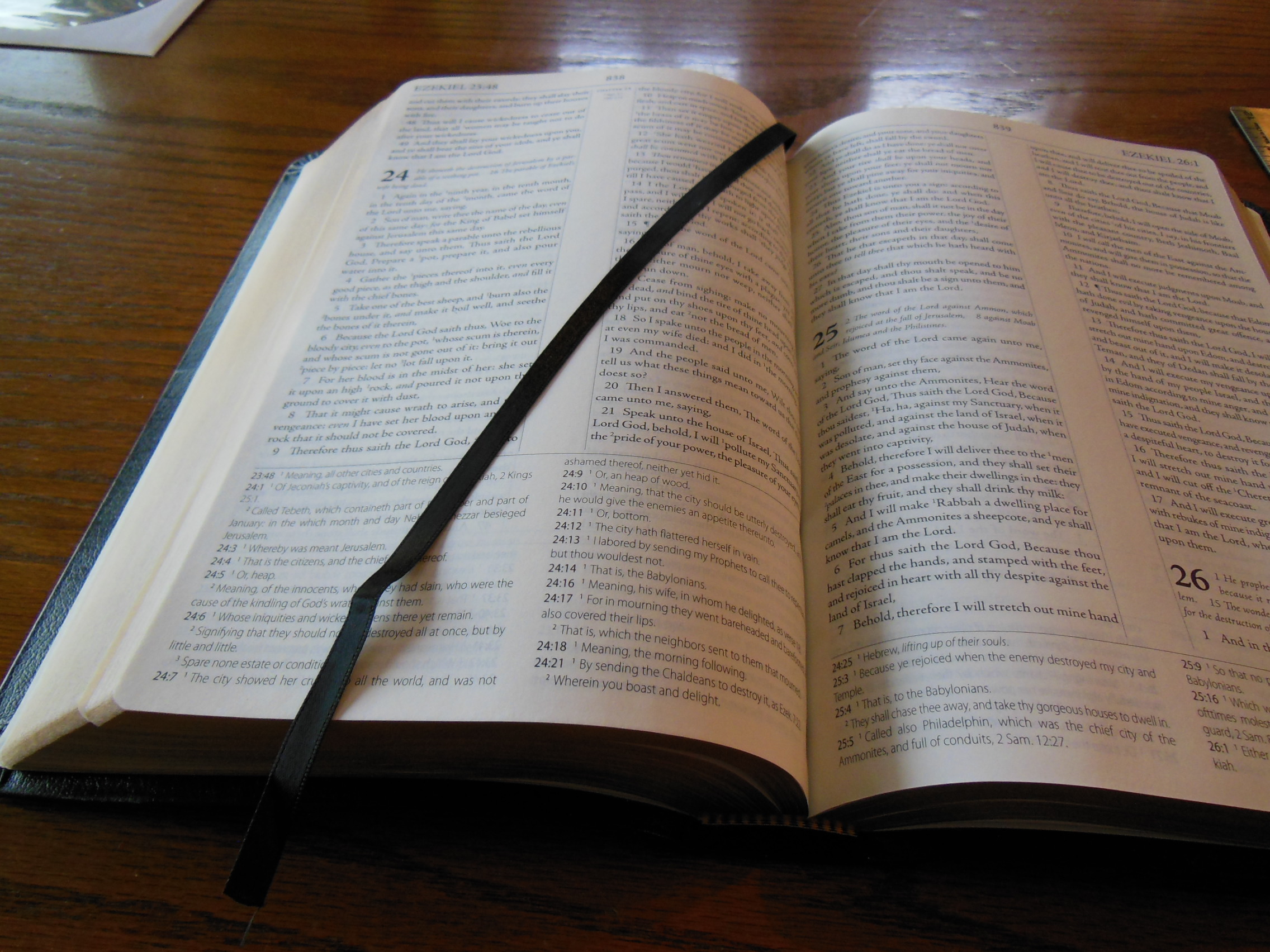
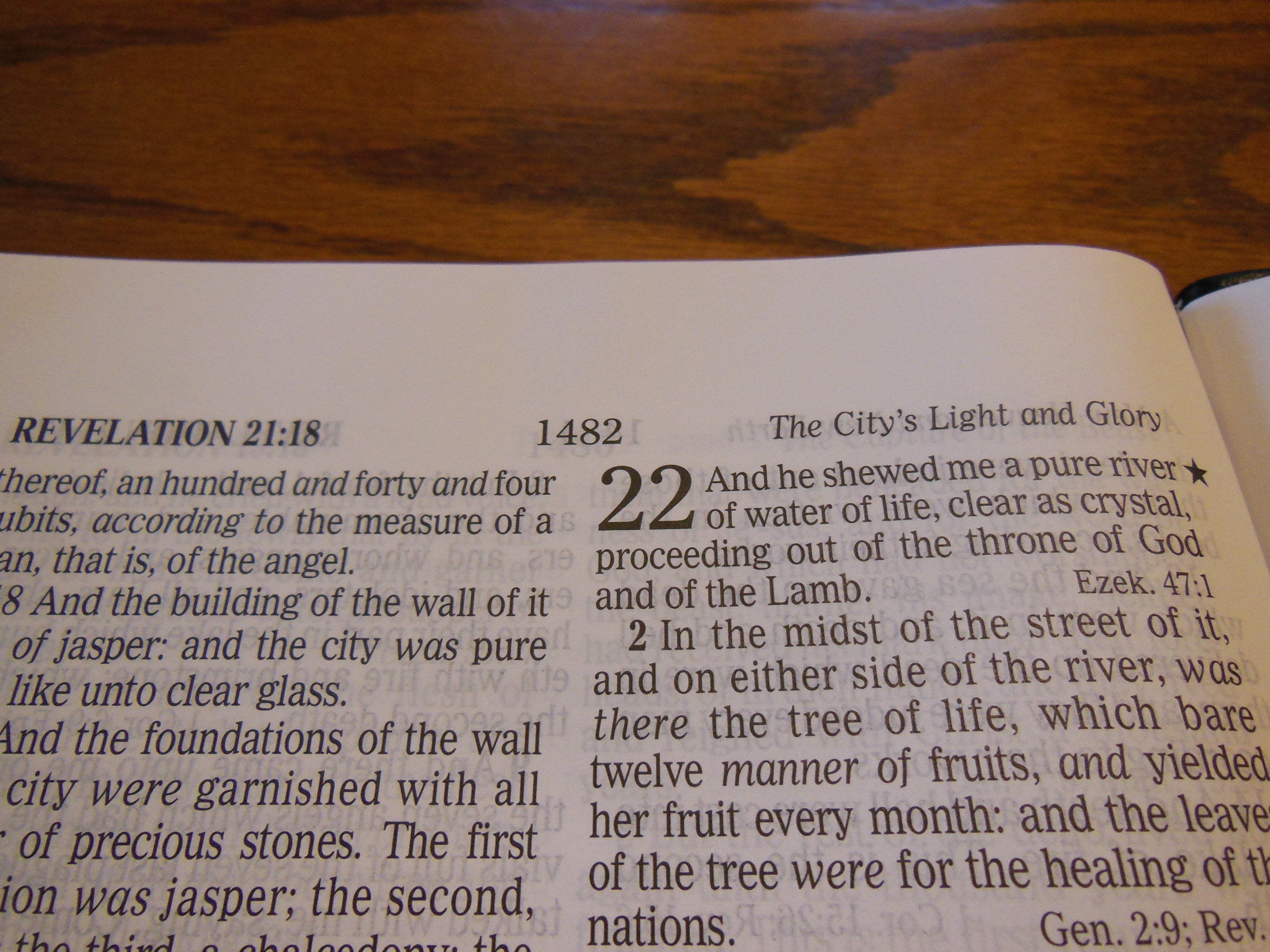
It is also a pleasant off white color that contrast well against the dark, 10/11 point Millers 2n Small Pica No.4 (small body) typeface.  It does look like an older typeset, but unlike some of the very old ones it has held up pretty good.  It is also a larger size which helps.  Again, thanks to the way this interlinear is set up.  This is a black text edition.

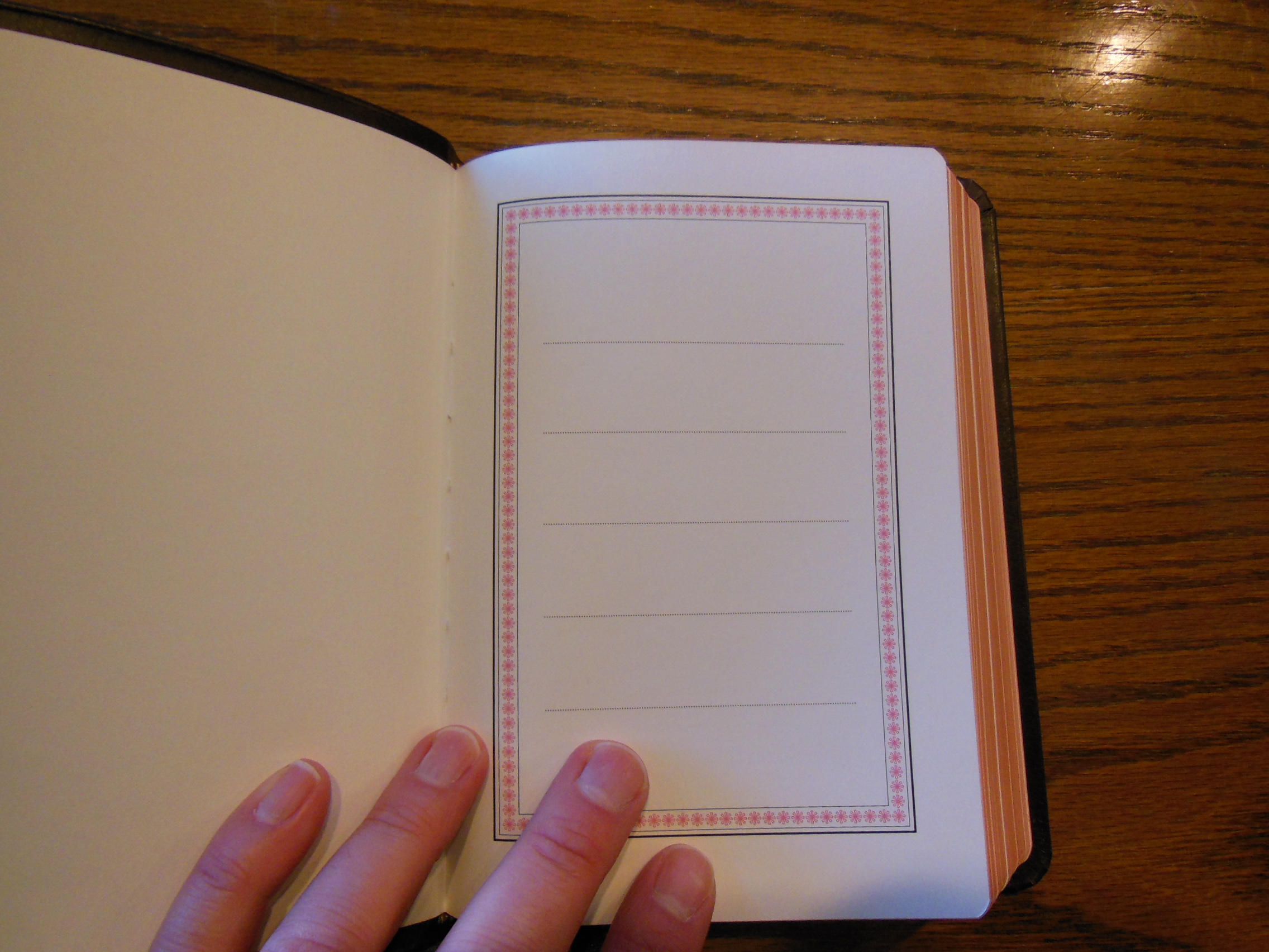
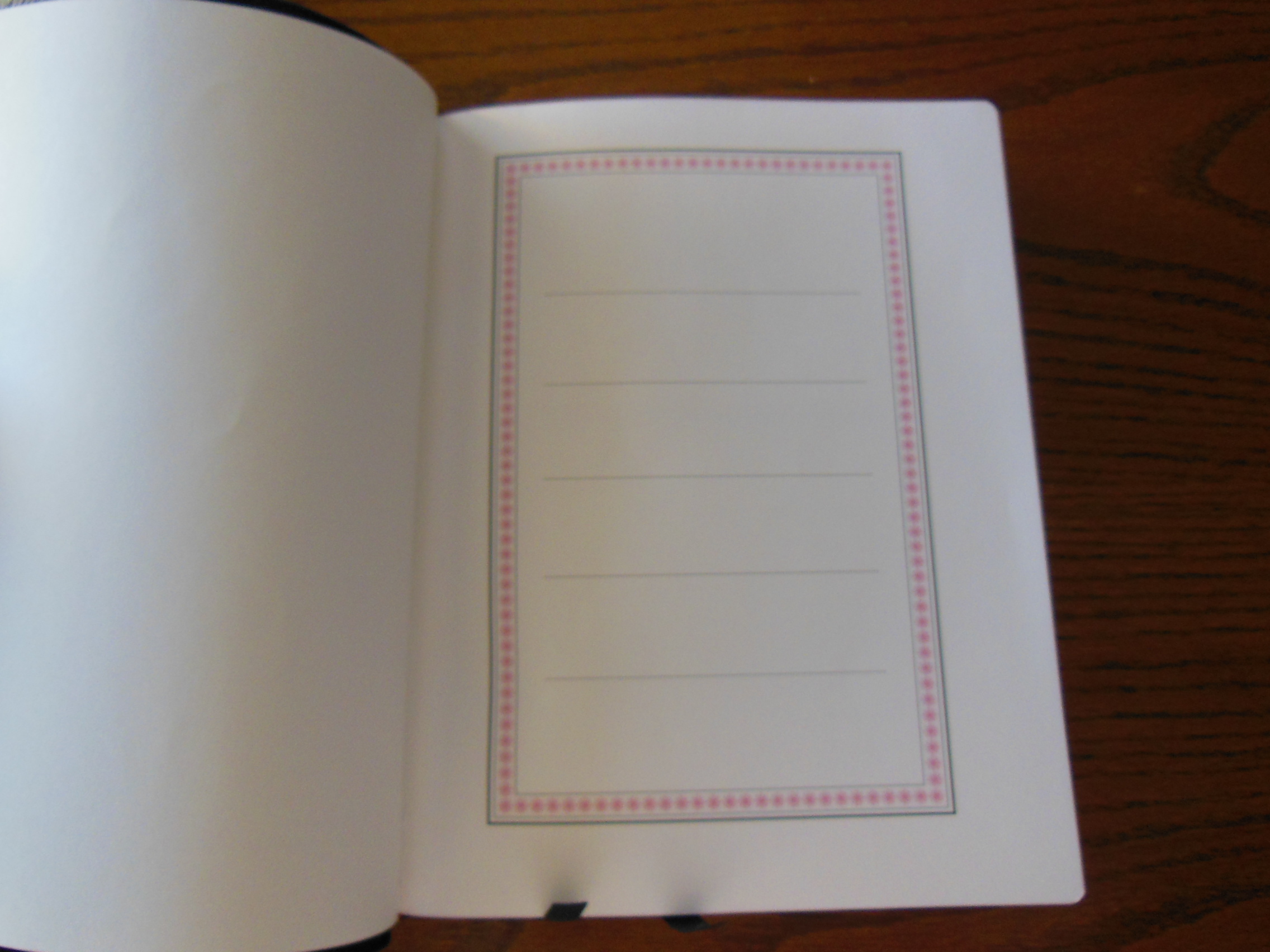
In the front of the Interlinear you’ll find a presentation page.

DSCN2877

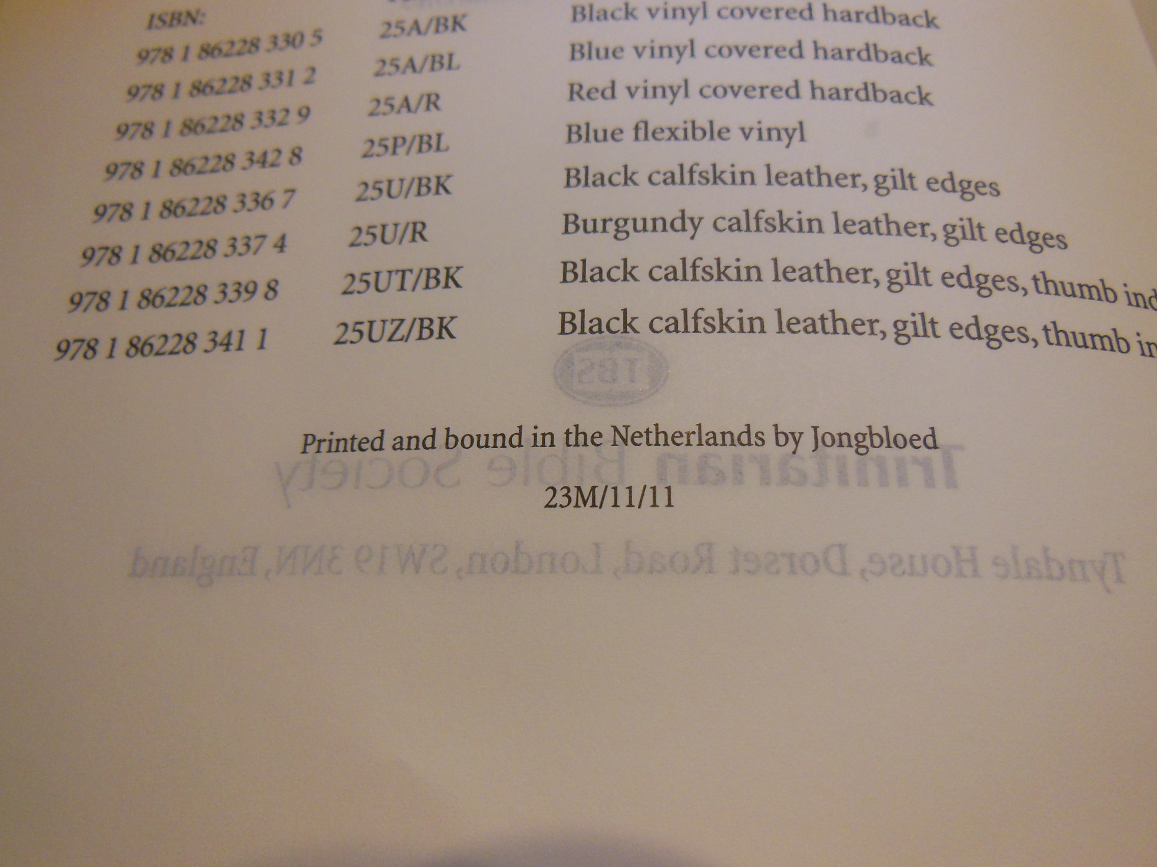
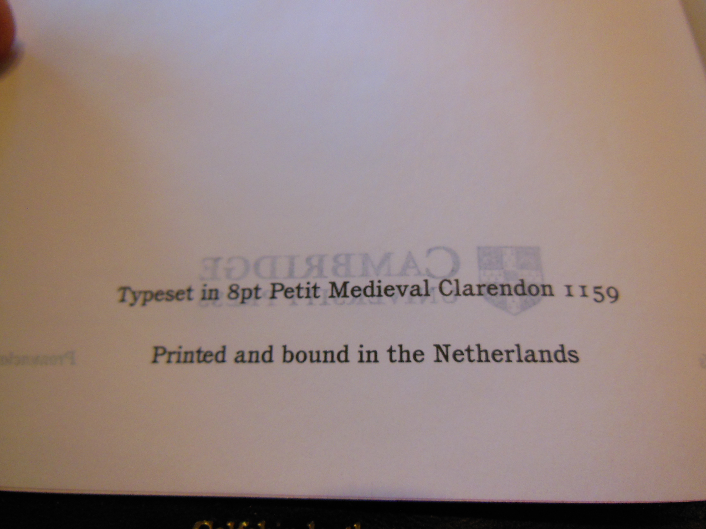
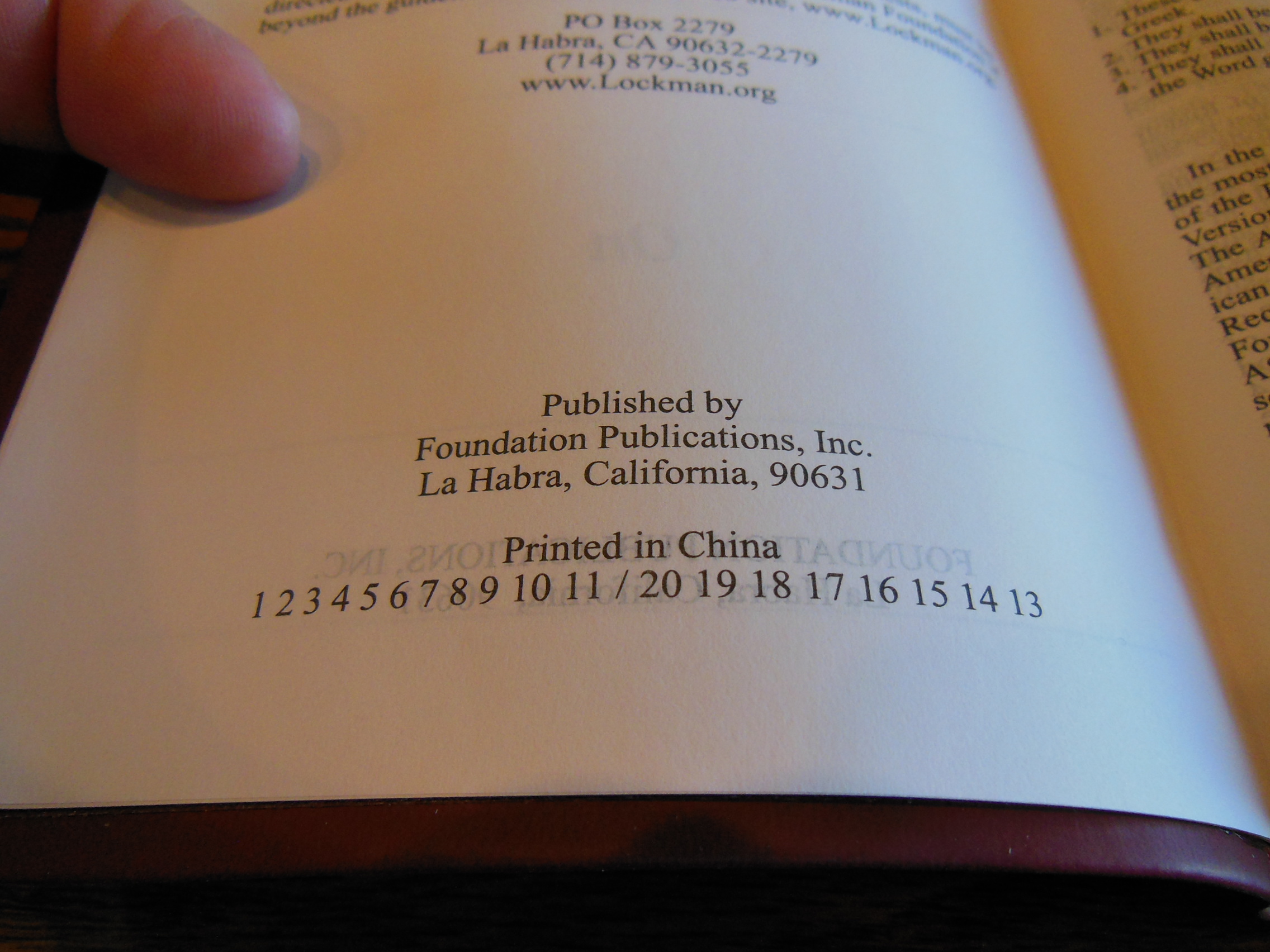
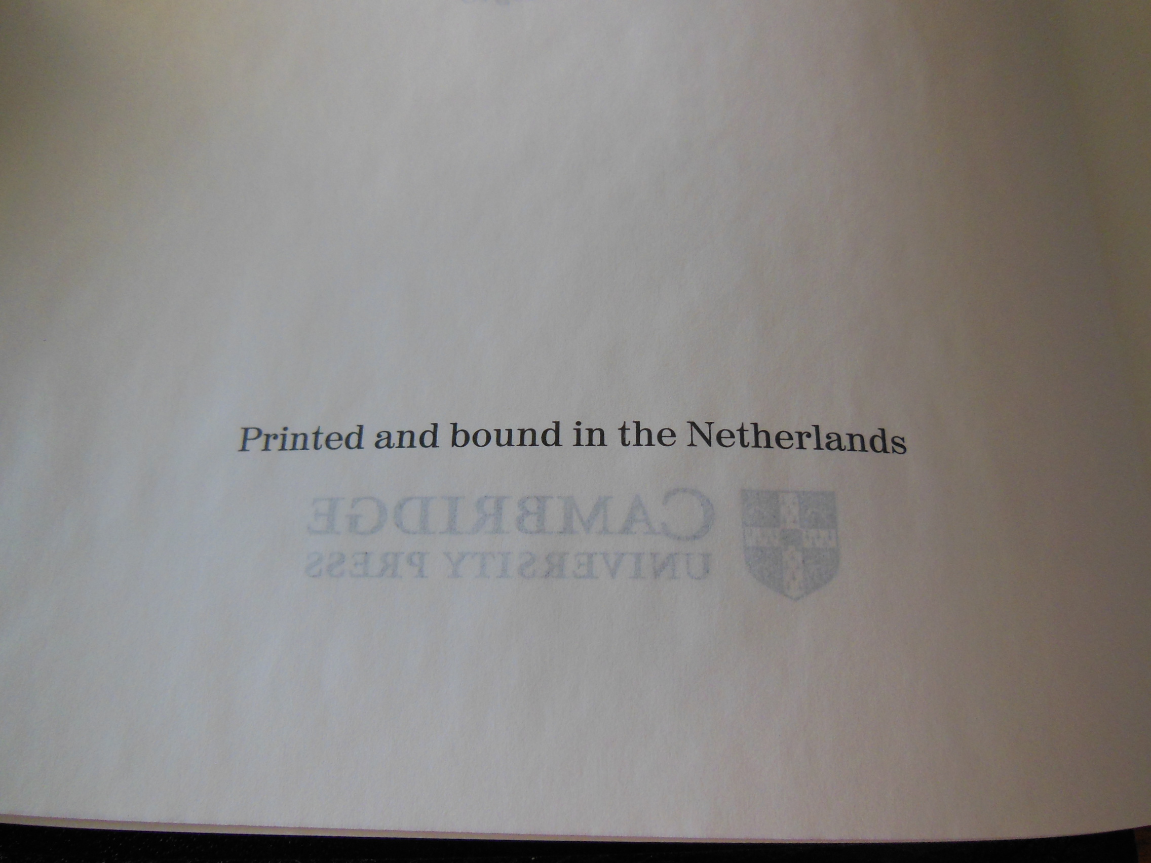
After that, the publication information including that the Interlinear is printed in the Netherlands.  I verified with Cambridge that Jonglboeds did the printing and binding.  They are the premier bindery for Bibles.  You can’t buy better that I know of.

DSCN2881

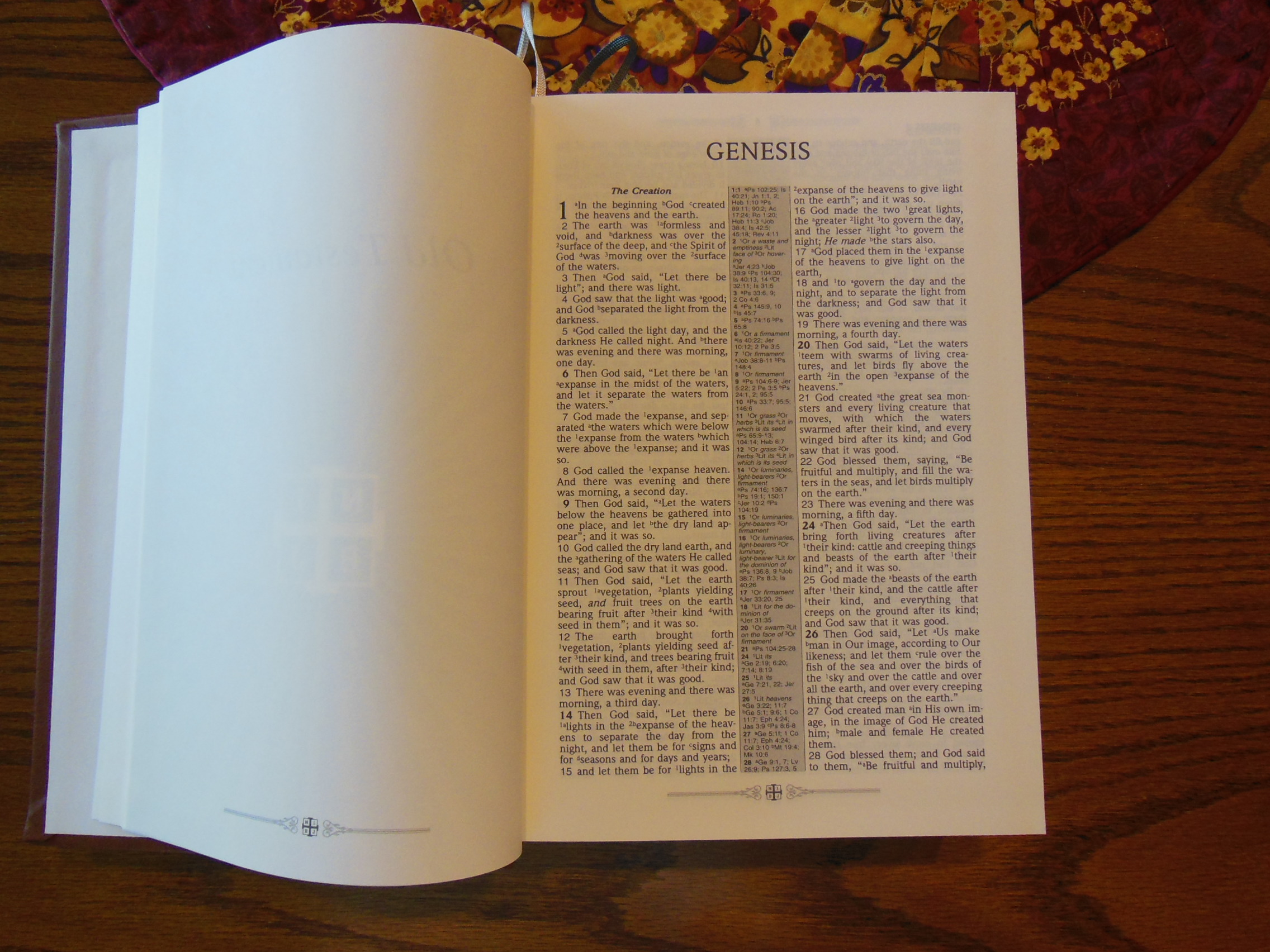
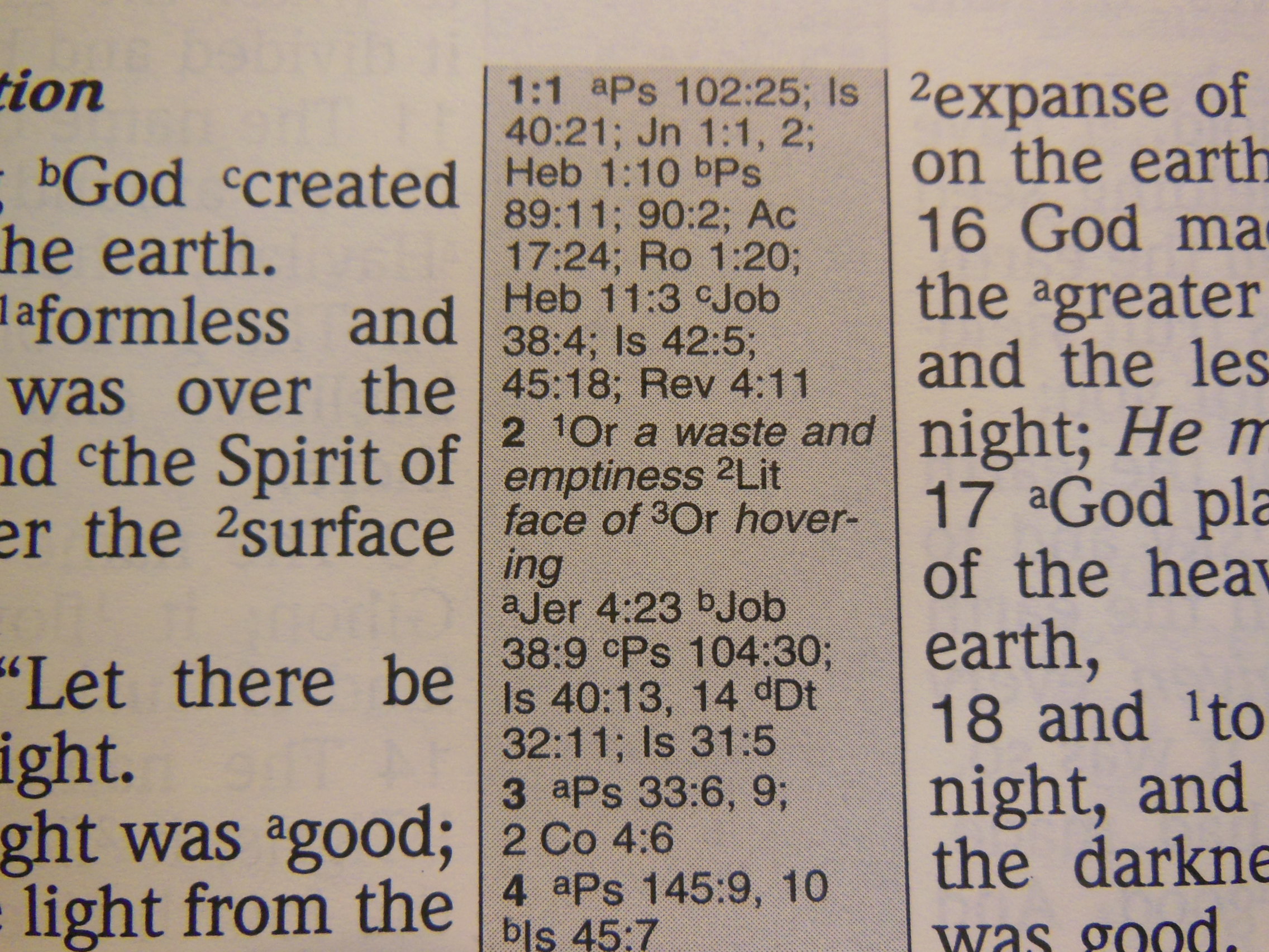
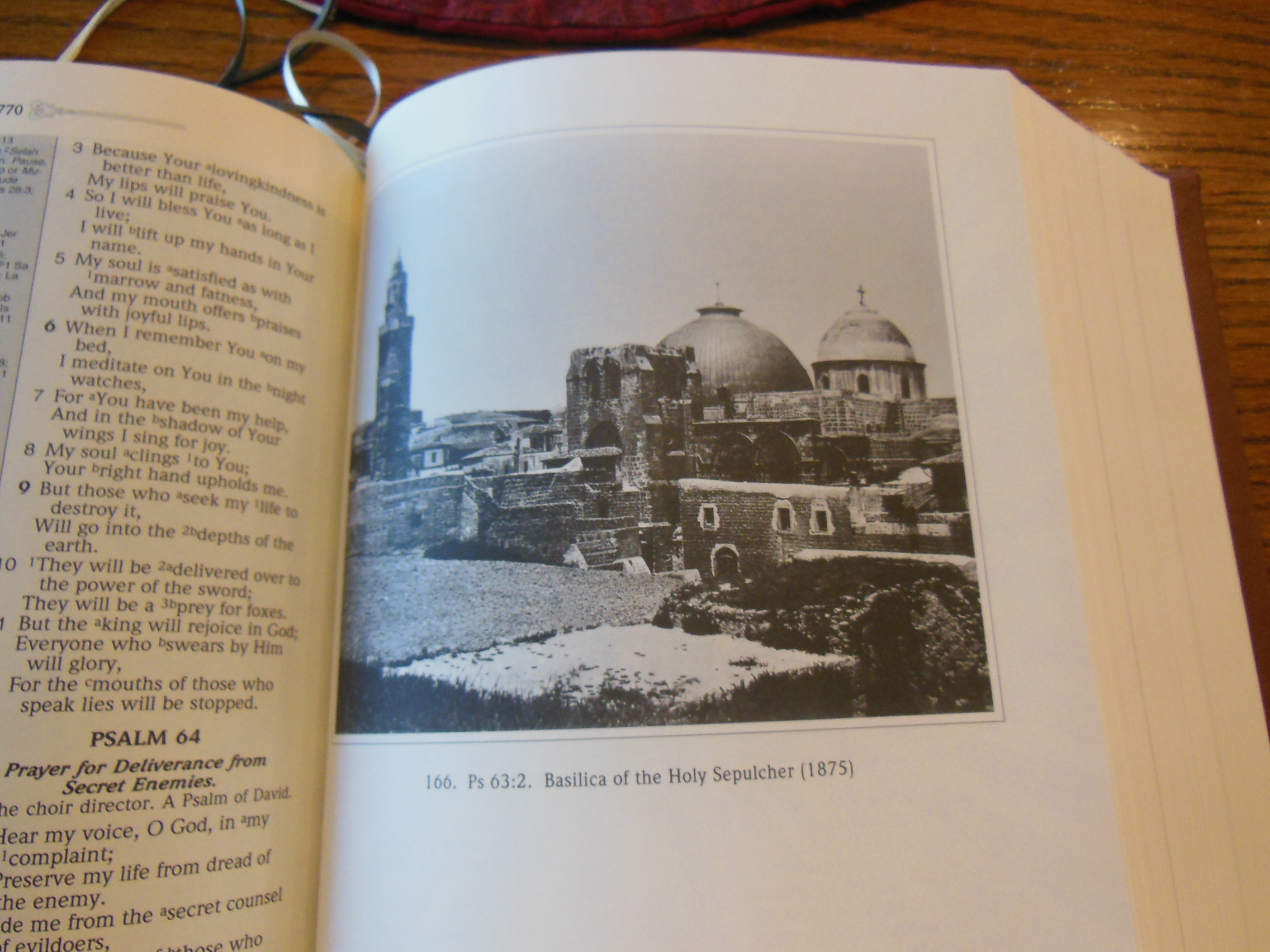
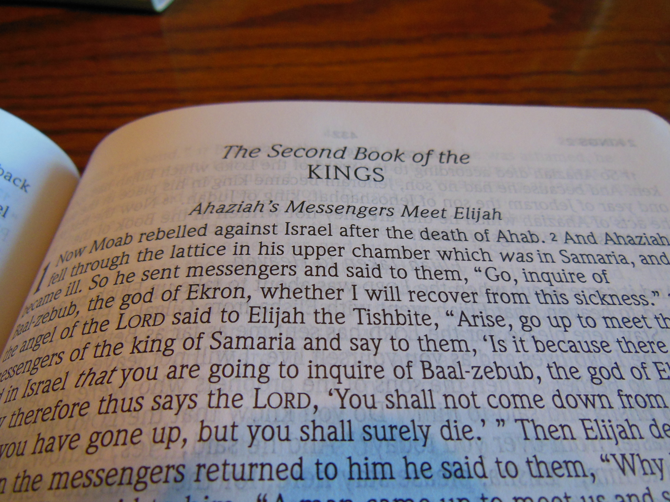
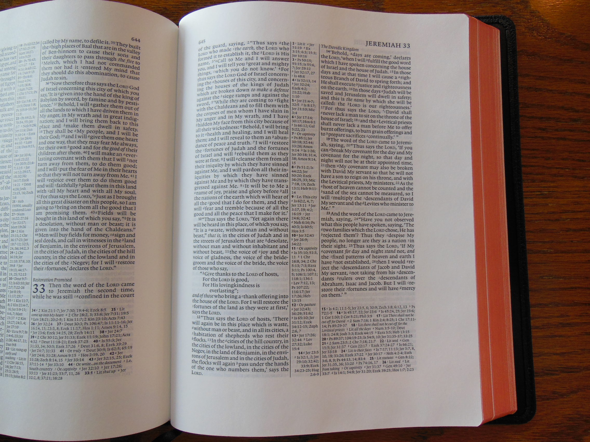
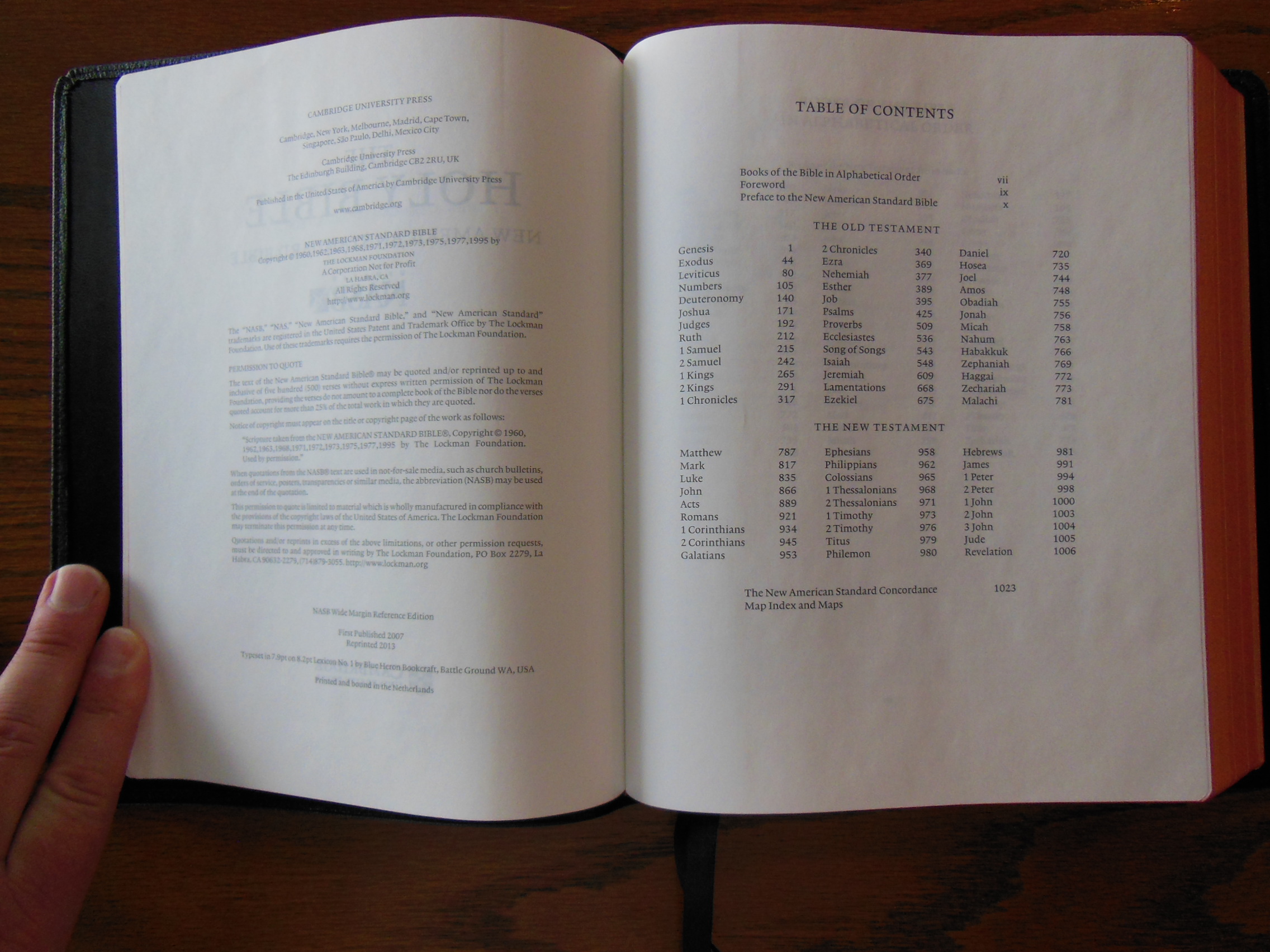
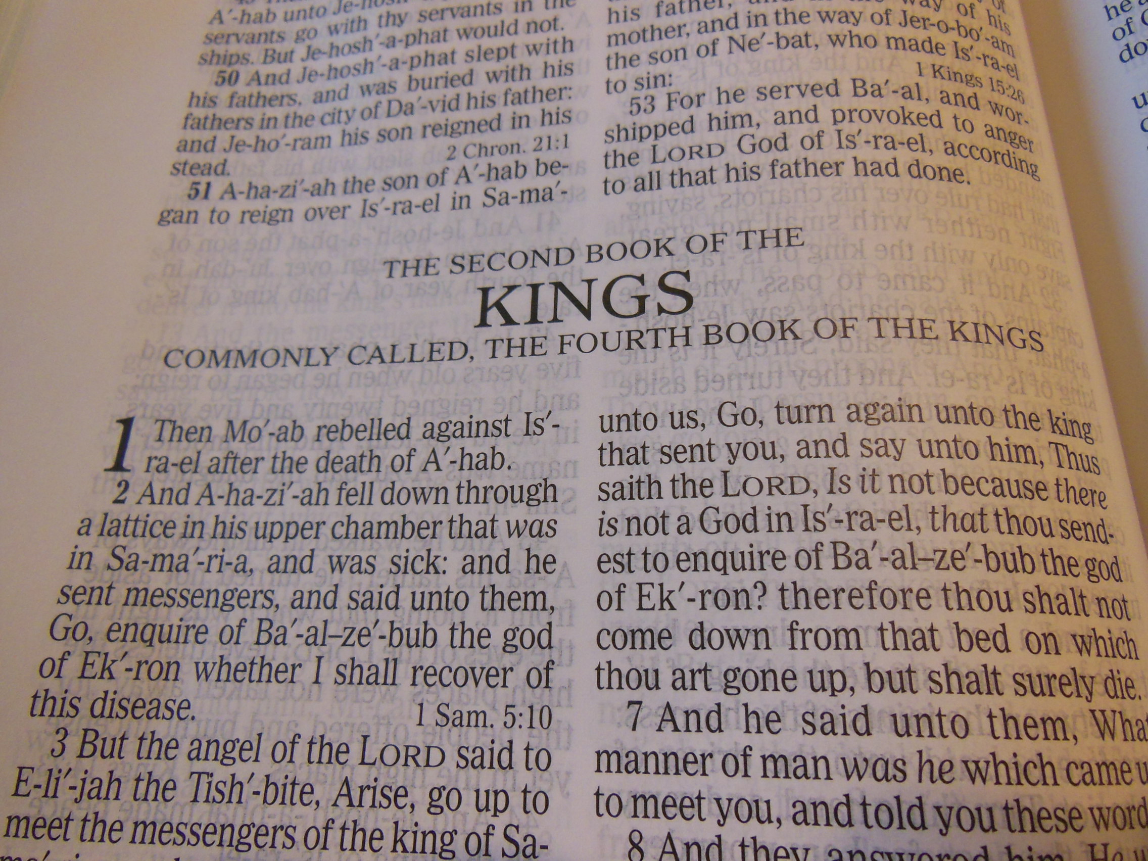
Then there is some information about the Interlinear and translation information about the KJV and RV.  The Old and New Testaments are both introduced with a Preface.  Usually the older type settings of the KJV are verse format.  This was one of the first editions to use paragraph format.  It does so in a double column layout with center column cross references.  Notes are at the bottom of the page.

DSCN2890

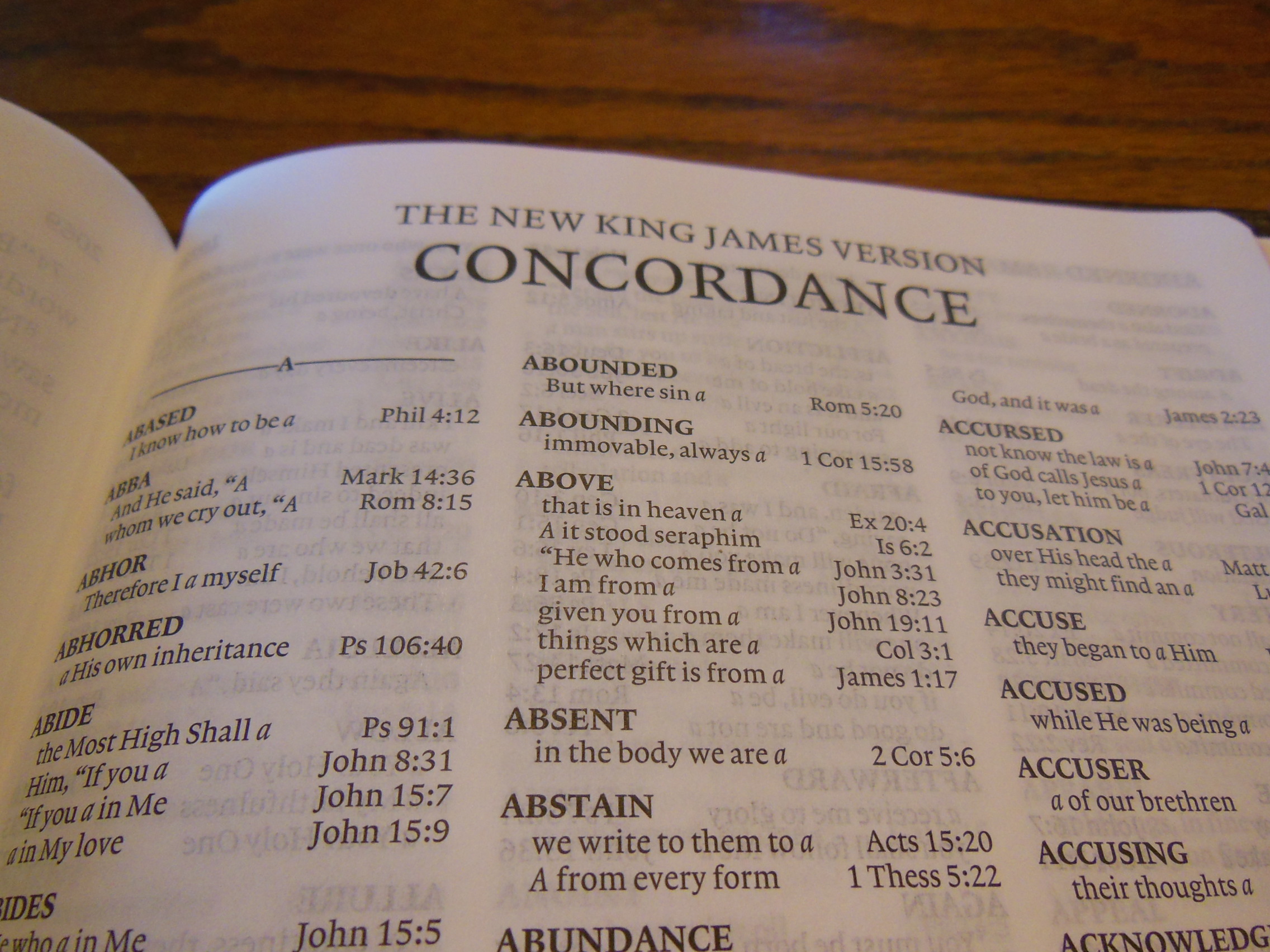
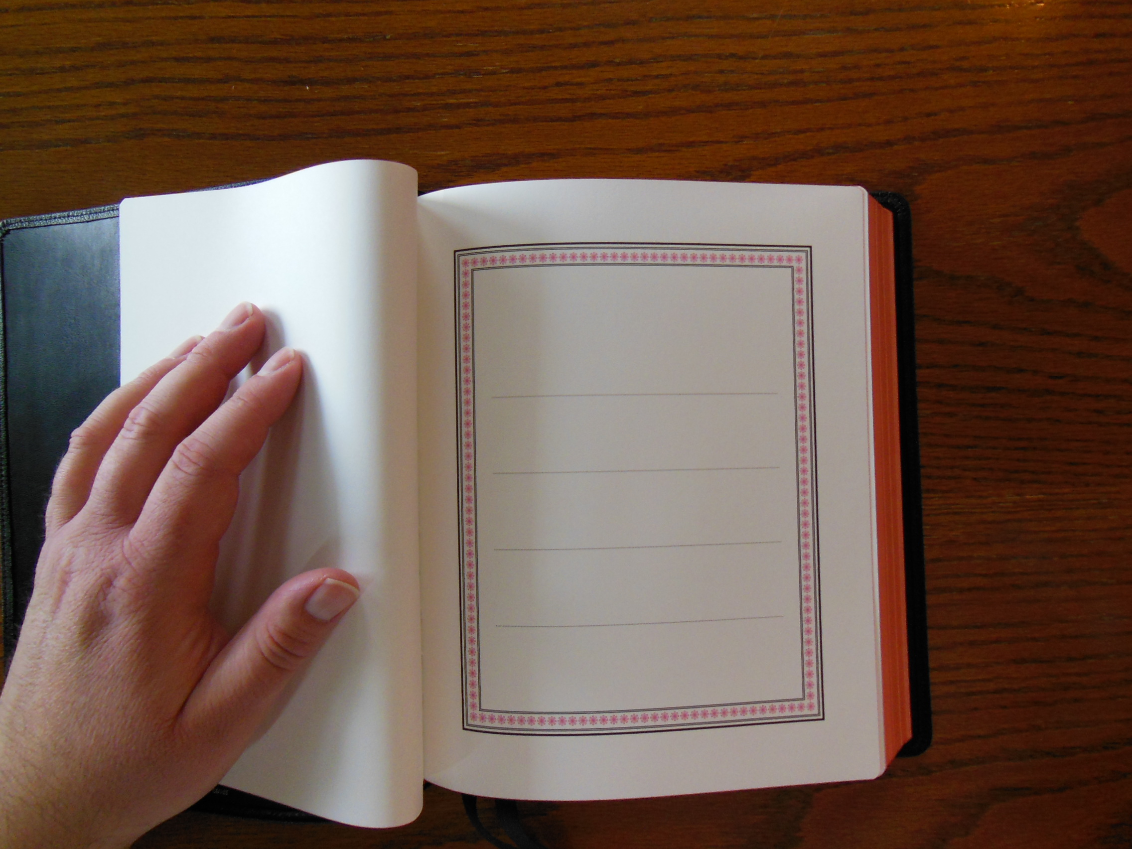
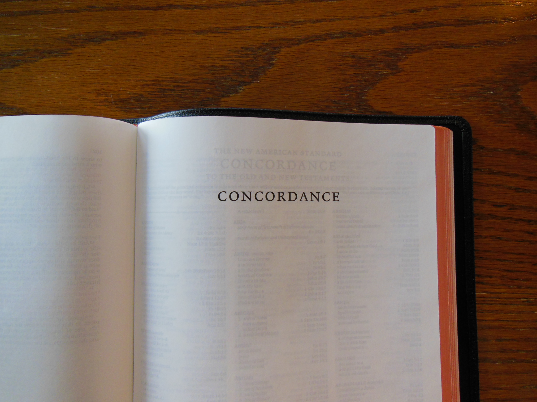
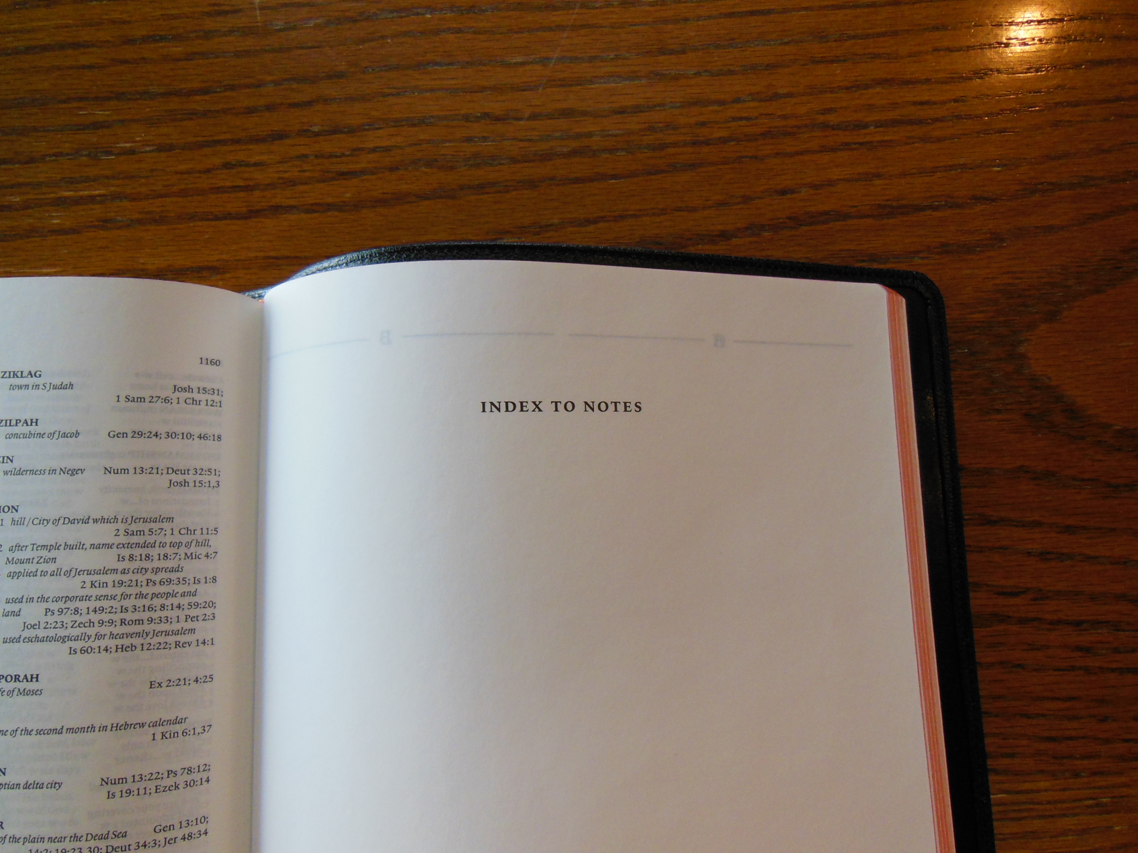
At the end of the Interlinear there is a section called the, “Bible Companion” which is basically a Bible reading plan.  Also there is an alphabetically arranged blank index.  This is great for adding your own notes and references.

DSCN2932 DSCN2928

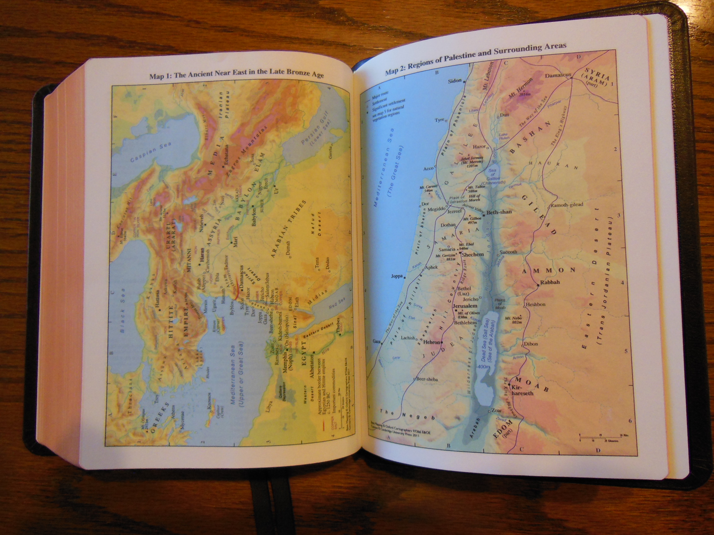
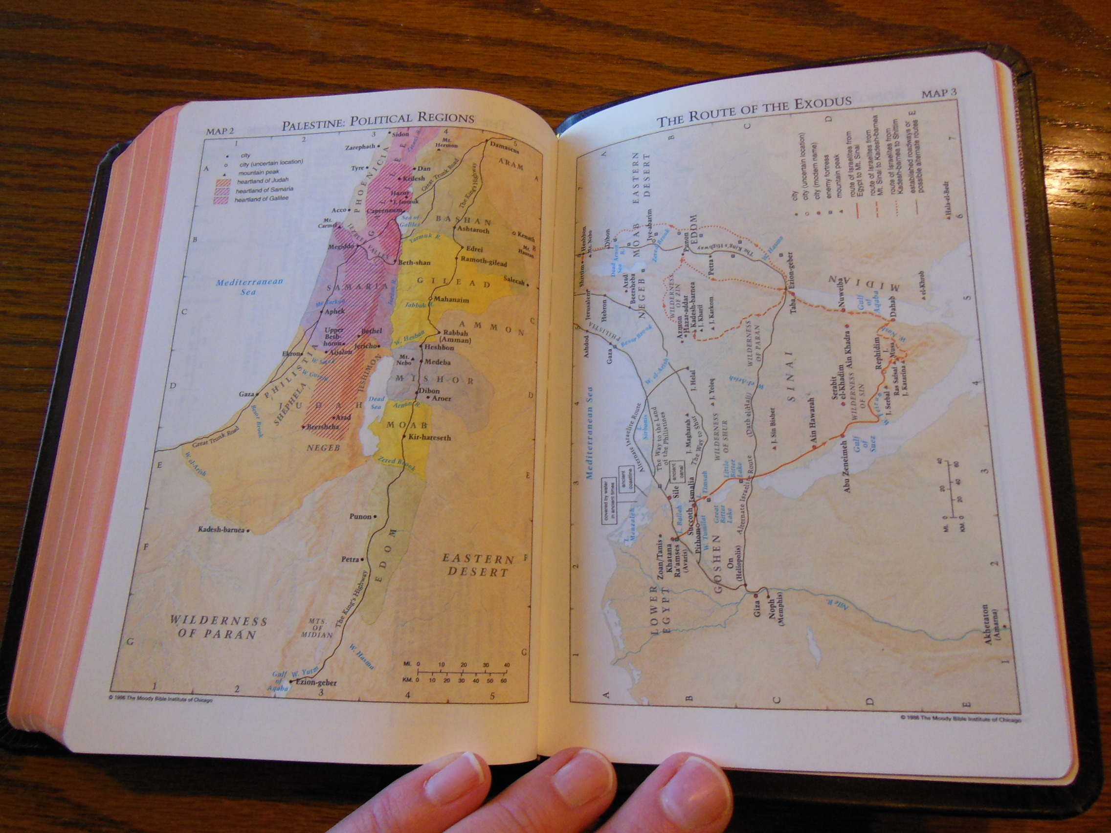
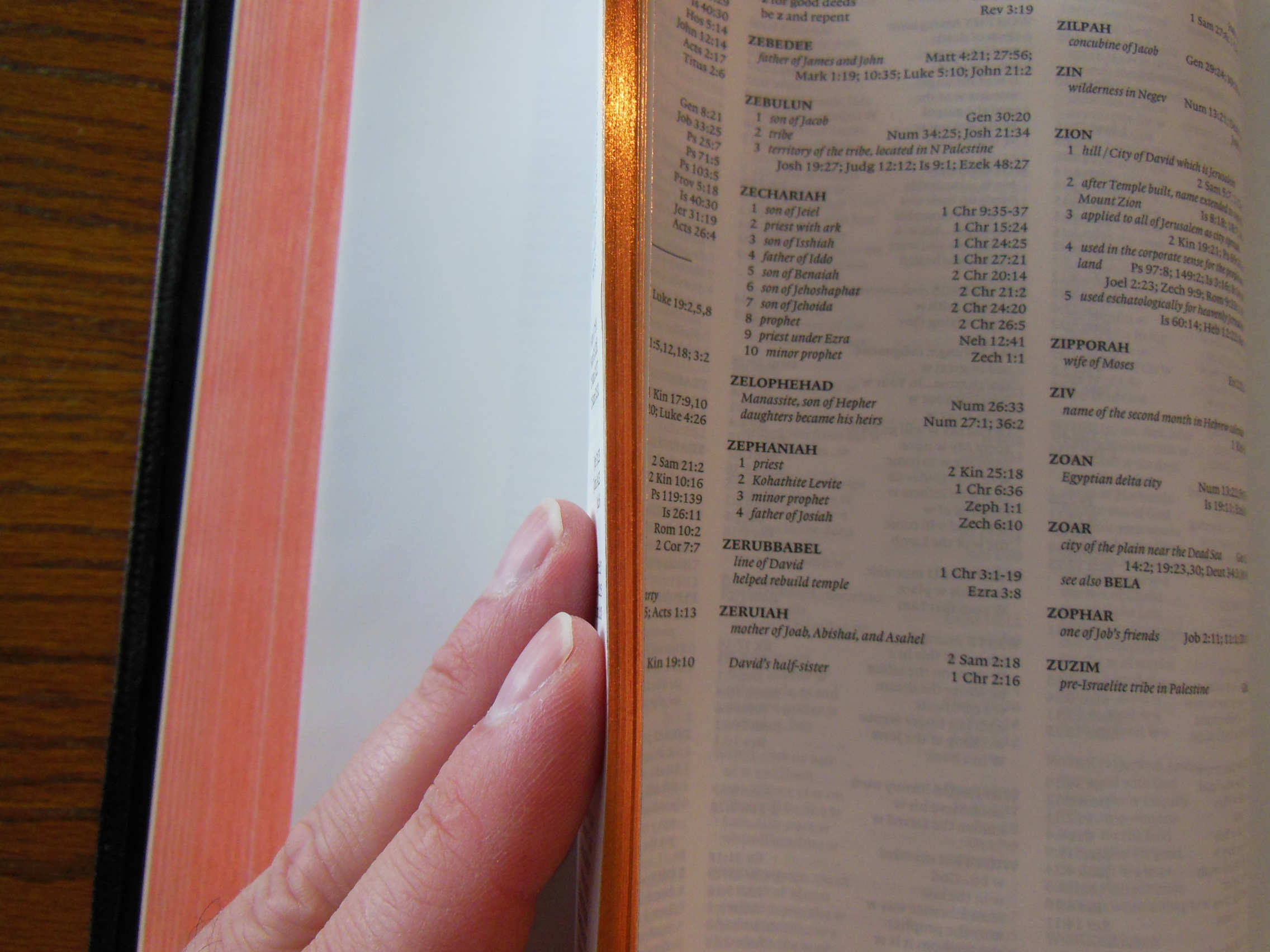
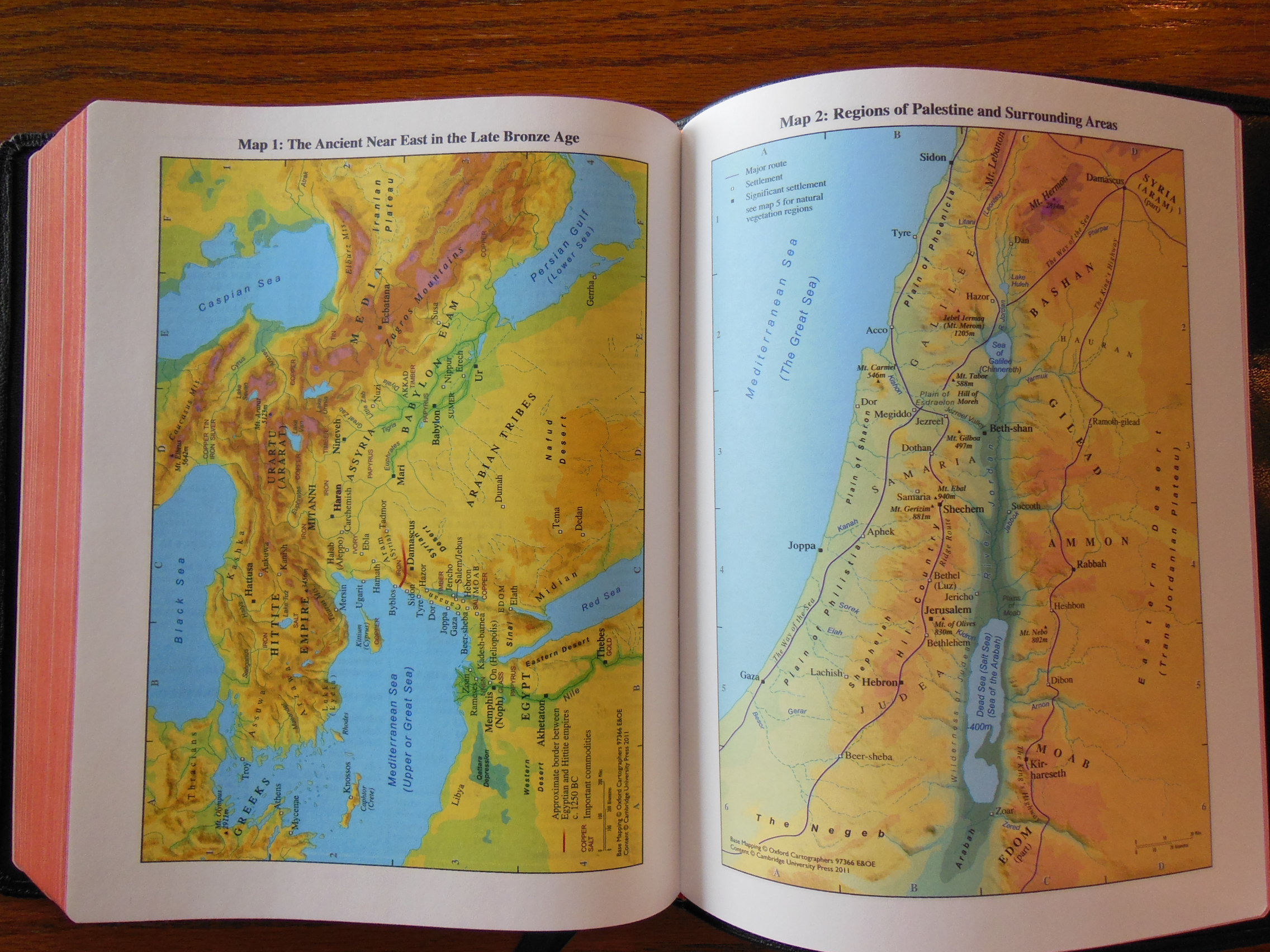
After that we have fifteen color maps, a map index, and a large list of variant readings preferred by the American Standard Version translation committee.  All of this together makes for one highly usable, functional, and handsome Bible.  If you like the majesty of Early Modern English, but need a bit of help from time to time, or if you just like the KJV and the RV because of their rich history, the KJV/RV Interlinear Bible from Cambridge is an excellent addition to any Christians library, even if it is the only book in it.

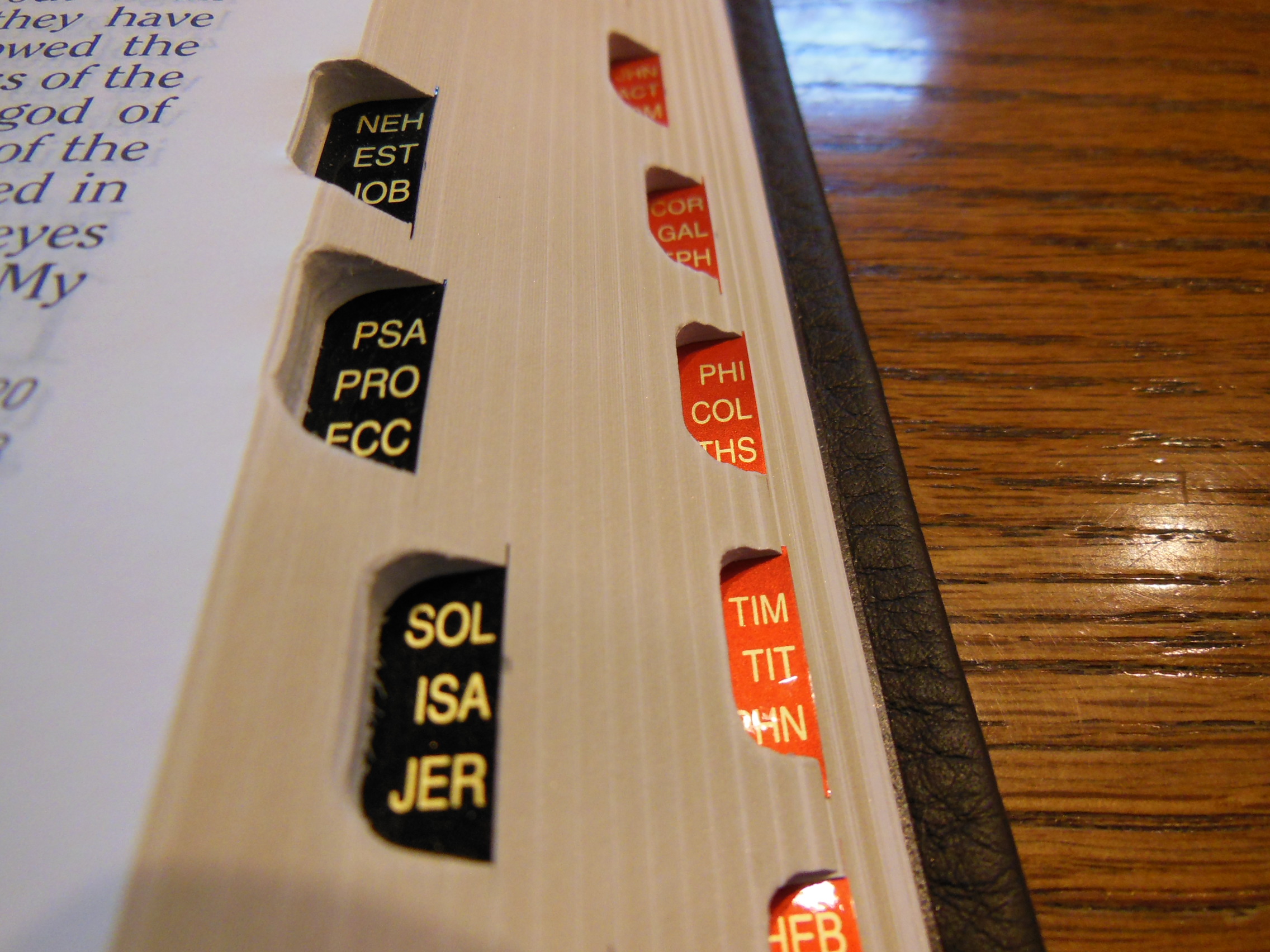
Be sure to check out the picture gallery at the bottom.

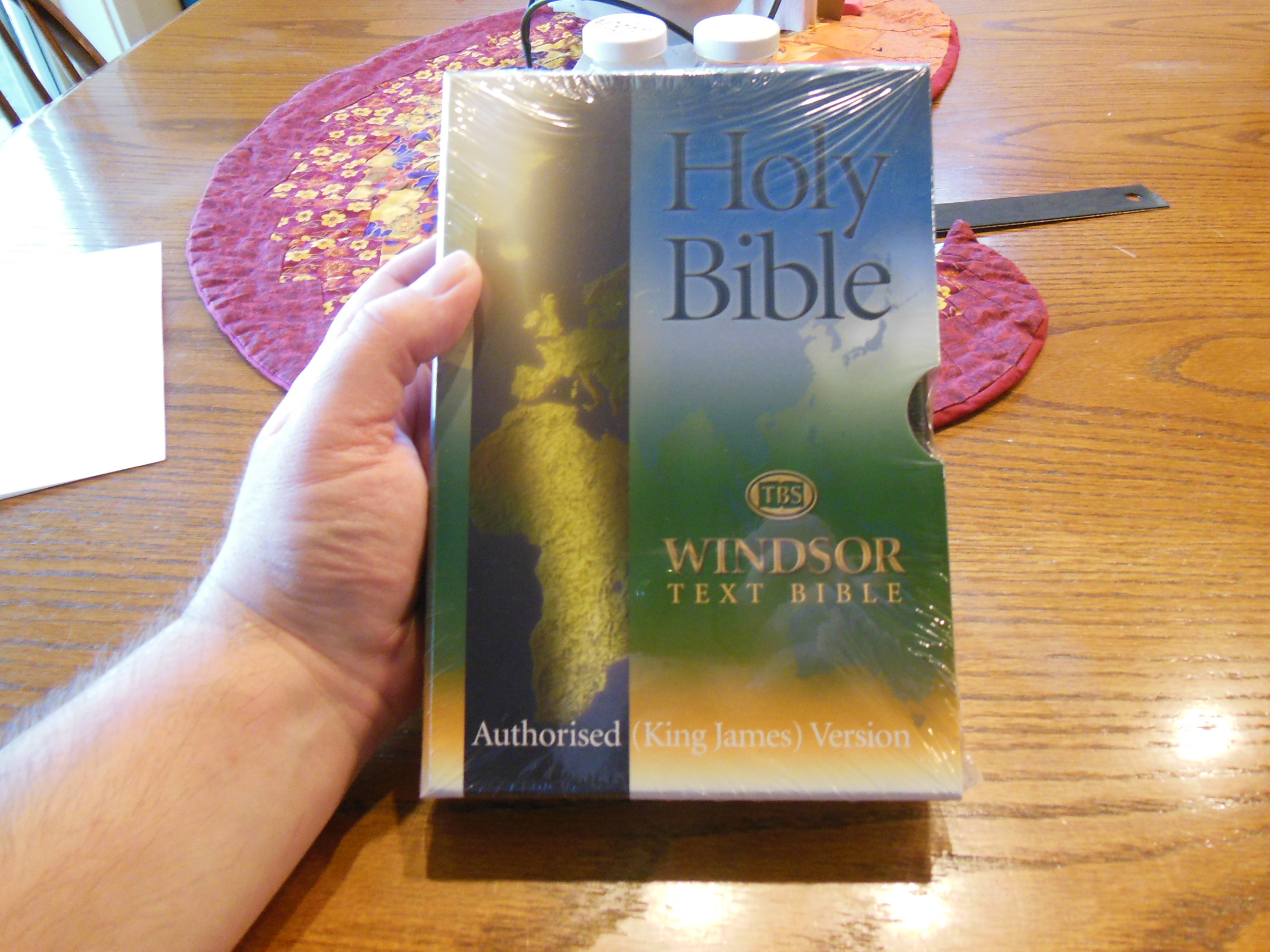
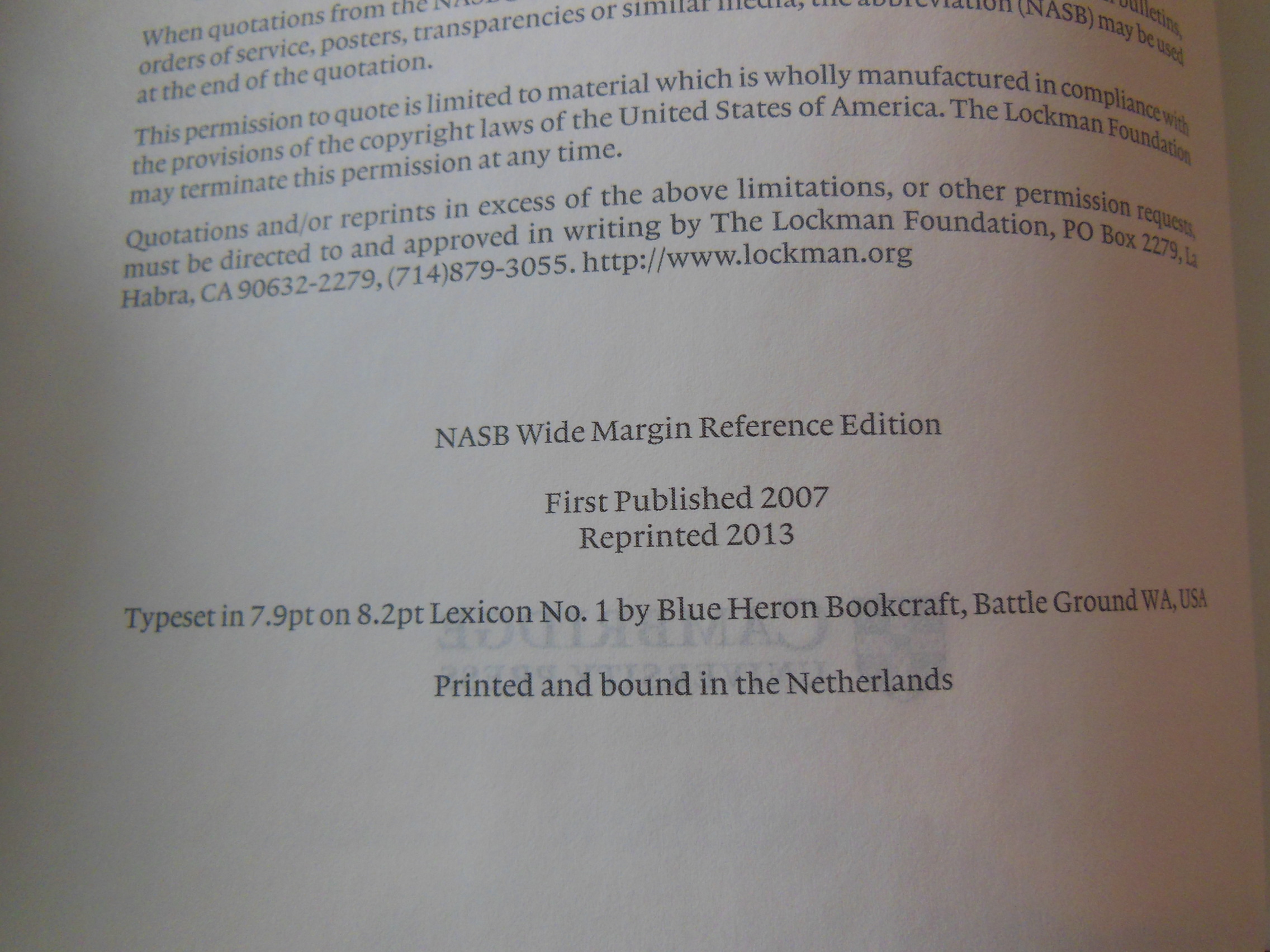
RV655X  isbn: 9781107630932

You can purchase the Cambridge KJV/RV Interlinear in black calfskin on these online retailer’s sites,

Cambridge University Press

Amazon.com

Christianbook.com

Evangelicalbible.com

Bible Reviews

The Trinitarian Bible Society’s, “Windsor Text Bible” in Black Calfskin, is the New Quintessential Compact Text Bible for King James Fans.

tbs windsor text Bible 005

I have done some reviews on TBS Bibles in the past. They have all been very well built, and beautifully printed workhorses. I wouldn’t call them luxury Bibles like R.L. Allans, or Schuylers. Nor do they carry the extravagant expense of those Bibles. Some people feel convicted to not spend that amount of money on a Bible. They would rather put the money to better use. Of course these devout and practical people wouldn’t waste money on a shoddily manufactured product of suspect quality and durability either. Now, why throw away money on something that will fall apart? Why print the word of God on the cheapest materials, in the lowest of fashion? So, being the devout and practical people they are, they opt for a TBS Bible.

I was curious about the history of this edition. The quality, legibility, portability, and price inspired me to ask questions. So I e-mailed my contact with TBS with my questions about this edition. She forwarded them to another person who had the answers. This is a direct quote from her reply, “The Windsor was first published in September 2007. It was designed to be a replacement for the Emerald Bible: the print image of the Emerald was becoming rather problematic – a common problem with reprinting older Bibles. But rather than simply reproducing the Emerald, we wanted to have a clear, sharp, more modern font, one that would last through years to come. The Windsor is now often used by churches as a pew Bible (as was the Emerald).” I was very pleased to receive this information to include in my review.

As some of you who collect Bibles know, there are several Bibles that are printed from an old typeset. The old typesets were done before modern digital printing, back when typesetting was done manually. The methods used didn’t produce the quality we are able to get today with digital font and modern precision printing. Here is an example of both.

tbs windsor text Bible 049

From steadfast practicality TBS produced a modern typeset of the 1611 AV KJV, printed it on high quality paper, bound it in a fine sewn binding, covered it in durable calfskin, and priced it for the common man.

tbs windsor text Bible 051

The size and construction of this edition makes it tactilely comfortable to hold. I found that I wanted to carry this Bible around with me. I wasn’t afraid of scratching, tearing, dropping, spindling, or mutilating it. It begs to tag along with you, and it can handle it without being babied.

The Windsor arrived gratis for the purpose of review. It was very well packaged, and protected for shipping. It was in a cardboard box with packing peanuts, and cushioning.

tbs windsor text Bible 001 tbs windsor text Bible 003 tbs windsor text Bible 004

I appreciate this attention to detail, in the packaging of the Bible, to ensure that it arrives undamaged. Many publishers, even higher end ones, don’t give this kind of protection to God’s word. The Bible comes in a slipcase as retail packaging. Retain it for storing your Bible, if you order one of these.

tbs windsor text Bible 008

The calfskin is a bit shiny, and hard. It is more so, than the Cambridge calfsplit leather, but not near as hard, or shiny as a pigskin leather cover.

tbs windsor text Bible 010

The spine is hot stamped in gold with, “Holy Bible” at the top and the TBS logo at the bottom.

tbs windsor text Bible 011

There are decorative head and tail bands and gold gilt page edges.

tbs windsor text Bible 014 tbs windsor text Bible 012

Upon opening the Bible, you’ll notice that the inner cover is lined with a black vinyl material. The corners are done quite well.

tbs windsor text Bible 016

The text block binding is smyth sewn and is case bound. There is a presentation page, and a publication page which shows that this Bible was printed and bound by Jongbloed in the Netherlands. Jongbloed is one of, if not the best print houses in the world when it comes to Bibles. You also have, Translators to the Reader, and The Epistle Dedicatory.

tbs windsor text Bible 023

This TBS Bible should be the archetype for all compact text Bibles. It is easy to read. The font is 9.6 pt. in size. There are not any cross references to take up space. The font is printed clearly, and in sharp contrast, on opaque Bible paper. Ample line spacing adds to the legibility as well. This is a black text edition. The text is in a double column, verse format. There is little room in the margins for notes. However, there is some room at the bottom of each page for limited note taking. Chapter numbers are printed larger, and bold. Page numbers are on the bottom corners. There are two black, ribbon markers for keeping your places in the Old and New Testament during your daily reading. In my opinion a minimum of two ribbons is a necessity for all Bibles. At the end there is a, List of pronunciation of words and proper names, Bible word list and a Daily Bible reading plan. With all the quality, features, and price of this Bible you can’t go wrong. The Windsor Text Bible from TBS will set the standard for years to come.

25U/BK

ISBN 9781862283367

Bible Reviews

A Tome of Tomes, The Lockman NASB New Illustrated Bible of Jerusalem.

tome of tomes, get it?  Well, I thought it was funny.

nasb picture bible 006

The Bible has been called the, “Book of books.”  This Bible gives you the impression that it is a, “Tome of Tomes.”  It is large and substantial.  The size of this thing is not in vain.  The paper is terrific, the print is great, and the binding is sewn.  Not to mention all of the 436 interesting photographs. (Yes, they are from real photographs, not pictures snapped by a teenager with their phone, while on vacation.) The photographs are from the 1800’s and early 1900’s.  They give you the feel that you are looking at an Israel before modern tourism.  Of course there was tourism in Israel back then.  These are just lacking modern accoutrements. The pictures help you to connect the places that you are reading about, to their actual locations.  The photographs enrich the readers experience.  I don’t know of any other Bible out there like this one.  It isn’t really a family Bible.  It isn’t one that I would take to Church, or carry around, due to the size, but it definitely scratches an itch for those of us who want to see the sites.  It fills a niche that leaves it with little competition.  There are archeological Bibles with pictures, but there is a distinct difference in their purpose, design, and layout.

It is also appealing because of the cover.  I realize it is not genuine, tooled leather.  It is a synthetic cover, but it does a good job of masquerading as an ancient tome that you discovered in an old library, far from home.  That makes it kind of fun to have and put on display.  I put it on the coffee table for a while and now it is on the mantle.  Here is what the description on Lockman Foundation’s page says about it,

From Sacralion Publishing House, Includes 436 pictures of Holy Places taken between the middle 19th – early 20th centuries. These images are spread throughout the whole biblical text and correspond exactly to the specific verses in the Holy Bible.

Features include, Concordance, Maps, Full Column Cross References and notes, Verse Format, Black Letter, Two Column Text, Photograph Index,  Two Marker Ribbons, Old Testament Genealogy Tables, and Illustrations.

Lockman Foundation credits Sacralion Publishing House with the NASB New Illustrated Bible of Jerusalem.  If you are interested in them you can check out their pages here and here.

For those of you who aren’t familiar with the NASB translation of the Bible, I can assure you it is one of, if not the most accurate translations out there.  Lockman Foundation is dedicated to being loyal to God in their translation work.  You won’t find any gender inclusive agenda with them.  Some people say it is a bit more difficult to read, but I have never experienced that.  I have found it an accurate translation that conveys the majesty of God’s word in a modern English translation.

So without further eloquence I will now show you the pictures.

The Bible arrived packaged in two boxes.  One was inside the other cushioned with paper.  I imagine this was due to the size and weight of this Bible.  It arrived undamaged and in good condition.

nasb picture bible 001 nasb picture bible 002

It was shrink wrapped and labeled.

nasb picture bible 004

nasb picture bible 005


The spine is hot stamped with, “Holy Bible” at the top, “The New Illustrated Bible of Jerusalem” next, and then, “Updated New American Standard” and finally at the bottom, “Sacralion Publishing House.”  The front cover is stamped with, “Holy Bible.”  As well as being gilded it is ornately decorated like the cover.

nasb picture bible 008

As I mentioned earlier the synthetic cover is stamped to look like tooled leather.  It does add to the aesthetic value of the Bible as well as the tactile experience.  Of course this leads one to wonder what this Bible would look like with a tooled leather cover.

The first few pages are an, “Introduction to the New Illustrated Bible of Jerusalem.”

nasb picture bible 015

Then we have, “A note to readers.”

nasb picture bible 016

The, “List of Photographic Illustrations” in the front of the Bible is very helpful in being able to match a photograph to scripture and its real location, as well as the page number it is on.

nasb picture bible 019 nasb picture bible 020

The Bible is wonderfully formatted.  It is a joy to read.  The double column, verse format has a  center column reference.  The center column is black text on a grey background.  The font is printed sharply and well inked against the cream colored paper.  The paper is very opaque.  There is virtually no ghosting making this one of the least distracting Bibles to read.

nasb picture bible 026 nasb picture bible 028 nasb picture bible 027

There are two ribbon markers that are quite different from what I am accustomed to.  They aren’t flat.  They are round.  The ends are frayed, and it looks like they are supposed to be this way.  I have a Greek New Testament that has the same style ribbon marker.  It was bound in Germany.  Since both came new out of the packaging like this and I have seen others like this, I assumed this is the style.  One is a white and the other is blue.

nasb picture bible 034

The photographs are black and white.  They are placed with relevant scriptures to help the reader connect to what they are reading.  Here is an example of some of the photographs you’ll see in this Bible.

nasb picture bible 033

The binding on this large Bible is sewn.  That is in my opinion a must for a large book of any kind.  It enables a book of this size to fully open.  At the end of the Bible is a Concordance, The Old Testament Genealogical Tables, and 11 maps.  I think that this is a compelling enough edition that every home library should have one of these.

If you want to order one of these you can find them here Lockman.org and here Amazon.com and here Christianbook.com

ISBN: 0984234306
ISBN-13: 9780984234301

Bible Reviews

Another Excellent Bible from Cambridge, the Clarion NKJV Bible in Brown Genuine Calfskin.

cambridge nkjv clarion and kjv cameo 046

I begin by referring you to my previous review of the Cameo from Cambridge.  The two Bibles were delivered in the same packaging from Cambridge.   Both have the sewn bindings and both are covered with the same brown calfskin.  You can read about those aspects in that review.

The Clarion from Cambridge is an example of modern Bible design done right.  Here is a quote from the Cambridge website about the Clarion in NKJV;

A Cambridge Clarion edition represents an unusual and attractive combination of features – a very readable text in a paragraph style, with a single-column layout – all within a personal size reference Bible format. Here, the NKJV text is presented in a single column with the cross-references in the outer margin, giving the page a very well laid out appearance. The font size is a little under 9 point with generous line spacing. It is typeset in Lexicon No.1, a modern digital font which has many of the characteristics usually associated with traditional Bible typefaces – in particular, a degree of readability more usually associated with much larger type. The Bible has 15 new colour maps and a concordance. There are two ribbons to keep the place in different parts of the Bible. This is a Bible of the very highest quality, printed on India paper with art-gilt edges, Smyth-sewn for flexibility and endurance, and bound in brown calfskin leather

Chances are if you are considering the purchase of the Clarion NKJV Bible in brown calfskin, you have a list of desired attributes in mind; manageable size, legibility, quality sewn binding, beautiful and durable cover, and so on.  The Clarion fits the niche almost perfectly in my opinion.  It brings together many desirable features without sacrificing too much in the other areas of design.  The Clarion is larger than the Cameo.  It is definitely thicker.  The thickness of the Clarion does make it a bit more to hold than the Cameo, but the font is so much more legible.  The tradeoff is well worth it.  Because of the thicker format the Clarion can use a larger font.  It is a modern font, printed with modern technology making it very clear and sharp.  The Cameo’s font was cleaned up, but still doesn’t compare to the font of the Clarion.

Another wonderful attribute is that you can get the Clarion in different translations.  Currently it is available in the New American Standard Bible (NASB), the English Standard Version (ESV), the King James Version (KJV), and the New King James Version (NKJV), which I am reviewing.

So besides the size, font, and available modern translations, the Clarion also breaks in very well.  I have been using an NASB Clarion in goatskin for my daily reading and it has become my standard for comparison.  The NKJV in calfskin adds some rigidity to the cover.  Instead of being edge lined and perimeter stitched with a very flexible material it uses a more common process of vinyl inner liners glued down to the outer cover.  The added structure can be a pro to some and a con to others.  In my opinion, if this Bible were thinner the stiffer cover would be a pro, but it is just a bit too thick.  I can’t roll the cover all the way around like I can with the goatskin covered Clarion.  It makes it a little less comfortable for me.  The cameo gets the size right for this type of cover, but at the sacrifice of font size, line spacing.  These all have an effect on the ease of reading.  If you are going to buy the Clarion, I’d suggest the goatskin.  Of course this is just my opinion.  Everyone has different sized hands and preferences.  I suggest looking one over in the Christian book store, or getting your friend to let you borrow theirs for a few minutes.  It is not a small investment for most people.  Because of the quality of craftsmanship and materials used it will be with you for a long time.  So it is important that you do your research before buying a lifetime companion like the Cambridge Clarion.

This Bible is covered with a genuine calfskin in brown.

cambridge nkjv clarion and kjv cameo 050

It is very supple and soft.  On the front of this Bible is hot stamped, “Holy Bible” in gold.  The spine of the cover has, “Holy Bible” at the top, “New King James Version” immediately under that.  At the bottom of the spine is, “Cambridge” in gold as well.  There are modest hubs worked into the spine as well.

cambridge nkjv clarion and kjv cameo 052

The inner vinyl liners are black and glued neatly to the calfskin.

cambridge nkjv clarion and kjv cameo 053

The calfskin has been folded over and finished uniformly.  The corners are all perfectly finished.  There are two ribbon markers that are color matched to the cover.  The ribbon markers are about a quarter inch wide.

cambridge nkjv clarion and kjv cameo 067

The page edges are art gilded.  This gives them a distinctive look that you won’t find on less expensive Bibles.

cambridge nkjv clarion and kjv cameo 065

The paper is high quality opaque paper.  It is slightly off white and contrasts with the black font nicely.  The text is printed in a single column, paragraph format with line matching.  Line matching is when the lines of text are printed in such a way so as to make the text on one side of the page directly opposite of the text on the other side of the page.  This aids in legibility.  The font is large enough to be easily read yet small enough to keep the size of the Clarion down.  It is clearly, and uniformly printed.

cambridge nkjv clarion and kjv cameo 062

It has a useful concordance and the maps are printed on a heavier paper with a  matte finish.

cambridge nkjv clarion and kjv cameo 069 cambridge nkjv clarion and kjv cameo 073

The sewn binding is of the quality I’ve come to expect from Cambridge.  The Clarion opens well and lays flat when opened.

To sum up, the Clarion is an excellent Bible that fills a big niche in the Bible market.  Many Christians are on the lookout for a Bible that travels well, is easy on the eyes while reading, and is well made.  The Clarion fits the bill and is available in some great translations.  Check out Cambridge Press’ Page.  You can pick up a copy of this Bible on evangelicalbible.com for about $140.00 and you can also get it from Amazon for about $120.00 and Christianbook for about $155.00

ISBN-13: 9781107664425

isbn: 9781107664425

ISBN: 110766442X

NKJV Clarion Reference Bible NK485:X Brown Calfskin Leather

Bible Reviews

Wow, the Cambridge Cameo KJV Bible in Brown Vachetta Calfskin Leather is a Triumph of Form and Function!

cambridge nkjv clarion and kjv cameo 007

I received this Bible from Cambridge gratis for review purposes.  It arrived sufficiently packaged in a cardboard box with one other Bible.

cambridge nkjv clarion and kjv cameo 001

They did not deform or break through their packaging and the Bibles were in perfect shape when they were delivered.

Upon opening the box I was presented with the clamshell retail box, which should be retained for storage purposes.  The Bible inside the box was instantly striking in appearance.  I am accustomed to many different qualities of cover material.  When I picked the Cameo up out of the box I was struck by the soft texture of this type of calfskin leather.  The grain was smoother with smaller pebbling compared to goatskin leather.

cambridge nkjv clarion and kjv cameo 008

I was expecting a darker brown with a texture like other top grain cowhide Bibles.  I was pleasantly surprised.  This calfskin was smoother and soft.  The front of the Cameo is hot stamped with, “Holy Bible” in gold.  There is a channel pressed into the leather around the perimeter of the cover.

cambridge nkjv clarion and kjv cameo 007

On the spine of the Cameo is, “Holy Bible” at the top, “King James Version” in the middle, and the Cambridge Logo at the bottom.  They are all hot stamped in gold.

cambridge nkjv clarion and kjv cameo 009

The page edges are beautifully art gilded with red under gold.

cambridge nkjv clarion and kjv cameo 024

The construction of the Cameo is top-notch.  In addition to having a wonderful cover that will last a lifetime, it has a sewn binding that will last as long as the cover.  Because of these two fine qualities the Cameo is a pleasure to hold and read.  The Bible opens well and lays flat easily without being overly flexible.

cambridge nkjv clarion and kjv cameo 023

This edition does everything right.  The only way this could be any better is if it were in NASB.

The inside cover is lined with vinyl that is glued down.  The corners are finished nicely.

cambridge nkjv clarion and kjv cameo 013

There are two ribbon markers that match the color of the cover as well.

cambridge nkjv clarion and kjv cameo 045

Some less expensive Chinese or Korean Bibles try to entice you with a very supple calfskin cover lined with calfskin or another very flexible material.  Then, they drop the ball with either the paper or the fit and finish.  That is not so with the Cameo from Cambridge.  The paper is nice and opaque.  The font is a cleaned up 8 point, Petit Medieval Clarendon type.  It is bold and easy to read.  The text is arranged in a double column verse format with center column references.

cambridge nkjv clarion and kjv cameo 022 cambridge nkjv clarion and kjv cameo 026

In the front of the Cameo you have publication information page followed by a nice presentation page.

cambridge nkjv clarion and kjv cameo 015 cambridge nkjv clarion and kjv cameo 018

After that is the text of the KJV.  Lastly, there is a very useful concordance in the back along with 15 color maps that are indexed.

cambridge nkjv clarion and kjv cameo 028 cambridge nkjv clarion and kjv cameo 033

I know there is a big trend now for the single column paragraph formats.  Personally, I find it more difficult to focus on during reading in my home.  I have a busy house and am always getting interrupted.  As a consequence I routinely lose my place and have to look for where I left off so that I can resume reading.  The paragraph format has all of the tiny verse numbers dispersed through the text and finding them or remembering where you left off can be a bit more tedious.  I find it easier to pick up where I left off if I can find the verse quickly.  This is my personal preference.

The Cameo is a delightful size Bible to hold and read anywhere.  I can sit in my recliner and read it, I can read it in bed, I can read it on my work break, and I can read it while I drive…  I was just checking to see if you were still awake.  Never read and drive!   Seriously, seldom will you find a combination of form and function like the Cameo.

Here the Cameo is compared to the Concord.

ISBN: 0521146100

isbn: 9780521146104

KJV Cameo Reference Red Letter Edition KJ455:XR Brown Calfskin Leather

Bible Reviews

Do you want a large print compact NASB? Review of the Lockman Foundation Large Print Compact Text Edition in Burgundy Leathertex.

nasb large print compact 003

Review of the Lockman Foundation Large Print Compact Text Edition in Burgundy Leathertex.

As usual Lockman did a fine job of packing and shipping the Bible to me.

nasb large print compact 001

This edition is not expensive.  If you have high expectations you will be disappointed.  This Bible sells for about $20.00 it is produced in China.

nasb large print compact 019

I’m not making excuses here, but there are some things you need to consider when criticizing a Bible.  I know some people have complained about the print and the paper on this edition.  They aren’t wrong.  The paper could be a bit more opaque or the print could be a bolder type face.  It would be much easier on the eyes if that were the case.

nasb large print compact 025

What would the consequences of that be?  Well, if the font were a bolder type face and stayed 9 point, it would take up more space on the page necessitating more pages.  This edition is already pretty thick at about 1 3/16” not to mention that they have already taken out the references and made it single column paragraph format.

nasb large print compact 012

There isn’t much in the way of helps either.  There aren’t any maps to remove to make this thinner.  So what about the paper?  Well, same problem if you make a thicker paper that is a higher g.s.m. then the Bible gets thicker.  It’s just the laws of physics in a finite world folks.  I hate to be a bummer.

This Bible tries to fill a niche that definitely is there.  I’ve heard many people complain that they want a nice clean, compact, text edition of the NASB in paragraph format.  The Cambridge Clarion is pretty close, but it costs almost $200 dollars in goatskin.  You could opt for the calf split leather for around $105-$115 but that is still pretty expensive.  So let’s look at what you are getting for $20.00 instead of what you aren’t getting.

This edition has 9 point font, the words of Christ in red arranged in a single column text format with limited footnotes at the bottom of the page.

nasb large print compact 036 nasb large print compact 024 nasb large print compact 027

It has a sewn binding and is covered in leathertex which is modern synthetic leather.  It has a cross stamped on the front with a channel around the perimeter.

nasb large print compact 007

On the spine is printed, “New American Standard Bible” in large letters from one end to the other.

nasb large print compact 008

The page edges are gilded.  There is one ribbon marker that matches the burgundy color of the cover.  The ribbon is pretty thin and narrow.  The inner liner is vinyl and color matched to the cover.  It is glued down.  There are decorative head and foot bands.  You have a presentation page printed on Bible paper and not card paper.  Then, you have the copyright page, followed by the foreword with translation explanation.  Before the text begins you have a table of contents.  After the text of the Bible you have one page of the, “Parables of Jesus” then, four pages of, “Important Events in Christ’s Life According to the Gospels” three pages of, “God’s Promises” and next, two pages of, “Old Testament Prophecies Fulfilled in Christ” and lastly, one page of, “The Miracles of Jesus.”  The outside cover closed measures 7 5/16” long by 5 1/4” wide by 1 3/16” thick.

This is exactly what it is labeled.  You can’t expect it to be everything you wanted in a Bible.  There are going to be compromises when you make a large print, compact, text edition.  I know this review sounds like an apology.  I really wanted to like this Bible, but the truth is that it is a bit hard on the eyes due to the seemingly skinny font and thin paper.

For the money though, it is an excellent value and the perfect size to carry with you.  The font is much larger than a 6 point font and you really haven’t gained that much in size over a traditional compact edition.  I would recommend this Bible for people with good eyes that aren’t going to do long reading sessions.  It would be good for break room reading or whenever you have a few minutes.

ISBN: 1581351569

ISBN-13: 9781581351569

Bible Reviews

Need a Large Print Personal Size Reference Bible? Holman Has a Great Value for You.

HCSB Reader 003

Let’s look at the Holman HCSB Personal Size Reference Bible, red letter edition, in Brown Genuine Cowhide, with indexes.

Holman shipped this Bible in a cardboard box and cushioned it with paper packaging material.

HCSB Reader 001

HCSB Reader 002

The two piece retail box should be kept for storage.

HCSB Reader 006

Holman wraps their genuine cowhide Bibles with construction paper to make them keep their shape and prevent damage while being shipped. When I opened the retail package I was presented with the wrapped Bible. After removing the wraps, they chocolaty brown genuine cowhide is revealed.

HCSB Reader 007

It has the feel of a quality Bible to it. It also has an affordable price. The cowhide is supple and soft.

HCSB Reader 008

The cover is lined with vinyl on the inside and glued down. This adds a bit of rigidity to the cover, but in my opinion just as much as is needed to make it easier to hold and read. Some Bibles are too floppy.

HCSB Reader 019

This Bible is about 8.25″ x 5.75″ x 1.25″ It is a very convenient size to carry around in your hand or in a medium bag of some kind. It is too large for a small lunch box or purse. I like the size of it for use in a chair without a table or desk. The overall dimensions and format are conducive to reading even though it is not a readers edition.

The spine of the Bible has at the top, “HCSB” and the logo above it, and, “Holy Bible” in the middle, and then, Holman’s logo at the bottom in gold. The spine is also decorated with hubs reminiscent of the raised hubs that were produced by the journals being sewed to the journal cords before the use of thinner journal tapes. Today as a rule they are decorative. They do add a bit of appeal to a Bible.

HCSB Reader 014

This Bible has a modern sewn binding. It is pretty comparable to the other Bibles from China with a sewn binding. Holman seems to do a better job of quality control than some of the other publishers I have seen that produce for the same market. The bindings we see from Jongbloed in the Netherlands are still a cut above. That is why they work for the luxury crowd. For a great value, this fits the bill. You can take it all over and not feel like a sinner for indulging in a $250.00 Bible, and you have the added benefit of not worrying it gets a wrinkled page.

The pages are gilded.

HCSB Reader 010

There is one narrow ribbon marker that matches the color of the cover.

HCSB Reader 016

There is a copyright page showing that this Bible was made in China. Then after that is a Table of Contents, How to Use the Bible, Gospel Presentation, Translation Notes, and then the text of the Bible begins. It is arranged in a two column paragraph format with end of paragraph cross-references, and footnotes at the bottom of the page. This setting is less cluttered making it easy to read. The font is a 10.5 point font that is printed clearly and sharply on the page.

HCSB Reader 032

The paper could stand to be a bit thicker. In this edition the words of Jesus are printed in red.

HCSB Reader 035

I like the way the indexes are cut on this Bible they are rectangular with rounded corners instead of the more common crescent shape. The Old Testament ones are gold text on black and the New Testament ones are gold text on red.

HCSB Reader 018

After the book of Revelation you have, HCSB Bullet Notes, Table of Weights and Measures, Where to Turn, Titles of Jesus, Messianic Scriptures that Jesus Fulfilled, a brief Topical Concordance, and finally eight color maps. I found the Where to Turn section useful for new Christians as well as the section on prophecies fulfilled by Christ.

My overall impression of this Bible is that is a good quality workhorse for daily reading. It isn’t good for note taking due to the margins being minimal to accommodate the text. It isn’t chocked full of notes and references for the same reason. This is a Bible geared for daily reading. The binding does have a bit of page puckering in the gutter near the front and end of the Bible, but it isn’t that bad and doesn’t present at all after the first and last pages.  For that purpose it works excellently and is a great value.

This particular Bible is in the Holman Christian Standard Bible translation. It is a more of an equivalent translation than anything else. It fills the gap left by the NIV when it went all apostate on us. Now when people need an easy to read translation I suggest the HCSB.

ISBN-13: 9781586407926 ISBN: 1586407929 Christianbook stock number CBD Stock No: WW407926

Bible Reviews

So You Would Like to Compile Your Own Study Bible? A Review of the NASB Wide Margin Reference Bible, Black Edge-Lined Goatskin Leather, Red Letter Text Edition.

Cambridge Wide Margin NASB 004

I like to keep a few of my Bibles unsullied and free of notation.  With some high quality Bibles it seems wrong or sinful to make marks in them.  It feels like an affront to the artistry and craftsmanship that goes into them.  While other Bibles I own are marked up as if a child with a box of crayons were set free on them.  I feel no shame in marking up my $30 Chinese made NASB Ultrathin.  It is a good sturdy Bible, but obviously there are not aesthetics there demanding appreciation.  So margin notes, underlining, and highlighting abounds.

The Cambridge Wide Margin is a strange Bible.  It confounds my sensibilities.  It is a fine Bible, but it demands that you use it like a workhorse.  Moreover, the moment you start using it, you begin to appreciate the craftsmanship, as you never would have, without the resources predisposed for your notation.   Besides the 1 5/16” outside margin, you have 32 pages of ruled note paper in the back, and blank index pages with alphabetical headings, so you can compile an index of your own as well.  To have a wide margin Bible is one thing, all you need is wide margins, but to have a Bible that you can utilize to make your own study Bible is another.

When I took this Bible out of the box and first held it I was concerned that it was too wide.  That was my first impression.  I failed to take into consideration the purpose of this Bible.  I put the Wide Margin next to my MacArthur Study Bible and was a bit shocked to see that it was only very slightly wider.  This type of Bible is meant to be written in.  Its natural habitat should be a well-lit desk or table.  The type of work that is going to be needed to complete the endeavor the owner of this Bible has embarked on will take many several hour sessions of focused study and notation.  I don’t see that happening from one’s easy chair.  No, a task this daunting requires a quiet well lit sanctuary alone with God’s word.  Picture a monk hunched over, with quill in hand, doing a scribe’s work by candle light in some cold stony abbey, or perhaps his modern counterpart the scholarly theologian, at some stuffy seminary quartered away in an office, in much the same fashion as the monk, only with better lighting, heating, and cooling.  Well, that might be how you would see yourself using this Bible for its intended purpose if you were so bold.

Bold enough to actually put your thoughts down on this beautiful Bible paper.  It is nice opaque and over 30 gsm.

Cambridge Wide Margin NASB 028

The quality of the paper will help to keep your notes from bleeding through the page.  The color of the paper is off white making for a good contrast between it and the sharply printed text.  The text is 8 point font in black and the words of Christ are in red.  The red text is printed uniformly and sharply like the black.  The text is arranged in a double column paragraph format with center column references.

Cambridge Wide Margin NASB 052

If the references weren’t there the outer margins could have been closer to two inches, giving you more room for your notes.  As it is the references are useful.  I think the only way you could do more with a Bible is if you purchased a loose leaf Bible.  Most of us will probably opt for a wide margin instead.

In the front of the Wide Margin you will find a presentation page, an introduction to the translation, and table of contents.

Cambridge Wide Margin NASB 026 Cambridge Wide Margin NASB 037

The Wide margin includes as previously mentioned 32 pages of ruled paper,

Cambridge Wide Margin NASB 061

a concordance,

Cambridge Wide Margin NASB 054 Cambridge Wide Margin NASB 057

and a blank index section along with 15 color maps and map index in the back.

Cambridge Wide Margin NASB 058 Cambridge Wide Margin NASB 059 Cambridge Wide Margin NASB 065

The maps are in color and printed on a flat paper instead of a glossy paper.  The glossy paper tends to crack and tear.  It is better to have these features printed the way they are.  There are two flat and wide ribbon markers in this Bible helping you keep your place.

Cambridge Wide Margin NASB 032

This is especially helpful considering the kind of work one would be doing with this Bible.  The page edges are art gilded with red under gold.

Cambridge Wide Margin NASB 031


The front cover is imprinted with the words, “Holy Bible” in gold and the spine is imprinted with, “Holy Bible” at the top, “New American Standard” immediately under that, “Wide Margin Edition” in the middle, and “Cambridge” at the bottom.  These are all printed in gold.

Cambridge Wide Margin NASB 012 Cambridge Wide Margin NASB 085

The cover on this edition is crafted from black goatskin leather.  It has a natural grain that is soft to the touch and comfortable to hold.  It is not slick and shiny like some less expensive covers made from pigskin leather.

Cambridge Wide Margin NASB 013 Cambridge Wide Margin NASB 081

The inside cover is edge lined and sewn to the outer cover.

Cambridge Wide Margin NASB 019

The edge lined goatskin cover coupled with the fine smyth-sewn binding make this Bible very durable and supple.

Cambridge Wide Margin NASB 078

This Bible opens easily no matter where you start and lays flat fresh out of the box.

Cambridge Wide Margin NASB 034

If hold it in one hand you will find that it drapes over your hand.

Cambridge Wide Margin NASB 077

The Wide Margin is printed and bound by Jongbloed of the Netherlands.  They are known for their craftsmanship in printing and binding fine Bibles.

Cambridge Wide Margin NASB 038

As usual Cambridge has excelled in producing a high quality Bible that will set the standard for all other wide margin editions from other publishers.  They have provided a target to aim for with their NASB Wide Margin in black goatskin leather.  I have seen very few wide margin editions that come close to the Cambridge one.  I hope that other publishers will rise to the challenge and start manufacturing their Bibles with the concept that it is God’s word and not solely a product to be carelessly mass produced.

In the picture below you can see the Wide Margin compared to the NASB MacArthur Study Bible.  This should give you an idea about the size of it.

Evidence KJV LCBP Red Wide Margin LCBP Black  Hand Size 004

In these pictures you can see the Wide Margin on the bottom of a stack of Cambridge Bibles.  On top is the NASB Clarion, then the KJV Concord, and finally the Wide Margin.

Evidence KJV LCBP Red Wide Margin LCBP Black  Hand Size 002


Here are some links to retailers selling this Bible

amazon.com

Christianbook.com

evangelicalbible.com

NS746:XRME

isbn: 9780521702652

Bible Reviews

Puritans, Pilgrims, and Reformers, a Review of the 1599 Geneva Bible from Tolle Lege Press.

1599geneva 019

Tolle Lege Press is responsible for the rejuvenating the 1599 Geneva Bible. Unfortunately not many people know about this or seem to care. (Except for Kirk Cameron)  I say it is unfortunate because I truly believe the historical importance of this translation has been overlooked for a blind allegiance to the KJV.  Many people don’t know anything about the Geneva translation.  They are happy with their King James versions.  I’ve always wondered why the KJV onlyists are so loyal to a version that was translated by order of the King to conform to the ecclesiology of the Church of England.  The royals and Church leaders were afraid of losing their grip on power.  The Bibles of that time period all relied on the Latin Vulgate to some degree as a resource for translation.  The Geneva and the KJV were no exceptions.  The KJV relied on the Geneva for reference during its translation.  The KJV onlyists are always spewing their venomous polemics towards all other versions being Papal translations from Rome.  It is disturbing that they can suspend rational thought in regards to the KJV, but seem rational most other times.

The Geneva was translated by the Reformers. They had to flee to Geneva so that they wouldn’t be martyred by the Roman Catholic Church and Bloody Mary.   John Calvin and John Knox are most often credited for the Geneva translation.  There were other individuals working with them in Geneva to make this translation.  The notes and references of this Bible are retained and printed in modern font.  They are printed on the bottom of the page like a modern study Bible.  These notes are what made this translation such an enemy to the Crowns of the King and the Pope.  You have to understand that the Roman Catholic Church was in the business of hunting down and killing the reformers.  Then Puritans were persecuted for believing what the reformation brought to fruition.  This is what led to them becoming pilgrims.  They fled to America hoping to live God honoring lives obedient to His word.  The Bible they took with them was the Geneva Bible.

For more on the Geneva’s history visit this site; http://genevabible.com/

Here is a short youtube video about it as well; http://youtu.be/Nq1YhU8cGko

Don’t mind the trolls. They keep complaining about some pagan imagery on the cover, but I don’t see any.  I’ve asked them specifically and really haven’t gotten any answers other than, “You’re going to Hell for using anything but the KJV heretic!!!”  and now for something completely different, how about the review of the 1599 Geneva Bible?

The 1599 arrived in a cardboard box.

1599geneva 011

Inside was the Bible in its retail 2 piece box.  The cd-rom contains searchable, printable PDFs of the Geneva Bible, plus the Apocryphal Books and Metrical Psalms, was also in the retail box.

1599geneva 018

The packaging was sufficient to ensure the Bible was delivered without being damaged.  Tolle Lege did a wonderful job of giving the 1599 a modern typography.  They placed all of the references and notes at the bottom like a modern day study Bible.

1599geneva 043

The Bible is printed on some pretty opaque paper.  It is off white and a bit more rigid than most Bible papers I’ve seen.  I don’t know what kind of paper it is for sure, but it seems suitable.  The text is printed in a double column verse format with an 8 point font.  The notes are printed at the bottom of the page like a modern study Bible.  Chapter numbers are larger and in bold print.  The pages are bound in a sewn binding done here in America.

1599geneva 027

The sewn binding makes up for the bonded leather cover.  I can’t begin to tell you how much I detest bonded leather.  I would much rather see a hardcover or trutone fake leather cover.  Of course if this Bible came in a top grain cowhide or goatskin cover with sewn edge lining of leather it would be great.  The cover is lined on the inside with white paper that is glued down.

1599geneva 028

The front outer cover is decorated with, “1599 Geneva Bible” at the top and some kind of flower on the bottom.

1599geneva 019

I imagine that these are the pagan symbols the kooks are upset about.  Who knows?  The spine is also gilded with the same as is on the cover except on the bottom of the spine is the Tolle Lege logo.

1599geneva 020

The sewn binding makes this Bible open better than it would without it.  It doesn’t open as nicely as it could with a better cover.

1599geneva 025 1599geneva 026

The binding doesn’t completely stop the pages from folding closed on you while you are reading.  This is only just out of the box, brand new.  As I used it this problem went away.  It also will make this Bible hold up much better.

1599geneva 056

There is one black ribbon marker.  The page edges are gilded.

1599geneva 022

There is a Middle English Glossary in the back and several prayers including morning and evening.  There is a purely subjective quality about this Bible that makes me want to sit and read it.  The combination of the size, weight, paper, and layout, make sense to me and I find it easy to read.  Now just because that is the experience I have with it doesn’t mean I expect everyone to agree with me so don’t go launching fiery darts at me.  This Bible should be a part of every Christian’s library.  If you don’t have one, go get one.

Don’t get this Bible confused with the 1560 facsimile Geneva Bible.  This one is actually useful for daily reading.  The 1560 is a little tedious.

Bible Reviews

A Pleasant Surprise from Holman, Review of the Holman KJV Minister’s Bible in Black Genuine Cowhide.

cambridge kjv, holman ministers kjv and funky lil kjv 151

Holman sent this Bible packaged in a cardboard box with some paper padding it.

cambridge kjv, holman ministers kjv and funky lil kjv 137

The retail box was inside.

cambridge kjv, holman ministers kjv and funky lil kjv 139

I had no idea which Bible they had sent me.  I didn’t remember requesting one for review.  I was pleasantly surprised by the arrival of the KJV Minister’s Bible.  When I had originally requested it they were out of stock.  It seems that Holman remembered and sent it when it became available.

When I opened the shipping box I found the retail packaging inside. Keep the two piece gift-box to store your Bible.  This Bible is so supple that it will need to be laid flat for storage.  When I opened the retail box I could see that the Bible was wrapped in a dark colored construction paper to keep it safe from being deformed.

cambridge kjv, holman ministers kjv and funky lil kjv 146 cambridge kjv, holman ministers kjv and funky lil kjv 147

I like this better than being, “shrink wrapped” with plastic wrap.  Plastic wrap has the tendency to pull the corners down and deform the cover and text block.  If the Bible arrives damaged or during use develops premature wear rest assured, Holman has a lifetime warranty on this product.

cambridge kjv, holman ministers kjv and funky lil kjv 141

I was impressed by the feel of the genuine cowhide leather cover. It was soft and supple.

cambridge kjv, holman ministers kjv and funky lil kjv 157

The Bible is edge lined not case bound.

cambridge kjv, holman ministers kjv and funky lil kjv 153

The edges of the outer cover are rolled over and sewn down.  The spine of the Bible has decorative spine hubs.  They used to be where the signature tapes or ribbons were sewn to the signatures.  The cover would have to be fitted over them which produced the raised hubs.  Now it isn’t an indicator of a sewn binding or not.  You’ll be glad to know this one does have a very flexible sewn binding.  It allows this Bible to do some pretty amazing things and come out unscathed.  It lays flat right out of the box and can even curl back under the spine with both covers at the same time.

cambridge kjv, holman ministers kjv and funky lil kjv 179

I wouldn’t make a practice of that, but it can do it.  When held open with one hand it drapes over your hand.

cambridge kjv, holman ministers kjv and funky lil kjv 177

The spine of the Bible is imprinted with, “KJV” at the top, “Holy Bible” in the Middle, and Holman’s logo at the bottom.

cambridge kjv, holman ministers kjv and funky lil kjv 149

The pages are edge gild with gold colored foil.

cambridge kjv, holman ministers kjv and funky lil kjv 150

There are two very nice quality ribbon markers in this Bible, one is red and the other is black.

cambridge kjv, holman ministers kjv and funky lil kjv 174

The pages are opaque, but could be a little more so.  They have a generous inch wide margin for adding your own notes.

cambridge kjv, holman ministers kjv and funky lil kjv 169

Wide margins are quite helpful for Pastors.  The opacity of the paper is important so that text doesn’t show through the page.

cambridge kjv, holman ministers kjv and funky lil kjv 175

While preaching and looking down at this Bible you should be able to focus on the text and not what is behind it.  The font is equally conducive to preaching.  It is a neat and clean 12 point font that is consistently inked throughout the Bible in this black text edition.  The text is arranged in a double column verse format making it easy to quickly locate verses.  Book names, chapter, and verse are printed on the top of the page along with headings.

cambridge kjv, holman ministers kjv and funky lil kjv 182

There are many aids for Pastors included in this Bible.  Here is a list of some of them; Sixty-six page KJV concordance, eight maps, Where to Turn When, Plan of Salvation, color presentation page, Various wedding and funeral outlines by Jim Henry, “Why Read the King James Version?” by Calvin Miller, “8 Traits of Effective Church Leaders” by Thom S. Rainer, “21 Essentials of Authentic Ministry” by James T. Draper, “Four Kinds of Expositional Preaching” by Ed Stetzer, “30 Keys to Giving an Invitation” by O. S. Hawkins, “Leading a Child to Christ” by Bill Emeott, “Reaching Students with the Gospel” by Lynn H. Pryor, “The Importance of Baptism and Communion” by Rick White, Commitment Counseling, The Christian Year and Church Calendar, The Apostles and Their History, and Table of Weights and Measures.  With all that this Bible offers it would be a wonderful blessing for your Pastor as a gift, even if the Pastor is your Dad.  Pastors shouldn’t feel bad about buying such a nice Bible.  It is money well spent on a product that should last for a long time.

You can purchase it on Christianbook.com, Amazon.com, or direct from Holman.

ISBN-10: 1586409301

ISBN-13: 978-1586409302

Product Dimensions: 5.5 x 1.1 x 8 inches

Shipping Weight: 2.2 pounds